Mónica Alcázar-Duarte: Digital Clouds Don’t Carry Rain @ Autograph ABP

This is a fabulous, complicated, interesting and inspiring exhibition. Although it occupies just one room (gallery 2, upstairs at Autograph ABP in Shoreditch) and consists of just eight photos, an installation and a video, it is overflowing with ideas, creative juxtapositions and wonderful imaginings.

Mónica Alcázar-Duarte is a Mexican-British artist and the installations in this room tackle a whole raft of contemporary issues around history, colonialism, imperial knowledge systems, but with a wit, intelligence and beauty I rarely find in contemporary art. I was dazzled, overwhelmed.

Installation view of ‘Digital Clouds Don’t Carry Rain’ by Mónica Alcázar-Duarte at Autograph ABP, showing the eight photos on the side walls, the big one at the end, and the installation in the centre of the room

1. Systems of knowledge

The room contains three distinct works or set of works but first I think I need to define the elements from which Alcázar-Duarte has concocted these wonderful pieces. Running through them all is an interest amounting to an obsession with problems of knowledge:

How do we know what we know? How does anyone know what they know? Predominantly by relying on the knowledge systems and values of our society and culture. But how do we know these are correct? When one system exterminates another, how we can be confident the right one has triumphed? What happened to the world when European imperialists crushed, burned and destroyed native systems of knowledge and value? How many indigenous ways of seeing the world have been lost and at what cost?

What if we are all living inside a system of knowledge and meaning which is seriously awry, consenting to values which are destroying the world? In fact what if (as I believe) we are living amidst the fantastically complex wreckage of numerous value systems and theories of knowledge (paganism, various forms of Christianity – Catholicism, Anglicanism, Puritanism, non-conformity, Enlightenment atheism, industrial capitalism, industrial socialism, Liberalism, imperialism and so on), which partly explains the difficulty of thinking through any idea to a logical conclusion, given the clamour of opposing systems and ideas which spring up at every thought.

An enormous amount of the modern world, its banking and economic and transport systems, not to mention all the cultural fol-de-rol of the internet and social media, are all utterly reliant on new-ish digital technology – but what if this, also, in its way, is a delusion, an artificial set of systems and values imposed on a natural world in order to control and exploit it in new ways? And imposed on us, its users, to exploit us? What if it is as compromised as all previous systems of knowledge have turned out to be?

In the artist’s words:

‘How is it that the knowledge of my ancestors has been completely disassociated from contemporary knowledge systems?… I find myself wondering if there could be different approaches to tackling the important questions of our time?’

David

And before proceeding, a shout-out to the lovely Autograph visitor assistant, David. He and I spent about 45 minutes discussing the works, teasing out their elements to reach interpretations and conclusions neither of us could have made by ourselves. Half of the insights detailed below derive from him. Thank you, David.

2. Issues and ideas in Alcázar-Duarte’s works

1. Mayan ancestry

Mayan culture, language, religion and history are invoked by the works. The 8 photos are named after Mayan gods. The Mayans, in other words, had their own complex, integrated systems of knowledge, language, ritual and ceremony. To quote Wikipedia:

The Maya elite were literate, and developed a complex system of hieroglyphic writing. Theirs was the most advanced writing system in the pre-Columbian Americas. The Maya recorded their history and ritual knowledge in screenfold books… In addition, a great many examples of Maya texts can be found on stelae and ceramics. The Maya developed a highly complex series of interlocking ritual calendars, and employed mathematics that included one of the earliest known instances of the explicit zero in human history.

2. Spanish conquest

Predictably, this was wiped out with the arrival of the Spanish conquerors in the mid-1500s. The Spanish adventurers wanted gold but the Spanish Catholic Church, more culturally curious, encountered a complete religion and knowledge system not previously known in Europe. Some wanted to record it but one of the most notorious actions of the Spanish religious authorities was to burn the Mayan holy books, in a conscious bid to extirpate this rival, blasphemous, ‘evil’, pagan value system.

This event is memorialised in the film installation here (see below).

3. Casta paintings

During the first centuries of the Spanish occupation there was a lot of ‘interbreeding’ which created new types of ethnicity. Like colonial authorities everywhere, the Spanish were keen to name and categorise all aspects of their conquered peoples and developed a thorough-going system of caste. According to the Wikipedia article on Casta:

Basic mixed-race categories that appeared in official colonial documentation were mestizo, generally offspring of a Spaniard and an Indigenous person; and mulatto, offspring of a Spaniard and an African.

What Alcázar-Duarte is interested in is that the Spanish developed an entire genre of art devoted to the caste system, the so-called Casta paintings. These illustrated the different ‘types’ of ethnicity which had been created by the Spanish occupation and the system eventually became awesomely complicated.

The point for this exhibition is that Alcázar-Duarte has used these paintings as the basis for most of the works here, in two ways: 1) in all eight photos she has dressed up and is adopting a (usually quite florid) pose taken from a Casta painting 2) she has used a modern artificial intelligence programs to analyse the poses, reduce them to shapes and patterns, then extrapolate these patterns as dotted silver lines across the photos.

4. The language of flowers

Throughout history human cultures have assigned meanings and symbolism to flowers. In these photos Alcázar-Duarte wears masks made of flowers. Like everything else they have multiple meanings because they are both part of Spanish colonial flower symbolism, itself a sub-set of European systems of symbolism; but at the same time she has selected flowering plants which were important foodstuffs for Mayan bees (see section 10, below).

So just to recap, in this photo you can see Mónica Alcázar-Duarte: 1) standing in the woods (in fact, apparently, in a stand of Queen Anne’s lace); 2) wearing an old-fashioned outfit which I imagine is taken from the colonial-era Casta paintings; 3) holding her arms in a hieratic pose taken from a Casta paintings; 4) her face hidden by a mask of symbolic flowers; 5) while a system of silver dotted lines waves and wiggles across the image. Then 6) there’s the orange lines weaving in and out of the dotted lines, and I’ll explain those in section 7, below.

K’aaxal ja’ – Mayan Thunder deity’ by Mónica Alcázar-Duarte (2021) © copyright Monica Alcazar-Duarte

The deep point is that these Casta paintings are yet another system of human categorisation, taxonomy of knowledge creation.

5. British ancestry and the Industrial Revolution

Alcázar-Duarte is half British. On the face of it, for once, the British Empire is not involved. The Mayan culture covered the territory of modern-day Guatemala and its suppression, as that of most of central America, was a solely Spanish affair.

But the works in the exhibition demonstrate a link nonetheless. This is because Britain is the country which invented the industrial revolution and, arguably, everything which derives from it, the complex system of values and practices which we still inhabit, including ideas like: industrial capitalism; mass production; universal timekeeping; the proletarianisation of work; the capitalist extraction of raw materials regardless of cost; the conquest of poor countries in order to exploit their mineral resources and expand our markets. And so on. See the writings of Karl Marx.

Alcázar-Duarte has an oblique approach to all this, because the eight photos are all taken in rural Derbyshire. Why, I asked myself. David and I discussed this for a bit. The wall labels clearly state that Derbyshire was chosen because its valleys and towns were the cradle of the Industrial Revolution, why not set the photos in ruined mills and workshops and warehouses?

6. Environmentalism

Because underneath the hi-tech gloss of the photos, installation and film there is a running thread of concern for the environment. Rereading the label I see it says all the photos are set among the ‘dying trees‘ of Derbyshire. Aha. So the idea of decay, death and ruin are here, but not in buildings, instead subtly symbolised by dead and dying trees.

And this decay is symbolic not only of the past, the industrial ruins which litter the British landscape (although most urban Victorian buildings have these days been converted into bougie apartments) but of the present and future because we are, of course, in the middle of a slow-motion holocaust of the natural world. It’s not as dramatic as cutting down the rainforests or oil spills in the Niger Delta, but the British countryside is slowly steadily becoming degraded. Once common types of trees are dying out, species of birds which used to be rare are now endangered. Our rivers and coasts are now all tainted by human faeces. Slowly the pan of water is heating up and we’re sitting like stupid frogs enjoying the warmth, oblivious of the disastrous future.

All the photos are, at first glance, warm and attractive, but contain these coded portents of future loss.

7. Digital technology and copper

And of course we are living through an age of rapid technological change, the Digital Age, kick-started by the spread of the internet during the late 1990s, ramped up by the rapid proliferation of smart phones in the Noughties, and then the wildfire spread of social media. Nowadays most people are wired into this grid (like me writing this blog and you reading it) and this has two consequences for Alcázar-Duarte: one is artistic but behind it stands a vast system of meaning.

Remember I pointed out the orange lines which weave across the photo I included? They are made of copper and they symbolise at least two things. For a start, the historical perspective: copper was one of the rare metals mined by the Spanish using native forced labour. On one level, the use of copper filaments sheets across all the works on display here points towards colonial atrocity.

But it’s copper cables which have historically linked the world, first in 19th century telegraph cables, then in the phone lines laid across developed nations. Nowadays it’s copper cable which carry digital technology and link all of us in a vast web of knowledge, information, data, exchange, commerce and everything else which happens on the web.

Alcázar-Duarte has used artificial intelligence programs (see below) to scan the faces of Casta paintings in order to create datasets and then used programs to develop the patterns which wave and shimmy across the face of her photos.

Thus the symbolism of the photos suggests that, even in the most beautiful and rural setting, we are still enmeshed in the digital world which, of course, more than any previous technology, has created its own taxonomies and systems of knowledge. Think of all the articles you read explaining how the content delivered to us is driven by algorithms based on our previous choices. The internet has created digital simulacra of ourselves, which have become so complex and, in many cases, so accurate, that they’re almost more lifelike than our ‘selves’.

Squabbling about Spanish Catholic ideology (systems of knowledge and belief) wiping out Mayan ideology seem bookish and obscurantist compared with where we are, and the wholesale creating of new digital systems of knowledge all around the world, part of which process is the stomping out of local and national differences as everyone in the world starts documenting their lives via Facebook, Instagram, TikTok or their Russia or Chinese equivalents and everyone, to some extent or other, validates their lives and selves online.

8. The fleur-de-lis

There’s an aspect of the flower symbolism I haven’t covered yet because it’s done in copper. This is her use of the motif of the Fleur-de-lis. For a thousand years the fleur-de-lis has been stylised into a visual motif which has variously denoted royalty, French cultural heritage, Christianity, light, defence, female virtue and much much more. As such it was used by the Spanish in their coats of armour and official insignia and so on.

But Alcázar-Duarte has, as usual, incorporated it into her work in such a way as to create ambiguity and new resonances. For the wall labels tell us that this shining image of monarchy and virtue and whatnot was also used as a brand which was burned into the skin of slaves as a punishment. This knowledge sheds a radical new light on the whole thing, and can’t help but make you shudder.

But there’s a third level because Alcázar-Duarte scatters the motif of the fleur-de-lis very freely across the photographs, rendered in the copper foil which, as we have seen, is already a complex symbol in itself, denoting the copper which was mined by forced labour but also, at the same time, a bang-up-to-date symbol of the digital world we all inhabit.

So, having worked it through, we can see that these copper renderings of fleur-de-lis bear a complex freight of historical, cultural, moral (and immoral) meanings, as they gaily cavort across the surface of her photos.

Close-up of one of the photos in ‘Digital Clouds Don’t Carry Rain’ by Mónica Alcázar-Duarte at Autograph ABP, showing clouds of intricate fleurs-de-lis drawn onto the surface of the photograph in copper © copyright Monica Alcazar-Duarte

9. Artificial intelligence

But of course technology never sleeps, in fact it seems to be speeding forward at ever-increasing pace. We appear to have moved beyond the Digital Age, the Internet Age and the Social Media Age into the worrying new era of the Artificial Intelligence Age.

And here again we are seeing a ramping up, a taking to the next level, of the digital systems which already mesh and define us, because artificial intelligence (if such a thing really exists) has the ability to invent new systems of knowledge and taxonomy, originating in the systems we program into it, but with the potential to create entirely new worlds of information, definition and control.

And this, too, is not just touched on but central to Alcázar-Duarte’s art works. Because all the works on display here use artificial intelligence programs. I’ve mentioned that she used some kind of program to ‘read’ the gestures in the Casta paintings and extrapolate from them patterns, in this case of dotted silver lines, which loop across the beautiful photographs like pearl necklaces lacing across their surfaces.

‘Itzamna – Mayan Time Deity’ by Mónica Alcázar-Duarte (2021) © copyright Monica Alcazar-Duarte

So to recap the story so far:

  • colonial flower symbolism mask
  • colonial dress
  • pose taken from a Casta painting
  • setting amid dying trees in the heartland of the Industrial Revolution
  • dotted lines generated by AI
  • copper lines symbolising the digital mesh we are all entangled in
  • copper fleurs-de-lis symbolising beauty and atrocity

10. Non-human systems of knowledge and organisation: bees

So far we have been isolating and defining the historically consecutive systems of knowledge which Alcázar-Duarte is interested in. But, to state the obvious, they have all so far been human. But what about the natural world? One of the big things we’ve learned over the past generation is that all kinds of living organisms have systems of communication which are far more subtle and far-reaching than previous generations of scientists imagined. Two areas where amazing discoveries have been made are in the methods of communication among trees and fungi.

Anyway, Alcázar-Duarte focuses in on one particular species which has long been famous for its advanced and complicated systems of organisation and communication, bees. To be more precise, and as you would expect, she chooses a species of bee which comes laden with historical and cultural symbolism.

This is Mexico’s endangered stingless bee, Xunan-Kaab, the Regal Lady bee. This was first cultivated in the Mayan civilisation 3,000 years ago and the Spanish conquerors discovered than its honey was considered (and still is) a delicacy.

So there’s a colonial legacy aspect here, but, characteristically, Alcázar-Duarte doesn’t rest on historical grievance but drives her vision into the future, in a film which points towards the completely alien, non-human forms of ‘knowledge’ which bees, like so many thousands of other species, possess and which humankind is only barely starting to understand.

The bee element (mostly captured in the film; see below) in a way sheds a new perspective back over the cavalcade of knowledge systems and technological advances which the works embody: because it suggests the possibility that all of them are wrong simply by virtue of being human, and thus, more often than not, exploitative and coercive.

What if all human values are erroneous and, despite giving us more knowledge and power than ever before in human history, what if modern, up-to-the-minute technology, knowledge and taxonomies are entertaining and distracting us while the planet goes to wrack and ruin around us? What if we’ve been wrong all along, and the fungi, the trees and the bees are much wiser than us?

3. The works

1. The photos

I’ve comprehensively covered the ingredients which make up the photos and what you can see in them, how dense and multi-layered they are with systems of meaning and symbolism, in sections above. As mentioned each one is named after – or assigned to – one of the major gods of the Mayan pantheon. And, since you ask, here’s a list:

  • Kukulkan, Mayan serpent deity
  • Ixchel, Mayan moon and birth deity
  • Itzamná, Mayan time deity
  • Kinich Ahau, Mayan sun deity
  • Ah-Muzen-Cab, Mayan deity of bees
  • Ah pu’uch, Mayan death deity
  • Yum Kaax, Mayan jungle deity
  • K’aaxal ja, Mayan thunder deity
  • Ek Chuaj, Mayan deity of Cacao

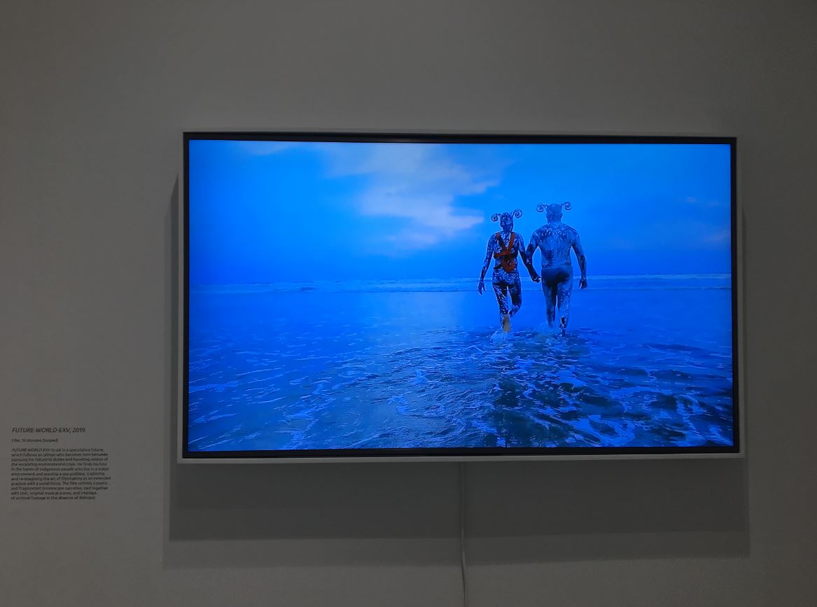
2. The film: ‘U K’ux Kaj/Heart of sky, Mayan god of storms’

While we’re on the subject of Mayan deities, the short film on show here is titled after one, ‘U K’ux Kaj / Heart of sky, Mayan god of storms’ (2023 to 2024). It’s only 8 minutes long. It was produced at Maní in the Yucatán Peninsula and why here? Because this is the town where, in 1562, the Spanish authorities in the form of the Church. assembled the largest ever collection of Mayan codices, books containing knowledge of the Maya religion, language and history, piled them up and burned them to ashes.

The film features slow shots of a wrecked building, the foundations of a long abandoned building surrounded by the lush greenery of the jungle, in which stands a statuesque woman clad from head to foot in a light flowing pink garment while a voiceover explains the events that took place here in Maya, the language of the first peoples. This is intercut with very slow close-ups of a native (non-white) hand slowly turning and rotating against a blue background.

But that’s not all. There are the bees. Remember I mentioned Mexico’s endangered stingless bee, Xunan-Kaab, the Regal Lady bee and how it was first cultivated in the Mayan civilisation 3,000 years ago? Well these bees also feature in the film, for the conquerors destroyed Mayan culture at one of the epicentres of Mayan apiculture, and the film includes references to the beekeeping skills, themselves rooted in a profound appreciation of the flora and fauna of the region, which the Spanish couldn’t extirpate.

3. The installation:

At the centre of the room is a new installation ‘T’aabal chukChuuk/Embers (2024)’. It consists of a sort of low ‘fence’ arranged on short posts in the shape of a hexagon, with one bar missing to allow visitors to enter the central space. Why a hexagon? Think about it. Because that is the shape of the cells in a beehive and, once again, the work incorporates aspects of Mayan bee lore.

Installation view of ‘T’aabal chukChuuk/Embers (2024)’ by Mónica Alcázar-Duarte, part of ‘Digital Clouds Don’t Carry Rain’ at Autograph ABP. Photo by the author

What’s she’s done is combine three things: 1) using an algorithm inspired by the collective intelligence of bee colonies, Alcázar-Duarte 2) has merged the fleur-de-lis motif with 3) fragments from the Casta paintings. What this means in practice is you have no fewer than fifty-six artificial lilies, created by modern 3-printing technology, all gilded with the same copper leaf colour we saw in the photos and – here’s the kicker – each one contains a face or hand or pair of hands recreated from some of the Casta paintings we’ve heard so much about. Bees. Copper. Digital technology. Casta. Lost culture. All these themes come together in this fragile’ garden of technology, based on the multiple historical classification systems which I’ve outlined above, and given form by the latest digital technology.

You don’t really need to know any of this, or not much, to find the ‘face lilies’ haunting and poignant.

Installation view of ‘T’aabal chukChuuk/Embers (2024)’ by Mónica Alcázar-Duarte at Autograph ABP, showing the 3-D-printed face lilies. Photo by the author

4. Augmented reality

But that, of course, is not all. There is a bit of augmented reality included in the installation. On the floor at the centre of the broken hexagon is a pattern in black and white, apparently based on a map of the Yucatan area of modern-day Mexico, once part of Mayan territory.

Diagram on the floor of ‘T’aabal chukChuuk/Embers (2024)’ by Mónica Alcázar-Duarte, at Autograph ABP. Photo by the author

The visitor assistant (in my case, the lovely David) has a big ipad which he loans to you. As you walk into the hexagon and focus the camera of the ipad on this floor diagram, something happens. A spangly tree grows up out of the floor, outlined in the same ghostly white dots as cover the eight photographs.

Installation view of ‘T’aabal chukChuuk/Embers (2024)’ by Mónica Alcázar-Duarte at Autograph ABP, showing the ipad on whose screen appears the ghostly outline of a digital tree growing and spreading. Photo by the author

I wasn’t quite sure what to make of this. It seems to me an elaborate gimmick. It didn’t really add to my understanding or enjoyment of the photo, the film or the installation with its scary poignant face lilies.  I saw it as an example of the cheapjack gimmicks people are trying to piggyback onto the digital world, including the numerous pointless headsets you can get which allow you to interact with the digital world (for example, Facebook’s ill-fated Meta VR headsets which were obviously going to be a failure before they were even release).

Possibly Alcázar-Duarte thinks this kind of thing is an exciting new development in digital art but two obvious points: 1) the visitor assistant only has one ipad so the entire thing is premised on only a tiny number of people ever experiencing it. 2) For me it is an extension of the deep question raised at the start which is, Might the entire digital world which everyone is helping to create, curate, and spread over the entire globe, might this digital matrix turn out to be the latest, most intrusive, most controlling and most delusory of all the systems of knowledge which Alcázar-Duarte has spent the exhibition investigating?

Conclusion

I can express what I want to say best by comparing this (relatively small) exhibition with the huge one currently at the Royal Academy, ‘Entangled Pasts, 1768 to Now: Art, Colonialism and Change‘. The RA show is, in effect, a major art institution washing its dirty laundry in public, owning up to its profound and multifarious links with the slave trade and then, once the trade was abolished, to its the enduring, institutional racism which ran through a lot of its work like a poisoned thread.

It’s a massive show full of loads of interesting and often beautiful art works but it feels like it is staggering under the weight of History and the burden of guilt which is why (apart from the horrors of some of the subject matter) it has an overall lowering and depressing effect.

By striking contrast, in this exhibition by Mónica Alcázar-Duarte, inheritor of an oppressed people and a suppressed culture, it feels like she has owned her historical legacy, assimilated it, mastered it, mastered all the insidious legacies of history, come out and top and transformed it to her advantage. The exhibition at the Royal Academy is crushed under the weight of its historical legacy. Mónica Alcázar-Duarte has taken her cultural legacy and transformed it into something fascinating, strange and new. She has made History fly.

And now you can see why I started my review by saying how dazzled I was by her work’s complexity and interest and depth and control and mastery of its material, in awe of the complexity and beauty of Alcázar-Duarte’s vision. It’s FREE. Do your mind a favour and go see both this and the Wilfred Ukpong in Autograph’s other gallery space. They’re both blisteringly good, but Alcázar-Duarte’s has a depth and vision you genuinely don’t often come across.


Related links

Related reviews

More Autograph ABP reviews

Wilfred Ukpong: Niger-Delta / Future-Cosmos @ Autograph ABP

‘Community history, ecology politics, indigenous environmentalism, extractive capitalism, and cultural evolution – these meditations on my homeland demonstrate how the art and film-making process can be employed to promote youth empowerment, challenge colonial narratives and disrupt systems of knowledge production.’
(Wilfred Ukpong)

Autograph ABP is a gallery dedicated to work by contemporary Black artists. It’s located just off Shoreditch High Street and is well worth a visit. It contains two gallery spaces, one on the ground, one on the first floor, and admission is FREE. The only slight snag is the opening hours which you need to check before you go (for example, it only opens at 12.30 on Saturdays).

But the thing about Autograph ABP is the work they display is always good and frequently outstanding. It has a case for being the best small gallery in London.

Strongly, We Believe In The Power of this Motile Thing That Will Takes Us There #2 by Wilfred Ukpong © Wilfred Ukpong. Courtesy of the artist and Blazing Century Studios

Niger-Delta/Future-Cosmos

Currently the downstairs gallery, gallery 1, is hosting a display dedicated to recent work by Wilfred Ukpong, titled ‘Niger-Delta/Future-Cosmos’.

The basic premise is an environmental one. Ukpong is protesting – as Nigerian artists, poets, playwrights and film-makers have been doing for decades – about the ruination of the Niger Delta by 70 or more years of ruthless and often careless oil extraction.

Nigeria and oil

Notoriously, Nigeria is a kleptocratic state in which various factions of the ruling elite vie with each other to gain control of the nation’s phenomenal oil revenues in order to steal them for themselves. See the relevant chapter of Tom Burgis’s searing 2015 exposé, The Looting Machine. So cynical is Burgis that he doesn’t bother referring to the president of Nigeria by his formal title but as ‘the captain of Nigeria’s looting machine’ (Burgis page 201) and quotes Nigerian analyst, Clement Nwankwo, describing the country’s largest political party, the People’s Democratic Party (PDP) as: ‘not a political party. It’s a platform to seize power and then share the resultant booty’ (Burgis p.203).

Oil was discovered in the delate of the river Niger in 1956 and the enormous wealth it generates for a small elite has been ruining the country for nearly 70 years. Oil currently accounts for 80% of Nigerian government revenue (Burgis p.63).

As a political economy took hold that was based on embezzlement and manipulating public office for private gain, government contracts for the upkeep of public goods that support industrialisation – a functioning electricity system among them – were diverted to the cronies of the rulers of the day. The pattern was the same [in Nigeria] as in Angola or Congo: the more the non-oil economy withered, the greater the impulse to embezzle, perpetuating the cycle of looting. (Burgis p.76)

Countries whose economies are largely reliant on oil production are commonly referred to as a petrostates. A country where the ruler entrenches power in himself and his clique, using authoritarian security forces against any form of protest, is called a petro-dictatorship. But so extreme is Nigeria’s corruption that Burgis coins the phrase petro-nightmare to describe Nigeria’s descent into universal corruption and an endless series of military coups.

To give a sense of the scale of the theft, in 2014 reforming banker Lamido Sanusi estimated that corruption at Nigeria’s national oil company, NNPC, was robbing the national treasury of $1 billion per month (Burgis p.205).

‘By and by,I Wil Carry this Burden of Hope, till the Laments of my Newborn is Heard #2’ by Wilfred Ukpong (2017) © Wilfred Ukpong. Courtesy of the artist and Blazing Century Studios

Niger Delta pollution

But not only has oil production corrupted and undermined Nigerian politics for over half a century, but it has had a catastrophic impact on the region where most of the oil extraction takes place, in the delta of the mighty river Niger, which covers 27,000 square miles and makes up 7.5% of Nigeria’s land mass. Beside the predictable impact of gas flares and burn-off into the atmosphere, the oil industry in the area has a long sorry history of disastrous oil spills, which has been compounded by a terrorist and insurgent attacks on pipelines from a variety of motivations, from siphoning off raw oil to sheer destructiveness.

The cumulative impact has been to make the Niger Delta one of the most polluted places on earth, and local activists, Nigerian writers and artists, and Western environmentalist groups have been publicising the issue for a long, long time.

Afrofuturism

How on earth can you, as an artist, respond adequately to such an enormous, ongoing, unstoppable social and environmental apocalypse? Ukpong’s response is simple and compelling – Afrofuturism.

Afrofuturism expresses notions of Black identity, agency and freedom through art, creative works and activism that envision liberated futures for Black life. (National Museum of African American History and Culture)

(I first encountered Afrofuturism at the Barbican’s 2017 science fiction show, Into The Unknown, where it was represented by the mysterious 2009 film Pumzi, directed by Wanuri Kahiu. Ukpoki’s vision has many things in common with Kahiu’s.)

Niger-Delta/Future-Cosmos

So Ukpong has taken his response to this disaster in his home region into an alternative reality and a strange and visionary future. The show consists of just eight photos and 2 videos but they are all riveting. All the photos are fantastic expressions of Ukpong’s vivid and striking Afrofuturism, very big, super-clear digital photos of Black people painted a deep shade of oil black and wearing strange curled headpieces, photographed in strange poses holding mysterious devices or artefacts.

‘The Advent of the Visionaries – A Screen To Behold’ by Wilfred Ukpong (2017) © Wilfred Ukpong. Courtesy of the artist and Blazing Century Studios

As the curators put it (and I apologise for the recap of the economic and social issues I’ve outlined above):

Once a major producer of palm oil for British colonisers, the Niger Delta is considered the mainstay of the Nigerian economy for its large oil reserves and its rich biodiversity due to the presence of rivers, mangroves, freshwater forests, and marine estuaries. In recent years, the region has been at the centre of environmental and social justice campaigns, challenging the pollution caused by major spills and flares at the hands of oil and gas industry giants.

The works in the exhibition are all set in the Niger Delta, Ukpong’s homeland. Driven by a profound desire to effect change, the artist worked with more than two hundred young people from marginalised, oil-producing communities to collectively address the historical and environmental issues in the oil-rich region.

The resulting photographs and film powerfully reference local rituals, ceremonial motifs, and symbols interwoven into a complex future cosmology.

All the photos are beautifully composed, beautifully clear, sunlit of strange objects, rituals, dress. I loved the weirdness and otherness of it. I loved the digital clarity of the images. I love science fiction so this pushed all my buttons right down to the great way all the photos are embedded in frames made from shiny black plastic folded into metal rods in such a way as to convey the sense of a rippling flood of black oil cascading around the alien future people captured in the photos.

Installation view of ‘Are My Dreams Too Bold for the Carbon Skin I Bear #1’ by Wilfred Ukpong (2017) Photo by the author © Wilfred Ukpong. Courtesy of the artist and Blazing Century Studios

They are so strong and clear and strangely imagined and beautifully designed and stunningly photographed. In their strong incomprehensibility they make perfect sense of mankind’s absurd destruction of the natural world. When reality is absurd, why not respond absurdly?

First film: FUTURE-WORLD-EXV

As well as the eight photos there are two films in this exhibition. The first, in the main room alongside the wonderful photos, is titled ‘FUTURE-WORLD-EXV’ and is 16 minutes long.

It is set in the year 2060 and follows a (Black) oil worker who is haunted by dreams of environmental disaster before coming to a grisly end on a wide smooth beach where his corpse is discovered by women members of a people who live in a watery environment and worship a water goddess. It is weird and it is absolutely wonderful.

In the particular scene I watched one particular woman covered in freckled white paint laments over his corpse, rubs and strokes it before climbing onto his body and then, lo, the body has also become white and speckled and the corpse animates, he gets up, they hold hands and walk into the waves. Sounds a bit clichéd but I found it genuinely strange and intense and riveting.

Installation view of ‘FUTURE-WORLD-EXV’ by Wilfred Ukpong, showing the final scene as the speckled man and woman walk into the waves, wearing the distinctive headgear of Ukpong’s futureworld. Photo by the author

Second film: Earth Sounds

The second film is set apart from the suite of 8 photos and the first film, which are linked by the vibrant colours and strange headgear of his science fiction futureworld. This one is titled ‘Earth Sounds’ and dates from 2021. It is 30 minutes long and less plotted and structured than ‘FUTURE-WORLD-EXV’.

It is the film of a performance in which Ukpong, again almost naked, flanked by two masked women carrying heraldic black flags, journeys on a wooden boat (a traditional canoe?) across a narrow waterway cluttered with mangroves or swamp plants, bushes and trees hemming them in. In this boat Ukpong is a shaman, performing obscure rituals, often involving a peculiar artefact, a yard-long circular wooden chest, painted red with yellow insignia of some sort, bound with heavy black metal clasps and with carved faces at each end.

Maybe the shaking of branches and the strange sounds he makes are invocations, designed to protect the Niger Delta from its dreadful despoliation. Whatever’s going on it is weird and wonderful up to the moment when the shaman kisses the wooden face on the chest and then, ritualistically, throws it into the polluted swamp water, and then dives in after it.

This isn’t high-budget Hollywood production values, there’s an obvious amateurishness to the camerawork and the sound quality, but this makes it all the more vivid and immediate, in all its mysterious, hypnotic power. Strange, compelling.

Summary

All this, all these ideas, designs, visions, images, sounds and movements, all of it happens in just one medium-sized gallery, but I came out reeling from the brilliant conception and luminous enactment of Ukpong’s brilliant vision.


Related links

Nigerian corruption

Nigerian fiction

Environmental art reviews

More Autograph ABP exhibitions

Soulscapes @ Dulwich Picture Gallery

Landscape painting is associated with the classical tradition, with nostalgic views of often idealised landscapes (in England, by painters such as Gainsborough and Reynolds in the 18th century, via Constable in the 19th, and onto 20th century artists as varied as Ravilious or David Hockney). Above all it is associated with white, male, historical artists, and Dulwich Picture Gallery is home to numerous works by masters of landscape painting, in Britain and Europe.

And so the thought naturally arises: why not gather together works by non-white artists, by contemporary living artists who, in a host of different ways, can offer new and interesting perspectives on a well-worn subject? Hence this exhibition, ‘a contemporary retelling of landscape by artists from the African Diaspora.’

It sounds like a simple enough proposition but raises a surprising number of questions and issues, problems and perplexities, which I try to address through the course of this review.

Scope

‘Soulscape’ features about 33 works (20 paintings, 2 textiles, 10 photos and 2 videos and a video installation) by 21 contemporary Black artists. The works include large-scale pieces, a site-specific installation, and a big new painting commission from Michaela Yearwood-Dan. They cover a wide variety of media including photography, film, tapestry and collage. And they are all very 21st century. The oldest work is from 2012 but that’s an outlier, most are much more recent. I counted five a piece from 2020, 2022 and 2023. It’s up-to-the-minute stuff.

Some of the artists I’d heard of before, namely the film-maker Isaac Julien, photographers Marcia Michael and Mónica de Miranda because I’ve been to exhibitions of their work at the Black gallery, Autograph ABP (and de Miranda also features in Tate Britain’s current Women in Revolt! exhibition). But most of the rest were, to my shame, completely new to me.

As you might expect the show goes way beyond traditional limited interpretations of ‘landscape’ to bring in a host of weighty themes and ideas. Dulwich Picture Gallery is a relatively small space, made up of four consecutive galleries (with a small broom cupboard of a mausoleum at the break between rooms 2 and 3) and the rooms have each been assigned themes or topics, being: belonging, memory, joy and transformation.

1. Belonging

Room one is arguably the best room in the show. It contains just four big works, but I liked them all. They have been selected to illustrate the theme of belonging. I’m going to quote the curators’ introduction in full:

Belonging is fundamental to the human experience. It is intrinsically linked with our relationship to landscape and our place in the world. We can feel an emotional affinity to a place through shared histories, as well as being rooted somewhere through a collective identity.

Each artist here offers a unique perspective in the way their work draws links between self and nature. They reflect on the intersections of felt experience and the traditional understanding of belonging, often against the backdrop of colonial history, migration, and the complexities of disputed territories.

‘Limestone Wall’ (2020) is a large-scale painting by Hurvin Anderson, depicts the tropical foliage of Jamaica and explores the artist’s relationship to his ancestral homeland. The curators write:

Anderson is the youngest of eight children born to Jamaican parents, the only one born in England. His work reflects an attempt to reconcile his inherited and imagined knowledge of Jamaica with his own limited experience of the landscape. ‘Limestone Wall’ invites us to consider the liminality of belonging through a landscape that was inspired by photographs taken on a visit to Jamaica.

Limestone Wall by Hurvin Anderson (2020) © Hurvin Anderson. Courtesy the artist and Thomas Dane Gallery. Photo by Richard Ivey

‘The liminality of belonging’. For those not familiar with curatorspeak, liminality means ‘the quality of being in between two places or stages, on the verge of transitioning to something new’. It’s in fact a term taken from anthropology where it indicates ‘the quality of ambiguity or disorientation that occurs in the middle stage of a rite of passage, when participants no longer hold their pre-ritual status but have not yet begun the transition to the status they will hold when the rite is complete’ (Wikipedia).

This is, as you can see, a big and complex idea to attach to a painting of what looks like some kind of terrace (of a café, maybe?) set against a lush green tropical jungle.

The idea that immigrants, emigrants, the children of people who have emigrated from one society to settle in another and who remain, in some sense, between two worlds, and two identities, is a Central Issue of Our Times, and runs like a thread through all the rooms in the exhibition.

The question which this first room raised for me was not the one the curators intended, about belonging or identity etc, but more like: Does the knowledge about the artist’s family background and immigration status (I apologise if this is insensitive phrasing, all I mean is knowledge of whether the artist comes from a family which has emigrated from an African country to somewhere in the West, Europe or America), does and should this knowledge affect our appreciation of the art?

On one level it doesn’t matter at all to me, I don’t care where any artist comes from or what their ethnic background is. I’ve come to an art gallery, I’m looking at 30 or so paintings (and a couple of videos) and deciding which ones I like purely on the basis of how they look and how they make me feel. But it matters a lot to the curators. It’s the curators who’ve made it an issue, because it’s the curators who include this ‘immigration information’ in almost every wall label, as well as in the articles which accompany the show in the Dulwich Gallery magazine.

This is the room which hosts the pieces by Marcia Michael and Mónica de Miranda. Of the Miranda triptych of photos, the curators write:

De Miranda, a Portuguese artist with Angolan ancestry, explores the poetry of belonging throughout her work. This piece, from the series ‘The sun does not rise in the north’, investigates the physical and mental concept of borders and migration. Depicting landscapes that witness hope, de Miranda examines the complexity of migrant histories in Europe in relation to the politics of land. The three figures, standing amid breaking waves, lead us to consider the limitations of belonging.

Sun rise (detail) by Mónica de Miranda (2023) Courtesy of the artist and Sabrina Amrani Gallery, Madrid

She’s also represented by ‘When words escape, flowers speak’, massive digital photos of twin Angolan sisters standing in the seemingly natural but carefully constructed landscape of the botanical gardens of Floresta da Ilha (Island Forest) in Angola’s capital city, Luanda. The curators describe this city, Luanda, as bearing ‘a history of colonial presence’. Well, yes, Luanda ‘bears’ quite a bit more than that, since Angola gained independence in November 1975 and was immediately plunged into a devastating civil war which lasted, with interludes, until 2002, leaving up to 800,000 dead and the country’s economy and infrastructure in ruins. See my reviews of:

As so often, as in Tate Modern’s excellent exhibition of African photography, the (white liberal) curators bang on at great length about the evils of the colonial period, and simply ignore the 60 years of civil wars, military coups, famines and kleptocratic dictatorships which have ravaged Africa since the end of the colonial era.

On the big wall facing the entrance is Marcia Michael‘s 2022 work, ‘Ancestral Home 45’, from the series ‘The Object of My Gaze’. It’s a photograph of a jungle scene which has been mirrored vertically and horizontally to create a dazzling image of a tropical landscape.

Kaleidoscopic and mesmerising, this photographic work is a meditation on the sense of belonging that can be evoked through immersion in nature. It was created from a series of images captured by Michael on a visit to her late mother’s homeland in Jamaica.

2. Memory

Room two is devoted to memory. The curators, again, make a number of sweeping claims:

Landscapes have the power to unlock feelings that only a particular place can activate. Sometimes these memories are nourishing and affirming and at other times they are challenging, making us feel unwelcome or excluded. The artists in this section explore the space in between these extremes. 

Do landscapes ‘have the power to unlock feelings that only a particular place can activate’? Maybe. It’s a big claim, a big thought.

This room contains the most works, with 8 or so paintings and fabrics, 6 photos, plus a video and a still from a video.

The video is by Harold Offeh, is titled ‘Body Landscape Memory. Symphonic Variations on an African Air’ (2019) and is 20 minutes long. It consists of very calm, quiet shots of one, two or three Black people sitting on log benches in what looks like a typical (and typically boring) English park. There’s no dialogue or interaction. The calm scenes are accompanied by music from the early twentieth-century Black British composer Samuel Coleridge-Taylor. There’s a web page which gives more explanation, stills and a clip from the video.

The curators give an explanation which is presumably the artist’s, namely that:

These figures are liberated from any racialised notions of victimisation, or suffrage, to reimagine the inclusive possibilities of this romanticised environment.

The complete lack of action or dialogue is the point, and I (think I) understand the political or polemical aim, to show Black people in a nice park, with none of the melodrama or negative stereotypes which usually accompany Black people in TV dramas or movies. Bit boring, though.

In a similar vein, of normalising Black figures in non-urban settings, are two big digital photos by Jermaine Francis.

‘A Pleasant Land J, Samuel Johnson, & the Spectre of Unrecognised Black Figures’ by Jermaine Francis (2023) Courtesy of Artist Jermaine Francis

According to the curators Francis:

considers the issues that arise out of interactions with our everyday environments, positioning the Black figure in rural settings to instigate conversations around power, identity and the history of the English Landscape.

‘Conversations around power, identity and the history of the English Landscape.’ These are hefty topics, walloping great ideas, to simply mention and then leave hanging. For me they are like lead weights which have been hung on the photos, which drag down your response, which channel whatever initial response you have to them as works of art, into an urgent-sounding, political-sounding straitjacket.

And the ideas are just too big to engage with. Am I meant, somehow, to review the entire history of the English landscape based on just these two photographs?

I mentioned Isaac Julien. He’s represented by a big colour photograph, a still from a 2015 film installation Julien made titled ‘Onyx Cave (Stones Against Diamonds)’. The film aimed to celebrate the beauty of natural elements. The sequence the still is from was filmed in the rarely accessible ice caves in the Vatnajökull region of Iceland. It shows a Black figure standing in a beautiful ice-white and azure cave. It is accentuated by the presence of the onyx figure, dwarfed by the magnificence of the backdrop.

Onyx Cave (Stones Against Diamonds) by Isaac Julien (2015) © Isaac Julien / private collection, London

But this beautiful, awesome image isn’t enough. Again the curators corral it into one of their polemical concerns about Black inclusion/exclusion from the tradition of landscape art.

Historically, these depictions of cold-climates excluded the Black figure, so its presence here challenges notions of belonging and memory.

Obviously this is an idea implicit in the image, if you choose to read it this way. But if Julien really did intend his piece to be first and foremost a celebration of the beauty of nature, I wonder how he feels about this broad aim being straitjacketed into yet another discussion about Black figures in art. It made me wonder what any of these 21 artists thought about being chosen for this exhibition primarily for the colour of their skin rather than the quality of their work.

Interlude: the Mausoleum

It’s a quirk of Dulwich Picture Gallery that half way through, between rooms 2 and 3, off to one side, there’s a smallish circular room which is actually the mausoleum of three of the founders of the gallery. It is shaped to recall a funeral monument, with urns atop the building on the outside, sarcophagi above the doors and sacrificial altars in the corners.

The back wall is flat and it’s onto this wall that Phoebe Boswell has created a ‘site-specific installation’, namely a big door-shaped projection of a video titled ‘I Dream of a Home I Cannot Know’ (2019). This is a kind of visual collage depicting everyday activities of (Black) people in a beach in Zanzibar. It’s happy and innocent and lovely, with a low soundtrack of laughter and conversation and chat as holiday makers and day trippers runs, skip, play, go swimming, handle fishing boats etc. There are four attractive stools carved from a gnarly old tree because they contain gaps and holes, for visitors to sit on and be nicely lulled. It’s more or less the only piece in the show which really does convey a sense of the happiness and relaxing quality of being out of doors. However, the curators rope it back into their concern with migration, disaporas and the artist’s multi-country identity:

The work is a reflection on belonging, community, freedom, and migration. Boswell is informed by her own history, which spans various geographies and landscapes, and her work navigates the spaces between.

3. Joy

Room 3 is devoted to the theme of Joy. It contains nine works.

The joy that that comes from connecting with nature is a deeply personal and emotional experience. Whether experienced in solitude or socially with others, this feeling is often underlined by the nourishment and release that arises from being at one with the natural world.

The artists here invite us to join with them in sharing this moment of euphoria. For some, this is conveyed through evoking the sensory delight that comes from an immersion in the beauty of nature; the smell of fresh flowers, the feel of petals between one’s fingers. For others, depicting scenes of familial joy that place Black figures into classical pastoral scenes is a way of expanding the possibility for Black bodies to experience true ease and freedom.

‘…expanding the possibility for Black bodies to experience true ease and freedom’ rather begs the question: Do Black bodies currently not experience true ease and freedom? Anywhere? What would it take for Black bodies to experience true ease and freedom? The wall labels begged loads of questions which I found worried and distracted me from the art.

Anyway, I’m afraid I found most of the pieces in this room pretty meh. After strolling through the four rooms four or five times, I came to the settled conviction that I only really liked about ten, about a third of the 33 or so works. Some I found so horrible that I could barely look at them. It would be invidious to single out the really bad ones, but here are some I thought were very average.

‘Unforeseen Journey of Self-Discovery’ by Kimathi Mafafo (2020). The medium is interesting – it’s a hand- and machine-embroidered fabric so that when you get up close, you can see the individual threads and appreciate the extraordinary amount of time and patience it must have taken to make. I just didn’t like the final image very much. Maybe you do. Tastes vary.

‘Unforeseen Journey of Self-Discovery’ by Kimathi Mafafo (2020) Image courtesy of the artist / Kristin Hjellegjerde Gallery

However the curators load the work with some rather scary issues.

Mafafo explores the joyous embrace of nature as an act of resistance. The woman emerging from a cocooned veil of white muslin peers out with an air of excitement and wonder. The veil, once a sanctuary of peace and introspection, billows around her playfully as she rediscovers her world, uplifted by the natural beauty that defies the weight of patriarchy and racism.

Looking at the image cold, was your first response be that it is an act of resistance to patriarchy and racism? Maybe it was. But these struck me as being huge, troubling issues to load onto what (I think) is intending to be an image of innocence and natural beauty.

Another work which didn’t light my fire was a set of four paintings by Kimathi Donkor from her ‘Idyl’ series (2016 to 2020).

‘On Episode Seven’ by Kimathi Donkor (2020) Courtesy of the Artist and Niru Ratnam, London. Photo by Kimathi Donkor

These depict:

The concept of Black joy is a central theme of Donkor’s Idyll series. The figures in his painting display gestures of ease, relaxation and shared play between friends and family members. The pleasures of public green space and balmy weather are celebrated as precious gifts of nature, available to uplift us all.

‘Black joy’? Is this a lot different from white joy? Chinese joy? Latinx joy? Asian joy? Then comes then the polemical kicker:

For Black communities, this joy is also a form of resistance against being excluded, silenced or classed as victims.

OK, if this picture is something as serious and politically committed as ‘a form of resistance…for Black communities’, am I even allowed to have a view of whether I like it or not? The other three in the series were all in the same style and, well, I just didn’t like them very much.

On the plus side, the room contained two very good works. Njideka Akunyili Crosby’s lush multimedia piece, ‘Cassava Garden’ (2015), layers images from fashion magazines, pictures of Nigerian pop stars, and samplings from family photo albums to represent a hybrid cultural identity.

‘Cassava Garden’ by Njideka Akunyili Crosby (2015) © Njideka Akunyili Crosby. Courtesy the artist, Victoria Miro, and David Zwirner. Photo by Robert Glowacki

I always like collage, whether in its 1910s Cubism, 1920s Weimar or 1960s Pop guides, so I straightaway liked this. But I just responded to the size and feel of this work, it’s big and striking. I liked the way the repeated face of the women embedded in the fabric on the right is at right angles to the picture plane. You can’t really see them in this reproduction but in the two big green leaves at the top are embedded (from left to right) the faces of an African woman and man and they are both stunningly vivid and realistic. Maybe they’re photos somehow worked into the piece. If they were painted they’re extraordinary. And the off-centre positioning of the stalk of what is, presumably, the cassava plant. It all combines to make this one of my favourite pieces from the show. According to the curators:

The Nigerian-born American artist Njideka Akunyili Crosby uses an abstracted collage to engage with the idea of memory. The main feature is the cassava plant, whose broad leaves extend across the canvas and are layered with photographic images of the artist’s family life.

The collage is a reflection on Njideka Akunyili Crosby’s childhood trips to her ancestral land which were marked in her memory by the presence of cassava plants. She also references traditional West African material and patterns, signifying the duality of her cultural identity since making a new life in the USA.

Nearby are two more really good pieces, ‘The Climber’ (2022) and ‘Moonlight Searchers’ (2022) by Che Lovelace which depict the flora, fauna, figures, landscapes and rituals of the Caribbean. Again this catered to my slightly Asperger’s taste for squares and geometric shapes. I immediately responded to the way it consists of four rectangles bolted together, each signalling a different perspective or colour palette on the main composition. And then I liked the rather Cézanne-like way the two naked women are turning into geometric shapes or geometric shapes are emerging from their bodies, beginning to schematise or diagrammatise them. And I liked the colours, especially the green fronds of the palm tree leaves on the left.

‘Moonlight Searchers’ by Che Lovelace (2022) private collection. Courtesy of the artist, Corvi-Mora, Various Small Fires and Nicola Vassell Gallery

According to the curators:

Lovelace reflects on the loving embrace of the landscapes found in his homeland, Trinidad. His depictions of the rhythms of life on the Caribbean island are informed by his rootedness there. The result is a complex and nuanced expression of his sense of identity, as well as an exploration of postcolonialism, resistance, freedom and joy. The division of the canvases into quadrants reflects the interactions between different cultures on Trinidad. Both works show bodies at ease with nature, exploring and connecting with their surroundings.

Once again the wall label raised questions in my mind: Is this painting ‘an exploration of postcolonialism, resistance, freedom and joy’? Or are those just fashionable words thrown at these paintings, combined and recombined in an impressive number of ways but, at bottom, representing just a handful of ideas, none of which actually is actually ‘explored’. Are these terms like confetti thrown at a wedding, bouncing off the central figures and then lying around on the floor till swept up and thrown away?

4. Transformation

The Gallery often reserves the fourth and final room for Big works, acting as a climax to what came before and this exhibition is no exception, the fourth room containing four big, big paintings. The curators explain the theme of transformation thus:

Nature can be a powerful force that changes the way we see the world and its history, as well as equipping us with tools for healing physical and emotional wounds.

This begs so many questions, it left me dizzy. Is nature ‘a powerful force’? What does that mean, exactly? Surely we are part of ‘nature’, every organic thing, plus the geographical and geological environment, surely these are all part of nature? So what does it mean to say that ‘nature’ can change ‘the way we see the world’? How are these terms, ‘nature’ and ‘world’ different? Is it because the curators are assuming that ‘world’ gestures more towards the world of humans the world of culture and technology we surround ourselves with?

And what does it mean to say that ‘nature’ can change ‘the way we see…history’? How, exactly? Does walking through a park change my view of the French Revolution or the Rwanda genocide? I don’t really see the connection?

And these are all implications of just the first half of that sentence. the second half goes on to make the huge claim that ‘nature’ equips us ‘with tools for healing physical and emotional wounds’. Does it? What tools? How?

So I found myself hugely distracted by this simple couple of sentences, my mind buzzing with an explosion of implications and issues, so it took quite a while to settle down and actually look at the works in the room.

These include the one specially commissioned for the show, by Michaela Yearwood-Dan, ‘Another rest in peace – from a holy land in which we came’. It’s a huge landscape-shaped canvas filled with swirling paints, with ceramic petals and other matter stuck to the surface, and I actively disliked it. It looked like an abortion on a canvas and had absolutely no healing impact on me.

Next to it is an equally huge painting of a tropical rainforest which appears to be hanging over a river, although the paint is handled in such a way that it looks like it is melting into the river, an uncomfortable image of distortion, reminding me of the cover art for a science fiction book where some horrible radioactive disaster has struck the world. the grey blobs on the right, from a certain angle, looked like distorted skulls.

‘There Is Water at the Bottom of the Ocean’ by Ravelle Pillay (2023)

This is ‘There Is Water at the Bottom of the Ocean’ by Ravelle Pillay (2023) and, according to the curators:

In this moody and evocative painting, Pillay explores the legacies of colonialism and transformation of painful colonial histories alongside the conflicting nature of historical memory. The lush shoreline sits against the backdrop of a jungle made up of palm trees that appear weighted and changed by the histories they have witnessed. The water seems to hold spectral energy. The artist allows us to consider the way history can affect a landscape and reveal wounds that call for healing and change.

None of that was obvious to me. I just found it huge, overpowering and depressing. Maybe you think differently.

And, finally, a pair of enormous paintings, dominated by orange and browns, by Christina Kimeze, namely ‘Wader (Lido Beach)’ and ‘Interior I’, both painted in 2022. Here’s a link to the Wader, and to the Interior on Kimeze’s website. Actually, in small reproduction they scrub up quite well, the orange palette coming across very powerfully. Also, on the internet you can see installation shots of exhibitions with lots of her works together, which I imagine give a strong cumulative effect.

But here, the context of two other huge and not very appealing works dragged my reaction down into negativity. In the ‘Interior’ I found the space (is it inside a hut?) offputtingly square and rigid, and the depiction of the woman’s shape or outline disconcertingly clumsy and unappealing.

The figure of the pregnant woman in ‘The Wader’ is a lot more appealing, as is the liberal use of purple marking or strokes but, in the flesh, huge and oppressive in a small room, I found both these works the exact opposite of healing or transformative. I couldn’t wait to get away from their looming presence.

Summary

After carefully reading the 40 or so wall labels which repeatedly invoke troubling social and political issues around racism, ethnicity, migration, identity, Black oppression, Black suffering, Black exclusion and Black exploitation, I felt anything but soothed and healed by nature. I felt very troubled and anxious about some of the hottest hot-button issues in modern society. The labels of almost every work have the harassing, hectoring tone of a Guardian article lecturing you about your white privilege and asking what you are going to do for the Black Lives Matter movement. Quite stressful.

As to the healing, joyous and transformative power of nature which the main room captions repeatedly invoke, one minute in the lovely gardens surrounding Dulwich Picture Gallery, amid the deckchairs and playing children and picnicking families, was more instantly and deeply healing and calming than anything I saw in the challenging hour I spent in this difficult and very uneven exhibition.

Exhibiting artists

  • Njideka Akunyili Crosby
  • Hurvin Anderson
  • Michael Armitage
  • Phoebe Boswell
  • Kimathi Donkor
  • Jermaine Francis
  • Ebony G. Patterson
  • Alain Joséphine
  • Isaac Julien
  • Christina Kimeze
  • Che Lovelace
  • Kimathi Mafafo
  • Marcia Michael
  • Mónica de Miranda
  • Harold Offeh
  • Nengi Omuku
  • Sikelela Owen
  • Ravelle Pillay
  • Alberta Whittle
  • EVEWRIGHT
  • Michaela Yearwood-Dan

Promotional video


Related link

  • Soulscapes continues at Dulwich Picture Gallery until June 2024

Related reviews

Women in Revolt! Art and Activism in the UK 1970 to 1990 @ Tate Britain

‘You start by sinking into his arms and end up with your arms in his sink.’
(1970s feminist slogan)

‘Women in Revolt! Art and Activism in the UK 1970 to 1990’ does what it says on the tin and is the largest assembly of British feminist art ever gathered together in one place. It is an encyclopedia of British feminist art and activism in the 1970s and 80s, packed with images, ideas, associations, slogans, shocking stories, stimulating art works, music and voices.

Seven Demands 1974 by See Red Women’s Workshop © See Red Women’s Workshop

Huge

‘Women in Revolt!’ is huge. It features some 600 works by over 100 women artists and (very often) women’s collectives.

The definition of ‘work of art’ is cast as wide as possible to include paintings, drawings, photographs, textiles, prints and films, but this doesn’t begin to indicate the range of the material. Each of the seven rooms (and these are often sub-divided so you end up with about 12 distinct spaces in total) contains at least one display case, sometimes two or three, each containing large amounts of documentary material on the theme of the room, and this includes posters, leaflets, pamphlets, handouts, magazines, self-help manuals and books, all with a polemical feminist theme.

As one way of surfing through the material I set out to list all the magazines featured in these cases. I ran out of puff after noting Speak Out, Foward, Outwrite, Shrew, (lots and lots of copies of) Spare Rib, Enough, Banshee (for Irish feminists), the Beaumont Bulletin, Women’s Report, Feminist Art News, Mukli, Red Rag, In Print, the GLC Women’s Committee, Socialist Woman, Power of Women, Women Now!, Edinburgh Women’s Newsletter, Glasgow Women’s Liberation Newsletter, Tayside Women’s Liberation Newsletter and so very much on – an extraordinary outpouring of voices and opinions, a nationwide, grass roots explosion of activism and organising that burst out everywhere and then snowballed…

Reading list

The exhibition is accompanied by all kinds of paraphernalia and accessories. Before you even get in there’s a room-sized space containing a big table and 7 or 8 chairs next to shelves holding 20 or 30 feminist books from or about the period. You are encouraged to take the books down, sit and read them. I liked the look of ‘The Lost Women of Rock Music‘, although maybe not at the price of £49.

On a hoarding nearby there’s a list of feminists organisations which I list at the end of this review.

The LP

There’s an old-style record player playing an LP which has been created specially for the exhibition:

There are a couple of headsets so you can sit on the bench and tap your toes to feminist hits by the likes of the Mo-Dettes, the Slits, X-Ray Spex, The Raincoats or, my favourite, The Gymslips.

Films and documentaries

The LP headphones prepare you for the fact that the exhibition includes no fewer than 27 films with a combined duration of around 7 hours! Plus 25 artworks which include audio.

These all have headphones so you can sit and listen to documentaries about black women or a BBC discussion about whether domestic work should be paid, about the Grunwick strike, a shocking documentary about how women of colour immigrating to Britain had to undergo virginity checks (in the 1970s) and so on.

Related events

The exhibition is accompanied by 6 podcasts, a long Spotify playlist of Women in Revolt music, and there’s a festival of feminist films at the National Film Theatre. The Tate café even has feminist cakes on sale.

Feminist meringues on sale in the Tate café. Photo by the author

It’s much, much more than an exhibition. It feels like a parallel universe, the universe of committed feminists which sits alongside the universe the rest of us inhabit, and yet is based on a completely different set of values and assumptions, has its own vocabulary and jargon, inhabits a discursive realm thronged with hundreds of thousands of books, pamphlets, articles, meetings, organisations, websites, social media pronunciations, an endless alternative point of view.

Start point 1970

The exhibition very specifically covers the period 1970 to 1990. Why? 1970 was the year of the first Women’s Liberation Conference and is a convenient starting point for the emergence of a distinctive feminist branch of the cultural and political rebellions of the later 1960s.

Thus the early rooms are all about squats and collectives and are liberally sprinkled with talk of overthrowing capitalism, how capitalism relies on the patriarchy i.e. the systematic oppression of women, undervaluing of women’s work (especially housework and child-rearing) and so on.

There are pamphlets explaining the communist take on women and the family (‘Feminism in the Marxist Movement’ and ‘Communism and the Family’). In the curators’ words:

In the 1970s and 1980s a new wave of feminism erupted. Women used their lived experiences to create art, from painting and photography to film and performance, to fight against injustice. This included taking a stand for reproductive rights, equal pay and race equality. This creativity helped shape a period of pivotal change for women in Britain, including the opening of the first women’s refuge and the formation of the British Black Arts Movement.

There are lots of black-and-white photos of squats and slums, some of the vintage documentaries who street scenes of road filled with lovely old motors from the 60s and 70s.

Are many women Marxists?

The wall label of room 2 states:

Many women see capitalism as the root of their oppression. They challenge its reliance on patriarchal systems in which men hold the power and women are largely excluded. They also view women’s unpaid reproductive labour as exploitation, and a necessary condition of capitalism.

Do they? Do ‘Many women see capitalism as the root of their oppression’? In the intense hothouse of academia, maybe. But out here in the wider world where many women run companies and corporations and, of course, populate the highest ranks of the Conservative Party?

The buzzwords ‘capitalism’, ‘communism’ and ‘socialism’ crop up throughout the exhibition, particularly in the earlier rooms when we’re closest in time to the revolutionary turmoil of the late 1960s and many radicals thought that Western capitalism was teetering on the brink of collapse.

This made me feel sadly nostalgic for my school days in the 1970s when left-wingers believed in such a thing as socialism, believed that capitalism could be ‘overthrown’, all it would take would be one more heave and the entire oppressive system would be overthrown and usher in the communist utopia, social ownership of utilities, industries and businesses, where everyone would contribute according to their ability and take according to their need.

The economic, social and political naivety of those times seem an age ago, now.

Nostalgia

This raises an issue I had throughout the show which is that, I think I was meant to respond with outrage and sympathy to the many oppressions women laboured under in the 1970s and 80s but I found quite a lot of the material heart-warmingly nostalgic. Take the room devoted to punk women, which featured artworks and videos (of Ludus performing) and a display case full of fanzines with Johnny Rotten or the Clash on the cover. This was pure nostalgia for me and warmed the cockles of my heart.

Art or social history?

This thought in turn triggered several other questions which nagged me all the way through, namely: 1) How much of the works on display were art and how much social history? At one end were paintings and sculptures which are explicitly and unambiguously art. At the other end were the display cases holding magazines, posters, pamphlets and whatnot which are, in my opinion, documents of social history. In between were questionable objects or works which begged the question. For example, there’s a room devoted to Greenham Common. As in every room, it has a display case showing magazines, flyers, letters, maps and so on. In complete contrast was a massive installation of a wire fences covered with bric-a-brac typical of the camp and, on another wall, a bit painting (art).

But what about the ten or so (very good) black-and-white photos showing Greenham women in various stages of protest? Are they ‘art’, or documentary shots as might be taken by a magazine journalist? Or the quilt made by several Greenham women, showing Greenham slogans, hanging on the wall?

Installation view of photos of women at Greenham Common. Photo by the author

2) And this was related to a second question which was: am I responding to the works because a) they nostalgically remind me of my misspent youth (e.g. the punk room), or b) because I’m responding to the issues they raise and the (sometimes terrible) stories they tell) or c) as works of art?

Very few of the 600 works on display actually cut through to me as works of art (I mention my favourites below). Far more of them were attached to stories which were more in the shape of newspapers stories (the police shooting of Cherry Groce, the virginity inspections of black women immigrants, the disabled woman who was sterilised by male doctors without her consent etc) or issues (abortion, social pressure on women etc).

Or had a kind of documentary factual basis such as, in the pregnancy room:

  1. the 90 second long black-and-white movie which consisted simply of a close-up of a pregnant woman’s stomach so that you could see the baby moving inside (Antepartum by Mary Kelly)
  2. the sequence of black-and-white photos a woman artist took of her stomach from the moment she learned she was pregnant

Installation view of ‘Ten Months’ by Susan Hiller. Photo by the author

‘Ten Months’ documents Hiller’s pregnancy. The artist uses a conceptual framework to explore an intensely subjective experience, presenting one photograph of her stomach for each of the 28 days of 10 lunar months. Accompanying the photographs are texts from the artist’s journal that reflect on the psychic and physical changes that occur during pregnancy.

(Who isn’t) restoring women’s voices?

As always, the curators claim that many of these artists have been overlooked and left out of traditional male-dominated narratives of modern art – ‘women, who despite long careers, have been largely left outside the artistic narratives of the time’ – and so this exhibition is putting things to rights!

For many of the featured artists, this will be the first time many of their works have been on display since the 1970s.

This is very similar to the claim made at the ‘RE/SISTERS: A Lens on Gender and Ecology’ exhibition which is on at the Barbican until 14 January, and which also brings together women artists and collectives from the 1980s through to the present day, also claiming they have been written out of art history, also claiming to set the record straight, also claiming to give women artists their voice, etc.

In other words, this is the standard claim made at the exhibition of almost any woman artist or artists. It may well be true. But it’s well on the way to being a cliché, one of the received ideas of our time.

Are they worth it?

I’ll come straight out and state an obvious point: maybe a lot of these women artists weren’t consciously ‘written out’ of art history by wicked white male art historians as a result of a patriarchal conspiracy, but because they…er…aren’t any good.

Take that LP featuring tracks by revolting women bands such as the Mo-Dettes, the Slits, the Poison Girls, the Gymslips, the Au Pairs, Girls At Our Best and so on…maybe these bands haven’t been forgotten by time or erased, i.e. aren’t much known or written about in histories of pop music, not as the result of some scary conspiracy by white male music critics but…because they’re just not as good or interesting as The Sex Pistols, The Clash, The Jam, The Buzzcocks et al.

Some of the work here is outstanding, but a lot of it only makes sense in the context of feminist protest, was designed to provoke the enemy or raise the consciousness of allies, to educate and inform. A lot of it is only a little step above the posters, pamphlets and handouts created by women all over the country in response to injustice and discrimination, which is to say they are all in a worthwhile cause but…as art…judged as works of art…even if we extend the definition of ‘art’ to breaking point…

Rather than rewriting them badly, here are the curators’ own wall labels quoted directly. Indentation indicates curators’ text.

Room 1. Rising with Fury

In the early 1970s, women were second-class citizens. The Equal Pay Act wouldn’t be enacted until 1975. There were no statutory maternity rights or any sex-discrimination protection in law. Married women were legal dependants of their husbands, and men had the right to have sex with their wives, with or without consent. There were no domestic violence shelters or rape crisis units. For many women, their multiple intersection identities led to further inequality. The 1965 Race Relations Act had made racial discrimination an offence but did nothing to address systematic racism. While trans women were gaining visibility, a controversial 1970 legal case found that sex assigned at birth could not be changed, setting a precedent that would impact trans lives for decades. The 1970 Chronically Sick and Disabled Persons Act gave people with disabilities the right to equal access but failed to make discrimination unlawful. In 1967, the Sexual Offences Act had partially decriminalised sex between two men, but lesbian rights were almost entirely absent from public discourse.

In 1970, more than 500 women attended the first of a series of national women’s liberation conferences. Sally Alexander, one of the organisers notes, it was the beginning of ‘a spontaneous iconoclastic movement whose impulse and demands reached far beyond its estimated twenty thousand activists.’ Many of these activists were also members of organisations like the Gay Liberation Front (1970 to 1973) and Brixton Black Women’s Group (1973 to 1985). Together they marked a ‘second wave’ of feminist protest, emerging more than fifty years after women’s suffrage. They understood that women’s problems were political problems, caused by inequality and solved only through social change.

The artists in this room made art about their experiences and their oppression. They worked individually, and in groups, sharing resources and ideas, and using DIY techniques. Their subject matter and practices became forms of revolt, and their art became part of their activism.

Three display cases in room 1 of Women in Revolt! giving a sense of the number of small to medium-sized objects on display © Tate. Photo by Madeleine Buddo

I liked ‘Rabbits – the Pregnant Bunny Girl, Mrs Rabbits and Woman as Animal’ by Shirley Cameron.

These photographs document a performance from 1974. While heavily pregnant with her twin daughters, Cameron dressed as a Playboy bunny girl and ‘installed’ herself in a pen with rabbits at local country shows. She toured the Devon County Show, Lincoln Show, Three Counties Show, Border Show and East of England Show. Brilliant idea.

I liked the photos of a performance based on a wedding ceremony by Penny Slinger.

These photographs document a performance in which Slinger wore a handmade wedding cake costume. The artist describes the series as ‘both a parody of a wedding ritual, and recreation from a woman’s point of view’. The images were included in Slinger’s 1973 solo show at Flowers Gallery, London. Deemed too controversial for public display, the police raided and shut down the exhibition shortly after it opened.

Near the top of my favourite pieces in the show was a series of three porcelain figures of dancers by Rose English. These are small, barely a foot tall, brightly and joyfully decorated, humorously emphasising each figures’ brightly coloured vulva and melony breasts. They were fun and innocently frank.

Porcelain Dancer 1 by Rose English © Rose English courtesy of Richard Saltoun Gallery, London and Rome. Photo by the author

Room 2. The Marxist wife still does all the housework

By the mid-1970s, women has asserted their rights to equal pay and to work free from discrimination and harassment. Some held positions of power in business and politics, and following Margaret Thatcher’s election as prime minister in 1979, a woman held the highest office in the country. Despite this, traditional gender roles remained. For women to achieve equality, change was needed in both public and private spheres.

Small consciousness-raising groups brought women together to discuss their shared experiences and recognise the social and political causes of their inequality. This practice woke women up to their oppression and made the personal political. Women discussed the concept of reproductive labour – the work required to sustain human life and raise future generations – and joined international campaigns such as Wages for Housework. Art became a tool to highlight the unpaid activities they were expected to perform and the physical and emotional impact this had on them.

For many women artists, there was no separation between their home life and artistic practice. They produced work at kitchen tables between caring and domestic responsibilities. Their environment informed the materials used, the size and format of their work, as well as their subject matter. Artists also turned to their bodies as their subjects. They explored fertility, reproduction and the complexity of navigating highly prejudicial medical systems, particularly for women with multiple intersecting identities.

The artists in this room challenge art historical tropes and media stereotypes: from the idealised nude to the selfless mother and doting housewife. These women present their bodies and homes as sites of oppression whilst simultaneously reclaiming agency over them.

Three fabulous crocheted figures by Rita McGurn

Untitled Rug and Figures by Rita McGurn (1974 to 1985) Photography by Keith Hunter

McGurn worked as a television, film and interior designer. In the 1970s and 1980s her art practice was pursued privately, primarily in the context of her home. She employed a range of found and domestic materials in her practice, making use of whatever was to hand. Working in crochet, she created life-sized people that were placed around the house in changing configurations. Her daughter, artist France-Lise McGurn (born 1983) recalls, ‘We all lost some good jumpers to those crochet figures, as stuffing or just stitched right in.’

Screaming video by Gina Birch

Still from 3 Minute Scream by Gina Birch (1977)

Birch writes: ‘I came to London from Nottingham in 1976 to go to Hornsey College of Art. I was very soon immersed in what became punk and the world of 1970s politics of squatting, nuclear disarmament, Rock Against Racism and later Rock Against Sexism. The rundown city was our playground.’ At Hornsey, she met Ana da Silva and they formed the experimental punk band The Raincoats (as featured on the exhibition LP). Birch recalls, ‘It was a time of casual sexism, casual sex and more overt sexism.’ Three-minutes is the approximate length of a Super 8 film cartridge, here filled entirely with Birch’s energetic screaming.

Helen Chadwick

This was really good, 12 photos recording a performance given by Chadwick, titled ‘In the Kitchen’. What I liked very much about them was their geometric precision and symmetry. Plus the brilliance of the conception.

For this performance Chadwick created wearable sculptural objects from PVC ‘skins’ stretched over metal frames. They included a cooker, sink, refrigerator, washing machine and cupboards. The original setting featured a strip of vinyl floor tiles and a soundtrack of excerpts from the BBC Radio 4 programmes ‘Woman’s Hour’ and ‘You and Yours’. Chadwick wrote: ‘The kitchen must inevitably be seen as the archetypal female domain where the fetishism of the kitchen appliance reigns supreme. By highlighting and manipulating this familiar domestic milieu, I have attempted to express the conflict that exists between … the manufactured consumer ideal/physical reality, plastic glamour images/banal routine, conditioned role-playing/individuality.’

‘In the Kitchen (Stove)’ by Helen Chadwick (1977) © The Estate of the Artist. Courtesy Richard Saltoun Gallery, London and Rome

Erin Pizzey

An honourable mention for Erin Pizzey who in 1971 founded the Chiswick refuge for abused women (formally known as Chiswick Women’s Aid), a self-funded haven for women victims of domestic abuse, and a model which was to be copied first around the country and then across the world.

It’s recorded here in six highly evocative black-and-white documentary photos. A nearby display case contains a copy of the book Pizzey wrote on the subject, ‘Scream quietly or the neighbours will hear.’ What a heroine, what a heroic achievement – although, reading further about her life, you see that Pizzey, like so many other idealistic feminists from the 1960s and 70s, has had a tortuous and often disillusioning afterlife.

Room 3. Oh bondage, up yours! (i.e. punk feminism)

Subcultures provided opportunities for new models of womanhood from the mid-1970s. Punk, post-punk and alternative music scenes combined socially conscious, anti-authoritarian ideologies with DIY methods. Technical virtuosity was out, and the amateur was in. Freed from the pressure of being the best, the first, or the most original, artists began trashing the conventions of both high and popular culture, giving rise to new forms of expression.

Young musicians, artists, designers and writers set up bands, record labels, fanzines, collectives and club nights. They created work that pushed the boundaries of acceptability, often using clashing and violent imagery and explicit material. For many women this meant subverting gender norms, embracing the provocatively ‘unfeminine’ as well as the hypersexual.

Through their DIY methods, multi-disciplinary approaches and challenge to the status quo, these subcultures had much in common with the women’s movement. Yet artist and musician Cosey Fanni Tutti notes: ‘I aligned myself more with Gay Liberation than Women’s Liberation… Freedom “to be” was my thing. I didn’t want another set of rules imposed on me by having to be “a feminist”.’ For zine writer and punk feminist Lucy Whitman (then Lucy Toothpaste), it didn’t matter whether these women identified as feminists or not, ‘in all their lyrics, in their clothing, in their attitudes – they were challenging conventional attitudes’. These artists were freeing women of the bondage of expectation and helping them redefine women’s role in society.

Leotard (1979) by Cosey Fanni Tutti

This is an example of one of the costumes worn by Fanni Tutti for her professional striptease performances. The artist explains: ‘The costumes I used for my striptease work were “scripted” according to the audiences I performed to. Each signed a different masked persona, a fantasy or sexual predilection applicable to the age or social groups of the men who frequented the places I performed in. The vast majority of the costumes were made myself using carefully selected sensual practical materials that enabled smooth, elegant removal.’

Installation view of ‘Leotard’ by Cosey Fanni Tutti. Photo by Larina Fernandes

Gill Posener’s defaced posters

You see these around quite a lot but they never lose their sparkle:

Installation view of photos of posters defaced by Gill Posener in 1982 and 1983. Photo by the author

In these prints Posener documents a series of feminist interventions to advertising billboards around London. Living in lesbian squats in the late 1970s and early 1980s, Posener and her friends (who wished to remain anonymous for fear of retribution) would graffiti over sexist billboards and photograph them. Prints were sold as postcards to raise funds for radical causes. After moving to the US in the late 1980s, Posener became photo editor of the hugely influential lesbian erotica magazine On Our Backs.

Room 4. Greenham Common

There’s a room about Greenham Common at the Barbican Re/Sisters exhibition. There was a room about Greenham at the Imperial War Museum’s exhibition about war protests a few years ago. I.e. it’s all true, it was all worthwhile but, in the realm of culture, it’s a well-trodden cliché.

On 5 September 1981, a group of women marched from Cardiff to the Royal Air Force base at Greenham in Berkshire. They called themselves Women for Life on Earth. They were challenging the decision to house 96 nuclear missiles at the site. When their request to debate was ignored, they set up camp. Others joined, creating a women-only space. Greenham Common Women’s Peace Camp became a site of protest and home to thousands of women. Some stayed for months, others for years, and many (including a great number of artists in this exhibition) visited multiple times.

Greenham women saw their anti-nuclear position as a feminist one. They understood that government spending on nuclear missiles meant less money for public services. They used their identities as mothers and carers to fight for the protection of future generations and a more equal society. The camp’s way of life – communal living, no running water, regular evictions and arrests – was challenging. But Greenham was also a refuge. Women were liberated from the restrictions of heteronormative society and embraced separatism. Race, class, sexuality and gender roles were regular topics of discussion.

Protest took on artistic forms for Greenham women. They made banners and collages, produced sculptures and newsletters, and weaved spider webs of wool around the perimeter fences. They wrote and sang protest songs and keened – wailing in grief to mourn lives lost to future nuclear wars. Large-scale public actions, like the 14-mile human chain created by 30,000 people holding hands to ‘embrace the base’ brought widespread media coverage to their cause.

Greenham politicised a generation of women, inspiring protests across the world. It also forged relationships and networks that continue to inform the women’s movement.

Dominating the Greenham room is this big installation by Margaret Harrison.

Installation view of ‘Greenham Common (Common reflections) 1989 to 2013’ by Margaret Harrison. Photo by Larina Fernandes

‘Greenham Common (Common reflections) 1989 to 2013’ is constructed from concrete, mirrors, clothes, children’s boots, pram, soft toys, photographs, plastic bags, household items, wire netting and barbed wire. In this installation Harrison recreates a portion of the perimeter fence at Greenham Common military base. Women living at the Greenham Peace Camp regularly attached clothes, banners, toys, photographs, household items and other everyday objects to the wire fence Here, Harrison adds mirrors in reference to the 1983 ‘Reflect the Base’ action when women held up mirrors to allow the base to symbolically look back at itself and its actions.

Room 5. Women of colour

The following two rooms highlight some of the artists that defined Black feminist art practice in the UK. These women were part of the British Black Arts Movement, founded in the early 1980s. Their artworks explore the intersections of race, gender and sexuality. They do not share a unified aesthetic but acknowledge shared experiences of racism and discrimination.

In the 1980s, a series of high-profile uprisings across the UK highlighted the reality of life for Black people. In the face of high unemployment, hostile media, police brutality and violence and intimidation by far-right groups, people of colour came together. The term ‘political blackness’ was used to acknowledge solidarity between those who faced discrimination based on their skin colour. Many artists drew on this collective approach. They formed networks, organised conferences and curated exhibitions in order to navigate institutional racism in the art world. As Sutapa Biswas and Marlene Smith described in 1988:

We have to work simultaneously on many different fronts.
We must make our images, organise exhibitions, be art critics, historians, administrators, and speakers. We must be the watchdogs of art establishment bureaucracies; sitting as individuals on various panels, as a means of ensuring that Black people are not overlooked.
The list is endless.

In 1981, Bhajan Hunjan and Chila Kumari Singh Burman opened Four Indian Women Artists, the first UK exhibition exclusively organised by and featuring women of colour. In the following years artists including Sutapa Biswas, Lubaina Himid, Rita Keegan and Symrath Patti curated group exhibitions that set out to challenge what Himid describes as the double negation of being Black and a woman. By working, organising and exhibiting together, women of colour developed personal and professional networks that helped them sustain their practices up to the present day.

There’s a lot in these rooms. I liked a very conventional but beautifully executed painting, ‘Woman with earring’ by Claudette Johnson, which you can see on Pinterest.

Also a video by Mona Hatoum in which she walked through Brixton barefoot with her ankles attached to Doctor Marten boots which seem to have been filled with weights to make each step a challenge. Irritatingly, I can’t find the video online, but there’s a Tate web page about it.

Love, Sex and Romance by Rita Keegan

‘Love, Sex and Romance’ consists of 12 vivid photocopies and screenprints on paper.

Love, Sex and Romance by Rita Keegan (1984) Photo by the author

Keegan’s work responds to her extensive family archive that dates back to the 1880s. Here, Keegan employs images and fragments from this archive to create monoprint collages. The artist describes her practice as a response to ‘a feminist perspective’ of ‘putting yourself in the picture’. In talking about her process, Keegan explains: ‘I’ve always felt that to tear somebody’s face can be quite violent, but if you’re doing that to your own face, you’ve given yourself permission, so it’s no longer a violent act. It’s a deconstructive act. It’s a way of looking.’ This work was made in 1984, the same year Keegan co-founded Copy Art, a community space for artists working with computers and photocopiers.

Room 6. ‘There’s no such thing as society’ [the AIDS, gay and lesbian room]

In 1987, weekly lifestyle magazine Women’s Own interviewed Prime Minister Margaret Thatcher. She discussed AIDS, the importance of the ‘traditional family’, and money as ‘the driving force of life’. During the interview she delivered the infamous line, ‘there is no such thing as society’

Thatcher’s statement centred the ‘individual’ and reflected her ‘fundamental belief in personal responsibility and choice’. This position aligned with her neoliberal ideology, encouraging minimal state intervention in economic and social affairs. Thatcher’s opponents read her comments as a suggestion people could overcome the conditions of their oppression through hard work and resolve. This failure to acknowledge the social and systemic inequalities that led to this oppression was counter to everything women’s liberation stood for.

The free market agenda of Thatcher’s Conservative government had also brought about a shift in the art world. Alongside the rapid commercialisation of the art market, a series of cuts to state funding resulted in arts organisations turning to corporate sponsorship. For the artists in this exhibition, this focus on individualism and profitability made the challenge of finding funding, space or a market for their work even harder.

Yet these artists persisted. They continued to make art, question authority and challenge dominant narratives. Times were difficult but they rose to the occasion. As Ingrid Pollard notes: ‘We weren’t expecting to get exhibitions at the Tate; in the 1980s, people set up things of their own. We did shows in alternative spaces – community centres, cafes, libraries, our homes. We occupied spaces differently.’

Gays and lesbians interviewed on film, playing on TV monitors. Photos of lesbians frolicking in the woods, on marches, staging poses for arty photos.

Stop the Clause protest, 1988 by Mumtaz Karimjee, Photograph courtesy the artist

There’s a humorous slogan on one of the photos (the exhibition is awash with ‘radical’ slogans, mottos, t-shirt jingles, lapel badge phrases and so on; before you even enter the exhibition, in the book space I mentioned there’s an entire wall of lapel badges each with a smart, catchy slogan).

One of these days these dykes are going to walk all over you.

Disability arts

The gay and lesbian room morphs into an area devoted to activist art for the disabled. For some reason these tugged at my heartstrings more than a lot of the art from the previous rooms. A society, and maybe all of us as individuals, will be judged by how we treat the weakest and most vulnerable in our society. If there is a God, they will judge us not by how angry we get at each other on Twitter or TikTok but how kind we are, especially to the poorest and weakest in our societies. It’s worth setting down the curators’ summary of disability arts, much less publicised than feminist art.

The Disability Arts Movement played an important part in the political struggle for Disability Rights and the 1995 Disability Discrimination Act. Artists and activists worked together to fight marginalisation and create more authentic representations of disabled people. Organisations such as Shape (founded 1976), Arts Integrated Merseyside (now DaDAFest) (founded 1984), London Disability Arts Forum (founded 1986) and publications such as Disability Arts in London (DAIL) (first published 1985) promoted Disability Arts across the UK.

Women were engaged with this work from the outset. In 1985, photographer Samena Rana spoke on disability and photography as part of Black Arts Forum Weekend at the ICA, London. In 1988 artist Nancy Willis was joint organiser of the Disabled Women Artists Conference at the Women Artists’ Slide Library in London. In 1989, DAIL editor Elspeth Morris guest edited an edition of Feminist Art News titled ‘Disability Arts: The Real Missing Culture’. The publication featured 18 contributors including standup comic Barbara Lisicki who declared, ‘I’m a disabled woman. My existence has been mocked, scorned and misrepresented and by being up here I’m not allowing that to continue.’

Rolling Sisters by Nina Nissen (1983) Courtesy of Lenthall Road Workshop

End point

The curators have chosen 1990 as the end point of the exhibition though there is no one event to mark it as clearly and definitively as the 1970s women’s liberation conference which marked the start. In November that year Mrs Thatcher was forced to resign. The Soviet Union was to cease to exist the following year. The downfall of Thatcher supposedly led to a more moderate form of Conservatism under John Major, though I was there and it seemed, at the time, more like a long, drawn-out epoch of embarrassing Tory incompetence. Around the same time (1989 to 1991) the collapse of the Soviet Union evaporated faith in a communist alternative to Western capitalism which had sustained the radical left for the previous 70 years. Much of the fiery left-wing rhetoric of the previous decades was suddenly hollowed out, became irrelevant overnight.

A bit more interestingly, in the wall label for the final room the curators claim that it was the growing influence of the commercial art market which led to the marginalisation of the kind of hand-made, self-grown, radical, agit-prop art we’ve just been soaking ourselves in. In the 1990s art began its journey of increasingly commercialisation and monetisation which has brought us to the present moment when Damien Hirst artworks regularly sell for tens of millions of dollars.

My memory is that, as the 1990s progressed, the economic and cultural legacy of the Thatcher years kicked in, became widely accepted, became the foundational values of more and more people – and that ‘art’ became more and more about money and image. I loved the 1997 ‘Sensation’ exhibition but recognised at the time that it symbolised the triumph of the values of its sponsor, Charles Saatchi, the sensational, newsworthy but superficial values of a phenomenally successful advertising executive.

A lot of the material in this huge exhibition is barely art at all, or is art which relies heavily on its polemical political message for its value – but I miss the era when feminists like these, when so many of us on the left, believed that genuine society-wide change was possible. I take the mickey out of it but I miss it, too.

The merch

After visiting an exhibition stuffed with calls to overthrow capitalism, overthrow the patriarchy, overthrow the system which exploits women etc it’s always comical to emerge into the exhibition shop and discover you can buy all sorts of classy merchandise designed to help you overthrow capitalism from the comfort of your own living room.

Alongside the posters, prints, fridge magnets and tote bags festooned with slogans about women uniting and overthrowing the patriarchy, even I was surprised to come across a stand of feminist beer.

Riot Grrl beer on sale in the Tate shop. Photo by the author

This is Riot Grrrl Pale Ale, retailing at the revolutionary price of £7.95 a can – according to its marketers, ‘a tropical pale ale that’s as bold and rebellious as the feminist music, art and activism it champions.’

A long, long time ago (1978) The Clash lamented how the system turns rebellion into money. Countless works and slogans from the exhibition will probably inspire women who visit it to keep the torch burning, to take forward the endless struggle of women fighting for equality. But I humbly suggest that not many women nowadays believe they can ‘overthrow capitalism’ and so they, like most of us, have to make the best accommodations we can to the system as it actually is.

List of artists

Brenda Agard; Sam Ainsley; Simone Alexander; Bobby Baker; Anne Bean; Zarina Bhimji; Gina Birch; Sutapa Biswas; Tessa Boffin; Sonia Boyce; Chila Kumari Singh Burman; Shirley Cameron; Thalia Campbell; Helen Chadwick; Jennifer Comrie; Judy Clark; Caroline Coon; Eileen Cooper; Stella Dadzie; Poulomi Desai; Vivienne Dick; Nina Edge; Marianne Elliott-Said (Poly Styrene); Rose English; Catherine Elwes; Cosey Fanni Tutti; Aileen Ferriday; Format Photographers Agency; Chandan Fraser; Melanie Friend; Carole Gibbons; Penny Goring; Joy Gregory; Hackney Flashers; Margaret Harrison; Mona Hatoum; Susan Hiller; Lubaina Himid; Amanda Holiday; Bhajan Hunjan; Alexis Hunter; Kay Fido Hunt; Janis K. Jefferies; Claudette Johnson; Mumtaz Karimjee; Tina Keane; Rita Keegan; Mary Kelly; Rose Finn-Kelcey; Roshini Kempadoo; Sandra Lahire; Lenthall Road Workshop; Linder; Loraine Leeson; Alison Lloyd; Rosy Martin; Rita McGurn; Ramona Metcalfe; Jacqueline Morreau; The Neo Naturists; Lai Ngan Walsh; Houria Niati; Annabel Nicolson; Ruth Novaczek; Hannah O’Shea; Pratibha Parmar; Symrath Patti; Ingrid Pollard; Jill Posener; Elizabeth Radcliffe; Franki Raffles; Samena Rana; Su Richardson; Liz Rideal; Robina Rose; Monica Ross; Erica Rutherford; Maureen Scott; Lesley Sanderson; See Red Women’s Workshop; Gurminder Sikand; Sister Seven; Monica Sjöö; Veronica Slater; Penny Slinger; Marlene Smith; Maud Sulter; Jo Spence; Suzan Swale; Anne Tallentire; Shanti Thomas; Martine Thoquenne; Gee Vaucher; Suzy Varty, Christine Voge; Del LaGrace Volcano; Kate Walker; Jill Westwood; Nancy Willis; Christine Wilkinson; Vera Productions, Shirley Verhoeven.

Promotional video

Information and support

Research and resources


Related links

Tate Britain reviews

Saint Francis of Assisi @ the National Gallery

‘If you want to be perfect, go, sell what you have and give to the poor’.
Gospel of Matthew, chapter 19, verse 21

Given that it’s free, this exhibition about the life and legacy of Saint Francis of Assisi (1182 to 1226) is surprisingly extensive, stretching over seven rooms packed with paintings, prints and sculptures.

Having sauntered round it twice and read all the wall labels, it dawned on me that it is not really a review of the saint’s life and legacy. There is very little about the historical or theological context of his day, about the state of the papacy and Catholic church at the end of the twelfth and start of the thirteenth century. There’s a sketchy timeline of the saint’s life but not a lot of detail about his teachings and beliefs (he espoused total poverty and valued all aspect of nature as bespeaking the glory of God). There’s not really anything about the impact of the saint’s beliefs on broader Catholic doctrine, and nothing about the complex 800-year history of the Franciscan Order which, a glance at the Wikipedia article suggests, actually consists of several orders, each with a complex history.

The impressive wall frieze at the entrance to the exhibition, made entirely of plastic and artificial materials

From scanning the introduction panels to each room and reading the captions to all the paintings, I learned that:

  • saint Francis was exceptionally pious
  • he emphasised Christ’s teachings about poverty (he came to be known in his time as il poverello)
  • his choice of vocation led to arguments with his father who on several occasions beat him
  • he tamed a ferocious wolf which had been terrorising the inhabitants of the town of Gubbio
  • he wrote a short letter to his friend, Brother Leo
  • he travelled to the Holy Land where, improbably enough, he met the Sultan of Egypt
  • four years before his death the stigmata or the same wounds suffered by Jesus on the cross, appeared on his body, obviously staggering his colleagues
  • towards the end of his life, already ill, he composed a hymn or canticle to the Sun

Not exactly a rich harvest of information, and with little or no historical context. The kind of richly historical exhibition the curators imagine their show to be would be better staged at the British Museum, and would involve a lot more historical documents and context, about church, doctrine, popes etc.

No, what this exhibition really consists of is something distinctly different, which is a review of how saint Francis has been depicted in art from his own time to the present day. If you go expecting to be thoroughly instructed about his life and relevance, I think you’d be sorely disappointed. Instead, I think the way to approach the show is as an excursion, a Cook’s tour, a fascinating stroll through the evolution and changing styles of Western art as represented by works on this one particular subject, this one historical figure.

The show includes over 40 works of art from European and American public and private collections, ranging from medieval painted panels, relic-like objects, medieval manuscripts, paintings, sculptures and even a Marvel comic.

Francis’s theology I could take or leave and mostly left, but what I found engaging was comparing the drastically different means and techniques and conceptualisations of art over pretty much the entire history of western art and featuring works by a who’s who of western art, including Botticelli, Caravaggio, El Greco, Zurbarán, Fra Angelico, Altdorfer, plus a gaggle of 19th and 20th century British artists.

Life of Saint Francis

Quoted from the National Gallery press release:

Francis was born to a prosperous silk merchant. He lived the typical life of a wealthy young man, but his disillusionment with the world around him grew. Events such as his traumatising experience of war, imprisonment, and an extended illness caused him to reassess his life. A mystical vision of Christ in the church of San Damiano and his encounter with a leper were life-changing moments. He renounced all his possessions, inheritance, and patrimony, and embraced the life of a penitent following in the footsteps of Christ, establishing the order of Friars Minor. In 1224 he received the stigmata (wounds that appear on a person’s body in the same places as those made on Christ’s body when he was crucified). These events contributed to the spread of his popularity as a preacher, peacemaker, a champion of the poor, early environmentalist, and social radical. Just two years after his death, in 1226, he was canonised (i.e. made a saint).

Francis’s life and miracles lent themselves to image making and were a great source of inspiration to artists. Apart from those appearing in the New Testament, Francis is probably the most represented saint in the history of art. The popularity of the Franciscan movement grew hand in hand with the rapid spread of imagery – by some of the greatest artists – recounting his likeness and legend. Art historians have estimated that as many as 20,000 images of Francis, not even including those in illuminated manuscripts, might have been made just in the century after his death.

Human nature

The single funniest thing in the show is the fact that although, by the time of his death in 1226, his followers were preaching his message all over Europe, Francis had already resigned the leadership of his order, dismayed by the increasingly worldly and materialistic turn it was taking as it became a pillar of the established Church.

Exactly. All attempts at reforming nature are always defeated by pragmatism and compromise and inertia and then laziness and then greed and institutionalisation and grand churches and rich paintings and rituals and ceremonies and pilgrimages and medals and so on – until the idea of standing quietly listening to the birds is left far, far behind.

13th century

From his native Umbria, Saint Francis’s image spread rapidly to become a global phenomenon. This was helped by the proliferation of biographies written by, among others, Thomas of Celano and Saint Bonaventure. In the 1290s, Giotto and his collaborators painted frescoes in the Upper Church of the Basilica of San Francesco in Assisi recounting the saint’s life, which changed the course of European painting. Many other artists depicted the saint within decades of his death, in that pre-Renaissance style which is so reminiscent of Eastern Orthodox art.

A ‘vita-retable’ is an altarpiece showing a central image of a saint flanked by episodes from his life and posthumous miracles. Here’s one from just 25 after Francis’s death.

Vita-retable of Saint Francis, about 1253 © Photographic archive of the Sacred Convent of S. Francesco in Assisi

Manuscripts

I love medieval manuscripts, for the awesome manual labour that went into them, as symbols of survival through the cataclysms of history, and for the sweet and charming illustrations you often find in them.

The exhibition not only includes some lovely old hand-written medieval books – notably, the ‘Chronica maiora’ of Matthew Paris (from the Parker Library, Corpus Christi, Cambridge) – but the curators have usefully pulled out and blown up some of the illustrations. I liked the curators’ identification of the birds in the illustration at bottom left, as being a crane, a heron, a hawk and some songbirds. What songbirds? Thrushes, maybe?

Details from the Chronica maiora II by Matthew Paris (1240 to 1255) © Parker Library, Corpus Christi College Cambridge (photo by the author)

Franciscans

As the popularity of the Franciscan movement grew, so did the numbers of Friars Minor, as Francis called his followers, who spread across Europe. They established friaries, built ever-larger Franciscan churches and commissioned pictorial decoration that venerated their founder, instigating a flowering of artistic and architectural production in the runup to the Renaissance.

15th century

One of the most celebrated visual biographies of Saint Francis was created by Stefano di Giovanni di Consolo, known as il Sassetta (1392 to 1450). In 1437 he was commissioned to create an altar-piece for the church of San Francesco in Borgo San Sepolcro. The National Gallery owns seven panels from the monumental double-sided altarpiece and devotes a room to displaying them in narrative order (they are missing the eighth panel and centrepiece).

Saint Francis meets a Knight Poorer than Himself (on the left) and Saint Francis’s Vision of the Founding of the Franciscan Order (on the right), from the San Sepolcro Altarpiece by Sassetta (1437 to 1444) © The National Gallery, London

The Counter-Reformation room

The Counter-Reformation was the Catholic Church’s response to the Protestant Reformation of the first half of the 16th century. It began with the Council of Trent (1545 to 1563) and is considered to have lasted through to the end of the European wars of religion in 1648.

The Counter-Reformation sought to redefine Catholic dogma and reform the hierarchy of the Church. It was accompanied by a new strictness of doctrine and organisation, associated with the revival of religious inquisitions in Italy and especially Spain. Spanish spiritualism developed a dark intensity which matched the authoritarian tendency of church and state. Religious painting and architecture achieved new heights of sophistication and were made on a grander scale than ever before, literally designed to awe and impress believers.

And so there’s a room devoted to this style of gloomy, intense and lachrymose religiosity, which includes paintings by masters from the period including Zurbarán, Caravaggio, Murillo and El Greco. I heartily loathed them all. I appreciate the technical mastery of Zurbarán but am repelled by its world of morbid shadows, mortification and self-loathing. Saint Francis loved the sun and the moon and preached to birds and beasts in the sunny Italian countryside. This figure, his face half-hidden, clutching a skull, represents the exact opposite, a world of darkness and death.

Saint Francis in Meditation by Francisco de Zurbarán (1635 to 1639) © The National Gallery, London

When the curators tell us that “approximately 135 paintings of Francis by El Greco and his collaborators survive, reflecting Spanish devotion to the saint” they obviously see this as an achievement, whereas I see it as sinister.

Victorian anecdote painting

There’s a section featuring lovely, detailed, hyper-realistic Victorian paintings of incidents in the life of the saint. These include Saint Francis of Assisi and the Heavenly Melody (1904) by a painter I don’t think I’d heard of before, Frank Cadogan Cowper, who is described as the last Pre-Raphaelite painter; and the much drabber ‘Brother Francis and Brother Sun‘ by Giovanni Costa (1875 to 1885).

The standout work is this detailed, hyper-realistic narrative painting based on the legend of the wolf of Gubbio by French painter Luc Olivier Merson. There’s an entertaining ‘Where’s Wally’ enjoyment to be had from picking out the countless artfully conceived and beautifully painted details.

The Wolf of Gubbio by Luc Olivier Merson (1877) Musée des Beaux-Arts, Lille © RMN-Grand Palais (PBA, Lille) / René-Gabriel Ojeda

Early 20th century

Bonkers but charming, Stanley Spencer is the Milton Jones of English artists. After the Great War (in which he served in the ambulance service) Spencer withdrew to the small village of Cookham on the River Thames, where he painted scenes of everyday life, striking nudes of himself and his wife and lovers, and numerous works showing scenes from Christian narratives, but taking place in the homely, domestic settings of his little hometown. And so here he is, reimagining Saint Francis, looking like the artist’s grandad and wearing his dressing gown and slippers, walking down Cookham High Street accompanied by a very English gaggle of chickens and songbirds.

St Francis and the Birds by Stanley Spencer (1935) Tate, London © Estate of Stanley Spencer. All rights reserved 2023 / Bridgeman Images (photo: Tate)

I’ve walked several times from Maidenhead to Cookham just to visit the Stanley Spencer Gallery there, and gone on pilgrimage to his headstone in Cookham graveyard. I know it’s nowhere near as much of an awesome work of art as the Zurbarán, but I find more of the Franciscan spirit of modesty and love in one work by Spencer than in the entire Counter-Reformation.

Contemporary art

Arguably, the modern works are the most successful, certainly the most striking and take us to a completely different place from the medieval altarpieces. For example, landscape artist Richard Long is represented by three works, A Walk for Saint Francis (2022), River Avon Mud Crescent (2023) and Desert Flowers (1987). In May 2022 Long spent a week in solitude walking and camping on Mount Subasio, the mountain rising above Assisi that provided Francis with an early refuge. ‘A Walk for Saint Francis’ derived from this experience. It is not a painting at all but a circle of words, of phrases, which capture the experience, such as ‘Watching night turn to day’ and ‘Watching the Earth turn’. Whereas ‘River Avon Mud Crescent’ is what it says in the title, a big circle on the wall, suggesting the crescent moon, and made from daubs of mud from the River Avon.

Installation view of Saint Francis of Assisi with ‘River Avon Mud Crescent’ on the left and ‘A Walk for Saint Francis’ on the right (photo by the author)

Oddly, there hadn’t been any sculptures of Francis through the classic eras of Western art. Only in the modern era do we come across not one but two. One is by Antony Gormley and is, typically, a cast of his own body. According to the wall label, it’s based on Giovanni Bellini’s painting ‘Saint Francis in the Desert’, complete with holes in his hands, feet and chest, referencing the tradition of Francis’s stigmata –but, like all Gormley’s sculptures, it is really a kind of everyman figure, this time everyman as devout believer.

Installation view of ‘Untitled (for Francis)’ by Antony Gormley (1985) Tate © Antony Gormley (photo by the author)

Vying with the Gormley for most striking sculpture, is this work, ‘Albero Porta – Cedro’ (‘Door Tree – Cedar’) by Italian artist Giuseppe Penone. Within the old tree, battered by generations of sun and rain and snow, lies concealed the secret inner soul of the tree, its youthful spirit, just as inside each of us cynical old adults still lies the fresh hopeful child of nature. I warmed to this even before the wall caption told me that Penone is a member of the Italian Arte Povera movement who sought to make art out of everyday material (and whose name, of course, echoes the nickname and concerns of il poverello).

Installation view of ‘Door Tree-Cedar ‘by Giuseppe Penone (2012) Gagosian and Marian Goodman Gallery © Giuseppe Penone (photo by the author)

There’s another Arte Povera work, ‘Sacco‘ (Sack) by Alberto Burri (1953), consisting of fragments of coarse hessian sack overlaid on each other and bound in a simple wooden frame. The single red wound gaping through a circle torn in the sacking presumably symbolises Francis’s stigmata but I found it all too realistic and stomach-churning.

There are two striking series of black and white prints. One is a series of lithographs by Arthur Boyd (1965). The Australian Arthur Boyd was living in London when he made 16 lithographs illustrating the life of Francis for an edition of T.S.R. Boase’s biography of the saint.

In a space to itself is an impressive set of black and white woodcuts on paper, made in 2016 by Andrea Büttner and titled ‘Beggars’. Nine hooded figures, reduced to the simplest possible outline of cloth and hands, are shown sitting with their arms outstretched in supplication. A source for the series was a book from 1510 which was, contrary to the spirit of Francis, a warning against dishonest and abusive mendicants. (The photo below, by the way, is from some other exhibition and is not how they’re displayed here.)

Beggars Suite 1 to 9, by Andrea Büttner (2016) © DACS 2023

Elsewhere, Büttner has an interesting big print showing tiers of birds, ‘Vogelpredigt (Sermon to the Birds)‘ which riffs off an altarpiece from Santa Croce, Florence, which was a very early cycle of images depicting the saint’s life.

Mass media

In the final room are some examples of how Francis has been portrayed in 20th century mass media, namely movies and, believe it or not, comics.

Saint Francis movies

A big monitor plays scenes from some of the post-war movies made about Francis, namely:

  • The Flowers of St. Francis (1950) directed by Roberto Rossellini
  • Brother Sun, Sister Moon (1972) directed by Franco Zeffirelli
  • Francesco (1989) directed by Liliana Cavani

Film, as a medium, is the ultimate instrument of consumer capitalism in reducing all facts, narratives and events to the same palatable product, to the same half dozen formulae, shoehorned into the same three-act structure, all loose ends neatly wrapped up in a nice bow in under two hours.

Comic books

The idea for the 1980 Marvel comic ‘Francis, Brother of the Universe’ came from two Franciscans who approached Marvel’s representative in Tokyo. If you think about it, like so many Marvel superheroes, Francis was a seemingly ordinary man with extraordinary capabilities (albeit given from God). The cover art shows a collage of our man in a series of characteristic scenes: preaching as a youth in the marketplace; leading crusaders; thrown before the initially scornful Sultan of Egypt; greeting the sun and the doves of peace; meeting the Pope or some such eminence. Shame they didn’t go on to do the kind of crossover story which Marvel excels at: Saint Francis calms The Hulk. Saint Francis persuades Thor to hand over his hammer and talk to the trees.

Installation view of ‘Francis, Brother of the Universe’ by Marvel Comics (1980) © Disney. All rights reserved (photo by the author)

Saint Clare

A small section of the exhibition is dedicated to Saint Clare (1194 to 1253), one of the first followers of Francis. Following her death, the order she founded was renamed the Order of Saint Clare, commonly referred to today as the Poor Clares. Her/their story is represented in works like:

  • Giovanni da Milano’s ‘Christ and the Virgin Enthroned with Six Saints’ (1350s)
  • Giovanni di Paolo’s ‘Saint Clare Rescuing a Child Mauled by a Wolf’ (1455 to 1460)
  • Josefa de Óbidos’s ‘Nativity Scene with Saint Francis and Saint Clare’ (1647)

Francis’s nature worship

Much is made of Saint Francis’s nature worship. The curators say he believed that nature itself was the mirror of God. He called all creatures his ‘brothers’ and ‘sisters’, preached to the birds and supposedly persuaded a wolf in the Italian town of Gubbio to stop attacking the locals. He saw God reflected in nature. In the hymn he composed – ‘Canticle of the Sun’ – he gives God thanks for Brother Sun, Sister Moon, Brother Wind, Water, Fire, and Earth and they print a full translation of the Canticle on the gallery wall. Here it is in the translation given on the Catholic Agency for Overseas Development website:

Most High, all-powerful, all-good Lord,
all praise is yours, all glory, honour and blessings.
To you alone, Most High, do they belong;
no mortal lips are worthy to pronounce your name.

We praise you, Lord, for all your creatures,
especially for Brother Sun,
who is the day through whom you give us light.
And he is beautiful and radiant with great splendour,
of you Most High, he bears your likeness.

We praise you, Lord, for Sister Moon and the stars,
in the heavens you have made them bright, precious and fair.

We praise you, Lord, for Brothers Wind and Air,
fair and stormy, all weather’s moods,
by which you cherish all that you have made.

We praise you, Lord, for Sister Water,
so useful, humble, precious and pure.

We praise you, Lord, for Brother Fire,
through whom you light the night.
He is beautiful, playful, robust, and strong.

We praise you, Lord, for Sister Earth,
who sustains us
with her fruits, coloured flowers, and herbs.

We praise and bless you, Lord, and give you thanks,
and serve you in all humility.

Surely this is a long way short of pantheism and Nature worship. It is, quite explicitly, the Lord God who Francis is praising – just as any priest of his time would – and the sun and moon and wind and fire and so on are emphatically not praised, or addressed, in their own right, but only insofar as they demonstrate the benevolence and all-powerfulness of the Creator. The feeling for nature is there, but only as a sin-off from the deep worship of the Lord God.

Projecting our values

At several places the curators assert that Francis speaks to us, now, in 2023, of very contemporary ‘concerns’, and list some of these, such as ‘interfaith dialogue’, environmental concern and feminism. They claim that ‘Saint Francis of Assisi continues to be an attractive and inspirational figure for’:

  • both Christians and non-Christians
  • for pacifists and environmentalists
  • for those who clamour for social justice
  • for utopians and revolutionaries
  • for animal lovers
  • for those who work for causes of human solidarity

Or:

Francis’s powerful appeals for peace and human solidarity, his encounter with Islam and his embryonic environmentalism continue to hold great interest. He is considered by many to be a patron saint, or an ally, of causes related to social justice, interreligious dialogue, socialism, feminism, the animal-rights movement and ecology, among others.

The exhibition was co-curated by the Director of the National Gallery, Dr Gabriele Finaldi, who joins in with his variation on the list of Francis’s fabulous qualities:

‘Francis’s spiritual radicalism, his commitment to the poor and human solidarity, his love of God, nature and animals, which we might call embryonic environmentalism as well as his striving for peace between enemies and openness to dialogue with other religions, are themes that still resonate with us today and make him a figure of enormous relevance to our times.’

But it’s my view that all this discourse consists of us projecting our own modern concerns back onto this remote medieval figure. Moreover, all this high-minded projection has the unintended consequence of highlighting how irrelevant Francis is to our modern day.

Poverty No modern Christian believes in God with the same wholeheartedness Francis was capable of. No Christian whatsoever is prepared to sell everything they possess, give all the proceedings to the poor, and become a mendicant beggar for God. Do you know anyone who’s done that? No.

Interfaith Although faith leaders in the West like to talk about dialogue between religions, it’s not clear that happens much on the ground here and, globally, dividing lines between the secular West, Muslim Middle East and Africa, and Hindu India have hardened, with astonishing levels of sectarian violence taking place around the world.

Pacifism Pacifists are irrelevant in an era when Russia has invaded Ukraine and threatens the rest of Europe, while analysts worry about China attacking Taiwan.

Environmentalism is sweet and lovely for the middle classes who can afford to fret about such things and shop at farmers’ markets, but irrelevant to most people who, in recent years, have been struggling to keep a roof over their heads and food on the table, who can’t afford electric cars and have no time to lobby for clean energy. When I worked at a distribution centre a couple of years ago, you should have heard the packers and supervisors yelling abuse at Just Stop Oil activists gluing themselves to the road or tube trains. Meanwhile, every single indicator of environmental wellbeing and climate change is deep in the red and getting worse.

Social justice Francis may have clamoured for social justice, just as millions of the kind and well meaning have done for the 800 years since: but the outcome of all this clamour is that today, in 2023, over a billion people worldwide live on less than a dollar a day, while all western societies are more unequal and unfair than at any time in the last 50 years.

In other words, Francis can, with some justice, be taken as the patron saint of lost causes.

I find the high-falutin’ sentimental sentiments of the wall labels so much cant (defined as ‘sanctimonious talk, typically of a moral, religious, or political nature’) where ‘sanctimonious’ is defined as ‘making a show of being morally superior to other people’. It is a discourse of feel-good bromides, where ‘bromide’ is defined as ‘a trite statement that is intended to soothe or placate’.

The National Gallery was, as usual, packed to overflowing with educated, middle-class people, many of whom were obviously tourists i.e. had travelled long distances, probably in environment-destroying airplanes, and spent a lot of money to be here. Outside the National Gallery I walked past a clutch of filthy dirty, wretched-looking vagrants, sleeping rough with their dogs. I gave each of them a pound. “Clamouring for social justice”, my arse.


Related link

Objects of Desire: Surrealism and Design 1924 to today @ the Design Museum

SURREALISM. Noun: Pure psychic automatism by which it is intended to express, either verbally or in writing, or otherwise, the true function of thought. Thought dictated in the absence of all control exerted by reason, and outside all aesthetic or moral considerations.
(First Manifesto of Surrealism, 1924)

Surrealism is not a new or better means of expression, not even a metaphysic of poetry; it is a means of total liberation of the mind.
(Surrealist declaration, January 1925)

Introduction to surrealism

Surrealism is ‘a philosophical and artistic approach which violently rejects the notion of the Rational Mind and all its works’. For Surrealists, the True Mind, true human nature – ‘the true function of thought’ – is profoundly irrational.

The Surrealists thought the Rational Mind formed the basis of ‘bourgeois’ society, with its moral and sexual repressiveness, its worship of work and money, its fetishisation of capitalist greed, which had led both to the stifling conformity of Western society and to a series of petty wars over colonies which had themselves led up to the unprecedented calamity of the First World War.

In the Surrealists’ opinion, this entire mindset had proved to be a ghastly mistake. The Surrealists thought that we had to reject it lock, stock and barrel by returning to the pure roots of human nature in the fundamentally irrational nature of the human mind, liberating thought from all censorship and superficial, petty morality, seeking to capture ‘the true function of thought’ and creativity through the exploration of the fortuitous and the uncontrolled, the random and the unexpected, through dreams and coincidences.

The first Surrealist magazine was titled La Révolution surréaliste (1924 to 1929) not because it espoused a communist political line, but because it proposed that Surrealist writing and art would, by its radical dysjunctions and unexpectednesses, reveal to readers and viewers the true nature of unbounded thought and lead to a great social transformation.

Cadeau by Man Ray

Massive show, massive space

This is a huge exhibition containing nearly 350 objects, an overwhelming number, a flood of objects and information in the related wall captions.

Also, the exhibition space itself is big and capacious. Roomy. This allows for the display of lots of large objects, namely furniture, lots and lots of chairs and several striking sofas, mannekins wearing dresses, some enormous sculptures and so on. Not so many tables because tables tend to be enormous, but three or four petite coffee tables or tea tables.

Gae Aulenti by Tour (1993) Manufactured by FontanaArte, Glass; bicycle wheels. Vitra Design Museum

Of course this is because this is an exhibition about design rather than art or sculpture as such. The exhibition is about how the design of objects was impacted by the Surrealist approach and ‘look’ and style and fashion. Hence the need for more than paintings and photos (though there are plenty of these); of designed products.

Chronological

Surrealism was, for its first five years or so, from 1924 to 1929, a writers’ movement, led by the self-appointed pope or bully of Surrealism, André Breton. Only in 1929 when the Catalan Wunderkind Salvador Dalí joined it, did the visual arts come to play a more important role and, eventually, dominate the movement and people’s ideas about it.

The show, like almost all exhibitions, is chronological in structure covering nearly a century of Surrealism from the earliest automatic writing to its most recent manifestation in using artificial intelligence to create artworks.

Thus we start with Surrealism’s first writings and manifestos, and then the outburst of Surreal artworks in the 1930s led by Dalí but with scores of other visual artists, and there were so many of them – Hans Arp, Hans Bellmer, Brassaï, Giorgio de Chirico, Salvador Dalí, Paul Delvaux, Max Ernst, Alberto Giacometti, Paul Klee, Wifredo Lam, René Magritte, André Masson, Joan Miró, Meret Oppenheim, Pablo Picasso, Man Ray, Yves Tanguy and many more.

The strangeness of objects

The exhibition is divided into themes and begins with the importance of everyday objects. Surrealism took the revolutionary approach of investing the most everyday of everyday objects with an aura of mystery and strangeness.

.It starts with an examination of Surrealism’s beginnings from the 1920s and considers the crucial role that Everyday objects and interiors were embraced by the movement’s early protagonists, as artists sought to capture the aura or mysterious side of ordinary household objects. Cubism had looked at everyday objects – café table, newspaper, bottle of wine – from multiple angles. Surrealism looked at them from a sur-real angle, attributing them volumes of meaning never dreamed of by ordinary people, setting them in weird juxtapositions to jar us out of our everyday doze and jerk us into awareness of the strangeness of being alive and moving through this world of images and symbols.

What could be more normal and everyday than an apple, a businessman and a cloudy sky? Or, in the way René Magritte deploys them, more disturbing?

The Son of Man by Rene Magritte (1946)

The Son of Man by René Magritte (1946)

These ideas took a while to be developed and fully expressed. It was only the ‘Second Surrealist Manifesto’ of 1929 that introduced the notion of ‘the Surreal object’ – using art or writing to reveal ‘the remarkable symbolic life of quite ordinary, mundane objects’. This inspired artists including Dalí, Magritte, Meret Oppenheim and Man Ray to experiment with an entirely new form of sculpture, by creating absurd objects from found materials and items, revealing the bizarre potential of the everyday.

Object by Meret Oppenheim (1936)

This is the point of Marcel Duchamp’s famous ‘readymades’, objects he noticed amid the bric-a-brac of ordinary life and carefully selected to be placed within a gallery setting, in an exhibition in a gallery, where they acquired completely new resonances, the cheapest of mass-manufactured objects acquiring a holy aura, its entirely practical aspects magically converted into profound and mysterious statements about shape and dynamism and meaning.

Bottle Rack (Porte-Bouteilles) by Marcel Duchamp (1914/1959)

He was to some extent mocking the idea of ‘art’ and ‘the gallery’; but he was also discovering the numinous in the quotidien which was to inspire artists ever since. But this gesture also, as the curators pithily point out, prioritised concept over craft and conceptual art has been with us ever since.

Paintings

There are cases containing manifestos and magazines, key works by Breton such as Amour fou.

There are early paintings by Dalí, Le Corbusier (who was a painter before he became an architect), the mysterious desertscapes of Yves Tanguy, a couple of weird paintings by the English artist, Leonora Carrington who came on the scene a bit later, in the 1940s.

The Old Maids by Leonora Carrington (1947) © Estate of Leonora Carrington / ARS, NY and DACS, London 2022

Photos

There are lots of photos, maybe a hundred photos, performing its two functions, as documentary record and as artwork.

Among the documents are scads of photos of the founders and early protagonists, Breton and his Parisian colleagues, then the artists. There’s records of the famous 1936 Surrealism exhibition in London, of the Surrealist pavilion (the Dream of Venus’) Dalí created for the World Fair in 1939, and so on. There’s Max Ernst at home in his apartment surrounded by African and Oceanic masks and artefacts (a lovely photo by Hermann Landshoff). And so on.

In the section about ‘sex and desire’ (every art exhibition has to have a section about sex and desire) there’s a suite of photos of Surrealists cross-dressing or being deliberately androgynous, for example photos of Marcel Duchamp dressing as his female alter ego, Rrose Sélavy, in 1921, and Claude Cahun’s calculatedly androgynous photographic self-portraits, from 1928.

There are photos of works of art, such as the still-disturbing fetishistic mannekins created by Hans Bellmer, or the room full of a mile of string created by Marcel Duchamp for a 1942 exhibition in New York.

And there are photos which are works of art, such as pretty much anything by the genius Man Ray (born Emmanuel Radnitzky in 1890 in New York but who changed his name and moved to Paris where he spent most of his career).

Le Violon d’Ingres by Man Ray (1924) © Man Ray 2015 Trust/DACS, London 2022

Films

There are four or five films. There are early black and white silent Surrealist films, such as Entre’Acte by Rene Clair (1924), winningly described by the director as ‘visual babblings’.

Oddly, they didn’t have clips from the most super-famous experimental movies by Bunuel, Luis Buñuel’s ‘subversive’ early films Un Chien Andalou and L’Age d’Or.

Later in the show there’s a few art films from a generation later:

And a much later film by an African director:

But dominating one wall, not least because it has a loud musical soundtrack, is a screen showing Destino, a short Surrealist animated film which was an unlikely collaboration between Dalí and Walt Disney. It tells the love story of Chronos – the personification of time – and a shapeshifting woman. In fact the movie was never completed because war work took precedence, and the project was only revived in the 1990s when Disney animators competed it according to the original sketches and scenario.

The significance of the film is its indication of Dalí’s success and name recognition in the USA by the 1940s, and the way in which what, on the face of it, are a sequence of nonsensical absurd events, have been assimilated enough for a mainstream producer like Walt Disney to agree to it.

Partly this is down to the instant recognition of a relatively small number of surreal images associated with Dalí. The short 7-minute animation is a collection of greatest hits such as the desert landscape setting, melting clocks, ants appearing out of cracks, human faces or bodies moving into trompe l’oeil settings to cleverly morph into something else.

Also in America during the war, Dalí designed shop windows for the Bonwit Teller department story. Frederick Kiesler designed a new gallery for rich art collector Peggy Guggenheim in a Surrealist style with curving walls. Emerging designers like Ray Eames and Isamu Noguchi used the zoomorphic curves found in Surrealism to design more moulded products, such as chairs (Eames) and a chess table and baby monitor (Noguchi).

Was it during the war, when so many European artists were exiled in America, that Surrealism’s pre-war radicalism was neutralised and converted into one more among many styles and fashions?

Sculpture

There are some sculptures, especially from the early period, but not many and this is because of the focus of the exhibition which is not on art, per se, but on design. Therefore, instead of abstract art sculptures, what the rooms are full of is designed furniture.

Classic Surrealist furniture

If the 1930s was the decade when there was an explosion of Surrealist art and the movement broke through into the general consciousness via a series of well-publicised exhibitions (and carefully staged scandals and press events, such as Dalí attending the opening of the London exhibition wearing a deep-sea diver’s outfit) it was in the 1940s that designers began to incorporate elements of the style into their work.

The Surrealists themselves had led the way. If they started out by invoking the weirdness of everyday objects and thoroughly explored this in paintings, sculptures and photos throughout the 1930s, some had applied their deliberately, provocatively bizarre way of seeing to create bizarre household objects, tables, chairs, lamps.

The most florid early examples come from the joint venture between Dalí and the English collector and patron, Edward James. James had Dalí create an entirely Surrealist interior for his home at Monkton House, West Dean in Sussex, notably the famous sofa designed in a cartoon imitation of the lips of Hollywood actress Mae West.

Mae West’s Lips sofa by Salvador Dalí and Edward James (c. 1938) Royal Pavilion & Museums Trust, Brighton and Hove. © Salvador Dalí, Fundació Gala-Salvador Dalí, DACS 2022

Also on display is the famous lobster telephone, alongside less well-known objects such as the standard lamp made out of brass casts of a stack of champagne glasses (which ‘subverts’ the Victorian notion of a standard lamp); and, most obviously humorous, a carpet with human footprints cut out of it. These, we are told, were the footprints of his wife, the dancer Tilly Losch. When Tilly danced right out of his life, James commissioned a new carpet with the footprints of his dog in it, the dog making, he dryly remarked, ‘a more faithful friend’.

Other rich people commissioned Surrealist interiors:

  • Swiss architect Le Corbusier was commissioned by eccentric millionaire Carlos de Beistegui to design his Paris apartment in a style which combined fantastical elements with clean cut modern lines
  • clean Le Corbusier-designed furniture was included in Dali’s house in Portlligat, Spain
  • aristocrats Charles and Marie-Laure de Noailles commissioned Man Ray to shoot a Surrealist film at their modernist pad on the Riviera

By the late 1930s the new surreal style of interior design had been given a name, Fantasy Modernism.

This suite of objects amount to some of the greatest hits of first wave surrealism but they weren’t alone. Meret Oppenheim produced equally imaginative and talismanic sets of surreal objects such as the fur cup and saucer mentioned above, and her birds-leg tables.

Occasional table (1939) by Meret Oppenheim

Occasional table (1939) by Meret Oppenheim

Modern Surrealist furniture

Once you turn the corner into the post-war period, you encounter two big rooms full of more contemporary interpretations of surrealist furniture, by designers from the 1960s, 70s, 80s and through on to the present day. These include lamps, chandeliers, some tables, but above all a lot of weird, wacky, and humorous chairs.

Hand Chair by Pedro Friedeberg (about 1962; this version 1965) Vitra Design Museum

I find it very revealing that this chair started life as a throwaway, joking remark of Friedeberg’s to a carpenter. He thought it would be funny to try and make a chair shaped on a human hand. For me this little anecdote is symptomatic of the way Surrealism stopped being subversive and became a type of visual joke, more like a branch of comedy than an art movement.

There’s:

  • a chair made out of burned carbon i.e. has been burned to a crisp – Smoke Thonet chair number 209 by Maarten Baas (2019)
  • Capitello chair by Studio65, a chair shaped like the capital of a classical column only made of comfy styrofoam instead of marble
  • Ruth Francken’s Man Chair (1971), shaped like a man’s body, the legs the shape of real legs, the arms effigies of two real arms
  • a chair made out of two thick jagged slabs of grass held together by thick steel springs
  • La Momma, a feminist piece by Gaetano Pesce (1973), the ball and chain referencing the oppression of women in a patriarchal society
  • Due Più by Nanda Vigo (1971)
  • Conquest by Nina Saunders (2017)

There’s a chair by Sara Lucas, characteristically lowering the tone (not necessarily a bad thing) with its two boobs made of lots of cigarettes glued together. What I noticed was a) that’s a really basic, anonymous, institutional chair, the kind you get at a school or college, and b) the cigarettes are really nicely arranged, not just bodged together but arranged in a neat concentric circles which bring out what a visually pleasing thing a cigarette is, with its nice alternation between white tube and sandy brown filter; the brown matching the wood brown of the chair seat and back i.e. it’s a funny gag, ha ha, but it’s also a nice ensemble to look at, aesthetically.

Cigarette Tits [Idealized Smokers Chest II] by Sarah Lucas (1999) © Sarah Lucas. Courtesy of Sadie Coles HQ, London

Picking up on the sofa theme set by Mae West, there’s a bang up-to-date piece, wherein a classic Chesterfield sofa, covered in trademark buttons, has been ‘released’, set free, and ‘melted’ out of shape and over the floor, in the manner of Dali’s melting watches – Pools and Poof! by Robert Stadler (2019).

There are several chandeliers, including this striking piece by Ingo Maurer. It immediately made me think of Cornelia Parker‘s famous exploding works, and made me wonder which came first.

Porca Miseria by Ingo Maurer (2019 edition of 1994 design) Vitra Design Museum

And dominating one of the rooms, a life-sized model of a horse, cast in black plastic and with an everyday lamp coming out of its head.

Horse Lamp by Front Design (2006), manufactured by Moooi BV, Breda /Niederlande, Plastic; metal. Vitra Design Museum

When you learn that this comes in a suite of animal furniture including a rabbit lamp and a pig table, you realise the original impulse has become washed out into a kind of homely humour. It’s become about as ‘radical’ as Ikea.

Fashion

One of the most high profile aspects of design is fashion, which holds shows around the world on an annual basis at which dress and clothes designers compete feverishly to outdo each other with new and outlandish ways to ornament the (tall, skinny) female body.

The world of Surrealism overlapped the vast ocean of fashion design, events and, above all, magazines, from the start of the 1930s when, as I’ve described, the visual side of the movement took over from the purely literary.

Thus several surrealist artists also worked as fashion photographers, including Lee Miller and Man Ray. Some, like Dalí and de Chirico, created covers for fashion magazines such as Vogue (some are included here). The exhibition includes fashion photographs and vintage copies of fashion magazines to highlight these connections

Dalí’s collaboration with the French fashion designer Elsa Schiaparelli (who set up her haute couture house in 1927) resulted in several ground-breaking designs. Their first collaborative piece, the Telephone Dial Powder Compact of 1935, became very popular and was copied and bootlegged for the mass market.

Over in a side room is a dais with five shop-window mannekins sporting classic surrealist designs. One applies Schiaparelli’s signature pink to a minidress contoured to look like the chest and stomach of a very buff man. Another is a modern reworking of iconic Skeleton Dress. There’s a dress by contemporary designer Mary Katrantzou which, when you look closely, uses elements of a typewriter.

Typewriter’ Printed Silk Dress by Mary Katrantzou (2018) Courtesy of Mary Katrantzou

Alongside other designs by Maria Grazia Chuiri, Christian Dior, Iris van Herpen and emerging Afro-surrealist inspired fashion designer Yasmina Atta.

These are funny conceits well executed but I couldn’t help thinking they’ve reduced Surrealism to a gag, a gif, a meme, a one-liner. ‘Did you see the typewriter dress?’ ‘Yes, Wasn’t it funny?’

Generally, by the time something reaches the world of fashion its disruptive energy has, by definition. been neutered, for example punk. Nothing is disturbed. Everything remains in place, but with lolz for a million Zoolander clones.

From communism to consumerism

At around this point in the exhibition, where I encountered the absorption of the Surrealist impulse into the world of international jet-setting fashion, I began to have my doubts.

Breton wanted Surrealism to trigger a genuine revolution in society and perception. He thought bourgeois society could be smashed apart by ripping a great tear through reality and letting out deeper realities. He talked about ‘convulsive beauty’, he wanted a kind of stricken, epileptic aesthetic.

Breton and many other Surrealists became card-carrying communists during the wartorn 1930s. Their movement was a protest against a bourgeois industrial society which had reached the end of its useful life and needed to be torn down to create a free-er, fairer world.

Ironic, then to see the entire movement, the impetus for revolutionary change, utterly absorbed, neutralised, defanged, neutered and then absorbed into the world of the international haute bourgeoisie in the form of high fashion. For me high fashion is the acme of consumer capitalism with its relentless drive for novelty and new product to keep the profits rolling in.

Fashion is not only a forward post of consumer capitalism but at the cutting edge of unnecessary consumption, the epitome of built-in obsolescence whereby you simply have to buy this season’s must-have items and junk last year’s hideously out of date clothes, handbags etc. Epitome of the compulsive need to keep up, to buy the new thing, which we now know, without any ambiguity, is using up the earth’s finite resources and destroying the planet.

Nothing I say, do or write can dent the huge power of the destructive urge to buy buy buy ever-new stuff, but I despise it and, in a way, fear it, this hysterical need to use up all the planet’s resources in the neurotic pursuit of novelty. What will our grandchildren make of the urge to fly round the world from fashion show to fashion show, seeking endless novelty, encouraging the throwing away and junking of what we have, burning up the planet at an ever-increasing rate.

Is Surrealism dated?

Putting aside my antipathy to the world of fashion, by the end of the exhibition the plethora of objects had raised another, pretty basic question, which is: Does any of this shock and surprise any more, cause the kind of frisson of fear, unnerve the viewer, let the unconscious erupt from the conscious mind with shocking force etc, as the Breton’s manifestos hoped it would?

The short answer is, of course: No. No, it doesn’t. Surely Surrealism has been completely assimilated into our bourgeois, neo-liberal, consumer capitalist society. The famous icons, the lobster phone, the Mae West sofa, every painting by Dali, these have been around for nearly 90 years, and you see images of them in any number of art books or postcards in what my kids call bougie (pronounced ‘boozhee’) shops.

Take the series of plates by Piero Fornasetti which run variations on a wonderfully blank, idealised portrait of the Victorian opera singer Lina Cavalieri. I suppose if you were actually eating off one of these, then it might give you a frisson to scrape away at the mashed potato and slowly reveal an eye looking at you. But as an image and idea I feel I’ve seen this hundreds of times and, indeed, almost 400 variations exist, of which seven are on display in an appealing little set hanging on the wall.

Wall plates no. 116 from the series Tema e Variazioni by Piero Fornasetti (after 1950) Fornasetti Archive

In other words, surely most Surrealist art, these days, instead of conveying ‘the shock of the new’ is the precise opposite – reassuring and familiar. We smile or laugh when we see the lobster phone and go ‘oh yes’ with a pleasant feeling of recognition.

Art changes nothing. All art is swiftly assimilated into bourgeois society and loses the ability to shock or even make the viewer think. The simple act of being displayed in a gallery neutralises art, makes it into a mental commodity, to be discussed in highbrow conversations or namedropped to make you seem swanky. Or into an actual commodity, which can be safely hung on the walls of any investment banker or corporate lawyer, or bought by Arab or Russian billionaires and salted away in a vault in Switzerland as part of their diversified investment portfolio.

Thus, for example, the exhibition includes black and white photos recording the Surrealist display Dali created for the 1939 New York World’s Fair. Apparently you entered the suite of bizarrely decorated rooms by walking between models of a woman’s open legs and through a wall-sized vulva into a ‘womb’ containing a predictable congeries of Freudian imagery, complete with numerous scantily clad models arranged in alcoves or sprawling on a bed amid unlikely ‘Surreal’ bric a brac. Looking at these photos now, they seem like a standard chorus girl show with added lobsters.

A lot of the exhibition, in other words, feels warm and nostalgic, pretty much the opposite of what Breton et al originally had in mind.

Up-to-date exhibits

The curators promise, and the exhibition title indicates, a review from the 1920s up to the present day i.e. covering just about a century of Surrealism, and nearly a third of the objects on show are from the past 50 years.

Thus there are a lot of works from more recent times, the 80s, 90s, noughties, generally by artists I’d never heard of. This is particularly true of the big items of furniture, mostly chairs, which dominate the last few rooms or sections of the show, including:

  • Gae Aulenti’s Tour (1993), a table made from a glass top supported by four bicycle wheels set in chrome forks
  • Jasper Morrison’s ‘readymade’ Handlebar Table (1982)
  • Roberto Matta’s amusing MagriTTA Chair, a sofa style chair which is filled with an enormous green apple, obviously a nod to Magritte’s apple paintings
  • the cartoon chair of Fernando and Humberto Campana from 2007, a basic wide-angle modernistic chair which is then infested with cuddly toys based on Disney characters
  • Sella (1957), by brothers Achille and Pier Giacomo Castiglioni, which is composed of a bicycle saddle mounted on a post fixed into a hemispherical base, blurring the boundary between furniture and art
  • video of how contemporary designers Ronan and Erwan Bouroullec use an intuitive, automatic drawing process to discover new imagery and forms
  • sketch furniture which is created using motion capture cameras to capture the movements of a designer’s hand in the air, save this as a digital file and then use 3D printing technology to print out the object the designer originally sketched out in the air; there’s a video of the process and an actual life-sized chair designed and created using this approach

Or simpler things, Surrealist objects like this absurdist hairbrush spouting hair, worthy of Magritte.

Beauty Hairbrush by BLESS (2019 edition of 1999 design) Vitra Design Museum

Maybe I’m being unfair, maybe I lack taste or sympathy, but I found most of the works in the second half of the show, from the 1960s onwards, far less engaging than the material from the first, classic, era. Take three examples from towards the end of the exhibition.

Björk

The famous musician, composer, performer, singer, songwriter etc Björk, is represented by videos of three fairly recent tracks. Visitors pop on swish earphones and listen to the track while you watch the video. They are:

Well, they’re very well made indeed, both the music and the videos – deliberately different, eschewing visual and musical clichés, consciously innovative and imaginative. And yet…and yet…Björk Guðmundsdóttir, born in 1965, has been Björking for 40 years now (her first single was in 1983). She has become a byword in the pop/fashion/music video businesses for her wildly inventive outfits and compellingly original videos etc. Her oeuvre demonstrates the strengths and weaknesses of being a lifelong innovator in pop music. But whatever you think of her exactly, she doesn’t tear the veil of bourgeois convention from the world because thousands of pop and rock musicians and video makers have been doing similar or comparable things for decades.

Tilda Swinton

Over by the fashion mannekins are some photos of famous and award-winning actress Tilda Swinton wearing some bizarre / surreal jewellery.

Same as with Björk, Tilda, born in 1960, feels over familiar. She has been doing her brave androgynous schtick since she first appeared in Derek Jarman’s films in the mid-1980s i.e for nearly 40 years. Far from disturbing me, tearing the veil from my mad unconscious urges, Tim Walker’s photos of Swinton looked like standard Sunday supplement fashion shoot any time in the past 30 years, just with a particularly ‘arty’ kink.

Sarah Lucas

I went to the original Sensation exhibition at the Royal Academy of Arts back in 1997 and it was a genuinely transformative experience, to see so much vibrantly exciting and innovative artworks, all by a young generation of artists reflecting the ‘modern’ world, all in one place. But it’s been some time now since Damian Hirst’s sharks in a glass tank stopped being subversive or world-shattering and became a kind of joke, common enough knowledge to be used in popular cartoons.

Sarah Lucas never reached Hirst-like levels of fame and notoriety, because she kept (I think) her visual metaphors to a much more modest scale and her works reek of laddish, pub culture, and schoolboy (or girl) jokes. Hence her cheap and cheerful work, Cigarette Tits.

Cigarette Tits by Sarah Lucas (1999)

Compare and contrast with Lucas’s fried eggs t-shirt which has become a popular postcard in the kind of bougie shops I mentioned earlier.

When has an art movement run its course?

This all raises the question: when do you recognise that – or admit that – a style has run its course, is worn out, has become pedestrian – has, in fact, become a cliché?

It’s a more relevant question for Surrealism than maybe any other art movement in history because Surrealism set out to be more shockingly subversive than any other art movement in history (with the possible exception, I suppose, of its parent, Dada).

So where are you, what are you to make of it, when the most deliberately bourgeois-bating, consciously ‘subversive’ art movement of the 20th century has long since arrived on the front of colour supplements, inspires high fashion dresses, is reduced to jokes and cartoons, has been done to death in TV, movies, comedy, in every channel of output, only to feature in calm and sedate and scholarly exhibitions like this one?

The curator’s view

Kathryn Johnson, the exhibition’s main curator, optimistically claims that:

“If you think Surrealism fizzled out in the 1960s, think again. This exhibition shows that it is still alive and well and that it never really went away. The early Surrealists were survivors of the First World War and the 1918 influenza pandemic, and their art was in part a reaction to those horrors. Today, in the context of dizzying technological change, war and another global pandemic, Surrealism’s spirit feels more alive than ever in contemporary design.”

Hmm. Are we in the midst of dizzying technological change? I mean, isn’t your laptop this year, or your smartphone, pretty much like the one you had one or five years ago? Maybe you can do a few more tricks on it, but isn’t it basically the same? And did the COVID-19 pandemic produce shattering changes in social structure and values? Not really. I don’t think so. And has the war in Ukraine turned Britain upside down, decimated a generation of young men, traumatised the western world? No, not really, not at all.

Like all curators, Johnson is paid to make the most powerful possible case for her show, and you can see how she’s roping in these adventitious historical events to try and do so, but…she doesn’t persuade me.

Did Surrealism have any impact on twentieth century design?

For the entire time I was at the gallery I was beguiled by the objects on display and spent all my mental energy reading the main wall labels, and then the many captions for each of the individual pieces. A labour of love or a fool’s errand, depending on your point of view.

It was only on the Tube home that something really struck me. The curators claim that Surrealism had a major impact on 20th century design but I’m not sure they prove it in this exhibition. They have gathered nearly 350 Surrealist exhibits, hundreds of which demonstrate how striking and powerful individual Surrealist objects, furniture, photos, films and so on can be. No doubt about it.

But whether Surrealist principles, the Surrealist aesthetic, actually impacted the broad range of 20th century design, that’s a lot less clear and the more I thought about it the less plausible it seemed.

Sure there were striking Surrealist chairs and lamps and chandeliers and some ‘Surreal dresses’, but…these are all one-offs. No-one is going to buy the melted Chesterfield sofa or the chair made out of two jagged slabs of glass, or the lamp sticking out of a horse (well, one or two wealthy people might).

My point is that pretty much all the designed objects in the show are one-offs, inspiring, amusing luxury artefacts or art objects, but…could any of them be mass produced and sold in significant numbers? Not really (the one notable exception is the Fornasetti plates, which have been mass produced).

The fad for adding Surreal elements to interior design was christened ‘Fantasy Modernism’ in the late 1930s, but how many homes did it every apply to? The curators name four. Not a large number, is it?

Compare and contrast with the impact of Art Nouveau or Art Deco. A glance at articles about them show that they mainly existed as styles of design: of lovely stained glass and furniture for cafes and restaurants for Art Nouveau; as an entire look in the 1930s which affected everything from blocks of flats to ocean liners.

Or take the impact of the Bauhaus. Without a shadow of a doubt the Bauhaus aesthetic of stripping away Victorian decoration to reveal the clean, geometric functional lines of everything from teapots to high rise buildings massively influenced mid-20th century design of everything, having a world-changing impact on, for example, the design of buildings all around the world for 50 years or so, from the 1930s to the 1980s. Nobody can doubt the profound impact the Bauhaus’s design principles had on all aspects of twentieth century design.

But Surrealism’s impact on design? Look around you. Is anything you can see in your house – interior design, table, chairs, sofa, workbench, laptop, sink, kettle, cups, or outside, the design of cars or bikes or buildings – does anything anywhere around you betray the slightest impact of the Surrealist impulse to yoke together the bizarre and the weird and the absurd? I don’t really think so.

Sure, there are a lot of Surreal works of art. Certainly a contemporary photographer or fashion designer can invoke or reference some aspects of the visual language worked out by Surrealist painters and photographers all those years ago. Movies can have Surreal dream sequences etc. But design? Mass market, mass produced, widely available objects which everyone could have in their house, mass produced styles of car design or architecture? No. Not at all.

Is the entire concept of design the opposite of Surrealism?

There’s a related point: designing anything and then converting the design into an actual object, especially an object produced through industrial manufacturing, obviously takes a lot of time, effort, precision of design and co-ordination of the manufacturing process.

Surrealism was committed to automatic writing, bizarre juxtapositions, spontaneous eruptions of the unconscious, savage breaks in reality. How could the weird, dissociative effects aimed at by Surrealism be reconciled with the careful calculation required of designing anything?

I wonder whether, by bombarding the visitor with 350 examples of Surrealist art works, photos, magazine covers, sculptures, paintings and so on, the curators somehow dodge the central point at issue. ‘Objects of Desire: Surrealism and Design 1924 to Today’ is a magnificent assembly of Surrealist works in all formats, and includes a lot of interesting, intriguing and amusing pieces from its origins right up to the present day. But does it make its case for the widespread influence of the Surrealist way of thinking on 20th century design. I was left wondering…

Top ten exhibits

The curators made a handy selection of top ten items. I might as well share it with you.

1. Lobster telephone by Salvador Dalí

One of the exhibition’s most iconic works and a key moment in Surrealism’s transition from art to design. Dalí designed it for the collector Edward James, and in the show it is positioned next to a Mae West sofa to bring to mind an image of James’ wild interiors. It is a fully functioning telephone, designed to give the impression that its user is kissing the lobster when speaking into the receiver. Dalí saw both lobsters and telephones as erotic objects, and his first designs for this object were titled the ‘Aphrodisiac Telephone.’

Lobster Telephone by Salvador Dalí (1938) Photo West Dean College of Arts and Conservation. © Salvador Dalí, Fundació Gala-Salvador Dalí, DACS 2022

2. Destino by Salvador Dalí

The cartoon animation collaboration with Walt Disney described above.

3. Porte-Bouteilles by Duchamp

A 1964 re-edition of Duchamp’s 1914 original Porte-Bouteilles or bottle rack. A ready-made sculpture, the original was bought at a department store in Paris. Duchamp didn’t think to keep it, and it was only when the piece became famous later on that he got an identical rack from the same store and remade it. Placing this mass-produced, industrial object in an artistic context was a hugely important gesture. It emphasised concept over craft, one of several gestures by Duchamp which in effect created ‘conceptual art’ which has been hugely influential ever since.

Bottle rack by Marcel Duchamp

4. Look 6 Haute Couture by Schiaparelli

Maison Schiaparelli’s shocking pink dress features a trompe-l’œil pattern embroidered by glass tubes, following the contours of a muscular (male?) body. This silhouette is echoed across Maison Schiaparelli’s Spring Summer 21 collection, and is modelled on Elsa Schiaparelli’s 1930s wooden mannequins – a pair called Pascal and Pascaline – that she showed in her shop window in Paris.

Look 6 Haute Couture by Schiaparelli (Spring/Summer 2021) Courtesy of Schiaparelli

5. Hay by Najla El Zein

Created by contemporary designer and sculptor El Zein, this is a piece of porcelain with hay inserted into the holes it to give the impression that it is growing out of the stone. Part of a series called ‘Sensorial Brushes’, this work plays with the transition between familiar and unfamiliar. El Zein’s imaginative use of materials, and the call to her audience to experience the world differently, places her firmly within the Surrealist canon.

6. Fur bracelet by Méret Oppenheim

Méret Oppenheim designed a fur-covered bracelet for Elsa Schiaparelli and reportedly wore the prototype when meeting up with fellow artists Pablo Picasso and Dora Maar at a Parisian café. They played with the idea that anything might be covered in fur, and Oppenheim soon afterwards created her widely celebrated Surrealist work ‘Luncheon in Fur / Object’ – a fur covered cup and saucer (see above) which ‘disrupts expectations’ by combining the domestic with the uncanny.

Fur bracelet by Meret Oppenheim

7. Cadeau by Man Ray

One of the first works you see in the show is called ‘Cadeau’ or ‘Gift’ by Man Ray. The story goes that Man Ray was on his way to one of the first Surrealist exhibitions in 1921 and needed to make a piece on the hoof to show. He went into an ironmonger and bought a flat iron and some nails, before proceeding to stick the nails to the flat iron with glue. Not only does it make the iron completely dysfunctional, it also has this aggressive, proto-punk edge. Instead of being a domestic tool for pressing clothes neatly, it becomes a weapon that could rip your clothes.

Cadeau by Man Ray

8. Sketch Chair by Front Studio

This ‘Sketch Chair’ is designed by literally sketching in mid-air with hand gestures. These gestures are captured using motion capture technology, then translated into 3D printed works. The 3D form captures the spontaneity and messiness of human movement in a functional piece of furniture.

It connects with Picasso’s light drawings, photographed by Gjon Mili, from 1949, shown in a photograph beside the Sketch Chair.

9. Photographs by Tim Walker

Tim Walker is known for using Surrealist imagery in his fashion photography. Both photographs in the exhibition featuring Tilda Swinton as a model are from a shoot for W magazine titled ‘Stranger than Paradise’. Walker and Swinton went to Mexico, to the architectural folly La Pazas, created by Edward James – the man who commissioned the lobster telephone and Mae West Lips sofa from Dalí.

They used the folly as a set for a fashion shoot inspired by Surrealist artists, referencing works by painters like Leonora Carrington and Leonor Fini. In the exhibition the photos are placed next to original paintings by Carrington (‘The old maids’, ‘The house opposite’) and Fini. Walker’s photography also features jewellery by Vicki Beamon, namely jewel-encrusted lips reminiscent of Dalí imagery.

10. Kosmos in Blue collection by Yasmina Atta

Working in the spirit of the rapidly expanding Afrosurrealist movement, Yasmina Atta’s Kosmos in Blue – from her graduate collection – derives from the confluence of different cultures, including the designer’s Nigerian heritage and her interest in Japanese manga and Gundam girls.

The piece on display here is a set of embellished leather wings that move intermittently. The foam harness attaching the wings to the wearer’s body has an intentionally DIY-feel, as it was made in Atta’s studio over COVID lockdown when her access to materials was limited. She wanted the final product to reflect this experience of constriction, and as a result the wings represent a more personal and ready-made brand of couture.


Related links

Other Design Museum review

Samuel Beckett timeline

A timeline of Samuel Beckett’s life and works with page references, where relevant, to James Knowlson’s 1996 biography of Beckett, Damned To Fame.

1906
13 April – Samuel Barclay Beckett born in ‘Cooldrinagh’, a house in Foxrock, a village south of Dublin (page 3), on Good Friday, the second child of William Beckett and May Beckett, née Roe. He has an older brother, Frank Edward, born 26 July 1902.

1911
Beckett enters kindergarten at Ida and Pauline Elsner’s private academy in Leopardstown. The spinster sisters had a cook named Hannah and an Airedale terrier named Zulu, details which crop up in later novels (p.24).

1915
Attends Earlsfort House School in Dublin (pages 30 to 35). Begins to excel at sports, for example, long distance running.

1920
Follows his brother Frank to Portora Royal, an eminent Protestant boarding school in Enniskillen, County Fermanagh, set in a strikingly beautiful location (pages 36 to 46). During his time there, Ireland was partitioned (1921) and Portora found itself in the new Northern Ireland. Beckett excelled at sports, in particular boxing, cross country running and swimming.

1923
October – Enrols at Trinity College, Dublin (TCD) to study for an Arts degree (p.47). Here he is taken under the wing of the individualistic Professor of Romance Languages, Thomas Brown Rudmose-Brown who teaches him classical French and English literature, but also more recent authors. He also engages a private tutor, Bianca Esposito, who teaches him Italian, in particular they embark on detailed study of Dante (p.51). During his time as a student Beckett’s father bought him not one but two motorbikes, one of which, the AJS, he rode in competitive time trials (p.62). His father then bought him a sports car (p.49) a Swift (p.79) in which he managed to run over and kill his beloved Kerry Blue terrier dog (p.67).

1926
August – First visit to France for a month-long cycling tour of the Loire Valley.

1927
April to August – Travels through Florence and Venice, visiting museums, galleries and churches (pages 71 to 75).
December – Receives BA in Modern Languages (French and Italian) from TCD and graduates in the First Class.

1928
January to June – Teaches French and English at Campbell College (a secondary school) in Belfast and really dislikes it. He finds Belfast cold and dreary after lively Dublin (pages 77 to 79).
September – First trip to Germany to visit seventeen-year-old Peggy Sinclair, a cousin on his father’s side, and her family in Kassel (p.82).
1 November – Arrives in Paris as an exchange lecteur at the École Normale Supérieure. Quickly becomes friends with his predecessor, Thomas McGreevy who introduces Beckett to James Joyce (pages 97 to 98 ) and other influential writers and publishers (pages 87 to 105).
December – Spends Christmas with the Sinclairs in Kassel (as also in 1929, 1930 and 1931). His relationship with Peggy develops into a fully sexual one, causing him anguish about the conflict (in his mind) between the idealised belovèd and the sexualised lover.

1929
June – Publishes his first critical essay (Dante…Bruno…Vico…Joyce) and his first story (Assumption) in transition magazine. Makes several visits to Kassel to see Peggy.

1930
July – Writes a 100-line poem Whoroscope in response to a poetry competition run by Nancy Cunard (pages 111 to 112).
October – Returns to TCD to begin a two-year appointment as lecturer in French. He hated it, discovering he was useless as a teacher and not cut out for academic life (pages 120 to 126)
November – MacGreevy introduces Beckett to the painter and writer Jack B.Yeats who becomes a lifelong friend (p.164).

1931
March – Chatto and Windus publish Proust, a literary study they’d commissioned (pages 113 to 119).
September – First Irish publication, the poem Alba in Dublin Magazine. At Christmas goes to stay with the Sinclairs in Kassel.

1932
January – Resigns his lectureship at TCD via telegram from Kassel, stunning his parents and sponsors (p.145). He moves to Paris.
February to June – First serious attempt at a novel, The Dream of Fair to Middling Women which, after hawking round publishers for a couple of years, he eventually drops and then, embarrassed at its thinly veiled depiction of close friends and lovers, actively suppresses. It doesn’t end up being published till after his death (in 1992). (Detailed synopsis and analysis pages 146 to 156.)
December – Short story Dante and the Lobster appears in This Quarter (Paris), later collected in More Pricks Than Kicks.

1933
3 May – Upset by the death of Peggy Sinclair from tuberculosis (p.169). They had drifted apart and she was engaged to another man.
26 June – Devastated by the sudden death of his father, William Beckett, from a heart attack (p.170). Panic attacks, night sweats and other psychosomatic symptoms. His schoolfriend, Geoffrey Thompson, now a doctor, recommends psychotherapy.

1934
January – Moves to London and begins psychoanalysis with Wilfred Bion at the Tavistock Clinic (the London years as a whole are described on page 171 to 197).
February – Negro Anthology edited by Nancy Cunard includes numerous translations by Beckett from the French.
May – Publication of More Pricks than Kicks (a loosely linked series of short stories about his comic anti-hero Belacqua Shuah (pages 182 to 184).
August to September – Contributes stories and reviews to literary magazines in London and Dublin.

1935
November – Echo’s Bones and Other Precipitates, a cycle of thirteen poems.

1936
Returns to Dublin, to stay in the family home in uneasy proximity to his demanding mother.
29 September – Leaves Ireland for a seven-month tour around the cities and art galleries of Germany (pages 230 to 261).

1937
April to August – First serious attempt at a play, Human Wishes, about Samuel Johnson and his household (pages 269 to 271).
October – After a decisive row with his mother, Beckett moves permanently to Paris which will be his home and base for the next 52 years (p.274)

1938
6 January – Stabbed by a street pimp in Montparnasse, Paris. Among his visitors at the Hôpital Broussais is Suzanne Deschevaux-Dumesnil, an acquaintance who is to become Beckett’s companion for life (pages 281 to 284).
March – Murphy, his first novel to be published.
April – Begins experimentally writing poetry directly in French.

1939
3 September – Great Britain and France declare war on Germany. Beckett, visiting family in Ireland, ends his trip in order to return to Paris.

1940
June – Following the German invasion of France, Beckett flees south with Suzanne.
September – Returns to Paris.

1941
13 January – Death of James Joyce in Zurich.
1 September – Joins the Resistance cell Gloria SMH (pages 303 to 317).

1942
16 August – As soon as Beckett and Suzanne hear that the Nazis have arrested close friend and fellow member of his resistance cell, Alfred Péron, they pack a few bags and flee to a safe house, then make their way out of Paris and flee south, a dangerous trip which involves being smuggled over the border into unoccupied France.
6 October – They arrive at Roussillon, a small village in unoccupied southern France, where they spend the next two and a half years, during which Beckett worked as a labourer on a local farm owned by the Aude family, working away at his novel, Watt, by night (pages 319 to 339)

1944
24 August – Liberation of Paris.

1945
30 March – Awarded the Croix de Guerre for his Resistance work.
August to December – Volunteers as a lorry driver and interpreter with the Irish Red Cross in Saint-Lô, Normandy. Appalled by the devastation of war and works closely with people from different backgrounds (pages 345 to 350).

1946
July – Publishes first fiction in French, a truncated version of the short story Suite (later to become La Fin) as well as a critical essay on Dutch painters Geer and Bram van Velde (who he’d met and become friendly with in Germany).
Writes Mercier et Camier, his first novel in French which he leaves unpublished till the 1970s (p.360).
On a visit to his mother’s house in Ireland has the Great Revelation of his career (pages 351 to 353). He realises he’s been barking up the wrong tree trying to copy Joyce’s linguistic and thematic exuberance, and from now on must take the opposite path and investigate the previously unexplored territory of failure, imaginative impoverishment and mental collapse:

‘I realised that Joyce had gone as far as one could in the direction of knowing more, [being] in control of one’s material. He was always adding to it; you only have to look at his proofs to see that. I realised that my own way was in impoverishment, in lack of knowledge and in taking away, in subtracting rather than in adding.’

This unlocks his imagination and from 1946 to 1949 he experiences a frenzy of productivity, writing the Beckett Trilogy of novels and Waiting For Godot, all in French, arguably his most enduring works.

1947
January to February – Writes first play, in French, Eleutheria, unproduced in his lifetime and published posthumously (pages 362 to 366).
April – French translation of Murphy.

1948
Undertakes a number of translations commissioned by UNESCO and by Georges Duthuit (pages 369 to 371).

1950
25 August – Death of his mother, May Beckett.

1951
March – Publication of first novel of The Beckett Trilogy, Molloy, in French.
November – Publication of the second novel of the Trilogy, Malone meurt, in French.

1952
Buys land at Ussy-sur-Marne and builds a modest bungalow on it, subsequently Beckett’s preferred location for writing.
September – Publication of En attendant Godot (in French).

1953
5 January – Premiere of Waiting for Godot at the Théâtre de Babylone in Montparnasse, directed by Roger Blin.
May – Publication of L’Innommable, third novel in the Trilogy.
August – Publication of the pre-war novel Watt, in English.

1954
8 September – Publication of Waiting for Godot in English.
13 September – Death of his brother, Frank Beckett, from lung cancer (pages 400 to 402)

1955
March – Molloy, translated into English with Patrick Bowles.
3 August – First English production of Waiting for Godot in England, at the Arts Theatre, London (pages 411 to 417)
November – Publication of Nouvelles et Textes pour rien.

1956
3 January – American premiere of Waiting for Godot in Miami, which turns out to be a fiasco; the audience had been promised a riotous comedy (p.420).
February – First British publication of Waiting for Godot.
October – Publication of Malone Dies in English.

1957
13 January – First radio play, All That Fall, broadcast on the BBC Third Programme.
Publication of Fin de partie, suivi de Acte sans paroles.
28 March – Death of Beckett’s friend, the artist Jack B.Yeats.
3 April 1957 – Premiere of Endgame at the Royal Court Theatre in London, in French.
August – Publication of his first radio play, All That Fall, in English.
October – Tous ceux qui tombent, French translation of All That Fall with Robert Pinget.

1958
April – Publication of Endgame, translation of Fin de partie.
Publication of From an Abandoned Work.
July – Publication of Krapp’s Last Tape.
September – Publication of The Unnamable which has taken him almost ten years to translate from the French original.
28 October – Premiere of Krapp’s Last Tape.
December – Anthology of Mexican Poetry, translated by Beckett.

1959
March – Publication of La Dernière bande, French translation of Krapp’s Last Tape with Pierre Leyris.
24 June – Broadcast of radio play Embers on BBC Radio 3.
2 July – Receives honorary D.Litt. degree from Trinity College Dublin. Dreads the ceremony but has a surprisingly nice time (pages 469 to 470)
November – Publication of Embers in Evergreen Review.
December Publication of Cendres, French translation of Embers done with Robert Pinget.
Publication of Three Novels: Molloy, Malone Dies,The Unnamable soon to become known as The Beckett Trilogy (a portmanteau title Beckett actively dislikes).

1960
23 August – Radio play The Old Tune broadcast on BBC Radio.

1961
January – Publication of Comment c’est.
24 March – Marries Suzanne at Folkestone, Kent.
May – Shares Prix International des Editeurs with Jorge Luis Borges.
August – Publication of Poems in English.
September – Publication of Happy Days.

1962
1 November – Premiere of Happy Days at the Royal Court Theatre, London.
13 November – Broadcast of radio play Words and Music on the BBC Third Programme.

1963
February – Publication of Oh les beaux jours, French translation of Happy Days.
May – Assists with the German production of Play (Spiel, translated by Elmar and Erika Tophoven) in Ulm.
22 May – Outline of Film sent to Grove Press.

1964
March – Publication of Play and Two Short Pieces for Radio.
April – Publication of How It Is, English translation of Comment c’est.
April – First performance in English of Play at the Old Vic in London.
June – Publication of Comédie, French translation of Play.
July to August – First and only trip to the United States, to assist with the production of Film in New York (pages 520 to 525)
6 October – Broadcast of radio play Cascando on BBC Radio 3.

1965
October – Publication of Imagination morte imaginez (in French) (p.531)
November – Publication of Imagination Dead Imagine (English translation of the above).

1966
January – Publication of Comédie et Actes divers, including Dis Joe and Va et vient (p.532)
February – Publication of Assez.
4 July – Broadcast of Eh Joe on BBC2.
October Publication of Bing.

1967
February – Publication of D’un ouvrage abandonné.
Publication of Têtes-mortes.
16 March – Death of Beckett’s old friend, Thomas MacGreevy, the colleague who played the crucial role in introducing Beckett to Joyce and other anglophone writers in Paris way back in 1930 (p.548).
June – Publication of Eh Joe and Other Writings, including Act Without Words II and Film.
July – Publication of Come and Go, the English translation of Va et vient.
26 September – Directs first solo production, Endspiel (German translation of Endgame) in Berlin (pages 550-554).
November – Publication of No’s Knife: Collected Shorter Prose, 1945 to 1966.
December – Publication of Stories and Texts for Nothing, illustrated with six ink line drawings by Beckett’s friend, the artist Avigdor Arikha.

1968
March – Publication of Poèmes (in French).
December – Publication of Watt, translated into French with Ludovic and Agnès Janvier.
9 December – British premiere of Come and Go at the Royal Festival Hall in London.

1969
16 June – his 1-minute skit, Breath, first performed as part of Kenneth Tynan’s revue Oh! Calcutta!, at the Eden Theatre, New York City. To Beckett’s outrage Tynan adds totally extraneous male nudity to the piece.
23 October – Awarded the Nobel Prize for Literature. Gets news while on holiday in Tunisia. Appalled at the loss of his anonymity (pages 570 to 573).
Publication of Sans (p.569)

1970
April – Publication of Mercier et Camier, written as long ago as 1946.
Publication of Premier amour, also written in 1946.
July – Publication of Lessness, English translation of Sans.
September – Publication of Le Dépeupleur (pages 535 to 536)

1972
January – Publication of The Lost Ones, English translation of Le Dépeupleur.

1973
January – Publication of Not I.
16 January – London premier of Not I at the Royal Court theatre featuring Billie Whitelaw.
July – Publication of First Love.

1974
Publication of Mercier and Camier in English.

1975
Spring – Directs Waiting for Godot in Berlin and Pas moi (French translation of Not I) in Paris.

1976
February – Publication of Pour finir encore et autres foirades.
13 April – Broadcast of radio play Rough for Radio on BBC Radio 3.
20 May – Directs Billie Whitelaw in Footfalls, which is performed with That Time at London’s Royal Court Theatre in honour of Beckett’s seventieth birthday.
Autumn – Publication of All Strange Away, illustrated with etchings by Edward Gorey.
Luxury edition of Foirades/Fizzles, in French and English, illustrated with etchings by Jasper Johns.
December – Publication of Footfalls.

1977
March – Collected Poems in English and French.
17 April – Broadcast of …but the clouds… and Ghost Trio on BBC 2.
Collaboration with avant-garde composer Morton Feldman on an ‘opera’ titled Neither.

1978
May – Publication of Pas, French translation of Footfalls.
August – Publication of Poèmes, suivi de mirlitonnades.

1979
14 December – Premiere of A Piece of Monologue at La MaMa Experimental Theatre Club, New York.

1980
January – Publication of Compagnie (French) and Company (English).
May – Directs Endgame in London with Rick Cluchey and the San Quentin Drama Workshop.

1981
March – Publication of Mal vu mal dit (pages 668 to 671).
April 8 – Premiere of Rockaby at the State University of New York at Buffalo starring Billie Whitelaw.
April – Publication of Rockaby and Other Short Pieces.
9 May – Premiere of Ohio Impromptu at a conference of Beckett studies in Columbus, Ohio (pages 664 to 666).
October – Publication of Ill Seen Ill Said, English translation of Mal vu mal dit.
8 October – TV broadcast of Quad (pages 672 to 674).

1982
21 July – Premiere of Catastrophe at the Avignon Festival (pages 677 to 681).
16 December – Broadcast of Quad on BBC 2.

1983
April – Publication of Worstward Ho  (pages 674 to 677).
June – Broadcast in Germany of TV play Nacht und Träume (pages 681 to 683).
15 June – Premiere of What Where in America (pages 684 to 688).
September – Publication of Disjecta: Miscellaneous Writings and a Dramatic Fragment, containing critical essays on art and literature as well as the unfinished play Human Wishes.

1984
February  -Oversees San Quentin Drama Workshop production of Waiting for Godot in London, which features the best performance of Lucky he ever saw, by young actor J. Pat Miller (pages 690 to 691).
Publication of Collected Shorter Plays.
May – Publication of Collected Poems, 1930 to 1978.
July – Publication of Collected Shorter Prose, 1945 to 1980.

1989
April – Publication of Stirrings Still with illustrations by Louis le Brocquy (pages 697 to 699).
June – Publication of Nohow On: Company, Ill Seen Ill Said, Worstward Ho illustrated with etchings by Robert Ryman.
17 July – Death of Beckett’s lifelong companion, Suzanne Deschevaux-Dumesnil (p.703).
22 December – Death of Samuel Beckett. Buried in Cimetière de Montparnasse (p.704).


Credit

Damned To Fame: The Life of Samuel Beckett by James Knowlson was published by Bloomsbury Publishing in 1996. All references are to the 1997 paperback edition.

Samuel Beckett’s works

An asterisk indicates that a work was included in the Beckett on Film project, which set out to make films of all 19 of Beckett’s stage plays using leading actors and directors. The set of 19 films was released in 2002 and most of them can be watched on YouTube.

The Second World War 1939 to 1945

*Waiting For Godot 1953 Play

Awarded the Nobel Prize for Literature 1969

Ill Seen Ill Said by Samuel Beckett (1981)

For the last time at last for to end yet again…

Ill Seen Ill Said is a short prose text by Samuel Beckett. It’s 33 pages long in the modern Faber paperback edition. It was first published in French as Mal vu mal dit in 1981, and then published in Beckett’s own English translation in 1982.

Its immediate predecessor in Beckett’s prose works, Company, consisted of 59 paragraphs, printed with enough space between them to create the sense that each paragraph is almost a freestanding unit. Ill Seen Ill Said continues this layout, with 61 paragraphs in total. A revealing aspect of this paragraph-ness is that it’s quite difficult to quote individual sentences from the piece. They all read much better when given in the full context of their entire paragraph, testament to the way each paragraph is carefully crafted and assembled.

Late Beckett prose style

The paragraphs sort of describe, or appear to describe, an old woman alone in a cabin, who, at various points, watches the evening and the morning star, and ventures out apparently only to visit a grave. But that gives the completely misleading impression that there is some kind of a plot. There isn’t, not at all. But the point is not the plot or story (which doesn’t exist). The points are, or include:

  • Beckett’s late-in-life, continuing experiments with a prose which is pared to the bone, and yet dominated by the repetition of key words or phrases, images and… strange perceptions
  • a sort of muted fantasia of other elements which infest the ostensible ‘story’, for example, the recurrence of a sort of all-seeing ‘eye’ through which we see much of the changing scene, or the occasional presence of a mysterious set of twelve ‘guardians’
  • above all, a sustained obliqueness of approach to the entire concept of ‘narrative’ which means that, although the words flow by in an apparently orderly fashion, quite regularly and sometimes for long stretches, the reader has no idea what is going on

Late Beckett prose is pared to the bone. The text is not made of long, rangey, descriptive sentences, no sir. Commas and all other punctuation except full stops are conspicuous by their absence. Instead the text is built of generally very short sentences, often with their subject surgically removed.

There was a time when she did not appear in the zone of stones. A long time. Was not therefore to be seen going out or coming in. When she appeared only in the pastures. Was not therefore to be seen leaving them. Save as though by enchantment.

These relatively simple omissions create a version of what used to be called telegraphese (which the internet defines as: ‘the terse, abbreviated style of language used in telegrams’ ) and that’s certainly an obvious and negative effect, the removal of unnecessary words.

But there are positive effects too. Removing pronouns and unnecessary words highlights what remains and contributes to what you could call a kind of cluttering effect created by the deployment of unexpected syntactical patterns. The text enjoys staging little car crashes of nouns and pronouns, often deliberately creating difficulties or ambiguities.

She is drawn to a certain spot. At times. There stands a stone. It it is draws her. Rounded rectangular block three times as high as wide. Four. Her stature now. Her lowly stature. When it draws she must to it.

‘It it is draws her.’ Presumably this means: ‘It is this which draws her to the spot’, and you can imagine traditional authors, from Dickens to Hardy, elaborating further: ‘It is this worn and weathered ancient stone which attracts the lonely old woman to his bleak and isolated location…’ or some such colourful locutions.

But for Beckett, in 1981, this has been worn down to just: ‘It it is draws her’. The language itself has been worn and weathered down to a kind of stump.

And making sense of those five words requires the reader to stop and parse the syntax. The repetition if ‘it’ causes the mind to stumble for a moment, till it gets its bearings, and a lot of the text is like this – like the mind stumbling over very uneven terrain, strewn with rocks, continually having to come to a dead stop and work out the way forward.

I suppose a sentence like ‘It it is draws’ can also be categorised as a sort of word game. Repeating a word or phrase, one after the other, but with a different syntactical weight.

Last example the flagstone before her door that by dint by dint her little weight has grooved.

Saying ‘dint by dint’ would make a sort of sense, albeit an unusual phrase. But ‘by dint by dint’ really forces you to stop and work out the syntax of what is going on in these four short little words.

So Beckett makes his prose sparser and barer by:

  • using short sentences
  • removing verbs
  • removing pronouns
  • removing the definite or indefinite article (‘the’ or ‘a’)
  • unusual repetition of the remaining elements to create numerous syntactical challenges

All of which result in a really strange, super-charged prose.

Mysteries

Then there are moments, many moments when, by combining this fairly familiar set of tricks, he makes the prose suddenly mysterious and unfathomable.

What is it defends her? Even from her own. Averts the intent gaze. Incriminates the dearly won. Forbids divining her. What but life ending. Hers. The other’s. But so otherwise. She needs nothing. Nothing utterable. Whereas the other. How need in the end? But how? How need in the end?

‘The other’s’? What other? What other’s?

This paragraph goes right over the edge into new territory. I don’t understand any of the sentences. I mean I can read them, but I have no idea what they’re referring to. They don’t seem to refer to anything in the preceding text apart from ‘her’, the ostensible female subject.

But language can never be empty, its purpose is to convey meaning, so each word conveys meaning – can be read – it’s just that arrangement of words into these sentences conveys no clear or definable meaning. Therefore you end up in this situation where you can read it – easily read it because there are no hard words involved – but have no idea what it really means.

This is why I sometimes use the word incantation or spell about Beckett’s prose because, although you can understand the individual words, the way they are combined works to evoke or create a kind of uncanny otherspace in your mind. Personally, I find this rather delirious and quite addictive sensation is often almost unrelated to the ostensible subject matter of the prose (although it obviously helps that the subject matter is spare and bare and bleak and simple). The subject matter, in its colourless, passionless minimalism abstractness is merely the vehicle which enables the prose to reach out into their entirely unexplored, strange and hypnotic otherspace.

Imagery

As to the piece’s content and imagery, this interests me quite a bit less than the language, not least because so many of the images are actually repeats. A few reviews ago, I looked at Beckett’s short prose piece One Evening in which an old woman dressed in black has ventured out to pick flowers to adorn the tomb of her husband and comes across the body of a young man, dead in the grass. Well, here in Ill Seen Ill Said we have another old woman dressed in black fussing about the tomb of her husband.

Beckett published One Evening about the same time as another short prose piece, Heard In the dark 1, which describes a narrator going out for a long walk in the snow and mentions the lambs which have just been born, a passage which was incorporated entire into the longer, later work, Company. Well, here in Ill Seen Ill Said we have another solitary figure trudging through snowy fields empty except for a few lambs.

In Fizzle 7 a man sits at a window in a small upright wicker chair with armrests, just like the narrator in As the story was told who also describes himself as sitting in a cane chair with armrests. Well, in Ill Seen Ill Said the old woman spends at least some of the time sitting in a comfy chair looking out of the window, or one of the two windows there seem to be in her room.

Sitting in a chair looking out the window. Trudging through the snow. A gravestone. The young lambs – all these images recur in Ill Seen, Ill Said, reshuffled, tumbled into a slightly new order. It is a reminder that the subject matter in Beckett is often stupefyingly banal, almost bland. A woman sits in a chair in her ‘cabin’ and likes to see the evening star rise. During the cold days she goes walking in the snow. It comes as no surprise to learn that the manuscript was initially titled, very simply, ‘The Evening or the night’.

Bear in mind this was written in 1980, Mrs Thatcher, Ronald Reagan, a huge social shift to the right in politics, re-ignition of the Cold War, mass unemployment and social unrest across the Western world, strikes and race riots. But in Beckettworld… he conceives images of this old woman at night in her cabin staring out the window, during the day trudging to the grave of her dead husband, a ring of 12 ‘guardians’ sometimes appearing to maybe menace her… and, stepping up from that level, the text appears to comment on itself, describing some sort of ‘eye’ which is observing the action, or contributing to it, although at other moments it seems to simply be the eye of the old lady herself as she shuts it to go to sleep or doze or opens it to take in the sight of her bare room in the gathering dusk.

In other words, Ill Seen Ill Said is, first and foremost, an imaginary landscape utterly detached from the real world. And what is clear from a bare consideration of just the imagery, the non-existence of any ‘plot’, and the flatness of the original title, is the immense amount of effort Beckett must have put in to transforming a set of very banal images and half a dozen gestures (looking out the window, going for a walk in the snow, eating from a bowl) into the strange, very challenging and delirious experimental prose piece it has become.

The author struggling

As with so many other Beckett texts, this one appears to include the author as a figure struggling to make sense of his own creation. In this paragraph he appears to be saying how much simpler it all would be – thinking and writing about her – if she were just a pure figment, a fictional construct, ‘cooped up’ in ‘the madhouse of the skull’ along with ‘the rest’.

Already all confusion. Things and imaginings. As of always. Confusion amounting to nothing. Despite precautions. If only she could be pure figment. Unalloyed. This old so dying woman. So dead. In the madhouse of the skull and nowhere else. Where no more precautions to be taken. No precautions possible. Cooped up there with the rest. Hovel and stones. The lot. And the eye. How simple all then. If only all could be pure figment. Neither be nor been nor by any shift to be. Gently gently. On. Careful.

I take ‘madhouse of the skull’ to be Beckettian hyperbole for the confusion within the creating mind which, at times, borders on mental illness. And I take ‘with the rest’ to refer to all the other creations of his mind, and half expect him to rattle off the list of familiar characters, Murphy, Watt, Malone, Molloy and so on.

But she can’t, she can’t be this simple. The authorial voice shares with us how much he is struggling to manage his material and then… makes what is probably the Beckettian manoeuvre: declares he must go on. He wants it to stop, the living, the breathing, the voices, the questions, God he wants it all to stop:

If there may not be no more questions let there at least be no more answers…

But, as Beckett characters have been declaring ever since he gave the notion its classic formulation at the end of The Unnamable (1953), something in him fights to continue, to go on:

I can’t go on, I’ll go on.

Only it is 30 years later and that ringing statement has been worn down like her husband’s gravestone, and like Beckett’s prose, to the bare stump:

On.

The eye

One way of going on is to move sideways and stop taking responsibility for the text. Thus the text slowly begins to mention the presence of some kind of ‘eye’, as if there is an organ of visual perception which is observing the action and the creation of the text enacting the action, but which at the same time is detached from the author, as such, and from the narrating voice and, apparently, from any other entity within the text.

The ‘eye’ becomes a kind of freestanding device with which the author can shuffle off his responsibility to own or control or complete the text:

  • Let the eye from its vigil be distracted a moment…
  • The eye rivets the bare window…
  • The eye breathes again but not for long. For slowly it emerges again. Rises from the floor and slowly up to lose itself in the gloom…
  • Here without having to close the eye sees her afar…

At some moments it seems to be the old lady’s eye, looking up at the ceiling in the gloom of the cabin? But then the difference is made clear:

  • Weary of the inanimate the eye in her absence falls back on the twelve…
  • While the eye digests its pittance. In its private dark…

Whose eye? How can it have a private dark of its own?

‘The eye’ is like another character, or another point, another focus. Having read Beckett’s later television plays, and the screenplay for his one and only film, Film, I know how very very precise he was at envisioning the camera’s precise position vis-a-vis the action, and how much effort he clearly out into visualising the events he was creating, first from this point of view, then from that, and so on. Well, that’s what the appearance of this ‘eye’ in the text reminds me of, at some moments, anyway: a kind of TV director’s point of view.

  • The eye closes in the dark and sees her in the end.
  • Seated on the stones she is seen from behind.
  • The hands. Seen from above. They rest on the pubis intertwined. Strident white.

And this feeling is reinforced in a couple of places where Beckett uses explicitly filmic terminology:

  • Close-up of a dial. Nothing else.

But it would be wrong to give the impression this screenplay terminology is consistent or easily comprehensible. The metaphor of the eye only sometimes appears to be televisual or filmic. In the text its precise meaning swims all over the place, from being, at one extreme, the actual eye of the old lady, at the other, the mechanical eye of a camera, while in other places it is sort of the eye of the narrator. Its definition and meaning are, in other words, radically uncertain, and one more factor destabilising the text and the reader’s efforts to situate themselves within it.

The intrusive author gives up

The intrusive author is traditionally associated with comedy, with the comic interventions into their own plots of novelists such as Laurence Sterne or Henry Fielding or early Dickens or William Thackeray.

Beckett reinvents the tradition as the voice of an author within the text, as he struggles to manage his own content, struggling to understand what he is seeing or hearing or experiencing. This explains, for example, the repeated one-word sentence ‘careful’. I take this to be the voice of the author telling himself to proceed carefully, as if the narrative itself is proceeding on a knife-edge, is in peril. As if it is dicing with dangerous material…

  • Was there once a time she did? Careful.
  • Gently gently. On. Careful.
  • What if not her do they ring around? Careful.
  • What forbids? Careful.
  • Dead still on her back evening and night. The bed. Careful.
  • With what one word convey its change? Careful.

The narrator is quite clearly telling himself to be careful about the way he conjures details into existence – but, as these details are by and large very banal, it’s clearly not them, the details, which are at stake.

South gable no problem. But the other. That door. Careful.

Here’s an example where he shares with us his indecision about precisely what posture to place the woman in:

Suddenly in a single gesture she snatches aside the coat and to again on a sky as black as it. And then? Careful. Have her sit? Lie? Kneel? Go?…

Thus the repeated phrase ‘careful’ builds up the sense that the narrator’s mind is in a very fragile state and that any sudden shocks or unexpected… slips in what he is fabricating, in what he is writing, inventing and describing, might tip him over the edge. But what edge? And why?

This sense of authorial jeopardy becomes especially vivid in one paragraph where the author appears to give up altogether, dismissing the whole attempt to write anything, to imagine anything, as a pitiful fiasco, dismissing all the details then the solar system itself, the entire universe he has invented, as a pitiful waste of time.

Such – such fiasco that folly takes a hand. Such bits and scraps. Seen no matter how and said as seen. Dread of black. Of white. Of void. Let her vanish. And the rest. For good. And the sun. Last rays. And the moon. And Venus. Nothing left but black sky. White earth. Or inversely. No more sky or earth. Finished high and low. Nothing but black and white. Everywhere no matter where. But black. Void. Nothing else. Contemplate that. Not another word…

Except that… there is always another word. Beckett’s characters and Beckett the author may repeatedly express the devout wish to cease, to end, to reach the end, to achieve completion. But humans can’t do that, the human condition is endless flux, consciousness won’t let up, the words won’t stop, the voices won’t be silent.

And so, after this moment of authorial collapse, this moment of authorial panic, the narrative picks up the pieces and carries on, doing what Beckett likes to do in moments of crisis, which is move to a systematic description of something trivial, in this instance the appearance of the old woman’s hands in her lap as she sits still:

Panic past pass on. The hands. Seen from above. They rest on the pubis intertwined. Strident white…

‘Panic past’. And so it continues, because it has to, like life.

Ghost stories

In my reviews of works like Eh Joe, Footfalls and Rockaby I’ve developed the notion that Beckett was writing ghost stories. Not deliberately, he is not consciously invoking the tradition of M.R. James et al. But in my opinion, although starting from a very different place, although starting from the rumbustious comic tradition of Rabelais which combines excessive interest in bodily functions with mockery and parodies of high philosophy, nonetheless Beckett has arrived in a place where he is obsessed with the evanescence of existence, with consciousnesses passing in and out of perception, of minds aware of multiple minds within themselves, containing multitudes of voices, voices in the darkness, voices from within the skull and maybe from elsewhere, who knows…

Times when she is gone. Long lapses of time. At crocus time it would be making for the distant tomb. To have that on the imagination! On top of the rest. Bearing by the stem or round her arm the cross or wreath. But she can be gone at any time. From one moment of the year to the next suddenly no longer there. No longer anywhere to be seen. Nor by the eye of flesh nor by the other. Then as suddenly there again. Long after. So on. Any other would renounce. Avow, No one. No one more. Any other than this other. In wait for her to reappear. In order to resume. Resume the – what is the word? What the wrong word?

A lot is going on in this paragraph but for my purposes I want to focus on:

But she can be gone at any time. From one moment of the year to the next suddenly no longer there. No longer anywhere to be seen. Nor by the eye of flesh nor by the other. Then as suddenly there again. Long after.

Someone appears to be watching the cabin where the old lady lives and knows that she disappears, or appears to disappear (this playing with words is contagious!) for periods of time. In my mind’s eye I see this filmically, dissolves with snow falling over an isolated rural cottage, and it appearing empty most of the time, only for the old woman, somehow, spookily, to reappear.

She is there. Again. Let the eye from its vigil be distracted a moment. At break or close of day. Distracted by the sky. By something in the sky. So that when it resumes the curtain may be no longer closed. Opened by her to let her see the sky. But even without that she is there. Without the curtain’s being opened. Suddenly open. A flash. The suddenness of all! She still without stopping. On her way without starting. Gone without going. Back without returning. Suddenly it is evening. Or dawn. The eye rivets the bare window. Nothing in the sky will distract it from it more. While she from within looks her fill. Pfft occulted. Nothing having stirred.

‘Gone without going. Back without returning.’ Creepy! Later on she seems to disappear even as we’re watching her, in the middle of eating from a bowl, she simply fades away.

But before she can proceed she fades and disappears. Nothing now for the staring eye but the chair in its solitude…

Or take the paragraph describing the buttonhook the old lady uses to lace up her boots before going out. The point is that:

It trembles faintly without cease. As if here without cease the earth faintly quaked…

Just this one object, alone in the whole cabin, very faintly, continually trembles. Why? It is like the detail from countless ghost/horror movies, he scene where you see otherwise inconsequential household objects suddenly start to shake…

And then there is the role played by ‘the twelve’. There are twelve, twelve somethings, presumably humans. Who, what why? They appear. They seem to circle the lady. Why?

What if not her do they ring around? Careful. She who looks up no more looks up and sees them. Some among them. Still or receding. Receding. Those too closely seen who move to preserve their distance. While at the same time others advance. Those in the wake of her wandering. She never once saw one come toward her. Or she forgets. She forgets. Now some do. Toward but never nearer. Thus they keep her in the centre. More or less. What then if not her do they ring around? In their ring whence she disappears unhindered.

Being circled, being at the centre of a ring of spooky, ghostly, spectral beings is another classic ghost story trope. Later they are suddenly referred to as ‘the guardians’, an even more obvious, spooky trope:

The guardians – the twelve are there but not at full muster.

The twelve are guardians? Of whom, of what? Why? Mystery. There is a great deal of text about stones, about the stoniness of the environs of the lady’s cabin, about how white bleached stone is encroaching on the pasture. Possibly the twelve are menhirs, dolmen, ancient standing stones and their movement closer and further is something to do with fog or mist. Or maybe with the old lady’s failing eyesight. Eye. Sight.

My suspicions about ghost story were bolstered when another ghost story word makes an unusual appearance, unusually explicit, short-circuiting the often impenetrable vagueness of the text with a bolt of obviousness:

The long white hair stares in a fan. Above and about the impassive face. Stares as if shocked still by some ancient horror…

‘Ancient horror’ eh. Sounds like Bram Stoker or Conan Doyle at their cheesiest.

Time slowing down. A haunted cottage. An old woman at the centre of a ring of twelve silent guardians. Staring as if shocked by some ancient horror…

It’s not by any means all that’s going on in this text, and it may well not have been Beckett’s primary concern or intention at all… But I think Ill Seen Ill Said takes its place in what I’m coming to think of as Beckett’s late-period ghost stories…

The title

The phrases ‘ill seen’ and ‘ill said’ are dropped into the text with increasing frequency as it moves towards its ending, and have complex resonances, not least because ‘ill’ can be both an adverb and a noun, so that ‘ill seen’ can mean both ‘something evil which is observed’ and ‘badly seen’.

But, to take ‘ill’ as an adverb one fairly obvious interpretation, is that ‘things’, ‘it’, ‘the world’, ‘reality’, can never be perfectly seen (or understood) and never perfectly expressed. Any human perception is necessarily very imperfect and incomplete. The world, in other words, can only, at best, be ‘ill seen’. And all human expression is similarly partial, incomplete, doomed to inadequacy. Even the best words can only hope to be ‘ill said’.


Related link

Samuel Beckett’s works

An asterisk indicates that a work was included in the Beckett on Film project, which set out to make films of all 19 of Beckett’s stage plays using leading actors and directors. The set of 19 films was released in 2002 and most of them can be watched on YouTube.

The Second World War 1939 to 1945

*Waiting For Godot 1953 Play

Awarded the Nobel Prize for Literature 1969

Quad by Samuel Beckett (1981)

Quad is a very short television ‘play’ by Samuel Beckett, written and first produced and broadcast in 1981 – the production embedded in this blog post lasts just 13 minutes. When printed in 1984 it was described as a ‘piece for four players, light and percussion’ and has also been called a ‘ballet for four people’.

Intensely choreographed

Quad consists of four actors dressed in robes, hunched and silently walking around and diagonally across a square stage in fixed patterns, alternately entering and exiting the set.

Each actor wears a distinct coloured robe (white, red, blue, yellow). According to Beckett’s instructions:

Gowns reaching to ground, cowls hiding faces. Each player has his particular colour corresponding to his light. 1 white, 2 yellow, 3 blue, 4 red. All possible costume combinations given.

The piece is accompanied by hyper-modern percussion track, for which Beckett gives characteristically precise instructions:

Four types of percussion, say drum, gong, triangle, wood block.
Each player has his particular percussion, to sound when he enters, continue while he paces, cease when he exits.
Say 1 drum, 2 gong, 3 triangle ,4 wood block. Then 1st series: drum, drum + triangle, drum + triangle + wood
block etc. Same system as for light.
All possible percussion combinations given.
Percussion intermittent in all combinations to allow footsteps alone to be heard at intervals.
Pianissimo throughout.
Percussionists barely visible in shadow on raised podium at back of set.

The actors walk in sync (except when entering or exiting), moving on one of four symmetrical paths – so that when one actor is at a corner, so are all others, when one actor crosses the stage, they all do together, and so on. Yet somehow, such is the choreography that despite the hectic pace at which they walk, they never touch or bump into each other  when walking around the stage they move in the same direction, when crossing the stage diagonally, at the moment they would collide, they veer off to avoid the centre area (walking around it, always clockwise or always anti-clockwise, depending on the production).

Beckett’s instructions

The dancers move counter-clockwise on the sides of the square once. After that they go to centre, making a clockwise semicircle move toward each respective opposite angles, thereby repeating the counter-clockwise move on the sides. After completing one cycle of four moves, the earliest of the four dancers steps out of the stage until only one dancer left. The last one dancer must complete one cycle in order for the second dancer to step inside, and so on.

Here are the stage directions given in the Collected Shorter Plays of Samuel Beckett:

Course 1: AC, CB, BA, AD, DB, BC, CD, DA
Course 2: BA, AD, DB, BC, CD, DA, AC, CB
Course 3: CD, DA, AC, CB, BA, AD, DB, BC
Course 4: DB, BC, CD, DA, AC, CB, BA, AD

1 enters at A, completes his course and is joined by 3. Together they complete their courses and are joined by 4. Together all three complete their courses and are joined by 2. Together all four complete their courses. Exit 1. 2, 3 and 4 continue and complete their courses. Exit 3. 2 and 4 continue and complete their courses. Exit 4. End of 1st series. 2 continues, opening 2nd series, completes his course and is joined by 1. Etc. Unbroken movement.

1st series (as above): 1, 13, 134, 1342, 342, 42
2nd series: 2, 21, 214, 2143, 143, 43
3rd series: 3, 32, 321, 3214, 214, 14
4th series: 4, 43, 432, 4321, 321, 21

Thorough as these instructions look, they miss the uncanny way the four actors don’t move in a square around the central point E, but do something more like dodging it, as if it is a zone of greatest danger to which they are mechanically, repeatedly, attracted and yet have to duck away from at the last moment.

Quad II

According to The Faber Companion to Samuel Beckett, during the German TV production, Beckett watched the recorded performance being played back on a black and white monitor as technicians checked for image quality. As part of the check they also experimented with slowing the tape down. Beckett was thunderstruck by the look of the performance slowed down and in black and white and, apparently, exclaimed: ‘My God, it’s a hundred thousand years later!’

Seeing the bustle of the original transformed this way into a slow, dim shuffle, made Beckett imagine a future time where his walkers continue their performance, this time in black and white, and much slower, or, as his characteristically pared-down instructions put it:

No colour, all four in identical white gowns, no percussion, footsteps only sound, slow tempo.

Since that first German TV production, the two parts have been titled Quad I and Quad II.

The 1981 German production

The play was first broadcast by the Süddeutscher Rundfunk in Germany on 8 October 1981, as Quadrat I + II. Beckett himself directed it and it’s significant that the four performers were all members of the Stuttgart Preparatory Ballet School for, according to Beckett’s instructions, the performers are to be:

As alike in build as possible. Short and slight for preference. Some ballet training desirable. Adolescents a possibility. Sex indifferent.

The same performance was rebroadcast on 16 December 1982 on BBC2.

As so often, a notable aspect of the piece is the extent to which Beckett’s instructions are not followed: it is not really clear that each performer is accompanied by their own particular instrument. It is certainly not ”Pianissimo throughout’. And the performers are not visible on a raised podium at the back of the set.

Interpretations

Entropy Adding part II meant that, like Waiting For Godot and Happy DaysQuad becomes a performance not only in two halves, but two halves in which almost the exact same sequence of actions are repeated, reflecting Beckett’s obsession with decline and degeneration or, to give it a swanky name derived from thermodynamics, entropy.

Dante The authors of the Faber Companion drag Dante, Beckett’s favourite author, into the mix by pointing out that the general direction of travel is to the left, the direction of the damned in Dante’s hell. Well, maybe, although the instructions actually say they can move round the course in either direction as long as it is consistent all the way through.

Choreography For my part, I would point out Quad‘s continuity with the other mimes in his oeuvre, the two Acts Without Words which amounted to wordless choreography, and to the wordless Film.

Numerical precision And to the importance of obsessive numbering, counting and enumerating all the possible permutations of set physical actions which feature prominently throughout all his prose and poetry.

Science fiction Also, I like science fiction as a genre, so even without Beckett’s explicit idea of part II being set 100,000 years in the future, the second part certainly has the haunting feeling of just the kind of obscure ritual which has long lost its original meaning and is being acted out by cowled faceless figures, the kind of thing the heroes of Star Trek or countless science fiction novels encounter when they travel into the future or land on some planet whose long lost civilisation has been decimated leaving only broken fragments and meaningless rituals.

Critics tend to overlook the possible science fiction interpretation of much of Beckett’s work: Waiting For Godot takes place in an allegorical nowhere which looks a bit like a Star Trek set complete with styrofoam rocks, and Endgame appears to take place in a nuclear bunker after a nuclear war; while The Lost Ones is set inside a horribly claustrophobic, rubber-walled cylinder, which can also be interpreted as a kind of science fiction hell.

So there are quite a few themes and ideas which the educated observer can drag into discussion of Quad I and II. But the main impression of watching the performance is surely to acknowledge what a magnificent piece of avant-garde theatre / mime / performance it is – that the spectacle of these four faceless figures shuffling through their endlessly repeating routine is too deep for precise definition or categorisation, addictively weird and unsettling.


Related link

Samuel Beckett’s works

An asterisk indicates that a work was included in the Beckett on Film project, which set out to make films of all 19 of Beckett’s stage plays using leading actors and directors. The set of 19 films was released in 2002 and most of them can be watched on YouTube.

The Second World War 1939 to 1945

*Waiting For Godot 1953 Play

Awarded the Nobel Prize for Literature 1969

Breath by Samuel Beckett (1969)

In 1969 Kenneth Tynan wrote to Beckett asking for a contribution to his hit stage revue, Oh! Calcutta!, which made headlines because of the extensive use of full-frontal nudity.

Beckett replied with the stage directions for what must be one of the shortest plays ever written. Some versions barely last a minute. Longer ones stretch it out to two minutes. Here are the directions:

Curtain.
1. Faint light on stage littered with miscellaneous rubbish. Hold for about five seconds.
2. Faint brief cry and immediately inspiration and slow increase of light together reaching maximum together in about ten seconds. Silence and hold about five seconds.
3. Expiration and slow decrease of light together reaching minimum together (light as in 1.) in about ten seconds and immediately cry as before. Silence and hold for about five seconds.

Rubbish No verticals, all scattered and lying.
Cry Instant of recorded vagitus. Important that two cries be identical, switching on and off strictly synchronized light and breath.
Breath Amplified recording.
Maximum light Not bright. If 0 = dark and 10 = bright, light should move from about 3 to 6 and back.

That’s the full text in its entirety. In other words, the stage lighting comes up on a pile of rubbish for a few seconds, there is the distant sound of the cry of a newborn baby followed by a big breath in accompanied by the light growing, followed by a big breath out as the light fades, a repeat of the cry of a newborn baby, then fade to black.

There are quite a few versions on YouTube and one of the funny things about them, taken as a group, is how few of them adhere strictly to Beckett’s directions, but feel the need to add and elaborate and embroider the bleak simplicity of the original.

Absurdist joke

On one level it’s clearly a sort of joke, in the same sort of absurdist spirit as John Cage’s 4’33” or Marcel Duchamp’s urinal – a reduction of theatre to almost its minimal possible components in order to see what the bare bones look like, to see what the most reduced idea of a theatrical piece can be. And yet at the same time be a work which is interesting in its own right – just like John Cage’s 4’33” or Marcel Duchamp’s urinal.

The unsustainability of a nihilistic attitude

At the same time it’s also a kind of reductio ad absurdum of the nihilistic attitude (I hesitate to use the word ‘philosophy’ because although Beckett likes to refer to canonical philosophers and difficult philosophical ideas in his works, he is not a philosopher and doesn’t propound a philosophy) expressed in the famous line from Waiting For Godot:

They give birth astride of a grave, the light gleams an instant, then it’s night once more.

In other words, we are born into a heap of rubbish, cry at our entrance, our entire existence can be summarised as a couple of breaths, and then there is the second cry of our death. Here’s another version, clearly inspired by Philip Glass and Godfrey Reggio’s film Koyaanisqatsi.

But as I remarked of that line in my review of Waiting For Godot, this nihilistic worldview is simply not true and everyone knows it’s not true. Lots of people live long, complex and fulfilling lives. People play computer games and chess, make discoveries, run theatres, write plays, go to art festivals and galleries and football matches, go scuba diving and skiing, build houses and cars, drive across America, join the army, join the navy, go to school, go to church, have children, grandchildren and quite a bit more.

It takes a special kind of imagination to see human life as simply a matter of two cries of pain and a handful of breaths set against a pile of rubbish, and a special kind of mindset to think this could possibly be true. It takes quite a bit of education to be quite this self-deluded.

Of course as a simplified allegory of human existence, as a symbol of a particular worldview, then fine. Paint what you like, draw what you like, write what you like. But as a depiction of the so-called ‘human condition’, it is profoundly untrue.

The unstoppable human instinct to tinker

And this is exactly the point driven home when you watch the half dozen or so short productions of Breath on YouTube – not one of them does it straight, just films Beckett’s simple directions; almost all of them feel compelled to add and embroider and elaborate in all kinds of ways, whether it’s bringing in the music of Philip Glass or a load of slides about the Nazis and the Holocaust.

Now there is where you have the real human spirit or experience – the endless urge to tell stories, tell anecdotes and jokes, harrow with horror, set to music, hum, sing, dance, plunge into grief, gossip about work colleagues, keep a diary, share instagram photos.

The multiplicity of productions which betray Beckett’s simple spartan and crystal clear stage directions, they’re the ones which tell you about ‘the human spirit’, the spirit which can’t stop itself adding, embroidering, inventing, yakking on, adding a new bit, what about some music, hey let’s project some slides, shall we add wheels, how about a flashing light on top and a siren. Humans: incorrigibly gabby.

In fact this betrayal of Beckett’s vision occurred right at the start, when the creator of Oh Calcutta, Kenneth Tynan, gratefully received Beckett’s contribution but thought, ‘Well, that’s a bit boring, let’s adapt it to suit the vibe of our bravely nude stage show’ and added a number of naked men and women to the production. As Beckett’s biographer, Deirdre Blair put it:

‘In one of his few displays of public anger, Beckett called Tynan a “liar” and a “cheat”, prompting Tynan to send a formal notice through his lawyers that he was not responsible for the travesty, which he claimed was due to others … Beckett decided the incident wasn’t worth the argument and dropped it.’

When you think about it it’s a delicious irony, because lovely naked young men and nubile young women, powerful symbols of fertility and sex and the Life Force are pretty much the exact opposite of the nihilistic and bleak ‘philosophy’ the piece supposedly exemplifies.

Drop it, Sam. Walk away. It’s just people, Sam, doing what they do, adding bells and whistles and go-faster stripes. I know you intended it as a searing indictment of the human condition, but the producer wanted boobs and bums.

Beckett as writer not ‘philosopher’

I am interested in Beckett, I am reading my way through his complete works, because I think he is an extraordinary writer – he conceives of language and the scenarios language can conjure and the tension between what can barely be called its ‘subject’ and the wrecked tatters of language it is conveyed in, with extraordinary originality. He repeatedly takes language to entirely new places, creating a kind of powerful and original dynamic interplay between form and content which is unparalleled.

But I don’t think his subject matter is true, good grief, what an idea. It is merely the subject matter he needs to create in order to develop the linguistic effects he is interested in. The white boxes which the narrative finds its protagonists stuck inside in the so-called ‘skullscapes’ or the people crawling through the mud in How It Is are objective correlatives or symbols or scenarios or setups which justify the extreme linguistic experimentation, the phenomenally strange and eerie way he handles the language.

The producers of the Beckett On Film project asked artist Damian Hirst to film it but even though part of an attempt to produce canonical versions, Hirst’s version simply omits the baby’s cry, the vagitus at beginning and end. It’s almost as if the text’s brevity and simplicity taunts producers to over-ride it.

The triumph of stage directions

And, quite obviously, this micro-drama also represents the triumph of stage directions over content. It’s easy to find critics and commentators lauding Beckett as among the greatest prose explorers of the 20th century, and I would whole-heartedly agree. But not so many people make the just-as-obvious point, that he was one of the greatest writers of stage directions.

All of the plays contain very, very detailed stage instructions specifying every aspect of the set, of props, what the characters are wearing, the kind of lighting, exactly how they move, how they speak or whisper or pause.

There’s the story of the hapless Americans who had the bright idea of staging Endgame but setting it in a disused New York subway station. Oops. It is comic and instructive to read the outraged response this prompted from Beckett himself, who tried to get the production stopped and, when that failed, got his lawyers to ensure that the following note was inserted into the programmes for the production:

Any production of Endgame which ignores my stage directions is completely unacceptable to me. My play requires an empty room and two small windows. The American Repertory Theater production which dismisses my directions is a complete parody of the play as conceived by me. Anybody who cares for the work couldn’t fail to be disgusted by this.
(quoted in the Wikipedia article)

What I’m driving at is that many of the later plays can be seen as the triumph of stage directions over prose content. Thus the short work Come And Go really consists of the tightly choreographed movements of the three women. The two Acts Without Words cease to have any dialogue at all, and are what they say on the tin, mimes. Similarly, Quad consists of the wordless movement of four humans dressed in shrouds through a complex series of positions on a stage set conceived as a mathematical quadrant, not really resembling anything we associate with the word ‘play’.

Even some of Beckett’s most famous works can be seen as the triumph of mise-en-scène over content. The only thing most people know or remember about Happy Days is that it’s about a woman trapped up to her waist in a mound of sand trying to look on the bright side of the situation.

Similarly, it’s not really necessary to understand any the text spoken in Not I to be dazzled by the beautiful simplicity of having the stage (or camera) focused entirely and only on a disconcerting close-up of the yammering mouth.

And Krapp’s Last Tape can be summed up as a knackered old man listening in anguish to tape recordings of his much younger, more confident self.

Prose there might have to be, language might be required, to make plays go, to allow a production to go ahead. I’m just suggesting that the stage setups and the fantastically detailed stage directions Beckett supplied to all his dramatic works is at least as, and sometimes maybe more, important than the supposed semantic content of the texts, their so-called ‘philosophy’ and so on. The setup and the actions are the play.

So, to repeat, a minute-long work in which we simply hear the cry of a newborn baby set against a rubbish dump, is brilliantly minimalistic, reduces Beckett’s so-called philosophy of life to one piercing image – but is also a kind of epitome of his theatrical practice.

The law of unintended adaptations

Last point. I suppose there is a cheeky connection between Beckett’s minimalism and the way so many of the interpreters on YouTube and elsewhere have felt free to embroider it. Maybe Beckett’s work survives and his reputation endures precisely because, contrary to his emphatic and repeated directions, the very minimalism, especially of the later plays, allows directors and producers a surprising amount of creative freedom.

More, as I hinted earlier, it’s almost as if the super-precise stage directions are tempting producers to ignore this or that aspect of them, and to improve on Beckett’s vision – to make it contemporary, make it diverse, bring it up to date, make it relevant to the age of social media, Black Lives Matter, #MeToo, and so on.

There’s some kind of perverse law of human nature at play, almost as if the more precise Beckett’s directions became, the more free later generations of producers have felt to bugger about with them,


Related link

Samuel Beckett’s works

An asterisk indicates that a work was included in the Beckett on Film project, which set out to make films of all 19 of Beckett’s stage plays using leading actors and directors. The set of 19 films was released in 2002 and most of them can be watched on YouTube.

The Second World War 1939 to 1945

*Waiting For Godot 1953 Play

Awarded the Nobel Prize for Literature 1969