Saint Francis of Assisi @ the National Gallery

‘If you want to be perfect, go, sell what you have and give to the poor’.
Gospel of Matthew, chapter 19, verse 21

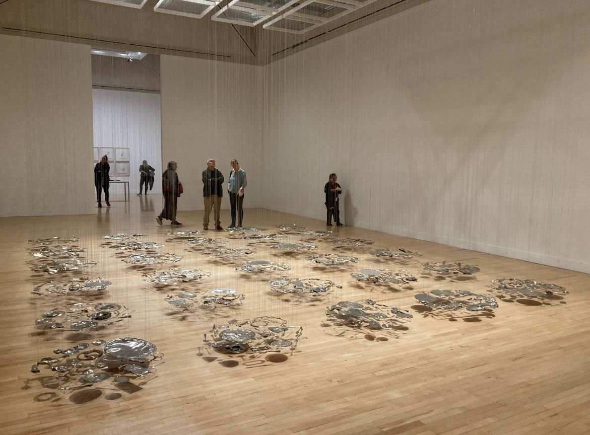
Given that it’s free, this exhibition about the life and legacy of Saint Francis of Assisi (1182 to 1226) is surprisingly extensive, stretching over seven rooms packed with paintings, prints and sculptures.

Having sauntered round it twice and read all the wall labels, it dawned on me that it is not really a review of the saint’s life and legacy. There is very little about the historical or theological context of his day, about the state of the papacy and Catholic church at the end of the twelfth and start of the thirteenth century. There’s a sketchy timeline of the saint’s life but not a lot of detail about his teachings and beliefs (he espoused total poverty and valued all aspect of nature as bespeaking the glory of God). There’s not really anything about the impact of the saint’s beliefs on broader Catholic doctrine, and nothing about the complex 800-year history of the Franciscan Order which, a glance at the Wikipedia article suggests, actually consists of several orders, each with a complex history.

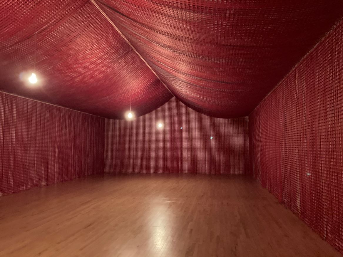
The impressive wall frieze at the entrance to the exhibition, made entirely of plastic and artificial materials

From scanning the introduction panels to each room and reading the captions to all the paintings, I learned that:

  • saint Francis was exceptionally pious
  • he emphasised Christ’s teachings about poverty (he came to be known in his time as il poverello)
  • his choice of vocation led to arguments with his father who on several occasions beat him
  • he tamed a ferocious wolf which had been terrorising the inhabitants of the town of Gubbio
  • he wrote a short letter to his friend, Brother Leo
  • he travelled to the Holy Land where, improbably enough, he met the Sultan of Egypt
  • four years before his death the stigmata or the same wounds suffered by Jesus on the cross, appeared on his body, obviously staggering his colleagues
  • towards the end of his life, already ill, he composed a hymn or canticle to the Sun

Not exactly a rich harvest of information, and with little or no historical context. The kind of richly historical exhibition the curators imagine their show to be would be better staged at the British Museum, and would involve a lot more historical documents and context, about church, doctrine, popes etc.

No, what this exhibition really consists of is something distinctly different, which is a review of how saint Francis has been depicted in art from his own time to the present day. If you go expecting to be thoroughly instructed about his life and relevance, I think you’d be sorely disappointed. Instead, I think the way to approach the show is as an excursion, a Cook’s tour, a fascinating stroll through the evolution and changing styles of Western art as represented by works on this one particular subject, this one historical figure.

The show includes over 40 works of art from European and American public and private collections, ranging from medieval painted panels, relic-like objects, medieval manuscripts, paintings, sculptures and even a Marvel comic.

Francis’s theology I could take or leave and mostly left, but what I found engaging was comparing the drastically different means and techniques and conceptualisations of art over pretty much the entire history of western art and featuring works by a who’s who of western art, including Botticelli, Caravaggio, El Greco, Zurbarán, Fra Angelico, Altdorfer, plus a gaggle of 19th and 20th century British artists.

Life of Saint Francis

Quoted from the National Gallery press release:

Francis was born to a prosperous silk merchant. He lived the typical life of a wealthy young man, but his disillusionment with the world around him grew. Events such as his traumatising experience of war, imprisonment, and an extended illness caused him to reassess his life. A mystical vision of Christ in the church of San Damiano and his encounter with a leper were life-changing moments. He renounced all his possessions, inheritance, and patrimony, and embraced the life of a penitent following in the footsteps of Christ, establishing the order of Friars Minor. In 1224 he received the stigmata (wounds that appear on a person’s body in the same places as those made on Christ’s body when he was crucified). These events contributed to the spread of his popularity as a preacher, peacemaker, a champion of the poor, early environmentalist, and social radical. Just two years after his death, in 1226, he was canonised (i.e. made a saint).

Francis’s life and miracles lent themselves to image making and were a great source of inspiration to artists. Apart from those appearing in the New Testament, Francis is probably the most represented saint in the history of art. The popularity of the Franciscan movement grew hand in hand with the rapid spread of imagery – by some of the greatest artists – recounting his likeness and legend. Art historians have estimated that as many as 20,000 images of Francis, not even including those in illuminated manuscripts, might have been made just in the century after his death.

Human nature

The single funniest thing in the show is the fact that although, by the time of his death in 1226, his followers were preaching his message all over Europe, Francis had already resigned the leadership of his order, dismayed by the increasingly worldly and materialistic turn it was taking as it became a pillar of the established Church.

Exactly. All attempts at reforming nature are always defeated by pragmatism and compromise and inertia and then laziness and then greed and institutionalisation and grand churches and rich paintings and rituals and ceremonies and pilgrimages and medals and so on – until the idea of standing quietly listening to the birds is left far, far behind.

13th century

From his native Umbria, Saint Francis’s image spread rapidly to become a global phenomenon. This was helped by the proliferation of biographies written by, among others, Thomas of Celano and Saint Bonaventure. In the 1290s, Giotto and his collaborators painted frescoes in the Upper Church of the Basilica of San Francesco in Assisi recounting the saint’s life, which changed the course of European painting. Many other artists depicted the saint within decades of his death, in that pre-Renaissance style which is so reminiscent of Eastern Orthodox art.

A ‘vita-retable’ is an altarpiece showing a central image of a saint flanked by episodes from his life and posthumous miracles. Here’s one from just 25 after Francis’s death.

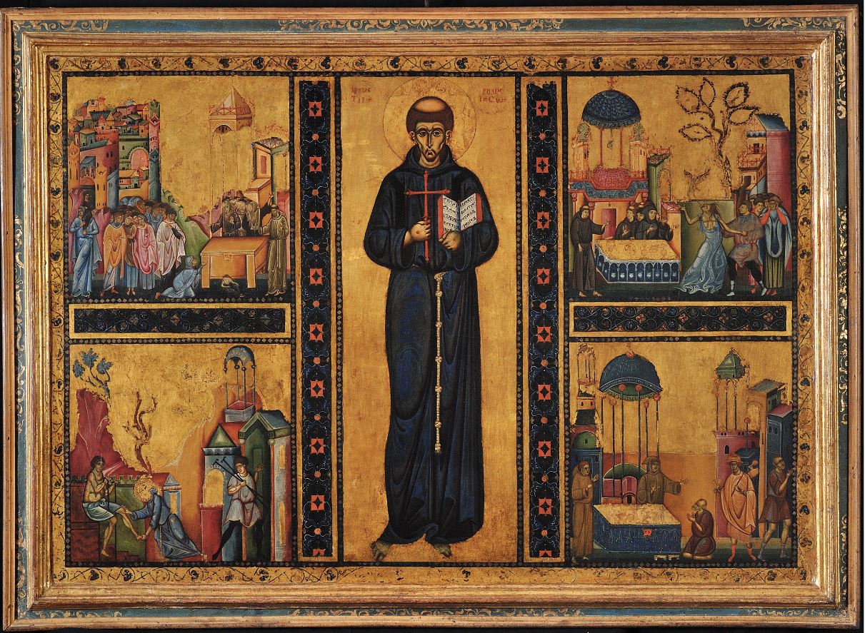
Vita-retable of Saint Francis, about 1253 © Photographic archive of the Sacred Convent of S. Francesco in Assisi

Manuscripts

I love medieval manuscripts, for the awesome manual labour that went into them, as symbols of survival through the cataclysms of history, and for the sweet and charming illustrations you often find in them.

The exhibition not only includes some lovely old hand-written medieval books – notably, the ‘Chronica maiora’ of Matthew Paris (from the Parker Library, Corpus Christi, Cambridge) – but the curators have usefully pulled out and blown up some of the illustrations. I liked the curators’ identification of the birds in the illustration at bottom left, as being a crane, a heron, a hawk and some songbirds. What songbirds? Thrushes, maybe?

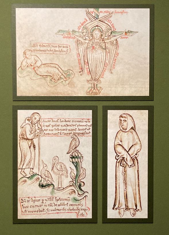
Details from the Chronica maiora II by Matthew Paris (1240 to 1255) © Parker Library, Corpus Christi College Cambridge (photo by the author)

Franciscans

As the popularity of the Franciscan movement grew, so did the numbers of Friars Minor, as Francis called his followers, who spread across Europe. They established friaries, built ever-larger Franciscan churches and commissioned pictorial decoration that venerated their founder, instigating a flowering of artistic and architectural production in the runup to the Renaissance.

15th century

One of the most celebrated visual biographies of Saint Francis was created by Stefano di Giovanni di Consolo, known as il Sassetta (1392 to 1450). In 1437 he was commissioned to create an altar-piece for the church of San Francesco in Borgo San Sepolcro. The National Gallery owns seven panels from the monumental double-sided altarpiece and devotes a room to displaying them in narrative order (they are missing the eighth panel and centrepiece).

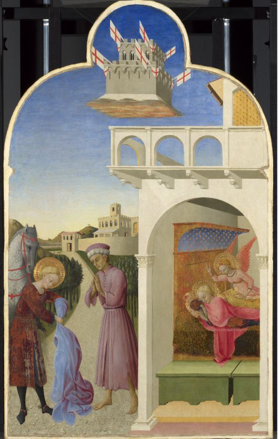
Saint Francis meets a Knight Poorer than Himself (on the left) and Saint Francis’s Vision of the Founding of the Franciscan Order (on the right), from the San Sepolcro Altarpiece by Sassetta (1437 to 1444) © The National Gallery, London

The Counter-Reformation room

The Counter-Reformation was the Catholic Church’s response to the Protestant Reformation of the first half of the 16th century. It began with the Council of Trent (1545 to 1563) and is considered to have lasted through to the end of the European wars of religion in 1648.

The Counter-Reformation sought to redefine Catholic dogma and reform the hierarchy of the Church. It was accompanied by a new strictness of doctrine and organisation, associated with the revival of religious inquisitions in Italy and especially Spain. Spanish spiritualism developed a dark intensity which matched the authoritarian tendency of church and state. Religious painting and architecture achieved new heights of sophistication and were made on a grander scale than ever before, literally designed to awe and impress believers.

And so there’s a room devoted to this style of gloomy, intense and lachrymose religiosity, which includes paintings by masters from the period including Zurbarán, Caravaggio, Murillo and El Greco. I heartily loathed them all. I appreciate the technical mastery of Zurbarán but am repelled by its world of morbid shadows, mortification and self-loathing. Saint Francis loved the sun and the moon and preached to birds and beasts in the sunny Italian countryside. This figure, his face half-hidden, clutching a skull, represents the exact opposite, a world of darkness and death.

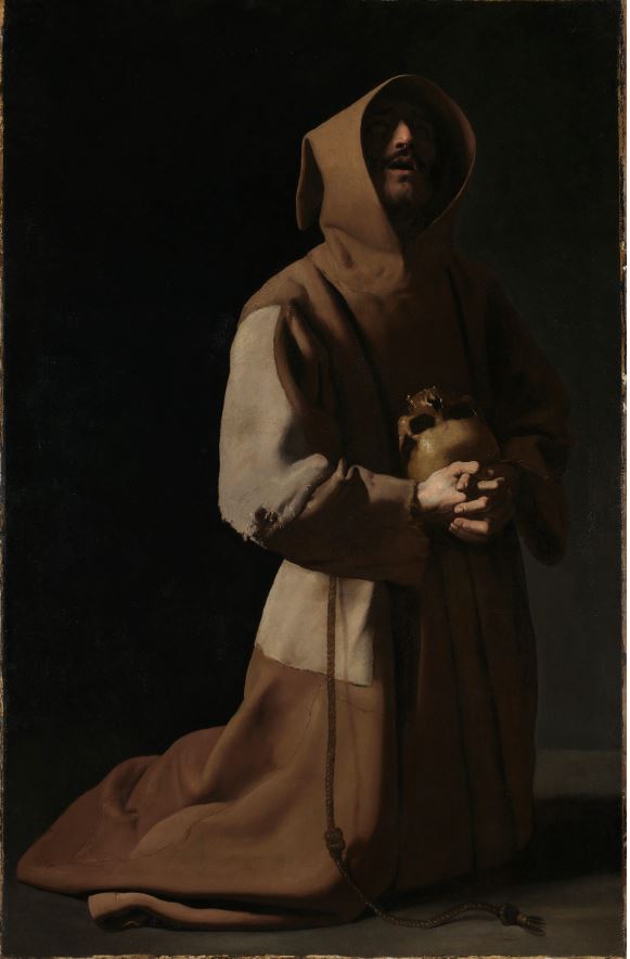
Saint Francis in Meditation by Francisco de Zurbarán (1635 to 1639) © The National Gallery, London

When the curators tell us that “approximately 135 paintings of Francis by El Greco and his collaborators survive, reflecting Spanish devotion to the saint” they obviously see this as an achievement, whereas I see it as sinister.

Victorian anecdote painting

There’s a section featuring lovely, detailed, hyper-realistic Victorian paintings of incidents in the life of the saint. These include Saint Francis of Assisi and the Heavenly Melody (1904) by a painter I don’t think I’d heard of before, Frank Cadogan Cowper, who is described as the last Pre-Raphaelite painter; and the much drabber ‘Brother Francis and Brother Sun‘ by Giovanni Costa (1875 to 1885).

The standout work is this detailed, hyper-realistic narrative painting based on the legend of the wolf of Gubbio by French painter Luc Olivier Merson. There’s an entertaining ‘Where’s Wally’ enjoyment to be had from picking out the countless artfully conceived and beautifully painted details.

The Wolf of Gubbio by Luc Olivier Merson (1877) Musée des Beaux-Arts, Lille © RMN-Grand Palais (PBA, Lille) / René-Gabriel Ojeda

Early 20th century

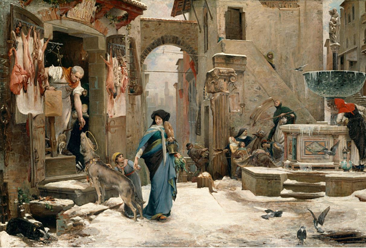
Bonkers but charming, Stanley Spencer is the Milton Jones of English artists. After the Great War (in which he served in the ambulance service) Spencer withdrew to the small village of Cookham on the River Thames, where he painted scenes of everyday life, striking nudes of himself and his wife and lovers, and numerous works showing scenes from Christian narratives, but taking place in the homely, domestic settings of his little hometown. And so here he is, reimagining Saint Francis, looking like the artist’s grandad and wearing his dressing gown and slippers, walking down Cookham High Street accompanied by a very English gaggle of chickens and songbirds.

St Francis and the Birds by Stanley Spencer (1935) Tate, London © Estate of Stanley Spencer. All rights reserved 2023 / Bridgeman Images (photo: Tate)

I’ve walked several times from Maidenhead to Cookham just to visit the Stanley Spencer Gallery there, and gone on pilgrimage to his headstone in Cookham graveyard. I know it’s nowhere near as much of an awesome work of art as the Zurbarán, but I find more of the Franciscan spirit of modesty and love in one work by Spencer than in the entire Counter-Reformation.

Contemporary art

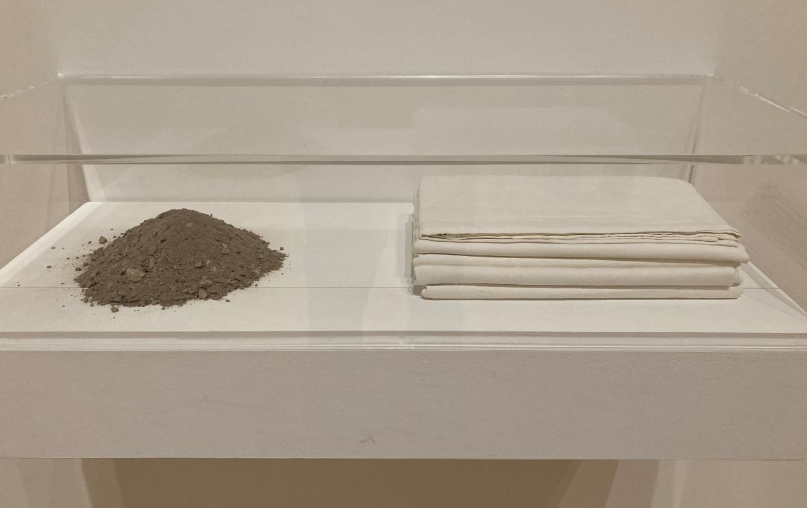
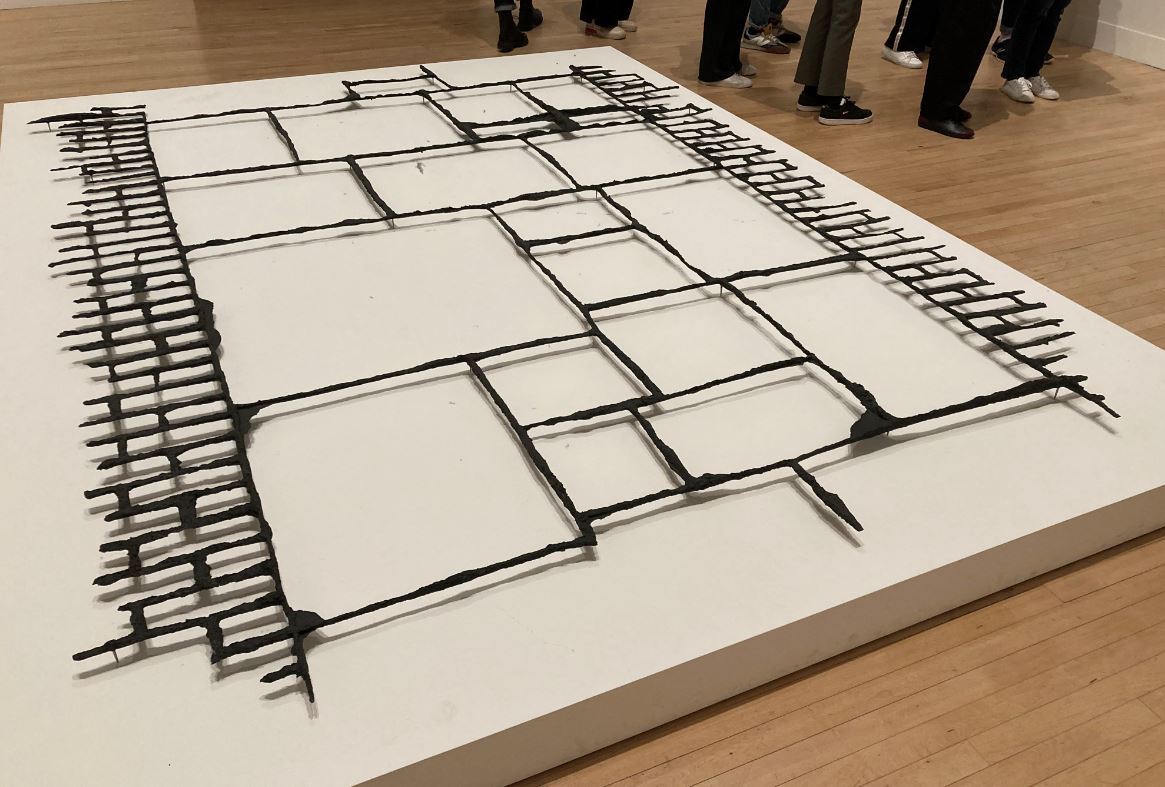
Arguably, the modern works are the most successful, certainly the most striking and take us to a completely different place from the medieval altarpieces. For example, landscape artist Richard Long is represented by three works, A Walk for Saint Francis (2022), River Avon Mud Crescent (2023) and Desert Flowers (1987). In May 2022 Long spent a week in solitude walking and camping on Mount Subasio, the mountain rising above Assisi that provided Francis with an early refuge. ‘A Walk for Saint Francis’ derived from this experience. It is not a painting at all but a circle of words, of phrases, which capture the experience, such as ‘Watching night turn to day’ and ‘Watching the Earth turn’. Whereas ‘River Avon Mud Crescent’ is what it says in the title, a big circle on the wall, suggesting the crescent moon, and made from daubs of mud from the River Avon.

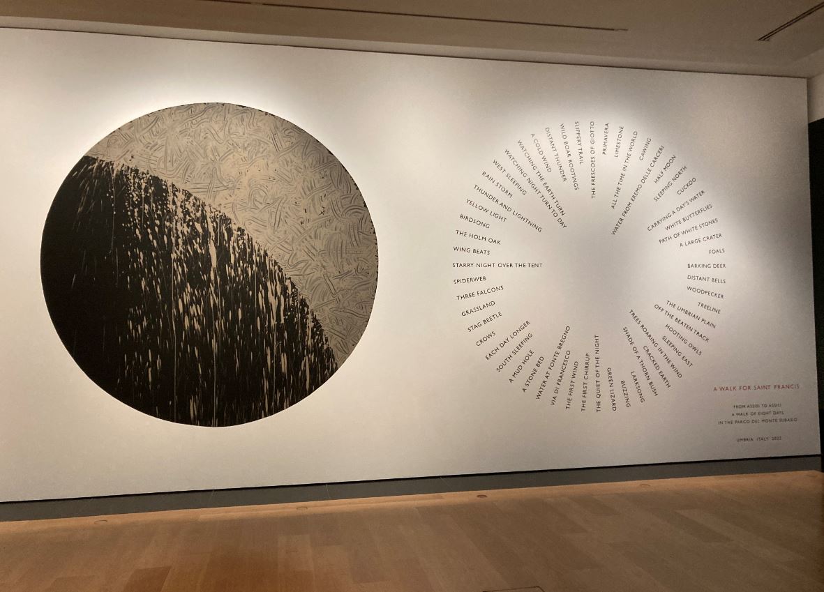
Installation view of Saint Francis of Assisi with ‘River Avon Mud Crescent’ on the left and ‘A Walk for Saint Francis’ on the right (photo by the author)

Oddly, there hadn’t been any sculptures of Francis through the classic eras of Western art. Only in the modern era do we come across not one but two. One is by Antony Gormley and is, typically, a cast of his own body. According to the wall label, it’s based on Giovanni Bellini’s painting ‘Saint Francis in the Desert’, complete with holes in his hands, feet and chest, referencing the tradition of Francis’s stigmata –but, like all Gormley’s sculptures, it is really a kind of everyman figure, this time everyman as devout believer.

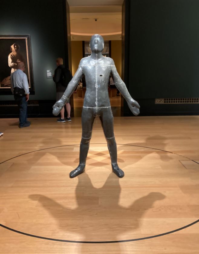
Installation view of ‘Untitled (for Francis)’ by Antony Gormley (1985) Tate © Antony Gormley (photo by the author)

Vying with the Gormley for most striking sculpture, is this work, ‘Albero Porta – Cedro’ (‘Door Tree – Cedar’) by Italian artist Giuseppe Penone. Within the old tree, battered by generations of sun and rain and snow, lies concealed the secret inner soul of the tree, its youthful spirit, just as inside each of us cynical old adults still lies the fresh hopeful child of nature. I warmed to this even before the wall caption told me that Penone is a member of the Italian Arte Povera movement who sought to make art out of everyday material (and whose name, of course, echoes the nickname and concerns of il poverello).

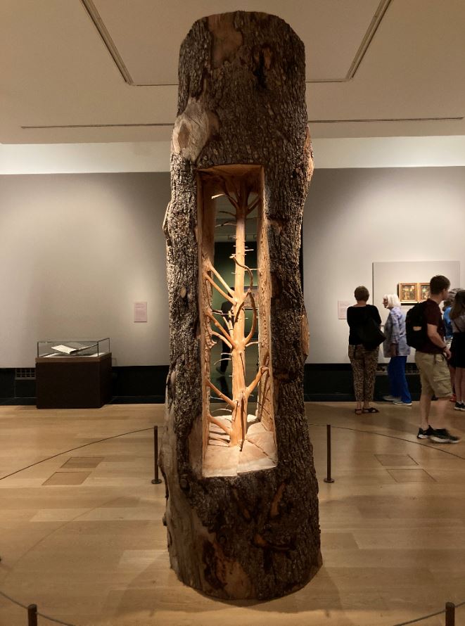
Installation view of ‘Door Tree-Cedar ‘by Giuseppe Penone (2012) Gagosian and Marian Goodman Gallery © Giuseppe Penone (photo by the author)

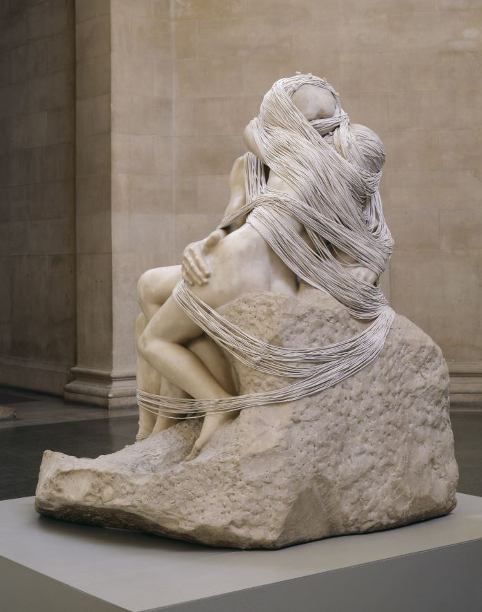
There’s another Arte Povera work, ‘Sacco‘ (Sack) by Alberto Burri (1953), consisting of fragments of coarse hessian sack overlaid on each other and bound in a simple wooden frame. The single red wound gaping through a circle torn in the sacking presumably symbolises Francis’s stigmata but I found it all too realistic and stomach-churning.

There are two striking series of black and white prints. One is a series of lithographs by Arthur Boyd (1965). The Australian Arthur Boyd was living in London when he made 16 lithographs illustrating the life of Francis for an edition of T.S.R. Boase’s biography of the saint.

In a space to itself is an impressive set of black and white woodcuts on paper, made in 2016 by Andrea Büttner and titled ‘Beggars’. Nine hooded figures, reduced to the simplest possible outline of cloth and hands, are shown sitting with their arms outstretched in supplication. A source for the series was a book from 1510 which was, contrary to the spirit of Francis, a warning against dishonest and abusive mendicants. (The photo below, by the way, is from some other exhibition and is not how they’re displayed here.)

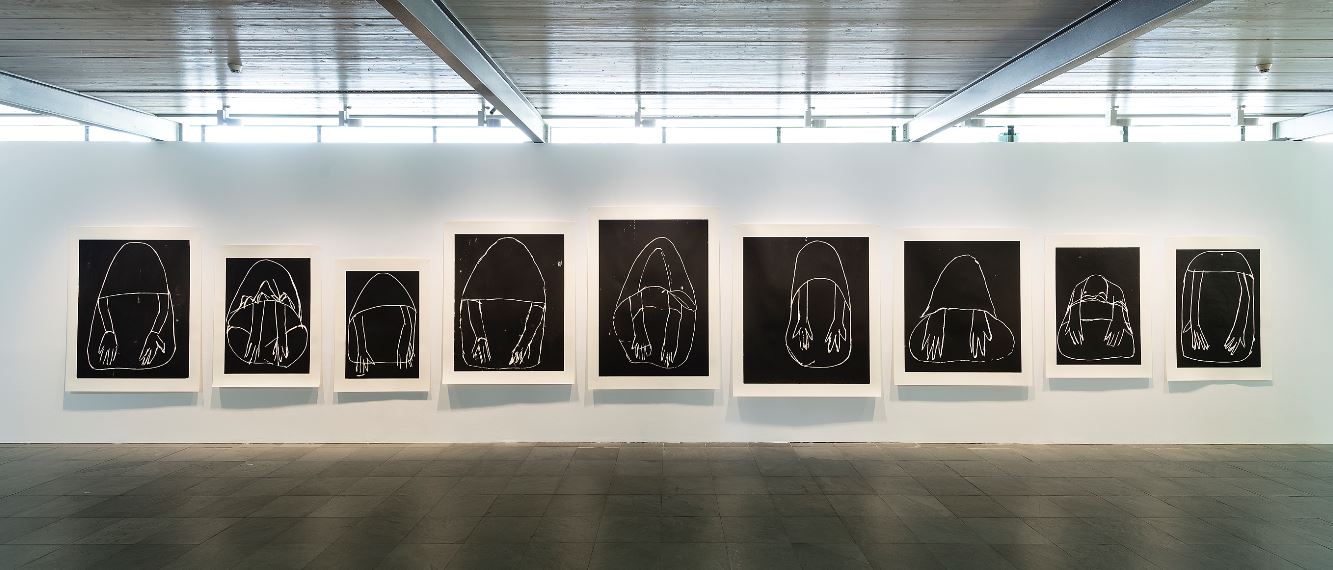
Beggars Suite 1 to 9, by Andrea Büttner (2016) © DACS 2023

Elsewhere, Büttner has an interesting big print showing tiers of birds, ‘Vogelpredigt (Sermon to the Birds)‘ which riffs off an altarpiece from Santa Croce, Florence, which was a very early cycle of images depicting the saint’s life.

Mass media

In the final room are some examples of how Francis has been portrayed in 20th century mass media, namely movies and, believe it or not, comics.

Saint Francis movies

A big monitor plays scenes from some of the post-war movies made about Francis, namely:

  • The Flowers of St. Francis (1950) directed by Roberto Rossellini
  • Brother Sun, Sister Moon (1972) directed by Franco Zeffirelli
  • Francesco (1989) directed by Liliana Cavani

Film, as a medium, is the ultimate instrument of consumer capitalism in reducing all facts, narratives and events to the same palatable product, to the same half dozen formulae, shoehorned into the same three-act structure, all loose ends neatly wrapped up in a nice bow in under two hours.

Comic books

The idea for the 1980 Marvel comic ‘Francis, Brother of the Universe’ came from two Franciscans who approached Marvel’s representative in Tokyo. If you think about it, like so many Marvel superheroes, Francis was a seemingly ordinary man with extraordinary capabilities (albeit given from God). The cover art shows a collage of our man in a series of characteristic scenes: preaching as a youth in the marketplace; leading crusaders; thrown before the initially scornful Sultan of Egypt; greeting the sun and the doves of peace; meeting the Pope or some such eminence. Shame they didn’t go on to do the kind of crossover story which Marvel excels at: Saint Francis calms The Hulk. Saint Francis persuades Thor to hand over his hammer and talk to the trees.

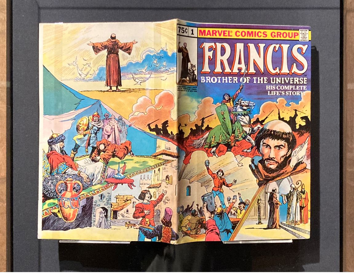
Installation view of ‘Francis, Brother of the Universe’ by Marvel Comics (1980) © Disney. All rights reserved (photo by the author)

Saint Clare

A small section of the exhibition is dedicated to Saint Clare (1194 to 1253), one of the first followers of Francis. Following her death, the order she founded was renamed the Order of Saint Clare, commonly referred to today as the Poor Clares. Her/their story is represented in works like:

  • Giovanni da Milano’s ‘Christ and the Virgin Enthroned with Six Saints’ (1350s)
  • Giovanni di Paolo’s ‘Saint Clare Rescuing a Child Mauled by a Wolf’ (1455 to 1460)
  • Josefa de Óbidos’s ‘Nativity Scene with Saint Francis and Saint Clare’ (1647)

Francis’s nature worship

Much is made of Saint Francis’s nature worship. The curators say he believed that nature itself was the mirror of God. He called all creatures his ‘brothers’ and ‘sisters’, preached to the birds and supposedly persuaded a wolf in the Italian town of Gubbio to stop attacking the locals. He saw God reflected in nature. In the hymn he composed – ‘Canticle of the Sun’ – he gives God thanks for Brother Sun, Sister Moon, Brother Wind, Water, Fire, and Earth and they print a full translation of the Canticle on the gallery wall. Here it is in the translation given on the Catholic Agency for Overseas Development website:

Most High, all-powerful, all-good Lord,
all praise is yours, all glory, honour and blessings.
To you alone, Most High, do they belong;
no mortal lips are worthy to pronounce your name.

We praise you, Lord, for all your creatures,
especially for Brother Sun,
who is the day through whom you give us light.
And he is beautiful and radiant with great splendour,
of you Most High, he bears your likeness.

We praise you, Lord, for Sister Moon and the stars,
in the heavens you have made them bright, precious and fair.

We praise you, Lord, for Brothers Wind and Air,
fair and stormy, all weather’s moods,
by which you cherish all that you have made.

We praise you, Lord, for Sister Water,
so useful, humble, precious and pure.

We praise you, Lord, for Brother Fire,
through whom you light the night.
He is beautiful, playful, robust, and strong.

We praise you, Lord, for Sister Earth,
who sustains us
with her fruits, coloured flowers, and herbs.

We praise and bless you, Lord, and give you thanks,
and serve you in all humility.

Surely this is a long way short of pantheism and Nature worship. It is, quite explicitly, the Lord God who Francis is praising – just as any priest of his time would – and the sun and moon and wind and fire and so on are emphatically not praised, or addressed, in their own right, but only insofar as they demonstrate the benevolence and all-powerfulness of the Creator. The feeling for nature is there, but only as a sin-off from the deep worship of the Lord God.

Projecting our values

At several places the curators assert that Francis speaks to us, now, in 2023, of very contemporary ‘concerns’, and list some of these, such as ‘interfaith dialogue’, environmental concern and feminism. They claim that ‘Saint Francis of Assisi continues to be an attractive and inspirational figure for’:

  • both Christians and non-Christians
  • for pacifists and environmentalists
  • for those who clamour for social justice
  • for utopians and revolutionaries
  • for animal lovers
  • for those who work for causes of human solidarity

Or:

Francis’s powerful appeals for peace and human solidarity, his encounter with Islam and his embryonic environmentalism continue to hold great interest. He is considered by many to be a patron saint, or an ally, of causes related to social justice, interreligious dialogue, socialism, feminism, the animal-rights movement and ecology, among others.

The exhibition was co-curated by the Director of the National Gallery, Dr Gabriele Finaldi, who joins in with his variation on the list of Francis’s fabulous qualities:

‘Francis’s spiritual radicalism, his commitment to the poor and human solidarity, his love of God, nature and animals, which we might call embryonic environmentalism as well as his striving for peace between enemies and openness to dialogue with other religions, are themes that still resonate with us today and make him a figure of enormous relevance to our times.’

But it’s my view that all this discourse consists of us projecting our own modern concerns back onto this remote medieval figure. Moreover, all this high-minded projection has the unintended consequence of highlighting how irrelevant Francis is to our modern day.

Poverty No modern Christian believes in God with the same wholeheartedness Francis was capable of. No Christian whatsoever is prepared to sell everything they possess, give all the proceedings to the poor, and become a mendicant beggar for God. Do you know anyone who’s done that? No.

Interfaith Although faith leaders in the West like to talk about dialogue between religions, it’s not clear that happens much on the ground here and, globally, dividing lines between the secular West, Muslim Middle East and Africa, and Hindu India have hardened, with astonishing levels of sectarian violence taking place around the world.

Pacifism Pacifists are irrelevant in an era when Russia has invaded Ukraine and threatens the rest of Europe, while analysts worry about China attacking Taiwan.

Environmentalism is sweet and lovely for the middle classes who can afford to fret about such things and shop at farmers’ markets, but irrelevant to most people who, in recent years, have been struggling to keep a roof over their heads and food on the table, who can’t afford electric cars and have no time to lobby for clean energy. When I worked at a distribution centre a couple of years ago, you should have heard the packers and supervisors yelling abuse at Just Stop Oil activists gluing themselves to the road or tube trains. Meanwhile, every single indicator of environmental wellbeing and climate change is deep in the red and getting worse.

Social justice Francis may have clamoured for social justice, just as millions of the kind and well meaning have done for the 800 years since: but the outcome of all this clamour is that today, in 2023, over a billion people worldwide live on less than a dollar a day, while all western societies are more unequal and unfair than at any time in the last 50 years.

In other words, Francis can, with some justice, be taken as the patron saint of lost causes.

I find the high-falutin’ sentimental sentiments of the wall labels so much cant (defined as ‘sanctimonious talk, typically of a moral, religious, or political nature’) where ‘sanctimonious’ is defined as ‘making a show of being morally superior to other people’. It is a discourse of feel-good bromides, where ‘bromide’ is defined as ‘a trite statement that is intended to soothe or placate’.

The National Gallery was, as usual, packed to overflowing with educated, middle-class people, many of whom were obviously tourists i.e. had travelled long distances, probably in environment-destroying airplanes, and spent a lot of money to be here. Outside the National Gallery I walked past a clutch of filthy dirty, wretched-looking vagrants, sleeping rough with their dogs. I gave each of them a pound. “Clamouring for social justice”, my arse.


Related link

ALERT by Antony Gormley

Imperial College Road

If you ever visit the Natural History Museum or the Victoria and Albert Museum you’ll know that running between them is the semi-pedestrianised road called Exhibition Road, which runs in a straight line up to a gateway into Hyde Park. Just beyond the entre to the Science Museum, half-way up on the left, is Imperial College Road, a fully pedestrianised street which leads into the open space of Dangoor Plaza. Bang in the middle of the pedestrianised road (as you walk along the pavement towards the car park and the bike racks at the other end) was recently unveiled the latest sculpture by one of Britain’s most famous and media-friendly artists, Sir Antony Gormley OBE RA.

ALERT by Sir Antony Gormley (2022) (photo by the author)

Antony Gormley biography

Born in 1950, Gormley has been extraordinarily productive and has sculptures and installations at sites all over Britain, Europe and the world.

His most famous work is probably The Angel of the North, but you might have heard of Another Place (1997) which consists of 100 cast-iron humanoid figures facing out to sea on Crosby Beach, near Liverpool.

In 1991 Gormley developed a work titled Field consisting of around 35,000 individual terracotta figures, each between 8 and 26 cm high. These toured the world, getting placed in various interesting locations and buildings. In 1994 as many of the little figures as he could fit into the space were shown at Tate, and then at the British Museum, under the name Field for the British Isles. Or you might have caught sight of 2007’s Event Horizon, when he placed 31 life-sized and anatomically correct casts of his own body on top of prominent buildings along London’s South Bank, staring rather spookily down on the rest of us.

Most of Gormley’s works are based on the dimensions of the human body, very often his own body, which he has had cast in fibre glass, more often metal, in all kinds of positions and postures. I caught him on Radio London this morning explaining that he wants people to ponder the fact that we are first and foremost bodies – we like to think of ourselves as ‘people’ and personalities who act on the things we see external to ourselves – but we are only able to do this because we exist, first and foremost, as bodies in space. It is this insight or principle, which his work reverts to, again and again.

Gormley is not only an inventive sculpture but he must also be one of the most personable and articulate living artists. Although his work is, in a sense, remarkably restricted in range (mostly life-size models of the human figure) he can talk about it endlessly and – this is the key thing – always makes it sound fresh and interesting.

ALERT

This new piece in Imperial College Road follows this ongoing interest of Gormley’s in the adult human body, but with a twist. The twist is that it isn’t a naturalistic depiction of the body, but a diagrammatic, schematic one, with the result that, if you didn’t know otherwise, you could easily take it as an abstract piece.

ALERT is a 6-metre-high sculpture which uses stacked and cantilevered blocks of weathering steel to evoke the human form. Gormley regards the work as “the conversion of anatomy into an architectural construction.” The aim is to “re-assess the relation between body and space”.

ALERT is actually based on the posture of Gormley balancing on the balls of his feet while squatting on his haunches. He realised this posture is one of someone watching and waiting and surveying the world around them. It is a posture of being “alive, alert and awake”.

Project diagram of the sculpture, showing different views and scale next to a typical person

Like most of his sculptures ALERT is made of weathering steel, designed to form a stable oxide coating and an organic hue over time. Rust, to you and me.

The pedestrian precinct where it’s located faces onto a quad or square green space between modern campus buildings. There are plenty of benches around this grassy rectangle which is busy with students going about their day. It’s a nice, relaxed vibe. The pedestrian walkway where it’s located is lined by London plane trees and Gormley hopes that the work will ‘interact’ with them – in the summer “the deep red oxidised surface contrasting with the vivid green of the plane trees’ leaves and in the winter its orthogonal geometry [acting] in consort with the organic inscription of their boughs.”

As usual, reading an artist’s official statement gives quite a misleading impression of what you actually see, because behind the trees and dominating the pedestrian walkway is the steep facade of a tall grey office block in brutalist concrete, which I believe to be the Sir Ernst Chain building. Being a drab metal grey colour itself, ALERT is quite difficult to make out – it certainly matches the brutalist building in colour and design far more than the organic curves and green leaves of the trees.

ALERT in front of the Sir Ernst Chain building (photo by the author)

Location

Most of the road has been completely renovated and pedestrianised as part of a fabulously generous donation of £5 million by former Imperial College students Brahmal Vasudevan (founder and CEO of private equity firm Creador) and his wife Shanthi Kandiah (founder of legal firm SK Chambers), two super high-achievers. ALERT was intended to be the cherry on the cake of this redesign.

In the press release, the couple are quoted as saying they were pleased to work with “JJS Fine Art Ltd, the Gormley studio, White Cube and Imperial College London” to bring this project to life. This is a good point because, of course, Imperial College is one of Britain’s leading centres of excellence in science and engineering and ALERT, in its mixture of art and engineering, is an apt symbol of collaboration across disciplines.

The Queen’s Tower

What none of the press blurb conveys, what you don’t know until you visit the location, is that the nice green space opposite Gormley’s sculpture is dominated by an enormous Victorian building, the Queen’s Tower.

The Queen’s Tower, Imperial College (photo by the author)

The tower is 287 feet tall, clad in Portland stone and topped by a copper covered dome. You can go inside and climb the 324 steps from the ground to the base of the dome on a narrow spiral staircase, all the way up to the viewing platform at the top with fine views over London in all directions and, in the belfry, a peal of bells! (Admittedly, none of this is open to the public at the moment.) Some photos of it show it lit up with coloured lights at night. In every way this impressive edifice dwarfs the Gormley sculpture into insignificance. When you read about ALERT you think, ‘6 metres, wow, that’s massive’, but if anything it should have been twice the height to begin to compete with either the tower just north of it or the science block immediately south of it.

According to Imperial College, who own the land and the sculpture, ALERT will provide “a point of interest and intrigue”. Well, one of the most intriguing things about the sculpture has been the controversy it’s sparked.

The controversy

One of the funniest things in life is when a roomful of extremely clever people come up with a plan, discuss it, develop it, test it, implement it, roll it out and…it’s only then that anyone outside their group sees it and says, ‘Er, guys…I think we may have a problem. Did none of you notice this?’

To take a recent example, former Chancellor of the Exchequer Kwasi Kwarteng working with a small, loyal team at the Treasury and coming up with the bold idea of borrowing huge sums to make unfunded tax cuts including cutting the 45% rate of income tax, and only when he proudly revealed it to completely unprepared financial markets, discovering how catastrophic the impact would be.

Well, on a smaller scale, it was apparently only after this huge, expensive sculpture had been conceived, designed, built and installed in this prestige location that anyone pointed out, “Er… you see the big bit sticking out the front? It looks like a man’s penis…Did none of you notice?’

This is what the creators intended, a stylish, cleverly designed and artfully engineered schematic sculpture of a man squatting down, “alive, alert and awake”.

Schematic of ALERT showing how it echoes the shape of a human being squatting

But this is how some have interpreted it – as a short-legged man with an erect penis sticking out from his body.

Schematic of ALERT showing how the big protuberance could be interpreted as a 3-metre long (metallic, rusty) penis

For what Sir Antony and all his collaborators, his sponsors and the college authorities overlooked is that they were installing this artwork on a university campus, an epicentre of gender politics and super-sensitivity, where a cigar is never just a cigar, where anything anybody says, does, writes, draws or creates has the potential to become a pretext for outrage and grievance. Thus the students union has described the statue as ‘exclusionary’, reinforcing the gross injustice that only 42% of students at the college are female. Time to pop some popcorn in the microwave and enjoy that traditional British pastime, a moral panic about a new artwork:

University wits have already renamed the area Dong Plaza. I wonder if the sculpture will be graffiti-ed, or whether angry feminists will splash it with paint or, better still, attempt to cut the protuberance off – although, having walked around it and patted the protuberance a few times, they’d need industrial-scale welding equipment to do that.

At the end of the day, ALERT is just another bit of nondescript modern sculpture in an all-too-familiar drab, metallic, geometric style, dwarfed by the long row of dismal office blocks behind it. If you’re in the area it’s maybe worth going to check it out to see what the storm in a teacup is about, but more to discover the peaceful quad with its lawn and numerous benches, a restful place to sit after a visit to one of the busy museums. But the most impressive sight in the area is the dominating Queen’s Tower. I wonder when they’ll reopen the viewing platform to the public. Now that would be worth a visit.


Related links

More art reviews

Cornelia Parker @ Tate Britain

Cornelia Parker (CBE, RA) is a very well-known and successful figure in British art. Born in 1956, she’s become famous for her ‘immersive’ i.e. BIG works. Above all she is a conceptual artist. What is conceptual art? According to the Tate website:

Conceptual art is art for which the idea (or concept) behind the work is more important than the finished art object. It emerged as an art movement in the 1960s and the term usually refers to art made from the mid-1960s to the mid-1970s.

In some exhibitions you react to the painting or sculpture immediately, as an object in space which fills your visual cortex with sensations and impressions. You don’t necessarily have to read the wall labels. With conceptual art it is almost always vital to read the wall label in order to understand what you’re looking at. Sure, you could still respond naively and sensuously to the work’s appearance but you would be missing out on 99% of its meaning and intention.

The wonderful wall labels

This major retrospective of Parker’s career brings together almost 100 works, spanning the last 35 years. So that’s quite a lot of reading you have to do in order to understand almost every one of these pieces.

But a major feature of the exhibition is that the wall labels are written by Parker herself. Most wall labels at exhibitions are written by curators who, in our day and age, are obsessed with the same handful of issues around gender and ethnicity and lose no opportunity to bash the visitor over the head with reminders of Britain’s shameful, imperial, racist, slave-trading past etc etc.

So it is a major appeal of this exhibition that, instead of every single piece explained solely in terms of race or gender – as it would be if Tate curators had written them – Parker’s own wall labels are fantastically interesting, insightful, thought-provoking insights into her way of thinking and seeing the world. Instead of the world of art being reduced to a handful of worn-out ideas, Parker’s wall labels are as entertainingly varied as her subject matter, full of stories, anecdotes, bright ideas, explanations of technique, aims, collaborations.

They give you a really privileged insight into her worldview and into her decades’-long ability to be interested, curious, take everyday objects and have funny and creative ideas about how to transform them. After spending an hour and a half working through her thought processes for the different pieces, some of her creative spirit begins to rub off on you, you begin to see the everyday world the way she does, full of opportunities for disruptive and fun interventions. In this respect, this exhibition is one of the most genuinely inspiring I’ve ever been to.

Types of work

The exhibition includes immersive installations, sculptures, photographs, embroidery and drawings, as well as four large-scale, room-sized installations, and two rooms showing her art films. At the simplest, physical level, the pieces can be divided into two categories: Small and Large. Examples of the small will serve as an introduction to the large.

Introductory

In the downstairs atrium of Tate Britain stands a single sculpture, preparing you for the exhibition ahead.

The Distance (A Kiss with String Attached) by Cornelia Parker (2003) © Tate Photography

It is, of course, a life-size cast of Rodin’s sculpture, The Kiss, wrapped up in a mile of string. A vague symbolic gesture towards ‘the ties that bind’ people in relationships, maybe. In the nearby wall label Parker describes this as a ‘punk gesture’, which I found very significant. It’s the only time she mentions punk but she was just 20 when it hit, maybe at art school by then, so its attitude of really offensive, in-your-face irreverence must have taken her art school by storm. The point is, various later wall labels repeatedly say that she is interested in destruction and violence – but not violence against persons, against things. Her art does violence to inanimate objects in all kinds of inventive, creative and often very funny ways.

But there is, as so often, a further twist to the tail. Wrapping The Kiss in string is a relatively tame thing to do compared with Dada, Surrealist, Duchamp provocations from 100 years ago. It becomes more interesting when you learn that some opponents of conceptual art within the art world, fellow young irreverent artists, vandalised the original version of The Distance by cutting up the string into short sections, thus ‘liberating’ the sculpture.

And best of all, that Parker was undaunted and promptly gathered up all the cut-up pieces of string and tied them back together around a mysterious object at the centre, ‘a secret weapon’, which is unnamed and unknown.

‘The Distance (with concealed weapon)’ by Cornelia Parker (2003) © Cornelia Parker (Photo by the author)

Small

I’ll jump straight in and give examples.

‘The Negative of Words’ (1996)

Parker realised that when an engraver engraves words into silver, for example into a cup like the Wimbledon champion’s cups, tiny fragments or curls of silver are generated. This piece is a pile of the shavings thus created. Parker contacted a silversmith, who agreed to her proposal, and it took several months to accumulate enough shavings for her to create the little mound, with sprinkled outliers, which we see on display here. As she points out, each sliver represents a letter, is the trace of a letter, is the inverse of writing, of language. They are absences made solid. This idea really resonated with me as I admired this carefully created little mound and its sprinkled outliers.

‘The Negative of Words’ by Cornelia Parker (1996) © Cornelia Parker (Photo by the author)

‘Luck Runs out’ (1995)

In the case next to it is an old dictionary. Under careful supervision, Parker arranged for a shotgun loaded with dice to be fired into the back of the book. The die penetrated to different depths into the text and jammed most of the pages together. As it happens the post-shooting dictionary automatically fell open at a page about ‘luck’. Hence the title, The luck of the draw. The roll of the dice.

‘Luck Runs Out’ and ‘The Negative of Words’ by Cornelia Parker © Cornelia Parker (Photo by the author)

Apparently it’s part of a series titled ‘Avoided Objects’, so-called ‘object poems’ which ‘explore the fractured, unmade and unclassified’. The series explores ‘the denied and repressed’, which sounds a bit hackneyed and stale until she goes on to specify what that means in practice – the backs, underbellies or tarnished surfaces of things, which is much more interesting. Hence shooting this dictionary ‘in the back’.

‘Embryo Firearms’ (1995)

While in Hartford Connecticut, Parker asked to visit the factory where the famous Colt 45 handgun is made. She was surprised to discover the process began with blank featureless gun-shaped casts, before any working parts were added. She asked if she could have one and the Americans, obliging as ever, gave her two and gave them a nice smooth industrial polish. Adding the word ’embryo’ to firearm juxtaposes the birth of the gun with the general idea of the birth of a human being, alongside a tool which might potentially bring it to an end.

‘Embryo money’ (1996)

Fascinated by money, Parker asked permission to visit the Royal Mint in Pontyclun, Wales. She asked for some samples of coins before they were ‘struck’ i.e. had the monarch’s face, writing, value, corrugated edges and everything else added – just the blank dummy coins. Embryo money, before it has accrued any of the power which so dominates all our lives.

‘Embryo Firearms’ (1995) and ‘Embryo money’ (1996) by Cornelia Parker © Cornelia Parker (Photo by the author)

See what I mean by ‘conceptual’. You could relate to these just as intriguing objects, but the stories behind them – the anecdotes of Parker’s expeditions to interesting and unusual places to see industrial processes in action – add immeasurably to the enjoyment.

‘Exhaled cocaine’ (1996)

Parker developed a relationship with His Majesty’s Customs and Excise. She visited and got to know them at their Cardiff headquarters over a period of several months. One of the many, many types of contraband objects they confiscate are drugs. Parker persuaded them to let her have a seizure of cocaine after it had been incinerated. A million pounds worth of cocaine turned to ash, which is on display here, as a sad little pile.

In her wall label, Parker adds the coda, which you’d never have got from a curator, that she really loves the way Customs and Exercise destroy things in such a theatrical way, steamrollering fake Rolex watches or alcohol. ‘Like me, they are often symbolically killing things off.’ This kind of casual, candid opinion is a lovely insight into her way of thinking.

Inhaled cliffs’ (1996)

A personal favourite was ‘Inhaled cliffs’. She asked Customs about methods people use to smuggle stuff into the country, especially drugs, and discovered that some drugs can be used to ‘starch’ sheets, so a set of innocuous looking sheets turn out to be drenched in heroin, cocaine or other illicit substances which can be extracted once they’re safely in the country. This notion inspired ‘Inhaled cliffs’ in which Parker starched sheets with chalk from the white cliffs of Dover, ‘smuggling’ those great symbols of England into bed with her. She is tickled by the notion of ‘sleeping between cliffs’.

‘Exhaled cocaine’ (1996) and Inhaled cliffs’ (1996) by Cornelia Parker © Cornelia Parker (Photo by the author)

I’m focusing a bit much on these objects in cases. There were conventional things attached to the wall, prints, flat objects treated in various ways. Photographs, for example. On her way to her studio past Pentonville Prison she noticed workmen plastering cracks in the perimeter wall, creating vivid white abstract shapes. They then started to whitewash the wall as a whole so, before these irregular, crack-shaped gestures disappeared, she quickly took photos with her phone and developed a set of 12 prints which are hung here, titled ‘Prison Wall Abstract’.

Or the ‘Pornographic drawings’ (1996). As part of her ongoing conversations with HM Customs she asked for examples of contraband and they gave her (along with the bag of cocaine ashes) chopped up lengths of pornographic film. Parker dissolved the fragments in solvent to create her own ink. She used this ink to create Rorschach blots i.e. poured them on one side of a piece of folded paper, pressed the other side down on the inked side and reopened it to have a symmetrical image. For some reason, all the ones she made (or chose to display) came out ‘to be particularly explicit’.

It dawns on me that these works are beyond ‘conceptual’ in the sense that they might better be described as anecdotal. Often there isn’t a grand concept, project or goal behind them – there is happenstance and accident. Seeing an opportunity to do something interesting and seizing it.

The other obvious thing is that she’s about transforming objects from one state to another. She starts with ‘found objects’ – gun moulds, unstamped coins, porn movies, cocaine and so on – and, in the examples I’ve given, doesn’t even transform them herself, but recognises their artistic potential.

Medium

Using this technique of remodelling the existing and everyday, is a middle-sized work titled ‘Black Path (Bunhill Fields)’ from 2013. Parker describes playing hopscotch on pavements with her daughter. This led her to pay attention to pavements and to notice the antiquity of the old stone paving in Bunhill Fields near Old Street. She got permission to pour liquid rubber into the cracks in a path through Bunhill Fields. When the rubber dried she used the mould to make a metal cast, memorialising the captured cracks in bronze. She then suspended the mould on pins so that the cracks in the pavement hover a few inches above the floor, making it seem more spectral and ghostly. (It’s an accidental quirk that my photo of it features so many people’s feet.)

‘Black Path (Bunhill Fields)’ (2013) by Cornelia Parker © Cornelia Parker (Photo by the author)

Large

The interest in destruction I’ve mentioned earlier really comes to the fore in the three most famous room-sized installations in the exhibition. These are by way of being her greatest hits. They are:

  • Thirty Pieces of Silver (1988 to 89)
  • Cold Dark Matter: An Exploded View (1991)
  • Perpetual canon (2004)

Cold Dark Matter: An Exploded View (1991)

I’ll quote her wall label in its entirety:

We watch explosions daily, in action films, documentaries and on the news in never-ending reports of conflict. I wanted to create a real explosion, not a representation. I chose the garden shed because it’s the place where you store things you can’t quite throw away. The shed was blown up at the Army School of Ammunition. We used Semtex, a plastic explosive popular with terrorists. I pressed the plunger that blew the shed skywards. The soldiers helped me comb the field afterwards, picking up the blackened, mangled objects. In the gallery, as I suspended the objects one by one, they began to lose their aura of death and appeared reanimated. The light inside created huge shadows on the wall. The shed looked as if it was re-exploding or perhaps coming back together again. The first part of the title is a scientific term for all the matter in the universe that can’t be seen or measured. The second part describes a diagram in which a machine’s parts are laid out and labelled to show how it works.

I’ve seen photos of this many times. Seeing it in the flesh I realised several things:

  1. it is a mobile – a very complex mobile, but in principle the same kind of thing my son makes to hang his origami figures from his ceiling
  2. it has a cubic, rectangular shape i.e. it is the opposite of chaotically exploding outwards; it is very contained
  3. this is achieved by hanging multiple objects from the same string, not just one
  4. as people walk slowly respectfully round it the eddies of air they stir
  5. and placing a single light bulb at the centre of it means not only that is casts shadows on the wall, but as the string move gently, so a) your perspective through the multiple layers of debris shifts and changes b) the shadows they cast on the wall subtly change

Cold Dark Matter: An Exploded View (1991) by Cornelia Parker © Cornelia Parker (Photo by the author)

Perpetual canon (2004)

Again, I’ll give Parker’s words verbatim:

I was invited to make a work for a circular space with a beautiful domed ceiling. I first thought of filling it with sound. This evolved into the idea of a mute marching band, frozen breathlessly in limbo. Perpetual Canon is a musical term that means repeating a phrase over and over again. The old instruments had experienced thousands of breaths circulating through them in their lifetime. They had their last breath squeezed out of them when they were squashed flat. Suspended pointing upwards around a central light bulb, their shadows march around the walls. This shadow performance replaces the cacophonous sound of their flattened hosts. Viewers and their shadows stand in for the absent players.

Perpetual canon (2004) by Cornelia Parker © Cornelia Parker (Photo by the author)

The ghosts of music past. I was really taken by the idea that the shadows of us, the visitors, stand in for the long-dead players of these instruments.

Thirty Pieces of Silver (1988 to 1989)

Tate own this piece. In Tate’s words:

‘Thirty Pieces of Silver’ comprises over a thousand flattened silver objects, including plates, spoons, candlesticks, trophies, cigarette cases, teapots and trombones. All the objects were ceremoniously crushed by a steamroller at Cornelia Parker’s request. She then arranged the transformed silver artefacts into thirty disc-shaped groups, which are suspended about a foot from the floor by hundreds of fine wires. Each ‘disc’ is approximately ninety centimetres in diameter and they are always hung in orderly rows, although their overall configuration is adapted each time to the space in which the work is displayed. The title refers to the biblical story of how the apostle Judas Iscariot betrayed Jesus in return for thirty pieces of silver.

And in Parker’s own words:

Drawn to broken things, I decided it was time to give in to my destructive urges on an epic scale. I collected as much silver plate as I could from car-boot sales, markets and auctions. Friends even donated their wedding presents. All these objects, with their various histories, shared the same fate: they were all robbed of their third dimension on the same day, on the same dusty road, by a steamroller. I took the fragments and assembled them into thirty separate pools. Every piece was suspended to hover a few inches above the ground, resurrecting the objects and replacing their lost volume. Inspired by my childhood love of the cartoon ‘deaths’ of Roadrunner or Tom and Jerry, I thought I was abandoning the traditional seriousness of sculptural technique. But perhaps there was another unconscious reason for my need to squash things. My home in east London was due to be demolished to make way for the M11 link road. The sense of anxiety lingers even now.

‘Thirty Pieces of Silver’ by Cornelia Parker (1988 to1989) © Cornelia Parker (Photo by the author)

Newer works

‘War Room’ (2015)

The biggest thing in the show is a big long room entirely lined with red paper with holes in, titled ‘War Room’, from 2015. As usual, you need to read the wall label to understand what this is about.

‘War Room’ by Cornelia Parker (2015) © Cornelia Parker (Photo by the author)

In Parker’s own words:

I was invited to make a piece of work about the First World War. I had always wanted to go to the poppy factory in Richmond, London. Artificial poppies have been made there since 1922. They are sold to raise for money for ex-military personnel and their families. When I visited the factory, I saw this machine that had rolls of red paper with perforations where the poppies had been punched out. The fact that the poppies are absent is poignant, because obviously a lot of people didn’t come back from the First World War, and other wars since. In this room there’s something like 300,000 holes, and there’s many more lives lost than that. I decided to make War Room like a tent, suspending the material like fabric. It’s based on the magnificent tent which Henry VIII had made for a peace summit with the French king in 1520, known as the Field of the Cloth of Gold. About a year later they were at war again.

The story, the anecdote, is, as usual, interesting but the resulting work less so.. You walk in, you walk round, you walk out. Meh. A slightly shimmery effect is created by having two layers of hole-y red paper hanging everywhere but…this is a minimal effect.

‘Magna Carta (An Embroidery)’ (2015)

One work dominates the penultimate room. It is an enormous, thirteen-metre long, hand-sewn embroidery of the Wikipedia page about Magna Carta.

‘Magna Carta (An Embroidery)’ by Cornelia Parker (2015) © Cornelia Parker (Photo by the author)

It is a collaborative work which involved over 200 volunteers including public figures, human rights lawyers, politicians and prisoners. On the wall is a list of the worthies who signed up to be involved, an entertaining list of the usual suspects: media-friendly left-of-centre politicians (Tom Watson, 55), actors, psychotherapists (Susie Orbach, 75), academics (Germaine Greer, 83), other high profile artists (Antony Gormley, 72), writers (Jeanette Winterson, 63, Philip Pullman, 75) and so on.

What struck me was how old all these people are. Our generation is declining, now, Cornelia. We’ve trashed the planet, wrecked the economy and degraded the political system for our children: best to withdraw tactfully and not keep on shouting and marching and trying to dominate everything. We’ve had our time. Over to a younger generation and hope they can do better.

The videos

There are two rooms featuring 7 or 8 art videos running consecutively. The best thing in the first room is a new six-minute video titled ‘FLAG 2022’ and made specially for this exhibition. Very entertainingly this shows the creation of a Union Jack by seamstresses in a factory only run backwards – so we see the British flag being systematically unsown and unstitched. It’s accompanied by a straight orchestral rendition of the hymn Jerusalem. Shame. It would have been funnier if Jerusalem had been played backwards, too – but maybe that would be a bit too 1960s, too much like the old avant-garde.

The second film room is about America. Oh dear. That far away country of which we hear so little, which is so rarely in the news, whose cultural products we so rarely get to see. This room contains:

  • One film which Parker shot at the annual Halloween Parade in New York, that city we so rarely hear about. Personally, I’d have though New York has enough artists of its own to do this kind of thing.
  • Another film showing supporters of Donald Trump milling about in New York outside Trump Tower sometime during his election campaign. I don’t know whether you’ve heard of Donald Trump? He was quite big in America, apparently.

Frankly, these films are a let-down. It’s disappointing to see Parker genuflecting to God’s Own Country – as if New York or America need the slightest bit more coverage or publicity than the saturation exposure they already enjoy in the British media, TV, radio, films, academia, all across the internet and the toxic marshes of social media. There are other countries in the world, you know.

I’d like to have shared FLAG or any of the others in t his review, but I can’t find any of them on the internet.

Politics

From here onwards – in the second half of the exhibition – politics emerges as an increasingly dominant theme.

As well as the flag movie, the British film room includes a film made in the empty chamber of the House of Commons in 2018 using a camera attached to a drone, titled ‘Left Right and Centre’. Not only did they make this film, but they made a film about the making of the film, in which I caught Parker telling us how damn difficult it was to make because of health and safety, fire risk assessment etc. When artists start to think they are heroes…

I thought the result was very underwhelming. The drone hovered over the table you see in front of the Speaker of the House’s chair, set between the two front benches, which usually has the Mace on it – except in this film it had been covered with copies of England’s daily papers, which fluttered in the downdraft of the drone’s little rotors.

As with Donald Trump, I am sick to death of Parliament, the succession of incompetent politicians we have had leading our nation for the past 12 years, and the corrupt newspapers which lie and distort in order to keep the ruling party in power. Watching a 10-minute film on the wretched subject of contemporary British politics went a long way to destroying the happy, creative, open impression inspired by the first half of the exhibition.

In 2017 Parker was the first woman to be appointed official artist for the General Election. In this role, she observed the election campaign leading up to the 8 June vote, meeting with politicians, campaigners and voters and producing artworks in response. She made several films during this period including the aforementioned drone movie, and one titled ‘Election Abstract 2018’, a documentation of Parker’s observations during the campaign, posted on her Instagram account.

None of this, to my mind, is as funny or inventive as flattening a load of silverware with a steamroller, or displaying a little pile of incinerated cocaine, or soaking sheets in white cliff chalk, or taking a mould of Bunhill pavement. It just looks and sounds like the news, with little or no inventiveness and no particular insight. British politicians are idiots. Our newspapers are studies in bias and lies. So what’s new?

My heart sank even further when I read that another of her films is titled ‘Chomskian Abstract 2007’ and is an interview with the American social critic and philosopher Noam Chomsky, apparently about ‘the entwined relationship between ecological disaster and capitalism’.

Oh dear God. It’s not that Chomsky’s wrong or that hyper-capitalism driven on by American corporations and banks is not destroying the planet; it’s just that he is such a bleeding obvious choice for Great Man of the Left to interview. And so very, very, very old (born in 1928, Noam Chomsky turns 93 this year).

Is this the best Parker can do in the field of ‘radical’ or oppositional politics – interview a 93-year-old? It’s like waking up one morning and deciding you need to make a film about the environment and, after careful consideration, deciding you’d like to interview David Attenborough (aged 96) on the subject. Topics, and interviewees, don’t come more crashingly obvious than this.

Each year thousands and thousands of students in Britain graduate from international studies, politics or environmental courses. It would have been so much more interesting to interview the young, the future generation, and get their point of view rather than the done-to-death, decrepit old.

And he’s another Yank for God’s sake. What is it with the British cultural establishment and their cringing obeisance to American culture, artists, film-makers, politicians and intellectuals. Of the 200 contributors to the Magna Carta embroidery, in their summary of the show the curators single out just two – Wikipedia founder Jimmy Wales (who stitched ‘user’s manual’ into the embroidery) and Edward Snowden (who stitched the word ‘Liberty’).

Notice anything about them? Yes, they’re both American. Americans just seem carry more weight with Britain’s art establishment. They have a little more human value than mere Brits like you and me. More pizzazz, more glamour.

Lastly, what has Chomsky actually changed in his 50-odd years of railing against the American government and global capitalism? Nothing. Come to that, what good does getting 200 media-friendly worthies to contribute bits to a 13-metre-long embroidery achieve? Nothing. It’s a feel-good exercise for everyone involved and maybe it makes some of the gallery visitors feel warm and fuzzy and virtuous, too. Which is nice, but…

But meanwhile, out in the real world, Liz Truss and Kwasi Kwarteng are destroying the economy, ruining Britain’s standing in the financial world, and declaring war on the poor, the unwell, the vulnerable, even trashing support among their own middle-class, mortgage-paying supporters, in a zombie march of ideologues divorced from reality.

Flying a drone round the House of Commons or stitching a room-length embroidery are not only feeble responses to the world we live in but, worse, I found them imaginatively limiting and cramped. If you’re going to tackle the terrible world of contemporary politics, at least do it with some style and imagination. Old newspaper photos of Theresa May or Jeremy Corbyn didn’t take me anywhere new – unlike the pile of silver shavings or a cast of Bunhill pavement or most of the pieces in the first half of the show, which opened magic doors in my mind.

Maybe Parker should stick to what she does best – blowing things up. Guy Fawkes Night is coming. Just a thought…


Related links

More Tate Britain reviews

Antony Gormley @ the Royal Academy

In the late 1990s I edited a what’s-on-in-London, arts and entertainment TV show for ITV. Mostly it was movies and stand-up comedy and West End musicals but I slipped in occasional blockbuster art shows.

We interviewed him for his 1998 exhibition show at the Royal Academy, the one where he positioned life-sized iron casts of his own body in various postures all round the forecourt, lying, standing on the rooftops, dangling from ropes.

What came over in the interview was his extraordinary fluency. He can just talk, in a calm mild voice, clearly and rationally, about art, for hours, without using jargon or difficult ideas. Here he is, in a short video explaining some aspects of this exhibition:

In his sensible calm voice he makes his art, modern art and its approaches, see seem eminently sensible and practical and interesting and, very often, blindingly obvious. Why didn’t I think of that?

For example, positioning a hundred or so iron casts of his own naked body across a two mile stretch of Crosby Beach in Merseyside. Seeing the figures dotted at random across the sane, some submerged in the sand, and then watching them be submerged and then revealed by the ebbing and flowing tide, is a wonderfully simple, but extremely evocative idea.

Another Place by Antony Gormley (2005)

A few years earlier Gormley had filled Great Court of the British Museum with 40,000 handmade clay figures. As soon as you heard about it, your realised it was a big blank space just crying out for some kind of intervention or installation.

Field for the British Isles by Antony Gormley (2002)

His best-known work is obviously The Angel of the North, erected in 1998, a vast steel sculpture of an angel, 20 metres tall, with wings 54 metres across, placed on a hill overlooking the motorway at Gateshead, Tyne and Wear. Yes. Yes the ‘North’ should have some kind of symbol or icon, something to mark it off from the soft South but give it pride and regional identity.

The Angel of the North by Antony Gormley (1998)

This big retrospective at the Royal Academy confirms that sense of his amazing fluency: there are recognisable themes (cast of his own body, for example) and plenty of other ideas and themes: and yet they all share this same quality of feeling just so, clever but not pretentious, just seeming like good ideas, good things to do, to have a go at.

Of course there’s a room of his trademark life sized casts of his own body, replicating the weirdness of all those bodies hanging all over the courtyard 20 years ago.

Lost Horizon I by Antony Gormley (2008) © the Artist. Photo by Stephen White

But he applies the same technique to other shapes and objects, though all distinguished by the same rust red iron finish, and the odd circular nodules which were originally part of the casting process but have become a visual and tactile signature. Having acquired such expertise at making huge iron casts of bodies, why not experiment with applying the same approach to other organic forms, with things as simple as fruit.

Body and Fruit by Antony Gormley (1991/93) © the Artist. Photo by Jan Uvelius, Malmö

But several rooms contain striking departures from the idea of the solid – the rust-red solid bodies and orbs we’re familiar with – a departure into explorations of the flimsy and the flexible and the peculiar sense of space this completely different approach can create.

Clearing V by Antony Gormley (2009) © the Artist, photo by Markus Tretter

I love industrial materials, I love stuff made from industrial junk redolent of factories and warehouses and the smelly, oily, petrol-soaked culture we actually live in.

I love Arte Povera and Minimalism and Mark Leckey’s current installation of the underside of a motorway bridge – and so that’s what I read into these wonderful ropes and tangles of thin but obviously taut and tremendously strong steel cable. Electricity pylons striding the countryside, motorway viaducts, overhead cables of trains and tubes and trams. Those complex metal grids which concrete is poured over to create tower blocks and tube power stations.

Our world is saturated with huge and immensely strong, durable industrial materials and designs.

The curators claim many of these more experiential sculptures are designed to make us aware of our bodies and the space we inhabit, but they reminded me of the vast, inhuman industrial processes which underpin our entire civilisation.

Matrix II by Antony Gormley (2014) © the artist, photo by Charles Duprat, Paris

The most experiential piece is The Cave, created this year. From the outside it looks like a Vorticist jaggle of angular steel blocks, which we are invited to go inside to discover a forbidding dark and angular space.

Cave by Antony Gormley (2019)

Some of the rooms change scale completely to show us much smaller early works from the 1970s and even change medium altogether to display a range of pocket sketchbooks and drawings. Even these have his trademark sureness of touch, a kind of radical simplicity, the human body against thrillingly abstract backdrops, and often made in the most primal materials, like this wonderful drawing which is made of earth, rabbit skin glue and black pigment. Rabbit skin?

Earth, Body, Light by Antony Gormley (1989) © the Artist

And then we’re back to a massive, radical and yet somehow entirely ‘natural’ feeling installation, Host, like Cave creates specially for this exhibition. One who huge room at the Royal Academy has been sealed watertight, the floor covered in sand-coloured clay and then covered with a foot or so of Atlantic seawater.

Host by Antony Gormley (2019)

What does it mean? Is it the image of a flood, of global warming and seas rising, of a drowned world?

On the whole I shy away from big ideas in art, and am more interested in an artwork’s actual tactile presence, the brushstrokes on the canvas or the shape and heft of a sculpture or, in this case, a purely sensual response to the smell of the seawater and the look of the rubbled clay just under the surface. Humans came from the sea and, all round the world, display the same wish to live on an eminence near water (as described at length in E.O. Wilson’s book The Diversity of Life).

And so Host had little or no ‘meaning’ for me, but conjured up all kinds of primal responses and longings from deep in my once-water-borne mammalian nervous system. I wanted to wade out into it. I wanted to swim into it.

Conclusion

No wonder the exhibition has been sold out since it was announced. Gormley has a genuine magic touch – everything he makes has the same sureness and openness and confidence. Although much of his sculpture sounds or looks like it should appear modern and forbidding, somehow it doesn’t at all. It all feels light and accessible and natural and unforced and wonderful.


Related links

  • Antony Gormley continues at the Royal Academy until 3 December 2019

More Royal Academy reviews