An Alternative History of Photography: Works from the Solander Collection @ the Photographers Gallery

The Solander Collection

OK, so what is the Solander Collection? In its own words:

Dedicated to the enjoyment and understanding of photographic art in all its forms, the Solander Collection has a special emphasis on international traditions, under-represented and forgotten artists, ethnic diversity, and women. The aim of the collection is to broaden the understanding of photography as inclusive and democratic.

Nearly all works are vintage (made within a few years of the negative) and include many rarities and ‘firsts’. It is a working collection, intended to be shared through exhibitions and publications. The collection is based in Oregon and California and is available to view by appointment, when it is not on public view. (About the Solander Collection)

It’s named after the Solander Box, the cloth-covered black box that museums use to store flat works in.

This exhibition

This exhibition at the Photographers’ Gallery displays over 130 works from the Solander Collection. They’ve been selected to make visitors “look again at well-known works by major artists, alongside forgotten greats, regional champions and unknown artists”. Here are curators Graham Howe and Phillip Prodger explaining.

Keywords are:

“feminist photography…connections between things that don’t always get connected…more inclusive, more welcoming…never meant to be a chronology…pockets of thought, ways of seeing, ways of thinking of photography…you’re meant to feel how organic everything is and the connections that exist between different time periods…a wider view, a more diverse pluralistic approach to looking at photography…as rich and diverse and interesting as the people of the world…”

Does it match up?

Does this exhibition match up to these brave words about diversity and inclusiveness? Well, yes and no. On the No side:

Still chronological

Although the curators claim to be eschewing chronology, the exhibition is still very chronological in feel. It starts with works from the very dawn of photography in the 1840s, when people used photos as the basis for fine art and painted over prints, or used the camera lucida as an aid to drawing, or when subjects were chosen to match the subjects of fine art and sculpture, for example the striking male nude included here by Charles Nègre.

It starts with the usual early pioneers such as William Henry Fox Talbot, Julia Margaret Cameron, Roger Fenton and Eadweard Muybridge. And then moves slowly forward through the decades of the nineteenth century before arriving at the explosion of Modernism around the time of the Great War.

So this is all reassuringly chronological and follows the same timeline as umpteen other history of photography exhibitions I’ve been to. The very fact that the curators feel compelled to call the exhibition ‘An alternative history‘ indicates how far they are from throwing off the shackles of chronology and arranging works by some other method. Why not call it ‘Selection from the Solander Collection’ and arrange the pieces in a genuinely non-linear, themed, or free associative manner?

Still very American-centric

Of the 130 or so pieces I counted 24 by American photographers, or about a fifth. There are also a lot from Europe, obvz, and then only a handful each from China, Japan, a few each from some south American countries, and about a dozen in total from Africa. So it may be more geographically diverse than your standard history of photography, but not as diverse as the actual world, the real world out there beyond Galleryland. In the real world the top half dozen nations are currently ordered by population thus:

  1. China 1.5 billion
  2. India 1.4 billion
  3. Africa 1.3 billion
  4. America 335 million
  5. Indonesia 280 million
  6. Pakistan 240 million

So, to be strictly ‘representative’, there ought to be four times as many photos by Chinese, Indian or African photographers as Americans. Another statistic is that America makes up 4.25% of the total world population so to be utterly ‘representative’ exhibitions of global art like this ought to have that amount of representation – whereas, of course, it’s nothing like that. America, with the imperial reach of its technological and commercial supremacy, is still the single most represented country.

The fact that Americans think it is an impressive achievement to feature handfuls of photographers from other countries tells you just how deep-grained American parochialism and chauvinism is, and how slavish the obeisance of British art and culture gatekeepers to American culture is that they unquestioningly, enthusiastically go along with America’s ongoing dominance.

Obscure photographers?

Well, yes, up to a point but maybe a third of the 100 exhibits were by famous photographers – the Victorians ones I’ve mentioned above, plus ‘legends’ like Ansel Adams, Diane Arbus, Robert Frank, Man Ray, Edward Weston, Rodchenko, and the fairly well known African studio photographer, Malick Sidibé.

On the Yes side:

More nationalities

Yes, there are works from Poland, Uzbekistan, Mali, Cameroon, as well as East Germany, Australian, Chile, Jamaica, Mexico, Singapore, Ukraine – nations you rarely see represented in any Anglo art exhibition. It does feel as if more nationalities are represented, albeit in nothing like the proportions they ought to be.

More obscure works

There are a number of anonymous works (particularly from the early period), odd or unexpected works like the studies using native peoples of John William Lindt; and, in the later part of the show, quite a few photos from what feel like obscure and overlooked photographers, from the under-represented countries mentioned above, Poland, Mali and so on.

The Western Gaze

More important/significant/telling is the curators’ inability to escape Anglocentric or Western notions of beauty or quality or the notion of ‘interest’ which they mention in the video. On my trips to Muslim countries, in my engagement with Chinese or Indian or Japanese art, I’ve realised that many other regions of the world have traditions and definitions and canons of ‘art’ utterly different, alien from, the Christian, white western ones I was brought up in.

Feminist curators and critics go on rather a lot about ‘the male gaze’. The phrase often appears on wall labels of numerous exhibitions. But I’m not sure I’ve read so much about ‘the Western gaze’, the way all western people bring very Western values and aesthetics and judgements to bear on all the art forms – music, sculpture, photography – we encounter outside our culture. Often it’s not even clear whether it is art, as we understand it; or some part of what we’d categorise as religious artifacts or cultural traditions or traditional practices.

The mindset whereby we want to take objects from their original location and categorise and label them and put them behind glass cases in antiseptic museums and galleries, that’s quite a Western way of thinking, specific to certain locations and times in Europe then America, and not necessarily fund in other cultures. (Rooms 1 to 5 at the British Museum, the long wood-panneled room on the right of the big central atrium, are devoted to describing the invention of the Western tradition of collecting, categorising and displaying precious artefacts. Visually, it’s the least sexy part of the British Museum but conceptually, maybe the most important: it’s an exploration of the origins of the entire concept of The Museum and The Collection.

In my opinion the curators of this exhibition have obviously made an effort, and have included works from a few more countries than you might expect; but they have come nowhere near throwing off the shackles of the Western Gaze and Western aesthetics, and so barely engaged with other ways of seeing.

The narrowing effect of photography

Then again, when it comes to photography, this may be because the technology and the form themselves such Western creations. Cameras, film and all the rest of the paraphernalia were invented, developed and improved in the advanced industrial nations of Europe and America (and Japan), and exported to other countries.

Maybe photography itself is an imperialist form, colonising the minds of everyone who uses it, co-opting them into modes of observation, alienation, categorisation and detached gazing, which are intrinsically Western.

Maybe to pick up a camera (or a phone with a camera in it i.e. pretty much every smartphone in the world) is to adopt an entirely Western technology and take on Western blinkers. Maybe, on this reading, it’s impossible for photography to be truly ‘diverse’ because, even though the person taking the photograph may be from Jakarta or Kinshasa or Shanghai, or an aborigine or native American, as soon as they pick up a camera they are infected, taken over, co-opted, colonised by the Western controlling, objective, alienating way of seeing. Just a thought…

Commentaries

Arguably, the single most important thing about this exhibition is the commentaries. The Solander Collection maintains a network of contributors in countries around the world, photographers but also critics and writers, and well over half (not all) of the photos in the exhibition are accompanied by fairly long wall labels, four or five thick paragraphs long, short essays –giving detailed information about how each photo was made, the photographer, the subject matter and so on.

if you read all of these commentaries it makes progressing around the two rooms which host the exhibition quite a slow business.

Selected works

So what did I like or what stood out for me? I’ll make a personal selection i.e. create my own networks of connections through the very varied corpus or body of work they’ve selected. To give it some structure I’ll base it on topic or subject matter.

African studio photography

Several African studio photographers are represented including the famous Malick Sidibé from Mali. Apparently the golden age of studio photography in West Africa was during the 1960s and early 70s i.e. the decade following independence from colonial rule.

Studio photographers used the conventions inherited from the West (the very idea of a studio; deeper than that, the very idea of a photograph) but gave it a style and swing, matching the newfound confidence of young urban types dressing according to new Africanised forms of fashion.

I’ve selected a pic by the less well-known Michel Kameni (1935 to 2020) from Cameroon. Apparently his photos are that bit less flamboyant than Sidibé’s, which you can see in the exhibition where examples of each guy’s work are place side by side. This example uses technical tricks to create a mirror image of the same woman, momentarily appearing as her own twin. Thus it is more mysterious and strange than Sidibé’s generally cool and confident but straightforward portraiture. What is the woman looking at us thinking? She’s a kind of African Mona Lisa.

Double Portrait by Michel Kameni (1966) © Studio Kameni

Constructed photography

Oscar Gustave Rejlander (1813 to 1875) spent much of his own life in poverty and set out to document the lives of the poorest in society. But that’s not the most interesting thing here. The interesting thing is that this photo was constructed. Not just staged – as the girl in the foreground standing on a suspiciously clean street sweeping broom is – no, the entire backdrop, a waybill publicising an 1871 rally in Trafalgar Square against the match industry – was added to the photo of the girl. Or the photo of the girl was superimposed onto the background. Fascinating that right from the start photographs were subject to artificial intervention.

Match Girl, 1871 by Oscar Gustave Rejlander

Documentary photography

Meaning recording the lives and practices of ordinary people. Or as the Tate website puts it:

a style of photography that provides a straightforward and accurate representation of people, places, objects and events, and is often used in reportage.

This is an apparently simple documentary photograph taken by Emilio Amero (1901 to 1976) recording a moment in a wedding celebration in Mexico. But this is a carefully curated photograph so it has depths which become clearer the longer you look.

Obviously, the woman is beautiful with a beguiling spiritual beauty which becomes more entrancing the more you look. But her dress is wonderful too, particularly the concatenation of metal necklace, pendant and ear-rings. And the bracelets on her right wrist. How beautiful she looks! And then – this is all happening in the street, far different from an English wedding in a crabbed and constricted English church. This is happening outside and, you realise, there seem to be loads of people in the background, some milling about but a row of figures on the left sitting down. Are all of these people here just for her wedding? How wonderful and sociable! How communal and shared and happy it looks. Which makes the look of concentration and seriousness on the young bride’s face all the more sweet, touching, foreboding, intense and magical.

A Bride Dances by Emilio Amero (about 1937) © Estate of the Artist

Ethnographic photography

John William Lindt (1845 to 1926) was an interesting character (Wikipedia article). Born in Germany he travelled to Australia where he built a reputation as ‘a landscape and ethnographic photographer, early photojournalist, and portraitist’. This is one of 31 photos Lindt took of Gumbaynggirr and Bundjalung people in a book titled ‘Australian Aboriginals’ in 1874. There are all kinds of things going on in this charged image. Most obvious is the clash or tension between the staged background and props and the vivid presence of the woman and child. And cross-threading against that, the similarity to the great Christian image of the madonna and child which he’s posed them in.

The early photographers saw the technology as a way to copy, re-enact, reproduce the poses and subject matter of the fine arts, of the Old Masters of the European visual tradition. One of the most interesting things about photography is how long it took for its practitioners to realise it could represent the world in ways not limited to fine art precedents, it could depict the world as it is, and then the development by Modernist practitioners of realising photography was susceptible to techniques which broke with reality altogether to create forms unique to the technology, such as photomontage, solarisation and so on.

Young Woman with Sleeping Child, Clarence Valley (1870 to 1873) by John William Lindt

Feminist photography

The whole point of ‘feminist photography’ is it has many strands and many meanings. Here are two quotes which indicate what they have in common, namely the quest to overthrow gendered stereotypes and expectations.

Feminist photographers turned a medium used traditionally to reinforce gender norms into a powerful tool of transformation and emancipation, reimagining not only the possibilities of photographic self-expression, but also the kinds of subjects and environments thought to be deserving of aesthetic representation.
(Beyond the Male Gaze: Photography and Feminist Theory)

Photography became an important tool of second-wave feminism to critique the established visual conventions through which gender, sexual, racial, and class identities have been constructed.
(Women and photography)

This pair of photos by German photographer Annegret Soltau (b.1946) were made in 1975 and have no written commentary, leaving us free to interpret or make up our own meanings. I’d have thought the place to start is the way the myriad fine threads covering her face in the left-hand picture have been snapped in the one on the right. But it’s not as if this has been caused by her, for example, opening her eyes to symbolise awakening from her heteronormative slumber or opening her mouth to break the silence and express her truth etc. It’s less predictable than that. Something has snapped, but what has caused it, and what it means remain suggestive but mysterious.

Self by Annegret Soltau (1975). Diptych of gelatin silver prints © Annegret Soltau, courtesy Richard Saltoun Gallery

Glum photography

Not exactly a happy couple, but the main thing about this photograph is that it was hand coloured, which explains the bright but somehow aged and faded tone of the pink shawl and yellow blouse. In one way this image links to the studio photos of the Africans, Malick Sidibé and Michel Kameni, displayed on the wall opposite – but it also links to the painted photo of the maharajah with tiger (see below) raising interesting questions about tradition and continuity.

Portrait of a Couple 1970s by Ram Chand. Hand-coloured gelatin silver print © Ram Chand, courtesy Christophe Prebois

Happy photography

‘Laugh, and the world laughs with you.’ Hard not to find these girls’ innocent mirth infectious. People from sometime in the 1970s and yet you feel an immediate deep contact with them, they could be a couple of girls giggling in gallery right next to me. Photography can do that, make unnerving links with people you know are long dead in places and cultures which have long ago vanished. If you’re feeling robust this can be wonderfully life-enhancing, expanding your sense of humanity. If you’re feeling tragic, it can give you a bad case of Weltshchmerz and loss. Où sont the giggling girls of yesteryear?

Two girls in Kingston, Jamaica by Unknown, possibly Ernesto Bavastro (1870s to 1880s)

Historic photography

This is the first known photograph of a Chinese police unit, which began serving in Hong Kong shortly after its establishment as a British colony in 1841. The tut-tutting wall label reminds us that colonial police forces like this were strictly hierarchical, with British officers in charge, then Indians who could serve as sergeants or inspectors, then local, in this case Chinese people who could serve as constables or sergeants but weren’t allowed to rise higher.

This wasn’t a one-off by the photographer, Lai Fong (1839 to 1890). Lai “created a body of work that laid the foundation for the art of photography in China”. The wall label optimistically declares the Lai “offered a window into the pictorial traditions, history and social structures of the late Qing dynasty” but it’s not obvious that there’s anything particularly Chinese about this photo: the staging of the men and the draped curtains to either side strongly suggest the European, semi-classical visual conventions. This is what I meant, above, when I said that, possibly, photography is an intrinsically imperialist form. If Lai indeed did lay the foundations for photography in China he appeared to do so by importing entirely Western visual conventions.

A Group of Hong Kong Native Police, 1870s, by Lai Fong

Humorous photography

This piece by Austrian artist Valie Export (b.1940) is the biggest thing in the show and more or less the only one which made me laugh. I suppose it’s straight satire, 1970s satire on the identification of women with housework, using the cut-up collage techniques which people like George Grosz pioneered in the 1920s. Obviously it’s taking the mickey out of a thousand renaissance paintings which show a Madonna holding the Christ child, satirically replacing the baby with a hoover, symbol of 1970s women’s greatest care/oppression.

Expectation (1976) unique photomontage by Valie Export © Valie Export 2022

It is an example of photomontage which wasn’t that represented in the show. I can imagine a section of it could have been devoted to this technique, alongside works by Grosz or John Heartfield or other photomontageurs from other traditions making political/satirical points.

Or, at the same time or alternatively, it’s also possibly an example of ‘sculptural photography’ because the silhouetted 70s woman and hoover aren’t laid flat on the surface of the painting but are attached so as to be raised and physically distinct from the backdrop. Which is why the thing requires not a flat frame but more like a glass case to cater for the depth of the effect created.

Anyway, the classical painting in the background is Botticelli’s ‘Madonna of the Pomegranate’ (1487).

Modernist photography

Double exposure became a standard Modernist device. Mark Neven DuMont (1892 to 1959) was born in Germany but emigrated to England. His friend, the avant-garde painter and provocateur George Grosz, was a leading exponent of photomontage so the curators reckon that’s where DuMont got the idea to experiment with it himself. The wall label tells us that photomontage – using two or more camera negatives to create a composite image – is as old as photography; but the striking make-up of the female model and the geometric shape of the palm tree give it a very modernist, Art Deco feel.

Patricia by Mark Neven DuMont (1930s)

If modernist visual forms (sculpture, painting, drawing as well as photography) have one thing in common it’s a love of sharp lines and geometric shapes. In contrast with gauzy impressionism, gloomy symbolism or scratchy expressionism, modernism loves slick lines and sharp angles. Almost everything in this photograph by the Brazilian photographer German Lorca (1922 to 2021) is precise and geometric: from the tiny regular squares of the paving to the straight seams of the concrete wall behind the two figures; the neatly pressed seams of the two men’s suits to the super-precise outline of the shadows behind them thrown by the hot tropical sun. It’s part of the hyper-modern effect that we don’t see the men’s face, which are turned away or hidden behind a newspaper, thus increasing the sense that this sidewalk drama is not about people but about the lines and energies of the modern city.

Looking for a job by German Lorca (1948)

Motion photography

Eadweard Muybridge (1830 to 1904) is the famous pioneer of ‘motion photography’ which caught the imagination of artists and scientists around the (developed) world. In his studio he set up series of cameras in the same position or staggered along the course of the action he wanted to record, and then fired them off at intervals, experimenting with doing it closer or further apart.

The result was his famous sets of photos showing successive stages in dramatic actions. Once he’d nailed the technique he went mad and, between 1884 and 1886, produced 781 new sequences! The art of fencing is peculiarly suited to this process because it involves dramatic gestures and physical postures while the body itself doesn’t actually change position very much.

Fencing by Eadweard Muybridge (1887) collotype

Naked photography

Lots of women artists and photographers in the 1970s and 80s thought it was a radical and subversive act to take their clothes off and stage happenings or interventions or performances featuring themselves naked, and record themselves for posterity. No doubt this was a radical, subversive and so on gesture in Russian-controlled communist Poland back in 1980. Forty-three years later it looks like a naked young woman in heels confronting a woman cop. What’s not to love?

It is a little disappointing, then, to learn that this scene never took place, but that the piece is in fact a photomontage, combining a shot Ewa Partum (b.1945) took of herself nude in the studio, superimposed on a straightforward snap of a cop in the street.

Döppelgängers always fascinate us and so we are taken by the dualistic oppositions suggested here, between the naked and the clothed, between authority and submission, between the ‘authenticity’ of the artistic naked woman with nothing to hide and the overdress authority figure encumbered with all the rigmarole of legal and physical repression (radio, handcuffs, baton, gun?)

(I appreciate this photo could also come under ‘feminist photography’ or ‘political photography’. But I’m enjoying making up frivolous headings and my own connections.)

Self and policewoman by Ewa Partum (1980)

Nature photography

Possibly my favourite photo of the 130 on display. I myself have taken lots of photos of trees, flowers, plants, lichen on stones and so on, but trees are special. I think trees are talking to us but so slowly, so very slowly, that we can’t slow down enough to hear what they’re saying. And so we chop them down and burn them, over vast areas, and will end up burning the entire planet in the process. Tant pis.

Meanwhile, this is just one of many studies the American photographer Paul Strand (1890 to 1976) took of driftwood, showing a profound feel for the shapes and twists and knots and gnarls which are created by this most beautiful of life forms. Although hyper-naturalistic in feel, capturing every fibre of the gnarled old wood, Strand’s studies like this at the same time suggest flowing zoomorphic forms and, if you’ve smoked a little dope, are gateways almost into another world, enabling the viewer to immerse themselves in the non-human world around us. Entirely naturalistic they are also like meditative states of mind.

Driftwood, Gaspé, Quebec, 1928 by Paul Strand © Paul Strand Archive/ Aperture Foundation

Painted photography

Believe it or not this is a photo, taken about 1890 by an unknown photographer. It looks like a painting because the entire surface has been covered with a thick layer of pigment, so it is a painting: a photo-painting. Apparently this kind of embellishment or overwriting of a factual photographic base with an extravagantly idealised and Romantic backdrop and details was very common. It has a floridness we don’t associate with the European tradition and feels genuinely ‘other’.

This image links to the portrait of a couple from the 1970s shown above. Was this a distinctively Indian approach to photography? Did other cultures do the same kind of thing? Does it persist to this day? Be interesting to know more.

Maharaja with Tiger, possibly Duleep Singh, after a hunt (about 1890) vintage gelatin silver print with hand painting. Maker unknown (India)

Soviet photography

In the heyday of the 1920s and early 1930s Soviet artists made some of the boldest, most radical art of the century in the name of the new society they were building. Alexander Rodchenko (1891 to 1956) specialised in taking photos from experimental and unconventional angles. This was called rakurs in Russian. The most powerful, impactful of these is looking up at the subject from below. This conveys a string sense of dynamism and energy which, when combined or attached to an image of a youth, conveyed just the sense of forward-looking, visionary, striding-into-the-future energy which Stalin and his commissars wanted. As the commentator points out, it also makes the figure look monumental, a photographic equivalent of all those huge statues of working men and women striding boldly into the brave Soviet future which used to litter communist cityscapes.

Pioneer girl (1930) by Alexander Rodchenko

Street photography

Harold Cazneaux (1878 to 1953) became known for naturalistic studies of children, often taken outdoors. During and after the war there was an explosion of technical experimentation associated with modernism, plus a great surge in popular magazines which relied on evermore photos. Thus this photo was taken for a spread in The Home magazine. It’s what you could call soft modernism or popular modernism, in the sense that a) the focus is on the children’s faces, not the ostensible subject (the Punch and Judy show); b) it’s taken from a relatively low angle, a characteristic modernist trait, but not actually down on the ground. So it’s assimilated enough modernist tricks to be considered ‘modern’ and not rattle any cages.

Punch and Judy (1930) by Harold Cazneaux

The promotional video


Related links

More Photographers’ Gallery reviews

More photography reviews

Young Bomberg and the Old Masters @ the National Gallery

The National Gallery regularly uses room to house interesting and quirky, FREE exhibitions. To get there, go up the grand main stairs, then left up a spur of the stairs and then, on the mezzanine, as you come to the shop, turn left into a relatively small exhibition room.

This one claims to be setting the early work of the radical Modernist, English painter David Bomberg (1890 to 1957) against some of the Old Master paintings in the National’s collection which we know inspired him. We know this because he recorded his enthusiasm for Old Masters at the National in letters and diaries and the exhibition quotes his sister and girlfriends who he would drag, at the drop of a hat, along to the National to show them his latest passion.

Young Bomberg and the Old Masters

Except that, surprisingly, and despite the explicit title, this isn’t what the exhibition actually does.

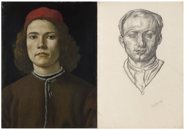
There are only two Old Master paintings in the exhibition: Sandro Botticelli’s Portrait of a Young Man in oil is hung next to Bomberg’s chalk self-portrait and they do indeed share a certain intensity, Bomberg’s confrontational direct gaze modelled on the Florentine’s.

Portrait of a Young Man by Sandro Botticelli (1480 to 1485) © The National Gallery, London and Self Portrait by David Bomberg (1913 to 1914) Courtesy of the National Portrait Gallery, London / © The estate of David Bomberg

And a crucifixion from the studio of El Greco which is interesting, but mostly for the strange moulded nature of the background, which reminded me of the Surrealists.

As for the rest of the Old Masters, the final wall label has a list of precisely five other Renaissance paintings which apparently influenced Bomberg – but they’ve all been left in situ in their original rooms and you have to go on a treasure hunt through the National Gallery to find them:

  • Michelangelos The Entombment (room 8)
  • Veronese’s Unfaithfulness (room 11)
  • Botticelli’s Mystic Nativity (room 58)
  • Antonio Poliaullo’s Martyrdom of Saint Sebastian (room 59)
  • Piero della Francesca’s Baptism of Christ (room 61)

Bomberg’s sketches and paintings

No, the real thing about this exhibition is much more interesting: they’ve brought together half a dozen of Bomberg’s greatest early paintings and Bomberg’s preparatory sketches for them. Setting them next to each other is fascinating.

Who was David Bomberg?

Bomberg’s early paintings were among the most excitingly dynamic and abstract created in the first flush of modernism just before the Great War. Visitors to his first solo show in 1914 thought he had completely rejected the entire existing tradition of painting in order to create dazzling abstract works like the justly famous Mud Bath, painted when he was just 23.

The Mud Bath by David Bomberg (1914) © Tate

Alongside Mud Bath are hung three masterpieces from his early, Modernist period and next to each one, a preparatory sketch:

  • Vision of Ezekiel (1912, Tate) inspired by the sudden death of his beloved mother Rebecca and the theme of the resurrection in the Old Testament
  • Ju-Jitsu (c.1913, Tate) a geometrical and fractured painting based on his brother’s East End gym
  • In the Hold (c.1913–14, Tate) where dockers appear to be unloading migrant adults and children from a ship

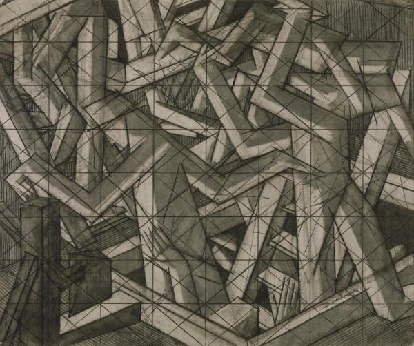
Take In The Hold. Here’s the preparatory sketch:

Study for In the Hold by David Bomberg (about 1914) © Tate

From this sketch you can clearly see that the objects ‘in the hold’ of the ship are human beings. You can see the ladder coming up out of the hold on the right, and two particularly obvious hands being waved up out of the hold in the centre middle. You can just about make out that the figure on the right is holding a horizontal child up over his head. The whole thing depicts the none-too-gentle removing of immigrants from the hold of an immigrant ship, maybe the kind of old steamer that brought Bomberg’s parents, Jewish immigrants, to London in the 1890s.

Already the curved human figures have been transformed into semi-abstract geometric patterns. Not only that but the clashes of angles and geometries powerfully convey a) the nervous energy and b) the sheer cramped claustrophobia of the ship’s belowdecks.

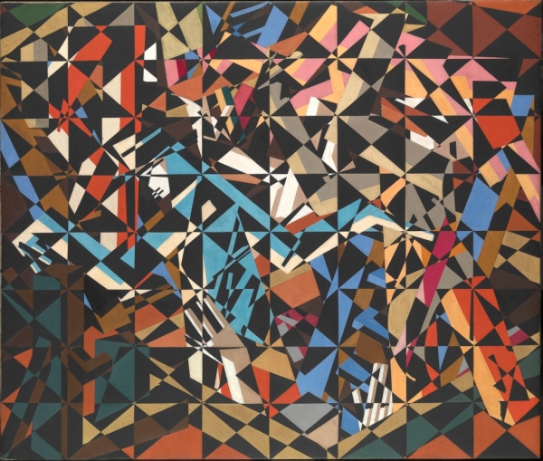
Now look at the painting he made from this sketch.

In the Hold by David Bomberg (1913 to 1914) © Tate

A masterpiece, in my opinion.

The most fundamental aspect of it is the grid of 64 squares which make it seem like a kaleidoscope. Next that he has painted the rectangles and other angular shapes between the figures with as much power and brightness as the figures themselves. The result is that everything is presented on the same plane, with no depth or perspective, a wonderfully bright and brilliantly arranged puzzle.

It’s fascinating to keep referring back to the sketch, then coming back to the painting and seeing just how expertly he has elided, obscured and displaced what were already geometrised human figures, until they are barely legible.

I couldn’t ‘read’ the painting by itself at all, I had no real sense of it being a depiction of a scene. But looking at the preparatory sketch is like having the key to undo its secret. And then I found that switching from one to the other was like alternative points of view of a landscape, or like stereo – like seeing two aspects of the same view. There was a kind of visually dynamic pleasure to be had simply from turning from one version to the other and back again.

And you can do the same – compare the detailed sketch and then the final painting – of Ju-Jitsu and Vision of Ezekiel, two other powerful (if rather smaller) hyper-modernist works.

Conclusions

1. It’s a small room, but it contains four or five masterpieces which remind you how great 1914 Bomberg was. Mud Bath and In The Hold are enormous paintings which dominate the room. Amazing that so much energy and beauty can be contained in such a small space.

2. In small letters, the introduction wall label says this is a collaboration with Tate. When you look closely you realise that all bar two of the nine works by Bomberg are actually from the Tate collection. So it’s more than a collaboration, it’s an inventive way of airing and sharing some of their key Bomberg holdings, bringing them together with some of the sketches which are held at completely different collections. Well done to the curators!

3. Lastly, it is hard not to lament the way Bomberg abandoned his avant-garde style after the Great War, adopting a more figurative style and ‘rediscovering nature’ – sigh – just like many other artists did, contributing to the undistinguished blah of a lot of English art in the 20s and 30s. Hard not to see it as a sad falling-off.

Evening, The Old City and Cathedral, Ronda by David Bomberg (1935)


Related links

Reviews of other National Gallery exhibitions

Edward Burne-Jones @ Tate Britain

One aspect of being a successful artist is establishing a look, a style, a brand. This exhibition, the first devoted to Burne-Jones at Tate Britain since 1933, brings together over 150 objects including some of his greatest paintings, a roomful of drawings, wall-sized tapestries, even a grand piano he decorated – which all go to prove that he established the ‘Burne-Jones look’ early on, and then stuck to it.

The Briar Wood (1874-8) by Edward Burne-Jones. The Faringdon Collection Trust

The Briar Wood (1874 to 1878) Picture one in the Briar Rose series, by Edward Burne-Jones. The Faringdon Collection Trust

People sleeping and dreaming are his subjects. Even when supposedly awake, all his figures look as if they’re sleep-walking through the situations he places them in.

The figures are tall, statuesque, rather elongated. If nude, they have beautifully defined musculature, if clothed the men, in particular, are often wearing fascinatingly detailed armour, while the women wear long gowns whose convoluted folds he captures with shimmering sensuality.

This painting, from a series depicting the legend of Perseus and Andromeda, shows all these features – human figures elongated, the (admittedly delicate but well-defined) musculature of the nude woman, and the fascinating style of armour Perseus is wearing, like no armour any real medieval warrior ever wore, almost cyber-punk in its fetishistic detail.

The Doom Fulfilled by Edward Burne-Jones (1888). Staatsgalerie, Stuttgart

The Doom Fulfilled by Edward Burne-Jones (1888). Staatsgalerie, Stuttgart

Many exhibitions I’ve been to at Tate Britain set out to prove a thesis, but this show is a return to an older, more traditional type of curating, which sets out simply to explain and delight.

Serena Thirkell

I recommend buying the audioguide. It has four voices on it:

  1. exhibition curator Alison Smith
  2. an art scholar who’s a long-standing fan of Burne-Jones but whose name I didn’t get
  3. novelist Tracey Chevalier
  4. but by far the most interesting voice is that of Burne-Jones’s great, great, grand-daughter, Serena Thirkell

Serena’s memories are fascinating of growing up in a house where some of these famous paintings hung in the hall or dining room, and how she and the other small children were attracted, frightened and fascinated by them.

I particularly liked her take on the amazingly sumptuous painting, King Cophetua and the Beggar Maid. To the adult eye there are all kinds of things going on in it, from the (typically strange) armour of the king to the (typically blank) expression on the beggar maid’s face, to the heads-together pose of the two figures at the balustrade – obviously inspired by pre-Raphael Renaissance paintings – and ditto the carefully delineated leaves of the olive branches poking in from the left.

But what Serena remembered was the avenues of escape from the picture, the way she and her little friends could imagine scampering up the stairs to the gallery, and then through the window into the lovely Italian landscape you can glimpse outside. And how this sense of escape was balanced by the sense of threat created at the other end of the painting – caused by the narrowing, claustrophobic steps going down, past the king’s knees and feet, down, down towards… what scary darkness?

King Cophetua and the Beggar Maid by Edward Burne-Jones (1884)

King Cophetua and the Beggar Maid by Edward Burne-Jones (1884)

Her memories remind the listener that you don’t always have to respond to art with sophisticated theories or abrasive gender politics. Sometimes you can let yourself be swept off your feet to fairyland. Few artists devoted as much energy to creating that effect as Burne-Jones.

Seven rooms

The exhibition is arranged into seven rooms:

  1. 1856 to 1870 Apprentice to Master
  2. Burne-Jones as a draughtsman
  3. 1877 to 1898 Exhibition paintings
  4. Portraits
  5. The series paintings – The Perseus series
  6. The series paintings – The Briar Rose
  7. Burne-Jones as a designer

Unusually, Burne-Jones didn’t attend art school at all. He began studying theology at university, before packing it in and essentially teaching himself art.

His theological knowledge and the iconography of Christianity i.e. the figurative depiction of key moments – the Annunciation, various saints though not, tellingly, the Crucifixion itself – stayed with him for the rest of his career.

Later in life Burne-Jones collaborated on designing stained glass windows for churches, which were produced in the factory of his close friend, William Morris. It’s estimated that he produced the designs for over 650 stained glass windows, which is why many of the patterns and designs in the final room, ‘Burne-Jones as designer’, seem so familiar. Anyone who visits English parish churches will have been exposed to his pervasive influence.

Adoration of the Magi (1894) by Edward Burne-Jones. Victoria and Albert Museum

Adoration of the Magi (1894) by Edward Burne-Jones. Victoria and Albert Museum

Room two shows how much effort Burne-Jones put into practicing drawing and sketching, especially on the four big trips he made to Italy during the 1870s, where he copied and studied extensively from the Renaissance Old Masters. Some of the sketches are breath-taking – of hands in different poses, or feet, the elaborate depictions of the folds of dresses, not to mention a standout sketch of a flowering plant and a page of sketches of birds. What an eye, what a hand!

Desiderium (1873) by Edward Burne-Jones. Tate

Desiderium (1873) by Edward Burne-Jones. Tate

This room also contains some surprisingly comic insights into his private life. Burne-Jones enjoyed a long friendship with the novelist Elizabeth Gaskell, and the exhibition shows some of the comic cartoons he included in his letters to her. He depicts himself in these as a skinny, long-bearded, mournful man, which creates an irresistibly comic effect when placed next to the caricatures of his bosom buddy, the big, super-energetic, wild-haired William Morris. I laughed out loud at the cartoon he drew of himself falling asleep in a chair while Morris passionately declaims one of his interminable epic poems.

Room three is amazing – full of massive ‘exhibition’ paintings, made to stun his contemporaries and sell to rich patrons. Love Amid the Ruins, The Beguiling of Merlin, The Golden Stairs, Laus Veneris, The Wheel of Fortune and half a dozen other enormous, strange, haunting, remote, dreamy images, pregnant with meaning, in which movement isn’t really movement at all.

Reminiscent, it occurred to me, of Botticelli whose Spring or Birth of Venus both show supposedly dynamic images in which, in fact, nothing is really moving.

The Tree of Forgiveness by Edward Burne-Jones

The Tree of Forgiveness by Edward Burne-Jones

Perseus

But the real Burne-Jones’ fan will be transported to heaven by rooms five and six. These recreate in their entirety the two most important series of paintings which Burne-Jones created. Room five contains the ten paintings he created to depict the Greek myth of Perseus between 1875 and 1885. The original idea was to hang ten oil paintings, interspersed with four relief panels on oak wood, all carefully arranged and lit so as to transport you into a mythic world of the imagination.

Only four of the planned ten were worked up into finished oil paintings (including The Doom Fulfilled, shown above) and the curators have hung these four, along with cartoons (actual size preparatory works) of the other six, plus one completed oak relief, placing them all in order so you can follow Burne-Jones’s huge and powerful depiction of the story through in order.

It’s a great bit of curating, which really works. Above all it shows you how muted, dulled and misty his palette was. And makes you realise this was always his style.

The Laus Veneris, which is used as a poster for the show, is in fact quite unrepresentative of most of the other paintings here, in its use of bright orange for Venus’s dress. Even in the first room of early works, his faces are softened and blurred, the colours are dark and misty. As the years passed he perfected the technique of using colour, but making all the colours submit to the same muted tonality.

The briar rose

A kind of silvery blue-black dominates the Perseus series and helps them to cohere, tonally. Whereas, when you step into room six, you are enveloped in the Briar Rose series, four massive paintings depicting the early parts of the Sleeping Beauty fairy story, where a kind of muddy brown dominates and unites the compositions.

The Garden Court (1874-84) by Edward Burne-Jones. the Faringdon Collection Trust

The Garden Court (1874 to 1884) by Edward Burne-Jones. The Faringdon Collection Trust

There are scores of incidental pleasures to be had along the way, noticing how the sketched birds are incorporated into later paintings, spotting the influence of Michelangelo in the more muscular figures, or of Mantegna in some of the amazingly detailed swirling gowns.

The room of portraits caters to people who like gossip about artists, featuring as it does portraits of his daughter Margaret, his long-suffering wife Georgiana, several of the lady friends with whom he enjoyed passionate friendships (Amy Gaskell and Lady Windsor) his longstanding patron, William Graham, and so on, with a bit of juicy gossip behind each one.

Burne-Jones and European symbolism

But what interested me more was the link the exhibition helps you to make between later Burne-Jones and the European Symbolist painters of the 1880s and 1890s. The subject matter of both is generally the figurative depictions of human beings – realistic, easy to decode and relate to.

And yet stylised in powerful ways which seem charged with mysterious meanings. Especially all those women with the same faces, the same large eyes, the same vacant stare, the same elongated bodies draped, folded, bent in positions of sleep and languor – compositions pregnant with a meaning just beyond the mind’s grasp.

Some of the unfinished Perseus series, especially the one about Perseus’ encounter with Atlas, could be by a European Symbolist, transmuting what ought to be the straightforward telling of a well-known myth into something altogether new and haunting. The figures inside the globe Atlas is holding are depictions of the signs of the Zodiac, and yet they are the Zodiac symbols come to life and seeming to interact in strange and unknowable ways…

Atlas Turned to Stone by Edward Burne-Jones (1872) Southampton City Art Gallery

Atlas Turned to Stone by Edward Burne-Jones (1872), a peculiarly Symbolist work. Southampton City Art Gallery

Some people don’t like Burne-Jones’s big-eyed damsels, or jewelled dreamscapes. They see his entire visions as a creative dead end which helped maintain a kind of anti-modern, British philistinism right up to the end of the 19th century and beyond, while, throughout this period, the French were busy inventing modern art just 50 miles across the Channel.

But it is now 2018. We are well into post-post-modern art, into the era when the internet makes everything available to everyone, when there are no longer movements with fierce adherents and bitter opponents. The stakes are no longer so high or so intense. We can like whatever we want to. I thought this was an absolutely wonderful exhibition – the room of the Sleeping Beauty panels is worth the admission price alone.

The promotional video

This shaky handheld video gives you a good sense of what the show is like.


Related links

Newspaper reviews

More Tate Britain reviews

Modigliani by Doris Krystof (1996)

Taschen Publishing specialise in medium-sized art books (23 cm tall x 18.5 cm wide). They’re all originally written in German, this one was translated into English by Christina Rathgeber. I picked it up for a fiver in some art shop years ago, and dusted it off and reread it to coincide with visiting the big Modigliani exhibition at Tate Modern.

The text is eminently readable and it has 88 good quality colour reproductions, not just of paintings and sculptures by the man himself but of works by contemporaries like Picasso, Kirchner and Brancusi, as well as classic nudes by Titian and Giorgione, quoted to compare and contrast with Modigliani’s famous nude paintings.

It is a real visual treat just slowly flipping through the pictures and soaking them up.

Biography

The outline of Modigliani’s life is clear enough. Born in 1884 to an arty Jewish family in northern Italy (his mother translated poetry, wrote essays and book reviews), his creative tendencies were encouraged so that by age 14 he was studying at the art academy in Livorno. He studied from books and attended a life drawing class; he visited Rome and Florence and Venice where he revelled in the Old Masters. He attended the Venice Biennale of 1903 and stayed there two years.

By which point it was time to move on and he headed for the Mecca of modern artists, Paris, arriving in 1906. Quite quickly he made important friends, not least the Spaniard Picasso and the Romanian sculptor Brancusi. For the next few years he experimented with a number of styles, from Cézanne (who had died in 1906 and quickly had several exhibitions devoted to his late work) to Edvard Munch, who impressed everyone with the work displayed at the Salon d’Automne of 1908 – although he avoided the main new movement of the day, Fauvism (given its name in 1905 and which flourished for the next few years).

Similarly, Modigliani was well aware of, but avoided, the arrival of Cubism in 1908, pioneered by Picasso and Braque, which swept up many lesser talents. Instead, he pursued his core interest of depicting the human form using outlines of graceful arabesques.

From about 1909 to 1912 Modigliani devoted himself entirely to sculpture, heavily influenced by the new taste for ‘primitive’ art from Africa and Oceania which became modish from around 1905, and by his friendship with the modernist sculptor, Brancusi.

Although some of his sculptures are obviously influenced by (copies) of African fetish masks which were becoming popular in artistic circles, Modigliani was just as obsessed by the idea of the caryatid, the statue of a woman bearing the weight of a building which had been developed in ancient Greece. He produced scores of sketches and variations on this crouching, hunched-up, female shape.

Eventually Modigliani gave up sculpting, maybe because the dust was bad for his chronic tuberculosis, but his painting style was now purified of the earlier variety and experimentalism – the faces in particular from now on were all variations on the elongated, oval shape with schematic, one-line features (eyes, eyelids and mouth all drawn with a crisp elegant line) which he had perfected in the sculptures and in the numerous preparatory sketches he made for them.

He continued to paint a wide variety of portraits of friends, lovers, fellow artists, collectors and patrons, and in the middle of the Great War began to paint a series of nudes. These differ from the portraits in being really simplified – the skin tone is generally a consistent warm orange colour, and the facial features are purified down to a handful of lines. They sold well – what’s not to like?

Towards the end of the War, Modigliani was advised to head south by his dealer and set up shop in Nice, along with his mistress, Jeanne Hébuterne, mother of his daughter. Here he painted lots more portraits, but in a noticeably lighter style, and of ordinary people – instead of the rich and famous of Paris’s art world – of peasants, hotel cleaners, and even of children. These, along with the nudes, became his most popular images.

By 1919 he was back in Paris, and the final portraits of his mistress and patrons show a further tendency to elongate both the neck and the face even more, making each person even more of an abstract collection of lines and colours.

Modigliani died after a long decline in his health on 24 June 1920. Soon afterwards friends and acquaintances, lovers and patrons began writing their memoirs, and quite quickly the myth grew up of the handsome, charming Wunderkind artist, who endured great poverty in his undying devotion to his art. And his paintings began to sell.

The works

Early paintings

Having seen a lot of the ‘greatest hits’ at the Tate Modern exhibition, I was taken by the more out-of-the-way works included in this book, especially of the early works before he’d perfected the Modigliani ‘look’.

Sketches

From early on he developed a hyper-simplified line, which comes over in nude sketches and then very much in the sketches he made from African artefacts in the Louvre and the Museum of Ethnography.

Sculptures

He took up sculpture in 1909, nobody knows why. Perhaps because he had always revered the sculptural legacy of his native Italy, perhaps because his paintings weren’t selling, perhaps because he moved to a bigger workspace in Montparnasse, perhaps because he met Constantin Brancusi in 19090 and was hugely influenced by him. Or all of the above.

Brancusi (b.1876) had perfected a smooth highly stylised way of working in stone which anticipates Art Deco.

Modigliani’s sculptures are of two types, a squat square type, which could fit at the top of a column –

And the much-better known, highly elongated, ‘primitive’ mask like heads. Although the politically correct like to raise the issue of ‘cultural appropriation’ and the way so many of the avant-garde artists of the 1900s looked to sculptures from Africa or Oceania, the book points out that there are also strong European origins for this look, in the stunningly abstract heads carved in the Cycladic islands of Greece thousands of years BC.

Apparently he conceived of the sculptures, these stone heads, as all being together in one place, creating a kind of temple of beauty. This may partly explain their thematic unity, that they were designed to be displayed and seen as an ensemble.

Nudes

Krystof makes a simple but effective point that it’s not so much in the sculptures but in the sketches for the sculptures, and especially in the sketches of caryatids, that we see Modigliani really simplifying his technique, perfecting a way of depicting the human body entirely made up of simple, one-line, shallow curves – no sketching, and repeated lines or cross-hatching – just one pure line to create the body’s outline, another to distinguish to the two legs, meeting another curve which creates the loins, two simple curves, maybe a bit pointed, to indicate the breasts, a curve for the mouth, a long narrow triangle for the nose, two almonds for eyes – in many ways a child’s eye view of the human body.

She also makes the good point that these curves are consciously not like the focus on blocks and squares and diagonals and geometric shapes of the suddenly fashionable Cubists. It is in pursuit of shallow curves that Modigliani is at odds with the art of his own times, a one-off.

And so to the female nudes which make up about 10% of his output – about 30 nudes in total – and in their simple outlines, as well as their very simple orange flesh colouring, present a kind of cartoon simplicity and pleasingness.

He began painting them in 1916, helped by the important patronage of dealer and friend Léopold Zborowski, who lent the artist use of his apartment, supplied models and painting materials, and paid him between fifteen and twenty francs each day for his work.

The simple graceful outlines, the soft orange skin and pink nipples, the simplified facial features, and the tonal unity of the paintings (compare and contrast with the violent garish colouring of the Fauves) makes Modigliani’s nudes understandably popular even among opponents of modern art.

Krystof also takes some time to explain another reason for their sense of familiarity, the reason they seem so assimilable. It’s because the poses are often based on established classics of Western art.

Quite systematic copying or borrowing or pastiching, isn’t it?

Krystof makes another, subtler, point. In all the classic paintings above you can see the entire body – you, the viewer, are standing some way away. By contrast, all of the Modigliani nudes are cropped, at least part of the arms or legs are out of the frame – as if you were really close up to the model, not so much contemplating them as about to fall over them. Immediacy.

Portraits

But the 20 or so nudes mark a sort of apricot-coloured interlude in Modigiliani’s core activity during his final years, which was the obsessive painting of hundreds of portraits.

Krystof divides them into two categories – one of friends, lovers, patrons, fellow artists and named individuals – the other category of scores of anonymous models, peasants and children.

They are all rougher and harsher, in design and finish, than the nudes.

To get at the essence of the Modigliani approach, Krystof compares his portrait of Jean Cocteau with a portrait done at exactly the same time and place by Moise Kisling.

The immediate and obvious conclusion is the huge amount of clutter Modigliani has chucked out – the window, shutters, table, vase, stove, chair, dog and rug are all not there – and the way he has zoomed in to focus on the top half of the body to create an image which is much simpler, sparer and more intense.

Hence Krystof’s suggestion that Modigliani developed in his portraits ‘the art of omission’ (p.53)

The same technique – cropping sitters at the bust and showing no interest in the details of the backdrop – characterises many of the portraits, which are more varied and interesting than the nudes.

Flight south

In the spring of 1918 the Germans began a final offensive. Planes and Zeppelins bombed Paris and many feared the city would fall. Up to a million people fled the capital, including Modigliani and his mistress / common-law wife, Jeanne Hébuterne, who gave birth to their daughter in 1918. The young family spent over a year in Nice and Cagnes-sur-Mer, where Modigliani painted more feverishly and intensely than ever before.

The light of the South of France lightened his palette and the texture of the paint he used, the paint is thinner. Also the local people he got to model for him lack the specificity of the Paris portraits, becoming more generic – which may account for their later popularity.

Jeanne Hébuterne

Modigliani painted at least 25 portraits of the mother of his children. Photographs of her make her look absolutely stunning, in fact she has something of the long-tressed, full-lipped beauty beloved of the pre-Raphaelites.

In his last paintings of her, the neck and face are more elongated than ever, the background painted in with lighter sketchier colours than previously.

Conclusion

This is a really handy book, containing not only nearly 90 beautiful full-colour illustrations which give you an immediate and comprehensive feel for Modigliani’s unique style, but also a more thoughtful and insightful text by Doris Krystof, than is usual for Taschen books.

Possibly my favourite portrait comes right at the end of the book, one of the few Modigliani portraits which has even a hint of feeling and emotion, in this case a self-contained, winsome sadness.


Related links

Botticelli Reimagined @ the Victoria and Albert Museum

Sandro Botticelli (1445 to 1510) is widely recognised as one of the masters of the Italian Renaissance and a handful of his images – SpringThe Birth of Venus – have become almost universal due to their reproduction on posters etc.

This exhibition brings together the largest number of works by Botticelli, his pupils and followers, seen in Britain since 1930, but there is a twist. For Botticelli’s reputation underwent a strange decline after his death and for 300 years he was eclipsed by his more famous contemporaries Michelangelo, Leonardo and Raphael. Only in the mid-Victorian period did his fortunes revive and then flourished as he was copied and emulated by, in this country especially, the pre-Raphaelites.

This era of new appreciation was followed, in the 20th century, by a mixture of homage and parody as some of his most famous imagery became ripe for re-appropriation, satire and comedy.

The Virgin and Child with Two Angels by Sandro Botticelli (c.1490) Gemäldegalerie der Akademie der Bildenden Künste Vienna . Image courtesy Gemäldegalerie der Akademie der Bildenden Künste Vienna .

The Virgin and Child with Two Angels by Sandro Botticelli (c.1490) Gemäldegalerie der Akademie der Bildenden Künste Vienna. Image courtesy Gemäldegalerie der Akademie der Bildenden Künste Vienna.

And so this exhibition is in three parts: 20th century homage; the 19th century rediscovery; the original Botticelli, pupils and followers. The exhibition is laid out in reverse chronological order, starting with the 20th century, and the first thing you see is a video screen showing the clip from the movie Dr No where Sean Connery wakes up on the island of Dr No to see Ursula Andress emerge from the sea in a bikini. This is taken as homage to Botticelli’s most famous image, The Birth of Venus, as is the other clip in the sequence, from Terry Gilliam’s movie Baron Munchausen, the scene where the picture comes alive and the statuesque Uma Thurman emerges naked from a huge sea shell.

Having grasped this layout I preferred to start in the opposite order from the exhibition, and spend my Saturday morning energy soaking up the real thing, before progressing to the Victorians, and only then returning the shiny plastic modern spoofs and homages.

Sandro Botticelli

Alessandro di Mariano di Vanni Filipepi (c. 1445 to 1510) belonged to the Florentine School under the patronage of Lorenzo de’ Medici. By 1470 he had his own workshop in which numerous pupils and craftsmen worked. One of the problems of Botticelli scholarship is that of attribution: only two paintings have his signature on them; all the rest are scholarly guesses, many causing controversy to this day.

In this respect the exhibition fascinatingly hangs sequences of paintings of the same subject in the same style next to each other: six Madonna and Childs, one (?) by the man himself, several (?) from his workshop, the rest (?) by contemporaries working in the same style, allow you to fine tune your understanding of his style and, incidentally, to understand a little the challenging world of art attribution.

The distinctive thing about Botticelli’s style is the way it is flat and diagrammatic, with no attempt at light and shade, of chiaroscuro, of blurring or shadowing. 1) The outlines of faces, noses, chins, arms and especially tresses of hair are all conveyed with a cartoon clarity 2) In particular the women’s faces all look the same or similar, oval with a strongly defined chin and jawbone which continues in a graceful curve round to the earlobe 3) The hair is stylised into into a kind of schematic diagram of hair 4) The women are tall and slender with high small boobs, the body generally covered in a light diaphanous-feeling, many-folded robe.

 Venus by Sandro Botticelli (1490s) Gemäldegalerie Staatliche Museen zu Berlin Preußischer Kulturbesitz . Photo: Volker-H. Schneider.

Venus by Sandro Botticelli (1490s) Gemäldegalerie Staatliche Museen zu Berlin Preußischer Kulturbesitz . Photo: Volker-H. Schneider.

My favourite work in these rooms was Portrait of a young woman, possibly Simonetta Vespucci (1484) the hair in particular more like a flat book illustration than a painting, each pearl painted with the same amount of detail, no attempt at modelling light and shade, further and nearer, blurring some area to create a sense of depth or shadow: everything in the same hyper-clarity, but all against an impenetrable black background, itself a change and a rest from the stereotypical broken columns or distant lakes with a boat on it which populate so many Renaissance paintings. Just her, in super-clarity.

In these two rooms are gather some 40 paintings by Sandro or his workshop as well as 11 pen and ink drawings and half a dozen early books from the period. A Renaissance junky could probably spend the whole morning poring over these marvellous works. The really classic works, the Spring and Birth of Venus are held in the Uffizi in Florence and are never leaving. I was surprised that the National Gallery’s Venus and Mars hadn’t made the 3 mile trip to be included (note Venus’s strong jawline and statuesque white neck). The nearest thing to them was the large and beautiful Pallas and the Centaur, with the slender grace of the goddess and the vines twining over her arms and breast.

Pallas and the Centaur by Sandro Botticelli (c.1482) © Galleria degli Uffizi, Florence, 2015 . Photo: Scala, Florence - courtesy of the Ministero Beni e Att. Cultura

Pallas and the Centaur by Sandro Botticelli (c.1482) © Galleria degli Uffizi, Florence, 2015. Photo: Scala, Florence, courtesy of the Ministero Beni e Att. Cultura

The main thing I learned was about his later style. In his last years Botticelli fell under the influence of the fundamentalist preacher Savonarola, a period shrouded in rumour. Some say he abandoned painting, others that he burned all his paintings (the ones which weren’t hanging in the villas of his rich patrons the Medicis). What the show illustrates is that is later style was heavier. Two paintings represent it, notably the Flight from Egypt. In this the figures fill the frame, looming and heavy, the composition no longer feels light and dainty but heavy and threatening and the cartoon element is even more to the fore. Look at the donkey. Joseph’s head looks as if it was done by a completely different artist.

Off to one side in a separate room were the prints and drawings. These included five illustrations of Dante’s Divine Comedy (there is currently a fabulous exhibition of thirty of these drawings at London’s Courtauld Gallery). The best of them was the Allegory of Abundance – or by ‘best’, do we just mean the one that looks most like the figures in Prinmavera and Venus? The paintings include a lot of Biblical subjects, a lot of Madonnas in tondi (round paintings). None of these are canonical i.e. none of these are what we expect our Botticelli to be: we expect slender graceful women, and so…

Allegory of Abundance or Autumn by Sandro Botticelli (c.1470-5) The British Museum (c) The Trustees of the British Museum.

Allegory of Abundance or Autumn by Sandro Botticelli (c.1470 to 1475) The British Museum (c) The Trustees of the British Museum.

The Victorian rediscovery of Botticelli

The exhibition suggests that it was the heaviness of these later works which caused Botticelli’s eclipse. For three hundred years or so (1510 to 1810) he was largely overlooked in history books and art teaching.

The exhibition claims that the first step in his revival was the way that, during the Napoleonic Wars, lots of Catholic religious houses were closed down and the art works they contained came onto the market. That began to revive interest in his name.

But the story then fast-forwards to the 1860s and to an essay written by English critic Walter Pater praising Botticelli, and especially to the patronage of Dante Gabriel Rossetti and the pre-Raphaelite painters. Their joint enthusiasm created a revival of Botticelli’s reputation.

There is a smallish room with Victorian books and magazines and posters explaining the Victorian resurgence in his reputation; and then there is a stunning long room full of beautiful sumptuous pre-Raphalite masterpieces. If you like Victorian painting it is worth visiting for these alone, with lovely big sensual works by Dante Gabriel Rossetti, Edward Burne-Jones, William Morris and many more.

La Ghirlandata by Dante Gabriel Rossetti (1873) © Guildhall Art Gallery 2015. Photo: Scala, Florence/Heritage Images .

La Ghirlandata by Dante Gabriel Rossetti (1873) © Guildhall Art Gallery 2015. Photo: Scala, Florence/Heritage Images.

Rossetti has taken the shape of the female head – all strong jawline and statuesque neck – and overlaid a whole world of Victorian sensuality and green velvet. Next to these images of sensuality Botticelli’s women look blankly emotionless. It is fascinating – and an amazing experience and opportunity – to wander back and forth between the Botticelli originals and what artists three hundred years later made of them.

The end wall of the room is covered by a fabulous William Morris tapestry, The Orchard, dominated by four female figures, loosely based on the Botticelli lightness and grace, but note the changing fruits of the trees which make up the background pattern of foliage. A reproduction doesn’t do justice to the scale and impact of this beautiful tapestry. Obviously Morris felt at home with, or was inspired by, the foliage themes of the Primavera.

The Orchard by William Morris (1890) V&A. John Henry Dearle, Morris & Co (c) Victoria and Albert Museum, London.

The Orchard by William Morris (1890) V&A. John Henry Dearle, Morris & Co (c) Victoria and Albert Museum, London.

There were also lovely works by Aubrey Beardsley and artists I’m less familiar with such as Arnold Böcklin, Simeon Solomon, Sartorio, and a couple of works by woman artist Evelyn de Morgan, including her Flora from 1895.

The twentieth century response

The thing about the twentieth century is how big and messy it was. From between the wars were traditional (sort of) paintings by the likes of:

But the lion’s share of the 20th century room is dominated by post-war art which, from one point of view, becomes progressively bigger and more facile. There is:

  • Orlan: Occasional strip-tease (1974) Like many of the women photographers featured in Performing for the camera at Tate Modern, Orlan thinks taking her clothes off is an artistic or subversive act, here done in homage, at last in the penultimate shot, to Sandro’s Venus.
  • Cindy Sherman: #225 (1990) homage to one of Sandro’s Madonnas
  • Vik Munix: VantagePoint X This is a huge work. Only when you go close do you realise every element in it is junk, rubbish collected from the streets and garbage bins, arranged to reproduce the famous image.
  • Tomoko Nagao: The Birth of Venus Apparently a homage to the instantly recognisable Japanese style of ‘Superflat’

Here is an image chosen to publicise the show, David Lachapelle’s kitchy, campy studio re-enactment of the Birth of Venus with some fit young men from the YMCA in attendance.

Rebirth of Venus by David LaChapelle (2009) Creative Exchange Agency, New York, Steven Pranica / Studio LaChapelle (c) David LaChapelle.

Rebirth of Venus by David LaChapelle (2009) Creative Exchange Agency, New York, Steven Pranica / Studio LaChapelle (c) David LaChapelle.

The ‘best’ of the 20th century homages had to be the Andy Warhol silk screens of Venus’s face from 1984. God knows how many exist in what combinations of colours, but this exhibition featured two with strikingly different colour schemes. The most attractive one, with a pink face, is used as the exhibition poster.

Warhol had a great eye for classic design, from Campbell’s soup tins to Elvis pulling a gun from his holster. These silks are an appropriate homage from one master of clarity of design and strength of line to another, Sandro’s cartoon-like tresses and features highlighted and retouched for the age of plastic and imacs.


Related links

More V&A reviews

Botticelli and Treasures from the Hamilton Collection @ the Courtauld Gallery

In 1882 the 12th Duke of Hamilton caused a national uproar by over-riding objections from the Royal Family and John Ruskin and selling his collection of priceless art works to the Berlin Kupferstichkabinett (Prints and Drawings Museum). At the heart of his collection was a set of illustrations of Dante’s famous epic poem, The Divine Comedy, by Renaissance artist Sandro Botticelli.

This exhibition gives us the opportunity to see these rare and precious works, along with other highlights from the Duke’s collection, namely a selection of invaluable illuminated manuscripts including the celebrated ‘Hamilton Bible’, back in the country for the first time in 130 years.

Dante

Dante Alighieri (1265 to 1321) was born and raised in Florence. He took the style of love poetry developed by the troubadours of the south of France to new heights in the love poetry he wrote to his muse, Beatrice Portinari. Florence was a hot-bed of political infighting and when Dante’s party, the White Guelphs, were violently overthrown in 1302, the poet was driven into bitter exile.

Here he conceived his epic poem, The Divine Comedy, divided into three books, in which the poet is escorted through Hell, Purgatory and Paradise, respectively. Although each book is quite long – and the whole poem is 14,233 lines long – they’re built up from quite short two- or three-page cantos (33 in each book), in each of which Dante and his guide meet dead souls who give potted histories of their lives.

Although 700 years old, Dante’s verse still feels fast-moving and fluid, and the often powerful stories of the dead give the poem a timeless appeal. What raises it to the position – in many people’s opinion – of the greatest work of literature in European history, is the tremendous scaffold of Christian theology and symbolism which underpins it. The dead souls Dante talks to not only relate stories but each represents a different aspect of Catholic theology, as well as embodying many levels of medieval symbolism.

For example, at the same time as the poem describes a ‘real journey’ through a precisely imagined terrain, it is also symbolic of the soul’s journey towards the loving Christian God. The more you investigate the poem, the richer and deeper it becomes.

Although the Divine Comedy is long, it is made very readable by being divided into short cantos, and by the interlocking rhyme scheme of terza rima, each verse made of three lines which rhyme aba, bcb, cdc and so on, drawing the reader onwards into the narrative. The famous opening lines are:

Nel mezzo del cammin di nostra vita
mi ritrovai per una selva oscura,
ché la diritta via era smarrita.

Which can be translated as:

Halfway along the roadway of my life
I found myself within a darkened wood,
For I had stumbled off the direct way.

Botticelli

Sandro Botticelli (1445 to 1510) was an Italian painter of the early Renaissance, famous for the serene expressions of his slender shapely women, exemplified in his allegorical paintings, The Birth of Venus (1486) or Primavera (1482). Like Dante he was born and raised in Florence, and there is evidence that he was especially attracted to Dante’s poem – a near contemporary wrote that Botticelli had written a detailed commentary on the Divine Comedy.

We know that Botticelli was commissioned to create drawings illustrating the poem, most likely for Lorenzo di Pierfrancesco de’ Medici, who also commissioned the Spring and Venus paintings. The Divine Comedy has 99 cantos and 92 Botticelli drawings have survived, dating probably from the 1480s. They are drawn with pen and ink on vellum i.e. sheep or goat skin. The sheets were created so that the drawings were done on one side and on the reverse was the next canto in the poem. When these were bound together you read the book sideways, by opening the pages vertically like a calendar, with the text of each canto written across one page and the illustration below.

As soon as the codex arrived at the Berlin Museum, the Germans unbound it in order to frame each drawing individually and exhibit them to the public. You can still see the series of little holes along the side of each picture where the stitching has been undone. You can also see the shadowy impress of the columns of text on the facing page, giving each image a ghostly imprint of the poem itself.

This exhibition displays ten drawings from each of the three parts of the Divine Comedy, charting Dante’s imaginary journey through Hell, Purgatory and Paradise.

Sketchy

Your first impression is that they are very faint and sketchy, with an almost schoolboy clumsiness in the way humans and clothes are depicted. Faces, bodies, clothes, expressions, limbs, hands, they all look a bit amateurish.

Punishment of the corrupt in the eighth circle (Divine Comedy, Inferno XXII) by Sandro Botticelli - (ca. 1481-1495) Pen and brown ink over metal pen on parchment, 32.9 x 47.1 cm. © Staatliche Museen zu Berlin, Kupferstichkabinett / Philipp Allard

Punishment of the corrupt in the eighth circle (Divine Comedy, Inferno XXII) by Sandro Botticelli (ca. 1481 to 1495) © Staatliche Museen zu Berlin, Kupferstichkabinett / Philipp Allard

An internet search quickly brings up the comprehensive set of illustrations for the Comedy done by the French artist Gustave Doré in the 1860s which, by comparison, are smooth and sinuous and fill the three dimensional space.

The contrast reminds us that the Botticelli created these nearly 400 years before Doré, right at the start of the western tradition, right at the moment that perspective was being rediscovered and the position of figures in a three dimensional space explored.

Some of the drawings have vestiges of colour, prompting the theory that they were initially all going to be coloured in. But something – maybe the size of the task, maybe artistic reasons – led them to remain uncoloured, fragile pen lines on a blank cream background.

Dynamic

In the poem Dante is guided through hell and purgatory by the great Latin poet, Virgil (70 to 19 BC). (It is notable and touching that he doesn’t select a theologian to be his guide through Christian belief, but the greatest author of the ancient world and a fellow Italian.) The entire poem is a journey in which – to take the two most obvious levels – Dante is shown the geography of the afterworld and gains a deeper understanding of Christian theology.

This helps to explain one of the most striking things about the images – the way Dante and Virgil appear in each one multiple times. In the drawing of the seventh circle of hell the two figures appear no fewer than eight times, progressing through the scene. The wall label points out that Inferno XXVII is unusual in depicting the pair only once.

The way they are shown progressing through each scene gives the pictures a tremendous dynamism. Once you settle to follow them through each scene, you find yourself examining it more carefully and then turning back to reread what it’s depicting. These are book illustrations and are designed to interact with a text: you read about Dante being stopped by an acquaintance in hell and then look down to see the illustration. Then you return to the text to read the soul in hell explaining how the dead are being punished in this particular circle – and look back at the illustration to find the couple in their next position, overlooking the panorama of tortured souls. And so on.

Each picture tells a story, selecting not a moment but a series of moments to capture the physical journey and the spiritual education. This is emphasised by the bridges down between the circles of hell, which Dante and Virgil cross and descend, their figures drawn at the top, in the middle and then at the bottom, moving ever downwards into realms of deeper horror.

Gestures

As I looked at the figures more closely, and followed their progress across each scene, I began to appreciate how Botticelli deploys a whole lexicon of physical gestures: here is Virgil showing, displaying, pointing, indicating, placating, berating, taking Dante’s arm, hand, embracing him. Similarly, it is Dante’s physical gestures rather than features which indicate that he is alarmed, distracted, clutching his head in horror, covering his eyes to blot out the terrible scenes.

A good example is the big illustration of Satan for which Botticelli, uniquely, used two pieces of vellum stitched together – a double-fold centre-spread of evil. Satan is a giant figure with three pairs of enormous bat’s wings, endlessly beating, creating the freezing wind which whirls some of the lost souls around hell. He has three heads and is depicted eternally eating the bodies of traitors, Judas and the two betrayers of Julius Caesar – Brutus and Cassio.

Centre of Hell. The full figure of Lucifer (Divine Comedy, Inferno XXXIV,2) by Sandro Botticelli (c. 1481-1495) Pen and brown ink over metal pen on parchment, 63.2 x 46.3 cm © Staatliche Museen zu Berlin, Kupferstichkabinett / Philipp Allard

Centre of Hell. The full figure of Lucifer (Divine Comedy, Inferno XXXIV) by Sandro Botticelli (c. 1481 to 1495) © Staatliche Museen zu Berlin, Kupferstichkabinett / Philipp Allard. Note: I have added the red highlights showing Dante and Virgil.

His body is covered in the shaggy hair of a goat but the most striking thing about it is the way it is wedged right at the bottom of hell, conceived of as an enormous stepped funnel, an inverted circular pyramid, each step down taking the poets into a new ‘circle’ of hell. Here at the bottom is a narrow hole representing the centre of the earth, and Satan’s body is wedged tight into it. Here they must hastily scurry across the body of ultimate evil in order to pass through the hole and out the other side to begin their journey back up to the surface of the world.

Botticelli depicts the scared poets no fewer than seven times in this one illustration (highlighted in red, in the image above), in successive postures of cowering dread as they scurry over the malign body, squeeze through the hole and out the other side, where they emerge upside down. The interactive qualities of the illustrations, the use of multiple figures, and the lexicon of gesture all reach a kind of apogee in this one image.

Mount Purgatory

In the poem the poets climb up a long tunnel to the surface of the earth and there discover Mount Purgatory on an island, rising up through similar stages to the Earthly Paradise at its top. It is immediately noticeable that in these illustrations the human figures are in groups. In hell each figure was scattered and alone, in psychological as well as physical torment, epitomised by the illustration of the circle named Cocytus with over 100 human figures disfigured and dismembered and abandoned to their misery. Here in purgatory, humans are allowed to congregate and speak. And unlike the movement of the poets ever downwards, now their figures move upwards through the pictures.

Beatrice explains to Dante the order of the cosmos (Divine Comedy, Paradiso II) by Sandro Botticelli (1481-1495) Pen and brown ink over metal pen on parchment, 32.4 x 47.4 cm © Staatliche Museen zu Berlin, Kupferstichkabinett / Philipp Allard

Beatrice explains to Dante the order of the cosmos (Divine Comedy, Paradiso II) by Sandro Botticelli (1481 to 1495) © Staatliche Museen zu Berlin, Kupferstichkabinett / Philipp Allard

Paradise

Dante eventually has to bid farewell to Virgil who was, after all, a pagan. He is taken forward in his spiritual education by Beatrice, the beautiful girl he fell in love with as a young man and stayed devoted to all his life, even though they both married other spouses.

In the ten illustrations from paradise the figure of poet and muse are much much larger than previously, as if by approaching spiritual purity, as if by approaching the most religious territory, Dante is becoming more human. His and Beatrice’s figures become larger, their expressions easier to read, and he is drawn always looking upwards, up towards the light radiating from the abode of bliss and the godhead. These are the most Botticelli-esque of the drawings, with the light swirling skirts and fabrics of Beatrice for the first time really reminding us of the Botticelli of the Primavera and Venus. No coincidence that it’s one of these illustrations which the Courtauld has selected as poster for the show. The wall label tells us that Kenneth Clark thought The ascent to the heaven of fire captured a delicate beauty ‘unequalled in Western art’.

Beatrice and Dante ascending to the heaven of fire (Divine Comedy, Paradiso II) by Sandro Botticelli (ca. 1481-1495) Pen and brown ink over metal pen on parchment, 32.4 x 47.6 cm © Staatliche Museen zu Berlin, Kupferstichkabinett / Philipp Allard

Beatrice and Dante ascending to the heaven of fire (Divine Comedy, Paradiso II) by Sandro Botticelli (ca. 1481 to 1495) © Staatliche Museen zu Berlin, Kupferstichkabinett / Philipp Allard

The images also become progressively emptier, less cluttered, with more space and light, as we climb higher towards the ultimate source of all light. The physical torment and spiritual chaos of hell is partly conveyed by its sheer clutter, its messiness, the busy-ness of the images. In the final illustrations the sketchiness of the lines emphasise the all-encompassing light. It is revealing that the artist seems to have struggled with the final cantos which describe the rose garden at the height of heaven, and opts eventually for the image of holy figures made tiny, remote, by their distance from the profane author.

The Hamilton Bible

Having started by thinking the drawings area bit sketchy and amateurish, you finish the sequence exhausted by the journey the poem and artist have taken you on and utterly won over by their creative engagement with the unparalleled text. I started out preferring the Doré but ended up much preferring the Botticelli. Something mysterious, something very powerful, is revealed by prolonged study of them.

It is a bit of a wrench to turn your attention to the other element in the exhibition, the equally priceless and stunning illuminated manuscripts which are housed in display cases. After the thirty monochrome Botticelli images, there French and Italian masterpieces from the Renaissance, they overwhelm you simply by being in colour.

Centrepiece is one of the most important illuminated manuscripts in the world, the massive and beautifully illustrated ‘Hamilton Bible’, famous enough in its own day to have been depicted in Raphael’s portrait of Pope Leo X.

Most of these have been artfully opened to display theological illustrations, with several colourful (literally) depictions of hell to compare and contrast with the Botticelli. The Hamilton Bible is open at the first page of Genesis, opposite which is a full page illustration made up of a dozen or so discreet images depicting key incidents from the Christian creation story – the creation of the universe and world, Adam and Eve in the Garden and Eden, and so on.

Cristoforo Orimina - Genesis (in the so called 'Hamilton-Bible'), around 1350-60. Book illumination and gold on parchment, 37.5 x 26.5 cm. © Staatliche Museen zu Berlin, Kupferstichkabinett / Jörg P. Anders

Cristoforo Orimina / Genesis (in the so called ‘Hamilton-Bible’), around 1350 to 1360 © Staatliche Museen zu Berlin, Kupferstichkabinett / Jörg P. Anders

Botticelli’s altarpiece

If you’ve paid the admission price to see this exhibition, you shouldn’t miss the Botticelli which is part of the Courtauld Gallery’s permanent collection, and housed on the first floor. It is the large altarpiece of The Holy Trinity with John the Baptist and Mary Magdalene, dated to the same years as the final drawings of the Dante series.

Botticelli at the V&A

This exhibition has been planned to coincide with a major new exhibition of Botticelli at the Victorian and Albert Museum, scheduled to open in March. It seems to be, fittingly enough, a Botticelli spring. This is a beautiful, inspiring and moving exhibition to kick it off.


Related links

Other Courtauld Gallery reviews

Every room in the Courtauld Gallery

The aim of doing all the rooms in a gallery isn’t necessarily to look at every exhibit in the place. It is to:

  • discover the out-of-the-way corners where treasures are sometimes hidden
  • get a feel for the complete geography of a place, to understand how it fits together as a building
  • and understand how the works exhibited in it fit together to tell a story (or multiple stories)

Background

The Courtauld Gallery houses the art collection of the Courtauld Institute of Art, a self-governing college of the University of London specialising in the study of the history of art.

The Courtauld collection was formed largely through donations and bequests and includes paintings, drawings, sculptures and other works from medieval to modern times. It’s a kind of miniature National Gallery, following the same story of Western art through a much smaller selection of, in many ways more exquisite, pieces. It’s best known for its French Impressionist and Post-Impressionist paintings; those rooms are always packed.

In total, the collection contains some 530 paintings and over 26,000 drawings and prints, displayed in 12 rooms over three floors reached via the charming old stone circular staircase.

The rooms

Room one:13th to 15th century

30 paintings and altar pieces, a big statue of the crowned Virgin Mary, 12 exquisite little ivory carvings, five caskets, a marriage chest and 12 pieces of Islamic metalwork. I liked:

  • The ivory Virgin and child with a chaffinch. I understand the symbolism, having seen the same subject at the V&A ie the chaffinch was thought to eat seeds from thorny plants, thus prefiguring the crown of thorns which the little baby Jesus was destined to wear 33 years later.
  • An ivory depicting ‘Scenes from the life of Jesus’, with an Ascension scene where the crowd are, Monty Python-style, looking up at a tunic and pair of sandals disappearing out of the frame (top left section).
  • What I liked about the medieval ivories is that the figures are cramped and packed into the composition, yet important ones, the Virgin in particular, are still willowy and sinuous; it’s the combination of cramped with willowy which is one of their appeals.
  • I discovered I like Robert Campin at the National Gallery: here, I liked his Seilern Triptych (1425). The most obvious thing is how dark it is; he uses an intense black to create variety or drama across the picture plane. On a separate level, I also liked the use of the grapes motif in the gilt background. And homely details like the handmade hedge in the bottom right.
  • Compare, in terms of light, with the nearby Coronation of the Virgin by Lorenzo Monaco, amazingly sumptuous and golden, but without the extremes of black, the density and drama of the Campin.
  • I realised at the National Gallery that I like northern European medieval and Renaissance painting for its concern for individuals. A good example here is the portrait of Guillaume Fillastre from the workshop of Roger van der Weyden (1430s)
  • Ugliest baby award went to Virgin and Child with angels by Quentin Massys

Mezzanine room: ‘Panorama’

Half-way up the stairs to the first floor is a small room which holds changing displays of prints. Currently it houses 14 drawings or prints on the theme of ‘the panoramic view’, including Canaletto, two Turners, a Towne etc. The wall label said the panorama derives from Dutch interest in landscapes, confirming my view of northern Europe as being humanist, interested in individuals and places, as opposed to Italy and Spain, home to countless images of the simpering Madonna, weeping saints and the limp corpse of Jesus, all set in rocky, barren deserts.

Room two: 16th century Renaissance Europe

19 paintings and some painted marriage chests, objects whose long narrow front panels are well suited to paintings depicting processions or battle scenes. There are also 23 Renaissance ceramics in an exhibition case, but the room is dominated by Botticelli’s Trinity with saints. As I discovered in the National Gallery, I like Botticelli as a cartoonist but not as a serious painter of the human condition.

Room three: 17th century Rubens and the Baroque

18 paintings, 11 of them Rubens, and a chest. My favourites were:

  • Cranach Adam and Eve (1526) for the medieval feel, the sumptuous northern flora, and the symbolic animals. Although it’s a well known story, the painting has a strange mysterious air, as if pregnant with additional, hidden meanings.
  • Hans Mielich Portrait of Anna Reitnor (1539) A typically north European, humanistic and individualistic portrait of a specific person. Compare and contrast with…
  • Rubens Cain killing Abel The wall label can go on about what Rubens had learned from his visit to Italy and his debt to Michelangelo – this still seems to me an over-muscled, deformed account of the human body, glorifying in a kind of murder porn.
  • Similarly, I disliked the nine sketches by Tiepolo, typified by St Aloysius Gonzaga. Words can’t convey the kitsch nastiness of this Catholic propaganda.

Room four: 18th century Enlightenment

As at the National Gallery, it is a great relief to walk from rooms full of tortured saints, crucified Christs and weeping Maries into the common sense, calmness and reason of the English Enlightenment. This rooms contains a pleasant selection of comfortable, bourgeois paintings by Romney, Ramsay, Gainsborough and display cases full of silver plate, cups and so on. I liked:

Room five: 19th century Early Impressionism

And now for something completely different, the rooms the Courtauld is famous for, this one holding 6 paintings, 2 sculptures. I liked:

  • Degas Two dancers on stage (1874) He did hundreds of studies and oils of this subject, this one is good.
  • Renoir La Loge (1874) When I went to see the Inventing Impressionism show at the National Gallery, Renoir emerged for me as the most consistent of the Impressionists, finding his style early and sticking to it, in paintings that look more consistently finished than his colleagues’ ones.
  • Monet Autumn effect at Argenteuil (1873) Exactly the kind of Monet which looks better compacted onto a computer screen or chocolate box, than how it appears here, in the flesh, where it is much larger, much blurrier and wispier.
  • Compare and contrast with Manet’s Banks of the Seine at Argenteuil (1874). The wall label says this is the most impressionist painting Manet ever did, made while he was staying at Monet’s house at Argenteuil. Although using the same short dabs of paint and showing the same hazy disregard for detail, as his friend, the striking thing is the quality of the black in the painting, a really deep, intense, black black, there in the boat but especially the woman’s hat, and giving the other colours, especially the blue, a darker hue. This gives the whole painting a greater intensity. It kind of roots it into a starker world, a firmer world, than anything in the pink and yellow creations of Monet’s which are hanging near it.

Room six :19th century Impressionism and post-impressionism

  • Manet The bar at the Folies Bergers (1880) This isn’t a very good reproduction, but again it highlights the importance of black in Manet’s compositions.
  • Cézanne The card players (1896) The stylisation of the human form is completely convincing.
  • Cézanne Mont St Victoire (1887) Characteristic deployment of the blocks and rectangles of colour which anticipate cubism.
  • Gauguin Te Rerioa (1897) I didn’t like Gauguin when I was young. I think exposure to lots and lots of tribal and native art has helped me ‘read’ him better, so that now I just accept and enjoy the whole composition.
  • Gauguin Nevermore (1897)

Room seven: 19th century Post-impressionism

Just seven paintings, the standout specimen being Self-portrait with a bandaged ear by Vincent van Gogh. I like the strong back lines and the forceful, not necessarily realistic colouring.

Room eight:

An exhibition room this is currently dedicated to Bridget Riley: learning from Seurat.

Room nine: 20th century French painting

12 paintings and statues by among others Derain, Braque, early Matisse, Vlaminck.

Room ten: 20th century French painting 1905 to 1920

12 paintings, including specimens by Dufy, Bonnard, Picasso, Léger, all dominated by the Modigliani.

  • Modigliani Female nude (1916) Perfectly and completely itself.

Room eleven a: Late 19th-early 20th century painting

8 paintings.

  • Cézanne Route tournante (1905) a) Unfinished, so I like it. b) Even more of Cézanne’s characteristic cubes and blocks of paint, creating a powerfully dynamic image.
  • Degas Woman at a window Unfinished and with strong black lines, a wonderful visionary image.

Room eleven b: 19th century

Seurat sketches. A small room with 8 tiny paintings by Seurat (died 1891)

Room 12: 20th century German Expressionists

A bit of a relief to emerge from the fuzziness of France into the bright, barbarian virility of strident German expressionism. 12 big bold crude paintings.

Room 13: 20th century British painting

Half a dozen big horrible paintings by Leon Kossof and Frank Auerbach, with an early Lucien Freud to brighten the gloom.

Rooms 14 and 15

Devoted to temporary exhibitions, earlier in the year Goya’s Witches and Old Women Album, currently the wonderful show of Peter Lanyon’s gliding paintings.

Conclusions

If I didn’t know before, spending three hours walking slowly through these wonderful rooms packed with treasures, made me realise a few simple things about my taste:

  • I like unfinished paintings, sketches and cartoons, where the image/work/composition is struggling to emerge, struggling to create order and beauty from the chaos of perception, or has the pathos and fragility of incompletion.
  • I like firm lines which define the subject, especially the human subject, as in Degas or van Gogh.
  • I like works which contain deep black blacks: for some reason its presence makes the entire work seem deeper, as if the spectrum from a really deep black to the light which illuminates the object is wider, and so makes the experience of the colours on the canvas or wood, deeper and richer.

Related links

Every room in other museums and galleries

Other Courtauld Gallery reviews

Every room in the National Gallery

A friend’s son is over from Spain. He’s studying art and so we spent one full day, from 10am till closing time at 6pm, on a mission to visit all 66 rooms in the National Gallery. We did it, and with 20 minutes left over to slip into the Goya exhibition as well.

The four sections

The Gallery holds some 2,300 works. They’re divided into four periods or themes, all of which are found in the 66 or so rooms spread over the gallery’s second floor:

  • 13th- to 15th-century paintings (rooms 51 to 60, west or Sainsbury wing) Duccio, Uccello, van Eyck, Lippi, Mantegna, Botticelli, Dürer, Memling, Bellini
  • 16th-century paintings (west wing, rooms 2 to 14) Leonardo, Cranach, Michelangelo, Raphael, Holbein, Bruegel, Bronzino, Titian, Veronese
  • 17th-century paintings (north wing, rooms 15 to 37) Caravaggio, Rubens, Poussin, Van Dyck, Velázquez, Claude, Rembrandt, Cuyp, Vermeer
  • 18th- to early 20th-century paintings (east wing, rooms 33 to 46) Canaletto, Goya, Turner, Constable, Ingres, Degas, Cézanne, Monet, Van Gogh

Floor plan of level 2 Hover your mouse over a room to see its title and click through to a detailed listing.

NB Rooms 41 and 42 are closed, some of the paintings have been moved to rooms C, D and E on level 0. Floor plan of level 0

Audioguide

There’s an audioguide: it costs £4, covers almost every painting in the collection and takes 5 hours to listen to non-stop. Obviously, if you pause it to wander from picture to picture, have lunch or take a comfort break, it will take longer. Maybe reckon on doing one of the four themes or periods on each visit.

Personal highlights

As with my recent trip to the British Museum, these are obviously not any kind of official highlights, just a list of things that made me stop and think or admire or want to make a note:

The Virgin and Child with Saint Anne and the Infant Saint John the Baptist ('The Burlington House Cartoon') (about 1499-1500) by Leonardo da Vinci, 1452 - 1519. The National Gallery, London.

The Virgin and Child with Saint Anne and the Infant Saint John the Baptist (‘The Burlington House Cartoon’) (about 1499 to 1500) by Leonardo da Vinci, 1452 to 1519. The National Gallery, London.

Leonardo da Vinci The Burlington House Cartoon (1500) This is kept in a small darkened room by the entrance to the Sainsbury wing where you can sit and admire genius. It is worth visiting the National Gallery to see this one image. Has any artist ever made any image more perfect, more mysterious and profound than this one? Leonardo is in a class of one. If you had to explain Western art to a Martian this painting would do it.

The Wilton Diptych (1395 to 1399) This was a portable altarpiece made for the use of King Richard II (1377 to 1399). I like the sideways posture of the young king and the generally static, hieratic posture of the figures. A gallery attendant explained Richard has ginger hair and therefore so do the angels. I really liked the image of the white hart on the reverse, with a crown round its neck and a golden chain. It was Richard’s personal emblem and therefore it is stamped onto the chests of the angels’ astonishingly blue tunics, like the logo of a football team.

Jan van Eyck Portrait of a Man (Self Portrait?) (1433) Next to the famous Arnolfini Portrait is this work. Like so many works of the northern Renaissance it is of a real person. No Christ child, Mary, angels, Magi, disciples or attendant saints. A real person commemorated for all time in their hereness, nowness, personhood.

Robert Campin A man and woman (1435) Real people.

Portrait of a Woman of the Hofer Family (about 1470) Swabian. A real person painted with great delicacy and sensitivity.

Sandro Botticelli Venus and Mars (1485) Not really looking like any human beings ever seen, this is like a high class cartoon, complete with lines around the figures, and the stylised neck, jaw and hair of the woman.

Giovanni Battista Moroni – Portrait of a Gentleman (‘Il Gentile Cavaliere’) (1564) Not a beautiful man but the rendition is perfect in every detail, including the gold lining and buttons up the front, and the loose binding of the leather-bound books under his left hand.

Titian emerges as one of the great geniuses of painting. He seems to have introduced a new much brighter palette. His portraits of 16th century notables are striking and individualistic. But I was struck by the handful of outdoors paintings which seem to have created a new way of conveying the human figure in outdoor settings, complete with realistic trees and earth and streams, old ruined buildings, in a brown palette. Before him there was nothing like this and after him everything looked like this for centuries: the effect on Gainsborough, for example, seems obvious:

The Death of Actaeon (1559 to 1575)

Paolo Veronese The Dream of Helena (1570) The posture of the dreaming woman is perfect and the light on the dress, shimmers impressionistically.

Nicolas Poussin (1594 to 1665) A whole room is devoted to Poussin (room 19) and I thought it significant that it was almost empty (three people). I’ve read that Poussin is a very intellectual painter and appreciating him is a developed taste. But I find his paintings empty of all passion or feeling, the characters positioned in stylised gestures, the overall composition draining the mythical events depicted of all energy or meaning. They are like a kind of abstract idea of painting, specimens of what painting would be if drained of all passion or feeling:

A Bacchanalian Revel before a Term (1632 to 1633) by Nicolas Poussin

Peter Paul Rubens (room 29) is famous for his plump women. Out of his big compositions I noticed his subjects’ black eyes, white breasts and shiny armour, all three exemplified in Minerva protects Pax from Mars (1630). In The Judgement of Paris (1632 to 1635) the black eyes and white boobs are obvious, but the shiny armour is there in the bottom left, in the shield with an image of the Gorgon and a discarded helmet on the ground.

Rembrandt van Rijn Portrait of Aechje Claesdr (1634) I like north European art because its humanism trumps the Mediterranean’s emphasis on Christian ideology. The compassion doesn’t come from choruses of angels or saints turning up their tearful eyes to heaven, but from the honest depiction of real people in all their frailty and humanity, deserving our empathy and compassion.

Portrait of Hendrickje Stoffels (1654 to 1656) by Rembrandt. His mistress, apparently, young, fresh faced, innocent, her open chemise hinting at her warm body, the whole image exudes intimacy, trust and love.

The solid, thick-waisted, small-breasted Rubens women make the Rokeby Venus (1647 to 1651) by Diego Velázquez in the next room (30) all the more striking, her very slender waist, narrow back and defined shoulder blades looking anorexic by contrast.

Frans Hal Portrait of a Young Woman (1650s) A real person, looking innocent and vulnerable. You expect her to start talking to you

The Procession of the Trojan Horse into Troy (about 1760) by Giovanni Domenico Tiepolo, only a sketch but the more powerful for that.

Thomas Gainsborough The Painter’s Daughters with a Cat (1760) What could be lovelier, more charming, more innocent. After all the friars, monks, weeping saints and tortured Jesuses of the Spanish and Italian Baroque, coming into the Gainsborough gallery was like being able to breathe again. Generally, arriving in the English gallery with its trees, open country and educated landowners was a great relief: sun and air, trees and rivers and not a tortured, bleeding Christ in sight.

La Coiffure (about 1896) by Hilaire-Germain-Edgar Degas. In last year’s Impressionism exhibition I was surprised not to like more Degas. But this painting seems to me a masterpiece: the combination of reds; the unfinished parts on the left; the heavy black lines giving a cartoon quality; the ordinary everyday subject matter; the two quiet women, not kings or gods or angels; the intimacy. A ragged modern perfection.

I learned…

Ugly babies

There are a lot, a really huge number, of terribly painted babies masquerading as the little baby Jesus. I don’t think we saw one believable image of an actual baby, and so many horrid ones we started a competition to find the ugliest baby Jesus. From a strong field (eg Virgin and Child (1475) by Hans Memling) the winner was The Virgin and Child in a Garden (late 15th century) in the style of Martin Schongauer. Enlarge the image to savour the full horror of the old man baby.

Geniuses who died young

  • Raffaello Sanzio da Urbino, known as Raphael (1483 to 1520) aged 37.
  • Jean-Antoine Watteau (1684 to 1721) aged 36.

Carlos’s Law

All the Dutch winter landscapes under snow (room 26), of villages or towns with people ice skating on frozen rivers and so on, are immediately appealing:

My friend’s son is called Carlos and after he pointed this out we developed a hypothesis – maybe one day it will be known as Carlos’s Law – which is that: No painting of a winter scene can be bad. Or, Every painting of a winter scene is automatically good. This held pretty much true from the 17th century Dutch painters where it began to dawn on us, through the intervening centuries to the wintry Impressionist works at the end of the gallery eg:

Personal taste

Turns out I like medieval and Gothic art and don’t like the Renaissance. I like medieval art’s emphasis on the humane, on gorgeous or quirky detail, the prevalence of design and pattern over the clear and (to me) often empty or sterile backdrops which Italian Renaissance art uses to show off its mastery of perspective. Thus I prefer the tight composition, the symmetry, the packed and slightly claustrophobic feel, the sumptuous fabric and cracked floor tiles and the dense foliage climbing over the cloisters of The Virgin and Child with Saints and Donor (1510) by Gerard David to, say, The Nativity (1470 to 1475) by Piero della Francesca, with its – to me – sense of abandonment in a sterile, rocky, Beckettian landscape.

And so I preferred almost any northern Renaissance painter – van Eyck and the fabulous Hans Holbein and Rogier van de Weyden – to the more famous Italians, because they seem to me to be more humane; to value the truly human, often ungainly, individual over the more religious types of the Italian Renaissance. Botticelli’s Venus and Mars are smoothly executed cartoons: Robert Campin’s man and woman are people.


Related links

Reviews of other National Gallery exhibitions

%d bloggers like this: