
The germ of the idea came following Lucien Freud’s death in 2011 when heirs and curators had to deal with the collection of other artists’ works which Freud had accumulated over a long life. His collection prompted the question, What did he collect and why? And how, if at all, did the items in his collection influence his own practice? Which in turn gave rise to thinking about the personal collections of other eminent painters throughout history: How have painters drawn inspiration from the examples of their predecessors’ subject matter, treatment and style, which they happened to own?
Hence this exhibition selects eight famous artist-collectors and, as far as possible, not only explains why they collected, but gives us examples of works from their collections, along with their thoughts and writings on the act of collecting.
The eight artists chosen are, in reverse chronological order: Lucien Freud, Matisse, Edgar Degas, Sir Frederick Leighton, George Frederick Watts, Sir Thomas Lawrence, Sir Joshua Reynolds and Sir Anthony van Dyck.
Thus the ten or so rooms of the show bring together, according to the National Gallery website, ‘more than eighty works spanning over five hundred years of art history, from Freud’s 2002 Self Portrait: Reflection to Bellini’s Agony in the Garden of about 1465′.
English
The first thing to notice is that only two of the list aren’t English (van Dyck becoming a sort of naturalised Englishman and Freud, though born in Berlin, taking British citizenship).
Following from this is the quick realisation, from just considering the first room, that a number of these paintings already hang in the National Gallery. A lot of these works you could see any day of the week for free. In other words, this is a canny way of displaying a lot of the NG’s collection but in a new and interesting context. On the other hand, nearly half the eighty works are on loan from elsewhere: Paris galleries for the Impressionists, from private collections and from HM Queen for some of the earlier paintings. Seen from this angle, the exhibition is a genuine opportunity to see works rarely if ever displayed in England.
In fact, the section on Lawrence goes further to make the point that Lawrence acted as advisor to several notable collectors, including Sir George Beaumont and John Julius Angerstein. Both of these men donated their collections at death to the British government, collections which formed the kernel of the National Gallery collection. So there is a side strand about the artist-collector Lawrence, who advised the aristocratic collectors, whose collections formed the basis of the collection of the gallery we’re standing in.
Chronology
In a familiar curator’s conceit the rooms and artists are arranged in reverse chronological order, starting with Freud (d.2011) and ending with van Dyck (d.1641). But, being old-fashioned or unafraid of curators’ fancies as well as knowing that I prefer older paintings, I simply began at the end – with the ‘last’ room, the van Dyck Room – and proceeded to ‘do’ the exhibition in reverse i.e. correct, chronological order.
Van Dyck (1599 to 1641)
Tate and the National Gallery have a lot of van Dyck’s because, although born in Antwerp (modern Belgium) van Dyck was invited to London by King Charles I in 1632 and stayed there until his death in 1641, making a living as a very successful portrait painter of the Royal Court and aristocracy.
The curators show how Titian’s use of stone steps allowed him to create a dynamic positioning of the bodies in The Vendramin Family, venerating a Relic of the True Cross (1550?) and this lesson was well learned by Van Dyck as can be seen by his use of stone steps for similar purpose of posing the figures in Lord John Stuart and his Brother, Lord Bernard Stuart (1632).
A rarely seen van Dyck is on loan from the Queen’s collection, which again shows the importance of classical architecture/references in this kind of painting. Here the broken column between the two men symbolises the death of the wife of Thomas Killigrew (on the left) after just a few years of marriage. He is wearing her wedding ring on a black bracelet around his wrist and a silver cross of mourning hangs on his chest.
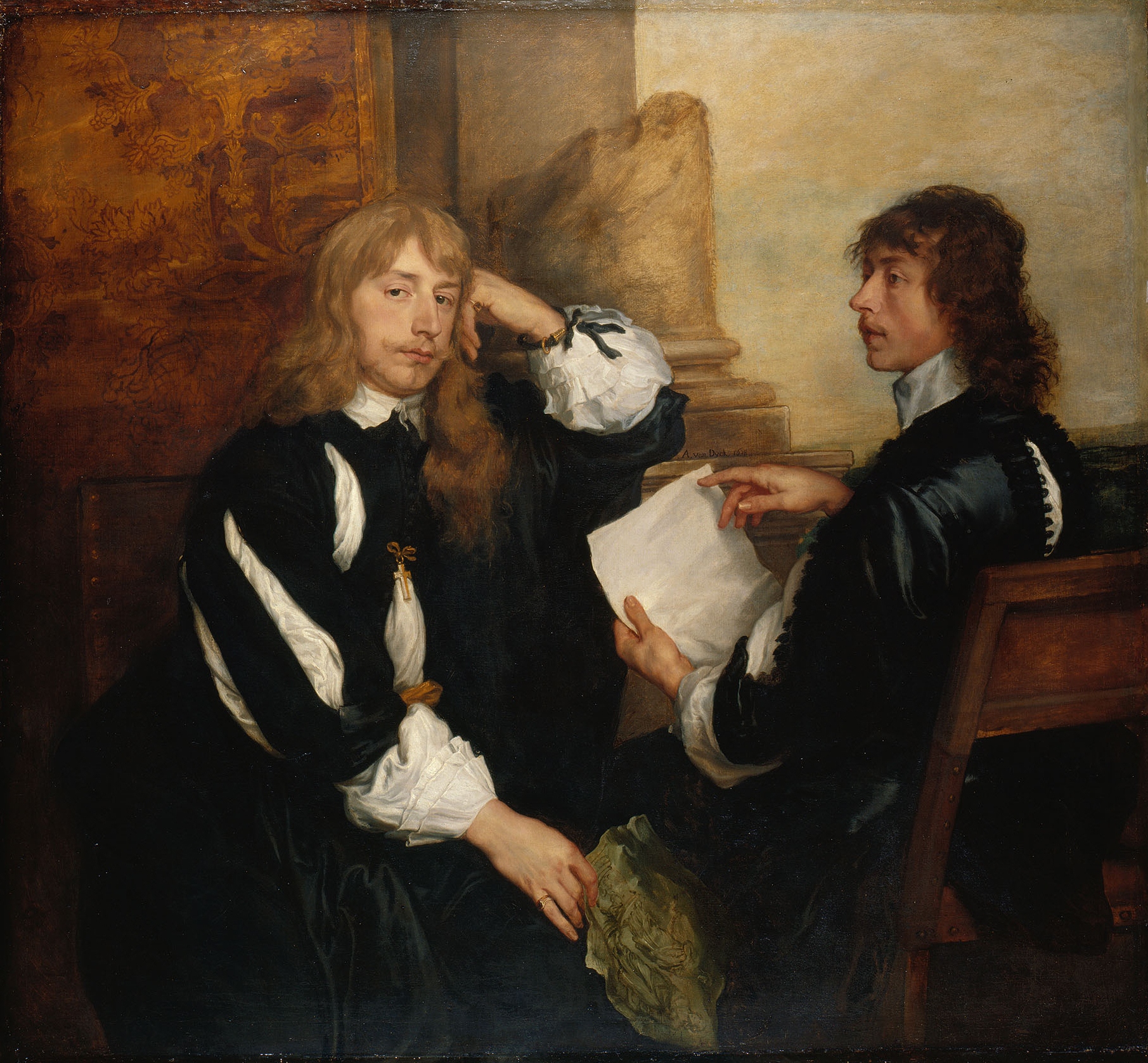
Thomas Killigrew and William, Lord Crofts (?) (1638) by Anthony van Dyck © Her Majesty Queen Elizabeth II 2016
On a more intimate scale the show compares one of van Dyck’s self portraits with Titian’s Portrait of Gerolamo (?) Barbarigo (about 1510), comparing the similar positioning of body (away from the watcher) with head turned back. Note the way van Dyck is turning his back and lowering his cloak, in a way which would be flirtatious in a female nude, but in this painting the gesture a) reveals his skill at catching the play of light on the folds of black silk of his shirt and b) the great big golden chain around his neck: I am a brilliant artist and I am rich.
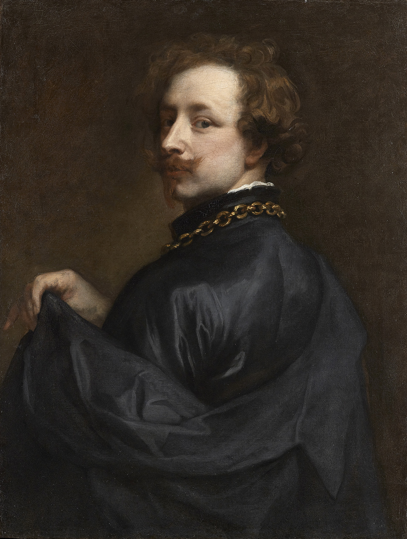
Self Portrait by Anthony van Dyck (about 1629) Lent Anonymously © Photo courtesy of the owner
Sir Joshua Reynolds (1723 to 1792)

Self Portrait by Sir Joshua Reynolds (about 1780) © Royal Academy of Arts, London; Photographer: John Hammond
Reynolds took himself immensely seriously (as you can tell from this self-portrait, posing with a bust supposedly by Michelangelo) making himself into the most successful portraitist of his day, dedicated to studying the European masters in order to raise the standards of British painting, helping to found and acting as first president of the Royal Academy. No surprise, then, that he amassed a large collection of European Old Masters to act as models and inspiration.
What comes over strongest in this section is the widespread misattribution of paintings in the past. The painting of Leda and the Swan which Reynolds thought was by Michelangelo is not now attributed to him at all. Reynolds thought a Bellini Agony in the Garden was by Mantegna; he thought van Dyck’s portrait of George Gage was a portrait of Rubens. Wrong in each case. Apparently, after his death, when his huge collection was assessed for sale, a contemporary described it as ‘swarming’ with fakes.
In a shock aside, the commentary also casually mentions that Reynolds routinely touched up paintings in his collection ‘to improve them’! That must be a risk very specifically related to falling into the hands of an artist who thinks he is qualified to ‘retouch’ a Renaissance masterpiece.
Reynolds didn’t collect many contemporaries but made an exception for his only equal, Thomas Gainsborough. A specific example shown here is the striking Girl with Pigs of 1782. Apparently, it’s a good example of the late trend of Gainsborough to paint landscapes with figures which Reynolds called his ‘fancy pictures’.
Fancy picture refers to a type of eighteenth century painting that depict scenes of everyday life but with elements of imagination, invention or storytelling. The name fancy pictures was given by Sir Joshua Reynolds to the supreme examples of the genre produced by Thomas Gainsborough in the decade before his death in 1788, particularly those that featured peasant or beggar children in particular. (‘Fancy picture’ on the Tate website)
So it’s the presence of the peasant girl, not the pigs, that makes it ‘fancy.
Sir Thomas Lawrence (1769 to 1830)
I was blown away by the big exhibition of Lawrence’s portraits at the National Portrait Gallery back in 2010. Now I learn that he was a compulsive collector, amassing some 5,000 works of which 4,300 were drawings. It helped a lot that the European art market was awash with art following the disruptions of the French Revolution and Napoleonic Wars. War > plunder. ‘Twas ever thus.
The exhibition contrasted an enormous Renaissance cartoon he owned with the composition of the three figures in his portrait of the Barings.

Sir Francis Baring, 1st Baronet, John Baring, and Charles Wallby Sir Thomas Lawrence (1806 to 1807) Private collection © Photo courtesy of the owner
To paraphrase the critic Richard Dorment, art historians love this triple portrait because it so cleverly incorporates references to group portraits by Titian and Reynolds. No doubt.
Going beyond the poses of the figures – which actually appeared a little clumsy to me – I was struck by the way classical pillars are included in this style of painting to add grandeur and authority – and to act as a doorway onto a distant landscape representing ‘the world’ which the rich people in the portrait are planning and controlling.
I much preferred his august and amused self-portrait, which I can’t find anywhere on Google images 😦
George Frederick Watts (1817 to 1904)
Watts is always touted as a giant of late Victorian painting but I think he’s by far the worst painter from the period. I once went on a pilgrimage to the Watts Gallery in Compton, a village near Guildford, and was desperately disappointed. His vaguely allegorical figures are mostly dark, brown and gloomy. He had a big collection and the show compares four tall slender paintings by the French painter Jean-Baptiste-Camille Corot depicting four stages of the day – Morning, Noon, Evening and Night – with Watt’s own Autumn from 1903.
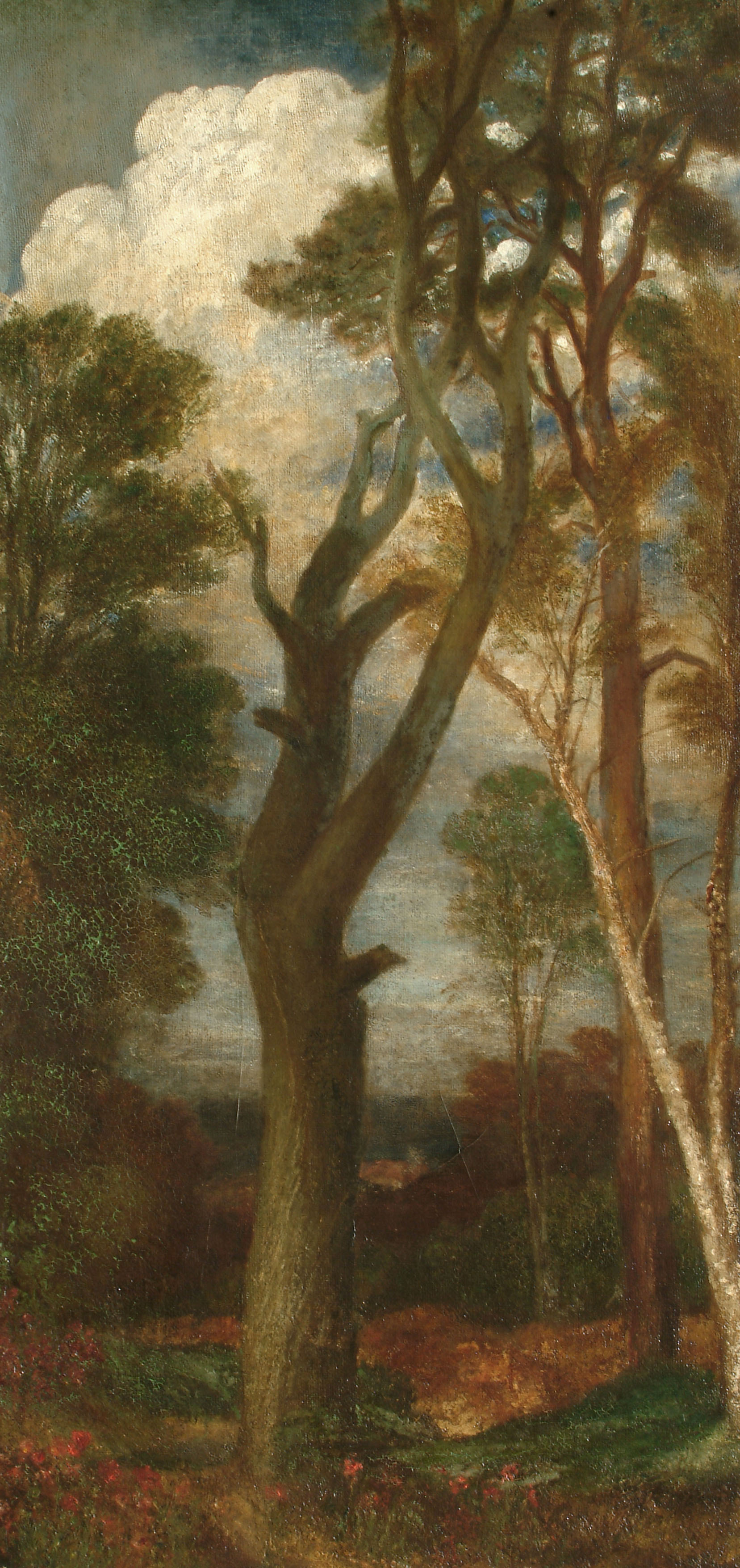
Autumn by George Frederic Watts (1901 to 1903) © Watts Gallery
Sir Frederic Leighton (1830 to 1896)
Leighton and Watts are made to share quite a small room, which features a small self portrait by Leighton, as well as some works from his collection. In my opinion, Leighton deserves a room to himself featuring more of his work. The National Gallery has plenty as does Tate. Maybe it was too big to squeeze in.
Edgar Degas (1834 to 1917)
Odd that the two Victorians were squeezed together in one pokey room, whereas the collection of French Impressionist Edgar Degas sprawls over two large rooms, the biggest space dedicated to one painter-collector.
Degas was notorious for his addiction to buying art. He beggared himself in a compulsive need to acquire works by his famous contemporaries, often snapping up Impressionist works as soon as they were finished. And so one room was devoted to the Impressionists in Degas’s collection, including the usual suspects such Sisley, Pissarro and Gauguin, as well as the enormous work The Execution of Emperor Maximilian by Édouard Manet (1867 to 1869) which, after it was (inexplicably) cut up into sections by Manet’s wife’s son, Degas tracked down to various Parisian art dealer’s premises and partly reassembled.

The Execution of Maximilian by Edouard Manet (1867 to 1868) © The National Gallery, London
In the second Degas room were mainly works by the two 19th century painters he reverenced, Delacroix for his use of colour, and Ingres for line. Apparently the young Degas met the old Ingres who told him, ‘Draw lines, young man, draw lines’. A man after my own heart.
In the welter of works in these two rooms the one that stood out for me was a portrait of Francis Poictevin by Jacques-Emile Blanche (1887). I very much like the solid line drawing, the draughtsmanship and the character which is captured of this aesthete and Symbolist writer.
Francis Poictevin by Jacques-Emile Blanche (1887) © Tate, London. Photo: The National Gallery, London
Henri Matisse (1869 to 1954)
Matisse also collected works by older masters and contemporaries. Dominating his room is the famous Combing the Hair (‘La Coiffure) by Degas, which Matisse owned for 16 years or so before selling it onto the National Gallery (which is why it’s here). La Coiffure manages to be a masterpiece of both line and colour, the dark outline of the figures masterfully suggesting their corporeality and motion, but the deliberate use of shades of red and orange creating a sumptuous and dynamic image.
Away from this super-dominating image were two smaller works, which I liked. A small Gauguin, Young Man with a Flower behind his Ear (1891).
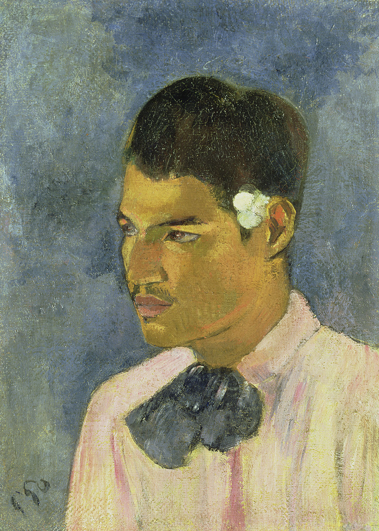
Young Man with a Flower behind his Ear by Paul Gauguin (1891) Property from a distinguished Private Collection, courtesy of Christie’s. Photo © Christie’s Images / Bridgeman Images
And it’s well known that Matisse and Picasso kept up a fierce rivalry throughout their lives. Thus the room contains a powerful Picasso, Portrait of Dora Maar from 1942.

Portrait of Dora Maar by Pablo Picasso (1942) Courtesy The Elkon Gallery, New York City © Succession Picasso/DACS 2016. Photo courtesy of the owner
Lucien Freud (1922 to 2011)
And so, feeling rather exhausted by this embarras de richesses, the visitor arrives at what the curators intend to be the first room and which contains half a dozen works owned by the émigré German painter, Lucien Freud. Pride of place is given to Italian Woman, or Woman with Yellow Sleeve (L’Italienne) by Jean-Baptiste-Camille Corot (about 1870), which I didn’t particularly like, finding the whole effect misjudged and drab.
And, although it’s on the main poster outside and all over the Tube, the gallery doesn’t provide for press use a copy of Freud’s self-portrait from 2002, striking, with the paint over his nose and veined hands looking as if it has bubbled with smallpox.
Having supped full of these horrors I strolled back through to the ‘end’ room to cleanse my palate with the smooth and lofty images of Sir Anthony van Dyke – though they themselves are not untainted by war and destruction. They just don’t know it yet…
Related links
- Painters’ Paintings: From Freud to Van Dyck continues at the National Gallery until 4 September 2016
- Daily Telegraph review by Mark Hudson
- Guardian review by Jonathan Jones
- Guardian review by Laura Cumming
