Angelica Kauffman @ the Royal Academy

Angelica Kauffman (1741 to 1807) was one of the most celebrated artists of the 18th century. She isn’t an obscure figure from the past who’s been dug up by revisionist feminist curators – she was genuinely a leading artistic and cultural figure of her time, one of the most successful portrait painters in Britain, celebrated here and across Europe, prints of whose works sold in the thousands, described by one of her contemporaries as ‘the most cultivated woman in Europe’.

Self-portrait with Bust of Minerva by Angelica Kauffman (1780 to 1781) Grisons Museum of Fine Arts, on deposit from the Gottfried Keller Foundation, Federal Office of Culture, Bern

This exhibition is not a blockbuster, it isn’t an encyclopedic overview of her career. Instead it’s staged in just three rooms in the Jillian and Arthur M. Sackler Wing of Galleries at the top of the Academy building, and contains just 30 or so works, including 20 or so paintings, 7 or 8 prints, some historical letters and her sales book.

It is, in other words, not an arduous ordeal of an exhibition like the vast ‘Entangled Pasts’ show in the main galleries downstairs – instead it is a light and airy overview, as calm and civilised, as interesting and undemanding as her Enlightenment-era portraits.

Potted biography

Angelica Kauffman was born in the Swiss town of Chur in 1741. She trained with her father, the Austrian painter Joseph Johann Kauffman, and was quickly recognised as a child prodigy.

The family moved between Austria, Switzerland and Italy and Kauffman trained as both a musician and as a painter. She eventually chose to pursue the latter career professionally, a decision she dramatised in one of her most famous paintings, ‘Self-portrait at the Crossroads between the Arts of Music and Painting’ (1794). (Note the three facial poses – half-turned, slightly turned, and profile – something we’ll come back to later.)

Self-portrait at the Crossroads between the Arts of Music and Painting by Angelica Kauffman (1794) National Trust Collections (Nostell Priory, The St. Oswald Collection) Photo: © National Trust Images/John Hammond

It was in Italy that she established a reputation as an artist and was elected a member of the Roman Accademia di San Luca at the age of just 23. Although, as a woman, Kauffman was not able to officially enrol at an art academy, she nevertheless studied the works of the Old Masters and classical sculpture at first hand.

In Italy, she mixed with neoclassical artists and scholars and also met many Britons undertaking the Grand Tour. Her popularity among the community of British visitors and expatriates encouraged her to move to London in 1766.

London

Soon after arriving in London, Kauffman established a close friendship with Joshua Reynolds, the leading portrait painted in Britain, a friendship commemorated in the portraits they painted of each other. Her friendship with Reynolds and other artists, along with Royal approval, helped to ensure that when the Royal Academy of Arts was established in December 1768, Kauffman was among the group of 36 founder members (along with one other woman, the painter Mary Moser).

The founding is commemorated in Johan Zoffany’s famous group portrait of the Royal Academy members, ‘The Academicians of the Royal Academy’ (1772). As women, Kauffman and Moser were not allowed into the Life Room, where the portrait is set (on account of the nude male models). Instead, their presence was signalled by their portraits on the wall on the right (Kauffman on the left, Moser on the right).

The Academicians of the Royal Academy by Johan Zoffany (1771 to 1772) © Royal Collection

For her part, Kauffman portrayed Reynolds in his studio seated at his easel with a desk full of books and a bust of Michelangelo, his artistic hero, by his side. Standing in front of Kauffman’s atmospheric portrait of Reynolds, and reflecting on his role on getting her elected a founder member, I couldn’t help remembering the old proverb, ‘It’s not what you know, it’s who you paint that counts’.

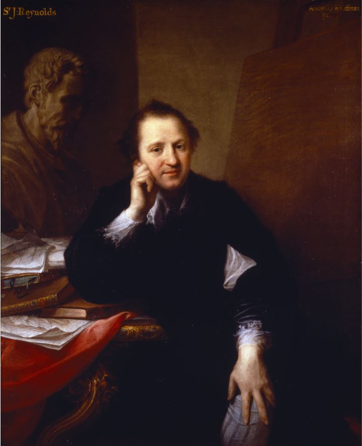
Portrait of Joshua Reynolds by Angelica Kauffman (1767) National Trust Collections, Saltram, The Morley Collection. Photo © National Trust Images/Rob Matheson

Kauffman became one of the most sought-after artists of the period. She was in great demand as a portraitist in London – as one contemporary commented, ‘the whole world is Angelica-mad.’ In London she enjoyed a prosperous career, earning significant fame, fortune and an influential circle of patrons, many of whom were women

Richard Samuel’s Muses

Her success was marked in many ways, not only by membership of the Academy but also inclusion in a painting of eminent women of the day by Richard Samuel.

‘Portraits in the Characters of the Muses in the Temple of Apollo’ by Richard Samuel (1778) National Portrait Gallery

The eminent women are, from left to right:

  • Elizabeth Carter, scholar and writer
  • Anna Letitia Barbauld, poet and writer
  • Angelica Kauffman (seated at the easel)
  • Elizabeth Ann Sheridan, singer and writer (in the middle, singing)
  • (sitting, left to right): Catharine Macaulay, historian and political polemicist
  • Elizabeth Montagu, writer and leader of the Bluestocking Society
  • Elizabeth Griffith, playwright and novelist
  • (standing at the back): Hannah More, religious writer
  • Charlotte Lennox, writer (holding the guitar)

Somerset House commission

In the late 1770s, at the time she was appearing in this painting, Kauffman was commissioned by the Royal Academy to paint a set of four ceiling paintings depicting the ‘Elements of Art’, to be displayed in the Council Room of New Somerset House which opened in 1780.

Again Reynolds was influential because she chose to depict the four stages of composition of a work of art, as described in Reynolds’ hugely influential ‘Discourses on Art’. The four oval paintings she produced represent the four stages of Invention, Composition, Design and Colour, as classically dressed female figures bearing a remarkable resemblance to herself. (The Royal Academy owns these works and all four of them are usually on display in the Front Hall of Burlington House.)

‘Design’ by Angelica Kauffman (1778 to 1780) © Royal Academy of Arts, London. Photo: John Hammond

The exhibition includes two of the four paintings (why only two if the RA owns all of them?) alongside four of her preparatory oil sketches (now owned by the V&A). ‘Design’, in particular, is a deeply impressive work in terms of composition, colour, shade, everything.

Rome

However, despite her success in London, in 1781 Kauffman decided to return to Rome. Returning to Italy at the height of her career, she established an international clientele and a famous salon which attracted celebrated visitors including Goethe and Canova. Her studio near the Spanish Steps became a hub for the cultural elite and her status and reputation continued to prosper. One contemporary described her as ‘the most cultivated woman in Europe.’ She continued to be popular among contemporary women who wanted themselves portrayed, such as:

Portrait of Emma, Lady Hamilton, as Muse of Comedy by Angelica Kauffman (1791) Private collection

Kauffman kept up her connections with her many British friends and patrons, continuing to exhibit at the Royal Academy, sending commissions back to the UK and painting British Grand Tourists visiting Rome. She continued to develop her practice as both a portraitist and a history painter in Rome, demonstrating ever greater confidence and skill in both genres.

Death

When Kauffman died in 1807, her grand funeral in Rome was arranged by the famous sculptor Antonio Canova and a bust of the artist, sculpted by her cousin Johann Peter Kauffmann, was subsequently placed in the Pantheon, beside that of Raphael. Recognition indeed. The funeral itself was described in a letter sent to the Royal Academicians in London and read out in their General Assembly and this, like several other letters from key moments in her career, is on display here.

Self portraits

Throughout her career Kauffman produced a series of self portraits, presenting herself in different costumes and guises. As a woman artist, portraying herself enabled Kauffman to define her identity and take control of how she was seen by others. Her many self portraits shape and cultivated her aesthetic identity and they are clearly among her best works. What comes over to the visitor is how consistent they are, the three or so really great portraits collected here are almost identical in shape and feature.

Self-portrait in all’antica Dress by Angelica Kauffman (1787) © Gallerie degli Uffizi, Florence

Portraits

Royalty

Kauffman painted some of the most influential figures of her day and who more influential than royalty? She started with a commission to paint Princess Augusta, sister of King George III, and subsequently painted Queen Charlotte herself in an allegorical attitude.

Her Majesty Queen Charlotte raising the Genius of the Fine Arts, published 19 May 1772 by Angelica Kauffman

As the curators explain:

Kauffman’s commissions from royal women were an important marker of her success in London and contributed to her inclusion as one of the founding members of the Royal Academy. In 1767 she painted Queen Charlotte with her eldest son, George (later King George IV), in the guise of the ‘Genius of the Fine Arts’. The painting is now lost but its appearance is recorded in this large
mezzotint. Prints after Kauffman’s paintings proved hugely popular and helped to make her famous throughout Europe.

Enlightenment men

There are a few lords and ladies on display but the best portraits on display here are not of royalty or aristocracy – in the true Enlightenment spirit, they are of men of intellect and character, namely Joshua Reynolds, actor David Garrick, architect and theatrical-set designer Michael Novosielski. All these portraits are astonishingly good, vividly conveying the sitter’s character. You feel Garrick is just about to tell a joke, you get a strong feel for Novosielski’s inventiveness and flair. Her portrait of classical scholar Johann Joachim Winckelmann, 1764, painted when she was just 22 years old, was celebrated for its exceptional likeness.

‘Portrait of Johann Joachim Winckelmann’ by Angelica Kauffman (1764) Kunsthaus Zurich © Kunsthaus Zurich

Classical history

And yet, despite her social and financial success as a portraitist, Kauffman identified herself primarily as a history painter, the genre Reynolds placed at the heart of the Royal Academy’s teaching. She exhibited history paintings each year at the Royal Academy’s influential annual exhibitions, displaying her erudition by depicting scenes from a wide range of mythological, literary and historical sources.

According to the curators, Kauffman reinvented the genre of history painting by focusing largely on female protagonists from classical history and mythology, as in:

Apparently, Kauffman regarded these works as the core of her achievement which is a shame because they’re generally the weakest. ‘The Death of Alcestis’ (1790) demonstrates why.

‘Death of Alcestis’ (1790), Angelica Kauffman. Voralberg Museum, Bregenz. Photo: Markus Tretter

Three things:

  1. the poses of the characters are absurdly histrionic, posed and theatrical – I imagine they conformed to theatrical conventions of the day which is why the ‘serious’ plays from this period haven’t survived
  2. as a result, the bodies are bent and contorted into uncomfortable and ungainly positions
  3. somehow, as a result of the first two, the faces are universally unconvincing – they are meant to be conveying extreme emotion and feeling but the faces themselves are curiously void and blank

Now the colour of the cloaks and fabrics and the realistic depiction of folds and shadows, are marvellous. But everything else is too staged and contrived for modern taste.

Bible history

Something else noticeable in the historical paintings is the ramrod straight Roman noses. Look at the woman third from the right in Alcestis. This is particularly obvious in the one Biblical painting in the exhibition, ‘Christ and the Samaritan Woman’, (1796). The curators tells us that this was one of two canvases carried in triumph at the artist’s funeral procession, organised by the sculptor, and her close friend, Antonio Canova, along with other contemporary artists and scholars. Yes, yes, very pious and impressive but…look at Jesus’s nose! The clothes, the fabrics, the colours, the folds, the copper basin all are done very well but…that nose!

Christ and the Samaritan Woman by Angelica Kauffman (1796) Bayerische Staatsgemäldesammlungen Munich – Neue Pinakothek

Alerted to the nose issue, I realised that The Roman Nose is a sort of symbol throughout her works of History and Seriousness. It features in all the history paintings (examine the noses of Odysseus and Cleopatra) and in the famous Crossroads painting, where the figure of Art has another razor-straight, Roman schnozz.

By contrast, compare the noses of the portraits – the noses of, say Reynolds or Novosielski. These are much more realistic i.e. generally soft and nobbly. It’s one of the reasons the portraits are warm, because they have realistic noses. And then I realised the straight noses are so noticeable because the History figures are often portrayed in profile.

In fact I realised there’s a spectrum at work here: at one extreme are the ruler-straight Roman noses of the Stern and Noble History Paintings. In the middle are the realistic noses of accurate portraits such as Reynolds, Garrick and Winckelman. And at the other end of the spectrum, she has a kind of bland and diffuse style where the faces are generic late-18th century, lacking the specificity of the best portraits.

And then I began to obsess about the eyes. In the best portraits and self portraits the eyes have colour and character. In her more perfunctory work, they eyes are just black, which tends to give the faces a generic, almost cartoon quality.

Portraits of Domenica Morghen and Maddalena Volpato as Muses of Tragedy and Comedy by Angelica Kauffman (1791) National Museum in Warsaw MNW. Photo © Collection of National Museum in Warsaw. Photo: Piotr Ligier

Although it’s not a blockbuster in size or ambition, nonetheless this is an interesting exhibition because the curators have assembled a various enough selection to allow to get to know Kauffman’s work, to see her addressing different genres, and to start to get a sense of her strong points and weak points.

Bad

I shouldn’t end before saying she could be actively bad. I disliked the contorted bodies and bad faces of the history paintings but could see their purpose and was impressed by the brightly coloured fabrics in many of them. But two or three paintings on display here are just bad: in ‘Penelope at her Loom’ (admittedly an early work) the folds of curtain on the left and the golden fabric Penelope’s wearing are tremendous – but look at the face! Disaster!

‘Penelope at her Loom’ by Angelica Kauffman (1764), Brighton & Hove Museums

Arguably, Poor Maria (1777) is even worse, one of her typical histrionic poses, a badly done face, but look at the dog in this one, the head far too small for the body.

Nathaniel Dance

The friend I went with really disliked the history paintings, grudgingly admired some the self portraits and the portraits of eminent men – but insisted that the only work she really liked in the whole show was in fact by someone else altogether, a tiny watercolour portrait of Kauffman by Nathaniel Dance. Still very much in the style of its day, this tiny work is a masterpiece of minute detail and, in its way, contains more feeling and precision than anything by Kauffman. A reproduction doesn’t do its shimmering, intricate detail justice.

‘Portrait of Angelica Kauffmann’ by Nathaniel Dance (1764 to 1766) National Galleries of Scotland

To my surprise, and not mentioned in the RA exhibition, the website of the National Galleries of Scotland (who own the painting) tells us that Dance spent a great deal of time in Italy, developing his inventive approach to drawing and painting and that, while in Rome in the 1760s, he had a love affair with fellow painter, Angelica Kauffman. Maybe that explains the extraordinary care and attention to detail which characterises this miniature masterpiece.

Invisible men

This raises a small but pertinent point. Only in the label to the case displaying the register of all her paintings kept by her second husband, Antonio Zucchi, do we learn that she married at all. With this sole exception, the exhibition very studiedly excludes all reference to Kauffman’s husbands, lovers, or children, if there were any. In other words if focuses entirely on her professional and artistic achievement, with no mention of her role as wife or mother or whatever. Which I admired.

Quality of reproductions

And just a note that all the images in this review are poor quality, even the ones supplied by the Royal Academy press office. The portrait of Reynolds and the Nathaniel Dance image are particularly disappointing and don’t convey at all the colour and liveliness of the originals. Without exception all the works I’ve included are much, much more vibrant, gripping and alive in the flesh. That’s why I choose to live in London, despite the expense, pollution and inconveniences – because with very little effort and relatively minimum expense, I get to see beautiful and exquisite, exciting and breath-taking art, on a weekly basis. And all of these art works, all of them, are infinitely better seen in the flesh.


Related links

Related reviews

Women’s art

Women’s art books

Sculpture and Other Matters by Peter Blake @ Waddington Custot

I came out the back end of the Royal Academy having seen two disappointing but mercifully small exhibitions and found myself in Cork Street, home of some of London’s most famous commercial art galleries. Ordinarily I don’t have the time or the headspace after crawling round a blockbuster like the current Entangled Pasts, but for once I did and decided to have a stroll and an explore.

Almost immediately I came across a display that’s more fun, more diverting and entertaining than anything at the Academy, ‘Peter Blake: Sculpture and Other Matters’ being held at the Waddington Custot Gallery.

Installation view of ‘Sculpture and Other Matters’ by Peter Blake at Waddington Custot

Blake is, of course, one of the famous pioneers of Pop Art in Britain, a movement which began in the 1950s and peaked in the 1960s. Apparently, it’s the first exhibition in twenty years to be dedicated to Peter Blake’s sculpture, less well known than his paintings. But it’s a lot of fun and there’s lots of them here – in fact there are no fewer than 100 works on display, covering the entire period of his career, from the 1950s right up to the present day.

Surprisingly, some of the most recent works are collages which throw back 60 odd years to his beginnings.

‘Big Little Books: Surrounded’ by Peter Blake (2023) Courtesy the artist and Waddington Custot

1959 This sculpture, an old RAF locker covered in glamorous pin-up images, was first shown at the Institute of Contemporary Arts (ICA), London in 1960 and is one of the earliest expressions of British ‘Pop’ culture.

It strikes me as marking two aspects of his aesthetic: 1) a loving fondness for found objects and the ephemera of pop culture and what was then mass media (newspapers and magazines) and 2) overlapping this, something to do with fandom, with the hypnotic appeal of being a fan of movie stars or pop bands and collecting their images and plastering them all over your bedroom wall as teenagers and students do, the strangeness, the obsessiveness and the deliciousness of being in love with glamorous stars.

‘Locker’ by Peter Blake (1959) Courtesy the artist and Waddington Custot

Another ‘investigation of’ or maybe, ‘infatuation with’ fandom. is the extraordinary wall-sized shrine to Elvis.

Installation view of ‘Sculpture and Other Matters by Peter Blake at Waddington Custot showing ‘Shrine for Elvis (Black and White)’ (2003) Photo by the author

Elvis fandom is a kind of black hole down which countless people have fallen into the sequined horror of Las Vegas soul death. Recently I was reading about and rewatching Elvis’s very first recordings and very first TV shows and what’s remarkable is how everything which made him so gauche and innocent and absolute dynamite in that first year or two was completely and utterly drained out of him until he had been replicated as a plastic simulacrum of himself in a decade of terrible movies. And yet the worse he got, the more besotted his fans became and still, to this day, lay flowers and wreaths outside Graceland.

While the Royal Academy’s Entangled Pasts show lectures its visitors about something they already know very well about (the Great Public Issue of the slave trade), art like this, which trembles on the brink of being no art at all, at the same time gestures towards something more strange and unexplored – the obstinate shallowness of human emotion, the ubiquity of bad taste, the universe of pop and movie obsessions which colours all of our lives. How so much of what we like to think of as our fine personalities is actually made of tacky pop culture. (‘Oh have you seen Andrew Scott in the new Ripley dramatisation on Netflix? Oh, he makes such a convincing psychopath!’)

Half our minds are made of junk, half people’s daily conversations about last night’s telly or movies are glamour-stricken kitsch. Oh the Oscars! Oh the Mercury awards! Oh Love island! Oh The Apprentice! Blake takes it out of the cellar of our minds and puts it on plain view for us to be appalled by.

Early 1960s The show includes painted wooden constructions from the early 1960s which nod to Blake’s earlier years studying at Gravesend, where he was taught woodwork.

1965 The iconic piece ‘Tarzan Box – “Big Iron Bird, She Come”’ (1965) demonstrates Blake’s early move towards assemblage and features some of the storybook characters which would recur in Blake’s work in the coming decades.

1980s The ‘Incidents from a sculpture park’ series, assemblages of found objects.

2003 The ‘Still Life’ series of 2003, homages are made to fellow artists including Claude Monet, Giorgio Morandi and Joseph Cornell, who take the place of pop icons and movie stars as the subjects of Blake’s fandom.

In a later series dedicated to artist and cartoonist Saul Steinberg, Blake assembles found items in compositions which directly reference the other artist’s sculptures of the 1970s and 1980s, in which he whittled and painted similar objects in wood.

‘A Parade for Saul Steinberg’ by Peter Blake (2007 to 2012) Courtesy the artist and Waddington Custot

2003 ‘In the Cubist’s Kitchen’ (2003) features a tobacco pipe while ‘Then & Now, For Damien’ (2003) gathers miniature bottles along a shelf, a reference both to Damien Hirst’s (now lapsed) heavy drinking and to Leonardo’s ‘Last Supper’ of 1498.

2008 to 2010 I really liked this ‘Museum of Black and White’, what a cornucopia of incunabula.

Installation view of ‘Sculpture and Other Matters by Peter Blake at Waddington Custot showing ‘Museum of Black and White 12: In Homage to Mark Dion’ (2008-2010). Photo by the author

Nearby were a number of alphabets with the letters represented by objects found in junk and antique shops, chosen for their poppy kitschness.

Installation view of ‘Sculpture and Other Matters by Peter Blake at Waddington Custot showing ‘Alphabet small’ (top) and ‘Alphabet large’ (bottom), both 2007 to 2012. Photo by the author

2012 In the ‘Found Sculpture’ series of conceptual works, pebbles, rocks and other found objects are elevated to fine art status, each placed on a plinth of oak and marble.

This work below is from a series where he uses stones which have ‘eyes’ and other facial features, stuck atop bits of wood or bric-a-brac, to create abstract human figures. It’s from a series of six or so which are all linked because in the foreground on the right is an utterly naturalistic little model of a boy sitting in an armchair (in each instance of the series he’s in a different type of chair but it’s always the same model).

Making art out of found materials goes back to the Dadaists and Duchamps. What makes it Pop or Blake is the inclusion of the pop-kitsch-junkshop element of the boy which turns it from sci fi weirdness into pipe smoking charm.

Installation view of ‘Sculpture and Other Matters’ by Peter Blake at Waddington Custot showing ‘people’ made out of found material and stones with ‘eyes’. Photo by the author

2012 The ‘Generals’ series features figures of dark-painted wood pinned with medals and each with a bowling ball for a head. Blake’s been fascinated by the artistic charge of medals, and of badges more generally, for over half a century and these works show that these small shiny pins and buttons retain a weird power. On one level these mysterious figures combine are fairly obvious satire on senior soldiers and militarism, the kind of naive anti-militarism which drove the 1969 musical ‘Oh What A Lovely War!’  But these figures combine that with something else entirely, something voodoo to do with science fiction and one-eyed robots…

Installation view of ‘Sculpture and Other Matters’ by Peter Blake at Waddington Custot showing five pieces from the ‘Generals’ series. Photo by the author

2010: Sea Battles One of the rooms is dominated by a series of big and wonderfully detailed models of old sailing ships. These chime strangely with the much bigger collection of model ships by Hew Locke, each suspended from the ceiling, currently to be seen in the Academy’s Entangled Pasts show. The difference is that whereas Locke is trying to make us feel bad (about slavery, pollution, globalisation, capitalism and the refugee crisis) Blake is aiming to make us smile. On the day I read about the Israeli army not just killing but blowing to pieces seven unarmed food aid workers in Gaza, I know which I prefer.

Installation view of ‘Sculpture and Other Matters by Peter Blake at Waddington Custot showing some of the ‘Sea Battle’ series. Photo by the author

Anyway, how do they make you smile? Because when you go up close you realise that these beautiful models are crewed by kitsch plastic models, mostly of Disney princesses (on the left) who appear to be coming under attack from models of soldiers (on the right). Hard not to be charmed and delighted.

Installation view of ‘Sculpture and Other Matters’ by Peter Blake at Waddington Custot, close-up of ‘Sea Battle: Disney Princesses’ (2010) Photo by the author

General themes

It’s amazing how impactful it can be just to put two found objects next to each other, on a plinth or a bench or a stand, and watch them reverberate. Not only visually, as objects, but semantically, as vessels of meaning, rich in cultural overtones.

The cult author the Comte de Lautréamont in his 1869 book ‘Les Chants de Maldoror’ wrote about ‘the chance meeting on a dissecting table of a sewing machine and an umbrella’, a sentence which was taken up and trumpeted by the Surrealists half a century later as expressing their aesthetic.

But Blake’s exuberant juxtapositions, despite yoking together all manner of objects, natural or man-made, are not, in fact, surreal. They don’t aim to disturb or momentarily open a doorway to the unconscious as surrealism did. They aim to entertain, amuse, and create good-humoured art objects, constructs, assemblies – strange but not that strange.

All of them feel very English and unthreatening, cosy and comfy, like the coloured pencils and shape tracer in this assembly which made me think of school, and not just school but junior school, of being 9 or 10 and happy.

Installation view of ‘Sculpture and Other Matters’ by Peter Blake at Waddington Custot showing ‘Still Life: The American Stamp Pad (in homage to Saul Steinberg)’ (2010) Photo by the author

They are playful in the literal sense of including toys and kids’ models, plastic figures for fairly small children or, as in the collages, Mickey Mouse images appropriate to toddlers. No images of Hiroshima or cut-up bodies or sex shock bondage of the kind favoured by the Surrealists or the psycho end of 60s Pop (I’m thinking, as I often do, of J.G. Ballard and his car crash exhibition at the ICA).

Not only does a lot of this stuff come from junk shops but the works feel as if they exist in a kind of mental junk shop – they invoke and recreate a wonderful old rag-and-bone shop of the kind that it’s hard to find nowadays, packed with all kinds of wonderful old junk, forgotten toys and curiosities – and then situate all these collocations and juxtapositions in your imagination.

Fundamentally, Blake deals in nostalgia but nostalgia with a kink, nostalgia for a kind of innocent strangeness, maybe the uncorrupted strangeness of the true child’s vision, which finds everything about the adult world bizarre and inexplicable.

Installation view of ‘Sculpture and Other Matters’ by Peter Blake at Waddington Custot showing ‘Family’ (2003) Photo by the author

The curators claim that the exhibition ‘transforms the gallery into an interactive, theatrical space which reflects the imaginative potential of the sculpture on show’ and for once this is true. It’s a fabulous exhibition. It really feels like you’re entering and strolling round another dimension. It feels like a wonderland, a fantasy world of oddities and strangenesses, some more obviously funny than others, but all underpinned by a fundamental and very winning sense of humour.

Because here is Snow White calling a meeting of all the dwarfs, not just the seven ones mentioned in the fairy tales and the Disney movie, no, the entire platoon of dwarves has been assembled and Snow White is about to make a Very Important Announcement. What is it? Imagine one. Make up one yourself. What message would you have for these plastic dwarves?

Installation view of ‘Sculpture and Other Matters’ by Peter Blake at Waddington Custot showing ‘Swiss chalet: A Lone Bagpiper Confronts Snow White and her 30 Dwarves’ (2012) Photo by the author


Related links

More art reviews

Relating to animals @ the British Museum

Room 24

Room 24 at the British Museum is a large open gallery at the junction between the huge covered courtyard and the back of the museum. It’s a kind of portmanteau room titled ‘Living and Dying’, bringing together displays from around the world to consider how these fundamental aspects of human existence vary from place to place, and people to people. So, for example, this room has a big display of Australian Aboriginal art (which I’ve described in another blog post) and another display about Inuit peoples.

Relatively new is the display about ‘Relating to animals’ which looks at some aspects of life among people in Amazonia. I’m going to more or less quote the wall labels along with my own photos of the artefacts.

Amazonian apron from Peru, 1920s, made from feathers and beetle tissue. © The Trustees of the British Museum. Photo by the author

Amazonia

Amazonia spans nine countries in South America and is made up of tropical rainforests and savannas. This display shows contemporary and traditional artworks from across the region.

For many Amazonian communities, animals and people are fundamentally interconnected with their environment. This relationship is reflected in microcosms such as the veins in leaves, and in macrocosms, such as the constellations of the stars.

The artefacts on display reveal different ideas about the world and ways of living with the environment that have endured colonisation. These concepts today are communicated through a wide range of art forms.

Indigenous art has traditionally been associated with local craft and folklore, but many Amazonian artists also participate in global circles. In this way the indigenous knowledge expressed in their art works reaches beyond local communities to an international audience.

The display arises from work by the British Museum’s Santo Domingo Centre which builds relationships with heritage-related projects in Latin America.

Cubeo barkcloth

Costumes like these were worn by Cubeo people from the Tukano region for the onye or ‘weeping’ dance. After the death of a community member these masks were worn to disguise the dancer as animals and insects or eggs and larvae. The ceremony marks the transition between the worlds of the living and the dead as well as the importance of rebirth and regeneration. These dances are no longer practiced anywhere in Amazonia.

Cubeo barkcloth costumes (1960s, 1970s) © The Trustees of the British Museum. Photo by the author

The power of feathers

Feathers can be used to enable people with special ritual and intellectual knowledge to transform into birds. These clothes might have been worn for ceremonies celebrating this transformation.

According to traditional knowledge there are many ways in which people can acquire the ability to move through space and time and so heal and shape their community’s experience of the world. One way of doing this is to transform into a bird and transition between spatial dimensions. This usually involves dream states and powerful plants.

Apron

An apron from Jivaro, Ecuador, made in the 1960s from feathers, bark and bird tissue.

Apron from Jivaro, Ecuador, 1960s © The Trustees of the British Museum. Photo by the author

Head dress

Head dress from Brazil, made in the 1860s from feathers and plant fibres.

Head dress from Brazil, 1860s © The Trustees of the British Museum. Photo by the author

Back ornament

A back ornament from Jivaro, Ecuador, made in the 1960s from feathers, seeds, bird and beetle tissue.

Back ornament from Jivaro, Ecuador, 1960s © The Trustees of the British Museum. Photo by the author

Feather hammock

Europeans settled in many parts of Amazonia from the 1670s onwards. An increase in demand for feather-work led Amazonian people to invent new techniques and styles of production to cater for foreign tastes. For example, the natural colour of the feathers was modified and the design began to incorporate European-style floral motifs and coats of arms. This hammock was made specifically for a foreign collector.

Feather hammock (1910s) Unknown artist, Iquitos, Peru © The Trustees of the British Museum. Photo by the author

Contemporary Amazonian art: A story of the fish people

According to the oral histories of the Tukano people from northern Amazonia, humans originated from a journey on the serpent canoe of transformation. These narratives describe worlds in which people and animals can transform into each other and where time can alter dramatically.

This set of 12 watercolours are by Tukano Desano artist Feliciano Lana and they depict just such an origin story. Unlike most stories Lana’s narrative does not take place at on particular time – the events happen in both the present and the past. This temporal disorder is echoed in the story where time is experienced in radically different ways in the two worlds which Lana describes.

Installation view of ‘A story of the fish people’ by Feliciano Lana (2019) © The Trustees of the British Museum. Photo by the author

Here are two episodes in close-up, numbers 5 and 8. In number 5, at the top, shows the protagonist of the story, a fisherman, locked in a dark room and ordered to climb on top of a giant fish before many tucuxis or dwarves come in and tell him to escape.

Installation view of ‘A story of the fish people’ by Feliciano Lana (2019) showing numbers 5 and 8 © The Trustees of the British Museum. Photo by the author

In number 8, at the bottom, a woman has told the fisherman to collect water from the river, at a specific place marked by a big stick. But when he gets there he discovers the stick is actually a big snake but he is the only one who can see it. When he returned empty handed the woman sent him back. This time he was able to climb on the back of the snake and so collect the water.

Summary

Room 24 is big, busy and confusing. In the centre are crowds walking from the main courtyard towards the back of the building, as well as all those taking the steps down to, or back up from, the Africa rooms downstairs. So it’s easy to blink and miss relatively small and niche displays like this. So, here it is for your enjoyment.


Related links

Related reviews

Rediscovering gems @ the British Museum

Room 3

As you enter the main entrance of the British Museum it’s easy, in the hurly burly of the crowd, to walk right past room 3, immediately on your right. This small, dark, wood-lined room features small but beautifully formed and always FREE exhibitions. My favourite was the one about mummified crocodiles from ancient Egypt.

The story of the stolen gems

Room 3 is currently hosting a small exhibition titled ‘Rediscovering gems.’ This needs a bit of background:

You may have heard about the scandal caused by the discovery that many items had been stolen from the British Museum’s collection. In August 2023 the Museum announced that a number of items had been stolen, were missing or damaged. One report estimates that over 1,500 objects have gone missing.

The Museum soon realised that a major target of the thefts was its collection of engraved gems, including the Townley and Blacas collections (see details below). Such was the scandal that it led, regrettably to the resignation of the Museum’s Director, Hartwig Fischer, who did the decent (and wise) thing and jumped before he was pushed.

Details of stolen gems

Such is the scope of the theft issue that the Museum has a web page devoted to it, Recovery of missing items. From this we learn that the vast majority of the missing items are from the Department of Greece and Rome and mainly fall into two categories: gems and jewellery.

Ancient glass cameo with a Nereid riding a sea horse, a cupid in the waves. Roman, late 1st century BC to 1st century AD © The Trustees of the British Museum

Tell me about these gems

Gems, cameos or intaglios are small objects, often set in rings or other settings, or left unmounted and unfinished. They may be made of semi-precious stone – for example, sard, sardonyx, amethyst – or glass. They may be cast from a mould or engraved by hand.

The majority of these antique gems are from the Hellenistic and Roman world, but some may were made in modern times in imitation of ancient gems. They may feature images of famous individuals from the Classical past, or mythological scenes, animals or objects.

The gems are of varied quality. Some are fragmentary and damaged.

Onyx cameo depicting a nude woman (perhaps Venus) before the statue of Priapus. Roman, 1st century AD. Collection: Charles Townley © The Trustees of the British Museum

Recovered gems

A dedicated team at the Museum is working with the Metropolitan Police and with an international group of experts in gems, collection history and art theft, to recover the missing items. So far the Museum has recovered 356 items and has identified more than 300 others.

One of the challenges with retrieving the missing items is that many of them had never been fully documented. So the Museum has embarked on an ambitious five-year plan to catalogue and photograph the entire gem collection and to make this information freely available online for everyone. Every cloud has a silver lining.

It is 20 or so of these recovered gems which have been put on display in room 3, providing the curators with an opportunity to go to town and really explain this particular type of art form. Thus this small display manages to describe different types of gems, made in different eras, from different materials, as well as explaining the role played by early modern collectors (in the 1700s) in saving and categorising them.

Ancient intaglio representing the head of Omphale, wearing the lion-skin of her lover Herakles. Roman, late 1st century BC to 1st century AD © The Trustees of the British Museum

Rediscovering gems: the exhibition

So, now to the display itself. Room 3 is a relatively small gallery so this is a relatively small display but, then again, these are tiny objects, very tiny, generally the size of one or two pound coin. It’s surprising how much information and beauty you can pack into one room.

Note: if you go to the Museum’s own large print guide (link below) you’ll see that I’ve relied very heavily on the curators’ explanatory text, albeit reordered and partly rewritten to make it flow better. Hopefully.

Tell me more about gems

Gems were the picture book of the ancient Mediterranean world. Carved from semi-precious stones or cast from glass, they depicted famous individuals, gods and goddesses, animals or objects and scenes from myth or daily life.

Used as seals, worn as jewellery, or collected as objects of beauty in their own right, these miniature designs required phenomenal skill to carve and became sought-after luxury objects and status symbols.

Ancient glass intaglio (waster) with Jupiter as an eagle abducting Ganymede. Roman, late 1st century BC to 1st century AD © The Trustees of the British Museum

Classical gems have been highly prized by collectors from the Renaissance onwards, but never more so than in 18th-century Europe. Cabinets of gems took up little room but held large collections of beautiful miniature artworks.

Gems tells us about the ancient world but gem collections offer deep insights into the personal tastes and aesthetic preferences of the people who assembled them.

Charles Townley, Enlightenment collector

The 18th century was a highpoint for interest in engraved gems. Recognized as key pieces of art and culture, they were collected and studied by royals, aristocrats, artists, and antiquarians such as Charles Townley (1737 to 1805).

A wealthy English country gentleman and insatiable collector of antiquities, Townley travelled to Italy on the Grand Tour and acquired important Roman marble statues, and many other ancient objects. The smallest pieces of classical art that caught his eye were engraved gems.

Townley’s wooden cabinets, with their distinctive shallow drawers, were specially designed to hold some of his glass gems and their impressions, made from ‘red sulphur’. Most of the drawers are labelled with strips of paper bearing notes in his handwriting, revealing his enthusiasm and scholarship.

One of Charles Townley’s cabinets containing 656 glass gems © The Trustees of the British Museum. Photo by the author

Townley became a trustee of the British Museum in 1791, and his collection of gems was purchased together with drawings, bronzes, and coins by the Museum in 1814.

Collections of gem impressions

Impressions of gems in wax, plaster and other materials had been known since the Renaissance. In the 18th and early 19th centuries, collections of impressions were commercially produced for connoisseurs and scholars, or as souvenirs of the ‘Grand Tour’. The Roman workshop of Tommaso Cades specialised in making plaster impressions of gems glued in boxes resembling books.

A gem box containing a set of plaster casts of engraved gems, made by Tommaso Cades. It is one of twelve boxes in book form. The book opens each side to reveal 2 trays of 25 casts so that there are 50 casts per volume, 600 casts in all. The casts are copies of gems arranged by date, ancient to modern, and subject matter © The Trustees of the British Museum

The availability of reproductions of gems from the ancient Mediterranean world encouraged generations of engravers to copy famous examples and to create new intaglios in the style of the best ancient artists.

Plaster casts and magnifying glasses

Engraved gems are small. Often set in rings, they need to be seen close-up and with ample light (which is why each display case is accompanied by a magnifying glass (attacked by a wire to the wall so they can’t be pinched; once bitten, twice shy).

A gem impression in plaster is generally more easily read than the original stone even though it is the same size. Townley had access to magnifying glasses but he also employed artists to draw his gems. The sharp eyes and the interpretations of these talented professionals helped to make fine details visible.

Precious fragments

Many cameos appear to be the work of the best artists, which is understandable since the materials employed were intrinsically valuable. The style of cutting closely matches that of major sculpture in stone and metal. In these miniature works we are even able to detect references to more familiar monumental works.

Fragments became particularly coveted among 18th-century collectors because their damaged state was seen as proof of their antiquity. They were mounted in gold to make them wearable again.

Fragment of a banded onyx cameo engraved with the head of a woman in profile. Rome 1st century BC to 1st century AD. Set in an 18th century gold ring by Charles Townley. Collection: Charles Townley © The Trustees of the British Museum

Art in miniature

Cameos, gems where the design has been carved in relief, were probably an invention of the royal Hellenistic court in Alexandria, Egypt. The most spectacular use layered stones (sardonyx). They were particularly popular from the 1st century BC onwards for secular and religious subjects, and they were worn as jewellery.

Cameos were also used for imperial portraiture and propaganda. These are often unusually large, such as the Blacas Cameo.

The Blacas Cameo

This spectacular ancient Roman gem is made from a layered sardonyx and shows the emperor Augustus (ruled 27 BC to AD 14). Augustus wears a headband, which is embellished with a fine assemblage of small cameos and precious stones, probably medieval additions.

The Blacas Cameo is named after a collector of ancient objects, Pierre Louis Jean Casimir, Duc de Blacas d’Aulps (1771 to 1839), who greatly increased the size and scope of his father’s collection. In 1866, his entire collection, 951 pieces in all, was purchased by the British Museum.

The so-called Blacas Cameo: sardonyx cameo, engraved with a portrait of Augustus wearing a headband embellished with small cameos and precious stones, likely a medieval addition. Roman AD 14 to 20. Collection Duc de Blacas d’Aulps © The Trustees of the British Museum

Renaissance and neoclassical engravers

From the Renaissance (about 1400 to 1600) onwards ancient gems became popular, imitated and collected. Set in fabulous mounts, they were widely reproduced and sometimes faked. Gem engravers used the visual language of the classical world to create new versions of popular subjects, such as the Hellenistic rulers of ancient Egypt depicted on this cameo.

These later gems were often difficult to distinguish from their ancient originals. Correctly identifying them can still be contentious, often requiring a laborious process of stylistic comparison and researching collection history.

Renaissance cameo depicting Hellenistic rulers of Egypt, set in a Renaissance enamelled mount. Late 16th to early 17th century. Collection: Dud de Blacas d’Aulps © The Trustees of the British Museum

Enter Michelangelo

The first publication devoted to describing precious gems was a set of engravings by Enea Vico (1523 to 1567) of the collection belonging to Cardinal Grimani (1461 to 1523). It has been claimed that the male pose in Grimani’s cameo of ‘Augustus on the Capricorn’ inspired the pose of Michelangelo Buonarroti’s figure of Adam in the Sistine Chapel, which is why the display shows them side by side.

Installation view of ‘Recovering gems’ at the British Museum showing (above) a cameo representing Augustus on the Capricorn, his chosen star sign (about 27 BC to AD 14) and (below) ‘The Creation of Adam’ from the Sistine Chapel ceiling (1508 to 1512) by Michelangelo. Photo by the author

Glass gems

Gems were usually engraved in semi-precious stones, such as colourful quartzes. In the later 1st century BC Roman workshops started manufacturing glass gems that imitated hardstone – a difficult process. Glass was pressed into a mould and the excess removed. Often small air holes remain visible in the surface of the glass. Many were unfinished or never set in a mount, such as the cameo depicting the three graces. Slightly different techniques suggest that there were several distinct workshops in antiquity.

Ancient glass cameo with the Three Graces. Roman, late 1st century BC to 1st century AD. Collection: Felix Slade © The Trustees of the British Museum

Nineteenth century fakes

Modern glass reproductions were made in workshops in the 18th and 19th centuries, providing sets and selections of impressions of ancient and neoclassical gems in a variety of materials, including glass. Sometimes these imitations were fraudulently sold as ancient antiques.

Fakes flooded the market in the 19th century, finding their way into many collections. The ubiquity of fakes and the difficulty of establishing provenance explains why generations of scholars shunned this class of object. Today, scientific analysis can successfully detect and date fakes by identifying additives in the glass. Hopefully…

Modern fake intaglio with Venus on two sea-horses. 18th to 19th century. Collection: Felix Slade © The Trustees of the British Museum

Wasters

Sometimes gems were damaged in the production process, especially when made in glass, which was tricky to handle. These were discarded which we know because they were never finished or set. However, surprisingly many of these abandoned pieces survive. The technical term for them is ‘wasters’. Here’s a typical waster.

Ancient glass intaglio (waster) with profile bust of helmeted Minerva. Roman, late 1st century BC to early 1st century AD © The Trustees of the British Museum

Summary

Small but beautifully formed exhibition. Surprising amount of information and huge historical range from the ancient Greeks via the Rome of Augustus, Michelangelo’s Renaissance and Townley’s Enlightenment, right up to the present day and the embarrassing pickle the Museum has found itself in.


Related links

Related reviews

Legion: life in the Roman army @ the British Museum

This is a classic British Museum blockbuster exhibition in the old style. Along with Egyptian mummies, the Roman Empire is one of the British Museum’s perennial visitor favourites. Here the curators give you everything you could possibly want to know about life in the Roman Army and much more, in a beautifully designed, highly informative, consistently entertaining and interactive exhibition.

Copper alloy Roman legionary helmet © The Trustees of the British Museum

The fundamental facts about Rome and its army are admirably summarised right at the start:

– At its peak the Roman empire spanned more than a million square miles with a population of some 60 million.

– The Roman Empire owed its existence entirely to its military might.

– Its dominance arose from a deeply militarised society where every male of noble birth was a part-time soldier and it gained hegemony over the Mediterranean by creating an army of professional soldiers.

– Roman military history stretches as far back at the sixth century BC but it wasn’t until the first emperor, Augustus (63 BC to AD 14), that soldiering became a career choice.

– There were big incentives to join up. Citizen-soldiers like Claudius Terentianus (see below) could expect to win loot, spoils (and sometimes slaves) through fighting, and were awarded a substantial pension upon retirement after 25 years’ service.

– By promising citizenship to those who lived till retirement, Rome’s war machine also became an engine for creating citizens, co-opting people of all nationalities and ethnicities into the Roman polity.

– Soldiers usually signed up for 25 years service and it’s estimated that around 50% would survive the full period of service.

Installation view of ‘Legion’ at the British Museum showing the Roman scutum (shield) (Yale University Art Gallery) on the left and an example of the metal ‘boss’ which would have stuck through the central circular hole (British Museum) Photo by the author

Claudius Terentianus

So who is this Claudius Terentianus they mention? Well, he’s the spine of the exhibition. The central premise or conceit is the fact that back in the 1950s archaeologists discovered a wonderful cache of letters written by a common Roman soldier, Claudius Terentianus around 110 AD (during the rule of the emperor Trajan, 98 until 117).

In his letters Terentianus complained about the difficulties of enlisting without a rich sponsor, the dissatisfactions of life serving as a marine in the fleet, before managing to be transferred to a legion. He was deployed to Syria, possibly in relation to Trajan’s Parthian campaign, and was wounded quelling civic unrest in Alexandria, possibly one of the Jewish rebellions against Roman rule. He was finally discharged in 136 AD, and probably settled in the village of Karanis.

So the curators use the letters and experiences of Terentianus – supplemented by the experiences of other soldiers where necessary (and wives of soldiers, officers and emperors), by funerary steles, the wonderful scenes carved on Trajan’s Column in Rome, and much more – to proceed in a logical way through the stages of a career in the Roman army from enlistment, type of regiment, ranks and roles, equipment, weapons, flags and banners, through actual fighting campaigns to enforcing occupation afterwards, keeping the Pax Romana, and then finally, as in Terentianus’ case, retirement.

Dragon Standard (Draco) © Koblenz Landesmuseum

Key quotes from Terentianus’s letters i.e. ones which illustrate the theme of each section, are not only printed on the walls, amid wall-sized depictions of life in a Roman camp, enforcing the peace, battle and so on – but are read out via speakers, with the aim of hearing the words of this long-dead soldier brought back to life.

Synopsis

To give a sense of the way the exhibition unfolds in an pleasingly logical order, here are the titles of the main areas or subjects:

  1. Joining the army
    • Introducing Claudius Terentianus (initially only managed to join the marines, a form of auxiliary force, and yearned to become a fully-fledged legionary)
    • Enlistment (you had to be at least 5 feet 7 tall and under 35)
    • Fitting in and getting fit to fight (learning to march at 2 set speeds; weapons drill and swimming)
  2. Ranks and roles
    • Marines (low in the hierarchy; a type of auxiliary; did basic chores)
    • Promotion: standard bearers (double basic pay in return for which they had to manage the men’s accounts and bear the standard into battle)
    • Promotion: centurions (earned at least 15 times as much pay as ordinary legionaries, senior centurions as much as 60 times; commanded a century of 80 men; had to be literate)
    • Cavalry (extra pay and a slave groom for your horse)
    • Cavalry display (wearing dramatic face-mask helmets)
  3. Dressing for battle (soldiers had to buy their own equipment; Terentianus wrote letters to his family asking them to buy and send him weapons)
  4. Camps and campaign (marching and footwear)
    • Life on campaign (camps, earth ramparts, 8 to a tent)
    • Battle (equipment and tactics; the famous shield wall)
    • Aftermath (looting and enslavement)
  5. Fort life (video of a fort layout, objects from Hadrian’s Wall)
  6. Enforcers of occupation
    • Abusers and abused (summary justice, brutal punishments up to crucifixion for non-citizens)
    • Rejecting the imperial system (the German revolt of Arminius, the Jewish revolts, Boadicea)
  7. Leaving the army

Not a military history

So if you were hoping for details of specific battles or campaigns this is the wrong exhibition for you. It is more like a social history of the army than a military history. A few battles are mentioned but only in passing and only to demonstrate particular aspects of armour or organisation.

There is much more about the social life of soldiers: for example, it includes letters written on papyri by soldiers from Roman Egypt and the many documents found at the Roman fort of Vindolanda on Hadrian’s Wall – some of the oldest surviving handwritten documents in Britain. These tablets reveal first-hand what daily life was like for soldiers and their womenfolk (wives or concubines), for the children and enslaved people who accompanied them.

So much of a social history is it that it contains more sandals than swords.

Horrible Histories

A major part of the exhibition is the museum has clearly invested a lot of time and resources making this a very child- and family-friendly display. They’ve teamed up with the team behind the mega-bestselling Horrible Histories books and TV series and produced a number of stands featuring a cartoon Roman rat legionary, who gives cartoon, child-appropriate summaries of the subjects under discussion, such as enlisting, musical instruments, equipment and weapons, the luck of war, and so on.

The Horrible Histories Roman rat, in this instance explaining the role of an army standard bearer, in ‘Legion’ at the British Museum (photo by the author)

These could have been embarrassing but struck me as really, really well done. At the end of the show a credits wall label explains that the text is by Terry Deary, the cartoon illustrations by Martin Brown, the original Horrible Histories team, and you can tell, not only from the distinctive visual style but because the text has a grip and entertainment that lots of other gallery text for children I’ve read, often lack. It’s a real gift to be able to write like this and I found Deary’s explanations of various aspect of the army much easier to read and process than the adult wall labels and much more memorable.

I counted ten of these Horrible Histories stands and they are not only informative but interactive. There’s:

– a height measurer to see if you’d be tall enough to enlist in the Roman army (5 feet seven inches)

– a pulley with a heavy sack weighing as much as a typical legionary pack, testing whether you can hoist it

The Horrible Histories Roman rat introducing the height measurer (off to the right is the weight pulley) in ‘Legion’ at the British Museum (photo by the author)

– in the display I’ve photographed, above, there’s three poles with big triangular dice on them, with each face of the die bearing a cartoon animal, such as you’d expect to find on a legion’s standard

– as we get closer to battle, there’s a Wheel of Misfortune which you spin to find out what would happen to you in the fighting (with some pretty grisly outcomes)

– there’s a rack of army shields to see if you can lift (they’re incredibly heavy) and some metal helmets designed to be taken off their poles and worn and a wall-length mirror for you to admire yourself in

– there’s an installation about camps where you lift wooden flaps to smell barrack smells (yuk) or put your hand down into recess to feel something creepy

– there’s a stand of games Roman soldiers played, such as a form of dice and noughts and crosses

– lastly, there’s a Survival Lottery, a kind of upright pinball machine where you put a black wooden coin in the top and then watch it ping down between the pins and wait to see if it will arrive in the ‘You’re dead!’ or ‘You survived!’ tray

The Horrible Histories Survive-ometer in ‘Legion’ at the British Museum (photo by the author)

I thoroughly enjoyed these and had a go on all of them, surrounded by lots and lots of children. In fact the whole exhibition was packed with families with babies, toddlers and children, so it appears to be a very successful Family Day Out.

Favourites

I appreciate that some of the objects on display are priceless, some are unique, and that the exhibition represents an impressive assembly of objects from around the world, containing 200 objects including loans from 28 lenders, both national and international.

Take the staggering fact that the shield whose photo I included, above, is the only legionary shield which has survived intact to the present day. Amazing given that millions of them were made over a period of 500 years. Or the oldest and most complete classic Roman segmental body armour, recently unearthed from the battlefield at Kalkriese (Germany) in 2018. Or the startlingly intimate correspondence discovered at Vindolanda camp on Hadrian’s Wall, which includes the earliest known woman’s hand-writing.

I understand the intellectual excitement of seeing and reading about the information-rich objects such as friezes, statues, tombstones and so on, many appearing in the UK for the first time, such as a rare public display of the Crosby Garrett mask helmet found in Cumbria in 2010, and a unique and fearsome dragon standard being displayed for the first time outside Germany.

And the glamorous, movie-level thrill of seeing real-life objects of war from 2,000 years ago, such as horse armour, cavalry face-masks, swords, armour, and so on – albeit may of these objects are in fragments, have been reconstructed, and only gesture towards their original finery.

Armour from the Arminius revolt. Museum und Park Kalkriese

But, for some reason, possibly influenced by the wholeness of the Horrible Histories graphics, on this visit I was attracted more towards finished and complete artifacts. So:

Spoils of war

Loots was a big motivation, for soldiers, officers and commanders who were allowed to loot captured property, towns or cities, according to a careful sliding scale. This relief shows captured arms and armour, mingling Roman with Dacian and Sarmatian equipment. It features: a draco or dragon standard top centre; helmets, cuirasses, shields and swords; a battle-axe, a quiver of arrows and a ram’s head battering-ram.

Marble victory relief – in ‘Legion’ at the British Museum (photo by the author)

Molossian hound

This marble statue of a seated Molossian hound is a Roman copy of a Greek bronze original. Molossians were a large aggressive breed used by Romans as guard dogs. They were used for fighting both in war and in the amphitheatre. At Roman forts they would be used both for security and for hunting. (Incidentally the blurred white blobs in the background are because the entire wall behind the hound and related artifacts displays an animation of snow falling on a dark northern day, as many of the objects are from Hadrian’s Wall).

Molossian hound – in ‘Legion’ at the British Museum (photo by the author)

Mummy paintings

Arguably the most beautiful objects in the exhibition are these two portraits. They were painted on wood to cover the wrappings of Romano-Egyptian mummies. Despite their refined appearance and her fine jewellery, the orientation of his sword suggests he was a soldier of relatively low rank.

Romano-Egyptian portraits on wood in ‘Legion’ at the British Museum (photo by the author)

At its conclusion, the exhibition funnels you out into the lovely, airy, well-stocked shop featuring the catalogue and plenty of books about the Roman Army. But I was very struck that the image plastered over the majority of the merch – posters, mugs, tote bags, postcards, jigsaws and soap – was none of the accoutrements of war, the armour or weaponry, the masks or shields – it was the stunningly beautiful face of this unknown woman, an image of beauty, wealth and, above all, peace.

Oddly meaningful that the most popular or saleable image from an exhibition about masculine war should be an image of feminine peace…

Dignity of remains

I first learned of the British Museum’s concern for the dignity of human remains at the World of Stonehenge exhibition, where the curator said we no longer gawped at skeletons and skulls in the style I was brought up with on numerous school trips, but were being introduced to real people, people like you and me, people who once lived and breathed, had family and worries and concerns just like us.

In recent years, a revolution has swept through our thinking about human remains and the dignity and respect owed to them. So much so that the exhibition was preceded by the museum’s policy statement on remains:

Visitors are advised that this exhibition contains human remains. The British Museum is committed to curating human remains with care, respect and dignity.

And there is a museum webpage and, indeed, a book of essays, devoted to this one subject.


Related links

Related reviews

Mónica Alcázar-Duarte: Digital Clouds Don’t Carry Rain @ Autograph ABP

This is a fabulous, complicated, interesting and inspiring exhibition. Although it occupies just one room (gallery 2, upstairs at Autograph ABP in Shoreditch) and consists of just eight photos, an installation and a video, it is overflowing with ideas, creative juxtapositions and wonderful imaginings.

Mónica Alcázar-Duarte is a Mexican-British artist and the installations in this room tackle a whole raft of contemporary issues around history, colonialism, imperial knowledge systems, but with a wit, intelligence and beauty I rarely find in contemporary art. I was dazzled, overwhelmed.

Installation view of ‘Digital Clouds Don’t Carry Rain’ by Mónica Alcázar-Duarte at Autograph ABP, showing the eight photos on the side walls, the big one at the end, and the installation in the centre of the room

1. Systems of knowledge

The room contains three distinct works or set of works but first I think I need to define the elements from which Alcázar-Duarte has concocted these wonderful pieces. Running through them all is an interest amounting to an obsession with problems of knowledge:

How do we know what we know? How does anyone know what they know? Predominantly by relying on the knowledge systems and values of our society and culture. But how do we know these are correct? When one system exterminates another, how we can be confident the right one has triumphed? What happened to the world when European imperialists crushed, burned and destroyed native systems of knowledge and value? How many indigenous ways of seeing the world have been lost and at what cost?

What if we are all living inside a system of knowledge and meaning which is seriously awry, consenting to values which are destroying the world? In fact what if (as I believe) we are living amidst the fantastically complex wreckage of numerous value systems and theories of knowledge (paganism, various forms of Christianity – Catholicism, Anglicanism, Puritanism, non-conformity, Enlightenment atheism, industrial capitalism, industrial socialism, Liberalism, imperialism and so on), which partly explains the difficulty of thinking through any idea to a logical conclusion, given the clamour of opposing systems and ideas which spring up at every thought.

An enormous amount of the modern world, its banking and economic and transport systems, not to mention all the cultural fol-de-rol of the internet and social media, are all utterly reliant on new-ish digital technology – but what if this, also, in its way, is a delusion, an artificial set of systems and values imposed on a natural world in order to control and exploit it in new ways? And imposed on us, its users, to exploit us? What if it is as compromised as all previous systems of knowledge have turned out to be?

In the artist’s words:

‘How is it that the knowledge of my ancestors has been completely disassociated from contemporary knowledge systems?… I find myself wondering if there could be different approaches to tackling the important questions of our time?’

David

And before proceeding, a shout-out to the lovely Autograph visitor assistant, David. He and I spent about 45 minutes discussing the works, teasing out their elements to reach interpretations and conclusions neither of us could have made by ourselves. Half of the insights detailed below derive from him. Thank you, David.

2. Issues and ideas in Alcázar-Duarte’s works

1. Mayan ancestry

Mayan culture, language, religion and history are invoked by the works. The 8 photos are named after Mayan gods. The Mayans, in other words, had their own complex, integrated systems of knowledge, language, ritual and ceremony. To quote Wikipedia:

The Maya elite were literate, and developed a complex system of hieroglyphic writing. Theirs was the most advanced writing system in the pre-Columbian Americas. The Maya recorded their history and ritual knowledge in screenfold books… In addition, a great many examples of Maya texts can be found on stelae and ceramics. The Maya developed a highly complex series of interlocking ritual calendars, and employed mathematics that included one of the earliest known instances of the explicit zero in human history.

2. Spanish conquest

Predictably, this was wiped out with the arrival of the Spanish conquerors in the mid-1500s. The Spanish adventurers wanted gold but the Spanish Catholic Church, more culturally curious, encountered a complete religion and knowledge system not previously known in Europe. Some wanted to record it but one of the most notorious actions of the Spanish religious authorities was to burn the Mayan holy books, in a conscious bid to extirpate this rival, blasphemous, ‘evil’, pagan value system.

This event is memorialised in the film installation here (see below).

3. Casta paintings

During the first centuries of the Spanish occupation there was a lot of ‘interbreeding’ which created new types of ethnicity. Like colonial authorities everywhere, the Spanish were keen to name and categorise all aspects of their conquered peoples and developed a thorough-going system of caste. According to the Wikipedia article on Casta:

Basic mixed-race categories that appeared in official colonial documentation were mestizo, generally offspring of a Spaniard and an Indigenous person; and mulatto, offspring of a Spaniard and an African.

What Alcázar-Duarte is interested in is that the Spanish developed an entire genre of art devoted to the caste system, the so-called Casta paintings. These illustrated the different ‘types’ of ethnicity which had been created by the Spanish occupation and the system eventually became awesomely complicated.

The point for this exhibition is that Alcázar-Duarte has used these paintings as the basis for most of the works here, in two ways: 1) in all eight photos she has dressed up and is adopting a (usually quite florid) pose taken from a Casta painting 2) she has used a modern artificial intelligence programs to analyse the poses, reduce them to shapes and patterns, then extrapolate these patterns as dotted silver lines across the photos.

4. The language of flowers

Throughout history human cultures have assigned meanings and symbolism to flowers. In these photos Alcázar-Duarte wears masks made of flowers. Like everything else they have multiple meanings because they are both part of Spanish colonial flower symbolism, itself a sub-set of European systems of symbolism; but at the same time she has selected flowering plants which were important foodstuffs for Mayan bees (see section 10, below).

So just to recap, in this photo you can see Mónica Alcázar-Duarte: 1) standing in the woods (in fact, apparently, in a stand of Queen Anne’s lace); 2) wearing an old-fashioned outfit which I imagine is taken from the colonial-era Casta paintings; 3) holding her arms in a hieratic pose taken from a Casta paintings; 4) her face hidden by a mask of symbolic flowers; 5) while a system of silver dotted lines waves and wiggles across the image. Then 6) there’s the orange lines weaving in and out of the dotted lines, and I’ll explain those in section 7, below.

K’aaxal ja’ – Mayan Thunder deity’ by Mónica Alcázar-Duarte (2021) © copyright Monica Alcazar-Duarte

The deep point is that these Casta paintings are yet another system of human categorisation, taxonomy of knowledge creation.

5. British ancestry and the Industrial Revolution

Alcázar-Duarte is half British. On the face of it, for once, the British Empire is not involved. The Mayan culture covered the territory of modern-day Guatemala and its suppression, as that of most of central America, was a solely Spanish affair.

But the works in the exhibition demonstrate a link nonetheless. This is because Britain is the country which invented the industrial revolution and, arguably, everything which derives from it, the complex system of values and practices which we still inhabit, including ideas like: industrial capitalism; mass production; universal timekeeping; the proletarianisation of work; the capitalist extraction of raw materials regardless of cost; the conquest of poor countries in order to exploit their mineral resources and expand our markets. And so on. See the writings of Karl Marx.

Alcázar-Duarte has an oblique approach to all this, because the eight photos are all taken in rural Derbyshire. Why, I asked myself. David and I discussed this for a bit. The wall labels clearly state that Derbyshire was chosen because its valleys and towns were the cradle of the Industrial Revolution, why not set the photos in ruined mills and workshops and warehouses?

6. Environmentalism

Because underneath the hi-tech gloss of the photos, installation and film there is a running thread of concern for the environment. Rereading the label I see it says all the photos are set among the ‘dying trees‘ of Derbyshire. Aha. So the idea of decay, death and ruin are here, but not in buildings, instead subtly symbolised by dead and dying trees.

And this decay is symbolic not only of the past, the industrial ruins which litter the British landscape (although most urban Victorian buildings have these days been converted into bougie apartments) but of the present and future because we are, of course, in the middle of a slow-motion holocaust of the natural world. It’s not as dramatic as cutting down the rainforests or oil spills in the Niger Delta, but the British countryside is slowly steadily becoming degraded. Once common types of trees are dying out, species of birds which used to be rare are now endangered. Our rivers and coasts are now all tainted by human faeces. Slowly the pan of water is heating up and we’re sitting like stupid frogs enjoying the warmth, oblivious of the disastrous future.

All the photos are, at first glance, warm and attractive, but contain these coded portents of future loss.

7. Digital technology and copper

And of course we are living through an age of rapid technological change, the Digital Age, kick-started by the spread of the internet during the late 1990s, ramped up by the rapid proliferation of smart phones in the Noughties, and then the wildfire spread of social media. Nowadays most people are wired into this grid (like me writing this blog and you reading it) and this has two consequences for Alcázar-Duarte: one is artistic but behind it stands a vast system of meaning.

Remember I pointed out the orange lines which weave across the photo I included? They are made of copper and they symbolise at least two things. For a start, the historical perspective: copper was one of the rare metals mined by the Spanish using native forced labour. On one level, the use of copper filaments sheets across all the works on display here points towards colonial atrocity.

But it’s copper cables which have historically linked the world, first in 19th century telegraph cables, then in the phone lines laid across developed nations. Nowadays it’s copper cable which carry digital technology and link all of us in a vast web of knowledge, information, data, exchange, commerce and everything else which happens on the web.

Alcázar-Duarte has used artificial intelligence programs (see below) to scan the faces of Casta paintings in order to create datasets and then used programs to develop the patterns which wave and shimmy across the face of her photos.

Thus the symbolism of the photos suggests that, even in the most beautiful and rural setting, we are still enmeshed in the digital world which, of course, more than any previous technology, has created its own taxonomies and systems of knowledge. Think of all the articles you read explaining how the content delivered to us is driven by algorithms based on our previous choices. The internet has created digital simulacra of ourselves, which have become so complex and, in many cases, so accurate, that they’re almost more lifelike than our ‘selves’.

Squabbling about Spanish Catholic ideology (systems of knowledge and belief) wiping out Mayan ideology seem bookish and obscurantist compared with where we are, and the wholesale creating of new digital systems of knowledge all around the world, part of which process is the stomping out of local and national differences as everyone in the world starts documenting their lives via Facebook, Instagram, TikTok or their Russia or Chinese equivalents and everyone, to some extent or other, validates their lives and selves online.

8. The fleur-de-lis

There’s an aspect of the flower symbolism I haven’t covered yet because it’s done in copper. This is her use of the motif of the Fleur-de-lis. For a thousand years the fleur-de-lis has been stylised into a visual motif which has variously denoted royalty, French cultural heritage, Christianity, light, defence, female virtue and much much more. As such it was used by the Spanish in their coats of armour and official insignia and so on.

But Alcázar-Duarte has, as usual, incorporated it into her work in such a way as to create ambiguity and new resonances. For the wall labels tell us that this shining image of monarchy and virtue and whatnot was also used as a brand which was burned into the skin of slaves as a punishment. This knowledge sheds a radical new light on the whole thing, and can’t help but make you shudder.

But there’s a third level because Alcázar-Duarte scatters the motif of the fleur-de-lis very freely across the photographs, rendered in the copper foil which, as we have seen, is already a complex symbol in itself, denoting the copper which was mined by forced labour but also, at the same time, a bang-up-to-date symbol of the digital world we all inhabit.

So, having worked it through, we can see that these copper renderings of fleur-de-lis bear a complex freight of historical, cultural, moral (and immoral) meanings, as they gaily cavort across the surface of her photos.

Close-up of one of the photos in ‘Digital Clouds Don’t Carry Rain’ by Mónica Alcázar-Duarte at Autograph ABP, showing clouds of intricate fleurs-de-lis drawn onto the surface of the photograph in copper © copyright Monica Alcazar-Duarte

9. Artificial intelligence

But of course technology never sleeps, in fact it seems to be speeding forward at ever-increasing pace. We appear to have moved beyond the Digital Age, the Internet Age and the Social Media Age into the worrying new era of the Artificial Intelligence Age.

And here again we are seeing a ramping up, a taking to the next level, of the digital systems which already mesh and define us, because artificial intelligence (if such a thing really exists) has the ability to invent new systems of knowledge and taxonomy, originating in the systems we program into it, but with the potential to create entirely new worlds of information, definition and control.

And this, too, is not just touched on but central to Alcázar-Duarte’s art works. Because all the works on display here use artificial intelligence programs. I’ve mentioned that she used some kind of program to ‘read’ the gestures in the Casta paintings and extrapolate from them patterns, in this case of dotted silver lines, which loop across the beautiful photographs like pearl necklaces lacing across their surfaces.

‘Itzamna – Mayan Time Deity’ by Mónica Alcázar-Duarte (2021) © copyright Monica Alcazar-Duarte

So to recap the story so far:

  • colonial flower symbolism mask
  • colonial dress
  • pose taken from a Casta painting
  • setting amid dying trees in the heartland of the Industrial Revolution
  • dotted lines generated by AI
  • copper lines symbolising the digital mesh we are all entangled in
  • copper fleurs-de-lis symbolising beauty and atrocity

10. Non-human systems of knowledge and organisation: bees

So far we have been isolating and defining the historically consecutive systems of knowledge which Alcázar-Duarte is interested in. But, to state the obvious, they have all so far been human. But what about the natural world? One of the big things we’ve learned over the past generation is that all kinds of living organisms have systems of communication which are far more subtle and far-reaching than previous generations of scientists imagined. Two areas where amazing discoveries have been made are in the methods of communication among trees and fungi.

Anyway, Alcázar-Duarte focuses in on one particular species which has long been famous for its advanced and complicated systems of organisation and communication, bees. To be more precise, and as you would expect, she chooses a species of bee which comes laden with historical and cultural symbolism.

This is Mexico’s endangered stingless bee, Xunan-Kaab, the Regal Lady bee. This was first cultivated in the Mayan civilisation 3,000 years ago and the Spanish conquerors discovered than its honey was considered (and still is) a delicacy.

So there’s a colonial legacy aspect here, but, characteristically, Alcázar-Duarte doesn’t rest on historical grievance but drives her vision into the future, in a film which points towards the completely alien, non-human forms of ‘knowledge’ which bees, like so many thousands of other species, possess and which humankind is only barely starting to understand.

The bee element (mostly captured in the film; see below) in a way sheds a new perspective back over the cavalcade of knowledge systems and technological advances which the works embody: because it suggests the possibility that all of them are wrong simply by virtue of being human, and thus, more often than not, exploitative and coercive.

What if all human values are erroneous and, despite giving us more knowledge and power than ever before in human history, what if modern, up-to-the-minute technology, knowledge and taxonomies are entertaining and distracting us while the planet goes to wrack and ruin around us? What if we’ve been wrong all along, and the fungi, the trees and the bees are much wiser than us?

3. The works

1. The photos

I’ve comprehensively covered the ingredients which make up the photos and what you can see in them, how dense and multi-layered they are with systems of meaning and symbolism, in sections above. As mentioned each one is named after – or assigned to – one of the major gods of the Mayan pantheon. And, since you ask, here’s a list:

  • Kukulkan, Mayan serpent deity
  • Ixchel, Mayan moon and birth deity
  • Itzamná, Mayan time deity
  • Kinich Ahau, Mayan sun deity
  • Ah-Muzen-Cab, Mayan deity of bees
  • Ah pu’uch, Mayan death deity
  • Yum Kaax, Mayan jungle deity
  • K’aaxal ja, Mayan thunder deity
  • Ek Chuaj, Mayan deity of Cacao

2. The film: ‘U K’ux Kaj/Heart of sky, Mayan god of storms’

While we’re on the subject of Mayan deities, the short film on show here is titled after one, ‘U K’ux Kaj / Heart of sky, Mayan god of storms’ (2023 to 2024). It’s only 8 minutes long. It was produced at Maní in the Yucatán Peninsula and why here? Because this is the town where, in 1562, the Spanish authorities in the form of the Church. assembled the largest ever collection of Mayan codices, books containing knowledge of the Maya religion, language and history, piled them up and burned them to ashes.

The film features slow shots of a wrecked building, the foundations of a long abandoned building surrounded by the lush greenery of the jungle, in which stands a statuesque woman clad from head to foot in a light flowing pink garment while a voiceover explains the events that took place here in Maya, the language of the first peoples. This is intercut with very slow close-ups of a native (non-white) hand slowly turning and rotating against a blue background.

But that’s not all. There are the bees. Remember I mentioned Mexico’s endangered stingless bee, Xunan-Kaab, the Regal Lady bee and how it was first cultivated in the Mayan civilisation 3,000 years ago? Well these bees also feature in the film, for the conquerors destroyed Mayan culture at one of the epicentres of Mayan apiculture, and the film includes references to the beekeeping skills, themselves rooted in a profound appreciation of the flora and fauna of the region, which the Spanish couldn’t extirpate.

3. The installation:

At the centre of the room is a new installation ‘T’aabal chukChuuk/Embers (2024)’. It consists of a sort of low ‘fence’ arranged on short posts in the shape of a hexagon, with one bar missing to allow visitors to enter the central space. Why a hexagon? Think about it. Because that is the shape of the cells in a beehive and, once again, the work incorporates aspects of Mayan bee lore.

Installation view of ‘T’aabal chukChuuk/Embers (2024)’ by Mónica Alcázar-Duarte, part of ‘Digital Clouds Don’t Carry Rain’ at Autograph ABP. Photo by the author

What’s she’s done is combine three things: 1) using an algorithm inspired by the collective intelligence of bee colonies, Alcázar-Duarte 2) has merged the fleur-de-lis motif with 3) fragments from the Casta paintings. What this means in practice is you have no fewer than fifty-six artificial lilies, created by modern 3-printing technology, all gilded with the same copper leaf colour we saw in the photos and – here’s the kicker – each one contains a face or hand or pair of hands recreated from some of the Casta paintings we’ve heard so much about. Bees. Copper. Digital technology. Casta. Lost culture. All these themes come together in this fragile’ garden of technology, based on the multiple historical classification systems which I’ve outlined above, and given form by the latest digital technology.

You don’t really need to know any of this, or not much, to find the ‘face lilies’ haunting and poignant.

Installation view of ‘T’aabal chukChuuk/Embers (2024)’ by Mónica Alcázar-Duarte at Autograph ABP, showing the 3-D-printed face lilies. Photo by the author

4. Augmented reality

But that, of course, is not all. There is a bit of augmented reality included in the installation. On the floor at the centre of the broken hexagon is a pattern in black and white, apparently based on a map of the Yucatan area of modern-day Mexico, once part of Mayan territory.

Diagram on the floor of ‘T’aabal chukChuuk/Embers (2024)’ by Mónica Alcázar-Duarte, at Autograph ABP. Photo by the author

The visitor assistant (in my case, the lovely David) has a big ipad which he loans to you. As you walk into the hexagon and focus the camera of the ipad on this floor diagram, something happens. A spangly tree grows up out of the floor, outlined in the same ghostly white dots as cover the eight photographs.

Installation view of ‘T’aabal chukChuuk/Embers (2024)’ by Mónica Alcázar-Duarte at Autograph ABP, showing the ipad on whose screen appears the ghostly outline of a digital tree growing and spreading. Photo by the author

I wasn’t quite sure what to make of this. It seems to me an elaborate gimmick. It didn’t really add to my understanding or enjoyment of the photo, the film or the installation with its scary poignant face lilies.  I saw it as an example of the cheapjack gimmicks people are trying to piggyback onto the digital world, including the numerous pointless headsets you can get which allow you to interact with the digital world (for example, Facebook’s ill-fated Meta VR headsets which were obviously going to be a failure before they were even release).

Possibly Alcázar-Duarte thinks this kind of thing is an exciting new development in digital art but two obvious points: 1) the visitor assistant only has one ipad so the entire thing is premised on only a tiny number of people ever experiencing it. 2) For me it is an extension of the deep question raised at the start which is, Might the entire digital world which everyone is helping to create, curate, and spread over the entire globe, might this digital matrix turn out to be the latest, most intrusive, most controlling and most delusory of all the systems of knowledge which Alcázar-Duarte has spent the exhibition investigating?

Conclusion

I can express what I want to say best by comparing this (relatively small) exhibition with the huge one currently at the Royal Academy, ‘Entangled Pasts, 1768 to Now: Art, Colonialism and Change‘. The RA show is, in effect, a major art institution washing its dirty laundry in public, owning up to its profound and multifarious links with the slave trade and then, once the trade was abolished, to its the enduring, institutional racism which ran through a lot of its work like a poisoned thread.

It’s a massive show full of loads of interesting and often beautiful art works but it feels like it is staggering under the weight of History and the burden of guilt which is why (apart from the horrors of some of the subject matter) it has an overall lowering and depressing effect.

By striking contrast, in this exhibition by Mónica Alcázar-Duarte, inheritor of an oppressed people and a suppressed culture, it feels like she has owned her historical legacy, assimilated it, mastered it, mastered all the insidious legacies of history, come out and top and transformed it to her advantage. The exhibition at the Royal Academy is crushed under the weight of its historical legacy. Mónica Alcázar-Duarte has taken her cultural legacy and transformed it into something fascinating, strange and new. She has made History fly.

And now you can see why I started my review by saying how dazzled I was by her work’s complexity and interest and depth and control and mastery of its material, in awe of the complexity and beauty of Alcázar-Duarte’s vision. It’s FREE. Do your mind a favour and go see both this and the Wilfred Ukpong in Autograph’s other gallery space. They’re both blisteringly good, but Alcázar-Duarte’s has a depth and vision you genuinely don’t often come across.


Related links

Related reviews

More Autograph ABP reviews

Wilfred Ukpong: Niger-Delta / Future-Cosmos @ Autograph ABP

‘Community history, ecology politics, indigenous environmentalism, extractive capitalism, and cultural evolution – these meditations on my homeland demonstrate how the art and film-making process can be employed to promote youth empowerment, challenge colonial narratives and disrupt systems of knowledge production.’
(Wilfred Ukpong)

Autograph ABP is a gallery dedicated to work by contemporary Black artists. It’s located just off Shoreditch High Street and is well worth a visit. It contains two gallery spaces, one on the ground, one on the first floor, and admission is FREE. The only slight snag is the opening hours which you need to check before you go (for example, it only opens at 12.30 on Saturdays).

But the thing about Autograph ABP is the work they display is always good and frequently outstanding. It has a case for being the best small gallery in London.

Strongly, We Believe In The Power of this Motile Thing That Will Takes Us There #2 by Wilfred Ukpong © Wilfred Ukpong. Courtesy of the artist and Blazing Century Studios

Niger-Delta/Future-Cosmos

Currently the downstairs gallery, gallery 1, is hosting a display dedicated to recent work by Wilfred Ukpong, titled ‘Niger-Delta/Future-Cosmos’.

The basic premise is an environmental one. Ukpong is protesting – as Nigerian artists, poets, playwrights and film-makers have been doing for decades – about the ruination of the Niger Delta by 70 or more years of ruthless and often careless oil extraction.

Nigeria and oil

Notoriously, Nigeria is a kleptocratic state in which various factions of the ruling elite vie with each other to gain control of the nation’s phenomenal oil revenues in order to steal them for themselves. See the relevant chapter of Tom Burgis’s searing 2015 exposé, The Looting Machine. So cynical is Burgis that he doesn’t bother referring to the president of Nigeria by his formal title but as ‘the captain of Nigeria’s looting machine’ (Burgis page 201) and quotes Nigerian analyst, Clement Nwankwo, describing the country’s largest political party, the People’s Democratic Party (PDP) as: ‘not a political party. It’s a platform to seize power and then share the resultant booty’ (Burgis p.203).

Oil was discovered in the delate of the river Niger in 1956 and the enormous wealth it generates for a small elite has been ruining the country for nearly 70 years. Oil currently accounts for 80% of Nigerian government revenue (Burgis p.63).

As a political economy took hold that was based on embezzlement and manipulating public office for private gain, government contracts for the upkeep of public goods that support industrialisation – a functioning electricity system among them – were diverted to the cronies of the rulers of the day. The pattern was the same [in Nigeria] as in Angola or Congo: the more the non-oil economy withered, the greater the impulse to embezzle, perpetuating the cycle of looting. (Burgis p.76)

Countries whose economies are largely reliant on oil production are commonly referred to as a petrostates. A country where the ruler entrenches power in himself and his clique, using authoritarian security forces against any form of protest, is called a petro-dictatorship. But so extreme is Nigeria’s corruption that Burgis coins the phrase petro-nightmare to describe Nigeria’s descent into universal corruption and an endless series of military coups.

To give a sense of the scale of the theft, in 2014 reforming banker Lamido Sanusi estimated that corruption at Nigeria’s national oil company, NNPC, was robbing the national treasury of $1 billion per month (Burgis p.205).

‘By and by,I Wil Carry this Burden of Hope, till the Laments of my Newborn is Heard #2’ by Wilfred Ukpong (2017) © Wilfred Ukpong. Courtesy of the artist and Blazing Century Studios

Niger Delta pollution

But not only has oil production corrupted and undermined Nigerian politics for over half a century, but it has had a catastrophic impact on the region where most of the oil extraction takes place, in the delta of the mighty river Niger, which covers 27,000 square miles and makes up 7.5% of Nigeria’s land mass. Beside the predictable impact of gas flares and burn-off into the atmosphere, the oil industry in the area has a long sorry history of disastrous oil spills, which has been compounded by a terrorist and insurgent attacks on pipelines from a variety of motivations, from siphoning off raw oil to sheer destructiveness.

The cumulative impact has been to make the Niger Delta one of the most polluted places on earth, and local activists, Nigerian writers and artists, and Western environmentalist groups have been publicising the issue for a long, long time.

Afrofuturism

How on earth can you, as an artist, respond adequately to such an enormous, ongoing, unstoppable social and environmental apocalypse? Ukpong’s response is simple and compelling – Afrofuturism.

Afrofuturism expresses notions of Black identity, agency and freedom through art, creative works and activism that envision liberated futures for Black life. (National Museum of African American History and Culture)

(I first encountered Afrofuturism at the Barbican’s 2017 science fiction show, Into The Unknown, where it was represented by the mysterious 2009 film Pumzi, directed by Wanuri Kahiu. Ukpoki’s vision has many things in common with Kahiu’s.)

Niger-Delta/Future-Cosmos

So Ukpong has taken his response to this disaster in his home region into an alternative reality and a strange and visionary future. The show consists of just eight photos and 2 videos but they are all riveting. All the photos are fantastic expressions of Ukpong’s vivid and striking Afrofuturism, very big, super-clear digital photos of Black people painted a deep shade of oil black and wearing strange curled headpieces, photographed in strange poses holding mysterious devices or artefacts.

‘The Advent of the Visionaries – A Screen To Behold’ by Wilfred Ukpong (2017) © Wilfred Ukpong. Courtesy of the artist and Blazing Century Studios

As the curators put it (and I apologise for the recap of the economic and social issues I’ve outlined above):

Once a major producer of palm oil for British colonisers, the Niger Delta is considered the mainstay of the Nigerian economy for its large oil reserves and its rich biodiversity due to the presence of rivers, mangroves, freshwater forests, and marine estuaries. In recent years, the region has been at the centre of environmental and social justice campaigns, challenging the pollution caused by major spills and flares at the hands of oil and gas industry giants.

The works in the exhibition are all set in the Niger Delta, Ukpong’s homeland. Driven by a profound desire to effect change, the artist worked with more than two hundred young people from marginalised, oil-producing communities to collectively address the historical and environmental issues in the oil-rich region.

The resulting photographs and film powerfully reference local rituals, ceremonial motifs, and symbols interwoven into a complex future cosmology.

All the photos are beautifully composed, beautifully clear, sunlit of strange objects, rituals, dress. I loved the weirdness and otherness of it. I loved the digital clarity of the images. I love science fiction so this pushed all my buttons right down to the great way all the photos are embedded in frames made from shiny black plastic folded into metal rods in such a way as to convey the sense of a rippling flood of black oil cascading around the alien future people captured in the photos.

Installation view of ‘Are My Dreams Too Bold for the Carbon Skin I Bear #1’ by Wilfred Ukpong (2017) Photo by the author © Wilfred Ukpong. Courtesy of the artist and Blazing Century Studios

They are so strong and clear and strangely imagined and beautifully designed and stunningly photographed. In their strong incomprehensibility they make perfect sense of mankind’s absurd destruction of the natural world. When reality is absurd, why not respond absurdly?

First film: FUTURE-WORLD-EXV

As well as the eight photos there are two films in this exhibition. The first, in the main room alongside the wonderful photos, is titled ‘FUTURE-WORLD-EXV’ and is 16 minutes long.

It is set in the year 2060 and follows a (Black) oil worker who is haunted by dreams of environmental disaster before coming to a grisly end on a wide smooth beach where his corpse is discovered by women members of a people who live in a watery environment and worship a water goddess. It is weird and it is absolutely wonderful.

In the particular scene I watched one particular woman covered in freckled white paint laments over his corpse, rubs and strokes it before climbing onto his body and then, lo, the body has also become white and speckled and the corpse animates, he gets up, they hold hands and walk into the waves. Sounds a bit clichéd but I found it genuinely strange and intense and riveting.

Installation view of ‘FUTURE-WORLD-EXV’ by Wilfred Ukpong, showing the final scene as the speckled man and woman walk into the waves, wearing the distinctive headgear of Ukpong’s futureworld. Photo by the author

Second film: Earth Sounds

The second film is set apart from the suite of 8 photos and the first film, which are linked by the vibrant colours and strange headgear of his science fiction futureworld. This one is titled ‘Earth Sounds’ and dates from 2021. It is 30 minutes long and less plotted and structured than ‘FUTURE-WORLD-EXV’.

It is the film of a performance in which Ukpong, again almost naked, flanked by two masked women carrying heraldic black flags, journeys on a wooden boat (a traditional canoe?) across a narrow waterway cluttered with mangroves or swamp plants, bushes and trees hemming them in. In this boat Ukpong is a shaman, performing obscure rituals, often involving a peculiar artefact, a yard-long circular wooden chest, painted red with yellow insignia of some sort, bound with heavy black metal clasps and with carved faces at each end.

Maybe the shaking of branches and the strange sounds he makes are invocations, designed to protect the Niger Delta from its dreadful despoliation. Whatever’s going on it is weird and wonderful up to the moment when the shaman kisses the wooden face on the chest and then, ritualistically, throws it into the polluted swamp water, and then dives in after it.

This isn’t high-budget Hollywood production values, there’s an obvious amateurishness to the camerawork and the sound quality, but this makes it all the more vivid and immediate, in all its mysterious, hypnotic power. Strange, compelling.

Summary

All this, all these ideas, designs, visions, images, sounds and movements, all of it happens in just one medium-sized gallery, but I came out reeling from the brilliant conception and luminous enactment of Ukpong’s brilliant vision.


Related links

Nigerian corruption

Nigerian fiction

Environmental art reviews

More Autograph ABP exhibitions

Sargent and Fashion @ Tate Britain

John Singer Sargent (1856 to 1925) is surely among the most visually pleasurable, sumptuous and sophisticated of Victorian artists. Born in Italy to American parents, he studied at places around the Continent and had made his name in Paris in the early 1880s, not least with the scandalous portrait of Virginie Amélie Gautreau, Madame X from 1884, before settling in Britain in 1886. During the later 1880s and 90s Sargent established himself as the leading portrait painter of his day. His astonishing virtuosity amazed contemporaries and still dazzle to this day. In ‘Ena and Betty’ marvel at the juxtaposition, from left to right, of velvet, satin and porcelain – it is a technical tour de force.

Ena and Betty, Daughters of Asher and Mrs Wertheimer by John Singer Sargent (1901) Tate. Photo © Tate (Joe Humphrys)

This is a major exhibition of Sargent’s work selected to focus on the dress and clothes his many sitters wore for their portraits. It investigates in great detail how Sargent worked with his sitters to select clothes, drapes, wraps, hats, fans and other accoutrements to maximise the impact of each portrait. In fact the unique selling point of the show is that next to many of the portraits, they’ve put on display the original dresses, hats, fans and so on which feature in the portraits.

Installation view of ‘Sargent and Fashion’ showing the portrait of Miss Elsie Palmer (1889 to 1890) at centre, flanked by dresses from the House of Worth. Photo © Tate (Jai Monaghan)

Objects

Thus there are display cases in every room, making it feel more like an exhibition at the V&A than an art exhibition per se. Because I like counting, I made a list:

  • 8 dresses
  • 2 fans
  • 1 top hat (as worn by Lord Ribblesdale)
  • 1 opera cloak
  • 1 lace collar
  • 1 shawl
  • 1 sample of batik fabric
  • 8 photos
  • 1 video, a 20 second silent black and white film made by Thomas Edison of Carmencita Dancing from 1894
  • a display case showing the regalia worn by Charles Stewart, sixth Marquess of Londonderry, at the coronation of Edward VII 1904, next to Sargent’s imposing portrait of the Marquess

The photos are used for various purposes: the portrait of Mrs Montgomery Sears (1899) is displayed alongside not only her own dresses but also her photographs of Sargent at work, while ‘Mrs Fiske Warren and her Daughter Rachel’ (1903) is shown alongside fascinating (and rather blurred) photos documenting the portrait sittings in process.

Haute couture

Sargent’s career coincided with the rise of haute couture (defined as ‘exclusive custom-fitted high-end fashion design’) and Sargent’s very rich clients were often among the top customers of the leading fashion houses of Europe. In the social circles he painted, clothes bore a complex system of codes and meanings and one of the interests of the exhibition is reading, in the wall labels, how the decisions made by individual sitters bore precise and carefully weighted meanings and values i.e. analyses of the subtle messages everything you wore sent out in that time and place.

Installation view of ‘Sargent and Fashion’ showing, on the left, the costume worn by La Carmencita around 1890, made of silk, net, beads and sequins (Private Collection © Houghton Hall) and, on the right, Sargent’s portrait of La Carmencita from 1890. Paris, musée d’Orsay. Photo © Musée d’Orsay, Dist. RMN-Grand Palais / Patrice Schmidt

(‘La Carmencita’ depicts 21-year-old Spanish dancer Carmen Dauset Moreno, who performed in music halls across the United States, Europe, and South America.)

So the exhibition’s appeals are:

1. Sheer number of Sargent paintings

It contains 60 enormous Singer Sargent paintings, all painted with consummate skill, which are worth revelling in for their beauty alone.

2. Dresses and accessories

About ten of the paintings are displayed next to the original dress, hat, fan, cloak, shawl and so on, which feature in the painting, and so it is fascinating to compare the real-life object with its depiction in the magic world of art.

One simple conclusion which comes over is that the objects all appear very small compared to their depiction in some of these enormous wall-sized painting. This is particularly true of the elaborate green dress worn by Ellen Terry. The painting is enormous, statuesque and, girded by its golden frame, dominates the space. The dress is amazingly small. The waist in particular, was so tiny I felt I could probably almost put my two hands around it.

Installation view of ‘Sargent and Fashion’ showing Sargent’s imposing portrait of Ellen Terry as Lady Macbeth alongside the original beetle-wing dress she’s wearing in the painting. Photo © Tate (Jai Monaghan)

3. Fashion

The wall labels give an enormous amount of information about late-19th century haute couture, high fashion, dresses and dress-making. For example the several wall labels which tell us a lot about the House of Worth, with a photo of the founder and an explanation of what made him so important and sought after.

4. Rarities

Adding to the point about lots of Sargent paintings, an additional appeal of the show is that there are lots of rare and obscure Sargent paintings on loan. The standard favourites (‘Carnation, Lily, Lily, Rose’, ‘Ena and Betty’, ‘Dr Pozzi’, ‘Ellen Terry as Lady Macbeth’ and so on) are owned by Tate and usually on permanent display. More than the clothes angle, what appealed to me was the opportunity to see lots of wonderful Sargent paintings which are rarely on public view or loaned from overseas and are, more often than not, of quite exquisite, shimmering brilliance.

Mrs Hugh Hammersley by John Singer Sargent (1892) Lent by the Metropolitan Museum of Art. Image copyright The Metropolitan Museum of Art/Art Resource/Scala, Florence

5. Social history

For once the old cliché is true, for every picture here really does tell a story. All the wall labels give pen portraits of the sitter, who they were, why they were rich enough to commission a Sargent portrait, how he and the sitter worked together to choose outfits, poses and backgrounds, and much more. In this respect the exhibition is a sustained look into the lives of the richest people in Britain at the peak of the British Empire, fascinating stuff for fans of the social history, gossip, clothes, marriages and relationships of the elite of that period. Here’s one example, the caption to the Ena and Betty portrait at the top of this review, to give a flavour:

Ena and Betty Wertheimer were the eldest daughters of Asher Wertheimer, a successful London art dealer, and his wife Flora. Their father commissioned paintings of the entire family, making him one of Sargent’s most important patrons. The two women posed for Sargent in the drawing room of their home. Betty wears a red velvet evening gown and holds an open fan. Ena, who is dressed in shiny white satin, began studying at the Slade School of Art shortly after this portrait was painted. She later ran a gallery in London.

Countless interesting titbits like this.

Gender

It wouldn’t be a Tate exhibition if the curators didn’t take the opportunity to lecture us about gender or race. I’m surprised they didn’t make more of the fact that Sargent’s career coincided with the peak of the British Empire, given their keenness to anathematise the British Empire whenever possible, nor to point out how frightfully white all these sitters are, as they do in plenty of other exhibitions.

They do, however, take the opportunity to shoehorn in some stuff about gender. In fact room 4 is devoted to the subject. I’ll quote the wall label in full:

Fixed ideas of masculinity and femininity exerted a strong influence on the society in which Sargent worked. He conformed to these expectations in commissioned portraits such as that of the Harvard benefactor Henry Lee Higginson, who appears as the epitome of virile manliness. In his more personal works, however, Sargent was drawn to sitters who used clothing to subvert these conventions, and embraced the expressive possibilities of clothing. Male sitters were depicted in traditionally feminine spaces or in unconventional clothing. Women in his paintings often wore clothes associated with men, either as playful masquerade or as wholesale rejection of gender conventions, such as Vernon Lee, on display here.

I smiled at the implication that ‘fixed ideas of masculinity and femininity’ somehow applied only in the society of Sargent’s time, as if it was a rare exception from the best practice of gender fluidity and multiple genders which we now enjoy – whereas the truth is the exact opposite, that the extreme gender fluidity of our own day (a full list of modern gender identities) is a very recent development which even now only exists in certain spaces in contemporary society, and that ‘fixed ideas of masculinity and femininity’ have been the norm throughout most of human history in most parts of the world.

Pride of place in this room, and to support this thesis, goes to Sargent’s magnificent portrait of Ena Wertheimer sub-titled ‘A Vele Gonfie’, which is Italian for ‘in full sail’, or ‘with gusto’, designed to capture the energy and enthusiasm of the woman. How much this portrait ‘subverts’ the ‘fixed ideas of masculinity and femininity’ of his day I leave the reader to decide.

Portrait of Ena Wertheimer: A Vele Gonfie by John Singer Sargent (1904) Tate. Photo © Tate (Oliver Cowling)

Conservative

My own view would be that, far from subverting anything, Sargent’s work is extremely conservative in a number of obvious ways: one, he depicts the rich of his day as unquestioningly glamorous and entitled; there is no inkling anywhere of any satirical attitude, not even in private sketches or diaries. He was a fan of the rich and the social order they controlled.

Two, he reinforced the existing social hierarchy in every painting he made, overtly so in depictions of members of the establishment such as the magnificently haughty Lord Ribblesdale and especially so in the portrait of Charles Stewart, Sixth Marquess of Londonderry, carrying the Great Sword of State at the coronation of King Edward VII, in August 1902. Doesn’t come more conservative, more bolstering the establishment, than images like these.

Three, contrary to what the curators have just stated, almost all the paintings are a) of women and b) portray them as fabulous objects of conventional beauty, display and ornament, sheathed in phenomenally expensive dresses, festooned with jewellery, necklaces, ear-rings and so on, depicting women as fabulous objects to be admired and envied. Is this painting of a beautiful woman swathed in gorgeous fabrics ‘subverting’ ‘fixed ideas of masculinity and femininity’?

Lady Agnew of Lochnaw (1864 to 1932) by John Singer Sargent (1892) National Galleries of Scotland. Purchased with the aid of the Cowan Smith Bequest Fund 1925

Not really…and neither do most of the solidly conservative, very gender-unfluid portraits on show here.

Finally, Sargent’s painting style. It’s so obvious that the curators don’t comment on it but Sargent was, arguably, the last magnificent gasp of the pre-modern world of painting. In 1905, the year after Sargent painted Ena Wertheimer and Lord Londonderry, the German Expressionist group Die Brücke (The Bridge) was formed in Dresden and the French modernist group, les Fauves (The Wild Beasts), was founded by André Derain and Henri Matisse. The future of art had arrived.

The curators make some fascinating comments about Sargent’s phenomenal ability with oil paint, at one point noting his interest in and skills with the colour black which explains his enthusiasm for Old Masters of black:

The contemporary vogue for black clothing enabled Sargent to create portraits that were both modern and in dialogue with this tradition. The introduction of aniline (synthetic) dyes in the mid-19th century resulted in an intense pure black, patented in 1863, that enabled a new depth of colour. Sargent’s heroes, meanwhile, included two 17th century masters of black: Spanish painter Diego Velázquez and Dutch artist Frans Hals. Indeed, the colour was so integral to his work that, when visiting his friend, French artist Claude Monet, Sargent was unable to work upon learning that Monet did not have any black paint.

I found this kind of insight fascinating and the exhibition is full of them. But, as I say, Sargent can be seen as representing the acme, under perfect social conditions and in a society of unparalleled wealth, of an art form mostly dedicated to portraying and validating the very rich – monarchs, aristocrats and the new wealthy of the second industrial revolution – using techniques refined over centuries and centuries of craftsmanship (Hals, Velasquez) – most of which were just about to be jettisoned by the revolutionaries poised to invent modern art and create an entirely new climate and context and meaning for art and aesthetics.

Sargent’s kind of technically fluent, traditionalist portrait painting continued on between the wars but is rarely exhibited or discussed, and I’m always interested to see examples when it is. But by 1918 it had been rendered redundant by the dazzling achievements of all manner of modernisms exploding all across Europe, and dwindled into an attractive, proficient but irrelevant backwater.

Conclusion

‘Sargent and Fashion’ is a big, well-staged and fascinating exhibition. This impressive gathering together of paintings and garments certainly succeeds in the curators’ aim of ‘offering a new generation and those already familiar with his work the chance to discover and reconsider Sargent and his enduring influence.’ Well done, Tate.

But I had one last quibble or query. I’ve known and loved several of Sargent’s greatest hits (such as the above-mentioned ‘Carnation, Lily, Lily, Rose’, ‘Ena and Betty’, ‘Dr Pozzi’) for decades. And yet something odd happened to them in this exhibition – they lost their power. In its position in the permanent display, ‘Carnation, Lily, Lily, Rose’ knocks me off my feet every time I see it. When ‘Dr Pozzi’ appeared in an exhibition of Sargent’s portraits at the National Portrait Gallery I was stunned and staggered and spent some time in front of it, soaking up its hypnotic power.

For some reason both of these old favourites, as well as others I love, failed to make the same impact in this exhibition. Was it the light? The way they were hung among a lot of similar works? Days later I’m still puzzling over why they failed to make their usual impact.


Related links

Related reviews

Extraction/Abstraction by Edward Burtynsky @ the Saatchi Gallery

This is an epic, awesome exhibition, maybe the best exhibition currently on in London, certainly the most visually stunning one I’ve been to this year. It is not just a ‘photography exhibition’ but a display of masterpieces by a photographer of genius.

Typically awesome aerial photograph of Thjorsá River #1, Iceland (2012) photo © Edward Burtynsky. Courtesy Flowers Gallery, London

Largest ever Burtynsky exhibition

It is the largest exhibition ever mounted of the work of world-renowned photographic artist, Edward Burtynsky. Born in Canada in 1955, Burtynsky has spent over 40 years documenting the generally ruinous impact of human industry around the planet, in series of projects focused on environment-changing human activities such as mining, oil production, agriculture and so on.

Nickel Tailings #34, Sudbury, Ontario, Canada (1996) photo © Edward Burtynsky. Courtesy Flowers Gallery, London

It’s a big exhibition in every sense. They’ve brought together 94 of Burtynsky’s large-format photographs and the thing to grasp is that his photos are not just big, they’re massive, huge, enormous. You can only fit so many of these monsters into one space so the show is spread across 6 big galleries over two floors.

Uralkali Potash Mine #1, Berezniki, Russia (2017) photo © Edward Burtynsky. Courtesy Flowers Gallery, London

In addition to the 80 or so enormous digital prints there are 13 high-resolution murals i.e. photos blown up to cover entire walls, which overawe you with their scale and then draw you in to study the incredibly fine digital detailing.

Example of a wall-size ‘mural’ photo at ‘Burtynsky: Extraction/Abstraction’ giving a sense of the size of the ‘mural’ photos. Photo © Justin Piperger (2024) Image courtesy of the Saatchi Gallery, London

Factual captions

Each photo comes with a fact-packed wall label which explains the human activity we’re looking at. Often curatorial wall labels are barely worth reading or contain tiresome lectures from the curators about the tired old subjects of race or gender. By complete contrast, the wall labels in this exhibition are head and shoulders above the usual ruck because every one tells a fascinating story and gives you the hard facts without moralising. The facts are enough.

So, for example, the piece below is an aerial photo taken just outside the Atlantic port city of Cadiz in south-west Spain. The city is surrounded by salt marshes which once brought prosperity to the region by making it a major producer of sea salt. Snaking through the salt marshes are streams of turquoise sea water. Around these are a complex series of ridges which divide the marshes into ‘fields’ where salt can be harvested, some of which date from 1,200 BC. At the start of the 20th century some 160 artisanal sea salt producers worked these salt pans, now it’s down to just a handful.

Salinas #2, Cádiz, Spain (2013) photo © Edward Burtynsky. Courtesy Flowers Gallery, London

Extraction and the environment

It is a highly environmentalist exhibition (where environmentalist is defined as ‘concerned with or advocating the protection of the environment.’) Almost all the pieces show the catastrophic impact of human activity on the natural world, each image accompanied by fascinating, often profoundly dismaying information. Because every exhibition needs organising principles, the pictures, and so the accompanying information captions, are divided into themes, being:

  • Agriculture
  • Extraction
  • Manufacturing and infrastructure
  • Waste

The facts described in the picture captions are often mind-boggling. For example, there’s a photo of a vast array of plastic greenhouses in Ziway, Ethiopia, which covers an enormous 450 hectares in total. Up to 4 million roses are cut and shipped each day from here, almost all destined for the European market, where unknowing consumers buy bunches of Ethiopian-grown roses for their impressionable partners, both heedless of the enormous environmental cost behind every one of them.

Or take the wall label introducing the gallery devoted to Agriculture. This tells us that there are over 8 billion people on the planet and we all need to eat, preferably several meals a day. Approximately 75% of the global population eats meat, which corresponds to roughly 23 billion animals kept as livestock. Adding up all the people, livestock and, of course, pets, global agriculture must feed over 31 billion hungry creatures every day.

Creating enough agricultural land to cater to this vast, relentless need is the cause of endless environmental catastrophe:

  • mass cutting down of ancient forests
  • devastation of biodiversity
  • depletion of one-off resources such as aquifers
  • leaching of toxic pesticides and fertilisers into the water supplies
  • constant emission of greenhouse gases at every step of production, processing and transport

Abstraction

So far, so environmentalist. But there’s another whole layer to the exhibition and to Burtynsky’s practice, which is indicated in the exhibition title (Extraction/Abstraction) and underpins much of his work. This is that, from the early days of his career he came to realise that large-scale photographs of landscapes, taken from high vantage points like mountains or from helicopters or drones, often look very like the abstract art produced by the various movements of abstract art in the twentieth century, from Paul Klee teaching at the Bauhaus in the 1920s to Jackson Pollock getting drunk in New Jersey in the 1950s.

Installation view of ‘Burtynsky: Extraction/Abstraction’ showing two works which look like mid-20th century abstract paintings but are in fact 21st century aerial photos of the Texas panhandle. Photo by the author

The curators have some characteristically clear and intelligent things to say about this:

Abstract art emerged in the early twentieth century as a radical break with the old ways of making pictures. Rather than depicting recognisable figures, objects or landscapes, abstract painting explores form, texture and colour for their own sakes.

Over the same period industrial agriculture, mass production, surface mining and the internal combustion engine also emerged, changing our way of life forever. Today technology is rapidly propelling us into the future in every sector…

While modern artists invented new expressive and emotional languages, modern engineers, technicians and industrialists were developing a new reality, divorced from the ancient ways of being, alien to the natural world and wholly unsustainable.

Among the appealing elements of Burtynsky’s thrilling photos is his invocation of and toying with the conventions of abstract art. Many of his photos can be appreciated for their abstract beauty first, before we delve further into the ruined landscapes and human toil which lies behind them.

And it’s true. Look at the photos I’ve included so far in this review and you can see how the vivid, colourful landscapes often approach or fully appear as abstract designs. To be honest, this turns out to be more true of the first floor of works, less true of the second floor which depicts more ‘realistic’ scenes, such as vast waste mountains in Nigeria, the world’s biggest dump of used tyres in America, dehumanisingly vast factories in China and Bangladesh, and so on.

So this abstract aspect is not to be found in all of his works, but the abstract qualities which are to the fore in the early rooms continue to haunt the later, more realistic works, appearing round their edges so to speak, hinting at the deeper, unexpressed patterns and subtle regularities which emerge from the chaos of human activity.

Oil Bunkering #9, Niger Delta, Nigeria (2016) Photo © Edward Burtynsky. Courtesy Flowers Gallery, London

‘In the Wake of Progress’

In between the two floors of big stunning photographs, on a mezzanine floor, is a large room which has been blacked out in order to host what the curators call an augmented reality (AR) experience but you and I might think of as an old-fashioned film, the gimmick being that it is divided into three separate screens alongside each other, sometimes depicting the same subject, sometimes showing different angles of the same thing, sometimes changing and moving on before the other two screens can catch up, a dynamic triptych. It is a musical and rhythmic way of presenting moving images.

Installation view of ‘In the Wake of Progress’ showing on three screens at ‘Burtynsky: Extraction/Abstraction’ showing the viewing room for ‘In the Wake of Progress’. Photo © Justin Piperger (2024) Image courtesy of the Saatchi Gallery, London

The film is titled ‘In the Wake of Progress’ and, as the name suggests, shows the vast wake of destruction and dehumanisation left by the unstoppable exploitation of the planet’s natural resources. Unusually for me, I sat and watched the entire half-hour thing through in its entirety. It is an absolutely stunning, commentary-free, wordless series of beautifully shot sequences depicting the same kinds of scenes we’ve seen in the photos, devastation, waste and pollution everywhere.

It starts with four or five minutes of a static shot in an unspoiled northern forest (as captured in the photo above), all moss-covered trees and hovering insects, calming the viewer and lulling us into a false sense of security (it was actually shot in a place called Avatar Grove on Vancouver island, British Columbia, Canada).

But then the destruction commences, with shots of forests much like this being logged and reduced to muddy bare hillsides; vast numbers of logs being floated downriver to huge lumber yards; and on to open cast mining; dynamiting rocks in quarries; oil spills rainbowing rivers; vast dumps of rusting oil cans, plastic phones, used tyres; terrifyingly huge inhuman factories; oil production; vast megacities criss-crossed by urban freeways choked with traffic – a bombardment of images of human destructiveness.

The promotional material makes much of the fact that the film and music were created with the help of ‘legendary’ Canadian music producer Bob Ezrin. I thought this phrasing was a tad counter-productive and made it sound like a self-congratulatory speech at the Oscars (‘And now ladies and gentleman,  the one and only, the legendary music producer, Boooob Ezrin!‘). The wall label also explains that the haunting wordless vocals which thread through the soundtrack are by ‘award-winning Cree Métis artist iskwē’, which is interesting enough, I suppose.

But the single most obvious thing about ‘In the Wake of Progress’ is how very similar it is, in visual themes and in even the repetitive, arpeggio-heavy soundtrack, to the great 1982 film Koyaanisqatsi, by ‘legendary’ director Godfrey Reggio, with music by ‘legendary’ minimalist composer Philip Glass. All it needed was the slow-motion sequence of Las Vegas casino workers and it would have become virtually the same film.

My point is nothing about plagiarism or anything like that, in fact I have two points. 1) What the similarity of both films suggest is that if you set off with the aim of depicting mankind’s destruction of the natural world, you’re going to end up shooting the same kinds of sequences (open cast mining, oil production, hyper-highways in mega-cities) i.e. there will be an inevitable sameyness about films like this because they are covering the same subject.

Secondly 2) the two films were produced and released exactly forty years apart (1982, 2022). Me and my like-minded liberal friends were obsessed with Koyaanisqatsi – I went to see it in the cinema at least five times when it came out. Being young, we thought immensely powerful cultural products like this would change the world and bring its rulers to their senses. Now, being old, I know that’s never going to happen. Films like this are nice to look at, trigger strong emotions, and change absolutely nothing.

Burtynsky the technological innovator

For photography buffs there’s a section of the show devoted to listing and explaining Burtynsky’s technical innovations. It turns out that he has not only adapted to the huge changes which have taken place in the technical side of photography over the past 40 years (the arrival of digital technology revolutionising everything) but has often been at the forefront of that innovation – working with the technical teams who accompany him on his projects to develop engineering and design solutions to the challenges of creating such huge photos, often taken from a great height.

This latter fact (height) explains the presence of not one but several drones in the display case, along with interesting explanations of how his engineers have changed and adapted them to fly stably and horizontally, while carrying ever-more powerful digital cameras.

Installation view of ‘Burtynsky: Extraction/Abstraction’ showing the display case of cameras and drones used by Burtynsky over the years. Photo © Justin Piperger (2024) Image courtesy of the Saatchi Gallery, London

In the photo above, on the wall on the right you can see a timeline of Burtynsky’s projects, starting with the earliest while he was still at Ryerson Polytechnic (1979 to 1981) and then listing each of his major projects and publications, year by year, with a paragraph or so detailing what technical innovations he brought to each of them.

Self overcoming

Years ago I read half a dozen books by the German philosopher Friedrich Nietzsche. I wouldn’t pretend to be any kind of expert but my understanding is that a fundamental principle of Nietzsche’s philosophy is the notion of ‘self overcoming’. It’s the idea that in order to become who you want to be, you first need to overcome who you are. In order to realise your full potential, you must consciously conquer the aspects of your character and mind which limit and hold you back.

So far, so much like a Californian self-help video. Where Nietzsche pushes on is in holding the view that most of us are held back from a full understanding of the world we live in by a whole network of conventional thinking, commonplace morality, sentimental attitudes, wishful thinking, moral cowardice and intellectual weakness. In a thousand ways we hide from the truth of who we are and what we are doing.

Nietzsche said we should face the truth about ourselves and embrace it no matter how negative and destructive it may appear. Only by embracing the totality of our real natures can we live in truth.

Well, OK, then. All the facts indicate that we are destroying the planet, wrecking every ecosystem we’ve ever encountered and exterminating our fellow life forms at an unprecedented rate – and, following Nietzsche, I think we should embrace the fact. We should fully admit to being world killers and planet destroyers. We should own it and admit to being the nature-hating, species-exterminating, habitat-trashing creatures that all the evidence suggests we are.

In my opinion most people, especially in the pampered West, live in complete denial about what monsters the human race are – as my recent reviews of modern African or Middle Eastern history show time and time again, or the situation in Ukraine or Gaza demonstrate beyond dispute – we are planet-destroying locusts but locusts with machine guns and nukes, committed to the devastation of the planet and the mass killing of our own species.

I would rather it isn’t so, but it is so and any attempt to deal with the situation must start by acknowledging this truth. This position explains why, for me, the only weak point in the exhibition was where Burtynsky, disappointingly, joined in with the chorus of trite truisms, the sentimental bromides, and the wilful optimism of the wishy-washy liberal who still has hope:

‘I have spent over 40 years bearing witness to how modern civilization has dramatically transformed our planet. At this time, the awareness of these issues presented by my large format images has never felt more urgent… I hope the exhibition experience will continue to provide inflection points for diverse conversations on these issues and move us all to a place of positive action.’

‘Diverse conversations’ – does he really think ‘diverse conversations’, at dinner parties, down the pub or on social media, even at high-level gatherings like the COP conferences, are going to make a blind bit of difference to anything, because they absolutely aren’t and it’s disappointing that an artist who’s made such original art out of the disaster, still holds such weakly conventional opinions about it.

‘Add your thoughts to the conversation’

In the spirit of sentimental optimism which I’ve just explained why I despise, the exhibition contains two big blackboards with cups of white chalk sticks, and encourages us to write uplifting messages on the boards and ‘add your thoughts to the conversation’. Examples included: ‘Turn your phone off now’, ‘It’s easy to be green,’ ‘Be nice to the environment’ and other such gift card slogans. True to my blunt Nietzschean approach, I wrote ‘Exterminate all the brutes’.

To anybody who doesn’t get the reference, these are the words scrawled at the end of the high-minded missionary pamphlet written by the deranged colonial ivory agent, Kurtz, in Joseph Conrad’s novella ‘Heart of Darkness’. I wrote it in a spirit of Swiftian satire, for in the novel Kurtz has been driven completely mad by the sub-human savagery he encountered in the heart of the Congo, which he has assimilated and then taken to a whole new level of nihilistic destructiveness. He started out with the highest aims of bringing ‘civilisation’ to the heart of Africa and ended up with a mad vision of killing every one of the local people.

Everything I’ve read about the Congo backs up Kurtz’s feelings about the human race. If in any doubt you should make a study the Rwanda genocide and its aftermath in the two Congo wars and the Great War of Africa, which, even after the loss of up to 5 million lives, in eastern Congo lingers on to this day. And what lay behind this series of disasters? Greed to rape Congo of its natural resources.

First it was white Europeans enslaving, mutilating and massacring Africans in order to extract Congo’s vast rubber production; but then it was Africans looting, impoverishing, massacring and murdering each other in order to loot Congo’s other, mineral, resources. The colours of the skin and the names of the rulers (Leopold, Lumumba, Mobutu, Kabila), the ideologies they used to justify themselves (Christianity, communism, pan-Africanism, capitalism), all changed with the passing decades, but one constant remained the same: the murderous, nature-killing intensity of human greed. Vast wars were fought, immense human suffering caused, and large areas of the country ravaged by man’s endless quest for the blood diamonds, copper, gold and the rare metals which the world needs to carry on its course of untrammeled consumption.

Which is why bromides like ‘Save Earth, Save Life!’, ‘Protect Our Planet, Preserve Our Future’ and ‘There is no planet B’ seem to me wholly inadequate to capture the brutal truth of the world we live in, the terrible violence man deals out to man every day (and worse to unprotected women and children), the appalling misery endured by the slaves who produce the components of our luxury goods, the daily murder of tens of millions of dumb animals so we can eat them, and the relentless degradation of every ecosystem on the planet.

Hence the saeva indignatio of my crayoned comment, scrawled across the blackboard in the same way that Kurtz, driven mad by seeing into the complete darkness of the human heart, ended his utopian pamphlet with the most nihilistic comment he could conceive of – ‘Exterminate all the brutes’ – a comment less on the natives of Congo than on the shallow, inadequate Christian ‘civilisation’ he was meant to be representing.

(The phrase saeva indignatio popped into my memory at this point and prompted me to look it up. It is Latin for ‘savage indignation’ and is a phrase used in the Latin epitaph of the great 18th century satirist Jonathan Swift, to denote his ‘intense feeling of contemptuous anger at human folly’.

So that’s what I wrote on the blackboard of this powerful, terrifying exhibition, and why – the last words of a deranged idealist, quoted to express my ‘intense feeling of contemptuous anger at human folly’.)

The merch irony

A last point about those exhibition blackboards: the way children, or those with a childlike understanding of the world, had covered them with infant-school slogans like ‘End consumerism’ and ‘Just stop buying stuff’ meant I couldn’t help laughing out loud when this breath-taking exhibition shunted me out, at the end, into the huge, clean and well-stocked Saatchi Gallery shop, a big room overflowing with classy merchandise and shiny products.

Here, as at all art exhibitions, you can find a range of posters and postcards and bags and books relating to the exhibition, which all lead up to a collectable box set of stylishly produced Burtynksy books and memorabilia. This will set back the well-heeled art fan a tidy £15,000.

As I reeled from the cognitive dissonance between everything I’d just been seeing and reading, between all those high-minded ‘green’ sentiments on the blackboards, and this riot of unashamed consumerism – a posh couple sauntered by and stopped at the pile of exhibition catalogues (a snip at £38). ‘Oh my God,’ gushed the young lady, flicking through the pictures of ruination made beautiful, ‘this would make such a fabulous coffee table book!’

And there, in a nutshell, you have it. Middle-class people queuing up to buy postcards, t-shirts, tote bags, fridge magnets, mobiles, videos and earnest books all advocating the end of the consumerism. Swift would be looking on, nodding and chuckling.

Thoughts

This is an awesome, amazing, must-see exhibition for at least four reasons:

1) Every single photo is a masterpiece. Each one of them is breath-takingly beautiful.

2) Each photo is accompanied by short but hugely informative wall captions which are all fascinating in their own right but also build up into an astonishingly encyclopedic overview of all types of human activity around the planet – hugely interesting and mercifully devoid of the moralistic hectoring you are subjected to at so many other exhibitions.

3) It is about the most important subject on earth, which is the way we humans are destroying it.

4) Unlike most art films, ‘In the Wake of Progress’, is a powerful, thrilling, devastating, hopeless, exhilarating watch.

I emerged reeling. I wanted to shake someone’s hand for organising such an overwhelming experience and bow down before Burtynsky’s awesome genius. ‘Extraction/Abstraction’ is quite brilliant.

Our hero at work on location in Belridge, California, site of hundreds of small oil wells (2003) Photo by Noah Weinzweig, courtesy of the Studio of Edward Burtynsky


Related links

Environment-related reviews

Exhibitions

Books

Deutsche Börse Photography Foundation Prize 2024 @ the Photographers’ Gallery

The annual Deutsche Börse Photography Award celebrates outstanding bodies of work that have been exhibited or published in Europe in the previous twelve months. All the nominated artists are acknowledged for their major achievements and innovations in the field of photography and contemporary culture. All the entrants are whittled down to just four artists who are displayed every spring at the Photographers’ Gallery in Soho, Central London.

This year’s four finalists are Lebohang Kganye, Gauri Gill & Rajesh Vangad, Hrair Sarkissian and VALIE EXPORT.

Lebohang Kganye (born 1990, South Africa)

Kganye’s display is the simplest. It looks like a junior school project. She has selected photos from her family album, blown them up and then stuck them on plywood stands. She’s then arranged them into four groups. The overall title is Mohlokomedi wa Tara and the four settings are: the inside of her grandmother’s kitchen; an outdoor scene with her grandfather sitting in a chair; a landscape with a herd of cows; a farm landscape with a mud house in the background.

Installation view of  ‘Mohlokomedi wa Tara’ by Lebohang Kganye (2018) Photo by the author

You can’t possibly deduce it from the installation itself, but the piece is intended to commemorate, among other things, the fact that the family was forced to migrate and to change their surname by the Apartheid regime’s Land Acts and Apartheid laws. According to the curators:

Using her family archive, Kganye skilfully explores and reimagines notions of home and belonging. Her fusion of images and words not only navigates the complexity of the South African experience but also contributes to the process of decolonisation through the visualisation of personal and collective memories and knowledge.

When I was in the room before it, I noticed people going into the Kganye room and spending as little as a few seconds in it. In, look around for 10 or 15 seconds, out. There’s nothing more to see or interact with than these wooden stands displaying family photos. It’s a neat gimmick or brand, but do you think they’re contributing anything ‘to the process of decolonisation’ in South Africa?

Gauri Gill and Rajesh Vangad

This is the most complex display, spread across two spaces and 6 or 7 walls. It is a collaboration between the photographer Gauri Gill (born 1970, India) and the painter Rajesh Vangad (born 1975, India). Over the years Gill has taken photos of rural Indian life in and around the village of Advasi and Vangad has used the techniques of the Warli culture he was born into to paint over them. The results are a fusion of photography and painting, documentation and art. Or, recognisable photos of rural India with lots of fiddly lines and details drawn onto them.

Installation view of photos from ‘Fields of Sight’ by Gauri Gill and Rajesh Vangad (2023). Photo by the author

The criteria for inclusion in the prize are not only to be featured in an exhibition in Europe but also for any books of photography published in Europe during the previous twelve months and it’s for their joint book, published in 2023, that Gill and Vangad have been nominated, and copies of it are on display here.

Installation view of copies of ‘Fields of Sight’ by Gauri Gill and Rajesh Vangad (2023). Photo by the author

Tate have bought one of their photos, ‘The Eye in the Sky, and devote a long web page to it, which explains their aims and techniques better than I can.

Hrair Sarkissian (born 1973, Syria)

Sarkissian’s works is about war and conflict. As his name suggests, he is of Armenian heritage, scion of a family which lost members in the Armenian Genocide during the Great War and the trauma of war and state repression ring through his work. Thus one of his first major projects, Executions Squares (2008 to 2010) depicts deserted public spaces in Syrian cities which were once sites of execution. The two works on display here are on the same theme of state repression.

Last Seen (2018 to 2021) is a set of 50 photos showing the locations where 50 people who were removed, arrested, interned, disappeared or abducted were last seen by their loved ones. Sarkissian travelled far and wide to locations in Argentina, Brazil, Bosnia, Kosovo and Lebanon. Some images have the appearance of a shrine where every detail has been left exactly as it was when the loved one vanished.

‘Last Seen’ (2018 to 2021) by Hrair Sarkissian

The second work is an installation which contains no photographs at all. You pass into a smallish room which is complete darkness, the walls painted black, no light, so dark I worried I might bump into one of the other visitors. No visuals just audio. Speakers on the walls play a soundscape. You totally have to have read the wall label to understand what’s going on.

First of all it’s called Deathscape and it is the recordings of forensic archaeologists exhuming bodies from the mass graves of the Spanish Civil War (1936 to 1939). Over 2,000 mass graves survive from the period in which over 100,000 civilians are buried. The soundscape of the installation mixes the sounds of shovels breaking the soil with brushes clearing away the dirt mingled with the heavy breathing of the excavators.

Quite obviously this isn’t a photograph and doesn’t include any photographs so what it is doing in a photography prize exhibition is open to question. For the tragic seriousness of the themes this is the most important display, but weighed solely as photography, it’s probably the weakest.

Trigger warnings

More and more art galleries post warnings at the entrance to warn visitors about dangerous material which might ‘trigger’ them. There are visitor warnings at the Royal Academy slavery exhibition and there’s a warning at the entrance to this exhibition, too.

The exhibitions have potentially triggering content including nudity, depictions of violence, and other sensitive matter.

Nudity!? The naked human form is now regarded as dangerous because it might ‘trigger’ viewers? Wow. This growing super-sensitivity can’t help but feel like a big step backwards into the Victorian era. Maybe galleries should cover up the legs of their pianos in order to prevent any suggestive thoughts. Maybe books ought to be rewritten to remove offensive material and anything which might ‘call a blush into the cheek of a young person,’ as Dickens put it in 1864. But then it’s already happening – Roald Dahl books rewritten to remove language deemed offensive (Guardian).

There are no warnings about the warnings, though, to help people who are triggered by trigger warnings. These might read: ‘This is a warning that the exhibitions contain warnings which might trigger people who are triggered by warnings about being triggered.’

VALIE EXPORT (born 1940, Austria)

All these warnings are to prepare you for the room devoted to VALIE EXPORTt, a ‘radical’ feminist artist from the late 1960s and 1970s. EXPORT became notorious ‘for her radical performances and critical examination of women’s role in society and the arts’ i.e. taking her clothes off in order to subvert the male gaze, challenge the patriarchy, reclaim her agency etc etc or, as the curators put it:

‘Pointing out entrenched patriarchal structures in mass media image culture, her fearless artistic practice exposes the role representation plays in the construction of gender, sexuality and social norms. Through photographs, filmic works, performances and installations, EXPORT deals with key issues including the body and the gaze, performance and the image, and subject and environment. For over 50 years, VALIE EXPORT has influenced generations of female artists, contorting, cutting and deforming her body to expose the profound social oppression of women – a theme that continues to resonate today.’

The single most striking thing about the EXPORT display is how old it is. It amounts to about a dozen black-and-white photos from her golden era in the 1970s and one small video installation from 1983.

In some of the photos she is shown embracing the stone walls of libraries and public buildings, dramatising the way women are forced to bend and distort themselves to fit into Patriarchal Society (Body Configurations, 1972). In several others she’s stripped naked and is crawling through a maze of electrified wires set up in her studio, acting out the snares and mazes which women have to navigate in a Patriarchal Society (Hyperbulie, 1973).

In 1970 she had a tattoo of a garter belt done on her thigh, where the garter would actually be, and then had it photographed from different angles. This is BODY SIGN ACTION from 1970 and by:

‘juxtaposing the garter with her exposed body EXPORT confronts society’s notions of female sexuality as repressed and shameful. Her work demonstrates female sexuality as liberated and prompts discussions about gender equality and autonomy.’

A pretty clear indication that, for curators, whether a photo is well composed, well shot, well lit, well developed, well framed, whether it is beautiful, evocative, emotionally powerful or aesthetically pleasing are all irrelevant; all that matters is whether it prompts discussion.

Installation view of VALIE EXPORT at the Photographers’ Gallery, showing stills from ‘Hyperbulie’ (1973) on the left, and ‘BODY SIGN ACTION’ (1970) on the right. Photo by the author

The most striking image, probably EXPORT’s greatest hit, is from a shoot when she dressed up as a wild-haired terrorist holding a machine gun, dressed in Velvet Underground-era leather, apart from the crotch, which has been removed to display her pubic hair and pudenda.

‘Aktionshose: Genitalpanik, Motiv’ 1969/2001 by VALIE EXPORT

This is by far her most famous work, so much so that it’s on the front page of her website and all across the internet if you Google the word ‘Aktionhose’. The German title translates as ‘Action Pants: Genital Panic’. Action Pants. There’s an idea for Ann Summers or Victoria’s Secret, although it also sounds like a character from Viz.

The photo records a performance where she walked into an independent cinema dressed like this, her exposed pubes at everybody’s eye level. This intervention was intended as:

‘a critique of the sexist voyeurism in film and cinema…Her unwavering gaze into the camera amplifies her challenge against a culture that objectifies and oppresses women, transforming her rage into a bold statement of empowerment and resistance.’

She did this on 22 April 1969, a few months after The Beatles released The White Album, which raises a pretty obvious question which is, Why has an artist whose heyday was fifty years ago been entered in a competition about the best photography exhibitions of 2023? This is the kind of baby boomer cultural imperialism which drives my kids nuts and some of the younger people at work occasionally complain about, too. There’s nothing in EXPORT’s display more recent than the 1980s. I guess it’s like giving a worthy old actor a Lifetime’s Achievement Award at the Oscars.

(Incidentally, this is an award for photography not performance and yet most of the photos of EXPORT – crawling through the wires or showing off her garter tattoo or wearing her crotchless trousers – weren’t taken by her, but my male photographers, in the crotchless case by Peter Hassmann. No award for him.)

Your call

The winner of the £30,000 prize will be announced on 16 May 2024, with the other finalists each receiving £5,000. Who do you think should win and why?


Related link

Photographers’ Gallery reviews