Extraction/Abstraction by Edward Burtynsky @ the Saatchi Gallery

This is an epic, awesome exhibition, maybe the best exhibition currently on in London, certainly the most visually stunning one I’ve been to this year. It is not just a ‘photography exhibition’ but a display of masterpieces by a photographer of genius.

Typically awesome aerial photograph of Thjorsá River #1, Iceland (2012) photo © Edward Burtynsky. Courtesy Flowers Gallery, London

Largest ever Burtynsky exhibition

It is the largest exhibition ever mounted of the work of world-renowned photographic artist, Edward Burtynsky. Born in Canada in 1955, Burtynsky has spent over 40 years documenting the generally ruinous impact of human industry around the planet, in series of projects focused on environment-changing human activities such as mining, oil production, agriculture and so on.

Nickel Tailings #34, Sudbury, Ontario, Canada (1996) photo © Edward Burtynsky. Courtesy Flowers Gallery, London

It’s a big exhibition in every sense. They’ve brought together 94 of Burtynsky’s large-format photographs and the thing to grasp is that his photos are not just big, they’re massive, huge, enormous. You can only fit so many of these monsters into one space so the show is spread across 6 big galleries over two floors.

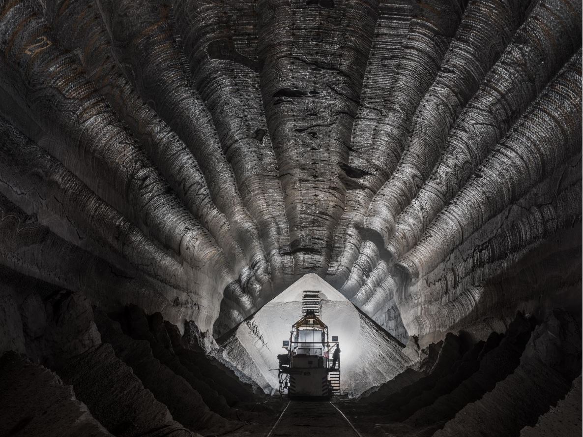
Uralkali Potash Mine #1, Berezniki, Russia (2017) photo © Edward Burtynsky. Courtesy Flowers Gallery, London

In addition to the 80 or so enormous digital prints there are 13 high-resolution murals i.e. photos blown up to cover entire walls, which overawe you with their scale and then draw you in to study the incredibly fine digital detailing.

Example of a wall-size ‘mural’ photo at ‘Burtynsky: Extraction/Abstraction’ giving a sense of the size of the ‘mural’ photos. Photo © Justin Piperger (2024) Image courtesy of the Saatchi Gallery, London

Factual captions

Each photo comes with a fact-packed wall label which explains the human activity we’re looking at. Often curatorial wall labels are barely worth reading or contain tiresome lectures from the curators about the tired old subjects of race or gender. By complete contrast, the wall labels in this exhibition are head and shoulders above the usual ruck because every one tells a fascinating story and gives you the hard facts without moralising. The facts are enough.

So, for example, the piece below is an aerial photo taken just outside the Atlantic port city of Cadiz in south-west Spain. The city is surrounded by salt marshes which once brought prosperity to the region by making it a major producer of sea salt. Snaking through the salt marshes are streams of turquoise sea water. Around these are a complex series of ridges which divide the marshes into ‘fields’ where salt can be harvested, some of which date from 1,200 BC. At the start of the 20th century some 160 artisanal sea salt producers worked these salt pans, now it’s down to just a handful.

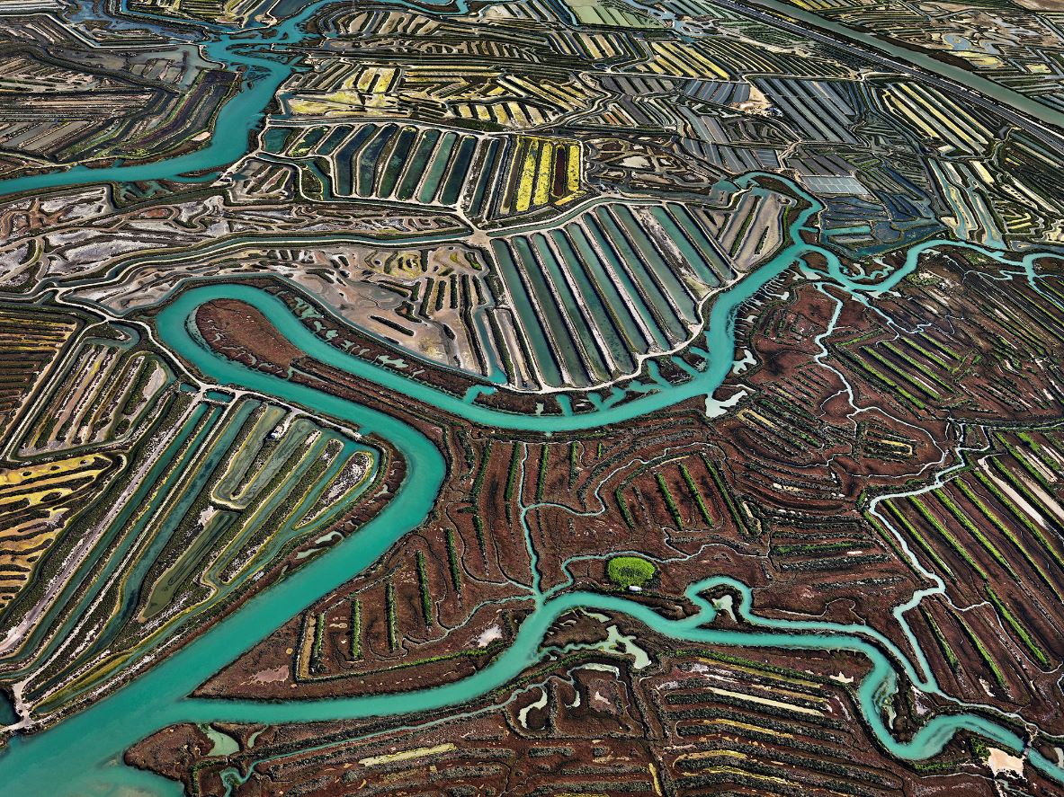
Salinas #2, Cádiz, Spain (2013) photo © Edward Burtynsky. Courtesy Flowers Gallery, London

Extraction and the environment

It is a highly environmentalist exhibition (where environmentalist is defined as ‘concerned with or advocating the protection of the environment.’) Almost all the pieces show the catastrophic impact of human activity on the natural world, each image accompanied by fascinating, often profoundly dismaying information. Because every exhibition needs organising principles, the pictures, and so the accompanying information captions, are divided into themes, being:

  • Agriculture
  • Extraction
  • Manufacturing and infrastructure
  • Waste

The facts described in the picture captions are often mind-boggling. For example, there’s a photo of a vast array of plastic greenhouses in Ziway, Ethiopia, which covers an enormous 450 hectares in total. Up to 4 million roses are cut and shipped each day from here, almost all destined for the European market, where unknowing consumers buy bunches of Ethiopian-grown roses for their impressionable partners, both heedless of the enormous environmental cost behind every one of them.

Or take the wall label introducing the gallery devoted to Agriculture. This tells us that there are over 8 billion people on the planet and we all need to eat, preferably several meals a day. Approximately 75% of the global population eats meat, which corresponds to roughly 23 billion animals kept as livestock. Adding up all the people, livestock and, of course, pets, global agriculture must feed over 31 billion hungry creatures every day.

Creating enough agricultural land to cater to this vast, relentless need is the cause of endless environmental catastrophe:

  • mass cutting down of ancient forests
  • devastation of biodiversity
  • depletion of one-off resources such as aquifers
  • leaching of toxic pesticides and fertilisers into the water supplies
  • constant emission of greenhouse gases at every step of production, processing and transport

Abstraction

So far, so environmentalist. But there’s another whole layer to the exhibition and to Burtynsky’s practice, which is indicated in the exhibition title (Extraction/Abstraction) and underpins much of his work. This is that, from the early days of his career he came to realise that large-scale photographs of landscapes, taken from high vantage points like mountains or from helicopters or drones, often look very like the abstract art produced by the various movements of abstract art in the twentieth century, from Paul Klee teaching at the Bauhaus in the 1920s to Jackson Pollock getting drunk in New Jersey in the 1950s.

Installation view of ‘Burtynsky: Extraction/Abstraction’ showing two works which look like mid-20th century abstract paintings but are in fact 21st century aerial photos of the Texas panhandle. Photo by the author

The curators have some characteristically clear and intelligent things to say about this:

Abstract art emerged in the early twentieth century as a radical break with the old ways of making pictures. Rather than depicting recognisable figures, objects or landscapes, abstract painting explores form, texture and colour for their own sakes.

Over the same period industrial agriculture, mass production, surface mining and the internal combustion engine also emerged, changing our way of life forever. Today technology is rapidly propelling us into the future in every sector…

While modern artists invented new expressive and emotional languages, modern engineers, technicians and industrialists were developing a new reality, divorced from the ancient ways of being, alien to the natural world and wholly unsustainable.

Among the appealing elements of Burtynsky’s thrilling photos is his invocation of and toying with the conventions of abstract art. Many of his photos can be appreciated for their abstract beauty first, before we delve further into the ruined landscapes and human toil which lies behind them.

And it’s true. Look at the photos I’ve included so far in this review and you can see how the vivid, colourful landscapes often approach or fully appear as abstract designs. To be honest, this turns out to be more true of the first floor of works, less true of the second floor which depicts more ‘realistic’ scenes, such as vast waste mountains in Nigeria, the world’s biggest dump of used tyres in America, dehumanisingly vast factories in China and Bangladesh, and so on.

So this abstract aspect is not to be found in all of his works, but the abstract qualities which are to the fore in the early rooms continue to haunt the later, more realistic works, appearing round their edges so to speak, hinting at the deeper, unexpressed patterns and subtle regularities which emerge from the chaos of human activity.

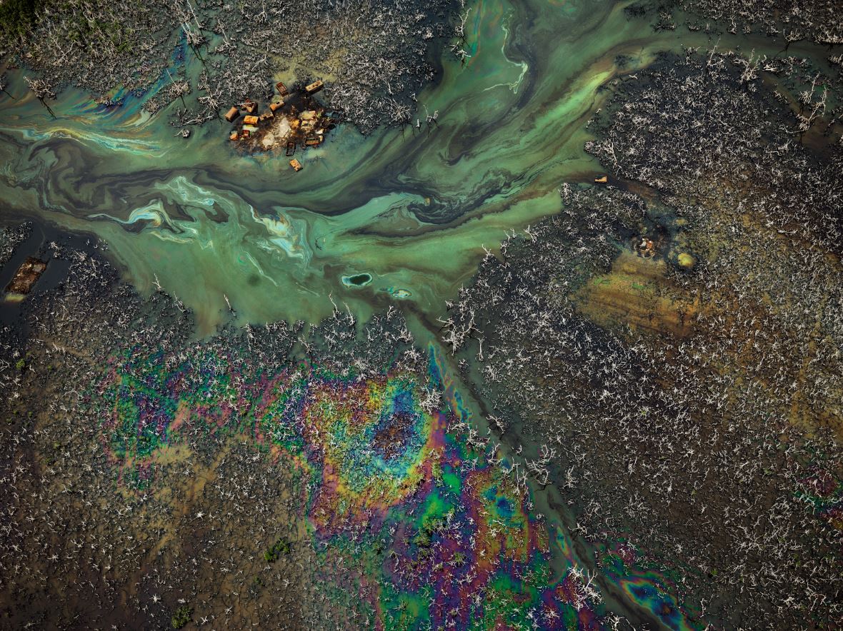
Oil Bunkering #9, Niger Delta, Nigeria (2016) Photo © Edward Burtynsky. Courtesy Flowers Gallery, London

‘In the Wake of Progress’

In between the two floors of big stunning photographs, on a mezzanine floor, is a large room which has been blacked out in order to host what the curators call an augmented reality (AR) experience but you and I might think of as an old-fashioned film, the gimmick being that it is divided into three separate screens alongside each other, sometimes depicting the same subject, sometimes showing different angles of the same thing, sometimes changing and moving on before the other two screens can catch up, a dynamic triptych. It is a musical and rhythmic way of presenting moving images.

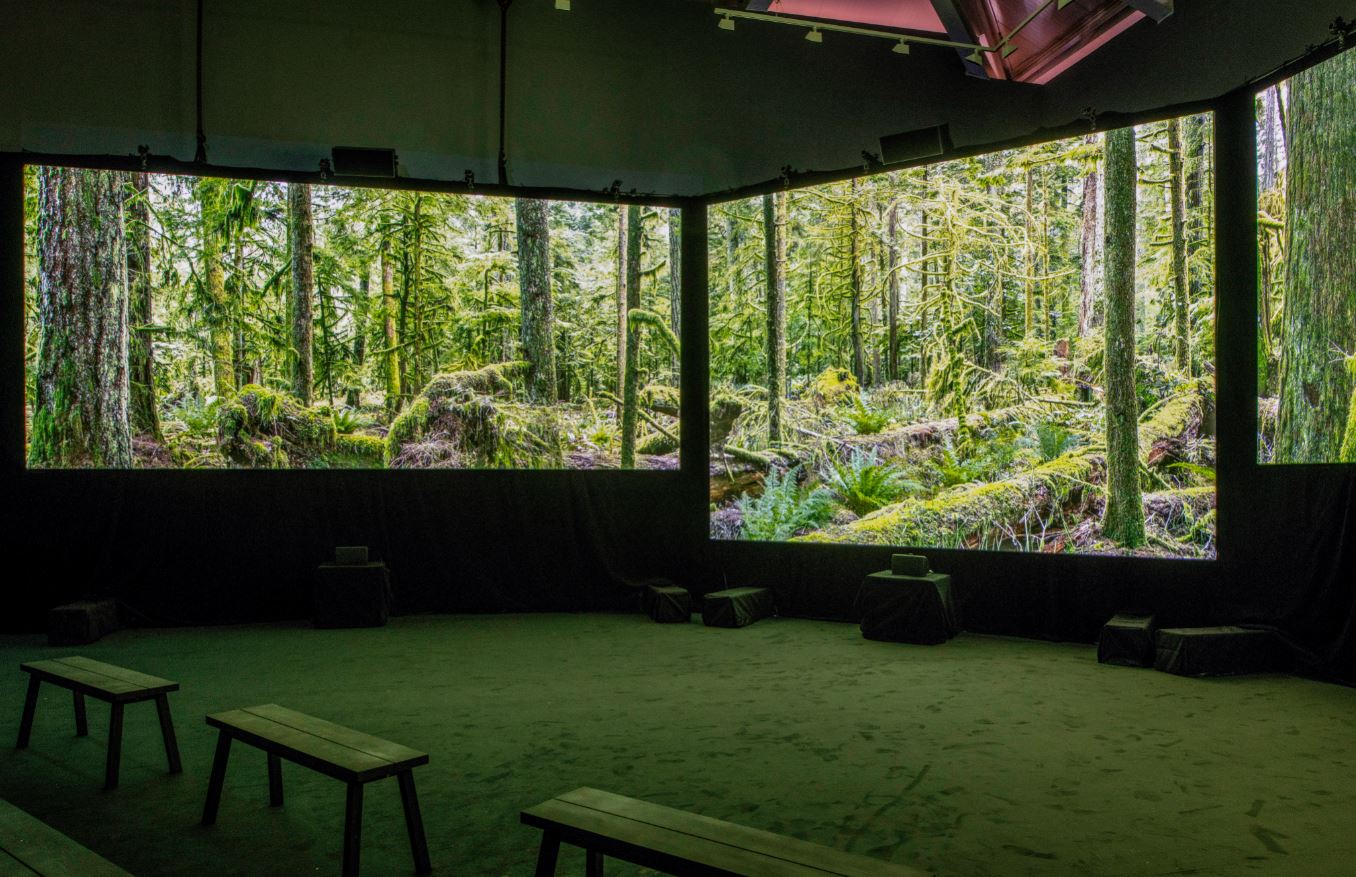
Installation view of ‘In the Wake of Progress’ showing on three screens at ‘Burtynsky: Extraction/Abstraction’ showing the viewing room for ‘In the Wake of Progress’. Photo © Justin Piperger (2024) Image courtesy of the Saatchi Gallery, London

The film is titled ‘In the Wake of Progress’ and, as the name suggests, shows the vast wake of destruction and dehumanisation left by the unstoppable exploitation of the planet’s natural resources. Unusually for me, I sat and watched the entire half-hour thing through in its entirety. It is an absolutely stunning, commentary-free, wordless series of beautifully shot sequences depicting the same kinds of scenes we’ve seen in the photos, devastation, waste and pollution everywhere.

It starts with four or five minutes of a static shot in an unspoiled northern forest (as captured in the photo above), all moss-covered trees and hovering insects, calming the viewer and lulling us into a false sense of security (it was actually shot in a place called Avatar Grove on Vancouver island, British Columbia, Canada).

But then the destruction commences, with shots of forests much like this being logged and reduced to muddy bare hillsides; vast numbers of logs being floated downriver to huge lumber yards; and on to open cast mining; dynamiting rocks in quarries; oil spills rainbowing rivers; vast dumps of rusting oil cans, plastic phones, used tyres; terrifyingly huge inhuman factories; oil production; vast megacities criss-crossed by urban freeways choked with traffic – a bombardment of images of human destructiveness.

The promotional material makes much of the fact that the film and music were created with the help of ‘legendary’ Canadian music producer Bob Ezrin. I thought this phrasing was a tad counter-productive and made it sound like a self-congratulatory speech at the Oscars (‘And now ladies and gentleman,  the one and only, the legendary music producer, Boooob Ezrin!‘). The wall label also explains that the haunting wordless vocals which thread through the soundtrack are by ‘award-winning Cree Métis artist iskwē’, which is interesting enough, I suppose.

But the single most obvious thing about ‘In the Wake of Progress’ is how very similar it is, in visual themes and in even the repetitive, arpeggio-heavy soundtrack, to the great 1982 film Koyaanisqatsi, by ‘legendary’ director Godfrey Reggio, with music by ‘legendary’ minimalist composer Philip Glass. All it needed was the slow-motion sequence of Las Vegas casino workers and it would have become virtually the same film.

My point is nothing about plagiarism or anything like that, in fact I have two points. 1) What the similarity of both films suggest is that if you set off with the aim of depicting mankind’s destruction of the natural world, you’re going to end up shooting the same kinds of sequences (open cast mining, oil production, hyper-highways in mega-cities) i.e. there will be an inevitable sameyness about films like this because they are covering the same subject.

Secondly 2) the two films were produced and released exactly forty years apart (1982, 2022). Me and my like-minded liberal friends were obsessed with Koyaanisqatsi – I went to see it in the cinema at least five times when it came out. Being young, we thought immensely powerful cultural products like this would change the world and bring its rulers to their senses. Now, being old, I know that’s never going to happen. Films like this are nice to look at, trigger strong emotions, and change absolutely nothing.

Burtynsky the technological innovator

For photography buffs there’s a section of the show devoted to listing and explaining Burtynsky’s technical innovations. It turns out that he has not only adapted to the huge changes which have taken place in the technical side of photography over the past 40 years (the arrival of digital technology revolutionising everything) but has often been at the forefront of that innovation – working with the technical teams who accompany him on his projects to develop engineering and design solutions to the challenges of creating such huge photos, often taken from a great height.

This latter fact (height) explains the presence of not one but several drones in the display case, along with interesting explanations of how his engineers have changed and adapted them to fly stably and horizontally, while carrying ever-more powerful digital cameras.

Installation view of ‘Burtynsky: Extraction/Abstraction’ showing the display case of cameras and drones used by Burtynsky over the years. Photo © Justin Piperger (2024) Image courtesy of the Saatchi Gallery, London

In the photo above, on the wall on the right you can see a timeline of Burtynsky’s projects, starting with the earliest while he was still at Ryerson Polytechnic (1979 to 1981) and then listing each of his major projects and publications, year by year, with a paragraph or so detailing what technical innovations he brought to each of them.

Self overcoming

Years ago I read half a dozen books by the German philosopher Friedrich Nietzsche. I wouldn’t pretend to be any kind of expert but my understanding is that a fundamental principle of Nietzsche’s philosophy is the notion of ‘self overcoming’. It’s the idea that in order to become who you want to be, you first need to overcome who you are. In order to realise your full potential, you must consciously conquer the aspects of your character and mind which limit and hold you back.

So far, so much like a Californian self-help video. Where Nietzsche pushes on is in holding the view that most of us are held back from a full understanding of the world we live in by a whole network of conventional thinking, commonplace morality, sentimental attitudes, wishful thinking, moral cowardice and intellectual weakness. In a thousand ways we hide from the truth of who we are and what we are doing.

Nietzsche said we should face the truth about ourselves and embrace it no matter how negative and destructive it may appear. Only by embracing the totality of our real natures can we live in truth.

Well, OK, then. All the facts indicate that we are destroying the planet, wrecking every ecosystem we’ve ever encountered and exterminating our fellow life forms at an unprecedented rate – and, following Nietzsche, I think we should embrace the fact. We should fully admit to being world killers and planet destroyers. We should own it and admit to being the nature-hating, species-exterminating, habitat-trashing creatures that all the evidence suggests we are.

In my opinion most people, especially in the pampered West, live in complete denial about what monsters the human race are – as my recent reviews of modern African or Middle Eastern history show time and time again, or the situation in Ukraine or Gaza demonstrate beyond dispute – we are planet-destroying locusts but locusts with machine guns and nukes, committed to the devastation of the planet and the mass killing of our own species.

I would rather it isn’t so, but it is so and any attempt to deal with the situation must start by acknowledging this truth. This position explains why, for me, the only weak point in the exhibition was where Burtynsky, disappointingly, joined in with the chorus of trite truisms, the sentimental bromides, and the wilful optimism of the wishy-washy liberal who still has hope:

‘I have spent over 40 years bearing witness to how modern civilization has dramatically transformed our planet. At this time, the awareness of these issues presented by my large format images has never felt more urgent… I hope the exhibition experience will continue to provide inflection points for diverse conversations on these issues and move us all to a place of positive action.’

‘Diverse conversations’ – does he really think ‘diverse conversations’, at dinner parties, down the pub or on social media, even at high-level gatherings like the COP conferences, are going to make a blind bit of difference to anything, because they absolutely aren’t and it’s disappointing that an artist who’s made such original art out of the disaster, still holds such weakly conventional opinions about it.

‘Add your thoughts to the conversation’

In the spirit of sentimental optimism which I’ve just explained why I despise, the exhibition contains two big blackboards with cups of white chalk sticks, and encourages us to write uplifting messages on the boards and ‘add your thoughts to the conversation’. Examples included: ‘Turn your phone off now’, ‘It’s easy to be green,’ ‘Be nice to the environment’ and other such gift card slogans. True to my blunt Nietzschean approach, I wrote ‘Exterminate all the brutes’.

To anybody who doesn’t get the reference, these are the words scrawled at the end of the high-minded missionary pamphlet written by the deranged colonial ivory agent, Kurtz, in Joseph Conrad’s novella ‘Heart of Darkness’. I wrote it in a spirit of Swiftian satire, for in the novel Kurtz has been driven completely mad by the sub-human savagery he encountered in the heart of the Congo, which he has assimilated and then taken to a whole new level of nihilistic destructiveness. He started out with the highest aims of bringing ‘civilisation’ to the heart of Africa and ended up with a mad vision of killing every one of the local people.

Everything I’ve read about the Congo backs up Kurtz’s feelings about the human race. If in any doubt you should make a study the Rwanda genocide and its aftermath in the two Congo wars and the Great War of Africa, which, even after the loss of up to 5 million lives, in eastern Congo lingers on to this day. And what lay behind this series of disasters? Greed to rape Congo of its natural resources.

First it was white Europeans enslaving, mutilating and massacring Africans in order to extract Congo’s vast rubber production; but then it was Africans looting, impoverishing, massacring and murdering each other in order to loot Congo’s other, mineral, resources. The colours of the skin and the names of the rulers (Leopold, Lumumba, Mobutu, Kabila), the ideologies they used to justify themselves (Christianity, communism, pan-Africanism, capitalism), all changed with the passing decades, but one constant remained the same: the murderous, nature-killing intensity of human greed. Vast wars were fought, immense human suffering caused, and large areas of the country ravaged by man’s endless quest for the blood diamonds, copper, gold and the rare metals which the world needs to carry on its course of untrammeled consumption.

Which is why bromides like ‘Save Earth, Save Life!’, ‘Protect Our Planet, Preserve Our Future’ and ‘There is no planet B’ seem to me wholly inadequate to capture the brutal truth of the world we live in, the terrible violence man deals out to man every day (and worse to unprotected women and children), the appalling misery endured by the slaves who produce the components of our luxury goods, the daily murder of tens of millions of dumb animals so we can eat them, and the relentless degradation of every ecosystem on the planet.

Hence the saeva indignatio of my crayoned comment, scrawled across the blackboard in the same way that Kurtz, driven mad by seeing into the complete darkness of the human heart, ended his utopian pamphlet with the most nihilistic comment he could conceive of – ‘Exterminate all the brutes’ – a comment less on the natives of Congo than on the shallow, inadequate Christian ‘civilisation’ he was meant to be representing.

(The phrase saeva indignatio popped into my memory at this point and prompted me to look it up. It is Latin for ‘savage indignation’ and is a phrase used in the Latin epitaph of the great 18th century satirist Jonathan Swift, to denote his ‘intense feeling of contemptuous anger at human folly’.

So that’s what I wrote on the blackboard of this powerful, terrifying exhibition, and why – the last words of a deranged idealist, quoted to express my ‘intense feeling of contemptuous anger at human folly’.)

The merch irony

A last point about those exhibition blackboards: the way children, or those with a childlike understanding of the world, had covered them with infant-school slogans like ‘End consumerism’ and ‘Just stop buying stuff’ meant I couldn’t help laughing out loud when this breath-taking exhibition shunted me out, at the end, into the huge, clean and well-stocked Saatchi Gallery shop, a big room overflowing with classy merchandise and shiny products.

Here, as at all art exhibitions, you can find a range of posters and postcards and bags and books relating to the exhibition, which all lead up to a collectable box set of stylishly produced Burtynksy books and memorabilia. This will set back the well-heeled art fan a tidy £15,000.

As I reeled from the cognitive dissonance between everything I’d just been seeing and reading, between all those high-minded ‘green’ sentiments on the blackboards, and this riot of unashamed consumerism – a posh couple sauntered by and stopped at the pile of exhibition catalogues (a snip at £38). ‘Oh my God,’ gushed the young lady, flicking through the pictures of ruination made beautiful, ‘this would make such a fabulous coffee table book!’

And there, in a nutshell, you have it. Middle-class people queuing up to buy postcards, t-shirts, tote bags, fridge magnets, mobiles, videos and earnest books all advocating the end of the consumerism. Swift would be looking on, nodding and chuckling.

Thoughts

This is an awesome, amazing, must-see exhibition for at least four reasons:

1) Every single photo is a masterpiece. Each one of them is breath-takingly beautiful.

2) Each photo is accompanied by short but hugely informative wall captions which are all fascinating in their own right but also build up into an astonishingly encyclopedic overview of all types of human activity around the planet – hugely interesting and mercifully devoid of the moralistic hectoring you are subjected to at so many other exhibitions.

3) It is about the most important subject on earth, which is the way we humans are destroying it.

4) Unlike most art films, ‘In the Wake of Progress’, is a powerful, thrilling, devastating, hopeless, exhilarating watch.

I emerged reeling. I wanted to shake someone’s hand for organising such an overwhelming experience and bow down before Burtynsky’s awesome genius. ‘Extraction/Abstraction’ is quite brilliant.

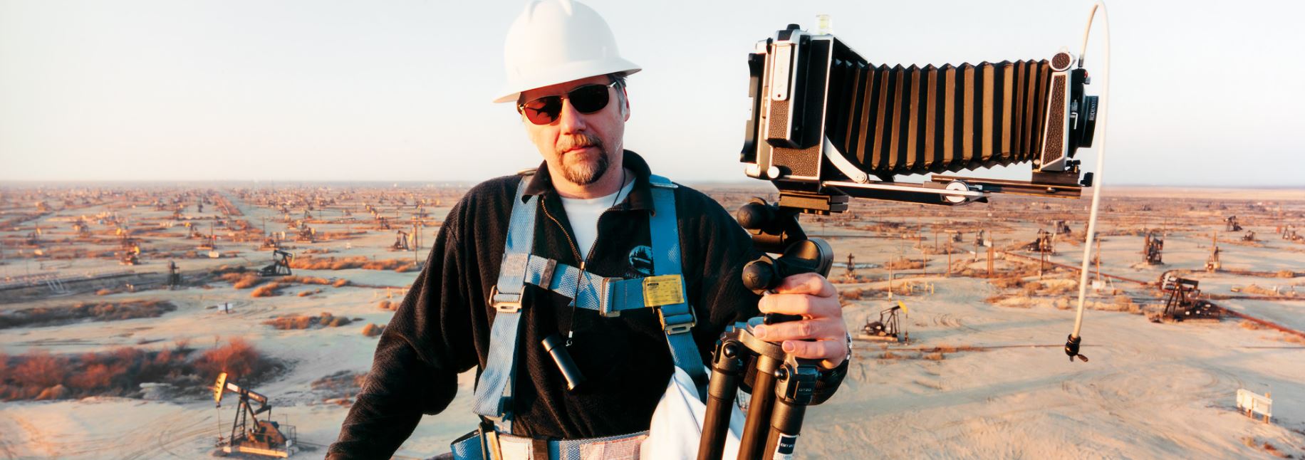
Our hero at work on location in Belridge, California, site of hundreds of small oil wells (2003) Photo by Noah Weinzweig, courtesy of the Studio of Edward Burtynsky


Related links

Environment-related reviews

Exhibitions

Books

Objects of Desire: Surrealism and Design 1924 to today @ the Design Museum

SURREALISM. Noun: Pure psychic automatism by which it is intended to express, either verbally or in writing, or otherwise, the true function of thought. Thought dictated in the absence of all control exerted by reason, and outside all aesthetic or moral considerations.
(First Manifesto of Surrealism, 1924)

Surrealism is not a new or better means of expression, not even a metaphysic of poetry; it is a means of total liberation of the mind.
(Surrealist declaration, January 1925)

Introduction to surrealism

Surrealism is ‘a philosophical and artistic approach which violently rejects the notion of the Rational Mind and all its works’. For Surrealists, the True Mind, true human nature – ‘the true function of thought’ – is profoundly irrational.

The Surrealists thought the Rational Mind formed the basis of ‘bourgeois’ society, with its moral and sexual repressiveness, its worship of work and money, its fetishisation of capitalist greed, which had led both to the stifling conformity of Western society and to a series of petty wars over colonies which had themselves led up to the unprecedented calamity of the First World War.

In the Surrealists’ opinion, this entire mindset had proved to be a ghastly mistake. The Surrealists thought that we had to reject it lock, stock and barrel by returning to the pure roots of human nature in the fundamentally irrational nature of the human mind, liberating thought from all censorship and superficial, petty morality, seeking to capture ‘the true function of thought’ and creativity through the exploration of the fortuitous and the uncontrolled, the random and the unexpected, through dreams and coincidences.

The first Surrealist magazine was titled La Révolution surréaliste (1924 to 1929) not because it espoused a communist political line, but because it proposed that Surrealist writing and art would, by its radical dysjunctions and unexpectednesses, reveal to readers and viewers the true nature of unbounded thought and lead to a great social transformation.

Cadeau by Man Ray

Massive show, massive space

This is a huge exhibition containing nearly 350 objects, an overwhelming number, a flood of objects and information in the related wall captions.

Also, the exhibition space itself is big and capacious. Roomy. This allows for the display of lots of large objects, namely furniture, lots and lots of chairs and several striking sofas, mannekins wearing dresses, some enormous sculptures and so on. Not so many tables because tables tend to be enormous, but three or four petite coffee tables or tea tables.

Gae Aulenti by Tour (1993) Manufactured by FontanaArte, Glass; bicycle wheels. Vitra Design Museum

Of course this is because this is an exhibition about design rather than art or sculpture as such. The exhibition is about how the design of objects was impacted by the Surrealist approach and ‘look’ and style and fashion. Hence the need for more than paintings and photos (though there are plenty of these); of designed products.

Chronological

Surrealism was, for its first five years or so, from 1924 to 1929, a writers’ movement, led by the self-appointed pope or bully of Surrealism, André Breton. Only in 1929 when the Catalan Wunderkind Salvador Dalí joined it, did the visual arts come to play a more important role and, eventually, dominate the movement and people’s ideas about it.

The show, like almost all exhibitions, is chronological in structure covering nearly a century of Surrealism from the earliest automatic writing to its most recent manifestation in using artificial intelligence to create artworks.

Thus we start with Surrealism’s first writings and manifestos, and then the outburst of Surreal artworks in the 1930s led by Dalí but with scores of other visual artists, and there were so many of them – Hans Arp, Hans Bellmer, Brassaï, Giorgio de Chirico, Salvador Dalí, Paul Delvaux, Max Ernst, Alberto Giacometti, Paul Klee, Wifredo Lam, René Magritte, André Masson, Joan Miró, Meret Oppenheim, Pablo Picasso, Man Ray, Yves Tanguy and many more.

The strangeness of objects

The exhibition is divided into themes and begins with the importance of everyday objects. Surrealism took the revolutionary approach of investing the most everyday of everyday objects with an aura of mystery and strangeness.

.It starts with an examination of Surrealism’s beginnings from the 1920s and considers the crucial role that Everyday objects and interiors were embraced by the movement’s early protagonists, as artists sought to capture the aura or mysterious side of ordinary household objects. Cubism had looked at everyday objects – café table, newspaper, bottle of wine – from multiple angles. Surrealism looked at them from a sur-real angle, attributing them volumes of meaning never dreamed of by ordinary people, setting them in weird juxtapositions to jar us out of our everyday doze and jerk us into awareness of the strangeness of being alive and moving through this world of images and symbols.

What could be more normal and everyday than an apple, a businessman and a cloudy sky? Or, in the way René Magritte deploys them, more disturbing?

The Son of Man by Rene Magritte (1946)

The Son of Man by René Magritte (1946)

These ideas took a while to be developed and fully expressed. It was only the ‘Second Surrealist Manifesto’ of 1929 that introduced the notion of ‘the Surreal object’ – using art or writing to reveal ‘the remarkable symbolic life of quite ordinary, mundane objects’. This inspired artists including Dalí, Magritte, Meret Oppenheim and Man Ray to experiment with an entirely new form of sculpture, by creating absurd objects from found materials and items, revealing the bizarre potential of the everyday.

Object by Meret Oppenheim (1936)

This is the point of Marcel Duchamp’s famous ‘readymades’, objects he noticed amid the bric-a-brac of ordinary life and carefully selected to be placed within a gallery setting, in an exhibition in a gallery, where they acquired completely new resonances, the cheapest of mass-manufactured objects acquiring a holy aura, its entirely practical aspects magically converted into profound and mysterious statements about shape and dynamism and meaning.

Bottle Rack (Porte-Bouteilles) by Marcel Duchamp (1914/1959)

He was to some extent mocking the idea of ‘art’ and ‘the gallery’; but he was also discovering the numinous in the quotidien which was to inspire artists ever since. But this gesture also, as the curators pithily point out, prioritised concept over craft and conceptual art has been with us ever since.

Paintings

There are cases containing manifestos and magazines, key works by Breton such as Amour fou.

There are early paintings by Dalí, Le Corbusier (who was a painter before he became an architect), the mysterious desertscapes of Yves Tanguy, a couple of weird paintings by the English artist, Leonora Carrington who came on the scene a bit later, in the 1940s.

The Old Maids by Leonora Carrington (1947) © Estate of Leonora Carrington / ARS, NY and DACS, London 2022

Photos

There are lots of photos, maybe a hundred photos, performing its two functions, as documentary record and as artwork.

Among the documents are scads of photos of the founders and early protagonists, Breton and his Parisian colleagues, then the artists. There’s records of the famous 1936 Surrealism exhibition in London, of the Surrealist pavilion (the Dream of Venus’) Dalí created for the World Fair in 1939, and so on. There’s Max Ernst at home in his apartment surrounded by African and Oceanic masks and artefacts (a lovely photo by Hermann Landshoff). And so on.

In the section about ‘sex and desire’ (every art exhibition has to have a section about sex and desire) there’s a suite of photos of Surrealists cross-dressing or being deliberately androgynous, for example photos of Marcel Duchamp dressing as his female alter ego, Rrose Sélavy, in 1921, and Claude Cahun’s calculatedly androgynous photographic self-portraits, from 1928.

There are photos of works of art, such as the still-disturbing fetishistic mannekins created by Hans Bellmer, or the room full of a mile of string created by Marcel Duchamp for a 1942 exhibition in New York.

And there are photos which are works of art, such as pretty much anything by the genius Man Ray (born Emmanuel Radnitzky in 1890 in New York but who changed his name and moved to Paris where he spent most of his career).

Le Violon d’Ingres by Man Ray (1924) © Man Ray 2015 Trust/DACS, London 2022

Films

There are four or five films. There are early black and white silent Surrealist films, such as Entre’Acte by Rene Clair (1924), winningly described by the director as ‘visual babblings’.

Oddly, they didn’t have clips from the most super-famous experimental movies by Bunuel, Luis Buñuel’s ‘subversive’ early films Un Chien Andalou and L’Age d’Or.

Later in the show there’s a few art films from a generation later:

And a much later film by an African director:

But dominating one wall, not least because it has a loud musical soundtrack, is a screen showing Destino, a short Surrealist animated film which was an unlikely collaboration between Dalí and Walt Disney. It tells the love story of Chronos – the personification of time – and a shapeshifting woman. In fact the movie was never completed because war work took precedence, and the project was only revived in the 1990s when Disney animators competed it according to the original sketches and scenario.

The significance of the film is its indication of Dalí’s success and name recognition in the USA by the 1940s, and the way in which what, on the face of it, are a sequence of nonsensical absurd events, have been assimilated enough for a mainstream producer like Walt Disney to agree to it.

Partly this is down to the instant recognition of a relatively small number of surreal images associated with Dalí. The short 7-minute animation is a collection of greatest hits such as the desert landscape setting, melting clocks, ants appearing out of cracks, human faces or bodies moving into trompe l’oeil settings to cleverly morph into something else.

Also in America during the war, Dalí designed shop windows for the Bonwit Teller department story. Frederick Kiesler designed a new gallery for rich art collector Peggy Guggenheim in a Surrealist style with curving walls. Emerging designers like Ray Eames and Isamu Noguchi used the zoomorphic curves found in Surrealism to design more moulded products, such as chairs (Eames) and a chess table and baby monitor (Noguchi).

Was it during the war, when so many European artists were exiled in America, that Surrealism’s pre-war radicalism was neutralised and converted into one more among many styles and fashions?

Sculpture

There are some sculptures, especially from the early period, but not many and this is because of the focus of the exhibition which is not on art, per se, but on design. Therefore, instead of abstract art sculptures, what the rooms are full of is designed furniture.

Classic Surrealist furniture

If the 1930s was the decade when there was an explosion of Surrealist art and the movement broke through into the general consciousness via a series of well-publicised exhibitions (and carefully staged scandals and press events, such as Dalí attending the opening of the London exhibition wearing a deep-sea diver’s outfit) it was in the 1940s that designers began to incorporate elements of the style into their work.

The Surrealists themselves had led the way. If they started out by invoking the weirdness of everyday objects and thoroughly explored this in paintings, sculptures and photos throughout the 1930s, some had applied their deliberately, provocatively bizarre way of seeing to create bizarre household objects, tables, chairs, lamps.

The most florid early examples come from the joint venture between Dalí and the English collector and patron, Edward James. James had Dalí create an entirely Surrealist interior for his home at Monkton House, West Dean in Sussex, notably the famous sofa designed in a cartoon imitation of the lips of Hollywood actress Mae West.

Mae West’s Lips sofa by Salvador Dalí and Edward James (c. 1938) Royal Pavilion & Museums Trust, Brighton and Hove. © Salvador Dalí, Fundació Gala-Salvador Dalí, DACS 2022

Also on display is the famous lobster telephone, alongside less well-known objects such as the standard lamp made out of brass casts of a stack of champagne glasses (which ‘subverts’ the Victorian notion of a standard lamp); and, most obviously humorous, a carpet with human footprints cut out of it. These, we are told, were the footprints of his wife, the dancer Tilly Losch. When Tilly danced right out of his life, James commissioned a new carpet with the footprints of his dog in it, the dog making, he dryly remarked, ‘a more faithful friend’.

Other rich people commissioned Surrealist interiors:

  • Swiss architect Le Corbusier was commissioned by eccentric millionaire Carlos de Beistegui to design his Paris apartment in a style which combined fantastical elements with clean cut modern lines
  • clean Le Corbusier-designed furniture was included in Dali’s house in Portlligat, Spain
  • aristocrats Charles and Marie-Laure de Noailles commissioned Man Ray to shoot a Surrealist film at their modernist pad on the Riviera

By the late 1930s the new surreal style of interior design had been given a name, Fantasy Modernism.

This suite of objects amount to some of the greatest hits of first wave surrealism but they weren’t alone. Meret Oppenheim produced equally imaginative and talismanic sets of surreal objects such as the fur cup and saucer mentioned above, and her birds-leg tables.

Occasional table (1939) by Meret Oppenheim

Occasional table (1939) by Meret Oppenheim

Modern Surrealist furniture

Once you turn the corner into the post-war period, you encounter two big rooms full of more contemporary interpretations of surrealist furniture, by designers from the 1960s, 70s, 80s and through on to the present day. These include lamps, chandeliers, some tables, but above all a lot of weird, wacky, and humorous chairs.

Hand Chair by Pedro Friedeberg (about 1962; this version 1965) Vitra Design Museum

I find it very revealing that this chair started life as a throwaway, joking remark of Friedeberg’s to a carpenter. He thought it would be funny to try and make a chair shaped on a human hand. For me this little anecdote is symptomatic of the way Surrealism stopped being subversive and became a type of visual joke, more like a branch of comedy than an art movement.

There’s:

  • a chair made out of burned carbon i.e. has been burned to a crisp – Smoke Thonet chair number 209 by Maarten Baas (2019)
  • Capitello chair by Studio65, a chair shaped like the capital of a classical column only made of comfy styrofoam instead of marble
  • Ruth Francken’s Man Chair (1971), shaped like a man’s body, the legs the shape of real legs, the arms effigies of two real arms
  • a chair made out of two thick jagged slabs of grass held together by thick steel springs
  • La Momma, a feminist piece by Gaetano Pesce (1973), the ball and chain referencing the oppression of women in a patriarchal society
  • Due Più by Nanda Vigo (1971)
  • Conquest by Nina Saunders (2017)

There’s a chair by Sara Lucas, characteristically lowering the tone (not necessarily a bad thing) with its two boobs made of lots of cigarettes glued together. What I noticed was a) that’s a really basic, anonymous, institutional chair, the kind you get at a school or college, and b) the cigarettes are really nicely arranged, not just bodged together but arranged in a neat concentric circles which bring out what a visually pleasing thing a cigarette is, with its nice alternation between white tube and sandy brown filter; the brown matching the wood brown of the chair seat and back i.e. it’s a funny gag, ha ha, but it’s also a nice ensemble to look at, aesthetically.

Cigarette Tits [Idealized Smokers Chest II] by Sarah Lucas (1999) © Sarah Lucas. Courtesy of Sadie Coles HQ, London

Picking up on the sofa theme set by Mae West, there’s a bang up-to-date piece, wherein a classic Chesterfield sofa, covered in trademark buttons, has been ‘released’, set free, and ‘melted’ out of shape and over the floor, in the manner of Dali’s melting watches – Pools and Poof! by Robert Stadler (2019).

There are several chandeliers, including this striking piece by Ingo Maurer. It immediately made me think of Cornelia Parker‘s famous exploding works, and made me wonder which came first.

Porca Miseria by Ingo Maurer (2019 edition of 1994 design) Vitra Design Museum

And dominating one of the rooms, a life-sized model of a horse, cast in black plastic and with an everyday lamp coming out of its head.

Horse Lamp by Front Design (2006), manufactured by Moooi BV, Breda /Niederlande, Plastic; metal. Vitra Design Museum

When you learn that this comes in a suite of animal furniture including a rabbit lamp and a pig table, you realise the original impulse has become washed out into a kind of homely humour. It’s become about as ‘radical’ as Ikea.

Fashion

One of the most high profile aspects of design is fashion, which holds shows around the world on an annual basis at which dress and clothes designers compete feverishly to outdo each other with new and outlandish ways to ornament the (tall, skinny) female body.

The world of Surrealism overlapped the vast ocean of fashion design, events and, above all, magazines, from the start of the 1930s when, as I’ve described, the visual side of the movement took over from the purely literary.

Thus several surrealist artists also worked as fashion photographers, including Lee Miller and Man Ray. Some, like Dalí and de Chirico, created covers for fashion magazines such as Vogue (some are included here). The exhibition includes fashion photographs and vintage copies of fashion magazines to highlight these connections

Dalí’s collaboration with the French fashion designer Elsa Schiaparelli (who set up her haute couture house in 1927) resulted in several ground-breaking designs. Their first collaborative piece, the Telephone Dial Powder Compact of 1935, became very popular and was copied and bootlegged for the mass market.

Over in a side room is a dais with five shop-window mannekins sporting classic surrealist designs. One applies Schiaparelli’s signature pink to a minidress contoured to look like the chest and stomach of a very buff man. Another is a modern reworking of iconic Skeleton Dress. There’s a dress by contemporary designer Mary Katrantzou which, when you look closely, uses elements of a typewriter.

Typewriter’ Printed Silk Dress by Mary Katrantzou (2018) Courtesy of Mary Katrantzou

Alongside other designs by Maria Grazia Chuiri, Christian Dior, Iris van Herpen and emerging Afro-surrealist inspired fashion designer Yasmina Atta.

These are funny conceits well executed but I couldn’t help thinking they’ve reduced Surrealism to a gag, a gif, a meme, a one-liner. ‘Did you see the typewriter dress?’ ‘Yes, Wasn’t it funny?’

Generally, by the time something reaches the world of fashion its disruptive energy has, by definition. been neutered, for example punk. Nothing is disturbed. Everything remains in place, but with lolz for a million Zoolander clones.

From communism to consumerism

At around this point in the exhibition, where I encountered the absorption of the Surrealist impulse into the world of international jet-setting fashion, I began to have my doubts.

Breton wanted Surrealism to trigger a genuine revolution in society and perception. He thought bourgeois society could be smashed apart by ripping a great tear through reality and letting out deeper realities. He talked about ‘convulsive beauty’, he wanted a kind of stricken, epileptic aesthetic.

Breton and many other Surrealists became card-carrying communists during the wartorn 1930s. Their movement was a protest against a bourgeois industrial society which had reached the end of its useful life and needed to be torn down to create a free-er, fairer world.

Ironic, then to see the entire movement, the impetus for revolutionary change, utterly absorbed, neutralised, defanged, neutered and then absorbed into the world of the international haute bourgeoisie in the form of high fashion. For me high fashion is the acme of consumer capitalism with its relentless drive for novelty and new product to keep the profits rolling in.

Fashion is not only a forward post of consumer capitalism but at the cutting edge of unnecessary consumption, the epitome of built-in obsolescence whereby you simply have to buy this season’s must-have items and junk last year’s hideously out of date clothes, handbags etc. Epitome of the compulsive need to keep up, to buy the new thing, which we now know, without any ambiguity, is using up the earth’s finite resources and destroying the planet.

Nothing I say, do or write can dent the huge power of the destructive urge to buy buy buy ever-new stuff, but I despise it and, in a way, fear it, this hysterical need to use up all the planet’s resources in the neurotic pursuit of novelty. What will our grandchildren make of the urge to fly round the world from fashion show to fashion show, seeking endless novelty, encouraging the throwing away and junking of what we have, burning up the planet at an ever-increasing rate.

Is Surrealism dated?

Putting aside my antipathy to the world of fashion, by the end of the exhibition the plethora of objects had raised another, pretty basic question, which is: Does any of this shock and surprise any more, cause the kind of frisson of fear, unnerve the viewer, let the unconscious erupt from the conscious mind with shocking force etc, as the Breton’s manifestos hoped it would?

The short answer is, of course: No. No, it doesn’t. Surely Surrealism has been completely assimilated into our bourgeois, neo-liberal, consumer capitalist society. The famous icons, the lobster phone, the Mae West sofa, every painting by Dali, these have been around for nearly 90 years, and you see images of them in any number of art books or postcards in what my kids call bougie (pronounced ‘boozhee’) shops.

Take the series of plates by Piero Fornasetti which run variations on a wonderfully blank, idealised portrait of the Victorian opera singer Lina Cavalieri. I suppose if you were actually eating off one of these, then it might give you a frisson to scrape away at the mashed potato and slowly reveal an eye looking at you. But as an image and idea I feel I’ve seen this hundreds of times and, indeed, almost 400 variations exist, of which seven are on display in an appealing little set hanging on the wall.

Wall plates no. 116 from the series Tema e Variazioni by Piero Fornasetti (after 1950) Fornasetti Archive

In other words, surely most Surrealist art, these days, instead of conveying ‘the shock of the new’ is the precise opposite – reassuring and familiar. We smile or laugh when we see the lobster phone and go ‘oh yes’ with a pleasant feeling of recognition.

Art changes nothing. All art is swiftly assimilated into bourgeois society and loses the ability to shock or even make the viewer think. The simple act of being displayed in a gallery neutralises art, makes it into a mental commodity, to be discussed in highbrow conversations or namedropped to make you seem swanky. Or into an actual commodity, which can be safely hung on the walls of any investment banker or corporate lawyer, or bought by Arab or Russian billionaires and salted away in a vault in Switzerland as part of their diversified investment portfolio.

Thus, for example, the exhibition includes black and white photos recording the Surrealist display Dali created for the 1939 New York World’s Fair. Apparently you entered the suite of bizarrely decorated rooms by walking between models of a woman’s open legs and through a wall-sized vulva into a ‘womb’ containing a predictable congeries of Freudian imagery, complete with numerous scantily clad models arranged in alcoves or sprawling on a bed amid unlikely ‘Surreal’ bric a brac. Looking at these photos now, they seem like a standard chorus girl show with added lobsters.

A lot of the exhibition, in other words, feels warm and nostalgic, pretty much the opposite of what Breton et al originally had in mind.

Up-to-date exhibits

The curators promise, and the exhibition title indicates, a review from the 1920s up to the present day i.e. covering just about a century of Surrealism, and nearly a third of the objects on show are from the past 50 years.

Thus there are a lot of works from more recent times, the 80s, 90s, noughties, generally by artists I’d never heard of. This is particularly true of the big items of furniture, mostly chairs, which dominate the last few rooms or sections of the show, including:

  • Gae Aulenti’s Tour (1993), a table made from a glass top supported by four bicycle wheels set in chrome forks
  • Jasper Morrison’s ‘readymade’ Handlebar Table (1982)
  • Roberto Matta’s amusing MagriTTA Chair, a sofa style chair which is filled with an enormous green apple, obviously a nod to Magritte’s apple paintings
  • the cartoon chair of Fernando and Humberto Campana from 2007, a basic wide-angle modernistic chair which is then infested with cuddly toys based on Disney characters
  • Sella (1957), by brothers Achille and Pier Giacomo Castiglioni, which is composed of a bicycle saddle mounted on a post fixed into a hemispherical base, blurring the boundary between furniture and art
  • video of how contemporary designers Ronan and Erwan Bouroullec use an intuitive, automatic drawing process to discover new imagery and forms
  • sketch furniture which is created using motion capture cameras to capture the movements of a designer’s hand in the air, save this as a digital file and then use 3D printing technology to print out the object the designer originally sketched out in the air; there’s a video of the process and an actual life-sized chair designed and created using this approach

Or simpler things, Surrealist objects like this absurdist hairbrush spouting hair, worthy of Magritte.

Beauty Hairbrush by BLESS (2019 edition of 1999 design) Vitra Design Museum

Maybe I’m being unfair, maybe I lack taste or sympathy, but I found most of the works in the second half of the show, from the 1960s onwards, far less engaging than the material from the first, classic, era. Take three examples from towards the end of the exhibition.

Björk

The famous musician, composer, performer, singer, songwriter etc Björk, is represented by videos of three fairly recent tracks. Visitors pop on swish earphones and listen to the track while you watch the video. They are:

Well, they’re very well made indeed, both the music and the videos – deliberately different, eschewing visual and musical clichés, consciously innovative and imaginative. And yet…and yet…Björk Guðmundsdóttir, born in 1965, has been Björking for 40 years now (her first single was in 1983). She has become a byword in the pop/fashion/music video businesses for her wildly inventive outfits and compellingly original videos etc. Her oeuvre demonstrates the strengths and weaknesses of being a lifelong innovator in pop music. But whatever you think of her exactly, she doesn’t tear the veil of bourgeois convention from the world because thousands of pop and rock musicians and video makers have been doing similar or comparable things for decades.

Tilda Swinton

Over by the fashion mannekins are some photos of famous and award-winning actress Tilda Swinton wearing some bizarre / surreal jewellery.

Same as with Björk, Tilda, born in 1960, feels over familiar. She has been doing her brave androgynous schtick since she first appeared in Derek Jarman’s films in the mid-1980s i.e for nearly 40 years. Far from disturbing me, tearing the veil from my mad unconscious urges, Tim Walker’s photos of Swinton looked like standard Sunday supplement fashion shoot any time in the past 30 years, just with a particularly ‘arty’ kink.

Sarah Lucas

I went to the original Sensation exhibition at the Royal Academy of Arts back in 1997 and it was a genuinely transformative experience, to see so much vibrantly exciting and innovative artworks, all by a young generation of artists reflecting the ‘modern’ world, all in one place. But it’s been some time now since Damian Hirst’s sharks in a glass tank stopped being subversive or world-shattering and became a kind of joke, common enough knowledge to be used in popular cartoons.

Sarah Lucas never reached Hirst-like levels of fame and notoriety, because she kept (I think) her visual metaphors to a much more modest scale and her works reek of laddish, pub culture, and schoolboy (or girl) jokes. Hence her cheap and cheerful work, Cigarette Tits.

Cigarette Tits by Sarah Lucas (1999)

Compare and contrast with Lucas’s fried eggs t-shirt which has become a popular postcard in the kind of bougie shops I mentioned earlier.

When has an art movement run its course?

This all raises the question: when do you recognise that – or admit that – a style has run its course, is worn out, has become pedestrian – has, in fact, become a cliché?

It’s a more relevant question for Surrealism than maybe any other art movement in history because Surrealism set out to be more shockingly subversive than any other art movement in history (with the possible exception, I suppose, of its parent, Dada).

So where are you, what are you to make of it, when the most deliberately bourgeois-bating, consciously ‘subversive’ art movement of the 20th century has long since arrived on the front of colour supplements, inspires high fashion dresses, is reduced to jokes and cartoons, has been done to death in TV, movies, comedy, in every channel of output, only to feature in calm and sedate and scholarly exhibitions like this one?

The curator’s view

Kathryn Johnson, the exhibition’s main curator, optimistically claims that:

“If you think Surrealism fizzled out in the 1960s, think again. This exhibition shows that it is still alive and well and that it never really went away. The early Surrealists were survivors of the First World War and the 1918 influenza pandemic, and their art was in part a reaction to those horrors. Today, in the context of dizzying technological change, war and another global pandemic, Surrealism’s spirit feels more alive than ever in contemporary design.”

Hmm. Are we in the midst of dizzying technological change? I mean, isn’t your laptop this year, or your smartphone, pretty much like the one you had one or five years ago? Maybe you can do a few more tricks on it, but isn’t it basically the same? And did the COVID-19 pandemic produce shattering changes in social structure and values? Not really. I don’t think so. And has the war in Ukraine turned Britain upside down, decimated a generation of young men, traumatised the western world? No, not really, not at all.

Like all curators, Johnson is paid to make the most powerful possible case for her show, and you can see how she’s roping in these adventitious historical events to try and do so, but…she doesn’t persuade me.

Did Surrealism have any impact on twentieth century design?

For the entire time I was at the gallery I was beguiled by the objects on display and spent all my mental energy reading the main wall labels, and then the many captions for each of the individual pieces. A labour of love or a fool’s errand, depending on your point of view.

It was only on the Tube home that something really struck me. The curators claim that Surrealism had a major impact on 20th century design but I’m not sure they prove it in this exhibition. They have gathered nearly 350 Surrealist exhibits, hundreds of which demonstrate how striking and powerful individual Surrealist objects, furniture, photos, films and so on can be. No doubt about it.

But whether Surrealist principles, the Surrealist aesthetic, actually impacted the broad range of 20th century design, that’s a lot less clear and the more I thought about it the less plausible it seemed.

Sure there were striking Surrealist chairs and lamps and chandeliers and some ‘Surreal dresses’, but…these are all one-offs. No-one is going to buy the melted Chesterfield sofa or the chair made out of two jagged slabs of glass, or the lamp sticking out of a horse (well, one or two wealthy people might).

My point is that pretty much all the designed objects in the show are one-offs, inspiring, amusing luxury artefacts or art objects, but…could any of them be mass produced and sold in significant numbers? Not really (the one notable exception is the Fornasetti plates, which have been mass produced).

The fad for adding Surreal elements to interior design was christened ‘Fantasy Modernism’ in the late 1930s, but how many homes did it every apply to? The curators name four. Not a large number, is it?

Compare and contrast with the impact of Art Nouveau or Art Deco. A glance at articles about them show that they mainly existed as styles of design: of lovely stained glass and furniture for cafes and restaurants for Art Nouveau; as an entire look in the 1930s which affected everything from blocks of flats to ocean liners.

Or take the impact of the Bauhaus. Without a shadow of a doubt the Bauhaus aesthetic of stripping away Victorian decoration to reveal the clean, geometric functional lines of everything from teapots to high rise buildings massively influenced mid-20th century design of everything, having a world-changing impact on, for example, the design of buildings all around the world for 50 years or so, from the 1930s to the 1980s. Nobody can doubt the profound impact the Bauhaus’s design principles had on all aspects of twentieth century design.

But Surrealism’s impact on design? Look around you. Is anything you can see in your house – interior design, table, chairs, sofa, workbench, laptop, sink, kettle, cups, or outside, the design of cars or bikes or buildings – does anything anywhere around you betray the slightest impact of the Surrealist impulse to yoke together the bizarre and the weird and the absurd? I don’t really think so.

Sure, there are a lot of Surreal works of art. Certainly a contemporary photographer or fashion designer can invoke or reference some aspects of the visual language worked out by Surrealist painters and photographers all those years ago. Movies can have Surreal dream sequences etc. But design? Mass market, mass produced, widely available objects which everyone could have in their house, mass produced styles of car design or architecture? No. Not at all.

Is the entire concept of design the opposite of Surrealism?

There’s a related point: designing anything and then converting the design into an actual object, especially an object produced through industrial manufacturing, obviously takes a lot of time, effort, precision of design and co-ordination of the manufacturing process.

Surrealism was committed to automatic writing, bizarre juxtapositions, spontaneous eruptions of the unconscious, savage breaks in reality. How could the weird, dissociative effects aimed at by Surrealism be reconciled with the careful calculation required of designing anything?

I wonder whether, by bombarding the visitor with 350 examples of Surrealist art works, photos, magazine covers, sculptures, paintings and so on, the curators somehow dodge the central point at issue. ‘Objects of Desire: Surrealism and Design 1924 to Today’ is a magnificent assembly of Surrealist works in all formats, and includes a lot of interesting, intriguing and amusing pieces from its origins right up to the present day. But does it make its case for the widespread influence of the Surrealist way of thinking on 20th century design. I was left wondering…

Top ten exhibits

The curators made a handy selection of top ten items. I might as well share it with you.

1. Lobster telephone by Salvador Dalí

One of the exhibition’s most iconic works and a key moment in Surrealism’s transition from art to design. Dalí designed it for the collector Edward James, and in the show it is positioned next to a Mae West sofa to bring to mind an image of James’ wild interiors. It is a fully functioning telephone, designed to give the impression that its user is kissing the lobster when speaking into the receiver. Dalí saw both lobsters and telephones as erotic objects, and his first designs for this object were titled the ‘Aphrodisiac Telephone.’

Lobster Telephone by Salvador Dalí (1938) Photo West Dean College of Arts and Conservation. © Salvador Dalí, Fundació Gala-Salvador Dalí, DACS 2022

2. Destino by Salvador Dalí

The cartoon animation collaboration with Walt Disney described above.

3. Porte-Bouteilles by Duchamp

A 1964 re-edition of Duchamp’s 1914 original Porte-Bouteilles or bottle rack. A ready-made sculpture, the original was bought at a department store in Paris. Duchamp didn’t think to keep it, and it was only when the piece became famous later on that he got an identical rack from the same store and remade it. Placing this mass-produced, industrial object in an artistic context was a hugely important gesture. It emphasised concept over craft, one of several gestures by Duchamp which in effect created ‘conceptual art’ which has been hugely influential ever since.

Bottle rack by Marcel Duchamp

4. Look 6 Haute Couture by Schiaparelli

Maison Schiaparelli’s shocking pink dress features a trompe-l’œil pattern embroidered by glass tubes, following the contours of a muscular (male?) body. This silhouette is echoed across Maison Schiaparelli’s Spring Summer 21 collection, and is modelled on Elsa Schiaparelli’s 1930s wooden mannequins – a pair called Pascal and Pascaline – that she showed in her shop window in Paris.

Look 6 Haute Couture by Schiaparelli (Spring/Summer 2021) Courtesy of Schiaparelli

5. Hay by Najla El Zein

Created by contemporary designer and sculptor El Zein, this is a piece of porcelain with hay inserted into the holes it to give the impression that it is growing out of the stone. Part of a series called ‘Sensorial Brushes’, this work plays with the transition between familiar and unfamiliar. El Zein’s imaginative use of materials, and the call to her audience to experience the world differently, places her firmly within the Surrealist canon.

6. Fur bracelet by Méret Oppenheim

Méret Oppenheim designed a fur-covered bracelet for Elsa Schiaparelli and reportedly wore the prototype when meeting up with fellow artists Pablo Picasso and Dora Maar at a Parisian café. They played with the idea that anything might be covered in fur, and Oppenheim soon afterwards created her widely celebrated Surrealist work ‘Luncheon in Fur / Object’ – a fur covered cup and saucer (see above) which ‘disrupts expectations’ by combining the domestic with the uncanny.

Fur bracelet by Meret Oppenheim

7. Cadeau by Man Ray

One of the first works you see in the show is called ‘Cadeau’ or ‘Gift’ by Man Ray. The story goes that Man Ray was on his way to one of the first Surrealist exhibitions in 1921 and needed to make a piece on the hoof to show. He went into an ironmonger and bought a flat iron and some nails, before proceeding to stick the nails to the flat iron with glue. Not only does it make the iron completely dysfunctional, it also has this aggressive, proto-punk edge. Instead of being a domestic tool for pressing clothes neatly, it becomes a weapon that could rip your clothes.

Cadeau by Man Ray

8. Sketch Chair by Front Studio

This ‘Sketch Chair’ is designed by literally sketching in mid-air with hand gestures. These gestures are captured using motion capture technology, then translated into 3D printed works. The 3D form captures the spontaneity and messiness of human movement in a functional piece of furniture.

It connects with Picasso’s light drawings, photographed by Gjon Mili, from 1949, shown in a photograph beside the Sketch Chair.

9. Photographs by Tim Walker

Tim Walker is known for using Surrealist imagery in his fashion photography. Both photographs in the exhibition featuring Tilda Swinton as a model are from a shoot for W magazine titled ‘Stranger than Paradise’. Walker and Swinton went to Mexico, to the architectural folly La Pazas, created by Edward James – the man who commissioned the lobster telephone and Mae West Lips sofa from Dalí.

They used the folly as a set for a fashion shoot inspired by Surrealist artists, referencing works by painters like Leonora Carrington and Leonor Fini. In the exhibition the photos are placed next to original paintings by Carrington (‘The old maids’, ‘The house opposite’) and Fini. Walker’s photography also features jewellery by Vicki Beamon, namely jewel-encrusted lips reminiscent of Dalí imagery.

10. Kosmos in Blue collection by Yasmina Atta

Working in the spirit of the rapidly expanding Afrosurrealist movement, Yasmina Atta’s Kosmos in Blue – from her graduate collection – derives from the confluence of different cultures, including the designer’s Nigerian heritage and her interest in Japanese manga and Gundam girls.

The piece on display here is a set of embellished leather wings that move intermittently. The foam harness attaching the wings to the wearer’s body has an intentionally DIY-feel, as it was made in Atta’s studio over COVID lockdown when her access to materials was limited. She wanted the final product to reflect this experience of constriction, and as a result the wings represent a more personal and ready-made brand of couture.


Related links

Other Design Museum review

Anni Albers @ Tate Modern

Anni Albers combined the ancient craft of hand-weaving with the language of modern art.

This monumental, 11-room retrospective is the first major exhibition of Anni Albers’ work in the UK. It is a revelation and a fabulously calm, peaceful and enjoyable experience. The curators have somehow made all the rooms appear white and bright and open-plan. A couple of rooms are divided into sections partitioned off by translucent fabric stretched across Ikea-style pine frames.

The effect is to slow and calm you right down to a frame of mind which allows you to really soak up the beautiful and varied patterns of Anni’s fabrics and hangings, watercolours, prints and gouaches.

Installation view of Anni Albers at Tate Modern

Installation view of Anni Albers at Tate Modern

The exhibition includes more than 350 objects from exquisite small-scale ‘pictorial weavings’ (her term for weavings which were not meant to decorate or hang, weren’t intended to have an architectural purpose, but to have the same importance and impact as traditional paintings), to the large wall-hangings and textiles Anni designed for mass production, as well as a generous selection of her later prints and drawings.

It opens with a big visual statement – with a room dominated by an actual loom of the type she would have used while a student at the Bauhaus. To match or balance this, right at the end of the show, the final room includes samples of cloth and fabric which we are encouraged to touch and feel, as well as a film showing a weaving loom in use, highlighting the complex interaction of hand and eye which was required to use one of these machines.

A 12 Shaft Counter March loom of the type Albers would have used at the Bauhaus

A 12 Shaft Counter March loom of the type Albers would have used at the Bauhaus

Biography

Anni Albers (1899 to 1994) was born Annelise Else Frieda Fleischmann in Berlin, Germany, to a bourgeois family of furniture manufacturers. In 1922 she joined the Bauhaus, the influential art and design school established by the architect Walter Gropius in Weimar, and enrolled in the school’s weaving workshop. It was at the Bauhaus that she met the artist Josef Albers, who she married in 1925. (I am going to refer to her as Anni to distinguish her from her husband.)

Wall Hanging (1926) by Anni Albers. Mercerized cotton, silk © 2018 The Josef and Anni Albers Foundation

Wall Hanging (1926) by Anni Albers. Mercerized cotton, silk © 2018 The Josef and Anni Albers Foundation

The early rooms display her student work alongside work by her tutors at the Bauhaus, including Paul Klee, and colleagues such as Gunta Stölzl and Lena Meyer-Bergner.

I couldn’t help revering the only Klee here, Measured Fields, a watercolour from 1929. Albers is quoted as saying that she didn’t learn that much from Klee’s teaching, but masses from the actual practice of his watercolours which experimented with laying blocks of (generally quite washed-out) colour next to each other.

Measured Fields by Paul Klee (1929)

Measured Fields by Paul Klee (1929)

Klee and Kandinsky were just the two most famous painters experimenting with colour and abstract design at the Bauhaus. Although he doesn’t get much mention here, Anni’s husband, Josef, was also thinking about colours and how they interact. The Bauhaus was an incredibly stimulating environment.

Anni completed her diploma in weaving in 1930 and succeeded Gunta Stölzl as the head of the weaving workshop the following year. However, in 1933 the Bauhaus closed under increasing pressure from the Nazi party, and the Alberses fled to America when they were invited by the American architect Philip Johnson to teach at Black Mountain College, an experimental art school in North Carolina.

Here Anni and Josef they initiated and led the art programme until 1949. That year, Anni Albers held her first retrospective at the Museum of Modern Art in New York, the first solo exhibition to be dedicated to a textile artist at the institution.

In 1950 she moved for the final time in her life to New Haven, Connecticut, when Josef Albers was appointed to teach in the Department of Design at Yale University.

Pasture (1958) by Anni Albers. Cotton © 2018 The Josef and Anni Albers Foundation

Pasture (1958) by Anni Albers. Cotton © 2018 The Josef and Anni Albers Foundation

Printmaking

Anni Albers continued to hand-weave until the late 1960s when she began to focus on printmaking. On display here is a fabulous sequence of white prints on white paper. The effect is of embossed zigzag patterns on a plain white background which itself contrasts with the slightly stippled surface of the surround outside the main square. It sounds simple but they are tremendously evocative, in one way they were the most attractive thing in the show.

 Mountainous I by Anni Albers (1978)

Mountainous I by Anni Albers (1978)

Six Prayers

In the mid-1960s Anni was invited to design an ark covering for a Jewish temple in Dallas, Texas. The result was Six Prayers which are given a room to themselves. Into the cotton and linen of the tapestries is woven silver thread, giving them a scintillating effect in the carefully gauged darkness of the room.

The pattern, when you look up close, invokes but doesn’t quite use, the Hebrew script, an effect which can be interpreted as a fragmenting of language and meaning or, more hopefully, a sense of the numinous, of silver threads of meaning, struggling to pierce through the weight of the everyday.

Six Prayers by Anni Albers (1966-7)

Six Prayers by Anni Albers (1966 to 1967)

The event of a thread

Room eight – titled ‘The event of a thread’ – explores how, in the mid-1940s, Anni began to explore knots. She was probably influenced by the German mathematician and knot theorist Max Wilhelm Dehn, who joined Black Mountain College in 1945 and became a friend of the Alberses.

Although not a painter, in 1947 Anni Albers began to sketch and paint entangled, linear structures. Later, in the 1950s, she produced a number of scroll-like works with celtic-style knots, and then the Line Involvements print series in the 1960s.

To be honest, I think I respond to painting and drawing more immediately than I do to fabric, and so I found some of these knot paintings absolutely mesmeric. They are as if someone has taken the beautifully taut and compact interlocking lines of classic Celtic patterns and… unlocked them, loosened them, shaken them up, set them free. My photo of them is awful but the real things are entrancing.

Drawings for a rug by Anni Albers (1959)

Drawings for a rug by Anni Albers (1959)

On Weaving

Next to this section was the space which most epitomised the tasteful design and layout of the exhibition – a room created of see-through partitions, devoted to Anni’s writings. She published two influential books: in 1959, a short anthology of essays titled On Designing, and in 1965 the seminal book On Weaving.

The extensive display cases in this space convey the tremendous breadth and range of this latter work, which took as its subject the entire 4,000 year long history of the practice, from right round the world.

While still a student in Berlin, Anni had become a regular visitor to the Museum of Ethnology and become fascinated by its collection of Peruvian textile art. Apparently, the ancient Peruvians never developed a written language, in the way we think of it. Instead their art, and most of all their textiles, served a sort of communicative purpose.

Anni’s ‘pictorial weaving’, Ancient Writing, from 1936, was the first in an occasional series of works whose titles explicitly refer to language and texts, such as Haiku (1961), Code (1962) and Epitaph (1968).

Ancient Writing by Anni Albers (1936) Cotton and rayon © 2018 The Josef and Anni Albers Foundation

Ancient Writing by Anni Albers (1936) Cotton and rayon © 2018 The Josef and Anni Albers Foundation

The Peruvian tradition was only one among hundreds of ancient techniques and traditions which Anni taught could be used to revitalise contemporary practice. The cases display the source material Anni gathered for the book, from images of works by contemporary artists such as Jean Arp, to fragments of woven pieces from Africa and Asia, Europe and the Americas.

These are accompanied by technical diagrams of various knotting techniques, as well as ‘draft notation’ diagrams which show the weaver how to create the different weave structures and patterns.

Although I didn’t follow the details, I did get a sense of how universal this art has been, practiced by all human cultures across a huge span of time. How there is something almost primeval about weaving and binding fabrics for human use.

Installation view of room 9, On Weaving, of Anni Albers at Tate Modern

Installation view of room 9, On Weaving, of Anni Albers at Tate Modern

In the 1970s Anni finally gave up the physically arduous task of weaving and switched her interest to printing techniques such as lithography, screen-printing, photo-offset, embossing and etching.

Printing allowed Anni to pursue her interest in colour, texture, pattern, surface qualities and other aspects of ‘textile language’, translating these concerns onto paper. She used simple grids and rows of triangles to create a wide variety of effects that reveal the influence of the pre-Columbian textiles and artefacts she collected and studied.

I’ve shown one of the white patterns which she came to title Mountainous earlier, but there are plenty more examples of her wonderful eye for geometric design and colour, an endless play of design and pattern.

TR II (1970) by Anni Albers. Lithograph © 2018 The Josef and Anni Albers Foundation

TR II (1970) by Anni Albers. Lithograph © 2018 The Josef and Anni Albers Foundation

This is an eye-opening exhibition in every sense. A lifetime’s output of beautiful objects, fabrics, rugs, hangings, paintings and prints by a consistently inspired and inspiring artist.

The guide tells me it was designed by PLAID Designs, so major respect to them for having laid all these treasures out in light and airy spaces. In her 1957 article, The Pliable Plane, Anni had imagined a museum where

textile panels instead of rigid ones … provide for the many subdivisions and backgrounds it needs. Such fabric walls could have varying degrees of transparency or be opaque, even light-reflecting…

Well, the curators and designers of this exhibition have come as close to realising Anni’s vision as is possible. There is much more I haven’t mentioned, about her involvement with specific architectural projects, about her innovatory use of hangings as room dividers or sound-proofing music auditoria, and an enormous amount about her wide-ranging experiments with fabrics ancient and modern, and with techniques from ancient Peru to modern America.

But it’s the light and space of the show, in which countless examples of beautiful fabrics and prints hang suspended in their beauty and weightlessness, which make you leave the exhibition walking on air.

The promotional video

And this is one of Simon Barker’s videos showing how a handloom is used.


Related links

More Tate Modern reviews

Bauhaus by Frank Whitford (1984)

It is perhaps details of the more trivial aspects of life which help us more clearly to imagine the atmosphere of the Bauhaus. (p.162)

This is a wonderful book. I’ve read plenty of accounts of the Bauhaus which emphasise its seismic importance to later design and architecture, but this is the only one which really brings it alive and makes it human. It is almost as gripping, and certainly filled with as many vivid characters and funny anecdotes, as a good novel.

Whitford’s book really emphasises that the Bauhaus was not some mythical source of everything wonderful in 20th century design, but a college of art and design, in essence like many others of the day, staffed by a pretty eccentric bunch of teachers and the usual scruffy, lazy and sometimes brilliant students. During its very chequered fifteen year history it faced all the usual, mundane problems of funding, staffing, organisation and morale with often chaotic and sometimes comic results.

Part of the Bauhaus building at Dessau, Germany

Part of the Bauhaus building at Dessau, Germany

Two things really stand out from this account:

One is Whitford’s attitude, which is refreshingly honest and accessible. He tells jokes. Usually the names of Paul Klee and Wassily Kandinsky (who both taught the college’s innovative Introductory course) are mentioned with reverend awe. It is extremely refreshing, then, to read accounts left by students who didn’t understand their teachings at all, and even more so for Whitford himself to admit that, even to their most devoted fans, the writings of both Klee and Kandinsky are often incomprehensible.

The practical problems of resources and staffing loom large in Whitford’s down-to-earth account. While Klee and Kandinsky were trying to teach their esoteric theories of line and picture construction to uncomprehending neophytes, the director Walter Gropius was doing deals with local grocers and merchants to get enough food for the students to eat, and wangling supplies of coal to keep the draughty old buildings heated.

Walter Gropius, founding director of the Staatliches Bauhaus

Walter Gropius, founding director of the Staatliches Bauhaus

The second key element is that the book is very rich in quotes, memories, diaries, letters, memoirs, later accounts from the successive directors, the teaching staff and – crucially – from the students. Kandinsky is an enormous Legend in art history: it makes him come alive to learn that although he dressed impeccably, in a sober suit with a wing collar and bow tie, he also loved cycling round the campus on a racing bike.

Whitford quotes a student, Lothar Schreyer, who decided to take the mickey out of the Great Man. Believing that abstract painting was nonsense he solemnly presented Kandinsky with a canvas painted white. Kandinsky went along with the plan by taking it intensely seriously and discussing his motivation, his choice of white, the symbolism of white and so on. But then he went on to say that God himself created the universe out of nothing, so ‘let us create a little world ourselves’, and he proceeded to carefully paint in a red, a yellow and a blue spot, with a shadow of green down the side. To the surprise of Schreyer and the students watching, the result was astonishingly powerful and ‘right’, in the way of the best abstract art. He was converted on the spot.

God, to have such teachers today!

Composition VIII by Wassily Kandinsky (1923)

Composition VIII by Wassily Kandinsky (1923)

The power of Whitford’s account is that he doesn’t stop at generalisations about teaching methods or philosophies; he gives vivid examples. Here’s an actual homework Kandinsky set:

For next Friday please do the following: take a piece of black paper and place squares of different colours on it. Then place these squares of the same colours on a white sheet of paper. Then take the coloured squares and place on them in turn a white and then a black square. This is your task for next class. (quoted page 100)

The aim wasn’t to produce works of art or learn to paint. It was to conduct really thorough systematic experiments with the impacts of countless combinations of colours and shapes. After a year of doing this (plus other things) in the introductory course, students would then move on in the second year to specialise in metalwork, ceramics, glasswork, industrial design, household products and so on – but with a year’s worth of experimenting with lines and shapes and colour combinations behind them.

The equally legendary Hungarian polymath László Moholy-Nagy arrived at the Bauhaus in 1923, taking over from the eccentric spiritualist Johannes Itten as teacher of the Bauhaus preliminary course, also replacing Itten as Head of the Metal Workshop.

Moholy-Nagy wore worker’s overalls to emphasise his communist Constructivist views, sweeping away the soft arts and crafts approach which had dominated the school for its first four years and implementing an entirely new approach, focused on designing and producing goods which could be mass produced for the working classes.

László Moholy-Nagy, the stern constructivist man of the people

László Moholy-Nagy, the stern constructivist man of the people

So far, so legendary. But it’s typical of Whitford’s account that he tells us that about the only thing Moholy-Nagy didn’t do well was speak German, with the result that the students took the mickey out of his appalling accent and nicknamed him ‘Holy Mahogany’. Now that sounds like a proper art school.

Even details like exactly how many people were on the teaching staff (12) and how many students there were (initially about 100, rising to 150) gives you a sense of the scale of the operation. Tiny, by modern standards.

I laughed out loud when Whitford tells us that Gropius very optimistically held an exhibition of students work in 1919 that was so disastrous – the exhibits were so poor and the reaction of the press was so scathing – that he swore never to hold another one (p.136).

For it was a college like any other and had to justify its costs to the local authorities. The government of Weimar (one of Germany’s many Länder, or mini-states) funded it for six years before withdrawing their funding. The director, Walter Gropius, had to advertise to the other states in Germany, asking if any others would be willing to fund the school. From the first it aimed to become self-supporting by selling its products (ceramics, rugs, fixtures and fittings, metal work, the occasional full-scale architectural commission) but it never did.

Herbert Bayer's cover for the 1923 book Staatliches Bauhaus

Herbert Bayer’s cover for the 1923 book Staatliches Bauhaus

So the school’s reliance on state funding put it at the mercy of the extremely volatile politics and even more unstable economics of Germany during the 20s. László Moholy-Nagy didn’t just join the Bauhaus, he joined a school of art and design which was struggling to survive, whose teaching staff were in disarray, which had failed to deliver on many of its initial aims and promises, and at the time of Germany’s ridiculous hyper-inflation which looked as if it might see the overthrow not only of the government but of the entire economic system.

Thus the sweeping changes to the syllabus he and his colleague Albers introduced weren’t just a personal whim, they were absolutely vital of the school was to stand a hope of breaking even and surviving. For the first four years Johannes Itten had included meditation, breathing exercises and the cultivation of the inner spirit in the Induction Course. Moholy-Nagy scrapped all of it.

Typically, Whitford finds a humorous way of conveying this through the words of a student eye witness. According to this student, they had previously been encouraged to make ‘spiritual samovars and intellectual doorknobs’; Moholy-Nagy instructed them to start experimenting with a wide range of modern materials in order to design practical household objects, tea sets, light fittings. Using glass and metal, they made what are probably the first globe lamps made anywhere.

It’s Whitford’s ability to combine a full understanding of the historical background, with the local government politics of Weimar or Dessau, with the fluctuating morale at the school and the characters of individual teachers, and his eye for the telling anecdote, which contribute to a deeply satisfying narrative.

Even if you’re not remotely interested in art, it would still be an interesting book to read purely as social history. Again Whitford made me laugh out loud when he pointed out that, although Germany’s hyperinflation of 1923 was catastrophic for most people, it was, of course, boom times for the printers of bank notes! Verily, every cloud has a silver lining.

Bauhaus student Herbert Bayer was commissioned to design 1 million, two million and one billion Mark banknotes. They were issued on 1 September 1923, by which time much higher denominations were needed.

Emergency bank notes designed by Herbert Bayer (1923)

Emergency bank notes designed by Herbert Bayer (1923)

Against his better judgement Gropius was persuaded to hold another exhibition, in 1923. This one, to everyone’s pleasant surprise, was a commercial and critical success. It ran from 15 August to 30 September. When it opened one dollar was worth two million Marks; by the time it ended a dollar bought 160 million Marks (p.147). What a catastrophe.

Brief timeline

The Bauhaus school of art, architecture and design lived precisely as long as the Weimar Republic. It was founded in 1919 by architect Walter Gropius, who was invited by the government of Weimar to take over a merger of the Grand Ducal School of Arts and Crafts and the Weimar Academy of Fine Art. Gropius wanted to integrate art and design with traditions of craft and hand manufacture, following the beliefs of the English critic John Ruskin and artist-entrepreneur and activist William Morris and the atmosphere of the early school was intensely spiritual and arty. The teachers were divided into ‘Masters of Form’ – responsible for theory of design – and ‘Workshop Masters’ – experts at rug-making, ceramics, metalwork and so on. The idea was that the two would work in tandem though in practice the relationship was often problematic.

Johannes Itten, follower of the fire cult Mazdaznan, deeply spiritual and the main influence on the first period of the Bauhaus to 1923

Johannes Itten, follower of the fire cult Mazdaznan, deeply spiritual and the main influence on the first period of the Bauhaus to 1923

As mentioned above, the hyper-inflation and the political crisis of 1923 helped to change the culture. Gropius managed to sack the spiritual Ittens and bring in the no-nonsense Moholy-Nagy and Albers. This inaugurated the Second Phase, from 1923 to 1925, when Romantic ideas of self-expression were replaced by rational, quasi-scientific ideas. Whitford points out that this shift was part of a wider cultural shift across Germany. The tradition of Expressionism which lingered on from before the Great War was decisively dropped in a whole range of arts to be replaced by a harder, more practical approach which soon came to be called the New Objectivity.

In 1925 a nationalist government took power in Weimar and withdrew funding from the school, which they portrayed (not inaccurately) as a hotbed of communists and subversives. The Bauhaus quit Weimar and moved to purpose-built buildings in Dessau. 1925-28 are probably its glory years, the new building inspiring a wave of innovations as well as – as Whitford emphasises – the themed parties which soon became legendary.

A new younger cohort of teachers, the so-called Young Masters, most of whom had actually been students at the school, were now given teaching places and generated a wave of innovations. Herbert Bayer pioneered the use of simple elegant typefaces without serif or even capital letters. Marcel Breuer designed the first ever chair made from tubular steel with leather pads stretched across it, a design which was still going strong when I started work in media land in the late 1980s, 60 years later. Breuer named it the Wassily chair in honour of his older colleague.

The Wassily Chair by Marcel Breuer (1925)

The Wassily Chair by Marcel Breuer (1925)

In 1928 Gropius quit and handed over the directorship to Hannes Meyer, an avowed Marxist who saw art and architecture solely in terms of social benefit. The merit of Whitford’s account is that for 150 pages or so, he has made us share Gropius’s triumphs and disasters, made us feel for him as he fought the local governments for funding, tried to stage exhibitions to raise the school’s profile and to sell things, battled against critics and enemies of both the right and the left.

Whitford quotes from the letters which Gropius sent out to his colleagues in which he explained that, after ten years of fighting, he is exhausted. More than that, Gropius realised that it was make or break time for him as a professional architect: either he was going to spend the rest of his life as a higher education administrator or get back to the profession he loved.

Similarly, Whitford deals sympathetically with the directorship of Meyer, which lasted for two short years from 1928 to 1930. Usually this seen as a period of retrenchment when the last dregs of the school’s utopianism were squeezed out of it. But Whitford is sympathetic to Meyer’s efforts to keep it afloat in darkening times. Students complained that all the other specialities were now subjugated to Meyer’s focus on architecture, for example explorations of how to use prefabricated components to quickly build well-designed but cheap housing for the masses.

But it was during Meyer’s time that the school had its biggest-ever commercial success. Whitford tells the story of how the school received a commission to design wallpaper, a challenge which was handed over to the mural-painting department. Staff and students developed a range of ‘textured and quietly patterned’ designs which were unlike anything else then on the market. To everyone’s surprise they turned out to be wildly popular and became the most profitable items the school ever produced. In fact they are still available today from the firm which commissioned them, Emil Rasche of Bramsche.

Meyer really was a devoted communist. He instituted classes in political theory and helped set up a Communist Party cell among the students. Opposition from powerful factions in the government of Thuringia (of which the city of Dessau was capital) lobbied continuously for Meyer to be replaced or the entire school closed down. The older generation of teachers were just as disgruntled as the last dregs of Expressionist feeling were squashed beneath revolutionary rhetoric.

The mayor of Dessau fired Meyer on 1 August 1930. Meyer promptly went to Russia to work for the Soviet government, taking several Bauhaus students with him.

Radical Bauhaus designs for household appliances

Radical Bauhaus designs for household appliances

Meyer was replaced by the internationally renowned architect Mies van der Rohe, who Gropius had sounded out about replacing him back in 1928.

Mies was more open to ideas of beauty and design than the functionalist Meyer, but he was forced by the Thuringian authorities (who, after all, owned and funded the school) to cut down severely on political activity at the college. This backfired as the politicised students demanded to know by what right Mies was implementing his policies and organised meetings, several of which descended into near riots.

The police were called and the school was closed. Not for the last time, ‘radical’ students were playing into the hands of their political enemies. Mies re-opened the school and insisted on a one-to-one interview with all the returning students, each of which had to make a personal promise, and sign a contract, to avoid political activity and trouble-making.

Of all the teachers who’d been at the college when it opened, only Kandinsky and Klee remained and Klee resigned soon after Mies’s arrival.

Of course, looming behind all this was the Great Depression, which had begun with the Wall Street Crash of October 1929. America had been the main backer of the German economy via the Dawes Plan of 1924 (which is what had brought the hyper-inflation under control). Now American banks, under extreme pressure, demanded all their loans back, and there was no-one to replace them.

Nesting tables designed by Josef Albers (1927)

Nesting tables designed by Josef Albers (1927)

Companies throughout Germany went bankrupt and millions of workers were laid off. In September 1928 Germany had 650,000 unemployed, By September 1931 there were 4,350,000 unemployed (and the number continued to rise, reaching a staggering 6,100,000 unemployed by January 1933, the year Hitler came to power promising jobs and work for all Germans.)

In 1931 the growing Nazi Party achieved control of the Dessau city council. After a campaign of criticism of its foreign-influenced and un-German designs, the school was closed on 30 September 1932. Nazi officials moved in, smashing windows and throwing paperwork and equipment out into the street.

It stuttered on. Heroically, Mies rented space in a disused telephone factory in Berlin and turned the school into a private institution, requiring private fees. They set about constructing workshops and teaching areas. Amazingly, Kandinsky was still on the faculty, though whether he was still cycling round on his racing bike isn’t recorded. Even this private incarnation was targeted by the Nazis and Whitford quotes a student’s vivid eye-witness account of truckloads of Nazi police rolling up outside the building on 11 April 1933.

Whitford reports the fascinating coda when, for a few months, letters were exchanged and discussion had with the new authorities about whether a school of modern design could find a place in the new Reich – after all the Nazi leadership had a keen sense of the arts and had utopian plans of their own to rebuild Berlin as the capital of Europe. But the discussions petered out and on 10 August 1933 Mies sent a leaflet to the remaining students telling them the school had been wound up.

Bauhaus chess set designed by Josef Hartwig in 1923

Bauhaus chess set designed by Josef Hartwig in 1923 (the shape of the pieces indicates the moves they can take)

Impact

After being closed down by the Nazis many of the teaching staff went abroad to found similar schools, colleges and institutes in other countries. In particular Germany’s loss was America’s gain. Moholy-Nagy founded the ‘New Bauhaus’ in Chicago in 1937. Gropius taught at Harvard. Albers taught at the hugely influential Black Mountain College. After the war a Hochschule für Gestaltung was set up in Ulm, which continued the school’s investigations into industrial design.

As to the Bauhaus’s general influence, Whitford opened the book with a summary. The Bauhaus influenced the practice and curriculums of post-war art schools around the world:

  • Every student who does a ‘foundation course’ at art school has the Bauhaus to thank for this idea.
  • Every art school which offers studies of materials, colour theory and three dimensional design is indebted to the experiments Bauhaus carried out.
  • Everyone sitting in a chair made with a tubular steel frame, or using an adjustable reading lamp, or is in a building made from pre-fabricated elements is benefiting from Bauhaus inventions.

I was particularly struck by the section about the model house, the Haus am Horn designed by Georg Muche, which Bauhaus architects and designers built as a showcase for the 1923 exhibition. It was the first building constructed based on Bauhaus designs, and its simplicity and pure lines were to prove very influential in international modern architecture.

Whitford, as ever, goes into fascinating detail, quoting a student who remarked of the interior designs by Marcel Breuer (then still himself a student) that it included: the first kitchen in Germany with separated lower cupboards, suspended upper cupboards attached to the walls, a continuous work surface running round the wall, and a main workspace in front of the kitchen window. (p.144)

The revolutionary kitchen of the Haus am Horn (1923)

The revolutionary kitchen of the Haus am Horn (1923)

Whitworth also points out that the Bauhaus legacy isn’t as straightforward as is often portrayed. From the mid-20s journalists began to associate the name with everything modern and streamlined in contemporary design, everything functional and in modern materials. But this was misleading; it certainly hadn’t been Gropius’s intention. He never wanted there to be a ‘Bauhaus style’; the whole idea was to encourage new thinking, questioning and variety.

The Bauhaus style which sneaked its way into the design of women’s underwear, the Bauhaus style as ‘modern decor’, as rejection of yesterday’s styles, as determination to be ‘up-to-the-minute’ at all costs – this style can be found everywhere but at the Bauhaus. (Oskar Schlemmer, quoted page 198)

Summary

By treating each period of the school’s evolution so thoroughly, beginning with a fascinating account of the pre-war sources of much of its thinking in the arts and crafts of Morris or the Expressionism of Kandinsky and Marc, Whitworth restores to the story its complexity, its twists and turns, showing that at different moments, and to different teachers and students, Bauhaus meant completely different things. The full fifteen year story has to be taken and understood as a whole to give a proper sense of the exciting experimentalism, diversity, challenges and achievements of this extraordinary institution.

This is a really good book, authoritative, sensible, funny – deeply enjoyable on multiple levels.


Related links

Related reviews

The Expressionists by Wolf-Dieter Dube (1972)

[In Expressionism] the expression was to determine the form, and no longer be obliged to appear in the guise of nymphs, heroes and allegories… [Expressionism is] the process whereby the colours and forms themselves become the repositories of the pictorial idea. (p.7)

1972 is a long time ago, before the politically correct mindset, before feminism, anti-racism and post-colonialist discourse took over university humanities departments. Therefore this book is a remarkably straightforward account of the various groups of German artists who are generally lumped together as ‘the Expressionists’, with none of the usual naming and shaming of artists as sexist, racist, imperialist cultural appropriators, which is so common in art history nowadays (for example, in Colin Rhodes’s book on Primitivism, or Whitney Chadwick’s Women, Art and Society).

The German character

Wolf-Dieter Dube was a senior curator at the Bavarian State Art Collection (home to an extensive collection of paintings by the Blue Rider group of Expressionists) and the book was translated from his original German by Mary Whittall. His German-ness is interesting because it allows Dube to make generalisations about German culture and German character which might not be allowed to non-Germans nowadays.

Comparison of Wilhelm Leibl or Hans van Marées, however much we may admire them, with Courbet or Manet, illustrates how difficult if not impossible it is for a German to produce ‘pure’ art. The harmonious equilibrium of form and content, ideally achieved in a ‘pure’ picture, is all too easily upset by the weight of philosophical concepts, by idealism or Romanticism. This fundamental trait of the German character was to be the mainspring of Expressionism… (p.7)

So a ‘fundamental trait of the German character’ is the impossibility for ‘a German to produce “pure” art’ because ‘the harmonious equilibrium of form and content … is all too easily upset by the weight of philosophical concepts’? Interesting thing for German art curator to say.

Half-Naked Woman with a Hat (1911) by Ernst Ludwig Kirchner

Half-Naked Woman with a Hat (1911) by Ernst Ludwig Kirchner

Pre-critical theory

It’s also interesting to read a 46-year-old text because it reminds us what used to fill up books like this before the various elements of post-modern art and critical theory came along. For politically correct criticism, among other things, gives the critic something to write about i.e. a whole checklist of indictments which can be applied to anyone and require little or no knowledge or sensitivity to art. For example, it requires only a casual knowledge of Paul Gauguin’s biography or works (pictures of South Sea islanders where he settled in the 1890s) to be able brand him as a racist, sexist, paedophile exploiter of under-aged girls in Tahiti. And so:

Feminist post-colonial critics decry the fact that Gauguin took adolescent mistresses, one of them as young as thirteen. They remind us that like many men of his time and later, Gauguin saw freedom, especially sexual freedom, strictly from the male point of view. Using Gauguin as an example of what is ‘wrong’ with primitivism, these critics conclude that, in their view, elements of primitivism include the ‘dense interweave of racial and sexual fantasies and power both colonial and patriarchal’. To these critics, primitivism such as Gauguin’s demonstrates fantasies about racial and sexual difference in ‘an effort to essentialize notions of primitiveness’ with ‘Otherness’. (Wikipedia article on Primitivism)

Easy, once you’ve picked up the lingo. Thus modern art critics often read as if they’re doing the job of the police, acting as a kind of ‘history police’. If he’d been alive today, Gauguin would have been sent to prison and put on the sex offenders register.

Modern critical theory is all the more useful as a device for generating large amounts of text because modern academics are under unprecedented pressure from the terms of their university tenure to continually generate new essays, articles, lectures and conference papers, to show output and productivity.

So, applying the insights of modern critical policing to the biography, writings and paintings of dead white male artists is an invaluable method for generating copious pages of much-needed text. If you interpret Gauguin’s attitudes as (in effect and despite his own claims to the contrary) a form of collaboration with the French colonial powers to ‘constrain and contain’ the native populations within ‘the visual discourse’ of ‘colonial power’ (and so on and so on), you might be able to spin it out for a whole chapter, possibly even a book. And so justify your job and salary.

But for Wolf-Dieter Dube, writing back in the early 1970s, this entire Armoury of Accusation wasn’t yet available. So, lacking the rhetoric of modern critical theory/moral accusation, Dube fills his text by repeating and amplifying the artists’ own intentions. He takes the artists at their own word in a way which would look terribly naive in a modern critic.

Thus this book includes very generous extracts from the writings, especially the letters, of all the artists mentioned, as well as by eye-witnesses like their art college tutor Fritz Schumacher. These numerous quotes help build up a really strong feeling of what the Expressionists were trying to do and how they felt about it.

The book is based on first-hand evidence and so, although its critical approach may be dated, the numerous quotes remain very relevant today. He quotes enough from each artist that you not only get a sense of their distinctive styles of painting, but of writing and thinking, too.

Under the Trees by Max Pechstein (1911)

Under the Trees by Max Pechstein (1911)

Art in Wilhelmine Germany

Dube sets the mood of Wilhelmine Germany (i.e. Germany under the reign of Kaiser Wilhelm II – or ‘Emperor William’ II) at the turn of the century. For a start Germany had only recently been ‘unified’ (in 1871) and its different component parts, the states or Länder, still had very strong regional identities. Cities with good technical schools included Dresden, Cologne, Munich and so on, but Berlin was the only truly metropolitan city. Even Berlin couldn’t match Paris for artistic tradition and glittering cultural production. German art was dominated by a late academic realist style, as taught in all the state art schools.

In the generation before the Expressionists, all the main cities with art schools had experienced ‘secessions’, when artists influenced by Impressionism had found their works rejected by the academies and salons and had set up independent progressive groupings – the Munich Secession in 1892, the Dresden Secession in 1893, the Vienna Secession under Gustav Klimt in 1897, the Berlin Secession in 1898.

Another sign of the times was the number of artists’ colonies which were set up in remote rural locations, starting with Worpswede in the 1890s (whose most lasting member was the woman artist Paula Modersohn-Becker). According to Colin Rhodes’s book on Primitivism, by 1910 there were about 30 artists’ colonies based in remote rural locations around Germany.

And the 1890s had also seen the founding of the German branch of Art Nouveau (known as the Jugendstil) in Munich in 1896. Like parallel movements elsewhere in Europe, the Jugendstil was dedicated to rejecting the accumulation of clutter which had encrusted Victorian furniture and handicrafts, and returning design to simpler, purer lines and more co-ordinated interiors.

As to the French influence, Dube explains how Impressionism came late to Germany, only being gathered and exhibited in a significant amount around the turn of the century. In fact it was almost immediately overtaken by Post-Impressionist works which were much more up to date and were exhibited at about the same time.

Of the Post-Impressionists, Van Gogh and Gauguin were the primary influences on the new young generation of German artists – the former for his emphasis on vibrantly thick brush strokes to convey strong feeling, and the latter a) for his odysseys, first to rural Brittany then to remote Tahiti, in search of the ‘primitive’ and ‘authentic’, and b) for his quest to simplify painting into thick black outlines containing areas of garish colour. And so Dube includes early works by Heckel, Kirchner and so on which are obviously influenced by van Gogh’s thick bright brushstrokes (Brickworks by Erich Heckel, Lake in the Park by Kirchner).

Histories of German Expressionism tend to focus on two main groups, Die Brücke (meaning ‘the bridge’) and Der Blaue Reiter (‘The Blue Rider’). Many artists joined these groups, then left, were simultaneously members of other groupings like the various ‘Secessions’, set up splinter groups, and so on. It was a fluid, fertile scene. But these two groups were the most organised, produced manifestos and held exhibitions, and so are easier to write about.

Origin of the term ‘Expressionism’

The term ‘Expressionism’ itself has about half a dozen possible sources. No one group ever claimed to be Expressionists, the word seems simply to have become current among journalists, critics and reviewers soon after 1910. An exhibition held in Cologne in 1912 referred to ‘the movement known as Expressionism’ and the first academic monograph on the subject was written in 1914, positioning it (inaccurately) as the German equivalent of French Cubism and Italian Futurism – so it was being used by contemporaries by those dates. But it never became the badge of a clearly defined group (unlike Impressionism in France).

What is certain is that the term was only just becoming widely known when the war broke out and art movements all across Europe were decimated.

Die Brücke 1905-13

Die Brücke was formed in Dresden in 1905. The four founding members were Fritz Bleyl, Erich Heckel, Ernst Ludwig Kirchner and Karl Schmidt-Rottluff (who was still alive when this book was published). Later members included Emil Nolde, Max Pechstein and Otto Mueller. They considered themselves a ‘bridge’ which would link together all the young artists of their time who were driven by the need to express themselves more forcefully, clearly and purely than academic conventions permitted. As manifestos and interpretations multiplied, they also saw their work as a ‘bridge’ to the more spiritual ‘art of the future’.

The four founder members were all originally architecture students, which explains why they felt free to take liberties with the tradition of figure painting. In their quest for new forms and visions they were all attracted to the technique of woodcut prints, which naturally accentuate stark outlines and sharp contrasts between light and shade.

Nowhere do severity of construction, strength of contrast and an uncompromising emphasis on plane and line find so complete fulfilment as in the woodcut… (p.26)

Their drawing technique was deliberately crude, and colour was garish and unnaturalistic, both devices to emphasise their freedom of expression. Kirchner wanted ‘free drawing from the free human body in the freedom of nature’.

Crouching woman by Erich Heckel (1913)

Crouching woman by Erich Heckel (1913)

Die Brücke harked back to the German tradition of harsh angular work by Albrecht Dürer, Matthias Grünewald and Lucas Cranach the Elder.

Typical of their polemical intent was the programme published in 1906 and which Kirchner carved in wood:

Believing in development and in a new generation both of those who create and of those who enjoy, we call all young people together, and as young people, who carry the future in us, we want to wrest freedom for our actions and our lives from the older, comfortably established forces. (quoted page 21)

Elsewhere they wrote that they belonged to a generation:

who want freedom in our work and in our lives, independence from older, established forces.

They wanted to apprehend art as ‘intensified, poetic life’ (p.37).

Looked at in the cold light of day, most of the manifestos, letters and other writings of both the Bridge and the Blue Rider seem extremely anodyne (in fact Dube concedes that this is the conventional modern view of them). After a century of impassioned manifestos, proclamations and statements of intent, the Bridge’s writings seem little more than codified excitement about being young and full of confidence in their burning mission to change the world.

The four would-be artists hired an empty butcher’s shop in a working class area of Dresden which they decorated extensively, packing it with paintings, drawings and prints. Nudity of both sexes was common – making it all sound very like a idealistic but scruffy commune from the early 1970s, just when Dube was writing. In summer they frequented the Moritzburg lakes, which features in many of their landscapes and nudes.

Summer by Karl Schmidt-Rottluff (1911)

Summer by Karl Schmidt-Rottluff (1911)

Dube devotes separate sections to each of the important Bridge artists – namely, Kirchner, Heckel, Schmidt-Rottluff, Nolde, Pechstein and Mueller – outlining their development over the key years from around 1905 to 1914. He follows them into the maelstrom of the Great War and beyond, with liberal quotes from their writings to help the reader really understand the aims and intentions and developing style of each of them.

Kirchner was the dominant personality and the best artist of the group. In 1913, as the Bridge began to drift apart, Kirchner wrote an account of the history and development of the group which the other three disagreed with so strongly that it precipitated the final break-up. Sic transit gloria iuventae.

Der Blaue Reiter 1911-14

The Blue Rider was slightly later. It was founded in 1909 in Munich by a group of artists who rejected the official art school there. Broader based than the Bridge, its founders included a number of Russian emigrants, including Wassily Kandinsky, Alexej von Jawlensky and Marianne von Werefkin, as well as native German artists such as Franz Marc, August Macke and Gabriele Münter. The Blue Rider also lasted till the outbreak of war in 1914.

The Village Church (1908) by Wassily Kandinsky

The Village Church (1908) by Wassily Kandinsky

Kandinsky was the central figure. Some people thought the name derived from an early painting of the same title by Kandinsky, created in 1903, but Kandinsky himself later wrote that it came from Marc’s enthusiasm for horses and Kandinsky’s love of riders, combined with a shared love of the colour blue.

Kandinsky was an intensely spiritual person. Indeed it’s one of the ironies of Expressionism that it looks so harsh, angular and repelling to us today (and especially in contrast to the softness of the French tradition — even the garish Fauves eventually led on to the decorativeness of Matisse and Dufy) – and yet all its proponents thought of themselves as highly spiritual visionaries, returning to nature, depicting the human soul, and other essentially gentle, hippy ideals.

For example, for Kandinsky blue was the colour of spirituality: the darker the blue, the more it awakens human desire for the eternal (as he put it in his seminal 1911 book, On the Spiritual in Art). All the other colours had similar spiritual connotations.

The history of the group is complex as it formed after the collapse of a previous group which had itself been created in opposition to the Secession Munich. All that takes a bit of explaining.

But the key point that emerges is that the Blue Rider’s main claim to fame is that its central figure, Kandinsky, was one of the first painters in Europe to push beyond Expressionism into pure painterly abstraction. This seismic event took place in or around 1910.

Certainly the Blue Rider was a large group whose intentions and ability varied from artist to artist. Broadly speaking, they all rejected the realist academic tradition and wanted to create a more spontaneous, intuitive approach to painting.

Their interests ranged from European medieval art to children’s art, to the ‘tribal’ art from Africa and the Pacific which was becoming fashionable in the latter part of the 1900s, and they were all well aware of contemporary developments in Paris – especially of Fauvism (1905) and Cubism (1908).

Portrait of a Young Woman in a Large Hat by Gabriele Münter (1909)

Portrait of a Young Woman in a Large Hat by Gabriele Münter (1909)

The Blue Rider group organised two exhibitions – held from December 1911 to January 1912, and from March to April 1912 – that toured Germany.

The Blue Rider almanac

In May 1912 they published an ‘almanac’ which included contemporary, primitive and folk art, along with children’s paintings. It contained reproductions of more than 140 artworks, and 14 major articles. A second edition was planned but never published because of the outbreak of war.

The Blue Ride Almanac is a fascinating record of the ‘turn against the European Tradition’ in the way it was dominated by primitive, folk, and children’s art, with pieces from the South Pacific and Africa, Japanese drawings, medieval German woodcuts and sculpture, Egyptian puppets, Russian folk art, and Bavarian religious art painted on glass.

The five works by Van Gogh, Cézanne, and Gauguin were outnumbered by seven from Henri Rousseau and thirteen (!) from child artists.

The group broke up with the advent of war, in which both Franz Marc and August Macke were killed, while Kandinsky was forced to move back to Russia. It had a ghostly post-war existence when Kandinsky, Feininger, Klee and Alexej von Jawlensky were persuaded to form Die Blaue Vier (the Blue Four) group in 1923 as a money-making scheme to exhibit and lecture around the United States from 1924.

The Blue Rider painters one by one

Dube moves systematically through the main Blue Rider painters (Kandinsky, von Jawlensky, Gabriele Münter, Franz Marc, Auguste Macke, Paul Klee, Heinrich Campendonk, Alfred Kubin) detailing their evolution from their beginnings, through their key contributions to the movement, and into the Great War, explaining the origin and development of their styles, quoting liberally from their letters and diaries.

  • Wassily Kandinsky – older (b.1866) Russian, earnest and spiritual, in the late 1900s he moved quickly through Fauvist garishness to achieve the breakthrough into pure abstraction (Cossacks, 1911)
  • Alexej von Jawlensky (b.1864) Russian, brilliantly coloured works exhibited in 1905 at the same Salon d’Automne show which gave birth to the term ‘les Fauves’, his portraits of women are popular but the war shocked him out of Expressionism and into semi-abstract religious painting – Saviour’s face, 1919
  • Gabriele Münter (b.1877) German – Kandinsky divorced his first wife to marry Münter and they lived in a house in Murnau which became known locally as ‘the Russian house’. She painted woman and landscapes with strong outlines and colours – Jawlensky and Werefkin, 1909
  • Franz Marc (b.1880) highly eloquent writer of art theory, and beautiful painter of animals, specially horses, evolving a steadily more abstracted style before his untimely death in 1916 – the Mandrill, 1913
  • Auguste Macke (b.1887) younger than Marc with whom he became close friends, Macke was – unusually for this gang – light and unspiritual. He frequently went to Paris, entranced by the experiments in colour of the Fauves and Delauney. He painted light, bright depictions of scenes of real life – Zoological gardens, 1912. Macke was developing quickly towards a lighter more abstract palette when war broke out and he was killed almost immediately, in September 1914.
  • Paul Klee (b.1879) from early on Klee had a facility for fine line drawing but found it hard to combine with colour. In 1914 he went on a two-week trip to Tunisia with Macke which has become famous in art history because both artists found it crystallised their styles and helped Klee, in particular, paint in watercolour washes which were to define his mature style – The Föhn Wind in the Marcs’ Garden, 1914. Klee went on to teach at the Bauhaus school.
  • Heinrich Campendonk (b.1889) friends with Marc and influenced by his animal paintings, Campendonk went on to develop a decorative, fairy-tale style – Cow, 1914.
  • Alfred Kubin (b.1877) A highly-strung Austrian print-maker who developed a grotesque style of illustration based on things he saw under a microscope and is perhaps more appropriately labelled a Symbolist, though he befriended and exhibited with the Blue Riders, before abandoning art altogether to become a writer in the 1920s.

Kandinsky has gone down in history as the most important figure because of his decisive move into complete abstraction – but Marc comes over as the more charismatic and fascinating character. Marc initially devoted himself to studying anatomy in order to do nudes better but, eventually repelled by humans, concentrated for his key four years (1910-1914) on wonderful stylised and colourful paintings of animals.

Tiger by Franz Marc (1912)

Tiger by Franz Marc (1912)

The Expressionists’ reversal of values

By now (about three-quarters of the way through the book) what is clear is that these two groups – the Bridge and the Blue Rider – taken together, had effected a complete revolution in thinking about art, quite literally reversing the priorities of 400 years of post-Renaissance painting:

Colour is not there to serve the representation of an object, or something material, but the object serves as the starting-point for the arrangement of colours. (p.114)

In the words of Franz Marc, their works were seeking:

the completely spiritualised, de-materialised inwardness of perception which our fathers, the artists of the nineteenth century, never even tried to achieve in their ‘pictures’. (quoted page 125)

Released from nature, colour is able to radiate its essence for, as Herwarth Walden put it:

Art is the gift of something new, not the reproduction of something already in existence. (quoted page 155)

As the preface to the third exhibition of the Neue Sezession, held in Berlin in spring 1911 put it:

Each and every object is only the channel of a colour, a colour composition, and the work as a whole aims, not at an impression of nature, but at the expression of feelings. (quoted page 159)

Or as Marc put it:

We no longer cling to reproductions of nature, but destroy it so as to reveal the mighty laws which hold sway beneath the beautiful exterior. (Marc, 1912, quoted p.132)

It comes as a surprise to learn that Marc’s very last paintings abandoned the subject altogether and became completely abstract exercises in vibrant colour and form. He was hard on Kandinsky’s footsteps and who knows where he would have gone next. But he had barely started when he was called up, then killed in the war. Which is why history remembers Kandinsky as the great pioneer of abstract art.

Berlin and Vienna

By this stage, 150 pages into the text, I felt overflowing with words, pictures and ideas. But there’s more! The book continues with a final fifty pages or so exploring other contemporary painters of Berlin and Vienna who were working in the same style, devoting four or five pages to an overview of the artistic scenes in those cities before going on to consider the individual works of:

  • Max Beckmann (b.1884) German painter, draftsman, printmaker, sculptor, and writer, Beckmann experimented with a late realistic style influenced by Munch (who met and advised him) until the war came and the experience of horror and murder led to a nervous breakdown in 1915, after which Beckmann completely rejected his earlier work and went on to perfect a style of highly figurative, angular caricatures, becoming part of the post-war taste for the grotesque. – The Night, 1918
  • Lyonel Feininger (b.1871) German, had a successful career as a political cartoonist, but during the later 1900s developed a sort of shimmering semi-Futurist way of depicting natural scenes, using ‘crystalline or prismatic construction’. – Bicycle race, 1912 He went on to work at the Bauhaus school.
  • Ernst Barlach (b.1870) German, part of the new generation, Barlach however rejected the move to the abstract, and produced prints and sculptures of stylised but essentially natural figures, mostly of a religious nature. – The Cathedrals, 1922
  • Ludwig Meidner (b.1884) German, Meidner was a prolific writer who studied in Berlin, then Paris, scraped a living by writing and painting until, at age 18 in 1912, he suddenly began expressing himself in vivid and violent religious visions. – Apocalyptic landscape, 1913.
  • Oskar Kokoschka (b.1886) Austrian artist, poet and playwright, a major figure whose physical pain and psychological unrest drove him through a series of styles. Most famous is the swirling angularity of a work like The Bride of the Wind, painted just before the war – note the nervously clenched hands of the male figure.
  • Egon Schiele (b.1890) staggeringly gifted figurative painter and draughtsman who developed a distinctive style depicting angular, naked or half-clothed bodies, reminiscent in the use of decorative mosaic-style detailing of his mentor Gustav Klimt, except Schiele removed all the gold and luxury from the designs, austerely emptying them out into starker elements surrounding and threatening his subjects. Schiele caused scandal with his nudes but was also widely recognised in Vienna and Germany. – Embrace, 1917, Self portrait

The Great War killed off Expressionism as a movement (not least by killing some of the most promising Expressionist painters). Germany lost the war and in short order saw the abdication of the Kaiser, the end of the Empire and street fighting in Berlin and Munich as Communists tried to declare a revolution. These disturbances were brutally crushed by right-wing militias and then the Weimar Republic settled into an uneasy, bitter and disillusioned peace.

In this context, long-haired artists going off to remote communes to paint sensitive nudes amid nature seemed like sentimental hogwash. The Dada manifesto of 1918 mocked Expressionism for being hopelessly out of date. Artists like Otto Dix and George Grosz painted bitter pictures of post-war poverty, corruption and prostitution, the Weimar Germany of Brecht and Weill’s bitter satires.

In 1925 an exhibition was staged of the new satirical artists with the name Neue Sachlichkeit (New Objectivity) and this became the slogan of the new generation.

Summary

Although old-fashioned in tone and approach, this is a really informative book, made extra valuable by the extensive quotes from the artists themselves, their friends and lovers, contemporary critics and writers – a collage of quotations which conveys a really powerful sense of the artists, their time and place, and their determination to create something really new and enduring. Which they did.


Related links

Related reviews

Surrealism by Cathrin Klingsöhr-Leroy (2004)

SURREALISM. Noun: Pure psychic automatism by which it is intended to express, either verbally or in writing, or otherwise, the true function of thought. Thought dictated in the absence of all control exerted by reason, and outside all aesthetic or moral considerations.
(First Manifesto of Surrealism, 1924)

One of German publisher Taschen’s ‘Basic Art’ movement series, this 95-page-long, mid-size art book consists of a series of key Surrealist art works, prefaced by a handy ten-page introduction, complete with funky timeline of historical events (for example, 1913: world’s first domestic refrigerator sold in Chicago!).

The main body of the text consists of 34 double-page spreads, each one displaying a major Surrealist painting on the right, and a page of commentary about the artist – with their biography, photo and interpretation of the work – on the left-hand page.

The artists are presented alphabetically, not chronologically, so the commentary on them and their pictures jumps about a bit in time and space, in a pleasantly random, surreal kind of way. They are:

  • Hans Arp (1 painting)
  • Hans Bellmer (1)
  • Brassaï (1 photo)
  • Giorgio de Chirico (2)
  • Salvador Dalí (5)
  • Paul Delvaux (1)
  • Max Ernst (4)
  • Alberto Giacometti (1)
  • Paul Klee (1)
  • Wifredo Lam (1)
  • René Magritte (4)
  • André Masson (1)
  • Matta (1)
  • Joan Miró (3)
  • Meret Oppenheim (1)
  • Pablo Picasso (4)
  • Man Ray (1 photograph)
  • Yves Tanguy (2 paintings)

As this list shows, Salvador Dalí emerges as the single biggest contributor to the Surrealist ‘look’.

Like other books on the subject, the excellent introduction has problems defining precisely what Surrealism was, because its definitions, ideas and embodiments changed and evolved over the key years between the First Surrealist Manifesto in 1924 and the outbreak of war in 1939.

From this account I took that Surrealism is ‘a philosophical and artistic approach which vehemently rejects the notion of the Rational Mind and all its works’. For Surrealists, the True Mind, true human nature – ‘the true function of thought’ – is profoundly irrational.

The Surrealists thought the Rational Mind formed the basis of ‘bourgeois’ society, with its moral and sexual repressiveness, its worship of work and money, its fetishisation of capitalist greed which had led both to the stifling conformity of Western society and to a series of petty wars over colonies which had themselves led up to the unprecedented calamity of the First World War.

In the Surrealists’ opinion, this entire mindset had proved to be a ghastly mistake. The Surrealists thought that we had to reject it lock stock and barrel by returning to the pure roots of human nature in the fundamentally irrational nature of the human mind, liberating thought from all censorship and superficial, petty morality, seeking to capture ‘the true function of thought’ and creativity through the exploration of the fortuitous and the uncontrolled, the random and the unexpected, through dreams and coincidences.

The first Surrealist magazine was titled La Révolution surréaliste (1924 to 1929) not because it espoused a communist political line, but because it thought that Surrealist writing and art would, by its very nature, reveal to readers and viewers the true nature of unbounded thought and lead to a great social transformation.

Strategies of Surrealist writers

The writers who initiated the movement (André Breton, Louis Aragon, Philippe Soupault, Paul Eluard, Robert Desnos) tried to get at and reveal ‘the true function of thought’ using a number of strategies.

Free association

In 1919 Breton and Soupault spent days taking it in turns to free associate words and sentences, while the other scribbled down the results – producing monologues ‘without any intervention on the part of the critical faculties, a monologue unencumbered by the slightest inhibition’. The results were published in 1920 in a work of ‘fiction’, The Magnetic Fields, the first Surrealist text.

Automatic writing

Later, in the mid-1920s, they experimented with the ability to go into a sort of trance or half-asleep state and then write the mind’s thoughts, similarly ‘unencumbered by inhibition’. The poet Robert Desnos turned out to be the best at this – he could put himself into a trance-like, sleep-like state but nonetheless write reams of text – to everyone’s amazement. There are photos of him doing it.

Transcribing the mad

Breton was a trainee doctor and towards the end of the war worked with shell-shocked soldiers, some of whom had gone completely mad. With this experience and training, it’s odd that he didn’t pursue the ravings of the mad in greater detail during the 1920s. Even Freud was forced to amend his theories about the unconscious in light of the universal incidence of shell shock, post traumatic stress disorder and so on among Great War soldiers. So it’s genuinely surprising that there isn’t more about war and madness in Surrealism (not in any of the books I’ve read, anyway).

Compare and contrast this absence with the dominating traumatic war art of the Surrealists’ German contemporaries, Otto Dix or George Grosz.

Paranoiac-critical method

It was left to Salvador Dalí, who only joined the movement in the late 1920s, to undertake a (sort of) exploration of madness. Dalí exploited his own florid psychological issues – hysteria, panic attacks, delusions – into a system he grandly titled the ‘Paranoiac-critical method’.

It was never exactly clear what he meant by this, but one definition he gave defined it as a ‘spontaneous method of irrational knowledge based on the critical and systematic objectivity of the associations and interpretations of delirious phenomena.’

In practice this meant cultivating a state of mind in which he was open to the multiple meanings of objects, receptive to visual puns, where one object turns into another object which turns into another object, presenting a kind of vertigo of endless transmutations.

Maybe the most famous example is the image of melting clocks. This came to him at the end of a dinner as he sat watching the cheese board and some super-ripe camembert cheeses drooping and oozing over the edge of the plate. In a flash he saw clock faces, melting clock faces, in the round cheeses, and rushed home to paint them. (At least, that’s the story he tells in his often unreliable memoirs.)

(I hadn’t realised till I read this book that the slug-like thing on the floor of this famous painting is a self-portrait. If you rotate the image through 45 degrees you can see Dalí’s big nose pointing to the left and that the fringe of hairs are the eyelashes of his closed eye. This ‘self-portrait as a slug’ appears in a number of early paintings – look out for the eyelashes.)

Strategies of Surrealist painters

We know that the artists who joined the group at first struggled to compete with the ‘pure’ automatism of their writer colleagues. After all, the ability to free associate words and text is a pretty cheap and easy technique, difficult to replicate with oil paints and brushes.

Automatic drawing

Early member André Masson simply free-associated his drawings, letting his pen wander over the surface of paper or canvas, drawing inconsequential lines, dots and squiggles. Many of these were saved and recorded but it’s difficult to get too excited by them.

Interesting up to a point, but you can see how after a certain number of these you might get bored. Is this all the Unconscious had to say?

Collage

Max Ernst was a member of the Cologne Dada group when he discovered the hallucinatory power of cutting up graphic elements from newspapers, magazines, adverts and so on and sticking them together in strange combinations.

A week of kindness by Max Ernst (1934)

Illustration from A week of kindness by Max Ernst (1934)

More than letting the pen or brush wander at random, it is this idea of the bizarre yoking-together of elements from different spheres, realms or discourses, the notion of strange and unexpected combinations, which lies at the heart of Surrealist art.

(The art of jarring juxtapositions is a technique Dalí would bring to a kind of cartoon, fluent perfection in Surrealist objects like the famous lobster telephone of 1936.)

Max Ernst emerges as the most prolific innovator among Surrealist artists: he went on to develop a number of other techniques designed either to remove the artist from the process of creation, or to fully incorporate elements of chance and randomness – both with the aim of getting at ‘the true function of thought’:

  • frottage The technique of taking a rubbing from an uneven surface to form the basis of a work of art. In frottage, the artist takes a pastel or pencil or other drawing tool and makes a rubbing over an uneven surface. The drawing can be left as it is or used as the basis for further refinement.
  • grattage Laying a canvas prepared with a layer of oil paint over a textured object and then scraping the paint off to create an interesting and unexpected surface.
  • decalcomania Applying paint to paper then folding it, applying pressure, and unfolding the paper to reveal a mirror pattern, then turning the resulting patterns into landscapes and mythical creatures. A kind of Rorshach diagram, with elaborations.

Biomorphic shapes

Much Surrealist art uses existing objects and motifs from the real world, albeit placed in unexpected combinations. But there also developed a whole sub-set of Surrealist art which explored shapes and patterns for their own sake, creating a whole new visual vocabulary of the strange and uncanny. Klingsöhr-Leroy says this type of exploration distinguishes the first wave of Surrealist painters – Masson, Miró, Arp and Tanguy.

Azure Day by Yves Tanguy (1937)

Azure Day by Yves Tanguy (1937)

Dreamlike serenity

Although the writers often invoked ‘revolution’, ‘overthrow’ and ‘violence’, there is a whole strand of Surrealist art which is the exact opposite, creating a dreamlike sense of stasis. Think of the mysterious empty cityscapes of de Chirico, the somnambulistic people in Paul Delvaux, or the apparently relaxed way the figures in Magritte paintings blankly accept the oddest apparitions.

Klingsöhr-Leroy Cathrin says dream paintings are more characteristic of the painters who joined the movement later on, like Magritte and Dalí. And contrary to all Surrealism’s revolutionary rhetoric, many of these works were, by the time I was growing up in the 1970s if not before, best-selling posters, calm and bright and pretty on the walls of the hated ‘bourgeoisie’.

The ‘Second Surrealist Manifesto’ of 1929 was a lot fiercer in tone. I’ve read various reasons for this, including Breton’s growing involvement with Communism or his own personal life being in disarray. The Second Manifesto notoriously accompanied the expulsion of a number of writers from the movement, angrily denouncing them for abandoning the cause.

But, on the positive side, it also expanded the movement’s terms of reference by namechecking medieval alchemists, drawing a parallel between their arcane quests for knowledge and the Surrealist investigations. And it introduced a distinct new idea, that of exploring ‘the Surreal object’ – using art or writing to reveal ‘the remarkable symbolic life of quite ordinary, mundane objects’.

To no artist is this more applicable than Magritte. What could be more normal than his apples and clouds? Or, in the way René Magritte deploys them, more disturbing?

The Son of Man by Rene Magritte (1946)

The Son of Man by René Magritte (1946)

Naked women

Coming from the generation born around 1900, all these men had been brought up in a traditional Roman Catholic society which was staggeringly repressive about sex.

When they looked for the aspect of ‘bourgeois’ society which would be easiest to provoke, or when they delved into themselves to try and identify their deepest unconscious urges, or when they read any of Freud’s numerous writings about the Unconscious – everywhere they looked, the Surrealists tended to find sex sex sex.

Hence, the most tiresome element of Surrealism, which is the endless images of naked women. I expected sex-mad Dalí would be the most guilty party, but they were all at it – bosoms and bottoms as images of ‘liberation’.

For all of them the female body, depicted realistically, or chopped up, or morphing into abstract shapes, was a constant source of inspiration.

Should it be? If feminists had their way, would male artists be allowed to charge the female body with all kinds of ‘profound’ meanings, as the repository of ‘fertility’, ‘sensuality’, ‘sexuality’, ‘mystery’, ‘consolation’, ‘depravity’ – all the hackneyed attributes of the famous madonna-whore complex, plus many more?

It’s partly the tedium of looking at yet another pair of bare boobs which draws me to more abstract artists like Paul Klee. He had a vast amount of beautiful, strange ideas to express, and not a bosom in sight.

Primitivism

In a way it’s surprising that there isn’t more evidence of ‘primitivism’ in Surrealist art i.e. the use of images and motifs from the supposedly more ‘primitive’ cultures of Africa or Oceania. According to Sue Roe’s book In Montmartre, there’s some debate about who introduced the taste for African and Oceanic fetishes and statues into avant-garde circles, but it was certainly present by around 1905.

So by 1925 it was a very well-established taste, with most artists having ‘primitive’ masks scattered about among the other bric-a-brac in their studios. But looking at some of the images in this book the main conclusion is that the cult of weird faces and masks had become so diverse that, by the 1930s and 40s, it is difficult to tell where ‘primitivism’ ended and a kind of science fiction weirdness began (the first science fiction magazine, Amazing Stories, was published in 1926).

The Surrealist Revolution?

How tiresome modern artists and modern art experts are with their persistence in thinking that modern art ‘undermines’ or ‘subverts’ ‘bourgeois’ values.

It’s hard for us, nowadays, to recreate just what the ‘bourgeoisie’ ever meant. The word derives from mid-nineteenth century France. Are we to think of the narrow-minded townsfolk in novels by Flaubert or Zola? Men who shave, dress ‘correctly’, have sensible jobs as doctors and lawyers and bankers?

Looking at all the photos of Surrealist artists in this book, one of the main visual impressions is how very smart and shaved and formal, how very bouregois, they themselves look, often in a nice suit, with white shirt and dark tie.

Living in 2018 London packed with stubbly dudes with nose piercings carrying huge backpacks, it’s difficult to imagine these ancient, respectable-looking men ever subverting anything.

It’s very hard to recapture ‘the shock of the new’ so long afterwards. The 1930s when Surrealist artworks began to be widely exhibited, were 20 years after Cubism had ‘shocked the world’, getting on for 30 years since the Fauves scandalised Paris, 40 years since Symbolist and decadent art upset newspaper columnists and 70 years after Manet’s Dejeuner sur l’herbe ‘scandalised’ Paris.

You have to wonder who these people are, who keep on being scandalised by modern art. Hadn’t they read about the previous scandal? And the one before that? And the one before that?

Klingsöhr-Leroy tells an anecdote about when the Surrealist gang broke up a literary banquet being held in honour of the rather conventional poet Saint-Pol-Roux at the Closerie des Lilas bar on 2 July 1925. Tables were overturned, crockery broken, the gang chanted ‘anti-bourgeois’ slogans, blows were exchanged. She goes on to comment:

The incident is characteristic of the Surrealists’ anarchic and anti-bourgeois attitudes. Their actions were an attack on the established bourgeois order, designed to undermine all that was generally accepted and revered by respectable society. (p.17)

Really? A punch-up in a café? Undermining the whole of bourgeois society? I don’t think so, and the fact that, 80 years later, Klingsöhr-Leroy thinks this, undermines your confidence in her sense of history or perspective. Choosing a punch-up in a bar as an outstanding example of their ‘anarchic and anti-bourgeois’ values somehow reduces the whole movement to a set of schoolboy pranks.

In fact the the Surrealists’ ‘anarchic’ and ‘anti-bourgeois’ behaviour and attitude sound like standard undergraduate high jinks to me, precisely the kind of ‘wild’ behaviour that is expected of upper or upper-middle-class ‘rebels’ and bohemians, wild and crazee artists (all men, of course) who, in the final analysis, depend on family money and connections (or in the Surrealists’ case) on rich patrons and rich buyers, to bail them out.

1. The connection between money and art was one of the messages of Sue Roe’s gossipy book about Picasso and Matisse, In Monmartre, set in the 1900s and explaining how the competition between the two Great Men of Modern Art was not only to find new artistic avenues of expression but, just as importantly, to curry favour with rich collectors and influential dealers. By 1910 both Picasso and Matisse had good working relationships with both and began to flourish.

2. In her book, Surreal Lives, Ruth Brandon writes a simple and devastating sentence which ought to be inscribed at the entrance to every modern art gallery in the world and tattooed on the forehead of every modern art scholar and curator.

Art is a luxury product, and artists rely for their living on rich patrons. (p.326)

3. I’ve known about Luis Buñuel’s ‘subversive’ early films Un Chien Andalou and L’Age d’Or for forty years or more, but it was only when I read Brandon’s book that I learned about the key role played in funding them by the wealthy French aristocrat Arthur Anne Marie Charles, Vicomte de Noailles. According to Wikipedia:

Charles financed Man Ray’s film Les Mystères du Château de Dé (1929), which centers around Villa Noailles in Hyères. He also financed Jean Cocteau’s film Le Sang d’un Poète (1930) and Luis Buñuel and Salvador Dalì’s L’Âge d’Or (1930). In 1930 Charles made possible the career of Dalí by purchasing in advance a large work for 29,000 francs, thus enabling Dalí and Gala to return from Paris to Port Lligat and devote themselves to his art.

The take-home message from all these books is that art – no matter how ostensibly ‘revolutionary’ and ‘subversive’ – depends on rich patrons to make it possible. Radical art may upset conservative newspapers and, through them, the great philistine middle classes. But it doesn’t ‘subvert society’; the opposite: it is the plaything of the rich.

There is nowadays more ‘radical’ art about than ever before in the history of the world, and yet finance capitalism has never been more entrenched and powerful.

Because their art revelled in images of sex and death, because they behaved like spoilt schoolboys, because they were sponsored by aristocrats, and because they had absolutely no understanding of the fatal consequences of revolutionary politics, it is difficult to disagree with the Soviet Commissar who pointed out that Surrealism itself represented ‘the ultimate degeneration of the French bourgeoisie’ i.e. the complete opposite of the values Breton claimed for it.

In any case, the Surrealists soon recognised the essentially luxury nature of their output. Just six years later, in 1933, the group launched a new, glossy Surrealist magazine, Minotaur. It was limited to 3,000 copies, intended for connoisseurs and collectors only and, as the Hungarian photographer Brassaï put it, was priced far:

beyond the reach of proletarian purses and could only serve a milieu of rich, titled snobs, the first patrons and collectors of Surrealist works. (quoted page 23)

‘Rich, titled snobs, the first patrons and collectors of Surrealist works.’ Precisely.

Dalí grasped this from the start and went to America to brazenly, openly become rich – which is why the others came to loathe him. Like Andy Warhol and Damien Hirst in later generations, Dalí realised that the best art is business. In fact art is a form of business, it’s just another specialist provider of luxury objects to the rich.

The artistic legacy

Surrealist art didn’t overthrow anything, but its explorations and experiments opened the way for an entirely new visual language to be created, for loads of individual masterpieces, styles and looks to be developed, which filtered through into all aspects of design, fashion, advertising, film and TV.

It became an imaginative climate where we still, to a large extent, live, strangely appropriate for the disjointed and technology-driven lives of the 20th century Western world.

And, having read so much about the earnestness and seriousness with which Breton set up his Institute of Surrealist Research, with which he and colleagues carried out their automatic writing and painting and so on – I wonder if the movement made any lasting scientific discoveries. Are psychologists, linguists or experts in perception and cognition aware of any lasting scientific facts which came out of this explosion of ideas and researches into the unconscious workings of the mind, about language and images and the unconscious?

Or was it all an enormous, delightful, argumentative and hugely influential but, in scientific terms, inconsequential game?


Related links

Related art reviews

Related book reviews

Painting the Modern Garden: Monet to Matisse @ the Royal Academy

‘Using the work of Monet as a starting point, this landmark exhibition examines the role gardens played in the evolution of art from the early 1860s through to the 1920s’ and features ‘masterpieces by Renoir, Cezanne, Pissarro, Manet, Sargent, Kandinsky, Van Gogh, Matisse, Klimt and Klee.’

Gardens! Monet! As might be expected there was a massive queue to get into this huge Royal Academy blockbuster exhibition, and it was very busy inside, making it quite hard to see the paintings in some rooms.

The exhibition is in ten or so rooms, and its skeleton or backbone is a chronological survey of the flower and garden paintings of Claude Monet.

In the first room are early ‘realist’ works like Lady in the garden (below) from the 1870s, set among similar works by numerous contemporaries. Half-way through the show is a room explaining how in 1883 Monet started renting a large house at Giverny, 50 miles north-west of Paris, and began laying out his famous garden, going on to buy some adjoining land to create the famous water lily pond, complete with Japanese bridge, which he was to paint for the rest of his life.

Then the exhibition climaxes in two rooms devoted solely to Monet – the first showing 15 or so late works, before the final space which is devoted to bringing together three huge paintings of the waterlilies. These enormous works were always intended to form one massive super-painting but were separated and sold off at his death, and are brought together here for the first time in nearly a century.

Lady in the Garden (1867) by Claude Monet. The State Hermitage Museum, St. Petersburg. Photo (c) The State Hermitage Museum. Photography: Vladimir Terebenin

Lady in the Garden (1867) by Claude Monet. The State Hermitage Museum, St. Petersburg. Photo by Vladimir Terebenin

The rise of gardening

At the Guildhall Art Gallery recently, I was interested to read how the nineteenth century saw the rise of the ‘home’. For many people in the 1800s the house they lived in was also the site of their work, where they performed all sorts of labouring, spinning, the manufacture of small artefacts etc. By 1900 the separation of home and workplace was complete for most people, who went to offices or factories to work, with ‘the home’ now a place which increasing numbers of people prided themselves on decorating and adorning according to the latest fashions, a place to express their personality or flaunt their status, a book market catered to by an ever-growing range of books and magazines dedicated to suggesting the best fabrics and wallpapers and furniture and ‘look’. (The Ideal Home Show was founded in 1908.)

Something similar happened with gardening. In 1800 ‘gardens’ were what aristocrats in grand houses had or where peasants in cottages grew vegetables. By 1900 ‘gardening’ had become a popular middle-class activity, complete with handbooks, guides and magazines to advise on which plants and flowers to grow where, how to lay out a garden, what to sow to achieve ‘year-round colour’, and an ever-growing range of exotic plants and hybrids imported from abroad to provide intense and novel colours. (The Chelsea Flower Show was established in 1912).

Auguste Renoir - Monet Painting in His Garden at Argenteuil (1873) Wadsworth Atheneum Museum of Art, Hartford, CT. Bequest of Anne Parrish Titzell. Photo (c) Wadsworth Atheneum Museum of Art, Hartford, CT

Auguste Renoir – Monet Painting in His Garden at Argenteuil (1873) Photo © Wadsworth Atheneum Museum of Art, Hartford, CT

Impressionism, insofar as it was ever a coherent movement, was about using the convenience of a broader range of oil paints newly available in easily portable tubes, and the newly-built railways lines around Paris, to take a day trip out to the suburbs and paint scenes of ‘real life’ in their actual setting. Naturally, part of this interest in the real life of the 1860s and 70s was the growing fashion for gardens, and this exhibition shows that many painters not only painted gardens – many, many paintings of gardens – but were often themselves enthusiastic gardeners.

Louis Comfort Tiffany (1911) by Joaquin Sorolla. On loan from the Hispanic Society of America, New York, NY. Photo (c) Courtesy of The Hispanic Society of America, New York

Louis Comfort Tiffany (1911) by Joaquin Sorolla. Photo © Courtesy of The Hispanic Society of America, New York

Average garden paintings

Thus, alongside the early Monets, the first rooms we walk through feature works by numerous other artists in the same plein air style – Pierre Bonnard, Jean-Édouard Vuillard, Édouard Manet, Camille Pissarro and Pierre-Auguste Renoir. There are three big rooms showing scores of paintings of gardens, garden paths, flowery borders, ladies with bonnets in chairs, and profusions of flowers, all in a hazy summery impressionist style. To be honest, not many really stood out. Lots were as bland or sketchy as, for example:

I liked:

Bad garden paintings

Among the many very average paintings here – it’s a massive show – some stood out as being actively bad, amateurish and shapeless, lacking life, definition, colour. Some of the real stinkers included:

  • Garden of le Relais and Seated Woman Reading by Jean-Édouard Vuillard
  • Weeping Willow by Monet Even the sainted Claude painted some horrible paintings, their palettes garish and pukey. There’s a lot of Monets here and not all of them are good.

This Bonnard is one of the images the RA has selected for reviewers to use, but I find it bland and lifeless. Does it convey the fierce heat of the south of France or the play of sunlight on leaves in a breeze? No.

Resting in the Garden (Sieste au jardin) (1914) by Pierre Bonnard. The National Museum of Art, Architecture and Design, Oslo. Photo (c) Nasjonalmuseet for kunst, arkitektur og design/The National Museum of Art, Architecture and Design / (c) ADAGP, Paris and DACS, London 2015

Resting in the Garden (Sieste au jardin) (1914) by Pierre Bonnard. The National Museum of Art, Architecture and Design, Oslo

Monet at Giverny

After wading through lots of so-so pictures, it’s a change of mood to enter the room devoted to Monet’s famous garden at Giverny. Several hundred books, thousands of articles, posters, mugs and posters and badges and tea towels have made these images of water lilies among the most famous in art. But to see them in the flesh is to be converted all over again to their strange magic.

By not depicting the edges of the pond, the surrounding trees, let alone the sky – by concentrating purely on the surface of the water, with its mysterious reflections punctuated by the clumps of free-floating lilies – Monet creates a hauntingly free space into which you feel yourself being ineluctably drawn. I was struck by how much purple and mauve and violet he used in his depictions of water which, in my experience, is rarely purple or mauve. By 1900 his pond paintings are more about composition and palette i.e. about the interaction between colours on the canvas, than the so-called ‘real world’. Images which are obviously about the ‘real world’, but just as clearly about pattern, shape, composition and colour. They are genuinely bewitching, and in a different league from everything else in the show.

Nympheas (Waterlilies) (1914-15) by Claude Monet. Portland Art Museum, Oregon. Museum Purchase: Helen Thurston Ayer Fund, 59.16. Photo (c) Portland Art Museum, Portland, Oregon

Nympheas (Waterlilies) (1914 to 1915) by Claude Monet. Portland Art Museum, Oregon. Museum

Monet garden dates

  • 1883 Monet rents the house at Giverny
  • 1890 Monet buys the house and starts designing the gardens
  • 1889 Monet admires the water-lily garden at the Paris Universal Exhibition
  • 1893 Monet buys a property next to the garden and diverts a stream to create a lily pond
  • He builds a bridge modelled on the Japanese prints he likes
  • 1899 Monet paints 12 paintings of the the bridge and water lilies beneath
  • 1909 Monet exhibits 48 water lily paintings

The greenhouse room

I was surprised to walk into a room dominated by glasshouse-, greenhouse- and hothouse-shaped display cases showing a selection of books, articles and magazines about gardening from across Europe in the late 19th century. This is a room for the true horticulturalists among the visitors. There were also photos of Monet in his garden, accounts of the instructions he gave the six (6!) gardeners he employed, notes on seeds to buy, species and varieties to select, planting dates and so on.

Interesting if you’re a real Monet-maniac, but for me the standout items in this room were the five or so Japanese prints by Hokusai and Hiroshige.

It was a shock to be transported for a moment to a completely different tradition. The clear, fine, black outlines and delicacy of colour and detail of these Japanese prints are as opposite as can be from the smudgy western impressionism and post-impressionism which this exhibition is foregrounding. They crystallised for me what I didn’t enjoy about many of the paintings earlier in the show – their vague mistiness, the depiction of flowers as great woolly expanses of undifferentiated colour – and helped explain the paintings I was drawn to – ones which showed some kind of clarity of line, like Caillebotte’s Nasturtiums, or:

I worked at Kew Gardens and occasionally write my own, very amateur flower blog (just a diary of wild flowers I try to identify when out and about). Years of looking at flowers and trying to distinguish, say, lesser burdock from greater burdock, or broad-leaved willowherb from short-fruited willowherb, have made me look very closely at the structure of plants, at the stems and leaf shapes and edges, at stamens and anthers; and have also given me a taste for the small, the shy and retiring native wild flowers of England (eg the tiny scarlet pimpernel).

Thus, as I wandered past scores and scores of soft-focus portrayals of great swathes of blossoms set vaguely amid stippled, sunny gardens, I found myself preferring the paintings where you could actually identify the species of flower being depicted, or alternatively where the blossoms were subtle and understated – and tending not to like the ones where the flora consisted of undifferentiated washes of colour or great sprawls of acid yellow and vivid red commercial hybrids, impossible to identify and difficult for a wildflower lover like me, to like.

Mention of Tissot made me think of other contemporary British artists and the show includes at least two works by John Singer Sergeant who, in between painting his lucrative society portraits, spent summers at the village of Broadway in the Cotswolds, painting flowers and gardens. The two samples here are not his best – for example, Garden Study of the Vicker’s Children (1884) – and they don’t, for some reason, include his super-famous garden masterpiece, Carnation, Lily, Lily, Rose (1886).

Modernist garden paintings

The exhibition puts the efforts of Monet and the other impressionists into the widest possible context, featuring generous selections of European contemporaries – those we know, like Wassily Kandinsky, Paul Klee and Edvard Munch – and those we’d never heard of, like Santiago Rusiñol, Joaquin Mir y Trinxet, Henri Le Sidanier, Henri Martin and the German impressionist, Max Liebermann.

  • Green Wall by Santiago Rusiñol – The four or five paintings by Rusiñol really stood out in this room, unusually ‘realist’ in detail but also for the orange dusk light which dominates them, very unlike the summery green of many of the other chocolate box images.
  • Glorieta de cipreses, Jardines de Aranjuez (1919) by Santiago Rusiñol
  • Steps, Gerberoy by Henri Le Sidanier

There were quite a few Libermanns and, although the wall labels point out how prolific he was, how famous in his day, and how devoted to the garden he created on the shore of Lake Wannsee in Berlin, I found them unfinished, undetailed, unsatisfying.

One room was devoted to the Fauves and other experimental, turn-of-the century art movements. I didn’t like the two Matisses on display: Rose-table (below) seemed to me just ugly, in composition and colour, and Palm Leaf, Tangier (1912) just looked unfinished but not in a good way.

The Rose Marble Table, Issy-les-Moulineaux, spring-summer (1917) by Henri Matisse. The Museum of Modern Art, New York. Mrs. Simon Guggenheim Fund, 1956 Photo (c) 2015. Digital image, The Museum of Modern Art, New York/Scala, Florence / (c) Succession H. Matisse/ DACS 2015

The Rose Marble Table, Issy-les-Moulineaux, spring-summer (1917) by Henri Matisse.
The Museum of Modern Art, New York. Photo © 2015. The Museum of Modern Art

But like the other rooms, it’s a fascinating selection of the good, the bad and the indifferent. Also in the category of ‘little known garden paintings by super-famous twentieth century artists’ were:

I liked the three little Klee paintings (he may be my favourite 20th century artist), and the way he turns everything into his own quirky type of linear composition. But, contrary to everything I had just told myself about liking understated and clearly defined flowers, I also really liked Kandinsky’s Murnau The Garden II (below). It was completely unlike almost everything else in the show, not trying to be gentle and sensitive, or an attempt at plein air painting, or particularly figurative, but a violent, vibrant exercise in primary colours and tones. I liked its virile confidence.

Murnau The Garden II (1910) by Wassily Kandinsky. Merzbacher Kunststiftung Photo (c) Merzbacher Kunststiftung

Murnau The Garden II (1910) by Wassily Kandinsky. Merzbacher Kunststiftung

The photo room

The biggest surprise of the show was entering a room which is full of garden tables and benches. It’s a rare opportunity in an exhibition of this size to be able to sit down and have a rest. There were four big wooden garden tables, each with a set of chairs, and bearing two or three copies of the exhibition catalogue to flip through.

The walls of this room were lined by extra-large (really large) black-and-white photos of many of the artists featured (Klee, Kandinsky, Bonnard etc), snapped in their respective gardens, the whole thing dominated by a big screen on the far wall showing three short clips from films of a) Monet at work, French fag hanging from his mouth, dressed in a white jacket, palette in hand and standing next to the famous lily pond b) Max Lieberman painting in his garden c) le Sidanier ditto.

Monet’s later years at Giverny

Immediately following the photo and film room you move into Monet’s final years.

He had been devastated by his wife’s death in 1911 and was also suffering from eye trouble, and so stopped painting for three years. Then, on the eve of the Great War, he took up his palette again and, when war came, bravely refused to leave even as the Germans advanced towards his house and garden and studio.

This penultimate room contains about a dozen paintings of the pond, lilies and trees from around the time of the War. What came over for me is how, by this stage, Monet had stopped really being an impressionist. Many of the paintings were painted from memory, inside the large studio he had built. Purple and violet tones predominate in the lily paintings, making the clumps of lilies float in a neutral non-space, an increasingly abstract arrangement of colours which have a genuinely hypnotic effect.

That’s not to say there aren’t some very poor works on offer, some crude heavy depictions of the Japanese bridge in a completely different palette from the gentle violets of the other paintings, hard to believe they’re by the same man.

But among half a dozen breath-taking works on show here, my favourite was the large weeping willow – probably because it is unfinished and I always love the idea of a work of art emerging from the raw canvas, of beauty struggling to free itself from chaos or banality – and because I like strong black marks and outlines, even if only sketchy, of the kind that can be seen here. The commentary points out that he did a series of weeping willow paintings date around 1918 which might express his feelings about the terrible catastrophe which had destroyed European civilisation. All the more poignant.

The agapanthus tryptich

The final room (in fact the Academy’s Wohl Central Hall) is devoted to the Agapanthus triptych, three enormous (7 feet by 14 feet) canvases Monet worked on from around 1915 to his death in 1926. The three separate pieces were sold off to different galleries and are rarely brought together, so this is a rare opportunity to see them reunited and to immerse yourself in Monet’s unique floating world.

Monet spoke and wrote a lot about his work, words which have been recombined into a thousand books, articles and t-shirt mottos: of all the words written about them, I liked the idea that these last works, enormous in scale and floating free of tradition, restraint, of all his previous work and from previous art, are Monet’s attempt to create harmony, balance, poise and beauty after the devastation of the Great War.

No matter how stupid and destructive humanity is, in the waterponds of the world the lilies will always blossom again.


Related links

More Royal Academy reviews

Paul Klee by Susanna Partsch (1993)

Taschen produce large format art books with high quality colour reproductions. The text is often foreign – I think this one was translated, not always fluently, from German. Who cares. It gives a good brief overview of Klee’s career with lots of full-page colour illustrations.

Early life

Born into a musical family, Klee was a prodigy on the violin who eventually plumped for the visual arts but, in his earlier career, made more from performing in concerts than by selling paintings. (Interestingly he was a conservative in his musical taste, devoted to Bach and Mozart, with no time for Schoenberg and his circle, which is odd considering he became good friends with Kandinsky who knew and had an important correspondence with Schoenberg.)

Paul Klee, photographed in 1911 by Alexander Eliasberg (Wikimedia Commons)

Paul Klee photographed in 1911 by Alexander Eliasberg (Wikimedia Commons)

Die Blaue Reite

Having developed a distinctive early style which combined detailed draughtsmanship of often grotesque and fantastical creatures, Klee was experimenting with a more abstract approach to design and layout of paintings when he was invited to join the Blaue Reite group – including Russians like Wassily Kandinsky and Germans like August Macke and Franz Marc – in 1911. In 1912 he exhibited with them. In those brief years before the War all sorts of influences were exploding across the European art world: in Paris they saw Robert Delaunay experimenting with colour, Picasso and Braque’s cubism ripping up perspective, along with the other post-Impressionist experimenters about to be dubbed the Fauves.

Die Blaue Reite group were interested in the liberation of colour (many of the group produced detailed writings investigating the psychological and aesthetic impact of colours and colour arrangements) and in freedom of inspiration (in art produced by children, primitives, the mentally ill) both of which left traditional Renaissance ideas of figurative representation in a fully-worked out perspective far, far behind.

Epiphany in Tunisia

Klee and Macke along with fellow painter Louis Moilliet visited Tunisia in June 1914 and forever afterwards Klee mythologised this trip as the moment when pure colour took control of his soul, when he realised the power of colour alone in painting.

‘Color possesses me. I don’t have to pursue it. It will possess me always, I know it. That is the meaning of this happy hour: Color and I are one. I am a painter.’

Tunisia, 1914

Tunisia, 1914

The ‘reality’ of the scene is metamorphosing into a matrix of colour possibilities, squares and square-ish blocks of colour, whose sharpish juxtaposition creates a ‘feel’, an affect. In the next few years Klee quickly grasped the opportunities presented by this ‘Move to Abstraction’; henceforth colour and line are to be deployed for their psychological affects, not for any relation they have to an external ‘reality’:

‘Art does not reproduce the visible; rather, it makes visible.’

Colour, tone, shapes, squares, triangles, lines, columns, circles, cones – all will be deployed as experiments, to see what affects they produce on the viewer. From this date stems Klee’s lifelong interest in analysing all the various components which go toward a painting – line, colour, shape, form and so on.  He constantly tried this, that or the other in order to hone his judgment on how to deploy them.

The book very usefully includes paintings by his colleagues on the trip, Macke and Moilliet, allowing us to see how very similar their thinking about colour and design were during this intense period of debate and experiment.

The Great War

The Blaue Reite published one almanac – containing reproductions of art works and key essays on form and colour and spirit – and organised two exhibitions, before the Great War broke out and was a catastrophe for them. Kandinsky was forced to go home to Russia and Macke and Marc were drafted into the German Army, Macke killed in September 1914, Marc at Verdun in 1916. Klee managed to sit out the war in a series of administrative jobs well away from the Front.

Experimentation

Klee had a lifelong dedication to experimenting with technique. According to Wikipedia Klee “worked in many different media – oil paint, watercolor, ink, pastel, etching, and others. He often combined them into one work. He used canvas, burlap, muslin, linen, gauze, cardboard, metal foils, fabric, wallpaper, and newsprint. Klee employed spray paint, knife application, stamping, glazing, and impasto, and mixed media such as oil with watercolor, water color with pen and India ink, and oil with tempera.”

An early example is the technique of ‘oil transfer’ which he developed, which produced a highly characteristic fragmenting the lines of his fantastic doodles, giving them an eerie remoteness, as if degraded images recovered from a remote past or intermittent signals from a distant universe.

They're biting by Paul Klee

They’re biting by Paul Klee (1920)

The German army and navy mutinied at the end of the 1918, the government collapsed and the Kaiser abdicated. In 1919 a Bolshevik republic was declared in Bavaria and Klee volunteered to be art delegate (rather like Daumier volunteering to serve on the Paris Commune, 1871) but it was quickly repressed by the Army and some 500 comunists were gaoled or executed, Klee escaped.

Breakthrough exhibition

The following year, 1920, came Klee’s breakthrough exhibition, in which he exhibited 362 pieces in a wide range of media including oil paint, oil on glass, prints, drawings, plaster casts, sculptures. It made his reputation and the next 20 years he was acknowledged as a major European painter and pioneer.

Of the exhibition and the power of his fantastical draughtsmanship, his colleague Oskar Schlemmer commented: ‘In a minimum of line he can reveal of his wisdom, this is how Buddha draws’.

The Bauhaus

In 1921 Klee was invited to join the Bauhaus where he was to become one of the most respected teachers, teaching a wide range of course, for the next 10 years. His technical experiments continued apace as did his writings leading up to publication of the Pedagogical Notebook in 1925 with its famous opening about taking a line for a walk. Throughout his life he experimented and recorded his technical experiments so that, at his death, he left some 3,000 manuscript pages on art theory.

Fish Magic, 1925

Fish Magic (1925)

Magic squares

Another exhibition of 1923 showed a series which became known as Klee’s ‘magic squares’, for example Architecture, an uncharacteristic palette of purple and yellow, its juxtaposition of rectangles of vivid colours cemented a certain classical ‘look’ of Klee’s. The squares which represent areas of light and shadow, colour and white light in the Tunisia paintings, have now become almost abstract arrangements of colour and tone.

Static-Dynamic Intensification, 1923 Watercolour and transferred printing ink on laid paper with gray and green gouache and black ink mounted on light cardboard 381 x 261 mm Metropolitan Museum of Art, New York

Static-Dynamic Intensification (1923)

But Klee never quite becomes completely abstract. In even the most pure paintings you can, maybe, just about, make out reference to an origin in organic shapes or landscapes. And in most of them there is some kind of reference to observed reality. And others of them happily incorporate human or animal shapes.

Combining the use of squares with his lifelong ability to produce fantastical versions of the human figure, Battlescene from the Seafarer is a lovely hymn to the quirkiness and humour and strangeness of the human imagination.

Battle scene from the comic fantastic opera 'The Seafarer'

Battle scene from the comic fantastic opera ‘The Seafarer’

Surrealist?

In the mid-20s the French intellectual world discovered Klee, especially the Surrealists and, like Picasso and de Chirico, he was adopted as a precursor. The Surrealists associated his dreamlike forms with their own attempts to capture the unconscious via automatic writing or painting. Klee didn’t mind but he never became a party member of the Surrealists.

Portrait of an Equilibrist again shows Klee’s cartoonish imagination, his sense of humour, along with his feel for the arrangement of colour and line. It can be read both as a rudimentary cartoon face, and as an actual stick figure holding a balancing pole weighted with two round red weights. At the bottom left is the ladder the equilibrist used to climb up onto his high wire. Possibly.

Portrait of an Equilibrist

Portrait of an Equilibrist

When the Bauhaus moved to the industrial city of Dessau, Klee and his wife moved into the hypermodern Master’s House designed by Walter Gropius. His studio was described as being like a magician’s lair where multiple canvases were on numerous easels at any one time, and the master magician quietly contemplated them, occasionally stepping forward to paint a detail or finetune the patterns.

From the 1920s come hundreds of images using the oil transfer technique such as Comedy which combines characteristic humorous cartoon-like figures, the oil transfer technique which gives them such a wavering, hesitant finish, and a new technique he experimented with, ‘gradation’, dividing the space into bands and giving the first one layer of paint, the second two layers and so on, thus creating a stylised background, which achieves a sense of depth, but completely different from traditional notions of perspective.

Comedy 1921 Watercolour and oil on paper support: 305 x 454 mm on paper, unique Tate. Purchased 1946

Comedy (1921)

Pointillism

In the late 20s and early 30s he experimented with a form of abstract pointillism and with the shapes and shades he saw on a trip to Egypt. The pointillism is just about the only one of Klee’s styles I don’t like. they are too light without any of the quirky inventiveness of everything else he did.

Clarification, 1932

Clarification (1932)

The Nazis

By 1932 Klee found his teaching duties taking up nearly all his time and so he quit the Bauhaus and moved to a job as professor of Art at Düsseldorf. However, early the next year the Nazis came to power, immediately rounding up communists, socialists, liberals, artist and writers and beginning to persecute Jews. The Bauhaus was closed and Klee fled to Switzerland.

Degenerate Art

In 1937 the Nazis held an exhibition of Degenerate Art which featured 17 pieces by Klee. The Wikipedia article says it all.

Later, bigger

In 1935 his supporters organised a big exhibition at Bern, though Klee insisted it only feature work from the past 5 years, but it was to prove a turning point. In the same year he felt increasingly ill and was diagnosed with an incurable disease. For a few years his legendary productiveness dwindled to a handful of paintings. However, from 1937 he got a second wind and became more prolific than ever.

In this final phase, as his body failed him, Klee painted larger and larger abstracts, the scale becoming larger, the gestures bigger and clearer. The tiny etching-like detail of the 1920s seem a long way behind. For example, the wonderful Forest Witches.

Forest witches (1938)

Forest witches (1938)

Or Blue Night. Not only is this a new, more rough and striking type of design, but Klee continued his experiments with surfaces and media, this one painted on burlap or sacking, a rough grainy surface further textured with plaster. Quite apart from the image itself, all Klee’s work repays really close-up scrutiny to enjoy the highly textured surfaces of the pieces, which adds tremendously to their sense of urgency, modernity and wistful fragility.

Blue Night

Last show and death

In 1940 fans and curators organised a last exhibition in Zurich – Twilight Flowers was among his last works, and a has completely new feel. Who knows where these new impulses would have taken him, but Klee died in June 1940. One of his last paintings is the eerie and moving Outbreak of Fear III.

Outbreak of Fear III (1939)

Outbreak of Fear III (1939)

Tribute

Klee invented a way to be hugely varied within a distinctive style. So many images, each so vivid and inventive and imaginative and stimulating. I much prefer his quiet, unshouty, consistently strange and quirky and funny and vibrant work to Picasso’s or Matisse’s. He lived though the worst years of the century producing countless works of wistful grace and haunting beauty.

Angelus Novus, 1920

Angelus Novus (1920)


Related links

Related reviews

Paul Klee – Making Visible @ Tate Modern

This is a marvellous, inspiring, life-affirming exhibition covering the full career of the Swiss-German artist Paul Klee (1879 to 1940) in 17 rooms containing some 130 of his wonderfully vivid and innovative paintings.

The five paintings I include here are the ones authorised by Tate for inclusion in reviews. They show a little of Klee’s variety and development over the main years of his career from 1920 to 1940.

Redgreen and violet-yellow rhythms, 1920

This is an example of Klee’s ‘magic squares’ though still with recognisable, figurative elements i.e. the trees. Maybe this is a mountain scene with fir trees, but with Nature abstracted and reinvented into pure colours and forms.

Redgreen and Violet-yellow Rhythms, 1920

Redgreen and violet-yellow rhythms (1920) © The Metropolitan Museum of Art / Source: Art Resource/Scala Photo Archives

Comedy, 1921

An example of Klee’s technique of ‘oil transfer’, as well as his experiments with grading colours i.e. bars of deepening colour. It also shows his cartoon-ish approach to figures which are stick-like, moving to strange abstract shapes. The nominal subject is the imaginative fancy dress parties held at the Bauhaus where Klee started to teach in 1921: as one witness commented Kandinsky went dressed as an antenna, Klee as The Song of the Blue Tree.

Comedy 1921 Watercolour and oil on paper support: 305 x 454 mm on paper, unique Tate. Purchased 1946

Comedy (1921) Tate

Look at the border of Comedy. As the exhibition continued I found myself noticing the contrast between the unfinished rough edges of the paintings and the highly finished edges of the frames: a contrast between intuition and rationality; or between inspiration and the Swiss clockmaker precision of the detailed catalogue Klee kept; or between art and the calculating world of commodity capitalism it has to be packaged and marketed in.

Almost none of the paintings have straight boundaries. They are straight-ish. And almost none of them are on traditional canvas, but on a wide variety of surfaces including, later in the show, oil and watercolour on burlap sacking prepared with plaster!

Static-dynamic intensification, 1923

Another ‘magic squares’ painting. Note a) the colours aren’t random; the more you look the more there appears to be a pattern which, at the same time, stays elusive, is not mathematically rigid b) it’s another novel surface: this is a watercolour and transferred printing ink on laid paper with grey and green gouache and black ink mounted on light cardboard; in an unobtrusive way most of the works are collages i.e. made of more than one surface laid on another c) the title: I didn’t read any commentary on this, but it seems to me that Klee experimented with words as much as with colour and line: what happens if we combine these words in a title? what impact does it have on the viewer’s response (if any)?

Static-Dynamic Intensification, 1923 Watercolour and transferred printing ink on laid paper with gray and green gouache and black ink mounted on light cardboard 381 x 261 mm Metropolitan Museum of Art, New York

Static-dynamic intensification (1923) Metropolitan Museum of Art, New York

Steps, 1929

After a trip to Egypt Klee experimented with abstracts where the magic boxes had been expanded to become bars of colour stretching across the picture. The crucial element remains the non-mathematical nature of the lines; he is not Mondrian. In their imprecision, quirkiness, non-rationality, they give a strong feeling of instinct and intuition, maybe a childlike sense of freedom.

Steps, 1929 Oil and ink on canvas 520 x 430 mm Moderna Museet (Stockholm, Sweden)

Steps (1929) Moderna Museet (Stockholm, Sweden)

Fire at full moon, 1933

Use of bolder, brighter colours, though with characteristic ‘quirky’ lines and squares.

Fire at Full Moon, 1933 Museum Folkwang, Essen, Germany

Fire at Full Moon (1933) Museum Folkwang, Essen, Germany

Park near Lu, 1938

In his final years, stricken with a wasting disease, Klee’s paintings became significantly larger and lost the flat, magic square aspect, to become more a case of bold black lines surrounded with a penumbra of vibrant colours. Gone are the scratchy little detailed cartoon people or fish of the 20s although you can, at a pinch, read some human or biological aspect into the shapes. Or not. Reminiscent of late Matisse, maybe.

Park near Lu, 1938 Zentrum Paul Klee

Park near Lu (1938) Zentrum Paul Klee

This is an absolutely brilliant exhibition by a quiet genius of the 20th century. Everyone should see it in order to learn just how free and light and joyous, how unguilty, expressive, funny and awe-inspiring art can be.


Related links

Other Surrealism reviews

More Tate Modern reviews