Impressionists on Paper: Degas to Toulouse-Lautrec @ the Royal Academy

This exhibition in is in the smaller set of three rooms at the back of the Royal Academy building i.e. it’s more of an amiable stroll through three rooms of relatively small drawings, rather than, say, the full-on assault course of the 11 big rooms of the extraordinary Marina Abramović show.

It does what it says on the tin, brings together 80 or so works by all the famous Impressionist and post-Impressionist artists plus quite a few I’d never heard of before, experimenting with different media on paper.

Exhibitions need an aim or project and this one aims to explore how Impressionist and Post-Impressionist artists in late 19th-century France didn’t just use paper works as studies but radically transformed the status of works on paper. Previously, drawings were mostly conceived as preparations for paintings; in the hands of the Impressionists drawings, pastels, watercolours, temperas and gouaches were increasingly perceived as more than just preparatory techniques, and became autonomous works of art, claiming a shared aesthetic with painting.

Dancer Seen from Behind by Edgar Degas (c. 1873). Essence (diluted oil paint) on prepared pink paper. Collection of David Lachenmann

Who are we talking about? The eye-catching famous artists are: Mary Cassatt, Paul Cézanne, Edgar Degas, Paul Gauguin, Eva Gonzalès, Claude Monet, Berthe Morisot, Camille Pissarro, Odilon Redon, Pierre-Auguste Renoir, Georges Seurat, Henri de Toulouse-Lautrec and Vincent van Gogh.

Less well known are the likes of Albert Lebourg, Jacques Emile-Blanche, Armand Guillaumin, Frederico Zandemeneghi.

Impressionists recap

As the curators explain:

The avant-garde artists known as the Impressionists came to prominence during the late 1860s and early 1870s, first exhibiting in Paris as a group in 1874. They shared a concern to depict scenes from everyday life and to address contemporary issues, which encouraged them to challenge traditional attitudes to drawing and seek innovation. Vivid colour, a quick, loose touch, and daring viewpoints, together with a deliberate lack of finish, were their means of capturing the fugitive effects of nature as well as vignettes of modern life.

The portability of drawing materials greatly facilitated direct observation and the recording of scenes on the spot. The eight Impressionist exhibitions, held in Paris between 1874 and 1886, included a large number of works on paper and reflected their shift in status. This was also encouraged by dealers who recognised the economic advantage of exhibiting and selling works on paper.

Cliffs at Etretat: The Needle Rock and Porte d’Aval by Claude Monet (c. 1885). Pastel on wove paper. National Galleries of Scotland

What it’s like

The most striking thing, for me, was how the drawings faithfully echo the style of each artist’s paintings i.e. the way each of the artists have strong signature styles or vision no matter what medium they’re working in.

So you see a hazy landscape of cliffs by the sea and instantly know it’s Monet; charcoal images of ballet dancers posed at striking angles and know its Degas; a round-faced woman’s face smiling at some outdoors dance and know it’s Renoir; a grotesque, angular woman in an urban setting and you know it’s Toulouse-Lautrec; a light and airy landscape made out of cubes and rectangles of colour and you know it’s Cezanne.

So you can play an entertaining game of standing far away from the wall to try and identify the artist by their style, then stroll over to the wall label to find out if you were correct. For example, who would you think this is by?

Portrait de Marie-Thérèse Gaillard by Mary Cassatt (1894) Pastel on paper. Private collection. Photo © 2007 Christie’s Images Limited

In this case it’s a trick question. You might have thought Renoir, from the treatment of the face, but it is in fact by Mary Cassatt. Note the striking difference in finish between the face – expertly and completely rendered – and the clothes, rendered in a completely different, hurried, unfinished style, with the background wall hovering somewhere between the two.

What I liked

The most striking work in room 1 is the Portrait of Madame Henri Wallet by Jacques Emile-Blanche simply because of its size. It’s a John Singer Sargent-style and sized portrait of an elegant society woman, and so stands out in a room full of much smaller, much more hazy and impressionistic images.

Degas sketched and drew things around him so compulsively that his colleagues nicknamed him Monsieur Pencil and, appropriately, there are more works by him in this exhibition than any other  artists, 12 in total, all of which I liked.

I love sketches and drawings, I love art which is half-finished, ghostly, hinting at a half-grasped reality, which is why I’ve always loved Degas’ strange and mysterious Woman at a Window (1871), which used to be tucked away in a side room at the Courtauld Gallery. Here it is presented in all its pregnant mystery and an epitome, for me, of the power of paintings or drawings which are better left unfinished, full of hints and implication.

But I’d forgotten, if I ever knew, about Degas’s friend Frederico Zandemeneghi (1841 to 1917). Zandemeneghi was invited by the Impressionists to exhibit at four of their 8 exhibitions. He was particularly close to Degas. They shared an interest in depicting scenes of modern life featuring women subjects, seen from unconventional viewpoints, often cropping the image unexpectedly, and using vibrant colourful pastels.

This example has several of those characteristics in spades, namely the dramatic cropping which makes the subject feel really close-up and in your face. And the very bright colours, blue, yellow, orange, red, making the most of the range of human sight.

Study of a Woman from Behind by Federico Zandomeneghi (1890 to 1897) Pastel on cardboard. Galleria D’Arte Moderna, Milan. Photo © Comune di Milano

The show is in chronological order, starting with works from the 1870s. Room 2 contains works from the 1880s. The highlight for me was van Gogh’s ‘The Fortifications of Paris with Houses’ from 1887, made from a combination of graphite, chalk, watercolour and gouache. This reproduction in no way conveys the glowing brightness of the original. Then I liked the contrast between the architecturally accurate apartment block on the left and the vague ‘impressionistic’ grass in the foreground. Then I noticed the way the big fortification wall is not made of bricks but of hundreds of vertical dabs of orange and grey. And then I noticed the ghostly couple walking past in the foreground, ghosts of the millions of people who lived and died in the great cities of Europe, leaving barely a trace of chalk on paper. At which point I realised that there’s a kind of spectrum of solidity, from the super-solid apartment blocks on the right, to the more dabbed and impressioned fortifications themselves, and then to the human beings, the least permanent or impactful things in the picture or in history, hundreds of millions of us leaving less trace than walls or buildings.

The Fortifications of Paris with Houses by Vincent van Gogh (1887) Graphite, black chalk, watercolour and gouache on paper. The Whitworth, The University of Manchester. Photo by Michael Pollard

The exhibition concludes in room 3 with works from the 1890s and 1900s, which saw an ever-growing appreciation of works on paper and a proliferation of exhibitions of the medium. There’s a lot more Degas who emerges as probably the strongest and most consistent artist on paper. Off in one corner is a set of quiet, thoughtful, washed-out watercolours by Cézanne from late in his career. At the opposite corner of the room, both literally but also in terms of subject matter is a small set of three vivid, scratchy, angular images of the louche underworld of Montmartre by Toulouse-Lautrec.

But floating above this world of human troubles is the work I liked the best, a classic of what, during the 1890s came to be known as Symbolist art, the wonderful, visionary ‘Ophelia among the flowers’ by Odilon Redon.

Ophelia Among the Flowers by Odilon Redon (1905 to 1908) Pastel. The National Gallery, London

The Impressionists were trying to capture the truths of the modern world, applying light quick touches to capture the fleeting moment. Redon, by complete contrast, sought out ‘the light that never was on land or sea’, depicting images from the inner world of fantasy and dream. So I thought he was pretty out of place in an exhibition of impressionists. But his inclusion makes sense if we forget the exhibition’s main title for a moment and think of it more as a study of the evolution of drawing and painting on paper in France from the 1870s to the 1900s. From that perspective the inclusion of Redon makes sense for his technical prowess. The flowers are obviously the dominant element in the work, but after a while you realise that it’s the peculiar quality of the light in the top middle and right of the image which give it its haunting, apocalyptic quality.

Consequences

According to the curators:

The French avant-garde artists’ interest in drawing and the remarkable range of their production had far-reaching consequences. The hierarchical distinction made between painting and drawing ceased to exist. Freedom of execution and a laissez-faire attitude to materials provided an impetus that allowed the world to be depicted in more imaginative ways, leading to developments in 20th-century art such as Abstract Expressionism.

So as we progress through the works in chronological order, we are not just witnessing the development of visual styles, generally away from figurativism and towards greater abstraction, but the evolution of the medium of drawing itself, as it prepares for the great lift-off of modern art at the start of the twentieth century.

It’s not all masterpieces. Some are not-great early works (for example, by van Gogh or Gauguin) which are of largely scholarly interest, others are wishy-washy landscapes which are a bit meh (Armand Guillaumin). But overall it’s a lovely civilised way to spend an hour, enlivened by a regular stream of masterpieces. It’s worth visiting just to see the 12 Degas works and the 3 or 4 pieces by Frederico Zandemeneghi and the van Gogh. But other visitors will find other works to marvel at and cherish.

Dancers on a Bench by Edgar Degas (around 1898) Pastel on tracing paper © CSG CIC Glasgow Museums Collection


Related links

Related reviews

Berthe Morisot: Shaping Impressionism @ Dulwich Picture Gallery

This is a lovely exhibition, the first major UK exhibition of the leading French Impressionist Berthe Morisot’s work since 1950, but it’s also much more than that.

At the Ball by Berthe Morisot (1875) © Musée Marmottan Monet, Paris

It is also a sustained comparison of Morisot’s work with the 18th century artists she knew and loved, which means that about a third of the paintings on display (about 15 out of a total 45 or so) are not by Morisot at all, but by eighteenth century classics, such as Watteau, Fragonard, Boucher and, surprisingly, the Brits Joshua Reynolds and Thomas Gainsborough.

A collaboration

How did this come about? Well, the Musée Marmottan Monet is ‘the world’s leading research centre for the work of Berthe Morisot’ and it turns out that Morisot was very influenced by eighteenth century art – the French eighteenth century work of Fragonard and Watteau and Boucher, but also the English eighteenth century art which she saw on her honeymoon to England in 1875.

And Dulwich Picture Gallery houses a celebrated collection of 18th century painting. So this exhibition is by way of being a collaboration between these two galleries – The Musée Marmottan Monet providing nine key examples of Morisot’s work (along with prime examples from international collections) and these are then juxtaposed with French and English eighteenth century paintings from the Dulwich collection and elsewhere – with the aim of demonstrating Morisot’s debt to the previous century, both in subject matter and aspects of her painting style.

Berthe Morisot potted biography

Berthe Marie Pauline Morisot (1841 to 1895) was a French painter and a founding member of Impressionism. In 1864, she exhibited for the first time in the highly esteemed Salon de Paris. Her work was selected for exhibition in six subsequent Salons until, in 1874, she joined the ‘rejected’ Impressionists in the first of their own exhibitions, a show which included Cézanne, Degas, Monet, Pissarro, Renoir and Sisley. Morisot went on to participate prominently in seven of the eight Impressionist exhibitions between 1874 and 1886 (she missed one in 1878, having just given birth to her daughter, Julie). In 1894 the art critic Gustave Geffroy as one of ‘les trois grandes dames’ of Impressionism, alongside Marie Bracquemond and Mary Cassatt.

Morisot was well connected. She came from an affluent family who secured her painting lessons, first copying works in the Louvre, and then as a pupil to landscape painter Camille Corot, who taught her to make swift outdoor sketches.

She married Eugène Manet, brother of her friend and colleague Édouard Manet. Her sister, Edma, was also a painter. The Symbolist poet Stephane Mallarmé was a family friend. She was a member of the haut bohemien.

Room one

The exhibition is in four rooms. The first room contains eight paintings, designed partly to give you an introduction to her light and airy style, but almost all of the captions also draw attention to the fact that, even at the time, many critics spotted her closeness in spirit to eighteenth century painting.

Installation view of Room 1 of ‘Berthe Morisot: Shaping Impressionism’ at Dulwich Picture Gallery

What they meant was that something in the lightness and airiness of her style, something in the domestic intimacy of her subjects (almost entirely women), and even in her use of shades of white and silver, related directly back to the mood and tone of French Rococo painting.

‘Woman at her Toilette’ by Berthe Morisot (1875 to 1880). Image courtesy of The Art Institute of Chicago, Stickney Fund

Take ‘Woman at her Toilette’. To quote the curators:

With its silvery palette and fluent brushwork, the painting appears as ephemeral as a mirror reflection. Reviewing it at the Fifth Impressionist exhibition in 1880, art critic Paul Mantz noted: ‘everything floats, nothing is formulated […] there is here a finesse like that found in Fragonard.’

Or:

The genius of the eighteenth century, but not its debauchery, lives again in these familiar and select images, which are animated by a kind of airy voluptuousness.’ (Henri Focillon)

Or take the painting at the start of this review, ‘At the Ball’. The woman in evening dress is holding an eighteenth-century fan, opened to display a picture-within-the-picture, a scene of outdoor courtship known as a fête galante, a genre invented by the eighteenth-century artist Watteau. (The fan belonged to Morisot and is included in the exhibition so we can admire its civilised 18th century style.)

Morisot was fond of making this kind of allusion to eighteenth-century visual culture and the connection proved attractive to collectors. The curators tell us that Rococo art had gone into a long period of neglect after the French Revolution but that, in Morisot’s generation, it underwent a revival. Exhibitions reintroduced eighteenth-century French art to the public and the Louvre opened new rooms devoted to the era.

So when Renoir declared her ‘the last elegant and “feminine” artist that we have had since Fragonard’ and Paul Girard, reviewing her summary exhibition in 1896 commented that her work was ‘the eighteenth century modernised’, it showed that she was very much on trend, and it was reflected in her sales. ‘At the Ball’ was bought from the Second Impressionist Exhibition in 1876 by art collector Georges de Bellio, to complement his existing collection of eighteenth-century art, and many of her works were sold to collectors with similar tastes.

Room two

The second room has the highest proportion of non-Morisot to Morisot, 8 or so works by other artists to her four. This is the room where the curators show a number of eighteenth century works and explore Morisot’s relationship to them. This turns out to be quite complicated, in the sense that she had a multi-levelled relationship with the artists of the preceding century, which evolved over time.

Engaging the classics

In her late teens and early twenties she had undergone supervised training which consisted of copying classic works at the Louvre. Over 20 years later, she returned to the Louvre to engage with the classics, no longer copying them but translating them into her own, loose, rough, late-impressionist style.

In her forties and fifties, Morisot engaged directly with grand mythological paintings in museum collections, translating elements of their compositions into her own Impressionist language. Unlike the copies that formed part of her own early training, these are original interpretations by a confident, mature artist.

Thus the exhibition shows us (a photo of) Apollo revealing his divinity to the shepherdess Issé by the great Rococo painter François Boucher:

‘Apollo revealing his divinity to the shepherdess Issé’ by François Boucher (1750)

And then shows us Morisot’s interpretation or translation or reinvention of the two embracing young women at the bottom left of the painting into her own hazy, light, unfinished style:

‘Apollo revealing his divinity to the shepherdess Issé, after François Boucher’ by Berthe Morisot (1892) © Musée Marmottan Monet, Paris

Now this raises all kinds of questions. On the face of it, I prefer the Boucher, as I consistently preferred all the 18h century originals to Morisot’s ‘interpretations’ when they were laid side by side. There’s more depth, more perspective, more (wonderful) painting technique, more detail and more visual pleasure to be had by the works by Fragonard, Boucher and Watteau on show here. They look and feel like the luxury objects they were intended to be.

And yet, Morisot’s work is doing something different: its looseness, its rough finish, its lack of interest in realistic perspective or twinkly detail are the result of something else. There’s a lot of experimentation going on in the technique, namely the long, blunt, wide brushstrokes which can be seen in the green reeds. (And it’s fascinating to learn that Monet very much liked this feature of Morisot’s later style, and went on to use a similar combination of short and longer sinewy brushstrokes and pastel colouring in his paintings of water lilies.)

But, arguably, there’s also a psychological dimension at play. In the Boucher work, the embracing women are yet more examples of the kind of sumptuous sensuality which floods the painting. In Morisot’s version they’re still naked, and we can see the outlines of their bodies, and yet these bodies are being dissolved into or drowned or clambered over by the powerful green reeds, powerful green reeds which, on the left, swirl and curve, leading the viewer’s eyes into a background which isn’t magically alluring but is more unadorned and bleak. Humanless and troubling.

The female gaze

Something similar can be said of another direct comparison the show gives us. First, look at this characteristically sensual and saucy painting by Fragonard of a woman reclining, all pink nipples and soft porn confection:

‘Young Woman Sleeping’ by François Boucher. Fondation Jacquemart-André – Institut de France, Domaine de Chaalis, Fontaine- Chaalis

Pretty obviously this painting, and this entire genre of painting, was designed to please and titillate its male audience with what T.S. Eliot called the ‘promise of pneumatic bliss’. And here is Morisot’s reinterpretation:

‘Resting’ by Berthe Morisot (1892) Private Collection

Same subject i.e. head and shoulders of a topless young woman reclining on an ornamental sofa or bed and yet…the Morisot comes from a different world, both artistically and psychologically. On the painterly level, the Bouchard buries the outlines of the subject in a realistic depiction i.e. you see more or less what you would see in real life, maybe a little Photoshopped and improved, but the outlines are soft a gentle.

On the contrary, the Morisot makes a point of emphasising outlines. Note the strong green lines shaping her hair, particularly as it tumbles onto her shoulder, the outline of her right shoulder against the pillow, the outlines of her right boob and forearm and left handing resting on it.

This painting isn’t interested in realism; it is making a statement about the artificiality of painting itself. In this respect, several of her later (this is from 1892) works reminded me of Gauguin, who had long ago ceased bothering about ‘realism’ and become interested in simplifying patterns and designs using heavy outlines, shapes which refer back to objects in the real world but take them a long way towards a kind of primitive abstraction.

Morisot isn’t Gauguin, but I thought some of her later works had moved just as far beyond impressionism, but in her own distinctive way. Another vivid example is ‘Julie Manet and her Greyhound Laertes’ from right at the end of her life (1893 – she died in 1895)

The straight-on face and the black, very loosely painted dress, reminded me of Edvard Munch more than Renoir or the other classic-era impressionists.

And this brings me to the other aspect of the work, which is its psychological impact. The Bouchard woman, a sleek airbrushed imago, has been painted for male viewing pleasure. The Morisot picture for other reasons altogether. As discussed, it is, on one level, an exercise in painterly technique, in exploring the world beyond pure realism. But on a psychological level it is just as complex. This woman doesn’t exist to give any man pleasure. This isn’t painted for the controlling male gaze. She comes across as a real individual, with idiosyncratic hair, colouring, non-male-fantasy boobs; like a painting of a woman who happens not to be wearing a top.

And, as well, there is some kind of power radiating from t, a sense of psychological depth. She reminds me of the heroines of late Victorian fiction, of Hardy or Zola or Henry James, of women whose every transient thought and emotion and response is annotated and analysed in vertiginous detail over three or four hundred pages novels.

There are a lot of paintings of women in the exhibition but, in my opinion, there is quite a big gulf between Morisot’s pretty-pretty, dressed-up Victorian women from the 1870s and 1880s, which are often variation on Renoir’s delightful dancing ladies – and these later depictions, which are something altogether different. They anticipate the much blunter honesty and psychological complexity of much early twentieth century portraiture.

Working in pastel

Room three also contains a useful contrast in the medium of pastel. From the 18th century we have a stunningly beautiful portrait of an unknown man by Jean-Baptiste Perronneau. This is the kind of work that has to be seen in the flesh to be appreciated. A reproduction like this flattens and smooths it out. In the flesh you can see the amazing amount of work that’s gone into the pastelwork, for example the way repeated layerings of broad blue crayon create a rich sensual impression like you could reach out and touch it, whereas, the wall label tells us, the intricate detail of his neckerchief was achieved with a fine-nibbed pen. It looks pretty good in this reproduction, but it’s a wonder to stand in front of.

Portrait of a Man, Thought to be Louis Journu, Known as Montagny by Jean-Baptiste Perronneau (1757 to 1758)

And so, placed next to it is a very good pastel portrait of her daughter Julie by Morisot:

Girl carrying a basket by Berthe Morisot (1891)

Again, the Morisot doesn’t have the astonishing finish or visual depth of the Perronneau. And yet, in its very sketchiness, it indicates an infinitely more modern consciousness, a proto-modern sensibility made of gaps and fragments, the strange ellipses and leaps of consciousness which modernist literature was about to start exploring about a decade later (I’m thinking about the earliest works of Kafka and Joyce).

The French eighteenth century

So, as mentioned above, the exhibition is worth visiting to see not just works by Morisot, but also (an admittedly small) number of works by French eighteenth century masters. There’s a pretty poor portrait of a young girl by Fragonard but a dazzling work by Watteau:

Les Plaisirs du bal by Antoine Watteau (1715 to 1717) Courtesy Dulwich Picture Gallery

Completely different in style from those guy’s frothy confections and commedia dell’arte whimsy, there’s a lovely piece by the master of eighteenth century realism, Jean-Baptiste-Siméon Chardin, The Scullery Maid, a characteristically humble domestic scene of a serving maid getting eggs out of a jug surrounded by beautifully depicted bowls and servant-level bric-a-brac.

This leads off in another direction because it turns out that Morisot’s sister, Edma, was also an artist and she is represented here by just one work, a beautiful landscape in the manner of Jean-Baptiste-Camille Corot who both girls had studied under. These are all delights.

Landscape by Edma Morisot (1860s) D. and J. Waller

The English connection

But back to the English. The exhibition explains that Morisot spent her honeymoon (with Manet’s brother, Eugène) on a trip which took in the joys of the Isle of Wight and then London. In London she saw the huge collection amassed by Sir Richard Wallace, Marquess of Hertford, which has been preserved for the nation as the Wallace Collection.

It was here that she was introduced to the works of 18th century English masters such as Joshua Reynolds, Thomas Gainsborough and George Romney. The exhibition takes a little detour to explain the different styles of these three men, and discuss some key works by each of them, and then how their styles or motifs found their way into Morisot’s work.

Gainsborough is the most obviously close to Morisot because of his light, feathery, sketchy approach, which drew criticism from the more grand and finished Reynolds, yet was precisely the quality that attracted the quick, sketchy Frenchwoman.

Installation view of ‘Berthe Morisot: Shaping Impressionism’ at Dulwich Picture Gallery, setting ‘Mrs Mary Robinson’ by George Romney (1781, on the left) against ‘Winter, or Woman with a Muff’ by Berthe Morisot (1880)

Summary

Not all of Morisot’s work is great. The fourth and final room contains only works by her and I have to admit I didn’t like most of them.

Installation view of Room 4 of ‘Berthe Morisot: Shaping Impressionism’ at Dulwich Picture Gallery

Worthy depictions of domestic interiors, of her growing daughter, intimate portraits of women outside in the Bois de Boulogne or out in a boat or resting on divans (clearly a full-time occupation for many Victorian ladies), I often found their style either washed-out (several of the supposedly sweet and intimate studies of her daughter gave her such a yellow-pale face she looked like a corpse, for example, ‘Children with a basin‘) or so quick and sketchy as to feel amateurish.

Very good amateurish, but in many of her paintings the multiple clumsinesses wherever I looked just stopped me really enjoying them, giving in, surrendering, saying Yes.

‘Eugène Manet on the Isle of Wight’ by Berthe Morisot (1885) © Musée Marmottan Monet, Paris

By contrast, I was enraptured by almost all the eighteenth century works (except for the ghastly, ugly Fragonard in room one), by her sister’s one work, and also by the massive work by a painter I haven’t mentioned yet, her contemporary James Tissot (The Ball on Shipboard), included because Tissot moved from Paris to London and made a great success of his career, so much so that, on her honeymoon trip, Morisot seriously considered doing the same and moving to London.

Even the 18th century ‘cartoons’ or preliminary sketches for big works like by Boucher (‘Vulcan’s Forge) delighted and enchanted with a depth and finish and wonderful technique, in a way that most of the Morisot didn’t.

For this reason I hardly think it the scandal of the century that Morisot isn’t as well known as many of the other impressionists. To be blunt, I don’t think she’s as good. Or definitely not on the strength of the works presented here, a handful of which are really good, some are pretty good, and some are positively poor.

But then again, it depends on your aesthetic. Did my general preference for the 18th century works indicate that I’m a peasant, a man of poor taste, a liker of pretty pictures and chocolate box art, who doesn’t appreciate more demanding (and hardly that demanding) art?

Here’s a test. Here’s the bold, take-no-prisoners self-portrait which the curators open the show with.

Self-portrait by Berthe Morisot (1885) © Musée Marmottan Monet, Paris

I get that she’s a strong independent woman, and that this comes over not only in the directness of her gaze but in the super-confidence with which she didn’t finish it. The French have an expression, ‘je-m’en-foutisme’, which translates as ‘I don’t give a damn-ism’ (or ruder, four-letter equivalents).

So, is the scrappy finish and the lack of immediate visual appeal outweighed by the strength of character and psychological depth of a painting like this? Your answer will determine whether you like Morisot, or at least the selection of 30 or so Morisot paintings to be found in this small but incredibly stimulating and hugely enjoyable exhibition.

The merch

I’ve made the point in previous reviews of Impressionist exhibitions, but one reason for the ongoing popularity of the Impressionists is simply that their paintings transfer so well onto posters and mugs and tea towels and jigsaws and the whole world of merchandise. Painting which, large and in the flesh feel half finished and scrappy, when reduced to the size of a coffee cup or tea tray, suddenly look finished, light and attractive. Never ceases to amaze me. As you can see from the full range of Morisot merchandise on sale at the Dulwich Picture Gallery shop:

The promotional video


Related links

Related reviews

More Dulwich Picture Gallery reviews

After Impressionism: Inventing Modern Art @ the National Gallery

This is a lavish and deeply enjoyable exhibition portraying the great explosion of creativity in West European painting which took place in the decades between the last Impressionist exhibition in 1886 and the outbreak of the First World War in 1914.

Critics then and now struggled to find a blanket term for the period, as Belinda Thompson explains in her excellent survey of the period, ‘The Post-Impressionists’. The term ‘post-impressionism’ persists because the only thing all these different artists had in common was that they were painting after the great Impressionist breakthrough of the 1860s and 1870s and were clearly influenced by it. Beyond that it’s difficult to generalise, except that they were all experimenting and innovating and following through on the countless possibilities inherent in the act of putting oil paint on canvas.

Mont Sainte-Victoire by Paul Cezanne (1902 to 1906) © Philadelphia Museum of Art

Structure

The exhibition structure is simple: it opens by celebrating the artists who have emerged, in retrospect, as the great gods of the period – Paul Cézanne, Vincent van Gogh, Paul Gauguin – and then examines the influence they had on the younger generations of artists, in the hotbed of modern art, Paris.

Where this exhibition strikes out and is distinctive from many surveys of the period is that it then makes a conscious effort to broaden its scope, geographically, with rooms or sections dedicated to other capital cities where exciting experimentation was taking place, namely Barcelona, Berlin, Brussels and Vienna. The curators point out that there was more cross-fertilisation than ever before due to the steadily increasing numbers of exhibitions and exhibiting societies, illustrated periodicals and commercial dealerships.

For once there isn’t a particularly strong central thread or thesis being propounded in the show, just a lot of wall labels describing art movements and groups and trends in all these different places, and then picture captions going into detail on individual works.

The show is, therefore, in effect, just a feast of fabulous post-impressionist masterpieces, and strolling through it is a quite wonderful, mind-blowing, eye-filling experience.

Specific movements are mentioned along the way (the Nabis, Symbolism, Die Brücke, the Fauves), in passing, but towards the end the show crystallises, as it were, presenting examples of the radical Modernism which supplanted what had come before in the form of works by Picasso, Matisse, and Mondrian.

What characterised post-impressionist art?

Impressionism began the movement away from traditional Salon art which a) depicted high historical or mythological subject matter or b) monumental nudes in c) an intensely figurative realistic manner. Instead the Impressionists were interested not in what was there, but in what we see, which is a different thing, trying to capture the shimmer and play of light.

The post-impressionists continued this departure from the conventional representation of the external world. In a host of different ways they developed non-naturalist visual languages, emphasising shape or pattern or colour which don’t exist in the real world. Some of them were interested in line and form, some became obsessed with colour, some with pattern bringing out the decorative potential of art, some focused on symbols and meanings. Once you walked away from the idea of figurative, realistic depiction of the ‘real world’ a thousand doors opened.

All this was helped by the swift development of photography, with many artists realising that their traditional role as makers of portraits, recorders of events, annotaters of landscapes was being superseded by the new technology. But this was entirely positive: it freed them up to explore the expressive potential of paint on flat surfaces in a thousand new ways.

Artists

With almost 100 works, many lent from institutions abroad and seen in London for the first time, the show features a host of big name artists like Paul Cezanne, Vincent Van Gogh, Edgar Degas, Pablo Picasso, Henri Matisse, Gustav Klimt, Käthe Kollwitz, Sonia Delaunay, Wassily Kandinsky, Piet Mondrian, Edvard Munch. It’s mostly paintings  but there’s a selection of ten or so sculptures carefully chosen to demonstrate innovation in that medium, too (notable sculptures by Rodin, Gauguin and Kollwitz).

I’m going to list the rooms, indicate what they contain i.e. which movements and artists, and then pick personal highlights.

Introduction

The introductory room contains just four works, a painting each by Pierre Puvis de Chavannes and Paul Cezanne, framed by two sculptures by Auguste Rodin (‘Monument to Balzac‘, 1898, and ‘Walking man‘, 1907). Cezanne’s ‘Mont Sainte-Victoire’ (1906) is obviously a greatest hit but after the recent Cezanne exhibitions at Tate Modern and the National Portrait Gallery I’m a bit Cézanned out. The Rodin pieces confirm my very strong dislike; I object to because of the lumbering clumsy size of his works and the crude, horrible unfinished nature. In terms of modern sculpture I like Epstein, Gill and Gaudier-Brzeska, small, smooth, beautiful lines and angles, the opposite of everything Rodin stands for.

Therefore I preferred the Puvis work, ‘The Sacred Grove’ from 1885, although this struck me as a very odd choice, because its idyllic classical setting, figurative approach, use of perspective etc seem completely contrary to everything which follows.

The Sacred Grove, Beloved of the Arts and the Muses by Pierre Puvis de Chavannes (1884) Art Institute of Chicago

Room 2: Cézanne, van Gogh, Degas, Gauguin

Greatest hits from some of Western art’s biggest names. Cezanne is represented by a classic version of The Bathers (1905) where he is transforming human figures, trees and landscape into geometric shapes, leaning rectangles of paint, the semi-abstract human figures having blank masks. You can clearly see the origins of Picasso and Braque’s cubism. A still life of a sugar bowl and apples, plus another of his numerous views of Mont Saint-Victoire.

There are 4 works by Van Gogh: ‘Snow-Covered Field with a Harrow (after Millet)‘ (1890) had the classic van Gogh wavy paint, as did ‘Sunset at Montmajour‘ and ‘Enclosed field with ploughman‘. But I found myself more drawn to ‘Houses in Saintes-Maries-de-la-mer’. Apparently the tight, constricted feel of the composition is a new thing in his style. It was painted in the south of France where the bright light made him realise he could exaggerate colour effects even more than he’d been doing previously.

Houses in Saintes-Maries-de-la-mer by Vincent van Gogh (1890)

An oddity I noticed is that the National Gallery itself owns some outstanding van Gogh masterpieces, such as the chair, and sunflowers and these aren’t in the exhibition. The only reason I can think of is that they’re part of the permanent collection which tourists quite possibly come to London to see and so the curators took the decision to exclude them from the exhibition and keep them on general display.

The caption to his ‘Woman from Arles’, a portrait of the owner of the Café de la Gare in Arles, raises an interesting point. Apparently, when they were sharing a house in the south of France, Gauguin and van Gogh had an ongoing argument about the nature of art: Gauguin argued that the artists is like a priest questing for the spiritual essence of a subject and therefore it was best to paint from memory, distance from the actual object freeing the artist to bring out the essential shapes and colours. Van Gogh, on the contrary, argued it is the artist’s sacred duty to paint what they see, as they see it.

No such scruples with the little selection of Degas works, the biggest example of which is the famous ‘Combing the Hair (Le Coiffure)’, an orgy of reds and oranges. It’s accompanied by a good example of his ballet dancers, ‘Dancers practicing in the foyer’. But my favourite piece was a small but exquisite piece, ‘Woman reading’ (1885).

Femme lisant by Edgar Degas (1883 to 1885)

It’s tightly focused, cropping the figure at the knee. Degas applied layers of pastel over a monotype print

Taken together this room makes a strong case for the dazzling impact these artists had both in Paris and elsewhere in Europe, with their reconsiderations of form, surface and space. The strokes are called ‘gestural’ because they convey the actual strokes by the artists as much as the object. Strong short dark lines make it look as if elements of the image have been stitched together. The use of bold pure colours and highly gestural strokes were very influential on later artists.

Then onto the Gauguin section. I was bowled over. Gauguin strikes me as less covered than Cezanne, van Gogh or Degas, maybe because he is the boldest, most radical, most muscular and controversial of them. He’s represented by a greatest hit, ‘Nevermore’, ‘The Wave’, ‘Fête Gloanec’, ‘The Wave’, ‘The Wine Harvest’ and his expressive ‘primitive’ carving in the circular shape of a totem, ‘The afternoon of a faun’. But it was the huge and amazing ‘Vision of the Sermon (Jacob Wrestling with the Angel)’ which bowled me over.

Vision of the Sermon (Jacob Wrestling with the Angel) by Paul Gauguin (1888) © National Galleries of Scotland, Edinburgh

As per the explanation on the van Gogh caption, you can see how Gauguin has taken real elements, such as peasant women from his native Brittany, a cow, a tree, but placed them in an abstract ‘symbolic’ landscape where the grass is bright orange and perspective is gestured at but mocked or transcended. And, contrary to all traditional rules, the nominal subject, the wrestling match, doesn’t take place at the front and centre of the painting, but is a strange, obscure, garbled struggle happening off in the middle distance.

Degas is more consistently sensually and visually pleasing, but Gauguin is bracing and weird. He is a godfather of the pictorial Symbolism which was a major strand of the 1890s with its concern for Big (if often nebulous) Ideas and a completely non-naturalistic treatment, both combining to convey a strong if indefinable emotion.

Room 3: Different paths

Side by side are placed dark, heavily outlined depictions of the city, and the tremendously light and airy works of the ‘divisionists’ or ‘pointillists’.

Part of the enjoyment of visiting art exhibitions is to test out my own tastes. Over the years my tastes have changed, and are also liable to vary from day to day depending on mood and circumstance (e.g. pressure of work). Something which appears to remain consistent is I am instantly drawn to works with strong outlines. This is part of the reason I like Gauguin over van Gogh and Degas over Cezanne.

So in this room I really liked the works by Emile Bernard and Louis Anquetin with their ‘intensified colour and flattened forms bounded by strong outlines’.

‘Avenue de Clichy: five o’clock in the evening’ by Louis Anquetin (1887)

The strong black lines defining figures or folds of clothes were described by some critics as cloisonné work. According to the curators it anticipates and to some extent influence Gauguin.

By contrast I found the works by pointillists Georges Seurat and Paul Signac pallid and limp. These were ‘Setting sun: sardine fishing’ and ‘Bertaud’s Pine’ by Signac, alongside ‘By the Mediterranean by Henri-Edmond Cross. I know they’re great works in their own right. I understand that they called themselves Neo-Impressionists because they saw themselves as applying ‘scientific’ rigour and analysis to the depiction of sunlight and shade. I appreciate that the pointillists were, surprisingly, associated with workers’ rights and socialism and thought of themselves as depicting a better lighter world for all. But it’s the dark urban night-time visions of Louis Anquetin which pull my daisy.

The Channel of Gravelines, Grand Fort-Philippe by Georges Seurat (1890) © National Gallery, London

Room 4:The Nabis

Beside them are two works showing the highly stylised approach of Toulouse Lautrec, ‘Tristan Bernard at the Vêlodrome Buffalo‘ and ‘The Reader‘. The room contains a partitioned-off section about the Nabis or ‘prophets’. According to Wikipedia, the Nabis were:

a group of young French artists active in Paris from 1888 until 1900, who played a large part in the transition from impressionism and academic art to abstract art, symbolism and the other early movements of modernism. They included Pierre Bonnard, Maurice Denis, Paul Ranson, Édouard Vuillard, Ker-Xavier Roussel, Félix Vallotton, Paul Sérusier and Auguste Cazalis.

The show includes what is commonly thought to be the first ‘Nabis’ painting, ‘Le Bois d’Amour à Pont-Aven or Le Talisman’ of 1888 by Paul Sérusier. You can see why it was widely felt to have pushed painting significantly beyond figurativism into an entirely new place where colour and pattern became the main aim of a painting. Serusier painted it under the supervision and direct encouragement of Gauguin at Pont-Aven in Brittany. This fact and the almost complete abstraction of the work itself had a dramatic impact on his friends back in Paris and helped crystallise the new movement.

‘Le Bois d’Amour à Pont-Aven or Le Talisman’ by Paul Sérusier (1888)

And so the show includes comparable works by other members of the Nabis, including ‘Island and village of Le Pecq‘ and ‘The evening wash by lamplight‘ by Maurice Denis. Nearby there’s a work by Pierre Bonnard, ‘Madame Claude Terrasse and her son Charles‘ (1893). I went to the Bonnard exhibition at Tate Modern back in 2019 and, eventually, overcome my initial dislike to sort of ‘get’ his messy way with colour and pattern but this specimen epitomised that lack of draughtsmanship which I find hard to overcome. Next to it are two pieces by Edouard Vuillard, ‘Figures in an interior: Music‘ (1896), ‘Lugny-Poe‘ (1891) and ‘Lady of Fashion‘ (1892), both of which highlight his interest in pattern and design over strict realism. No likee.

Room 5: New voices – Barcelona and Brussels

By my count there were 6 paintings from Barcelona and 5 from Brussels.

Barcelona

Barcelona is represented by works by Hermenglido Anglada-Camaras, Ramon Casas i Carbo, Santiago Rusiñol I Prats, Isidro Nonell i Monturio and Pablo Picasso. The exhibition goes heavy on the enormous painting by Casas i Carbo, ‘The Automobile’.

The Automobile by Ramón Casas i Carbó (about 1900) © Círculo del Liceo / photo Fotogasull

It’s imposingly big and has a long backstory. Casas, a leading figure in the Barcelona avant-garde, was commissioned to the series of 12 paintings for the private club, Círculo del Liceu in Barcelona, depicting modern musical life. In this one a woman dressed in modern (1900) clothes drives that amazing new invention, the automobile. Casas was one of the first in the city to own a motor car and, of course, the curators point out how ‘radical’ it was to depict a woman driving one. The link to ‘music’? She’s meant to be driving to or from a concert. You can see it in the background on the right. The bold simplicity of the design is said to represent ‘Catalan Modernism’ and to have impressed the young Picasso.

Picasso is represented by an early work, ‘The absinthe drinker‘ and a portrait of ‘Gustave Coquiot‘, Hermenglido Anglada-Camaras by ‘The White Peacock‘ (1904), Isidre Nonell by a tough naturalistic depiction of poverty titled ‘Hardship‘. But I particularly liked the portrait of Modesto Sanchez Ortiz by Santiago Rusiñol, not particularly radical or modernist but just very powerful. Ortiz’ eyes followed me round the room.

Brussels

As to Brussels, the curators tell us it was home to progressive exhibiting societies like The Twenty and The Free Aesthetic which fostered close links with the Paris avant-garde. The Twenty was an exhibition society founded in 1883 by 20 artists who wanted to break away from the conventional art establishment. It was in Brussels that van Gogh made his only sale during his lifetime. The five pieces felt very light and pointillist. They include the decorative and soothing ‘The Scheldt upstream from Antwerp‘ by Theo van Rysselberghe (1892), the political motive behind ‘The eve of the strike‘ by Jan Toorop (1889), and a strikingly pointillist work, ‘Going to church’ by Henry van de Velde (1892). As you can see, although pointillist in technique, it has a much darker, gloomier vibe than the sun-drenched works of Signac and Seurat.

Woman in front of the Church by Henry Van de Velde (1889)

Off in a corner is a single work by the outlier James Ensor, ‘Astonishment of the Mask Wouse‘ (1889). As you can see, Ensor’s art goes beyond satire into the weird and the grotesque.

Room 6: New voices – Vienna and Berlin

In both Vienna and Berlin at the start of the 20th century artists withdrew from the traditional art academies and salon exhibitions and set up breakaway organisations, the Secessions.

Vienna

Dominating the left side of the room are two huge portraits of women by Gustav Klimt in his trademark style, combining a highly realistic sensual face with a luscious depiction of stylised dress and fabric: ‘Hermine Gallia (1904) and ‘Adele Bloch-Bauer II‘ (1912). I loved Klimt when I first discovered him at school but move quickly on to prefer his disciple Egon Schiele and eventually found him too sweet and chocolate box. Also from Vienna is ‘The Artist’s Mother‘ by Broncia Koller-Pinell (1907).

Surprisingly, there are some works by Norwegian depressive Edvard Munch. Why? Because Munch actually exhibited and sold his works in Berlin. The works here show a healthy lack of interest in traditional perspective and preference for pattern and design, but aren’t particularly impressive: ‘Consul Christen Sandberg‘. More characteristic is ‘The death bed‘ (1896). I was interested to learn that Munch eventually had a complete nervous breakdown (in 1908) and that, when he returned to painting, it was in a far looser style and of relatively unemotional landscapes: ‘Cabbage field‘ (1915).

Berlin

I was surprised by this room because so many of the works seemed the opposite of ‘modern’ but surprisingly old fashioned. Thus the two works by Lovis Corinth are, maybe, a bit candid and honest about the female body but they are, nonetheless, female nudes in the time-honoured tradition, without a hint of the stylisation we’ve seen throughout the show up to this point: ‘Perseus and Andromeda‘ (1900).

Nana by Lovis Corinth (1911) St Louis Art Museum

There’s a portrait of historian and philosopher George Brandes by Max Liebermann (1901) and ‘Danae‘ (1895) where I really admired the frank peasant ugliness of the servant, and ‘Children by the Pond: The Garden in Godramstein‘ (1909) by Max Slevogt.

I was surprised by this entire room because it all seemed so reactionary and old fashioned. A glimmer of modernism was given by the sole piece by the great German artist Käthe Kollwitz, not a painting but a tightly conceived sculpture, ‘Pair of Lovers‘ from 1913 to 1915. I’m a huge fan.

Room 7: German Expressionism

The penultimate room is a small one tucked off to the side of the flow of big rooms but it came to me as a huge relief after the retro kitsch of the previous room, a sudden burst of vibrant colour and exciting non-conformity.

Why stick to traditional methods of compositions? Why not use blaring flagrant primary colours! Why bother to cover the whole canvas when leaving blank spots creates a sense of urgency and drama! Bang!!

Many of the works are by members of Die Brücke (The Bridge), a group of German expressionist artists formed in Dresden in 1905. Founding members were Fritz Bleyl, Erich Heckel, Ernst Ludwig Kirchner and Karl Schmidt-Rottluff. What they had in common was interest in primitivist art and expressing extreme emotion through high-keyed colours that were non-naturalistic. God, this is the dog’s bollocks, I thought, what a relief after the stodgy naturalism of the previous room!

Here are splendidly bold and unfettered works by Erich Heckel – ‘The house in Dangast‘ (1908) – and Karl Schmitt-Rottluf – ‘Break in the dyke‘) (1910). I loved Sonia Delaunay’s ‘Jeune Finlandaise’ (1907). In this small room experienced a physical sense of liberation.  This is the real McCoy.

Young Finnish woman by Sonia Delaunay (1907)

It’s significant that this painting captures Delauney on her journey towards pure abstraction which she would achieve a few year later. Part of the thrill of paintings like this is you can feel the future in them, ready to burst through. In the same vein is the National Gallery’s portrait of Charlotte Cuhrt by Max Pechstein (1910).

Two outliers are a portrait by Henri Rousseau (‘Joseph Brum’), whose ‘naive’ self-taught style became very popular in turn of the century Paris where ‘primitivism’ of all kinds was becoming fashionable.

And, off to one, side, the eerie and disturbing ‘Seated girl with a white shirt and standing nude girl’ by Paula Modersohn-Becker (1906).

8: New Terrains

Finally the exhibition closes with a big room drawing together strands which have emerged during the exhibition to date, and pointing forwards to the radical ruptures of Modernism.

Thus there’s a work by Wassily Kandinsky which is well on the way of his journey towards abstraction – ‘Bavarian Village with Field‘ (1908).

There are three paintings by Matisse, highlighting his move towards decoration, colour and pattern:

There are three little works by Piet Mondrian which neatly capture his progression from traditional figurativism in a realistic depiction of a tree by a river bank; to a half-way house, a tree painted in a style influenced by van Gogh’s broad brushstrokes; and finally onto pure abstraction:

In a similar spirit there are four Picassos which capture his progression from deliberate ‘primitivism’ of 1907 on to the invention of cubism in 1911:

But dominating the room is the enormous work ‘The Dance’ by André Derain. Derain was one of the group of Parisian artists who, in a review of a 1905 exhibition, were mockingly called ‘les Fauves’ (which simply means ‘the wild things’) by a Parisian critic and adopted the name as a badge of pride. Other works by Derain are included:

But it’s ‘The Dance’ which dominates the entire room and is your lasting, lingering visual image of it. Wild, high-toned colours, a cheerful disregard for perspective and, in this image in particular, a complete transition to fantasy, fairy-tale, exotic subject matter.

‘The Dance’ by André Derain (1906) Private Collection © ADAGP, Paris and DACS, London 2023

It’s funny but, although the curators started out by claiming there was a great explosion of styles and approaches from the late 1880s onwards, the works chosen for this final room suggest that all along there were in fact just two threads or streams or approaches.

For me the drab colouring and obsessive interest in volumes, hard-edged angles, facets and geometry found in the cubism of Picasso and Braque relates directly back to the exploration of volumes, forms, rectangles and blocks developed by Cézanne. Maybe we can call this the Analytic tradition and define it as stretching from (on one wing) the scientific approach of the Neo-Impressionists and, on the other, the pure, geometric abstraction of Mondrian.

Whereas the wild children’s drawing of brightly coloured figures dancing in the jungle obviously comes from a completely different place, clearly relates directly back to Gauguin’s symbolic exoticism. Maybe we could call this the Expressive tradition. Obviously, it incorporates, in Germany, the Bridge artists who we saw in the previous room, and includes the other Fauves, besides Derain.

Analytical versus expressive. Composition versus colour. Well, that’s the neat and simple pattern which struck me as I came to the end of this brilliant, exhilarating exhibition.


Related links

Related reviews

Nineteenth century France reviews

More National Gallery reviews

The Big City @ the Guildhall Art Gallery

What’s the largest painting you know? What’s the biggest picture you can think of? Monet’s huge water lilies? Mark Rothko’s Seagram murals at Tate Modern? Juan Miro’s huge canvases of biomorphic shapes? These canvases are so big that if you ever find yourself sitting on an exhibition bench in front of a trio of them, as I have done with Monet and Miro, you realise entire field of vision is filled with them. It is an immersive experience. You are in Miroworld or Monetland.

Is size important? When it comes to art? Does a big painting really do a lot more than a medium-sized one? What, exactly? At what size does a big painting become an immersive one? Have psychologists or art colleges done research into viewers’ psychological and aesthetic responses to size? Is there a recognised point at which a painting goes from ‘big’ to ‘massive’ or is it subjective i.e according to the viewer’s physical size and visual range?

Do artists, collectors or galleries categorise paintings by size? Have there been fashions for huge canvases? Or historical periods particularly associated with them? Are there particular artists famous for their monster canvases? Is there a record for the biggest painting ever made? By who? Why?

These are some of the questions raised by ‘The Big City’, an exhibition at the little known but well-worth-a-visit Guildhall Art Gallery, a hop, skip and a jump from Bank tube station.

The gallery is owned by the Corporation of London, which possesses some 4,500 works of art. Fifty or so of these are on display in the gallery’s permanent exhibition, itself packed with gems, and then the gallery runs rotating exhibitions of selections of the others, alongside exhibitions of new, original art works.

The Big City

This exhibition is titled ‘The Big City’. It is housed in three rooms, respectively small, medium and large. The small room, the third one you come to, houses a display which comes first in terms of chronology:

Sir James Thornhill

Sir James Thornhill (1676 to 1734) was the premier exponent of the Italian Baroque style in Britain in the early 1700s. Much of this took the form of site-specific allegorical murals for public or grand buildings. He supervised large painting schemes in the dome of St Paul’s, in the hall of Blenheim Palace, at Chatsworth House.

In the early 1720s Thornhill was commissioned to create an Allegory of London for the ceiling of the council chamber at the Guildhall where the Lord Mayor and aldermen held their meetings. He used the established style of Baroque allegory to create a central image of London, represented by a topless woman, being advised by the goddess of wisdom, Pallas Athena, and women symbolising Peace and Plenty. It features putti or podgy winged toddlers who often flit around Baroque paintings. Here they are depicted at the bottom right among images of: the City insignia, the sword bearer’s fur cap, a pearl sword and the City mace.

Allegory of London by Sir James Thornhill (1725) © Guildhall Art Gallery, City of London

This oval painting was fixed in the middle of the ceiling and was accompanied by four smaller pieces, one in each corner of the ceiling, depicting flying cherubs or putti representing the four cardinal virtues: Temperance, Prudence, Fortitude and Justice.

We know what the whole design looked like because there’s a painting of the room by John Philipps Emslie showing how it looked in 1886. The story is that the centrepiece and four smaller parts were dismantled and stored during the Second World War. The building was damaged in the Blitz and the original decorative scheme destroyed but these individual pieces were saved, along with some preparatory sketches by Thornhill. All of this is on display here.

It would be easy to say the figures ‘looked down’ on the City officials meeting below but a glance at the image shows they’re not looking down at all, they are tied up in their own conversations in their own world.

The piece’s content, size and position are obviously connected with values – moral and social values. The size not so much of the individual elements, but the way they were arranged over the entire roof, were designed to act as a constant reminder to the officials below, of the longevity and depth of the values associated with the City and its officials and business. This is what we stand for: commerce and prosperity, bringing justice and peace.

So the images aren’t instructive, they are aspirational. It wasn’t a case of the gods looking down but of ordinary mortals looking up and, whenever they did, being reminded of the traditions and values they were meant to be aspiring to. (Also, a point often not made about Baroque painting – they’re quite playful.)

Prudence from The Allegory of London by Sir James Thornhill (1725) © Guildhall Art Gallery, City of London

Grand occasions

Before you get to the Thornhill room you walk through the medium-sized first room in the show. This has a completely different look and feel. It contains nine big paintings of ceremonies associated with the City of London from the late Victorian period through to the 1960s. They depict lots of old white men wearing formal clothes, gowns and regalia, chains of office, wigs and so on.

The paintings depict different types of event which the curators usefully itemise: civic, royal, state, ceremonial, funeral.

They are big, and their size is more obviously connected to notions of power than the relatively benign Thornhill. By power I don’t mean images of solders or Big Brother looming threateningly, not direct power. But the soft power implicit in grand occasions which serve to bolster and underpin ideas of hierarchy. The pictures are big because the event was big.

Take ‘Queen Victoria at St. Paul’s Cathedral on Diamond Jubilee Day 22 June 1897’ by Andrew Carrick Gow, completed in 1899. The painting was commissioned to capture the magnificence and the magnificence is exemplified in the extraordinary scene of the packed steps of St Paul’s. Not just packed but, as you look closer, you realise arranged in a highly structured way, as was the event, to include representatives of the army, the Church, politicians and academics, arranged in groups and hierarchies. The crème de la crème, the top figures in all the important fields of state.

Queen Victoria at St. Paul’s Cathedral on Diamond Jubilee Day 22 June 1897 by Andrew Carrick Gow (1899) © Guildhall Art Gallery, City of London Corporation

The curators point out that a massive royal state occasion like this transformed the centre of London into a stage, a set on which the thousands of figures here, and lining the route of the royal procession to the cathedral, were arranged – and which the painter then has to capture as best he can. Put this way I sympathise with the scale of the challenge the artist faced. He had to be in complete control of the old values of structured composition and extremely detailed naturalism.

There’s another super-simple way to categorise the paintings on display here, which is: inside or outside. The Gow is a good example of outdoor magnificence; ‘The Coronation Luncheon to Her Majesty Elizabeth II in the Guildhall, London, 12 June 1953’ by Terence Cuneo is a good example of magnificence in an indoors setting.

The Coronation Luncheon to Her Majesty Queen Elizabeth II in the Guildhall, London, 12 June 1953 by Terence Cuneo. © Guildhall Art Gallery, City of London Corporation. Image © Terence Cuneo

Once again the size of the painting is an attempt to match the scale of the actual event and, as you can see here, the size of the actual banqueting hall which is, as it is intended to be, awesome. And, leaving aside the ostensible splendour of the occasion, it’s hard not to be awed by the photographic realism of Cuneo’s painting. There’s a ‘Where’s Wally’ element to looking closely at the hundred or more individual guests, how they’re sitting, what they’re going (eating, talking, turning to their neighbour and so on).

(It might be worth pointing out that the word ‘magnificence’, like so many English words used to describe this kind of thing, has a Latin root, and so carries with it the connotation of learning and cultural capital which Latinate words always bestow. It derives from magnus meaning big or great [the Roman general Gnaeus Pompeius Magnus is translated into English as Pompey the Great] and facere meaning ‘to make or do’. So at its root ‘magnificence’ means ‘to make big’. At its origin, it is about size. During 2,000 years of evolution through medieval Latin, French and into English it has come to mean ‘splendour, nobility and grandeur’, themselves all Latinate words.)

Terence Cuneo OBE (1907 to 1996) was a prolific English painter noted for his scenes of railways, horses and military actions. He was the official artist for the coronation of Queen Elizabeth II in 1953 and the Queen’s favourite portraitist. Including ceremonial occasions he painted her no fewer than 17 times. He’s represented by two works here, the coronation lunch (above) and:

Frank O. Salisbury (1874 to 1962) was an English artist who specialised in portraits, large canvases of historical and ceremonial events, stained glass and book illustration. In his heyday he made a fortune on both sides of the Atlantic and was known as ‘Britain’s Painter Laureate’. He painted over 800 portraits (!) and painted Churchill more times than any other artist.

What you’ll have realised by now is that most of these works are, by modern standards, barely what we’d call art at all. Sure they’re well composed, efficiently worked paintings, but they are in a style that was old fashioned by 1900 and completely moribund by the 1960s.

In this respect, despite their size and detail and polish, they epitomise the opposite of what was intended; rather than impressing with awe and magnificence they tend, to the modern viewer, to emphasise how remote and out of touch these figures of power were with the wider world of the 40s, 50s and 60s.

You could argue that the grand old panelled rooms in which they suited old boys had their gala dinners protected and insulated them from a world moving beyond their grasp and even their understanding.

Churchill, who features in two of the paintings here (one alive, one dead) fought the Second World War to preserve the empire. Fifteen short years later he lived to see it being dismantled and the influx of immigrants from the former colonies who would bring new voices and new perspectives to Britain. None of that historic change is even hinted at in these old-fashioned depictions of old-fashioned institutions carrying out their time-honoured ceremonies.

There are some older paintings on the same type of subject. These, as it were, have permission to be dated, or are easier to take ‘straight’ because they are in styles appropriate to their day.

In this latter painting, apparently Paton, a noted painter of maritime scenes and naval occasions, did the composition and painted the main scene while Wheatley, famous for a series of paintings called ‘The Cries of London‘, did the figures in the foreground.

Contemporary art

The third and biggest room contains the biggest variety of paintings and the biggest single works. Size is not the only factor for their inclusion here, since each of the paintings also has a specific setting or story and these to some extent represent different aspects of life in the city.

I counted 18 paintings in this big room. I won’t list them all but will select some highlights and themes.

Ken Howard’s ‘Cheapside 10.10 am. 10 February 1970‘ is big and sludgy. It shows the north side of Cheapside looking west on the kind of cold overcast February morning typical of London. This reproduction softens the impact of the paint which Howard has laid on in thick dollops, makes it look a much cleaner, slicker object than it is in real life. A reproduction also brings out instantly what is less obvious in the flesh, which is the fact that it’s a painting about a mirror, namely the way St Mary le Bow church on the left is reflected in a shop window on the right.

Howard is quoted as saying that urban landscapes give more scope for an artist interested in shape, tone and colour than the countryside. This is exemplified in the next work, which is a splendid depiction of Fleet Street in the 1930s.

Fleet Street, London, 1930s by unknown artist © Guildhall Art Gallery, City of London

There’s quite a backstory to this painting. It was commissioned by Viscount Rothermere, owner of the Evening Standard and Daily Mail, to depict the hustle and bustle of Fleet Street, then centre of Britain’s newspaper industry. But the artist intended to include portraits of real Fleet Street luminaries down at the bottom right, and one of the first to be completed was a portrait of Rothermere’s rival press baron, Lord Beaverbrook, owner of the Express group. At which point Rothermere took the painting from the artist, which explains why, if you look closely, you realise it is unfinished, many of those figures without faces and some little more than ghosts. Which in its own way, makes the image quite haunting.

What is finished is the central vista along the ‘Street of Shame’ and, in particular, the gleaming Art Deco glass and steel building on the left. This was the newly opened Daily Express building (1932) which features, thinly disguised, in Evelyn Waugh’s great satire on the 1930s newspaper industry, Scoop.

What does size have to do with it? Well, at 2.13 metres tall this is a big painting, but clearly the scale doesn’t aim to do the same as the Thornhill (embody inspiring moral values) or the civic paintings we saw earlier (impress the viewer with rank and hierarchy).

I suggest its implicit aim is to do with modernism whose fundamental driver is excitement about life in the modern city, in this instance the new technologies and new designs and new architecture represented by Art Deco. It is an image of hustle and bustle and energy. Since it was commissioned by a multi-millionaire media baron I suppose you could also say it represents a capitalist’s, a plutocrat’s view of the city, full of folk hustling and bustling to make him money for him, his class, society at large. It is a celebration of the system.

This enjoyable work was succeeded by a sequence of paintings which I didn’t like at all, in fact actively disliked.

1. Walk by Oliver Bevan (1995) is certainly big (2.29m high, 2.13 m wide). It is a depiction of the pedestrian crossing in front of the Barbican tube station. Apparently Bevan specialises in the depiction of ‘non-personal urban spaces’. Actually, the tiny reproduction I’ve linked to makes it look a lot better than it does in real life. Confronting the 2 metre high thing in real life makes you all too aware of the crudity of the painting and the unsatisfying randomness of the arrangement of the people. I know people mill about randomly all the time but this has been carefully arranged to look gauche and clumsy.

I’m guessing the intention of doing such a humdrum scene on such a large scale is somehow democratic, to say that size isn’t limited to the high and mighty but that any moment in our everyday lives is worthy of record and depiction, can be made ‘monumental’ in scale and implication.

Maybe. But in this instance the size of the piece did the exact opposite of almost all the earlier works, which was impress me with its graceless lack of design and poor finish. Its size worked against it.

2. Jock McFadyen is represented by a work called Roman (1993). McFadyen depicts scenes around his flat and studio in Bethnal Green. This murky painting is of a block of flats in Roman Road nearby. It’s horrible. Again, the tiny online reproduction intensifies and clarifies the image. In reality it’s 2 metres square and an offence to the eye. Everything possible has been done to make it feel shitty. The left vertical of the flats is wonky, which is upsetting. The flats themselves are depicted with wobbly lines which completely fail to capture the hard geometric shape of such blocks which is their only redeeming feature. The human figure on a balcony is poorly drawn. The red VW in the street is appallingly badly drawn. And the decision to paint railings across the bottom spoils the entire composition even more and made me turn away quickly. I actively like scenes of urban devastation, graffiti and whatnot. But this just felt shoddy and amateurish.

3. Worse is to come. Flyover St Peter’s (1995) by Paul Butler is a whacking 2.74 metres wide and a big donkey turd of a painting. Regular readers of my blog know I actively like pictures or sculptures to be textured or incorporate detritus like dirt, wood, glass or whatever (see Hepher, below); but that I fiercely dislike the paintings of Frank Auerbach and Leon Kossof with their inch-deep sludges of filthy puddle-coloured oils.

They seem to me to do dirt on the entire idea of painting. They deny clarity, structure, composition, delicacy, skill, light, everything which makes painting worthwhile. The Ken Howard painting, earlier on in this room, was well on the way to achieving Auerbach levels of sludge, but Butler goes full throttle and annihilates the human spirit in a disgusting refuse tip of stricken oil spillage. Again, the reproduction you’re looking at flattens and clarifies the image so that it almost becomes appealing. In the flesh it’s like someone has spent a year blowing their nose and menstruating on a canvas to produce a thick layer of rotting mucus and menses. Yuk.

(All three of these works, plus a few others nearby, are, in their different ways, poor. This in itself is quite interesting. Most exhibitions you pay to go to in London represent the best of the best – tip-top Surrealist works at the Design Museum or Cezanne’s greatest hits at Tate Modern. You don’t often get to see a collection of art works that are average or plain bad, and it was interesting to dwell on what made all these works so sub-standard or actively objectionable.)

Anyway, this little set of poor works contrast dramatically with the series of paintings on the opposite wall, which are much cleaner, airier panoramas of London. Indeed, the canvas of London as seen from the top of the Shell Centre by David Thomas (1968) is the widest painting in the show, at a whopping 4.88 metres.

London from the top of the Shell Centre by David Thomas (1968) © Guildhall Art Gallery, City of London Corporation. Image © David Thomas

But it’s not this that impresses; it’s the lightness and the clarity of the image, which was like walking out of a dark room (Bevan, McFadyen, Butler) into the light and clarity of a lovely spring day. The painting feels wonderfully lucid, with all the buildings lining the Thames in central London depicted with thrilling geometric accuracy, almost like an architect’s conspectus come to life.

For people who like a bit of gossip or social history with their art, the label tells us that the picture shows at the centre bottom the Royal Festival Hall – the most enduring legacy of the 1951 Festival of Britain – to its right the daring Hayward Gallery which had just opened, and to the right of Waterloo Bridge a brown open space which had just been cleared to make way for construction of the new National Theatre.

What size does here is introduce the notion of the panorama, a particular genre of art which has reappeared in urban centres over the centuries. It embodies the pleasure of being up at a viewing platform looking over a city we mostly only get to see from ground level. The same kick which has people queuing up to buy tickets to the (disappointing) London Eye.

It begins a little series of urban panoramas which include a view over Clerkenwell by Michael Bach. The thrill or bite in something like this has to come from the architectural accuracy of the depiction. Bach, like Thomas’s, is very accurate and it’s big (2 metres wide) but…something (for me) is lacking.

Possibly that something is demonstrated in a much older work, the classic ‘Heart of Empire’ by Niels Moeller Lund. Though born in Denmark (hence the name) Lund grew up in Newcastle-upon-Tyne before moving to Paris to study painting. He is best known for his impressionistic paintings of England, particularly London and the North-East and ‘The Heart Of The Empire’ is his best-known painting.

The Heart of the Empire by Niels Moeller Lund (1904) © Guildhall Art Gallery, City of London Corporation

The view is taken from the roof of the roof of the Royal Exchange looking west across London. There are several obvious points to be made: I suppose the most obvious one is that panoramas over cities taken from up high, like this, give the viewer a sense of freedom, as if we can fly, as if we are gods flying above the mob and the crowd, freed from the cramped dictates of the busy streets, the traffic, the jostling with strangers, flying free. There’s a kind of psychological release.

Second and allied with it is some kind of sense of power. I don’t mean direct power like we’ve been elected president, I mean a kind of psychological empowerment, a sense of somehow owning what we survey. We know we don’t but it feels like it. This is my city with all its awesome hustle and bustle, its millions of lives, its buying and selling and wealth and poverty.

Why, then, do I get that feeling about this painting but not when looking at the view from the Shell building or over Clerkenwell? It’s something to do with the composition and, especially, the style. Lund’s work is described as ‘impressionist’ though it’s nowhere near as hazy as the classic French impressionists.

What he achieves is a soft focus, gauzy effect. The light isn’t champagne-clear as in Thomas’s bright somewhat clinical treatment; it creates a softening, blurring effect. This is evidenced in numerous ways, for example the buildings shimmer and face into the distance.

And after looking at it for a while I noticed the smoke issuing from chimneys across the vista and especially in the foreground. These may or may not be contributing to the blurry hazy effect, but they epitomise another aspect of the painting which is that it is anecdotal. What I mean is there are things going on in the painting. To be precise, note the flight of white birds (presumably pigeons) in front of the neo-classical Mansion House in the lower left. Once you’ve seen them your eye is drawn past them to the blurry throng of horses and carts and red omnibuses below.

The life of the city is dramatised. Because I happen to have watched the Robert Downey movie recently, it makes me think of Sherlock Holmes and a million details of late Victorian London life. When I look at the Thomas painting I get absolutely no sense whatever of the life of London 1968, there don’t appear to be any people in it at all.

So these are preliminary suggestions about how the same type of painting – the big urban panorama – can have dramatically different impact on the viewer depending on the sense of composition and painterly style.

David Hepher

I’ve left the best thing about the exhibition till last. The main room in the exhibition space is a kind of atrium in the sense that the ceiling has been removed to create a hole which lets you see into the floor above. Or, conversely, the floor above requires a modern glass railing to stop people falling down into the floor below, a railing which allows them to look down into the room below and view the artworks from above.

Anyway the point is that this removed ceiling has allowed the curators to place here a big wooden block supporting the three biggest paintings in the exhibition, three fabulous and very big paintings depicting modern brutalist blocks of flats by artist David Hepher.

Born in 1935, over the past 40 years Hepher has established a reputation for painting inner city estates of the 1960s and 70s. The three works here are 3 metres high. They’ve been attached to a wooden display stand to create an enormous triptych which dominates the room and is the biggest and most convincing thing in the exhibition. It’s worth making the journey to the gallery just to see this.

Gordon House East Face; Gordon House Nocturne; Gordon House West by David Hepher (2013) © Guildhall Art Gallery, City of London Corporation. Image © David Hepher

I loved these works for half a dozen reasons. For a start this it the real London, the appalling 70s tower blocks which millions of Londoners are forced to live in every day and which enables London’s intense population density: one seventh of the UK’s population lives in London, the most populous city in Europe, which has a population density of 145,000 per square mile, and it feels like it.

Secondly, tower blocks, like much modern architecture, is a fantastic subject for composition, because it comes ready-made with grids, squares, geometric shapes, which can either be dealt with in an arty modernist style (for example, photographs of their many motifs from unexpected angles as in lots of 20s and 30s photography) or dealt with straight-on, as here. They are just thrilling artefacts – or thrilling to those of us who like lines, symmetries, geometric regularities and angles.

Thirdly, there’s a fabulously dystopian vibe to them. You don’t need to be familiar with J.G. Ballard’s depictions of urban collapse and psychic displacement (Crash, Concrete Island and High Rise‘) to see, realise and feel concrete tower blocks as powerful symbols of social collapse and anomie. You don’t need to know much about the Grenfell Tower disaster to learn that tower blocks have become the cheap, under-maintained dumping ground for the poor, immigrants and the powerless.

They’re real world equivalents of the tower atop Mount Doom in Lord of the Rings, real world sentinels of poverty and deprivation. The broken lifts and urine-stained stairwells and broken pavements littered with dog turds and broken glass, the whole ensemble liberally decorated with impenetrable graffiti create an overwhelming sense of a society which has given up on itself.

The people who designed, built and shunted the poor into these cheap, shoddy death traps are obviously war criminals but in a special kind of war, a kind of below-the-radar class war which has been going on for decades and has become increasingly mixed up with institutional racism and the war on refugees to produce a toxic, and at Grenfell fatal, brew.

In their betrayal of the art, design and architectural utopianism of the 50s, 60s and 70s, in their magical transformation into symbols of social apartheid, exemplifying the scapegoating of the poorest in society, tower blocks like this are absolutely central to the urban experience in cities all around the western world.

The logistics of their size meant they had to be placed in the centre of the atrium, but the positioning also has a deeply symbolic meaning: all the other images, swish modernism of the 1930s, of flyovers and pedestrian crossings, of slick aerial panoramas, are all spokes rotating round the axle of these monster images.

To zero in on the works, another crucial and thrilling aspect of them is that they aren’t just paintings. Hepher has incorporated all the tricks of modern painting to make them rough textured objects. They aren’t flat paintings, they use wood and PVA to give texture to the surface. The graffiti symbols have genuinely been spraypainted over the images. He has dripped green slime down the front of the images to represent the unstoppable decay, concrete cancer and dilapidation which turned out to be a central aspect of these buildings. And most importantly of all he’s used actual concrete to produce rough-hewn, raw grey sections to either side of the central images. I couldn’t resist touching it, as cold and unyielding, as thrillingly alien as the raw concrete in the National Theatre or Barbican centre, as cold as the touch of the devil.

These three huge paintings strike me as classics of their type, of their subject matter and style. On the wall nearby is the Lund ‘Heart of Empire’ painting which I also really liked for its depth and evocative power. It seemed to me they form two ends of a spectrum: London traditional and London modern, London as romantic fantasy and as brutal reality, bourgeois London and chav London, the sublimely uplifting and the sordidly degraded, flying and falling.

I felt a kind of electrical energy crackling between the two completely different imaginative spaces they inhabit which was utterly thrilling. I found it hard to leave. I kept walking back into the room, walking round the stand, viewing these great looming canvases from different angles, drawn back to their thrilling, angry, visionary dystopian energy.


Related links

Other Guildhall Art Gallery reviews

Félix Vallotton: Painter of Disquiet @ the Royal Academy

This exhibition is a revelation and a treat. Valloton made lots of immensely pleasing, teasing, entertaining, beautiful and slightly puzzling images, enough to make it hard to leave the show. Normally I have half a dozen highlights from an exhibition, but I wanted to take twenty or thirty of Vallotton’s images away with me, wanted to be able to revisit them regularly, especially the woodcuts, and so I bought the catalogue (which is currently selling at the knock-down price of £12.50).

The exhibition is in six rooms so, rather than reinvent the wheel, I might as well follow the academy’s structure, with comments and observations along the way.

Early works

Félix Vallotton was born in 1865 into a Swiss Protestant family in Lausanne. At 16 he headed off for Paris, the art capital of the world, where he showed prodigious talent. He rejected studying at the prestigious École des Beaux-Arts and enrolled in the more informal Academie Julian. His early works are realistic and figurative in a way which completely ignored the avant-garde of the day, the (by now) prevailing style of Impressionism, or the various post-Impressionist styles which were on the horizon. From the start he went his own way, and his style right to the end would be realistic and, in many ways, deeply conservative. (Note, by the way, the large plain background to this confident self portrait; we’ll come back to it later…)

Self-portrait at the age of twenty (1885) by Félix Vallotton. Musée cantonal des Beaux-Arts de Lausanne. Photo © Nora Rupp

The early Nabis years

The Nabis was a group of French painters who rejected Impressionism in favour of lofty spiritual goals, and were more aligned with the late-nineteenth century movement of Symbolism.

The Nabis (from the Hebrew and Arabic term for ‘prophets’) were a Symbolist, cult-like group founded by Paul Sérusier, who organized his friends into a secret society. Wanting to be in touch with a higher power, this group felt that the artist could serve as a ‘high priest’ and ‘seer’ with the power to reveal the invisible. The Nabis felt that as artists they were creators of a subjective art that was deeply rooted in the soul of the artist. While the works of the Nabis differed in subject matter from one another, they all ascribed to certain formal tenets – for example, the idea that a painting was a harmonious grouping of lines and colours. (from the Art Story website)

The Nabis’ most famous members were Édouard Vuillard and Pierre Bonnard. Valloton became involved with the Nabis in the early 1890s and their ideas produced a dramatic change in his style, as he experimented with non-naturalistic ways of playing with colour, pattern and form to try and convey the higher spiritual ideas the Nabis aspired to. Some of these are wonderful, for example an exquisite small stylised painting of a beach by moonlight, and a highly experimental painting of Parisians ice skating to waltz music, their gyrations throwing up sparkly fragments of ice which shimmer with multiple colours.

Waltz by Félix Vallotton (1893) Musée d’art moderne André-Malraux (MuMa), Le Havre, France. Source: Wikimedia Commons.

By far the oddest of these paintings is Bathing on a summer evening which combines all kinds of influences (from Old Master bathing scenes to the Pointillism of his contemporary Seurat, and maybe something of the naive style of Le Douanier Rousseau) to produce something very strange and ‘modern’. The curators point out the influence on many artists of this time of classic Japanese prints, which liberated Western painters from Renaissance perspective and helped them rethink the picture plane as a flat arrangement of lines and blocks of colours.

Bathing on a Summer Evening (1892 to 1893) by Félix Vallotton © Kunsthaus Zürich

However, as the exhibition progresses you realise that early works like this are the exception rather than the rule. Or maybe that they were stepping stones towards his more mature and rather mysterious style. The oddity and ‘spiritual’ aspect of these Nabis works (if that’s what it is) become subsumed into a return to realism, but of a highly stylised variety.

Woodcuts

Valloton began making woodcuts in 1891 and quickly became an acknowledged expert in the medium, which was undergoing a revival across Europe. Changes in printing technology led in the 1880s and especially 1890s to a proliferation of illustrated journals and magazines.

(It was the proliferation of literary and popular magazines in London which led to the market for, and sudden florescence of, brilliant short fiction commissioned from the likes of Oscar Wilde, Rider Haggard, Conan Doyle and Rudyard Kipling. And in fact, Vallotton was also a writer, producing three novels and eight plays. He was also heavily involved in the theatre, designed stage sets, took photographs and made sculpture. In his best-known novel, The Murderous Life, the protagonist, Jacques Verdier, has a power which causes everyone in his path to die in a tragic accident. Vallotton illustrated the novel himself in the darkly humorous style of his woodcuts. All this is reminiscent of the black humour of exactly contemporary English works like The Picture of Dorian Grey or of Aubrey Beardsley’s black and white prints.)

Valloton turned out to have a gift for woodcut as a form, being able to produce images which were entertaining, troubling, moody, artistic or humorous, as required. He became principal illustrator for the influential journal La Revue Blanche and, as such, came into contact with and befriended many of Paris’s artistic, musical and literary élite – Mallarmé, Debussy, Proust, Satie and so on.

‘This newcomer, who is not a beginner, engraved on blocks of soft pearwood various scenes of contemporary life with the candour of a sixteenth-century woodcut.’ (French critic Octave Uzanne describing Vallotton’s exceptional talent for printmaking)

The exhibition contains some forty of Vallotton’s woodcuts, arranged by series.

Paris life

I can’t find a figure for how many illustrations he created for La Revue Blanche but presumably it was lots. Included here are all kinds of street scenes including crowds caught in downpours and rioters attacking the police, schoolgirls laughing, swans in the park, a sudden downpour of rain, and so on. My favourite was a beautifully clear and precise image of a naked woman lying on her front on a highly patterned coverlet and reaching out to scratch a cat, titled Laziness.

Laziness (1896) by Félix Vallotton

Musicians

The Musicians series shows starchy Victorian ladies and gents playing the violin or piano or trumpet. The one that caught my eye was a man playing the flute but keeping a wary eye on a cat which looks like it’s about to pounce on him or his sheet music.

The Flute (1896) by Félix Vallotton

Worlds Fair

There’s a series of six woodcuts on the subject of the 1900 Paris World Fair, showing visitors gawping at jewels, having a picnic lunch, caught in a sudden rain shower, a recreation of a street scene in Algiers, a footbridge between displays, and, finally, a vivid woodcut depicting fireworks. All these illustrations are wonderfully vivid and characterful and fascinating social history.

Intimacies

Most famous is the series of ten graphic woodcuts he titled Intimacies. These portray the sexual mores of Parisians, and the moral and psychological intensity of late-Victorian affairs. Each one shows a scene fraught with sexual or psychological tension (I say ‘sexual’ – there’s no nudity; everything is implied).

Below is maybe the most striking and intriguing one, Money. What money, where? Is the man handing her money (doesn’t look like it) or offering her money verbally? For what? Sex? To buy her silence? Is she his mistress? Or an unhappy wife?

The curators point out Valloton’s striking use of black. It’s simple but extremely effective to have about two-thirds of the image, the whole right side, jet black. Thus the man doesn’t stand against a backdrop or shadow, but emerges out of the blackness. He is part of the blackness. All the others in the Intimacies series are just as strange and teasing and suggest complex psychodramas on which we are eavesdropping.

Intimacies V: Money (1898) by Félix Vallotton © Musées d’art et d’histoire, Ville de Genève, Cabinet d’arts graphiques

Vallotton’s extensive experience churning out woodcuts recording and satirising contemporary Paris life, fed over into his paintings. During this period they stopped being either the rather stiff portraits and still lifes of his first years in Paris, or the experimental paintings mentioned above like the Waltzers or Bathers, and became more like accompaniments in paint of the contemporary social themes he was depicting in the woodcuts. Especially the Intimacies theme of the complexity of male-female relations, the complex lies and deceptions of the Paris bourgeoisie as they go about their affairs and infidelities. One is titled Five O’Clock which, we learn from the wall label, was the time of day when the Parisian bourgeois left their offices and went to visit their mistresses for an hour of pleasure, before returning home to their wives and families. Another shows a naked woman curled up in a very red chair, in a sort of defensive or foetal posture. You can’t help asking why. Has something bad happened to her, has she received good or bad news, or is it her usual comforting position?

Uncertainties

This is the theme or feeling which is present in his earlier paintings but comes more and more to the fore during the 1890s – which is that, although his technique remained pretty conservative (especially if you consider what was happening around him in Paris, with Picasso and Matisse just over the horizon), nonetheless, there is a very modern sense of unease and ambiguity about his paintings from the 1890s.

A good example is The Visit from 1899. Three points: 1. What is going on in this painting? Has she just arrived? Are they dancing? Or is he pushing her towards the open door at the left which we can assume leads into a bedroom? So is it an illicit visit from a mistress?

The Visit (1899) by Félix Vallotton © Kunsthaus Zürich

2. Note the bold colours. This is what Valloton had in common with the other Nabis: it’s a figurative scene alright, but all the colours are too overbright and simplified. It is this overlit colouring which creates the unsettling mood as much as the composition.

3. As are the faces. You can see the influence of all those hundreds of popular woodcuts, which required often cartoon-like simplicity of faces, spilling over into a simplification of the faces and indeed the outlines of the bodies in his paintings. It’s a painting of a real scene but all done with overbright simplifications of colour and outline which bring to mind, say, the style of American painter Edward Hopper. The clothes and decor have changed but the mood of lassitude or ambiguity, the troubled atmosphere between a man and a woman, are very similiar and above all, conveyed by simplifying the shape and colour of the figures, and leaving their faces blurred and shadowed.

Room in New York by Edward Hopper (1932)

Marriage

In 1899 Valloton dumped the Bohemian mistress he had lived with during the 1890s, and married Gabrielle Rodrigues-Henriques. This was an excellent career move in two ways. 1. She was the widowed daughter of Alexandre Bernheim, one of the most successful art dealers in Europe, and her brothers still ran the immensely successful art dealership. 2. She was rich.

At a stroke Vallotton moved from a garret studio with a mistress into a grand city house with a wife and step-children. He entertained. He became a good bourgeois and family man.

And his style changed, too. For a start he stopped making the woodcuts which had provided his livelihood during the 1890s, and ceased working for La Revue Blanche. Freed from financial worries he concentrated all his energies on painting.

A lot of these new paintings feature his wife, in a variety of respectable family poses, on the family sofa, or at the family dinner table. These portraits show the enduring influence on him of one of his heroes, Ingres, the painter of crystal-clear nudes and women’s faces.

But alongside these respectable paintings are others, also apparently sensible and polite, which nonetheless exude a strange unease and sense of foreboding. It is as if the psychological tensions he had investigated so ably in the Intimacies woodcuts has been driven underground to become merely implicit, barely implicit, only just noticeable.

The curators single out one particular painting from this period, The Ball, which shows a little girl in a garden chasing after a ball. What could be more innocent? And yet, when you look at it in the flesh, there is something very eerie about the way the shadow is creeping across the grass from the left and onto the gravel drive – almost as if it’s reaching out for her. And the darker shadows lurking at the bottom of the shrubbery above the girl. And something a little uncanny about the two figures in the distance…

The Ball (1899) by Félix Vallotton © Musée d’Orsay

This unsettling effect is much more obvious in a brilliant painting titled simply The Pond. A realistic painting of a pond, what could be more plain and simple? And yet (once again, more in the flesh than in this flat reproduction) once you’ve noticed the way the blackness of the pond water is seeping weirdly towards you, it’s impossible not to be a little worried by it. It’s like a still from the Disney film Fantasia, it looks like the shadow of the mountain coming to life, with big devil’s horns, rearing towards you…

The Pond (1909) by Félix Vallotton

Nudes

Also, from about 1904 onwards, alongside the many fully clothed and respectable portraits of his wife and step-children, Valloton began to focus his energies on the nude, the female nude.

If you realise that Picasso and Matisse were just launching their careers at just this time, it is astonishing just how conservative and traditional Valloton’s style was. If you do a quick google search of Félix Vallotton+nude it is astonishing to discover that he did so many of them.

Many of the nudes explicitly refer to the great tradition of Old Masters from his favourite, Ingres, through to Manet’s Olympia. In all of them there is a cold, detached, calculating air. The largest of the half dozen or so on display here is the wonderful White Woman and Black Woman of 1913.

White Woman and Black Woman (1913) by Félix Vallotton © Fondation Hahnloser, Winterthour

1. The clarity There is hardly any shadow in the room. Everything is depicted in the exact crystalline light of Ingres.

2. The technical virtuosity Look at him show off his ability to paint folds of cloth, one of the litmus tests of the Old Masters stretching back to Titian.

3. Psychology In the Olympia of Manet the fully clothed black servant is bringing flowers to the naked prostitute Olympia, very obviously serving her. But what on earth is the relationship here, between the black woman who’s very casually dressed and – for God’s sake – smoking a fag!? All kinds of speculation is possible, the curators’ favourite one being that they are lesbian lovers, but it looks much more complex and weird than that.

4. The nude The depiction of the white woman’s naked body is quite simply stunning. It is a masterwork in the depiction of fleshtones, and the way they vary across the naked body, rising towards her flushed red cheeks. Why are her cheeks flushed and red?

You remember me pointing out about the first painting in this review, how the background is a flat, bare wash? Well, same here. Once I’d processed the lavish sensual appeal of the naked body in this painting, and then wondered about the relationship between the two figures, than I turned to consider a third level or avenue of approach, which is to see it purely as a composition of colours – and surely the most striking thing is the huge size of the aquamarine wall behind both figures. Against which is set the black woman’s brilliant orange headscarf. And then her bright blue wrap, for sure. If it is a virtuoso display of folds and shadows in fabric, it is also, on another level, an exercise in big blocks of colour. Once I’d noticed this fondness for slabs of colour, I began to notice it in many of his paintings, and also link it up with his decisive use of solid black in the woodcuts. It’s an entire visual approach to see things as blocks rather than broken up into the multitude of details.

Landscapes

In 1909, alongside his prodigious output of nudes, Valloton turned his attention to landscapes. As with so many of his earlier depictions of people, these were done in a simplified style which often brought out the basic shapes underlying messy nature and, as with the nude above, done in primary or elemental colours.

A good example is The Pond, above, with its radical simplification of pond, grass, shrubs and trees to create an almost cartoon-like image.

He called them composed landscapes. He had taken to using a box camera at the turn of the century and now it became a habit to take photos of a scene and then use that, once developed, to paint the scene from the simplified (black and white) photo and from memory. He dreamed, he said, ‘of a painting free from any literal respect for nature.’

The result was landscapes reduced to broad ‘zones’ or shapes of colour which recall the simplifications of the woodblock. And also hark back to the principles of the Nabis from a decade or more earlier, the idea that art needn’t be realistic, but was more a matter of finding the colours and patterns which replicated your inner feelings.

A late landscape which really got me was Last Rays painted at Honfleur where Vallotton spent many of his summers and where he made several versions of this scene of umbrella pine trees overlooking the Bay of the Seine. In its simplification and strong sense of design it subtly references the clarity of the Japanese prints which had so influenced him in the 1890s.

Last Rays (1911) by Félix Vallotton © Musée des Beaux-Arts de Quimper

A conventional artist?

But, also, looking round any of the rooms, I kept being amazed at how… conventional Vallottin is. It’s as if Impressionism or any other modern art movement had never happened. Towards the end of the exhibition, I began to realise why I’d never heard of Félix Vallotton before – because he stands so totally outside the classic narrative of Modern Art, and its core lineage from Impressionism thru Post-Impressionism, to the eruption of Picasso and Matisse, and then into Cubism, Futurism etc etc.

None of this seems to have had any impact on Vallotton, and if you look at his Wikipedia article, you do get the impression that many if not most of his paintings can be read as utterly traditional and ‘straight’.

Which set me wondering whether the curator’s attempt to rebrand Vallotton as the painter of ‘unease’ quite stacks up. There’s nothing particularly uneasy about the trees at sunset above, nor about many of the nudes which are just skillful paintings of naked women, often in not very flattering postures, but depicted with beautiful fluency.

Maybe it would be impossible just to stage an exhibition of Vallotton’s work ‘cold’ as it were; maybe it would come across as too conventional and, possibly, in some cases, kitsch, as reworkings of Ingres-style nudes and Flemish-style still lifes being painted in the 1910s.

Maybe the curators had to find an angle, some kind of modernist theme, to make him appear edgy and relevant.

The Great War

Then the Great War broke out. Vallotton was swept up in the patriotic fervour (he had become a French citizen in 1900) but was dismayed to discover he was too old (49) to enlist. Interestingly, the war sparked the decision to create a new series of woodcuts, a genre he hadn’t touched since 1900. Maybe he associated the woodcut with journalism, with the immediate depiction of a society’s life, with the everyday activities of its citizens, and so with the journalistic immediacy of the war and its horrors. In fact the images were copied from newspaper photos or articles before he worked them up into woodcuts.

The result was a series of six woodcuts, collectively titled This is War! and consisting of: The Trench, The Orgy (being a piss-up in a wine cellar), Barbed wire, In the Darkness, the Lookout, and The Civilians.

The Trench (1915) by Félix Vallotton © Bibliothèque de Lausanne / Cabinet de gravures et xylogravures

In their stylised simplification, all six are cartoon-like and almost comic. They remind me a little of the Great War cartoons of William Heath-Robinson. They certainly evince the kind of visual humour which characterised the woodcuts of the 1890s and which largely disappeared from his paintings after 1900. It’s interesting to think that it was there all along, this impish humour, but that he had consciously suppressed it in order to become ‘a serious artist’.

In 1917 Vallotton managed to secure a government commission to tour the trenches in the Champagne region, which led to paintings of the battlefields of Verdun, of ruined churches behind the lines and so on.

Haunted realism

In line with the curator’s thesis that Vallotton is the painter of quiet unease, they end with an image which combines everything we’ve learned so far. It is an astonishingly realistic depiction of peppers on a plate, summarising his prodigious gift as a draughtsman and colorist, and his reverence for the naturalistic tradition of the Old Masters. (Also, I note, the blank slablike colouring of the neutral background.)

But this dazzling work of photorealism was painted during the appalling blood-letting of the Great War, and the curators draw our attention to the knife. Nothing in the picture justifies the way the knife blade is half covered in something red. Is it blood, symbolising the immense bloodletting going on all across the once peaceful civilised continent of Europe? Or just a reflection of the peppers next to it?

Red Peppers (1915) by Félix Vallotton. Kunstmuseum Solothurn, Dübi-Müller Foundation. Photo © SIK-ISEA, Zurich

Disquiet or not?

Let’s weight the evidence.

The popular illustrative woodblocks he made for La Revue Blanche don’t display a trace of ‘disquiet’, they’re entertaining and very straightforward pictures of Parisians in parks or rain showers or at the Worlds Fair. But the Intimacies series of woodcuts are all about bourgeois guilt, hypocrisy and unease.

Some of the landscapes are just simplified landscapes stylised in the way he had made his own. But others, yes, some of the others are strange and a little… disconcerting.

And many of the paintings made during the 1890s definitely depict fully-dressed bourgeois couples in ambiguous situations. Or single individuals in rather… puzzling moods.

Of the half dozen nudes here, most are just paintings of women without their clothes on, highlighting the way women’s tummies or boobs can hang very unromantically downwards if they’re lying on their sides. But some of them hint at something a little more… mysterious and teasing…

So are the curators justified in labelling Vallotton ‘the painter of disquiet’? It’s hard to say. You’d have to review all 70 or so works on display here with this thesis in mind: maybe… And then are you allowed to review the rest of his works which are readily available online and most of which seem remarkably… un-disquieting…

All I can say with certainty is that this exhibition is a revelation of a painter I’d never heard of before – whose woodcuts are entertaining, charming and evocative – and whose range of paintings, from mysterious interiors to stunningly accurate nudes, through to the entrancing simplicity of the ‘composed landscapes’, from family portraits to slightly unnerving still lives – present an array of accessible, attractive, memorable and subtly haunting images. Wow. Very enjoyable. Well worth the price of admission.

Promotional video


Related links

Nineteenth century France reviews

More Royal Academy reviews

Sorolla: Spanish Master of Light @ the National Gallery

This is the first UK exhibition in over a century of the painter who came to be known as ‘Spain’s Impressionist’, Joaquín Sorolla y Bastida.

The 58 works on show have been loaned from Spanish and private collections to present the most complete exhibition of his paintings outside Spain so this is a unique opportunity to see, enjoy and judge for yourself. (A third of the works are on loan from the Museo Sorolla, ‘one of Madrid’s most dazzling small museums, which occupies the house and garden Sorolla designed and built for his family’. So next time you’re in Madrid…)

Sewing the Sail (Cosiendo la vela), 1896

Almost immediately you can see why Sorolla is known as ‘the master of light’. Room two contains what is surely the most impressive painting here, Sewing the Sail, which is a miracle of evocation. You can feel the harsh Mediterranean sun, you can hear the distant susurration of the sea and the laughing chatter of the women as they work, you can smell the scents from the profusion of flowers in baskets and jars.

It is also a big painting, an enormous painting, which takes up most of one wall. You are immersed in the visual experience. Of all the paintings here this was the hardest to tear yourself away from.

But the exhibition brings together works in an impressive variety of genres, large and small. Sorolla was prolific, leaving at his death over a thousand paintings and several thousand drawings and sketches. The exhibition displays a selection of works including vivid seascapes and bather scenes, studies of architecture and formal gardens, many of the portraits from which he made a lucrative living, a whole room of social conscience paintings, and some of the images he prepared for a vast mural depicting Spanish regional customs and dress.

The Return from Fishing (La vuelta de la pesca), 1894

Room 1. Early works and wife

The first room includes an arresting self-portrait of a man determined to make his way in the world. There are portraits of Sorolla’s wife, Clotilde, as well as his daughters María and Elena, and son Joaquín, who became the Museo Sorolla’s first director.

Sorolla married Clotilde, the daughter of his first major patron, in 1888. She remained his favourite model and, in his many portraits, barely appears to age over the decades. The strong family connection resonates with the painting of a rose bush from Sorolla’s house which, legend has it, withered when the artist passed away and wilted away entirely when Clotilde died.

But the room is dominated by this expressive nude of his wife.

Female Nude (1902) by Joaquín Sorolla. Private Collection. Photo Joaquín Cortés

Three things. 1. He is showing off his skill with oil paint. Look at the shimmer and the shadows and the numerous different shades of pink of the presumably silk sheet she is lying on. 2. He was consciously chanelling the Rokeby Venus, a masterpiece by probably the most eminent Spanish painter Diego Velázquez. Sorolla set himself up as Velázquez’s modern heir and incarnation and, like Velázquez, cultivated a wide circle of rich aristocratic patrons until he reached the social pinnacle of being commissioned to paint a portrait of the Spanish king..

3. How very, very traditional it is. By 1902 the Impressionists had been at it for 30 years, and we had had a decade or more of post-Impressionism, Gauguin, van Gogh and so on and were teetering on the brink of the Fauves with their mad garish daubs of vibrant colour. Not in Sorolla’s world. One of the features of the early rooms is the number of international exhibitions Sorolla sent his work to, and the number of prizes he won, in Madrid, Paris, all over Europe. This is the height of late-Victorian Salon art. Sorolla represents everything modern painting set out to overthrow.

Room 2. Social conscience

Sorolla trained in Valencia and studied in Madrid and Rome. He first won an international reputation for major works tackling social subjects. The second room focuses on the 1890s, when Spain witnessed a period of social unrest as well as the final collapse of its overseas empire.

During this period Sorolla launched his career with a series of monumental canvases depicting the realities and hardships of Spanish life. His first great success was Another Marguerite! which depicted a woman arrested for murdering her child and won great acclaim when it was exhibited in Madrid in 1892.

From there, Sorolla set about gaining an international reputation by sending his pictures to exhibitions across Europe. While Sorolla largely moved away from socially engaged subjects after 1900, the pictures had a lasting impact on the next generation of Spanish painter.

And They Still Say Fish is Expensive! (¡Y aún dicen que el pescado es caro!), 1894

Many of them are wonderful but they feel very old. A painting like this reminds me of the British artist Sir Luke Fildes who was painting grittily realistic depictions of working class life in the 1870s.

Room 3. Portraits

The third room shows how Sorolla positioned himself as the heir to the tradition of Spanish artists such as Velázquez and Goya, whose works he closely studied at the Prado in Madrid.

In his portraits, Sorolla often adopted their distinctive palette of blacks, greys and creams. He also sought to achieve the same psychological penetration and sense of human presence for which both painters were famous.

Lucrecia Arana and Her Son (Lucrecia Arana y su hijo), 1906

I wasn’t convinced. Like all his works I began to realise that they make a better effect the further back you stand. But I still found the three faces in this double portrait unsatisfactory. The boy’s face looks like the black eyed boys you seen in the countless kitsch paintings you can buy in sunny markets and harbours around the Mediterranean. The woman just looks flat and ugly, and the image of the painter at work in the mirror isn’t exactly inspiring.

Many of the portraits are large, portrait-shaped depictions of the grand and rich and naturally invite comparison with one of the most successful portrait painters in Europe at the time, the American John Singer Sargent who based himself in London. Here’s a characteristic Sargent joint portrait from the period.

Lady Adele Meyer and her children (1896) by John Singer Sargent

In my opinion the Sargent is better. It captures the expressions on all three faces with a kind of dainty realism, and the fabric of the woman’s dress, the son’s velvet suit and, above all, of the antique sofa she’s sitting on – all of these seem to me to be caught with a kind of shimmering accuracy which Sorolla can’t match.

Room 4. The beach and sunlight

Room Four celebrates Sorolla’s love of sunlight and the sea. Having grown up by the coast in Valencia, Sorolla began after 1900 to create a substantial body of work, painted out of doors, documenting the mixture of leisure and work he witnessed on beaches close to Valencia and further down the coast at Jávea. These scenes proved hugely popular especially in the United States.

Running along the Beach, Valencia (1908) by Joaquín Sorolla © Museo de Bellas Artes de Asturias. Col. Pedro Masaveu

The audioguide is very thorough and comprehensive and includes several photos showing Sorolla at work on the beach, a) wearing an amazingly thick, heavy, conventional set of clothes (waistcoat, hat) in what must have been sweltering conditions b) with his canvas protected by a windbreak and the easel held down with an elaborate system of ropes and heavy stones.

In my opinion these paintings are wonderfully evocative but tread a fine line just this side of kitsch. On the one hand the use of colours in a painting like Boys on the beach is masterful – the commentary highlighted how he creates shadow out of colours, not using black, but looking at the composition as a whole I was struck by how he captures the many colours of sand, caused by the changing depths of sea water and light refracted through it.

Boys on the Beach (Chicos en la playa), 1909

But some of them topple into kitsch and once I’d though of Jack Vettriano’s immensely popular paintings of people on beaches, I couldn’t get them out of my mind. I found it hard not to see the Athena Posters aspect of many of these beach works.

Mad Dogs by Jack Vettriano

Mad Dogs by Jack Vettriano

Compared to the threatening new style of the Fauves or the Cubism which was just being invented by Picasso and Braques, yes, I can well imagine that American millionaires bought this kind of thing by the yard.

Room 5. Studies for the mural

In 1911 Sorolla was commissioned by the Hispanic Society of America in New York to create a vast mural-like series of paintings entitled Vision of Spain.

As preparation Sorolla travelled extensively through Spain, documenting the country’s regional dress, occupations, and traditions. Local people, often provided by Sorolla with costumes and props, were depicted in situ in works which were painted between 1911 and 1919.

The exhibition includes four large-scale preparatory studies for Vision of Spain demonstrating the intensity with which the artist engaged in Spanish folk tradition. Sorolla also painted the landscapes in these regions which he then incorporated in the Hispanic Society paintings.

Bride from Lagartera (1912) by Joaquín Sorolla © Museo Sorolla, Madrid

Three things:

1. The audioguide explains that, because the subjects were not professional models, they had to be painted quickly. The audioguide emphasises a) the terrific skill this required b) the way the paint was applied very quickly, often direct from the tube, in squiggles across the surface, and it’s true, if you get up close the pictures become almost abstract and, the guide suggests, exercises in pure painterliness.

2. They’re not very good, though, are they? They are not a patch on the huge realist works from the start of the exhibition, from the 1890s and, even allowing for the fact that they were rushed and are only preparatory works, still, the overall effect is negative.

3. Shame there weren’t more big colour photos of the finished mural. This does look very impressive but was only available as tiny black and white photos on the screen of the ipod-sized audioguide. Shame.

Room 6. Landscape and gardens

The sixth room of the exhibition is devoted to Sorolla’s views of landscapes and gardens. From a panoramic vista of the barren mountains of the Sierra Nevada glowing in evening light to the medieval towers of Burgos Cathedral under snow, Sorolla had a gift for finding the viewpoint to best communicate the atmosphere and character of a setting.

On several visits to the south, he recorded the country’s heritage in views of the gardens of the Alcázar in Seville and the Alhambra in Granada. None of these paintings pulled my daisy as much as the big realist works in room two or some of the sunlight beach scenes.

Reflections in a Fountain (Reflejos de una fuente), 1908

Room 7. Family

The final room highlights Sorolla’s fascination with depicting his family in large canvases painted out of doors such as Strolling along the Seashore (1909) and The Siesta (1911).

These works are twenty years on from Another Marguerite! and And They Still Say Fish is Expensive! and Sewing the Sail, and in The Siesta in particular you can see him really exploring the possibilities of oil painting, but in a landscape saturated with light. The Impressionists often painted fog or snow, for the German Expressionists it was always stormy night-time, but for Sorolla – even when he is at his most experimental, verging on abstraction – it is always bright and dazzlingly sunny.

The Siesta (1911) by Joaquín Sorolla © Museo Sorolla, Madrid

The Siesta (1911) by Joaquín Sorolla © Museo Sorolla, Madrid

Conclusion

In June 1920 Sorolla suffered a stroke in the middle of painting a portrait which paralysed him down one side, effectively ending his career, and died on the 10th August 1923.

The downstairs exhibition space at the National Gallery includes a comfy little cinema where they were showing a fifteen-minute documentary about Sorolla, complete with extensive explanations from the show’s curator, Christopher Riopelle.

From this we learn that he was given a state funeral, as befitted the official portraitist of the king and the royal family, and one of the last public painters working in the great European tradition, before Modernism swept all that way forever.

Having walked around it a couple of times and listened to the audioguide, I couldn’t help making continual comparisons to the social realist paintings of a Luke Fildes or the much finer portraits of Singer Sargent and, on the couple of occasions Sorolla does statuesque women in bathing suits, I was immediately reminded of the much more precise and lustrous paintings of the late-Victorian Olympians like Lawrence Alma-Tadema.

But… some of the large scale paintings, notably Sewing the Sail, are really stunning, eye-opening exercise in the overwhelming power of painting, and many of the details of the beach and sunlight paintings are wonderful – there’s a way he has of capturing the fading sunlight as it’s thrown across rocks which reminds you of all the Mediterranean holidays you’ve ever had.

And his use of colour, his juxtaposition of shades and hues to create subtle visual effects, is often dazzling. The more you look, the more absorbed you become. The curator claims that ‘No one before or since has painted Mediterranean sunlight like Sorolla’ and this may well be true.

Young Fisherman, Valencia (1904) by Joaquín Sorolla. Private Collection © Photo Laura Cohen

Videos

Review by Visiting London Guide.

Curator’s introduction by Christopher Riopelle.


Related links

Reviews of other National Gallery exhibitions

Courtauld Impressionists: From Manet to Cézanne @ the National Gallery

Samuel Courtauld

Samuel Courtauld (1876 to 1947) was rich. He was born into the Courtauld family, which, over several generations, had built up a successful fabric company based in Essex. After a good education and trips abroad to study the business, Courtauld took over as general manager in 1908, and then served as chairman from 1921 to 1946. Under his guidance the firm developed and marketed rayon, an artificial fibre and inexpensive silk substitute, growing into a major international company.

Courtauld became interested in art after seeing the Hugh Lane collection on exhibition at the Tate Gallery in 1917. However, his career as a collector only started in 1922 following an exhibition of French art at the Burlington Fine Arts Club. He was particularly taken with the Impressionist and Post-Impressionist paintings, which were still viewed with suspicion in Britain, even in the art establishment. On seeing a Cézanne, he said:

At that moment I felt the magic, and I have felt it in Cézanne’s work ever since.

He decided to become a full time collector and, during the 1920s Courtauld created two collections in parallel:

  1. in 1923 he created a fund, the Courtauld Fund, of £50,000 to acquire modern French paintings for the National Gallery, which worked through a board of trustees and a network of dealers
  2. at the same time, he also bought works for his own private collection which eventually grew to more than seventy works

This latter set, he displayed at the London house he rented for the purpose, Home House, 20 Portman Square.

Courtauld had always shared his passion with his wife, Elizabeth and when she died in 1931, his interest in collecting waned. However, the experience had shown him that there was a need for sophisticated modern art scholarship, and so he worked with other sponsors and partners to found the Courtauld Institute of Art in 1932.

The Courtauld, as it is generally referred to, went from strength to strength. It is now among the most prestigious institutions in the world for the study of the history of art and conservation, and well known for the disproportionate number of directors of major museums drawn from its small body of alumni.

The Courtauld Gallery

The Institute houses the Courtauld Gallery which is like a miniature version of the National Gallery, showcasing masterpieces of Western art from medieval times until the turn of the 20th century. Ever since its inception the Gallery has been renowned for the collection of Impressionist and Post-Impressionist paintings which Samuel Courtauld gave to it 85 years ago.

In autumn 2018 the Courtauld Gallery closed for a major refurbishment. What to do with its priceless art works? It occurred to someone to reunite the French paintings Courtauld gave to his Institute, with the works by the same masters which his trust acquired for the National Gallery back in the 1920s.

Courtauld Impressionists: From Manet to Cézanne

Hence this exhibition. Courtauld Impressionists: From Manet to Cézanne brings together the 26 French masterpieces from the Courtauld Gallery and reunites them with the paintings acquired for the National Trust by the Courtauld Trust back in the 1920s.

The result is three large gallery rooms displaying forty three paintings by twelve master of the period in straightforward chronological order. The artists are:

  1. Daumier
  2. Manet
  3. Monet
  4. Renoir
  5. Pissarro
  6. Seurat
  7. Cézanne
  8. Bonnard
  9. Toulouse-Lautrec
  10. Gauguin
  11. Van Gogh

The exhibition tells two stories at the same time. On the surface this is yet another excuse (or opportunity) to trace the epoch-defining development of French painting from the 1860s to the 1900s, with lengthy wall labels about each of the twelve artists, and how they contributed to Impressionism and what became known, rather unsatisfactorily, as post-Impressionism – and then a wall label for each painting, telling us about the subject matter and treatment.

But each of the wall labels, and the audioguide, also give the stories behind Courtauld’s purchases of each of the paintings. These are sometimes convoluted, often expensive, and sometimes funny. It was intriguing to learn that Vollard, the famous art collector and dealer, who had had his portrait done by Renoir, Pissarro and others, actively wished a representation of himself to be displayed in Britain and so encouraged Courtauld to buy Renoir’s portrait of him. It cost Courtauld a whopping 800,000 francs.

Other anecdotes include the fact that the sketch of Manet’s famous Dejeuner sur l’herbe set him back £10,000, and that Courtauld bought van Gogh’s searing painting of a wheatfield for a mere £3,300, a lot of money at the time – but think what it would fetch now!

Money and philistinism

Although the curators prefer to think of this as a story about Cortauld’s ‘visionary and extraordinarily generous’ approach to art, it is also a story about money. The power of money, the necessity of money, the unavoidable imbrecation of art and money.

And peeping through the chinks in this mostly positive account of one man’s taste, drive and generosity – there is another story about the staggering philistinism of the British. It really is worth reflecting that, in the 1920s and into the 1930s, major British art institutes chose not to buy Impressionist and Post-Impressionist art because they didn’t think it was proper painting.

What barbarism! What philistinism! (That, in case you didn’t realise it, is why so much Modern French art ended up in America; rich Yanks snapped up works which the hoity-toity Brits turned their noses up at).

It is shaming to learn that the National Gallery refused, twice, to buy Degas’s masterpiece Young Spartans Exercising. Courtauld bought it and only 15 years later was it bequested to the National who had, at last, grasped its importance.

Similarly, it is appalling to learn that when the Cézanne self-portrait which Courtauld had acquired was first publicly displayed, in 1934, it had to be glazed to protect it from any attempts to deface and vandalise it!

Greatest hits

The exhibition includes some of the absolute all-time high points of Impressionism and Post-Impressionism, including La Loge by Renoir, Young Spartans Exercising by Degas, Seurat’s immense Bathers at Asnières, Cézanne’s Card PlayersTe Rerioa by Paul Gauguin

Personal favourites

From this treasury, I emerged liking four paintings in particular. This Degas painting of a woman at a window has always been tucked away in a corner when I’ve seen it at the Courtauld Gallery. This has added to its sense of mystery. But what I mainly like about it is the unfinished, dark obscurity of the image. In general, like strong defining black lines, disegno, outlines – and here you can feel Degas’s draughtsmanship performing an piece of magic – caught in the act of making a woman of flesh appear from a sequence of lines and dark colours. Next to it is a classic painting of two ballet dancers on stage, prettier, more finished. But for me, Woman at a window has always had atmosphere.

Woman at a Window (1871-72) by Hilaire-Germain-Edgar Degas © The Samuel Courtauld Trust, The Courtauld Gallery, London

Woman at a Window (1871 to 1872) by Hilaire-Germain-Edgar Degas © The Samuel Courtauld Trust

Talking of pairs, take the corner of the room where the Manet section ends and the Monet section begins. The Monets include a wonderfully light luminescent view of the River Seine titled Autumn Effect at Argenteuil. (Like most Monets it looks far better seen from across the room; the further away the more luminous it becomes.)

Autumn Effect at Argenteuil (1873) by Claude Monet © The Samuel Courtauld Trust, The Courtauld Gallery, London

Autumn Effect at Argenteuil (1873) by Claude Monet © The Samuel Courtauld Trust

Famous though they are, I didn’t like the handful of other Manets on show here. They confirmed my feeling that I don’t like Manet that much, I really do find his paintings scrappy and unfinished, often with errors of draughtsmanship and perspective which annoy me.

Except for this view of the Seine which he painted around the time he got to know Monet and had gone to stay with him at his Seine-side house. Here you can see Manet copying Monet’s use of broken brushstrokes and light, airy palette. But what I like Manet’s river study, why I prefer it to Monet’s, is the intensity of the black – in the ribbon round the woman’s hat, in the shadow of the boats – and the deepness and richness of the blue tone he’s used for the river water, darker, fuller, richer than the light frolicsome Monet. For me, this makes the picture much more biting, punchy, virile.

Which one do you prefer?

Banks of the Seine at Argenteuil (1874) by Edouard Manet, on loan to The Courtauld Gallery from a private collection © The Samuel Courtauld Trust

Banks of the Seine at Argenteuil (1874) by Edouard Manet, on loan to The Courtauld Gallery from a private collection © The Samuel Courtauld Trust

Having established that I like strong blacks, it was no surprise to me that I kept returning to Renoir’s La Loge i.e. the box at the theatre.

In reviews of other Impressionist exhibitions, and books, I’ve already pointed out that it seems to me Renoir established a ‘look’, a style, a brand, early on and stuck to it for most of his career (until, admittedly, he drastically changed in the last decade of his life).

The commentary gives a sophisticated analysis of the picture. It explains that a Paris theatre box was a place to see and be seen. It explains that the woman is on show, knows she is on show, is looking straight at us, putting us right there, maybe in a box opposite, an effect subtly reinforced by the way a) her male companion is busy scanning the crowd with opera glasses, maybe looking for another beautiful woman to ogle at (as we, it is implied, as observing this one) and b) the way the details at the periphery (her hands, the edge of the box) are blurred as if we are looking at her through opera glasses, which blur the edge of vision.

All this is true, but I just like the pattern of her dress, the strong black and white lines – and above all, the porcelain beauty of the woman’s face, pale and perfect. It took me a while to realise that this is because her face is the only part of the composition which is painted smoothly and with great finish – everything else is blurred and unsettling to look at. Whichever detail you zero in on, you end up being pushed back to her perfect face as a point of rest. I find it hypnotic.

The Theatre Box (1874) by Pierre-Auguste Renoir © The Samuel Courtauld Trust

The Theatre Box (1874) by Pierre-Auguste Renoir © The Samuel Courtauld Trust

The three Gauguin paintings on display are important but don’t quite do it for me. I like Gauguin but, for all the talk of the exotic South Seas, the selection here was surprisingly drab, dominated by a worn out brown colour. (Poor Bonnard had a little section next to Gauguin and van Gogh; his two works were knocked completely into the shade by them).

No, the masterpiece of the final room is A Wheatfield, with Cypresses by Vincent van Gogh. Whereas reproductions tend to improve Monet’s Impressionist works (often a bit scrappy when seen close-up), no reproduction can convey the extraordinary turmoil and rhythm and energy of this van Gogh.

It is a revelation, a masterpiece which, for me, towers above all the other masterpieces on show. Being able to go right up to the surface and investigate the complex technique of whirls and splashes of thick oil van Gogh used to create the impression of tumult and dynamism is worth the price of admission by itself. It really is. The closer you get, the more you can see the gaps in the swirling brushstrokes and the raw canvas beneath, can see the way the red blodges at the bottom have been added to the already thick layers of paint to convey poppies. But the extravagance of the impasto, the thick layers of paint used, only adds to the tremendous emotionality of the picture. Viewed in a smoother-out reproduction (as below) it is great, but viewed in the flesh, close-up, it is like being struck by lightning.

A Wheatfield, with Cypresses (1889) by Vincent van Gogh by the Courtauld Fund, 1923 © The National Gallery, London

A Wheatfield, with Cypresses (1889) by Vincent van Gogh. The Courtauld Fund, 1923 © The National Gallery, London

A mystery

You exit the three big gallery rooms which contain these masterpieces into the shop (fridge magnets, books, tote bags etc) and then into room 41, another big National gallery room. This one follows on naturally from the subject matter of the previous exhibition with works by Monet and van Gogh among other turn of the century French artists and then….

You notice that no fewer than eight of the paintings in this room have a label next to them indicating that they, too, were collected by the Courtauld Trust and donated to the National Gallery. They should, in other words, be included in the exhibition. Why aren’t they?

Lack of space? But surely the existing 40 or so paintings could have been shuffled up a bit… or display panels could have been erected in the middle of the rooms, as I’ve seen done at countless exhibitions.

The paintings which are part of the Courtauld bequest but are not included in the Courtauld exhibition include a Monet waterlilies, a view of the St Lazare station in Paris, and van Gogh’s Sunflowers (bought by the Courtauld Fund, 1924) and van Gogh’s chair (bought by the Courtauld Fund, 1924).

If the exhibition aims to bring together all the Courtauld’s Impressionist and Post-Impressionist works in one place… these should without doubt have been included in the exhibition.

Maybe… maybe they’re too famous. Over six million people visit the National Gallery every year. These paintings are among the most popular attractions. Maybe the National Gallery is forbidden to make people pay to see them. Or maybe it was just discretion on the part of the curators, knowing that many people might make the pilgrimage down to London, or from abroad, many to see these treasures… and then be pretty disgruntled to discover they had to pay to see them.

Maybe displaying eight painting which Courtauld bought for the nation outside an exhibition about paintings which Courtauld bought for the nation, was the only solution.

Van Gogh's chair by Vincent van Gogh. Not in the Courtauld Impressionist exhibition, but free to see at the National gallery

Van Gogh’s chair by Vincent van Gogh. Not in the Courtauld Impressionist exhibition, but free to see anytime at the National Gallery

Video

Exhibition curator Anne Robbins talks us through two pivotal works bought by Courtauld, including Manet’s last great masterpiece, ‘A Bar at the Folies-Bergère’.


Related links

Press reviews

Nineteenth century France reviews

Dreaming With His Eyes Open: A Life of Diego Rivera by Patrick Marnham (1998)

My father was a storyteller and he invented new episodes of his past every day.
(Diego Rivera’s daughter, Guadalupe)

This is a hugely enjoyable romp through the life of Mexico’s most famous artist, the massive, myth-making Marxist muralist Diego Rivera. In his own autobiography My Art, My Life, Rivera made up all sorts of tall stories and whopping fibs about his ancestors, childhood and young manhood. He then collaborated with his first biographer, friend and fan Bertram David Wolfe, to produce an ‘official’ biography (published in 1963) in which he continued to perpetrate all sorts of fantastical stories.

Instead of boringly trying to tell fact from fiction, Marnham enters into the spirit of Rivera’s imagination and, maybe, of Mexico more generally. The opening chapter is a wonderful description of Marnham’s own visit to Rivera’s home town during the famous Day of the Dead festival, in which he really brings out the garish, fantastical and improbable nature of Mexican culture – a far far better introduction to Rivera’s world than a simple recital of the biographical facts.

Mexico appears throughout the book in three aspects:

  • via its turbulent and violent politics
  • in its exotic landscape, brilliant sky, sharp cacti and brilliantly-coloured parrots
  • and its troubled racial heritage

As to the whoppers – where Rivera insisted that by age 11 he had devised a war machine so impressive that the Mexican Army wanted to make him a general, or that he spent the years 1910 and 1911 fighting with Zapata’s rebels, or that he began to study medicine, and after anatomy lessons he and fellow students used to cook and eat the body parts – Marnham gently points out that, aged 11, Rivera appears to have been a precocious but altogether dutiful schoolboy, while in 1910/11 he spent the winter organising a successful exhibition of his work and the spring in a small town south of Mexico City worrying about his career and longing for his Russian girlfriend back in Paris.

First half – Apprenticeships 1886-1921

The most interesting aspect of the first half of his career is the long time it took Rivera to find his voice. Born in 1886 to a minor official in the provincial city of Guanajuato, young Diego’s proficiency at drawing was noticed at school. The family moved to Mexico City and his parents got him into the prestigious San Carlos Academy of Fine Arts, when he was just 11 years old. In 1906 i.e. aged 19, he won a scholarship to study abroad and took a ship to Spain, settling in Madrid, where he met the city’s bohemian artists and studied the classics, Velasquez and El Greco, who he particularly revered.

But the real intellectual and artistic action in Spain was taking place in Barcelona (where young Picasso had only recently been studying), the only Spanish city in touch with the fast-moving art trends in northern Europe.

So it was only when Rivera went to Paris in 1909 that he was first exposed to Cézanne and the Impressionists and even then, they didn’t at first have much impact. After a trip to London where he saw Turner, his painting becomes more misty and dreamy, but it was only in 1913 that he began to ‘catch up’, for the first time grasping the importance of the Cubism, which had already been around for a few years. For the next four years Diego painted in nothing but the Cubist idiom, becoming a well-known face in the artistic quarter of Montparnasse, a friend of Picasso, and a fully paid-up member of the avant-garde – all mistresses, models and drinking late into the night.

Marnham’s account of these years is interesting for a number of reasons. It sheds light on how a gifted provincial could happily plough a traditional academic furrow right up until 1910, blithely ignorant of what we now take to be all the important trends of Modern Art. And it is a compellingly gossipy account of the artistic world of the time.

I liked the fact that, in this world of bohemian artists, whenever a ‘friend’ visited, all the artists turned their works to the wall before opening the door. The artistic community – which included not only Picasso, but Gris, Mondrian, Chagall, Derain, Vlaminck, Duchamp – was intensely competitive and also intensely plagiaristic. Picasso, in particular, was notorious for copying everything he saw, and doing it better.

Food was so cheap in the little cafés which sprang up to cater to the bohemians that the Fauvists Derain and Vlaminck invented a game which was to eat everything on the cafe menu – in one sitting! Whoever gave up, to full to carry on, had to pay the bill. On one occasion Vlaminck ate his way through every dish on a café menu, twice!

Rivera’s transition from traditional academic style to cubism can be seen in the ‘Paintings’ section of the Wikipedia gallery of his art. First half is all homely realism and landscapes, then Boom! a dozen or so hard-core cubist works.

Rivera returned to Mexico in October 1910 and stayed for 6 months, though he did not, as he later claimed, help the Mexican revolutionary bandit leader Zapata hold up trains. He simply wanted to see his family and friends again.

But upon arrival, he discovered that he was relatively famous. His study in Madrid and Paris had all been paid for by a state scholarship awarded by the government of the corrupt old dictator, Porfirio Diaz and, to justify it, Diego had had to send back regular samples of his work. These confirmed his talent and the Ministry of Culture had organised an exhibition devoted to Rivera’s work which opened on 20 November 1910, soon after his return, to quite a lot of fanfare, with positive press coverage.

As it happens, this was exactly the same day that the Liberal politician Francisco Madero crossed the Rio Grande from America into northern Mexico and called for an uprising to overthrow the Diaz government, thus beginning the ‘Mexican Revolution’.

In his autobiography Rivera would later claim that he was a rebel against the government and came back to Mexico to help Emiliano Zapata’s uprising. The truth was pretty much the opposite. His ongoing stay in Madrid and then Paris was sponsored by Diaz’s reactionary government. He never met or went anywhere near Zapata, instead supervising his art exhibition in Mexico City and spending time with his family, before going to a quiet city south of the capital to paint. He was, in Marnham’s cutting phrase, ‘a pampered favourite’ of the regime (p.77)

In the spring of 1911 Rivera returned to Paris with its cubism, its artistic squabbles, and where he had established himself with his Russian mistress. Not being a European, Rivera was able to sit out the First World War (rather like his fellow Hispanic, Picasso) while almost all their European friends were dragged into the mincing machine, many of them getting killed.

Of minor interest to most Europeans, the so-called Mexican Revolution staggered on, a combination of complicated political machinations at the centre, with a seemingly endless series of raids, skirmishes, battles and massacres in scattered areas round the country.

Earlier in the book, Marnham gives a very good description of Mexico in the last days of Diaz’ rule, ‘a system of social injustice and tyranny’. He gives a particularly harrowing summary of the out-and-out slavery practiced in the southern states, and the scale of the rural poverty, as exposed by the journalist John Kenneth Turner in his 1913 book Barbarous Mexico (pp. 36-40).

Now, as the Revolution turned into a bloody civil war between rival factions, in 1915 and 1916, Rivera began to develop an interest in it, even as his sophisticated European friends dismissed it. Marnham himself gives a jokey summary of the apparently endless sequence of coups and putsches:

Diaz was exiled by Modera who was murdered by Huerta who was exiled by Carranza who murdered Zapata before being himself murdered by Obregón. (p.122)

Obregón himself being murdered a few years later…

Rivera’s Russian communist friend, Ilya Ehrenburg, dismissed the whole thing as ‘the childish anarchism of Mexican shepherds’ – but to the Mexicans it mattered immensely and resonates to this day.

Rivera spent a long time in Europe, 1907 to 1921, 14 years, during which he progressed from being a talented traditionalist and established himself at the heart of the modern movement with his distinctive and powerful brand of cubism. Some of the cubist works showcased in the Wikipedia gallery are really brilliant.

But all good things come to an end. Partly because of personal fallings-out, partly because it was ceasing to sell so well, Rivera dropped cubism abruptly in 1918, reverting to a smudgy realist style derived from Cézanne.

Then he met the intellectual art critic and historian Elie Faure who insisted that the era of the individual artist was over, and that a new era of public art was beginning. Faure’s arguments seemed to be backed up by history. Both the First World War and the Russian Revolution had brought the whole meaning and purpose of art into question and the latter, especially, had given a huge boost to the notion of Art for the People.

It was with these radical new thoughts in mind that Diego finally got round to completing the Grand Tour of Europe which his grant from the Mexican government had been intended to fund. off he went to Italy, slowly crawling from one hilltop town to the next, painstakingly copying and studying the frescos of the Quattrocento masters. Here was art for the people, public art in chapels and churches, art which any peasant could relate to, clear, forceful depictions of the lives of Jesus and the apostles and the saints. Messages on walls.

Second half – Murals 1921-33

The Mexican Revolution was declared over in 1920, with the flight and murder of President Carranza and the inauguration of his successor President Obregón. A new Minister of Culture, José Vasconcelos, was convinced that Mexico needed to be rebuilt and modernised, starting with new schools, colleges and universities. These buildings needed to be decorated with inspiring and uplifting murals. As Mexico’s most famous living artist, Diego had been contacted by Vasconcelos in 1919, and his talk of murals came at just the same time that Elie Faure was talking to Diego about public art and just as Diego concluded his painstaking studies of Renaissance frescos in Italy.

In 1921 Rivera returned to Mexico and was straightaway given two of the most important mural commissions he was ever to receive, at the National Preparatory School (la Escuela Prepatorio), and then a huge series at the new Ministry of Education.

At the same time Diego evinced a new-found political consciousness. He not only joined the Mexican Communist Party but set up a Union of Technical Workers, Painters and Sculptors. From now on there are three main strands in his life:

  1. the murals
  2. the Communist Party
  3. his many women

Diego’s women

Rivera was a Mexican man. The patriarchal spirit of machismo was as natural as the air he breathed. Frank McLynn, in his book about the Mexican Revolution, gives lengthy descriptions of Pancho Villa and Emiliano Zapata’s complex love lives (basically, they both kept extraordinary strings of women, lovers, mistresses and multiple wives). Diego was a man in the same mould, albeit without the horses and guns. More or less every model that came near him seems to have been propositioned, with the result that he left a trail of mistresses, ‘wives’ and children in his turbulent wake.

EUROPE
1911 ‘married’ to Angelina Beloff, mother of a son, also named Diego (1916–1918)
1918 affair with Maria Vorobieff-Stebelska, aka ‘Marevna’, mother of a daughter named Marika in 1919, whom he never saw or supported

MEXICO
1922-26 Diego married Guadalupe Marin, who was to be the mother of his two daughters, Ruth and Guadalupe; she modelled for some of the nudes in his early murals
– affair with a Cuban woman
– possible affair with Guadalupe’s sister
– affair with Tina Modotti, who modelled for five nudes in the Chapingo murals including ‘Earth enslaved’, ‘Germination’, ‘Virgin earth’ 1926-7
1928 – seduced ‘a stream of young women’
1929 marries Frida Kahlo, who goes on to have a string of miscarriages and abortions
– three-year affair with Frida’s sister, Cristina, 1934-7
1940 divorces Frida – starts affair with Charlie Chaplin’s wife, Paulette Goddard
– affair with painter Irene Bohus
December 1940 remarries Frida in San Francisco
1954 marries Emma Hurtado
– affair with Dolores Olmedo

Diego’s murals

Making frescos is a tricky business, as Marnham explains in some detail – and Rivera’s early work was marred by technical and compositional shortcomings. But he had always worked hard and dedicatedly and now he set out to practice, study and learn.

Vasconcelos was convinced that post-revolutionary Mexico required ‘modernisation’, which meant big new infrastructure projects – railways with big stations, factories, schools, universities – and that all these needed to be filled with inspiring, uplifting, patriotic ‘art for the people’.

The National Preparatory School, and then a huge series at the new Ministry of Education, took several years to complete from 1922 to 1926 and beyond. He was convinced – as Marnham reductively puts it – that he could change the world by painting walls.

There was a hiatus while he went to Moscow 1927-8.

There is an unavoidable paradox, much commented on at the time and ever since, that some of Diego’s greatest socialist murals were painted in America, land of the capitalists.

In 1929 he received a commission to decorate the walls of a hacienda at Cuernevaca (in Mexico) from the U.S. Ambassador, Dwight Morrow. Following this, Diego went to San Francisco to paint murals at the San Francisco Stock Exchange (!) and the San Francisco School of Arts.

His argument in his own defence was always that he was bringing the Communist message to the capitalist masses – but there’s no doubt that these commissions also meant money money money. Fame and money.

In 1931 Diego helped organise a one-man retrospective at New York’s new Museum of Modern Art (founded in 1929) which was a great popular success. Marnham is amusingly sarcastic about this event, listing the names of the umpteen super-rich, American multi-millionaires who flocked to the show and wanted to be photographed with the ‘notorious Mexican Communist’. ‘Twas ever thus. Radical chic. Champagne socialism.

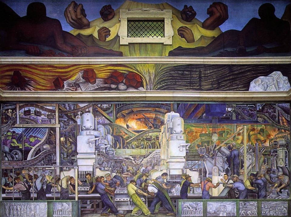
As a result of all this publicity, Diego was then invited by Edsel Ford, son of the famous Henry, to do some murals at the company’s massive car factory in Michigan. Diego put in a vast amount of time studying the plant and all its processes with the result that the two massive murals painted on opposite sides of a big, skylit hall are arguably among the greatest murals ever painted, anywhere. Stunningly dynamic and exciting and beautifully composed.

North wall of Diego Rivera's Detroit Murals (1933)

North wall of Diego Rivera’s Detroit Murals (1933)

Everything was going swimmingly until the next commission – to do a mural in the foyer of the enormous new Rockefeller Building in New York – went badly wrong.

Diego changed the design several times, to the annoyance of the strict and demanding architects, but when he painted the face of Lenin, not in the original sketches, into the mural the architects reacted promptly and ejected him from the building.

A great furore was stirred up by the press with pro and anti Rivera factions interviewed at length, but it marked the abrupt end of commissions (and money) in America. What was to have been his next commission, to paint murals for General Motors at the Chicago World Fair, was cancelled.

Diego was forced, very reluctantly, to go back to Mexico in 1934, back to ‘the landscape of nightmares’ as he called it. Marnham makes clear that he loved America, its size, inventiveness, openness, freedom and wealth – and was angry at having to go back to the land of peasants and murderous politicians.

Diego was ill for much of 1934, and started an affair with Frida Kahlo’s sister. Towards the end of the year he felt well enough to do a mural for the Palacio de Bellas Artes. In 1935 he resumed work on new rooms of the National Palace, a project he had abandoned when he set off for America. He made the decision to depict current Mexican politicians and portray the current mood of corruption. That was a bad idea. They caused so much offence to the powers that be that, once the murals were finished, the Mexican government didn’t give him another commission for six years and he was replaced as official government muralist by José Clemente Orosco.

He did a set of four panels for the Hotel Reforma in Mexico City, but the owner was offended by their blatant anti-Americanism (given that most of his guests were rich Americans) so he took them down and they were never again displayed in Diego’s lifetime.

Thus he found himself being more or less forced out of mural painting – and forced back into painting the kind of oil canvases which, paradoxically, were always far more profitable than his murals. They were relatively quick and easy to do (compared to the back-breaking effort of the murals) and so for the next five years Diego concentrated on politics.

Diego’s politics

Diego’s politics seem to be strangely intangible and were certainly changeable. He lived in a fantasy world, was a great storyteller, and Lenin and Marx seem to have entered his huge imaginarium as yet another set of characters alongside Montezuma, Cortes and Zapata.

Having joined the Mexican Communist Party in 1922 but left it in 1925. He went on an ill-fated trip to Moscow in 1927-8, arriving just as Stalin was beginning to exert his power and the campaign against Trotsky was getting into full swing. During his visit he made some tactless criticisms of the Party and so was asked by the Soviet authorities to leave.

Enter Trotsky

A decade later, stymied in his artistic career, Diego joined the International Communist League, a separate organisation from the Communist Party, which was affiliated to Trotsky’s Fourth International. He wanted to be a Communist, but not a Stalinist.

Trotsky had been exiled from the Soviet Union in 1929. For the next 8 years he wandered as an exile, with spells in Turkey, France and Norway. As this last refuge became increasingly difficult, Diego gave his support to a suggestion by Mexican intellectuals that Trotsky be given refuge in Mexico. They persuaded the reluctant Mexican government to give him safe haven at Diego’s home in Mexico City.

Trotsky lived with Diego and Frida for two years, Diego providing him with every help and resource, taking him on long tours of the country (at one point in the company of the godfather of Surrealism, André Breton, who also stayed at the Casa Azula).

Diego wasn’t a political thinker. In Russia in 1927 he had begun to realise the dictatorial turn which Soviet communism was taking, and the point was rammed home for even the most simple-minded by the simultaneous collapse of the Communist Left in the Spanish Civil War (where Stalin’s commissars, secret police and assassins spent more time torturing and killing the other left-wing forces than combating the common enemy, Franco) and then by the outrageous Moscow Show Trials of 1936-38.

Marnham’s account of all this is very interesting; he writes in a wonderfully clear, sensible, entertaining style, with a persistent dry humour.

Anyway, the idyll with Trotsky came to a grinding halt when Diego discovered that Frida had been having an affair with him. She was 30, Trotsky was 58. (One of the revelations of this book is the number of affairs Frida Kahlo had, with both men and women. She had affairs with at least 11 men between summer 1935 and autumn 1940.)

In fact Diego had put himself in some danger by hosting Trotsky. We now know that Stalin commissioned no fewer than three NKVD hit squads to track Trotsky down and kill him. After Diego kicked Trotsky out of the Blue House (the home he shared with Kahlo), the ailing Communist, along with wife and bodyguards, were fixed up in a house only a few hundred yards away.

It was here that Trotsky was subject to a horrifying attack by an armed gang led by – bizarrely – one of Mexico’s other leading mural painters – David Alfaro Siqueiros – who burst into the villa and fired 173 shots into the bedroom. Amazingly, the gunmen managed to miss Trotsky who took shelter under the bed with his wife. Siqueiros went on the run.

Having read 400 pages of Frank McLynn’s biography of the endlessly violent Mexican Revolution, I was not at all surprised: McLynn shows that this was the routine method for handling political disagreements in Mexico.

A second assassination attempt was made in August, when Ramón Mercader, also hired by the NKVD, inveigled his way past Trotsky’s security men and, as the great man leaned down to read a letter Mercader had handed him, attacked Trotsky with a small ice-pick he had smuggled into the house. Amazingly, this failed to kill Trotsky who fought back, and his guards burst in to find the two men rolling round on the floor. The guards nearly killed Mercader but Trotsky told them to spare him. Then the great man was taken off to hospital where he died a day later.

After Trotsky

Deeply wounded by Frida’s affair with the old Bolshevik, Trotsky’s murder led Diego a) to forgive her b) to flee to America, specifically  toSan Francisco where he’d received a commission to do a big mural on the theme of Pan America.

Also, a new president had taken office in Mexico with the result that the unofficial ban on Rivera was lifted. He returned to his home country and, in 1940, began a series of murals at the National Palace. There were eleven panels in all, running around the first floor gallery of the central courtyard. They took Rivera, off and on, nine years to complete and weren’t finished till 1951. They bring to the fore his lifelong engagement with a central issue of Mexican identity? Are Mexicans Aztec Indians? Or Spanish? Or half-breeds? Who are the Mexicans? What is the nation and its true heritage?

Diego and Frida

Surprisingly, Marnham deals with the last 15 or so years of Diego’s life (he died in 1957) very scantily. Rivera painted numerous more murals but Marnham barely mentions them.  Instead Marnham devotes his final pages to developing a theory about the psycho-sexual relationship between Frida and Diego, trying to tease sense out of their complicated mutual mythomania.

He starts from the fact that Frida’s illness limited her mobility and made her a world-class invalid. This she dramatised in a wide range of paintings depicting her various miscarriages, abortions, corsets, operations, prosthetic legs and other physical ailments.

But overlaid on almost all of Frida’s paintings was her unhappiness about Diego’s infidelity, especially with her own sister… In reality she seems to have had scads of affairs with lots of men and quite a few women but this doesn’t come over from her art, which presents her as a a pure victim.

And yet she was a powerful victim. Biographical accounts and some of the paintings strongly suggest that, although he boasted and bragged of his own countless affairs and ‘conquests’, in the privacy of their relationship, Diego could become the reverse of the macho Mexican male – he became Frida’s ‘baby’, the baby she was never able to have. Apparently, Frida often gave Diego baths, and maybe powdered and diapered him. Many women dismiss men as big babies: it can be a consolation for their (women’s) powerlessness. But it can also be true. Men can be big babies.

Then again Marnham quotes a startling occasion when Diego said he loved women so much that sometimes he thought he was a lesbian. And Frida apparently poked fun at his massive, woman-sized breasts.

Marnham shows how their early childhoods had much in common: both had close siblings who died young and haunted their imaginations; both fantasised about belonging to peasant Indian parents, not to their boring white European ones. And so both egged each other on to mythologise their very mixed feelings for their vexing country.

I was particularly struck to discover that, during their various separations, Frida completely abandoned her ornate ‘look’, the carefully constructed colourful dresses, and earrings and head-dresses which she largely copied from the native women of the Tehuana peninsula. According to Marnham, when the couple divorced in 1940, Frida promptly cut her hair, wore Western clothes and flew to New York to stay with friends, looking like a crop-haired, European lesbian.

The conclusion seems to be that her self-fashioning into a kind of mythological creature incorporating native dress and symbolism – and his murals, which obsess about the native inheritance of Mexico – were both ingredients in a psychological-sexual-artistic nexus/vortex/chamber of wonders which they jointly created.

Their mutual infidelities upset the other, but they also found that they just couldn’t live apart. Sex between them may have stopped but the intensity of the psychological and artistic world they had created together couldn’t be even faintly recreated with other partners.

It was obviously very complicated but in its complexity prompted the core of the artworks, in particular the endless reworking of her own image which have made Frida more and more famous, probably better known these days than her obese husband.

Looking for one narrative through all this – especially a white, western, feminist narrative – strikes me as striving for a spurious clarity, where the whole point was the hazy, messy, creativity of very non-academic, non-Western, non-judgmental, very Mexican myth-making.

Same with the politics. In her last years Frida became a zealous Stalinist. This despite the Moscow Show Trials, Stalin’s alliance with Hitler and everything Trotsky had told them from his unparalleled first-hand experience of the corrupt dictatorship Stalin was creating. None of that mattered.

Because Marx, Engels, Lenin and Stalin were part of her personal and artistic mythology. Just as Diego – more objective, more interested in the external world than Frida – experimented endlessly with the theme of the Spanish conquest, fascinated by his Aztec forbears, and endlessly tormented by the meaning of being Mexican. Is being Mexican to value the European heritage, or despise it? Should you side with the defeated Indians, or leap forwards to a future of factories and communist state ownership? Even when – as Diego knew only too well – most of the Indian peasants he claimed to be speaking for, and ‘liberating’ in his murals, in fact clung to village traditions and above all to their Roman Catholic faith, were, in other words, among the most reactionary elements in Mexican society.

Neither of them wrote clear, logical works of politics and philosophy. They both created fantasias into which their devotees and critics can read what they will. That, in my opinion, is how art works. It opens up spaces and possibilities for the imagination.

Two deaths

On 13 July 1954 Frida died, probably from an overdose of painkillers. A few months later, one of Diego’s repeated attempts to rejoin the Mexican Communist Party was successful.

He embarked on his last set of murals. In 1954 he married his art dealer, Emma Hurtado. Everyone says that after Frida’s death, he aged suddenly and dramatically. Before the year was out he was having an affair with Dolores Olmedo who had been friends with Frida, was her executrix, and was also the principal collector of Diego’s easel paintings.

So, as Marnham summarises the situation in his customarily intelligent, amused and dry style – Diego was married his deceased wife’s art dealer while simultaneously having an affair with her principal customer.

In September 1957 Diego had a stroke and in December of the same year died of heart failure. He left an autobiography, My Life, My Art, full of scandalous lies and tall tales, and a world of wonder in his intoxicating, myth-making, strange and inspiring murals.

Dream of a Sunday Afternoon in Alameda Park by Diego Rivera (1947)

Dream of a Sunday Afternoon in Alameda Park by Diego Rivera (1947)


Related links

Related reviews – Diego and Frida

Related reviews – Mexico

Monet and Architecture @ the National Gallery

This is a staggeringly brilliant exhibition for a number of reasons.

1. It is about an aspect of Monet’s work – the importance of all kinds of buildings to his art throughout his career – which has never been explored before but turns out to shed fascinating light on his art.

2. It brings together 78 works loaned from an astonishing variety of galleries across America and Europe to create a unique opportunity to see so many, and so varied, Monets together in one place. Sometimes big exhibitions are based largely on a gallery’s own collection, but not here: I counted over forty galleries and collections that works have been borrowed from. And not only that; almost a quarter are loaned from private collections. This really is a once in a lifetime opportunity to see so many works – from all round the Western world – all in one place.

3. Monet really was a genius. The first three or so rooms are interesting and contain good things, but the last two rooms, full of the works of his maturity, are quite stunning – spaces in which you feel you should be on your knees praying to the more-than-human brilliance of this complete master of oil painting.

4. They’ve really gone to town on the extras for the exhibition, with not only a fascinating audioguide but in the cinema room off to one side, a long film explaining the importance of architecture in Monet. The free printed guide contains not only a detailed timeline of Monet’s life but maps of France, Italy, London and Venice showing the precise locations where many of the paintings were made.

And the gallery has co-operated with Google Arts to produce a dedicated website / online experience which allows you to see the paintings in digital clarity, alongside text explaining their creation, all playfully titled Monet Was Here.

Seven rooms

There are seven rooms. The first three look at different ways Monet used rural and village buildings, buildings set in landscapes, to point and focus the composition. The next two look at his depictions of Paris and the Paris suburbs, from the smoky railway station of the Gare St Lazare, to the new bridge being built at Argenteuil, to busy scenes at seaside resorts, to some wonderful street scenes in Paris.

Then the last two, the Temples of Monet – the penultimate room has a wall of paintings depicting the facade of Rouen cathedral in changing light with, opposite them, a wall of wonderfully atmospheric paintings of London, Waterloo bridge and the Houses of Parliament.

And the final room is devoted to ten shimmering, magical paintings of the queen of the Adriatic, Venice.

The village and the picturesque

At the start of his career Monet used strong designs, powerfully constructed. In this example, bright colours (green grass, aquamarine sea) boats and distant smoke, but all crystallised by the hut in the foreground.

In the 1870s Monet visited Holland where he played with the influence of the great 17th century Dutch painters of landscapes and interiors. This is a rare example of a Monet where the viewer is entirely enclosed by buildings.

Footbridge at Zaandam, 1871 by Claude Monet. Musées de Mâcon © photo Pierre Plattier, Musées de Mâcon

Footbridge at Zaandam, 1871 by Claude Monet. Musées de Mâcon © photo Pierre Plattier, Musées de Mâcon

Thus the first few rooms explore numerous aspects and experiments with buildings, in townscapes, by the sea, amid fields, from close up, seen on a shimmering horizon, playing with the impact and focus they bring to a composition.

By the sea

All through his life Monet painted sequences showing the same view, or different views of the same subject, like a chemist repeating the same experiment, trying to get at the core of a reaction.

Monet spent a lot of 1882 on the Normandy coast and painted a number of works which feature a modest custom officer’s cottage on the cliffs. Sometimes centre stage, sometimes tucked away or almost hidden, the exhibition includes three of these works to show how Monet took a building as the central focus around which he could experiment. In two of them it dominates the composition but – can you see it in this picture?

The Cliff at Varengeville (1882) by Claude Monet. Private Collection, USA, Courtesy of Richard Green Gallery, London © Photo courtesy of the owner

The Cliff at Varengeville (1882) by Claude Monet. Private Collection, USA, Courtesy of Richard Green Gallery, London © Photo courtesy of the owner

In 1888 Monet travelled to the south of France, staying at Antibes which he painted from the spit or ‘cap’ across the bay. This vantage point allowed endless experimentation with the effect of the shimmering sunlight on the blue Mediterranean.

Antibes from la Salis (1888) by Claude Monet. Private collection © Photograph courtesy of Sotheby’s

Antibes from la Salis (1888) by Claude Monet. Private collection © Photograph courtesy of Sotheby’s

These Antibes paintings include recognisable landmarks – the tower of the cathedral and the medieval castle of the Grimaldi family – but the commentary points out how, in many of his paintings, Monet very deliberately chose not to include more modern elements. For example, there’s a cluster of paintings he made of the picturesque Italian town of Bodighera, which he visited and painted in 1884, and from which he quietly excised newly built holiday homes or the new railway line.

Mist and snow

But Monet isn’t all Mediterranean sunlight. One very vivid painting is a depiction of his home village of Giverny, a few miles west of Paris, in the snow.

Monet is always conscious of the effet, the effects of changing light and weather and even of the clarity or mistiness of the air. In this snowscape it is the dimly visible buildings of Giverny, the architectural elements, which give the painting a sense of depth and volume, and the composition a focus for the eye, while the paint does the work of creating a mood.

Snow Effect at Giverny (1893) by Claude Monet © New Orleans Museum of Art

Snow Effect at Giverny (1893) by Claude Monet © New Orleans Museum of Art

Impressions not precision

At about this point I should mention that Monet isn’t a particularly accurate painter of architecture. His buildings are not mathematically precise renditions of the squares and angles which modern buildings and bridges must necessarily consist of.

I recently visited the Dulwich Picture Gallery’s excellent exhibition of Edward Bawden and I very much enjoyed the way that, whether he’s doing a watercolour of his back garden or a linocut print of Covent Garden market, Bawden’s lines are all clearly defined and mathematically precise.

Albert Bridge (1966) by Edward Bawden. Trustees of the Cecil Higgins Art Gallery © Estate of Edward Bawden

Albert Bridge (1966) by Edward Bawden. Trustees of the Cecil Higgins Art Gallery © Estate of Edward Bawden

Monet’s buildings are never this precise, even when he is painting bridges or railways stations or other highly engineered structures.

Monet’s buildings, like his trees and other elements, are created by shimmering and often vague daubs of paint, overlaid and juxtaposed to create an atmosphere, a mood, an impression, rather than efforts at precise delineation.

Because I, personally, tend to like clear defined lines, I felt ambivalent about the series of big paintings Monet did of the new Gare St Lazare in Paris in 1877, a cluster of which hang here.

The commentary makes the clever point that they are a subtle subversion of the landscape genre, with a metal and glass roof replacing the sky and the shimmers of steam replacing the foliage of trees.

Maybe so. But after looking for some time I realised that I actively dislike the inaccurate draughtsmanship of the engineered roof, lamps and above all of the beautiful and ornate steam engines. All this is a kind of lost opportunity to show gleaming metal, precisely engineered structures, rivets, pistons and coupling rods. They seem to me a kind of acknowledgement of modernity which somehow misses the point of modernity.

The Saint-Lazare Railway Station (1877) by Claude Monet © The National Gallery, London

The Saint-Lazare Railway Station (1877) by Claude Monet © The National Gallery, London

Monet’s use of urban motifs

Monet’s use of contemporary urban subjects in a manner more appropriate to his style is demonstrated in The Boulevard des Capucines, Paris painted in 1873.

The commentary makes the interesting point that the painting captures the view from the first floor of the building where the first ever Impressionist Exhibition was to be held the following year, and where this very painting would be exhibited. Always interesting to learn snippets of art trivia.

And I couldn’t help thinking that there’s a large amount of L.S. Lowry in the way Monet paints his people, or at least his crowds of tottering nine-pin-like figures.

But the real visual interest is obviously in the shadow which casts a great diagonal line across the composition. It is the contrast between light and shade which really pulls Monet’s daisy, the drama it gives to the composition, the way your eye is pulled in by the great diagonal and then wants to explore the different effets of shade and direct sunlight.

So much so that if you look closely at the big buildings on the opposite side of the boulevard, you notice that they are leaning backwards – they are not accurately and strictly vertical. Architectural accuracy is not what he’s about.

The Boulevard des Capucines, Paris (1873) by Claude Monet © The State Pushkin Museum of Fine Arts, Moscow

The Boulevard des Capucines, Paris (1873) by Claude Monet © The State Pushkin Museum of Fine Arts, Moscow

This slight wonkiness is a feature of many of the paintings. It was apparent in one of the earlier seaside paintings where an enormous white cliff seemed to be bulging out and threatening to collapse onto the beach below. The walls of the rural buildings in a number of the early village scenes seemed to meet at odd angles as if about to topple over. There’s a striking early painting of rural houses with Dutch gables reflected in the river (Houses on the Banks of the Zaan, Zaandam) where the wall of the left is leaning outwards at a perilous angle. In all of them the lines are wonky and unvertical, hazy, not ‘true’ in the engineering sense.

The point is – who cares, when he paints like this?

On the Boardwalk at Trouville (1870) by Claude Monet © Photo courtesy of the owner

On the Boardwalk at Trouville (1870) by Claude Monet © Photo courtesy of the owner

In this, as in several other seaside paintings shown side by side, the point is not the mathematical precision of the booth on the left, or the hotels on the right, of the steps down to the beach or of the planking of the boardwalk – these are all elements which go to create the overall effet.

In both boardwalk paintings the important thing is not the precision but the tremendous dynamism given by the plunging perspective of the boardwalk itself, which draws you quickly right into the heart of the painting which is all about vibrant colour, space and life.

Rouen, London, Venice

The previous five rooms have contained 50 or so good and sometimes outstanding paintings – for me the Trouville paintings and Giverny in the snow stood out, and there’s a painting of the Japanese bridge over Monet’s world-famous lily pond for fans of his garden paintings – all accompanied by fascinating and insightful commentary.

But walking into the last two rooms is like walking into a different world. Here you are brought face to face with half a dozen examples each of his famous series of paintings of the facade of Rouen cathedral, opposite a selection of the series of paintings he made of the Thames in London, before you enter the final room devoted entirely to his late paintings of Venice – and it is as if you have died and gone to art heaven.

I have rarely felt so overwhelmed and awed by such an array of astonishingly beautiful artworks.

Rouen

By the 1890s Monet had perfected his technique of having multiple canvases of the same view on the go at once, and painting each of them at a specific time of the day, switching to the next one at the clock moved on, the sun rose, and the play of light and shadows changed.

Cities were easier to do this in since he needed the space to house quite a few wet canvases and all his equipment, somewhere he could leave it all overnight. The three cities represented here – Rouen, London, Venice, were all tourist resorts famous for their great architecture.

Monet painted some 30 canvases in Rouen, between February and April 1892 and the same months of 1893. He rented various rooms from shop owners opposite the cathedral which explains why there are two distinct points of view. The five massive paintings of the facade of Rouen cathedral show that slight difference in vantage point but above all Monet’s godlike ability to capture the changes in light and colour on this elaborate and detailed architectural facade, with quite stunning results.

Rouen Cathedral (1894) by Claude Monet. Private collection © Photo courtesy of the owner

Rouen Cathedral (1894) by Claude Monet. Private collection © Photo courtesy of the owner

London

Monet first stayed in London in 1870 to 1871 to escape from the violence of the Franco-Prussian War and the civil war in Paris which followed (a historical moment documented by the recent Tate Britain exhibition Impressionists in London).

In September 1899 he returned and stayed on the 6th floor of the Savoy Hotel overlooking the Thames Embankment, returning for another visit in January to April 1902. In total Monet made an impressive 100 canvases of London.

He painted the view from the Savoy he painted the view west towards Waterloo Bridge. Later he got permission to paint the houses of Parliament from the newly built St Thomas’s Hospital on the opposite bank of the Thames. In both views what interested him was the play of light.

This was made much more interesting but sometimes frustrating, by the high level of pollution in London’s air not to mention the erraticness of the English weather which made capturing exactly the same light at the same hour on successive days a challenge.

This section about London included one of the many half-finished canvases Monet made, a strikingly vague sketch of the Embankment including Cleopatra’s Needle. The commentary points out that with his London paintings, as with those of Rouen cathedral and Venice, Monet developed the paintings up to a certain point, alongside extensive sketches and notes, and then finished the paintings back home at Giverny.

Two of the Parliament paintings really stood out for me, one where the sun is flaming red and the Thames is on fire. Right next to it the exact same view at night with the moon a divided into fragments by cloud and reflecting shivers of silver all over the river surface.

But the one I really couldn’t tear myself away from was this stunning painting of an orange sun struggling through the London smog to glimmer and fleck red-gold highlights on the Thames. The painting is all about light and colour, it is a masterpiece of what oil painting can do to fill the visual cortex with pleasure – and yet the vague architectural structure of London Bridge with its neat arches, just barely visible through the smog, is a vital part of the composition in the way it enables the light to exist, to function, to perform.

Waterloo Bridge, Sunlight in the Fog by Claude Monet

Waterloo Bridge, Sunlight in the Fog by Claude Monet

Venice

Monet visited Venice in 1908, staying for two months in apartments on the Grand Canal. The floating city under a Mediterranean sun was crying out to be depicted by the greatest impressionist of all. He produced 37 canvases, of which nine are on show here.

No people. No human activity is portrayed. Just the play of unearthly pink and eggshell blue in this watery paradise. (On a practical note, observe how the buildings on the right have the characteristic Monet lean; to my eye all of them look out of ‘true’, bulging out slightly over the water – but, as mentioned before, who cares.) they are quite staggeringly, luminescently transcendent works of art.

The Grand Canal (1908) by Claude Monet © Fine Arts Museums of San Francisco

The Grand Canal (1908) by Claude Monet © Fine Arts Museums of San Francisco

Scholarly conclusion

The rational, historical, art scholarly conclusion is that Monet used a very wide range of buildings, more than has previously been recognised, as motifs in his paintings:

  • as the basis of designs and patterns and compositions
  • as symbols of modernity and the bustling city
  • or to emphasise rural tranquillity or isolation

In all cases using buildings to create, point and highlight his subtle emotional and psychological effects. Then, later in his career, he uses buildings as the subjects of some of his most dazzling, experimental and awe-inspiring works, the London, Rouen, Venice paintings.

Emotional conclusion

Often by the end of an exhibition I’m full to overflowing with facts and impressions and a little relieved to walk back out onto the street, but I found it genuinely difficult to leave this one, in particular to leave the room full of Monet’s London paintings.

I spent a good ten minutes looking from one to another and back again, walking out the room then finding myself drawn back in, to marvel all over again at Monet’s unprecedented handling of paint and the breathtaking creation of gorgeous, transcendent, shimmering works of art.

I’ve rarely encountered such a feeling of pure, unalloyed beauty and wonder in an art exhibition.

Exhibition videos

This is an introduction to the role of architecture in Monet’s life by Christopher Riopelle, The Neil Westreich Curator of Post 1800 Paintings at the National Gallery in London.

And here is Richard Thomson, exhibition curator and Watson Gordon Professor of Fine Art at the University of Edinburgh, introducing The Credit Suisse Exhibition: Monet & Architecture.


Related links

Reviews of other National Gallery exhibitions

Impressionists by Antonia Cunningham (2001)

This is a small (4½” x 6″) but dense (256 high-gloss pages), handily pocket-sized little overview of the Impressionist movement.

The ten-page introduction by Karen Hurrell is marred by some spectacular errors. In the second paragraph she tells us that Paris was ‘in the throes of the belle epoque‘ when the 19-year-old Monet arrived in town in 1859 – whereas the Belle Époque period is generally dated 1871 to 1914. She tells us that Napoleon Bonaparte had commissioned the extensive redesign of the city  when she means Louis-Napoléon Bonaparte, the great man’s nephew and heir, more commonly known as Napoleon III, who reigned as Emperor of the French from 1852 to 1870.

Thus cautioned to take any other facts in the introduction or the picture captions with a touch of scepticism, nonetheless we learn some basic background facts about the Impressionists:

Monet was inspired by the French landscape painter Eugène Boudin (1824 to 1898)

Success in the art world was defined as acceptance of your work into the biannual exhibition of the Paris Salon

Reputable artists were expected to train at the Académie des Beaux-Arts which was dominated by the classical painter Jean-Auguste-Dominique Ingres (1780 to 1867), who insisted on training in draughtsmanship, copying the Old Masters, using a clear defined line.

Edgar Degas (1834 to 1917) enrolled in the Beaux-Arts as did Pissarro.

Monet attended the Académie Suisse where he met Pissarro, then entered the studio of Charles Gleyre: here he met Pierre-Auguste Renoir (1841 to 1919). Alfred Sisley (1839 to 1899) and Frédéric Bazille (1841 to 1870).

Older than the others and really from a different generation was their inspiration, Édouard Manet (1832 to 1883). He sought academic success in the traditional style, attaining Salon success in 1861.

In 1863 the Salon refused so many contemporary painters that Napoleon III was asked to create a separate show for them, the Salon des Refusés. Manet stole the show with his The lunch on the grass showing a naked woman in the company of two fully dressed contemporary men.

The 1865 Salon show included works by Degas, Manet, Pissarro, Renoir, Berthe Morisot (1841 to 1895).

From 1866 Manet began to frequent the Café Guerbois, and was soon joined by Renoir, Sisley, Caillebotte and Monet, with Degas, Henri Fantin-Latour (1836 to 1904), Paul Cézanne (1839 to 1906) and Pissarro also dropping by, when in town. They became known as the Batignolles Group after the area of Paris the cafe was in.

Paris life of all kinds was disrupted by the catastrophic Franco-Prussian War and then the disastrous rising of communists during the Paris Commune, which was only put down by the official government with great bloodshed and destruction (July 1870 to May 1871). All the artists who could afford to fled the city, many to England and London – an event which was the basis of the Tate Britain exhibition, Impressionists in London.

From April to May 1874 this group held an independent art exhibition in the gallery of the photographer Nadar. The critic Louis Leroy took exception to Monet’s painting Impression: Sunrise (1872), satirising the group’s focus on capturing fleeting impressions of light instead of painting what was there, but the name was taken up by more sympathetic critics and soon became a catch-phrase the artists found themselves lumbered with.

It’s interesting to note that Degas was a driving force behind this and the subsequent Impressionist shows, single-handedly persuading artists to take part. He himself was not really an impressionist, much of his subject matter, for example, being indoors instead of painting out of doors, en plein air, as Impressionist doctrine demanded. Similarly, whereas the other experimented with creating form through colour i.e. using colour alone to suggest shape and form, Degas was to the end of his life a believer in extremely strong, clear, defining lines to create shape and form and texture.

In 1876 the group exhibited again, at the gallery of Paul Durand-Ruel. The role played by Durand-Ruel in sponsoring and financing the Impressionists was chronicled in the national Gallery exhibition, Inventing Impressionism.

There were eight Impressionist exhibitions in total: in 1874, 1876, 1877, 1879, 1880, 1881, 1882, 1886. The eight Impressionist exhibitions

From this point on we begin to follow the differing fortunes and styles of the group:

Monet

developed his mature style in the first half of the 1870s, letting go of any attempt to document reality, instead developing ‘a new vocabulary of painting’ in blobs and dashes of often unmixed primary colours in order to capture the essence of the scene. In 1880 Monet organised a solo show and submitted two works to the Salon. Degas called him a sell-out, but he was trying to distance himself from the group.

Renoir

developed a unique style of portraying the gaiety of contemporary Parisian life in realistic depictions of people dancing and drinking at outdoor cafés, with broad smiles, the whole scene dappled with light. He was to become the most financially successful of the group and you can see why: his uplifting works are popular to this day. In the 1880s he took to nudes and portraits rather than landscapes. He was always interested in people.

Degas

resisted being called an Impressionist – he painted mostly indoor scenes and never abandoned his hard outlines – but certainly was influenced by the Impressionist emphasis on the effect of light captured in loose brushstrokes. During the 1870s he began to produce the hundreds of oil paintings and pastels of ballet dancers which were to be a key subject.

Mary Cassatt (1844 to 1926)

American, Cassatt saw a Degas in a dealer’s window and realised these were her people. She lightened her palette, adopted the modern attitude towards light and exhibited at the successive Impressionist exhibitions.

Sisley

became dependent on Durand-Ruel. When the latter fell on hard times, Sisley and his family led a tough, hard-up, peripatetic life. Arguably he is the only one who never developed but carried on working in the same, pure Impressionist way.

Pissarro and Cézanne became firm friends, painting the same scenes side by side.

Cézanne

Even at the time commentators could see the difference with Cézanne applying paint in broad, heavy brushstrokes, and becoming ever more interested, less by light than by the geometric forms buried in nature, increasingly seeing the world as made of blocks and chunks and rectangles and rhomboids of pure colour – paving the way for Cubism and much modern art. His style diverged from the group just as Impressionism was becoming more accepted, by critics and public. He resigned from the group in 1887.

Neo-impressionism

The name given to the post-impressionist work of Georges Seurat (1859 to 1891), Paul Signac (1863 to 1935) and their followers who used contemporary optical theory to try to take Impressionism to the next level.

Seurat

developed a theory called Divisionism (which he called chromoluminarism) the notion of creating a painting not from fluid brush strokes but from thousands of individual dots of colour. Seurat used contemporary colour theory and detailed colour wheels to work out how to place dots of contrasting colour next to each other in order to create the maximum clarity and luminosity. The better-known technique of pointillism refers just to the use of dots to build up a picture, without the accompanying theory dictating how the dots should be of carefully contrasting colours.

There follow 120 very small, full colour reproductions of key paintings by the main members of the movement (and some more peripheral figures). Each picture is on the right hand page, with text about the title, date, painter and a one-page analysis on the page opposite. Supremely practical and useful to flick through. Here’s a list of the painters and the one or two most striking things I learned:

Eugène Boudin (1)

The landscape painter Monet credited with inspiring him to paint landscapes.

Manet (15)

I love Manet for his striking use of black, for his use of varying shades of white but he is not a totally convincing painter. His two or three masterpieces are exceptions. I struggle with the perspective or placing of figures in Dejeuner sur l’herbe, particularly the woman in the lake who seems bigger and closer than the figures in the foreground and is a giant compared to the rowing boat, and the way the lake water is tilting over to the left. He was awful at painting faces – Inside the cafe, Blonde woman with bare breasts. The body of the Olympia is sensational but her badly modelled head looks stuck on. In 1874 he began experimenting with the Impressionists’ technique i.e. lighter tones and out of doors, not that convincingly (The barge).

Frederic Bazille (2)

Bazille studied with Monet, Renoir and Sisley but on this showing never quit a highly realistic style – Family reunion.

Monet (16)

Without a doubt the god of the movement and the core practitioner of Impressionism, produced hundreds of masterpieces while slowly fascinatingly changing and evolving his technique. The big surprise was an early work, Women in the garden (1867) which shows what a staggeringly good realistic artist he could have been: look at the detail on the dresses! Of all the impressionist works here I was most struck by the modest brilliance of the water and reflections in The bridge at Argenteuil (1874).

Alfred Sisley (6)

The English Impressionist. Always hard up, he persisted in the core Impressionist style. I was struck by Misty morning (1874) and Snow at Louveciennes (1878).

Camille Pissarro (14)

Ten years older than Monet, he quickly took to the Impressionist style (an open-mindedness which led him, in the 1880s, to adopt Seurat’s new invention of pointillism). Pissarro is the only one of the group who exhibited at all 8 Impressionist exhibitions. I was bowled over by Hoar frost (1873). I too have walked muddy country lanes in winter where the ridges of churned up mud are coated with frost and the puddles are iced over, while a weak bright winter sun illuminates the landscape.

Renoir (15)

Everyone knows the depictions of happy Parisians dancing at outdoor cafés under a dappled summer light. Set next to the landscapes of Monet, Sisley and Pissarro you can see straightaway that Renoir was fascinated by the human figure and was an enthusiastic portrayer of faces. I like Dance in the country (1883) for the extremely strong depiction of the man, an amazing depiction of all the shades of black to be found in a man’s black suit and shoes. I was startled to learn that, in the mid-1880s, dissatisfied with Impressionism, he took trips abroad and returned from Italy determined to paint in a more austere classical style. The plait (1884) anticipates 20th century neo-classicism, and is not at all what you associate with Renoir.

Armand Guillaumin (2)

From a working class background, Guillaumin met the others at art school, exhibited in the Salon des Refusés show, but never had a large output.

Edgar Degas (17)

Having visited and revisited the Degas exhibition at the National Gallery, I am convinced Degas was a god of draughtsmanship. It’s interesting that he lobbied hard for the Impressionists and organised the critical first exhibition, but always denied he was one. Skipping over the obvious masterpieces I was struck by the faces, especially the far left face, of The orchestra at the opera (1868). It shows his characteristic bunching up of objects. And the quite fabulous Blue dancers (1897).

Gustave Caillebotte (3)

A naval engineer turned artist. The only link with the Impressionist style I can make out is his frank depiction of contemporary life. But the dabs and rough brushwork, leaving blank canvas, obsession with sunlight and creating form out of colour alone – none of that seems on show here. Street in Paris in the rain (1877). Very striking and distinctive but I’m surprised to find him in the same pages as Sisley or Pissarro.

Berthe Morisot (6)

On the evidence here, painted lots of women in quiet domestic poses. Young girl at the ball (1875). See her 2023 exhibition at the Dulwich Picture Gallery.

Mary Cassatt (5)

More scenes of quiet domestic life, some of which eerily prefigure the same kind of rather bland domestic style of the early 20th century. Young mother sewing (1900)

Paul Cézanne (16)

Yesterday I visited the exhibition of Cézanne Portraits at the National Portrait Gallery, so those 50 or so portraits are ringing in my memory, along with knowledge of how he painted subjects in series, the style he developed of painting in kinds of blocks or slabs of colours, which bring out the geometric implications of his subjects, and his playing with perspective i.e. the three or four components of even a simple portrait will be depicted as if from different points of view, subtly upsetting the composition The smoker (1890). Among the brown portraits and orangey still lifes, a dazzling riot of green stood out, Bridge over the pond (1896) though it, too, is made out of his characteristic blocks of (generally) diagonal brushstrokes, clustered into groups which suggest blocks or ‘chunks’, giving all his mature works that odd ‘monumental’ look, almost as if they’ve been sculpted out of colour more than painted smoothly.

Seurat (2)

Nineteen years younger than Monet (born in 1859 to Monet’s 1840), Seurat was not an Impressionist, but exhibited with them in 1886. His highly intellectual theory of Divisionism divided the group, causing big arguments. Seurat produced some highly distinctive and classic images before dying tragically young, aged 31.

Conclusion

This is a very handy survey, a useful overview of 120 works which remind the reader a) how varied the Impressionists were b) who were the core flag-wavers (Monet, Sisley, Pissarro) c) who were the outriders (Manet, Degas) and above all, d) what scores and scores of wonderful, enduring masterpieces they created.


Nineteenth century France reviews