When Forms Come Alive: Sixty Years of Restless Sculpture @ the Hayward Gallery

This is a great, a really great exhibition. I came out wreathed in smiles, hesitated a moment, then went back in and did the whole thing all over again. And I wasn’t the only one enjoying it – it was packed, very noticeably with young families with prams and crawling babies and toddlers and junior school-aged kids. This is unusual at London art galleries which are generally full of doddering grey-haired old seniors. Word has somehow gotten around about what fun it is!

Planet organic

Why? Well, it’s billed as a massive survey of abstract, organic sculpture featuring the work of 21 international artists from the past 60 years. Obviously the broad term ‘sculpture’ can include realistic depictions of people and animals, depictions of buildings or manufactured objects, along with all manner of angular modernists creations. But all those possibilities and visions have been omitted as the curators have chosen works expressly designed to convey the shapes and forms and motions of organic life.

Bubbling foam and shiny baubles, hanging mesh and oozing tubes, wormlike mouldings and flying tutus, pendulous eggs and looping strands, tenuous tendons and metallic tangles, hidden claws and giant talons, all the works have been chosen for the way they capture, suggest, echo, are based on the endlessly moving, changing, bubbling, proliferating forms of organic life.

It’s a show of (mostly static) works which, however, suggest movement, melting, flux and floating, congeries and conglomerations, a continually impressive collection of sculptural forms that seem to ooze, undulate, blossom, erupt and sprawl all over the gallery space and beyond.

The drag of political art

Many if not most modern art exhibitions are highly themed and conceptualised – many are overtly political and polemical, such as the current exhibitions at the Barbican (the politics of textiles), Tate Britain (Women in Revolt!) and Dulwich Picture Gallery (Black artists’ takes on the genre of landscape painting).

Art works in those kinds of shows are more often than not chosen to make a political point and so are accompanied by baleful and grim text labels, ramming home the curators’ woke concerns. (I’m not using ‘woke’ in a general derogatory sense but in its original dictionary definition of ‘alert to racial prejudice and discrimination’, which is exactly what the Barbican and Dulwich shows are at pains to be.)

The joy of fun art

Anyway, that’s all by way of explaining that this show comes as quite a relief from the relentless preaching of art curators, because it is actually about art, just art, just the expression of forms and shapes for their own sake, for the fun of exploring and playing.

It feels playful. It feels fun. The promotional photos show small children looking in awe at a huge agglomeration of metal balls (‘Untitled’ by Tara Donovan) or two giant carrot shapes (‘Tunnel Boring Machines’ by Teresa Solar Abboud), and a child’s perspective is entirely appropriate to get the most from the wonderful shapes and vibrant colours on display – to the flying skirts (DRAFT) and bubbling foam (Michel Blazy) and funny sounds and neon constructions (E.J. Hill) and huge blobs and massive pink fabric worms (Eva Fàbregas) and big blob of metal lava (Lynda Benglis) and dangling fabrics (Ernesto Neto) and looming dolmen (Phyllida Barlow).

We are, just occasionally, allowed to stop feeling guilty about our part in the slave trade or institutional misogyny; we are allowed to relax and let our minds frolic and sport around and under and into weird and wonderful shapes, to be let off the leash of society’s endless worrying about ‘issues’ and let the carefree mind rediscover the primal joy of shapes and patterns created for our delight – and this is the exhibition to do it at!

It’s a welcome reminder that art can actually be carefree and fun, strange and mysterious, teasing and tantalising. For once I felt like I was visiting an exhibition of art designed to uplift and inspire me instead of attending my company’s compulsory course on inclusion and diversity.

We are allowed to smile. We are allowed to laugh out loud. We suddenly remember something we’d forgotten amid the stern and serious lecturing of those other exhibitions, that art can be liberating and light and frolicsome and funny. I’m smiling. Give yourself a treat.

Engineering

Buried in the layout is a form of chronological order, and you could take it that way, studying the wall labels to follow changing looks and trends from the 1950s onwards.  But what this approach highlights is not so much developments in the artistic imagination as in technology and engineering. In each successive decade you can see how technological developments in moulding and shaping, erecting and supporting, above all in the variety and malleability of a steadily increasing diversity of materials, allowed artists’ imaginations to bloom and expand.

Gallery

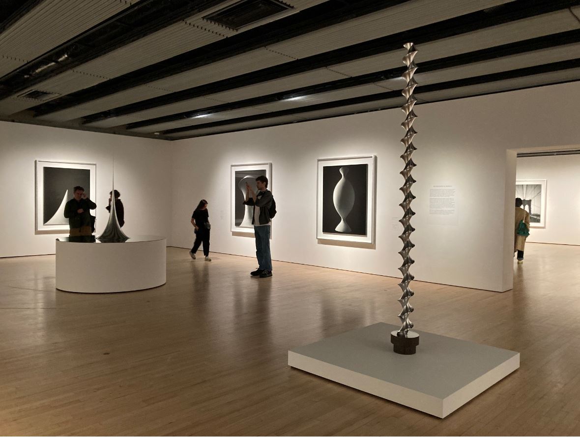
Here’s a gallery of some of the most striking works and, as I increasingly do, I’ll add in the curators’ own wall labels about them. These are italicised to make it crystal clear they are not my words.

Tara Donovan

Installation view of ‘Untitled (Mylar)’ by Tara Donovan (2011) Photo by Jo Underhill

Tara Donovan makes her sculpture from manufactured materials that are often a part of consumers’ everyday lives but she finds her primary inspiration in nature. Untitled (Mylar) is created from thousands of flat, reflective discs of Mylar (a metallic polyester film), which have been folded, hot-glued and massed into spheres of varying sizes. Together they form a gigantic agglomeration that appears to mimic the growth patterns of biological or molecular structures. As always in Donovan’s work, light is an important factor, which she thinks of as an additional material, generating kaleidoscopic perceptual shifts of reflectivity as the viewer moves around the installation.

Eva Fàbregas

Installation view of ‘Pumping’ by Eva Fàbregas (2019) Photo by Jo Underhill

‘My work aims to fully inhabit the world of the senses, to imagine other possible bodies, other ways of feeling, caring and being in the world.’

A trio of massive inflatables crawls across the exhibition space. Made from stretched fabric and inflated balls, these tangled, pulsating forms appear distinctly intestinal. The sculptures are like instruments, activated by a choreography of subsonic frequencies, elastic rhythms, and textural sounds. The bass-heavy soundtrack is inspired by the artist’s experience of sound systems in nightclubs; Eva Fàbregas intends for the low audio frequencies in her work, emitted by multiple subwoofers, to be felt and not just heard. We resonate together with the sculptures, recalling forms of communication that occur inside us – at a cellular level – and between our bodies and the world.

Marguerite Humeau

Installation view of ‘The Guardian of Ancient Yeast’ by Marguerite Humeau (2023) Photo by Jo Underhill

‘There are forms of life that will survive us. How can we take them as our guides or companions to understand how to navigate our own futures?’

The sculptures in this room by Marguerite Humeau evoke forms that exist in nature: honeycomb, gills of mushrooms, discs of bracket fungi. The tallest sculpture, The Guardian of Ancient Yeast, takes its shape from termite mounds. Working collectively, termites build enormous structures to protect and grow fungi that feed the entire colony. Humeau draws a parallel with the way yeast has contributed to the evolution of human societies through its use in making bread and beer, which have been staples of communal gatherings for millennia. Multiple musical loops, all recorded from one single saxophone, connect the sculptures through a dynamic soundscape, as if they are engaged in ongoing conversations and attempting to synchronise. This interconnectedness hints at the opportunities that can arise from the interdependence of organisms.

Choi Jeong Hwa

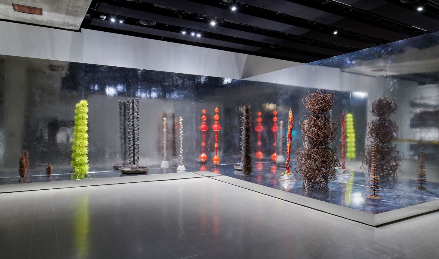
Installation view of ‘Blooming matrix’ by Choi Jeong Hwa (2008) Photo by Jo Underhill

Choi Jeong Hwa’s columns of discarded junk are bearers of memory across time, space and cultures. Built from a mix of man-made and natural objects that were once the stuff of everyday life, their varied textures and symmetrical shapes echo structures found in nature. Choi refers to his playful and dynamic forms as ‘stupas’ – markers for religious places of burial and/or meditation. Individually and collectively, they point to the consumerism and overconsumption that has caused the environmental loss of the plant-life they resemble.

Jean-Luc Moulène

Installation view of ‘Plongement 1’ and ‘Méduse’ by Jean-Luc Moulène (2023 and 2018) Photos by the author

With their intricate play of irregular forms, Jean-Luc Moulène’s small sculptures often convey a sense of fluid movement. Méduse (the French word for jellyfish) brings to mind that creature’s shape-shifting mode of propulsion, its tentacles floating freely behind its open, bell-shaped body. Even in his blown glass and metal sculptures that draw on the shapes of different types of knots, the artist imbues his objects with a suggestion of dynamic change and deformation.

Plongement 1 reminded me (and the gallery attendant I discussed it with) of the Alien movies. We shared a very slight worry that, if we turned our backs on it, the metal claw would leap out of its glass container and grab us.

Lynda Benglis

Installation view of ‘Quartered Meteor’ by Lynda Benglis (1969, cast 1975) Photo by the author

‘The pouring of the material was very much about wanting to create undulating surfaces and complex planes that resist geometry; I like things to flow.’

A cast of an earlier work made from polyurethane foam (‘King of Flot’, 1969), this sculpture is made from lead – one of the most malleable metals – but its uncanny sense of liquidity is at odds with its solid form. To create the original work, Lynda Benglis heaped polyurethane into the corner of a room. Installed just away from the wall, this sculpture is strangely solid, like lava that has stopped mid-flow. The title alludes to the fiery conditions under which it could become molten again, drawing our attention to the instability of all forms.

Ruth Asawa

Installation view of sculptures by Ruth Asawa. Photo by Jo Underhill

These hanging sculptures are looped from wire using a basket-making technique that Ruth Asawa learned in Toluca, Mexico. The resulting objects have a lightness and transparency that belies their complexity, not unlike the natural forms – leaves, seed pods and spiders’ webs – that fascinated Asawa and inspired her artistic work. The nested, intersecting and continuous surfaces produce variations in density, which affect the patterns of light that pass through the forms and the shadows that they cast. Each work presented here shows a different stage in the development of Asawa’s technique from the 1950s to the 1990s.

Installation view of ‘A Subsequent Offering’ by E.J. Hill (2017) Photo by Jo Underhill

‘Thinking about roller coasters is one way for me to communicate ideas that I have about struggle and mortality and the impulse to go higher and faster and test our physical and mental limits.’

E.J. Hill has described rollercoasters as public monuments to the possibility of attaining joy, which, as he notes, is ‘a critical component of social equity.’ Although Hill’s gallery-scaled rollercoaster is unrideable, it prompts us to imagine the terror evoked by free-falling, the joy of moving at high speed, and the thrill of being propelled around its looping track. The public expression of these emotions presupposes a sense of safety that, as Hill points out, is not equally available to all bodies: ‘So much of my life in this body, in a black body, being queer, it’s not quiet, it’s very loud, aggressive and violent. That’s my experience. I feel like the counter to that, to all those loops and twists and turns, absolutely has to be a self-imposed quietness and stillness.’ For the first presentation of this work Hill lay on the platform at the centre of the installation, all day, every day, inserting his own immobile body into the scene. As a subsequent offering, this sculpture is what Hill describes as a ‘performance relic’, but one that invites us all to think about the nature of collective experience.

Installation view of ‘untitled: girl ii; 2019’ by Phyllida Barlow. Photo by the author

Writing about the nature of sculpture, Phyllida Barlow (1944 to 2023) noted that it can be awkward, unbalanced, restless and unpredictable – qualities that she seems to convoke in ‘untitled: girl ii; 2019’. Like all her sculpture, this massive dolmen-like object asks us to walk around it, wonder about it. Its figurative appearance, like a voluminous dancer en pointe with swollen, meaty thighs, seems both ominous and absurd. In a poetic text she wrote when this sculpture was first shown, the artist revealed that its genesis lay in a memory from her childhood: in an abandoned house on a wild moor, among ‘unnameable things’, Barlow recalled ‘these big shapes, anthropomorphic…dumb, curvaceous, still, biding time…’

DRIFT

Installation view of ‘Shylight’ by DRIFT (2006 to 2014) Photo by the author

DRIFT describe Shylight as ‘a performative sculpture; when you enter the space it becomes a kind of dance that is performed in front of you.’ Shylight’s fluidly ascending and descending lights are programmed to open and close like flowers whose petals furl and unfurl in response to changes in light or climate. DRIFT’s aim is to call attention to such rhythms and harmonies in our everyday natural environment. The impetus for their work can be as varied as the flight patterns of birds, a proliferation of dandelion seedheads, or the formation of a mass of clouds, coupled with innovative, cutting-edge technology.

Installation view of two ‘Tunnel Boring Machines’ by Teresa Solar Abboud (2021) Photo by the author

‘These works are a reimagination of the underground, with vibrant, finely finished elements that ooze out from the pores of the rough clay. They are hybrids between biology, geology and engineering.’

These three Tunnel Boring Machines by Teresa Solar Abboud resemble composite entities combining industrial and organic materials and forms. Emerging from clay bases, sleekly shaped ‘limbs’ painted in bright, artificial colours, suggest a range of forms – fins, propeller blades, aerodynamic appendages – all of which appear to be engineered to generate dynamic movement. In contrast, roughly-worked, heavy clay ‘joints’ function as bases or points of equilibrium for these polished elements. For the artist clay evokes the ancient, raw material of mud, which ‘always speaks to the underground, the mountains, the landscape; that which is underneath us all the time but we can never see.’

The one big drawback

The exhibition’s wall labels and individual captions, the press and promotional material and everything on the website, all trumpet the notion that the artworks capture the fundamental principle of organic life that nothing in the world stays the same, that everything is moving, changing and transforming

We are repeatedly told about the works’ ‘sensuous textures and surprising physical qualities’, and that sculpture ‘can be an indispensable vehicle for rediscovering and recovering lost dimensions of physical experience’.

All of which made it the more frustrating that you’re not allowed to touch them. Not only are there grey strips on the floor around all the artefacts beyond which you must not tread, but entrance into the exhibition is delayed while the ticket guy tells every single visitor that they MUST NOT TOUCH THE ARTWORKS.

God, how frustrating. I wanted again and again to reach out and touch and stroke and caress and run my fingers over these balls and bulges and foams and fantastical shapes, fabric and metal and glass and foam, closed my eyes and really, really let my other senses enjoy their involutions and contortions and reshaping of space.

Take the neon rollercoaster by E.J. Hill. He tells us how he spent whole days lying on the mat built into the sculpture, on the left hand side in the photo. My God, wouldn’t it be great if visitors could do that – lie down and become part of the sculpture. Or ‘Pumping’ by Eva Fàbregas, the room-sized arrangement of big pink fabric worms, just crying out, if not for me then certainly for little kids to run in and out of its arches and folds and explore, giggling and squealing!

Alas that in this of all exhibitions, which is about organic shapes and contours and materials and complex patterns, the visitor has to keep their distance, is kept apart from, detached from, prevented from enjoying, the really full all-sensual experience which the works so obviously cry out for.

And there were so many little kids on my visit, who would have loved to have run in and out of the bigger pieces, or run their hands across the surfaces of the weird and wonderful creations, generating a real sense of awe and strangeness which might last them a lifetime.

Instead, for all the curators’ brave talk of joyous this and sensual that, ‘When Forms Come Alive’ is visually stunning but remains as emotionally cold and sensually sterile as an operating theatre. Shame.

The artists

Twenty-one artists, 2 from the UK, 7 from the USA.

They are Ruth Asawa (USA), Nairy Baghramian (Iran), Phyllida Barlow (UK), Lynda Benglis (USA), Michel Blazy (France), Paloma Bosquê (Brazil), Olaf Brzeski (Poland), Choi Jeonghwa (South Korea), Tara Donovan (USA), DRIFT (Netherlands), Eva Fàbregas (Spain), Holly Hendry (UK), EJ Hill (USA), Marguerite Humeau (France), Jean-Luc Moulène (France), Senga Nengudi (USA), Ernesto Neto (Brazil), Martin Puryear (USA), Matthew Ronay (USA), Teresa Solar Abboud (Spain) and Franz West (Germany).


Related links

More Hayward Gallery reviews

Hiroshi Sugimoto: Time Machine @ the Hayward Gallery

This is an outstanding exhibition. For once all the superlatives like ‘landmark’ and ‘definitive’ are true. I massively recommend it.

Hiroshi Sugimoto

Born in 1948, Hiroshi Sugimoto is a Japanese photographer, who has also been involved in architecture and set design. He’s famous in the art world for the way that, over the past 50 years, he has created a body of carefully crafted, subtly thought-provoking and quietly subversive photographs. The central point about his photography is that it is not ‘documentary’ in the sense of recording the world as he finds it. Instead Sugimoto’s photography is proactive, creative, staged and invented. It is expressive, expressing ideas and feelings from within, in this respect more like a kind of poetry than what we usually think of as photography.

‘Usually photographers capture something. I use the camera to project my inner idea of reality.’

Staged and carefully conceptualised as his photography is, Sugimoto’s work tends to come in sets or series. He’s had scores of exhibitions but they have tended to focus on specific series. This is the first one to display key works from all the series spanning his entire career. It’s a triumph. It’s dazzling.

Time

I initially thought the exhibition title ‘Time Machine’ was a bit contrived but it turns out to be extremely accurate and apposite. Over the different series, Sugimoto explores history, prehistory, the origin of life, the power of natural forces, compresses 2 hour movies into one image, in hugely inventive ways. They really do amount to an exploration of time, light and space. In his visual universe the ancient ancestors of man come to life while talismanic modern buildings take on the aura of archaeological runs.

He is a majestically playful artist, playing with the technology of camera, our understanding of what a photograph is and what it can depict. The old cliché has it that the camera never lies. No, but it can invent and subvert and tell stories, and Sugimoto must be one of the most beguiling and mind-opening storytellers to ever use a camera.

Sugimoto is quoted as saying:

‘The camera is a time machine capable of representing the sense of time… The camera can capture more than a single moment, it can capture history, geological time, the concept of eternity, the essence of time itself… The more I think about that sense of time, the more I think this is probably one of the key factors  of how humans became humans.’

The Director of the Hayward Gallery, Ralph Rugoff, is quoted as saying:

His photographs ingeniously recalibrate our basic assumptions about the medium, and alter our sense of history, time and existence itself. Amidst all his peers, his work stands apart for its depth and striking originality of thought.

And for once this kind of hyperbole is completely true.

Big and black and white

All Sugimoto’s are big, really big, often four or five feet square. And almost all of them are in beautifully crisp black and white, except for the very last room, which forms a kind of climax to the show and where his images explode into vivid vibrant colour.

This makes them very immersive. That word is often bandied about but here it’s true. Whether it’s a huge photo of an empty movie theatre, or a vast image of the Eiffel Tower or the soothing, calming series of seascapes, the longer you look, the calmer you feel and the more you feel mesmerically drawn into the image and into its teasing, beguiling worldview.

Manatee by Hiroshi Sugimoto (1994) © Hiroshi Sugimoto, courtesy of the artist

Diorama

Shortly after arriving in New York in 1974 Sugimoto visited the American Museum of Natural History. Here he discovered an array of Victorian-era dioramas which display stuffed animals in what are effectively stage sets of their natural habitat. he was beguiled by the way the animals looked stuffed, static and fake and yet, if you stepped back and deliberately blurred your focus or took just a quick look, they seemed to come to life.

Thus began the photographic series which he was to call Dioramas. His first piece was a shot of a stuffed polar bear. Using an old large-format camera and black and white film, he set up like a Victorian photographer. He exposed the film for 20 minutes during which he made careful lighting adjustments to capture texture and tonal differences between the stuffed bear and its artificial background. Thus was born an entire approach, an entire aesthetic.

Polar Bear by Hiroshi Sugimoto (1976) © Hiroshi Sugimoto, courtesy of the artist

The Diorama photos draw attention less to the natural world than to its theatrical representation in museums. In Sugimoto’s hands what was intended by its creators to be dramatically realistic becomes eerily false. These are depictions of the unnatural world. He himself is quoted as saying these works being out a subtle fleeting sense of ‘ the fragility of existence’. They certainly give a flavour of its eeriness.

Theatres

In 1976 Sugimoto made another experiment. He set up his big old-fashioned black-and-white camera at the back of a New York movie theatre and here’s the thing – he set the exposure time not to a fraction of a second but to the length of the entire film, some two hours. The 178,000 or so frame required to project a 2-hour long movie are reduced back to one fixed image. All the dramatic action which so much work and imagination has gone into crafting is reduced to a kind of timeless essence, to a single image of radiant whiteness. Two hours of time are compressed down to the the eternity of one photographic image.

UA Playhouse, New York by Hiroshi Sugimoto (1978) © Hiroshi Sugimoto, courtesy of the artist

It’s impossible to convey, you have to see them in the flesh, but in the ten or so variations on the theme on display here the white screen at the centre of the composition glows, eerily, incandescently, ominously. Some kind of optical illusion is going on because I swear the white rectangles glowered and shimmered and seemed to overflowing the frames.

The whiteness is a kind of absence, the absence of the movie you’re used to consuming a frame at a time. But it’s also an image of excess, of the too-muchness of all those multicoloured images which have collapsed into a white glare, too much for the camera to take in, overflowing with artifice.

And, of course, on a more obvious level, the white light from the blank screens illuminates the wonderful interior architecture of these movie palaces, and part of the pleasure of the series is enjoying the different styles and decorations to be found under the one category ‘cinema’.

Drive-ins

Later the idea led to a spin-off, which was applying the same kind of prolonged exposure technique to drive-in movies. Here, while the movie is reduced to a glowing rectangle, the camera records the vapour trails of planes flying overhead and the passage of stars through the night sky. So at least three different types of time are recorded in the same image.

Union City Drive-in, Union City by Hiroshi Sugimoto (1993) © Hiroshi Sugimoto, courtesy of the artist

This in turn gave rise to a series titled ‘Opera House’ (2014) which records the fancy filigree decoration of Europe’s grand opera houses, decorative details which was copied for a long time by cinemas. And then of ‘Abandoned Theatres’ which records the many movie houses which have fallen into neglect and ruin as entertainment goes in home.

Installation view of the ‘Theatres’ series at ‘Hiroshi Sugimoto: Time Machine’ at the Hayward Gallery (photo by the author)

Portraits

In 1999 Sugimoto approached Madame Tussauds, famous home of wax portraits of the famous. The intention was similar to the Diorama series which was to imbue the utterly fake and artificial with an eerie kind of life.

Sugimoto was given permission to work at night, removing the figures from their naturalistic settings and set them against a black backdrop. He then used sophisticated studio lighting to recreate the effect of professional portrait photography, softening the reflections from the waxy skin, and highlighting the realistic fabric of their clothes.

Salvador Dalí by Hiroshi Sugimoto (1999) © Hiroshi Sugimoto, courtesy of the artist

The resulting images are not quite lifelike; they achieve an eerie state of being artificially lifelike, or lifelikely artificial, a peculiar combination of contrive stage setting, poised lighting, realistic figures, gives the whole thing an eerily real unreality. Despite claims to the contrary, the camera always lies and this is a prime example. Sugimoto says: ‘However fake the subject, once photographed, it’s as good as real.’

For some reason I wrote down the full list of people given this eerie treatment, namely: Henry VIII, Anne Boleyn, Queen Elizabeth II, Queen Victoria, the Duke of Wellington, Napoleon, Fidel Castro, Yasser Arafat, Salvador Dalí, Darcey Bussell, Oscar Wilde and Princess Diana.

Diana, Princess of Wales by Hiroshi Sugimoto (1999) © Hiroshi Sugimoto, courtesy of the artist

Architecture

In 1997 Sugimoto began  another series based on a brilliant insight. As a practicing architect himself Sugimoto knows that every building starts with a germ, an idea, a sketch in the mind of its ideal shape and size. He discovered that if he took images of classic buildings deliberately out of focus then he could, in a kind of magical mystical way, recapture the initial vision behind the finished structure.

He discovered that the optimum effect was achieved by setting the focal length of his old-fashioned box camera to twice infinity which creates maximum blur. And discovered that the best buildings, or at least the biggest and most striking, survive the onslaught of this corrosive, detail-destroying approach.

Engineers have to stress test new buildings. Sugimoto subjected a selection of classic Modernist buildings to a kind of image stress test, visual stress test, conceptual stress test.

World Trade Centre by Hiroshi Sugimoto (1997) © Hiroshi Sugimoto, courtesy of the artist

With my obsessive-compulsive hat on I made a complete list of the buildings given this treatment, namely: the SC Johnson building, the Brooklyn Bridge, the Eiffel Tower, the Chapel Notre Dame du Haut, the Woodland Chapel, Barragan House, the Seagram Building, the World Trade Centre and the Chrysler Building.

You don’t need very much of a science fiction tendency to also interpret these images as the result of some kind of destruction, some kind of blurring of the pinprick precision we associate with architectural photography. Sugimoto himself suggests that they gesture towards an ‘architecture after the end of the world.’

Thus by only half the way round the exhibition we have covered the huge historical span from the dawn of man (back in the Diorama section) to the post-human age hauntingly suggested by these blurred buildings.

Installation view of the ‘Architecture’ series at ‘Hiroshi Sugimoto: Time Machine’ at the Hayward Gallery (photo by the author)

Lightning Fields

Sugimoto’s inspiration for this series came from a common technical problem in photography. Sometimes when a photographer pulls out a sheet of film from its folder the friction causes a spark of static electricity to flash across the film. This can leave a permanent scar and ruin the image. Sugimoto wondered what would happen if he set out to deliberately create such sparks.

To this end he bought a 400,000 volt van der Graaff generator. Once set up he used this to send bursts of electric charge across unexposed plates of film which was stood on a grounded metal plate. The result is the big and awesome Lightning Fields series, in effect photographs taken without a camera.

Lightning Fields 225 by Hiroshi Sugimoto (2009) © Hiroshi Sugimoto, courtesy of the artist

What do they depict, what do they resemble? It’s a Rorschach test, it can be whatever comes to mind, from a dramatic lightning strike, as the title suggests, or at the opposite end of the spectrum of life and danger, maybe depictions of tiny organisms seen under a microscope; maybe tributaries to huge meandering rivers; maybe X-rays of blood systems in strange animals.

Installation view of the ‘Lightning Fields’ series at ‘Hiroshi Sugimoto: Time Machine’ at the Hayward Gallery (photo by the author)

Seascapes

Sugimoto’s series Seascapes has become particularly well known. These photos depict the horizon where sea and sky meet. There is no land to anchor the image or orientate the viewer, no indication of human existence. Just the three great timeless primeval forces, ocean and sky and – the photographer’s element – light!

Bay of Sagami, Atami by Hiroshi Sugimoto (1997) © Hiroshi Sugimoto, courtesy of the artist

Despite their apparent simplicity they have been technically challenging to make. Sugimoto erects his large-format camera on a cliff and arranges the composition so that there is even balance between sea and sky, a balance of the elements, if you like. All extraneous elements are eliminated, such as land, cliff edge, shore or beach, ships or birds. Nothing to interfere with the primeval simplicity of the imagery.

They prompt lots of comparisons such as to abstract paintings, but also to the Zen Buddhist vibe of his homeland. As I mentioned above, I found that if you go up close to them you can make out the fine susurration of the waves, just barely visible in the grey sea. Somehow, being that close and making out such delicate filigree and evanescent objects, was profoundly moving.

Sugimoto is quoted as saying they depict views that ‘are before human beings and after human beings.’ Maybe, but I prefer another quote where he says that the seascapes don’t depict the world in photographs, ‘but rather project my internal seascapes onto the canvas of the world.’ Yes. That feels right.

And the relevance to the time machine is that, if some of the diorama images take us back to the dawn of human consciousness, if the blurred buildings take us into a post-human world, if the movie theatre photos compress hours and hours of time into one single image, then the seascapes escape from time, convey the sense of a realm of timelessness, eternity, an eternity of elemental forces quite indifferent to human measurements and concerns.

Installation view of the ‘Seascapes’ series at ‘Hiroshi Sugimoto: Time Machine’ at the Hayward Gallery (photo by the author)

Sea of Buddha

Towards the end and next to the seascapes is a room devoted to human attempts to convey timelessness, namely statues of the god of detachment, the Buddha. The photo series Sea of Buddha (1995) all depict the interior of a 12th century Buddhist temple in Kyoto.

The temple contains a thousand and one wooden statues of Kanon, the boddhisattva of compassion, seated in an almost identical pose. Having seen them Sugimoto wanted to see if he could recapture their appearance when they were brand new.

To achieve this, over a period of ten days in midsummer, Sugimoto made a series of 49 pictures. He took these each morning at dawn just as the sun rose over the eastern mountains. This first light filtered through under the eaves of the temple, momentarily illuminating the gold leaf on all of the statues, filling the gloomy temple with a golden glow.

The photos thus play with time in two ways: 1) they depict a specific moment of each day, first light, first sun; and, in a broader way 2) are an attempt to travel back in time to the glories of the temple when first built.

Sea of Buddha 049 (Triptych) by Hiroshi Sugimoto (1995) © Hiroshi Sugimoto, courtesy of the artist

Sculptures

Alongside the photographs, there’s a room of his sculptures. These turn out to be highly geometric. They came about after Sugimoto was introduced to the collection of plaster mathematical models which are used in maths and science courses at Tokyo University.

These kinds of models were developed as teaching aids in Germany at the end of the nineteenth century and are designed to give concrete tangible form to mathematical concepts. They are an aid to design and engineering students, among others.

Conceptual Forms 0003 Dini’s surface – a surface of constant negative curvature obtained by twisting a pseudosphere by Hiroshi Sugimoto (2004) © Hiroshi Sugimoto, courtesy of the artist

In fact the abstract beauty of these forms had already been spotted by Modernist artists in the 1920s and 30s, by Surrealists like Man Ray who made a series of studies. But whereas they tended to bring out the artefacts’ anthropomorphic qualities Sugimoto was interested in their architectural and monumental feel, which is why his studies are shot a) at close range and b) from below.

Hence a series of black and white studies on display here, alongside just a handful of abstract geometric shapes Sugimoto has himself designed and created.

Installation view of the sculpture room at ‘Hiroshi Sugimoto: Time Machine’ at the Hayward Gallery (photo by the author)

Opticks

The exhibition builds up to a climax with gallery which for the first time displays colour images. This is  Sugimoto’s most recent series, Opticks, dating from 2018. I got chatting to one of the gallery’s visitor assistants who told me that Sugimoto was at an auction when an early edition of Sir Isaac Newton’s classic work on optics was up for sale. Sugimoto bought it and read it and found it full of interesting ideas.

Above all, Newton’s discovery and proof that natural light is not pure white but is made up of the seven constituent colours of red, orange, yellow, green, blue, indigo and violet. In 2009 Sugimoto began to investigate the practical consequences of this. After a while he realised that he wanted to dispense with ‘form’ i.e. an actual subject, altogether, and record colour, just colour, solely colour and its effects.

So in his studio he set up a massive prism which could be suspended and moved about to different heights and angles, which he used to project the shades of colour onto clean backgrounds. Then, in a break with his usual practice, instead using a big old-fashioned lens camera, Sugimoto used a Polaroid camera. The visitor assistant told me this was because Polaroid was closing down and gifted him a lot of unsold stock.

Opticks 163 by Hiroshi Sugimoto (2018) © Hiroshi Sugimoto, courtesy of the artist

Sugimoto discovered that the small format of the Polaroid allowed him to create condensed and vivid compositions of colours in their purest form. And not just Sir Isaac’s conical seven. Anyone who’s played with a prism knows there are other colours at the junction of the main ones, in fact blow the spectrum up large enough and you realise it is just that, an entire spectrum of colour.

‘The world is filled with countless colours, so why did natural science insist on just seven? I seem to get a truer sense of the world from those disregarded intracolours.’

After almost a decade of experimentation Sugimoto enlarged his Polaroid photos into huge digital chromogenic prints and it’s nine or so of these big vibrant prints which are on display here. In the flesh they are much more vivid and immediate than my rubbish photo (below) indicates, and they are hung in a room with lovely bright natural daylight. It’s a brilliant and immersive affect which almost has you believing the photographer’s claim that he has invented a new form of painting. Has he?

Installation view of the ‘Opticks’ series at ‘Hiroshi Sugimoto: Time Machine’ at the Hayward Gallery (photo by the author)

Exquisite detail

Hopefully this selection whets your appetite, but it really is worth travelling to London and paying to see the images in the flesh. It’s one thing to see them on a little screen and quite another to experience them at their proper size, four foot or more square and beckoning you into their imaginative worlds.

And the closer up you go, the more exquisite the detail you see. This is particularly true of the seascapes which look a bit boring reproduced in a blog like this. But go right up close to the real thing and you can make out the tiny, barely visible, filigree detail of the waves, the small waves lapping at the distant horizon, taking you with them out to the farthest point of the ocean. There is an exquisite Japanese attention to detail and a calm Zen poetry in all of Sugimoto’s images which reward looking closely, and then more closely still.

The video


Related link

Related reviews

Dear Earth: Art and Hope in a Time of Crisis @ the Hayward Gallery

This is an outstanding exhibition. It may be my favourite exhibition of the year so far. Why? At least six reasons:

1. Empty It was empty. When I arrived at 10 past 10 there were 5 or 6 people in it. When I left an hour later there were more visitors, maybe 30 to 40, but I could still walk into a room and be the only person there. This is very rare at a gallery. At a blockbuster show at the National or British Museum, by 11 it would be so packed it often gets hard to see the pictures. Here I waltzed from one big white empty room to another, almost completely alone, like a private view.

2. Cold The Hayward’s galleries are, for the most part, big and spacious. On the first floor they are light and airy. And all of them have excellent air conditioning! I arrived hot foot from the boiling, sweaty tube, and the weather outside was warm and humid. So entering big, white, airy and beautifully cool spaces was a welcome balm to the senses.

3. Outstanding art This exhibition is full of outstanding pieces of modern art. I’ll pick out the four or five highlights below, but it feels like an excellent introduction to this is what art is like now, in 2023. Not old paintings by dead white men from 100 years ago. Many of the works are from just the last few years, no fewer than seven of them were commissioned specially for this show, so these are by way of being world premieres.

4. Big installations Many of these works are big and immersive. There are plenty of photos and paintings and a few rooms devoted to huge projections of videos i.e. traditional media. But half a dozen of the works are really massive and impressive and enjoyable. It’s just fun to walk around a very big work of art.

5. International And it’s very cosmopolitan, very international. Art these days is, of course, an international business, with a non-stop calendar of festivals and biennales which artists, curators and gallery owners have to jet to all around the world (Beijing, Dubai, Venice, Buenos Aires) and, thanks to the internet, works from exhibitions all round the world can be seen online. But this particular selection is deliberately global in range. It felt like a series of windows into alternative worldviews, from other countries, other sensibilities.

(I suppose if you were being cynical, you could argue the opposite; that all the works have a certain sameyness, if not of execution, then certainly of worldview and mindset, products of a fully globalised artworld with a highly conformist artspeak. Well, on this day, at this exhibition, I was in a good mood – helped by the lovely air-conditioning – and so responded lightly and brightly to all the shiny exhibits and chose not to be dour and cynical.)

6. Women artists And the majority of the artists are women. I’m not sure you could tell from just the art works alone, but on this particular day, on this particular visit, I enjoyed the knowledge of being surrounded by the work of caring sharing women; maybe it contributed, at some level, to the calming, healing, hugely enjoyable tone of the whole show.

Climate change

On the ramp up to the second room or space you’re confronted by a motto made of neon signage by the ‘passionate ecofeminist’ and American artist, Andrea Bowers. It’s from 2017 and reads CLIMATE CHANGE IS REAL. Maybe that was sort of necessary in 2017 but I think most people in the West now know about climate change, most educated people anyway.

Just over the last few days the front pages of the newspapers, on the radio and TV, there have been reports of Keir Starmer’s speech being interrupted by climate activists, Just Stop Oil disrupted the cricket test, protesters threw stuff at George Osborne’s wedding; there was the news that Monday and Tuesday had been the hottest days on record; the UN announced that the climate crisis is now out of control. So it’s no longer a niche issue: it’s all over the press and media on a pretty much daily basis, in fact it’s hard to ignore it.

Given almost universal awareness of the climate crisis, what is the point and aim of an exhibition like this? Let’s quote the press and publicity material issued by the Hayward Gallery:

‘Dear Earth: Art and Hope in a Time of Crisis’ brings together fifteen pioneering artists from across the globe, many of whom have created new commissions for this exhibition. Their work invites us to imaginatively rethink our responses to many of today’s major environmental issues.

Taking its cue from Otobong Nkanga’s suggestion that ‘care is a form of resistance,’ the exhibition focuses on artworks that seek to rekindle our bond with the natural world as a means of developing new attitudes and sustainable ways of being. Different forms of care are made visible throughout the exhibition, whether through nurturing communities, tending to plants or joining protests.

Many of the artists foreground the interconnected nature of all beings and challenge us to engage and empathise with non-human perspectives. Some works highlight the voices of environmental activists; others underscore histories of industrial and chemical pollution, whilst illuminating ways in which the growing ecological crisis is entangled with social, economic and political spheres. There are also works that commemorate loss – of people, species, habitats – due to climate change or ecological degradation.

But in one way or another, all of the artworks in ‘Dear Earth’ inventively imagine an ethic of care and compassion. Mapping out an ecology of hope and spiritual connection, they seek to deepen our engagement with the subject in ways that ultimately nurture both our understanding and our capacity to act in support of our planet.

I don’t want to be negative, but I don’t really believe in any of that, in, for example, ‘an ecology of hope and spiritual connection’. This world, and our species, contains Vladimir Putin, the Wagner Group, Xi Jinping, Islamic State, Jair Bolsonaro. Mass murder and ecocide are arguably the distinguishing characteristics of our species.

On a more mundane level, most people think it is fine to own and drive a car. Me, I think it should be a criminal offence to own and drive a car, van, lorry, bus, coach, motorbike or scooter. They should be banned. Everyone should cycle or walk, maybe ride horses, a return to mid-Victorian horse and carts. Cities should be redesigned without ICE-powered vehicles so that people can live closer to their work. Flying should be banned, obviously.

Either we need to make complete and comprehensive and sweeping changes to our lifestyles, and as soon as possible, or we’re just going to carry on as usual. I am a climate radical, a climate extremist. We need to stop burning fossil fuels NOW.

I’m fully signed up to the cause. I don’t own a car, am never getting on a plane again, have been recycling everything for 30 years. In the 1990s my wife helped launch The Forest Stewardship Council which promotes responsible management of the world’s forests. Last year we planted half a dozen trees in our back garden, along with as many butterfly and bee-friendly plants as we could fit in, and each year let it run wild to encourage insects, with the result that we get lots of birds. Trivial, insignificant stuff, I know, but the best I can do.

So maybe that’s why I wasn’t very interested in ‘the message’ of many of the works here – because I’ve been discussing, debating and embodying the same ‘messages’ for decades. With the result that I barely scanned the wall labels telling me how awful capitalism is, or how ruinous the oil industry is, or how the Amazon is being devastated etc etc, the kind of thing I’ve been reading and worrying about since the 1980s.

My pre-existing commitment to the cause freed me up to enjoy the works purely as works of art, judged solely by the impact they made on all my senses.

I can see what the various artists are aiming at, I can read what they wish the world was like, I understand their desire for a more caring and compassionate approach – to ourselves, to each other, and to the natural world around us. But that’s not what the world is like, that’s not what we’re like. We are horribly heedless and destructive. We have to face the facts and act accordingly.

Anyway this, the green environmentalist subject matter, is not why I liked this exhibition; I liked it because a lot of the art is really bold and impactful (and staged in big, calming, air-conditioned spaces).

Top works

As I mentioned, there are:

  • many excellent large photos – for example, of abandoned industrial plants by Richard Mosse (Ireland)
  • prints – for example, a series of X-rays of living organisms by Agnes Denes (Hungary)
  • big paintings – including a striking nude woman in a tribal style by Daiara Tukano

But what bowled me over were the installations.

1. ‘Memorial to Arcadia Woodlands Clear-Cut (Green, Violet, and Brown)’ by Andrea Bowers (2014)

The afore-mentioned ecofeminist Andrea Bowers made a big sculpture consisting of ropes or twines hanging from the ceiling, each ending with a fragment of wood. It’s entitled ‘Memorial to Arcadia Woodlands Clear-Cut (Green, Violet, and Brown)’. It commemorates a forest in California that Bowers attempted to save by climbing and tying herself to an oak tree alongside three other activists. The action failed to prevent the destruction of the pristine grove of trees and the protesters were arrested. Bowers later returned to the site, collecting the remaining wood chippings and connecting them with ropes and other tree-sitting gear to create this shrine. It is a ‘hanging sculpture’.

‘Memorial to Arcadia Woodlands Clear-Cut (Green, Violet, and Brown)’ by Andrea Bowers in ‘Dear Earth: Art and Hope in a Time of Crisis’ at the Hayward Gallery. Photo by Mark Blower. Courtesy of the Hayward Gallery

2. ‘we are opposite like that’ by Himali Singh Soin (2018 to 2019)

This is splendid. The space it’s in is dark, no lights. There is a big video screen but instead of hanging on a wall it is standing upright in a big square pool of something. Because it’s dark I wondered if it was oil, a protest against the oil industry etc, but a visitor assistant told me it’s water, flat, cold, completely black water. And so it reflects the action of the video above it. You sit on a bench and watch the video and watch its perfect reflection in the icy black water beneath.

The video itself is a haunting, slow-moving sequence of the artist appearing in various guises, sometimes wearing those foil protective suits against the cold, in Arctic or Antarctic landscapes. Reading the wall label you discover that it is Soin herself and she is playing Ice, an alien figure navigating a polar landscape speckled with coal mines. The film is based on the Victorian fears that a new ice age would advance across the world and consume the British Empire.

So, apparently the artist is reflecting on this colonial past and ‘the reparative possibilities of the Earth’s polar regions as they become increasingly vulnerable in the midst of climate change.’ Maybe. But just as striking as the imagery is the confrontationally modernistic soundtrack an original score (by David Soin Tappeser – any relation?) performed by a string quartet. Apparently the splintered, pointillist fragments are meant to denote the sounds of ice crystals, shifting ice platforms, an eerie, unhuman landscape.

Installation view of ‘we are opposite like that’ by Himali Singh Soin in ‘Dear Earth: Art and Hope in a Time of Crisis’ at the Hayward Gallery. Photo by Mark Blower. Courtesy of the Hayward Gallery

A photo can’t convey the impact of sitting in the dark, watching these beautiful images, hearing this jagged spooky music. There’s a video on YouTube of the artist introducing and explaining the piece, with a long extract starting at 3:44.

3. ‘Axis of Life and Vines in the Mountains’ by Aluaiy Kaumakan (2018)

Many of the rooms are such self-contained worlds or zones that they are separated by thick black curtains. You have to actively push through these to go from one artzone to another.

One of the best experiences in the show was pushing through some heavy black curtains into a big room to be confronted by this fabulous work, an enormous sculpture in multi-coloured fabric by Aluaiy Kaumakan. Kaumakan is not a rootless city-dweller but comes from a specific community within Taiwan. In 2009, a devastating typhoon forced the Indigenous Paiwan community to leave their mountain village in southern Taiwan. Kaumakan’s response to the disaster was to begin working collaboratively with other displaced women from her community, passing on the traditional Paiwan weaving techniques her mother had taught her. Apparently, the motifs and styles derives from Paiwan’s highly ornamented ceremonial dress, and Kaumakan combines natural fibres and recycled materials using the Paiwan technique of ‘lemikalik’, a process of binding fabric into cords looped in concentric circles.

This is all good to know but… wow! The piece is big and dramatic and strange and absorbing and mesmeric. I wandered off and came back twice, unable to tear myself away from its strange, and haunting power. Apparently, lemikalik can be translated as ‘intertwining’ and evokes both the joining of threads and the unbreakable bond between people and the land. I felt myself being drawn in, as in a science fiction film, into its strange, haunting, scary, huge, colourful world of skeins and ropes.

Installation view of ‘Axis of Life and Vines in the Mountains’ by Aluaiy Kaumakan in ‘Dear Earth: Art and Hope in a Time of Crisis’ at the Hayward Gallery. Photo by Mark Blower. Courtesy of the Hayward Gallery

4. ‘Green Screen’ by Hito Steyerl (2023)

You push through another set of thick, heavy, black curtains into a completely different world. The Kaumakan room is light and bright but next second you are in a room which is dark as a cinema. You are immediately confronted with a wall of what appear to be lightbulbs which are continually flashing ever-changing patterns of changing colours. There’s a bench to sit on and bean bags to slump on. I playfully asked the visitor assistant if the installation included drugs – obviously only natural, organic, environmentally-friendly drugs, things like peyote or mescaline. Apparently not. Shame. It’s screaming out for psychedelic enhancement.

Installation view of ‘Green Screen’ by Hito Steyerl in ‘Dear Earth: Art and Hope in a Time of Crisis’ at the Hayward Gallery. Photo by Mark Blower. Courtesy of the Hayward Gallery

But it is, obviously, not just a nightclub-style lightshow. It is an LED screen constructed from empty bottles and crates. When you go round the back you realise that plants, rubber plants, houseplants, are growing out of each of these bottles (‘a living wall of plants’). Now here’s the thing: bioelectrical signals from plants have been converted into the sounds and images displayed on the LED wall, with each bottle acting as a single pixel! So the ever-changing visual patterns (and the bleeps and tweeks which you hear) are generated by the living plants. Cool, eh.

5. Pabellón de Cristal I by Cristina Iglesi (2014)

Up the Brutalist concrete stairs you come across another wonder. This photo doesn’t do it justice.

Installation view of ‘Pabellón de Cristal I’ by Cristina Iglesi (2014) in ‘Dear Earth: Art and Hope in a Time of Crisis’ at the Hayward Gallery. Photo by Mark Blower. Courtesy of the Hayward Gallery

What happens is you walk up the concrete steps into something that resembles the steam room at my local gym, a square space with a (green) bench lining 3 sides and which you’re obviously meant to sit and rest on. But what makes it magical is the ‘floor’ is actually a metal grid under which is an uneven wrinkled brown surface, which looks like solidified lava flow, and across the multiple runnels and crevices of this surface is gurgling an abundance of real water. Actual flowing water, in an art gallery! The wall label gives a copious explanation:

The green glass room, benches and the grid floor affect the viewer’s perception of space, creating a sense of instability, while the increasing speed of the water draining away makes the passing of time more visible. Iglesias wants us to slow down and think about where we are standing. The land under our feet is an accumulation of different strata of rock and sediment, but also of layers of culture and memory, which are often overlooked. For the artist, consciousness of this stratification and how our planet is formed reveals our need to care for nature and the environment. ‘I want people to be aware that we’ve constructed the road and under that road, there’s a water system and there are also wider waters coming from deeper back in time,’ she explains.

Maybe. For me, as I mentioned, because the exhibition was incredibly empty meant that on the two separate occasions when I entered the Pabellon, I sat for a couple of minutes, I was completely alone. I put down my bag and notebook and pen and glasses and sat back against the green wall and closed my eyes and listened to the gurgling water and felt really, really chilled.

6. The Living Pyramid by Agnes Denes (2015/2024)

In one sense, the best is saved for last. Further along the corridor, you open double doors into the biggest display space in the Hayward, the Anna and Michael Zanni Gallery. And smack bang in the centre of this huge white open space, lit by skylights in the ceiling, sits the enormous Living Pyramid by Agnes Denes.

Installation view of ‘The Living Pyramid’ by Agnes Denes in ‘Dear Earth: Art and Hope in a Time of Crisis’ at the Hayward Gallery. Photo by Mark Blower. Courtesy of the Hayward Gallery

Denes is, apparently a leading pioneer of the environmental art movement, well known for creating outdoor works that engage with nature ever since the 1960s. She is perhaps best known for ‘Wheatfield – A Confrontation’ where she sowed, tended and harvested two acres of wheat on a landfill site beside the World Trade Centre in New York, and there are big colour photos of that and other similar works on the walls. But it’s obviously this dirty great pyramid lined with plants which grabs your attention.

The Living Pyramid was first shown in 2015 at Socrates Sculpture Park in New York and has become one of Denes’s iconic works, with versions appearing in Germany and Turkey. This is the first time it’s been shown indoors and this most recent iteration reaches five metres in height and showcases a flourishing selection of wildflowers and grasses. They include, for the gardeners among you, Calamagrostis, Deschampsia, Echinacea, Festuca, Helenium, Pennisetum, Rudbeckia and Veronica.

Obviously it’s meant to be saying something about the hierarchy of power in modern society and is probably a statement against capitalism or some such – but it’s also just a really impressive, big artefact, makes a awesome impression on the senses, is amusing and uplifting to walk around or to go up close and examine the plants.

However, at this point you notice something quite ironic, which is that quite a few of these carefully spaced and arranged plants are dying. I asked the visitor assistant if they’re getting enough water, because the soil around them (lovely compost-y soil, not like the heavy London clay soil in my garden) seemed very dry. This led him to tell me that the curators did at one point consider putting the whole thing outside, on the terrace just outside the Anna and Michael Zanni Gallery. That way it would have got natural sunlight and the showers which we’ve been getting here in London recently. He doesn’t know why they decided to stick it inside. There are skylights in the ceiling of the gallery, so the plants get some daylight but, by the looks of things, not enough. And not enough water.

I don’t know whether Denes intended this, for her work to be a pyramid of dying plants? Is that deliberate? Some kind of irony? It certainly raises the problem of creating works of art about ‘nature’ and displaying them in any art gallery because art galleries must be among the most sterile, antiseptic locations in the modern world. Clean, dry, air-conditioned and antiseptic in the highest degree to ensure the complete safety of priceless works of art.

Nature is dirty, messy, full of animals crapping everywhere, fungi and mould and spores and insects eating away at wood and dirty, unhygienic ecosystems everywhere you look. There is a profound contradiction between the messy world of nature and the spic and span world of art. This exhibition goes further than others I’ve been to, to try and address this gap. The very first display is a dirty great big fallen tree incorporated into a sculpture by Otobong Nkanga. But it is, characteristically, dead.

Installation view of ‘The Trifurcation’ by Otobong Nkanga (2023) in ‘Dear Earth: Art and Hope in a Time of Crisis’ at the Hayward Gallery. Photo by Mark Blower. Courtesy of the Hayward Gallery

I loved the Pabellón de Cristal with its real water, but the surface it was swirling across was completely lifeless resin moulding. The bottle bank LED had plants in it, but they weren’t the thing you noticed.

Anyway, the apparent ‘failure’ of the Living Pyramid highlights questions the ability of art to be genuinely fertile and full of life. Must art always be sterile and arid?

Videos

In addition to the wonderful Himali Singh Soin video, there are at least three other videos, all projected onto huge screens and so immersive experiences in their own right. Two stood out:

Grid (Palimi-ú) by Richard Mosse

In a big darkened room is a very widescreen projection of a series of poignant speeches by Yanomami people recorded on analogue 35mm infrared film in the village of Palimi-ú, near the Brazil-Venezuela border. On the wall adjacent is projected a series of images, multispectral photographs captured by drones flying over sites of environmental crimes in the rainforest. The aim is to’ document the impact of illegal mining and agribusiness in the Amazon’. Alas, the Amazon.

THE FUTURE (Sixes and Sevens) by Cornelia Parker (2023)

This is one of the seven works commissioned specially for this exhibition. In a darkened room are two massive video screens on which are projected primary school children answering questions about what they imagine their future will be like. After a while you realise the two screens are showing different kids answering the same question or raising other thoughts. In other words, out of this simply material is created a kind of polyphony. (The title is a reference to the very famous [if you’re me and Cornelia’s age] 1964 TV documentary ‘Seven Up!’ in which 7-year-olds were asked what they wanted to be when they grew up.) Watching kids is sweet and touching and maybe speaks to the exhibition’s theme of care and compassion. Doesn’t get us off the hook of doing something, though – doing something radical, now.

Installation view of ‘THE FUTURE (Sixes and Sevens)’ by Cornelia Parker in ‘Dear Earth: Art and Hope in a Time of Crisis’ at the Hayward Gallery. Photo by Mark Blower. Courtesy of the Hayward Gallery

Last tweet

Outside on the terrace are two works by the American artist Jenny Kendler. One is the rather scary sculpture, ‘Birds Watching III’, made up of paintings of the eyes of one hundred bird species that are threatened by the climate crisis. They are printed onto the reflective material used for traffic signs to give a sheeny, reflective and spooky effect.

More user friendly, child friendly, even, is the piece, ‘Tell it to the Birds’. This consists of half a ball or drum erected on a tripod and which you lean into to discover a microphone sitting nestled among a bed of foam. The idea is that you should say something into the microphone and… instead of your voice booming out across the rooftops, a savvy software ‘translates’ your words into birdsong. the software contains the calls of a load of endangered bird species and whatever you say will be ‘converted’ into tweets and calls. To quote the wall label:

These songs are broadcast for all to hear, yet only the speaker knows their true meaning. Driven by a desire to ‘re-enchant’ our relationship with the natural world, Kendler asks us to imagine what interspecies communication could sound like.

Installation view of ‘Tell it to the Birds’ by Jenny Kendler in ‘Dear Earth: Art and Hope in a Time of Crisis’ at the Hayward Gallery. You can see ‘Birds Watching III’ reflected in the window. Photo by Mark Blower. Courtesy of the Hayward Gallery

Obviously this is nothing whatsoever like what ‘interspecies communication could sound like’ but it’s a fun way to end a wonderfully inventive, big, immersive and enthralling exhibition. I can’t recommend it highly enough.

What can I do?

A few years ago UN Climate Envoy Christiana Figueres made a short list of things everyone should do, must do, right now:

  • give up meat
  • give up dairy
  • sell your car
  • never fly again
  • move any savings or investments you have from fossil fuel-supporting companies to sustainable, decarbonised investments

And plant trees. Lots and lots of trees. How many of these have you done? How many of these has anybody done?


Related links

Other Hayward Gallery reviews

Mike Nelson: Extinction Beckons @ the Hayward Gallery

This is a great exhibition. You should definitely go. Fun, spooky, scarey, immersive, yet strangely liberating and uplifting. Completely different from the hard study required at something like the Tate Modern Cezanne blockbuster where you have to pay attention, read and study. Here you walk about and through and under and experience your own sensations, moods and thoughts.

Mike Nelson

British artist Mike Nelson specialises in big installations, room-sized installations, huge installations, assembled from industrial junk and derelict objects, knackered old tyres, abandoned doors, auctioned-off industrial equipment, bric-a-brac salvaged from junkyards, abandoned buildings, car boot sales and much more.

All this stuff and more is assembled into strange and eerie combinations and installations, some you look at, but some you can actually enter and wander through, all of them designed to tease and nag at the corner of your mind, with their eerie sense of abandoned building sites, derelict workshops, underground bars, rough plywood hoardings, half-plastered rooms.

I reviewed an installation of some of these works at Tate Britain back in 2019. There I go into some detail about the autobiographical reasons why I like modern art made from industrial junk, namely the number of labouring jobs I did when I was a teenager and young man, and so how powerfully evocative I find old industrial machinery, equipment, tools and especially tyres – car tyres, lorry tyres, their smell and feel and the black rubber marks they leave on your skin and clothes were a big part of my boyhood.

Anyway. Let’s consider some of the key works in this exhibition:

I, Imposter (2011)

A really big room filled with wide apart shelves crammed with all kinds of bulky non-descript industrial products, miscellaneous furniture and fixtures, with big palettes and wooden sheets leaning up against the wall. Atmosphere of a derelict warehouse. BUT the key fact: all illuminated by a low level but intense scarlet light. Not daylight or fluorescent light, but blood-red, deep dread, womb-red luminence. Abandoned, eerie, spooky. Straightaway taking you to another place, into the realm of horror movies or intense science fiction.

Installation view of I, IMPOSTOR by Mike Nelson (2011) at the Hayward Gallery. Photo by the author

The Deliverance and the Patience (2001)

Next we move onto a big gallery space in which has been created out of wood a maze of narrow corridors, unpainted, with damaged, derelict half-built walls – a zigzag of short passages with wooden doors of different styles, presumably picked up from skips across London, leading into claustrophobically small, low-ceiling walls, some of which have further doors leading you on into the maze, others don’t so you exit the way you entered. The process of navigating this space is surprisingly unsettling and, at one point, I felt a surge of the panic I get when trapped in really small, confined spaces, like the real panic I experienced when I once went potholing with my son (and a guide).

Typical corridor scene inside The Deliverance and The Patience by Mike Nelson (2001) at the Hayward Gallery. Photo by the author

Anyway, each of the ‘rooms’ – barely more than cubicles – are like tiny stage sets: one is a cramped bar with a photo-mirror of Elvis on the wall; another has old oil paintings of sailing ships and some model ships on the bar along with ‘Do not spit’ signs in English and Chines. Another is a sort of travel agents’, with a narrow counter and ancient posters of old-style air stewardesses standing in front of passenger jets. Another contains a small green baize table on which is a miniature roulette wheel, some tarot cards, and on the wall behind a communist-era Chinese poster of young model communist striding into the brave future.

The pokey little ‘travel agency’ inside The Deliverance and The Patience by Mike Nelson (2001) at the Hayward Gallery. Photo by the author

As far as I can tell these don’t ‘mean’ anything. They are meant to be experiences, of eeriness and spookiness. A world of other times and lives which have all been abandoned. Wreckage. Remains. Detritus. As in a thousand and one science fiction movies where the entire human race is whisked away leaving meals half eaten and cigarettes still smouldering, for the dazed survivors to blunder amidst.

The ‘gambling den’ inside The Deliverance and The Patience by Mike Nelson (2001) at the Hayward Gallery. Photo by the author

Triple Bluff Canyon (2004)

If all this cramped interiority is getting a bit claustrophobic, you then go up the steps to the upper galleries, which are dominated by one huge installation titled ‘Triple Bluff Canyon’.

Installation view of Triple Bluff Canyon (the woodshed) by Mike Nelson (2004) at the Hayward Gallery. Photo by Matt Greenwood. Courtesy the artist and the Hayward Gallery

First off this is a wonderful work, combining everything I love in modern art: big, imaginative, made of industrial detritus, a profound comment on modern society at the same time as being funny, a kind of art joke. And, reading the wall label, you realise there’s more to it than meets the eye, in fact three distinct elements:

First off, it’s a homage to an American artist named Robert Smithson who, in 1970, half buried a woodshack in 20 tonnes of earth. Nelson has recreated the basic idea, but replaced earth with sand, maybe in reference to the Gulf War and the West’s general inability to stop meddling in Arab countries.

Second, the tyres. From what I could make out, these are part of a separate series of works which are simply collections of wrecked, damaged and abandoned tyres which can be found alongside motorways and highways around the world. Each little collection is simply titled after the road where Nelson found them. And so these tyres are titled ‘M25’.

Third, you see the white rectangle on the right of the photo, well that’s actually a doorway into a corridor which curves round into the woodshed itself which has been turned, by being half-buried, into a grim, spooky bunker. First of all the corridor is only 10 yards or so long but curves quite steeply, so that I was lucky to enjoy quite a cinematic moment; because I’d got as far as the door into the bunker when I heard footsteps behind me. A woman with very loud heels had entered the curved corridor and was walking very slowly, with a very loud clack of each footstep, behind me, following me, but because of the steep curve I couldn’t see her. Rather than push the door and go into the bunker I waited and it turned into a surprisingly tense, eerie couple of seconds as I waited for my mysterious pursuer to appear.

The Uncanny

I’ve been rereading Freud. Freud wrote an essay on The Uncanny. My understanding is that we experience ‘the uncanny’ when something we perceive reminds us of, evokes and stirs, childhood feelings and emotions which themselves are concealing deeper ‘truths’ or drives or instinctive wishes, which we have successfully repressed. The uncanny is the dread we feel in situations in which our childish fantasies and fears appear more real and true than our adult knowledge and perspective.

This description applies 100% to the feeling I had after getting lost in half a dozen cramped, subterranean rooms in The Deliverance and the Patience, and then his uncanny moment inside ‘Triple Bluff Canyon’

Eventually she came into sight and wasn’t actually the science fiction-cyborg-horror monster my unconscious was momentarily panicking about, but a regular gallery goer – so I held the door into the bunker open and we both went inside. Into another womb-like cave, entirely lit by blood-red lighting.

Installation view of I, IMPOSTOR (the darkroom) by Mike Nelson (2011) at the Hayward Gallery. Photo by Matt Greenwood. Courtesy the artist and the Hayward Gallery

The wall label tells us that this interior is a separate work from Triple Bluff. This is ‘I, IMPOSTOR (the darkroom)’ which makes explicit reference to its nature as a mock-up of a photographer’s darkroom. Except it doesn’t feel like that at all. It feels like a cave, an underground bunker. The equipment on the bench doesn’t look like a professional photographer’s but is another collection of junk and detritus, and what’s the big boiler dominating the far end of the room? It feels like a room in a hobbit house late at night. More doors lead onto a half-wrecked room which is open to the sand pouring in from the main installation, again with a strong feeling of dereliction and abandonment, as in thousands of science fiction movies.

View from inside the sand bunker looking out – I, IMPOSTOR (the darkroom) by Mike Nelson (2011) at the Hayward Gallery. Photo by the author

Absence

When I was a literature student ‘absence’ was an important concept in critical theory. I think I read about it in the work of French philosopher Pierre Macherey. Put very simply, what is absent from a work can sometimes tell you more than what is present. But you don’t have to dig that deeply to realise that what all these installations have in common is the absence of people.

This is emphasised by the way so many of them are types of locations which ought to be populated, such as the bars and gambling den and travel agents of ‘The Deliverance and the Patience’, the hobbit-bunker of I, IMPOSTOR, or the eerily empty red warehouse at the start. That’s why I’ve mentioned several times the powerfully eerie sense of abandonment and loss that pervades the exhibition.

(I was reminded me of the phrase Homo absconditus which curators coined for an exhibition of painting by Norwegian artist Harald Sohlberg.)

Asset Strippers

Moving along the upper floor we come to another large room containing five items from the series Nelson calls ‘Asset Strippers’. I’ll quote my review of Asset Strippers’ when I saw it at Tate Britain.

There are old weaving machines, heavy-duty metal cabinets, two huge old-fashioned weighing scales, the threshing wheels of a tractor attachment, the huge rubber tracks from a mechanical digger. Nelson has collected knitting machines from textile factories like the ones he grew up around in the East Midlands, woodwork stripped from a former army barracks, graffitied steel awnings once used to secure a condemned housing estate, doors from an NHS hospital, and much, much more. It is a rag and bone yard, a paradise of defunct paraphernalia artfully arranged so that each piece creates a space around itself, defines its space, creates a psychic zone of defunct power.

Installation view of ‘Asset Strippers’ by Mike Nelson (2011) at the Hayward Gallery. Photo by Matt Greenwood. Courtesy the artist and the Hayward Gallery

In my review of the Tate Britain display I tackle Nelson’s intended aim of commenting on the destruction of British industrial manufacturing and the trope of cliché that tells us we live in a post-industrial society. For some reason, at some point, I was struck by the word ‘strippers’. I know the title refers to the kinds of financial companies which buy up businesses not to run them at a profit but to gut them of all their assets and sell on the shell, and Nelson is implying this modus operandi can be applied widely across British society in the neo-liberal era i.e. the last 40 years.

But this time round I was struck by the word ‘strippers’. As in strippers in a strip club. And for a while I enjoyed perceiving each of these carefully assembled artefacts as Dada joke reworkings of the human figure, using abandoned industrial machinery.

The exhibition then takes you back down to the ground level where there are two more enormous works:

Studio Apparatus for Kunsthalle Munster

Apparently this is one of a series of such works which are designed to parody the notion of an artist’s studio as ‘a place for authentic production’. As a thing what’s noticeable is the heavy industrial vibe of the big wooden hoardings but most of all of the threatening thick-wire mesh matrix. Only when you look closely do you realise that the grey balls suspended throughout it are in fact grey clay models of human heads. As far as I could tell, all the ones I saw looked like the heads of Black people and all of them are hung upside down. Why?

Installation view of Studio Apparatus for Kunsthalle Munster – A Thematic Instalment Observing the Calendrical Celebration of its Inception: Introduction; towards a linear understanding of notoriety, power and their interconnectednessl future objecs (misspelt); mysterious island by Mike Nelson (2014) Photo: Matt Greenwood. Courtesy of the artist and the Hayward Gallery

The Amnesiacs

Up the ramp behind this is a similar work, also using big industrial wood framing but much finer wire mesh to create what look like a series of rabbit hutches. These contain objects created from the standard sources to illustrate a fictional gang Nelson has created and which he calls The Amnesiacs. This little conceit combines a wistful yearning of ‘cool’ imagery from American culture (biker gangs from ‘The Wild Ones’ onwards) with Nelson’s characteristic feel for dereliction and decay.

Installation view of The Amnesiacs by Mike Nelson (1996-ongoing) at the Hayward Gallery. Photo by the author

I particularly liked the ‘motorbike’ which is actually constructed, in a semi-Dalì kind of way, from two old tyres, two walking sticks for the front wheel prongs, antlers for handlebars, three yellow rubber rings supporting the antlers, which themselves rest on an orange helmet standing in for the petrol tank, with the main body of the ‘bike’ being a packing case covered in a fleece. The way that Nelson has recreated an everyday object out of readymade material adds support to my idea that the asset strippers might in fact be sly, Dada-joke sculptures of the human body…

Thoughts

Spooky, surreal, claustrophobic, anxiety-provoking, wonderfully imaginative, beautiful, thoughtful, silly, funny, surreal and a bit disturbing. it only took me 45 minutes or so to go round the entire exhibition but it was a very intense 45 minutes, and I staggered out of the gallery feeling like I’d watched half a dozen different movies and read or read a bunch of upsetting and disturbing science fiction short stories. Go experience it for yourself.

As in life: some doors open, some do not. You nly find out when you try them.


Related links

Other Hayward Gallery reviews

The Big City @ the Guildhall Art Gallery

What’s the largest painting you know? What’s the biggest picture you can think of? Monet’s huge water lilies? Mark Rothko’s Seagram murals at Tate Modern? Juan Miro’s huge canvases of biomorphic shapes? These canvases are so big that if you ever find yourself sitting on an exhibition bench in front of a trio of them, as I have done with Monet and Miro, you realise entire field of vision is filled with them. It is an immersive experience. You are in Miroworld or Monetland.

Is size important? When it comes to art? Does a big painting really do a lot more than a medium-sized one? What, exactly? At what size does a big painting become an immersive one? Have psychologists or art colleges done research into viewers’ psychological and aesthetic responses to size? Is there a recognised point at which a painting goes from ‘big’ to ‘massive’ or is it subjective i.e according to the viewer’s physical size and visual range?

Do artists, collectors or galleries categorise paintings by size? Have there been fashions for huge canvases? Or historical periods particularly associated with them? Are there particular artists famous for their monster canvases? Is there a record for the biggest painting ever made? By who? Why?

These are some of the questions raised by ‘The Big City’, an exhibition at the little known but well-worth-a-visit Guildhall Art Gallery, a hop, skip and a jump from Bank tube station.

The gallery is owned by the Corporation of London, which possesses some 4,500 works of art. Fifty or so of these are on display in the gallery’s permanent exhibition, itself packed with gems, and then the gallery runs rotating exhibitions of selections of the others, alongside exhibitions of new, original art works.

The Big City

This exhibition is titled ‘The Big City’. It is housed in three rooms, respectively small, medium and large. The small room, the third one you come to, houses a display which comes first in terms of chronology:

Sir James Thornhill

Sir James Thornhill (1676 to 1734) was the premier exponent of the Italian Baroque style in Britain in the early 1700s. Much of this took the form of site-specific allegorical murals for public or grand buildings. He supervised large painting schemes in the dome of St Paul’s, in the hall of Blenheim Palace, at Chatsworth House.

In the early 1720s Thornhill was commissioned to create an Allegory of London for the ceiling of the council chamber at the Guildhall where the Lord Mayor and aldermen held their meetings. He used the established style of Baroque allegory to create a central image of London, represented by a topless woman, being advised by the goddess of wisdom, Pallas Athena, and women symbolising Peace and Plenty. It features putti or podgy winged toddlers who often flit around Baroque paintings. Here they are depicted at the bottom right among images of: the City insignia, the sword bearer’s fur cap, a pearl sword and the City mace.

Allegory of London by Sir James Thornhill (1725) © Guildhall Art Gallery, City of London

This oval painting was fixed in the middle of the ceiling and was accompanied by four smaller pieces, one in each corner of the ceiling, depicting flying cherubs or putti representing the four cardinal virtues: Temperance, Prudence, Fortitude and Justice.

We know what the whole design looked like because there’s a painting of the room by John Philipps Emslie showing how it looked in 1886. The story is that the centrepiece and four smaller parts were dismantled and stored during the Second World War. The building was damaged in the Blitz and the original decorative scheme destroyed but these individual pieces were saved, along with some preparatory sketches by Thornhill. All of this is on display here.

It would be easy to say the figures ‘looked down’ on the City officials meeting below but a glance at the image shows they’re not looking down at all, they are tied up in their own conversations in their own world.

The piece’s content, size and position are obviously connected with values – moral and social values. The size not so much of the individual elements, but the way they were arranged over the entire roof, were designed to act as a constant reminder to the officials below, of the longevity and depth of the values associated with the City and its officials and business. This is what we stand for: commerce and prosperity, bringing justice and peace.

So the images aren’t instructive, they are aspirational. It wasn’t a case of the gods looking down but of ordinary mortals looking up and, whenever they did, being reminded of the traditions and values they were meant to be aspiring to. (Also, a point often not made about Baroque painting – they’re quite playful.)

Prudence from The Allegory of London by Sir James Thornhill (1725) © Guildhall Art Gallery, City of London

Grand occasions

Before you get to the Thornhill room you walk through the medium-sized first room in the show. This has a completely different look and feel. It contains nine big paintings of ceremonies associated with the City of London from the late Victorian period through to the 1960s. They depict lots of old white men wearing formal clothes, gowns and regalia, chains of office, wigs and so on.

The paintings depict different types of event which the curators usefully itemise: civic, royal, state, ceremonial, funeral.

They are big, and their size is more obviously connected to notions of power than the relatively benign Thornhill. By power I don’t mean images of solders or Big Brother looming threateningly, not direct power. But the soft power implicit in grand occasions which serve to bolster and underpin ideas of hierarchy. The pictures are big because the event was big.

Take ‘Queen Victoria at St. Paul’s Cathedral on Diamond Jubilee Day 22 June 1897’ by Andrew Carrick Gow, completed in 1899. The painting was commissioned to capture the magnificence and the magnificence is exemplified in the extraordinary scene of the packed steps of St Paul’s. Not just packed but, as you look closer, you realise arranged in a highly structured way, as was the event, to include representatives of the army, the Church, politicians and academics, arranged in groups and hierarchies. The crème de la crème, the top figures in all the important fields of state.

Queen Victoria at St. Paul’s Cathedral on Diamond Jubilee Day 22 June 1897 by Andrew Carrick Gow (1899) © Guildhall Art Gallery, City of London Corporation

The curators point out that a massive royal state occasion like this transformed the centre of London into a stage, a set on which the thousands of figures here, and lining the route of the royal procession to the cathedral, were arranged – and which the painter then has to capture as best he can. Put this way I sympathise with the scale of the challenge the artist faced. He had to be in complete control of the old values of structured composition and extremely detailed naturalism.

There’s another super-simple way to categorise the paintings on display here, which is: inside or outside. The Gow is a good example of outdoor magnificence; ‘The Coronation Luncheon to Her Majesty Elizabeth II in the Guildhall, London, 12 June 1953’ by Terence Cuneo is a good example of magnificence in an indoors setting.

The Coronation Luncheon to Her Majesty Queen Elizabeth II in the Guildhall, London, 12 June 1953 by Terence Cuneo. © Guildhall Art Gallery, City of London Corporation. Image © Terence Cuneo

Once again the size of the painting is an attempt to match the scale of the actual event and, as you can see here, the size of the actual banqueting hall which is, as it is intended to be, awesome. And, leaving aside the ostensible splendour of the occasion, it’s hard not to be awed by the photographic realism of Cuneo’s painting. There’s a ‘Where’s Wally’ element to looking closely at the hundred or more individual guests, how they’re sitting, what they’re going (eating, talking, turning to their neighbour and so on).

(It might be worth pointing out that the word ‘magnificence’, like so many English words used to describe this kind of thing, has a Latin root, and so carries with it the connotation of learning and cultural capital which Latinate words always bestow. It derives from magnus meaning big or great [the Roman general Gnaeus Pompeius Magnus is translated into English as Pompey the Great] and facere meaning ‘to make or do’. So at its root ‘magnificence’ means ‘to make big’. At its origin, it is about size. During 2,000 years of evolution through medieval Latin, French and into English it has come to mean ‘splendour, nobility and grandeur’, themselves all Latinate words.)

Terence Cuneo OBE (1907 to 1996) was a prolific English painter noted for his scenes of railways, horses and military actions. He was the official artist for the coronation of Queen Elizabeth II in 1953 and the Queen’s favourite portraitist. Including ceremonial occasions he painted her no fewer than 17 times. He’s represented by two works here, the coronation lunch (above) and:

Frank O. Salisbury (1874 to 1962) was an English artist who specialised in portraits, large canvases of historical and ceremonial events, stained glass and book illustration. In his heyday he made a fortune on both sides of the Atlantic and was known as ‘Britain’s Painter Laureate’. He painted over 800 portraits (!) and painted Churchill more times than any other artist.

What you’ll have realised by now is that most of these works are, by modern standards, barely what we’d call art at all. Sure they’re well composed, efficiently worked paintings, but they are in a style that was old fashioned by 1900 and completely moribund by the 1960s.

In this respect, despite their size and detail and polish, they epitomise the opposite of what was intended; rather than impressing with awe and magnificence they tend, to the modern viewer, to emphasise how remote and out of touch these figures of power were with the wider world of the 40s, 50s and 60s.

You could argue that the grand old panelled rooms in which they suited old boys had their gala dinners protected and insulated them from a world moving beyond their grasp and even their understanding.

Churchill, who features in two of the paintings here (one alive, one dead) fought the Second World War to preserve the empire. Fifteen short years later he lived to see it being dismantled and the influx of immigrants from the former colonies who would bring new voices and new perspectives to Britain. None of that historic change is even hinted at in these old-fashioned depictions of old-fashioned institutions carrying out their time-honoured ceremonies.

There are some older paintings on the same type of subject. These, as it were, have permission to be dated, or are easier to take ‘straight’ because they are in styles appropriate to their day.

In this latter painting, apparently Paton, a noted painter of maritime scenes and naval occasions, did the composition and painted the main scene while Wheatley, famous for a series of paintings called ‘The Cries of London‘, did the figures in the foreground.

Contemporary art

The third and biggest room contains the biggest variety of paintings and the biggest single works. Size is not the only factor for their inclusion here, since each of the paintings also has a specific setting or story and these to some extent represent different aspects of life in the city.

I counted 18 paintings in this big room. I won’t list them all but will select some highlights and themes.

Ken Howard’s ‘Cheapside 10.10 am. 10 February 1970‘ is big and sludgy. It shows the north side of Cheapside looking west on the kind of cold overcast February morning typical of London. This reproduction softens the impact of the paint which Howard has laid on in thick dollops, makes it look a much cleaner, slicker object than it is in real life. A reproduction also brings out instantly what is less obvious in the flesh, which is the fact that it’s a painting about a mirror, namely the way St Mary le Bow church on the left is reflected in a shop window on the right.

Howard is quoted as saying that urban landscapes give more scope for an artist interested in shape, tone and colour than the countryside. This is exemplified in the next work, which is a splendid depiction of Fleet Street in the 1930s.

Fleet Street, London, 1930s by unknown artist © Guildhall Art Gallery, City of London

There’s quite a backstory to this painting. It was commissioned by Viscount Rothermere, owner of the Evening Standard and Daily Mail, to depict the hustle and bustle of Fleet Street, then centre of Britain’s newspaper industry. But the artist intended to include portraits of real Fleet Street luminaries down at the bottom right, and one of the first to be completed was a portrait of Rothermere’s rival press baron, Lord Beaverbrook, owner of the Express group. At which point Rothermere took the painting from the artist, which explains why, if you look closely, you realise it is unfinished, many of those figures without faces and some little more than ghosts. Which in its own way, makes the image quite haunting.

What is finished is the central vista along the ‘Street of Shame’ and, in particular, the gleaming Art Deco glass and steel building on the left. This was the newly opened Daily Express building (1932) which features, thinly disguised, in Evelyn Waugh’s great satire on the 1930s newspaper industry, Scoop.

What does size have to do with it? Well, at 2.13 metres tall this is a big painting, but clearly the scale doesn’t aim to do the same as the Thornhill (embody inspiring moral values) or the civic paintings we saw earlier (impress the viewer with rank and hierarchy).

I suggest its implicit aim is to do with modernism whose fundamental driver is excitement about life in the modern city, in this instance the new technologies and new designs and new architecture represented by Art Deco. It is an image of hustle and bustle and energy. Since it was commissioned by a multi-millionaire media baron I suppose you could also say it represents a capitalist’s, a plutocrat’s view of the city, full of folk hustling and bustling to make him money for him, his class, society at large. It is a celebration of the system.

This enjoyable work was succeeded by a sequence of paintings which I didn’t like at all, in fact actively disliked.

1. Walk by Oliver Bevan (1995) is certainly big (2.29m high, 2.13 m wide). It is a depiction of the pedestrian crossing in front of the Barbican tube station. Apparently Bevan specialises in the depiction of ‘non-personal urban spaces’. Actually, the tiny reproduction I’ve linked to makes it look a lot better than it does in real life. Confronting the 2 metre high thing in real life makes you all too aware of the crudity of the painting and the unsatisfying randomness of the arrangement of the people. I know people mill about randomly all the time but this has been carefully arranged to look gauche and clumsy.

I’m guessing the intention of doing such a humdrum scene on such a large scale is somehow democratic, to say that size isn’t limited to the high and mighty but that any moment in our everyday lives is worthy of record and depiction, can be made ‘monumental’ in scale and implication.

Maybe. But in this instance the size of the piece did the exact opposite of almost all the earlier works, which was impress me with its graceless lack of design and poor finish. Its size worked against it.

2. Jock McFadyen is represented by a work called Roman (1993). McFadyen depicts scenes around his flat and studio in Bethnal Green. This murky painting is of a block of flats in Roman Road nearby. It’s horrible. Again, the tiny online reproduction intensifies and clarifies the image. In reality it’s 2 metres square and an offence to the eye. Everything possible has been done to make it feel shitty. The left vertical of the flats is wonky, which is upsetting. The flats themselves are depicted with wobbly lines which completely fail to capture the hard geometric shape of such blocks which is their only redeeming feature. The human figure on a balcony is poorly drawn. The red VW in the street is appallingly badly drawn. And the decision to paint railings across the bottom spoils the entire composition even more and made me turn away quickly. I actively like scenes of urban devastation, graffiti and whatnot. But this just felt shoddy and amateurish.

3. Worse is to come. Flyover St Peter’s (1995) by Paul Butler is a whacking 2.74 metres wide and a big donkey turd of a painting. Regular readers of my blog know I actively like pictures or sculptures to be textured or incorporate detritus like dirt, wood, glass or whatever (see Hepher, below); but that I fiercely dislike the paintings of Frank Auerbach and Leon Kossof with their inch-deep sludges of filthy puddle-coloured oils.

They seem to me to do dirt on the entire idea of painting. They deny clarity, structure, composition, delicacy, skill, light, everything which makes painting worthwhile. The Ken Howard painting, earlier on in this room, was well on the way to achieving Auerbach levels of sludge, but Butler goes full throttle and annihilates the human spirit in a disgusting refuse tip of stricken oil spillage. Again, the reproduction you’re looking at flattens and clarifies the image so that it almost becomes appealing. In the flesh it’s like someone has spent a year blowing their nose and menstruating on a canvas to produce a thick layer of rotting mucus and menses. Yuk.

(All three of these works, plus a few others nearby, are, in their different ways, poor. This in itself is quite interesting. Most exhibitions you pay to go to in London represent the best of the best – tip-top Surrealist works at the Design Museum or Cezanne’s greatest hits at Tate Modern. You don’t often get to see a collection of art works that are average or plain bad, and it was interesting to dwell on what made all these works so sub-standard or actively objectionable.)

Anyway, this little set of poor works contrast dramatically with the series of paintings on the opposite wall, which are much cleaner, airier panoramas of London. Indeed, the canvas of London as seen from the top of the Shell Centre by David Thomas (1968) is the widest painting in the show, at a whopping 4.88 metres.

London from the top of the Shell Centre by David Thomas (1968) © Guildhall Art Gallery, City of London Corporation. Image © David Thomas

But it’s not this that impresses; it’s the lightness and the clarity of the image, which was like walking out of a dark room (Bevan, McFadyen, Butler) into the light and clarity of a lovely spring day. The painting feels wonderfully lucid, with all the buildings lining the Thames in central London depicted with thrilling geometric accuracy, almost like an architect’s conspectus come to life.

For people who like a bit of gossip or social history with their art, the label tells us that the picture shows at the centre bottom the Royal Festival Hall – the most enduring legacy of the 1951 Festival of Britain – to its right the daring Hayward Gallery which had just opened, and to the right of Waterloo Bridge a brown open space which had just been cleared to make way for construction of the new National Theatre.

What size does here is introduce the notion of the panorama, a particular genre of art which has reappeared in urban centres over the centuries. It embodies the pleasure of being up at a viewing platform looking over a city we mostly only get to see from ground level. The same kick which has people queuing up to buy tickets to the (disappointing) London Eye.

It begins a little series of urban panoramas which include a view over Clerkenwell by Michael Bach. The thrill or bite in something like this has to come from the architectural accuracy of the depiction. Bach, like Thomas’s, is very accurate and it’s big (2 metres wide) but…something (for me) is lacking.

Possibly that something is demonstrated in a much older work, the classic ‘Heart of Empire’ by Niels Moeller Lund. Though born in Denmark (hence the name) Lund grew up in Newcastle-upon-Tyne before moving to Paris to study painting. He is best known for his impressionistic paintings of England, particularly London and the North-East and ‘The Heart Of The Empire’ is his best-known painting.

The Heart of the Empire by Niels Moeller Lund (1904) © Guildhall Art Gallery, City of London Corporation

The view is taken from the roof of the roof of the Royal Exchange looking west across London. There are several obvious points to be made: I suppose the most obvious one is that panoramas over cities taken from up high, like this, give the viewer a sense of freedom, as if we can fly, as if we are gods flying above the mob and the crowd, freed from the cramped dictates of the busy streets, the traffic, the jostling with strangers, flying free. There’s a kind of psychological release.

Second and allied with it is some kind of sense of power. I don’t mean direct power like we’ve been elected president, I mean a kind of psychological empowerment, a sense of somehow owning what we survey. We know we don’t but it feels like it. This is my city with all its awesome hustle and bustle, its millions of lives, its buying and selling and wealth and poverty.

Why, then, do I get that feeling about this painting but not when looking at the view from the Shell building or over Clerkenwell? It’s something to do with the composition and, especially, the style. Lund’s work is described as ‘impressionist’ though it’s nowhere near as hazy as the classic French impressionists.

What he achieves is a soft focus, gauzy effect. The light isn’t champagne-clear as in Thomas’s bright somewhat clinical treatment; it creates a softening, blurring effect. This is evidenced in numerous ways, for example the buildings shimmer and face into the distance.

And after looking at it for a while I noticed the smoke issuing from chimneys across the vista and especially in the foreground. These may or may not be contributing to the blurry hazy effect, but they epitomise another aspect of the painting which is that it is anecdotal. What I mean is there are things going on in the painting. To be precise, note the flight of white birds (presumably pigeons) in front of the neo-classical Mansion House in the lower left. Once you’ve seen them your eye is drawn past them to the blurry throng of horses and carts and red omnibuses below.

The life of the city is dramatised. Because I happen to have watched the Robert Downey movie recently, it makes me think of Sherlock Holmes and a million details of late Victorian London life. When I look at the Thomas painting I get absolutely no sense whatever of the life of London 1968, there don’t appear to be any people in it at all.

So these are preliminary suggestions about how the same type of painting – the big urban panorama – can have dramatically different impact on the viewer depending on the sense of composition and painterly style.

David Hepher

I’ve left the best thing about the exhibition till last. The main room in the exhibition space is a kind of atrium in the sense that the ceiling has been removed to create a hole which lets you see into the floor above. Or, conversely, the floor above requires a modern glass railing to stop people falling down into the floor below, a railing which allows them to look down into the room below and view the artworks from above.

Anyway the point is that this removed ceiling has allowed the curators to place here a big wooden block supporting the three biggest paintings in the exhibition, three fabulous and very big paintings depicting modern brutalist blocks of flats by artist David Hepher.

Born in 1935, over the past 40 years Hepher has established a reputation for painting inner city estates of the 1960s and 70s. The three works here are 3 metres high. They’ve been attached to a wooden display stand to create an enormous triptych which dominates the room and is the biggest and most convincing thing in the exhibition. It’s worth making the journey to the gallery just to see this.

Gordon House East Face; Gordon House Nocturne; Gordon House West by David Hepher (2013) © Guildhall Art Gallery, City of London Corporation. Image © David Hepher

I loved these works for half a dozen reasons. For a start this it the real London, the appalling 70s tower blocks which millions of Londoners are forced to live in every day and which enables London’s intense population density: one seventh of the UK’s population lives in London, the most populous city in Europe, which has a population density of 145,000 per square mile, and it feels like it.

Secondly, tower blocks, like much modern architecture, is a fantastic subject for composition, because it comes ready-made with grids, squares, geometric shapes, which can either be dealt with in an arty modernist style (for example, photographs of their many motifs from unexpected angles as in lots of 20s and 30s photography) or dealt with straight-on, as here. They are just thrilling artefacts – or thrilling to those of us who like lines, symmetries, geometric regularities and angles.

Thirdly, there’s a fabulously dystopian vibe to them. You don’t need to be familiar with J.G. Ballard’s depictions of urban collapse and psychic displacement (Crash, Concrete Island and High Rise‘) to see, realise and feel concrete tower blocks as powerful symbols of social collapse and anomie. You don’t need to know much about the Grenfell Tower disaster to learn that tower blocks have become the cheap, under-maintained dumping ground for the poor, immigrants and the powerless.

They’re real world equivalents of the tower atop Mount Doom in Lord of the Rings, real world sentinels of poverty and deprivation. The broken lifts and urine-stained stairwells and broken pavements littered with dog turds and broken glass, the whole ensemble liberally decorated with impenetrable graffiti create an overwhelming sense of a society which has given up on itself.

The people who designed, built and shunted the poor into these cheap, shoddy death traps are obviously war criminals but in a special kind of war, a kind of below-the-radar class war which has been going on for decades and has become increasingly mixed up with institutional racism and the war on refugees to produce a toxic, and at Grenfell fatal, brew.

In their betrayal of the art, design and architectural utopianism of the 50s, 60s and 70s, in their magical transformation into symbols of social apartheid, exemplifying the scapegoating of the poorest in society, tower blocks like this are absolutely central to the urban experience in cities all around the western world.

The logistics of their size meant they had to be placed in the centre of the atrium, but the positioning also has a deeply symbolic meaning: all the other images, swish modernism of the 1930s, of flyovers and pedestrian crossings, of slick aerial panoramas, are all spokes rotating round the axle of these monster images.

To zero in on the works, another crucial and thrilling aspect of them is that they aren’t just paintings. Hepher has incorporated all the tricks of modern painting to make them rough textured objects. They aren’t flat paintings, they use wood and PVA to give texture to the surface. The graffiti symbols have genuinely been spraypainted over the images. He has dripped green slime down the front of the images to represent the unstoppable decay, concrete cancer and dilapidation which turned out to be a central aspect of these buildings. And most importantly of all he’s used actual concrete to produce rough-hewn, raw grey sections to either side of the central images. I couldn’t resist touching it, as cold and unyielding, as thrillingly alien as the raw concrete in the National Theatre or Barbican centre, as cold as the touch of the devil.

These three huge paintings strike me as classics of their type, of their subject matter and style. On the wall nearby is the Lund ‘Heart of Empire’ painting which I also really liked for its depth and evocative power. It seemed to me they form two ends of a spectrum: London traditional and London modern, London as romantic fantasy and as brutal reality, bourgeois London and chav London, the sublimely uplifting and the sordidly degraded, flying and falling.

I felt a kind of electrical energy crackling between the two completely different imaginative spaces they inhabit which was utterly thrilling. I found it hard to leave. I kept walking back into the room, walking round the stand, viewing these great looming canvases from different angles, drawn back to their thrilling, angry, visionary dystopian energy.


Related links

Other Guildhall Art Gallery reviews

Bridget Riley @ Hayward Gallery

This is a major retrospective of the work of the celebrated British artist Bridget Riley (b.1931), covering 70 years of her career, and featuring over 200 works and 50 huge and wonderful paintings.

Movement in Squares by Bridget Riley (1961) Arts Council Collection, Southbank Centre, London © Bridget Riley 2019. All rights reserved

  1. It is a big, bright, light, beautifully arranged exhibition for which they’ve removed walls and partitions to make the gallery space as open and light as possible
  2. What’s not to love? Riley’s paintings are large and joyful, life-affirming, wonderfully inventive and teasing and striking and bold and imaginative works

To shake it up, the exhibition is organised thematically rather than chronologically, in order to draw attention to the interests and themes that recur throughout her oeuvre, themes such as ‘Stripes and Diagonals’. ‘Curves’, ‘Black and White’.

An explorer

As you progress through you learn that Riley is a sort of inventor, or explorer, or analyst, of the effects of pattern and colour on the eye and mind.

This becomes clear in what is chronologically the beginning but has been arranged to be the ‘final’ section of the show (though you can wander round it in any order), and is titled Beginnings.

It includes a large selection of drawings right from the start of her career. Some go as far back as her secondary school, the phenomenally posh Cheltenham Ladies College which she attended after the war. Others are from her time at Goldsmiths College (1949–52) and the Royal College of Art (1952–55).

What we see is a very gifted student doing scores of life studies, nudes, portraits, and some landscapes. She was a good drawer and is quoted as saying drawing remains central to her practice – ‘an enquiry, a way of finding out’. I was particularly captivated by this woman’s head, whose beady features reminded me of Daumier.

But the point of showing the early work is to bring home how she was fascinated by the impact of lines and shapes. There are landscapes with detail filled in, and next to them the same landscape but sketched only as parts of lines, leaving the eye to complete the design and also to fill in the volume. Looking at them you realise how she was restlessly investigating the impact of shapes, patterns and design.

Seurat

The post-impressionist painter Georges Seurat is so important to Riley’s art that he merits a section to himself. Seurat pioneered the use of pointillism i.e. reducing the entire painting to blobs or dabs of colour. The aim was to make the colours vibrate against each other and so to capture the effect of light.

But in doing so Seurat discovered that deploying colour like this – not in the long smooth strokes of traditional painting, but in dots placed next to each other – created a curiously dynamic and energetic image. Riley was early on fascinated by the use of contrasting colours, patterns and sapes to create a completely deceptive sense of volume and depth.

So much so that in 1959 Riley made her own, larger version of Seurat’s classic painting The Bridge at Courbevoie. The aim wasn’t to reproduce it but to get right under the skin of Seurat’s method and vision. She’s quoted as saying:

I believed – and in fact still believe – that looking carefully at paintings is the best training you can have as a young painter.

Copy of Le Pont de Courbevoie by Georges Seurat by Bridget Riley (1959) © Bridget Riley 2019

The subject matter isn’t really the point for either painter. It was the way design and depth and volume and shape could all be created by arranging dots. What came next was a breakthrough.

Black and white

She threw out colour. She chose to concentrate on black and white alone, in order to focus on the perceptual potential of the work – in order to explore the nuts and bolts, the bare bones of perception, to explore what goes on when we look at an image. And the results surprised even her.

Blaze 1 by Bridget Riley (1962) © Bridget Riley 2019

From 1961 to 1965 Riley worked only in black and white, exploring a wide range of visual effects, including many which create optical illusions of depth, of the picture plane folding away from the viewer, or emerging from the canvas, or shimmering.

She said at the time that she began with a basic geometrical shape (square, circle, line) and then ‘put it through its paces’ – subjecting it to systematic distortions and experiments.

She was immediately recognised as an exciting new voice and included in a 1965 collective exhibition, The Responsive Eye at the Museum of Modern Art, New York, which featured many exponents of what was becoming known as Op Art (short for optical illusion art), so she found herself grouped with them, though she has always disavowed connection with the movement.

There are several rooms full of these wonderful optical illusions from the 1960s, many of which look like they could be on a polka-dot mini-skirt modelled by Twiggy.

Coloured lines

Then, in 1967, Riley first introduced colour into her work. Since then, the way that colour behaves and the way that different colours interact has been one of her main concerns.

At the core of colour is a paradox. It is simultaneously one thing and several things – you can never see colour by itself, it is always affected by other colours.

In particular her analysis led her to realise the importance of lines and edges.

A long line of colour, essentially an ‘edge’ without a large volume to carry, is the ideal element to work with this elusive relationship between colour and light.

It’s fascinating to share with her the discovery that colour is inherently unstable. The colours we see are defined by the other colours we see them with. Hence her work in the later 1960s and throughout the 1970s which explored a wide range of effects created by long, apparently straight, ‘edges’ of colour and the way they bleed and reverberate against each other.

Chant 2 by Bridget Riley (1967) © Bridget Riley 2019

May sound improbable but many of these vast collections of coloured strips do shimmer and vibrate against each other. And I realised that some of them created colour-based optical illusions. Lines of only red and green, viewed at the right distance, create additional lines of yellow which, in reality, are just not there. But you can see them, loud and clear.

In the early 1980s she expanded her palette to include more colours. Ra from 1981 is the first of Riley’s large-scale ‘Egyptian palette’ paintings, inspired by the colours found in ancient Egyptian art. You can see how much richer and deeper it is than something thinner like Chant 2. That’s also because she began using oil paint instead of her previous staple of acrylic paint, oil giving a richer and deeper effect.

Ra by Bridget Riley (1981) © Bridget Riley 2019

Curves

Curves were present in some of the early black-and-white paintings such as Kiss (1961) and Current (1964) but very much within the geometric simplicity of those early works.

In the 1970s she reintroduced curves as a compositional element using a limited number of colours that cross over each other in twisted curves, such as Aubade (1975), Clepsydra (1976) and Streak 2 (1979). You can see how these compositions lead logically on from – or certainly derive a strong visual debt to – the edge and line drawings. She has taken the discoveries of the use of multiple coloured parallel lines and subjected them to wave-like undulations.

Some of them, huge affairs hanging on the Hayward’s big white walls, are quite wonderfully hypnotic.

Stripes and diagonals

In the late 1980s a major shift occurred in Riley’s work when she crossed the stripe with a diagonal thrust of colour. The exhibition features four of these large ‘rhomboid’ paintings which create visual effects far more complex than the earlier Op Art or line paintings.

High Sky by Bridget Riley (1991) © Bridget Riley 2019

To be honest, paintings like this felt a long, long way from the works of the 60s and 70s. They had a very different vibe, and I didn’t warm to them as much. The Op Art stuff feels cool and stylish, sleek and slick like the original James Bond Aston Martin.

This feels more… well, how would you describe it? It is a natural progression from the line paintings which they’re exhibited next to but… some kind of line has been crossed into a different visual universe.

Even more so when, in the 1990s, Riley returned to the idea of interlocking curved shapes but combining them with what she had discovered about the power of diagonals to create more complex but also more zoomorphic or relaxed or curved patterns. And gone are the lines. These are experiments with blocks of colour as shapes, or with the way shaped colour effects us.

Painting with Verticals 3 by Bridget Riley (2006) © Bridget Riley 2019

What there was of hard angles and linear energy in the diagonals paintings has now been almost entirely lost. These rhomboid paintings are more… decorative. If they have a visual energy it is much more diffused.

Something about their sheer size and their bright bright colours reminded me of David Hockney’s last decade or more, both displaying a late-in-life love of big big brightly coloured, blocks of patterned or abstract shapes for their own sake. There were references to Matisse and his late-in-life highly-coloured cutouts. Maybe it is a state some artists arrive at after 50 years of painting – a sense of complete freedom.

Dots

And just when you thought she’d earned the right to hang up her brushes, Riley surprised everyone with another drastic change of approach – coloured dots. Black and white dots had featured in the early Op Art works, but now she set out to investigate the impact of using quite large coloured discs arranged in regular patterns.

The result was a large painting titled Cosmos and a series painted on canvas and on walls known as the Measure for Measure series, and the wall painting Messengers which was recently unveiled as a permanent decoration to the Annenberg Court in the National Gallery, just across the river from the Hayward.

It’s not just the shapes – it’s another experiment with colour as Riley deliberately pared back her pallete to just purple, orange and green. Then in 2018 she added turquoise.

Measure for Measure by Bridget Riley (2017)

Inventor and superviser

At some point one of the wall labels casually mentions that from quite early on Riley designed her pieces and then had assistants actually paint them. This professional and rather detached, scientific approach to the work is reinforced by the Beginnings section which, alongside the early drawings, includes quite a lot of studies for the early abstract works, cartoons or preparatory sketches, which are covered in notes and instructions and she suggested moving various blocks of colour around to experiment with the effects.

It’s somehow rather wonderful and inspiring to think of her as this chief, boss, head designer, experimenter, analyst and visual scientist, paying others to actually make the work so that she can continue her alchemical investigations into the visual power and patterns, designs and colour.

What I really really really missed from the exhibition is any summary of her findings. After a lifetime devoted to experimenting with visual effects – what conclusions can she share with us? She’s quite liberally quoted on the wall labels, but generally only in respect of particular works or series. Are there no general conclusions which she could share with us? I’d love to know.

Life enhancing

The Director of Hayward Gallery is quoted as saying that Riley’s work is not just vision-enhancing but life-enhancing’ and that seems to me absolutely right. This is a wonderful, inspiring and deeply enjoyable exhibition by a great and lovely artist.

I’ve managed to get to the end without conveying that some of the art has really genuinely hallucinatory optical illusory power. I found myself walking back and forth in front of a series up on the first floor of the curved line paintings from the late 60s. They really did shimmer and billow as you walked past. Maybe you get a little of it from this image on your screen, but imagine something like this only ten feet tall. It’s transporting!

Cataract 3 by Bridget Riley (1967) © Bridget Riley 2019

Interview

The exhibition was first staged at the Royal Scottish Academy. In this video Bridget Riley is interviewed by Sir John Leighton, Director General of the National Galleries of Scotland.

Curators

Senior Curator Dr Cliff Lauson, with Assistant Curator Sophie Oxenbridge and Curatorial Assistant Alyssa Bacon.


Related links

Other Hayward Gallery reviews

Kader Attia: The Museum of Emotion @ Hayward Gallery

Kader Attia is ‘one of today’s leading international artists’ and this exhibition is the first major survey of his work ever held in the UK.

Attia was born in 1970 France. His parents were of Algerian origin. He grew up in one of the banlieues or suburbs in north-east Paris, in a multicultural environment where Catholic, Jewish and Muslim religions mixed. Attia has dual nationality and has returned often to the family home in Algeria. In the mid-1990s he worked and travelled in the democratic republic of Congo where he held his first exhibition.

Since then he has gone on to forge a career as an exponent of deeply fashionable ‘post-colonial art’, working across a dazzling array of media to criticise western imperialism, western colonialism, western racism, western cultural appropriation of native lore and art, western control of its immigrant populations, and so on.

‘I try to trigger a political feeling in the viewer. My job is like all of us confronted with reality. What interests me is when a work poses a political question not only from a linguistic point of view, formal, but more from an ethical point of view.’

Political feelings. Political questions. Well, the show as a whole struck me as a sustained attack on western values, history, art and culture. The assault is sustained across six rooms on the ground floor of the Hayward gallery, plus the Heni Project space entered from the gallery lobby.

Transgender sex workers

When I learned that one of his earliest successes was a project to photograph and ‘document’ the lives of a community of Algerian transgender sex workers, and that a slideshow of 160 of these images won him international recognition when displayed at the 50th Venice Biennale, my heart sank.

What could be more crushingly obvious, inevitable and clichéd? Is there any other subject as fashionably outré and yet as well trodden? I immediately thought of:

  • Modern Couples: Art, Intimacy and the Avant-Garde at the Barbican, which featured lesbian, gay and transgender artists and performers
  • diane arbus: in the beginning currently the sister exhibition to Attia, upstairs in the Hayward, which features a ton of male female impersonators and performers from the 1950s and 60s
  • Under Cover: A Secret History Of Cross-Dressers at the Photographers’ Gallery, with hundreds of photos of transgender and cross-dressing people from the past century, notable:
    • the well documented life of Marie-Pierre Pruvot, born a male in Algeria, who became a famous French transsexual entertainer with the stage name of ‘Bambi’
  • The photos taken by Olivia Arthur of the suppressed LGBT+ sexualities in India which featured in the Illuminating India exhibition at the Science Museum
  • Another Kind of Life: Photography on the Margins at the Barbican, which featured photos by half a dozen photographers of sex workers and transgender people, namely:
    • Daido Moriyama’s photos of prostitutes and transvestites in Tokyo
    • Walter Pfeiffer’s portfolio of photos of his young transsexual friend Carlo Joh, from the Zurich gay scene
    • Casa Susanna, a historic collection of around 400 prints taken during the mid-50s and 60s at a private retreat for transvestites in upstate New York
    • Paz Errázuriz’s project depicting the community of transgender sex-workers working in an underground brothel in Chile
    • Teresa Margolles’s series of enormous colour photos depicting transgender sex workers in Mexico
  • Queer British Art 1861 to 1967 at Tate Britain which was packed full of transsexuals, transgenders and same-sex desires

Identity and ‘trangressive’ sexuality are the fashionable subject of our age and yet curators and artists conspire to imagine they are still hugely taboo subjects which you have to whisper about and which an artist is oh-so brave to address. Instead of a boringly predictable subject which has been comprehensively ‘explored’ by every art gallery in London.

This set the tone for my reception of Attia: he and his supporters think he is a grand rebel, an incisive critic of western historical narratives and norms – but all of his critiques seemed to me extremely old and over-familiar and passé.

When I went to the Sensation exhibition of young British Artists in 1997 I was genuinely bowled over by their dazzling new approaches to an amazing new range of subject matters. This guy is retreading ideas and approaches I got bored with decades ago.

Room 1. Modern architecture

Room one is dominated by an awesome projection which covers one entire wall of a camera very slowly moving up the facade of one of the shitty council housing blocks which make up the dreaded banlieues of Paris, the post-war sink estates where Paris sent all its working class and immigrant population to live and which, more or less every summer, erupt in rioting and car burning.

Post-war concrete high-rise council estates are crap. Not a new idea, is it?

Installation view of Shifting Borders by Kader Attia, part of The Museum of Emotion at Hayward Gallery. Copyright the artist. Photo by Linda Nylind

Installation view of Shifting Borders by Kader Attia, part of The Museum of Emotion at Hayward Gallery. Copyright the artist. Photo by Linda Nylind

The wall label tells us Attia is drawing attention to the way these blocks were built around principles of surveillance and control similar to those used to subdue colonial populations.

As it happens a) I grew up on the edge of one of Britain’s all-concrete post-war new towns and b) I’ve been reading a lot recently about post-war town planning and architecture in the social histories of David Kynaston:

Although the subject of post-war town planning was fraught with controversy and disagreement I’ve nowhere read anything suggesting that the new estates were designed in order to monitor and control their inhabitants.

Sounds like Attia has swallowed his Michel Foucault whole. (Michel Foucault was a French philosopher, historian of ideas, social theorist, and literary critic whose theories address the relationship between power and knowledge and how they are used as a form of social control through societal institutions. He died in 1984. Foucault was awesomely fashionable in the early 1980s when I went to university and read half a dozen of his books. It was when I found myself reading an interview from the mid-70s in which Foucault explained how ‘we’ [the radical student movement] could use Maoist concepts to battle against the fascist French police, that I began to realise that Foucault had little or nothing to offer me in the actual political and cultural situation of Thatcherite Britain that I found myself in.)

The mistakes the planners made had nothing whatever to do with surveillance and control. In knocking down the old slums and rehousing people, they decided that, instead of rehousing them on the same locations, they would move them out to clean new locations which had no historic restrictions on design. All the architects were fans of the fashionable Le Corbusier who promoted cities in the sky and also adopted high rise builds as solutions to shortages of space.

It was only as tenants moved into these gleaming and fashionable new blocks that the drawbacks became clear: very often the planners had forgotten to build in shops and facilities, pubs and churches and you centres and the miscellaneous kinds of places where people meet and hang out. Public transport into the city centres was poor and irregular, and they were too far way to walk to.

More importantly it turned out that various elements needed expensive maintenance, especially the lifts without which people couldn’t get to their flats. Getting rubbish out of people’s flats down to collective rubbish collection points didn’t always work and anyway resulted in overflowing bins which bred rats.

Most subtly, it was discovered that traditional communities are self-policing. Where you had an old-fashioned street you had windows on the street and, in any kind of good weather, people sitting out on stoops and steps watching, generally congeries of mums watching their kids playing, or owners of the various small shops in a neighbourhood similarly watching what was going on.

These acted as an informal and highly informed police. If fights broke out, if kids did something dodgy or rude or bullying and so on, there were scores of eyes watching and people could intervene, often mums who knew the mother of the wrong-doer. Thus communities were able to police themselves with little or no intervention from the authorities. This is something I’ve seen described in Somerset Maugham’s novel Lisa of Lambeth, have read about in 2,000 pages of David Kynaston’s histories, and was really emphasised by a recent BBC 4 documentary about Janet Jacobs who wrote the classic book The Death and Life of Great American Cities (1961) describing how over-intellectual architects and planners, dazzled by the futuristic designs of le Corbusier and other fashionable European architects, were destroying the neighbourhoods of old Manhattan, replacing rundown but friendly and self-policing communities, with windswept high ‘projects’ – just like the French banlieues. Into the projects American planners decanted a lot of their cities’ poorest which tended to include lots of blacks, just as Paris decanted its poorest, which included lots of Algerian immigrants, into its banlieues.

The result? Vast expanses of concrete high rise buildings where ‘community’ has been destroyed, and the public spaces belong to the worst kind of tearaway teenagers who patrol in gangs, peddle drugs, stab rivals and erupt in violence if the police try to intervene.

In everything I’ve read and watched on this subject, no-one has mentioned the idea these wretched estates were built to to monitor and control their inhabitants. A far simpler explanation is that they were the disastrous result of planners and architects falling under the spell of fashionable French and German theorists with sweeping intellectual attitudes: demolish the old, build the shiny gleaming new cities of the future.

This is what went through my mind as I stood in this first room looking at the awesome film of a camera slowly moving up the side of just such a concrete high rise building, next to a model of such a building.

My conclusion was that Attia is deliberately and wilfully ignoring the real motivations and the complex social history of these places, in order to turn them into a cheap and obvious jibe at the police and authorities. The claim that these places were built solely so the authorites could control their inhabitants is 1. factually incorrect 2. a deliberate distortion which allows Attia to quote Foucault and so sound wondrously intellectual and clever and 3. 40 years out of date.

Meanwhile, back in the real world, who is surveilling and controlling the inhabitants of these horrible slums if it isn’t the owners of multinational American corporations, Microsoft, Google, Apple, Amazon, Instagram, Facebook and twitter to name but a few? But the internet is a bit too up to date for Attia. He is still lost in the 1970s when it was cool and path-breaking to take photos of transgender people (wow) and use new Left Bank ideas to deconstruct notions of power and control (“have you read Foucault, man, he’s just soooo cool”).

Away from the leather-jacketed student politics, I liked some of Attia’s more allusive pieces, such as this piece of minimalism, although I still found it weird that he made it some forty years after minimalism had become well established as a style in America.

Narcissus (2012) by Kader Attia. Concrete block, mirror and wire

Narcissus (2012) by Kader Attia. Concrete block, mirror and wire

Room 2. Joy, fear and humiliation

This is a massive room devoted to scores of big prints of his photos of 1990s Algerian transgender sex workers, capturing ‘moments of elation experienced in the course of an otherwise precarious and difficult existence’.

Attia is obviously yet another artist who subscribes to the view that prostitutes and sex workers are privy to a kind of special knowledge and insight concealed to the rest of us, that photographing hookers reveals a ‘secret world’, that the mere act of photographing them ‘breaks taboos’ and ‘transgresses’ conventional bourgeois values. Really?

La Piste d’Atterrissage (The Landing Strip) by Kader Attia (2000) © the artist

La Piste d’Atterrissage (The Landing Strip) by Kader Attia (2000) © the artist

He says:

I wanted to present the whole picture of their lives, to show that even illegal immigrants working as transgender prostitutes have moments of joy, of happiness, of hope.

‘Even illegal immigrants have moments of joy, of happiness, of hope’. How patronising. How patronising to his subjects to treat them like some kind of remote tribe in New Guinea, instead of people like you or me. Aand how patronising to us, the viewers, that he feels he has to explain that prostitutes are people who have feelings too. Really? You think?

As to the transgender issue, some of us have been totally comfortable with, not to say bored by, the whole idea of cross-dressing and transgender for nearly fifty years. (‘But she never lost her head, even when she was giving head…’ as Lou Reed sang in 1972 i.e. 50 years ago.)

Like the room criticising soulless concrete housing estates, this took me right back to the 1970s.

The opposite wall displays a number of black-and-white press and publicity photos of world famous politicians and popular singers, entitled Field of Emotion. Apparently, this work

explores the ambivalent role that emotion plays in all areas of our lives… Attia asks us to consider how and whether powerful emotions might help heal rather than create conflict.

Emotions play a role in our lives. Hmm. Really. Do you see why I felt I was being patronised?

Anyway, what struck me about the display was how very dated all of the images were. Miles Davis, Fidel Castro, Idi Amin, Edith Piaf, Moshe Dayan, Lenin, Mussolini, Ella Fitzgerald. It looks like the wall of a radical student on the Left Bank circa 1974. “Right on, baby. Have you heard Lou Reed’s new album? And what about Foucault’s new book?” Dated dated dated.

Installation view of Kader Attia: The Museum of Emotion at Hayward Gallery. Copyright the artist, courtesy Hayward Gallery

Installation view of Kader Attia: The Museum of Emotion at Hayward Gallery. Copyright the artist, courtesy Hayward Gallery

Room 3. Chaos + Repair

I liked this big ball made out of fragments of fabric, broken mirrors and wire. Apparently it is an attempt to capture the ambivalence most people feel about aspects of their cultural, political or personal identity. Is that how it makes you feel? Do you feel ambivalent about aspects of your cultural, political or personal identity?

I just liked it as another example of the minimalist thread in his thinking and creating.

Chaos + Repair = Universe, 2014 by Kader Attia. Photo by the author

Chaos + Repair = Universe, 2014 by Kader Attia. Photo by the author

Room 4. Joy, fear and humiliation

Attia is, apparently, critical of

the museological impulse to classify and categorise [because it] is part of a much broader and more problematic system of control. In many of his sculptures and installations, he typically invokes the display methods and subject matter of a typical 19th-century natural history or ethnographic museum… in order to explore the ways in which colonialism continues to shape how western societies represent and engage with non-western cultures.

I profoundly disagree with this on all kinds of levels.

Abandoning all the achievements of science

All western science is based on the collection and sorting of data. Medicine is based on a vast array of anatomical, chemical, biochemical and medical information which has been painstakingly collected, sorted and categorised over the last 200 years. Does Attia really think the inhabitants of Algeria would be better off without antibiotics, anaesthetics, innoculations and vaccinations which European scientists devised after years of collecting samples, experimenting and cataloguing? If so, he is an idiot.

Valorising voodoo

His work, he says, is looking for a way we can escape from ‘the obsession of the Western modern mind to organise the universe’, which sounds very cool and Foucauldian. “Let’s smash the system, man.”

But just really, really think for a moment what it would be like to live in a world where there was no organising, classifying impulse, where knowledge was not recorded, and collated, in which each generation was born into the same old ignorance and fear. The world of the illiterate wode-painted heath-dwellers who the Romans found in ancient Britain, performing human sacrifices to placate the anger of the gods. Is that the kind of world you’d like to live in, ruled by shamans and witch doctors. Don’t think the transgender prostitutes would last long in that world. Or any woman who defies tribal customs.

Luckily Attia with his irresponsible views and the entire class of dilettantish modern artists to which he belongs, has absolutely no effect whatsoever on politics, economics, medicine, science or technology.

Classifying and categorising

A few years ago I went through every room in the British Museum and discovered that the five dark, dusty, wooden-cabinet-lined rooms on the east side of the central courtyard are devoted to showing how everything we know today had its origins in the impulse of all sorts of people, from the Holy Roman Emperor to English parish vicars, to collect all manner of weird and wonderful objects, and to sort and organise their collections.

These rooms look boring but turn out to be full of quirky and highly personal collections of everything from bones and fossils to Roman antiquities, types of rock to the shape of clouds.

All human knowledge is based on the impulse to collect and categorise. The impulse to collect is a fundamental human attribute. Everyone does it. I arrange my books into categories. My daughter puts her photos into different Instagram albums. My son organises his music into different spotify playlists. Who doesn’t ‘curate’ their own content on social media and the web?

Well then, it turns out you are in the grip of the Western world’s sick and dubious ‘museological impulse to classify and categorise’. It turns out you employ ‘problematic system of control’.

Of course some of this classifying and categorising can be used for evil purposes, as the Nazis categorised humans into different races, starting with the distinction between Jews and Aryans, and imperial authorities may well have categorised people into ‘white’ and ‘native’ for all kinds of bureaucratic reasons. And it is very much this tradition of classifying people and in particular the inhabitants of the colonised nations of Africa and Asia which Attia has in mind.

But to say that the impulse to collect and categorise is in itself evil and to devote your work to finding ways ‘to escape this’ impulse is like deciding to abolish language because Hitler used language in his speeches and imperialists used language in their racist laws.

Hypocrisy

And, it barely seems worth pointing out that all these works which are devoted to critiquing the wicked Western habit of wanting to organise and classify and categorise are being displayed in an art gallery where… they are being organised and classified and categorised :).

The walls of this exhibition abound in labels precisely dating each piece, carefully explaining the materials they’re made from, categorising them as photographs, sculptures, installations and soon.

The works are divided into rooms each of which has been organised around a central theme or concept.

And there is, of course, a big expensive catalogue of the works on sale in the gallery shop, ‘a fully-illustrated catalogue with an extensive interview between Kader Attia and Ralph Rugoff’, Director, Hayward Gallery, no less.

In other words, this exhibition itself demonstrates the very compulsion to categorise and organise which Attia claims to have devoted a career to trying to deconstruct.

When I was younger and experiencing the first heady rush of reading Foucault and Barthes and Adorno and Benjamin I might have interpreted this as sophisticated irony, or as ‘a playful deconstruction of the normative values which underlie the western historical narrative’, or some such.

Now I’m older and more impatient, I just see it as idiotic hypocrisy.

Technology

Is Attia at any point using traditional tribal native-people’s media to create his art with? No. He uses digital photography, digital video, film, light shows and minimalist sculpture. All the hallmarks and media of the most technically advanced, post-industrial, post-modern Western art.

Ethnography

But of course Attia isn’t really referring to the impulse to collect and categorise as a whole, whatever he might say. He is speaking much more personally about the West’s history of collecting and categorising the artefacts (and indeed peoples) of the non-Western, ‘developing’ world which he has taken it upon himself to be a post-colonial mouthpiece for.

No prizes then, for guessing that there might well be a room devoted to showing how Western culture has ripped off and appropriated non-western art and artefacts.

As long ago as the 1920s left-wing critics were criticising Picasso for ripping off African tribal masks. This accusation became a standard part of Marxist art criticism in the 1960s and 70s. Now it is entirely accepted, it is the utterly conventional wisdom of our time, that early 20th century artistic Modernism wouldn’t have existed if Picasso and Matisse hadn’t been able to see African and Oceanic tribal masks in the Paris Ethnography Museum. Which exhibition of Picasso and Matisse does not point it out?

Thus the Royal Academy’s exhibition on Matisse and his studio was at pains to prove how up to date and politically correct it was by ‘calling out’ Matisse for his ‘cultural appropriation’ of tribal artifacts, as well as his ‘orientalism’ for painting odalisques.

So – as with Attia’s pieces of minimalism, or his insight that concrete high-rise estates are horrible, or his oh-so-risqué photos of transgender prozzies – what really struck me about his western-modern-art-ripped-off-African-art pieces was how very, very, very old, clichéd and totally acceptable this fact is.

How he presents this is so glaringly obvious I thought it was funny, Here is one of his ‘artworks’ where he has placed a book with a cover illustration of Munch’s notorious painting The Scream next to a ‘Pende sickness mask’. Yes, Kader, I do get it. Munch would never have painted like this if it he hadn’t had sight of the African masks collected by wicked imperialists, and therefore his painting is a wicked wicked piece of cultural appropriation.

Installation view of Kader Attia: The Museum of Emotion at Hayward Gallery. Photo by the author

Installation view of Kader Attia: The Museum of Emotion at Hayward Gallery. Photo by the author

Naughty, naughty Western artists. Pablo and Henri and Edvard, you must all go and sit on the naughty step. Don’t you know that art must never copy ideas from other cultures. Only Europeans are this wicked. The Chinese, the Japanese, the Indians never copied art, writing or religions from of other people’s cultures. And even if they did, it’s alright, because they aren’t white.

What I found literally impossible to believe was the wall label for this work which explained that:

Several works in this room, including The Scream and Mirrors and Masks point to the still under-acknowledged influence of African art on the trajectory of Western art history.

Still under-acknowledged? By whom? This point of view has been knocking around for ages. I found it in full cry in an art history book from 25 years ago which I reviewed last year.

Do you really think this is news to anyone who regularly attends art galleries or knows anything about modern art? It is one of the clichés, one of the absolute bedrock certainties, of modern art history. Anybody who studies modern art will hear about it.

Room 5. The Repair from Occident to Extra-Occidental Cultures

The biggest room in the gallery is given over to this massive installation.

Installation view of The Repair from Occident to Extra-Occidental Cultures, part of Kader Attia: The Museum of Emotion at Hayward Gallery. Copyright the artist, courtesy Hayward Gallery 2019. Photo by Linda Nylind

Installation view of The Repair from Occident to Extra-Occidental Cultures, part of Kader Attia: The Museum of Emotion at Hayward Gallery. Copyright the artist, courtesy Hayward Gallery 2019. Photo by Linda Nylind

The fundamental concept is ‘repair’. Attia, as a self-declared expert on Western and non-Western societies, confidently proclaims:

While Western societies seek to erase marks left by injury or trauma, ‘in traditional societies it’s the opposite: they have ways to fix an injury that also keeps it visible.’

Hence this collection of twenty or so metal warehouse shelf units as well as three vitrines which display hundreds of objects including African masks, vintage photographs, books, newspapers and a series of decorative, functional or devotional objects constructed by soldiers during the First World War.

In among all these objects are mingled busts which Attia commissioned from craftsmen in Carrara, Italy and Senegal, which depict members of an African ethnic group known for body modification including facial scarring – juxtaposed with busts of First World War soldiers with severe facial injuries.

The whole thing, then, is an ‘investigation’ into contrasting Western and non-Western attitudes to scarring and healing, repairing and fixing.

Another part of the display is a slideshow juxtaposing photos of First World War soldiers undergoing early and rudimentary plastic surgery, with African masks showing obvious signs of repair:

an unsettling series of juxtapositions that challenges our conventional ideas about wholeness, injury, beauty and otherness.

Ah. ‘Otherness’. Surprised it’s taken this long to get round to this worn-out cliché of cultural studies and critical theory. The premise is that Western cultures try to cover, repair and occlude physical scars and injuries, whereas non-Western cultures don’t and often wear them with pride.

OK. I’ll buy that.

Room 6. Shifting Borders

The most recent work in the exhibition is a set of three videos being shown on three big monitors with benches in front of them, and headphones for you to put on so you can listen to the talking heads.

Each of the videos features Attia interviewing mental health professionals, academics and survivors of the 1980 Gwangju Uprising in South Korea in which more than 600 people, most of them students, were killed.

Installation view of Shifting Borders by Kader Attia, part of Kader Attia: The Museum of Emotion at Hayward Gallery. Copyright the artist, courtesy Hayward Gallery 2019. Photo by Linda Nylind

Installation view of Shifting Borders by Kader Attia, part of Kader Attia: The Museum of Emotion at Hayward Gallery. Copyright the artist, courtesy Hayward Gallery 2019. Photo by Linda Nylind

In one of the videos a Vietnamese spiritualist describes holding a ceremony for the spirit of an American soldier who had possessed her brother-in-law. In another a professional doctor declares ‘I don’t think a psychiatrist is the only one who can heal.’ In other words:

Through the spoken testimonies that make up the video element of Shifting Borders, Attia addresses different forms of healing and in particular the therapeutic role played by shamanistic and spiritualist practices in non-Western societies.

West bad. Non-West good.

Thoughts

The first impact is the scale and variety of the work, sculptures, photos, installations, videos on display – Attia is covering the whole waterfront of contemporary media.

Next I was struck by how very out of date so much of it seemed – finding 70s housing estates crappy, oh-so-edgy photos of transgender prostitutes, the claim that European modern art ripped off African masks, the claim that traditional non-western ‘healers’ know things Western scientists don’t understand, a wall of political and jazz icons from the 1950s – all of these struck me as old, old, old ideas and images. Claiming that non-western medicine might have alternative ways of healing is a new idea? Really?

Attia wanted a political response and so I have responded politically to the ideas on show and I find them thin, deliberately misleading, superficial and, although dressed up in fashionable curator-speak, actually dated and old.

The one big theme which I did find thought-provoking or interesting was this idea of ‘repair’ which runs through many of the works. Thus in the room of African masks placed next to western books to prove how wicked wicked Europeans ripped off African culture, there was suddenly a big hole in the wall, apparently unconnected to the grim lecturing of the other pieces.

Untitled (2014) by Kader Attia, part of Kader Attia: The Museum of Emotion at Hayward Gallery. Copyright the artist. Photo by the author

Untitled (2014) by Kader Attia, part of Kader Attia: The Museum of Emotion at Hayward Gallery. Copyright the artist. Photo by the author

I liked this. Like the ball made of fabric and broken mirror, I just found this an arresting artefact, object, thing. Not something you see every day.

I get so bored by hectoring, lecturing, dogmatic, ideological modern art. It’s a refreshing change to come across something which just… is. Which connects with you at some inexplicable level… Which gives you a funny feeling about space, and secrets, and interiors and wrecks and rubble.

It reminded me of some of the works of Anish Kapoor which play with the integrity of the surface of the gallery i.e. disappear into the walls and ceilings.

Something similar could be said of this hypnotic jumble of sheep horns, that it creates an eerie and uncanny sensation in the viewer, a kind of discomforting sensation in your mind as you imagine running your hands over its sharp surfaces.

Schizphrenic Melancholia (2018) by Kader Attia, part of Kader Attia: The Museum of Emotion at Hayward Gallery. Copyright the artist. Photo by the author

Schizophrenic Melancholia (2018) by Kader Attia, part of Kader Attia: The Museum of Emotion at Hayward Gallery. Copyright the artist. Photo by the author

Unfortunately the wall label then goes on to give a lengthy explanation which does its best to eliminate all of the mystery and surprise from the piece, and convert it into another part of the heavy-handed anti-western lecture.

In this sculptural work, Attia elaborates on the relationship between contemporary Western medicine and traditional healing practices, in particular those that deal with mental illness. Attia’s research in this area – a key subject for the artist – took him to Dakar, Senegal, where he witnessed an ancient healing ceremony called ‘Ndeup’, in which the horns of sacrificial goats and sheep form the centrepiece of a ritual that involves the whole community. According to the Lebu people, by the ceremony’s end these horns would hold all the ‘bad energy’ that had been forced out of the afflicted individual during the ritual.

“Yeah, man, western society has lost its way, it’s like traditional peoples, man, they’re like so much more in touch with nature and their true selves, man. I’ve seen stuff on my trips, man, things you people can’t understand, stuff which defies western medicine, man.” Neil the hippy.

It was only on leaving the gallery that I realised that the enormous poster / hanging / digital print opposite the main entrance is also by Attia.

Rochers Carrés (2008) by Kader Attia, part of Kader Attia: The Museum of Emotion at Hayward Gallery. Copyright the artist. Photo by the author

Rochers Carrés (2008) by Kader Attia, part of Kader Attia: The Museum of Emotion at Hayward Gallery. Copyright the artist. Photo by the author

It’s a striking composition although, like everything else in the exhibition, it cannot be allowed to simply be: it must immediately be stuffed full of progressive moralising and curatorial meaning-making.

It has to be categorised and defined and described, to be titled and dated and explained and interpreted, in just the kind of way which Attia has made a career out of saying he is trying to run away from. So:

Kader Attia is interested in boundaries – ‘geographical, cultural, sexual, religious’ – and the way they function as in-between spaces. the son of Algerian immigrants, Attia grew up in Paris but spent his summer holidays in Algiers where he spent hours smoking, fishing and – like the teenagers in this photograph – watching the ships going back and forth between Algeria and Europe.

Rochers Carrés – in English ‘square rocks’ – is one of a series of images that Attia made of this breakwater ‘beach’ in the Algiers neighbourhood of Bab El Oued. In Attia’s words, this beach is ‘the ultimate boundary’ that separates these young people from their dreams of a better life.

Really? Is it really that much of a boundary to youths like Attia who could take a cab to the airport, get on a plane and fly back to their homes in Paris, secure in the heart of the scientific, economic, technological and artistic bosom of the West?

Summary

The world is much more perforated and mixed up and heterogenous and immigrated than Attia’s simplistic binary definitions (West bad, non-West good) allow.

And this big poster is a classic example of the constricting, strangulating way in which every single piece in the show has to be dated and defined, contextualised and interpreted, labelled and explained to death.

If Attia is sincerely trying to ‘escape’ from the European obsession with collecting and categorising, then this exhibition shows his efforts to have been a self-defeating failure. It’s one of the most intensively collected and categorised exhibitions I’ve ever been to.


Related links

Other Hayward Gallery reviews

diane arbus: in the beginning @ Hayward Gallery

Diane Arbus was born in 1923 into a rich and cultured Jewish family in New York City. Her older brother, Howard, would go on to become the American poet laureate. She was sent to a series of private schools. In American terms, it would be difficult to be more privileged. But her father was rarely involved in her upbringing, absorbed in running the well-known Russek department store on Fifth Avenue, and her mother suffered from depression – so Diane and her siblings were raised by a succession of maids and governesses. It was a childhood of alienation and loneliness.

Indeed, Arbus suffered depressive episodes throughout her life and in 1971, at the age of 48, she took her own life while living at an artists community in New York City, swallowing barbiturates and slashing her wrists with a razor.

By that time she had established herself as one of the most influential, visionary and powerful photographers of the post-war period, and her reputation has grown steadily ever since.

The exhibition layout

This exhibition at the Hayward Gallery includes nearly 100 photographs taken during the first half (‘in the beginning’) of Arbus’s career, from 1956 to 1962, giving you a powerful sense of how she started out, of the incredible gift she began with, and how she developed and crafted it into something really distinctive.

All the photos are black and white, and consist of vintage prints from the Diane Arbus Archive at The Metropolitan Museum of Art, New York. They are generally quite small, discreetly framed. The earlier ones are often dark and grainy in texture, shot on the hoof as she captures street scenes. By the early 60s this has changed a lot, the images gain clarity, the prints become larger, more lucid, the subjects more obviously posed and engaged, rather than caught on the fly.

But the first and most striking thing about the exhibition is how they’ve all been hung. The images are attached to the sides of square pillars which have arranged in a grid pattern in two big rooms.

The images are not in any particular chronological order, and so this ‘pillar layout’ allows you to wander past them in a number of directions: from front to back, or from side to side, diagonally, or to shimmy through the pillars in a random pattern.

Installation view of diane arbus: in the beginning at Hayward Gallery, 2019. Photo by Mark Blower

Installation view of diane arbus: in the beginning at Hayward Gallery, 2019. Photo by Mark Blower

If you saw them from above they would make a grid pattern and I suppose this could be said to echo the grid-like layout of the streets of her home town, Manhattan, the pillars representing city ‘blocks’.

Themes

The result of roaming freely through this forest of images is to make you notice recurring themes and subjects and thread them onto your own strings. Three large themes stick out:

  1. They’re all set in the city – urban scenes, streets and cars and shops, snack bars, inside people’s homes (generally shabby front rooms and cramped kitchens of cheap apartments) as well as various places of entertainment
  2. They’re all black and white, the earlier ones especially (i.e. mid-1950s) having a gritty, late-night film noir feel, almost like the crime scene photos and artless street scenes of someone like Weegee
  3. They’re almost all of people. Only three out of the hundred don’t feature people as their central focus, and in all three the absence of people is their main affect.

To be more specific, the images include the following recurring subjects:

  • night-time street scenes, people standing in the daytime street, taxi cabs, passersby
  • looking into shop windows, down a passage into a barber shop, an empty snack bar
  • scenes from films and shows broadcast on her television
  • circus performers
  • freaks: dwarves, giants, identical twins
  • a waxworks museum
  • Coney Island, famous for its entertainment and sideshows
  • the changing rooms of female impersonators
  • unnerving children
  • fathers holding babies
  • upper class women, in the street, in art galleries, in restaurants
Jack Dracula at a bar, New London, Connecticut (1961) Courtesy The Metropolitan Museum of Art, New York © The Estate of Diane Arbus, LLC. All Rights Reserved

Jack Dracula at a bar, New London, Connecticut (1961) Courtesy The Metropolitan Museum of Art, New York © The Estate of Diane Arbus, LLC. All Rights Reserved

Performers

The subjects most associated with Arbus are circus performers, midgets, giants, freaks and grotesques, transvestites and other ‘outsiders’ – so we have photos of ‘the human pin cushion’, of a circus strong man, a contortionist seen over the heads of a watching crowd. These might all come under the heading ‘Performers’, along with shots of:

  • Andy ‘Potato Chips’ Rotocheff doing his impression of Maurice Chevalier
  • the man who swallows razor blades
  • the Russian midget
  • The Jewish giant
  • the Mexican dwarf

Outsiders, people who perform exaggerate versions of themselves for entertainment.

Female impersonators

Another recurring subject is images of men who made a living as female impersonators in various states of undress in their backstage dressing rooms. I guess they have a combination of cheap glamour with pathos.

Female impersonator holding long gloves, Hempstead, Long Island (1959) Courtesy The Metropolitan Museum of Art, New York © The Estate of Diane Arbus, LLC. All Rights Reserved

Female impersonator holding long gloves, Hempstead, Long Island (1959) Courtesy The Metropolitan Museum of Art, New York © The Estate of Diane Arbus, LLC. All Rights Reserved

Circus acts, sideshow entertainers, female impersonators. They are all people who dress up and perform versions of themselves, who create their identities.

That summary might give the impression Arbus is attracted by the glamour of show business, or be a relative of the countless photographers of Hollywood film stars or Broadway actors. Far from it.

Poor and shabby

Because what all these subjects have in common is that they are poor.

Arbus was born into a wealthy family with nannies and maids, but emotionally stifled, repressed, alienated. The photos indicate that she went out looking for trouble, for worlds which represented the opposite of her privileged, Upper East Side, private school bubble. Slumming down among the proles in their shabby bars, pool halls and bizarre Victorian entertainments.

It’s in this spirit that there’s a strong thread of grainy, gritty shots of ugly working class people snogging, getting drunk and generally being lowlives at the poor man’s seaside resort, Coney Island in Brooklyn. As distant in terms of class, culture and manners, as it was possible to get from her privileged Manhattan background.

Note the grainy, foggy quality of the images. There’s a good cross-section of her photos in this New York Times article.

The Macabre

Alongside the depictions of living freaks and performers, there are several images of the dead. For example, a handful of shots from a New York waxworks museum, including a really gruesome one of an elaborately staged crime scene with fake blood spattered over the waxwork figures (Wax Museum Axe Murder).

Nearby is a shot of a corpse at a mortuary, shot from behind the head and showing the rib cage broken open to perform an autopsy.

The Surreal

As a grace note to these images of the grotesque and morbid is a handful of images of the genuinely surreal. Thus she made a trip to Disneyland where she saw a number of stage set ‘rocks’ parked on the trailers or trolleys which were used to move them around.

But this kind of deliberate and rather obvious surrealism was not her thing, not least because these are objects. Arbus is a people person: weird, disturbing and unsettling people, maybe, but it the strangeness of humanity is her subject, not the wide world of odd objects.

TV and film

Related to the idea of performance, and of the grotesque, is a whole series of black and white photos she took of films or TV shows. As far as I could tell a lot of these were shot directly off her TV while they were being broadcast, although some also seem to have been shot at the cinema, the camera pointing up at a distorted image on the screen.

Either way, these film still photos are clearly related to the themes discussed above in being hammy or kitsch. Thus we have:

  • Bela Lugosi playing Dracula
  • Man on Screen Being Choked,1958
  • a blonde woman on screen about to be kissed (and looking terrified)
  • a kiss for Baby Doll (from a movie)
  • a screaming woman with blood on her hands

As you can see, she’s chosen subjects which are cheap, melodramatic and pulpy. They should be funny except that something in Arbus’s framing, exposure and printing stops them being funny. Somehow they all suggest an imaginative world of genuine trauma, no matter how hokey its trappings.

Behind the cheap histrionics of Bela Lugosi or the woman screaming, behind the appalling bubblegum world of American culture, Arbus manages to identify something much deeper and genuinely disturbing.

How the weird infects the everyday

And this, I think, was the one big idea which gradually suggested itself as I circulated round the pillars and viewed and re-viewed this jungle of images: it dawned on me that Arbus took the same sensibility which had plumbed the depths of proley entertainment, which had faced the waxwork axe murders, which had tracked down ‘the human pin cushion’ and captured rough, deformed, chavvy working-class people about their entertainments in cheap funfairs and seedy pool halls, in smoke-filled cinemas, arguing and getting drunk and watching gimcrack performers, and…

… she then brought this feel for the weird and the strange and applied it to everyday life. She found herself able to detect the strange and unsettling quality of the sideshow contortionist in random passersby, the pathos of the fat lady in the passengers in a parked taxi cab, the mystery of the circus dwarf in a middle-aged woman on a bus, the glittery pathos of the transvestites in the face of a boy about to cross the road.

Somehow, what should be everyday people and banal scenes become charged, through her lens, with a tremendous sense of weirdness and strangeness.

Lady on a bus, New York City (1957) Courtesy The Metropolitan Museum of Art, New York © The Estate of Diane Arbus, LLC. All Rights Reserved

Lady on a bus, New York City (1957) Courtesy The Metropolitan Museum of Art, New York © The Estate of Diane Arbus, LLC. All Rights Reserved

It’s just a woman of a certain age in a fur coat on a bus, what’s so strange about that?

Well, in Diane Arbus’s hands, lots. Everything about this image has become strange and unsettling. It’s as if she had bottled the weird, edge-of-humanity vibe she had found down among the midnight sawdust and sweaty changing rooms of the circus midget and the transvestite performers, and then come back to the ordinary, everyday world of the bustling city and stealthily blown it onto passersby, transforming everyone she pointed her camera at into the stars of some obscure, unfathomable but deeply eerie storylines.

Through her lens they all become aliens caught in the act of… of doing something… of being something… strange and incommunicable.

Boy stepping off the curb, N.Y.C. 1957–58 © The Estate of Diane Arbus, LLC. All Rights Reserved

Boy stepping off the curb, N.Y.C. 1957–58 © The Estate of Diane Arbus, LLC. All Rights Reserved

A boy stepping off a kerb, what could be more mundane and boring, right? Except that in Arbus’s hands – through her eye -–transmuted through her ability with camera and print – this kid seems to be a representative from another planet. Or to be hinting at strange unsuspected depths, of mysteries which can never be fathomed, right here, in this hectic, over-crowded city.

And so it is with a huge tranche of these images, even the most thoroughly ordinary – a girl with a pointy hood 1957, a woman with white gloves and a pocketbook 1956, a woman carrying a child in Central Park 1956 – all are super-charged with rare meaning and some kind of fraught but invisible symbolism, felt but not understood.

She was dead right when she said:

I do feel I have some slight corner on something about the quality of things. I mean it’s very subtle and a little embarrassing to me but I really believe there are things which nobody would see unless I photographed them.

Very subtle, but very very powerful.

A box of ten photographs

She didn’t stop photographing the weird and the uncanny. Well into the 60s she was photographing giants and midgets and twins. But as the 1950s turns into the 1960s, you can watch how she perfected her ability to capture the ominous quality of people doomed to be outsiders, losing the grainy look of the 50s and producing images which are much clearer, starker, all the more moving for their bluntness – and at the same time more and more subtly injecting that freak quality into deceptively ‘ordinary’ scenes of everyday life.

In a change to the white pillar layout, a room to the side of the main exhibition is devoted to one of her last works, a limited edition portfolio containing just ten of her photographs which she considered her best. Beautifully printed and presented, the limited edition boxes were priced at a thousand dollars apiece!

All ten of the photos she selected are on display here, and include several of her greatest hits, such as the identical twins.

Also included are A Jewish giant at home with his parents in the Bronx, N.Y. 1970, the Mexican dwarf, the King and Queen of a Senior Citizen dance, and the boater-wearing young man who is a supporter of the Vietnam war.

In just these ten shots you can see her major subjects recapitulated: circus freaks, grotesque chavs, transvestites (the guy with curlers in his hair), the everyday weirdness of the middle-aged nudist couple in their living room.

Posed weirdness against spontaneous unease

So far so obvious. But the image I liked most from the set was of the youngish couple lying on loungers in their big garden while junior plays with a paddling pool in the background.

The wall label tells us that her friend, the photographer Richard Avedon, bought two of the boxes, one for himself and one to give as a gift to the film director Mike Nichol.

Now Nichol has made a whole rack of excellent films, but that image of the couple on their loungers reminded me strongly of The Graduate from 1967, starring then unknown actor Dustin Hoffman, alongside Anne Bancroft and Katharine Ross. The Graduate is set in wealthy suburbia, is a story about people with nice houses with big gardens and swimming pools, and powerfully conveys the smothering politeness of American middle-class life which you only had to scratch the surface of to reveal a seething underworld of jealousies and animosities, lusts and betrayals.

It’s a very uncharacteristic photo for Arbus. Not urban, city streets, not at night. A suburban garden. Yet somehow (to pursue my thesis of her ability to find the weird amid the banal) the couple’s awkward pose and their strange indifference to their rummaging child, conveys – to me, at any rate – just as much un-ease, as much edginess, as a photo of, say, the spooky twins, or another one nearby, the kid with the hand grenade.

This is a famous photo. It has its very own Wikipedia article. After getting talking to him in the park and getting his parents permission to photograph him, she circled him getting to adopt different faces and poses, before selecting the one where he’s pulling the funniest face and looking, well, weirdest.

In the later photos, the exhibition gives us an increasing sense of the photographer arranging, engaging with and posing her subjects like this, a change from the more casual, fly-on-the-wall street photography of the 50s. They become more clearly framed and shot. It’s after the period covered by the show, from 1962 onwards, that she produces the images she’s most famous for.

But this, I think, is why I like the couple in the garden – it’s obviously been set up but it’s not a pose, it’s one among, presumably, a set of shots, and yet it captures very well the quality I’m on about – the more subtle end of her work, the capturing of dis-ease in the midst of the what ought to be the everyday.

Only connect

There’s another aspect to the Child with a toy hand grenade photo. The boy’s name was Colin Wood. Years later he gave an interview to the Washington Post about the experience of being photographed by Diane Arbus.

My parents had divorced and there was a general feeling of loneliness, a sense of being abandoned. I was just exploding. She saw that and it’s like… commiseration. She captured the loneliness of everyone. It’s all people who want to connect but don’t know how to connect. And I think that’s how she felt about herself. She felt damaged and she hoped that by wallowing in that feeling, through photography, she could transcend herself.

It would be easy to take this testimony and what we know about her unhappy childhood, to conclude that alienation and disconnect is the single dominating and defining quality of her photos.

It’s a powerful interpretation because it does, in fact, eloquently express the look in the eyes of all those transvestites, midgets and so on, the taxi drivers, the woman with white gloves and a pocketbook standing marooned on the sidewalk – people who seem somehow abandoned in the middle of their own lives.

But I tend to shy away from interpretations of books or art which focus solely on the psychology of the creator. Obviously it’s important, often decisive, but it is never enough. For me the most important thing is the work itself, the book and the words or the art and the images. The interest for me is in deciphering how it works, why it moves and transports us, in analysing the choice of subject, the maker’s skill with composition, framing, lighting, with contrasting effects of graininess or smoothness and so on.

It may be that the haunted loneliness in Diane Arbus’s personality sought, drew out and depicted the fellow loneliness she found in the people she photographed. But this psychological sympathy isn’t a sufficient explanation for her achievement. The same, the ability to coax secrets from subjects, might be said of social workers or therapists.

Any full explanation of the photographs’ impact must not lose sight of the fact that she was a photographer of genius. It is because she was a superb technician that her personal vision of the world didn’t die with her but is preserved in literally thousands of haunting photographs (some 6,000 at the most recent count).

The rise of weirdness

Looking at all these images of shabby circus performers and seedy changing rooms suddenly made me think of the cover art of The Basement Tapes by Bob Dylan. In the same year as Arbus shot the Identical twins – 1967 – Dylan retired to Woodstock where he and the Band made home tape recordings of scores of songs which were later released on the album titled the Basement Tapes.

The album cover (in fact created a decade later) is an effort to depict the surreal cast of characters who wander through the forty or so songs Dylan wrote that summer, a deliberate invocation of the circus world of bizarre and offbeat performers – a ballerina, a strong man in a leopard skin, a harem odalisque, a fire-eater, a midget, a fat lady.

It feels as if the rich vein of American weirdness which Arbus mined in her very personal photos from the late 1950s onwards was somehow destined to become part of the pop mainstream less than a decade later.

Cover of The Basement Tapes by Bob Dylan (1975)

Cover of The Basement Tapes by Bob Dylan (1975)

Arbus’s photos progress from a film noir and Naked City world of the late 1950s – distilled in her grainy shots of empty bars, barber shops, Coney island fairground lights and so on – to a much clearer, early-60s aesthetic which presents its subjects much more openly, candidly and vulnerably.

But I couldn’t help thinking that in both incarnations, she eerily anticipated what by the mid-1960s had become a very widespread interest in outsiders, freaks, the circus, transvestites and the rest of it.

In 1957 the word ‘freak’ meant someone suffering a deformity of body or mind, unacceptable to the average smartly-dressed, Middle American family. But just ten years later, the word ‘freak’ was being used to describe the pioneers of a new Zeitgeist, the trippy, zoned-out prophets of new ways of seeing and living. As soon as I hear the word ‘freak’ I think of the cartoon characters, The Fabulous Furry Freak Brothers, who first appeared in 1971, and the whole freak aesthetic went on to have a long dwindling afterlife in the 1970s.

From what I read Arbus herself was never anything like a hippy or flower child – but she was certainly way ahead of the curve in her obsession with freaks and outsiders. And in her ability to find the freakish and the uncanny in the everyday, she had nailed and defined a whole thread of Americana before its emergence into broader pop culture a few years later.

Cover of Strange Days by The Doors

Cover of Strange Days by The Doors (1967)

Not just illuminating ‘some slight corner on something about the quality of things’, Diane Arbus pioneered a whole way of seeing America, the world and modern urban life which shed light, not only on the obviously weird and bizarre (what she’s famous for), but also suffused countless banal and everyday scenes with wonderfully strange and ominous undertones.

What a great exhibition. What a brilliant photographer.


Related links

More Hayward Gallery reviews

More photography reviews

The Return of the Past: Postmodernism in British Architecture @ Sir John Soane’s Museum

In the two-room exhibition space at Sir John Soane’s Museum is an interesting show about five key British architects who were central in the rise of the architectural style known as Postmodernism. This review consists of:

  1. An introduction to Sir John Soane’s Museum
  2. A brief explanation of Modernism and Postmodernism
  3. Notes on the exhibition

1. Sir John Soane’s Museum

Sir John Soane’s Museum is a little-known treasure trove of art, architecture and antiquities, in central London.

Just a few minutes’ walk from hectic Holborn tube station, down narrow back alleys, you arrive at big, leafy Lincoln’s Inn Fields and here, on the north side of the square, in the centre of a terrace of sober Georgian houses, is Sir John Soane’s Museum, with its surprisingly grand neo-classical facade.

Facade of Sir John Soane's Museum. Photo by John Bridges

Facade of Sir John Soane’s Museum. Photo by John Bridges

This unusual facade is because Soane was himself an architect in the neo-classical style, and a great collector of art and antiquaries. To quote from Wikipedia:

Soane (1753 to 1837) made his living as an architect in the neo-classical style and rose to the top of his profession, becoming professor of architecture at the Royal Academy. His best-known work was the Bank of England (his work there is largely destroyed), a building which had a widespread effect on commercial architecture. He also designed the Dulwich Picture Gallery whose top-lit galleries were a major influence on subsequent art galleries and museums.

At one point Soane owned three adjoining houses in the square, numbers 12, 13 and 14. He spent much time remodelling the facade of number 13 (now the museum), experimenting with internal design and decoration in all three properties, and also experimenting with ways to hang and display his ever-growing collection of paintings, books and antiquities.

The museum was created by an 1833 Act of Parliament which gifted Soane’s huge collections to the nation on the condition that they be displayed as they were during his lifetime, in the old-fashioned ‘cluttered’ style, with rows of paintings one above the other, and statuary and antiquities crammed higgledy-piggledy together.

In the past ten years the Soane Museum has undergone extensive renovation. But although the trustees have bought the house next door (number 14) and carried out extensive work to create a new Research Library, a room devoted to Soane’s huge collection of drawings (9,000) by the architect Robert Adam, an airy shop, offices and a temporary exhibition space – it is still the clutteredness of the hang which really makes an impression – small, tall, top-lit rooms and staircases absolutely crammed with busts, friezes, sculptures, antiquities and paintings all packed cheek by jowl.

Interior of Sir John Soane's Museum

The interior of Sir John Soane’s Museum

It’s this combination of intense clutteredness with the open and airy nature of some of the upstairs drawing rooms – and, of course, the value and interest of many of the objects, drawings and paintings – which gives Sir John Soane’s Museum its unique and magical atmosphere.

2. Modernism and Postodernism

Modernism

To understand Postmodernism, it helps to understand the modernism it was reacting against.

Modernism in literature, art and architecture from, say, the First World War through to some time in the 1970s, took it as axiomatic that there was one and just One, central avant-garde Movement and, if you were serious, you had to belong to It.

This avant-garde – in architecture in particular – was devoted to getting rid of all ornaments, all decorative features – which were condemned as bourgeois luxuries, fripperies, indulgences – and instead designing stark, angular buildings, which emphasised their harsh functionality.

The Swiss-French architect, designer, painter, urban planner and writer Le Corbusier was the lead figure in the 1920s and 30s of the idea that a building is no more than ‘a machine for living in’.

Villa Savoye, Poissy, France (1931) designed by Le Corbusier

Villa Savoye, Poissy, France (1931) designed by Le Corbusier

Architects from the German Bauhaus pioneered designs which reduced buildings to the simplest possible shapes, cubes, square windows. Most were left wing if not active communists and saw themselves as building the architecture of a future society in which everyone was equal and lived in well-designed, functional units which could be mass produced and easily assembled.

After the Second World War the style became international. Not only decoration of any type, but even decorative materials were rejected in the name of the most simple, ‘honest’ building methods of the day.

When the Bauhaus was closed by the Nazis in 1933, a number of its artists and architects fled abroad. The most famous exile was the architect Ludwig Mies van der Rohe who became head of an architecture school in Chicago. Mies is largely credited with bringing to perfection the principles of Le Corbusier and Bauhaus in a series of soaring steel and glass skyscrapers in ‘the Windy City’.

860–880 Lake Shore Drive, Chicago, Illinois by Mies van der Rohe

860–880 Lake Shore Drive, Chicago, Illinois by Mies van der Rohe

Completely smooth facades made of industrial steel and plate glass are combined with often light and airy atriums or plazas to give a sense of drama, combining the thrusting power of the building with sometimes surprisingly graceful spaces.

He strove toward an architecture with a minimal framework of structural order balanced against the implied freedom of unobstructed free-flowing open space. He called his buildings ‘skin and bones’ architecture. (Wikipedia)

An alternative variant of this Modernist style was the unrestrained use of concrete in low-rise buildings. During the 1960s this style became known as Brutalism, possibly a reference to Le Corbusier’s use of the French term béton brut, which means ‘raw concrete’ in French, but the term took off because it accurately described the unflinching, uncompromising, in-your-face look and feel of buildings which were made from slabs of raw concrete.

Prime examples are the Hayward Gallery or the Barbican Centre in London. Indeed, the newly-reopened Hayward Gallery shop stocks a surprising number of books celebrating Brutalism around the world. There’s even a book titled Brutal London with maps so you can go on a pilgrimage around the brutalist buildings of London. Harsh, slabby, heavy, undecorated.

The Barbican Centre, London

The Barbican Centre, London

It’s difficult to recapture at this distance in time, but Modernism was strongly flavoured by left-wing politics, with the notion that unnecessary ‘decoration’ was a sign of bourgeois, wealthy elitism, and that all right-minded architects were working for a better world, a new socialist, communist, egalitarian world, whose buildings must be characterised by clarity and simplicity and ‘honesty’ to their materials.

Instead of bourgeois mystification, statues of lions or generals, ornate facades and so on, Modernist buildings should emphasise their functionality – the vast frontages of identical windows in Mies skyscrapers, or the open-to-the-elements staircases, walkways and balconies in Brutalist buildings.

Result: Countless 1960s high-rise blocks of flats. New towns. Ring roads. Shopping centres. Square, featureless, concrete slabs.

Postmodernism

But as is the way with all fashions, people – that is the architects themselves – eventually got fed up with all this plainness, brutality and po-faced, anti-bourgeois rhetoric.

Sometime in the mid-1970s, the Modernist mindset began to crumble. New architects questioned the need for everything to be grey and joyless, and also the need for there to be only One Dominating Aesthetic, approved by a jury of like-minded straightlaced colleagues.

Why shouldn’t buildings have decorative features? Why did they all have to be made of slate-grey concrete? And why must there only be One Style? Given the possibilities of modern engineering and the wealth of new materials – why not hundreds of styles – why not a different style for every building?

Postmodernist architecture started in America and is often linked with the name of architect Robert Venturi who published a deliberately controversial book Learning from Las Vegas in 1972, which suggested that architects could learn something from the tacky, commercial shops, drive-ins, Dunkin’ Donuts and MacDonalds buildings, the big signs and flashing neon, along the Sunset Strip in Los Angeles.

Venturi and others began building deliberately garish, playful new buildings in a range of materials.

In Britain, in 1977 critic and architect Charles Jencks wrote The Language of Postmodern Architecture, a book which brought together examples of a wide range of fanciful and colourful buildings being designed by American architects. The book popularised the term ‘Postmodernism’ to a wider audience, and ultimately led to it spreading out to other disciplines in the humanities.

So postmodernism was a conscious revolt against the Modernist architectural orthodoxy which many felt had become stifling and dull. The new young architects thought that new buildings:

  • should reintroduce historical references and quotes from other periods
  • should reference and echo their surroundings, instead of being concrete boxes plonked down willy-nilly
  • should use a variety of materials instead of just concrete (Brutalism) or steel and glass (Internationalism)
  • should use colours – shock horror – yes the whole rainbow of colours, not just slate grey
  • should be funny, witty, ironic and provocative

Suddenly there was no longer One Dominant Orthodox Movement, but the potential for everyone to break free and do their own things.

3. Five postmodernist British architects

This exhibition brings together a range of drawings, sketches, plans, designs, models and images, as well as full-scale replicas, of iconic works by five of the British architects most associated with Postmodernist architecture. The drawings and models are displayed in large wall cabinets and in table-based display cases.

Installation view of Return of the Past. Photo by Gareth Gardner

Installation view of Return of the Past. Photo by Gareth Gardner

The five architects are:

  • Terry Farrell
  • John Outram
  • Jeremy Dixon
  • James Stirling
  • CZWG

Terry Farrell (b.1938)

Farrell is sometimes taken as the pioneer of the new look in Britain. The wall labels explain that postmodernism was, among other things, an end of the utopian, left-wing beliefs of Modernism. Instead of trying to bring about a brave new egalitarian world through buildings, Farrell was one of a number of architects who looked back beyond the concrete wastelands of Modernism, with a view to reconnecting to older styles and, well, having fun.

Why not reference the old architectural motifs of classicism and so on, but done in a new way, with a 1980s aesthetic, the age of shoulder pads and big hairdos, with bright colours and ornamentation?

One of the earliest of the new wave buildings was the TVam headquarters, built next to Camden Lock. It includes unnecessarily bright colours, references a range of older elements, and emphasises its frivolous decorative features. Why not?

TV-am building, Camden (1981–82) by Terry Farrell

TV-am building, Camden (1981–82) by Terry Farrell

In terms of cultural references, there were elements of an Egyptian ziggurat (look at the skyline at the back of this photo) and a Japanese tea garden tucked away at the back. The front of the building sported a modernist metal variation on a traditional archway, complete with massive keystone – but made not of stone but of brightly coloured tubular piping. The whole facade curves gently following the curve of the road it stands on, and is end-stopped by huge cutouts of the letters T V a m. And all done in bright brash colours, unafraid of the grey Style Police.

Traditional Modernists hated it and really hated the set of 11 fibre glass rooftop eggcups dotted along the top of the building. Breakfast TV – hard-boiled eggs – geddit? One of them is in the exhibition!

Critics thought it was all tacky, vulgar, superficial and – worst epithet of all – bourgeois!

One of the eggcups from the TV am building by Terry Farrell, photo by the author

One of the fibreglass eggcups from the TV am building by Terry Farrell, photo by the author

Farrell went on to design what is now one of London’s iconic buildings, the new SIS or MI6 building at Vauxhall on the south bank of the River Thames.

Initially it was just going to be another speculative block of offices, it was only some way into the process that he learned the government was interested in buying it. The exhibition includes a fascinating series of preparatory sketches and drawings. Farrell starts from the premise that a number of other London riverfront buildings make big, grand stylistic statements (for example, Somerset House) and then the drawings show him playing with different combinations of cubes and bulges and curved sections, working towards the stepped faced we see today. It’s really interesting to see architectural ‘creativity’ at work.

SIS Building, London by Terry Farrell, completed 1994. Photo by Nigel Young

SIS Building, London by Terry Farrell, completed 1994. Photo by Nigel Young

The exhibition includes models of the building which help you examine the ziggurat-style, stepped detail of the finished building close up, along with one case devoted to the Dr Who, Tardis-style blue entrance doors on the side of the building. The closer you look, the weirder it all gets.

Display case showing models of side entrances into the SIS building by Terry Farrell. Photo by Gareth Gardner

Display case showing models of side entrances into the SIS building by Terry Farrell. Photo by Gareth Gardner

John Outram (b.1934)

Outram emerges as the philosopher and visionary of the group. He built the New House, Wadhurst Park (pictured in the show) but it is the models and big plans of some of his unbuilt projects which really dominate. Here is a large colour drawing for a building planned for 200 Victoria Street in London.

Project for 200 Victoria Street for Rosehaugh- Stanhope Developers (1988-90) Image credit: John Outram

Project for 200 Victoria Street for Rosehaugh- tanhope Developers (1988 to 1990) Image credit: John Outram

Mad, isn’t it? A long, long way from concrete slabs, in fact it’s difficult to know where to begin in describing the extravagant use of colour and decoration. Most outrageous are the coloured statues of mermaids on the roof, and what appears to be a windmill design off to the top right. The surface seems to be as encrusted with coloured tiling and decorations as an Anglo-Catholic Victorian Church.

And I was tickled to learn that Outram claimed to have invented an entirely new ‘order’ of column, the Robot Order. Anyone interested in columns knows that the ancient Greeks pioneered three ‘orders’ of column – the plain Dorian, the Ionian with a scroll at the top, and the Corinthian which has a capital covered in carved acanthus leaves – which were copied all across Europe from the Renaissance up to the present day.

In his plan you can see that Outram’s ‘robot order’ is characterised by its squat massiveness (the columns actually contain all the building’s services), but most of all by the way that each column is topped off by a massive pair of turbines, spoofing the Doric order. A good example of the jokey, ha-ha, ironic, insider wittiness which Postmodernist architects now felt free to display in their buildings.

Jeremy Dixon (b.1939)

Dixon is represented by the redevelopment of the Royal Opera House and Covent Garden, which took from 1989 to 2000. There are a number of plans plus two wooden models of the piazza and one of the Opera House itself, with one wall pulled away to give a cutaway, inside view.

Reading about the evolution of Covent Garden the scheme reminds you of probably the most distinguishing feature of architecture as an ‘art’, which is how mightily collaborative it is, and how very restricted by site, location and environment.

I can paint a painting, write a sonnet, take a photograph more or less anywhere. But most architects are hemmed in a) by the space where the building is to go b) by an extraordinarily complicated web of planning regulations and restrictions. And all of that before c) you get to the self-imposed limitations of fashion, what’s in, what’s new etc.

A lot of people stuck their oar into the Covent Garden redevelopment, from the City of Westminster, through the GLC and the government. Only a decade earlier there had been moves to demolish the entire square and build some nice brutalist flats over it. By the time Dixon became involved in the 1980s it was clear that the existing structures were going to be preserved, but how should they be fronted, completed and styled?

Dixon decided the facades would be allowed to change to reflect their immediate surroundings. Thus a new arcade was created at the north-east of the piazza – where it abuts the Opera House – in order to echo, but not copy, the central arcade designed by Inigo Jones back in the 1630s.

Modern but… echoing the old. Certainly not outfacing it with a vast steel skyscraper nor shaming it with Barbican-style bunkers.

Painting of the Royal Opera House project in Covent Garden by Jeremy Dixon and BDP (1986) Painting by Carl Laubin

Painting of the Royal Opera House project in Covent Garden by Jeremy Dixon and BDP (1986) Painting by Carl Laubin

James Stirling (1926 to 1992)

A similar problem confronted James Stirling when he was commissioned to design a building for 1 Poultry, opposite the Bank of England. Six huge plans are on display here for the first time (on the far wall in this photo), showing how Stirling sought to ‘relate’ his design to nearby buildings designed by Edward Lutyens and Nicholas Hawksmoor.

Installation view showing the large case of drawings for 1 Poultry, on the wall, and models of the TVam frontage and the SIS building by Terry Farrell on the table

Installation view showing the large case of drawings for 1 Poultry, on the wall, and models of the TVam frontage and the SIS building by Terry Farrell on the table. Photo by Gareth Gardner

CZWG

The firm CZWG is named after four students who studied architecture together in the 1960s – Nicholas Campbell, Rex Wilkinson, Roger Zogolovitch and Piers Gough. Next to Farrell, these guys seem to have come up with the most playful designs.

CZWG Architects, China Wharf, London (1988) Photo by John and Jo Peck

CZWG Architects, China Wharf, London (1988) Photo by John and Jo Peck

The display case devoted to this building, at China Wharf, contains old photos showing the state of the often derelict Victorian warehouses surrounding the site, and makes the case that the structure ‘echoes and reflects’ its surroundings. Maybe. But, the casual viewer might point out, it also has a dirty great big red concrete stuck onto the front.

The wall label says:

The orange concrete facade echoes adjacent warehouse frontages, whilst making reference to Baroque and Art Nouveau design – all to create a new architectural identity for Docklands.

My Dad told me never to trust anyone who says ‘whilst’.

Another CZWG building facing on the Thames is Cascades. This building had a display case devoted to it which was arguably the most interesting in the exhibition because, alongside contemporary photos and ephemera (for example, an invitation to the opening party), were extracts from magazines and newspapers which were virulently critical of this building and of the Postmodern trend it represented.

Cascades, London (1988) by CZWG Architects. Photo by John and Jo Peck

Cascades, London (1988) by CZWG Architects. Photo by John and Jo Peck

Cascades was one of the first new-look builds in Canary Wharf, a twenty-story tower which, to quote the wall label:

emerges at its base through references to Victorian warehouses and the ocean liner aesthetic, before reaching a summit that would not appear out of place in Hong Kong… The sloping side gives the building a dynamic shape absent from a more conventional tower, while allowing the penthouse apartments along that side to have south-facing balconies open to the sky…. Cascades showed how high-rise living could be popular and glamorous.

With its sloping side, its tonal variation from dark to light brown, with its semi-circular bulges dotted along the facade, the many round ‘porthole’ windows and the three white ocean liner style piped vents, it couldn’t be further from the grey concrete brutalism of a 1970s tower block.

What’s fascinating is the highly critical article shown alongside the plans, written by architect Stephen Gardiner (1924 to 2007). Gardiner warms up by making general criticisms of Postmodern architecture, raging against its ‘jazzy vulgarity’, the way it screams out like a TV commercial, is full of cheap dodges and flashy effects, is ‘B-movie architecture’. Then he lets fly at Cascades in particular, finding it:

a grotesque and shapeless 20-story tower block on the Isle of Dogs… a horrifying result of the deregulation of aesthetic controls… an example of visual chaos… a crazy jumble of so-called architectural references … and a heap of different materials… These architects appear to regard a city as a private gallery for their brand of pop-art buildings. But it isn’t: their appearance affects us all, particularly when exposed on the river front. Whatever the situation architects have a very special responsibility to the public…

Go Stevie, go. This article is more or less the only thing in the exhibition which really expresses why the new Postmodernist style was so controversial and on what grounds its critics attacked it.

But all good things come to an end. In 1987 an essay was published in Art in America magazine titled Late Postmodernism: The End of Style? By the late 1980s the first fine careless flush of anti-establishment defiance was played out. Postmodernist buildings continued to be built into the 1990s but younger architects tried to forge new lines of development moving beyond its jokiness and irony.

Thoughts

I suppose architecture can be considered and assessed in three ways:

  1. As plans and designs and drawings and concepts I warm to straight lines and geometric patterns, and also to dinky scale models of buildings with tiny little figures walking by, so I often find architectural designs and models entrancing. That said, insofar as they are drawings, they all look a bit samey, drawn in the same kind of technical way on the same kind of paper with the same kind of formal conventions.
  2. It’s only when they’re built that architects’ plans come alive and can then be considered in two ways.
    1. If you live or work in one – does it work? What’s it like? Does it have the conveniences promised? Or is it badly designed and thought-through, as so many ‘city in the sky’ council flats and tower blocks of the 1960s and 70s were.
    2. What’s it like to walk past? What impact does it have on those who don’t live or work in it, but whose built environment it contributes to? What contribution does it make to the skyline and cityscape?

I am no expert, I am just an averagely educated Londoner, but I think there are now so many buildings like Cascades – the Thames from Battersea to Westminster, and from the City down to Docklands is so lined with quirky jokey blocks of luxury apartments, take the stepped ziggurats and the tower block that bends backwards at Battersea Reach – that most people just accept it as the style of our times.

Battersea Reach, London

Battersea Reach, London

I don’t really like any of it. Today I walked through the Covent Garden piazza on the way to Sir John Soane’s Museum and all I can think is that a) it’s a blessing that the bastard planners of the 1970s didn’t knock it down and replace it with concrete flats b) it does the job of being a Tourist Trap, a place where tourists are funneled and blunder around buying over-priced coffee and gewgaws.

But I don’t really like the Royal Opera rebuild or the North arcade. I rather think I dislike it for seeming hollow and… somehow fake.

And I happened to walk through the little atrium of 1 Poultry a month or so ago and it seemed dark and noisily polluted from the two City roads which hem it in. Some kind of rebuilding work was going on, there were pipes across the floor, drilling, entrances to some tacky chain shops like Accessorise or H&M. Horror.

Whenever I’ve been past the TVam building in Camden it’s always seemed to me poky, tacky, narrow, low and constricted. It makes me feel choked and cramped. It is not a happy building.

I don’t think I’ve consciously seen the China Wharf building but there are now so many extraordinary designs of buildings dotted all over the Isle of Dogs that it’s just one more in the wacky show.

Buildings for faceless overlords

My impression is that nobody can stop it now. Quirky, funny, witty, ironic, call it what you will – knowing, arch, self-referential etc – Postmodern architecture is where we are, is the modern look.

The Thames is now lined with ranks of po-mo apartment blocks which come from the same lineage as Cascades.

I appreciate that more recent buildings which have hit the headlines such as the Shard and the Gherkin are not Postmodern in style. If you look it up you discover that the Shard and the Gherkin are examples of ‘neo-Futurism’. Neverthetheless, it feels that the way was paved for this generation of jokey, quirky, steel-and-glass monsters, by the jokey, quirky innovators of Postmodernism.

The net result of all this is the widely shared feeling that modern architecture is commissioned, given planning permission, designed and built by a faceless élite, by our lords and masters, by nameless faceless people who don’t seem to be accountable to anyone except their billionaire oil sheikh or Russian oligarch sponsors – to Brazilian billionaire Joseph Safra who owns the Gherkin or to the Qatari Royal Family who own the Shard.

Modern architecture in this vein is the plaything and fantasy of an international cosmopolitan élite which has nothing to do any more with the concerns and tastes of the powerless populations which they tower over.

Which is why I always laugh out loud whenever I see architects writing about ‘social responsibility’ or ‘working with the community’. Ha! As if. Which is why I always think of the architecture room at the Royal Academy Summer Exhibition as ‘the Room of Shame’. Most architecture doesn’t have anything to do with ‘ordinary people’. Maybe it never did.

Postmodernism is a lot better than the concrete misanthropy which preceded it. In terms of architectural history, it opened the floodgates to an enormous diversity of modern buildings whose designers feel free to play and experiment with a wide range of designs, ornamentation, features and materials.

But I don’t think there are any po-mo buildings that I actually like. And in my mind, anyway, the big hair and padded shoulders of TVam associate it with the end of the post-war social democratic consensus and the rise of loads-of-money capitalism, the Thatcherism and Blairism of the 1980s and 90s, which led directly to the steel-and-glass artefacts of the age of terror, the age of relentlessly growing inequality, and the age of a hyper-articulate, cosmopolitan art and architectural élite pandering to the wishes of the international super-rich – the age in which we now find ourselves.

Thoughts

The Return of the Past: Postmodernism in British Architecture is a small but really interesting exhibition. It was useful to be reminded of the names of the architects behind the MI6 building, or 1 Poultry, to be shown that this was Stirling, that was Farrell, and to be introduced to the unbuilt extravaganzas of John Outram.

It was fun.

And, like all good exhibitions, it sets you thinking about its subject – about architecture and the modern built environment, determined to read up more on a subject which, although it affects all of us – the buildings we live and work in and walk by every day – is given surprisingly little coverage in any of the media.

And it’s FREE. Check it out.


Related links

Lee Bul: Crashing @ Hayward Gallery

This is a major retrospective of the art of the (female) Korean artist Lee Bul, born in 1964 and still going strong, so something of a mid-career snapshot. It brings together over 100 works in the five enormous exhibition rooms of Hayward Gallery, plus some work located outside.

Installation view of Lee Bul: Crashing at Hayward Gallery © Lee Bul 2018. Photo by Linda Nylind

Installation view of Lee Bul: Crashing showing Monster Pink (left) and Civitas Solis II (in the background) © Lee Bul 2018. Photo by Linda Nylind

Oh for a life of Sensations rather than of Thoughts!

As you walk into room one, you immediately realise that much of Lee’s art is big, involving costumes, installations, mannequins and dummies.

You also realise that it is done to a high degree of finish. Everything looks very professional and seamless. It comes as no surprise to learn that much of her recent work is conceived by her but created by a studio of craftspeople and technicians.

I’m always a little envious of my teenage kids. When they come to art exhibitions like this, they roam at will, attracted by whatever is big and brash, rarely bothering with the boring wall labels or grown-up ‘issues’, enjoying things purely for what they look like and how much fun they are. They would certainly find lots to admire here, from the point of view of the spectacular and dramatic.

Monster Pink, pictured above, is accompanied by Monster White both of which look like assemblages of wriggling worms, like some mutant aliens from Dr Who. The same sci-fi vibe attaches to what look like fragments of space suits dangling from the ceiling. On closer examination you can see that these are life-size depictions of the human body in the style of Japanese manga comics, in which both men and women have sleek, perfect bodies, often encased in futuristic body armour.

Lee has produced dismembered versions of these, half a sleek, armoured torso, or combinations of limbs and extremities, moulded into striking but disconcerting fragments of mannequins. Soft pink sacks hang next to sleek machine-tooled silhouettes.

Installation view of Lee Bul at Hayward Gallery (photo by the author)

Installation view of Lee Bul at Hayward Gallery showing Cyborg WI on the left (photo by the author)

Up the concrete ramp, in room three, there’s what seems to be a model of a futuristic city, held up by thin scaffolding, some kind of hyper-freeway emerging from a tall plastic mountain, complete with a massive neon sign clicking on and off.

Installation view of Lee Bul at Hayward Gallery (photo by the author)

Installation view of Lee Bul at Hayward Gallery showing Mon grand récit – Weep into stones… (2005) Photo by the author

Nearby is a big ‘cave’ made of shiny plastic, with a ‘door’ to go in through, a ‘window’ to look out of, and walls decorated with a mosaic of mirror fragments.

Installation view of Lee Bul at Hayward Gallery (photo by the author)

Installation view of Lee Bul at Hayward Gallery showing Bunker (M. Bakhtin) (photo by the author)

Best of all, from an excitable teenager’s point of view, are two big transport machines.

Downstairs in long, low room two, is what appears to be a space-age hovercar not unlike the one Luke Skywalker and Obi-Wan Kenobi use to go to the city of Mos Eisley to look for Han Solo in the first Star Wars movie.

Installation view of Lee Bul at Hayward Gallery (photo by the author)

Installation view of Lee Bul at Hayward Gallery showing Live Forever III (photo by the author)

To my amazement, visitors are actually encouraged to get into this device (once they’ve slipped on some protective plastic bags to go over their shoes). As I was saying to myself the immortal line ‘These are not the droids you’re looking for’, the gallery assistant lowered the roof and sealed me in.

You’re forced to lie quite low in the beautifully upholstered leather chair and watch a TV monitor placed right in front of you. If only I could have flicked the ignition, heard the engine roar, made a secret tunnel door open up and slid down a chute into the nearby River Thames to begin a high-speed boat chase against the baddies who’d just blown up the MI6 building.

Alas, all that actually happens is that the screen hanging in front of your face plays tacky Korean karaoke videos. You’re invited to put on headphones, pick up the handy microphone and join in which I was far too intimidated to do.

Finally, up the Hayward’s heavy concrete stairwell to gallery four where a) the entire floor has been covered in futuristic reflective silver plastic, giving it a Dr Who-TV set appearance, and b) and in which floats one of Lee Bul’s most iconic works, a huge model of a zeppelin made from shiny reflective silver foil.

Installation view of Lee Bul showing Willing To Be Vulnerable - Metalized Balloon (2015-2016) at Hayward Gallery © Lee Bul 2018. Photo: Linda Nylind

Installation view of Lee Bul showing Willing To Be Vulnerable: Metalized Balloon (2015 to 2016) at Hayward Gallery © Lee Bul 2018. Photo by Linda Nylind

And thus the native hue of resolution is sicklied o’er with the pale cast of thought…

My son, a big fan of manga, animé, graphic novels and sci-fi, would have loved all this, consumed purely as spectacle, as weird and wonderful objects of fantasy and imagination.

However, art is rarely this simple or free. The artists themselves, and certainly their curators and critics, are all too ready to catch the butterfly of fantasy in a net of explanations, drag it back down to earth, and pin it to a board next to all the other specimens in their collection. For example, when you look up the Wikipedia article about Lee, it begins:

Lee’s work questions patriarchal authority and the marginalization of women by revealing ideologies that permeate our cultural and political spheres

firmly dragging Lee’s art into contemporary art discourse with its all-too-familiar obsessions of gender, race, ideology and politics.

The free exhibition handout and the wall labels are where you go for more information about Lee, and they certainly are extremely informative and illuminating. In addition, there are two timelines printed on walls – one telling the history of South Korea since the 1950-53 war to the present, and one describing the development of modern art in Korea from the time of Lee’s birth (1964) to the present day, with a special emphasis on women’s art and issues.

All very interesting, but the more you read, the more you become weighed down by interpretations of art which see it all in terms of ponderous ‘issues’ – of ‘challenges’ and ‘subversions’ and ‘questionings’ – the more it feels like you are sitting through a dreary two-hour-long sociology lecture.

Korea

The South Korea Lee was born into was ruled by a right-wing dictator who had come to power in a military coup, General Park Chung-hee, who ruled with an iron fist from 1963 to 1979. Park inaugurated a series of five year plans designed to modernise Korean society and the economy at breakneck speed.

But Lee’s parents were left-wing dissidents and, although they weren’t arrested, were subjected to harassment, periodic house searches, banned from government employment and hassled into keeping on the move, never settling long in one place.

Thus Lee’s childhood memories are of often cold and bleak makeshift homes and the oppressiveness of the authorities set against a vista of brave new towns, cities, motorways and buildings built quickly of shoddy cement, destined soon to crumble and become seedy and derelict.

The failure of utopias

Amidst all the other ‘issues’ addressed in the art, it was this latter notion – the failure of utopianism – which interested me most. It seems to me that we are currently living through just such an epoch of failure, the slow-motion failure of the dream of a digital future.

Having worked in four British government departments or agencies on their websites and IT projects for the past eight years I have seen all manner of cock-ups and mismanagement – the collapse of the unified NHS project, the likely failure of the system for Universal Credit which was launched in 2010 and still doesn’t work properly, let alone the regular bank failures like the recent TSB collapse. All this before you consider the sinister implications of the recent Facebook-Cambridge Analytica-U.S. Presidential elections debacle.

I have also observed the negative impact of phones and laptops on my own children i.e. they have both become phone addicts. As a result of all this I have very strong, and generally negative, opinions about ‘the Digital Future’.

That’s why I warmed to this aspect of the work of Chinese art superstar, Ai Weiwei, as displayed at the 2015 Royal Academy retrospective of his work. Twitter, Facebook and all the rest of them sell themselves as agents of ‘liberation’ whereas they are, quite obviously in my opinion, implements of a new kind of surveillance society, instruments of turbo-charged consumerism, and the tools of Russian hackers and any number of other unknown forces.

Yet people love them, ignore the scandals, can’t give up their phones or Facebook accounts, and big corporation, banks and governments carry on piling all their services online as if nothing could possibly go wrong with this technology.

With all this in mind I was surprised that there was no mention anywhere of the digital utopia, of digital technology, of phones and screens and big data anywhere in this big exhibition. Instead the utopias Lee Bul is concerned with seemed to me very dated. People wearing futuristic (manga) outfits or living in futuristic cities – this all seemed very Flash Gordon to me, very old tech, a very 1950s and 60s definition of what the future is going to look like.

This feeling that her art is very retro in its vision was crystallised by one of her most iconic works, which was a star feature of the 20th Sydney Biennale in 2016 – the enormous foil zeppelin – Willing To Be Vulnerable: Metalized Balloon.

I’m perfectly aware that the Hindenburg Zeppelin is an enduring symbol of technological hubris and disaster – that it burst into flames and crashed to the ground in 1937. I’ve seen the black and white film footage many times, I’ve even watched the terrible 1975 disaster movie they made about it.

Willing To Be Vulnerable is one of Lee’s most recent works and yet… isn’t it a very old reference to a long-ago event. It would be like discussing the rise of right-wing populism by reference to Adolf Hitler (German Chancellor when the Hindenburg crashed). It’s a plausible reference, sort of, but it’s not very up to date, is it? It’s not where we are now.

And then again, it isn’t even a detailed or accurate model of the Hindenburg. It’s just a big shiny balloon. An awesomely big shiny balloon. My kids would love it. I couldn’t really see it interrogating or questioning anything.

Architecture

The grandiose rhetoric of Korean President Park Chung-hee’s regime, and its relative failure to build the utopia it promised, also explain the strong theme of architecture throughout the exhibition.

When you look closer, you realise that the big model of the kind-of super highway emerging from a phallic mountain – Mon grand récit – Weep into stones… – pictured above, is accompanied by a series of paintings and sketches on the walls showing aspects of architecture, visions and fantasies of architecture which come to ruin.

They are subtler, quieter work which would be easy to overlook in the first impact of all the big models and installations. I particularly liked one collage painting which gives an impression of some kind of disaster involving a glass and chrome skyscraper. The idea – urban apocalypse, skyscrapers in ruins – has been done thousands of times – but I admired the layout and design of it, the shape of the main image with its ‘feeler’-like hairs at the left, and the way the small fragment floats freely above it.

Untitled (Willing to be vulnerable - Velvet #6 DDRG240C) 2017 by Lee Bul

Untitled (Willing to be vulnerable: Velvet #6 DDRG240C) 2017 by Lee Bul

Political criticism

Again, it’s only if you read the wall labels and exhibition guide quite carefully that you realise there is a thread of political satire running through the show. In room one, in between the more striking cyborgs hanging from the ceiling, are a couple of small mannequin models of President Park, naked, in full anatomical detail (reminiscent in the way they’re less than life size and so somehow feeble and vulnerable, of Ron Mueck’s mannequins of his naked dead dad, back in the 1997 Sensation exhibition).

Next to the ‘bat cave’ installation (Bunker), which I described above, is what at first seems like an enormous ‘rock’, made out of some kind of plastic. It’s titled Thaw and if you look closer you just about see another model of President Park, wearing his trademark dark sunglasses, as if he’s been frozen in ice in some alternative science fiction history, and is only waiting to thaw out and rise again…

Thaw (2007) by Lee Bul

Thaw (2007) by Lee Bul

Next to this is a very big installation of a bath. Unusually, you are allowed to walk across the tiled floor which makes up a good part of the installation, towards the bath itself – a big rectangular affair as if in a sauna or maybe in the bath rooms of some kind of collective housing – to discover that it is ringed with what looks like white meringue tips, and that the bath itself is full of black ink.

This is Heaven and Hell and without the exhibition guide there’s no way you’d be able to guess that it commemorates Park Jong-chul, a student protester who was tortured and killed by the South Korean security services in a bathtub in 1987.

Installation view of Lee Bul at Hayward Gallery showing Heaven and Hell (1987) Photo by the author

Installation view of Lee Bul at Hayward Gallery showing Heaven and Hell (1987) Photo by the author

Thinking about political art, Peter Kennard’s blistering photomontages flaying political leaders such as Mrs Thatcher, Ronald Reagan and Tony Blair come to mind, for example the enormous photomontage of Tony Blair plastered with images of atrocities from the Iraq War which was on display at the recent Age of Terror exhibition at the Imperial war Museum.

Installation view of Age of Terror at Imperial War Museum London showing Head of State by Cat Phillipps and Peter Kennard, with a marble sculpture of a CCTV camera by Ai Weiwei

Installation view of Age of Terror at Imperial War Museum London showing Head of State, a photomontage by Cat Phillipps and Peter Kennard, and a marble sculpture of a CCTV camera by Ai Weiwei

There is nothing that overt or emotional here. Everything is much more controlled, inflected, allusive. Given that Lee Bul is sometimes referred to as a ‘political’ artist, there’s nothing at all that – for me anyway – packed any kind of real political punch.

Women’s bodies / desire

With a certain inevitability, what the exhibition probably showcases most consistently is Lee Bul’s identity as a woman artist coming from a society which was extremely repressive, not only of political dissent, but of any form of feminism or gender politics.

The historical timeline tells us that a women’s movement only got going in Korea in the later 1980s and that Lee Bul was an enthusiastic part of it. It tells us that her earliest work went beyond sculpture to explore the possibilities of performance art.

Thus room two contains six screens on which we see some of Lee’s performances – ‘provocative performance works involving her own body’, as the commentary describes them – which she carried out between 1989 and 1996.

In Abortion (1989) she suspended herself from the ceiling of an auditorium for two hours and entertained the audience with lines from poems and pop songs as well as a description of her own abortion, a medical procedure which is still, to this day, apparently, illegal in South Korea.

The Monsters at the start of the show, the wriggly worm creations, turn out to be costumes which Lee wore either writhing around on the ground or walking the streets in order to question received ideas about X and subvert assumptions about Y.

Throughout the exhibition the ‘issue’ of gender and the ‘problematics’ of the female body are reiterated. For example, the timeline of women in Korean society describes ‘the rise of a generation of artists concerned with the representation of the female body‘ who also began ‘subverting the way that women are depicted in the media’.

The guide explains that

at the core of Lee’s recent work is an investigation into landscape, which for the artist includes the intimate landscape of the body

It turns out the her interest in the manga-style cyborgs comes less from a feeling for science fiction tropes or ideas around artificial intelligence and the possibility of improving human bodies by combining them with machine parts (from pacemakers to prosthetic limbs), no, she

is interested in what the figure of the cyborg – a transhuman hybrid of flesh and machine – can tell us about desire, our relationship to technology, and cultural attitudes towards the female body.

Or, as the press release puts it:

Shaped by her experience of growing up in South Korea during a period of political upheaval, much of Lee Bul’s work is concerned with trauma, and the way that idealism or the pursuit of perfection – bodily, political or aesthetic – might lead to failure, or disaster. Questioning women’s place in society, particularly Korean society, she also addresses the ways in which popular culture – in both the East and West – informs and shapes our idea of ‘feminine’ beauty.

Actually, rather like the so-called ‘political’ works (Thaw and Heaven and Hell) I only discovered that Lee was addressing the ways popular culture shapes our idea of femininity or questions cultural attitudes towards the female body by reading the guidebook. It really wasn’t that obvious from just seeing the works themselves. The three or four cyborg fragments hanging from the ceiling are probably, but not very obviously, female. They could belong to any gender, and be about anything.

Later on there are a couple of ‘busts’ made of lurid plastic of human thoraxes encased in cyber-armour but they aren’t very obviously female. The fact that they’re made of garish pink plastic and the design of the manga-style armour is the striking thing about them.

In one or two of the videos, the artist is seen naked or semi-naked, which even I picked up on as probably a reference to the female body, although I’ve never understood how young, nubile women artists stripping off is meant to subvert anything. To me it plays directly to society’s expectation that the most important or interesting thing about nubile young women is their nubile young bodies.

But if you hadn’t been told by the exhibition website, press release, guide and wall labels that her work ‘questions ideas of femininity’ I’m not sure you’d particularly notice.

I was, for example, surprised to learn that the silver zeppelin ‘addresses the ways in which popular culture – in both the East and West – informs and shapes our idea of feminine beauty’. Really?

Willing To Be Vulnerable by Lee Bul (photo by the author)

Willing To Be Vulnerable by Lee Bul (photo by the author)

Via Negativa II

I haven’t yet mentioned another of the really impressive installations, Via Negativa II (2014) which is a maze made out of metal sheets suspended on stands, a bit like the stands you get at conferences but arranged to create an entrance into a convoluted labyrinth of shiny metal plates.

It’s not a very big maze – only three people are allowed in at a time. The ‘justification’ or ‘idea’ behind it? Well, the walls are covered with a text by an American psychologist, Julian Jaynes, in which he argued that early humans experienced a split consciousness when messages from one hemisphere of the brain to the other were experienced as auditory hallucinations. To make it art, the text is printed in a mirror image of itself i.e you can’t actually read it. You’d need to hold up a mirror to the text to see it printed properly.

I suppose this small metal maze is designed to recreate that sense of mild hallucination that Jaynes describes. At its heart there is certainly a great experience when you find yourself in a cubicle dominated by grids of yellow lights reflected to infinity in parallel mirrors. The other two visitors and I all jostled for the best position to take photos from. Maybe it’s meant to make you think about something, but it’s also just a great tourist photo opportunity.

Installation view of Lee Bul showing Via Negativa II (2014) (interior detail) © Lee Bul 2018. Photo by Mark Blower

Installation view of Lee Bul showing Via Negativa II (2014) (interior detail) © Lee Bul 2018. Photo by Mark Blower

This is all great fun, but is it ‘questioning the limits of the human’ or ‘interrogating cultural ideas of the female’? Not really.

The international language of art

In fact, you don’t learn very much about the art or culture or history of Korea from this exhibition nor even – surprisingly – about feminism.

What comes over loud and clear is that this is now the international language of art – the same kind of brash, confident, well-manufactured, high concept work which you also see being produced by (the workshops of) Ai Weiwei, Damien Hirst, and numerous other superstars.

(Hirst sprang to mind as soon as I saw Lee Bul’s Majestic Splendour, a work consisting of rows of decomposing fish with sequins on, from 1997 which, of course, echoes Hirst’s A Thousand Years, a vitrine containing a cow’s decomposing head which he displayed in 1990. Great minds think alike.)

Not long ago I visited the fascinating exhibition of everyday products from North Korea held at the House of Illustration behind King’s Cross station. There I learned about the unique political system, the Cult of the Leader and the special economic policy (Juche) of North Korea. I learned about the importance of opera, theatre and enormous public performance in their culture, about the way the Korean language lends itself to blocky futuristic design, and about their fondness for a much brighter, more acid colour palette than we in the West are used to.

In Lee Bul’s exhibition I don’t think I learned anything at all about South Korea apart from being reminded of the name of its military dictator, and that its repressive military dictatorship was, well, repressive.

For me this exhibition shows that whatever her origins, whatever her personal biography may have been (the difficult childhood, the early anti-establishment and feminist performances), Lee Bul is now – in 2018 – on a par with Ai and Hirst in creating aroma-less, origin-free, international objets d’art for the delectation of equally rootless, cosmopolitan art critics, and for transnational buyers and billionaire investors.

I went to the press launch where the show was introduced by the director of Hayward Gallery – the American Ralph Rugoff – and the show’s curator – the German Stephanie Rosenthal. As they spoke I was struck by how all three of the people behind the microphones were members of an international art élite, a cosmopolitan, transnational art world which seems impossibly glamorous to those of us forced to earn our livings in the country of our birth and unable to jet off to international biennales in Venice and Sydney, to visit art shows at the Met in New York or the Foundation Cartier in Paris or the Mori Gallery in Tokyo or the Museum of Contemporary Art in Seoul (all places where Lee has exhibited). Wow. What a glamorous jet-setting life!

Summary

This is a very well-put together overview of the career to date of one of the world’s most successful and distinctive artists. It’s packed with big, bold, funky, cool objects and installations.

If you think art needs to be ‘about’ something, then you will enjoy the way the commentary invokes issues around the female body, around social utopias, about architecture and landscape, about the interface of technology and humans, to explain Lee’s work.

Or, like me, you may come to the conclusion that these issues, ideas and texts may well be important to motivate and inspire the artist, to get her juices flowing – but that most of the works can just be enjoyed in and of themselves, as highly inventive three-dimensional objects – fun, strange, colourful, jokey – without requiring any sort of ‘meaning’ or ‘interpretation’.


Related links

Related reviews

Other Hayward Gallery reviews