‘The Lavergne Family Breakfast’ is generally considered the masterpiece of Swiss painter Jean-Etienne Liotard (1702 to 1789). It was made not in oil paint but in pastel, of which Liotard was an acknowledged master.
Executed across more than six sheets of paper, ‘The Lavergne Family Breakfast’ is Liotard’s largest and most ambitious pastel. It depicts a breakfast between an elegantly dressed woman and a young girl, whose hair is still in paper curlers. Between the two lies a luxurious breakfast still life. Although not strictly a portrait, the sitters have long been associated with relatives of Liotard’s, the Lavergne family, who lived in Lyon.
The calm domesticity of the scene is accentuated by the tremendous technical brilliance of his pastelwork, recording a hundred tiny details – the sheen on the metal coffee pot, the shiny ceramic jug, the silky fabrics, the reflections in the black lacquer tray, down to individual notes on the sheet music peeping out from the drawer at the bottom left.
But it is not only a remarkable work in itself, it is also remarkable for the fact that twenty years later, Liotard painted exactly the same scene, with almost digital accuracy, in oil paint. According to the curators this is an extremely rare example of a painter anywhere ever painting the precise same subject with such photographic accuracy, in two different media. Above is the pastel version. Below is the paint version.
In 2019 the National Gallery acquired the oil version and this provided the impetus to request the loan of the pastel version (in a private collection) so that the two works could be hung side by side. Both versions were made for Liotard’s most important patron, William Ponsonby, Viscount Duncannon (1704 to 1793) and this is probably the first time in 250 years that they have been seen side by side to compare and admire the difference in technique and effect between the two.
Can you spot the differences? The oil one is better at depicting darkness – the shadows, on the figures’ skin and on the background wall, are deeper and richer. As to the actual design, the curators remark only two significant differences between the two versions: There are only two differences: in the oil painting the bright blue decorations on the porcelain have turned brown, probably due to the use of smalt (a blue pigment that loses its colour), and in both works the signature on the sheet of music poking out of the table drawer bears a different date.
Using this pairing as a centrepiece the National Gallery has created a small (three rooms) but lovely and FREE exhibition, bringing together about 20 other works and objects to give a charming overview of Liotard’s life and career.
Pastel
Liotard was extremely versatile, producing works in pastel, oil, enamel, chalk and even on glass, but was best known for his work in pastel. Pastel is a notoriously delicate medium but the exhibition doesn’t just tell us this, it devotes an entire display to it.
Installation view of ‘Liotard and the Lavergne Family Breakfast’ at the National Gallery. Photo by the author
Here we can see an antique box of pastels from 1910 Paris alongside the tools you needed to use them, namely:
a colour chart from La Maison du Pastel, Paris, showing the range of colours available in the 1930s
a box of charcoal sticks for drawing, produced by the Maison Macle in the second half of the 19th century
a porte-crayon (chalk holder) used for holding chalks whilst drawing
a selection of ‘stumps’ used to blend pastels on the picture surface
blue rag paper, of the sort used by pastellists
And there’s a lovely, calm, silent 4-minute video showing modern-day French artisans creating pastel pencils by hand. As the curators explain:
Pastel crayons are made of coloured pigment, a pale, chalky filler and a binder to hold them together. Until the late 17th century they had to be rolled by hand in the studio – a lengthy and laborious process. By the 18th century it was possible to buy ready-made pastel crayons in major European cities. The pastels on view here are antiques, made in Paris in the 1910s.
The act of using pastels is described as ‘painting’ in pastel. But unlike oil paint, pastel was not applied with a brush, nor could you mix pastel crayons to create new colours. Artists therefore needed many crayons to work with. In Liotard’s day pastellists painted onto vellum (prepared animal skin) or thick paper made from rags. These surfaces were often roughened with pumice stones or razor blades so that the pastel medium – in essence, millions of coloured particles – had something onto which to cling. The 18th-century art critic and philosopher Denis Diderot (1713 to 1784) described pastel, which commanded very high prices but was also extremely fragile, as ‘precious dust’.
Fascinating and instructive.
Travels
Liotard worked across the length and breadth of 18th-century Europe, from Paris, Rome, London and Amsterdam to the courts of Versailles and Vienna, and the show features a wall-sized map showing his extensive peregrinations.
Map showing Jean-Etienne Liotard’s travels round Europe. Photo by the author
Liotard’s most extended stay was in distant Constantinople where he accompanied his patron Viscount Duncannon. He spent four years there and developed a taste for oriental life and manners. He grew a long beard, adopted Turkish dress and nicknamed himself ‘the Turkish painter.’ The exhibition includes a group of black and red chalk drawings made on his travels, most strikingly charming studies he made of (European) women in Oriental dress.
Liotard drew this portrait in Smyrna (present-day Īzmir) in May 1738, while on route to Constantinople. Smyrna was the busiest port on the Turkish coast, and Signora Marigot probably belonged to its thriving international community. Liotard captures her confident pose with great economy, using bare paper to create the folds of her gown and the ornaments in her hair. The high level of detail is characteristic of an artist skilled at working on a miniaturist’s scale.
Liotard in London
Liotard’s arrival in London in 1753, with a full beard and Turkish dress, created a sensation. He was introduced to the Royal Family, took lodgings in Golden Square near Piccadilly and advertised his works in the newspapers. A young Joshua Reynolds, later first President of the Royal Academy, enviously described Liotard’s ‘vast business at 25 guineas a head in crayons’ and Horace Walpole marvelled at a viscountess having her four daughters painted by Liotard ‘as his price is so great’.
London provided rich possibilities for a portraitist. It was taken as fact in the 18th century that the British loved having their portraits painted. Even allowing for a visit to Lyon in 1754, where ‘The Lavergne Family Breakfast’ was painted, some 50 works survive from the two years that Liotard spent in London between 1753 and 1755. Nobles, celebrities and even the Royal Family asked Liotard to paint their portraits in pastel, some of them donning Turkish dress themselves.
Take this striking portrait of Lady Anne Somerset, later Countess of Northampton.
With her cascading auburn locks and plunging neckline, Lady Anne (1741 to 1763) looks older than her fourteen years. But women’s lives were accelerated in the 18th century and Lady Anne was already active on the London social scene when this portrait was painted. She may have chosen this Turkish dress – either a garment Liotard owned or one inspired by his drawing Woman from Constantinople (also in display) – to create a more grown up, sophisticated persona.
Miniatures
Liotard also gained a reputation for his skill at creating miniatures. Several are featured here including a stunning miniature self-portrait. It’s only about 2 inches tall so the exquisiteness of the detail is breath-taking. Surely he must have used some kind of magnifying glass and the brushes must have had only a handful of hairs in them. A photo doesn’t do the richness of the real thing justice. Look at the perfectly painted flowers decorating his collar!
Liotard exploits the smooth and luminous surface of enamel to paint his wiry beard, the folds of his raspberry-red jacket and the tiny flowers that dance along his collar in minute detail. His first training as an artist in Geneva was with a miniaturist and he could rely on his skill in this demanding form of painting to impress. This miniature was probably intended as a means of self-promotion on his first arrival in London, capturing his unusual appearance.
Chocolate tracing
As well as the Family Breakfast the exhibition displays several other works highlighting Liotard’s skill at depicting porcelain services. Sadly, they don’t have the original of one of his other Greatest Hits, The Chocolate Girl (about 1756), which is astonishing both for the wonderful poise of the central figure and the incredible realistic detail of the chocolate cup and glass of water. What they do have is a tracing of the original work which Liotard would have used to generate copies, the same technique he used for making his copy of the Family Breakfast.
Porcelain
And this brings us to the final section of the exhibition, which focuses on Liotard’s fascination for, and incredible skill at depicting, porcelain.
Throughout his career Liotard was fascinated by porcelain, repeatedly depicting cups, saucers and the act of using them in his works. In this he was not alone: throughout the 18th century, paintings of people drinking tea, coffee and chocolate became extremely popular. Such paintings played on the idea of taste: both the literal tastes depicted in these pictures and the tasteful refinement of the scenes portrayed. Liotard was unusual, however, in his fidelity to the porcelain he depicted.
The cups and saucers in ‘The Lavergne Family Breakfast’, for example, can be identified as true Japanese porcelain and not cheaper European imitations. It is not surprising that Liotard owned several pieces of important porcelain, including the boxed tea service displayed nearby.
And here’s a photo of that tea service:
Luxury tea service given to Liotard by the Empress Maria-Theresa during his third visit to Vienna in 1777. Photo by the author
The curators:
Liotard received this luxury tea service as a gift from the Empress Maria-Theresa (1717 to 1780) during his third visit to Vienna in 1777 to 1778. He had not only worked extensively for the Empress as a portraitist, producing likenesses of her and her family in pastel, oil, enamel and chalk, but he had also enjoyed privileged access to the Imperial Porcelain Manufactory where this tea service was made. Liotard’s lifelong fascination with technical experimentation led him to help develop new enamel colours for production.
This isn’t an exhibition, it’s an awesomely immersive installation of blistering power and intensity. I loved it. I wanted to stay all day. I can’t recommend it too highly. And it’s free.
Installation view of Nalini Malani: My Reality is Different @ the National Gallery
You go in the main entrance, up the stairs. through swing doors and across an old-fashioned gallery lined with grand 18th century paintings, to arrive at the entrance to the installation, with the title in big letters over the doorway – ‘Nalini Malani: My Reality is Different’.
Here a couple of visitor attendants stand, pointing out the wall label which explains the installation, the list of paintings used in it, and a list of quotes from the text, as well as advising people that it contains loud music, sounds, flashing lights, and brutal, violent imagery. All sounds great!
The animation chamber
If you want to proceed, you simply turn left and walk into a big, big room, the size of a school gym or assembly hall. The room is in pitch darkness but suspended from the ceiling are nine or so projectors and these are projecting continuous loops of overlapping, continually changing images and animations onto all four walls.
The basis of the loops are a selection of 22 classic paintings from the National Gallery collection and 3 from the Holburne Museum, Bath: 25 in total. There’s a full list in a wall label in the ante-room to the show but you don’t need to know them to ‘get’ the show – what they are becomes perfectly apparent as they morph in and out of view. The point is the treatment they’ve been subjected to, which is radical and brilliant.
Malani has turned them into continuous unfurling animations whereby each image appears and is immediately subject to all kinds of manipulations –flooded with colour wash, disintegrated as if by acid, and scribbled over with blunt crayon markings and animated figures generated by an iPad.
These beautiful, graceful classical paintings are walked over by matchstick figures engaged in indecipherable activities, are revived and reappear, are washed and disintegrated again, merge with other images, with photographs, with non-classical imagery of black or Asian people, are subject to random bars of colour exploding across them, at one point stock-market charts and graphic examples of complex financial systems, dancing stick figures, splurges of blood red paint, anarchy, chaos.
Installation view of Nalini Malani: My Reality is Different @ the National Gallery
Apparently there are 25 distinct animations, one for each classical painting, but they’re of different lengths and are projected over each other, so being played together like this creates endlessly changing juxtapositions and interactions. I was entranced, I was transported.
Cassandra’s story
Why the systematic over-writing, destruction and transformation of such beautiful, elegant paintings? The clue is in the voiceover because, if your eyes are overwhelmed by the continual huge looping animations coming at you from all directions, your ears are hearing a narration, a woman’s voice telling a terrible story from amid the crashes and blizzards of imagery, and it is a story of war.
For it is Cassandra talking, princess of Troy, daughter of King Priam and Queen Hecuba, sister of Paris and Hector. According to legend, Apollo fell in love with beautiful Cassandra and promised her the gift of prophecy if she would have sex with him. He gave her the gift but she went back on the deal, refusing to sleep with him, making him furious. Now the ancient gods could not rescind gifts they had given so Apollo couldn’t withdraw his gift of prophecy – so instead he took revenge by adding a codicil to the original gift – Cassandra continued to have the gift of seeing the future but Apollo now added that nobody would believe her.
Her plight was more than ordinarily significant or tragic because the main thing she foresaw was the sack of Troy after its long siege by the Greeks, its complete destruction, the murder of most of its inhabitants, including her venerable father, Priam, and the taking away into slavery of the remaining women, including herself and her mother Hecuba. This terrible fate she saw with crystal clarity and told everyone around her, but nobody believed her. Can you imagine the mental torment of her position, knowing the absolute worst but being powerless to prevent it?
Sound and vision
So, to recap, as images of classic paintings emerge out of the darkness, are defaced and scribbled over, a calm, detached woman’s voice reads a text which references the Tale of Troy, identifies as Cassandra, mentions key figures in the story such as Aeneas, Paris, Hector, seems to hint at the trauma of war and destruction, and yet, at other moments, segues off into what may be a description of a large sailing ship struggling through rain and storm of an ocean.
Noises, sound effects, washes of sound, obscure and cloud the voice just as the scribbles and animations deface the paintings.
The voice belongs to Malani’s longtime collaborator and friend, Alaknanda Samarth, and has the lofty visionariness of a classical actor – cool, detached, oblique – wonderfully fitting with both the classic paintings and the classical subject matter.
Installation view of Nalini Malani: My Reality is Different @ the National Gallery
Troy and Basquiat
1. Troy and Greek violence
I really loved this installation for two reasons. One is that I am besotted by the Tale of Troy and the Iliad, which I read as a boy and has stayed with me for the rest of my life, underpinning my studies at university, the central work of literature of the entire western tradition, standing at the door like a violent, lowering presence.
I happen to have recently read a lot of Roman literature including retellings of the tale of Troy by poets like Ovid and Seneca which has refreshed my memory with the extreme violence and rapine of the old Greek myths. Our modern culture has a cosy place for the old myths, treats them as assimilated and contained, but to reread them is to be appalled all over again by the brutality, the often exquisite tortures and the persistent sexual violence.
Thus, at the fall of Troy, Cassandra sought shelter from the pillaging Greeks in the temple of Athena, clinging to a statue of the goddess, but was dragged away and raped by Ajax the Lesser (there were two heroes named Ajax at the siege). For this desecration of her temple, Ajax was later killed by Athena. Cassandra passed as a slave into the possession of King Agamemnon and sailed back to Mycenae with him, where she was murdered along with Agamemnon by his wife, Clytemnestra, who had never forgiven him for the ritual sacrifice of their daughter Iphigeneia right back at the start of the war.
The Greek myths are not cosy and comforting. It’s bloodshed all the way through – rape, abduction, war, killing, massacre, more rape, revenge of the gods, murder. So what thrilled me about Malani’s installation is the way she has found an audiovisual equivalent of the terrifying destructive violence at the heart of Greek myth and legend. The scribbling over Old Master paintings with rude graffiti, acid destruction, incoherent animations perfectly captures the destruction of war, which is at the core of human history. That’s what thrilled me. Malini creates an audiovisual expression for the deepest truth about human nature. Congo. Iraq. Syria. Ukraine. The beauty of human perception and sensitivity is everywhere bludgeoned by brutes.
Installation view of Nalini Malani: My Reality is Different @ the National Gallery
2. Basquiat
The other reason was the powerful influence of Basquiat on the entire experience. Jean-Michel Basquiat (1960 to 1988) was a brilliant young American artist who rose out of the street art and graffiti scenes in New York to create a stunning visual language to capture contemporary urban experience. The Barbican had sell-out exhibition devoted to him back in 2017.
Basquiat developed a vibrant visual style based on the primary colours found in spray cans, on the designs and logos used in graffiti, incorporating and deploying all aspects of street art with style and panache. A lot of Malini’s animated squiggles, random attacks of primary colour, scribbling out, reveals, animations, matchstick figures struggling through the blare of pattern, reminded me of Basquiat at his vivifying, energising, bracing best.
It was pure visual pleasure to slump against one of the walls (like everyone else was doing) and watch the incredible panoramic animations explode across the walls.
Contemporary fellowship
My Reality is Different is result of Malini’s selection in 2020 to be the first artist to receive the National Gallery’s Contemporary Fellowship, supported by Art Fund and part of the National Gallery’s Contemporary Programme. As far as I’m concerned, it’s an absolute triumph. More, please.
Installation view of Nalini Malani: My Reality is Different @ the National Gallery
Two videos
As far as I can tell there’s no official video of the installation. In a sense, how could there be, if it’s designed to create a loop of indeterminable duration and complexity? So I’ve embedded here the longest of the three videos of it you can find on YouTube which have obviously been made by visitors. They’re obviously amateur – a bit chaotic, out of focus, swinging round too fast – but they give you a good sense of the barrage of brilliantly changing imagery and ghostly, shimmering narrative that the visitor is subjected to.
And:
The text
Here’s the text that Alaknanda Samarth reads out. It’s adapted by her and Malini from ‘Cassandra: A Novel and Four Essays’ by the East German writer, Christa Wolf (1951 to 2011).
It was here. This is where she stood. These stone lions looked at her, now they no longer have heads. The walls, today as in the past, the gate, where no blood can be seen seeping out from beneath. Into the darkness. Into the slaughterhouse. And alone.
Keeping step with the story, I make my way into death. Why did I want the gift of prophecy? To speak with my voice. There’s something of everyone in me, so I’ve belonged completely to no one. Troy’s end was in sight. We were lost. Aeneas had pulled out with his people.
What I grasp between now and evening will perish with me. ‘She’s laughing.’ They don’t know I speak their language.
Who was Penthesilea? I knew Penthesilea was going to fall in battle. I rejoiced to see her, a woman, put on her weapons. Who will find a voice again? ‘You’re lying when you prophesy we’re all doomed.’
War gives people their shape.
Nothing left to describe the world but the language of the past. The language of the present has shriveled. The language of the future, one sentence only. ‘Today I’ll be killed.’
Apollo. He conferred on me the gift of prophecy, approached me as a man. Due to my terror, he transformed into a wolf with mice, spat furiously into my mouth when he was unable to overpower me.
Dream-image. The sea burning. Last thing in my life, a picture, not a word. Will I split myself in two? Will I… How many realities were there in Troy beside mine? One day I announced ‘Troy will fall.’ A hot terror.
When I look, there’s no god, no judgement, only myself.
Events that aroused the craving for more events, finally for war. The first thing I really saw.
The paintings
German School – The Judgement of Paris
Jan van der Venne – The Temptation of Saint Anthony
Johan Zoany – The Auriol and Dashwood Families
Jacopo Bassano – The Way to Calvary
Hieronymus Bosch – Christ Mocked (The Crowning with Thorns)
Pieter Bruegel the Elder – The Adoration of the Kings
Bronzino – An Allegory with Venus and Cupid
Michelangelo Merisi da Caravaggio – Boy Bitten by a Lizard
Michelangelo Merisi da Caravaggio – The Supper at Emmaus
Michelangelo Merisi da Caravaggio – Salome receives the Head of John the Baptist
Paul Delaroche – The Execution of Lady Jane Grey
Luca Giordano – Perseus turning Phineas and his Followers into Stone
Hans Holbein the Younger – Jean de Dinteville and Georges de Selve (‘The Ambassadors’)
Master of the Saint Bartholomew Altarpiece – The Deposition
Michelangelo – The Virgin and Child with Saint John and Angels (‘The Manchester Madonna’)
Guido Reni – Lot and his Daughters leaving Sodom
Guido Reni – Susannah and the Elders
Guido Reni – Saint Mary Magdalene
Peter Paul Rubens – Samson and Delilah
Jan Steen – The Effects of Intemperance
Harmen Steenwyck – Still Life: An Allegory of the Vanities of Human Life
Zanobi Strozzi – The Annunciation
Workshop of Rogier van der Weyden – Pietà
Paolo Veronese – The Family of Darius before Alexander
Joseph Wright ‘of Derby’ – An Experiment on a Bird in the Air Pump
The National Gallery regularly uses room to house interesting and quirky, FREE exhibitions. To get there, go up the grand main stairs, then left up a spur of the stairs and then, on the mezzanine, as you come to the shop, turn left into a relatively small exhibition room.
This one claims to be setting the early work of the radical Modernist, English painter David Bomberg (1890 to 1957) against some of the Old Master paintings in the National’s collection which we know inspired him. We know this because he recorded his enthusiasm for Old Masters at the National in letters and diaries and the exhibition quotes his sister and girlfriends who he would drag, at the drop of a hat, along to the National to show them his latest passion.
Young Bomberg and the Old Masters
Except that, surprisingly, and despite the explicit title, this isn’t what the exhibition actually does.
There are only two Old Master paintings in the exhibition: Sandro Botticelli’s Portrait of a Young Man in oil is hung next to Bomberg’s chalk self-portrait and they do indeed share a certain intensity, Bomberg’s confrontational direct gaze modelled on the Florentine’s.
And a crucifixion from the studio of El Greco which is interesting, but mostly for the strange moulded nature of the background, which reminded me of the Surrealists.
As for the rest of the Old Masters, the final wall label has a list of precisely five other Renaissance paintings which apparently influenced Bomberg – but they’ve all been left in situ in their original rooms and you have to go on a treasure hunt through the National Gallery to find them:
Michelangelos The Entombment (room 8)
Veronese’s Unfaithfulness (room 11)
Botticelli’s Mystic Nativity (room 58)
Antonio Poliaullo’s Martyrdom of Saint Sebastian (room 59)
Piero della Francesca’s Baptism of Christ (room 61)
Bomberg’s sketches and paintings
No, the real thing about this exhibition is much more interesting: they’ve brought together half a dozen of Bomberg’s greatest early paintings and Bomberg’s preparatory sketches for them. Setting them next to each other is fascinating.
Who was David Bomberg?
Bomberg’s early paintings were among the most excitingly dynamic and abstract created in the first flush of modernism just before the Great War. Visitors to his first solo show in 1914 thought he had completely rejected the entire existing tradition of painting in order to create dazzling abstract works like the justly famous Mud Bath, painted when he was just 23.
From this sketch you can clearly see that the objects ‘in the hold’ of the ship are human beings. You can see the ladder coming up out of the hold on the right, and two particularly obvious hands being waved up out of the hold in the centre middle. You can just about make out that the figure on the right is holding a horizontal child up over his head. The whole thing depicts the none-too-gentle removing of immigrants from the hold of an immigrant ship, maybe the kind of old steamer that brought Bomberg’s parents, Jewish immigrants, to London in the 1890s.
Already the curved human figures have been transformed into semi-abstract geometric patterns. Not only that but the clashes of angles and geometries powerfully convey a) the nervous energy and b) the sheer cramped claustrophobia of the ship’s belowdecks.
Now look at the painting he made from this sketch.
The most fundamental aspect of it is the grid of 64 squares which make it seem like a kaleidoscope. Next that he has painted the rectangles and other angular shapes between the figures with as much power and brightness as the figures themselves. The result is that everything is presented on the same plane, with no depth or perspective, a wonderfully bright and brilliantly arranged puzzle.
It’s fascinating to keep referring back to the sketch, then coming back to the painting and seeing just how expertly he has elided, obscured and displaced what were already geometrised human figures, until they are barely legible.
I couldn’t ‘read’ the painting by itself at all, I had no real sense of it being a depiction of a scene. But looking at the preparatory sketch is like having the key to undo its secret. And then I found that switching from one to the other was like alternative points of view of a landscape, or like stereo – like seeing two aspects of the same view. There was a kind of visually dynamic pleasure to be had simply from turning from one version to the other and back again.
And you can do the same – compare the detailed sketch and then the final painting – of Ju-Jitsu and Vision of Ezekiel, two other powerful (if rather smaller) hyper-modernist works.
Conclusions
1. It’s a small room, but it contains four or five masterpieces which remind you how great 1914 Bomberg was. Mud Bath and In The Hold are enormous paintings which dominate the room. Amazing that so much energy and beauty can be contained in such a small space.
2. In small letters, the introduction wall label says this is a collaboration with Tate. When you look closely you realise that all bar two of the nine works by Bomberg are actually from the Tate collection. So it’s more than a collaboration, it’s an inventive way of airing and sharing some of their key Bomberg holdings, bringing them together with some of the sketches which are held at completely different collections. Well done to the curators!
3. Lastly, it is hard not to lament the way Bomberg abandoned his avant-garde style after the Great War, adopting a more figurative style and ‘rediscovering nature’ – sigh – just like many other artists did, contributing to the undistinguished blah of a lot of English art in the 20s and 30s. Hard not to see it as a sad falling-off.
Evening, The Old City and Cathedral, Ronda by David Bomberg (1935)
This is a major retrospective of the work of the celebrated British artist Bridget Riley (b.1931), covering 70 years of her career, and featuring over 200 works and 50 huge and wonderful paintings.
It is a big, bright, light, beautifully arranged exhibition for which they’ve removed walls and partitions to make the gallery space as open and light as possible
What’s not to love? Riley’s paintings are large and joyful, life-affirming, wonderfully inventive and teasing and striking and bold and imaginative works
To shake it up, the exhibition is organised thematically rather than chronologically, in order to draw attention to the interests and themes that recur throughout her oeuvre, themes such as ‘Stripes and Diagonals’. ‘Curves’, ‘Black and White’.
An explorer
As you progress through you learn that Riley is a sort of inventor, or explorer, or analyst, of the effects of pattern and colour on the eye and mind.
This becomes clear in what is chronologically the beginning but has been arranged to be the ‘final’ section of the show (though you can wander round it in any order), and is titled Beginnings.
It includes a large selection of drawings right from the start of her career. Some go as far back as her secondary school, the phenomenally posh Cheltenham Ladies College which she attended after the war. Others are from her time at Goldsmiths College (1949–52) and the Royal College of Art (1952–55).
What we see is a very gifted student doing scores of life studies, nudes, portraits, and some landscapes. She was a good drawer and is quoted as saying drawing remains central to her practice – ‘an enquiry, a way of finding out’. I was particularly captivated by this woman’s head, whose beady features reminded me of Daumier.
But the point of showing the early work is to bring home how she was fascinated by the impact of lines and shapes. There are landscapes with detail filled in, and next to them the same landscape but sketched only as parts of lines, leaving the eye to complete the design and also to fill in the volume. Looking at them you realise how she was restlessly investigating the impact of shapes, patterns and design.
Seurat
The post-impressionist painter Georges Seurat is so important to Riley’s art that he merits a section to himself. Seurat pioneered the use of pointillism i.e. reducing the entire painting to blobs or dabs of colour. The aim was to make the colours vibrate against each other and so to capture the effect of light.
But in doing so Seurat discovered that deploying colour like this – not in the long smooth strokes of traditional painting, but in dots placed next to each other – created a curiously dynamic and energetic image. Riley was early on fascinated by the use of contrasting colours, patterns and sapes to create a completely deceptive sense of volume and depth.
So much so that in 1959 Riley made her own, larger version of Seurat’s classic painting The Bridge at Courbevoie. The aim wasn’t to reproduce it but to get right under the skin of Seurat’s method and vision. She’s quoted as saying:
I believed – and in fact still believe – that looking carefully at paintings is the best training you can have as a young painter.
The subject matter isn’t really the point for either painter. It was the way design and depth and volume and shape could all be created by arranging dots. What came next was a breakthrough.
Black and white
She threw out colour. She chose to concentrate on black and white alone, in order to focus on the perceptual potential of the work – in order to explore the nuts and bolts, the bare bones of perception, to explore what goes on when we look at an image. And the results surprised even her.
From 1961 to 1965 Riley worked only in black and white, exploring a wide range of visual effects, including many which create optical illusions of depth, of the picture plane folding away from the viewer, or emerging from the canvas, or shimmering.
She said at the time that she began with a basic geometrical shape (square, circle, line) and then ‘put it through its paces’ – subjecting it to systematic distortions and experiments.
She was immediately recognised as an exciting new voice and included in a 1965 collective exhibition, The Responsive Eye at the Museum of Modern Art, New York, which featured many exponents of what was becoming known as Op Art (short for optical illusion art), so she found herself grouped with them, though she has always disavowed connection with the movement.
There are several rooms full of these wonderful optical illusions from the 1960s, many of which look like they could be on a polka-dot mini-skirt modelled by Twiggy.
Coloured lines
Then, in 1967, Riley first introduced colour into her work. Since then, the way that colour behaves and the way that different colours interact has been one of her main concerns.
At the core of colour is a paradox. It is simultaneously one thing and several things – you can never see colour by itself, it is always affected by other colours.
In particular her analysis led her to realise the importance of lines and edges.
A long line of colour, essentially an ‘edge’ without a large volume to carry, is the ideal element to work with this elusive relationship between colour and light.
It’s fascinating to share with her the discovery that colour is inherently unstable. The colours we see are defined by the other colours we see them with. Hence her work in the later 1960s and throughout the 1970s which explored a wide range of effects created by long, apparently straight, ‘edges’ of colour and the way they bleed and reverberate against each other.
May sound improbable but many of these vast collections of coloured strips do shimmer and vibrate against each other. And I realised that some of them created colour-based optical illusions. Lines of only red and green, viewed at the right distance, create additional lines of yellow which, in reality, are just not there. But you can see them, loud and clear.
In the early 1980s she expanded her palette to include more colours. Ra from 1981 is the first of Riley’s large-scale ‘Egyptian palette’ paintings, inspired by the colours found in ancient Egyptian art. You can see how much richer and deeper it is than something thinner like Chant 2. That’s also because she began using oil paint instead of her previous staple of acrylic paint, oil giving a richer and deeper effect.
Curves were present in some of the early black-and-white paintings such as Kiss (1961) and Current (1964) but very much within the geometric simplicity of those early works.
In the 1970s she reintroduced curves as a compositional element using a limited number of colours that cross over each other in twisted curves, such as Aubade (1975), Clepsydra (1976) and Streak 2 (1979). You can see how these compositions lead logically on from – or certainly derive a strong visual debt to – the edge and line drawings. She has taken the discoveries of the use of multiple coloured parallel lines and subjected them to wave-like undulations.
Some of them, huge affairs hanging on the Hayward’s big white walls, are quite wonderfully hypnotic.
Stripes and diagonals
In the late 1980s a major shift occurred in Riley’s work when she crossed the stripe with a diagonal thrust of colour. The exhibition features four of these large ‘rhomboid’ paintings which create visual effects far more complex than the earlier Op Art or line paintings.
To be honest, paintings like this felt a long, long way from the works of the 60s and 70s. They had a very different vibe, and I didn’t warm to them as much. The Op Art stuff feels cool and stylish, sleek and slick like the original James Bond Aston Martin.
This feels more… well, how would you describe it? It is a natural progression from the line paintings which they’re exhibited next to but… some kind of line has been crossed into a different visual universe.
Even more so when, in the 1990s, Riley returned to the idea of interlocking curved shapes but combining them with what she had discovered about the power of diagonals to create more complex but also more zoomorphic or relaxed or curved patterns. And gone are the lines. These are experiments with blocks of colour as shapes, or with the way shaped colour effects us.
What there was of hard angles and linear energy in the diagonals paintings has now been almost entirely lost. These rhomboid paintings are more… decorative. If they have a visual energy it is much more diffused.
Something about their sheer size and their bright bright colours reminded me of David Hockney’s last decade or more, both displaying a late-in-life love of big big brightly coloured, blocks of patterned or abstract shapes for their own sake. There were references to Matisse and his late-in-life highly-coloured cutouts. Maybe it is a state some artists arrive at after 50 years of painting – a sense of complete freedom.
Dots
And just when you thought she’d earned the right to hang up her brushes, Riley surprised everyone with another drastic change of approach – coloured dots. Black and white dots had featured in the early Op Art works, but now she set out to investigate the impact of using quite large coloured discs arranged in regular patterns.
The result was a large painting titled Cosmos and a series painted on canvas and on walls known as the Measure for Measure series, and the wall painting Messengers which was recently unveiled as a permanent decoration to the Annenberg Court in the National Gallery, just across the river from the Hayward.
It’s not just the shapes – it’s another experiment with colour as Riley deliberately pared back her pallete to just purple, orange and green. Then in 2018 she added turquoise.
Measure for Measure by Bridget Riley (2017)
Inventor and superviser
At some point one of the wall labels casually mentions that from quite early on Riley designed her pieces and then had assistants actually paint them. This professional and rather detached, scientific approach to the work is reinforced by the Beginnings section which, alongside the early drawings, includes quite a lot of studies for the early abstract works, cartoons or preparatory sketches, which are covered in notes and instructions and she suggested moving various blocks of colour around to experiment with the effects.
It’s somehow rather wonderful and inspiring to think of her as this chief, boss, head designer, experimenter, analyst and visual scientist, paying others to actually make the work so that she can continue her alchemical investigations into the visual power and patterns, designs and colour.
What I really really really missed from the exhibition is any summary of her findings. After a lifetime devoted to experimenting with visual effects – what conclusions can she share with us? She’s quite liberally quoted on the wall labels, but generally only in respect of particular works or series. Are there no general conclusions which she could share with us? I’d love to know.
Life enhancing
The Director of Hayward Gallery is quoted as saying that Riley’s work is not just vision-enhancing but life-enhancing’ and that seems to me absolutely right. This is a wonderful, inspiring and deeply enjoyable exhibition by a great and lovely artist.
I’ve managed to get to the end without conveying that some of the art has really genuinely hallucinatory optical illusory power. I found myself walking back and forth in front of a series up on the first floor of the curved line paintings from the late 60s. They really did shimmer and billow as you walked past. Maybe you get a little of it from this image on your screen, but imagine something like this only ten feet tall. It’s transporting!
The exhibition was first staged at the Royal Scottish Academy. In this video Bridget Riley is interviewed by Sir John Leighton, Director General of the National Galleries of Scotland.
Curators
Senior Curator Dr Cliff Lauson, with Assistant Curator Sophie Oxenbridge and Curatorial Assistant Alyssa Bacon.
Related links
Bridget Riley continues at the Hayward Gallery until 26 January 2020
Louis-Léopold Boilly (1761 to 1845) was 28 and an established painter when the French Revolution broke out. He managed not to get his head cut off by the apostles of freedom and equality, going on to survive the rise and fall of Napoleon and the restoration of the Bourbon monarchy, and enjoying a long and successful career – 84 was quite a ripe old age, especially back then.
The National Gallery owns just one Boilly painting, the small but intriguing A Girl at a Window. For this exhibition they’ve borrowed 20 works from a British private collection which have never previously been displayed or published and hung them all in Room One of the gallery (up the stairs and immediately to your left, if you come in the main entrance).
So this really is an unparalleled opportunity to find out more about an artist who is little known in Britain.
The twenty paintings and drawings on display show that Boilly was a lot of fun. He comes from an era when people used paintings for amusement and entertainment and information and titillation.
The latter motive is to the fore in two or three of his paintings from the 1790s. In these boudoir scenes or ‘seductive interiors’ Boilly combines two or three of key concerns. One is human interest. This is an anecdotal scene of two nubile young women comparing feet (and stockings). For the time this was quite a ‘saucy’ picture in that you can see a lot of the ladies’ stockinged feet and (as the wall label points out) a titillating amount of bosom on the verge of falling out of both women’s dresses. Boilly was certainly not highbrow. He wanted to please and entertain.
But the second feature of this painting is the phenomenal attention to detail. When you lean in you can see how much fun he’s had capturing the difference textures and surfaces and the play of light on the wooden table, the pink sash, the silver tankard and the sheets of paper behind them. A tremendous eye for detail and a concern that the image is completely finished. The looseness of brush we are used to in the Impressionists and everyone who followed is inconceivable here. Every millimetre of the canvas is covered in paint which depicts the scene in loving detail.
But it was scenes of Parisian street life that made Boilly famous. the exhibition includes half a dozen paintings of street scenes – working men gambling at a tavern, a beggar importuning a smartly dressed couple couple, a small crowd of gawpers gathered round a punch and judy booth.
This is narrative or anecdote painting. You’re meant to admire the overall composition, but then are encouraged to look out for all the humorous touches and details the painter has included – the boy at far right trying to look inside the booth, the soldiers at far left commenting, the old lady nursing a baby under the tree, the dog on the left has he seen or smelt something? And of course the central event they’re all looking at which is the hand puppet of Mr Punch trying to fit a hoop over the neck of a cat.
Note the twee little girl in a bonnet with her face turned towards us. Boilly’s crowd scenes nearly always include someone looking out directly at the viewer, including us in the scene. And then, stepping back, note that by far the brightest, best illuminated part of the painting is the bright pink and white dresses of the two young ladies with their backs to us. Once you’ve noticed how dazzlingly bright they are, you can read the painting again, purely in terms of the play of light and shade. When you do that, you come to appreciate how cannily Boilly has used various levels of lighting to create a dynamic interplay between different parts of the composition.
The French Revolution brought a new class to power, very loosely definable as the bourgeoisie, the educated middle classes who supplanted the French aristocracy in positions of power. Boilly’s naughty but nice interiors, and his observant depictions of street scenes were aimed at this new market. Instead of lofty allegories about Greek gods – the kind of thing which made aristocrats feel clever and godlike – Boilly’s pictures depict Parisian life as it actually was, naughty young ladies, beggars, the homeless, street entertainers, fine looking bourgeoisie, workers in rags.
The teemingness of it, the panoramic effect reminds me of the huge series of novels written by Honoré de Balzac which commenced in the same year as the Poor Cat and as what is arguably Boilly’s masterpiece, A Carnival Scene.
It is a winter’s afternoon and characters from the Italian commedial dell’arte are roaming the streets of Paris alongside men dressed as monkeys and aristocratic spectres from the pre-revolutionary era. Down at the front is a dog leaping with a theatrical mask over its tail, a boy is blowing a horn, a fat lady is climbing into the coach in the middle and her skirts have blown up to reveal her bare buttocks. This is the largest panorama of Paris life Boilly attempted, and I think you can detect its influence in later panoramic anecdotal paintings.
There’s a (slightly spooky) figure at the front a third of the way across the painting which is holding out its arms to the scampering dog. This gesture reminded me of William Powell Frith’s classic panorama, Derby Day, painted about 25 years later in 1858, where, in the centre at the front an acrobat entertainer dressed in white with yellow shorts is holding out his arms to his son who is completely distracted by the lavish meal being laid out on a picnic to his left (our right).
The Derby Day by William Powell Frith (1856 to 1858)
Comparing the two paintings brings out how totally Frith has assimilated all the lessons of painting and applied them directly to depicting his day with complete realism, fastidiously capturing costume, human types, and the chaotic teeming of the crowd.
By contrast Boilly seems very dated. The pink sky and the overall brown hue refers back to the countless landscapes of the Dutch school of the 17th century. Although his crowd is teeming, too, a look at any individual in it indicates that they are either caricatures (all the masked and costumed characters) or sentimentalised (the young ladies) and Boilly uses bright white light to lead the eye towards the centre of the composition and the fine lady in an expensive yellow dress, which acts as a sort of visual and psychological anchor. The well-heeled bourgeoisie are still at the heart of, still in control of things.
Portraits
Boilly’s depictions of modern urban life made his reputation at the Salon, but it was his vast output of portraits which made him his income. Over the course of his career he painted over 5,000 small portraits for a huge range of patrons, soldiers, lawyers, members of the Napoleonic nobility and the bourgeoisie.
Most of these were smallish oil portraits measuring about 22cm by 17cm. It is recorded that they took him about two hours to complete. He was nothing if not a pro. But I’ve chosen to represent his skill at depicting the human face with this set of charcoal and chalk drawings of Jean Darcet and six members of his family. It’s a funny mix of the conventional and the truly realistic. The two young ladies on either side of the venerable patriarch have rather simpering expressions and the chap at bottom left looks like a certain stock type of 18th century portrait. It was the row of sons along the bottom that caught my attention, specially the chap with the porky cheeks second from left. I really like the way they all have very loose and scruffy haircuts.
Connected to the portraits are Boilly’s rather sickly sweet treatment of small children. Boilly was married twice (both wives predeceased him) and fathered ten children, of whom four died young. This picture depicts three of Boilly’s young sons, Julien adjusting the position of Alphonse’s head, while Édouard (left) looks on. It’s one of several which focus on small children and mothers.
If you look on the left you can see the boys’ pet dog is sitting to attention, with a stick over one soldier like a soldier. Yes, this is sickeningly sentimental tripe for a sensitive bourgeois audience, but Boilly knew his market very well. Pictures like this sold very well, particularly to mothers, which is why many of them feature a mother amid her oh-so-lovely brood.
Trompe l’oeil
I had no idea that Boilly coined the expression trompe l’oeil, which is French for ‘deceives the eye’ and has come to be the term used to refer to tricks with paint which create visual illusions. The final little section of the display shows three or so paintings which use trompe l’oeil effects including this, the only Boilly painting the National Gallery possesses, A Girl at a Window.
It dates from 1799, the decade when Boilly was painting his saucy interiors, and it is an interior with a young woman but there’s nothing hugely saucy about it. As in so many of the paintings the figure is looking directly out at us, inviting us into the scene and at first we are – as we’ve seen in some of his other works – mainly taken with her face and dress because this is so very highlighted, so bright, the best lit part of the composition.
Only slowly do our eyes adjust to the relative gloom of the rest of the scene and slowly come to realise how absolutely packed it is with anecdote and detail. To the right not just a vase but a bowl with a fish swimming in it, echoed by the smaller vial in front of it and then some kind of stick (or flute). And when you really look you realise there is a bird cage hanging on the wall above the goldfish bowl.
And to the left is an attractive young boy peering through a telescope trained off to the left. Look at the catchlight on the rim of the telescope and then on the frame and tripod supporting it. The depiction of light and reflection is wonderful.
And then you notice the frieze carved into the stone beneath the window ledge. Half a dozen characters are depicted in that, caught in some mythological travails.
It qualifies as a trompe l’oeil, as a humorous attempt to trick the viewer because although it is painted, every aspect of it is designed to make it look like a print, namely the fact that it is monochrome, painted only in shades of black, white and grey. This illusion is accentuated by the grey mount or surround for the picture which is itself painted, and by the artist’s ‘printed’ signature at bottom left.
Coming to A Girl at a Window hanging on its own in the National Gallery, you might have been intrigued for a few minutes and then passed on. The achievement of this small but beautifully formed little exhibition is to place it in the context of a life and career which was artful, clever, stylish and fun.
This is a FREE exhibition and you leave it with a smile on your face.
This is the first UK exhibition in over a century of the painter who came to be known as ‘Spain’s Impressionist’, Joaquín Sorolla y Bastida.
The 58 works on show have been loaned from Spanish and private collections to present the most complete exhibition of his paintings outside Spain so this is a unique opportunity to see, enjoy and judge for yourself. (A third of the works are on loan from the Museo Sorolla, ‘one of Madrid’s most dazzling small museums, which occupies the house and garden Sorolla designed and built for his family’. So next time you’re in Madrid…)
Sewing the Sail (Cosiendo la vela), 1896
Almost immediately you can see why Sorolla is known as ‘the master of light’. Room two contains what is surely the most impressive painting here, Sewing the Sail, which is a miracle of evocation. You can feel the harsh Mediterranean sun, you can hear the distant susurration of the sea and the laughing chatter of the women as they work, you can smell the scents from the profusion of flowers in baskets and jars.
It is also a big painting, an enormous painting, which takes up most of one wall. You are immersed in the visual experience. Of all the paintings here this was the hardest to tear yourself away from.
But the exhibition brings together works in an impressive variety of genres, large and small. Sorolla was prolific, leaving at his death over a thousand paintings and several thousand drawings and sketches. The exhibition displays a selection of works including vivid seascapes and bather scenes, studies of architecture and formal gardens, many of the portraits from which he made a lucrative living, a whole room of social conscience paintings, and some of the images he prepared for a vast mural depicting Spanish regional customs and dress.
The Return from Fishing (La vuelta de la pesca), 1894
Room 1. Early works and wife
The first room includes an arresting self-portrait of a man determined to make his way in the world. There are portraits of Sorolla’s wife, Clotilde, as well as his daughters María and Elena, and son Joaquín, who became the Museo Sorolla’s first director.
Sorolla married Clotilde, the daughter of his first major patron, in 1888. She remained his favourite model and, in his many portraits, barely appears to age over the decades. The strong family connection resonates with the painting of a rose bush from Sorolla’s house which, legend has it, withered when the artist passed away and wilted away entirely when Clotilde died.
But the room is dominated by this expressive nude of his wife.
Three things. 1. He is showing off his skill with oil paint. Look at the shimmer and the shadows and the numerous different shades of pink of the presumably silk sheet she is lying on. 2. He was consciously chanelling the Rokeby Venus, a masterpiece by probably the most eminent Spanish painter Diego Velázquez. Sorolla set himself up as Velázquez’s modern heir and incarnation and, like Velázquez, cultivated a wide circle of rich aristocratic patrons until he reached the social pinnacle of being commissioned to paint a portrait of the Spanish king..
3. How very, very traditional it is. By 1902 the Impressionists had been at it for 30 years, and we had had a decade or more of post-Impressionism, Gauguin, van Gogh and so on and were teetering on the brink of the Fauves with their mad garish daubs of vibrant colour. Not in Sorolla’s world. One of the features of the early rooms is the number of international exhibitions Sorolla sent his work to, and the number of prizes he won, in Madrid, Paris, all over Europe. This is the height of late-Victorian Salon art. Sorolla represents everything modern painting set out to overthrow.
Room 2. Social conscience
Sorolla trained in Valencia and studied in Madrid and Rome. He first won an international reputation for major works tackling social subjects. The second room focuses on the 1890s, when Spain witnessed a period of social unrest as well as the final collapse of its overseas empire.
During this period Sorolla launched his career with a series of monumental canvases depicting the realities and hardships of Spanish life. His first great success was Another Marguerite! which depicted a woman arrested for murdering her child and won great acclaim when it was exhibited in Madrid in 1892.
From there, Sorolla set about gaining an international reputation by sending his pictures to exhibitions across Europe. While Sorolla largely moved away from socially engaged subjects after 1900, the pictures had a lasting impact on the next generation of Spanish painter.
And They Still Say Fish is Expensive! (¡Y aún dicen que el pescado es caro!), 1894
Many of them are wonderful but they feel very old. A painting like this reminds me of the British artist Sir Luke Fildes who was painting grittily realistic depictions of working class life in the 1870s.
Room 3. Portraits
The third room shows how Sorolla positioned himself as the heir to the tradition of Spanish artists such as Velázquez and Goya, whose works he closely studied at the Prado in Madrid.
In his portraits, Sorolla often adopted their distinctive palette of blacks, greys and creams. He also sought to achieve the same psychological penetration and sense of human presence for which both painters were famous.
Lucrecia Arana and Her Son (Lucrecia Arana y su hijo), 1906
I wasn’t convinced. Like all his works I began to realise that they make a better effect the further back you stand. But I still found the three faces in this double portrait unsatisfactory. The boy’s face looks like the black eyed boys you seen in the countless kitsch paintings you can buy in sunny markets and harbours around the Mediterranean. The woman just looks flat and ugly, and the image of the painter at work in the mirror isn’t exactly inspiring.
Many of the portraits are large, portrait-shaped depictions of the grand and rich and naturally invite comparison with one of the most successful portrait painters in Europe at the time, the American John Singer Sargent who based himself in London. Here’s a characteristic Sargent joint portrait from the period.
Lady Adele Meyer and her children (1896) by John Singer Sargent
In my opinion the Sargent is better. It captures the expressions on all three faces with a kind of dainty realism, and the fabric of the woman’s dress, the son’s velvet suit and, above all, of the antique sofa she’s sitting on – all of these seem to me to be caught with a kind of shimmering accuracy which Sorolla can’t match.
Room 4. The beach and sunlight
Room Four celebrates Sorolla’s love of sunlight and the sea. Having grown up by the coast in Valencia, Sorolla began after 1900 to create a substantial body of work, painted out of doors, documenting the mixture of leisure and work he witnessed on beaches close to Valencia and further down the coast at Jávea. These scenes proved hugely popular especially in the United States.
The audioguide is very thorough and comprehensive and includes several photos showing Sorolla at work on the beach, a) wearing an amazingly thick, heavy, conventional set of clothes (waistcoat, hat) in what must have been sweltering conditions b) with his canvas protected by a windbreak and the easel held down with an elaborate system of ropes and heavy stones.
In my opinion these paintings are wonderfully evocative but tread a fine line just this side of kitsch. On the one hand the use of colours in a painting like Boys on the beach is masterful – the commentary highlighted how he creates shadow out of colours, not using black, but looking at the composition as a whole I was struck by how he captures the many colours of sand, caused by the changing depths of sea water and light refracted through it.
Boys on the Beach (Chicos en la playa), 1909
But some of them topple into kitsch and once I’d though of Jack Vettriano’s immensely popular paintings of people on beaches, I couldn’t get them out of my mind. I found it hard not to see the Athena Posters aspect of many of these beach works.
Mad Dogs by Jack Vettriano
Compared to the threatening new style of the Fauves or the Cubism which was just being invented by Picasso and Braques, yes, I can well imagine that American millionaires bought this kind of thing by the yard.
Room 5. Studies for the mural
In 1911 Sorolla was commissioned by the Hispanic Society of America in New York to create a vast mural-like series of paintings entitled Vision of Spain.
As preparation Sorolla travelled extensively through Spain, documenting the country’s regional dress, occupations, and traditions. Local people, often provided by Sorolla with costumes and props, were depicted in situ in works which were painted between 1911 and 1919.
The exhibition includes four large-scale preparatory studies for Vision of Spain demonstrating the intensity with which the artist engaged in Spanish folk tradition. Sorolla also painted the landscapes in these regions which he then incorporated in the Hispanic Society paintings.
1. The audioguide explains that, because the subjects were not professional models, they had to be painted quickly. The audioguide emphasises a) the terrific skill this required b) the way the paint was applied very quickly, often direct from the tube, in squiggles across the surface, and it’s true, if you get up close the pictures become almost abstract and, the guide suggests, exercises in pure painterliness.
2. They’re not very good, though, are they? They are not a patch on the huge realist works from the start of the exhibition, from the 1890s and, even allowing for the fact that they were rushed and are only preparatory works, still, the overall effect is negative.
3. Shame there weren’t more big colour photos of the finished mural. This does look very impressive but was only available as tiny black and white photos on the screen of the ipod-sized audioguide. Shame.
Room 6. Landscape and gardens
The sixth room of the exhibition is devoted to Sorolla’s views of landscapes and gardens. From a panoramic vista of the barren mountains of the Sierra Nevada glowing in evening light to the medieval towers of Burgos Cathedral under snow, Sorolla had a gift for finding the viewpoint to best communicate the atmosphere and character of a setting.
On several visits to the south, he recorded the country’s heritage in views of the gardens of the Alcázar in Seville and the Alhambra in Granada. None of these paintings pulled my daisy as much as the big realist works in room two or some of the sunlight beach scenes.
Reflections in a Fountain (Reflejos de una fuente), 1908
Room 7. Family
The final room highlights Sorolla’s fascination with depicting his family in large canvases painted out of doors such as Strolling along the Seashore (1909) and The Siesta (1911).
These works are twenty years on from Another Marguerite! and And They Still Say Fish is Expensive! and Sewing the Sail, and in The Siesta in particular you can see him really exploring the possibilities of oil painting, but in a landscape saturated with light. The Impressionists often painted fog or snow, for the German Expressionists it was always stormy night-time, but for Sorolla – even when he is at his most experimental, verging on abstraction – it is always bright and dazzlingly sunny.
In June 1920 Sorolla suffered a stroke in the middle of painting a portrait which paralysed him down one side, effectively ending his career, and died on the 10th August 1923.
The downstairs exhibition space at the National Gallery includes a comfy little cinema where they were showing a fifteen-minute documentary about Sorolla, complete with extensive explanations from the show’s curator, Christopher Riopelle.
From this we learn that he was given a state funeral, as befitted the official portraitist of the king and the royal family, and one of the last public painters working in the great European tradition, before Modernism swept all that way forever.
Having walked around it a couple of times and listened to the audioguide, I couldn’t help making continual comparisons to the social realist paintings of a Luke Fildes or the much finer portraits of Singer Sargent and, on the couple of occasions Sorolla does statuesque women in bathing suits, I was immediately reminded of the much more precise and lustrous paintings of the late-Victorian Olympians like Lawrence Alma-Tadema.
But… some of the large scale paintings, notably Sewing the Sail, are really stunning, eye-opening exercise in the overwhelming power of painting, and many of the details of the beach and sunlight paintings are wonderful – there’s a way he has of capturing the fading sunlight as it’s thrown across rocks which reminds you of all the Mediterranean holidays you’ve ever had.
And his use of colour, his juxtaposition of shades and hues to create subtle visual effects, is often dazzling. The more you look, the more absorbed you become. The curator claims that ‘No one before or since has painted Mediterranean sunlight like Sorolla’ and this may well be true.
One of the most striking paintings in the National Gallery in London is a full-length portrait of Sir Banastre Tarleton, 1st Baronet, GCB (21 August 1754 to 15 January 1833), who led a cavalry troop in the American War of Independence, depicted by the leading portrait painter of the day, Sir Joshua Reynolds, then-president of the Royal Academy of Arts, in 1782.
Lieutenant-Colonel Banastre Tarleton in the uniform of the British Legion, wearing a ‘Tarleton Helmet’ by Sir Joshua Reynolds (1782)
See how he is placed centre stage in a graceful pose which dominates the scene, the storm clouds of war to his right (possibly clouds of smoke from some conflagration on the horizon), while an underling manages two panic-stricken horses on the left, making the link that Tarleton led a notorious troop of British cavalry during the war.
The fallen flags – presumably of the defeated enemy – are draped across one cannon to the left, while Tarleton has nonchalantly placed his left book on another fallen cannon while he does.. what? Is he adjusting a strap in his shapely jodhpurs or adjusting his boot? Or is he going for his sword?
The cream colour of his trousers chime with the white choker, set against the billowing white clouds, and echoed by the white patch on the nose of one of the horse’s.
But he himself is gorgeous, an arrestingly beautiful young man, with full lips and a smooth complexion, both emphasised by the way Reynolds gives them catchlights or white gloss or sheen reflected from the imagined light source. And the way the shadow from the helmet with its fur ruff – which Tarleton himself made fashionable – coquettishly casts a shadow over his right eye.
‘What a stunner’, to use Dante Gabriel Rossetti’s phrase.
… and the beast
Tarleton was phenomenally ambitious. After a spell at Oxford he had joined the British Army and sailed to American to help put down the rebels. Tarleton went on to distinguish himself in the British campaigns around New York. Within three years he rose from the lowest commissioned rank in the army to be a lieutenant colonel.
Stocky and powerful, with sandy red hair and a rugged visage that disclosed a hard and unsparing nature, Tarleton had the reputation of one who was ‘anxious of every opportunity of distinguishing himself.’ (The American Victory in the War of Independence by John Ferling, p.423)
The war of independence was stalemated in the North, in New York and Pennsylvania. So in 1780 the British decided to try a new strategy and attack the colonists in the South. Tarleton went south with the commander-in-chief of British forces in America, Sir Henry Clinton, and his second in command, Charles Cornwallis, to besiege Charleston, port city and capital of South Carolina. He was now leading a cavalry group which was named the ‘British Legion’.
Tarleton won two important cavalry engagements.
In the first he led a devastating attack on about 500 rebel cavalry and militia commanded by Brigadier General Isaac Huger at Monck’s Corner, 30 miles from Charleston, which protected its eastern approaches. This small encounter helped seal off the final escape route for the rebel forces trapped in Charleston and contributed to the eventual surrender of the town on 11 May 1780, the greatest single American defeat of the War of Independence.
After accepting the surrender of Charleston, Clinton ordered Cornwallis to set about pacifying the back country. He knew that a force of North Carolina militiamen, and a separate force of American soldiers, had been marching to relieve Charleston. Intelligence suggested the militiamen had returned home, but the American force under Colonel Abraham Buford was still at large. Cornwallis detached the British Legion to attack Buford.
Tarleton, always mad for a fight, force-marched the 270 men under his command, covering 160 miles in just two days in the Carolina heat and humidity. On 29 May the British cavalry caught up with Buford in an area known as the Waxhaws. Buford was without artillery – having sent it ahead – but still outnumbered Tarleton two to one.
Buford hurriedly assembled his men into one straight line but, without stopping to think, Tarleton ordered his entire force to charge straight into the middle of the line, covering the 300 yards or so which separated the forces in a few seconds at full gallop. Buford’s line had time to get off one thunderous volley – which brought down some of Tarleton’s riders – but then the British were on them.
The momentum of those who were unscathed carried them into the enemy’s lair, or like Tarleton, whose horse was killed beneath him, they simply cleared their fallen mount and sprinted the last few final yards toward their foe. Whether on horseback or foot, the attackers swung their sabres, cutting men to pieces, overwhelming their stunned adversaries.
Battlefields are horrid places, but this one was especially ghastly. Here were men with severed hands and limbs, crushed skulls, and breached arteries. Some men were decapitated by the slashing cavalrymen. Others were trampled by maddened horses. The bellies of many were laid open by bayonets. Although resistance ended within seconds, the carnage continued. Tarleton did not order the slaughter that ensued, but he did not stop it either. As the Virginians screamed for ‘quarter’, for mercy, Tarleton’s men waded among the hapless rebels hacking and bayoneting in a saturnalia of bloodshed. It was a massacre. (‘I have cut 170 Off’rs and Men to pieces’, Tarleton said straightforwardly in his report.)
In a war in which rarely more than 6 or 7 percent of combatants fell on a battlefield, nearly 75 percent of the Virginians fell victim on this day of horror at the Waxhaws. As the British Legion was a Loyalist outfit, scholars have sometimes attributed the slaughter to a frenzy of retribution by neighbour against neighbour, but Tarleton’s men consisted entirely of fairly recent Scottish immigrants who had been recruited in Northern provinces.
Other historians have depicted Tarleton as a bloodthirsty ogre. That, too, seems not to have been true, but he was relatively new to command responsibilities and he had previously exhibited a habit, for which Cornwallis had reprimanded him, of not controlling his men in the immediate aftermath of battle, when churning passions, including bloodlust, drove men to act in unspeakable ways
From this day forward, southern rebels called him Bloody Tarleton and spoke of ‘Tarleton’s quarter’ in the same vituperative manner in which they uttered an expletive. (The American Victory in the War of Independence by John Ferling, p.437)
I will never look at Tarleton’s rosy lips and trim, sexy figure in the same way again.
This is a staggeringly brilliant exhibition for a number of reasons.
1. It is about an aspect of Monet’s work – the importance of all kinds of buildings to his art throughout his career – which has never been explored before but turns out to shed fascinating light on his art.
2. It brings together 78 works loaned from an astonishing variety of galleries across America and Europe to create a unique opportunity to see so many, and so varied, Monets together in one place. Sometimes big exhibitions are based largely on a gallery’s own collection, but not here: I counted over forty galleries and collections that works have been borrowed from. And not only that; almost a quarter are loaned from private collections. This really is a once in a lifetime opportunity to see so many works – from all round the Western world – all in one place.
3. Monet really was a genius. The first three or so rooms are interesting and contain good things, but the last two rooms, full of the works of his maturity, are quite stunning – spaces in which you feel you should be on your knees praying to the more-than-human brilliance of this complete master of oil painting.
4. They’ve really gone to town on the extras for the exhibition, with not only a fascinating audioguide but in the cinema room off to one side, a long film explaining the importance of architecture in Monet. The free printed guide contains not only a detailed timeline of Monet’s life but maps of France, Italy, London and Venice showing the precise locations where many of the paintings were made.
And the gallery has co-operated with Google Arts to produce a dedicated website / online experience which allows you to see the paintings in digital clarity, alongside text explaining their creation, all playfully titled Monet Was Here.
There are seven rooms. The first three look at different ways Monet used rural and village buildings, buildings set in landscapes, to point and focus the composition. The next two look at his depictions of Paris and the Paris suburbs, from the smoky railway station of the Gare St Lazare, to the new bridge being built at Argenteuil, to busy scenes at seaside resorts, to some wonderful street scenes in Paris.
Then the last two, the Temples of Monet – the penultimate room has a wall of paintings depicting the facade of Rouen cathedral in changing light with, opposite them, a wall of wonderfully atmospheric paintings of London, Waterloo bridge and the Houses of Parliament.
And the final room is devoted to ten shimmering, magical paintings of the queen of the Adriatic, Venice.
The village and the picturesque
At the start of his career Monet used strong designs, powerfully constructed. In this example, bright colours (green grass, aquamarine sea) boats and distant smoke, but all crystallised by the hut in the foreground.
In the 1870s Monet visited Holland where he played with the influence of the great 17th century Dutch painters of landscapes and interiors. This is a rare example of a Monet where the viewer is entirely enclosed by buildings.
Thus the first few rooms explore numerous aspects and experiments with buildings, in townscapes, by the sea, amid fields, from close up, seen on a shimmering horizon, playing with the impact and focus they bring to a composition.
By the sea
All through his life Monet painted sequences showing the same view, or different views of the same subject, like a chemist repeating the same experiment, trying to get at the core of a reaction.
Monet spent a lot of 1882 on the Normandy coast and painted a number of works which feature a modest custom officer’s cottage on the cliffs. Sometimes centre stage, sometimes tucked away or almost hidden, the exhibition includes three of these works to show how Monet took a building as the central focus around which he could experiment. In two of them it dominates the composition but – can you see it in this picture?
In 1888 Monet travelled to the south of France, staying at Antibes which he painted from the spit or ‘cap’ across the bay. This vantage point allowed endless experimentation with the effect of the shimmering sunlight on the blue Mediterranean.
These Antibes paintings include recognisable landmarks – the tower of the cathedral and the medieval castle of the Grimaldi family – but the commentary points out how, in many of his paintings, Monet very deliberately chose not to include more modern elements. For example, there’s a cluster of paintings he made of the picturesque Italian town of Bodighera, which he visited and painted in 1884, and from which he quietly excised newly built holiday homes or the new railway line.
Mist and snow
But Monet isn’t all Mediterranean sunlight. One very vivid painting is a depiction of his home village of Giverny, a few miles west of Paris, in the snow.
Monet is always conscious of the effet, the effects of changing light and weather and even of the clarity or mistiness of the air. In this snowscape it is the dimly visible buildings of Giverny, the architectural elements, which give the painting a sense of depth and volume, and the composition a focus for the eye, while the paint does the work of creating a mood.
At about this point I should mention that Monet isn’t a particularly accurate painter of architecture. His buildings are not mathematically precise renditions of the squares and angles which modern buildings and bridges must necessarily consist of.
I recently visited the Dulwich Picture Gallery’s excellent exhibition of Edward Bawden and I very much enjoyed the way that, whether he’s doing a watercolour of his back garden or a linocut print of Covent Garden market, Bawden’s lines are all clearly defined and mathematically precise.
Monet’s buildings are never this precise, even when he is painting bridges or railways stations or other highly engineered structures.
Monet’s buildings, like his trees and other elements, are created by shimmering and often vague daubs of paint, overlaid and juxtaposed to create an atmosphere, a mood, an impression, rather than efforts at precise delineation.
Because I, personally, tend to like clear defined lines, I felt ambivalent about the series of big paintings Monet did of the new Gare St Lazare in Paris in 1877, a cluster of which hang here.
The commentary makes the clever point that they are a subtle subversion of the landscape genre, with a metal and glass roof replacing the sky and the shimmers of steam replacing the foliage of trees.
Maybe so. But after looking for some time I realised that I actively dislike the inaccurate draughtsmanship of the engineered roof, lamps and above all of the beautiful and ornate steam engines. All this is a kind of lost opportunity to show gleaming metal, precisely engineered structures, rivets, pistons and coupling rods. They seem to me a kind of acknowledgement of modernity which somehow misses the point of modernity.
Monet’s use of contemporary urban subjects in a manner more appropriate to his style is demonstrated in The Boulevard des Capucines, Paris painted in 1873.
The commentary makes the interesting point that the painting captures the view from the first floor of the building where the first ever Impressionist Exhibition was to be held the following year, and where this very painting would be exhibited. Always interesting to learn snippets of art trivia.
And I couldn’t help thinking that there’s a large amount of L.S. Lowry in the way Monet paints his people, or at least his crowds of tottering nine-pin-like figures.
But the real visual interest is obviously in the shadow which casts a great diagonal line across the composition. It is the contrast between light and shade which really pulls Monet’s daisy, the drama it gives to the composition, the way your eye is pulled in by the great diagonal and then wants to explore the different effets of shade and direct sunlight.
So much so that if you look closely at the big buildings on the opposite side of the boulevard, you notice that they are leaning backwards – they are not accurately and strictly vertical. Architectural accuracy is not what he’s about.
This slight wonkiness is a feature of many of the paintings. It was apparent in one of the earlier seaside paintings where an enormous white cliff seemed to be bulging out and threatening to collapse onto the beach below. The walls of the rural buildings in a number of the early village scenes seemed to meet at odd angles as if about to topple over. There’s a striking early painting of rural houses with Dutch gables reflected in the river (Houses on the Banks of the Zaan, Zaandam) where the wall of the left is leaning outwards at a perilous angle. In all of them the lines are wonky and unvertical, hazy, not ‘true’ in the engineering sense.
The point is – who cares, when he paints like this?
In this, as in several other seaside paintings shown side by side, the point is not the mathematical precision of the booth on the left, or the hotels on the right, of the steps down to the beach or of the planking of the boardwalk – these are all elements which go to create the overall effet.
In both boardwalk paintings the important thing is not the precision but the tremendous dynamism given by the plunging perspective of the boardwalk itself, which draws you quickly right into the heart of the painting which is all about vibrant colour, space and life.
Rouen, London, Venice
The previous five rooms have contained 50 or so good and sometimes outstanding paintings – for me the Trouville paintings and Giverny in the snow stood out, and there’s a painting of the Japanese bridge over Monet’s world-famous lily pond for fans of his garden paintings – all accompanied by fascinating and insightful commentary.
But walking into the last two rooms is like walking into a different world. Here you are brought face to face with half a dozen examples each of his famous series of paintings of the facade of Rouen cathedral, opposite a selection of the series of paintings he made of the Thames in London, before you enter the final room devoted entirely to his late paintings of Venice – and it is as if you have died and gone to art heaven.
I have rarely felt so overwhelmed and awed by such an array of astonishingly beautiful artworks.
Rouen
By the 1890s Monet had perfected his technique of having multiple canvases of the same view on the go at once, and painting each of them at a specific time of the day, switching to the next one at the clock moved on, the sun rose, and the play of light and shadows changed.
Cities were easier to do this in since he needed the space to house quite a few wet canvases and all his equipment, somewhere he could leave it all overnight. The three cities represented here – Rouen, London, Venice, were all tourist resorts famous for their great architecture.
Monet painted some 30 canvases in Rouen, between February and April 1892 and the same months of 1893. He rented various rooms from shop owners opposite the cathedral which explains why there are two distinct points of view. The five massive paintings of the facade of Rouen cathedral show that slight difference in vantage point but above all Monet’s godlike ability to capture the changes in light and colour on this elaborate and detailed architectural facade, with quite stunning results.
Monet first stayed in London in 1870 to 1871 to escape from the violence of the Franco-Prussian War and the civil war in Paris which followed (a historical moment documented by the recent Tate Britain exhibition Impressionists in London).
In September 1899 he returned and stayed on the 6th floor of the Savoy Hotel overlooking the Thames Embankment, returning for another visit in January to April 1902. In total Monet made an impressive 100 canvases of London.
He painted the view from the Savoy he painted the view west towards Waterloo Bridge. Later he got permission to paint the houses of Parliament from the newly built St Thomas’s Hospital on the opposite bank of the Thames. In both views what interested him was the play of light.
This was made much more interesting but sometimes frustrating, by the high level of pollution in London’s air not to mention the erraticness of the English weather which made capturing exactly the same light at the same hour on successive days a challenge.
This section about London included one of the many half-finished canvases Monet made, a strikingly vague sketch of the Embankment including Cleopatra’s Needle. The commentary points out that with his London paintings, as with those of Rouen cathedral and Venice, Monet developed the paintings up to a certain point, alongside extensive sketches and notes, and then finished the paintings back home at Giverny.
Two of the Parliament paintings really stood out for me, one where the sun is flaming red and the Thames is on fire. Right next to it the exact same view at night with the moon a divided into fragments by cloud and reflecting shivers of silver all over the river surface.
But the one I really couldn’t tear myself away from was this stunning painting of an orange sun struggling through the London smog to glimmer and fleck red-gold highlights on the Thames. The painting is all about light and colour, it is a masterpiece of what oil painting can do to fill the visual cortex with pleasure – and yet the vague architectural structure of London Bridge with its neat arches, just barely visible through the smog, is a vital part of the composition in the way it enables the light to exist, to function, to perform.
Waterloo Bridge, Sunlight in the Fog by Claude Monet
Venice
Monet visited Venice in 1908, staying for two months in apartments on the Grand Canal. The floating city under a Mediterranean sun was crying out to be depicted by the greatest impressionist of all. He produced 37 canvases, of which nine are on show here.
No people. No human activity is portrayed. Just the play of unearthly pink and eggshell blue in this watery paradise. (On a practical note, observe how the buildings on the right have the characteristic Monet lean; to my eye all of them look out of ‘true’, bulging out slightly over the water – but, as mentioned before, who cares.) they are quite staggeringly, luminescently transcendent works of art.
The rational, historical, art scholarly conclusion is that Monet used a very wide range of buildings, more than has previously been recognised, as motifs in his paintings:
as the basis of designs and patterns and compositions
as symbols of modernity and the bustling city
or to emphasise rural tranquillity or isolation
In all cases using buildings to create, point and highlight his subtle emotional and psychological effects. Then, later in his career, he uses buildings as the subjects of some of his most dazzling, experimental and awe-inspiring works, the London, Rouen, Venice paintings.
Emotional conclusion
Often by the end of an exhibition I’m full to overflowing with facts and impressions and a little relieved to walk back out onto the street, but I found it genuinely difficult to leave this one, in particular to leave the room full of Monet’s London paintings.
I spent a good ten minutes looking from one to another and back again, walking out the room then finding myself drawn back in, to marvel all over again at Monet’s unprecedented handling of paint and the breathtaking creation of gorgeous, transcendent, shimmering works of art.
I’ve rarely encountered such a feeling of pure, unalloyed beauty and wonder in an art exhibition.
Exhibition videos
This is an introduction to the role of architecture in Monet’s life by Christopher Riopelle, The Neil Westreich Curator of Post 1800 Paintings at the National Gallery in London.
And here is Richard Thomson, exhibition curator and Watson Gordon Professor of Fine Art at the University of Edinburgh, introducing The Credit Suisse Exhibition: Monet & Architecture.
Room 1 of the National Gallery is just that, a normal-sized room, not a massive gallery. They use it to host smallish displays of work brought together on a common theme or by a niche artist, and the exhibitions or displays on here are generally FREE. The most recent one was a compact survey of lake paintings by the Finnish artist Akseli Gallen-Kallela.
This summer, room one is hosting a display of ten big paintings by the American artist Ed Ruscha.
Ed Ruscha
For a start you pronounce his name ROO-SHAY. He was born in 1937.
Since the 1960s Ruscha has been producing paintings and prints depicting the American urban landscape in a highly simplified and stylised way. His subject is the modern American landscape of petrol stations, highways and industrial units, all depicted in a semi-abstract manner which emphasises cool lines, streamlined design, and dispenses with human beings altogether.
Initially associated with the Pop Art movement of the 1960s, Ruscha often incorporates commercial art elements into his paintings, prints and photography – from the 1980s onwards they have included typography, graffiti and billboards.
All this can be grasped in a glance at what is probably his most famous work, Standard Station from 1966.
Standard Station by Ed Ruscha (1966)
Ed Ruscha’s ‘Course of Empire’
In 1992 Ruscha created a number of black and white urban landscapes of Los Angeles, focusing on highly simplified views of purely architectural structures, reduced to almost cartoon simplicity, taken from below looking up, in order to remove any evidence whatsoever of street life, traffic or people.
The look like simple, box-like, utilitarian structures with no pretension to beauty, although their stark simplicity itself bespeaks a kind of urban economic power.
In 2005, Ruscha was asked to represent the United States at the 51st Venice Biennale. Ruscha had long been a fan of Thomas Cole’s great cycle of five big oil paintings depicting the rise and fall of an imaginary empire, Course of Empire, on view in a gallery in New York.
Inspired by this idea of a rise and fall, a before and after, Ruscha decided to take five of his 1992 black and white paintings and revisit their locations, painting how they looked after the passage of 13 years.
And so Ruscha presented at the Biennale five of the black and white urban landscapes made in 1992, hung next to five new colour versions of these same sites, and gave the series the same title Cole had used, Course of Empire.
And this is what’s hung here in room one at the National Gallery – five massive black and white paintings of industrial units in urban L.A., each one hung above the colour view of the same location 13 years later.
Top row:Blue Collar Tool & Die (1992) and Blue Collar Trade School (1992), bottom row: The Old Tool & Die Building (2004) and The Old Trade School Building (2005) by Ed Ruscha
The tool and die shop has been taken over by what looks from the signage to be a Korean business. The trade school has been closed down, its windows filled with plywood, locked behind a barbed wire fence which is itself showing signs of wear. The tyre shop has now become what looks like a storage facility.
You can see how simplistic the depiction of the buildings is. The complete absence of human warmth or emotion. The lack of detail. The looming presence of the sky in the top left picture, in particular.
Blue Collar Tires (1992) and Expansion of the Old Tires Building (2005) by Ed Ruscha
Ed and the curators made the fairly obvious decision to hang the paintings in two rows, the older ones directly above their respective partners from the later series, for the simple reason that this is a small room – the paintings are so enormous they simply wouldn’t all have fit if placed in one row.
The most puzzling thing – which wasn’t explained anywhere in the notes – is why the old paintings are black and white and the new in colour. Does it mimic the change from black and white to colour photography which took place in the 1960s? Was the blue collar world which they seem to lament a world of black and white, contrasted with the funky digital colours of our new, smart phone culture?
Blue Collar Telephone (1992) and Site of a Former Telephone Booth (2005) by Ed Ruscha
It’s impossible to say that the passage of time has somehow dehumanised the landscape because there were never any humans in the landscape to start with.
And the paradox is that, although the contrast between working buildings and now empty buildings is presumably meant to convey a sense of loss or abandonment, the use of colour in the 2005 pictures actually makes them feel much more warm and welcoming.
In fact, the before and after of the telephone booth is pretty much a ‘sight gag’. Where there used to be phone booths there is now nothing at all because everyone has mobile phones. no need for the expensive-to-maintain old booths. And that’s a good thing, isn’t it?
I was also puzzled the way the old phone booth had been replaced by a tree because trees are good, aren’t they? That sort of suggests a positive change, which goes against the gloomy declinism of most of the others.
Blue Collar Tech-Chem (1992) and The Old Tech-Chem Building (2003) by Ed Ruscha
So is it all a tale of woe, a snapshot of American economic decline? Or a little more complicated than that?
Certainly, all five of the 1992 paintings have the words ‘blue collar’ in the title which are absent from the 2003/4/5 titles. Is the series a lament for the passing of the traditional working class world?
Who knows. The paintings offer no more information than their straightforward content and their blankly factual titles. It’s for us to respond and interpret.
The tie-in with Thomas Cole
Why are they here in the National Gallery, now? To coincide with the big exhibition downstairs covering the career of the American landscape painter, Thomas Cole, which includes the epic five-painting cycle The Course of Empire (1834–6) which Ruscha has acknowledged as a major inspiration for his series.
It is the first time that Cole’s source set of paintings, and Ruscha’s response to them, have ever been exhibited at the same time, in the same institution.
This is a fabulously enjoyable exhibition on numerous levels. It contains 58 works, the majority on loan from North American collections, focusing on a score of masterpieces by American landscape painter Thomas Cole – making this a once-in-a-lifetime chance to see so many of his works together in one place.
It also brings together some enormous paintings by Claude, Constable, Turner and John Martin to show how Cole studied and learned from them.
And, quite apart from the visually stunning impact of many of these huge works, it is rich in thought-provoking issues and ideas.
Four rooms and seven chapters
Thomas Cole is famous in the U.S. as the greatest American landscape artist of his generation, more or less founding the young republic’s tradition of landscape painting.
In fact he was British, born in Bolton, Lancashire in 1801 to a middle class family in reduced circumstances. So reduced that young Thomas was sent out to work while still school age, among other jobs working as an assistant to an engraver.
The story of his life, achievement and influence is told in the four rooms of the National Gallery’s ground Floor Galleries, which have been divided into seven sections or ‘chapters’. There’s also a handy timeline of his life on one wall, to give a sense of the flow and development of his career before he was struck down tragically young, dying aged 47 in 1848.
Chapter 1. Industrial England
Cole was born in Bolton near Manchester as the industrial revolution reached its first flood of development.
The first section includes a vivid depiction of the impact of this new coal and iron technology in Philippe Jacques de Loutherbourg’s painting Coalbrookdale by Night, painted in 1801 the year of Cole’s birth. Note the enormous abandoned cogs and crankshafts at the bottom left and their resemblance to the ruined columns in paintings of Roman and Greek ruins i.e. the way older aesthetic forms lingered on in the new world.
Not only was the physical landscape being devastated, but so were the people too, the old cottage-based artisan economy eroded by mass production in the new manufactories where people were reduced to ‘hands’, working 12 hours a day, seven days a week, to serve the machines.
This prompted a backlash. Nearby hangs a contemporary lampoon of a Luddite, one of the gangs of workers who smashed up the machinery in a bid to halt ‘progress’ and to keep work human.
When his father’s business failed, Cole, a sensitive well-educated teenager, was forced to take work engraving printing blocks in a local cotton mill. He had, quite literally, hands-on experience of the way industrial ‘progress’ was making work mechanical and alienating.
In 1817 the family moved to Liverpool where Cole got a job working in an engraver’s shop where he would have seen prints by the leading artists of the day.
Chapter 2. American Wilderness
When he was 17 Cole’s parents decided to emigrate. His family sailed to America and settled in Philadelphia. Cole was now determined to become a painter, borrowing all the textbooks he could find and taking lessons from an itinerant artist. In 1825 he moved to New York City and that summer took a steamboat trip up the Hudson river into the Catskill Mountains.
He made numerous sketches of this picturesque landscape, rich in hills, valleys, small rivers, abundant wildlife and forests stretching as far as the eye could see. Already it was a tourist destination for New Yorkers but Cole removed all human traces from his sketches and especially from the finished paintings he worked up from them, depicting the landscape as a virgin wilderness.
Although there are a few tiny sailboats on the river in the far distance of this painting you’d be forgiven for not seeing them. What you are meant to see is the wild and storm-battered trees and the outcrop of rock, highlighted in the foreground and set against the ominous dark shape of the mountain (Round Top) rising behind it.
In these paintings Cole was seeking, in his own words, ‘a higher style of landscape’. He was influenced by the prints he’d seen of the magnificent sprawling light effects achieved by J.M.W. Turner and the grandiose melodramatic effects of ‘end of the world’ John Martin. What makes this exhibition even more visually stunning than it would have been is the inclusion of some wildly dramatic works by Turner and Martin of the sort which inspired young Cole.
A classic example of Cole’s literary or melodramatic embellishment of landscape is this fantastical scene from James Fenimore Cooper’s classic novel of the wilderness north of New York, Last of the Mohicans, published just the year before, in 1826.
The humans are obviously dwarfed by the setting, an improbably fantastical circular ledge of rock on the right of the picture, allowing the left half to reveal a ‘sublime’ receding vista of successive rugged mountains, lakes, and more mountains. The very human passions of Cooper’s novel have been translated into an image of almost cosmic significance.
These paintings attracted buyers, and word of mouth led Cole to be taken up by some very wealthy patrons. It was one of these patrons, Luman Reed, who paid for Cole to return to Europe and undertake a tour of Italy in order to improve his technique and his life drawing.
Chapter 3. London: Imperial Metropolis
So at the age of 28 Cole returned to Europe, stopping in London, where he visited the newly opened ‘National Gallery’ to study Old Masters. Here he actually met Constable and Turner. He was invited for a personal tour of the latter’s studio, where he admired the remarkable painting, Snow Storm: Hannibal and his Army Crossing the Alps.
You can see how this kind of thing played to Cole’s interest in depicting absolutely massive natural landscapes, enormous cosmic or geographical motifs which dwarf their puny human characters.
But like everyone else who met him, Cole was disappointed by the contradiction between the sublimity of Turner’s paintings and the man himself, who was dirty, smelly, abrupt and inarticulate, having the appearance and manners, as Cole put it, of ‘the mate of a coasting vessel’.
At the Royal Academy Cole exhibited some of his own landscapes, such as the striking Distant View of Niagara Falls, which he actually completed in London from sketches taken at the scene, and which he deliberately painted with a view to wowing the London public. He was disappointed when they didn’t make much impact.
Chapter 4. The Grand Tour
Cole travelled quickly through Paris, which held no interest for him, and on to Florence, where he spent eight months getting to know the town’s close-knit artistic community, painting the city and going out into the surrounding countryside to paint landscapes and especially all and any remains of the once-great Roman Empire.
In 1832 he moved on to Rome itself, studying and sketching all the famous sites and also venturing out into the surrounding countryside, much loved by the French painted Claude Lorraine whose work he had admired in London.
This part of the exhibition displays figure studies Cole did in Italy, as well as oil paintings of Florence and of picturesque Roman ruins embedded in the tranquil Italian countryside.
Chapter 5. The Course of Empire
Cole returned to the States in 1832 and became a citizen in 1834. It was now, after all this training and preparation, that he began work on the ambitious cycle of five massive paintings designed to portray the rise and fall of an imaginary civilisation which he was to call The Course of Empire.
Visually, the ‘civilisation’ – i.e. the buildings, clothes and trappings of all the inhabitants – are based on ancient Rome, with its vast classical buildings, all pillars, porticoes and domes. But the landscape, the natural setting of the rise and fall, are recognisably the America of Cole’s Catskill paintings.
In this, the first of the sequence, a ‘savage’ dressed in a loincloth in the middle foreground on the left is chasing a deer he has wounded with an arrow, at the bottom and slightly to the right of middle. In the distance on the right is a circle of Indian teepees with a fire burning. Looming up out of the John Martin-style, over-arching clouds, is a sloping mountain topped by a distinctive boulder, which appears in all five paintings.
As you can see, the paintings combine epic scale and deep perspective with a beguiling attention to minute detail. For example, in the second painting, look for the old man tracing geometric shapes in the sand with a stick, the first tremors of the ‘science’ which will give rise to ‘industry’.
The Consummation of Empire is in some ways the most visually pleasing. It’s physically the biggest of the five, but I think a lot of its success is due to the importance of light in bringing an unexpected sense of air and spaciousness to what ought to be a ridiculously crowded and crammed composition.
It adds to your appreciation to learn that the five paintings are conceived of taking place at different times of day: Savage at dawn, Arcadia in mid-morning, Consummation in the full light of a Mediterranean noon, Destruction in the late afternoon, and Desolation at moonrise.
A whole room is devoted to these five enormous paintings (with a handful of works from Italy on other walls so you can see where ideas of perspective, and especially of classical buildings and plant-covered ruins came from). It is a dazzling array of visionary genius.
Chapter 6. Cole’s Manifesto
Andrew Jackson was the seventh president of the United States, serving from 1829 to 1837, that’s to say at exactly the period when Cole came into his own as a professional artist, travelled to Europe and painted his epic Course of Empire series.
Jackson is controversial nowadays for the politically correct reasons that he was a slave-owner who also took a tough line with native Americans, leading the US Army in the First Seminole War (1814 to 1819), and in 1830 signing an Indian Relocation Act which expelled native Americans from the South to the mid-West of America, causing an immensely destructive uprooting of peoples and cultures in which many died.
But contemporaries like Cole disliked Jackson not for these reasons, but because he was a demagogic populist who appealed over the heads of the Washington establishment to the broader electorate, claiming to speak up for ‘the common man’.
Several art scholars were on hand at the press view I attended and one of them said that Jackson was ‘the Donald Trump of his day’, claiming to stand up for the common man, but in reality paving the way for the spread of industrial capitalism into the West.
He said that if the figure in a red cloak riding in triumph across the viaduct in The Consummation of Empire can be seen as Jackson/Trump, then his empress, seated on a throne at the extreme right and bottom of the picture, must be Melania!
Why did Cole dislike Jackson so much? Because he objected to Jackson forcefully encouraging the opening up of the West for settlement and exploitation.
For Cole is seen by many as not only the first serious painter of landscapes in America, and founder of the Hudson River School of art, but also as one of the first American environmentalists.
Cole was deeply fearful that the Americans were about to repeat the mistakes he had witnessed at first hand in Britain, and were about to destroy their natural landscape in a misguided quest for industrialisation and ‘progress’.
This wasn’t just an opinion he expressed in painting. In 1836, while he was working on the Course of Empire paintings, Cole felt strongly enough about it to write an ‘Essay on American Scenery’ pleading for the preservation of the American wilderness.
Coincidentally and ironically, the same year saw construction begin on the Hudson Valley railway. In the final room, among other works, there’s a pairing of paintings Cole did before and after the railway was built through his beloved Catskill landscape.
The commentary very usefully pointed out the way Cole uses techniques borrowed from Claude Lorraine, namely the elegant trees framing the view, at the right, and the big eggshell blue sky, to convey a tremendous sense of openness and tranquility, against which his characteristically tiny people are framed.
The ‘after’ painting, made six years later in 1843, hardly depicts the end of the world; the changes are more subtle.
A moment’s attention shows that the trees have gone. The framing pair at the right of the earlier work, and the smaller one on the left, have disappeared, replaced by hacked-down stumps. Worse, where the entire lake was previously lined by an elegant sweep of trees, now these have all gone, replaced by low-growing bushes. Removing the trees eliminates the sense of depth and mystery from the view.
The railway itself cuts across the middle distance and this also, once you focus on it, has a subtly undermining effect. Previously the view unfolded with a sense of limitless depths, a sense of mystery succeeding wooded mystery. Now, denuded of trees and bisected by this subtle but decisive line, the entire landscape now appears somehow more constrained and controlled.
The highlight of the last room is arguably Cole’s most famous painting into which he poured everything – his management of sheer scale and size, his sense for landscape, everything he had learned from Turner and Constable about clouds – all expressed in yet another realistic painting which lends itself to allegorical interpretation – View from Mount Holyoke, Northampton, Massachusetts, after a Thunderstorm, generally known as The Oxbow.
This is a huge and hugely enjoyable painting, with much to note and savour. Moving from left to right, up in the sky, we pass from a violent thunderstorm (with forked lightning at the extreme left), to the storm petering out, whiter clouds and then a clear blue sky appearing.
This movement is paralleled on the earth by a movement from violently broken trees in the left foreground and dense virgin brush in the middle-left, suddenly giving way with a great sense of release to a huge vista down over the river valley to the mountains beyond.
And down in the river valley – in striking contrast to the dark, dark green of the wild brush in the left foreground, is the honey yellow of wheatfields in which stand tiny stooks of wheat. Scattered among the orderly yellow and light green fields are occasional settlements of good, honest, horny-handed farmers. Down at the bottom right is a ford with a few horses coming down to it and a raft crossing the river.
This is Cole’s vision of what America should be like, a land of free-living independent yeoman-farmers – the polar opposite of the urbanisation, the galloping desecration of the wilderness, and the encouragement of rapid industrialisation, all of which were taking place under Jackson’s presidency.
It was staring me in the face but I didn’t notice until one of the art historians pointed it out, that the river doesn’t just form a sharp loop – it is in the shape of a question mark. Which future will America choose, a federation of independent farmers, or go down the ruinous path of the Britain which Cole had himself escaped, towards industrialisation, environmental ruination and the transformation of free agricultural workers into a wretched proletariat?
More light-heartedly, Cole has painted himself into his work. At the bottom, just to the right of centre, you can see his head and hat emerging from behind a log. Here I am. I’m painting this beauty. What are you going to make of it?
Detail of The Oxbow by Thomas Cole, showing the artist himself
The Oxbow has never been seen in the UK before. It is just one of about 20 paintings which are normally based in America, are rarely displayed together, and are well worth paying the admission price to see and savour.
Chapter 7. Cole’s Legacy
The final wall in the exhibition shows us the works of some of the painters who inherited Cole’s mantle. He died suddenly aged only 47, but not before he had taught the talented Asher Brown Durand and the exceptional Frederic Edwin Church. They both absorbed Cole’s practice of direct observation of nature, sketching and painting on site in the open air. There are several works by Durand and Church to assess them by.
Ironically, although Cole’s style and approach expanded into an entire ‘school’, almost all of his followers dropped his environmental concerns and adopted the new spirit of the times, the infectious optimism that America’s expansion West, its development and industrialisation, all represented a Manifest Destiny to become God’s Own Country.
Durand’s Progress (The Advance of Civilisation) was painted in 1853, just five years after Cole’s death, yet it celebrates the nascent taming of the wilderness.
At bottom right some cattle are being rounded up while a wagon is being driven up the road. To its left we can see a canal with a lock in it, over which, a bit further down, what looks like a railway bridge crosses over.
On a spur of land sticking out into the lake, in the distance, is some kind of town with a cluster of chimneys emitting the kind of smoke we saw in the first room of the gallery, denoting the British Industrial revolution. Meanwhile, half hidden among the broken trees to the left, is a group of three native Americans looking on – with awe, with regret, who knows? – but in effect characters made to pose and gaze in wonder at the unstoppable Progress of the White Man.
Absences and contradictions
There’s no slavery in Cole’s paintings. There are few native Americans. Politically correct curators can point out what – to our enlightened times – are these notable absences.
But then again there are no working poor of any kind. Farms we see, from a great distance, in The Oxbow, but none of the early starts and long days and hard manual labour involved in farming.
In fact people in general are conspicuous by their absence from Cole’s painting. Having never had a formal training, he was self-conscious about his ability to draw bodies and faces and so limited his depictions of people to distant puppets.
In any case, all this was part of his overall strategy, which was to cleanse the landscape of its human inhabitants (white or black or red) in order to present it as a bountiful and idyllic wildscape.
For example, the wall label tells us that there were already tourists at Niagara Falls, roads to bring them there and accommodation for them to stay in. But all of this was omitted from Cole’s primitivising vision of Niagara Falls (above).
The great irony of his career and art is, Who did he produce these visions of a pristine nature for, who did he sell them to?
The answer: to rich patrons in New York and Connecticut who had become rich precisely by laying roads across the wilderness, by selling dry goods to new settlements and, in the case of the New York bankers who patronised Cole, by funding the new railroads and industrial enterprises which were despoiling the very landscapes they paid him to paint.
Cole is praised as a founding environmentalist – but he is just as much a forerunner of that familiar figure, the modern artist who uses art to rail against capitalism, the West, exploitation, poverty and so on but – makes a career by selling their work to rich bankers or to art institutions founded and endowed by rich bankers, the lynchpins of the very system they purport to criticise.
A rapture of beauties
This exhibition would be worth visiting for the Cole alone, but the National Gallery has given us a real embarras de richesses by including masterpieces by the four European painters who most influenced him:
the enormous Snowstorm by Turner (Tate)
the ludicrously melodramatic Belshazzar’s Feast by John Martin (Yale, USA)
as well as five works by John Constable including Hadleigh Castle (Yale, USA) the Opening of Waterloo Bridge (Tate) and three beautiful sketches all usually kept at Yale University in the States, including some wonderful sketches of clouds
Cole developed a friendship with Constable and they exchanged letters and sketches. In fact there are a number of studies by Constable and Turner of skies, cloudscapes and so on, to compare and contrast with Cole’s own sketches. Some of the Constable ones are stunningly skilful uses of paint.
In fact one of the most fascinating snippets or sidelights of the exhibition was being shown the relationship between Cole’s anti-industrialising ethos and Constable’s similar sentiments. I hadn’t noticed before that the south bank of the Thames in the Opening of Waterloo Bridge (at the far right of the painting) is thronged with factory chimneys spewing out toxic smoke. Apparently, in his final years, Constable was depressed at the arrival of industrial blight in the landscape of the south of England.
I last saw The Opening in a large exhibition of Constable and powerfully disliked it. The curator pointed out that so does everyone else, but that was part of its point. It is an English version of Cole’s The Consummation of Empire, showing foolhardy pomp and circumstance while in the background industrialism is beginning to corrupt and destroy the culture.
Last but not least in the room showing enormous paintings which influenced Cole is Seaport with the Embarkation of Saint Ursula by Claude Lorraine. You can immediately see how his light-filled combination of water with classical buildings was absorbed and repurposed by Cole for the Course of Empire series, but there are plenty of pleasures to linger and enjoy just in this one painting.
Seaport with the Embarkation of Saint Ursula (1641) by Claude
The point is, this exhibition isn’t just about Cole. If you add in the couple of paintings each by Durand and Church to the Claude, Turner, Constable and Martin, the feeling is of encountering masterpiece after masterpiece in an exhibition which expands your mind and gladdens the heart.
While the rational mind is processing a raft of issues and ideas, the eyes are surfeited with quite rapturous beauty.


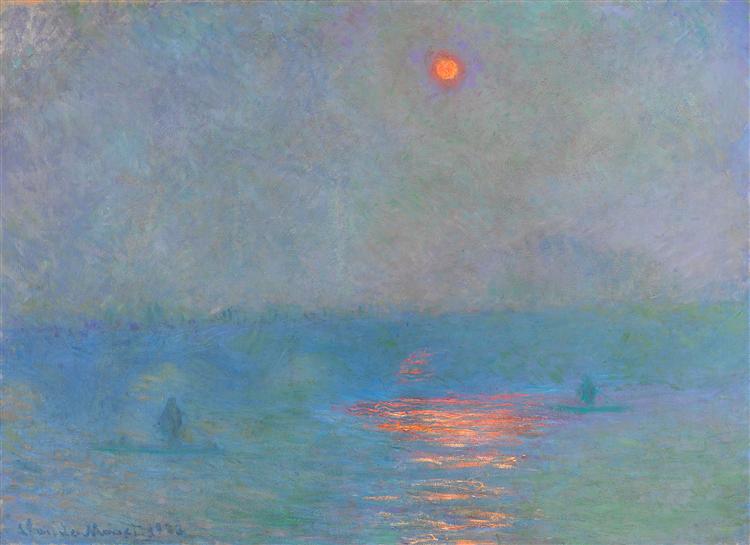


/arc-anglerfish-arc2-prod-shropshirestar-mna.s3.amazonaws.com/public/KZFOG7H5GBDTDPFTMMQRWERGPA.jpg)


