Entangled Pasts, 1768 to Now: Art, Colonialism and Change @ the Royal Academy

The Royal Academy has discovered that Britain used to have an empire, and that this empire and many other aspects of British culture and economy were deeply indebted to the Atlantic slave trade and wants to tell everyone about it! Those of us who have known, read and written about the British Empire and the Atlantic slave trade for a quite a long time are not quite as excited about these great discoveries as the curators of this exhibition are.

But then we don’t work for an organisation like the Royal Academy which, like a growing number of British institutions (banks, insurance companies, the Church of England, the National Trust) are coming under pressure to uncover, publish and apologise for all their institutional connections with slavery and imperialism.

Installation view showing ‘The First Supper (Galaxy Black)’ by Tavares Strachan (2023), commissioned specially for this exhibition

So that’s what this exhibition is about. It is a huge, dazzling and quite exhausting exhibition about the links between Slavery and the Royal Academy, ‘informed by our ongoing research of the RA and its colonial past.’ Featuring over a hundred works by around 50 artists connected to the RA, it is designed:

‘to explore themes of migration, exchange, artistic traditions, identity and belonging.’

A theme of our times

These, as anyone who reads my blog knows, are the same kinds of themes which dominate most contemporary art exhibition. Notable recent examples which focus on empire, slavery or the Black experience include:

‘no world’ from ‘An Unpeopled Land in Uncharted Waters’ by Kara Walker, Hon RA (2010) British Museum, London © Kara Walker, courtesy of Sikkema Jenkins & Co. and Sprüth Magers

Mixing ancient and modern

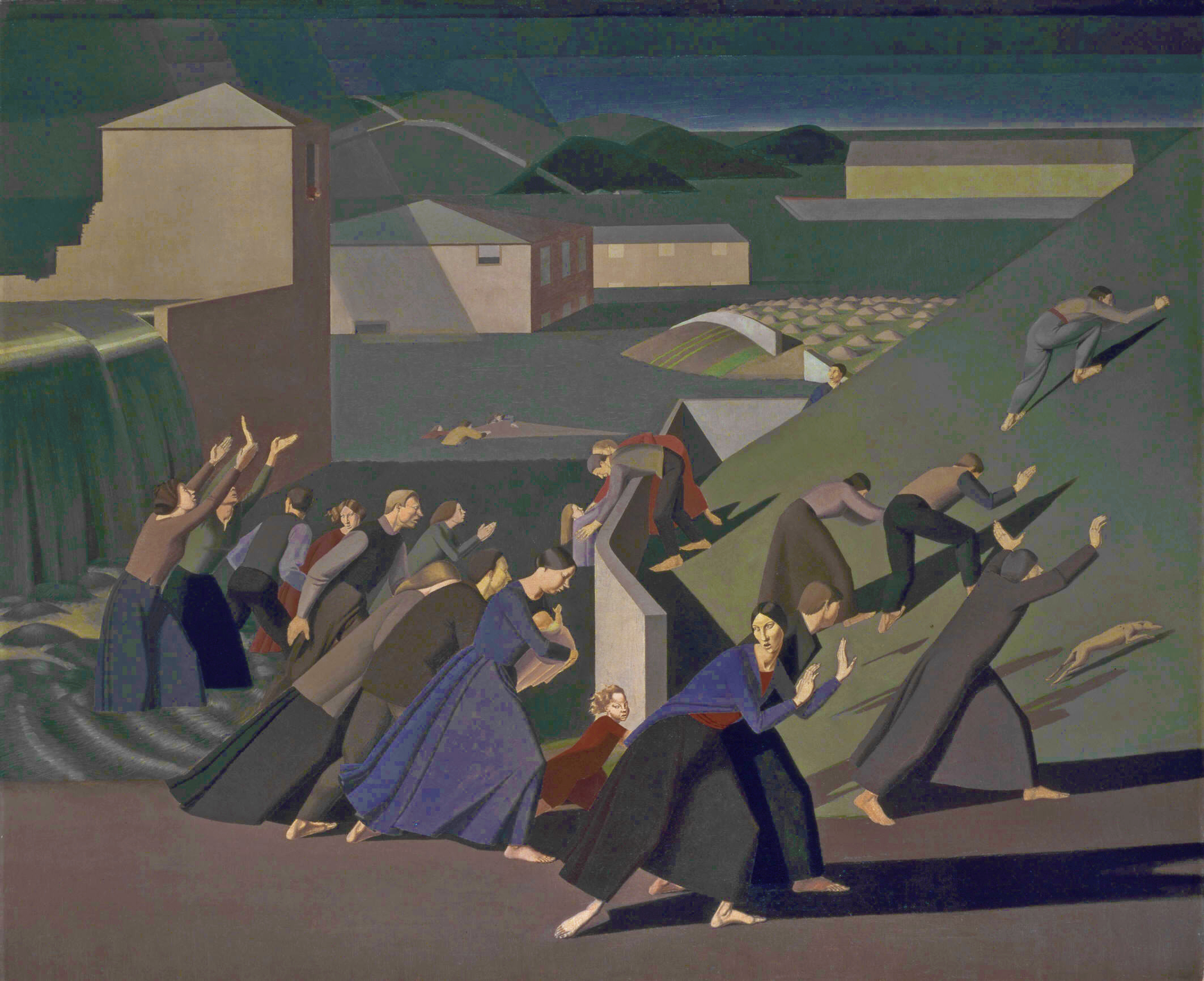
Of all of these shows Entangled Pasts most resembles the 2016 Tate show which took a very straightforward view of the British Empire and colonial guilt, and mixed up classical works from the 18th and 19th centuries with bang up-to-date pieces by contemporary Black artists. Same here. Maybe the most striking thing about this huge show is the way that it deliberately mixes up past and present, into a sometimes confusing, a-chronological, thematic display.

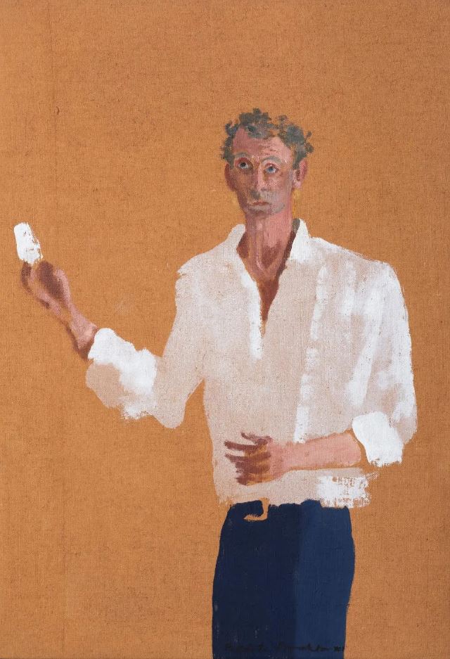
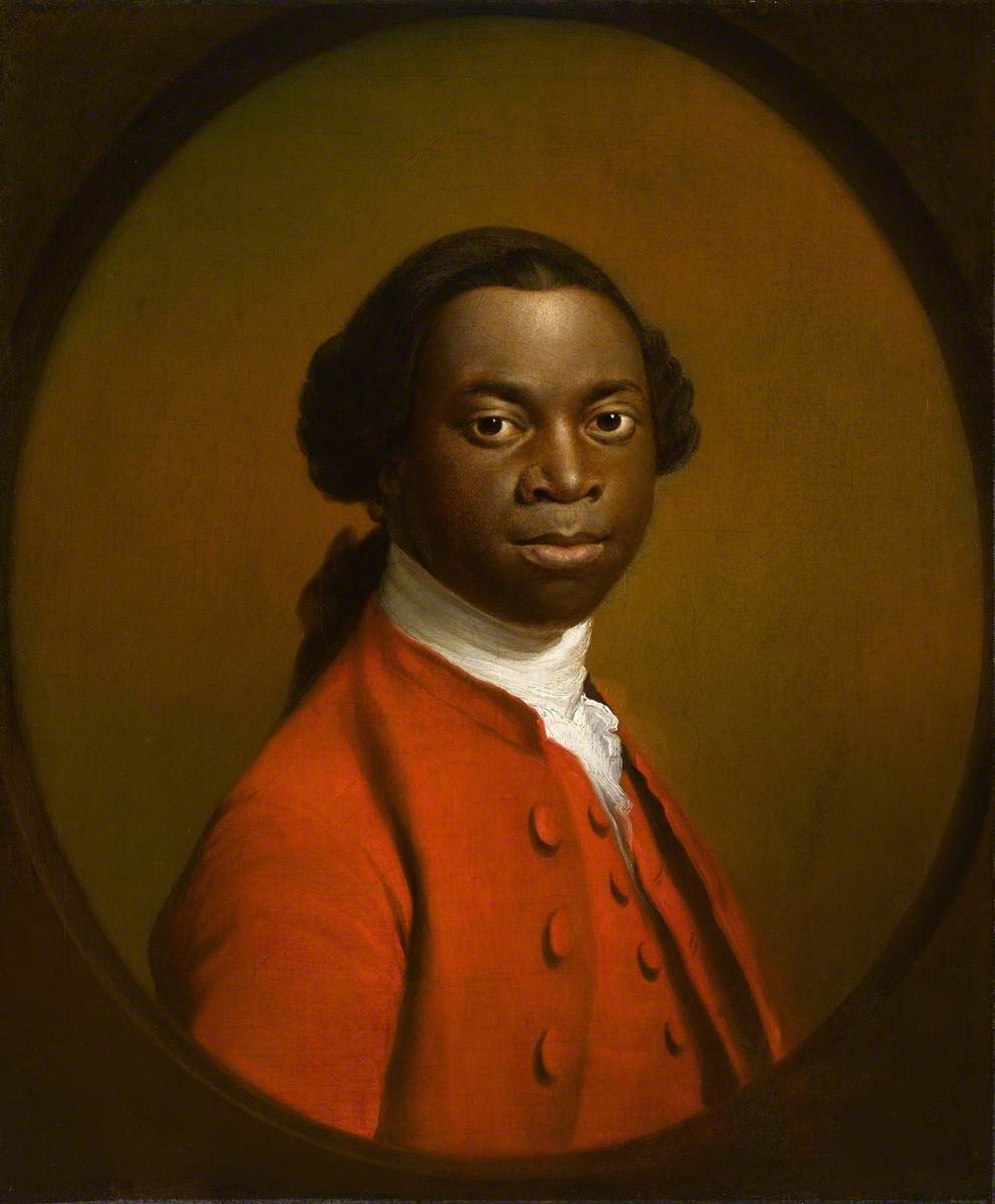
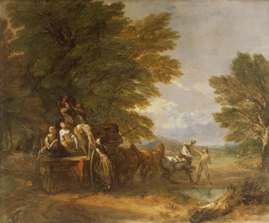
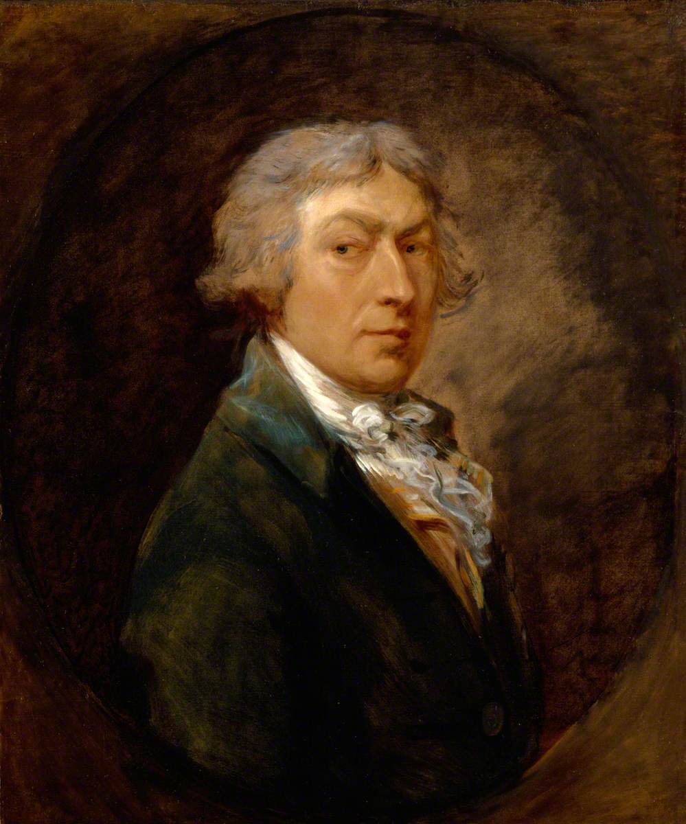
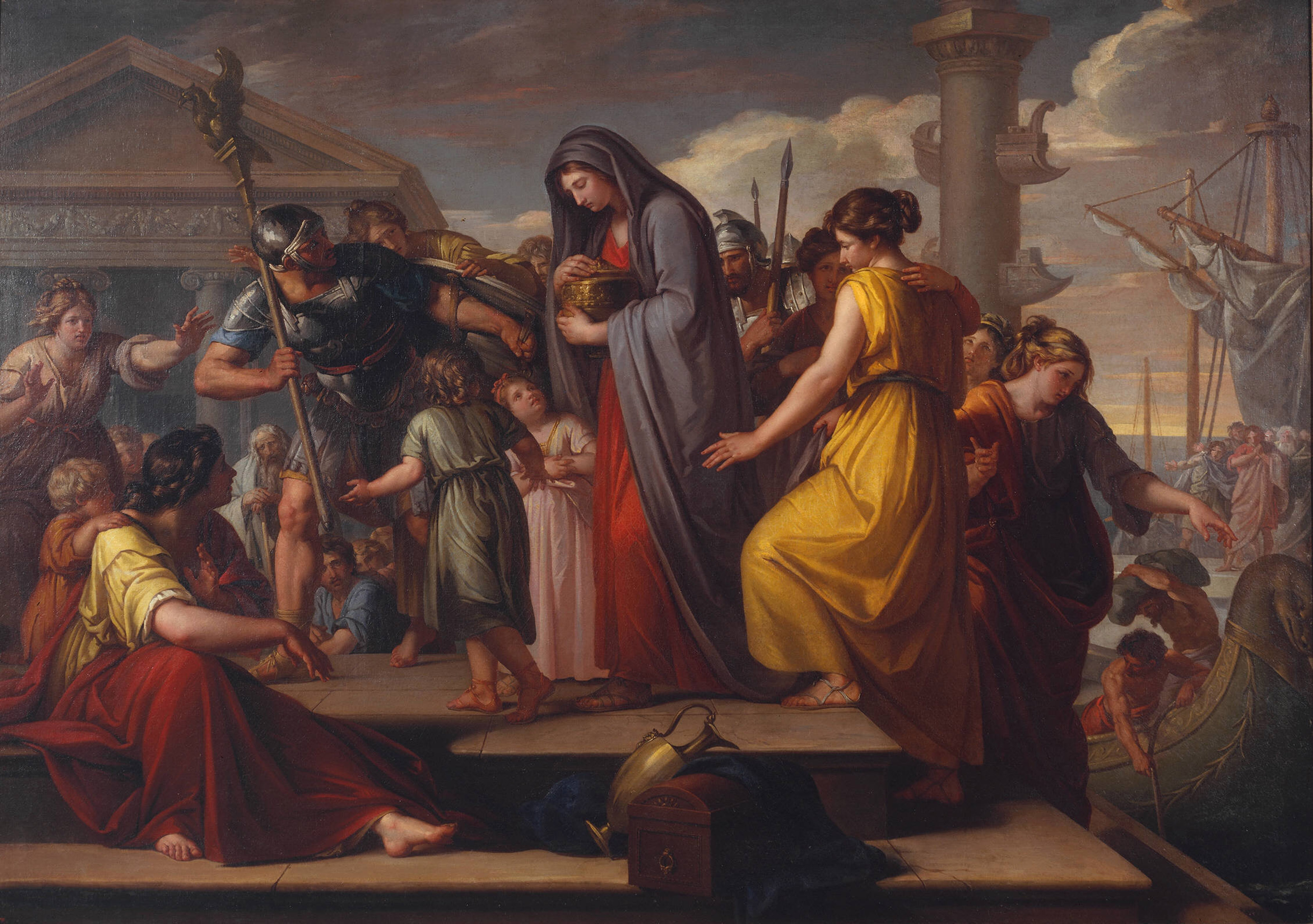
Portrait of a Man, probably Francis Barber by Sir Joshua Reynolds PRA (around 1770) The Menil Collection, Houston Photo © Hickey-Robertson, Houston

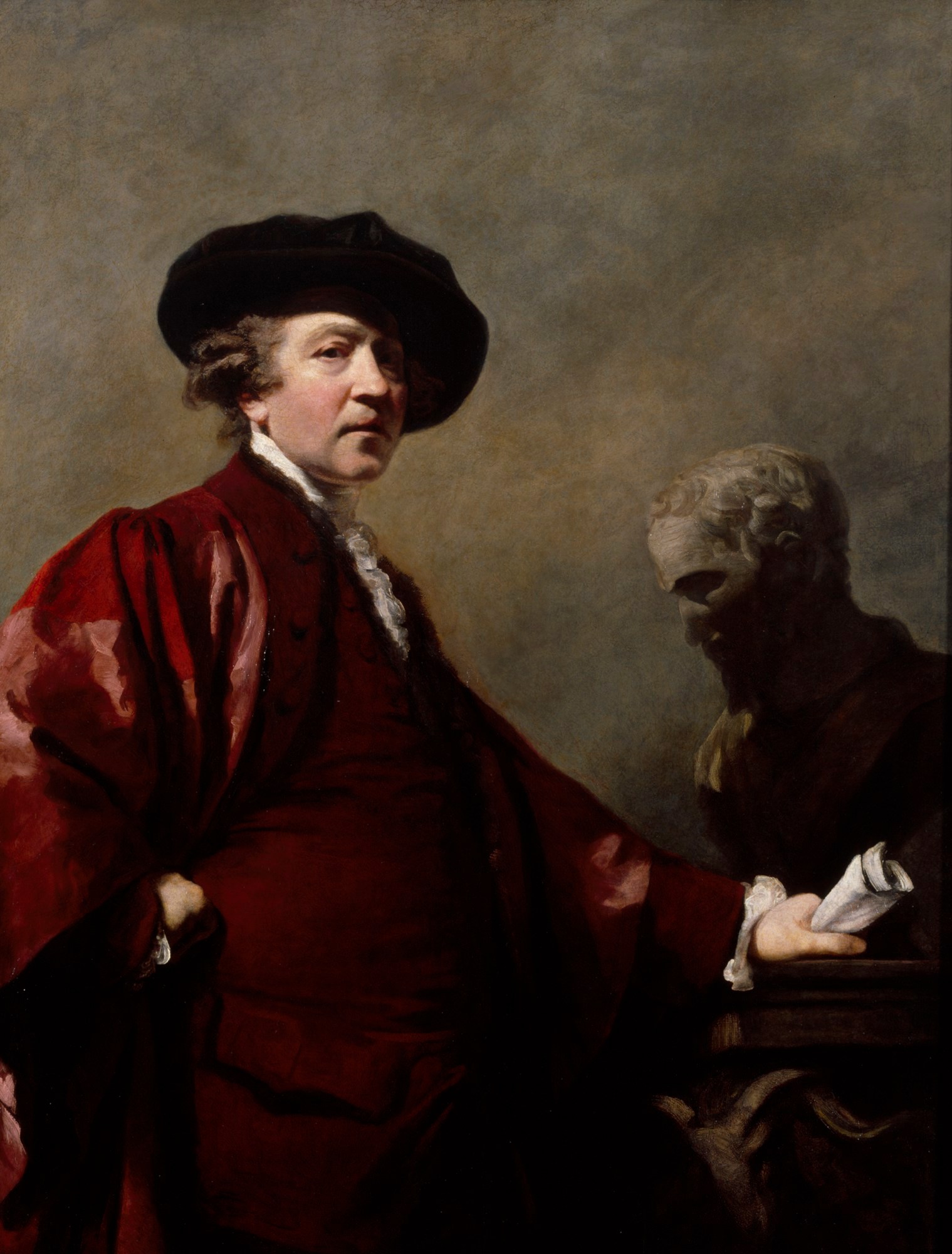
So paintings by old masters like Royal Academy founding president Joshua Reynolds, John Singleton Copley and J.M.W. Turner are presented alongside works by what the curators call ‘leading contemporary British artists of the African, Caribbean and South Asian diasporas’, including by Ellen Gallagher, Yinka Shonibare and Hew Locke, Sonia Boyce, Frank Bowling and Mohini Chandra.

Installation view of ‘Woman Moving Up’ by showing Yinka Shonibare (2023) Courtesy the artist and James Cohan Gallery, New York. Photo © Royal Academy of Arts, London / David Parry © Yinka Shonibare CBE RA

Exhibition premise

The exhibition starts from the fact that the Royal Academy was founded in 1768, at more or less the peak of the transatlantic slave trade. Some of its early members actually owned slaves, but most of them certainly painted portraits of rich people who derived their wealth from sugar or tobacco plantations which were worked by slave labour, generally painting their portraits in England or, occasionally, painting life on slave plantations in the colonies.

Britain banned the slave trade in 1807, although the legal condition of slavehood wasn’t abolished until much later, in 1833. So for the fifty years or so between the founding of the Academy (1768) and the final abolition of slavery in the British colonies (1833) people at all levels of British society continued to benefit from slave labour – at the low end of the social scale, workers in factories using raw cotton from American plantations, at the high end, rich plantation owners, merchants and companies which benefited from the profits of the slave triangle.

So the early part of the exhibition brings together lots of work by Royal Academicians which:

  • portray rich slave owners and their plantations
  • portray families in Britain who benefited directly or indirectly from slave labour
  • more generally portray Black people in the 18th and 19th centuries, many of whom have a backstory involving slavery and liberation

These early works provide an impressive and interesting range of paintings to look at, enjoy, and read picture captions about. In addition there are display cases containing relevant relics, such as early editions of memoirs by freed slaves such as Olaudah Equiano or Frederick Douglass, and correspondence about them with various members of the Academy.

As it happens, I’ve written for this blog a detailed summary of Douglass’s most famous work:

But right from the first room, mixed up with all these classical works are a variety of much more modern pieces by predominantly Black artists, including bang up-to-date pieces and some works commissioned specially for the exhibition.

I was expecting to mostly like the classical pieces but was impressed by a lot of the contemporary work. Some was super-memorable, like Hew Locke’s installation of a fleet of model boats, created with loving attention to detail, and suspended from the ceiling to create an ‘armada’. As a keen model-maker, I really loved these.

Installation view of ‘Armada’ by Hew Locke (2017 to 2019) Photo by the author

The videos

What nothing I’d read had prepared me for was the impact of the two enormous videos. An entire room has been hung with thick red velvet curtains to create a heavy Victorian flavour and onto a big wall-sized screen is projected a nicely-shot and powerful 26 minute film by Isaac Julien about the African-American abolitionist Frederick Douglass who, during his active years in the 1840s and 50s, was ‘the most photographed person in the USA’ and a tireless campaigner against slavery. Here’s a clip:

In my opinion moving pictures quite eclipse static ones in interest and imaginative power which is why I am prejudiced against films and movies – their appeal is too immediate and visceral and flashy. Watching a movie and then returning to a book or painting is like staring at the sun and then looking back at trees or flowers, you are too dazzled to register their much weaker but more profound content. In this exhibition the two videos were beautifully made, with powerful polemical messages but, in my opinion, tended to drain the impact of the paintings.

This was even more true of the second video piece, an enormous installation towards the end of the exhibition. This is ‘Vertigo Sea’ by John Akomfrah, which involves the projection of immaculate, high definition videos onto three enormous screens. The piece dates from 2015 and lasts a whopping 48 minutes.

The 3 or 4 minutes I watched contained awesome footage of whales cavorting in the southern seas (according to the wall label, the film incorporates footage from the legendary BBC Natural History unit) before introducing old black and white footage of whales being harpooned by whaling ships, dragged aboard and their carcases eviscerated. This was unpleasant enough but was intercut with shots of Black people in chains washed up on a beach, presumably intended to depict victims of the vast evil of the slave trade, so I could sort of see a connection, how an instrumental view of others – whether people or animals – leads us to brutality. But then, suddenly, there was black and white footage of an atom bomb going off in the Pacific, and this cut to footage of Japanese survivors of Hiroshima, looking very sick indeed.

So it felt like the whole 48-minute video was turning into a review of humanity’s worst actions and activities (after all, countries like Norway and Japan still pursue commercial whaling). It felt like a long powerful Feel Bad movie and, as someone who reads the daily news headlines, I really don’t need any more bad news to tip me over the edge.

Responses

This brings me to my responses to the exhibition. Well, I can see that the basic premise – a review of the involvement of the Royal Academy and leading individual academicians to the issues of slavery and empire and then, by extension, attitudes to race and ethnicity, from its founding to the present day – is valid and interesting. And many of the works from the classic period (18th and 19th centuries) had interesting wall labels which highlighted direct links between the grand, beautifully dressed sitters for various portraits and their involvement in the slave trade, members or the aristocracy and royal family, portraits of plantation life, and much more.

But when art curators write about history you start to get into difficulties. Art curators are not historians. They are paid to keep up with developments in art studies, they are not trained to undertake historical research or to assess new evidence and ideas in historical studies.

It is this, I think, which accounts for the way that this and all the exhibitions about slavery and imperialism I’ve been to feel – no matter how thorough their selection of works of art and how scrupulous the art historical research has been – from a purely historical perspective, shallow and superficial.

If we take ‘history’ to be the record of all human activity, then you can’t just take an enormously long period, from the start of the European slave trade around 1500 until the cessation of slave trading to places like Brazil in the 1900s – and make it all about just one issue.

1. A simplistic view of imperialism

It may be true to say that a good deal of the history of the European nations from the 1500s to the 1960s was affected by or heavily involved in, imperial and colonial activities, but the more you simplify that huge and multifarious history down to the two ‘issues’ of slavery and imperialism, the more you realise you are missing out on all the multiple complexities which make it ‘history’.

To take an obvious aspect, for most of that period, the European nations were at one another’s throats with an enormous number of wars, on mainland Europe and at sites around the world. If we focus on the period from the founding of the Academy, you have the Seven Years War, then the American War of Independence, and then the gargantuan Napoleonic wars between Britain and France. At the end of the period you have the two great conflicts of the twentieth century.

So both the trade and the broader activity of imperialism must be set against the complex, troubled conflicts between the colonial powers and the permanently shifting web of alliances they created, other people’s battles which the populations of Africa, in particular, found themselves caught up in (resentment against fighting in the white man’s wars is a recurring theme of the three novels by Kenyan author Ngũgĩ wa Thiong’o which I recently reviewed).

Presenting ‘imperialism’ as just the One Bad Thing which characterises the history of Western Europe misses out on all the multitudinous complexity of imperialism in practice, and its complex embedding in a host of other historical, economic, social and military realms. The best introduction to this complexity that I know of are John Darwin’s brilliant books:

The first one, in particular, goes into great detail about the many types of imperial enterprise which came under the heading imperialism (commercial, military, territorial, legal and so on) and the more you read, the more vastly complicated and confusing the subject becomes.

It also makes the staggeringly obvious but often forgotten point that, for most of history, most human beings have lived under empires. Empires have been the usual way in which societies have been organised for as long as we have written records. Therefore, the European empire builders were simply expanding a mode of social organisation which can be found in the Chinese Empire, the Assyrian Empire, the Egyptian Empire, the Roman Empire, the Persian Empire, the Aztec Empire, the Inca Empire, the Mongol Empire, the Ottoman Empire, the Russian Empire, and many others.

One of the interesting questions, from an intellectual or historical point of view, is how the European empires differed from the many, many empires which preceded them or existed alongside them. And that is the kind of question, triggering detailed and sophisticated analysis, which makes studying the concept of empire, as explained by professional historians, so rewarding – but visiting simple-minded, dumbed-down exhibitions like this so shallow and frustrating.

It’s not that an exhibition like this one which presents ‘imperialism’ as one thing, carried out by one group of people – ‘white people’ or ‘Europeans’ – with one sole aim in mind, which was the exploitation of all non-white peoples, is wrong, exactly – it’s just that it’s so simplistic. It doesn’t begin to capture the multi-layered complexity of everything that happened over such a long period of time.

2. A simplistic view of slavery

Similarly, the exhibition takes a very simple view of slavery, which is that it was something done exclusively to Black Africans by white European nations who were all as bad as each other and had no redeeming features. There are, of course, numerous caveats to this naive idea.

1. Slavery is a universal human institution. It existed in all the empires I listed above. The Romans exported slaves from Britain. the Vikings captured Saxons as slaves. When William of Normandy conquered Britain in 1066 an estimated 10% of the population were slaves. But there’s not much here about the Roman slave trade, the Viking slave trade or Saxon slavery because they’re the wrong kinds of slaves, white slaves.

2. About a million white Europeans were carried off into slavery by Arab raiders:

Many historical studies exist but you won’t find them mentioned in exhibitions like this. Wrong kind of slaves.

3. Slavery existed in Africa before Europeans ever arrived.

4. Slavery existed between Black people who. Before the advent of Europeans with their binary notions of ‘black’ and ‘white’, Africans divided themselves into numerous tribes, all of which were continually fighting and jockeying for power with their neighbours, some of which rose to becomes ’empires’, such as the Empire of Mali (1226 to 1670) or Greater Zimbabwe (1220 to 1450). But the history of Black imperialism and of Black-on-Black slavery are rarely if ever mentioned in exhibitions like this.

5. Long before Europeans arrived, there was a thriving Arab slave trade, the systematic kidnapping of Black Africans by Arab slavers who shipped them across the Sahara or up the East coast to the slave-hungry markets of the Arab heartlands. For a comprehensive description see Islam’s Black Slaves: The Other Black Diaspora by Ronald Segal (2001). Segal cites scholars Ralph Austen, Paul Lovejoy and Raymond Mauvey who estimate the total number of black Africans trafficked into the Islamic world between 650 and the twentieth century was between 11 and 14 million i.e. directly comparable to the number trafficked in the transatlantic slave trade we hear so much about. None of this alleviates the guilt and responsibility for the Atlantic slave trade, it just puts it in wider, fuller historical context – but it is rarely if ever mentioned in exhibitions like this because the enslavers weren’t white, and this is an exhibition about white guilt.

6. Once the Europeans arrived, Black Africans conspired to capture and sell their African ‘brothers and sisters’ to the slavers. The full extent of the complicity of Black tribes and leaders in capturing and selling into captivity other Blacks is rarely if ever mentioned in exhibitions, nor how it continued long after the British banned slavery and tried to stamp out slave trading at its source in Africa.

All these omissions are glossed over and suppressed because exhibitions like this, and entire subject of imperialism and slavery in broader cultural discourse, in the media, in education, is less about these messy complexities and more about emphasising white guilt, British guilt.

Taken together, all these omissions build up an impression that only white Europeans are capable of evil and exploitation. The implication throughout, in every wall label, video and caption, is that no Africans or non-white groups ever did anything wrong, that all Black people were always and everywhere only the innocent victims of the appalling trade. It’s an impression encouraged by the complete omission of any reference to the Arab slave trade.

I’m not saying the Atlantic slave trade wasn’t a monstrous evil, a crime against humanity, a scar on European history, a scandal whose damning legacy we may well never escape from. I’m just making the fairly obvious point that like any other historical event which took place over hundreds of years, across two or three continents and involved scores of millions of people, it was a very complicated phenomenon, which breaks down into countless millions of smaller actions and events. The interest, for me at any rate, is precisely in the full historical complexity, not in simplistic naming and shaming.

To someone like me the interest of history is in the complexity of human affairs and the often counter-intuitive nature of people and events. That’s one of the things which I would have thought make art and literature valuable – their capacity to surprise us in the same way that people we know, even the ones we think we know well, sometimes surprise us. Unexpected twists. Strange ironies. Moments of humanity amid the darkness.

But in an exhibition like this there are no surprises. Empire bad. Slavery bad. White people bad. Britain bad. Anyone who disagrees with these uninflected sentiments runs the risk of being ostracised or cancelled because the conflation of empire and slavery, and a uniform, unquestioned condemnation of  both, have become the new cultural orthodoxy, and nuance, complexity and contradiction, questioning and curiosity, are not welcome.

7. One last point, the guilt of the British (traders, businessmen, plantation owners, politicians, army, artists) is hammered home in wall label after label, caption after caption, for running this wicked, evil thing the British Empire. But something you rarely if ever see referred to is that, once the wicked British Empire had gotten round to banning the slave trade in 1807, the Royal Navy, the British Army, countless British missionaries and a good deal of British diplomatic activity was deployed to get other countries to follow suit – to ban slavery, to end the Arab slave trade in Africa, and to intercept ships carrying slaves across the Atlantic and set them free.

The naval campaign against slavery is documented in books such as:

But none of the slavery and empire exhibitions I’ve visited ever mention the huge cost in men, resources, time, money and effort which Britain devoted to trying to end the slave trade. Why not? Because these exhibitions aren’t about presenting a complete review of all the historical evidence, in its vast and confusing complexity – they are about making the simple-minded political points relevant to our present cultural concerns and anxieties.

After a while the systematic erasure and suppression of all these other strands and of the broader context starts to look more like propaganda than history.

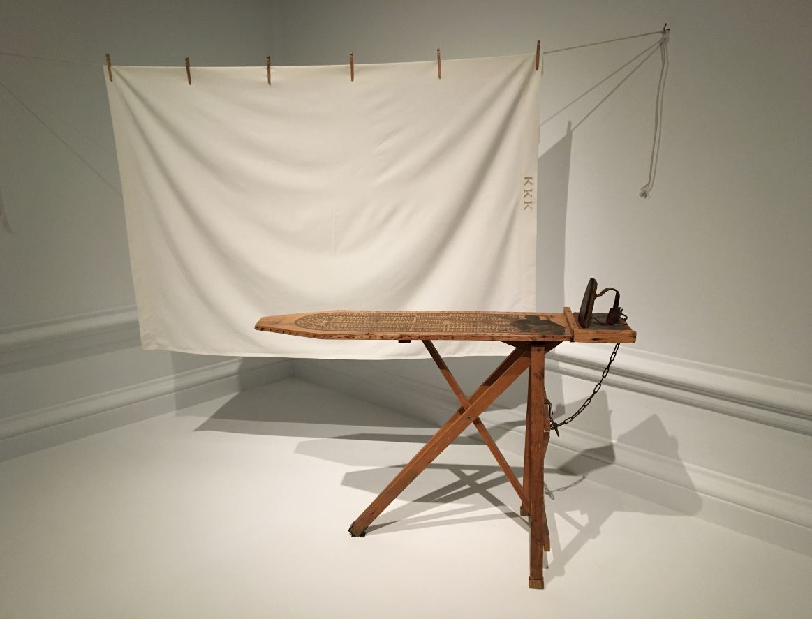
Installation view of ‘I’ll bend but I will not break’ by Betye Saar (1998) which combines a white sheet as worn by the Ku Klux Klan with an ironing board showing the famous image of slaves packed into a slave ship (for the importance of this iconic image see Bury the Chains: The British Struggle to Abolish Slavery by Adam Hochschild). Photo by the author

Labels or works?

As I’ve mentioned lots of times, my friend Andrew the designer long ago stopped reading the wall labels at art exhibitions. He just strolls around responding to the art works as contemporary artefacts, reacting to shapes and designs, patterns and poses, colours and textures, as he finds them.

Unfortunately, I had a lot more of a literary education than him and am addicted to texts, so I’m the kind of visitor who reads every single wall label, sometimes several times, in order to orientate myself within the curators’ worldview and claims.

Very often I end up disagreeing with these labels because curators have only one job, which is to write just enough to justify their exhibition and their selection of works but nowhere near enough to deeply analyse and work through the issues which they routinely raise, name-check, and then leave hanging.

Art curators’ grasp of history is generally superficial and is always selective, carefully selected to make the kinds of points that will justify, market and promote exhibitions which are themselves responding to contemporary times and trends.

Art galleries (surprise surprise) have to make money. They need visitors and so have to wait until they think a blockbuster exhibition like this will be commercially viable i.e. until pretty much all the ideas in it have become common currency and widely accepted, in this case, by the kind of people who visit Royal Academy exhibitions. This is why so many of the big exhibitions tend to be on trend but rarely ahead of it.

And what could be more on trend, what is dominating the news and the political agenda these days more than issues of race and ethnicity, what with politicians and businessmen accusing each other of racism, and making outrageous slurs against Black and Asian people? (I am, of course, referring to the scandalous remarks allegedly made by businessman and Conservative Party donor Frank Hester about former Labour MP Diane Abbott, coming hot on the heels of former Conservative Party deputy chairman Lee Anderson’s outrageous comments about London mayor Sadiq Khan)

And these recent controversies involving (Conservative) politicians’ views about Black and Asian people come against the grim backdrop of the 7 October Hamas attack into Israel and Israel’s subsequent invasion of Gaza, which have, apparently, triggered an alarming rise in incidents of both antisemitism and Islamophobia.

Political, social and cultural problems or issues around race, and the role of the British Empire whose legacy, in the form of a deeply multicultural society we now live in, could hardly be more topical.

The way this kind of exhibition is following public opinion, not leading it, is clearly indicated by the press release for the show. This explicitly states that the curators were reacting to events and responding to public opinion, not shaping it.

The exhibition was programmed in 2021 in response to the urgent public debates about the relationship between artistic representation and imperial histories. These debates were prompted by the Black Lives Matter protests and the toppling of the statue of Edward Colston in Bristol in 2020.

All of this, the responsive nature of the thinking behind this exhibition and the fraught nature of recent headlines about race and racism, all explain why the show feels in many places more like an extension of the news – illustrated by a selection of works from the Royal Academy archives – than an exhibition in its own right – because that’s, in a sense, what it is.

Then again, maybe I’m wrong. Maybe the omission of the more complex perspectives I mentioned above (Darwin, Segal) rubbed me up the wrong way and gave me an unduly negative view of the whole thing.

Maybe I should be more like Andrew the gay designer, who strolls around the same exhibitions as me, but never gets cross or confused because he never reads the curators’ wall labels and so never takes issue with them. Instead he simply delights in the wonderful things that he encounters – an armada of model boats hanging from the ceiling (Hew Locke), a sculpture of a woman with a globe for ahead struggling up some broken stairs (Yinka Shonibare), beautifully realistic portraits of Black men, women and children from the 18th century (Reynolds, Copley), not one but two rooms full of life-sized cartoon cut-out figures of Black people in colourful costumes (Lubaina Himid), two enormous immersive film installations (Isaac Julien, John Akomfreh), and the many other visual and artistic delights this huge and dazzling exhibition has to offer.

Installation view of ‘Naming the Money’ by Lubaina Himid RA (2004) © Lubaina Himid. Photo by the author.

Warning

As the topics of race, imperialism, immigration, identity and gender become ever more dominant in the art world as in the so-called ‘real’ world, so, apparently, does the need to warn people about some of the exhibits found in these exhibitions.

Long ago in the 1960s and 70s the aim of radical art was to shock the staid bourgeoisie. Nowadays, the exact opposite is the case. Anything which might possibly shock or trigger any possibly type of visitor has to be flagged up in advance with multiple warnings.

Tate did it very prominently in their exhibition about the British Baroque because it contained some paintings of Black slaves in chains. This exhibition also comes with a general warning:

This exhibition contains themes of slavery and racism. Some works include historical racial language and violent imagery.

And by the doorways into some of the individual rooms there are warnings that you are about to be confronted with upsetting imagery depicting racism and slavery. We didn’t use to need these kinds of warnings. Now we do. They are straws in the wind indicating the huge social and cultural changes which we are all living through.


Related links

Related reviews

Other posts about slavery and racism

Origins

The Islamic slave trade

The Atlantic slave trade

The American civil war and slavery

Slave accounts

Image of the Artist @ the Royal Academy

This tiny little display is next door to the current ‘Souls Grown Deep like the Rivers’ show – not worth making a pilgrimage to the Royal Academy just for itself, but worth popping into if you’re in the building (as is the small Emma Stibbon display which is right next to it). No rush: it’s on till the end of the year.

It’s a display of eight self-portraits by current and recent Royal Academicians from the last 50 years. They are (in alphabetical order) Anthony Green, Chantal Joffe, Hew Locke, Sidney Nolan, Patrick Procktor, Paula Rego, Gillian Wearing and Clare Woods.

Obviously the genre of the self-portrait raises multiple, many-levelled issues of intention, agency and identity: Who am I? How do I depict myself? How much do I compromise what I see with the medium I’m using? How much am I influenced, consciously or unconsciously, by the vast tradition pressing down on me? How do I escape the weight of the past and develop my own voice and vision?

Here are the pictures in question, along with selected facts from the curators’ wall labels. Which ones do you like, and why?

Anthony Green – The Artist (1976)

The Artist, 1976 by Anthony Green RA © Royal Academy of Arts

Green’s humorous creations, cartoony paintings made in imaginative shapes, used to appear every year in the summer exhibition (he passed away in February of this year). Looking closely you realise there’s a whole narrative going on: for a start the curators tell us the thing is in the shape of a crown, which I didn’t immediately ‘get’. Spotlights shine down from the top right onto a full-length, fully clothed portrait of the artist standing on a sort of stage in front of a yellow stage curtain. And on the left are the stalls of a theatre, full of serried ranks of more self-portraits. The general idea is: Who is the artist performing for, creating for? Himself, copies f himself, clones of himself? I like Green’s works well enough when I see them but, well…

Chantal Joffe – Looking towards Bexhill (2016)

Looking Towards Bexhill, 2016 by Chantal Joffe © The Artist

Here’s Joffe and her daughter on the beach at St Leonard’s-on-sea. According to the curators, the image catches a girl on the cusp of adolescence, turning away from her mother. Joffe is quoted as saying, the more intense the emotion, the more she is driven to simplify the image. Personally I find this a disturbing and upsetting painting. The lack of any effort to convey sand, sea or sky repels me, but not as much as the faces. Eyes are what we look at in the people that we meet or look at and both sets of eyes here are distorted and bent and speak very loudly of physical deformity and/or mental illness.

Hew Locke – Chevalier (2007)

Chevalier by Hew Locke © The Artist

This is one of a series of eleven life-sized photographs from the series ‘How Do You Want Me?’ in which the artist adopts menacing personas. Here he is a sort of surrealist knight in an image saturated with colour and collages of unlikely images, not least the halo of machine guns and daggers which surrounds him. Locke says the series title ‘How Do You Want Me?’ is a satirical reference to the way the art world voraciously consumes the ‘latest thing’, especially the exotic or strange and – by implication – Black artists. So it’s by way of showing two fingers to the art world. Fair enough, but this rational explanation gets nowhere near conveying the over-coloured demented collage with a sword-wielding maniac at the centre.

Sidney Nolan – Self-portrait in Youth (1986)

Self-portrait in Youth, 18 April 1986 by Sir Sidney Nolan © Royal Academy of Arts

Nolan’s dates are 1917 to 1992 i.e. he’s one of the older artists here. This may or may not be reflected in the fact that this is pretty much the weirdest and most abstract work here. According to the curators, as a young man Nolan worked with spray paint in a factory and, later in his career, returned to spray paint as a medium. The heavily distorted image and bars of colour down the left, in one mode make me think of raves and acid and hard-edged psychedelic drugs i.e. a positive image. But then, really looking at the head and deep damage that’s been done to it, the radioactive degrading of the image, make me think of Francis Bacon and all his heads turning into meat or screams. Scary.

Patrick Procktor – Self-portrait (1991)

Self-Portrait, 1991 by Patrick Procktor © The Artist’s Estate

I like stylised paintings but I don’t warm to this one. According to the curators he’s holding a thick paintbrush loaded with white paint in his right hand. I thought it was a mirror or a mobile phone glinting in the sun. I ought to like the plain orange background but I don’t. The curators think this is a very ‘intellectual’ image because he’s glancing up at the frame of the picture i.e. investigating the limits of art etc. The asymmetry of his face, the unevenness of his eyes, speaks to me of mental illness and unhappiness.

Paula Rego – Self portrait (1994)

Self Portrait, 1994 by Paula Rego © Ostrich Arts Ltd. Courtesy Ostrich Arts Ltd and Victoria Miro

The curators point out how many artist’s self-portraits capture the artist holding a palette and brush and looking at the viewer in a pose which captures the moment of creation, as if we are there, with them, in that moment. They also shrewdly point out how the two most completed parts of this sketchy image are the face/eyes which see and the arm/hand which creates – as if the two most important parts of the act of creation are fuller, wholer, more complete, than the rest of the body, which fades away into irrelevance. So it’s an image about artistic force and power.

Gillian Wearing – Me as a Ghost (2015)

Me as a Ghost by Gillian Wearing (2015) © The Artist

Apparently Wearing has ‘explored’ her identity with numerous self portraits playing with format and genre. The smoke is meant to be a reference to her place of birth, industrial Birmingham but made me think of a genii appearing from a lamp. The t short slogan, ‘HEAVY METAL’ is a reference to the disproportionate number of heavy metal rock bands who haled from Birmingham. The artist and curators may think of this as an experimental investigation of issues of identity and mortality, but it also looks very much like the cover of a certain kind of album depicting a rock chick fan of the band.

Clare Woods – Life with the Lions (2020)

Life with the Lions by Clare Woods (2020) © The Artist

Apparently this painting is based on a photograph of the artist’s cat climbing over her, something which just about makes sense once it’s pointed out but I didn’t guess beforehand. Maybe I have a morbid imagination but I read it as the image of someone’s fact (blonde hair, eyes and nose) horribly melting into a great white blancmange. As paintings of cats go, it’s not a classic, is it? Neither is the mood exactly typical of most cat lovers: Woods explains that the title is from the Billy Bragg song of the same name, which captures the feeling of being present but detached, ‘a feeling of suffocation by responsibilities and expectations.’ All this puts into words the very negative response I had to this image. The glutinous melting effect is achieved by mixing thick oil paint directly onto the aluminium surface of the base, which maybe accounts for the powerful feeling of being asphyxiated.

Personal tastes

Personally, I like the Wearing and Rego, in that order. Wearing because it’s a photo/image which looks like a rock poster, could be on a billboard or a poster on the tube i.e which is very assimilable, not least because it makes her look very attractive in a rock chick kind of way.

The Rego I like because I like charcoal sketches, particularly if they’re unfinished (hence my veneration of Degas). I also like the strong female vibe, the aura of strength and indomitability about it. The obvious feature is the dark eyes which are about twice the size of an ordinary adult’s eyes. Decades ago I read some pop science which pointed out that the eyes are proportionately larger in babies than in adults and that, therefore, we humans are programmed to feel soft and sentimental and attracted by large eyes i.e. in order to warm to, and protect, babies. Obvious evolutionary advantage.

This apparently explains why we feel warmly towards Disney cartoons, from Mickey through hundreds of cartoon characters to Nemo or Frozen – they all have disproportionately large eyes and trigger a soppy sentimental feeling; certainly disarms our adult cynicism. If anything, the Rego portrait inverts the convention, because she looks not soft but spooky – not threatening exactly, but lowering and damaged. And the stumpy muscular right arm gives the image a dwarfish, freakish atmosphere, too. Don’t Look Now.

Reynolds

There’s a twist in the tail. This miniature display takes up only part of The Collection Gallery, the narrow corridor-shaped space at the start of the gallery. At the end of this corridor you can see the start of a completely separate exhibition, which is a selection of highlights from the Royal Academy’s Old Master collection, grand mythological themes, Biblical paintings and Renaissance statues. But the first work in that, completely separate display, is a portrait of Sir Joshua Reynolds, founder and first President of the Royal Academy. So when you look away from the eight self-portraits I’ve just discussed, your eye passes over the lovely image of Reynolds at the end of the corridor.

Self-portrait by Sir Joshua Reynolds (1770 to 1780) © Photo: Royal Academy of Arts, London

The point is, the Reynolds portrait is clearly head and shoulders (pun intended) better than the eight works in this little display. It has class and dignity and gravitas. It reminds me of the umpteen histories of art which try and put into words the revolution in visual technology which the development of oil painting during the Renaissance brought about; how artists used the new medium of oil to portray depth and scale of subject, with true perspective etc, but then went on, as the centuries progressed, to focus on the conjuring of light and shade, in particular of dark shadow, to convey psychological and spiritual depths unlike any art which had gone before (Leonardo, Rembrandt).

In this picture Reynolds is clearly channelling Rembrandt and the sophisticated Old Master tradition of strong contrasts of light and shade which came to be referred to as chiaroscuro. It has a human dignity and depth and sensitivity which none of the eight modern images come close to matching.


Related links

More Royal Academy reviews

Joshua Reynolds: The Creation of Celebrity (2005)

This is the catalogue of a major exhibition of Sir Joshua Reynolds’s portraits held at Tate Britain back in 2005. I went, loved the exhibition and bought this catalogue. In my opinion the written content of the catalogue is poor, but the colour reproductions of 100 or so of Reynolds’s best paintings are spectacular.

The catalogue contains a biography of Reynolds by Martin Postle and four essays by Reynolds scholars:

  • ‘The Modern Apelles’: Joshua Reynolds and the Creation of Celebrity by Martin Postle
  • Reynolds, Celebrity and The Exhibition Space by Mark Hallett
  • ‘Figures of Fame’: Reynolds and the printed Image by Tim Clayton
  • ‘Paths of Glory’: Fame and the Public in Eighteenth-Century London by Stella Tillyard

The essays are followed by some 100 full-colour reproductions, divided into the following sections:

  • Reynolds and the Self-Portrait
  • Heroes
  • Aristocrats
  • The Temple of Fame
  • The Streatham Worthies
  • Painted Women
  • The Theatre of Life

With separate sections of images devoted to:

  • Reynolds and the Reproductive Print
  • Reynolds and the Sculpted Image

The concept of celebrity

As the title suggests, the idea is somehow to tie Reynolds’s 18th century art and career to 21st century ideas of ‘celebrity’. In my opinion all four essays fail to do this. Despite frequently using sentences with the word ‘celebrity’ in them, the catalogue nowhere really explains what ‘celebrity’ is.

The authors have a hard time really distinguishing it from the notion of ‘fame’ and the pursuit of ‘fame’ and the risks of ‘fame’ – subjects which have been thoroughly discussed since ancient Greek times.

In Greek mythology Pheme was the personification of fame and renown, her favour being notability, her wrath being scandalous rumors… She was described as ‘she who initiates and furthers communication’… A tremendous gossip, Pheme was said to have pried into the affairs of mortals and gods, then repeated what she learned, starting off at first with just a dull whisper, but repeating it louder each time, until everyone knew. In art, she was usually depicted with wings and a trumpet… In Roman mythology, Fama was described as having multiple tongues, eyes, ears and feathers by Virgil (in Aeneid IV line 180 ff.) and other authors.

In other words, the concept of ‘fame’ and the way it unavoidably attracts a spectrum of public comment, from dignified praise at one end through to scurrilous rumour at the other end – is as old as Western civilisation.

In my opinion the authors struggle to establish a really clear distinction between these multiple and time-honoured notions of fame with all its consequences, and their attempt to shoe-horn modern-day ‘celebrity’ into the picture.

The whole thing is obviously an attempt by Tate to make Reynolds and his paintings more ‘relevant’ to a ‘modern’ audience, maybe to attract in those elusive ‘younger’ visitors which all arts venues need to attract to sustain their grants. Or to open a new perspective from our time back to his, which makes his society, his aims and his paintings more understandable in terms of modern concepts.

I can see what they’re trying to do, and it is obvious that the four authors have been told to make as many snappy comparisons between the society of Reynolds’s day and our own times as possible – but flashy references to the eighteenth-century ‘media’ or to Reynolds’s sitters getting their ‘fifteen minutes of fame’, aren’t enough, by themselves, to give any insight. In fact, these flashy comparisons tend to obscure the complexity of 18th century society by railroading complex facts and anecdotes into narrow 21st notions and catchphrases.

Being modish risks becoming dated

The authors’ comparisons have themselves become dated in at least two ways:

  1. the ‘modern’ celebrities they invoke have dated quickly (David Beckham is given as a current example)
  2. it was written in 2005, before the advent of social media, Instagram, twitter etc, so has itself become completely out of date about the workings of ‘modern celebrity’

There is a third aspect which is: Who would you trust to give you a better understanding of social media, contemporary fame, celebrity, influencers, tik tok and so on – a social media marketing manager, a celebrity journalist or… a starchy, middle-aged, white English academic?

There is a humorous aspect to listening to posh academics trying to get down wiv da kids, and elaborately explaining to their posh white readership how such things as ‘the media’ work, what ‘the glitterati’ are, and showing off their familiarity with ‘the media spotlight’ – things which, one suspects, library-bound academics are not, in fact, all that familiar with.

The authors’ definitions of celebrity

The authors attempt numerous definitions of celebrity:

Reynolds’s attitude towards fame, and how it was inextricably bound up with a concern for his public persona, or what we today would call his ‘celebrity‘ status.

So Reynolds was concerned about his fame, about building a professional reputation and then defending it, but wasn’t every other painter, craftsman and indeed notable figure of the time? As Postle concedes:

In this respect he was not untypical of a whole range of writers, actors and artists  who regarded fame as the standard for judging the worthiness of their own performance against the achievements of the past.

Postle goes on to try and distinguish fame from celebrity:

However, Reynolds [achieved fame] by using the mechanisms associated with what has become known as ‘celebrity‘, a hybrid of fame driven by commerce and the cult of personality.

Hmm. Is he saying no public figures prior to Joshua Reynolds cultivated a ‘cult of personality’ or that no public figures tried to cash in on their fame? Because that is clearly nonsense. And putting the word celebrity in scare quotes doesn’t help much:

Reynolds pandered to the Prince [of Wales]’s thirst for ‘celebrity‘ and fuelled his narcissistic fantasies.

The author doesn’t explain what he means by ‘celebrity’ in this context or why the prince thirsted for it and how he was different in this respect from any other 18th century aristocrat who ‘thirsted’ for fame and respect.

Through portraits such as these [of the Duc d’Orleans], Reynolds openly identified with fashionable Whig society; the Georgian ‘glitterati’ – liberal in the politics, liberated in their social attitudes, and libidinous in their sexual behaviour.

Does use of the word ‘glitterati’ add anything to our understanding?

He was also the first artist to pursue his career in the media spotlight.

‘Media spotlight’? Simply using modern clichés like ‘media spotlight’ and ‘celebrity’ and ‘glitterati’ didn’t seem to me to shed much light on anything. The reader wants to ask a) what do you understand by ‘media spotlight’? b) in what way did Reynolds pursue his career in a media spotlight?

As experience of the modern media tells us, a sure sign that an individual’s fame has been transmuted into ‘celebrity’ is when press interest in his or her professional achievements extends to their private and social life.

I’m struggling to think of a time when there hasn’t been intrusive interest in the lives of the rich and famous, and when it hasn’t been recorded in scurrilous satires, squibs, poems.

People gossiped about Julius Caesar, about all the Caesars. We have written records of the way Athenians gossiped about Socrates and his wife. Prurient interest in the personal lives of anyone notable in an urban environment go back as far as we have written records.

Here’s another definition:

In a process that seems to prefigure the ephemeral dynamics of heroism and redundancy found in today’s celebrity culture, the exploitation of celebrity typified by Reynolds’s representation of [the famous soldier, the Marquess of] Granby depended not only on the glorification, in portrait form, of individuals who had already gained a certain kind of renown within the wider realms of urban culture, but also on a continual replenishment – from one year to the next – of this hyperbolic imagery of bravery, beauty and fame.

I think he’s saying that visitors to the annual exhibitions liked to see new pictures – or, as he puts it with typical art scholar grandiosity, ‘a continual replenishment of this hyperbolic imagery’.

‘The ephemeral dynamics of heroism and redundancy found in today’s celebrity culture’? Does that tortuous definition have any relevance to Kim Kardashian, Beyonce, Taylor Swift, Rihanna et al?

What these authors are all struggling to express is that Reynolds made a fabulously successful career by painting the well-known and eminent people of his day, making sure to paint army or naval heroes as soon as they returned from famous victories, making sure he painted portraits of the latest author after a hit novel or play, painting well-known courtesans, carefully associating his own name (or brand) with success and fame.

It was a dialectical process in which Reynolds’s portraits, often hung at the annual Royal Academy exhibition – which was itself the talk of the town while it lasted – promoted both the sitter and their fame, but also kept Sir Joshua’s name and reputation as Top Painter Of The Famous continually in the public eye.

That’s what the essay writers are trying to say. But you have to wade through a lot of academic rhetoric to get there. Take this questionable generalisation thrown out by Stella Tillyard, which sounds reasonable, until you start to think about it.

Like so much else that defines us in Europe and America now, celebrity appears to have been made in the eighteenth century and in particular in eighteenth century London, with its dozens of newspapers and print shops, its crowds and coffee houses, theatres, exhibitions, spectacles, pleasure gardens and teeming pavements. (Stella Tillyard, p.61)

‘Like so much else that defines us in Europe and America now’? What would you say defines modern society in 2020? I’d guess the list would include the internet, mobile phones, social media, webcams and digital technology generally, big cars, long-haul flights, cheap foreign holidays, mass immigration, multi-cultural societies, foreign food… things like that.

Quite obviously none of these originated in eighteenth century London.

Tillyard’s essay is the best of the four but it still contains highly questionable assertions. She thinks there is a basic ‘narrative’ of ‘celebrity’ which is one of rise, stardom, fall and rise again. The examples she gives are Bill Clinton getting into trouble because of Monica Lewinsky, and the footballers Francesco Totti and David Beckham. She thinks this basic narrative arc echoes the story of Jesus Christ, rising from obscurity, gaining fame, being executed, and rising from the dead. You have to wonder what drugs she is on.

Nonetheless, Tillyard’s is the best essay of the four because she’s an actual historian and so has a wide enough grasp of the facts to make some sensible points. She also gives the one and only good definition of celebrity in the book when she writes that:

Celebrity was born at the moment private life became a tradeable public commodity. (p.62)

Aha. Right at the end of the four essays we get the first solid, testable and genuinely insightful definition of celebrity.

According to Tillyard’s definition, the really new thing about celebrity is not the interest in gossip about the rich and famous – that, as pointed out, has been with us forever – it is that this kind of fame can be packaged into new formats and sold. It has become part of the newly mercantile society of the 18th century.

Celebrity, among other things, is about the commodification of fame, about the dissemination of images representing the individual celebrity, and about the collective conversations and fantasies generated by these processes. (p.37)

The assertion is that Reynolds was able to capitalise on his reputation. He made money out of it. He was able to exploit the new aspects of mid-18th century fame in order to build up a successful business and make a fortune.

He developed a process for making his portraits well known. The lead element in this was ensuring they were prominently hung at the annual exhibition of paintings by members of the new Royal Academy and so became the subject of the enormous amount of comment the exhibition attracted in the scores of newspapers, magazines, cartoons, lampoons, caricatures, poems and plays which infested Georgian London.

Deftly riding this tide of gossip and talk and critical comment, Reynolds was able to assure his sitters that he would make them famous – and he made himself famous in the process. And, as a result, he was able to charge a lot of money for his portraits.

He was able to turn the insubstantial, social quality of ‘fame’ into hard cash. That’s how the argument goes. I’ve put it far more plainly than any of these four writers do, and it’s an interesting point, but still begs a lot of questions…

Robert Orme’s 15 minutes of fame

When Postle says that the soldier Robert Orme got his ‘fifteen minutes of fame’ (p.27) it strikes me as being a flashy but misleading reference.

Andy Warhol’s expression, ‘in the future everyone will be famous for 15 minutes’, refers very specifically to the 15-minute time slots allocated on the kind of American TV programmes which are punctuated every 15 minutes or so with ad breaks. Its merit derives from its source in a very specific technology and at a very specific moment in that technology (the later 1960s).

Whereas Robert Orme took part in an important battle of the Seven Years War (surviving the massacre of General Edward Braddock’s forces by French and Indians in July 1755), returned to England and was for a while feted and invited to dinners to give first-hand accounts of the massacre.

OK, so interest in Orme petered out after a while, but his story hardly conforms to the ‘fifteen minutes of fame’ description in the very precise, TV-age way Warhol had intended.

It’s an example of the way the authors are prepared to twist the historical record in order to shoehorn in their strained comparisons with modern ‘celebrity’ or the ‘glitterati’ or ‘the media spotlight’.

My point is that just chucking modern buzzwords at historical events doesn’t help us understand the historical events and doesn’t shed much light on the buzzwords or the ideas behind them, either. Not without a much more detailed analysis, anyway.

What was new about 18th century ‘media’

The one place in the four essays which comes alive i.e. presents new facts or insights, is in historian Stella Tillyard’s essay, where she explains that a new concept of ‘fame’ was being driven by some genuinely new developments in mass publication. She suggests four factors which account for the rise of a new type of fame in the mid-18th century:

1. A limited monarchy – the mystique surrounding the Divine Right of Kings which had clung to the Stuart Monarchy (1660-1714) drained away from the stolid Hanoverian monarchs who replaced them after 1714. Their powers were circumscribed from the start by Parliament and this made them much more human, much more worldly and, well, sometimes boring figures, for example. George III, widely known as Farmer George.

2. Royal glamour migrated – instead of surrounding the monarch in a nimbus of glory the human desire to have glamorous figures to look up to and gossip about migrated to new categories of ‘star’ or ‘celebrity’, namely top military figures, successful actors and even writers.

3. The lapse of the Licensing Act left the press a huge amount of freedom. By 1770 there were 60 newspapers printed in London every week, all looking for gossip and tittle tattle to market. Combined with a very weak libel law which allowed almost any rumour and speculation to be printed. Well before the tabloids were invented, the taste for an endless diet of celebrity tittle tattle was being catered to.

4. A public interested in new ways of thinking about themselves or others. This is the tricksiest notion, but Tillyard argues that this huge influx of new printed matter, combined with shops full of cheap prints, to make literate urban populations think about themselves and their roles as citizens of a busy city, and as consumers, in new ways.

Now all this chimes very well with the picture painted in Ian McIntyre’s brilliant biography of Reynolds, which clearly shows how almost every incident, not only from his personal life but of the lives of all his famous friends (for example, the writer Dr Johnson, the actor David Garrick, the historian Edmund Gibbon, the poet Oliver Goldsmith) was quickly leaked to scurrilous journalists, who reported them in their scandal sheets, or made cartoons or comic poems about them.

Reynolds’s world was infested with gossip and rumour.

By contrast with Tillyard’s authoritative historian’s-eye view, Postle’s art critic assertions are less precise and less persuasive:

Reynolds grew up in an age that witnessed the birth of modern journalism.

Did he, though? ‘Modern’ journalism?

Googling ‘birth of modern journalism’ you discover that ‘modern journalism’ began with a piece written by Defoe in 1703. Or was it during the American Civil War in the 1860s? Or maybe it was with Walter Lippmann, writing in the 1920s, often referred to as the ‘father of modern journalism’?

In other words, the birth of ‘modern’ journalism happened more or less any time you want it to have done, any time you need to add this cliché into your essay to prop up your argument. And that little bit of googling suggests how risky it is making these kinds of sweeping assertions.

In fact it suggests that any generalisation which contains the word ‘modern’ is dodgy because the term ‘modern’ itself is so elastic as to be almost meaningless. Historians themselves date ‘the modern period’ to the 1500s. Do you think of the Elizabethan era as ‘modern’?

The modern era of history is usually defined as the time after the Middle Ages. This is divided into the early modern era and the late modern era. (Define modern era in history)

Postle’s assertion that there was something uniquely and newly journalistic about Reynolds’s era sounds fine until you think of earlier periods – take the turn-of-the 18th century and the reign of Queen Anne (1702-1714) which was packed with coffee house publications and scurrilous poems written against each other by leading figures. Alexander Pope’s entire career exemplifies a world of literary gossip and animosity.

Going further back, wasn’t the court of Charles II the subject of all kinds of cartoons, pictures, scurrilous paintings and poems and plays? Lots of John Dryden’s poems only make sense if you realise they’re about leading figures of the day, either praising or blaming them. During the British civil wars (1637-51) there was an explosion of pamphlets and leaflets and poems and manifestos denouncing the actions of more or less every notable figure, and giving a running commentary on the political developments of the day. Wasn’t Shakespeare’s time (1590 to 1615) one of rumour and gossip and pamphlet wars?

And in fact I’ve just come across the same idea, on page 4 of Peter H. Wilson’s vast history of the Thirty Years War, where he writes:

From the outset, the conflict attracted wide interest across Europe, accelerating the early seventeenth-century ‘media revolution’ that saw the birth of the modern newspaper.
(Europe’s Tragedy by Peter H. Wilson, page 4)

So surely the widespread availability of gossip sheets and scandal mongering publications was a matter of degree not kind. Artists of the late-17th century (van Dyck, Peter Lely, Godfrey Kneller) had earned types of ‘fame’ and certainly tried to capitalise on it. By Reynolds’s day there were just more outlets for it, more magazines, newspapers, journals – reflecting a steadily growing urban population and market for all things gossip-related. Between 1650 and 1750 the British population increased, the population of London increased, the number of literate people increased, and so the market for reading matter increased.

So when Postle asserts that newspapers played an increasingly important part in the critical reception of art, well, they played an increasingly important role in the critical reception of everything, such as war and politics and religion, such as the Seven Years War, the American War of Independence, the French Revolution and every other kind of debate and issue.

1. That is what newspapers do – tell people what’s going on and editorialise about it – and 2. there were more and more of them, because the population was growing, and the number of literate consumers was steadily growing with it.

Reynolds didn’t invent any of this. He just took advantage of it very effectively.

Reynolds’s strategies for success

  • Reynolds was apprenticed to a fellow Devonian, Thomas Hudson, who not only taught him how to paint portraits but introduced him to important patrons
  • Hudson introduced Reynolds to leading gentlemen’s clubs of the time (the 1740s)
  • Reynolds took care to keep a large table i.e. to invite notable people to dinner, specially if they had had a recent ‘hit’ with a novel or play or work of art
  • Reynolds took dancing lessons, attended balls and masquerades, cultivated a man about town persona
  • as Reynolds became well known he was invited to join top clubs and societies e.g. the Royal Society and the Society of Dilettanti
  • he helped to found the blandly named The Club, with a small number of very eminent figures in literature, theatre and politics, including Garrick, Goldsmith, Johnson and Edmund Burke, later to include Charles James Fox and Richard Brinsley Sheridan
  • in the 1770s Reynolds painted portraits of the friends to be met at the Streatham house of his friend Mrs Hester Thrale (who became nicknamed ‘the Streatham Worthies‘)
  • during the 1770s and 80s there was a growth in a new genre, ‘intimate biographies’ told by authors who knew the subjects well, such as Johnsons Lives of the Poets (1781) and Boswell’s The Journal of a Tour to the Hebrides with Samuel Johnson (1785) – the intimate portraits of the Streatham Worthies tied into this taste, in fact Boswell considered writing an intimate biography of Reynolds
  • the point of having a cohort of friends like this was that they provided a mutual admiration and mutual support society, promoting each others’ work – for example, Oliver Goldsmith dedicated his famous poem, The Deserted Village to Reynolds, James Boswell’s vast ‘intimate biography’ The Life of Samuel Johnson (1791) was dedicated to Reynolds, as was Sheridan’s The School for Scandal (1777)
  • in former times, getting an appointment to work for the king had been crucial to artists’ careers – by Reynolds’s day, however, it was no longer vital because 1. the monarch no longer had the absolute powers of the Stuarts – the Hanoverian kings’ powers and patronage were much more limited and often determined by Parliament 2. there was a well enough developed domestic market for art for a painter to make a career and livelihood without explicit royal patronage
  • Reynolds very consciously bought a large house in fashionable Leicester Fields; the Prince of Wales owned a big house in the same square
  • Reynolds bought an expensive coach that had formerly belonged to the Lord Mayor of London, renovated it and encouraged his sister Fanny to drive round in it in order to prompt gossip and awe

But was Reynolds unique?

As mentioned above, the four essayists have clearly received a brief to make Reynolds sound as modern and edgy and contemporary and down with the kids as possible.

But the tendency of the essays is also to try and make Reynolds sound unique – in his painterly ambition, in the way he used connections and pulled strings to paint famous sitters, promoted himself socially (by being a member of many clubs and inviting all the famous men and women of the time to large dinners), promoted his work through public exhibitions, tried to wangle key painting positions to the royal family, and by having prints made of his portraits which could be sold on to a wider audience.

The trouble is that – having just read Ian McIntyre’s brilliant biography of Reynolds which presents an encyclopedic overview of his times, its clubs, newspapers, magazines, his colleagues and rivals, of the mechanisms of a career in art and an in-depth overview of all Georgian society – I realise these were the standard procedures of the day.

For example, the authors point out that Reynolds was keen to paint portraits of famous people to boost his career – but what portrait painter of the day wasn’t? Allan Ramsay and Thomas Gainsborough, to name just two contemporary painters, lobbied hard to win aristocratic patrons, to promote their portraits to other potential clients, to expand their client base, and so on. It was a highly competitive and commercial world.

The catalogue contains sections on the portraits of aristocratic ladies, military heroes and courtesans as if Reynolds had invented the idea of painting these kinds of figures – but paintings of aristocrats go back at least as far as the Renaissance, and statues of emperors, notable figures and military leaders go back through the ancient Romans to the Greeks.

There’s a section devoted to showing how Reynolds used prints extensively to promote his career, not only here but abroad, where British art prints commanded good prices. (One of the few new things I learned from the essays was that British mezzotinting was so highly regarded as to become known as la maniere anglaise, p.51)

But all his rivals and colleagues did just the same, too – otherwise there wouldn’t have been a thriving community of printmakers and of printbuyers.

And the authors strain to prove that the kind of high-profile aristocrats, military leaders, and top artists-writers-actors of the day that Reynolds portrayed were often discussed, profiled, ridiculed and lampooned in London’s countless scurrilous newspapers, magazines, pamphlets, poems, broadsides, gossip columns and so on.

But this was just as true of all the notable figures that all the other portrait painters of his day painted. It was an extremely gossipy society.

In other words, none of the activities the authors attribute to Reynolds was unique to him – they were being energetically carried out by scores of rivals and colleagues in the swarming ant hill of rivalry and competition that was Georgian London. What is interesting, is the extent to which Reynolds did all these things best (when he did), or where he failed, or where he pioneered a new aspect of this or that activity.

Unfortunately, the four authors don’t really have much space to make their cases. The four essays are relatively short. They have nowhere like the 550 closely-typed pages that Ian McIntyre has in his masterful biography of Reynolds. Therefore, to anyone who’s read McIntyre, the four essays come over as fleeting and superficial sketches of subjects and issues which deserve to be dealt with in much, much greater detail if you want to understand why Reynolds was the towering figure that he was.

It wasn’t that he did all these activities listed above – it’s that he did many of them better, more comprehensively, and more systematically than his rivals.

And also that he just worked harder at it. He was extremely disciplined and professional, working a solid 6 or 7 hour days, every day, often on Sundays. He produced, on average, well over one hundred commissions a year, an extraordinary workrate. This isn’t mentioned anywhere in the essays, but it is a key reason for his success.

Or the even more obvious fact that a his success was down to the fact that he was, quite simply, the best portrait painter of his time. He may well have adopted the canny career strategies listed above, but they’d have been meaningless if he hadn’t also been a painter of genius.


Art scholarship prose style

This section contains no facts and is devoted to an analysis and skewering of pretentious artspeak. Art scholar prose is very identifiable. It has at least three elements:

  1. use of fashionable, pretentious buzzwords such as ‘subvert’, ‘interrogate’, ‘engage’, ‘gendered’, ‘identity’, ‘desire’, ‘site’, ‘gaze’, ‘other’
  2. combined with a curiously starchy, old-fashioned locutions such as ‘whilst’, ‘amongst’
  3. thin content

1. Buzzwords

In terms of his desire to associate himself with the celebrity of others, the most compelling paintings by Reynolds are surely his portraits of prostitutes… (p.29)

‘Wish’ wouldn’t be a better word?

When the ancient philosopher, Socrates, visited the artist’s house with friends, the courtesan was to be found under the gaze of the painter (p.29)

The word ‘gaze’ now has the adjective ‘male’ attached to it in all contexts, and is always a bad thing.

[At the new public exhibitions of the 1760s] the visitor’s encounter with the painted images of celebrities was crucially informed by those other burgeoning cultural sites of the period, the newspaper and the periodical. (p.35)

Do you think of a newspaper or magazine you read as a cultural site? Alliteration is always good, makes your ideas sound grander and more important.

In arranging that his pictures of such women [the royal bridesmaids at the wedding of George III and Queen Charlotte]… Reynolds… was contributing to, and trading upon, a burgeoning cult of aristocratic celebrity within the sites and spaces of urban culture. (p.39)

Tillyard in particular likes the word and idea of the ‘site’:

In response to the overwhelming attention of the London public [Jean-Jacques Rousseau] took himself off to the wilds of Derbyshire and began to write his Confessions, in which he demanded the right to be heard on his own terms rather than to become the site for others’ imaginings. (p.66)

Omai [a South Sea islander Reynolds painted] is both sophisticate and innocent, celebrity and savage, an eloquent but mute subject whose lack of the English language and inability to write allowed his audience and the picture’s viewers to make him a site for their own imaginings. (p.69)

It is surprising that Omai isn’t taken as an example of The Other, an almost meaningless word commonly used to describe anyone who isn’t a privileged white male.

The press functioned as one vital counterpart to the exhibition space in terms of what was emerging as a recognisably modern economy of celebrity… (p.37)

The ‘modern economy of celebrity’ sounds impressive but what does it mean, what is an ‘economy of celebrity’ (and remember the warning about using the word ‘modern’ which is generally an empty adjective used solely for its sound, to make the text sound grand and knowledgeable).

Reynolds painted a number of portraits of aristocratic patrons such as Maria, Countess Waldegrave and Elizabeth Keppel. This allows art scholar Mark Hallett to write:

In being invited to track the shifting imagery of such women as Keppel, Bunbury and Waldegrave, attentive visitors to the London exhibition rooms thus became witness to an extended process of pictorial and narrative transformation, choreographed by Reynolds himself, in which his sitters became part of a gendered, role-playing theatre of aristocratic celebrity that was acted out on an annual basis in the public spaces of the exhibition room. (p.39)

If you read and reread it, I think you realise that this long pretentious sentence doesn’t actually tell you anything. It is prose poetry in the tradition of the mellifluous aesthete, Walter Pater, just using a different jargon.

‘Narrative’, ‘gendered’, ‘theatre’, ‘spaces’ are all modish critical buzzwords. What does ‘gendered’ even mean? That some portraits were of women and some of men? Hmm. And a gallery isn’t really a theatre, no matter how hard art scholars wish their working environment was more jazzy and exciting. It’s a gallery. It consists of pictures hung on a wall. Therefore to say a gallery is a ‘role-playing theatre’ is simply a literary analogy, it is a type of literary artifice which makes absolutely no factual addition to our knowledge.

Translated, that sentence means that regular visitors to the Royal Academy exhibition often saw portraits of the same famous sitters and so could judge different artists’ treatment of them, or gossip about how their appearance changed from year to year. That’s what ‘pictorial and narrative transformation’ means.

The artist’s portrait of Granby can now be understood as just one element within an unfolding iconography of military celebrity that was being articulated by the artist in the exhibition space during the 1760s.

Translated, this means that Reynolds painted many portraits of successful military heroes. As did lots and lots of other portrait painters of the time. But it sounds more impressive the way Hallett expresses it using key buzzwords.

We can even suggest that such details as the Duchess [of Devonshire]’s ‘antique’ dress and rural surroundings… transform her into a figure of pastoral fantasy, a delicately classicised icon of aristocratic otherness… (p.43)

Ah, ‘the Other’ and ‘otherness’, it was the last empty space on my bullshit bingo card. What does ‘otherness’ mean here? That aristocrats aren’t like you and me? That, dressed up in fake Greek robes, leaning against a classical pillar in a broad landscape, they seem like visions from another world? Better to say ‘otherness’. Makes it sound as if you understand complex and only-hinted-at deeply intellectual ideas (taken, in fact, from Jacques Lacan and other French theorists).

2. Starchy prose style

It’s peculiar the way art scholars combine these flashy buzzwords from Critical Theory (interrogate, subvert, gender, identity, The Other) with creaky old phrases which sound as if they’ve come from the mouth of a dowager duchess.

It’s as if Lady Bracknell had read a dummy’s guide to Critical Theory and was trying to incorporate the latest buzzwords into her plummy, old-fashioned idiolect. For example, art scholars always prefer ‘within’ to ‘in’, ‘amongst’ to among, and ‘whilst’ to while – versions of common English words which help them sound grander.

Some contemporary critics thought Reynolds’s experiments with oil and painting techniques meant his works would eventually decay and disintegrate. Mark Hallett says:

The fact that an exhibition including paintings such as these is now taking place, more than two hundred years after Reynolds’s death, helps put paid to such aspersions.

‘Helps put paid to such aspersions’? Isn’t that the voice of Lady Bracknell? ‘I should certainly hope, Mr Moncrieff, that in future you shall keep your aspersions and animadversions to yourself.’

3. Thin content

See above where I’ve highlighted the relative lack of new or interesting insights in the four critical essays, which can’t be concealed by tarting them up with references to the eighteenth century ‘glitterati’ or Andy Warhol.

Sometimes the essays descend to the bathetic. When we read that scholar Richard Wendorf has written a paper in which he observes that

Reynolds was adept at cultivating patrons through observing the rules of polite society

we are straying close to the University of the Bleeding Obvious.

When we learn that Reynolds sometimes flouted these rules in order to create a Bohemian effect, in order to copy the more raffish end of the aristocratic spectrum of behaviour, it feels like a variation on the obvious, and hardly something which required an entire essay to ‘explain’.

Conclusion

Having read the four essays twice, what you take away is that Reynolds specialised in painting portraits of famous people, that this ensured the portraits were much talked about, written about and commented on by the larger-than-ever number of daily newspapers and magazines, and encouraged other famous people to commission their portraits from him, all of which boosted his professional career.

And that he was canny in using the means available to him – aristocratic patrons, choosing famous people to paint – famous soldiers, sailors, aristocrats, courtesans, writers and fellow artists – socialising and hosting grand dinners, joining top clubs, getting supporters to talk him up in the press, and encouraging the distribution of prints of his work – to build a successful and profitable career.

All of these were strategies adopted by most of his contemporaries were doing. He just did it better.

I’m confident making a statement like that because I’ve just read Ian McIntyre’s brilliant biography of Reynolds which places the great man in the incredibly busy, buzzing, competitive, dog-eat-dog environment of Georgian London, and  gives extended portraits of scores and scores of his peers, rivals, colleagues and competitors.

It shows how British society changed during Reynolds’s long career, from his earliest paintings in the 1740s to his last ones in 1790. He changed, art changed, society changed.

None of the essays in this catalogue have much space to play with and so these art scholars play very fast and loose with the historical record, yanking together quotes and events which were actually far separated in time, in order to impose on the people and culture of a very different society the modish contemporary art scholar concerns of ‘gender’, ‘identity’ and ‘celebrity’.

The point being: these essays are actually quite an unreliable introduction to the life and career of Joshua Reynolds, written at the behest of a gallery with an agenda and a marketing plan. By all means buy or borrow this book for its wonderful reproductions of the paintings. But read the McIntyre biography to understand the man and his times.

Unanswered questions

Having read both MacIntyre’s book and this catalogue, I still have a couple of unanswered questions:

1. They both tell me that History Painting was meant to be the highest and most prestigious genre of the day. In which case, how come the greatest painter of the age, Reynolds, didn’t paint any history paintings, and neither did his closest rivals, Allan Ramsay or Thomas Gainsborough?

2. Why are there so many black servants in 18th century portraits?


Related links

More eighteenth century reviews

Joshua Reynolds: The Life and Times of The First President of the Royal Academy by Ian McIntyre (2003)

Sir Joshua Reynolds (1723 to 1792) was one of – if not the – leading English painter of the 18th century. He specialised in portraits, painting about 2,000 of them during a long and busy professional career, as well as 200 ‘subject pictures’, and over 30 self-portraits.

Self-portrait by Sir Joshua Reynolds (1780) Note the bust of Michelangelo, the Rembrandtesque hat, and the text of one of his Discourses folded in his hand © Royal Academy of Arts

Reynolds promoted a ‘Grand Style’ in painting which was less interested in visual or psychological accuracy to his sitters than in placing them in idealised and heroic poses and settings. He was known – and criticised – for pinching aspects from the Old Masters – poses, tints, props, tricks of lighting and so on.

So when you look at this painting – of Reynolds’s lifelong friend, the successful actor David Garrick – you see that not only is he caught between the two allegorical figures representing Comedy and Tragedy, but that the figures are each painted in different styles – the figure of Comedy on the left in a flirty rococo style of Correggio, the figure of Tragedy is done in a consciously ‘antique’ or neo-classical style reminiscent of Guido Reni, dressed in Roman robes with a stern profile – and Garrick in the middle, is wearing a historical costume reminiscent of van Dyck but his face is done in an unashamedly realistic or figurative style.

David Garrick Between Tragedy and Comedy by Joshua Reynolds (1760)

Reynolds was a founder and first president of the Royal Academy of Arts. He gave an inaugural lecture and this soon settled into an annual – later, biannual – lecture or ‘discourse’. At the end of his life these were published together as 20 or so Discourses about art, which were influential for decades afterwards.

The biography

Ian McIntyre’s biography of Sir Joshua Reynolds is a big book, weighing in at 608 pages, including index and notes (542 pages of actual text). What makes it hugely enjoyable is the way McIntyre very deliberately widens its scope to become a portrait of the age. Not a page goes by without entertaining and often amusing digressions away from the basic chronology of events.

For example, before we’re ten pages in we’ve had a whistlestop history of Devon and the town Reynolds was born in, Plympton, from Roman times to his birth in 1723. There’s an interesting explanation of the medieval and Renaissance tradition of Emblem Books and in particular the work of Jacob Cats, little known in this country but hugely influential on the continent. A little detour into the life of a well-known gypsy of the early 18th century, Bamfylde Carew. And so on.

The book is packed with footnotes, often as many as six on a page, giving biographical snapshots of every single person Reynolds comes into contact with, reads or meets or writes to or mentions, often with a bit of background about their achievements in art or literature – Reynolds cultivated friendships with the leading writers of the time – or, quite often, the wars or battles they were involved in, as a) Reynolds painted a large number of military and naval personnel and b) Britain was almost continually at war throughout the 18th century.

This blizzard of contextual information is partly explained because, as McIntyre candidly points out, we don’t actually know all that much about Reynolds’s life. We know he went to Italy to study the Old Masters for an extended stay from ages 25 to 27 (1750 to 1752). Then he returned to London, set up a studio, and quickly became very successful. We have annual business ‘pocketbooks’ he kept, and these are packed full of appointments with sitters, practical notes about rents and paints and canvas and shopping (p.94). We have the accounts and minutes of the Royal Academy which he set up and ran from 1768 till his death in 1792, the Discourses he published to the world – the written version of the lectures he delivered at the Academy – and numerous descriptions of him in the diaries and letters of contemporaries – but not much more.

Reynolds didn’t keep a diary or interesting notes and thoughts about art which contain breath-taking insights and ideas. He never married, and so didn’t have either a wife or children to write memoirs about him. He doesn’t appear to have had affairs, or if he did they were kept very secret (the issue is discussed on p.85). His sister, Fanny, was his housekeeper for 25 years, followed by a niece.

Er, that’s about it in terms of a ‘personal’ life.

`So in a way McIntyre’s strategy of padding out the story with reams and reams of information about pretty much everyone else alive at the time was a necessity – a factual account of just Reynolds’s life would be quite sparse. Still, McIntyre’s encyclopedic approach makes for a highly enjoyable account.

As does his rangy, slangy style. He is at pains to emphasise that he is not a stuffy art critic, he’s one of the boys:

  • Then, brushing away a crocodile tear, he [an anonymous critic] put the boot in. (p.319)
  • Reynolds was taking a fair amount of stick in the press… (p.320)

18th century artists

Thus McIntyre doesn’t just place Reynolds in the 18th century art world – he introduces us to quite an intimidating number of 18th century artists, starting with Reynolds’s predecessors in Britain, referencing leading contemporary painters in France and Italy, and then a host of other contemporary painters – the famous, the not so famous, and the downright obscure. They include – and this list excludes all the many sculptors:

  • Sir Godfrey Kneller (1646 to 1723) leading portraitist of his time
  • Francesco Solimena (1657 to 1747) leading Italian painter of the Baroque
  • Jonathan Richardson (1667 to 1745) whose book, ‘An Essay on the Theory of Painting’ inspired young Reynolds
  • Joseph Highmore (1692 to 1780)
  • William Hogarth (1697 to 1764) leading English artist, caricaturist and printmaker
  • Jean-Baptiste-Siméon Chardin (1699 to 1779) ‘the other great middle-class painter of the century’ specialising in quiet domestic scenes, in contrast to either grand historical paintings, or pink and blue rococo
  • John Shackleton (? to 1767) Principal ‘Painter in Ordinary’ to George II and George III
  • Thomas Hudson (1701 to 1779) Reynolds was apprenticed to him
  • Francesco Zuccarelli (1702 to 1788) Italian landscape painter from Venice
  • Jean-Étienne Liotard (1702 to 1789) French portraitist working mainly in pastel
  • Francis Hayman (1708 to 1776)
  • Arthur Devis (1712 to 1787) started as landscape artist, then portraits of members of pro-Jacobite Lancashire families, then portraits of London society
  • Allan Ramsay (1713 to 1784) rising star arrived in London from Rome in 1738, painted the definitive image of the coronation of King George III and a stream of royal commissions
  • Claude-Joseph Vernet (1714 to 1789) landscape and marine painter
  • Richard Wilson (1714 to 1782) ‘the classic master of British 18th century landscape painting’
  • Henry Robert Morland (1716 to 1797) Young woman shucking oysters
  • Richard Dalton (1720 to 1791)
  • Katherine Read (1721 to 1778) Scottish portrait painter
  • John Astley (1724 to 1787) portrait painter
  • George Stubbs (1724 to 1806) English painter of horses
  • Francis Cotes (1726 to 1770) pioneer of English pastel painting
  • Thomas Gainsborough (1727 to 1788)
  • Anton Raphael Mengs (1728 to 1779) German artist, precursor of neo-classicism
  • Charles Catton (1728 to 1798) coach painter to George III
  • George Barrett Senior (1732 to 1784) Irish, leading contemporary landscape painter
  • Jean-Honoré Fragonard (1732 to 1806) late Rococo painter of remarkable facility, exuberance, and hedonism
  • Robert Edge Pine (1730 to 1788)
  • George Romney (1730 to 1802) portrait painter in the Reynolds / Ramsay league
  • Sawrey Gilpin (1733 to 1807) English animal painter, illustrator and etcher who specialised in painting horses and dogs
  • Johann Zoffany (1733 to 1810) German neo-classical painter
  • Joseph Wright (1734 to 1797) to become Wright of Derby
  • Jeremiah Meyer (1735 to 1789) Painter in Miniatures to Queen Charlotte, Painter in Enamels to King George III
  • John Singleton Copley (1738 to 1815) Anglo-American painter, active in both colonial America and England
  • Benjamin West (1738 to 1820) first American artist to visit Rome, settled in London as a painter of historical scenes, early pioneer of neo-classicism
  • Nicholas Pocock (1740 to 1821) master of a merchant ship aged 26, he became a noted painter of naval battles
  • Ozias Humphry (1740 to 1810) a leading English painter of portrait miniatures, later oils and pastels
  • Angelica Kauffman (1741 to 1807) history painter and portraitist
  • Ozias Humphrey (1742 to 1810) a leading English painter of portrait miniatures, later oils and pastels
  • Mary Moser (1744 to 1819) English painter specialised in flowers
  • Philip Reinagle (1749 to 1833) pupil of Allan Ramsey, specialised in hunting pictures: Members of the Carrow Abbey Hunt
  • Robert Smirke (1753 to 1845) English painter and illustrator, specialising in small paintings of literary subjects
  • James Gillray (1756 to 1815) British caricaturist and printmaker
  • Thomas Rowlandson (1757 to 1827) English artist and caricaturist of the Georgian Era
  • Maria Cosway (1760 to 1838) Italian-English artist and educationalist
  • John Opie (1761 to 1807) English painter of historical subjects and portrait, took London by storm in 1781
  • Thomas Phillips (1770 to 1845) leading English portrait painter of the day, notable for portraits of William Blake and Lord Byron
  • Benjamin Haydon (1786 to 1846) British painter who specialised in grand historical pictures,

As with many of McIntyre’s digressions about contemporary figures, I found it well worth taking a few minutes to look up each of these painters. I was particularly drawn to some of the pictures of Jean-Étienne Liotard who I’d never heard of before.

The Chocolate Girl by Jean-Etienne Liotard (1744)

Provenances

An interesting aspect of Reynolds’s career is the number of portraits which have gone missing or are disputed. That the authorship of works of art can be disputed is significant: it shows you that, when the provenance of a painting is crystal clear, then the experts can confidently pontificate about its distinctive composition and style; but where there is no signature of clear history of ownership, where the authorship is disputed, then style and composition are not enough to determine the identity of the painter. Take this portrait of a black man.

Portrait of an African by Allan Ramsay (1757 to 1760)

It is instructive to learn that it was once thought to be a portrait of Olaudah Equiano and painted by Joshua Reynolds, but is now generally accepted to a portrait of the young Ignatius Sancho painted by the Scottish painter, Allan Ramsay. The point being that the ‘house style’ of 18th century portrait painters was so similar, overlapped at so many points, that even experts can’t tell them apart.

Destructions

McIntyre’s book is extremely thorough. He documents the sitters and the painting sessions for what seems like every one of Reynold’s nearly two and a half thousand paintings. But a theme which emerges is the dismayingly large number of paintings which have been lost or destroyed, by Reynolds:

  • Portrait of Lady Edgcumbe – destroyed by bombing during Second World War
  • Portrait of Thomas Boone – untraced
  • Portrait of Jane Hamilton – untraced
  • Portrait of Mrs Baddeley – untraced
  • Portrait of Alexander Fordyce – untraced
  • Portrait of Elizabeth Montagu – untraced

No fewer than nineteen works by Reynolds were destroyed in a disastrous fire at the family seat of the Dukes of Rutland, Belvoir Castle in Grantham, Leicestershire, in 1816 (in which also perished works by Titian, Rubens and Van Dyck).

Or other artists of the day:

  • Benjamin West’s Cimon and Iphigenia and Angelica and Medoro – untraced

Which gives rise to a meta-thought: I wonder what percentage of all the paintings ever painted, still exist? Half? A quarter? To put it another way – how much of all the art ever created has been ‘lost’?

[The beginnings of an answer are given in Peter H. Wilson’s vast history of the Thirty Years War where he writes that Dutch artists produced several million paintings in the 16th and 17th centuries combined – ‘of which perhaps 10 per cent survive‘ (p.816). 10% – is that a good working guesstimate?]

Miscellaneous notes

Reynolds’s first studio was at 5 Great Newport Street, in London’s West End. It was on the edge of the country, with a good sized garden both behind and in front (inconvenient in rainy weather since rich people’s carriages couldn’t park right outside the door, p.119). His rival, Allan Ramsay (1713 to 1784) lived round the corner in Soho Square.

In 1760 he moved to a house on the west side of Leicester Fields, later Leicester Square. The Prince of Wales kept a big house dominating the north side. Hogarth had lived since 1733 in a house on the east side.

Reynolds’s style is considered ‘more masculine and less ornamental’ than that of his main rival, Allan Ramsay, who was therefore generally thought to be the better painter of women portraits (p.117).

Penny-pinching Reynolds was careful with money. Anecdotes abound. He got up early to visit the fishmarket to select the best value fish then returned home with detailed instructions to his servant about which ones to buy. He made a fuss about the value of an old mop (p.122)

Vandal

Reynolds was fantastically disrespectful of old paintings. Apparently, he stripped back layer by layer of paint to see how they had been painted, a number of Venetian paintings and one by Watteau – stripped them right down to the canvas until he had utterly destroyed them (p.239).

Factory production

None of your romantic waiting-for-inspiration nonsense, 18th century painters painted to order and commission and on an awesome scale. Allan Ramsay’s portraits of George III and Queen Charlotte dressed for his coronation (1761) was so popular that his studio i.e. assistants, produced no fewer than one hundred and fifty pairs of the paintings to meet the market; buyers including members of the royal family, sovereigns, heads of state, colonial governors, ambassadors, corporations, institutions and courtiers.

Knock ’em out, pile ’em high was the watchword. When one aristocratic sitter offered to come for an additional sitting so that Reynolds could have a session devoted to her hands (of which she was very proud) Reynolds casually told her not to bother as he normally used his servants as models for hands (p.137). (This chimes with the revelation in James Hamilton’s book that Gainsborough generally painted the entire body of his sitters from models, often his wife or grown-up daughters.)

Anti-romanticism

It has been the fate of arts to be enveloped in mysterious and incomprehensible language, as if it was thought necessary that even the terms should correspond to the idea entertained of the instability and uncertainty of the rules which they expressed.

To speak of genius and taste as any way connected with reason or common sense, would be, in the opinion of some towering talkers, to speak like a man who possessed neither, who had never felt that enthusiasm, or, to use their own inflated language, was never warmed by that Promethean fire, which animates the canvas and vivifies the marble.

If, in order to be intelligible, I appear to degrade art by bringing her down from her visionary situation in the clouds, it is only to give her a more solid mansion upon the earth.  It is necessary that at some time or other we should see things as they really are, and not impose on ourselves by that false magnitude with which objects appear when viewed indistinctly as through a mist. (Discourse 7)

No good at drawing

Reynolds was acknowledged to be more interested in colour and tone than in drawing and design. He himself confessed he wasn’t too strong on anatomy. One of the hardest parts of pure figure drawing is hands and Reynolds’s sitters hands are often ungainly, stylised or hidden. He wasn’t too bothered about strict visual accuracy:

The likeness consists more in taking the general air, than in observing the exact similitude of every feature. (quoted on page 127)

‘Flying colours’

Throughout his career Reynolds experimented with materials that make an oil painting, incorporating at one time or another, asphalt, wax, charcoal, experimenting with non-traditional types of key colours such as incarnadine for red. This was often disastrous, as scores of anecdotes testify, the painter Benjamin Haydon just one who was sharply critical of his over-treatment of his paintings (quoted page 282).

One painting, being carried to its patron, was knocked in the street and the entire creation simply slid off the canvas and onto the street. Many others complained that the colours changed. The sky in Admiral Barrington’s portrait changed from blue to green within months of receiving it (p.362). Hence his reputation for ‘flying colours’ and many burlesques and parodies about them.

Rich

As a result of his astonishing industry, Reynolds was by 1762 making £6,000 a year (p.141). By way of comparison, the homely parson in Goldsmith’s The Deserted Village has a stipend of:

A man he was, to all the country dear,
And passing rich with forty pounds a year.

By about 1780 it cost 50 guineas for a ‘head’, 70 guineas for a ‘half length’, 200 guineas for a full length (p.361).

Reynolds’s deafness

In Rome in 1751 Reynolds suffered a heavy head cold which left him partially deaf. For the rest of his life he carried about an ear trumpet. There are numerous humorous anecdotes of him pretending not to hear unflattering or critical remarks.

Reynolds’s height

Sir Joshua Reynolds was five feet five and one-eighths of an inch tall (p.149).

Reynolds and the king

Despite his prolific portrayal of the British aristocracy, Reynolds was disliked by King George III and never got the post of Principle Painter in Ordinary which he aimed for. This post went to Allan Ramsay in 1761. A number of reasons are given for this dislike, for example that when Reynolds was offered the presidency of the newly founded Royal Academy in 1768 but said he’d have to consult his close friends, Dr Johnson and Edmund Burke. Since it was a royal appointment which the king had personally agreed, he was offended that Reynolds hesitated, and particularly offended at the mention of Edmund Burke, a critic of the king. And his friendship with John Wilkes, a radical critic of the king and the Establishment as a whole (p.322).

Reynolds and Dr Johnson

I’d like to like Dr Johnson more than I do. At the end of the day, his bluff English pragmatism comes close to philistinism. His rudeness was legendary, as was his greed (the story of a host setting out bowls of clotted cream, strawberries and a jar of cider for a party of guests and Johnson eating the lot, or asking for pancakes and eating 13 in a row) and his addiction to tea. And his depression: letters are quoted in which he describes his morbid fear of being left alone to his thoughts. Which is why it was difficult to get rid of him; he’d pop round for tea then stay, talking interminably, till past midnight. If he was ever left out of a conversation:

His mind appeared to be preying on itself; he fell into a reverie accompanied with strange antic gesticulations. (Reynolds, quoted page 210)

Reynolds and his sister

Reynolds’s sister, Francis (1729 – 1807), acted as his housekeeper from when he moved to London in the early 1750s until 1779, when some kind of argument – still unknown – led to her leaving and her place being taken by their nieces. Fanny was an artist in her own right, of histories and portraits. She also wrote and won the support of Dr Johnson, who encouraged her and remained friendly and supportive even after the break with her brother. Mutual friends were critical of Reynolds’s treatment of her, e.g. Mrs Thrale (p.327).

Reynolds and Gainsborough

The ‘Grand Style’ which Reynolds spoke about in his Discourses meant improving on nature, removing blemishes and imperfections, creating an idealised image.

The likeness consists more in taking the general air, than in observing the exact similitude of every feature. (p.127)

And by ‘idealised’ he often meant aspiring to the style of Roman art and architecture, all pillars and togas. Thus Gainsborough and Reynolds disagreed about what their sitters should wear. Gainsborough, the more informal, casual and bohemian (p.338) of the pair thought it was an important part of capturing a sitter’s personality that they wore their own clothes; Reynolds, by contrast, kept a wardrobe of ‘idealised’ costumes and often painted his sitters in Romanised togas and tunics. The Dowager Duchess of Rutland complained that Reynolds made her try on eleven different dresses before settling on what she dismissed as ‘that nightgown’ (p.151).

Benjamin West, the American painter of historical scenes and second President of the Royal Academy, is quoted criticising Reynolds’s fondness for dressing his female sitters in antique robes, pointing out how much more interesting and useful for posterity it would be to see them in their actual everyday wear.

Technical terms

Conversation piece

An informal group portrait, popular in Britain in the 18th century, beginning in the 1720s, distinguished by portrayal of a group apparently engaged in genteel conversation or some activity, very often outdoors. Typically the group will be members of a family, but friends may be included, and some groups are of friends, members of a society or hunt, or some other grouping.

Fancy picture

Fancy picture refers to a type of eighteenth century painting that depicts scenes of everyday life but with elements of imagination, invention or storytelling. The name fancy pictures was given by Sir Joshua Reynolds to the supreme examples of the genre produced by Thomas Gainsborough in the decade before his death in 1788, particularly those that featured peasant or beggar children in particular. (Source: Tate)

Profile portrait

The profile portrait ultimately derived from coins and medals from ancient Rome. It could be used as a commemoration of the dead, or as a tribute to the living great.

Eighteenth century London courtesans

In terms of his desire to associate himself with the celebrity of others, the most compelling paintings by Reynolds are surely his portraits of courtesans which he began to make from the late 1750s onwards.

I include this list not out of a conscious or unconscious wish to define women by their sexuality, but because these women’s lives are fascinating, and the niche they occupied in the society of their time so startlingly different from our day.

Eighteenth century women artists

  • Katherine Read (1721 to 1778) Scottish portrait painter
  • Angelica Kauffman (1741 to 1807) history painter and portraitist
  • Mary Moser (1744 to 1819) English painter specialised in flowers
  • Maria Cosway (1760 to 1838) Italian-English artist and educationalist

Those are the ones I noticed in the text. There’s a full list of eighteenth century women artists online:


More eighteenth century reviews

Gainsborough’s Family Album @ the National Portrait Gallery

This exhibition is pure visual, intellectual and emotional pleasure. It is beautifully hung and really informatively labelled and guided. In particular the American scholar who curated it, David Solkin, is pitch perfect in his audioguide commentary, telling you exactly what you need to know about each key painting, and about Gainsborough’s wider family background.

It’s a simple enough idea: Thomas Gainsborough (1727 to 1788) was one of the 18th century’s most successful portrait painters, rising from modest beginnings in Sudbury Suffolk, to owning a mansion on Pall Mall and being painter to Britain’s aristocracy, rivalled only by the towering figure of his contemporary, Sir Joshua Reynolds.

But alongside his formal commissions he painted an unusual number of portraits of his immediate and extended family. This exhibition brings together some 50 of these paintings and a few drawings, some familiar from national collections, some never before publicly displayed, to tell the story of his changing and evolving painterly style, as well as the biographies of himself, his wife and daughters, parents, brothers and sisters, and other members of the extended family.

It’s not quite a portrait of the age but it’s certainly a portrait of a charming, sometimes tragic, often comic and endearing family, told via sketches, drawings and paintings which are sometimes breath-takingly beautiful.

The two Gainsboroughs

It’s always seemed to me there are two Gainsboroughs: the early paintings from the 1740s feature beanpole figures with Woodentop faces which I personally find difficult to take seriously.

the artist with his wife Margaret and eldest daughter Mary by Thomas gainsborough (1748)© The National Gallery, London

‘The artist with his wife Margaret and eldest daughter Mary’ by Thomas Gainsborough (1748) © The National Gallery, London

Then something seismic happened to his technique during the 1750s, so that within a decade his handling of the human face had become marvellously expressive, and his handling of the volume and shape of the human body, masterful.

The following is one of my all-time favourite paintings, one of the best depictions of love and affection and innocence I know of. it looks and feels as if by a completely different artist from the painting above.

Mary and Margaret Gainsborough, the artist's daughter, with a cat by Thomas Gainsborough (1760-61) © The National Gallery, London

‘Mary and Margaret Gainsborough, the artist’s daughter, with a cat’ by Thomas Gainsborough (1760 to 1761) © The National Gallery, London

It demonstrates several of Gainsborough’s qualities. One is the characteristic ‘feathering’ of the trees and clouds in the background. Another is that it is unfinished – a lot of the paintings in this exhibition are unfinished. They demonstrate his sprezzatura, his ability to rough out an image at astonishing speed.

And for me, personally, I love the way you can see the artist at work. I almost like the rough sketching of the arms and hands as much as the smooth finish of the seraphic faces. They remind me of the quick evocative charcoal sketches by Degas which were exhibited next door at the National Gallery earlier this year. I love draughtsmanship, outlines, the miraculous way a few lines on a flat surface can conjure up the look and feel of warm human bodies, and many of even the most mature paintings on display here have an unfinished quality, which allows you to enjoy Gainsborough’s terrific verve and confidence.

Gainsborough’s speed

In fact Gainsborough’s legendary speed often caused him problems. One was that, even once he was famous, his clients regularly complained that he’d left his paintings unfinished. There’s an example here of his wife, done in sumptuous silks but, when you look closer, lacking hands, as if he was in too much of a hurry to bother.

As to sheer speed the commentary tells us that he made this painting of his nephew and protégé, Gainsborough Dupont, in one hour. One hour. It is riveting to be able to examine this painting really closely and observe the nerveless precision of his draughtsmanship and the dash and confidence of his brushstrokes. The eyes and eyebrows in particular dazzled me. Note the ‘feathering’ effect of the background and the quick, dashed-off impression of the boy’s ‘cavalier’ costume.

Gainsborough Dupont, the artist's nephew by Thomas Gainsborough (1773) Waddesdon (the Rothschild family)

‘Gainsborough Dupont, the artist’s nephew’ by Thomas Gainsborough (1773) Waddesdon (the Rothschild family)

The influence of van Dyck

As he became more successful the young painter moved from his Suffolk home to the fashionable spa resort of Bath. Here he made important contacts with rich clients and also got the opportunity, when visiting the aristocracy, to see their collections of Old Masters.

Of all the past masters, the one that struck him most was Sir Anthony van Dyck, the Flemish painter who came over to work at the court of Charles I in the 1630s. I’d love to know whether it was the deliberate attempt to copy van Dyck which led to the revolution in his work which I indicated above. Certainly Gainsborough revered van Dyck till his dying day. In fact the exhibition tells us that, as his death from terminal cancer approached, he told those around him he wanted to be measured against van Dyck, and apparently his very last words were ‘Van Dyck is right’.

The commentary on the Gainsborough Dupont portrait mentions that van Dyck used flicks of red to create depth of colouring of human skin and then points out just such red flecks which you can see if look closely above the figure’s left eye. It’s the type of opportunity to lean right into the real paintings, and to really appreciate their subtle technique – to see at first hand exactly how paint is laid onto the canvas – which makes visiting exhibitions like this so worthwhile.

Gainsborough’s daughters

The exhibition brings together all twelve surviving portraits Gainsborough made of his beloved daughters. The ones of them as children are wonderful (see above) but the portraits follow them through into young womanhood and then maturity. We learn at one point that he taught them both how to paint landscapes so that they would have a trade to fall back on in case he should be struck down. Later on we learn that the younger sister married but the marriage broke down after just two years. She suffered mental illness and moved in with her older sister who never married and cared for her for the rest of her life.

In this painting I was drawn to the peripheral details, to Gainsborough’s ‘feathery’ treatment of the trees’ foliage, and to the shaggy dog, a symbol, we are told, of fidelity, to the extraordinary finish on the shimmering silk of the daughter on the left. But keep returning to the faces, especially of the daughter on the right, which seems to frank and open and candid.

Mary and Margaret Gainsborough, the artist's daughters by Thomas Gainsborough (1770-74) Private collection

‘Mary and Margaret Gainsborough, the artist’s daughters’ by Thomas Gainsborough (1770 to 1774) Private collection

Gainsborough’s wife

Family tradition had it that Gainsborough painted a portrait of his wife every year and gave it to her as a present on their wedding anniversary.

The commentary doesn’t make a meal of it but strongly hints that Gainsborough was serially unfaithful to his wife who was well known for having a fierce temper. Maybe the paintings were a form of atonement.

Rather beautifully, their relationship is discussed in terms of their dogs because Thomas owned a brisk alert collie which he called Fox (maybe because it looked a bit fox-like but also in humorous reference to the fat radical politician of the day, Charles James Fox). His wife owned a spaniel, which she named Tristram after the hero of the wildly popular contemporary novel, Tristram Shandy. Moreover:

‘Whenever [Gainsborough] spoke crossly to his wife …he would write a note of repentance, sign it with the name of his favourite dog, ‘Fox’, and address it to his Margaret’s pet spaniel, ‘Tristram’. Fox would take the note in his mouth and duly deliver it…’

In 1746, aged just 19, Gainsborough had married Margaret Burr, an illegitimate daughter of the Duke of Beaufort, who settled a £200 annuity on the couple. The commentary points out that at various tight moments in the 1750s and before he became successful, the couple had to borrow extensively against the promise of this annuity.

Apparently, Margaret was the tough-minded, business-minded person in the relationship, with Gainsborough being the more slothful and phlegmatic. He casually had affairs. She went mad with anger.

None of this is present in the later portraits of her, quite a few of which are gathered here, which really beautifully capture the flavour of mature married love, of mutual forgiveness and affection. Next to the daughters with the invisible cat, this painting of Margaret Gainsborough was my favourite work in the show. It is marvellous how he has captured (or invented or created) the impression of deep and affectionate character in her face, in the deep calm accepting maturity of her gaze.

Margaret Gainsborough, the artist's wife by Thomas Gainsborough (1777) The Courtauld Gallery, London

‘Margaret Gainsborough, the artist’s wife’ by Thomas Gainsborough (1777) The Courtauld Gallery, London

Other points

The exhibition has other themes. Although he made his living as a Society portrait painter, throughout his life Gainsborough’s first love was landscape painting, and the exhibition contains a massive unfinished landscape, included on the pretext that two of the figures in its central incident of a farm cart pulled by unruly horses are based on his two daughters (the white-chested figure looking up, and the woman being pulled up into the cart).

The Harvest Wagon by Thomas Gainsborough. (1767) the Barber Institute of Fine Arts

‘The Harvest Wagon’ by Thomas Gainsborough. (1767) The Barber Institute of Fine Arts

We learn an awful lot about Gainsborough’s extended family and there is a big family tree at the start of the show showing just how extensive it was. The wall labels give us interesting anecdotes about his father and mother (he went bankrupt) about his sisters (one was a milliner which gave him a lifelong interest in fabrics and women’s dresses) about one brother, Humphrey, who became a non-conformist minister and was also a noted inventor, while the other one, John, became known in the family as ‘Scheming Jack’ because of his endless moneymaking plans and schemes all of which came to nothing with the result that Scheming Jack and his family lived on handouts from his siblings.

In other words, there’s a lot of fascinating gossip-cum-social history mixed in with the art appreciation.

And then there is the steady sequence of self-portraits, not quite as profound and searching as, say, Rembrandt’s, but stretching from his earliest works in the 1740s right to the end of his life in 1788, which take you on a fascinating journey from ambitious neophyte, to proud father, to accomplished craftsman, to ageing husband.

The exhibition tells us that he wanted this self-portrait to be the approved one, with (as the commentary points out) its rather quizzical raised eyebrow, and the air of a calm mature man, confident in his powers and conscious of a life well lived (and note the jazzy, unfinished squiggles which depict his neckerchief. Dazzling sprezzatura and confidence right to the end!)

Self Portrait by Thomas Gainsborough (1787) Royal Academy of Arts, London

Self Portrait by Thomas Gainsborough (1787) Royal Academy of Arts, London

This is a wonderful, gossipy, beautiful and life-affirming exhibition.

Battle of the videos

NPG have commissioned an official video of the show:

But there’s also an informal review by Visiting London Guide which shows more pictures and gives more information.


Related links

More eighteenth century reviews

More National Portrait Gallery reviews

Beauty and barbarism (a note on Banastre Tarleton)

Beauty…

One of the most striking paintings in the National Gallery in London is a full-length portrait of Sir Banastre Tarleton, 1st Baronet, GCB (21 August 1754 to 15 January 1833), who led a cavalry troop in the American War of Independence, depicted by the leading portrait painter of the day, Sir Joshua Reynolds, then-president of the Royal Academy of Arts, in 1782.

Lieutenant-Colonel Banastre Tarleton in the uniform of the British Legion, wearing a 'Tarleton Helmet' by Sir Joshua Reynolds (1782)

Lieutenant-Colonel Banastre Tarleton in the uniform of the British Legion, wearing a ‘Tarleton Helmet’ by Sir Joshua Reynolds (1782)

See how he is placed centre stage in a graceful pose which dominates the scene, the storm clouds of war to his right (possibly clouds of smoke from some conflagration on the horizon), while an underling manages two panic-stricken horses on the left, making the link that Tarleton led a notorious troop of British cavalry during the war.

The fallen flags – presumably of the defeated enemy – are draped across one cannon to the left, while Tarleton has nonchalantly placed his left book on another fallen cannon while he does.. what? Is he adjusting a strap in his shapely jodhpurs or adjusting his boot? Or is he going for his sword?

The cream colour of his trousers chime with the white choker, set against the billowing white clouds, and echoed by the white patch on the nose of one of the horse’s.

But he himself is gorgeous, an arrestingly beautiful young man, with full lips and a smooth complexion, both emphasised by the way Reynolds gives them catchlights or white gloss or sheen reflected from the imagined light source. And the way the shadow from the helmet with its fur ruff – which Tarleton himself made fashionable – coquettishly casts a shadow over his right eye.

‘What a stunner’, to use Dante Gabriel Rossetti’s phrase.

… and the beast

Tarleton was phenomenally ambitious. After a spell at Oxford he had joined the British Army and sailed to American to help put down the rebels. Tarleton went on to distinguish himself in the British campaigns around New York. Within three years he rose from the lowest commissioned rank in the army to be a lieutenant colonel.

Stocky and powerful, with sandy red hair and a rugged visage that disclosed a hard and unsparing nature, Tarleton had the reputation of one who was ‘anxious of every opportunity of distinguishing himself.’ (The American Victory in the War of Independence by John Ferling, p.423)

The war of independence was stalemated in the North, in New York and Pennsylvania. So in 1780 the British decided to try a new strategy and attack the colonists in the South. Tarleton went south with the commander-in-chief of British forces in America, Sir Henry Clinton, and his second in command, Charles Cornwallis, to besiege Charleston, port city and capital of South Carolina. He was now leading a cavalry group which was named the ‘British Legion’.

Tarleton won two important cavalry engagements.

In the first he led a devastating attack on about 500 rebel cavalry and militia commanded by Brigadier General Isaac Huger at Monck’s Corner, 30 miles from Charleston, which protected its eastern approaches. This small encounter helped seal off the final escape route for the rebel forces trapped in Charleston and contributed to the eventual surrender of the town on 11 May 1780, the greatest single American defeat of the War of Independence.

After accepting the surrender of Charleston, Clinton ordered Cornwallis to set about pacifying the back country. He knew that a force of North Carolina militiamen, and a separate force of American soldiers, had been marching to relieve Charleston. Intelligence suggested the militiamen had returned home, but the American force under Colonel Abraham Buford was still at large. Cornwallis detached the British Legion to attack Buford.

Tarleton, always mad for a fight, force-marched the 270 men under his command, covering 160 miles in just two days in the Carolina heat and humidity. On 29 May the British cavalry caught up with Buford in an area known as the Waxhaws. Buford was without artillery – having sent it ahead – but still outnumbered Tarleton two to one.

Buford hurriedly assembled his men into one straight line but, without stopping to think, Tarleton ordered his entire force to charge straight into the middle of the line, covering the 300 yards or so which separated the forces in a few seconds at full gallop. Buford’s line had time to get off one thunderous volley – which brought down some of Tarleton’s riders – but then the British were on them.

The momentum of those who were unscathed carried them into the enemy’s lair, or like Tarleton, whose horse was killed beneath him, they simply cleared their fallen mount and sprinted the last few final yards toward their foe. Whether on horseback or foot, the attackers swung their sabres, cutting men to pieces, overwhelming their stunned adversaries.

Battlefields are horrid places, but this one was especially ghastly. Here were men with severed hands and limbs, crushed skulls, and breached arteries. Some men were decapitated by the slashing cavalrymen. Others were trampled by maddened horses. The bellies of many were laid open by bayonets. Although resistance ended within seconds, the carnage continued. Tarleton did not order the slaughter that ensued, but he did not stop it either. As the Virginians screamed for ‘quarter’, for mercy, Tarleton’s men waded among the hapless rebels hacking and bayoneting in a saturnalia of bloodshed. It was a massacre. (‘I have cut 170 Off’rs and Men to pieces’, Tarleton said straightforwardly in his report.)

In a war in which rarely more than 6 or 7 percent of combatants fell on a battlefield, nearly 75 percent of the Virginians fell victim on this day of horror at the Waxhaws. As the British Legion was a Loyalist outfit, scholars have sometimes attributed the slaughter to a frenzy of retribution by neighbour against neighbour, but Tarleton’s men consisted entirely of fairly recent Scottish immigrants who had been recruited in Northern provinces.

Other historians have depicted Tarleton as a bloodthirsty ogre. That, too, seems not to have been true, but he was relatively new to command responsibilities and he had previously exhibited a habit, for which Cornwallis had reprimanded him, of not controlling his men in the immediate aftermath of battle, when churning passions, including bloodlust, drove men to act in unspeakable ways

From this day forward, southern rebels called him Bloody Tarleton and spoke of ‘Tarleton’s quarter’ in the same vituperative manner in which they uttered an expletive.  (The American Victory in the War of Independence by John Ferling, p.437)

I will never look at Tarleton’s rosy lips and trim, sexy figure in the same way again.


Related links

More eighteenth century reviews

Fighting History @ Tate Britain

The title is slightly misleading. It, and the poster of British redcoats in a battle, suggest the show will be about depictions of war (a thorough investigation of how artists have depicted war would have been very interesting) – but it isn’t. There are some depictions of war scenes and there’s an entire room dedicated to the so-called Battle of Orgreave during the 1984 Miners’ Strike, but there are as many or more depictions of non-war-related, if dramatic, scenes from history and literature, and an entire room dedicated to the Biblical flood – neither of them involving fighting or battles.

Like a lot of Tate shows in recent years, this show takes a provocatively eclectic, pick’n’mix approach to the subject which, ultimately, leaves the visitor more confused than when they arrived. There are good and interesting things in the jumble, but the visitor is left, again, with the strong impression that Tate has to find themes or topics to justify displaying lots of second-rate paintings (usually kept in its enormous archive) and livened up with a handful of greatest hits to pull the punters in.

Word of this must have got around: when I arrived (Friday 10.30am) there was one other visitor in the whole show; when I left this had shot up to four visitors. People must have read the reviews (see below).

There are six rooms:

1. Radical history painting

The first room points out that history painting, considered the peak of artistic achievement in the 18th and 19th centuries, fell out of favour in the Modernist 20th century and became widely associated with conservative, old-fashioned, patriotic tendencies. But the exhibition seeks to show that artists can still ‘engage’ with historical subjects, with ‘anti-establishment’ events, demonstrating ‘resistance’ to established authority, in ‘radical’ ways. In other words – history painting can be cool.

  • Dexter Dalwood – The Poll Tax Riots (2005) I watched this riot on TV and was caught up in a poll tax riot in Brixton around this period. I see the cleverness of imposing the Berlin Wall on either side of Trafalgar Square and this painting is very big, but I don’t find very appealing, powerful or persuasive.
Dexter Dalwood, The Poll Tax Riots (2005) Private collection © The Artist and Simon Lee Gallery, London & Hong Kong

Dexter Dalwood, The Poll Tax Riots (2005) © The Artist and Simon Lee Gallery, London & Hong Kong

  • Jeremy Deller: The History of The World (1997 to 2004) Placed in the first room to maybe deliberately subvert the visitor’s expectations of a show about history painting, this instead confirms the visitor’s expectations that this will be another Tate show designed to display the curator’s eclectic vision and street-cool radicalism. Connected to the art work, Deller made recordings of a brass band playing acid house tracks, a fun idea though it seems a bit dated now.

2. 250 years of British history painting

History painting in the 18th century involved taking a pregnant or meaningful moment which demonstrated heroic virtues and patriotism, figures were grouped to create a dramatic tableau (and to highlight the artist’s knowledge of anatomy) with stylised and symbolic gestures, the whole thing often referencing classical predecessors to add artistic and cultural authority.

In fact remarkably few of the 12 paintings in this room reflected any of that, only the last three really fit the description.

  • Richard Hamilton: Kent State (1970) Image of one of the four students shot dead by State troopers taken, as was Hamilton’s Pop practice, from a TV still.
  • Walter Sickert: Miss Earhart’s Arrival (1932) I’ve never liked Sickert’s murky, muddy style.
  • Richard Eurich: D-Day Landing (1942) Superficially realistic, this painting apparently used diagrams, maps and charts of the landing to create a slightly more schematic image.
Richard Eurich, The Landing at Dieppe, 19th August 1942 1942-3 Oil paint on wood Tate

Richard Eurich, The Landing at Dieppe, 19th August 1942 (1942 to 1943) Tate

  • Stanley Spencer: The Centurion’s Servant (1914) Early Spencer, an example of standard English anti-Romanticism/naive style. Not that attractive.
  • Sir John Everett Millais: The Boyhood of Raleigh (1870) A lollypop. A greatest hit. An Abba classic. Churlish not to love it.
  • Henry Wallis: The Room In Which Shakespeare Was Born (1853)
  • Steve McQueen: The Lynching Tree (2003) McQueen was scouting locations for his movie 12 Years A Slave and came across this still-surviving lynching tree, surrounded by graves of the black people murdered on it.
  • Sir Lawrence Alma-Tadema – A Silent Greeting (1889) I like the ‘Olympians’, the group of late Victorian artists who painted scenes from the classical world. Alma-Tadema was often compared to the painters of the Dutch enlightenment eg Vermeer, for his attention to the detail of quiet domestic scenes.
  • Charles Holroyd: Death of Torrigiano (1886) The commentary points out that the death of Torrigiano was taken by Protestant Brits as an example of the repressiveness of Catholicism, which prompts the thought that this is a vast subject – you could probably fill an exhibition on the theme of the fighting Protestantism of British identity since the Reformation – which goes almost untouched in this exhibition about British history.
  • Johann Zoffany: The Death of Captain Cook (1798) Not a good painting, though demonstrating the arch and stylised gestures to be found in ‘history painting’.
  • Colin Morison: Andromache Offering Sacrifice to Hector’s Shade (1760) An episode from Virgil’s Aenieid, with badly-painted classical figures arranged artfully around the canvas engaging in stereotyped expressions of emotion.
  • Benjamin West: Cleombrotus Ordered into Banishment by Leonidas II, King of Sparta (1768) A stylised simplicity of gesture and lack of decoration which anticipates the French neo-classical painter, David.

3. Ancient history

Antiquarians and painters interested in history transferred the dignity of setting and classical attitudes to myths and legends of ancient Britain, lending the aura of classical authority to our island story.

  • Sir Edward Poynter: A Visit to Aesculapius (1880) Poynter was director of the National Gallery and an important theorist of late Victorian painting. The gestures of the women seems modelled on statues of the three graces, but are also saucy naked women which eminent Victorians could view without moral qualms.
  • Sir John Everett Millais: Speak! Speak! (1895) Millais was a painter of genius as various recent exhibitions of the pre-Raphaelites have highlighted. This appears to have been an entirely invented situation: the male figure reaching out is hand is corny, but the figure of the commanding woman in white is majestic and haunting when you see the actual painting, reminiscent of other late Victorian powerful women eg John Singer Sargent’s extraordinary painting of Ellen Terry playing Lady Macbeth.
  • James Barry: King Lear Weeping over the Dead Body of Cordelia (1786 to 1788) Once taken deadly seriously, this looks like a cartoon now.
  • Gavin Hamilton: Agrippina Landing at Brindisium with the Ashes of Germanicus (1765) Another chaste, neo-classical canvas, the unrealistic figures displaying stylised gestures. I think the purpose is to emphasise wifely fidelity and humility, neither of which strike a chord in our times.
Gavin Hamilton, Agrippina Landing at Brindisium with the Ashes of Germanicus (1765-72) Tate

Gavin Hamilton, Agrippina Landing at Brindisium with the Ashes of Germanicus (1765 to 1772). Tate

4. British history

The trouble is there is a lot of British history, an enormous amount. This selection is so random, such a miscellany, that it’s hard to extract any meaning or ideas from it.

  • Allen Jones: The Battle of Hastings (1961) A bracing doodling semi-abstract, jokey 60s-style.
  • William Frederick Yeames: Amy Robsart (1877) Robert Dudley, Earl of Leicester, stood a strong chance of marrying Queen Elizabeth, the only problem being he was already married. He conveyed his wife, Amy Robsart, to a country house and there his servants asphyxiated her with a pillow then threw her down the stairs as if killed by an intruder. This painting shows the killer and other servants coming across her body. I like the simplicity of the painting and the simple but effective trick of having the innocent woman illuminated by a glow with the murderous servants in gloom at the top of the stairs.
  • Michael Fullerton: Loyalist Female (Katie Black) Glasgow, 3rd July 2010 (2010)
  • Richard Hamilton: The Citizen (1981) Taken, as was Hamilton’s practice, from a still of a TV documentary about the ‘dirty protesters’ in H block. A large, striking and, I think, very successful painting due to its composition, the balance of the two panels, the abstract swirls (made out of the inmate’s faces) and the haunting Jesus-like figure of the prisoner, Hugh Rooney.
Richard Hamilton, The citizen (1981-3) Oil paint on two canvases Tate © The estate of Richard Hamilton

Richard Hamilton, The citizen (1981 to 1983) Tate © The estate of Richard Hamilton

  • Sir Joshua Reynolds: Colonel Tarleton (1782) A wonderful composition showing what a genius Reynolds was as the posed portrait.
  • John Singleton Copley: The Collapse of the Earl of Chatham in the House of Lords, 7 July 1778 (1779) To be admired for the sweep and flow of the composition and the use of light to highlight the heroic figure of William Pitt, Earl of Chatham, who made a great patriotic speech against granting America its independence, and promptly collapsed and died. Apparently, Copley exhibited the painting privately and charged visitors a shilling a view.
  • Philip James de Loutherbourg: The Battle of the Nile (1800) It was displayed with a key naming the ships depicted, which the guidebook to the exhibition usefully quotes.
  • Malcolm Morley: Trafalgar Waterloo (2013) Modern construction piggybacking on two famous portraits of Nelson and Wellington.
  • John Minton: The Death of Nelson (1952) Though obviously a modern recasting of the vent, it’s interesting to see how Minton uses the same highlight effect to focus on the hero as all his predecessors.
  • John Singleton Copley: The Death of Major Peirson, 6 January 1781 (1783) French forces tried to invade Jersey. Peirson was in charge of the British defenders, refused to give way, and was shot dead by a sniper. It’s notable how contemporary many of these history paintings were, depicting events still fresh in the public memory.
John Singleton Copley, The Death of Major Peirson, 6 January 1781 (1783) © Tate

John Singleton Copley, The Death of Major Peirson, 6 January 1781 (1783) © Tate

5. The Battle of Orgreave

An entire room dedicated to the 1984 miners’ strike, focusing on the so-called ‘Battle of Orgreave’ coal mine. Part of the room is showing on a permanent loop the 62-minute documentary reconstructing the battle with eyewitness accounts and interviews, produced by artist Jeremy Deller (and directed by Mike Figgis) in 2001. The shouting and the angry Northern accents are very penetrating and spill over into the surrounding rooms, distracting me from thinking about the Battle of the Nile or Trafalgar or any of the subjects in the preceding room.

I felt sorry for the poor security guards who must have to sit here and listen to the same angry Northern voices hour after hour, day after day. It must drive them mad.

For me the fact that every shot in the documentary was a reconstruction fatally undermined it, no matter that many of the re-enactors had been there. It’s 31 years ago now. A friend at school’s sister was going out with a policeman who told her how much fun they were having: spirited away from boring trudging the beat, to live in barracks, with exciting opportunities for fighting on a regular basis and getting paid triple time – perfect!

Next to the video is a room whose wall is covered with a comprehensive timeline of the miners’ strike, as well as display cases of journals, diaries, newspapers, a police shield, a big map of the UK with coal mines and power stations indicated, a TV showing a video of Confederate re-enactors in the US (?), a shelf of books about Thatcher and the strike.

If you want to relive those bitter days and the crushing sense of defeat many people felt at the eventual capitulation of the miners, it’s all here to wallow in.

Jeremy Deller, Jacket from The Battle of Orgreave Archive (An Injury to one is an Injury to All) (2001) Tate. Commissioned and produced by Artangel, film directed by Mike Figgis. Presented by Tate Members 2005. The Artangel Collection at Tate © Jeremy Deller

Jeremy Deller, Jacket from The Battle of Orgreave Archive (An Injury to one is an Injury to All) (2001) Tate. Commissioned and produced by Artangel, film directed by Mike Figgis. © Jeremy Deller

6. The deluge

The final, very large, room is dedicated to the subject of the Deluge, the Biblical flood, nothing – you might think – to do with history or fighting. It was interesting to be told that, as a subject, it gained a new relevance in the mid-19th century with new discoveries in Geology which shed light on the deep history of the planet, with a school of scientists using the story of the Flood to explain the presence of fossils of seashells on the tops of mountains etc. All the paintings in this room were poor – big, yes, melodramatic, yes, and a bit silly.

  • William Westall:The Commencement of The Deluge (1848) Rough thick Constable-esque crests of white paint. Looked better from the other end of the room.
  • Francis Darby:The Deluge (1840) A powerful, smooth, heroically bad painting.
  • JMW Turner:The Deluge (1805) A bad Turner.
  • Dexter Dalwood: The Deluge (2006)
  • Winifred Knights: The Deluge (1920)
Winifred Knights, The Deluge (1920) Oil paint on canvas Tate © The estate of Winifred Knights

Winifred Knights, The Deluge (1920) Tate © The estate of Winifred Knights

The commentary gives the room a bit of factitious ‘relevance’ by claiming that, with scientists warning of sea level rises due to global warming, the subject may be taking on a new relevance.

Not really – warming won’t produce the flood which these paintings all depict, it will be slow if inexorable. If it happens at all. Rather than a sentence in the guide it would have been good to have an actual work making this connection. For example, one of Maggie Hambling’s sea-related works, the You are the sea installation or the Wall of water paintings which I reviewed in April.


Related links

More Tate Britain reviews