
This tiny little display is next door to the current ‘Souls Grown Deep like the Rivers’ show – not worth making a pilgrimage to the Royal Academy just for itself, but worth popping into if you’re in the building (as is the small Emma Stibbon display which is right next to it). No rush: it’s on till the end of the year.
It’s a display of eight self-portraits by current and recent Royal Academicians from the last 50 years. They are (in alphabetical order) Anthony Green, Chantal Joffe, Hew Locke, Sidney Nolan, Patrick Procktor, Paula Rego, Gillian Wearing and Clare Woods.
Obviously the genre of the self-portrait raises multiple, many-levelled issues of intention, agency and identity: Who am I? How do I depict myself? How much do I compromise what I see with the medium I’m using? How much am I influenced, consciously or unconsciously, by the vast tradition pressing down on me? How do I escape the weight of the past and develop my own voice and vision?
Here are the pictures in question, along with selected facts from the curators’ wall labels. Which ones do you like, and why?
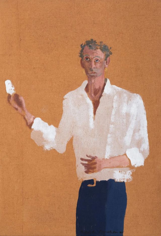
Anthony Green – The Artist (1976)
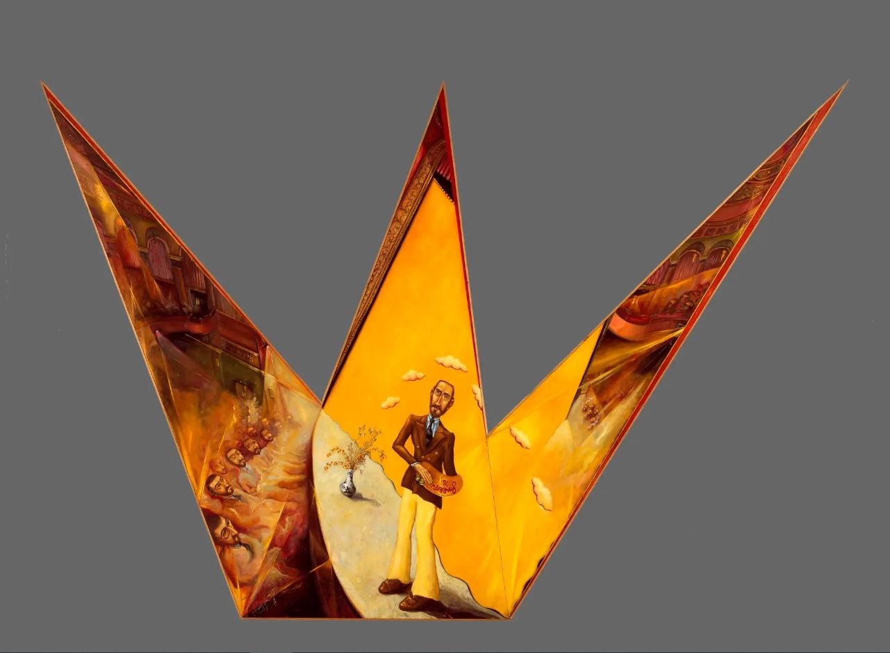
The Artist, 1976 by Anthony Green RA © Royal Academy of Arts
Green’s humorous creations, cartoony paintings made in imaginative shapes, used to appear every year in the summer exhibition (he passed away in February of this year). Looking closely you realise there’s a whole narrative going on: for a start the curators tell us the thing is in the shape of a crown, which I didn’t immediately ‘get’. Spotlights shine down from the top right onto a full-length, fully clothed portrait of the artist standing on a sort of stage in front of a yellow stage curtain. And on the left are the stalls of a theatre, full of serried ranks of more self-portraits. The general idea is: Who is the artist performing for, creating for? Himself, copies f himself, clones of himself? I like Green’s works well enough when I see them but, well…
Chantal Joffe – Looking towards Bexhill (2016)
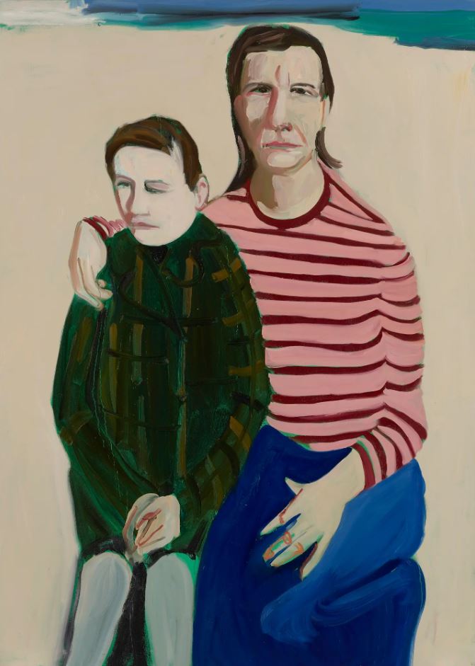
Looking Towards Bexhill, 2016 by Chantal Joffe © The Artist
Here’s Joffe and her daughter on the beach at St Leonard’s-on-sea. According to the curators, the image catches a girl on the cusp of adolescence, turning away from her mother. Joffe is quoted as saying, the more intense the emotion, the more she is driven to simplify the image. Personally I find this a disturbing and upsetting painting. The lack of any effort to convey sand, sea or sky repels me, but not as much as the faces. Eyes are what we look at in the people that we meet or look at and both sets of eyes here are distorted and bent and speak very loudly of physical deformity and/or mental illness.
Hew Locke – Chevalier (2007)
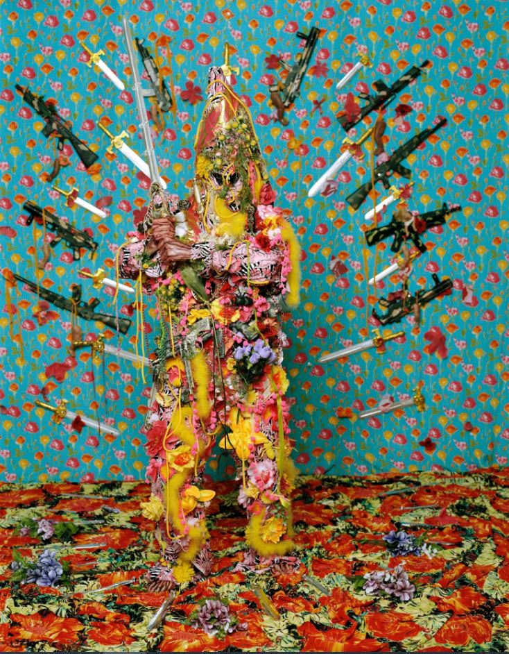
Chevalier by Hew Locke © The Artist
This is one of a series of eleven life-sized photographs from the series ‘How Do You Want Me?’ in which the artist adopts menacing personas. Here he is a sort of surrealist knight in an image saturated with colour and collages of unlikely images, not least the halo of machine guns and daggers which surrounds him. Locke says the series title ‘How Do You Want Me?’ is a satirical reference to the way the art world voraciously consumes the ‘latest thing’, especially the exotic or strange and – by implication – Black artists. So it’s by way of showing two fingers to the art world. Fair enough, but this rational explanation gets nowhere near conveying the over-coloured demented collage with a sword-wielding maniac at the centre.
Sidney Nolan – Self-portrait in Youth (1986)
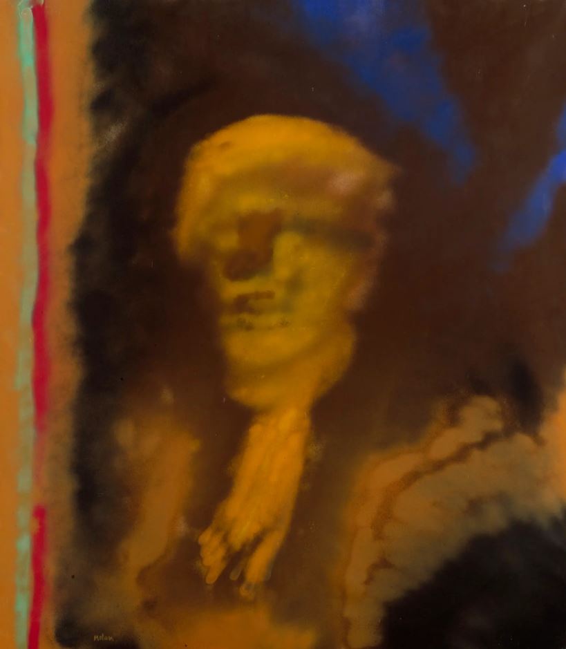
Self-portrait in Youth, 18 April 1986 by Sir Sidney Nolan © Royal Academy of Arts
Nolan’s dates are 1917 to 1992 i.e. he’s one of the older artists here. This may or may not be reflected in the fact that this is pretty much the weirdest and most abstract work here. According to the curators, as a young man Nolan worked with spray paint in a factory and, later in his career, returned to spray paint as a medium. The heavily distorted image and bars of colour down the left, in one mode make me think of raves and acid and hard-edged psychedelic drugs i.e. a positive image. But then, really looking at the head and deep damage that’s been done to it, the radioactive degrading of the image, make me think of Francis Bacon and all his heads turning into meat or screams. Scary.
Patrick Procktor – Self-portrait (1991)
Self-Portrait, 1991 by Patrick Procktor © The Artist’s Estate
I like stylised paintings but I don’t warm to this one. According to the curators he’s holding a thick paintbrush loaded with white paint in his right hand. I thought it was a mirror or a mobile phone glinting in the sun. I ought to like the plain orange background but I don’t. The curators think this is a very ‘intellectual’ image because he’s glancing up at the frame of the picture i.e. investigating the limits of art etc. The asymmetry of his face, the unevenness of his eyes, speaks to me of mental illness and unhappiness.
Paula Rego – Self portrait (1994)
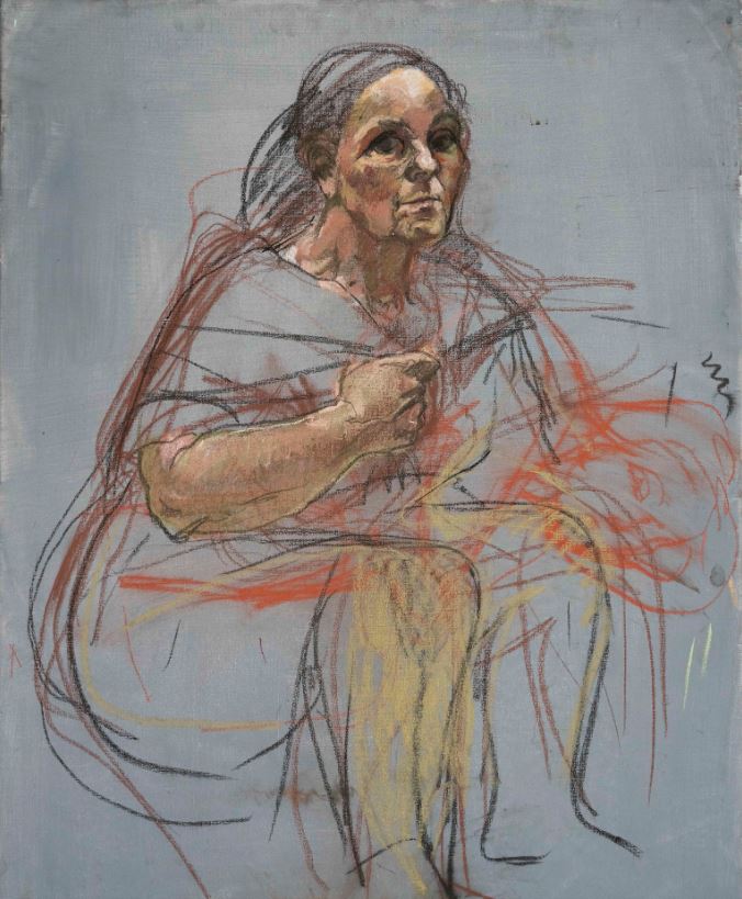
Self Portrait, 1994 by Paula Rego © Ostrich Arts Ltd. Courtesy Ostrich Arts Ltd and Victoria Miro
The curators point out how many artist’s self-portraits capture the artist holding a palette and brush and looking at the viewer in a pose which captures the moment of creation, as if we are there, with them, in that moment. They also shrewdly point out how the two most completed parts of this sketchy image are the face/eyes which see and the arm/hand which creates – as if the two most important parts of the act of creation are fuller, wholer, more complete, than the rest of the body, which fades away into irrelevance. So it’s an image about artistic force and power.
Gillian Wearing – Me as a Ghost (2015)
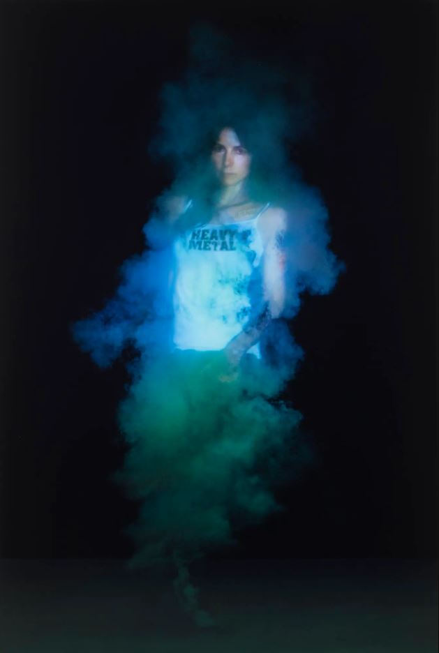
Me as a Ghost by Gillian Wearing (2015) © The Artist
Apparently Wearing has ‘explored’ her identity with numerous self portraits playing with format and genre. The smoke is meant to be a reference to her place of birth, industrial Birmingham but made me think of a genii appearing from a lamp. The t short slogan, ‘HEAVY METAL’ is a reference to the disproportionate number of heavy metal rock bands who haled from Birmingham. The artist and curators may think of this as an experimental investigation of issues of identity and mortality, but it also looks very much like the cover of a certain kind of album depicting a rock chick fan of the band.
Clare Woods – Life with the Lions (2020)
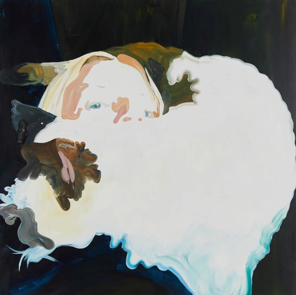
Life with the Lions by Clare Woods (2020) © The Artist
Apparently this painting is based on a photograph of the artist’s cat climbing over her, something which just about makes sense once it’s pointed out but I didn’t guess beforehand. Maybe I have a morbid imagination but I read it as the image of someone’s fact (blonde hair, eyes and nose) horribly melting into a great white blancmange. As paintings of cats go, it’s not a classic, is it? Neither is the mood exactly typical of most cat lovers: Woods explains that the title is from the Billy Bragg song of the same name, which captures the feeling of being present but detached, ‘a feeling of suffocation by responsibilities and expectations.’ All this puts into words the very negative response I had to this image. The glutinous melting effect is achieved by mixing thick oil paint directly onto the aluminium surface of the base, which maybe accounts for the powerful feeling of being asphyxiated.
Personal tastes
Personally, I like the Wearing and Rego, in that order. Wearing because it’s a photo/image which looks like a rock poster, could be on a billboard or a poster on the tube i.e which is very assimilable, not least because it makes her look very attractive in a rock chick kind of way.
The Rego I like because I like charcoal sketches, particularly if they’re unfinished (hence my veneration of Degas). I also like the strong female vibe, the aura of strength and indomitability about it. The obvious feature is the dark eyes which are about twice the size of an ordinary adult’s eyes. Decades ago I read some pop science which pointed out that the eyes are proportionately larger in babies than in adults and that, therefore, we humans are programmed to feel soft and sentimental and attracted by large eyes i.e. in order to warm to, and protect, babies. Obvious evolutionary advantage.
This apparently explains why we feel warmly towards Disney cartoons, from Mickey through hundreds of cartoon characters to Nemo or Frozen – they all have disproportionately large eyes and trigger a soppy sentimental feeling; certainly disarms our adult cynicism. If anything, the Rego portrait inverts the convention, because she looks not soft but spooky – not threatening exactly, but lowering and damaged. And the stumpy muscular right arm gives the image a dwarfish, freakish atmosphere, too. Don’t Look Now.
Reynolds
There’s a twist in the tail. This miniature display takes up only part of The Collection Gallery, the narrow corridor-shaped space at the start of the gallery. At the end of this corridor you can see the start of a completely separate exhibition, which is a selection of highlights from the Royal Academy’s Old Master collection, grand mythological themes, Biblical paintings and Renaissance statues. But the first work in that, completely separate display, is a portrait of Sir Joshua Reynolds, founder and first President of the Royal Academy. So when you look away from the eight self-portraits I’ve just discussed, your eye passes over the lovely image of Reynolds at the end of the corridor.
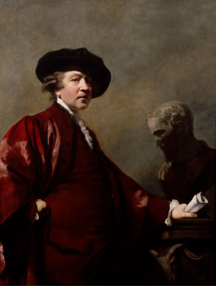
Self-portrait by Sir Joshua Reynolds (1770 to 1780) © Photo: Royal Academy of Arts, London
The point is, the Reynolds portrait is clearly head and shoulders (pun intended) better than the eight works in this little display. It has class and dignity and gravitas. It reminds me of the umpteen histories of art which try and put into words the revolution in visual technology which the development of oil painting during the Renaissance brought about; how artists used the new medium of oil to portray depth and scale of subject, with true perspective etc, but then went on, as the centuries progressed, to focus on the conjuring of light and shade, in particular of dark shadow, to convey psychological and spiritual depths unlike any art which had gone before (Leonardo, Rembrandt).
In this picture Reynolds is clearly channelling Rembrandt and the sophisticated Old Master tradition of strong contrasts of light and shade which came to be referred to as chiaroscuro. It has a human dignity and depth and sensitivity which none of the eight modern images come close to matching.
Related links
- Image of the Artist continues at the Royal Academy until 31 December 2023
- The Procession by Hew Locke @ Tate Britain (October 2022)
