Well, this was disappointing. ‘Flaming June’ is one of the most important and famous works by Frederic, Lord Leighton (1830 to 1896) President of the Royal Academy from 1878 to 1896. It was originally exhibited at the Royal Academy in 1895. However, due to the vagaries of the art market it has for some time been owned by the Museo de Arte de Ponce, in Puerto Rico of all places.
Now, for a whole year, it is on an extended loan back to the Academy where it was first exhibited, by one of its most famous luminaries, almost 128 years ago. Here she is, flaming away:
Flaming June by Frederic Leighton (1895) Museo de Arte de Ponce. Luis A. Ferré Foundation, Inc.
The curators promise that ‘Flaming June’ is being shown alongside other popular works from the RA Collection, including:
other works by Leighton
works by his contemporaries
works which inspired him (including Michaelangelo’s Taddei Tondo)
works which he in turn influenced
Which fired me up to expect an orgy of masterpieces, not least by Leighton’s fellow Olympians who specialised in diaphanously dressed Roman and Greek ladies draped over marble benches playing ancient lyres or scattered with rose petals. Critics often describe it as late-Victorian soft porn.
Well, apart from June herself, there’s absolutely none of that here and the display is a big disappointment.
Confusing
For a start it’s been put on in the Collections Gallery, which already hosts a couple of absolutely vast Renaissance murals and some hefty Renaissance statues which dwarf the Leighton and confused me about where the Leighton display ended and the works on permanent display started. Off to one side, on the way to the small temporary exhibition room, was Michelangelo’s ‘Taddei Tondo’. This is the only carving by Michelangelo in the UK and was part of the RA Collection during Leighton’s presidency so… is it part of this display or not?
No good paintings
Second, there are none of the large sensual depictions of the ancient world I was looking forward to, none. Instead there are only two other paintings:
2. A less well-known work by fellow Olympian, Lawrence Alma-Tadema, ‘The Way to the Temple‘ (1882) which – bizarrely and perversely given that the whole point of ‘Flaming June’ is the combination of shimmering sea and Mediterranean light and female sensuality – is a picture of a woman hidingin the shadows of ancient buildings while, in a narrow sliver, you can see a few people in some ancient procession marching by in the sunlight. Yes the redness of her pre-Raphaelite hair and shawl, yes the detail of the bronze brazier, the architectural reliefs in the background and so on – but really, could they possibly have selected a less appropriate work to compare June with? The wall label make the most tenuous connection imaginable by pointing out that the female figure in this painting is holding…what? Can you see what she’s holding? It’s a votive statue – so the curators are able to shoehorn this inappropriate work into their overarching theme of sculpture and painting and sculpture in painting.
So the ‘paintings by contemporaries’ turn out to be a bit rubbish.
Sculpture versus painting
Instead, all there really is to look at is some pretty technical, art school stuff about the contrast between sculpture and painting, illustrated with drab, black-and-white preparatory sketches.
The first wall label tells us that the debate about which art form was superior goes back to Leonardo and Michelangelo. It then goes on to explain Leighton’s process, which was to make sketches on paper with squares on, trying out this or that composition, until he had it right and was then able to transfer the small (A4 size) sketch up to the much larger scale of the finished painting (in Flaming June’s case, 47 inches by 47 inches).
There’s a sketch and a model made to model the figures in his painting The Garden of the Hesperides. As you can see, the figure on the left is wearing pretty much the same colour dress as June and is also sculpted to have a great haunch of thigh.
There are some small dark sketches he made in preparation for his painting Perseus and Andromeda (1891), these are the ones on squared paper. God if only they’d been able to include the finished paintings of Hesperides and Perseus what a different feel the display would have had!
The Sluggard
Oh yes, on the way in to the Collections Room they’ve placed an impressive sculpture by Leighton, The Sluggard, dominating the entrance and, I suppose, announcing the curator’s theme of ‘sculpture versus painting’ or ‘how Leighton incorporated sculpture into painting’. I’d say this was worth going to see except that it belongs just a mile or two up the road at Tate where it’s regularly on public display, so not much of a treat either.
The Sluggard by Leighton
There’s another sculpture, the ‘reduced’ i.e. preliminary version of ‘Athlete struggling with a python.’ I think we can safely say that this lacks the scale and finish of the final version and so contributes, somehow, to the second-hand, shabby feel of the whole display, as if they couldn’t afford the real thing. A Tescos exhibition.
Academic
Frankly, this would all have been better in an academic textbook where it could have been more fully explained with more examples and more discussion. Instead: June herself, two inferior paintings from the period, a good Leighton sculpture, half a dozen sketches, some preparatory masques, and that’s your lot.
Some learnings
Well, at least there’s a bench to plonk yourself down on in front of ‘Flaming June’ and give it a damn good looking at. Some points emerge:
The sea Fool that I am, I hadn’t, from the hundreds of reproductions I’ve seen, quite realised that the horizontal band just above her head is a view over the shimmering sea, with the vast sun just out of sight.
The foot For some reason I’d never really noticed the model’s left foot poking out at you from under her right knee; it’s there in all the reproductions but somehow, in the flesh, appeared more prominent.
The body This foot had the effect of transforming the image which I had previously considered as an almost abstract design – with the line of the neck and head almost aligned with that of the enormous slab-like thigh to create a sort of abstract pattern – anyway the foot brought out the reality of the human model more than reproductions do, and I began to connect up all her limbs, the right hand hooked into the left arm etc.
Happy accident Now, given how the curators go on about Leighton’s worship of Michelangelo and the entire display makes a big deal of sculpture I was expecting the model’s striking pose to be the result of detailed study of the arcana of Michelangelo’s sketches or sculpture etc etc; instead, the wall label informs us that the entire pose, in all its famous combination of hugeness and sensual abandonment, was completely accidental – according to Leighton the model curled up and went to sleep in that pose and he thought Eureka!
Sculpture and painting The point of including The Sluggard is to demonstrate Leighton’s terrific fluency with both painting and sculpture and how experiments with posing the human body in one medium influenced the other. The rather more obvious point is that, like June, it’s an image of tremendous sensuality, caught in a moment of relaxed intimacy and quite unlike the heroic Greek and Roman statues it derives from. The ‘expressive dynamism’ of figures like this led Leighton and friends to be labelled as the New Sculpture Movement.
Michelangelo The one useful thing the curators say about Michelangelo is pointing out that the great sculptor became fascinated with seeing how much he could convey in very compacted compositions and cite the compact, almost circular composition of Leda and the Swan as an example. As soon as you see this, you realise its influence on Leighton’s composition of June. And go on to realise that the composition is the opposite of The Sluggard. Whereas The Sluggard is thin and vertical, is long, is about height and stretch – June is all about monumental compaction and compression.
Embarrassing
If I was the head of the Puerto Rican gallery which loaned ‘Flaming June’, the Museo de Arte de Ponce, and flew over with my assistants to see what the world famous Royal Academy had done with their priceless painting, I’d have been furious. And seen from this perspective, I think this shabby, half-arsed display is an embarrassment.
Related links
Flaming June continues at the Royal Academy continues until 12 January 2025
Angelica Kauffman (1741 to 1807) was one of the most celebrated artists of the 18th century. She isn’t an obscure figure from the past who’s been dug up by revisionist feminist curators – she was genuinely a leading artistic and cultural figure of her time, one of the most successful portrait painters in Britain, celebrated here and across Europe, prints of whose works sold in the thousands, described by one of her contemporaries as ‘the most cultivated woman in Europe’.
Self-portrait with Bust of Minerva by Angelica Kauffman (1780 to 1781) Grisons Museum of Fine Arts, on deposit from the Gottfried Keller Foundation, Federal Office of Culture, Bern
This exhibition is not a blockbuster, it isn’t an encyclopedic overview of her career. Instead it’s staged in just three rooms in the Jillian and Arthur M. Sackler Wing of Galleries at the top of the Academy building, and contains just 30 or so works, including 20 or so paintings, 7 or 8 prints, some historical letters and her sales book.
It is, in other words, not an arduous ordeal of an exhibition like the vast ‘Entangled Pasts’ show in the main galleries downstairs – instead it is a light and airy overview, as calm and civilised, as interesting and undemanding as her Enlightenment-era portraits.
Potted biography
Angelica Kauffman was born in the Swiss town of Chur in 1741. She trained with her father, the Austrian painter Joseph Johann Kauffman, and was quickly recognised as a child prodigy.
The family moved between Austria, Switzerland and Italy and Kauffman trained as both a musician and as a painter. She eventually chose to pursue the latter career professionally, a decision she dramatised in one of her most famous paintings, ‘Self-portrait at the Crossroads between the Arts of Music and Painting’ (1794). (Note the three facial poses – half-turned, slightly turned, and profile – something we’ll come back to later.)
It was in Italy that she established a reputation as an artist and was elected a member of the Roman Accademia di San Luca at the age of just 23. Although, as a woman, Kauffman was not able to officially enrol at an art academy, she nevertheless studied the works of the Old Masters and classical sculpture at first hand.
In Italy, she mixed with neoclassical artists and scholars and also met many Britons undertaking the Grand Tour. Her popularity among the community of British visitors and expatriates encouraged her to move to London in 1766.
London
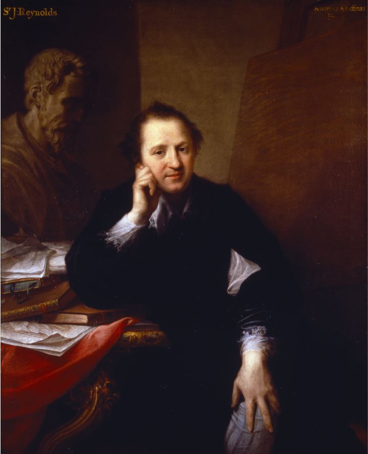
Soon after arriving in London, Kauffman established a close friendship with Joshua Reynolds, the leading portrait painted in Britain, a friendship commemorated in the portraits they painted of each other. Her friendship with Reynolds and other artists, along with Royal approval, helped to ensure that when the Royal Academy of Arts was established in December 1768, Kauffman was among the group of 36 founder members (along with one other woman, the painter Mary Moser).
The founding is commemorated in Johan Zoffany’s famous group portrait of the Royal Academy members, ‘The Academicians of the Royal Academy’ (1772). As women, Kauffman and Moser were not allowed into the Life Room, where the portrait is set (on account of the nude male models). Instead, their presence was signalled by their portraits on the wall on the right (Kauffman on the left, Moser on the right).
For her part, Kauffman portrayed Reynolds in his studio seated at his easel with a desk full of books and a bust of Michelangelo, his artistic hero, by his side. Standing in front of Kauffman’s atmospheric portrait of Reynolds, and reflecting on his role on getting her elected a founder member, I couldn’t help remembering the old proverb, ‘It’s not what you know, it’s who you paint that counts’.
Kauffman became one of the most sought-after artists of the period. She was in great demand as a portraitist in London – as one contemporary commented, ‘the whole world is Angelica-mad.’ In London she enjoyed a prosperous career, earning significant fame, fortune and an influential circle of patrons, many of whom were women
Richard Samuel’s Muses
Her success was marked in many ways, not only by membership of the Academy but also inclusion in a painting of eminent women of the day by Richard Samuel.
‘Portraits in the Characters of the Muses in the Temple of Apollo’ by Richard Samuel (1778) National Portrait Gallery
The eminent women are, from left to right:
Elizabeth Carter, scholar and writer
Anna Letitia Barbauld, poet and writer
Angelica Kauffman (seated at the easel)
Elizabeth Ann Sheridan, singer and writer (in the middle, singing)
(sitting, left to right): Catharine Macaulay, historian and political polemicist
Elizabeth Montagu, writer and leader of the Bluestocking Society
Elizabeth Griffith, playwright and novelist
(standing at the back): Hannah More, religious writer
Charlotte Lennox, writer (holding the guitar)
Somerset House commission
In the late 1770s, at the time she was appearing in this painting, Kauffman was commissioned by the Royal Academy to paint a set of four ceiling paintings depicting the ‘Elements of Art’, to be displayed in the Council Room of New Somerset House which opened in 1780.
Again Reynolds was influential because she chose to depict the four stages of composition of a work of art, as described in Reynolds’ hugely influential ‘Discourses on Art’. The four oval paintings she produced represent the four stages of Invention, Composition, Design and Colour, as classically dressed female figures bearing a remarkable resemblance to herself. (The Royal Academy owns these works and all four of them are usually on display in the Front Hall of Burlington House.)
The exhibition includes two of the four paintings (why only two if the RA owns all of them?) alongside four of her preparatory oil sketches (now owned by the V&A). ‘Design’, in particular, is a deeply impressive work in terms of composition, colour, shade, everything.
Rome
However, despite her success in London, in 1781 Kauffman decided to return to Rome. Returning to Italy at the height of her career, she established an international clientele and a famous salon which attracted celebrated visitors including Goethe and Canova. Her studio near the Spanish Steps became a hub for the cultural elite and her status and reputation continued to prosper. One contemporary described her as ‘the most cultivated woman in Europe.’ She continued to be popular among contemporary women who wanted themselves portrayed, such as:
Portrait of Emma, Lady Hamilton, as Muse of Comedy by Angelica Kauffman (1791) Private collection
Kauffman kept up her connections with her many British friends and patrons, continuing to exhibit at the Royal Academy, sending commissions back to the UK and painting British Grand Tourists visiting Rome. She continued to develop her practice as both a portraitist and a history painter in Rome, demonstrating ever greater confidence and skill in both genres.
Death
When Kauffman died in 1807, her grand funeral in Rome was arranged by the famous sculptor Antonio Canova and a bust of the artist, sculpted by her cousin Johann Peter Kauffmann, was subsequently placed in the Pantheon, beside that of Raphael. Recognition indeed. The funeral itself was described in a letter sent to the Royal Academicians in London and read out in their General Assembly and this, like several other letters from key moments in her career, is on display here.
Self portraits
Throughout her career Kauffman produced a series of self portraits, presenting herself in different costumes and guises. As a woman artist, portraying herself enabled Kauffman to define her identity and take control of how she was seen by others. Her many self portraits shape and cultivated her aesthetic identity and they are clearly among her best works. What comes over to the visitor is how consistent they are, the three or so really great portraits collected here are almost identical in shape and feature.
Kauffman painted some of the most influential figures of her day and who more influential than royalty? She started with a commission to paint Princess Augusta, sister of King George III, and subsequently painted Queen Charlotte herself in an allegorical attitude.
Her Majesty Queen Charlotte raising the Genius of the Fine Arts, published 19 May 1772 by Angelica Kauffman
As the curators explain:
Kauffman’s commissions from royal women were an important marker of her success in London and contributed to her inclusion as one of the founding members of the Royal Academy. In 1767 she painted Queen Charlotte with her eldest son, George (later King George IV), in the guise of the ‘Genius of the Fine Arts’. The painting is now lost but its appearance is recorded in this large
mezzotint. Prints after Kauffman’s paintings proved hugely popular and helped to make her famous throughout Europe.
Enlightenment men
There are a few lords and ladies on display but the best portraits on display here are not of royalty or aristocracy – in the true Enlightenment spirit, they are of men of intellect and character, namely Joshua Reynolds, actor David Garrick, architect and theatrical-set designer Michael Novosielski. All these portraits are astonishingly good, vividly conveying the sitter’s character. You feel Garrick is just about to tell a joke, you get a strong feel for Novosielski’s inventiveness and flair. Her portrait of classical scholar Johann Joachim Winckelmann, 1764, painted when she was just 22 years old, was celebrated for its exceptional likeness.
And yet, despite her social and financial success as a portraitist, Kauffman identified herself primarily as a history painter, the genre Reynolds placed at the heart of the Royal Academy’s teaching. She exhibited history paintings each year at the Royal Academy’s influential annual exhibitions, displaying her erudition by depicting scenes from a wide range of mythological, literary and historical sources.
According to the curators, Kauffman reinvented the genre of history painting by focusing largely on female protagonists from classical history and mythology, as in:
Apparently, Kauffman regarded these works as the core of her achievement which is a shame because they’re generally the weakest. ‘The Death of Alcestis’ (1790) demonstrates why.
‘Death of Alcestis’ (1790), Angelica Kauffman. Voralberg Museum, Bregenz. Photo: Markus Tretter
Three things:
the poses of the characters are absurdly histrionic, posed and theatrical – I imagine they conformed to theatrical conventions of the day which is why the ‘serious’ plays from this period haven’t survived
as a result, the bodies are bent and contorted into uncomfortable and ungainly positions
somehow, as a result of the first two, the faces are universally unconvincing – they are meant to be conveying extreme emotion and feeling but the faces themselves are curiously void and blank
Now the colour of the cloaks and fabrics and the realistic depiction of folds and shadows, are marvellous. But everything else is too staged and contrived for modern taste.
Bible history
Something else noticeable in the historical paintings is the ramrod straight Roman noses. Look at the woman third from the right in Alcestis. This is particularly obvious in the one Biblical painting in the exhibition, ‘Christ and the Samaritan Woman’, (1796). The curators tells us that this was one of two canvases carried in triumph at the artist’s funeral procession, organised by the sculptor, and her close friend, Antonio Canova, along with other contemporary artists and scholars. Yes, yes, very pious and impressive but…look at Jesus’s nose! The clothes, the fabrics, the colours, the folds, the copper basin all are done very well but…that nose!
Christ and the Samaritan Woman by Angelica Kauffman (1796) Bayerische Staatsgemäldesammlungen Munich – Neue Pinakothek
Alerted to the nose issue, I realised that The Roman Nose is a sort of symbol throughout her works of History and Seriousness. It features in all the history paintings (examine the noses of Odysseus and Cleopatra) and in the famous Crossroads painting, where the figure of Art has another razor-straight, Roman schnozz.
By contrast, compare the noses of the portraits – the noses of, say Reynolds or Novosielski. These are much more realistic i.e. generally soft and nobbly. It’s one of the reasons the portraits are warm, because they have realistic noses. And then I realised the straight noses are so noticeable because the History figures are often portrayed in profile.
In fact I realised there’s a spectrum at work here: at one extreme are the ruler-straight Roman noses of the Stern and Noble History Paintings. In the middle are the realistic noses of accurate portraits such as Reynolds, Garrick and Winckelman. And at the other end of the spectrum, she has a kind of bland and diffuse style where the faces are generic late-18th century, lacking the specificity of the best portraits.
And then I began to obsess about the eyes. In the best portraits and self portraits the eyes have colour and character. In her more perfunctory work, they eyes are just black, which tends to give the faces a generic, almost cartoon quality.
Although it’s not a blockbuster in size or ambition, nonetheless this is an interesting exhibition because the curators have assembled a various enough selection to allow to get to know Kauffman’s work, to see her addressing different genres, and to start to get a sense of her strong points and weak points.
Bad
I shouldn’t end before saying she could be actively bad. I disliked the contorted bodies and bad faces of the history paintings but could see their purpose and was impressed by the brightly coloured fabrics in many of them. But two or three paintings on display here are just bad: in ‘Penelope at her Loom’ (admittedly an early work) the folds of curtain on the left and the golden fabric Penelope’s wearing are tremendous – but look at the face! Disaster!
‘Penelope at her Loom’ by Angelica Kauffman (1764), Brighton & Hove Museums
Arguably, Poor Maria (1777) is even worse, one of her typical histrionic poses, a badly done face, but look at the dog in this one, the head far too small for the body.
Nathaniel Dance
The friend I went with really disliked the history paintings, grudgingly admired some the self portraits and the portraits of eminent men – but insisted that the only work she really liked in the whole show was in fact by someone else altogether, a tiny watercolour portrait of Kauffman by Nathaniel Dance. Still very much in the style of its day, this tiny work is a masterpiece of minute detail and, in its way, contains more feeling and precision than anything by Kauffman. A reproduction doesn’t do its shimmering, intricate detail justice.
‘Portrait of Angelica Kauffmann’ by Nathaniel Dance (1764 to 1766) National Galleries of Scotland
To my surprise, and not mentioned in the RA exhibition, the website of the National Galleries of Scotland (who own the painting) tells us that Dance spent a great deal of time in Italy, developing his inventive approach to drawing and painting and that, while in Rome in the 1760s, he had a love affair with fellow painter, Angelica Kauffman. Maybe that explains the extraordinary care and attention to detail which characterises this miniature masterpiece.
Invisible men
This raises a small but pertinent point. Only in the label to the case displaying the register of all her paintings kept by her second husband, Antonio Zucchi, do we learn that she married at all. With this sole exception, the exhibition very studiedly excludes all reference to Kauffman’s husbands, lovers, or children, if there were any. In other words if focuses entirely on her professional and artistic achievement, with no mention of her role as wife or mother or whatever. Which I admired.
Quality of reproductions
And just a note that all the images in this review are poor quality, even the ones supplied by the Royal Academy press office. The portrait of Reynolds and the Nathaniel Dance image are particularly disappointing and don’t convey at all the colour and liveliness of the originals. Without exception all the works I’ve included are much, much more vibrant, gripping and alive in the flesh. That’s why I choose to live in London, despite the expense, pollution and inconveniences – because with very little effort and relatively minimum expense, I get to see beautiful and exquisite, exciting and breath-taking art, on a weekly basis. And all of these art works, all of them, are infinitely better seen in the flesh.
Related links
Angelica Kauffman continues at the Royal Academy continues until 30 June 2024
This is a fabulous, complicated, interesting and inspiring exhibition. Although it occupies just one room (gallery 2, upstairs at Autograph ABP in Shoreditch) and consists of just eight photos, an installation and a video, it is overflowing with ideas, creative juxtapositions and wonderful imaginings.
Mónica Alcázar-Duarte is a Mexican-British artist and the installations in this room tackle a whole raft of contemporary issues around history, colonialism, imperial knowledge systems, but with a wit, intelligence and beauty I rarely find in contemporary art. I was dazzled, overwhelmed.
Installation view of ‘Digital Clouds Don’t Carry Rain’ by Mónica Alcázar-Duarte at Autograph ABP, showing the eight photos on the side walls, the big one at the end, and the installation in the centre of the room
1. Systems of knowledge
The room contains three distinct works or set of works but first I think I need to define the elements from which Alcázar-Duarte has concocted these wonderful pieces. Running through them all is an interest amounting to an obsession with problems of knowledge:
How do we know what we know? How does anyone know what they know? Predominantly by relying on the knowledge systems and values of our society and culture. But how do we know these are correct? When one system exterminates another, how we can be confident the right one has triumphed? What happened to the world when European imperialists crushed, burned and destroyed native systems of knowledge and value? How many indigenous ways of seeing the world have been lost and at what cost?
What if we are all living inside a system of knowledge and meaning which is seriously awry, consenting to values which are destroying the world? In fact what if (as I believe) we are living amidst the fantastically complex wreckage of numerous value systems and theories of knowledge (paganism, various forms of Christianity – Catholicism, Anglicanism, Puritanism, non-conformity, Enlightenment atheism, industrial capitalism, industrial socialism, Liberalism, imperialism and so on), which partly explains the difficulty of thinking through any idea to a logical conclusion, given the clamour of opposing systems and ideas which spring up at every thought.
An enormous amount of the modern world, its banking and economic and transport systems, not to mention all the cultural fol-de-rol of the internet and social media, are all utterly reliant on new-ish digital technology – but what if this, also, in its way, is a delusion, an artificial set of systems and values imposed on a natural world in order to control and exploit it in new ways? And imposed on us, its users, to exploit us? What if it is as compromised as all previous systems of knowledge have turned out to be?
In the artist’s words:
‘How is it that the knowledge of my ancestors has been completely disassociated from contemporary knowledge systems?… I find myself wondering if there could be different approaches to tackling the important questions of our time?’
David
And before proceeding, a shout-out to the lovely Autograph visitor assistant, David. He and I spent about 45 minutes discussing the works, teasing out their elements to reach interpretations and conclusions neither of us could have made by ourselves. Half of the insights detailed below derive from him. Thank you, David.
2. Issues and ideas in Alcázar-Duarte’s works
1. Mayan ancestry
Mayan culture, language, religion and history are invoked by the works. The 8 photos are named after Mayan gods. The Mayans, in other words, had their own complex, integrated systems of knowledge, language, ritual and ceremony. To quote Wikipedia:
The Maya elite were literate, and developed a complex system of hieroglyphic writing. Theirs was the most advanced writing system in the pre-Columbian Americas. The Maya recorded their history and ritual knowledge in screenfold books… In addition, a great many examples of Maya texts can be found on stelae and ceramics. The Maya developed a highly complex series of interlocking ritual calendars, and employed mathematics that included one of the earliest known instances of the explicit zero in human history.
2. Spanish conquest
Predictably, this was wiped out with the arrival of the Spanish conquerors in the mid-1500s. The Spanish adventurers wanted gold but the Spanish Catholic Church, more culturally curious, encountered a complete religion and knowledge system not previously known in Europe. Some wanted to record it but one of the most notorious actions of the Spanish religious authorities was to burn the Mayan holy books, in a conscious bid to extirpate this rival, blasphemous, ‘evil’, pagan value system.
This event is memorialised in the film installation here (see below).
3. Casta paintings
During the first centuries of the Spanish occupation there was a lot of ‘interbreeding’ which created new types of ethnicity. Like colonial authorities everywhere, the Spanish were keen to name and categorise all aspects of their conquered peoples and developed a thorough-going system of caste. According to the Wikipedia article on Casta:
Basic mixed-race categories that appeared in official colonial documentation were mestizo, generally offspring of a Spaniard and an Indigenous person; and mulatto, offspring of a Spaniard and an African.
What Alcázar-Duarte is interested in is that the Spanish developed an entire genre of art devoted to the caste system, the so-called Casta paintings. These illustrated the different ‘types’ of ethnicity which had been created by the Spanish occupation and the system eventually became awesomely complicated.
The point for this exhibition is that Alcázar-Duarte has used these paintings as the basis for most of the works here, in two ways: 1) in all eight photos she has dressed up and is adopting a (usually quite florid) pose taken from a Casta painting 2) she has used a modern artificial intelligence programs to analyse the poses, reduce them to shapes and patterns, then extrapolate these patterns as dotted silver lines across the photos.
4. The language of flowers
Throughout history human cultures have assigned meanings and symbolism to flowers. In these photos Alcázar-Duarte wears masks made of flowers. Like everything else they have multiple meanings because they are both part of Spanish colonial flower symbolism, itself a sub-set of European systems of symbolism; but at the same time she has selected flowering plants which were important foodstuffs for Mayan bees (see section 10, below).
So just to recap, in this photo you can see Mónica Alcázar-Duarte: 1) standing in the woods (in fact, apparently, in a stand of Queen Anne’s lace); 2) wearing an old-fashioned outfit which I imagine is taken from the colonial-era Casta paintings; 3) holding her arms in a hieratic pose taken from a Casta paintings; 4) her face hidden by a mask of symbolic flowers; 5) while a system of silver dotted lines waves and wiggles across the image. Then 6) there’s the orange lines weaving in and out of the dotted lines, and I’ll explain those in section 7, below.
The deep point is that these Casta paintings are yet another system of human categorisation, taxonomy of knowledge creation.
5. British ancestry and the Industrial Revolution
Alcázar-Duarte is half British. On the face of it, for once, the British Empire is not involved. The Mayan culture covered the territory of modern-day Guatemala and its suppression, as that of most of central America, was a solely Spanish affair.
But the works in the exhibition demonstrate a link nonetheless. This is because Britain is the country which invented the industrial revolution and, arguably, everything which derives from it, the complex system of values and practices which we still inhabit, including ideas like: industrial capitalism; mass production; universal timekeeping; the proletarianisation of work; the capitalist extraction of raw materials regardless of cost; the conquest of poor countries in order to exploit their mineral resources and expand our markets. And so on. See the writings of Karl Marx.
Alcázar-Duarte has an oblique approach to all this, because the eight photos are all taken in rural Derbyshire. Why, I asked myself. David and I discussed this for a bit. The wall labels clearly state that Derbyshire was chosen because its valleys and towns were the cradle of the Industrial Revolution, why not set the photos in ruined mills and workshops and warehouses?
6. Environmentalism
Because underneath the hi-tech gloss of the photos, installation and film there is a running thread of concern for the environment. Rereading the label I see it says all the photos are set among the ‘dying trees‘ of Derbyshire. Aha. So the idea of decay, death and ruin are here, but not in buildings, instead subtly symbolised by dead and dying trees.
And this decay is symbolic not only of the past, the industrial ruins which litter the British landscape (although most urban Victorian buildings have these days been converted into bougie apartments) but of the present and future because we are, of course, in the middle of a slow-motion holocaust of the natural world. It’s not as dramatic as cutting down the rainforests or oil spills in the Niger Delta, but the British countryside is slowly steadily becoming degraded. Once common types of trees are dying out, species of birds which used to be rare are now endangered. Our rivers and coasts are now all tainted by human faeces. Slowly the pan of water is heating up and we’re sitting like stupid frogs enjoying the warmth, oblivious of the disastrous future.
All the photos are, at first glance, warm and attractive, but contain these coded portents of future loss.
7. Digital technology and copper
And of course we are living through an age of rapid technological change, the Digital Age, kick-started by the spread of the internet during the late 1990s, ramped up by the rapid proliferation of smart phones in the Noughties, and then the wildfire spread of social media. Nowadays most people are wired into this grid (like me writing this blog and you reading it) and this has two consequences for Alcázar-Duarte: one is artistic but behind it stands a vast system of meaning.
Remember I pointed out the orange lines which weave across the photo I included? They are made of copper and they symbolise at least two things. For a start, the historical perspective: copper was one of the rare metals mined by the Spanish using native forced labour. On one level, the use of copper filaments sheets across all the works on display here points towards colonial atrocity.
But it’s copper cables which have historically linked the world, first in 19th century telegraph cables, then in the phone lines laid across developed nations. Nowadays it’s copper cable which carry digital technology and link all of us in a vast web of knowledge, information, data, exchange, commerce and everything else which happens on the web.
Alcázar-Duarte has used artificial intelligence programs (see below) to scan the faces of Casta paintings in order to create datasets and then used programs to develop the patterns which wave and shimmy across the face of her photos.
Thus the symbolism of the photos suggests that, even in the most beautiful and rural setting, we are still enmeshed in the digital world which, of course, more than any previous technology, has created its own taxonomies and systems of knowledge. Think of all the articles you read explaining how the content delivered to us is driven by algorithms based on our previous choices. The internet has created digital simulacra of ourselves, which have become so complex and, in many cases, so accurate, that they’re almost more lifelike than our ‘selves’.
Squabbling about Spanish Catholic ideology (systems of knowledge and belief) wiping out Mayan ideology seem bookish and obscurantist compared with where we are, and the wholesale creating of new digital systems of knowledge all around the world, part of which process is the stomping out of local and national differences as everyone in the world starts documenting their lives via Facebook, Instagram, TikTok or their Russia or Chinese equivalents and everyone, to some extent or other, validates their lives and selves online.
8. The fleur-de-lis
There’s an aspect of the flower symbolism I haven’t covered yet because it’s done in copper. This is her use of the motif of the Fleur-de-lis. For a thousand years the fleur-de-lis has been stylised into a visual motif which has variously denoted royalty, French cultural heritage, Christianity, light, defence, female virtue and much much more. As such it was used by the Spanish in their coats of armour and official insignia and so on.
But Alcázar-Duarte has, as usual, incorporated it into her work in such a way as to create ambiguity and new resonances. For the wall labels tell us that this shining image of monarchy and virtue and whatnot was also used as a brand which was burned into the skin of slaves as a punishment. This knowledge sheds a radical new light on the whole thing, and can’t help but make you shudder.
But there’s a third level because Alcázar-Duarte scatters the motif of the fleur-de-lis very freely across the photographs, rendered in the copper foil which, as we have seen, is already a complex symbol in itself, denoting the copper which was mined by forced labour but also, at the same time, a bang-up-to-date symbol of the digital world we all inhabit.
So, having worked it through, we can see that these copper renderings of fleur-de-lis bear a complex freight of historical, cultural, moral (and immoral) meanings, as they gaily cavort across the surface of her photos.
But of course technology never sleeps, in fact it seems to be speeding forward at ever-increasing pace. We appear to have moved beyond the Digital Age, the Internet Age and the Social Media Age into the worrying new era of the Artificial Intelligence Age.
And here again we are seeing a ramping up, a taking to the next level, of the digital systems which already mesh and define us, because artificial intelligence (if such a thing really exists) has the ability to invent new systems of knowledge and taxonomy, originating in the systems we program into it, but with the potential to create entirely new worlds of information, definition and control.
And this, too, is not just touched on but central to Alcázar-Duarte’s art works. Because all the works on display here use artificial intelligence programs. I’ve mentioned that she used some kind of program to ‘read’ the gestures in the Casta paintings and extrapolate from them patterns, in this case of dotted silver lines, which loop across the beautiful photographs like pearl necklaces lacing across their surfaces.
setting amid dying trees in the heartland of the Industrial Revolution
dotted lines generated by AI
copper lines symbolising the digital mesh we are all entangled in
copper fleurs-de-lis symbolising beauty and atrocity
10. Non-human systems of knowledge and organisation: bees
So far we have been isolating and defining the historically consecutive systems of knowledge which Alcázar-Duarte is interested in. But, to state the obvious, they have all so far been human. But what about the natural world? One of the big things we’ve learned over the past generation is that all kinds of living organisms have systems of communication which are far more subtle and far-reaching than previous generations of scientists imagined. Two areas where amazing discoveries have been made are in the methods of communication among trees and fungi.
Anyway, Alcázar-Duarte focuses in on one particular species which has long been famous for its advanced and complicated systems of organisation and communication, bees. To be more precise, and as you would expect, she chooses a species of bee which comes laden with historical and cultural symbolism.
This is Mexico’s endangered stingless bee, Xunan-Kaab, the Regal Lady bee. This was first cultivated in the Mayan civilisation 3,000 years ago and the Spanish conquerors discovered than its honey was considered (and still is) a delicacy.
So there’s a colonial legacy aspect here, but, characteristically, Alcázar-Duarte doesn’t rest on historical grievance but drives her vision into the future, in a film which points towards the completely alien, non-human forms of ‘knowledge’ which bees, like so many thousands of other species, possess and which humankind is only barely starting to understand.
The bee element (mostly captured in the film; see below) in a way sheds a new perspective back over the cavalcade of knowledge systems and technological advances which the works embody: because it suggests the possibility that all of them are wrong simply by virtue of being human, and thus, more often than not, exploitative and coercive.
What if all human values are erroneous and, despite giving us more knowledge and power than ever before in human history, what if modern, up-to-the-minute technology, knowledge and taxonomies are entertaining and distracting us while the planet goes to wrack and ruin around us? What if we’ve been wrong all along, and the fungi, the trees and the bees are much wiser than us?
3. The works
1. The photos
I’ve comprehensively covered the ingredients which make up the photos and what you can see in them, how dense and multi-layered they are with systems of meaning and symbolism, in sections above. As mentioned each one is named after – or assigned to – one of the major gods of the Mayan pantheon. And, since you ask, here’s a list:
Kukulkan, Mayan serpent deity
Ixchel, Mayan moon and birth deity
Itzamná, Mayan time deity
Kinich Ahau, Mayan sun deity
Ah-Muzen-Cab, Mayan deity of bees
Ah pu’uch, Mayan death deity
Yum Kaax, Mayan jungle deity
K’aaxal ja, Mayan thunder deity
Ek Chuaj, Mayan deity of Cacao
2. The film: ‘U K’ux Kaj/Heart of sky, Mayan god of storms’
While we’re on the subject of Mayan deities, the short film on show here is titled after one, ‘U K’ux Kaj / Heart of sky, Mayan god of storms’ (2023 to 2024). It’s only 8 minutes long. It was produced at Maní in the Yucatán Peninsula and why here? Because this is the town where, in 1562, the Spanish authorities in the form of the Church. assembled the largest ever collection of Mayan codices, books containing knowledge of the Maya religion, language and history, piled them up and burned them to ashes.
The film features slow shots of a wrecked building, the foundations of a long abandoned building surrounded by the lush greenery of the jungle, in which stands a statuesque woman clad from head to foot in a light flowing pink garment while a voiceover explains the events that took place here in Maya, the language of the first peoples. This is intercut with very slow close-ups of a native (non-white) hand slowly turning and rotating against a blue background.
But that’s not all. There are the bees. Remember I mentioned Mexico’s endangered stingless bee, Xunan-Kaab, the Regal Lady bee and how it was first cultivated in the Mayan civilisation 3,000 years ago? Well these bees also feature in the film, for the conquerors destroyed Mayan culture at one of the epicentres of Mayan apiculture, and the film includes references to the beekeeping skills, themselves rooted in a profound appreciation of the flora and fauna of the region, which the Spanish couldn’t extirpate.
3. The installation:
At the centre of the room is a new installation ‘T’aabal chukChuuk/Embers (2024)’. It consists of a sort of low ‘fence’ arranged on short posts in the shape of a hexagon, with one bar missing to allow visitors to enter the central space. Why a hexagon? Think about it. Because that is the shape of the cells in a beehive and, once again, the work incorporates aspects of Mayan bee lore.
Installation view of ‘T’aabal chukChuuk/Embers (2024)’ by Mónica Alcázar-Duarte, part of ‘Digital Clouds Don’t Carry Rain’ at Autograph ABP. Photo by the author
What’s she’s done is combine three things: 1) using an algorithm inspired by the collective intelligence of bee colonies, Alcázar-Duarte 2) has merged the fleur-de-lis motif with 3) fragments from the Casta paintings. What this means in practice is you have no fewer than fifty-six artificial lilies, created by modern 3-printing technology, all gilded with the same copper leaf colour we saw in the photos and – here’s the kicker – each one contains a face or hand or pair of hands recreated from some of the Casta paintings we’ve heard so much about. Bees. Copper. Digital technology. Casta. Lost culture. All these themes come together in this fragile’ garden of technology, based on the multiple historical classification systems which I’ve outlined above, and given form by the latest digital technology.
You don’t really need to know any of this, or not much, to find the ‘face lilies’ haunting and poignant.
Installation view of ‘T’aabal chukChuuk/Embers (2024)’ by Mónica Alcázar-Duarte at Autograph ABP, showing the 3-D-printed face lilies. Photo by the author
4. Augmented reality
But that, of course, is not all. There is a bit of augmented reality included in the installation. On the floor at the centre of the broken hexagon is a pattern in black and white, apparently based on a map of the Yucatan area of modern-day Mexico, once part of Mayan territory.
Diagram on the floor of ‘T’aabal chukChuuk/Embers (2024)’ by Mónica Alcázar-Duarte, at Autograph ABP. Photo by the author
The visitor assistant (in my case, the lovely David) has a big ipad which he loans to you. As you walk into the hexagon and focus the camera of the ipad on this floor diagram, something happens. A spangly tree grows up out of the floor, outlined in the same ghostly white dots as cover the eight photographs.
Installation view of ‘T’aabal chukChuuk/Embers (2024)’ by Mónica Alcázar-Duarte at Autograph ABP, showing the ipad on whose screen appears the ghostly outline of a digital tree growing and spreading. Photo by the author
I wasn’t quite sure what to make of this. It seems to me an elaborate gimmick. It didn’t really add to my understanding or enjoyment of the photo, the film or the installation with its scary poignant face lilies. I saw it as an example of the cheapjack gimmicks people are trying to piggyback onto the digital world, including the numerous pointless headsets you can get which allow you to interact with the digital world (for example, Facebook’s ill-fated Meta VR headsets which were obviously going to be a failure before they were even release).
Possibly Alcázar-Duarte thinks this kind of thing is an exciting new development in digital art but two obvious points: 1) the visitor assistant only has one ipad so the entire thing is premised on only a tiny number of people ever experiencing it. 2) For me it is an extension of the deep question raised at the start which is, Might the entire digital world which everyone is helping to create, curate, and spread over the entire globe, might this digital matrix turn out to be the latest, most intrusive, most controlling and most delusory of all the systems of knowledge which Alcázar-Duarte has spent the exhibition investigating?
Conclusion
I can express what I want to say best by comparing this (relatively small) exhibition with the huge one currently at the Royal Academy, ‘Entangled Pasts, 1768 to Now: Art, Colonialism and Change‘. The RA show is, in effect, a major art institution washing its dirty laundry in public, owning up to its profound and multifarious links with the slave trade and then, once the trade was abolished, to its the enduring, institutional racism which ran through a lot of its work like a poisoned thread.
It’s a massive show full of loads of interesting and often beautiful art works but it feels like it is staggering under the weight of History and the burden of guilt which is why (apart from the horrors of some of the subject matter) it has an overall lowering and depressing effect.
By striking contrast, in this exhibition by Mónica Alcázar-Duarte, inheritor of an oppressed people and a suppressed culture, it feels like she has owned her historical legacy, assimilated it, mastered it, mastered all the insidious legacies of history, come out and top and transformed it to her advantage. The exhibition at the Royal Academy is crushed under the weight of its historical legacy. Mónica Alcázar-Duarte has taken her cultural legacy and transformed it into something fascinating, strange and new. She has made History fly.
And now you can see why I started my review by saying how dazzled I was by her work’s complexity and interest and depth and control and mastery of its material, in awe of the complexity and beauty of Alcázar-Duarte’s vision. It’s FREE. Do your mind a favour and go see both this and the Wilfred Ukpong in Autograph’s other gallery space. They’re both blisteringly good, but Alcázar-Duarte’s has a depth and vision you genuinely don’t often come across.
The annual Deutsche Börse Photography Award celebrates outstanding bodies of work that have been exhibited or published in Europe in the previous twelve months. All the nominated artists are acknowledged for their major achievements and innovations in the field of photography and contemporary culture. All the entrants are whittled down to just four artists who are displayed every spring at the Photographers’ Gallery in Soho, Central London.
This year’s four finalists are Lebohang Kganye, Gauri Gill & Rajesh Vangad, Hrair Sarkissian and VALIE EXPORT.
Lebohang Kganye (born 1990, South Africa)
Kganye’s display is the simplest. It looks like a junior school project. She has selected photos from her family album, blown them up and then stuck them on plywood stands. She’s then arranged them into four groups. The overall title is Mohlokomedi wa Tara and the four settings are: the inside of her grandmother’s kitchen; an outdoor scene with her grandfather sitting in a chair; a landscape with a herd of cows; a farm landscape with a mud house in the background.
Installation view of ‘Mohlokomedi wa Tara’ by Lebohang Kganye (2018) Photo by the author
You can’t possibly deduce it from the installation itself, but the piece is intended to commemorate, among other things, the fact that the family was forced to migrate and to change their surname by the Apartheid regime’s Land Acts and Apartheid laws. According to the curators:
Using her family archive, Kganye skilfully explores and reimagines notions of home and belonging. Her fusion of images and words not only navigates the complexity of the South African experience but also contributes to the process of decolonisation through the visualisation of personal and collective memories and knowledge.
When I was in the room before it, I noticed people going into the Kganye room and spending as little as a few seconds in it. In, look around for 10 or 15 seconds, out. There’s nothing more to see or interact with than these wooden stands displaying family photos. It’s a neat gimmick or brand, but do you think they’re contributing anything ‘to the process of decolonisation’ in South Africa?
This is the most complex display, spread across two spaces and 6 or 7 walls. It is a collaboration between the photographer Gauri Gill (born 1970, India) and the painter Rajesh Vangad (born 1975, India). Over the years Gill has taken photos of rural Indian life in and around the village of Advasi and Vangad has used the techniques of the Warli culture he was born into to paint over them. The results are a fusion of photography and painting, documentation and art. Or, recognisable photos of rural India with lots of fiddly lines and details drawn onto them.
Installation view of photos from ‘Fields of Sight’ by Gauri Gill and Rajesh Vangad (2023). Photo by the author
The criteria for inclusion in the prize are not only to be featured in an exhibition in Europe but also for any books of photography published in Europe during the previous twelve months and it’s for their joint book, published in 2023, that Gill and Vangad have been nominated, and copies of it are on display here.
Installation view of copies of ‘Fields of Sight’ by Gauri Gill and Rajesh Vangad (2023). Photo by the author
Tate have bought one of their photos, ‘The Eye in the Sky, and devote a long web page to it, which explains their aims and techniques better than I can.
Hrair Sarkissian (born 1973, Syria)
Sarkissian’s works is about war and conflict. As his name suggests, he is of Armenian heritage, scion of a family which lost members in the Armenian Genocide during the Great War and the trauma of war and state repression ring through his work. Thus one of his first major projects, Executions Squares (2008 to 2010) depicts deserted public spaces in Syrian cities which were once sites of execution. The two works on display here are on the same theme of state repression.
Last Seen (2018 to 2021) is a set of 50 photos showing the locations where 50 people who were removed, arrested, interned, disappeared or abducted were last seen by their loved ones. Sarkissian travelled far and wide to locations in Argentina, Brazil, Bosnia, Kosovo and Lebanon. Some images have the appearance of a shrine where every detail has been left exactly as it was when the loved one vanished.
‘Last Seen’ (2018 to 2021) by Hrair Sarkissian
The second work is an installation which contains no photographs at all. You pass into a smallish room which is complete darkness, the walls painted black, no light, so dark I worried I might bump into one of the other visitors. No visuals just audio. Speakers on the walls play a soundscape. You totally have to have read the wall label to understand what’s going on.
First of all it’s called Deathscape and it is the recordings of forensic archaeologists exhuming bodies from the mass graves of the Spanish Civil War (1936 to 1939). Over 2,000 mass graves survive from the period in which over 100,000 civilians are buried. The soundscape of the installation mixes the sounds of shovels breaking the soil with brushes clearing away the dirt mingled with the heavy breathing of the excavators.
Quite obviously this isn’t a photograph and doesn’t include any photographs so what it is doing in a photography prize exhibition is open to question. For the tragic seriousness of the themes this is the most important display, but weighed solely as photography, it’s probably the weakest.
More and more art galleries post warnings at the entrance to warn visitors about dangerous material which might ‘trigger’ them. There are visitor warnings at the Royal Academy slavery exhibition and there’s a warning at the entrance to this exhibition, too.
The exhibitions have potentially triggering content including nudity, depictions of violence, and other sensitive matter.
Nudity!? The naked human form is now regarded as dangerous because it might ‘trigger’ viewers? Wow. This growing super-sensitivity can’t help but feel like a big step backwards into the Victorian era. Maybe galleries should cover up the legs of their pianos in order to prevent any suggestive thoughts. Maybe books ought to be rewritten to remove offensive material and anything which might ‘call a blush into the cheek of a young person,’ as Dickens put it in 1864. But then it’s already happening – Roald Dahl books rewritten to remove language deemed offensive (Guardian).
There are no warnings about the warnings, though, to help people who are triggered by trigger warnings. These might read: ‘This is a warning that the exhibitions contain warnings which might trigger people who are triggered by warnings about being triggered.’
VALIE EXPORT (born 1940, Austria)
All these warnings are to prepare you for the room devoted to VALIE EXPORTt, a ‘radical’ feminist artist from the late 1960s and 1970s. EXPORT became notorious ‘for her radical performances and critical examination of women’s role in society and the arts’ i.e. taking her clothes off in order to subvert the male gaze, challenge the patriarchy, reclaim her agency etc etc or, as the curators put it:
‘Pointing out entrenched patriarchal structures in mass media image culture, her fearless artistic practice exposes the role representation plays in the construction of gender, sexuality and social norms. Through photographs, filmic works, performances and installations, EXPORT deals with key issues including the body and the gaze, performance and the image, and subject and environment. For over 50 years, VALIE EXPORT has influenced generations of female artists, contorting, cutting and deforming her body to expose the profound social oppression of women – a theme that continues to resonate today.’
The single most striking thing about the EXPORT display is how old it is. It amounts to about a dozen black-and-white photos from her golden era in the 1970s and one small video installation from 1983.
In some of the photos she is shown embracing the stone walls of libraries and public buildings, dramatising the way women are forced to bend and distort themselves to fit into Patriarchal Society (Body Configurations, 1972). In several others she’s stripped naked and is crawling through a maze of electrified wires set up in her studio, acting out the snares and mazes which women have to navigate in a Patriarchal Society (Hyperbulie, 1973).
In 1970 she had a tattoo of a garter belt done on her thigh, where the garter would actually be, and then had it photographed from different angles. This is BODY SIGN ACTION from 1970 and by:
‘juxtaposing the garter with her exposed body EXPORT confronts society’s notions of female sexuality as repressed and shameful. Her work demonstrates female sexuality as liberated and prompts discussions about gender equality and autonomy.’
A pretty clear indication that, for curators, whether a photo is well composed, well shot, well lit, well developed, well framed, whether it is beautiful, evocative, emotionally powerful or aesthetically pleasing are all irrelevant; all that matters is whether it prompts discussion.
Installation view of VALIE EXPORT at the Photographers’ Gallery, showing stills from ‘Hyperbulie’ (1973) on the left, and ‘BODY SIGN ACTION’ (1970) on the right. Photo by the author
The most striking image, probably EXPORT’s greatest hit, is from a shoot when she dressed up as a wild-haired terrorist holding a machine gun, dressed in Velvet Underground-era leather, apart from the crotch, which has been removed to display her pubic hair and pudenda.
‘Aktionshose: Genitalpanik, Motiv’ 1969/2001 by VALIE EXPORT
This is by far her most famous work, so much so that it’s on the front page of her website and all across the internet if you Google the word ‘Aktionhose’. The German title translates as ‘Action Pants: Genital Panic’. Action Pants. There’s an idea for Ann Summers or Victoria’s Secret, although it also sounds like a character from Viz.
The photo records a performance where she walked into an independent cinema dressed like this, her exposed pubes at everybody’s eye level. This intervention was intended as:
‘a critique of the sexist voyeurism in film and cinema…Her unwavering gaze into the camera amplifies her challenge against a culture that objectifies and oppresses women, transforming her rage into a bold statement of empowerment and resistance.’
She did this on 22 April 1969, a few months after The Beatles released The White Album, which raises a pretty obvious question which is, Why has an artist whose heyday was fifty years ago been entered in a competition about the best photography exhibitions of 2023? This is the kind of baby boomer cultural imperialism which drives my kids nuts and some of the younger people at work occasionally complain about, too. There’s nothing in EXPORT’s display more recent than the 1980s. I guess it’s like giving a worthy old actor a Lifetime’s Achievement Award at the Oscars.
(Incidentally, this is an award for photography not performance and yet most of the photos of EXPORT – crawling through the wires or showing off her garter tattoo or wearing her crotchless trousers – weren’t taken by her, but my male photographers, in the crotchless case by Peter Hassmann. No award for him.)
The Royal Academy has discovered that Britain used to have an empire, and that this empire and many other aspects of British culture and economy were deeply indebted to the Atlantic slave trade and wants to tell everyone about it! Those of us who have known, read and written about the British Empire and the Atlantic slave trade for a quite a long time are not quite as excited about these great discoveries as the curators of this exhibition are.
But then we don’t work for an organisation like the Royal Academy which, like a growing number of British institutions (banks, insurance companies, the Church of England, the National Trust) are coming under pressure to uncover, publish and apologise for all their institutional connections with slavery and imperialism.
Installation view showing ‘The First Supper (Galaxy Black)’ by Tavares Strachan (2023), commissioned specially for this exhibition
So that’s what this exhibition is about. It is a huge, dazzling and quite exhausting exhibition about the links between Slavery and the Royal Academy, ‘informed by our ongoing research of the RA and its colonial past.’ Featuring over a hundred works by around 50 artists connected to the RA, it is designed:
‘to explore themes of migration, exchange, artistic traditions, identity and belonging.’
A theme of our times
These, as anyone who reads my blog knows, are the same kinds of themes which dominate most contemporary art exhibition. Notable recent examples which focus on empire, slavery or the Black experience include:
Of all of these shows Entangled Pasts most resembles the 2016 Tate show which took a very straightforward view of the British Empire and colonial guilt, and mixed up classical works from the 18th and 19th centuries with bang up-to-date pieces by contemporary Black artists. Same here. Maybe the most striking thing about this huge show is the way that it deliberately mixes up past and present, into a sometimes confusing, a-chronological, thematic display.
So paintings by old masters like Royal Academy founding president Joshua Reynolds, John Singleton Copley and J.M.W. Turner are presented alongside works by what the curators call ‘leading contemporary British artists of the African, Caribbean and South Asian diasporas’, including by Ellen Gallagher, Yinka Shonibare and Hew Locke, Sonia Boyce, Frank Bowling and Mohini Chandra.
The exhibition starts from the fact that the Royal Academy was founded in 1768, at more or less the peak of the transatlantic slave trade. Some of its early members actually owned slaves, but most of them certainly painted portraits of rich people who derived their wealth from sugar or tobacco plantations which were worked by slave labour, generally painting their portraits in England or, occasionally, painting life on slave plantations in the colonies.
Britain banned the slave trade in 1807, although the legal condition of slavehood wasn’t abolished until much later, in 1833. So for the fifty years or so between the founding of the Academy (1768) and the final abolition of slavery in the British colonies (1833) people at all levels of British society continued to benefit from slave labour – at the low end of the social scale, workers in factories using raw cotton from American plantations, at the high end, rich plantation owners, merchants and companies which benefited from the profits of the slave triangle.
So the early part of the exhibition brings together lots of work by Royal Academicians which:
portray rich slave owners and their plantations
portray families in Britain who benefited directly or indirectly from slave labour
more generally portray Black people in the 18th and 19th centuries, many of whom have a backstory involving slavery and liberation
These early works provide an impressive and interesting range of paintings to look at, enjoy, and read picture captions about. In addition there are display cases containing relevant relics, such as early editions of memoirs by freed slaves such as Olaudah Equiano or Frederick Douglass, and correspondence about them with various members of the Academy.
As it happens, I’ve written for this blog a detailed summary of Douglass’s most famous work:
But right from the first room, mixed up with all these classical works are a variety of much more modern pieces by predominantly Black artists, including bang up-to-date pieces and some works commissioned specially for the exhibition.
I was expecting to mostly like the classical pieces but was impressed by a lot of the contemporary work. Some was super-memorable, like Hew Locke’s installation of a fleet of model boats, created with loving attention to detail, and suspended from the ceiling to create an ‘armada’. As a keen model-maker, I really loved these.
Installation view of ‘Armada’ by Hew Locke (2017 to 2019) Photo by the author
The videos
What nothing I’d read had prepared me for was the impact of the two enormous videos. An entire room has been hung with thick red velvet curtains to create a heavy Victorian flavour and onto a big wall-sized screen is projected a nicely-shot and powerful 26 minute film by Isaac Julien about the African-American abolitionist Frederick Douglass who, during his active years in the 1840s and 50s, was ‘the most photographed person in the USA’ and a tireless campaigner against slavery. Here’s a clip:
In my opinion moving pictures quite eclipse static ones in interest and imaginative power which is why I am prejudiced against films and movies – their appeal is too immediate and visceral and flashy. Watching a movie and then returning to a book or painting is like staring at the sun and then looking back at trees or flowers, you are too dazzled to register their much weaker but more profound content. In this exhibition the two videos were beautifully made, with powerful polemical messages but, in my opinion, tended to drain the impact of the paintings.
This was even more true of the second video piece, an enormous installation towards the end of the exhibition. This is ‘Vertigo Sea’ by John Akomfrah, which involves the projection of immaculate, high definition videos onto three enormous screens. The piece dates from 2015 and lasts a whopping 48 minutes.
The 3 or 4 minutes I watched contained awesome footage of whales cavorting in the southern seas (according to the wall label, the film incorporates footage from the legendary BBC Natural History unit) before introducing old black and white footage of whales being harpooned by whaling ships, dragged aboard and their carcases eviscerated. This was unpleasant enough but was intercut with shots of Black people in chains washed up on a beach, presumably intended to depict victims of the vast evil of the slave trade, so I could sort of see a connection, how an instrumental view of others – whether people or animals – leads us to brutality. But then, suddenly, there was black and white footage of an atom bomb going off in the Pacific, and this cut to footage of Japanese survivors of Hiroshima, looking very sick indeed.
So it felt like the whole 48-minute video was turning into a review of humanity’s worst actions and activities (after all, countries like Norway and Japan still pursue commercial whaling). It felt like a long powerful Feel Bad movie and, as someone who reads the daily news headlines, I really don’t need any more bad news to tip me over the edge.
Responses
This brings me to my responses to the exhibition. Well, I can see that the basic premise – a review of the involvement of the Royal Academy and leading individual academicians to the issues of slavery and empire and then, by extension, attitudes to race and ethnicity, from its founding to the present day – is valid and interesting. And many of the works from the classic period (18th and 19th centuries) had interesting wall labels which highlighted direct links between the grand, beautifully dressed sitters for various portraits and their involvement in the slave trade, members or the aristocracy and royal family, portraits of plantation life, and much more.
But when art curators write about history you start to get into difficulties. Art curators are not historians. They are paid to keep up with developments in art studies, they are not trained to undertake historical research or to assess new evidence and ideas in historical studies.
It is this, I think, which accounts for the way that this and all the exhibitions about slavery and imperialism I’ve been to feel – no matter how thorough their selection of works of art and how scrupulous the art historical research has been – from a purely historical perspective, shallow and superficial.
If we take ‘history’ to be the record of all human activity, then you can’t just take an enormously long period, from the start of the European slave trade around 1500 until the cessation of slave trading to places like Brazil in the 1900s – and make it all about just one issue.
1. A simplistic view of imperialism
It may be true to say that a good deal of the history of the European nations from the 1500s to the 1960s was affected by or heavily involved in, imperial and colonial activities, but the more you simplify that huge and multifarious history down to the two ‘issues’ of slavery and imperialism, the more you realise you are missing out on all the multiple complexities which make it ‘history’.
To take an obvious aspect, for most of that period, the European nations were at one another’s throats with an enormous number of wars, on mainland Europe and at sites around the world. If we focus on the period from the founding of the Academy, you have the Seven Years War, then the American War of Independence, and then the gargantuan Napoleonic wars between Britain and France. At the end of the period you have the two great conflicts of the twentieth century.
So both the trade and the broader activity of imperialism must be set against the complex, troubled conflicts between the colonial powers and the permanently shifting web of alliances they created, other people’s battles which the populations of Africa, in particular, found themselves caught up in (resentment against fighting in the white man’s wars is a recurring theme of the three novels by Kenyan author Ngũgĩ wa Thiong’o which I recently reviewed).
Presenting ‘imperialism’ as just the One Bad Thing which characterises the history of Western Europe misses out on all the multitudinous complexity of imperialism in practice, and its complex embedding in a host of other historical, economic, social and military realms. The best introduction to this complexity that I know of are John Darwin’s brilliant books:
The first one, in particular, goes into great detail about the many types of imperial enterprise which came under the heading imperialism (commercial, military, territorial, legal and so on) and the more you read, the more vastly complicated and confusing the subject becomes.
It also makes the staggeringly obvious but often forgotten point that, for most of history, most human beings have lived under empires. Empires have been the usual way in which societies have been organised for as long as we have written records. Therefore, the European empire builders were simply expanding a mode of social organisation which can be found in the Chinese Empire, the Assyrian Empire, the Egyptian Empire, the Roman Empire, the Persian Empire, the Aztec Empire, the Inca Empire, the Mongol Empire, the Ottoman Empire, the Russian Empire, and many others.
One of the interesting questions, from an intellectual or historical point of view, is how the European empires differed from the many, many empires which preceded them or existed alongside them. And that is the kind of question, triggering detailed and sophisticated analysis, which makes studying the concept of empire, as explained by professional historians, so rewarding – but visiting simple-minded, dumbed-down exhibitions like this so shallow and frustrating.
It’s not that an exhibition like this one which presents ‘imperialism’ as one thing, carried out by one group of people – ‘white people’ or ‘Europeans’ – with one sole aim in mind, which was the exploitation of all non-white peoples, is wrong, exactly – it’s just that it’s so simplistic. It doesn’t begin to capture the multi-layered complexity of everything that happened over such a long period of time.
2. A simplistic view of slavery
Similarly, the exhibition takes a very simple view of slavery, which is that it was something done exclusively to Black Africans by white European nations who were all as bad as each other and had no redeeming features. There are, of course, numerous caveats to this naive idea.
1. Slavery is a universal human institution. It existed in all the empires I listed above. The Romans exported slaves from Britain. the Vikings captured Saxons as slaves. When William of Normandy conquered Britain in 1066 an estimated 10% of the population were slaves. But there’s not much here about the Roman slave trade, the Viking slave trade or Saxon slavery because they’re the wrong kinds of slaves, white slaves.
2. About a million white Europeans were carried off into slavery by Arab raiders:
Many historical studies exist but you won’t find them mentioned in exhibitions like this. Wrong kind of slaves.
3. Slavery existed in Africa before Europeans ever arrived.
4. Slavery existed between Black people who. Before the advent of Europeans with their binary notions of ‘black’ and ‘white’, Africans divided themselves into numerous tribes, all of which were continually fighting and jockeying for power with their neighbours, some of which rose to becomes ’empires’, such as the Empire of Mali (1226 to 1670) or Greater Zimbabwe (1220 to 1450). But the history of Black imperialism and of Black-on-Black slavery are rarely if ever mentioned in exhibitions like this.
5. Long before Europeans arrived, there was a thriving Arab slave trade, the systematic kidnapping of Black Africans by Arab slavers who shipped them across the Sahara or up the East coast to the slave-hungry markets of the Arab heartlands. For a comprehensive description see Islam’s Black Slaves: The Other Black Diaspora by Ronald Segal (2001). Segal cites scholars Ralph Austen, Paul Lovejoy and Raymond Mauvey who estimate the total number of black Africans trafficked into the Islamic world between 650 and the twentieth century was between 11 and 14 million i.e. directly comparable to the number trafficked in the transatlantic slave trade we hear so much about. None of this alleviates the guilt and responsibility for the Atlantic slave trade, it just puts it in wider, fuller historical context – but it is rarely if ever mentioned in exhibitions like this because the enslavers weren’t white, and this is an exhibition about white guilt.
6. Once the Europeans arrived, Black Africans conspired to capture and sell their African ‘brothers and sisters’ to the slavers. The full extent of the complicity of Black tribes and leaders in capturing and selling into captivity other Blacks is rarely if ever mentioned in exhibitions, nor how it continued long after the British banned slavery and tried to stamp out slave trading at its source in Africa.
All these omissions are glossed over and suppressed because exhibitions like this, and entire subject of imperialism and slavery in broader cultural discourse, in the media, in education, is less about these messy complexities and more about emphasising white guilt, British guilt.
Taken together, all these omissions build up an impression that only white Europeans are capable of evil and exploitation. The implication throughout, in every wall label, video and caption, is that no Africans or non-white groups ever did anything wrong, that all Black people were always and everywhere only the innocent victims of the appalling trade. It’s an impression encouraged by the complete omission of any reference to the Arab slave trade.
I’m not saying the Atlantic slave trade wasn’t a monstrous evil, a crime against humanity, a scar on European history, a scandal whose damning legacy we may well never escape from. I’m just making the fairly obvious point that like any other historical event which took place over hundreds of years, across two or three continents and involved scores of millions of people, it was a very complicated phenomenon, which breaks down into countless millions of smaller actions and events. The interest, for me at any rate, is precisely in the full historical complexity, not in simplistic naming and shaming.
To someone like me the interest of history is in the complexity of human affairs and the often counter-intuitive nature of people and events. That’s one of the things which I would have thought make art and literature valuable – their capacity to surprise us in the same way that people we know, even the ones we think we know well, sometimes surprise us. Unexpected twists. Strange ironies. Moments of humanity amid the darkness.
But in an exhibition like this there are no surprises. Empire bad. Slavery bad. White people bad. Britain bad. Anyone who disagrees with these uninflected sentiments runs the risk of being ostracised or cancelled because the conflation of empire and slavery, and a uniform, unquestioned condemnation of both, have become the new cultural orthodoxy, and nuance, complexity and contradiction, questioning and curiosity, are not welcome.
7. One last point, the guilt of the British (traders, businessmen, plantation owners, politicians, army, artists) is hammered home in wall label after label, caption after caption, for running this wicked, evil thing the British Empire. But something you rarely if ever see referred to is that, once the wicked British Empire had gotten round to banning the slave trade in 1807, the Royal Navy, the British Army, countless British missionaries and a good deal of British diplomatic activity was deployed to get other countries to follow suit – to ban slavery, to end the Arab slave trade in Africa, and to intercept ships carrying slaves across the Atlantic and set them free.
The naval campaign against slavery is documented in books such as:
But none of the slavery and empire exhibitions I’ve visited ever mention the huge cost in men, resources, time, money and effort which Britain devoted to trying to end the slave trade. Why not? Because these exhibitions aren’t about presenting a complete review of all the historical evidence, in its vast and confusing complexity – they are about making the simple-minded political points relevant to our present cultural concerns and anxieties.
After a while the systematic erasure and suppression of all these other strands and of the broader context starts to look more like propaganda than history.
Installation view of ‘I’ll bend but I will not break’ by Betye Saar (1998) which combines a white sheet as worn by the Ku Klux Klan with an ironing board showing the famous image of slaves packed into a slave ship (for the importance of this iconic image see Bury the Chains: The British Struggle to Abolish Slavery by Adam Hochschild). Photo by the author
Labels or works?
As I’ve mentioned lots of times, my friend Andrew the designer long ago stopped reading the wall labels at art exhibitions. He just strolls around responding to the art works as contemporary artefacts, reacting to shapes and designs, patterns and poses, colours and textures, as he finds them.
Unfortunately, I had a lot more of a literary education than him and am addicted to texts, so I’m the kind of visitor who reads every single wall label, sometimes several times, in order to orientate myself within the curators’ worldview and claims.
Very often I end up disagreeing with these labels because curators have only one job, which is to write just enough to justify their exhibition and their selection of works but nowhere near enough to deeply analyse and work through the issues which they routinely raise, name-check, and then leave hanging.
Art curators’ grasp of history is generally superficial and is always selective, carefully selected to make the kinds of points that will justify, market and promote exhibitions which are themselves responding to contemporary times and trends.
Art galleries (surprise surprise) have to make money. They need visitors and so have to wait until they think a blockbuster exhibition like this will be commercially viable i.e. until pretty much all the ideas in it have become common currency and widely accepted, in this case, by the kind of people who visit Royal Academy exhibitions. This is why so many of the big exhibitions tend to be on trend but rarely ahead of it.
And what could be more on trend, what is dominating the news and the political agenda these days more than issues of race and ethnicity, what with politicians and businessmen accusing each other of racism, and making outrageous slurs against Black and Asian people? (I am, of course, referring to the scandalous remarks allegedly made by businessman and Conservative Party donor Frank Hester about former Labour MP Diane Abbott, coming hot on the heels of former Conservative Party deputy chairman Lee Anderson’s outrageous comments about London mayor Sadiq Khan)
And these recent controversies involving (Conservative) politicians’ views about Black and Asian people come against the grim backdrop of the 7 October Hamas attack into Israel and Israel’s subsequent invasion of Gaza, which have, apparently, triggered an alarming rise in incidents of both antisemitism and Islamophobia.
Political, social and cultural problems or issues around race, and the role of the British Empire whose legacy, in the form of a deeply multicultural society we now live in, could hardly be more topical.
The way this kind of exhibition is following public opinion, not leading it, is clearly indicated by the press release for the show. This explicitly states that the curators were reacting to events and responding to public opinion, not shaping it.
The exhibition was programmed in 2021 in response to the urgent public debates about the relationship between artistic representation and imperial histories. These debates were prompted by the Black Lives Matter protests and the toppling of the statue of Edward Colston in Bristol in 2020.
All of this, the responsive nature of the thinking behind this exhibition and the fraught nature of recent headlines about race and racism, all explain why the show feels in many places more like an extension of the news – illustrated by a selection of works from the Royal Academy archives – than an exhibition in its own right – because that’s, in a sense, what it is.
Then again, maybe I’m wrong. Maybe the omission of the more complex perspectives I mentioned above (Darwin, Segal) rubbed me up the wrong way and gave me an unduly negative view of the whole thing.
Maybe I should be more like Andrew the gay designer, who strolls around the same exhibitions as me, but never gets cross or confused because he never reads the curators’ wall labels and so never takes issue with them. Instead he simply delights in the wonderful things that he encounters – an armada of model boats hanging from the ceiling (Hew Locke), a sculpture of a woman with a globe for ahead struggling up some broken stairs (Yinka Shonibare), beautifully realistic portraits of Black men, women and children from the 18th century (Reynolds, Copley), not one but two rooms full of life-sized cartoon cut-out figures of Black people in colourful costumes (Lubaina Himid), two enormous immersive film installations (Isaac Julien, John Akomfreh), and the many other visual and artistic delights this huge and dazzling exhibition has to offer.
As the topics of race, imperialism, immigration, identity and gender become ever more dominant in the art world as in the so-called ‘real’ world, so, apparently, does the need to warn people about some of the exhibits found in these exhibitions.
Long ago in the 1960s and 70s the aim of radical art was to shock the staid bourgeoisie. Nowadays, the exact opposite is the case. Anything which might possibly shock or trigger any possibly type of visitor has to be flagged up in advance with multiple warnings.
Tate did it very prominently in their exhibition about the British Baroque because it contained some paintings of Black slaves in chains. This exhibition also comes with a general warning:
This exhibition contains themes of slavery and racism. Some works include historical racial language and violent imagery.
And by the doorways into some of the individual rooms there are warnings that you are about to be confronted with upsetting imagery depicting racism and slavery. We didn’t use to need these kinds of warnings. Now we do. They are straws in the wind indicating the huge social and cultural changes which we are all living through.
Related links
Entangled Pasts continues at the Royal Academy continues until 28 April 2024
This is an amazing exhibition by an extraordinary artist.
Marina Abramović is one of the most famous performance artists in the world. This major retrospective, filling all 11 rooms of the Royal Academy’s main exhibition space, takes you on a rollercoaster ride through her extraordinarily prolific, disruptive, endlessly inventive career and works.
Door into Marina Abramović at the Royal Academy. Photo by the author
Early years
Abramović was born in 1946 in Belgrade, then freshly liberated from Nazi occupation and the capital of newly communist Yugoslavia (now, of course, the capital of Serbia). There is a room devoted to her interaction with communism which we’ll come to later.
From 1965 to 1972 Abramović studied as an academic painter in Belgrade and Zagreb. However, towards the end of that period, she began to engage with the era’s radical political and artistic ideas which expanded the definition of art far beyond traditional media such as painting and sculpture. In the early 1970s she began to create work which would help define and shape the emerging genre of performance art.
Performance art is an artwork or art exhibition created through actions executed by the artist or other participants. It may be witnessed live or through documentation, spontaneously developed or written, and is traditionally presented to a public in a fine art context in an interdisciplinary mode.
By definition, for most performance art you had to be there to experience the full thing, very similar to theatre. But it can, of course, be recorded in writing, photographs or video. The exhibition proceeds in more or less chronological order through Abramović’s career, using just such media i.e. video, photo and writings, to convey her numerous performances and activities, along with documentation and the props, or recreation of props, used in various performances.
Re-enactments
One of the exhibition’s huge attractions is that is also includes re-enactments of four of her most iconic pieces. These are being reperformed in the UK by performance artists live in the Academy galleries, for the first time. These live performances are reperformed by performance artists trained at the institute Abramović set up for the purpose, the Marina Abramović Institute. They are:
Imponderabilia (1977) approximately 1 hour per performance
Nude with Skeleton (2002) approximately 2 hours per performance
Luminosity (1997) approximately 30 minutes per performance
The House with the Ocean View (2002) performed continuously over 12 days, 24 hours per day
Stillness and endurance
What set Abramović apart from the beginning was her practice of taking everyday actions and turning them into strange and disturbing rituals through stillness and endurance. She pioneered using the live body in her work and has consistently tested the limits of her own physical and mental tolerance.
A lot of performance art is very confrontational, lots of shouting and dancing about, but what Abramović’s version confronts you with, above all, is the spectacle of her endurance. Most of her performances are very passive. If you were expecting wild dancing, gesticulation, recital, verbalising, forget it. All four of the performances put on here, and may of the others recorded on video, are about complete stillness. She holds the same pose for hours. But her ability to persist in ritualised positions raises all kinds of thoughts in the mind of the spectator – about human endurance, female endurance, and her personal endurance.
Endurance
For example, I found one of the most moving pieces a recent film projected on the wall of Abramović standing in a grimly derelict kitchen, dressed in a Victorian-style black dress, holding a bowl of milk which is full up to the brim. Standing stock still, without moving.
That’s all. But, of course, as the minutes tick by, this simple pose becomes steadily harder to maintain as her muscles protest at the rictus position, start quivering, then shaking which, of course, spills the white milk down the front of her dark dress, at first in small drops, then bigger drips.
This is clearly a video someone has taken of the original video, which explains the wobbly camera and zooming in and out. Still, it conveys the experience:
I can’t really put into words why I found this so staggeringly moving and poignant. So simple, so brilliant, saying something haunting about the human condition, the poverty of so many mundane human tasks, the pitifulness of human vulnerability.
‘Carrying the Milk’ was filmed in the abandoned kitchen of the Laboral University of Gijón (Asturias, Spain) which was originally built to be an orphanage. In this self-portrait as a foster mother, the artist, austere and dressed in black, in the monastic setting of this time-ravaged kitchen, ‘religiously’ holds a container of milk. Despite an apparent stillness and a mind inhabited by action, the artist trembles, gradually spilling the white liquid on her long black dress. The milk references the initial purpose of the place, and the kitchen resembles that of her pious grandmother, where family life took place. With the addition of a mystical reference – the performances of ‘The Kitchen’ series are inspired by the life of Saint Teresa of Avila – and her contemplative nature, Marina Abramović explores the precarious balance between body and spirit, considering her work as a form of spiritual purification.
Confrontations
One of her most famous early works was ‘Rhythm 0’ from 1974. In this Abramović presented herself as an object to be acted upon. She stood motionless for eight hours alongside a table of 72 implements capable of being used for pain or pleasure, for the public to use on her as they wished.
Initially hesitant, some audience members became increasingly violent, stripping Abramović to the waist, cutting her skin, and even holding a gun to her neck. When the performance ended and Abramović moved, the public fled the galleries. The trauma of the experience turned part of the artist’s hair white.
Recreation of the trestle table covered with (scary) implements which Abramović invited gallery visitors to apply to her in ‘Rhythm 0’ (1974), with video footage projected on the wall behind. Photo by the author
What does that tell us about human nature, not just the audience’s which became steadily more abusive, but about Abramović’s for conceiving and then putting up with the performance? And then our attitude, 50 years later, comfortable gallery goes watching this ritual of degradation? Strange eddies of disturbing thoughts…
Forty later she performed ‘The Artist is Present’ at the Museum of Modern Art in New York. She set up a table in the atrium and sat at it every day for three months. Members of the public were invited to sit silently opposite the artist for a duration of their choosing, their gazes meeting. The faces of both the audience members and Abramović herelf were filmed and photographed during the process. The footage indicates how much the experience challenged, discomfited and disturbed the visitors, sitting in the hot chair, forced into an intense one-on-one human confrontation but with none of the talking, greeting, etiquette and gesturing which normally defuses and manages such a situation. Instead the intense confrontation of human and human, triggering really deep feelings of disquiet and anxiety.
Installation view of ‘The Artist is Present’ showing a bank of stills of Abramović juxtaposed with stills of the many gallery visitors who sat opposite her. Photo by the author.
Imponderable
Several of the staged reperformances involve nudity (real live naked people!) in the gallery. The most famous one, and the most interactive, is the work titled ‘Imponderabilia’. This is an extremely simple but devastatingly effective idea. Have two naked people stand on either side of a narrow doorway so that visitors to the gallery are forced to squeeze between their naked bodies. Here’s a record of the original performance from 1977, featuring Marina and her performance partner Ulay.
I went through it, twice. You can’t go through facing forwards, you have to face one or other of the naked people. The friend I went with was amused to see whether I would face the boobs or the willy. Both times I faced the man to avoid the slightest accusation of wanting to brush against bare boobs.
In the event, this teenage question of embarrassment is irrelevant because it turns out to be a really intense, highly charged experience. It’s impossible to put into words but I felt a tremendous bolt of embarrassment, self consciousness, physical awareness, strangeness, which seized me for the 3 or 4 seconds it took to squeeze through.
Usually I go through an exhibition in a fairly sober, unruffled, detached mode and mostly react to works intellectually and clinically. But I was really disturbed by this brief experience. I loitered just past the door for a few minutes trying to figure out what just happened to me, almost feeling the need to sit down and recover. So did a middle-aged woman who came through me after me, and we both tried to put it into words but couldn’t, perplexed and disturbed.
Nudity
There’s one other nude performance in the show. In ‘Nude with Skeleton’ (2002) a naked woman lies on a dais or platform and two white-clothed assistants carefully position a full-length human skeleton on her body, then walk away. Then we, the audience, watch a naked woman quietly breathing, with every breath the white skeleton rising and falling. What is going on?
The question of nudity is worth discussing a bit. I live in England, a notoriously tightly wrapped, prudish society with a surprising amount of embarrassment around nudity and boobs in particular (page 3, the media’s obsession with side boob, under boob etc). So you have to address that in your mind and try to park it i.e. eliminate the prurient part of your reaction. Because clearly nudity is about something else, it’s about the human body in a completely open, exposed, vulnerable state. As I approached the two naked people my overwhelming feeling was how small they were, how open and defenceless. For a moment I was overcome with compassion for poor struggling humanity, its weakness and helplessness. No wonder so many people believe in God, surely this isn’t all there is, this poor bare forked animal.
But in a piece like the skeleton work you can see how nudity is appropriate because it very much is about the body, and the skeleton within us all, to which we will return. In other words, you can argue that nudity is appropriate when the subject matter is the human body, in the door piece, the skeleton piece.
As a general rule, it’s arguable that you have understood a work (of art or literature or whatever) when you are able to see round it enough to criticise it. What I’m driving at is that, although nudity may be appropriate in many works, you can question whether it’s necessary for all of them. There’s a film in the Communist room where Abramović starts off in a white doctor’s coat declaiming a speech to camera and something about her tightly wrapped hair and her stiletto shoes and the fact you couldn’t see a dress under the coat made me suspect she was about to strip off. I bet my friend she would and, after five or so minutes of talk, she did, indeed, take off the white coat to reveal a sheer black negligée in which she proceeded to do a very energetic folk (gypsy) dance, her boobs bouncing all over the place.
I didn’t find it erotic, I found it funny because it felt so predictable. It had the heavy logic of ten million soft porn movies and so it wasn’t surprising, unexpected or engaging. (It wasn’t total nudity, either, just to be clear.)
I think what I’m trying to say is that a focus on the body, the female body, and on the naked female body, can be surprising, inventive, confrontational, disorientating and creative. But it can also become a mannerism, a quick way of getting a reaction, a shock tactic.
So, back to the ‘Nude with Skeleton’ performance, the room it happened in was dark and packed, with many people sitting on the floor, like an infants’ school play, but what was chiefly interesting was watching the white-coated assistants trying to balance a skeleton on a naked person. This was trickier than it sounds because the naked person kept breathing, bits of their body moving up and down, so that bits of the skeleton kept slipping off the smooth skin. It was like watching someone setting up a tricky window display.
Once the white-coated assistants had finished and walked away and there was just a naked person lying under a skeleton, all the drama disappeared and the watchers stood up, stretched, looked around and walked away. Being a few yards away from a naked women felt surprisingly, well, meh… That also was odd, strange, worth pondering…
Collaborating with Ulay
‘Imponderabilia’ is just one of many many performances Abramović staged with German artist Ulay, real name Frank Uwe Laysiepen. They met in 1975 and Ulay was, for a decade or more, her partner in performance and life. One particularly big room features multiple screens on which are projected half a dozen black-and-white films from the 1970s in which they staged various interactions.
The curators blandly comment that these films ‘explore male and female dualities’ but you feel quite a massive amount more than that is going on, something profound, deep and searching about human nature, the human predicament, human limits.
In one they are standing facing each other and take it in turns to shout at the top of their lungs for a single breath. This feels very 70s, very primal scream therapy. On the screen next to it they are involved in a deep French kiss.
Shouting then snogging: installation view of some of the videos made by Marina Abramović and Ulay. Photo by the author
On the wall is a set of prints showing them facing away from each other but linked by their long hair which is plaited together into a Gordian knot.
In a particularly intense video, ‘Rest Energy’ – obviously more recent as it’s in colour (1980) – they pair stand with Ulay holding the feather end of an arrow strung in a bow while Marina grips the wooden bow itself and slowly leans back away from him, thus creating a greater and greater tension, with the arrow all the while pointing at her body. If he fumbled or slipped, the arrow would shoot through her neck. The ultimate trust exercise. As I watched I could feel my body tensing up and my breathing becoming more anxious.
The couple split up in 1989, in fact during one of their largest-scale performances.
Walking the Great Wall
For in the next room we learn that Abramović and Ulay set off to walk from opposite ends of the Great Wall of China, intending to meet somewhere in the middle and get married (!). In the event, by the time they actually met, after some 90 days of solo walking, they realised their relationship and their period of working together was over. This room displays film footage of each performer walking, titled ‘The Lovers, Great Wall Walk’ (1988), which leads up to a ritualised separation.
But that’s arguably the least interesting thing in the room. During the walk Abramović became fascinated by all things related to the wall, learning that it was built along the earth’s energy lines, reading up on Chinese and Tibetan medicine. She had become conscious of passing over stones that held vast quantities of geological and human energy.
One tangible output of this was a set of huge prints which seem to be a sort of brass rubbing of different parts of the wall, in different styles and patterns. These were just really lovely to look at, interesting to see the very wide range of brickwork involved, but also beautiful to look at as abstract patterns and designs.
Installation view of ‘The Lovers, Great Wall Walk, Wall Rubbings’ by Marina Abramović (1988) Photo by the author
The room also features urns in two media. There are two big black urns, one shiny, one with a dull matt finish which, apparently, symbolise Ulay and Abramović and, more generally, the male and female principles – titled ‘The Sun, The Moon’ (1987) . According to the curators:
They speak to themes of the duality and symbiosis present in many of the couple’s works, yet also marked the breakdown of their artistic and personal connections. Abramović realised: ‘The vases represented us and our inability to perform together anymore.’
They are big and black and a pleasant shape. Nice things to look at.
But they’re given an extra dimension by a set of big prints of urns on the wall behind them, three urns and a scarf, titled ‘Modus Vivendi: Urn 1, Urn 2, Veil, Urn 3’. Like the brick rubbings and the two urns this doesn’t seem to have much to do with performance in any way. They’re just beautiful and beguiling images, lovely pastel colours, shimmering asymmetrical images, and a pleasing sense that they’re made on rough-hewn parchment adding to a sort of rough-hewn ethnic finish.
Installation view of Urn prints by Marina Abramović. Photo by the author
Video
Here’s an excerpt from what looks like a longer video about Abramović and Ulay’s relationship which, alas, makes them sound like everybody else, but does include some footage of the bow and arrow performance, of their earlier confrontational performances (mutual slapping) then goes heavy on the ill-fated Wall of China walk.
The Communist Body
This room brings together works about or referencing Abramović’s origins in the communist state of the former Yugoslavia. Communism was obviously a repressive system but it did preserve peace and security among the Balkans’ squabbling nationalities, a situation which swiftly broke down into brutal internecine wars with the collapse of Yugoslavia in 1991.
Abramović’s parents Danica Rosić and Vojin Abramović had been partisan fighters in the Second World War. Celebrated as heroes they were rewarded with coveted state jobs. The strictures of communist ideology – from extreme physical discipline to restricted freedom of speech – shaped Abramović’s early years and her subsequent formation as an artist.
The five-pointed communist star appears in many early pieces, as she explored communist ideology and its impact on herself and others. In ‘Rhythm 5’ (1974), this took the form of a wooden structure which was set alight as she lay within it. The resultant dense smoke was suffocating and caused the artist to faint.
Installation view of the long panel displaying photos of the performance of ‘Rhythm 5’ by Marina Abramović. Photo by the author
The following year she incised a star into her abdomen as part of the performance ‘Lips of Thomas’, leaving behind an indelible scar on her body. Abramović left Belgrade in 1976 but continued to feel a close tie to the region.
Balkan Baroque
Obviously she was affected when, from 1991 onwards, her native country collapsed into a series of interlocking civil wars marked by astonishing brutality. At the Venice Biennale in 1997 she presented ‘Balkan Baroque’, a complex and multifaceted reflection on her homeland.
This consisted of two elements, videos and an activity. On the wall were projected three videos, in the centre a film of Abramović dressed in the white coat of a doctor and reciting a folk story about a rat catcher, before taking off her coat to reveal herself as (in her own words) ‘a sexy dancer’ who proceeds to dance the Hungarian Czardas. In smaller projections to left and right of her film of her father and her mother, filmed in a series of static poses reacting to the narrative and then the dance, the father ending up with a pistol in his hands, the mother at first showing empty hands and then with crossed hands on her eyes.
Meanwhile, part two of the piece was Abramović herself sitting amid a huge pile of animal bones fresh from the abattoir and slippery with blood and gristle, and attempting to wash and clean it. In her own words:
It was summer in Venice, very, very hot and after a few days already worms start coming out of the bones. And the smell was unbearable. The whole idea that by washing bones and trying to scrub the blood, is impossible. You can’t wash the blood from your hands as you can’t wash the shame from the war. But also it was important to transcend it, that can be used, this image, for any war, anywhere in the world. So to become from personal there can be universal.
The video is here, in the Royal Academy but, regrettably, the pile of bones on display is antiseptically clean and dry and no woman is sitting amid them desperately trying to wash the blood off herself. British Health and Safety regulations. Shame. Rotting bloody bones would have freaked everyone out.
Three years later, Abramović’s father, Vojin Abramović, passed away. In memory of him she created ‘The Hero’. This consists of two elements: 1) a big projection of a black-and-white shot of her sitting – characteristically stationary – on a white horse, holding a white flag flapping in the wind to the accompaniment of an elegiac arrangement of the Yugoslavian national anthem. And 2) a display case in front of it showing a collection of memorabilia, army membership and medals and so on associated with her father.
Surprisingly, this isn’t an ironic reference to heroes and heroism. She genuinely means it. In fact the piece is accompanied by a Heroes’ Manifesto:
Heroes should not lie to themselves or others
Heroes should not make themselves into an idol
Heroes should look deep inside themselves for inspiration
The deeper they look inside themselves, the more universal they become
Heroes are universe
Heroes are universe
Heroes are universe
Heroes create their own symbols
Symbols are the Heroes’ language
The language must then be translated
Sometimes it is difficult to find the key
Heroes have to understand silence
Heroes have to create a space for silence to enter their soul
Silence is like an island in the middle of a turbulent ocean
Heroes must make time for the long periods of solitude
Solitude is extremely important
Away from home
Away from family
Away from friends
Heroes should have more and more of less and less
Heroes should have friends that lift their spirit
Heroes have to learn to forgive
Heroes have to learn to forgive
Heroes have to learn to forgive
Heroes have to be aware of their own mortality
For the Heroes, it is not only important how they live their life but also how they die
Heroes should die consciously, without anger, without fear
Heroes should die consciously, without anger, without fear
Heroes should die consciously, without anger, without fear
If we wanted, we could pause here and reflect on the disastrous impact of Serb nationalism on the Balkans in the 1990s, the atrocities committed by the Serbian Army and paramilitaries (documented in, for example, books by Anthony Loyd and Michael Ignatieff), the 1,425 day-long siege of Sarajevo by the Yugoslav/Serbian Army, and so on. It seems odd, and maybe distasteful, to create such an unironic image. The way it’s placed next to the Balkan Baroque mound of bones suggests the progression from heroic nationalist rhetoric to villages full of butchered peasants.
Doors
To quote the curators:
Every day we move without thinking through a series of thresholds, each ushering us between different experiences and states of being. Throughout cultures, portals have also been understood as symbolic sites of passage between good and evil, darkness and light, paradise and hell, life and death. Building on her earlier ‘Transitory Objects’, Abramović has created numerous works that give representation to transition and transformation. ‘The portal, for me, is really about a changed state of consciousness. It’s about how to access different temporal dimensions from the cosmic to the earthly.’
Hence this portal adorned with illuminated crystals. This was first displayed at the Modern Art Museum in Oxford, whose website provides further details:
A 297cm-tall portal adorned with 190 selenite crystals jutting out from each internal side. Selenite is a variety of gypsum with properties that conduct light and act as a natural optic fiber. A custom-made circuit of LED panels transmits light through the crystals, which emerges from the absorbant black-painted steel structure. This creates a portal with an intensely illuminated centre.
Portal (2022) by Marina Abramović. Photo by the author.
Four crosses
In the main atrium space of the galleries are arrange four enormous crosses made up of still photos of the artist pulling a wide variety of faces (2019). In their positioning, leaning out from the walls, they reference the language of Slavic icons and I couldn’t help thinking that, quite obviously, she’s replaced the figure of the crucified Christ, Son of God, with herself, an act, you might think, of quite staggering narcissism and which reflects back through the entire show the thread of self-promoting exhibitionism which is part and parcel of performance art. Here I am. I am a work of art.
One of the Four Crosses by Marina Abramović (2019) Photo by the author
Alternatively, you could give it a feminist interpretation, saying the idealised figure of a dead man representing the dead hand of patriarchal religion has been replaced by the reality of a living woman in all her emotional messiness and reality.
Or split the difference with an ungendered, humanist interpretation, that an idealised religious figure designed to take our thoughts away from this world has been replaced by a real live human being in all her emotional complexity and predicaments.
The House with the Ocean View
The exhibition concludes with an enormous installation, the reperformance of ‘The House with the Ocean View’. This involves a mockup of two floors of an apartment with 3 rooms on the first floor and open to the viewing public like rooms in a doll’s house when the front has been opened.
First performed by Abramović in 2002, she lived continuously for 12 days in this ‘home’ of only three spaces in the Sean Kelly Gallery in New York. Abramović fasted by only drinking water, while converting the most basic functions of living into rituals. Audiences were invited to witness it on the condition that they didn’t speak. Held a year after 9/11, the work, according to the curators, ‘created a collective vigil’. Maybe. Or maybe it was an odd, strangely engaging, slightly bewildering, boring and yet hypnotic experience…
Interactive fun
The Chinese adventure was her first time not performing directly in front of an audience. After the relationship with Ulay broke down she had to start again. Part of this was thinking about pieces which still interact with the audience but without the presence of the artist. Hence her series of ‘Transitory Objects For Human Use’. These are objects designed to make the audience the central participant of the artwork without requiring the presence of the artist. According to the curators:
Rather than sculptures or items of furniture, the ‘Transitory Objects’ act as tools allowing viewers to access the energy and curative power of the crystals and metal that form them, based on traditional Chinese medicine’s correspondences between minerals and parts of the body.
In practice these are a series of green metallic head rests, seats and stands stuck onto the wall of the gallery and visitors are encouraged to interact with them – standing on podiums, resting your forehead against head rests, sitting astride the metal chairs. Maybe visitors felt ‘traditional Chinese medicine’s correspondences between minerals and parts of the body’ but these provided posing and photo opportunities for scores of gallery goers queuing up to strike a pose and tell their friends all about it on Snapchat, Instagram and TikTok.
Along the wall of the room with the woman lying under a skeleton is a series of works which, when you look at them, seem to be prints of the iconic images of Abramović pulling faces. It’s only when you approach them sideways that you realise these are 3-D sculptures, with the faces cut into successive layers of alabaster.
These are ‘Five Stages of Maya Dance’ (2013/2016) in which she performed to camera the extremes of human expression and then the photographs were carved in negative relief on alabaster slabs:
turning them into performative sculptural objects that memorialise the artist’s performance yet transform into rough stone when approached.
An entertaining 3-D optical illusion. One more wonder, delight and entertainment in a brilliant exhibition.
‘Five Stages of Maya Dance’ by Marina Abramović. Left: one of the sculptures face-on. Right: the series of five sculptures from the side. Photo by the author.
Conclusion
I have commented on barely half the works on display. It’s a massive, mighty exhibition. Amazing. Mind blowing. An extraordinary body of work which helped define and shape performance art for its 50 year history, and continues to amaze and challenge and disturb and impress and inspire. Epic. Must see. Best exhibition in London.
Related links
Marina Abramović at the Royal Academy continues until 1 January 2024
This exhibition in is in the smaller set of three rooms at the back of the Royal Academy building i.e. it’s more of an amiable stroll through three rooms of relatively small drawings, rather than, say, the full-on assault course of the 11 big rooms of the extraordinary Marina Abramović show.
It does what it says on the tin, brings together 80 or so works by all the famous Impressionist and post-Impressionist artists plus quite a few I’d never heard of before, experimenting with different media on paper.
Exhibitions need an aim or project and this one aims to explore how Impressionist and Post-Impressionist artists in late 19th-century France didn’t just use paper works as studies but radically transformed the status of works on paper. Previously, drawings were mostly conceived as preparations for paintings; in the hands of the Impressionists drawings, pastels, watercolours, temperas and gouaches were increasingly perceived as more than just preparatory techniques, and became autonomous works of art, claiming a shared aesthetic with painting.
Dancer Seen from Behind by Edgar Degas (c. 1873). Essence (diluted oil paint) on prepared pink paper. Collection of David Lachenmann
Who are we talking about? The eye-catching famous artists are: Mary Cassatt, Paul Cézanne, Edgar Degas, Paul Gauguin, Eva Gonzalès, Claude Monet, Berthe Morisot, Camille Pissarro, Odilon Redon, Pierre-Auguste Renoir, Georges Seurat, Henri de Toulouse-Lautrec and Vincent van Gogh.
Less well known are the likes of Albert Lebourg, Jacques Emile-Blanche, Armand Guillaumin, Frederico Zandemeneghi.
Impressionists recap
As the curators explain:
The avant-garde artists known as the Impressionists came to prominence during the late 1860s and early 1870s, first exhibiting in Paris as a group in 1874. They shared a concern to depict scenes from everyday life and to address contemporary issues, which encouraged them to challenge traditional attitudes to drawing and seek innovation. Vivid colour, a quick, loose touch, and daring viewpoints, together with a deliberate lack of finish, were their means of capturing the fugitive effects of nature as well as vignettes of modern life.
The portability of drawing materials greatly facilitated direct observation and the recording of scenes on the spot. The eight Impressionist exhibitions, held in Paris between 1874 and 1886, included a large number of works on paper and reflected their shift in status. This was also encouraged by dealers who recognised the economic advantage of exhibiting and selling works on paper.
Cliffs at Etretat: The Needle Rock and Porte d’Aval by Claude Monet (c. 1885). Pastel on wove paper. National Galleries of Scotland
What it’s like
The most striking thing, for me, was how the drawings faithfully echo the style of each artist’s paintings i.e. the way each of the artists have strong signature styles or vision no matter what medium they’re working in.
So you see a hazy landscape of cliffs by the sea and instantly know it’s Monet; charcoal images of ballet dancers posed at striking angles and know its Degas; a round-faced woman’s face smiling at some outdoors dance and know it’s Renoir; a grotesque, angular woman in an urban setting and you know it’s Toulouse-Lautrec; a light and airy landscape made out of cubes and rectangles of colour and you know it’s Cezanne.
So you can play an entertaining game of standing far away from the wall to try and identify the artist by their style, then stroll over to the wall label to find out if you were correct. For example, who would you think this is by?
In this case it’s a trick question. You might have thought Renoir, from the treatment of the face, but it is in fact by Mary Cassatt. Note the striking difference in finish between the face – expertly and completely rendered – and the clothes, rendered in a completely different, hurried, unfinished style, with the background wall hovering somewhere between the two.
What I liked
The most striking work in room 1 is the Portrait of Madame Henri Wallet by Jacques Emile-Blanche simply because of its size. It’s a John Singer Sargent-style and sized portrait of an elegant society woman, and so stands out in a room full of much smaller, much more hazy and impressionistic images.
Degas sketched and drew things around him so compulsively that his colleagues nicknamed him Monsieur Pencil and, appropriately, there are more works by him in this exhibition than any other artists, 12 in total, all of which I liked.
I love sketches and drawings, I love art which is half-finished, ghostly, hinting at a half-grasped reality, which is why I’ve always loved Degas’ strange and mysterious Woman at a Window (1871), which used to be tucked away in a side room at the Courtauld Gallery. Here it is presented in all its pregnant mystery and an epitome, for me, of the power of paintings or drawings which are better left unfinished, full of hints and implication.
But I’d forgotten, if I ever knew, about Degas’s friend Frederico Zandemeneghi (1841 to 1917). Zandemeneghi was invited by the Impressionists to exhibit at four of their 8 exhibitions. He was particularly close to Degas. They shared an interest in depicting scenes of modern life featuring women subjects, seen from unconventional viewpoints, often cropping the image unexpectedly, and using vibrant colourful pastels.
This example has several of those characteristics in spades, namely the dramatic cropping which makes the subject feel really close-up and in your face. And the very bright colours, blue, yellow, orange, red, making the most of the range of human sight.
The show is in chronological order, starting with works from the 1870s. Room 2 contains works from the 1880s. The highlight for me was van Gogh’s ‘The Fortifications of Paris with Houses’ from 1887, made from a combination of graphite, chalk, watercolour and gouache. This reproduction in no way conveys the glowing brightness of the original. Then I liked the contrast between the architecturally accurate apartment block on the left and the vague ‘impressionistic’ grass in the foreground. Then I noticed the way the big fortification wall is not made of bricks but of hundreds of vertical dabs of orange and grey. And then I noticed the ghostly couple walking past in the foreground, ghosts of the millions of people who lived and died in the great cities of Europe, leaving barely a trace of chalk on paper. At which point I realised that there’s a kind of spectrum of solidity, from the super-solid apartment blocks on the right, to the more dabbed and impressioned fortifications themselves, and then to the human beings, the least permanent or impactful things in the picture or in history, hundreds of millions of us leaving less trace than walls or buildings.
The Fortifications of Paris with Houses by Vincent van Gogh (1887) Graphite, black chalk, watercolour and gouache on paper. The Whitworth, The University of Manchester. Photo by Michael Pollard
The exhibition concludes in room 3 with works from the 1890s and 1900s, which saw an ever-growing appreciation of works on paper and a proliferation of exhibitions of the medium. There’s a lot more Degas who emerges as probably the strongest and most consistent artist on paper. Off in one corner is a set of quiet, thoughtful, washed-out watercolours by Cézanne from late in his career. At the opposite corner of the room, both literally but also in terms of subject matter is a small set of three vivid, scratchy, angular images of the louche underworld of Montmartre by Toulouse-Lautrec.
But floating above this world of human troubles is the work I liked the best, a classic of what, during the 1890s came to be known as Symbolist art, the wonderful, visionary ‘Ophelia among the flowers’ by Odilon Redon.
Ophelia Among the Flowers by Odilon Redon (1905 to 1908) Pastel. The National Gallery, London
The Impressionists were trying to capture the truths of the modern world, applying light quick touches to capture the fleeting moment. Redon, by complete contrast, sought out ‘the light that never was on land or sea’, depicting images from the inner world of fantasy and dream. So I thought he was pretty out of place in an exhibition of impressionists. But his inclusion makes sense if we forget the exhibition’s main title for a moment and think of it more as a study of the evolution of drawing and painting on paper in France from the 1870s to the 1900s. From that perspective the inclusion of Redon makes sense for his technical prowess. The flowers are obviously the dominant element in the work, but after a while you realise that it’s the peculiar quality of the light in the top middle and right of the image which give it its haunting, apocalyptic quality.
Consequences
According to the curators:
The French avant-garde artists’ interest in drawing and the remarkable range of their production had far-reaching consequences. The hierarchical distinction made between painting and drawing ceased to exist. Freedom of execution and a laissez-faire attitude to materials provided an impetus that allowed the world to be depicted in more imaginative ways, leading to developments in 20th-century art such as Abstract Expressionism.
So as we progress through the works in chronological order, we are not just witnessing the development of visual styles, generally away from figurativism and towards greater abstraction, but the evolution of the medium of drawing itself, as it prepares for the great lift-off of modern art at the start of the twentieth century.
It’s not all masterpieces. Some are not-great early works (for example, by van Gogh or Gauguin) which are of largely scholarly interest, others are wishy-washy landscapes which are a bit meh (Armand Guillaumin). But overall it’s a lovely civilised way to spend an hour, enlivened by a regular stream of masterpieces. It’s worth visiting just to see the 12 Degas works and the 3 or 4 pieces by Frederico Zandemeneghi and the van Gogh. But other visitors will find other works to marvel at and cherish.
If you’re visiting the Royal Academy Summer Exhibition you MUST go through to the back of the building where they’re also hosting a parallel Young Artists’ Summer Show which, unlike the summer show, is completely FREE!
(To get there you either go in the main entrance, behind the stairs, downstairs into the underpass full of big naked statues, then up the stairs at the other side, through the room with a display about Swiss architecture to arrive at the cafe and shop area and turn right (or ask one of the many attendants); or from Piccadilly, stroll through Burlington Arcade, take a right and come to the back entrance.)
Tiger by Molly, age 4. “I learnt how to mix the colours orange and green using ink. I have painted a tiger with stripes in a garden. I really love the orange colour and the stripes on the tail.”
This is the fifth Young Artists Show and it’s brilliant. The curators have managed to pack 248 works into just one medium-sized gallery, but for some reason it doesn’t feel cramped – the opposite, it feels fun and light and open. More importantly, it has a strong claim to having more interesting, varied and successful pieces in one room than the grown-up Summer Exhibition has in 12.
In the adult show there are entire walls covered with still lifes of flowers or bowls of fruit, surely an exhausted subject in a tired medium. Molly’s painting of a tiger gave me more visual and psychological pleasure than all of them put together.
The works were made by students aged 4 to 19 from across the UK. The judges had to choose from more than 21,000 works submitted and used the criteria of original ideas and unique expressions, and were looking for the final selection to include a mix of media and broad representation across the UK.
The result is a joy to visit and look at. It is also by way of being a tribute to the commitment of teachers, parents and guardians who continue to champion the importance of art in the face of a philistine government (roughly speaking, all governments are philistine). Hats off to the teachers who supervised the creation of this wonderful tableau.
Fishing Boats on the Sea by Year 5 (age 8) at Blue Gate Fields Junior School. “We made ginger glazed boats on a paper sea inspired by The Great Wave wood block print by Hokusai Katsushika.”
The curators have a good summary of the point of art for young people, which I’ll share:
Making art enriches young people’s lives by developing a sense of free, flexible and independent thinking, skills that make us resilient to the challenges of an ever-changing world. Creating art helps us make sense of our lives. While looking at art enables us to understand the lived experiences of others.
I suspect all of these aspects are quite a bit more complicated/debatable than that, but it works as a motivator for schoolchildren.
Three joys
A lot of the works really are by very young children, aged 4, 5, 6 etc. Obviously they’re not professional standard but the curators have chosen well because lots and lots and lots of them are beautiful and charming and inspiring.
Dad With a Bread on His Head by Elfie, Age 4. “I wanted to draw a bread on Daddy’s head because I thought he’d look good like that.”
There is the touching, sweet feeling you get from seeing the gawky, naive works of little children. Somehow you can feel the love, the joy of creativity far more than you ever do with adult art works.
Last but not least, the (free) catalogue which accompanies the exhibition includes comments on the works, but not from curators weighed down by the same narrow range of artspeak and obsessions with gender and race. Instead they’re the words of the children themselves and these are not only beautifully straightforward and lovely, but they are surprisingly varied and insightful.
Curators use the same limited vocabulary and handful of ideas to describe all artworks in all adult exhibitions. The straightforward, artless enthusiasm of the children quoted here is worth going along to enjoy by itself. I realise that the texts have probably been heavily edited by parents and teachers to appear to best effect – but the freshness of the inspiration and the innocent enthusiasm still shines through.
My son particularly liked this brilliant sculpture of a marmoset and loved the artist’s explanation for making one, which begins: ‘I like marmosets’. Can’t say fairer than that.
Montgomery the Marmot by Grace, age 14. “I like marmots. I think that they are characterful. I wanted to reflect this quirkiness in Montgomery. He looks a little pensive, like he’s just finished performing on stage and is deep in thought.”
A personal selection
You can see all the works in the online gallery, which has nearly double the number presented in the gallery (478 online against 248 in the gallery), but I’m going to select a few pieces which really stood out for me.
Colour and pattern seemed to be used in a much more free and creative way than in the adult show.
Commentary of the Crown by Gabriel, age 14. “In 2022, the UK mourned the loss of Queen Elizabeth II and, in her place, King Charles III ascended the throne. It must be daunting to set aside his life’s work and passion, to take on the legacy left by his mother. I wanted to show how Charles III might feel in his mother’s shadow as well as some of the concerns and thoughts of the public.”
Charles has never looked cooler! And what is not to adore about this wonderfully vivid, dynamic, mixed media painting?
Escaping on Our Rainbow Zebra by Francesca and Olivia, age 8. “We are identical twins and painted this artwork together. In our picture, we are riding on our rainbow zebra through the night sky. We have put real diamond dust in the sky. We also used acrylic paint and cut paper to make a collage for the jungle. We were inspired by the book, The Zebra’s Great Escape. We love animals, especially zebras, and we wanted to create our own magical animal friend.”
Obviously the children will have had help from teachers and parents. But still, the level of achievement is awesome. Here’s a mock-up of the door of Number Ten Downing Street with the changing height of young Bea measured against the sequence of Conservative Prime Ministers.
Height of Politics by Bea, age 9. “By the time my mum was my age she’d only had two prime ministers. I am on my FIFTH! My cousin, who is only 3, has had more prime ministers than birthdays! My mum let me turn our old kitchen door into 10 Downing Street. Will I get to my 10th birthday before the next prime minister?! I did the papier-mâché head as a cross between a PM head and a cake – it’s a party head.”
There were lots of sculptures, from the big and complex to the simpler to really effective; from the Number Ten door, the flotilla of ceramic ducks and the wonderful model of a Tube station made of cardboard, to this bold and striking piece.
Boudica by Jacey, age 13. “I was inspired to create this sculpture after researching Boudica in art lessons at school. I wanted to portray her as a strong, powerful women. I enjoyed sculpting with wire as it was a new medium to me. I liked the way I could shape it to create curvaceous forms and expressive lines.”
I was staggered by the accomplishment of this self portrait, by someone who is 9 years old!
Demi by Demi, age 9. “This was a really quick self-portrait where I concentrated on a few colours, strong light and simple shapes in the background. I wanted to keep it fresh rather than too much detail.”
I was really struck by this array of decorated wooden cutlery. Surely this is full-on professional level work, both the idea and the implementation?
When I am bored… by Daniel, age 11. “My parents had banned me from computer games for a week and I was sitting in my room, bored. I saw some wooden cutlery lying around and started colouring it in. I realised how the individuality of the patterns in the cutlery showed how all people are different and unique. Then I realised how being bored had made me more creative.”
Along with the wonderful sculpture of ships on a wavey sea, this lovely patterning of ducks, waddling from one end of their big white plinth to the other, then swirling in circles, really defined the gallery space and gave it a lovely light and flowing energy.
Nice Weather for Ducks by Year 6 (10 to 11) at Heath Mount School
As the kids get older, the work gets more ‘sophisticated’ in a way. This is obviously a more gritty, realistic depiction of the London environment than the much younger children’s lovely visions.
Leytonstone Tube Station by Ben, age 17. “This is a sculpture of Leytonstone tube station in London, made from cardboard and acrylic paint. I chose to produce a piece based on the station because it has been the start of many journeys I have gone through in London and I have been through the building many times, often without recognising the architectural and artistic intrigue of it all. I can say that it succeeds in evoking my many fond memories of Leytonstone.”
Adolescence brings with it all kinds of problems and pleasures, and this is reflected in works with a completely different vibe from the innocent tigers and marmosets. I was really impressed by this drawing, simply using pencil on paper, but the product of intense focus and hours of work.
Shepherds Bush Road by Ruby, age 17. “This pencil drawing was inspired by the view from the 94 bus with my sister and her friend. I thought it could be interesting to combine the image of them and their phones and the urban background with the pencil medium.”
And I was moved by this piece, a vivid depiction of teenage loneliness.
Alien by Rowan, age 18. “As a transgender person, I am constantly exploring and evolving my identity but I know that society doesn’t see me as a person. Looking into the uncanny, I aimed to portray the trans experience of not being viewed as human.”
I so wanted to reach out and tell Rowan that: a) I for one view you as human. But also that b) the teenage years are difficult and often alienating for all types of people, not just trans or gay people. You’re not as alone and isolated as you think, and you will come through this horrible period stronger, more confident of who you are, able to laugh and enjoy life with the people who really love and care for you.
Summary
By now, hopefully you can see why I thought this one gallery contained more varied, more vivid and more enjoyable art than all 12 rooms of the Summer Exhibition. And it’s free! You really should go. It will make you smile for the rest of the day. Dad With A Bread On His Head. Genius!
This tiny little display is next door to the current ‘Souls Grown Deep like the Rivers’ show – not worth making a pilgrimage to the Royal Academy just for itself, but worth popping into if you’re in the building (as is the small Emma Stibbon display which is right next to it). No rush: it’s on till the end of the year.
It’s a display of eight self-portraits by current and recent Royal Academicians from the last 50 years. They are (in alphabetical order) Anthony Green, Chantal Joffe, Hew Locke, Sidney Nolan, Patrick Procktor, Paula Rego, Gillian Wearing and Clare Woods.
Obviously the genre of the self-portrait raises multiple, many-levelled issues of intention, agency and identity: Who am I? How do I depict myself? How much do I compromise what I see with the medium I’m using? How much am I influenced, consciously or unconsciously, by the vast tradition pressing down on me? How do I escape the weight of the past and develop my own voice and vision?
Here are the pictures in question, along with selected facts from the curators’ wall labels. Which ones do you like, and why?
Green’s humorous creations, cartoony paintings made in imaginative shapes, used to appear every year in the summer exhibition (he passed away in February of this year). Looking closely you realise there’s a whole narrative going on: for a start the curators tell us the thing is in the shape of a crown, which I didn’t immediately ‘get’. Spotlights shine down from the top right onto a full-length, fully clothed portrait of the artist standing on a sort of stage in front of a yellow stage curtain. And on the left are the stalls of a theatre, full of serried ranks of more self-portraits. The general idea is: Who is the artist performing for, creating for? Himself, copies f himself, clones of himself? I like Green’s works well enough when I see them but, well…
Here’s Joffe and her daughter on the beach at St Leonard’s-on-sea. According to the curators, the image catches a girl on the cusp of adolescence, turning away from her mother. Joffe is quoted as saying, the more intense the emotion, the more she is driven to simplify the image. Personally I find this a disturbing and upsetting painting. The lack of any effort to convey sand, sea or sky repels me, but not as much as the faces. Eyes are what we look at in the people that we meet or look at and both sets of eyes here are distorted and bent and speak very loudly of physical deformity and/or mental illness.
This is one of a series of eleven life-sized photographs from the series ‘How Do You Want Me?’ in which the artist adopts menacing personas. Here he is a sort of surrealist knight in an image saturated with colour and collages of unlikely images, not least the halo of machine guns and daggers which surrounds him. Locke says the series title ‘How Do You Want Me?’ is a satirical reference to the way the art world voraciously consumes the ‘latest thing’, especially the exotic or strange and – by implication – Black artists. So it’s by way of showing two fingers to the art world. Fair enough, but this rational explanation gets nowhere near conveying the over-coloured demented collage with a sword-wielding maniac at the centre.
Nolan’s dates are 1917 to 1992 i.e. he’s one of the older artists here. This may or may not be reflected in the fact that this is pretty much the weirdest and most abstract work here. According to the curators, as a young man Nolan worked with spray paint in a factory and, later in his career, returned to spray paint as a medium. The heavily distorted image and bars of colour down the left, in one mode make me think of raves and acid and hard-edged psychedelic drugs i.e. a positive image. But then, really looking at the head and deep damage that’s been done to it, the radioactive degrading of the image, make me think of Francis Bacon and all his heads turning into meat or screams. Scary.
I like stylised paintings but I don’t warm to this one. According to the curators he’s holding a thick paintbrush loaded with white paint in his right hand. I thought it was a mirror or a mobile phone glinting in the sun. I ought to like the plain orange background but I don’t. The curators think this is a very ‘intellectual’ image because he’s glancing up at the frame of the picture i.e. investigating the limits of art etc. The asymmetry of his face, the unevenness of his eyes, speaks to me of mental illness and unhappiness.
The curators point out how many artist’s self-portraits capture the artist holding a palette and brush and looking at the viewer in a pose which captures the moment of creation, as if we are there, with them, in that moment. They also shrewdly point out how the two most completed parts of this sketchy image are the face/eyes which see and the arm/hand which creates – as if the two most important parts of the act of creation are fuller, wholer, more complete, than the rest of the body, which fades away into irrelevance. So it’s an image about artistic force and power.
Apparently Wearing has ‘explored’ her identity with numerous self portraits playing with format and genre. The smoke is meant to be a reference to her place of birth, industrial Birmingham but made me think of a genii appearing from a lamp. The t short slogan, ‘HEAVY METAL’ is a reference to the disproportionate number of heavy metal rock bands who haled from Birmingham. The artist and curators may think of this as an experimental investigation of issues of identity and mortality, but it also looks very much like the cover of a certain kind of album depicting a rock chick fan of the band.
Apparently this painting is based on a photograph of the artist’s cat climbing over her, something which just about makes sense once it’s pointed out but I didn’t guess beforehand. Maybe I have a morbid imagination but I read it as the image of someone’s fact (blonde hair, eyes and nose) horribly melting into a great white blancmange. As paintings of cats go, it’s not a classic, is it? Neither is the mood exactly typical of most cat lovers: Woods explains that the title is from the Billy Bragg song of the same name, which captures the feeling of being present but detached, ‘a feeling of suffocation by responsibilities and expectations.’ All this puts into words the very negative response I had to this image. The glutinous melting effect is achieved by mixing thick oil paint directly onto the aluminium surface of the base, which maybe accounts for the powerful feeling of being asphyxiated.
Personal tastes
Personally, I like the Wearing and Rego, in that order. Wearing because it’s a photo/image which looks like a rock poster, could be on a billboard or a poster on the tube i.e which is very assimilable, not least because it makes her look very attractive in a rock chick kind of way.
The Rego I like because I like charcoal sketches, particularly if they’re unfinished (hence my veneration of Degas). I also like the strong female vibe, the aura of strength and indomitability about it. The obvious feature is the dark eyes which are about twice the size of an ordinary adult’s eyes. Decades ago I read some pop science which pointed out that the eyes are proportionately larger in babies than in adults and that, therefore, we humans are programmed to feel soft and sentimental and attracted by large eyes i.e. in order to warm to, and protect, babies. Obvious evolutionary advantage.
This apparently explains why we feel warmly towards Disney cartoons, from Mickey through hundreds of cartoon characters to Nemo or Frozen – they all have disproportionately large eyes and trigger a soppy sentimental feeling; certainly disarms our adult cynicism. If anything, the Rego portrait inverts the convention, because she looks not soft but spooky – not threatening exactly, but lowering and damaged. And the stumpy muscular right arm gives the image a dwarfish, freakish atmosphere, too. Don’t Look Now.
Reynolds
There’s a twist in the tail. This miniature display takes up only part of The Collection Gallery, the narrow corridor-shaped space at the start of the gallery. At the end of this corridor you can see the start of a completely separate exhibition, which is a selection of highlights from the Royal Academy’s Old Master collection, grand mythological themes, Biblical paintings and Renaissance statues. But the first work in that, completely separate display, is a portrait of Sir Joshua Reynolds, founder and first President of the Royal Academy. So when you look away from the eight self-portraits I’ve just discussed, your eye passes over the lovely image of Reynolds at the end of the corridor.
The point is, the Reynolds portrait is clearly head and shoulders (pun intended) better than the eight works in this little display. It has class and dignity and gravitas. It reminds me of the umpteen histories of art which try and put into words the revolution in visual technology which the development of oil painting during the Renaissance brought about; how artists used the new medium of oil to portray depth and scale of subject, with true perspective etc, but then went on, as the centuries progressed, to focus on the conjuring of light and shade, in particular of dark shadow, to convey psychological and spiritual depths unlike any art which had gone before (Leonardo, Rembrandt).
In this picture Reynolds is clearly channelling Rembrandt and the sophisticated Old Master tradition of strong contrasts of light and shade which came to be referred to as chiaroscuro. It has a human dignity and depth and sensitivity which none of the eight modern images come close to matching.
This is a small but interesting, free display in The Collection Gallery at the Royal Academy (at the back of the building on the first floor). Its point of departure is an enormous woodcut engraving made by Emma Stibbon of a derelict whaling station in Antarctica. It was Stibbon’s Diploma piece, which she submitted along with related drawings and photos, to gain membership of the Academy.
Collapsed Whaling Station, Deception Island, Antarctica, 2006 by Emma Stibbon
It’s a big work – 1.17 meters tall by 2.38 meters wide. If you’re close up to it, you have to turn your head to take it all in, creating a panoramic effect. Up close you can see how the powerful grain of the woodcarving echoes and amplifies the heavy wooden beams of the structure itself.
Contexts
This mini exhibition also features about twenty other artefacts, which includes prints, drawings and photographs, chosen to expand and contextualise the image:
1. About a third of them deal directly with the whaling station including photos of it during its time as a research base in the 1950s; from just after the volcanic eruption and its abandonment in 1979; through to the photos Stibbon took on her visits to Antarctica, alongside related sketches and charcoal drawings.
2. Another set of images relate to Robert Scott’s ill-fated British Antarctic Expedition (1910 to 1913).
3. But the biggest amount, about half the display, consists of works by other Royal Academicians of either a) ruined buildings or b) extreme landscapes, which provide visual and conceptual accompaniment to the Stibbon piece.
Section 1. Stibbon
Stibbon is drawn to environments that have been shaped by both the elemental forces of nature and the impact of human endeavour, what she describes as ‘landscapes that have a tension between the natural forces and the manmade’. (So, if you go to her website, you’ll see folders of projects with titles like ‘Polar regions’, Wild lands’, ‘Volcanoes’.)
a) Collapsed Whaling Station
The main woodcut depicts Biscoe House, a large building erected in the early 20th century for the purposes of commercial whaling. In the 1930s it fell into disuse, before being taken over and renovated by the British military during the Second World War. In the 1960 it was damaged by a lava flow. Lava in the Antarctic? Yes, Deception Island itself is actually formed by the crater of a submerged volcano.
Nobody lives permanently on Deception Island though scientific stations run by different nations are visited periodically by scientists. Stibbon saw the building when she accompanied one of these scientific trips in 2006 as an artist in residence. The display includes photos of the station in its heyday, alongside photographs and sketches made by Stibbon on that first trip in 2006, and a subsequent one in 2013.
She tells us that she chose to depict the station in a woodcut because of the physicality of the medium, but also because of the size you can achieve. It’s a very big print, which creates a kind of cinematic, immersive experience.
Installation view of ‘Collapsed Whaling Station, Deception Island, Antarctica, 2006’ by Emma Stibbon
b) Lead
Beside the central woodcut are other works by Stibbon, notably a very striking piece titled ‘Lead’. She made this after her second visit to Deception Island, in 2013. Unlike the big wood carving, it’s an intaglio print. (‘Intaglio describes any printmaking technique in which the image is produced by incising into the printing plate – the incised line or area holds the ink and creates the image.’)
Obviously the central crack in the ice is the thing that catches the eye. It was created by the ice-breaking ship Stibbon was travelling on, and is, perhaps, a vivid symbol of the fragility and contingency of this, and indeed all, environments.
Lead by Emma Stibbon (2014)
But what I liked is the rough and ready finish given by the medium, e.g. the flotsam of white froth at the bottom of the jagged channel of open sea, the black dots in the sky, the strange lizard eye in the hill above the dwindling crack, and the vertical lines at the top left.
I doubt if any of these would appear in a photograph. It’s what art does; even at its most apparently naturalistic, art transforms and amplifies reality, feeding the eye and the mind with more meaning and possibility than we actually see.
Section 2. Scott
Stibbon travelled to Antarctica as artist-in-residence to the Friends of the Scott Polar Research Institute, Cambridge. This, I presume, is why there’s some photos and information panels about Scott’s ill-fated expedition to the Antarctic. This photo shows five members of the British Antarctic Expedition (1910 to 1913) . After much trial and endurance the group reached the South Pole on 17 January 1912 only to discover that the Norwegian expedition under Roald Amundsen had beaten them by 34 days. All five men in this photo perished on the journey back to their base camp.
But the display highlights some unexpected connections. First, it turns out that Dr Edward Wilson, seated on the right, was himself an artist. Among his belongings at base camp were discovered works he’d made before the expedition set out on the ill-fate final part of their journey. These included a watercolour of Mount Erebus, a volcano in Antarctica. After the expedition perished, a fundraiser was organised to raise money for the wives and children of the dead men, and the print on display here, based on the original watercolour, was sold for the cause.
Watercolour of Mount Erebus by Edward Wilson (1911)
And second, it turns out that the expedition itself was organised from an office in 6 Burlington Gardens, which is now itself part of the Royal Academy buildings! Huge empire but a small world, official London was.
Extreme weather and ruins
a) Extreme conditions
Extreme weather has fascinated artists for centuries and this little display includes some choice examples from the RA’s collection.
This is a print based on William Daniell’s painting of the Eddystone Lighthouse off Rame Head during the Great Storm that battered the south of England in 1824. Huge waves almost engulf the lighthouse, sea and sky are mingled in the tumult. From a compositional point of view the interest is in the light emanating from the vulnerable lamp room at the top of the building: if it wasn’t there you’d need the moon to achieve the same effect of luminous light shed on the towering waves and highlighting the turbulent clouds. It is also symbolic. Given the date, 1824, viewers would be invited to identify the fragile but persistent light as not only a navigational aid to ships in distress but of the resilience of Christian faith in even the most troubled times.
Hung next to it is a sort of modern equivalent, not a storm but what looks like a steady downpour onto remote rock stacks near St Kilda in the Outer Hebrides. Norman Ackroyd has been producing prints like this for decades, they’re a familiar sight at the Academy’s summer exhibitions. The wall label tells us these two rock formations, Stac Lee and Stac an Armin, the most remote of the thousands of British Isles, became an obsession of Ackroyd’s after his repeated attempts to visit them were defeated by bad weather.
Other extreme conditions images in the show include a study of waves by Anthony Gross, the print of Mount Erebus by Edward Wilson mentioned above, and three photographs of Mount Etna erupting by Ledru Mauro. All the images in this display (and tens of thousands more) can be found via the Royal Academy Search the Collection function.
b) Ruins
But ruins have fascinated artists, too. I remember Tate Britain’s 2014 exhibition devoted to the art of ruins. In that spirit, the most extreme ruin here is a photo of one of the galleries at Burlington House after a direct hit from a bomb during World War One, showing broken glass, plaster and stone scattered everywhere. But that’s, obviously enough, the result of human violence. Other images are more in line with Stibbon’s interest in the powerful forces of the natural world.
This is one of several sketches by George Clausen who did naturalistic and no doubt dated sketches and paintings of English rural life, especially in Essex, from the 1870s right through to the 1930s. This isn’t a ruin caused by enemy action or the violence of nature, but a much quieter image of slow decay and collapse. Natural entropy. It doesn’t reproduce as well as some of the other images, but in the flesh I found it reassuring and homely.
Study of a dilapidated cottage, Finchingfield, Essex, after 1907 by Sir George Clausen
Other ruin images in the exhibition include a ruin in Greece by Hugh Casson, a study of Dolbardern Castle Llanberis by George Clausen, and a collapsed gate by Norman Stevens. All the images in this display (and tens of thousands more) can be found via Royal Academy Search the Collection function.
The video
Thoughts
The whaling station woodcut is obviously a fine work in its own right. But this is a charming display because it is designed to lead the eye and the mind on journeys ravelling outwards from the central image. Its juxtapositions tease and inform and entertain. Some of the ancillary art works are as enchanting as the centrepiece. Sometimes the smallest exhibitions are the most enjoyable.