This is a staggering, stunning exhibition, for once the hackneyed phrase ‘immersive installation’ really is justified. The relatively small space of the Serpentine North Gallery has been taken over by the studio of Refik Anadol and the result is quite mind-blowing, stunning, stupefying. This is a must-see experience.
Installation view of ‘Echoes of the Earth: Living Archive, 2024’ by Refik Anadol at Serpentine North. Photo by Hugo Glendinning. Courtesy Refik Anadol Studio and Serpentine
Born in 1985, Refik Anadol is Turkish. He is a pioneer in the aesthetics of machine intelligence, so a technologist as well as an artist. He and the many employees in his software, art and design company, Refik Anadol Studios, have developed an artificial intelligence program into which they’ve fed scores of millions of images of the natural world, and the program produces animated, continually changing visions of the natural world which they’ve projected along the walls and ceiling of the gallery. It’s accompanied by a dreamy, trippy soundtrack of ambient music, birdsong etc to create a genuinely overwhelming immersive experience.
Every direction you look in, there’s flowers changing into coral changing into rainforest changing into parrots changing into strange landscapes, weird organic shapes, constantly flowing and evolving and mutating along the entire length of the gallery walls, overwhelming the senses.
At some moments it’s flowers, then corals, for long stretches it’s a sequence of mutating bobbled surfaces, like the skin of lizards or bobbly semolina thrusting out and multiplying, like boiling porridge, like microscope footage of the gut wall, splitting and expanding and softly exploding to create a phantasmagoria of shapes, sometimes doubling and quartering symmetrically as in a kaleidoscope, never staying the same.
Installation view of ‘Echoes of the Earth: Living Archive, 2024’ by Refik Anadol at Serpentine North. Photo by the author
For one passage, the static shots of idealised coral and the semolina mutations give way to a clean vision of a dream landscape, a spectral forest of the type found on the covers of science fantasy books or in sci fi games, a world of mysterious walkways through a landscape of vast trees and illuminated mushrooms, like something out of the Avatar movies.
Installation view of ‘Echoes of the Earth: Living Archive, 2024’ by Refik Anadol at Serpentine North. Photo by the author
And then, suddenly, abruptly, all the images disappear, the walls go black for a moment and then code appears, the binary code which drives all digital devices and content, we see black space, then flickers of code, like a program being rebooted. Then there’s a vast array of tiny digital images, the images of the natural world from which the whole thing has been concocted, streaming down the walls like a digital waterfall, in a style we’re accustomed to from loads of Hollywood movies about AI and digital information. We are being shown the guts of the program, behind the scenes.
Installation view of ‘Echoes of the Earth: Living Archive, 2024’ by Refik Anadol at Serpentine North. Photo by the author
Running between the four outside corridors of Serpentine North are two smaller spaces known as the gunpowder rooms. One of these has its entire ceiling dedicated to a projection of one of these ever-changing displays. While I watched it, focused on a rainforest environment, showing branches and lianas morphing into each other, sat on by birds which started as parrots and morphed into cockatoos, themselves changing into a sloth then a bear – a mesmerising, everchanging fantasia, vividly Pixar Studio-bright, over-coloured images of the natural world.
The great feature of the main gunpowder room is the beanbags! Fifteen or so beanbags are strewn around the floor and visitors are actively encouraged to lie back on one, stare up at the extraordinary display on the ceiling, and drift away to the ambient electronic soundtrack.
Installation view of the gunpowder room showing the beanbags scattered around the floor, at ‘Echoes of the Earth: Living Archive, 2024’ by Refik Anadol at Serpentine North. Photo by Hugo Glendinning. Courtesy Refik Anadol Studio and Serpentine
The facts
There are no wall labels in the traditional sense, well, only one big one at the beginning. Most of the information is conveyed on one of their wall-sized projections and, like everything else, is animated i.e. there’s a rotating series of texts explaining the facts, projected onto a background of moving, changing, evolving images.
From this I learned that the entire installation has the umbrella name ‘Living Archive: Large Nature Model’ (2024). Within this sit three specific works, being:
Echoes of the Earth: Living Archive (2024)
Artificial Realities: Coral (2023)
Artificial Realities: Rainforest (2024)
The rainforest one is the one projected on the ceiling of the gunpowder room. The Living Archive is the name of the main one which projects onto the walls of the three main corridors of the gallery, and within it sits the coral one, which appears as an interlude or sequence in among all the other morphing, changing patterns.
Hyper-perfect images of coral portrayed in ‘Artificial Realities: Coral’ by Refik Anadol (2023) Courtesy Refik Anadol Studios
All of this is created using the Large Nature Model, the world’s first open source generative AI model dedicated to images of the natural world. The studio has been developing the LNM as part of the evolving ‘DATALAND’, Anadol’s future museum and Web3 platform devoted to data visualization and AI arts.
If I understand this correctly, the Large Nature Model is an artificial intelligence program into which have been fed scores of millions of images of the natural world – be they birds, flora, fungi and fauna. These were sourced from publicly available images from major institutions such as the Natural History Museum, the Smithsonian Institute and many more.
The sea of digital data as seen in this installation view of ‘Echoes of the Earth: Living Archive, 2024’ by Refik Anadol at Serpentine North. Photo by Hugo Glendinning. Courtesy Refik Anadol Studio and Serpentine
The Fact panel on the opening wall lists the sources of the images :
Smithsonian: 6.3 million public images
Natural History Museum: 4 million public images
Herbarium of the Muséum Nationale d’Histoire Naturelle: 4 million images
Naturalis Biodiversity Centre: 4.5 million images
New York Botanical Garden: 3.5 million images
Meise Botanic Garden herbarium: 2.3 million images
Harvard University Herbaria: 1.4 million images
Institutio de Pesquisas Jardim Botanico do Rio de Janeiro: 1.2 million images
International Barcode of Life Project: 1 million images
Atlas of Living Australia: 5 million images
The bit that struck me about the process description was the explanation of how the image creation is a two-step process: first they use ‘diffusion models’ to create a series of increasingly ‘noisy’ images, presumably meaning blurred, fuzzy, inaccurate. And then the pogram reviews and cleans the images, removing the noise which had been added. The result is to create images with a kind of super-real clarity and cleanness. This was particularly true of the coral sequences, where the coral looks like it had been Photoshopped to remove any blemish or imperfection. It explains the hyper-real nature of all the images, millions of images with all their imperfections removed by a program which has taught itself how nature ought to look.
The image of an unfeasibly perfect flower in ‘Echoes of the Earth: Living Archive, 2024’ by Refik Anadol at Serpentine North. Photo by the author
So far, so static. Nowhere did I read an explanation of how millions of static images of nature, no matter how dirtied up and then super cleaned, were turned into animated sequences. You’d have thought that was the core of the process, the thing that the program changes what could just be a slideshow into a mind-blowing animation – yet I hung around by the Fact panel and watched the same series of texts go through two iterations but couldn’t find anything about the animation process.
Critique
Here at Serpentine, on the exhibition wall label, on the gallery’s relevant web page, on Anadol’s website and in articles about him, everyone makes large claims for this approach and these works, saying they will educate and inform people about nature, or change our relationship with the natural world, and so on. As the man himself puts it:
‘Our vision for the Large Nature Model goes beyond being a repository or a creative research initiative. It is a tool for insight, education, and advocacy for the shared environment of humanity.’
Well, as our American friends would put it, I’m calling bullshit on these claims. The way to relate to nature is go outside and experience it. The Serpentine galleries are right in the middle of Hyde Park. A half hour walk round the park, listening to the birds, identifying different trees and plants, would do more for your relationship with ‘nature’ than any amount of slumping on bean bags watching trippy dayglo videos.
I have a garden. In the mornings and evenings I have the window open to listen to the birds. I put out birdfeeders and it’s about time I weeded my flower beds and thought about what to plant. Last year I bought and planted seven trees. Watching plants grow from seedlings or plugs or pots, watering them in, learning about fertiliser and mulch, when to feed, when to prune – that’s engaging with nature and understanding its rhythms.
Not, I suggest, wandering around a flash gallery watching trippy cartoons, rendered clean and sterile for the Instagram generation. It’s a really amazing, mind-blowing experience and it’s FREE so I strongly recommend you go see for yourself. I just don’t buy into the rhetoric about it teaching you anything at all about the natural world, which it doesn’t. It’s an entertainment, a vivid distraction, a painstakingly created one but, at the end of the day, a jaw-dropping spectacle with little or no educational value.
Like all such natural history products, even the gold standard David Attenborough documentaries, it reduces the viewer to a passive onlooker, feeling vaguely edified and engaged without the bother of ever budging from your sofa or, in this case, beanbag. ‘Engaging with nature’ needs a bit more effort than this.
Installation view of ‘Echoes of the Earth: Living Archive, 2024’ by Refik Anadol at Serpentine North. Photo by Hugo Glendinning. Courtesy Refik Anadol Studio and Serpentine
Landscape painting is associated with the classical tradition, with nostalgic views of often idealised landscapes (in England, by painters such as Gainsborough and Reynolds in the 18th century, via Constable in the 19th, and onto 20th century artists as varied as Ravilious or David Hockney). Above all it is associated with white, male, historical artists, and Dulwich Picture Gallery is home to numerous works by masters of landscape painting, in Britain and Europe.
And so the thought naturally arises: why not gather together works by non-white artists, by contemporary living artists who, in a host of different ways, can offer new and interesting perspectives on a well-worn subject? Hence this exhibition, ‘a contemporary retelling of landscape by artists from the African Diaspora.’
It sounds like a simple enough proposition but raises a surprising number of questions and issues, problems and perplexities, which I try to address through the course of this review.
Scope
‘Soulscape’ features about 33 works (20 paintings, 2 textiles, 10 photos and 2 videos and a video installation) by 21 contemporary Black artists. The works include large-scale pieces, a site-specific installation, and a big new painting commission from Michaela Yearwood-Dan. They cover a wide variety of media including photography, film, tapestry and collage. And they are all very 21st century. The oldest work is from 2012 but that’s an outlier, most are much more recent. I counted five a piece from 2020, 2022 and 2023. It’s up-to-the-minute stuff.
Some of the artists I’d heard of before, namely the film-maker Isaac Julien, photographers Marcia Michael and Mónica de Miranda because I’ve been to exhibitions of their work at the Black gallery, Autograph ABP (and de Miranda also features in Tate Britain’s current Women in Revolt! exhibition). But most of the rest were, to my shame, completely new to me.
As you might expect the show goes way beyond traditional limited interpretations of ‘landscape’ to bring in a host of weighty themes and ideas. Dulwich Picture Gallery is a relatively small space, made up of four consecutive galleries (with a small broom cupboard of a mausoleum at the break between rooms 2 and 3) and the rooms have each been assigned themes or topics, being: belonging, memory, joy and transformation.
1. Belonging
Room one is arguably the best room in the show. It contains just four big works, but I liked them all. They have been selected to illustrate the theme of belonging. I’m going to quote the curators’ introduction in full:
Belonging is fundamental to the human experience. It is intrinsically linked with our relationship to landscape and our place in the world. We can feel an emotional affinity to a place through shared histories, as well as being rooted somewhere through a collective identity.
Each artist here offers a unique perspective in the way their work draws links between self and nature. They reflect on the intersections of felt experience and the traditional understanding of belonging, often against the backdrop of colonial history, migration, and the complexities of disputed territories.
‘Limestone Wall’ (2020) is a large-scale painting by Hurvin Anderson, depicts the tropical foliage of Jamaica and explores the artist’s relationship to his ancestral homeland. The curators write:
Anderson is the youngest of eight children born to Jamaican parents, the only one born in England. His work reflects an attempt to reconcile his inherited and imagined knowledge of Jamaica with his own limited experience of the landscape. ‘Limestone Wall’ invites us to consider the liminality of belonging through a landscape that was inspired by photographs taken on a visit to Jamaica.
‘The liminality of belonging’. For those not familiar with curatorspeak, liminality means ‘the quality of being in between two places or stages, on the verge of transitioning to something new’. It’s in fact a term taken from anthropology where it indicates ‘the quality of ambiguity or disorientation that occurs in the middle stage of a rite of passage, when participants no longer hold their pre-ritual status but have not yet begun the transition to the status they will hold when the rite is complete’ (Wikipedia).
This is, as you can see, a big and complex idea to attach to a painting of what looks like some kind of terrace (of a café, maybe?) set against a lush green tropical jungle.
The idea that immigrants, emigrants, the children of people who have emigrated from one society to settle in another and who remain, in some sense, between two worlds, and two identities, is a Central Issue of Our Times, and runs like a thread through all the rooms in the exhibition.
The question which this first room raised for me was not the one the curators intended, about belonging or identity etc, but more like: Does the knowledge about the artist’s family background and immigration status (I apologise if this is insensitive phrasing, all I mean is knowledge of whether the artist comes from a family which has emigrated from an African country to somewhere in the West, Europe or America), does and should this knowledge affect our appreciation of the art?
On one level it doesn’t matter at all to me, I don’t care where any artist comes from or what their ethnic background is. I’ve come to an art gallery, I’m looking at 30 or so paintings (and a couple of videos) and deciding which ones I like purely on the basis of how they look and how they make me feel. But it matters a lot to the curators. It’s the curators who’ve made it an issue, because it’s the curators who include this ‘immigration information’ in almost every wall label, as well as in the articles which accompany the show in the Dulwich Gallery magazine.
This is the room which hosts the pieces by Marcia Michael and Mónica de Miranda. Of the Miranda triptych of photos, the curators write:
De Miranda, a Portuguese artist with Angolan ancestry, explores the poetry of belonging throughout her work. This piece, from the series ‘The sun does not rise in the north’, investigates the physical and mental concept of borders and migration. Depicting landscapes that witness hope, de Miranda examines the complexity of migrant histories in Europe in relation to the politics of land. The three figures, standing amid breaking waves, lead us to consider the limitations of belonging.
Sun rise (detail) by Mónica de Miranda (2023) Courtesy of the artist and Sabrina Amrani Gallery, Madrid
She’s also represented by ‘When words escape, flowers speak’, massive digital photos of twin Angolan sisters standing in the seemingly natural but carefully constructed landscape of the botanical gardens of Floresta da Ilha (Island Forest) in Angola’s capital city, Luanda. The curators describe this city, Luanda, as bearing ‘a history of colonial presence’. Well, yes, Luanda ‘bears’ quite a bit more than that, since Angola gained independence in November 1975 and was immediately plunged into a devastating civil war which lasted, with interludes, until 2002, leaving up to 800,000 dead and the country’s economy and infrastructure in ruins. See my reviews of:
As so often, as in Tate Modern’s excellent exhibition of African photography, the (white liberal) curators bang on at great length about the evils of the colonial period, and simply ignore the 60 years of civil wars, military coups, famines and kleptocratic dictatorships which have ravaged Africa since the end of the colonial era.
On the big wall facing the entrance is Marcia Michael‘s 2022 work, ‘Ancestral Home 45’, from the series ‘The Object of My Gaze’. It’s a photograph of a jungle scene which has been mirrored vertically and horizontally to create a dazzling image of a tropical landscape.
Kaleidoscopic and mesmerising, this photographic work is a meditation on the sense of belonging that can be evoked through immersion in nature. It was created from a series of images captured by Michael on a visit to her late mother’s homeland in Jamaica.
2. Memory
Room two is devoted to memory. The curators, again, make a number of sweeping claims:
Landscapes have the power to unlock feelings that only a particular place can activate. Sometimes these memories are nourishing and affirming and at other times they are challenging, making us feel unwelcome or excluded. The artists in this section explore the space in between these extremes.
Do landscapes ‘have the power to unlock feelings that only a particular place can activate’? Maybe. It’s a big claim, a big thought.
This room contains the most works, with 8 or so paintings and fabrics, 6 photos, plus a video and a still from a video.
The video is by Harold Offeh, is titled ‘Body Landscape Memory. Symphonic Variations on an African Air’ (2019) and is 20 minutes long. It consists of very calm, quiet shots of one, two or three Black people sitting on log benches in what looks like a typical (and typically boring) English park. There’s no dialogue or interaction. The calm scenes are accompanied by music from the early twentieth-century Black British composer Samuel Coleridge-Taylor. There’s a web page which gives more explanation, stills and a clip from the video.
The curators give an explanation which is presumably the artist’s, namely that:
These figures are liberated from any racialised notions of victimisation, or suffrage, to reimagine the inclusive possibilities of this romanticised environment.
The complete lack of action or dialogue is the point, and I (think I) understand the political or polemical aim, to show Black people in a nice park, with none of the melodrama or negative stereotypes which usually accompany Black people in TV dramas or movies. Bit boring, though.
In a similar vein, of normalising Black figures in non-urban settings, are two big digital photos by Jermaine Francis.
‘A Pleasant Land J, Samuel Johnson, & the Spectre of Unrecognised Black Figures’ by Jermaine Francis (2023) Courtesy of Artist Jermaine Francis
According to the curators Francis:
considers the issues that arise out of interactions with our everyday environments, positioning the Black figure in rural settings to instigate conversations around power, identity and the history of the English Landscape.
‘Conversations around power, identity and the history of the English Landscape.’ These are hefty topics, walloping great ideas, to simply mention and then leave hanging. For me they are like lead weights which have been hung on the photos, which drag down your response, which channel whatever initial response you have to them as works of art, into an urgent-sounding, political-sounding straitjacket.
And the ideas are just too big to engage with. Am I meant, somehow, to review the entire history of the English landscape based on just these two photographs?
I mentioned Isaac Julien. He’s represented by a big colour photograph, a still from a 2015 film installation Julien made titled ‘Onyx Cave (Stones Against Diamonds)’. The film aimed to celebrate the beauty of natural elements. The sequence the still is from was filmed in the rarely accessible ice caves in the Vatnajökull region of Iceland. It shows a Black figure standing in a beautiful ice-white and azure cave. It is accentuated by the presence of the onyx figure, dwarfed by the magnificence of the backdrop.
But this beautiful, awesome image isn’t enough. Again the curators corral it into one of their polemical concerns about Black inclusion/exclusion from the tradition of landscape art.
Historically, these depictions of cold-climates excluded the Black figure, so its presence here challenges notions of belonging and memory.
Obviously this is an idea implicit in the image, if you choose to read it this way. But if Julien really did intend his piece to be first and foremost a celebration of the beauty of nature, I wonder how he feels about this broad aim being straitjacketed into yet another discussion about Black figures in art. It made me wonder what any of these 21 artists thought about being chosen for this exhibition primarily for the colour of their skin rather than the quality of their work.
Interlude: the Mausoleum
It’s a quirk of Dulwich Picture Gallery that half way through, between rooms 2 and 3, off to one side, there’s a smallish circular room which is actually the mausoleum of three of the founders of the gallery. It is shaped to recall a funeral monument, with urns atop the building on the outside, sarcophagi above the doors and sacrificial altars in the corners.
The back wall is flat and it’s onto this wall that Phoebe Boswell has created a ‘site-specific installation’, namely a big door-shaped projection of a video titled ‘I Dream of a Home I Cannot Know’ (2019). This is a kind of visual collage depicting everyday activities of (Black) people in a beach in Zanzibar. It’s happy and innocent and lovely, with a low soundtrack of laughter and conversation and chat as holiday makers and day trippers runs, skip, play, go swimming, handle fishing boats etc. There are four attractive stools carved from a gnarly old tree because they contain gaps and holes, for visitors to sit on and be nicely lulled. It’s more or less the only piece in the show which really does convey a sense of the happiness and relaxing quality of being out of doors. However, the curators rope it back into their concern with migration, disaporas and the artist’s multi-country identity:
The work is a reflection on belonging, community, freedom, and migration. Boswell is informed by her own history, which spans various geographies and landscapes, and her work navigates the spaces between.
3. Joy
Room 3 is devoted to the theme of Joy. It contains nine works.
The joy that that comes from connecting with nature is a deeply personal and emotional experience. Whether experienced in solitude or socially with others, this feeling is often underlined by the nourishment and release that arises from being at one with the natural world.
The artists here invite us to join with them in sharing this moment of euphoria. For some, this is conveyed through evoking the sensory delight that comes from an immersion in the beauty of nature; the smell of fresh flowers, the feel of petals between one’s fingers. For others, depicting scenes of familial joy that place Black figures into classical pastoral scenes is a way of expanding the possibility for Black bodies to experience true ease and freedom.
‘…expanding the possibility for Black bodies to experience true ease and freedom’ rather begs the question: Do Black bodies currently not experience true ease and freedom? Anywhere? What would it take for Black bodies to experience true ease and freedom? The wall labels begged loads of questions which I found worried and distracted me from the art.
Anyway, I’m afraid I found most of the pieces in this room pretty meh. After strolling through the four rooms four or five times, I came to the settled conviction that I only really liked about ten, about a third of the 33 or so works. Some I found so horrible that I could barely look at them. It would be invidious to single out the really bad ones, but here are some I thought were very average.
‘Unforeseen Journey of Self-Discovery’ by Kimathi Mafafo (2020). The medium is interesting – it’s a hand- and machine-embroidered fabric so that when you get up close, you can see the individual threads and appreciate the extraordinary amount of time and patience it must have taken to make. I just didn’t like the final image very much. Maybe you do. Tastes vary.
‘Unforeseen Journey of Self-Discovery’ by Kimathi Mafafo (2020) Image courtesy of the artist / Kristin Hjellegjerde Gallery
However the curators load the work with some rather scary issues.
Mafafo explores the joyous embrace of nature as an act of resistance. The woman emerging from a cocooned veil of white muslin peers out with an air of excitement and wonder. The veil, once a sanctuary of peace and introspection, billows around her playfully as she rediscovers her world, uplifted by the natural beauty that defies the weight of patriarchy and racism.
Looking at the image cold, was your first response be that it is an act of resistance to patriarchy and racism? Maybe it was. But these struck me as being huge, troubling issues to load onto what (I think) is intending to be an image of innocence and natural beauty.
Another work which didn’t light my fire was a set of four paintings by Kimathi Donkor from her ‘Idyl’ series (2016 to 2020).
‘On Episode Seven’ by Kimathi Donkor (2020) Courtesy of the Artist and Niru Ratnam, London. Photo by Kimathi Donkor
These depict:
The concept of Black joy is a central theme of Donkor’s Idyll series. The figures in his painting display gestures of ease, relaxation and shared play between friends and family members. The pleasures of public green space and balmy weather are celebrated as precious gifts of nature, available to uplift us all.
‘Black joy’? Is this a lot different from white joy? Chinese joy? Latinx joy? Asian joy? Then comes then the polemical kicker:
For Black communities, this joy is also a form of resistance against being excluded, silenced or classed as victims.
OK, if this picture is something as serious and politically committed as ‘a form of resistance…for Black communities’, am I even allowed to have a view of whether I like it or not? The other three in the series were all in the same style and, well, I just didn’t like them very much.
On the plus side, the room contained two very good works. Njideka Akunyili Crosby’s lush multimedia piece, ‘Cassava Garden’ (2015), layers images from fashion magazines, pictures of Nigerian pop stars, and samplings from family photo albums to represent a hybrid cultural identity.
I always like collage, whether in its 1910s Cubism, 1920s Weimar or 1960s Pop guides, so I straightaway liked this. But I just responded to the size and feel of this work, it’s big and striking. I liked the way the repeated face of the women embedded in the fabric on the right is at right angles to the picture plane. You can’t really see them in this reproduction but in the two big green leaves at the top are embedded (from left to right) the faces of an African woman and man and they are both stunningly vivid and realistic. Maybe they’re photos somehow worked into the piece. If they were painted they’re extraordinary. And the off-centre positioning of the stalk of what is, presumably, the cassava plant. It all combines to make this one of my favourite pieces from the show. According to the curators:
The Nigerian-born American artist Njideka Akunyili Crosby uses an abstracted collage to engage with the idea of memory. The main feature is the cassava plant, whose broad leaves extend across the canvas and are layered with photographic images of the artist’s family life.
The collage is a reflection on Njideka Akunyili Crosby’s childhood trips to her ancestral land which were marked in her memory by the presence of cassava plants. She also references traditional West African material and patterns, signifying the duality of her cultural identity since making a new life in the USA.
Nearby are two more really good pieces, ‘The Climber’ (2022) and ‘Moonlight Searchers’ (2022) by Che Lovelace which depict the flora, fauna, figures, landscapes and rituals of the Caribbean. Again this catered to my slightly Asperger’s taste for squares and geometric shapes. I immediately responded to the way it consists of four rectangles bolted together, each signalling a different perspective or colour palette on the main composition. And then I liked the rather Cézanne-like way the two naked women are turning into geometric shapes or geometric shapes are emerging from their bodies, beginning to schematise or diagrammatise them. And I liked the colours, especially the green fronds of the palm tree leaves on the left.
‘Moonlight Searchers’ by Che Lovelace (2022) private collection. Courtesy of the artist, Corvi-Mora, Various Small Fires and Nicola Vassell Gallery
According to the curators:
Lovelace reflects on the loving embrace of the landscapes found in his homeland, Trinidad. His depictions of the rhythms of life on the Caribbean island are informed by his rootedness there. The result is a complex and nuanced expression of his sense of identity, as well as an exploration of postcolonialism, resistance, freedom and joy. The division of the canvases into quadrants reflects the interactions between different cultures on Trinidad. Both works show bodies at ease with nature, exploring and connecting with their surroundings.
Once again the wall label raised questions in my mind: Is this painting ‘an exploration of postcolonialism, resistance, freedom and joy’? Or are those just fashionable words thrown at these paintings, combined and recombined in an impressive number of ways but, at bottom, representing just a handful of ideas, none of which actually is actually ‘explored’. Are these terms like confetti thrown at a wedding, bouncing off the central figures and then lying around on the floor till swept up and thrown away?
4. Transformation
The Gallery often reserves the fourth and final room for Big works, acting as a climax to what came before and this exhibition is no exception, the fourth room containing four big, big paintings. The curators explain the theme of transformation thus:
Nature can be a powerful force that changes the way we see the world and its history, as well as equipping us with tools for healing physical and emotional wounds.
This begs so many questions, it left me dizzy. Is nature ‘a powerful force’? What does that mean, exactly? Surely we are part of ‘nature’, every organic thing, plus the geographical and geological environment, surely these are all part of nature? So what does it mean to say that ‘nature’ can change ‘the way we see the world’? How are these terms, ‘nature’ and ‘world’ different? Is it because the curators are assuming that ‘world’ gestures more towards the world of humans the world of culture and technology we surround ourselves with?
And what does it mean to say that ‘nature’ can change ‘the way we see…history’? How, exactly? Does walking through a park change my view of the French Revolution or the Rwanda genocide? I don’t really see the connection?
And these are all implications of just the first half of that sentence. the second half goes on to make the huge claim that ‘nature’ equips us ‘with tools for healing physical and emotional wounds’. Does it? What tools? How?
So I found myself hugely distracted by this simple couple of sentences, my mind buzzing with an explosion of implications and issues, so it took quite a while to settle down and actually look at the works in the room.
These include the one specially commissioned for the show, by Michaela Yearwood-Dan, ‘Another rest in peace – from a holy land in which we came’. It’s a huge landscape-shaped canvas filled with swirling paints, with ceramic petals and other matter stuck to the surface, and I actively disliked it. It looked like an abortion on a canvas and had absolutely no healing impact on me.
Next to it is an equally huge painting of a tropical rainforest which appears to be hanging over a river, although the paint is handled in such a way that it looks like it is melting into the river, an uncomfortable image of distortion, reminding me of the cover art for a science fiction book where some horrible radioactive disaster has struck the world. the grey blobs on the right, from a certain angle, looked like distorted skulls.
‘There Is Water at the Bottom of the Ocean’ by Ravelle Pillay (2023)
This is ‘There Is Water at the Bottom of the Ocean’ by Ravelle Pillay (2023) and, according to the curators:
In this moody and evocative painting, Pillay explores the legacies of colonialism and transformation of painful colonial histories alongside the conflicting nature of historical memory. The lush shoreline sits against the backdrop of a jungle made up of palm trees that appear weighted and changed by the histories they have witnessed. The water seems to hold spectral energy. The artist allows us to consider the way history can affect a landscape and reveal wounds that call for healing and change.
None of that was obvious to me. I just found it huge, overpowering and depressing. Maybe you think differently.
And, finally, a pair of enormous paintings, dominated by orange and browns, by Christina Kimeze, namely ‘Wader (Lido Beach)’ and ‘Interior I’, both painted in 2022. Here’s a link to the Wader, and to the Interior on Kimeze’s website. Actually, in small reproduction they scrub up quite well, the orange palette coming across very powerfully. Also, on the internet you can see installation shots of exhibitions with lots of her works together, which I imagine give a strong cumulative effect.
But here, the context of two other huge and not very appealing works dragged my reaction down into negativity. In the ‘Interior’ I found the space (is it inside a hut?) offputtingly square and rigid, and the depiction of the woman’s shape or outline disconcertingly clumsy and unappealing.
The figure of the pregnant woman in ‘The Wader’ is a lot more appealing, as is the liberal use of purple marking or strokes but, in the flesh, huge and oppressive in a small room, I found both these works the exact opposite of healing or transformative. I couldn’t wait to get away from their looming presence.
Summary
After carefully reading the 40 or so wall labels which repeatedly invoke troubling social and political issues around racism, ethnicity, migration, identity, Black oppression, Black suffering, Black exclusion and Black exploitation, I felt anything but soothed and healed by nature. I felt very troubled and anxious about some of the hottest hot-button issues in modern society. The labels of almost every work have the harassing, hectoring tone of a Guardian article lecturing you about your white privilege and asking what you are going to do for the Black Lives Matter movement. Quite stressful.
As to the healing, joyous and transformative power of nature which the main room captions repeatedly invoke, one minute in the lovely gardens surrounding Dulwich Picture Gallery, amid the deckchairs and playing children and picnicking families, was more instantly and deeply healing and calming than anything I saw in the challenging hour I spent in this difficult and very uneven exhibition.
Exhibiting artists
Njideka Akunyili Crosby
Hurvin Anderson
Michael Armitage
Phoebe Boswell
Kimathi Donkor
Jermaine Francis
Ebony G. Patterson
Alain Joséphine
Isaac Julien
Christina Kimeze
Che Lovelace
Kimathi Mafafo
Marcia Michael
Mónica de Miranda
Harold Offeh
Nengi Omuku
Sikelela Owen
Ravelle Pillay
Alberta Whittle
EVEWRIGHT
Michaela Yearwood-Dan
Promotional video
Related link
Soulscapes continues at Dulwich Picture Gallery until June 2024
This is an amazing exhibition by an extraordinary artist.
Marina Abramović is one of the most famous performance artists in the world. This major retrospective, filling all 11 rooms of the Royal Academy’s main exhibition space, takes you on a rollercoaster ride through her extraordinarily prolific, disruptive, endlessly inventive career and works.
Door into Marina Abramović at the Royal Academy. Photo by the author
Early years
Abramović was born in 1946 in Belgrade, then freshly liberated from Nazi occupation and the capital of newly communist Yugoslavia (now, of course, the capital of Serbia). There is a room devoted to her interaction with communism which we’ll come to later.
From 1965 to 1972 Abramović studied as an academic painter in Belgrade and Zagreb. However, towards the end of that period, she began to engage with the era’s radical political and artistic ideas which expanded the definition of art far beyond traditional media such as painting and sculpture. In the early 1970s she began to create work which would help define and shape the emerging genre of performance art.
Performance art is an artwork or art exhibition created through actions executed by the artist or other participants. It may be witnessed live or through documentation, spontaneously developed or written, and is traditionally presented to a public in a fine art context in an interdisciplinary mode.
By definition, for most performance art you had to be there to experience the full thing, very similar to theatre. But it can, of course, be recorded in writing, photographs or video. The exhibition proceeds in more or less chronological order through Abramović’s career, using just such media i.e. video, photo and writings, to convey her numerous performances and activities, along with documentation and the props, or recreation of props, used in various performances.
Re-enactments
One of the exhibition’s huge attractions is that is also includes re-enactments of four of her most iconic pieces. These are being reperformed in the UK by performance artists live in the Academy galleries, for the first time. These live performances are reperformed by performance artists trained at the institute Abramović set up for the purpose, the Marina Abramović Institute. They are:
Imponderabilia (1977) approximately 1 hour per performance
Nude with Skeleton (2002) approximately 2 hours per performance
Luminosity (1997) approximately 30 minutes per performance
The House with the Ocean View (2002) performed continuously over 12 days, 24 hours per day
Stillness and endurance
What set Abramović apart from the beginning was her practice of taking everyday actions and turning them into strange and disturbing rituals through stillness and endurance. She pioneered using the live body in her work and has consistently tested the limits of her own physical and mental tolerance.
A lot of performance art is very confrontational, lots of shouting and dancing about, but what Abramović’s version confronts you with, above all, is the spectacle of her endurance. Most of her performances are very passive. If you were expecting wild dancing, gesticulation, recital, verbalising, forget it. All four of the performances put on here, and may of the others recorded on video, are about complete stillness. She holds the same pose for hours. But her ability to persist in ritualised positions raises all kinds of thoughts in the mind of the spectator – about human endurance, female endurance, and her personal endurance.
Endurance
For example, I found one of the most moving pieces a recent film projected on the wall of Abramović standing in a grimly derelict kitchen, dressed in a Victorian-style black dress, holding a bowl of milk which is full up to the brim. Standing stock still, without moving.
That’s all. But, of course, as the minutes tick by, this simple pose becomes steadily harder to maintain as her muscles protest at the rictus position, start quivering, then shaking which, of course, spills the white milk down the front of her dark dress, at first in small drops, then bigger drips.
This is clearly a video someone has taken of the original video, which explains the wobbly camera and zooming in and out. Still, it conveys the experience:
I can’t really put into words why I found this so staggeringly moving and poignant. So simple, so brilliant, saying something haunting about the human condition, the poverty of so many mundane human tasks, the pitifulness of human vulnerability.
‘Carrying the Milk’ was filmed in the abandoned kitchen of the Laboral University of Gijón (Asturias, Spain) which was originally built to be an orphanage. In this self-portrait as a foster mother, the artist, austere and dressed in black, in the monastic setting of this time-ravaged kitchen, ‘religiously’ holds a container of milk. Despite an apparent stillness and a mind inhabited by action, the artist trembles, gradually spilling the white liquid on her long black dress. The milk references the initial purpose of the place, and the kitchen resembles that of her pious grandmother, where family life took place. With the addition of a mystical reference – the performances of ‘The Kitchen’ series are inspired by the life of Saint Teresa of Avila – and her contemplative nature, Marina Abramović explores the precarious balance between body and spirit, considering her work as a form of spiritual purification.
Confrontations
One of her most famous early works was ‘Rhythm 0’ from 1974. In this Abramović presented herself as an object to be acted upon. She stood motionless for eight hours alongside a table of 72 implements capable of being used for pain or pleasure, for the public to use on her as they wished.
Initially hesitant, some audience members became increasingly violent, stripping Abramović to the waist, cutting her skin, and even holding a gun to her neck. When the performance ended and Abramović moved, the public fled the galleries. The trauma of the experience turned part of the artist’s hair white.
Recreation of the trestle table covered with (scary) implements which Abramović invited gallery visitors to apply to her in ‘Rhythm 0’ (1974), with video footage projected on the wall behind. Photo by the author
What does that tell us about human nature, not just the audience’s which became steadily more abusive, but about Abramović’s for conceiving and then putting up with the performance? And then our attitude, 50 years later, comfortable gallery goes watching this ritual of degradation? Strange eddies of disturbing thoughts…
Forty later she performed ‘The Artist is Present’ at the Museum of Modern Art in New York. She set up a table in the atrium and sat at it every day for three months. Members of the public were invited to sit silently opposite the artist for a duration of their choosing, their gazes meeting. The faces of both the audience members and Abramović herelf were filmed and photographed during the process. The footage indicates how much the experience challenged, discomfited and disturbed the visitors, sitting in the hot chair, forced into an intense one-on-one human confrontation but with none of the talking, greeting, etiquette and gesturing which normally defuses and manages such a situation. Instead the intense confrontation of human and human, triggering really deep feelings of disquiet and anxiety.
Installation view of ‘The Artist is Present’ showing a bank of stills of Abramović juxtaposed with stills of the many gallery visitors who sat opposite her. Photo by the author.
Imponderable
Several of the staged reperformances involve nudity (real live naked people!) in the gallery. The most famous one, and the most interactive, is the work titled ‘Imponderabilia’. This is an extremely simple but devastatingly effective idea. Have two naked people stand on either side of a narrow doorway so that visitors to the gallery are forced to squeeze between their naked bodies. Here’s a record of the original performance from 1977, featuring Marina and her performance partner Ulay.
I went through it, twice. You can’t go through facing forwards, you have to face one or other of the naked people. The friend I went with was amused to see whether I would face the boobs or the willy. Both times I faced the man to avoid the slightest accusation of wanting to brush against bare boobs.
In the event, this teenage question of embarrassment is irrelevant because it turns out to be a really intense, highly charged experience. It’s impossible to put into words but I felt a tremendous bolt of embarrassment, self consciousness, physical awareness, strangeness, which seized me for the 3 or 4 seconds it took to squeeze through.
Usually I go through an exhibition in a fairly sober, unruffled, detached mode and mostly react to works intellectually and clinically. But I was really disturbed by this brief experience. I loitered just past the door for a few minutes trying to figure out what just happened to me, almost feeling the need to sit down and recover. So did a middle-aged woman who came through me after me, and we both tried to put it into words but couldn’t, perplexed and disturbed.
Nudity
There’s one other nude performance in the show. In ‘Nude with Skeleton’ (2002) a naked woman lies on a dais or platform and two white-clothed assistants carefully position a full-length human skeleton on her body, then walk away. Then we, the audience, watch a naked woman quietly breathing, with every breath the white skeleton rising and falling. What is going on?
The question of nudity is worth discussing a bit. I live in England, a notoriously tightly wrapped, prudish society with a surprising amount of embarrassment around nudity and boobs in particular (page 3, the media’s obsession with side boob, under boob etc). So you have to address that in your mind and try to park it i.e. eliminate the prurient part of your reaction. Because clearly nudity is about something else, it’s about the human body in a completely open, exposed, vulnerable state. As I approached the two naked people my overwhelming feeling was how small they were, how open and defenceless. For a moment I was overcome with compassion for poor struggling humanity, its weakness and helplessness. No wonder so many people believe in God, surely this isn’t all there is, this poor bare forked animal.
But in a piece like the skeleton work you can see how nudity is appropriate because it very much is about the body, and the skeleton within us all, to which we will return. In other words, you can argue that nudity is appropriate when the subject matter is the human body, in the door piece, the skeleton piece.
As a general rule, it’s arguable that you have understood a work (of art or literature or whatever) when you are able to see round it enough to criticise it. What I’m driving at is that, although nudity may be appropriate in many works, you can question whether it’s necessary for all of them. There’s a film in the Communist room where Abramović starts off in a white doctor’s coat declaiming a speech to camera and something about her tightly wrapped hair and her stiletto shoes and the fact you couldn’t see a dress under the coat made me suspect she was about to strip off. I bet my friend she would and, after five or so minutes of talk, she did, indeed, take off the white coat to reveal a sheer black negligée in which she proceeded to do a very energetic folk (gypsy) dance, her boobs bouncing all over the place.
I didn’t find it erotic, I found it funny because it felt so predictable. It had the heavy logic of ten million soft porn movies and so it wasn’t surprising, unexpected or engaging. (It wasn’t total nudity, either, just to be clear.)
I think what I’m trying to say is that a focus on the body, the female body, and on the naked female body, can be surprising, inventive, confrontational, disorientating and creative. But it can also become a mannerism, a quick way of getting a reaction, a shock tactic.
So, back to the ‘Nude with Skeleton’ performance, the room it happened in was dark and packed, with many people sitting on the floor, like an infants’ school play, but what was chiefly interesting was watching the white-coated assistants trying to balance a skeleton on a naked person. This was trickier than it sounds because the naked person kept breathing, bits of their body moving up and down, so that bits of the skeleton kept slipping off the smooth skin. It was like watching someone setting up a tricky window display.
Once the white-coated assistants had finished and walked away and there was just a naked person lying under a skeleton, all the drama disappeared and the watchers stood up, stretched, looked around and walked away. Being a few yards away from a naked women felt surprisingly, well, meh… That also was odd, strange, worth pondering…
Collaborating with Ulay
‘Imponderabilia’ is just one of many many performances Abramović staged with German artist Ulay, real name Frank Uwe Laysiepen. They met in 1975 and Ulay was, for a decade or more, her partner in performance and life. One particularly big room features multiple screens on which are projected half a dozen black-and-white films from the 1970s in which they staged various interactions.
The curators blandly comment that these films ‘explore male and female dualities’ but you feel quite a massive amount more than that is going on, something profound, deep and searching about human nature, the human predicament, human limits.
In one they are standing facing each other and take it in turns to shout at the top of their lungs for a single breath. This feels very 70s, very primal scream therapy. On the screen next to it they are involved in a deep French kiss.
Shouting then snogging: installation view of some of the videos made by Marina Abramović and Ulay. Photo by the author
On the wall is a set of prints showing them facing away from each other but linked by their long hair which is plaited together into a Gordian knot.
In a particularly intense video, ‘Rest Energy’ – obviously more recent as it’s in colour (1980) – they pair stand with Ulay holding the feather end of an arrow strung in a bow while Marina grips the wooden bow itself and slowly leans back away from him, thus creating a greater and greater tension, with the arrow all the while pointing at her body. If he fumbled or slipped, the arrow would shoot through her neck. The ultimate trust exercise. As I watched I could feel my body tensing up and my breathing becoming more anxious.
The couple split up in 1989, in fact during one of their largest-scale performances.
Walking the Great Wall
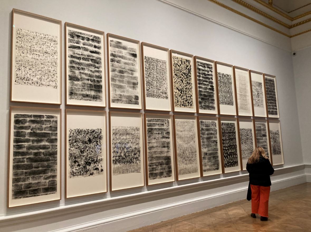
For in the next room we learn that Abramović and Ulay set off to walk from opposite ends of the Great Wall of China, intending to meet somewhere in the middle and get married (!). In the event, by the time they actually met, after some 90 days of solo walking, they realised their relationship and their period of working together was over. This room displays film footage of each performer walking, titled ‘The Lovers, Great Wall Walk’ (1988), which leads up to a ritualised separation.
But that’s arguably the least interesting thing in the room. During the walk Abramović became fascinated by all things related to the wall, learning that it was built along the earth’s energy lines, reading up on Chinese and Tibetan medicine. She had become conscious of passing over stones that held vast quantities of geological and human energy.
One tangible output of this was a set of huge prints which seem to be a sort of brass rubbing of different parts of the wall, in different styles and patterns. These were just really lovely to look at, interesting to see the very wide range of brickwork involved, but also beautiful to look at as abstract patterns and designs.
Installation view of ‘The Lovers, Great Wall Walk, Wall Rubbings’ by Marina Abramović (1988) Photo by the author
The room also features urns in two media. There are two big black urns, one shiny, one with a dull matt finish which, apparently, symbolise Ulay and Abramović and, more generally, the male and female principles – titled ‘The Sun, The Moon’ (1987) . According to the curators:
They speak to themes of the duality and symbiosis present in many of the couple’s works, yet also marked the breakdown of their artistic and personal connections. Abramović realised: ‘The vases represented us and our inability to perform together anymore.’
They are big and black and a pleasant shape. Nice things to look at.
But they’re given an extra dimension by a set of big prints of urns on the wall behind them, three urns and a scarf, titled ‘Modus Vivendi: Urn 1, Urn 2, Veil, Urn 3’. Like the brick rubbings and the two urns this doesn’t seem to have much to do with performance in any way. They’re just beautiful and beguiling images, lovely pastel colours, shimmering asymmetrical images, and a pleasing sense that they’re made on rough-hewn parchment adding to a sort of rough-hewn ethnic finish.
Installation view of Urn prints by Marina Abramović. Photo by the author
Video
Here’s an excerpt from what looks like a longer video about Abramović and Ulay’s relationship which, alas, makes them sound like everybody else, but does include some footage of the bow and arrow performance, of their earlier confrontational performances (mutual slapping) then goes heavy on the ill-fated Wall of China walk.
The Communist Body
This room brings together works about or referencing Abramović’s origins in the communist state of the former Yugoslavia. Communism was obviously a repressive system but it did preserve peace and security among the Balkans’ squabbling nationalities, a situation which swiftly broke down into brutal internecine wars with the collapse of Yugoslavia in 1991.
Abramović’s parents Danica Rosić and Vojin Abramović had been partisan fighters in the Second World War. Celebrated as heroes they were rewarded with coveted state jobs. The strictures of communist ideology – from extreme physical discipline to restricted freedom of speech – shaped Abramović’s early years and her subsequent formation as an artist.
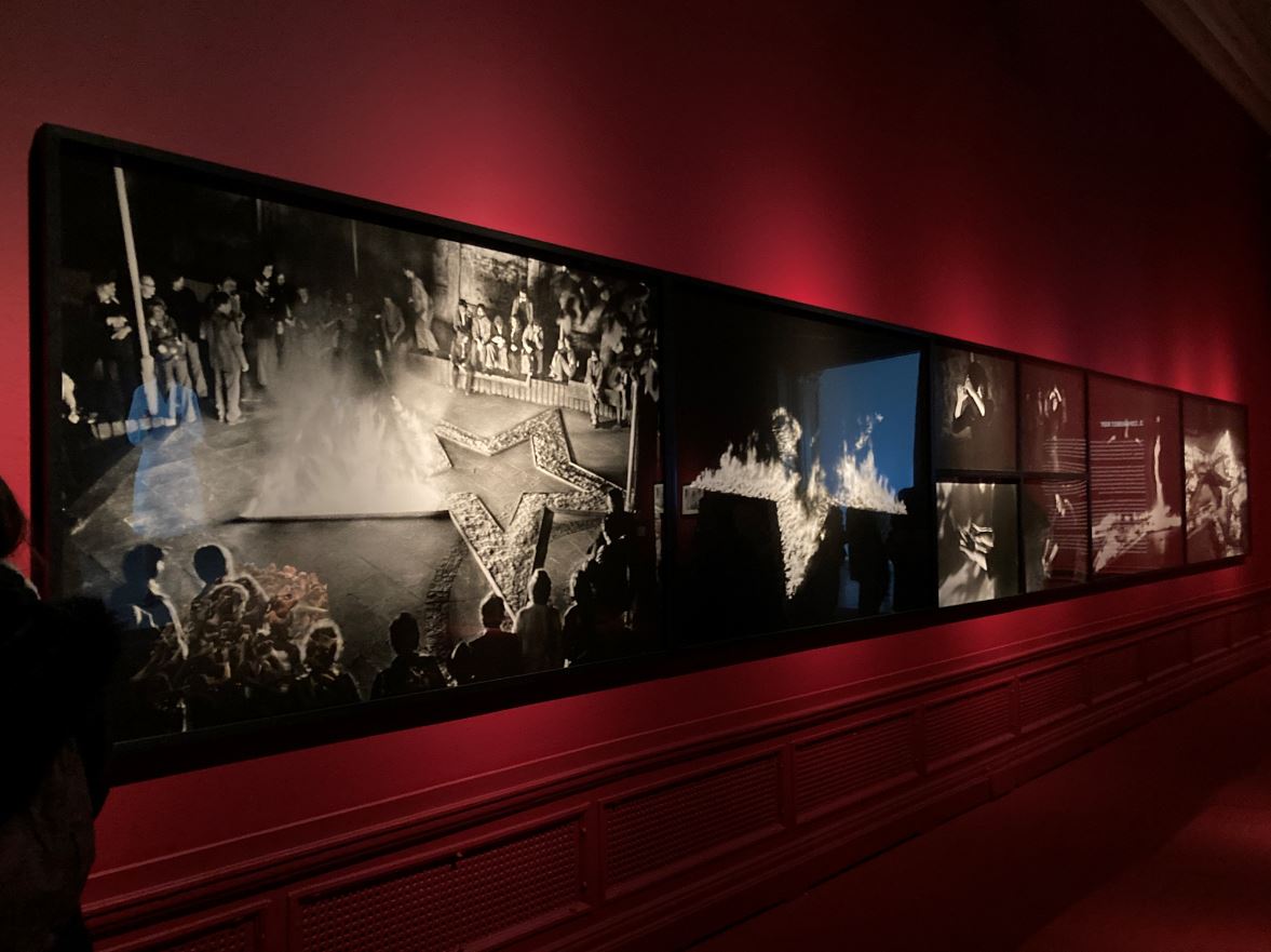
The five-pointed communist star appears in many early pieces, as she explored communist ideology and its impact on herself and others. In ‘Rhythm 5’ (1974), this took the form of a wooden structure which was set alight as she lay within it. The resultant dense smoke was suffocating and caused the artist to faint.
Installation view of the long panel displaying photos of the performance of ‘Rhythm 5’ by Marina Abramović. Photo by the author
The following year she incised a star into her abdomen as part of the performance ‘Lips of Thomas’, leaving behind an indelible scar on her body. Abramović left Belgrade in 1976 but continued to feel a close tie to the region.
Balkan Baroque
Obviously she was affected when, from 1991 onwards, her native country collapsed into a series of interlocking civil wars marked by astonishing brutality. At the Venice Biennale in 1997 she presented ‘Balkan Baroque’, a complex and multifaceted reflection on her homeland.
This consisted of two elements, videos and an activity. On the wall were projected three videos, in the centre a film of Abramović dressed in the white coat of a doctor and reciting a folk story about a rat catcher, before taking off her coat to reveal herself as (in her own words) ‘a sexy dancer’ who proceeds to dance the Hungarian Czardas. In smaller projections to left and right of her film of her father and her mother, filmed in a series of static poses reacting to the narrative and then the dance, the father ending up with a pistol in his hands, the mother at first showing empty hands and then with crossed hands on her eyes.
Meanwhile, part two of the piece was Abramović herself sitting amid a huge pile of animal bones fresh from the abattoir and slippery with blood and gristle, and attempting to wash and clean it. In her own words:
It was summer in Venice, very, very hot and after a few days already worms start coming out of the bones. And the smell was unbearable. The whole idea that by washing bones and trying to scrub the blood, is impossible. You can’t wash the blood from your hands as you can’t wash the shame from the war. But also it was important to transcend it, that can be used, this image, for any war, anywhere in the world. So to become from personal there can be universal.
The video is here, in the Royal Academy but, regrettably, the pile of bones on display is antiseptically clean and dry and no woman is sitting amid them desperately trying to wash the blood off herself. British Health and Safety regulations. Shame. Rotting bloody bones would have freaked everyone out.
Three years later, Abramović’s father, Vojin Abramović, passed away. In memory of him she created ‘The Hero’. This consists of two elements: 1) a big projection of a black-and-white shot of her sitting – characteristically stationary – on a white horse, holding a white flag flapping in the wind to the accompaniment of an elegiac arrangement of the Yugoslavian national anthem. And 2) a display case in front of it showing a collection of memorabilia, army membership and medals and so on associated with her father.
Surprisingly, this isn’t an ironic reference to heroes and heroism. She genuinely means it. In fact the piece is accompanied by a Heroes’ Manifesto:
Heroes should not lie to themselves or others
Heroes should not make themselves into an idol
Heroes should look deep inside themselves for inspiration
The deeper they look inside themselves, the more universal they become
Heroes are universe
Heroes are universe
Heroes are universe
Heroes create their own symbols
Symbols are the Heroes’ language
The language must then be translated
Sometimes it is difficult to find the key
Heroes have to understand silence
Heroes have to create a space for silence to enter their soul
Silence is like an island in the middle of a turbulent ocean
Heroes must make time for the long periods of solitude
Solitude is extremely important
Away from home
Away from family
Away from friends
Heroes should have more and more of less and less
Heroes should have friends that lift their spirit
Heroes have to learn to forgive
Heroes have to learn to forgive
Heroes have to learn to forgive
Heroes have to be aware of their own mortality
For the Heroes, it is not only important how they live their life but also how they die
Heroes should die consciously, without anger, without fear
Heroes should die consciously, without anger, without fear
Heroes should die consciously, without anger, without fear
If we wanted, we could pause here and reflect on the disastrous impact of Serb nationalism on the Balkans in the 1990s, the atrocities committed by the Serbian Army and paramilitaries (documented in, for example, books by Anthony Loyd and Michael Ignatieff), the 1,425 day-long siege of Sarajevo by the Yugoslav/Serbian Army, and so on. It seems odd, and maybe distasteful, to create such an unironic image. The way it’s placed next to the Balkan Baroque mound of bones suggests the progression from heroic nationalist rhetoric to villages full of butchered peasants.
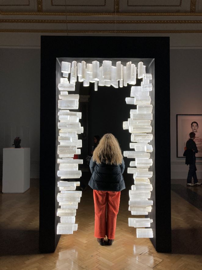
Doors
To quote the curators:
Every day we move without thinking through a series of thresholds, each ushering us between different experiences and states of being. Throughout cultures, portals have also been understood as symbolic sites of passage between good and evil, darkness and light, paradise and hell, life and death. Building on her earlier ‘Transitory Objects’, Abramović has created numerous works that give representation to transition and transformation. ‘The portal, for me, is really about a changed state of consciousness. It’s about how to access different temporal dimensions from the cosmic to the earthly.’
Hence this portal adorned with illuminated crystals. This was first displayed at the Modern Art Museum in Oxford, whose website provides further details:
A 297cm-tall portal adorned with 190 selenite crystals jutting out from each internal side. Selenite is a variety of gypsum with properties that conduct light and act as a natural optic fiber. A custom-made circuit of LED panels transmits light through the crystals, which emerges from the absorbant black-painted steel structure. This creates a portal with an intensely illuminated centre.
Portal (2022) by Marina Abramović. Photo by the author.
Four crosses
In the main atrium space of the galleries are arrange four enormous crosses made up of still photos of the artist pulling a wide variety of faces (2019). In their positioning, leaning out from the walls, they reference the language of Slavic icons and I couldn’t help thinking that, quite obviously, she’s replaced the figure of the crucified Christ, Son of God, with herself, an act, you might think, of quite staggering narcissism and which reflects back through the entire show the thread of self-promoting exhibitionism which is part and parcel of performance art. Here I am. I am a work of art.
One of the Four Crosses by Marina Abramović (2019) Photo by the author
Alternatively, you could give it a feminist interpretation, saying the idealised figure of a dead man representing the dead hand of patriarchal religion has been replaced by the reality of a living woman in all her emotional messiness and reality.
Or split the difference with an ungendered, humanist interpretation, that an idealised religious figure designed to take our thoughts away from this world has been replaced by a real live human being in all her emotional complexity and predicaments.
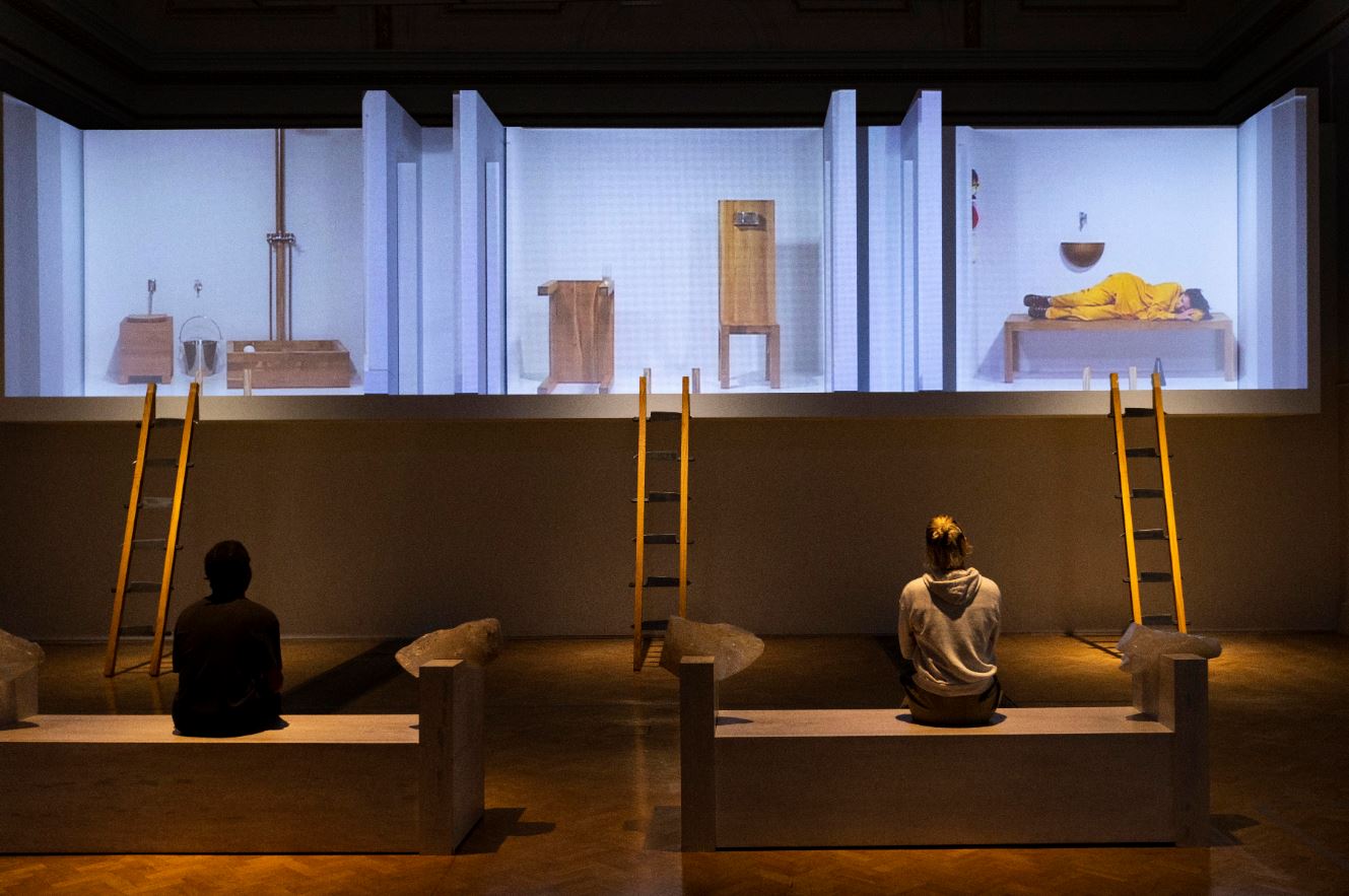
The House with the Ocean View
The exhibition concludes with an enormous installation, the reperformance of ‘The House with the Ocean View’. This involves a mockup of two floors of an apartment with 3 rooms on the first floor and open to the viewing public like rooms in a doll’s house when the front has been opened.
First performed by Abramović in 2002, she lived continuously for 12 days in this ‘home’ of only three spaces in the Sean Kelly Gallery in New York. Abramović fasted by only drinking water, while converting the most basic functions of living into rituals. Audiences were invited to witness it on the condition that they didn’t speak. Held a year after 9/11, the work, according to the curators, ‘created a collective vigil’. Maybe. Or maybe it was an odd, strangely engaging, slightly bewildering, boring and yet hypnotic experience…
Interactive fun
The Chinese adventure was her first time not performing directly in front of an audience. After the relationship with Ulay broke down she had to start again. Part of this was thinking about pieces which still interact with the audience but without the presence of the artist. Hence her series of ‘Transitory Objects For Human Use’. These are objects designed to make the audience the central participant of the artwork without requiring the presence of the artist. According to the curators:
Rather than sculptures or items of furniture, the ‘Transitory Objects’ act as tools allowing viewers to access the energy and curative power of the crystals and metal that form them, based on traditional Chinese medicine’s correspondences between minerals and parts of the body.
In practice these are a series of green metallic head rests, seats and stands stuck onto the wall of the gallery and visitors are encouraged to interact with them – standing on podiums, resting your forehead against head rests, sitting astride the metal chairs. Maybe visitors felt ‘traditional Chinese medicine’s correspondences between minerals and parts of the body’ but these provided posing and photo opportunities for scores of gallery goers queuing up to strike a pose and tell their friends all about it on Snapchat, Instagram and TikTok.
Along the wall of the room with the woman lying under a skeleton is a series of works which, when you look at them, seem to be prints of the iconic images of Abramović pulling faces. It’s only when you approach them sideways that you realise these are 3-D sculptures, with the faces cut into successive layers of alabaster.
These are ‘Five Stages of Maya Dance’ (2013/2016) in which she performed to camera the extremes of human expression and then the photographs were carved in negative relief on alabaster slabs:
turning them into performative sculptural objects that memorialise the artist’s performance yet transform into rough stone when approached.
An entertaining 3-D optical illusion. One more wonder, delight and entertainment in a brilliant exhibition.
‘Five Stages of Maya Dance’ by Marina Abramović. Left: one of the sculptures face-on. Right: the series of five sculptures from the side. Photo by the author.
Conclusion
I have commented on barely half the works on display. It’s a massive, mighty exhibition. Amazing. Mind blowing. An extraordinary body of work which helped define and shape performance art for its 50 year history, and continues to amaze and challenge and disturb and impress and inspire. Epic. Must see. Best exhibition in London.
Related links
Marina Abramović at the Royal Academy continues until 1 January 2024
This is an outstanding, wonderful exhibition bringing together some 150 photographs (and a few installations and videos) by no fewer than 36 photographers and artists from across Africa. It is full of breath-taking and beautiful works, suggesting a continent alive with wonderfully creative, innovative artists.
It’s divided into three ‘chapters’, each of which are sub-divided into themes. To quote the curators:
The first chapter is rooted in ancient African cultures and traditions which have survived periods of struggle and resistance. Inspired by Pan-African liberation movements, the second chapter looks at photography’s ability to produce counter histories – archival practices and the agency of photographer and subject are brought into focus. The third chapter explores the impact of globalisation and the climate emergency.
Chapter 1: Identity and tradition
Queens, Kings and Gods
For centuries Africa was conquered and colonised by European countries. The artists in room one pay tribute to the monarchs and matriarchs who resisted colonial conquest and occupation. The photographers here invoke the heritage of kingdoms such as the Asante of Ghana and the Yoruba of Nigeria, who are descended from the goddesses and gods of the ancient spiritual capital, Ilé-Ifẹ̀. Thus a series of big, beautifully clear portraits of traditional monarchs of the present day by George Osodi (born Nigeria 1974).
Installation view of ‘Nigerian Monarchs’ series by George Osodi (2012 to 2022) in ‘World in Common’ at Tate Modern (photo by the author)
There is a set from the ‘We Live in Silence; sequence by Kudzanai Chiurai (born 1981, Zimbabwe) which elaborately recreates biblical narratives, history painting and Christian iconography which themselves turn out to be scenes from the 1967 film, ‘Soleil Ô’, by Mauritanian-born French filmmaker Med Hondo. So, worlds within worlds…
The next room gestures towards the complex and diverse history of religion across this vast continent. There’s a set of photographic self portraits by Khadija Saye (1992 to 2017, born and worked in the UK, of Gambian heritage). You might recall that it was one of these photos that British artist Chris Ofili used as the centrepiece for his huge new site-specific Requiem for Grenfell Tower at Tate Britain. In this sequence Saye photographed herself performs a series of rituals using sacred objects that combine her African, Christian and Islamic heritage.
Installation view of the ‘Dwelling: in the space we breathe’ series by Khadija Saye (2017) (photo by the author)
At the end of the room is a stunning work, a set of five huge digital photos arranged to create a striking tableau by Maïmouna Guerresi (born 1951, born in Italy, works in Senegal). Titled ‘M-eating – Students and Teacher’ it shows four girls and an older man sitting around a long table draped in a yellow cloth. The wall behind the table is inscribed with the Basmala, a Muslim prayer recited to elicit God’s blessings. It’s a huge and really powerful image of absorption and contemplation but, more than that, it’s just a beautifully clear and vividly coloured composition.
‘M-eating – students and teacher’ by Maïmouna Guerresi (2012) Courtesy of the artist and Mariane Ibrahim
Masks
The next room is devoted to the role of masks in African religion, ritual, folklore and culture. There’s a stunning series by Edson Chagas (born 1977 in Angola), the Tipo Passe series of sitters wearing contemporary clothes but traditional Bantu masks. ‘Tipo passe’ is Portuguese for passport and the frontal composition references passport photography.
Installation view of the ‘Tipo Passe’ series by Edson Chagas (2014) (Photo by the author)
Opposite these is a series of really wonderful photos by Leonce Raphael Agbodjélou (born 1965, works in Benin), instances from the Egungun series.
Installation view of ‘Egungun’ series by Leonce Raphael Agbodjélou (photo by the author)
As the curators explain:
Egungun is a Yoruba masquerade practice which calls upon the spirits of departed ancestors. Through ceremonial drumming and dance, ancestral spirits inhabit the bodies of Egungun practitioners to pass on blessings and guide the passage of the dead to the spirit world. Clothing plays an important role in Egungun masquerade – elaborate masks and fabrics must completely seal the performer’s body. Agbodjélou’s performers wear costumes which layer expensive foreign materials and traditional Yoruba cloth. This combination of the traditional and the contemporary parallels the Egungun’s complex role as mediators between the world of the living and the dead.
They’re absolutely stunning, vivid photos.
Untitled from the ‘Egungun’ series by Leonce Raphael Agbodjélou
There’s a massive video piece by Wura-Natasha Ogunji titled ‘Will I still carry water when I am a dead woman?’ and showing women dressed in colourful (traditional?) clothes, dragging kegs of water roped to their ankles through the backstreets of Lagos. Here’s a clip:
You may not be altogether surprised to learn that it’s a feminist piece. Their costumes evoke images of Egungun masquerade, a Yoruba practice that manifests ancestors’ spirits and is traditionally reserved for men, and Ogunji explains the piece is designed to question the heavy labour still done by many women in traditional societies.
Chapter 2: Counter Histories
The next room is big with a lot going on. Along one wall is a series of relatively small ‘family portraits’. These loving portraits of family members gesture towards the long history of studio portraiture that gave agency to African photographers and their sitters, letting them create domestic alternatives to the imperial rhetoric of colonial postcards, posters and magazines. These included pioneering photographers such as James Barnor in Ghana and Lazhar Mansouri in Algeria, photographing families and individuals who would gather proudly to have their portraits taken, often for the first time. All fair enough, but they’re relatively small and struggle to compete with the other, enormous offerings in the same space.
Most striking is the large assembly of old box files arranged on a pebbly red base. This is ‘A History of a City in a Box’ by Ndidi Dike (born UK, works in Nigeria). These old file boxes are filled with archival documents, including colonial-era postcards and photographs, and then carefully choreographed on sand and soil. It is a general metaphor for the way information was power for the old colonial authorities and was hidden away in files and folders but then, during the period of independence, colonial archives were abandoned, hidden and destroyed. And yet…that information decayed, became irrelevant, barely concealing the true earth of the country, its geological bedrock, symbolising the country’s real roots.
In the centre, at the back of n this photo, you can see a set of four figures, blown-up and pasted onto cardboard bases, these are the work of Samson Kambalu (born 1975 in Malawi, works in the UK). They’re actually cardboard cut-outs of African soldiers use photographs sourced from the Weston Library in Oxford, UK. They represent the unnamed infantry who fought for the British Empire during the First and Second World Wars and were known as the King’s African Rifles. The cardboard indicates the soldiers’ expendable status to colonial powers. Behind them is a patchwork of quilts inspired by Kambalu’s childhood memories of collecting bubblegum cards of world flags.
Next to them, on the right, you can see a sequence of three big pieces. These are from the sequence ‘Figures’ by Malala Andrialavidrazana (born 1971 in Madagascar, works in France). These are collages of maps, fragments of bank notes, record sleeves and other archival documents which build up into complex, evocative collages. The maps are, as you might expect, old-style colonial-era maps, the idea being that maps were used by the imperial countries to define and control; while the images are of strong African figures, including striking portraits of ancient Egyptian queen Nefertiti and Zairean dictator Mobutu Sese Seko. These are strong, highly impactful images.
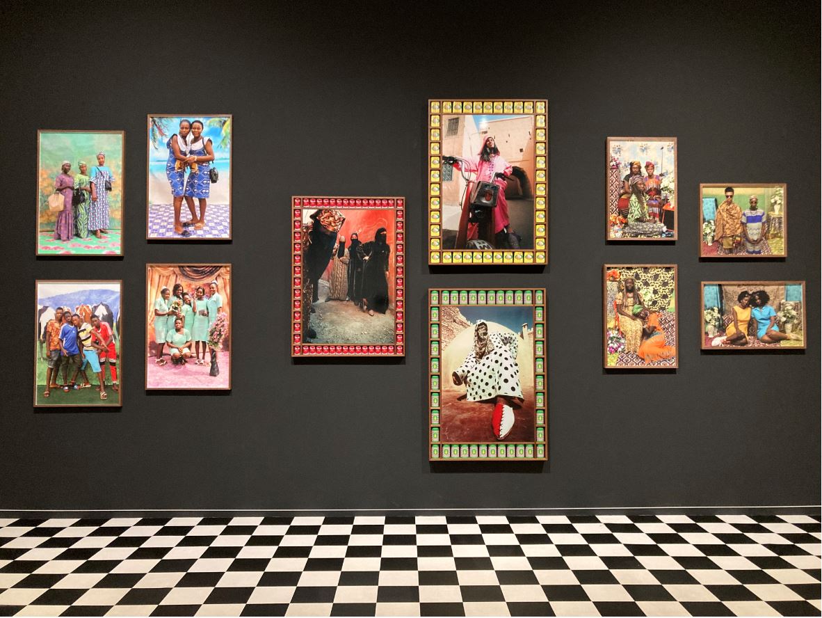
Away on the opposite side of the room is a large alcove with a distinctive black-and-white tiled floor, containing three big vivid sets of photographs by three different photographers.
They are, from left to right, four photos by Ruth Ginika Ossai (Nigeria), three by Hassan Hajjaj (Morocco) and four by Atong Atem (born 1994 in South Sudan, works in Australia).
Ruth Ginika Ossai’s portraits are carefully staged on floormats made of Astroturf and parquet-style laminate flooring. The backdrops are inspired by the special effects featured in Igbo gospel music videos and Nollywood films and give them a super-real feel.
The central three are by Hassan Hajjaj in a series called ‘Kesh Angels’ (named after the Hells Angels and the city’s motorbike culture). These are brilliant. The women are not only wearing vivid djellabas and veils but are posed in deliberately in-yer-face, take-no-**** attitudes. To cap it all, the frames are inset with tins of popular products, one appears to be lamb meat, another of tomato juice. So they’re stylish, stroppy, modern and funny.
Installation view of ‘Kesh Angels’ by Hassan Hajjaj (photo by the author)
To the right of the Kesh Angels are four portraits by Atong Atem. Atem portrays friends who are fellow members of Australia’s African diaspora. She says: This body of work honours the South Sudanese Dinka tradition of record-keeping and archiving as an intimate cultural practice.’ Aren’t they beautiful, brightly colourful, densely patterned, vibrantly alive?
The final room contains yet more series of really strong photographs. The theme is the environmental challenges facing Africa, specifically its overpopulated cities and its degraded environment plus, of course, the heating up and drying out caused by global warming.
Kiripi Katembo (1979 to 2015, born and worked the Democratic Republic of the Congo) discovered that people in his home town of Kinshasa, capital of the Democratic Republic of the Congo, didn’t like being photographed. But he could get away with photographing their reflections in the city’s countless large puddles and pools of water. Often these contained rocks or building rubble, but Katembo discovered that the intrusion of these objects into the crystal clear reflections created an interesting disturbance. As the curators describe it: usually depicted as a chaotic and busy capital, ‘here Kinshasa appears as a dream-like landscape populated by shadows and unidentified objects.’
Installation view of ‘Un regard’ by Kiripi Katembo (photo by the author)
There’s a striking series of large black and white photos by Mário Macilau (born 1984, born and works in Mozambique). These, as the images instantly convey, document the workers of the Hulene landfill site in Maputo, Mozambique. Obviously it shows human beings reduced to picking through rubbish to glean a living, and, of course, affected by the toxic substances released into the air and soil by the widespread practice of burning.
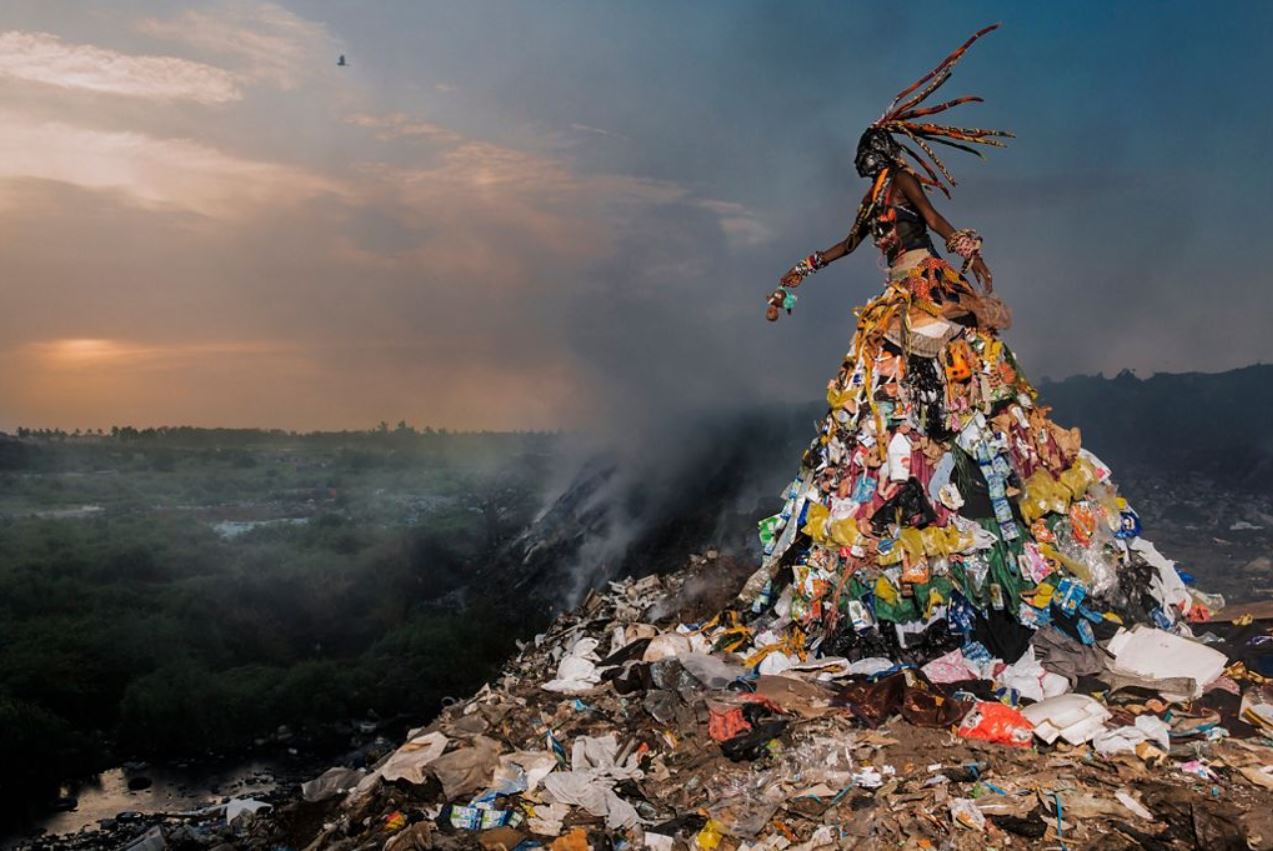
Related to the same topic of environmental destruction, but in a completely different register, is a series of 3 wonderful photos by Fabrice Monteiro (born 1972 in Belgium, works in Senegal). They’re from his ‘Prophecies’ series and they are absolutely brilliant.
Untitled #1 (2013) from ‘The Prophecy’ series 2013 to 2015 by Fabrice Monteiro in ‘World in Common’ at Tate Modern
‘The Prophecy’ series captures environmental issues facing communities in Dakar, Senegal, from forest fires to coastal erosion. Spookily tall spiritual figures, inspired by West African masquerade and animism, rise up out of the rubbish dumps, themselves made of rubbish and detritus. They’re stunning.
And next to them is arguably the best set in the show, the ones the curators have (wisely) chosen as the posters, a set of four quite stunning, beautifully, staged, semi-abstract photos by Aïda Muluneh (born and works in Ethiopia, 1974).
Installation view of ‘Water Life’ series by Aïda Muluneh, being (top row): The Shackles of Limitation, Steps (bottom row): Star Shine Moon Glow and The Sorrows We Bear
These were commissioned by the charity Water Aid and depict – in an obviously highly stylised way – ‘rural water access and its impact on women’s rights, well-being and education.’ The impact of global warming will obviously further degrade access to drinking water for hundreds of millions of people in the poorest countries. But clearly the thing here is Muluneh’s stunning use of a limited palette of bright blue and red, and her incorporation of traditional African body painting and dress.
Epilogue
The final (small-ish, corridor-like) room in the exhibition hosts videos by two artists. On the whole I don’t like videos. I don’t have the patience – the photos I’ve highlighted earlier in the show all make their impacts with dramatic immediacy whereas art videos are, by and large, extremely slow.
The most striking is ‘In Praise of Still Boys’ by Julianknxx (born 1988 in Sierra Leone, works in the UK).
The 3 or 4 minutes of this I sat and watched featured lots of footage of a very young Queen Elizabeth II visiting somewhere in Africa (Freetown?), white British sailors steering a motor launch through canoes rowed by local Africans, then British troops from the (I’m guessing) 2000 intervention in Sierra Leone (almost none of this is shown in the trailer, above). And this harking on about the British colonial legacy prompted the train of thought which follows in my political commentary on the exhibition.
Political commentary
I hugely enjoyed this impressive, wide-ranging exhibition about African photography as an aesthetic i.e. visual and psychological experience. But aesthetics and politics are far apart, at least in this exhibition and Tateworld more generally. As political analysis or commentary, this exhibition was rubbish. Dire. Seriously misleading. On and on and on and on and on the curators go about ‘colonialism’ which, for most of these countries, ended in the 1960s, 60 years ago, and on and on and on the curators and the artists go about the Atlantic Slave Trade, which Britain banned in 1807, 216 years ago.
In chapter 3 the curators optimistically claim that the featured artists ‘imagine multiple futures’ and cite Senegalese academic, musician and writer Felwine Sarr (born 1972) who calls for ‘Africans to think and formulate their own future’. In his 2016 book Afrotopia, Sarr writes:
‘Africa has always been the object of discourse by others. Now is the time to dream this utopia in Africa itself, to design Africa ourselves, to think, and to act for ourselves.’
Which immediately prompts two objections. 1) Dreaming isn’t going to get you anywhere, buddy. Practical policies might. See Paul Collier’s list of practical steps in his hard-headed book ‘The Bottom Billion’.
But more relevantly to this exhibition, 2) there’s almost nothing about the future, instead there is a sustained, deep immersion in the legacy of colonialism. Loads of the 36 photographers’ work is directly about colonialism, the colonial legacy, colonial control, colonial archives, ‘the colonial gaze’, colonial images, colonial photography, colonial identity cards, colonial posters, colonial postcards. The word ‘colonial’ occurs 26 times on the wall labels. Even if the artist isn’t themselves addressing it, you can bet the curators will drag in a reference to slavery or colonialism or both in their wall labels.
In other words, the overall effect of the exhibition is immensely backward-looking. It’s like a traumatised adult condemned to act out the abuse of their childhood again and again, with no hope of escape. Maps of colonial Africa, footage of colonial Africa, old box files from colonial Africa, old derelict buildings from colonial Africa, trying to escape from the Christian religion imposed by colonial Africa. Backwards backwards, everything relates backwards to a lost era of 60 years ago.
Here’s a timeline of the year and date African nations gained independence, just to make clear how long ago this all was.
24 December 1951: Libya
1 January 1956: Sudan
2 March 1956: Morocco
20 March 1956: Tunisia
6 March 1957: Ghana
2 October 1958: Guinea
1 January 1960: Cameroon
27 April 1960: Togo
26 June 1960: Madagascar
30 June 1960: DR Congo
1 July 1960: Somalia
1 August 1960: Benin
3 August 1960: Niger
5 August 1960: Burkina Faso
7 August 1960: Côte d’Ivoire
11 August 1960: Chad
13 August 1960: Central African Republic
15 August 1960: Congo
17 August 1960: Gabon
20 August 1960: Senegal
22 September 1960: Mali
1 October 1960: Nigeria
28 November 1960: Mauritania
27 April 1961: Sierra Leone
31 May 1961: South Africa
1 July 1962: Rwanda
1 July 1962: Burundi
3 July 1962: Algeria
9 October 1962: Uganda
12 December 1963: Kenya
24 April 1964: Tanzani (Tanganyika 9 December 1961 – Zanzibar 10 December 1963)
6 July 1964: Malawi
24 October 1964: Zambia
18 February 1965: Gambia
30 September 1966: Botswana
4 October 1966: Lesotho
We’re talking about the era of Sputnik. The era when the Berlin Wall was going up. Before the Beatles’ first LP. That is the era, of the 1940s and 50s, which so many of these artists, at least in their Tate interpretation, are harking back to, again and again and again.
This obviously indicates a glaring great gap, two gaps if you like, which are: 1) what happened in Africa during the 60 years since independence and 2) what is happening in Africa today?
Sixty years of mismanagement, civil war, famine and genocide
One wall label sports a quote from Kwame Nkrumah, first Prime Minister of Ghana, the first British African colony to become independent in 1957.
‘We believe in the rights of all peoples to govern themselves. We affirm the right of all colonial peoples to control their own destiny. All colonies must be free from foreign imperialist control.’
What the Tate wall label does not mention is that Nkrumah went on to become a steadily more repressive figure, passing emergency laws, outlawing the opposition, creating a cult of personality, having himself referred to as the ‘the Man of Destiny’, ‘the Star of Africa’, ‘His High Dedication of Redeemer’ and so on. He was an outspoken supporter of the Soviet Union and Mao’s China, receiving a Lenin Prize, tried to abolish tribalism and wasted money on vast white elephant building schemes. He made himself very unpopular with the rulers of neighbouring African countries when it was discovered that he was supporting various communist and guerrilla movements to overthrow their capitalist governments. In 1966 Nkrumah was himself overthrown in a coup by the army which set about de-Sovietising the economy and reversing most of his calamitous economic policies. At independence Ghana had a GDP on a par with South Korea, but decades of political instability, military coups and economic mismanagement brought the country to the brink of ruin. Ghana is now 83rd in the world rankings of GDP compared to South Korea at 13.
NONE of this is in the Tate exhibition, none of it, no politics, no economics, no contemporary history at all. Africa’s desperate history of secessions, civil wars, genocides, famines, economic mismanagement, rule by brutal Marxist murderers, by kleptocrats and homicidal dictators, NONE of that is here, none. It is all erased, made invisible, ignored, brushed under the carpet.
Instead what the wall labels repeat again and again and again are the only two tunes they know, the evils of colonialism (ended in the 1960s) and of the slave trade (ended 200 years ago). Simplistic binaries.
Why artists and curators simplify history and politics to make them more acceptable
In my review of Paul Danahar’s irritating book about the aftermath of the Arab Spring, I sketched out four reasons why even high-end (BBC, Channel 4) coverage of foreign affairs tends to be simplified and sanitised. These are:
1. Logisticallyeasy It’s easier to get stories out of countries where journalists and film crews can operate freely, so countries with good infrastructure, like Israel or America, tend to be over-represented.
2. Familiar narratives Editors prefer sticking to super-familiar, easy narratives, my examples being the Arab-Israeli conflict and the (now defunct) struggle against the apartheid regime in South Africa. Absolutely everyone was familiar with the outline of those stories which had taken on the simplicity of fairy tales. Pantomime narratives with pantomime goodies and baddies. Easy to understand, easy to write about, easy to feel moral indignation about, easy to go on marches about, all your emotions pre-packaged and ready to take away.
To give an example, bad stuff is happening in various parts of China (Xinjiang, Tibet) but my points 1 and 2 apply in that: 1) it’s difficult to get access to those places, and 2) the issues are complicated. But, for the sake of argument, say that a protest march in Hong Kong is broken up by riot police and – because it’s easy to access and easy to cover – it’s all over the front pages for days. Easy access. Easy issues. Somewhere we know about. Easy to relate to.
3. Britain-related Some places matter more to Brits than others because they used to be colonies or places where Brits lived and feel a residual attachment to, thus India, Hong Kong, Egypt, Kenya – or which we feel some kind of special responsibility for (the Middle East, all those lines on the map, the Balfour Declaration yadda yadda yadda). The result is that these countries are over-represented in British foreign news at the expense of everywhere else.
4. Student causes Lastly, there’s what you could call student politics. Some of these places are associated with big, simple-minded political causes. All good progressive people marched against apartheid in the 1980s. All good progressive people are outraged by Israel’s bombing of Gaza today. All good progressive people agree that China is not keeping to its bargain of letting Hong Kong remain a democracy. Etc.
In the same kind of way all good progressive people are shocked and disgusted by anything to do with the European empires. And all good progressive people are shocked etc by the slave trade.
These are hot button topics, guaranteed to win over the audience, please the crowd, which can’t fail to unite artists, curators and visitors in a cosy feeling of moral righteousness, moral superiority, grievance from the artists and grovelling apology by white gallery goers.
Slavery and the evils of empire are the new consensus topics – everyone agrees that they were utterly evil and that they explain everything about modern Africa.
All the artists chosen for this exhibition stick to the narrow line adopted by the curators that African history ceased some time in the 1960s, at the moment of independence, that nothing whatsoever has happened since then, that all Africans are still trying to cope with the trauma of imperialism or the trauma of the slave trade – and that absolutely nothing significant has happened since.
No military coups, civil wars, mad rulers, stupid socialist economics, thieving stealing looting leaders like Mobutu, psychopaths like Idi Amin, mass murderers like the Hutu regime in Rwanda, cannibals like the Emperor Bokassa, ruinous rebel leaders in Angola or Mozambique, warlord chaos in the Congo.
No African history beyond the 1960s is present in this exhibition because it doesn’t fit the simple-minded, pantomime-level narrative which many of the artists address and the curators almost obsessively promote – white slave traders / colonialists = evil, all black people = saintly victims.
I’m not saying the slave trade wasn’t bad or that colonialism wasn’t wretched, humiliating and shamelessly exploitative. Of course they were. And forms of neo-colonialism are obviously still alive and constraining African nations in all kinds of ways today. But that’s just the starting position: that’s the obvious stuff you need to process before moving on to a more sophisticated understanding of the situation.
You’re not going to begin to understand the plight of modern African countries unless you move on from the 1960s and engage with the 60 years of history since then. And then, once you’ve processed the 60 years since independence, it requires a further effort to engage with the host of military, economic and security issues which plague Africa today, in 2023.
Africa today
And what about the political and economic and social issues which face Africa today? Are these addressed in this exhibition? Is there any mention of the rise of Islamic fundamentalism across North Africa, of the havoc being wrought by al Qaeda, or Boko Haram, or al Shabaab? No. Nothing.
Is there any mention of China’s involvement in Africa over the last 20 years, buying up raw materials and rare metals and food in exchange for infrastructure projects? Mention of China’s ‘Belt and Road’ initiatives all across Africa? Nothing.
Mention of the US’s surprisingly extensive investment in army, navy and air force bases across the region in efforts to combat Islamic terrorists? Nothing.
Lots of complicated geopolitical, military, strategic and economic manoeuvring is going on all across Africa, right now, as we speak, and none of it is discussed, described or even mentioned in this immensely backward-looking exhibition.
Conclusion
So I really liked lots of the art on display, a lot of these photos are stunning and breath-taking, world class, outstanding, and it is such a relief to get away from America and the usual suspects of the art world. Congratulations to Tate for staging this exhibition so beautifully and bringing so many great photographers to our attention.
But as politics this show is a washout, a whitewash, a travesty, a systematic erasure of African history for the last 60 years in favour of a fairy-tale story about colonialism. It not only takes absolutely no account of Africa’s 60 years of troubled tragic post-colonial history but presents a complete blank when it comes to the complex, difficult, multi-sided political issues faced by Africa today. An artistic triumph but when it comes to any serious discussion of the political, economic and social challenges of contemporary Africa, this exhibition is a travesty, seriously misleading in its omissions, elisions and simplifications of a long inconveniently complex history.
Autograph is a small gallery in Hoxton, which is open from Wednesday to Saturday only, but is FREE. Details of opening hours and location are on their website.
It’s housed in an ultra-modern building with a main gallery space – one wide square room with high ceilings – on the ground floor, and other spaces, of more conventional size, upstairs.
Whenever I’ve visited there’s only been a handful of other visitors so, apart from the exhibitions themselves, it feels like a cool, slick oasis of calm amid the hustling backstreets of Hoxton let alone the hectic traffic on nearby Shoreditch High Street.
Currently, Autograph is displaying a work by the Angolan-Portuguese artist Mónica de Miranda.
Mónica de Miranda: official biography
De Miranda is an Angolan Portuguese visual artist, filmmaker and researcher who works and lives between Lisbon and Luanda. Her work incorporates photography, video, drawing, sculpture and installation. Through it she investigates postcolonial politics of geography, history, and subjectivity in relation to Africa and its diaspora through a critical spatial arts practice.
Often conceptual and research-based, de Miranda is interested in the convergence of socio-political narratives, gender, and memory at the boundaries between fiction and documentary.
De Miranda is affiliated with the University of Lisbon where she is engaged on projects dealing with ethical and cultural aspects of contemporary migration movements linked to lusophone Africa, such as Post-Archive: Politics of Memory, Place and Identity, and Visual Culture, Migration, Globalization and Decolonization.
Intriguingly for someone who has roots in, what for many Brits are rather exotic countries – Portugal and Angola – her qualifications are very English. She holds undergraduate and post-graduate degrees in art and arts education from Camberwell College of Arts and the Institute of Education, and a doctorate in Visual Art from the University of Middlesex.
The exhibition
The exhibition consists of two elements:
1. The Island is a film, a 37-minute art film. This is being played on a continuous loop in the upstairs exhibition space. The room is dark, you make your way to one of the 4 or 5 basic benches provided, settle down and watch.
2. The main exhibition space downstairs contains half a dozen still photographs from the film. These have been blown up to large scale and cut up into a number of perfectly symmetrical separate frames. So one still from the film may be cut up into two, four or six separate sections, each beautifully framed and placed with mathematical precision on the white walls.
Installation view of photographic stills from ‘The Island’ by Mónica de Miranda at Autograph
They are all large, digitally clear, very calming images of a handful of people in lovely rural settings. Presumably they’re in Portugal, maybe even in Angola, but the lack of tropical foliage, and the look of the trees often made it feel like somewhere in the Thames Valley.
There are only about 6 of these big cut-up photos in the entire exhibition space. It makes for clarity and calm. It’s a very mindful experience.
The film
The problem with making any kind of art film must be persuading the audience to sit all the way through it. I wonder if there’s any data, from any gallery, of what percentage of visitors make it all the way through an art film. I watched about ten minutes of it.
During that time a striking, statuesque black woman wearing a long white dress stood in a haunting, abandoned quarry. Then she was wearing a bright red jacket trimmed with gold epaulettes and standing in what looked like a ruined outdoor auditorium with tiers of concrete benches.
Two young black women wearing black jumpers and red berets (the uniform, I think, of 1970s radicals) walked along paths through woods. The same two women wearing white dresses played on a hilltop with panoramic views over a wooded landscape. Without warning they are suddenly wearing Regency era dresses. Time jumps. Different historical eras are overlapped, photoshopped. At another point we see them sitting on a fallen tree half-sunk in a lake (see image at the start of this review).
The statuesque woman sat on some rocks. She was joined by a handsome black man. Cut to the same couple sitting down at a table placed just so on the sandy bank of a river. Long lazy tracking shots of the riverbank, as from a boat slowly drifting along the river.
Three points:
1. It’s all shot in a slow, classic style i.e. all the shots are long and lingering, they’re all set up to give full view of the scene. It’s consciously beautiful, especially the shots in the abandoned quarry, now filled with a huge pool of deep green water, some of which were really haunting.
2. But more striking is the words. There are frequent shots of the striking woman speaking deep and meaningful sentences while staring into the middle distance. When she and the handsome man sit down at the dinner table on the river bank they don’t chat, they declaim more deep and meaningful sentences. As the two young women pick flowers in the woods, or walk through woodland paths or hold hands and spin round on the hilltop, there’s a voiceover of the same kind of deep and meaningful commentary. All spoken in a rich Portuguese accent, heavy on ‘sh’ sounds, sounding more East European than Latin.
I can’t find a transcript anywhere online. All I can find is the text accompanying the trailer on YouTube, where the voiceover tells us:
Do not stay lost.
Do not stay forgotten.
Do not lose the memory of who you are.
Breathe!
All the voiceover for the ten or so minutes I saw is like this. It, could have been copied from any one of the hundreds of books which fill the Spirituality and Mindfulness sections of bookshops. Like mottos from a series of inspirational posters. From the same place as the famous ‘Desiderate’ prose poem of healing advice:
Go placidly amid the noise and the haste, and remember what peace there may be in silence…
Either you like this kind of thing or you don’t. Chacun à son goût. Personally, I found it very relaxing. My companion had to stifle her titters.
Thirdly, the music. It’s very, very low-key, slowly-changing chords generated by some kind of synthesiser or electronic instruments i.e. not orchestra or pop music etc. It’s ambient, relaxing and lulling. It reminds me of Brian Eno’s ambient albums from the 70s and 80s.
The combination of the bland bromides of the voiceover, sensitively read in a rich Portuguese accent, the slow ambient music, and the lazy tracking shots of the riverbank, of girls walking through woods, of the striking woman standing in abandoned sites…explain why after ten or 12 minutes I fell slowly, lazily asleep. I think I was woken up by my own snoring.
The curator’s commentary accompanying the show wants us to believe that de Miranda:
deploys the metaphor of the island as a utopian place of isolation, refuge, and escape: a space for collective imaginings that speak to new and old freedoms. Anchored in cultural affinities and ecofeminism, the artist considers soil as an organic repository of time and memory, where ancestral and ecological trauma linked to colonial excavations continue to unfold. The Island urges us to develop a more conscious relationship between our bodies, the past and the lands we inhabit – and all that they hold – towards regenerative possible futures.
The visitor is free to take these ideas and spin them on into complex post-colonial critiques, pondering empire, slavery, colonialism, gender and ethnicity, all the usual topics of contemporary art.
But as an actual sensory experience the film, and then the big white room full of beautiful photos, are wonderfully calming, relaxing and healing. If you’re in that part of London on one of the days when Autograph is open, it’s worth making a detour to experience a chilled half hour of these calm and healing music and images.
In case you get the impression that Angola is all beautiful woods, picturesque ruins and spiritual ladies, here are reviews of books by people who’ve worked in or visited this tragic, war-torn country recently.
Barbican Art does things big – exhaustively and exhaustingly BIG. To quote the press release:
Masculinities: Liberation through Photography is a major group exhibition that explores how masculinity is experienced, performed, coded and socially constructed as expressed and documented through photography and film from the 1960s to the present day.
The exhibition brings together over 300 works by over 50 pioneering international artists, photographers and filmmakers such as Richard Avedon, Peter Hujar, Isaac Julien, Rotimi Fani-Kayode, Robert Mapplethorpe, Annette Messager and Catherine Opie to show how photography and film have been central to the way masculinities are imagined and understood in contemporary culture.
300 works! I wonder if anyone’s ever done a study of the optimum number of works which should be included in an exhibition. Or the optimum number of contributors.
The Piranesi exhibition I went to last week contained 60 images and that was too many to process: I ended up studying about ten of the best. But 300 images! And over 50 contributors! Each with a long and detailed explanatory wall label explaining their career and motivation and the genesis and point of their particular exhibit.
It’s less like an exhibition than a degree course!
Untitled from the series Soldiers (1999) by Adi Nes. Courtesy Adi Nes & Praz-Delavallade Paris, Los Angeles
A degree course in Gender Studies. because Masculinities: Liberation through Photography tends to confirm my sense that, for many modern artists and for most modern art curators, gender and sexual identity are the only important subjects in the world. Thus, according to Jane Alison, Head of Visual Arts, Barbican:
‘In the wake of the #MeToo movement and the resurgence of feminist and men’s rights activism, traditional notions of masculinity have become the subject of fierce debate. This exhibition could not be more relevant and will certainly spark conversations surrounding our understanding of masculinity.’
In fact quoting this much makes me think it might be most effective simply to quote the entire press release, so you can see exactly where the Barbican Art curators are coming from, without any editorial comment by me. So here it is:
With ideas around masculinity undergoing a global crisis and terms such as ‘toxic’ and ‘fragile’ masculinity filling endless column inches, the exhibition surveys the representation of masculinity in all its myriad forms, rife with contradiction and complexity. Presented across six sections by over 50 international artists to explore the expansive nature of the subject, the exhibition touches on themes of queer identity, the black body, power and patriarchy, female perceptions of men, heteronormative hypermasculine stereotypes, fatherhood and family. The works in the show present masculinity as an unfixed performative identity shaped by cultural and social forces.
Seeking to disrupt and destabilise the myths surrounding modern masculinity, highlights include the work of artists who have consistently challenged stereotypical representations of hegemonic masculinity, including Collier Schorr, Adi Nes, Akram Zaatari and Sam Contis, whose series Deep Springs, 2018 draws on the mythology of the American West and the rugged cowboy. Contis spent four years immersed in an all-male liberal arts college north of Death Valley meditating on the
intimacy and violence that coexists in male-only spaces.
Complicating the conventional image of the fighter, Thomas Dworzak’s acclaimed series Taliban consists of portraits found in photographic studios in Kandahar following the US invasion of Afghanistan in 2001, these vibrant portraits depict Taliban fighters posing hand in hand in front of painted backdrops, using guns and flowers as props with kohl carefully applied to their eyes.
Trans masculine artist Cassils’ series Time Lapse, 2011, documents the radical transformation of their body through the use of steroids and a rigorous training programme reflecting on ideas of masculinity without men.
Elsewhere, artists Jeremy Deller, Robert Mapplethorpe and Rineke Dijkstra dismantle preconceptions of subjects such as the wrestler, the bodybuilder and the athlete and offer an alternative view of these hyper-masculinised stereotypes.
The exhibition examines patriarchy and the unequal power relations between gender, class and race. Karen Knorr’s series Gentlemen, 1981 to 1983, comprised of 26 black and white photographs taken inside men-only private members’ clubs in central London and accompanied by texts drawn from snatched conversations, parliamentary records and contemporary news reports, invites viewers to reflect on notions of class, race and the exclusion of women from spaces of power during Margaret Thatcher’s premiership.
Toxic masculinity is further explored in Andrew Moisey’s 2018 photobook The American Fraternity: An Illustrated Ritual Manual which weaves together archival photographs of former US Presidents and Supreme Court Justices who all belonged to the fraternity system, alongside images depicting the initiation ceremonies and parties that characterise these male-only organisations.
With the rise of the Gay Liberation Movement through the 1960s followed by the AIDS epidemic in the early 1980s, the exhibition showcases artists such as Peter Hujar and David Wojnarowiz, who increasingly began to disrupt traditional representations of gender and sexuality.
Hal Fischer’s critical photo-text series Gay Semiotics, 1977, classified styles and types of gay men in San Francisco and Sunil Gupta’s street photographs captured the performance of gay public life as played out on New York’s Christopher Street, the site of the 1969 Stonewall Uprising.
Street Fashion: Jock from the series Gay Semiotics, 1977/2016 by Hal Fischer. Courtesy of the artist and Project Native Informant London
Other artists exploring the performative aspects of queer identity include Catherine Opie’s seminal series Being and Having, 1991, showing her close friends in the West Coast’s LGBTQ+ community sporting false moustaches, tattoos and other stereotypical masculine accessories.
Elle Pérez’s luminous and tender photographs explore the representation of gender non-conformity and vulnerability, whilst Paul Mpagi Sepuya’s fragmented portraits explore the studio as a site of homoerotic desire.
During the 1970s women artists from the second wave feminist movement objectified male sexuality in a bid to subvert and expose the invasive and uncomfortable nature of the male gaze. In the exhibition, Laurie Anderson’s seminal work Fully Automated Nikon (Object/Objection/Objectivity), 1973, documents the men who cat-called her as she walked through New York’s Lower East Side, while Annette Messager’s series The Approaches (1972) covertly captures men’s trousered crotches with a long-lens camera.
German artist Marianne Wex’s encyclopaedic project Let’s Take Back Our Space: ‘Female’ and ‘Male’ Body Language as a Result of Patriarchal Structures (1977) presents a detailed analysis of male and female body language, and Australian indigenous artist Tracey Moffatt’s awkwardly humorous film Heaven (1997) portrays male surfers changing in and out of their wet suits…
Thus the press release for this huge exhibition. I’ve quoted it at length so you can:
get an overview of the exhibition’s contents
get a sense of the thinking behind the exhibition
get familiar with the dated sociological jargon which is used throughout – ‘interrogate’, ‘challenge’, ‘disrupt’, ‘heteronormative’, ‘male gaze’, ‘patriarchy’
So you can see the curators’ point of view and intentions before I start critiquing them.
The complete irrelevance of any of these ‘masculinities’ to my own life and experience
Almost none of the art or artists in this exhibition bore any relation to my experiences as a boy, teenager, young man, adult man, working man, husband, and then father of my own son. I thought it was quite an achievement to feature so much work by so many artists claiming to speak for or about ‘masculinity’ or men, but which managed to touch on so little of my own personal life experiences of ‘masculinity’.
I took photos of the wall captions as I went round the exhibition and so, as a sample, here are the subjects of the first 15 or so displays, with the exact subject matter of the sets of photographs highlighted in bold:
Taliban warriors by Thomas Dworzak
Beirut fighters by Fouad Elkoury
Israeli soldiers by Adi Nes
a video of a close-up of the trousers of a man who urinates in his pants and trousers, so you see the wet patch spreading by Knut Asadam (Pissing by Knut Asdam)
American, German and British soldiers by Wolfgang Tillmans
American cowboys by Collier Schorr
a film by Isaac Julien about American cowboys, The Long Road to Mazatlan
American photographer Sam Contis’s photos of a liberal arts college in the mid-West
American photographer Catherine Opie’s photos of American footballers
American artist Andy Warhol’s movies of male fashion models
American photographer Herb Ritt’s photos of buff Hollywood garage attendants
American photographer Robert Mapplethorpe’s photos of Arnold Schwarzenegger and female bodybuilder Lisa Lyon
Akram Zaatari’s photos of Middle Eastern weightlifters
100 black and white photos of himself wearing y-fronts taken from all angles by Canadian transmasculine performance artist and bodybuilder Cassils
a series of photos by a British photographer of London Fire Brigade firefighters at work and in the showers
Men I know
Down the road from me lives my neighbour Nigel. He regularly goes folk dancing with his wife. At weekends they go for long cycle rides in the country. I helped him with a bit of guerrilla gardening last autumn when we planted daffodils on a patch of waste ground at the end of our road, which are now flowering. Nigel tended one of the allotments at the end of our road, and we’d have lengthy chats about the best plants I could put in my back garden to encourage more birds and butterflies.
Occasionally, we see old Richard go slouching along the road to his allotment where he tends his bee hives and chain smokes. A few years ago he was in the papers, in a photo showing him wearing full beekeeping rig and handing a letter into Number 10 asking for more government help to protect bees.
I shared a house with two friends in my last year at university who did science subjects: Nowadays Tony works for the Worldwide Fund For Nature trying to save the rainforests, and David is a microbiologist who helps develop micro-devices which can be installed within the human body to secrete medicine at regular or required intervals, for example in diabetics.
My boyhood friend Jonathan runs a puppet theatre for schools. Tom works for a seaman’s charity in the East End. Adam works for The Royal Society for the Protection of Birds in Scotland, monitoring bird populations, nesting habits, tagging birds to follow their migration patterns.
My son is studying biology at university. He’s considering doing a PhD into plant biology with a view to developing more sustainable crops. We play chess when he comes home at the holidays, although I’m always nagging him for frittering away so much of his time playing online video games.
These are ‘masculinities’, aren’t they? These are ways of being male? At least I think Nigel and Richard and Tom and Jonathan and Tony and David, Adam and Luke and I are men. Aren’t we?
But there was nobody like us in this exhibition, what you could call ‘normal’ people. Not a hint of men who like birdwatching, or gardening, or keeping bees, or study plant science, or like folk dancing, or are helping the environment.
Instead this exhibition’s view of masculinity is almost deliriously narrow: alternating between ridiculous American stereotypes of huge steroid-grown athletes or shouting fraternity members, and equally stereotyped images of flamboyant, make-up wearing gays working in nightclubs or part of the uber-gay communities of downtown New York or San Francisco’s Castro district. It is an exhibition of extremes and stereotypes.
Paul, who I worked with for all those years in TV, wasn’t camp or flamboyant, he was just a guy who liked a beer and a laugh and happened to be gay. As was his boyfriend. As was Edwin, the Viking-looking giant with a beard who I worked with at a government agency, who also just happened to be gay, it was no big deal, and really hated the way everyone expected him to conform to ‘gay’ stereotypes.
Exactly the kind of dated gay stereotypes which exhibitions like this promote and propagate.
The British art establishment’s slavish worship of American culture
Once again I find it weirdly unself-aware that an exhibition which so smugly uses words like ‘transgressive’, ‘interrogate’, ‘disrupt’ and ‘subvert’ about its exhibits, is itself so completely and slavishly in thrall to American photographers and American subject matter and so utterly kowtows to the cultural dominance of The Greatest City in the World (if you’re an art curator) – which is, of course, New York.
The Barbican is in London. Which is in England. Not in New York or San Francisco. And yet only one of the first fifteen or so of the featured photographers was British, and I can only remember two or three other Brits among the remaining 35 or so exhibitors.
The art élite
So by about half way through the exhibition it had dawned on me that there is a very strong political element to this show, just not the one the curators intend. It is that:
Once again an exhibition about gender and race and identity proves beyond doubt the existence of a transnational art élite, made up of international-minded, jet-setting artists and photographers and film-makers, and their entourage of agents and gallery curators, who have more in common with each other than they do with the rest of the populations of their host countries.
What I mean is that the curators and critics who’ve selected the works and written the catalogue of a show like this have much more in common with their counterparts in the art worlds of New York or Berlin or Shanghai than they do with the men or women in the streets of their own cities. They speak the same art language, use the same art theory buzz words and jargon, all agree on the wonderfulness of New York, and all share the same supremely woke and politically correct attitudes to LGBT+ and transgender and BAME rights which, the exhibition strongly implies, are the most important political or social issues anywhere in the world.
They liberally throw around words like ‘elite’ and criticise pretty much all white men for their ‘privilege’. It obviously doesn’t occur to them that being part of the jetsetting, international circuit of artists and art curators is also to belong to a privileged élite.
As a small symbol of this, after having read a host of wall labels castigating élite, men-only, members-only clubs and fraternities – which had the result of hyper-sensitising me to the the wickedness of these restrictive organisations – I couldn’t help smiling when I read on the Barbican website about an ‘exclusive Members’ talk’ which is available to Barbican members only.
And so when I watched the curator of the exhibition speaking to the assembled journalists, critics and reviewers about #MeToo and toxic masculinity, and watched the approving nods and murmurs of her audience, I realised she was praising the values and priorities of the art world and its ferociously politically correct denizens, to exactly the kinds of journalists and critics who inhabit that world and attend these kinds of launches. And it crossed my mind that I had rarely in my life seen a purer example of ‘preaching to the choir’ and reinforcing entrenched groupthink.
It felt to me that the exhibition is wildly, almost hallucinatorily partial, misleading and inaccurate about its purported subject matter – masculinity. It simply ignores and neglects almost everything I think about when I think about my own and other men’s masculinity.
But what it undoubtedly is, is a handy survey of the deeply entrenched anti-heterosexual, anti-male, anti-white, pro-feminist, pro-black, pro-queer attitudes which now dominate universities, colleges, the art world and art galleries. So the exhibition has this additional layer of interest which is as a fascinating sociological specimen of the current attitudes and terminology of the über-woke.
I’m not against or opposed to those positions and views, in fact I broadly support them (pro-feminism, pro-LGBT+, anti-racism etc). I’m just modestly suggesting that there’s more to the world of men than this polemical and extremely limited exhibition – either American footballers or street queens of New York – gets anywhere near suggesting. In fact there is much more to culture, and politics, and the world, than a relentless obsession with ‘gender’.
Highlights
Having got all that off my chest, you may be surprised to learn that I really enjoyed this exhibition. There’s so much stuff on show they can’t help having lots of really good and interesting art here, and – as usual with the Barbican – it is presented in a series of beautifully designed and arranged spaces. So:
I loved Herb Ritts‘ pinup-style black-and-white photos of incredibly buff and sexy (male) garage hands, stripped to the waist.
I really liked Akram Zaatari‘s photos of Middle Eastern weightlifters: he found a trove of badly degraded, faded, marked and damaged photos, then blew them up to wall size, warts and all. The weightlifters are dressed in loose loincloths, a world away from the slick professionalism of Schwarzenegger et al, and then further removed by the spotty blotchy finish of the damaged negatives. I like all art which shows the marks of industrial processes, decay, found objects, Arte Povera etc, art which records its own struggle to emerge from a world of chaos and war.
Bodybuilders Printed From A Damaged Negative by Akram Zaatari (2011)
I liked the work of German feminist photographer Marianne Wex. In the 1970s she made a whole set of collages where she cut out magazine images of men sitting with their legs wide apart and juxtaposed these with magazine images of women sitting primly with their legs tight together. This was funny for all sorts of reason, but also had multiple levels of nostalgia: for the black and white world of 1960s and 70s magazines (and fashions – look at the hair and the flares on the men).
There was a room on the ground floor which I nicknamed ‘The Grid Room’ which contained three massive sets of images laid out as grids, and which I liked simply because I like big grids and matrices, geometric and mathematical designs, in the same way as I like Carl Andre’s bricks. The grids are:
1. German-American photographer Karen Knorr’s series Gentlemen (1981 to 1983) consists of 26 black-and-white photographs taken inside men-only, private members’ clubs in central London and accompanied by texts drawn from conversations Knorr claims to have overheard.
a) they’re strikingly composed and arranged photos
b) the overheard conversations are amusingly arrogant and pompous, if a little too pat to be totally plausible
c) but what makes this funniest of all is that Knorr is surprised that the inhabitants of expensive, members-only private clubs will be a bit, you know, pompous
2. Back in the 1990s Polish-American photographer Piotr Uklański created a vast, super-wall-sized collage of A4-sized publicity photos of Hollywood actors dressed as Nazis from a host of movies.
It is 18 columns by 9 rows, which means it shows the images of 162 actors playing Nazi. The wall label suggested that the work is an indictment of Hollywood and its trivialisation of atrocity and, in the context of this exhibition, it is also meant to be an indictment of ‘toxic masculinity’ and the hyper-masculinity promoted by the Nazis.
But look at it. It isn’t really either of those things. What it obviously is, is an invitation to identify the actors and the movies they’re in, lots of fun in a Where’s Wally kind of way. Can you spot Clint Eastwood from Where Eagles Dare, Lee Marvin in The Dirty Dozen, Leonard Nimoy from the spisode of Star Trek where they beam down to some planet which is having a Nazi phase?
And then, for me, any serious intention was undermined when I noticed that two of the belong to Monty Python actors Michael Palin and Eric Idle dressed as Nazis (6 rows down, 10 and 11 across). And when I noticed the face of Norman Wisdom (from his 1959 movie, The Square Peg, where Norman is asked to impersonate a Nazi general he happens to look like), I couldn’t help bursting out laughing.
(Having googled this artwork and studied the results, I realise that Uklański changes the arrangement of the photos from site to site, with the order of the faces different in each iteration. The version below gives you an immediate impression of the work’s overall impact – imagine this spread across an entire wall, a big art gallery wall – but in this version Norman’s photo, alas, is absent.)
The Nazis by Piotr Uklanski (1998)
3. The third big grid is a set of 69 black-and-white photos taken by American photographer Richard Avedon and ironically titled The Family, each one depicting key politicians, military men, lawmakers and captains of industry who held the reins of power in America in the Bicentennial year of 1976.
The overt aim is to shock and appal the modern social justice warrior with the fact that almost all the movers and shakers are white men (though I did, in fact, count six women in the grid and two or three black people). But it just didn’t seem too much of a surprise to me that nearly fifty years ago the make-up of the ruling class was different from now or, to put it another way, over the past fifty years the representation of women and black people at the highest levels of American power have changed and improved.
Anyway, any political message was, for me, eclipsed by the hazy memories of the 1970s which these photos evoked — the era when Gerald Ford hastily replaced that excellent American president, Richard Nixon and when Henry Kissinger won the Nobel Peace Prize (1973). There’s a youthful Jimmy Carter (elected President in 1977), a serious-faced Ronald Reagan (another most excellent American President), and gorgeously handsome Teddy Kennedy, for so long the poster boy of liberal Democrats.
Americana
As you can see from the three works in The Grid Room, even when I was trying to overlook it, I couldn’t help noticing the American subject matter or the American provenance of most of the photographers.
The America worship continues into the next room, which is devoted to the American tradition of the college fraternity, and the secret initiation rituals they apparently hold.
Thus artist Richard Mosse made a film by asking members of an American fraternity house to have a shouting competition, with the young student who could shout loudest and longest winning a keg of beer. Having contrived this artificial situation in which he films the faces of young American men shouting their heads off till they’re red in the face, Mosse then described his film as ‘a performance of masculinity and elite, white male rage’.
Is it, though? I’d have thought it was a highly contrived set-up, Mosse bribing the men to act out a certain kind of behaviour which he then turned round and criticised using his modish sociological jargon.
Also note how the word ‘white’ in sentences like that is slowly becoming a term of abuse. Mosse is, of course, himself ‘white’, but he’s the OK sort of ‘white’. He’s artist white.
Next to it is a work by American photographer Andrew Moisey, who spent seven years studying college fraternities and putting together The American Fraternity: An Illustrated Ritual Manual. This, you won’t be very surprised to learn,
explores the relationship between hegemonic masculinity and the toxic culture of American fraternities.
Toxic men. Toxic masculinity. White male rage.
The gay American photographer Duane Michals is represented by a series of photos depicting a grandfather and grandson with an eerie, surrealist vibe.
There’s a sequence of photos by American-based Indian photographer Sunil Gupta, who recorded New York’s gay scene in the 1970s.
Upstairs, in the section devoted to Reclaiming the Black Body, there’s a series by American photographer Kalen Na’il Roach which are described as explorations of ‘the construction of the African-American family and the absent father’.
Nearby is a set of brilliant photos by black American photographer Rotimi Fani-Kayode, who arranged human bodies in all manner of creative and interesting poses, all shot as clear and crisply as anything by Robert Mapplethorpe. There was a really beautiful, crystal clear and vivid and intimidating and erotic photo of a black man holding a pair of large scissors against his thigh, wow.
There’s an entire section of the exhibition devoted to gay masculinity titled Queering Masculinity. Among many others, this contains a set of photos by American photographer George Dureau, ‘a prominent figure in the queer and non-conformist communities in New Orleans’s French Quarter’, which included some disturbing images of a handsome young man with a hippy hairdo who had had both legs amputated right at the top of the thighs, images which didn’t make me think about masculinity at all, but about disability.
A corner is given to the technicolour experimental underground film Kustom Kar Kommandos (1965) by rebel film-maker Kenneth Anger, which explores the fetishist role of hot rod cars among young American men, and whose soundtrack – Dream Lover by Bobby Darin – wafted gently through the galleries as the visitors sauntered around, looking at these collections of cool, gay and black American photography.
And also upstairs was a fabulous series of black and white shots by American photographer David Wojnarowicz, who got his friends to wear a face mask of French poet Arthur Rimbaud and pose in unlikely locations around New York.
And there’s work by Peter Hujar, ‘a leading figure in New York‘s downtown cultural scene throughout the 1970s’ who photographed its various gay subcultures.
There’s photos by Paul Mpagi Sepuya, an American photographer from who explores ‘the studio and darkroom as a site of homoerotic desire’.
And photos by Elle Pérez from America which are concerned with ‘the artist’s relationship with their own body, their queerness and how their sexual, gender and cultural identities intersect and coalesce through photography’.
While ‘in her meticulously staged photos, American artist Deanna Lawson (b.1979) explores black intimacy, family, sexuality and spirituality.’
Then there’s American avant-garde artist, composer, musician and film director Laurie Anderson who is represented by her 1973 work Fully Automated Nikon (Object/Objection/Objectivity) which records the men who cat-called her as she walked through New York’s Lower East Side.
One of my favourite sections was black American Hank Willis Thomas’s ironic and funny collages, Unbranded: Reflections In Black by Corporate America which cut and paste together tacky old adverts featuring black people from the 70s, 80s and 90s. As the wall label explains:
Thomas sheds light on how corporate America continues to reproduce problematic notions of race, sexuality, class and gender through the white male gaze.
(Note: ‘the white male gaze’. The male gaze is bad enough but, God, it’s twice as bad when it’s the white male gaze. Just as male rage is bad, but white male rage, my God, that’s unforgiveable. You don’t have to read many of these wall labels to realise that everything is so much worse when it’s white.)
There are photographers and artists from other countries – from the Lebanon, Cameroon, Holland, Ghana, Norway and so on. Even, mirabile dictu, some British artists. But in every room there are American artists and wherever you look there are images of New York or San Francisco or Los Angeles, while an American pop song drifts over the images of American cowboys and American bodybuilders and New York gays.
It is a very America-dominated exhibition.
It’s hard to avoid the conclusion that the woke, LGBT+-friendly, feminist, anti-patriarchal and anti-white curators are willing to disrupt, subvert, interrogate and question every received opinion, stereotype and shibboleth about the world today except for one – except for America’s stranglehold on global art and photography, except for America’s cultural imperialism, which goes unquestioned and uncommented-on.
Before this form of imperialism, British art curators bow down and worship.
Second summary
Well, if you’re a white man and you enjoy the experience of being made to feel like a privileged, white racist, elitist, misogynist, homophobic, transphobic, sexist pig by lots of righteous black, gay and women photographers, this exhibition will be right up your street.
But having said all that, I did, ultimately, and despite everything, really enjoy it. In fact I might go back for seconds. There is a huge amount of visually interesting and varied work in it and, as I’ve explained – to take the whole thing on a completely different level – it is a fascinating sociological study of up-to-date, woke and politically correct attitudes and sociological terminology.
And also because the picture of Norman Wisdom dressed as a Nazi was so utterly unexpected, so surreally incongruous among the rest of the po-faced, super-serious and angry feminist rhetoric that I was still smiling broadly as I walked out the door.
Norman Wisdom as General-Major Otto Schreiber in the hit movie, The Square Peg (1959), subverting seriousness
Dated
Not only does the exhibition mostly deal in types and stereotypes, but so many of them are really dated.
The concept of ‘the male gaze’ was invented in a 1975 essay by film critic film critic Laura Mulvey. Not one but two quotes from it are printed in large letters across the walls of feminist section of the exhibition, rather like the Ten Commandments used to be put up for the whole congregation to learn in a church.
Karlheinz Weinberger’s photos of leather-clad rebels date from the early 1960s.
Kenneth Anger’s film Kustom Kar Kommandos is from 1965.
Annette Messager’s series The Approaches is from 1972.
Laurie Anderson’s piece is from 1973.
Richard Avedon’s set, The Family, was shot in 1976.
Sunil Gupta’s street photographs of gay New Yorkers are from the mid-1970s
Hal Fischer’s amusing photos of gay street fashion are from 1977.
Marianne Wex’s project ‘Let’s Take Back Our Space: ‘Female’ and ‘Male’ Body Language as a Result of Patriarchal Structures’ dates from 1977.
David Wojnarowicz’s briliant series ‘Rimbaud in New York’ was taken between 1977 and 1979.
Andy Warhol’s film about male models is from 1979.
Hank Willis Thomas’s funny collages use magazine photos from the 1970s and 80s
Karen Knorr’s series about knobs at posh clubs were shot from 1981 to 1983.
Herb Ritts’ photos of stunning hunky men date from 1984.
Now of course a lot of the other pieces are from more recently, from the 1990s, 2000s and 2010s, and I am deliberately cherry-picking my evidence, but you get my point.
If the whole issue of gender and masculinity is as hot and urgent and topical as the curators insist, why are they going back to the 1960s and 1970s to illustrate it? My answer would be that, although many of its details have been subsequently elaborated and extended, the basis of the curators (and most of the artists’) liberate worldview date back to the late 60s and early 70s, the era which saw the real breakthroughs for modern feminism, gay rights, and a more ambitious form of black civil rights.
In other words, when you go to a contemporary exhibition of feminist art or gay art or lesbian art or politically motivated black art, you are in fact tapping into movements which have been around for about fifty years. This what gives them a curiously dated, almost nostalgic feeling. The artists and the curators may try to dress these tried-and-tested approaches up in the latest buzzwords or drum up some fake outrage by mentioning the magic words ‘Donald Trump’, but I remember going to exhibitions by gay and lesbian and feminist and black artists in the 1980s, and 1990s, and 2000s, and 2010s which all said more or less what this one does: Blacks are oppressed, women are oppressed, gays and lesbians are oppressed.
For an exhibition which is claiming to address one of the burning issues of our time it seemed curiously… dated. All these carefully printed photographs and films, how very retro, how very 1970s they seem. It’s as if the internet, digital art and social media have never happened. I described the exhibition to my daughter (18, feminist, studied sociology, Instagram and social media addict) and she said it sounded boring and preachy. Yep.
Counting the countries of origin
It’s good to count. Actually counting and analysing the data about almost any subject almost always proves your subjective impressions to be wrong, because all of our unconscious biases are so strong.
Thus when I looked up the countries of origin of all the photographers represented in this exhibition, I realised the raw facts prove me wrong in thinking that most of the exhibitors are American. Out of 54 exhibitors, some 23 were born in the States and another 3 or 4 emigrated there, so the number of ‘American’ photographers is only just about half of those included.
This exercise also highlighted the true range of other nationalities represented, which I had tended to underestimate. There are, for example, seven Brits, double the number I initially remembered.
However, these figures don’t quite tell the full story, since a number of contributors might not be from the USA, but are represented by their images of the USA. Thus Sunil Gupta is from India but is represented by a suite of photos from 1970s New York (as well as a second series of photos about gay life in India).
Isaac Julien is a British artist but is represented by two movies, one about American cowboys and one – a big one which has one of the Barbican’s entire alcoves devoted to it – a black-and-white movie set in a glamorous American cocktail bar, and set to evocative American cocktail jazz.
To really establish the facts on this one issue of American influence, I suppose you’d have to itemise every single one of the images or films on show and indicate whether they were American in origin or subject matter – which is a little beyond the scope of the present review, and possibly a little mad.
Here’s the complete list of photographers represented in this exhibition with their country of origin, which can be roughly summarised as: the exhibition includes as many American, American-based, or America-covering photographers as those from the rest of the world put together.
Bas Jan Ader (Dutch)
Laurie Anderson (USA)
Kenneth Anger (USA)
Liz Johnson Artur (Ghanaian-Russian)
Knut Åsdam (Norway)
Richard Avedon (USA)
Aneta Bartos (Polish-American)
Richard Billingham (UK)
Cassils (Canada)
Sam Contis (USA)
John Coplans (UK emigrated to USA)
Jeremy Deller (UK)
Rineke Dijkstra (Holland)
George Dureau (USA)
Thomas Dworzak (Germany)
Hans Eijkelboom (Holland)
Fouad Elkoury (Lebanon)
Hal Fischer (USA)
Samuel Fosso (Cameroon)
Anna Fox (UK)
Masahisa Fukase (Japan)
Sunil Gupta (India)
Kiluanji Kia Henda (Angola)
Peter Hujar (USA)
Isaac Julien (UK)
Rotimi Fani-Kayode (Nigeria)
Karen Knorr (German-American)
Deana Lawson (USA)
Hilary Lloyd (UK)
Robert Mapplethorpe (USA)
Peter Marlow (UK)
Ana Mendieta (Cuba, moved to New York)
Annette Messager (France)
Duane Michals (USA)
Tracey Moffatt (Australia)
Andrew Moisey (USA)
Richard Mosse (Ireland)
Adi Nes (Israeli)
Catherine Opie (USA)
Elle Pérez (USA)
Herb Ritts (USA)
Kalen Na’il Roach (USA)
Paul Mpagi Sepuya (USA)
Collier Schorr (USA)
Clare Strand (UK)
Mikhael Subotzky (South Africa)
Larry Sultan (USA)
Wolfgang Tillmans (Germany)
Hank Willis Thomas (USA)
Piotr Uklański (Polish-American)
Andy Warhol (USA)
Karlheinz Weinberger (Switzerland)
Marianne Wex (Germany)
David Wojnarowicz (USA)
Third summary: why American influence is so malign
The reliance on exaggerated American stereotypes of masculinity explains why the exhibition simply omits the vast majority of male experience
American attitudes to masculinity – American images of masculinity – are grossly exaggerated, hyper-commercialised, and do not represent the experience of masculinity of men from other countries.
(Possibly they don’t even represent the experience of most men in America itself: just on the curators’ favourite subject of ethnic minorities, about 18% of Americans are Latino, compared to only 12% or so who are black. But I don’t think I saw any images of Latinos, or the names of any Latino photographers or artists anywhere in the show. To adopt the curators’ own values of diversity: Why not?)
So one way to sum up this exhibition (it’s so huge I’m aware that there are, potentially, lots of ways to do this – a feminist take, a view which focused more on the gay or black or non-western perspectives) is to posit that the Americanness of half the exhibition, photos and photographers – and the overall sense you have of the exhibition’s cultural narrowness and exaggeration – are intimately connected.
Reading my way carefully around the exhibition reminded me all over again – as hundreds of documentaries and articles and news reports have over the past few decades:
just how polarised American society has become
how a great deal of this polarisation is in the realm of culture
and how exhibitions like this tend to emphasise, exaggerate and exacerbate that atmosphere of poisonous polarisation
The relentless criticism of toxic masculinity and the male gaze and manspreading and men-only organisations, along with the continual suggestion that being white is a crime, have their ultimate source in the turbo-charged feminism, political correctness and woke culture of American universities, art schools and liberal media.
My point is that the the poisonous cultural politics of America are deeply rooted in the extremes images of masculinity which America developed since the Second World War – and that these extremes, along with the anger and vilification they prompt on both sides of the political and cultural divide – are just not applicable outside America.
Does Norway have a massive film industry devoted to promoting impossibly buff and hunky images of super-tough men? Is French culture dominated by the ideal of the gunslinging cowboy? Is Czech sporting life dominated by huge, testosterone-charged American footballers? In 1950s did Greek husbands throw open the doors to their suburban houses and shout, ‘Hi honey, I’m home!’
No. Since the war many European countries, led by France, have vehemently resisted the bubblegum stereotypes and crass vulgarity of American culture. The American example just doesn’t apply to Swiss watchmakers and French winegrowers and Greek hotel owners and Italian waiters.
Obviously accusations of patriarchy and sexism and toxic masculinity and the male gaze and white anger can be, and routinely are, levelled at all men in any Western society, but my suggestion is that the level of anger and rancour which politically correct and woke culture have reached in America is unique.
America has morphed during my lifetime into a violently aggressive and angry society which stands apart from all other industrialised countries (look at the levels of gun crime, or the number of its citizens which America locks up, 2.2 million adults, more than all the other OECD nations put together).
The anger of American liberals against Trump has to be witnessed to be believed, but so does the anger of American conservatives and the mid-West against the tide of immigrants and liberals who they think are ruining their country. America has become a swamp of hatreds, and it is an American civil war, it is not mine.
And here’s my point – an exhibition which defines ‘masculinity’ very heavily through the lens of such an unhealthy, sick and decadent society is giving a wildly twisted, biased, partial and inaccurate impression of what the word ‘masculine’ even means because it is deriving it very heavily from a culture which is tearing itself apart. We are not all American footballers or New York gay pioneers.
So although only half the exhibition is made up of American photographers and American subjects, nonetheless the poisonous rhetoric of the American cultural civil war (‘toxic masculinity’, ‘white rage’, ‘the male gaze’) infects the conception, selection and discourse of the exhibition so thoroughly from start to finish, that it helps explain why the vast majority of much more humdrum, down-to-earth types of non-American, everyday masculinity – the kinds you or I encounter among our families and friends and at work, the kind I experience when I help Nigel plant the daffodil bulbs in the waste ground at the end of our road – are so utterly absent from this blinkered and biased exhibition.
If you enter Somerset House from the terrace facing the River Thames, then immediately on your right is a set of three long consecutive rooms which Somerset House uses to house left-field and intriguing exhibitions. In the past I’ve come to see exhibitions about Tintin, Beards, and Mary Sibald here.
Continuing this tradition is the current exhibition, three long rooms packed with Victorian, 20th century, and contemporary art works all on the theme of mushrooms and fungi.
The show brings together the work of over 40 leading artists, designers and musicians to present an overview of fungi’s colourful cultural legacy, as well as some optimistic ideas about our fungus future.
Mindful Mushroom by Seana Gavin
Fungus facts
Printed around the walls are some of the fungus facts which we all need to know:
It was fungi that allowed plants to colonise the earth by mining rocks for mineral nourishment, slowly turning them into what would become soil
90% of living plant species depend on fungi to provide basic nutrients through their roots
the largest organism on earth is Armillaria ostoyae which covers 2,385 acres and is at least 2,400 years old
mushrooms have hundreds of ‘sexes’ and reproduce by fusing together
Victorians and fungus
Lewis Carroll was partly reflecting the Victorian growth in interest in the natural world, with decades of collectors having amassed mountains of information about the natural world, here in the British Isles and all around the Empire. In Alice In Wonderland Carroll has Alice encounter a caterpillar sitting smoking an elaborate waterpipe on a fly agaric mushroom. He tells her that eating one side of it will make her grow, while eating the other side will make her shrink. And so the exhibition contains a display case showing volumes of Alice open at this scene and illustrated by different illustrators including the original by Sir John Tenniel and a slender Edwardian Alice by Arthur Rackham.
Alice and the caterpillar by Arthur Rackham (1907)
When his intrepid explorers landed in the moon, H.G. Wells had them discover that it was covered in fast-growing fungi. A whole wall is devoted to a dozen or so watercolours of fungi made by children’s author Beatrix Potter, who painted more than 300 watercolours of fungi between 1888 and 1897.
Hygrophorus puniceus by Beatrix Potter (1894)
Twentieth century fungus
The twentieth century is represented by a wall of collages by American artist Cy Twombly – to be precise, No.I – No.X 91974), combining images from the human world with mushroom images, random crayon marks, bits of print and so on. I’ve never liked Cy Twombly.
In a display case is a record of John Cage’s mushroom music and a rare copy of the limited edition Mushroom Book made by the avant-garde composer, John Cage, who was also a dedicated and serious mycologist. The label tells us that Cage helped found the New York Mycological Society with artist Lois Long, and made a living partly by selling luxury mushrooms which he foraged in upstate New York to the city’s top restaurants.
Cochlea Brick Tuft by Hamish Pearch
A dominant theme of this, the second room, is DRUGS, namely the hallucinogenic effects of the chemical psilocybin, a naturally occurring psychedelic prodrug produced by more than 200 species of mushrooms, collectively known as psilocybin mushrooms.
There’s a display case of various literary and counter-culture books and magazines which register the growing interest in mind-altering drugs through the 1950s and into the psychedelic 60s, sparked off by Aldous Huxley’s Doors of Perception, through Timothy Leary, and on into other pop culture references.
As well as these pop culture references, the exhibition tells us that:
psilocybin evolved in mushrooms 10 to 20 million years ago, apparently as a way to dampen insect appetites – it is a defence mechanism
Contemporary mushroom art
This is the core of the exhibition, a large number of artworks by over 20 contemporary artists on the subject of fungi, which include paintings, collage, assemblies, installations, video, films, clothes and household ornaments about, with or made from fungi.
Take the jokey film, Fly Amanita by David Fenster, in which he dresses up as a mushroom and shares the thoughts of an Amanita muscaria (also known as Fly Agaric or Fly Amanita) mushroom on his species’ relationship with humans.
British artist Simon Popper has been collecting postage stamps from around the world which depict mushrooms. The result is a large collection of sheets of paper to which the stamps are pinned and titled Mycology Philately.
There’s a video by Egyptian video artist Adham Faramawy showing him and two others doing contemporary dance in a room coloured green with superimposed graphic mushrooms appearing in various corners symbolising, apparently, a break through cultural boundaries’.
There’s a Mushroom Suitcase by Carsten Höller, who trained as a scientist before becoming an artist and plays with the intersection of games, mind tricks, scientific experiments, and scientific research.
Pilzkoffer (Mushroom Suitcase) 2008 by Carsten Holler. Photo by Mark Blower
There are some wall cases containing amazingly realistic, life-sized sculptures of various fungi, done with utter scientific accuracy even down to the trailing roots at the bottom, actually made of silk but designed to look as if each one has been freshly pulled from the soil.
Mushroom sculptures by Amanda Cobbett
Artist Alex Morrison combines arts and crafts patterning with colours and layouts inspired by graffiti found in his native Vancouver. The result is a mildly subversive trippy wallpaper.
Mushroom motif, black and ochre by Alex Morrison (2017)
I liked the work of Laurence Owen who:
draws parallels between humanly-constructed grid systems and modes of connectivity within fungal network systems… [exploring] the innate need within both human and fungal organisms to co-exist and thrive.
In practice this amounted to three large-ish (two foot across) ceramic works hung on the wall which looked like fungus–inspired futuristic cities.
And they are hung to quite a few other exhibits by many more contemporary artists, including:
Hannah Collins
Cody Hudson
Jae Rhim Lee
Graham Little
Mae-ling Lokko
Perks and Mini
Haroon Mirza
Takashi Murakami
Hamish Pearch
Annie Ratti
Fungi futures
As to the fungi futures, it is estimated that there may be as many as five million fungi species in the world of which we have identified as little as 1%. Considering that penicillin was an accidental discovery made from fungi and has gone on to save more human lives than any other discovery in history, it’s reasonable to wonder how many other wonder-drugs and super-substances may be out there in the Mycological Kingdom.
Some fungi are already used to combat pollution and waste, in rehabilitating oil spills and recolonising the sites of radioactive accidents. And so the third and final room of the exhibition displays examples of the ways fungus material may be turned into more sustainable products that metal and oil-based artefacts. Thus:
Sebastian Cox and Ninela Ivanova have produced a series of lamp shades made of mycelium (“Mycelium is the vegetative part of a fungus or fungus-like bacterial colony, consisting of a mass of branching, thread-like hyphae.”)
Mae-Ling Lokko works on the upcycling of agro-waste and biopolymer materials into building materials, including blocks built from mycelium
there’s a life size ‘burial suit’ by Korean-American artist Jae Rhim Lee, made of biomaterials including mushroom, and designed to prevent the more toxic chemicals from human bodies leeching into the soil
another film, this one by Australian director Jason Evans, documenting foragers of the Pacific North-West collecting matsutake mushrooms which only grow in human-disturbed forest.
And clothes. There’s a display case containing a t-shirt, a handbag and what looks like a bra made out of fungus material, the obvious idea being these are more sustainable and less polluting materials than most traditional fabrics let alone plastics.
And some works by Belgian footwear designer Kristel Peters who now focuses on sustainable shoe design. Her focus is on the use of mycelium as a material with little or no environmental impact, so that the samples of her ‘mycoshoes’ on display here demonstrate experiments at the intersection of bio-technology and fashion.
Mycoshoen by Kristel Peters
Curator
The exhibition was curated by writer and curator of contemporary art Francesca Gavin.
This may explain why, after the Alice and Beatrix Potterdisplays, the show cruises briskly through the twentieth century (Cage and Twombly) before arriving very firmly in the absolute present: most of the artworks on display here are bang up to date, with a number of the pieces dating from as recently as 2019.
With the result that, by the end, you realise that this isn’t an exhibition about mushrooms or fungi: an exhibition like that would have to include vastly more botany and science in it, explaining how fungi have evolved, grow, spore, reproduce, exactly how they break down organic waste, and are vital in helping almost all plants and trees to survive.
As an example, there were several references in the wall labels to fungi’s ability to create vast fibrous underground networks and to communicate along them somehow, along with speculation that these networks could be developed in the future to a) transmit electricity b) to form some kind of artificial intelligence network. But then there was no further explanation of any of these mind-blowing notions. I wanted more.
No, this is an exhibition of contemporary art – an impressive selection of videos, installations, clothes and household goods, ceramics, collages and paintings – which just happens to be on the subject of fungi. You learn a few factoids about fungi (some of which the average interested person might well already have known), but what is undeniably new and distinctive is the cross-section of little-known contemporary artists which Gavin has assembled.
Taken as an exhibition about fungi, this show is disappointing. Taken as a wide-ranging exhibition of contemporary art which just happens to have chosen fungi as a subject, this show is a fascinating insight into the contemporary art scene.
According to the press release, Cindy Sherman is widely regarded as one of the world’s leading contemporary artists. This is a massive retrospective of Sherman’s entire career, from the mid-1970s to the present day. It includes over 190 works from international public and private collections, some of them never seen in public before, some of them reunited after decades apart.
What is Sherman famous for? For dressing up as fictional characters and types, and taking photos of herself.
She stumbled across the idea as an art student in the mid-1970s and – in an impressive example of an artist hitting a style, establishing a brand, and then sticking to it through thick and thin – she has followed the same practice for the past 45 years.
Untitled Film Still #21 by Cindy Sherman (1978) Courtesy of the artist and Metro Pictures, New York
Chronological order
The exhibition is arranged in a straightforward chronological order allowing you to see how Sherman’s art has evolved and developed from the mid-1970s to today. It opens with rarely exhibited photographs and films created while she was still an art student at the State University College at Buffalo from 1972 to 1976.
One early set, from 1976, is titled Unhappy Hooker where Sherman depicts herself as a prostitute waiting for a client.
In Murder Mystery (also 1976) she made a series of black-and-white photos of herself, in each one dressed up in the outfit of a character from a fictional murder mystery play (which she herself wrote) – the butler, the waitress, the rich old lady, the detective etc. Note the stereotyping of the characters.
In November 1976, shortly after she graduated from art school, Sherman created a series titled Cover Girl, in which she takes the covers of five fashion or ‘women’s’ magazines (Cosmopolitan, Vogue, Family Circle, Redbook and Mademoiselle), and transposes her own face (generally pulling a yucky, silly expression) onto the face of the glamour model on the cover. Each work accomplishes the transformation from sensible to satirical in three images, and the five sets of three images are displayed here together for the first time since that heady summer of 76!
In Line-Up (1977) made just after she graduated and just before she moved to New York City, there are thirty-five black and white photos, in each of which Sherman appears, on her own, dressed in costume with make-up, playing thirty-five different characters.
So right from the beginning we can see the patterns emerging in Sherman’s work which will hold true for the rest of her career:
She works in projects or series, all addressing a particular theme or taking a similar approach
All the photos are of herself. There is never anyone else in the photos. But she is always ‘in character’, playing a role.
None of her photos has ever had a title. They are all called Untitled and then given a number. Thus the final photo in the exhibition is named Untitled #549. (They may have brackets added after the number indicating the particular series the image belongs to.) One of the intentions of this is to ‘universalize the particular’, and leave the images open to the widest possible range of interpretations by the viewer.
Untitled Film Stills
Her breakthrough piece was Untitled Film Stills. Building on the previous series but going one big aesthetic step further, Untitled Film Stills is a series of 70 black-and-white photos which Sherman started creating soon after she arrived in New York City in 1977, and which, when they were exhibited, made her reputation. They are also – to give away the plot – in my opinion, by far and away the best thing in the exhibition.
They’re fairly small, portrait-shaped prints, about 18 inches high by a foot wide. In each of them Sherman dresses and poses as a completely different character. So that’s 70 female characters going about their business in the big bad city. Each of the figures is caught in different setting, in apartments, out on the street, in a suburban garden, several appear to be set in a swimming pool.
If there’s a consistent ‘look’ to the photos it derives from 1950s and 60s Hollywood – from film noir, B-movies and, maybe, from European art-house films. Some could be papparazzi shots of unknown celebs. The most obvious vibe they emit is a sense of suppressed anxiety or, in some of the long lens photos of blurred figures, a sense of mystery. Though all that makes them sounds too dark and indoors-y. Many of the best ones are outdoors or in full sunlight.
Untitled Film Still #7 by Cindy Sherman (1978) Courtesy of the artist and Metro Pictures, New York
A number of things make them great. As compositions, they are all top quality, imaginatively posed, full of detail and interest.
But the really obvious thing is how dramatic they are. They are like stills from a wider drama. You feel the presence of other people just out of the shot, who are about to walk in and say or do something, or else have just left the frame after saying something explosive. They suggest all kinds of possible backstories – who where what why how? – and prompt an incredibly rich response in the viewer, making you imagine all kinds of films and stories and plots of which these are decisive moments and fragments. Each one is like a short story in itself.
The Untitled Film Stills are given a room to themselves early on in the show and – in my humble opinion – it is by far the best room, the one I came back to at the end, once I’d reviewed the entire exhibition, and sat on the bench conveniently provided for visitors, and let my eye wander over the images and my mind – not exactly work out a complete story for each image – but respond to the mood and vibe and possibilities contained in each one.
This idea, of a kind of photo pregnant with meaning, struck me as a wonderful achievement. And doing them as a set hugely contributes to the cumulative effect, creating the sense of an entire world set in this one but, because of the demonstrably false and made-up actor Cindy Sherman featuring centre stage in each photo, both this world and vividly artificial, fake and created.
Bigger
From this point onwards, the remaining eight or so rooms show three things happening to Sherman’s work over the succeeding decades:
the photos go from black and white to colour
they get bigger and bigger until, soon they are four or five foor tall, in the work from the 1990s they are horribly, oppressively huge and, in the final room, have become photo-murals covering entire walls
and, as a result, I felt that – as the photos became more technically adroit in colour and saturation, and evermore grandiose in size – the viewer, and the viewer’s imagination, gets progressively more and more squeezed out of the photos and, eventually, instead of leaning forward and entering her imaginative world, I felt I was cowering backwards and being harangued
Later series
Each of the remaining rooms hangs samples from Sherman’s major series, namely:
Rear Screen Projections (1980 to 1981)
The first series she made in colour, the Rear Screen Projections are also noticeably larger than the Film Stills, about five times bigger. The camera is closer up to her face, which is more subtly made-up to create different characters. The commentary says this greater close-up creates more psychological depth, but I felt there was more imaginative depth in the Untitled Film Stills.
Centrefolds (1981)
In the new larger size, and in the new full colour, Centrefolds are cast in a wide, landscape format which is deliberately reminiscent of the centrefolds of men’s magazines i.e. soft porn. But instead of scantily-clad women arranged to titillate ‘the male gaze’, Sherman’s personas look ill at ease and troubled, women in trouble or some kind of extreme situation. Though referencing magazine culture, some of the images very clearly derive from the aesthetic of film posters or the kind of dramatic stills used to promote movies.
Untitled #92 by Cindy Sherman (1981) Courtesy of the artist and Metro Pictures, New York
Pink Robes (1982)
A series of big colour photos in which Sherman dresses as an artist’s or photographer’s model, who wraps herself in a pink robe between shots. So the idea is these are off-the-cuff casual moments in a photographer’s studio, with Sherman posing as the bored model.
For the first time in these photos Sherman stares directly at the camera, which led some critics to get over-excited about how we were ‘seeing the real Cindy Sherman for the first time’! This strikes me as taking a strikingly naive view of what constitutes ‘reality’.
Fashion (1983)
In 1983 Sherman was commissioned by New York boutique owner Dianne Benson to produce advertising images to promote clothes designed by Jean Paul Gaultier. Sherman responded with photos of herself – in different personas – wearing the clothes alright, but in characters which are obviously abject and neurotic. This was intended as a satirical critique of the shallow superficiality of the fashion world.
The trouble is you cannot satirise fashion. There’s nothing you can say about the frivolity and shallowness of the fashion world which the inhabitants of the fashion world are not completely aware of, but still love. Thus the client loved the photos, so new, so original daaahling.
Vogue Paris (1984)
Sherman received another fashion commission from a French fashion house to provide photos for a shoot for Vogue Paris. She created images of herself made-up to be the models, again wearing the designer clothes alright, but again shooting them in a subversive style, making her look deliberately gawky, clumsy and unhappy. The client loved them. And a glance at her Wikipedia article shows that she has had a long and extensive engagement with the world of fashion, receiving numerous further commissions, designing jewellery and other accessories etc. ‘There’s nothing you can say about the frivolity and shallowness of the fashion world which…’
Fairy Tales (1985)
In this series Sherman dresses up as ‘types’ from fairy tales, in enormous colour photos, heavily made-up to create some really aggressive, scary images. The lighting is (inevitably) more dark and in most of these shots, the settings looking like the forests and gravelly soil of the Germanic Grimm stories – a visual departure for Sherman most of whose photos – you realise – have been set in city streets or urban interiors. In some of them the Sherman personas looking like they’re undergoing real physical ordeals.
Untitled #153 by Cindy Sherman (1985) Courtesy of the artist and Metro Pictures, New York
History Portraits (1988 to 1990)
the fairy tale series represents a conscious departure from the urban setting of most of her photos hitherto,
At the end of the 1980s Sherman took a conscious break from dissecting / analysing / subverting contemporary culture and immersed herself in the world of Old Master paintings, including a trip to Rome to see the real thing.
The result was a series of thirty elaborately staged, huge, richly coloured photos in which Sherman appears in a range of costumes and uses prosthetic noses, breasts and other accessories to drastically change her appearance and parody the appearance of male and female royalty and aristocrats, even a madonna and child.
Untitled Film Still #216 by Cindy Sherman, 1989. Courtesy of the artist and Metro Pictures, New York
I didn’t like these at all. I thought they were a bad joke in poor taste. I thought they showed a complete lack of empathy with the Middle Ages, Renaissance or Old Master painting. You can’t really dress them up as a feminist ‘reclamation’ of the images as – unusually – half the images are of Sherman dressing up as late medieval men.
Sex Pictures (1992)
In a room by themselves – with a warning that it contains ‘adult content’ – is a set of huge, garishly coloured and disturbing photos of what look like plastic mannequins, cut up and reassembled to emphasise their (generally female) genitals, which – presumably – were specially created for these photos. The general aim is to produce disturbingly transgressive rewrites of porn tropes, and the handful of massive images here certainly are disgusting, showing cobbled-together bits and pieces of fake plastic human bodies, featuring not only vulvas but anuses, penises made of plastic, in one image a string of sausage-like turds proceeding from what looks like a vulva.
As far as I can see, these are the only series in which she does not appear. A very great deal has been written about these pictures, by critics who, apparently, do not understand what pornography is or who it is for. By which I mean they imagine that disassembling the human body into surreal conglomerates of chopped up pieces will act as a once and for all, decisive ‘subversion’ and undermining of the male gaze and pornographic imagery.
How pitifully, it seems to me, they underestimate the baseness of human nature, and woefully underestimate the ubiquitous power of pornography. A few repellent art photos change nothing, nothing at all.
Office Killer (1997)
In the later 1990s Sherman got involved in making films, directing an art movie titled Office Killer released in 1997. One critic called it ‘sadly inept’, others ‘crude’ and ‘laugh-free’. Having produced and directed TV myself, I know there is a world of difference between taking one inspired photo and creating a plausible and effective series of moving shots.
Clowns (2003 to 2004)
Sherman dresses up as a variety of clown types. Obviously all looking miserable and forlorn. The sad reality behind the clown strikes me as being one of the more exhausted, clichéd tropes of all time.
Society Portraits (2008)
A series satirising rich women in high society. The ageing female characters created in these huge colour photos are all using make-up and cosmetics to try and mask the ageing process and, failing in that, emphasise their wealth via fashionable dresses, expensive accessories and to-die-for houses.
Untitled #466 by Cindy Sherman (2008) Courtesy of the artist and Metro Pictures, New York
Presumably these are meaningful if you in any way read about, or are aware of, rich American society ladies – from magazines and high society and gossip columns in newspapers, or from the publicity surrounding fashion houses, or at the openings of new operas or plays or art exhibitions at the Met or New York’s fashionable art galleries. Not engaging with any of this content or people, I saw them less as satire than fictionalised portraits of a social type I’ve been aware of for decades – the swank American millionaire wife – who has been lampooned and satirised for ages, going back to the so-called Gilded Age (1870s to 1900) and before.
Balenciaga (2008)
Balenciaga is a luxury fashion house, originally from Spain. Echoing her repeated engagement with the world of fashion, and mixing it with the ageing heroines of Society Portraits, Sherman created a series of six enormous, colour digital photos of herself playing the character of an ageing fashion doyenne, a bit like Patsy from Absolutely Fabulous. Like I say, this is maybe hilarious or relevant if you give a damn about the world of high fashion or rich-bitch society women – but I don’t.
Untitled #462 by Cindy Sherman (2008) Courtesy of the artist and Metro Pictures, New York
Chanel (2012)
Sherman was then commissioned by the perfumier Chanel to record some of their dresses and outfits. Sherman chose to create her biggest works to date, a set of absolutely enormous, wall-sized photos depicting more-than-life-sized women standing alone in enormous landscapes. On closer inspection these landscapes appear to have been either painted in, or digitally altered to have a painterly feel. The landscapes were from both Iceland and the isle of Capri, and I found them, artistically, the most interesting part of the compositions.
Flappers (2016 to 2018)
Sherman dresses up as flappers from the 1920s.
Untitled #574 by Cindy Sherman (2016) Courtesy of the artist and Metro Pictures, New York
For completists
If you are a Sherman completist then I can imagine you will be thrilled by the digital version on display here of A Cindy Book, a private album of family photographs that Sherman began compiling when she was eight or nine-years-old, which has never been seen before, and which reveals an early fascination with her own changing appearance.
Similarly, one whole room (in fact it’s the ‘transition’ space between the galleries at the front and the galleries at the back of the building) has been given over to a recreation of Sherman’s studio in New York, with wall-sized photos of her bookshelves, posters and collections of photos torn from glamour magazines and pinned to the wall, and shelves and cupboards full of masks and make-up and prosthetic attachments – all designed to provide ‘an unprecedented insight into the artist’s working processes.’
During the recent big exhibition at the NPG of photos by Martin Parr (which I found much more interesting and fun than Sherman) this space was converted into a working model of a transport caff which actually sold hot tea and cake. It would be funny if, for every exhibition they hold in these galleries, the National Portrait Gallery created a themed eaterie. A Giacometti pizzeria would have been good – imagine how thin the crusts would have been! Or a Cézanne café, with French peasants smoking pipes and playing cards, and a view of Mont Saint Victoire in the distance…
Thoughts
First of all, it is a striking achievement to have made a career out of what is basically one idea.
This is because Sherman has been able to come up with a succession of subjects and topics to each of which she can apply her distinctive, dressing-up approach and each of which are susceptible to rich and stimulating critical interpretation.
Then there’s the quality of the photographs themselves. The wall labels don’t go into as much detail about this as I’d like, but you get the impression that, as digital photography has evolved over the past forty years, Sherman has kept well abreast of all the developments and been able to incorporate each new wave of technology into her trademark concept. The sheer size of prints which modern digital photography enables, with pinpoint focus at every part of the image, becoming the most obvious one, as the exhibition progresses.
To keep mining the same vein and consistently coming up with apparently new and innovative variations on more or less the same theme deserves respect, especially in the shark pool which is the New York art scene.
However, at about this point questions of personal taste begin to intrude. All of the series certainly contained at least several highly impactful and striking photographs. And, unlike me, readers of this post may well like the fairy tale or Old Master or Flapper photos more than the earlier ones. Different people will have different responses.
All I can say is that, as the exhibition advanced through the decades and series, I was less and less engaged and attracted, and slowly became repelled by the sheer size and garish colouring of some of the photos. Way before the porn room I was actively shrinking from these big, shouty images, and I had certainly had enough by the end, and was relieved when I got to the final room with its overpowering wall-sized murals of vague landscapes with a modern woman plonked in front of them. Phew. Duty done, I could stroll back to the early room and enjoy again the marvelous Untitled Film Stills.
As well as feeling more and more repelled by the images, I also quickly disliked the ideas and subjects. Satirising the world of New York fashion, while making a lot of money from working within the world of New York fashion, just struck me as hypocritical and typically… American. If you are American, an American artist or photographer or film-maker, it appears to be very difficult to escape from the vast money-making machine which is American culture.
When it came to the society photos, taking the mickey out of vain, rich, wrinkly old American millionairesses is something I grew up watching the great Alan Whicker do on his TV documentaries back in the 1970s. It just seemed such a very…. old idea.
And lampooning Old Master paintings seemed to me a rather pointless thing to do, particularly when it’s done in such a grim and humourless way. Strapping on a fake plastic boob and spending hours dressing up to look like a madonna and child seemed a peculiarly futile exercise. If you’re going to mock them at least be funny, in the manner of Monty Python or the Horrible Histories. Just pointing out that the real-life kings and queens of that time were probably not as smooth-skinned and luminously handsome as their portraitists depicted them strikes me as being, well, not the most original or interesting idea.
The notes to the porn room made the point for me that her photos heavily referenced the disturbing sexualised mannequins the Surrealist sculptor Hans Bellmer was making back in the 1930s. Well, quite.
The curators suggest that Sherman’s work has never been more relevant than here and now, in the age of the selfie and the internet and Instagram and social media – but I disagree.
Watching my teenage kids and their friends has shown me that all my ideas about images and how they should and shouldn’t be used, assessed and consumed, belong in the Stone Age. The speed and sophistication of modern teenagers’ attitudes to movies, TV shows, stills, photos, ads and selfies is light years ahead of the kind of mainstream, dad culture represented by this exhibition.
For this exhibition – like most of the exhibitions I go to – was mostly populated by mums and dads, mostly filled, as usual, with grey-haired, older, white people, the majority of them women. No doubt some of the visitors have done courses in Critical Theory and Feminist Studies and are conversant with the numberless theories of gender and identity and performance which have been generated over the past fifty years, all of which can be liberally applied to Sherman’s work.
But a) Cindy Sherman’s basic idea – dressing up as ‘characters’ contemporary or historical or from fairy tales, and photographing herself – seems so old-fashioned, so pre-digital, as to be sweet and naive.
And b) I didn’t really believe anything I read in the wall labels about gender and identity and subverting this or that stereotype. In most of the photos she looks like a woman. When she was a young woman, she looks like a young woman, sometimes dressed and posed as a noticeably attractive young woman, pink towel about to fall off her lissom body as in a Kenny Everett sketch.
As she’s grown older, Sherman’s subjects have changed and, for example, the series of photos depicting fictional American women using cosmetics to appear younger than they are… well… that’s actually what millions of ageing American women do, isn’t it? I didn’t see that it was subverting any stereotypes. On the contrary, I thought almost all of her images reinforced the stereotypes so actively produced and disseminated by the mainstream American bubblegum culture which she so constantly refers to (all those compositions which look like scenes from movies) or which she has herself, personally, contributed to (all those fashion shoots).
For me the Untitled Film Stills series was the best series. It was the most modest in aim and so, somehow, the most effective. It had the most mystery and each one of the shots created an imaginative space for the viewer to inhabit and populate as they wished.
You may well disagree and find her later work funny or disturbing or inspiring or bitingly satirical, and I can see how different people – old and young, gay and straight, men or women – might get very different things from her work.
The one thing which is unquestionably true is that this is as definitive and complete an overview of a figure many critics refer to as ‘one of the most important and influential artists of our time’ (the Observer) as we are likely to see in our lifetimes.
So if you want to find out for yourself whether you like some, all, or none of Cindy Sherman’s work, you should definitely go along and check it out for yourself.
Video
This short video by Divento.com gives a good feel for the variety and layout of the exhibition.
Related links
Cindy Sherman continues at the National Portrait Gallery until 15 September 2019
This is the first large-scale exhibition of Dorothea Tanning’s work to be held in the UK for 25 years. It brings together 100 pieces from her seven-decade-long career (she lived to be an astonishing 101 years old, 1910 to 2012) across a range of media, including oil paintings, pencil drawings, ‘soft’ sculptures, lithographs, a massive installation, and a film about her. It is as comprehensive a survey of her artistic achievement as you could wish for.
Tanning was born in provincial America (Galesburg, Illinois) in 1910. As soon as she was able to, she moved to New York, where she soon afterwards saw the famous Surrealism exhibition of 1936. It was a coup de foudre which changed her life. She began painting in a boldly Surrealist style and in 1939 set off to Paris to meet the leaders of the movement.
Unfortunately, Hitler had other plans, and the advent of the Second World War saw her coming straight back to New York but, happily, so did half the Surrealist artists, fleeing the Nazis. These fleeing artists included one of the leading Surrealists, Max Ernst (b.1891), who she fell in love with and married in 1946.
Surrealist paintings
The exhibition features a generous selection of the Surrealist paintings she made from the mid-1930s to the end of the 40s.
Tanning said she wanted to depict ‘unknown but knowable states’ and the pictures show humans in strange postures, or morphing into inanimate objects, or bursting into flames, or standing in deserts littered with incongruous objects, or standing in bedrooms among strange and Gothic figures, or staring into sunflowers which are changing into mirrors, or standing in front of doors opening onto other doors.
Some of these are really powerful images, although many felt to me like they were channelling existing Surrealist artists, especially Salvador Dali, the man who had crystallised the Surrealist ‘look’ in the late 1920s, introducing an immaculate finish to his oil paintings which depicted random objects or events, melting watches, elephants on stilts, melting limbs propped up by crutches and so on.
In other works you can detect the influence of Giorgio de Chirico (b.1888) with his mysterious abandoned Italian squares and brooding neo-classical architecture. In some of them you can see the Magritte who painted a man in a bowler hat with an apple in front of his face.
For example the blue skyscape at the bottom of this Surreal image of a chess game, and its startling optical illusion it gives that the rest of the painting has been draped in front of a landscape, reminds me of the deceptively simple blue skies of Magritte paintings.
But all that said, many of Tanning’s paintings do have a unique and distinctive feeling.
The recurrence of women in the paintings is nothing special in itself, since the Surrealists as a movement thought of the female as being more instinctive, irrational, closer to the unconscious and an all-purpose muse figure – so Tanning’s depictions of women with bared breasts (or herself with bared breasts) don’t cover any new ground.
But I felt that her depictions of girls do capture something unique. Pre-pubescent girls are not such a common motif in male artists, who tend, all too often, to depict shapely, nude and nubile women.
I think Tanning’s depictions of pre-pubescent girls and the depiction of women not as sex objects but as individuals – I’m struggling to put this into words, but her depiction of girls and women – did have a different and distinctive feeling, capturing something genuinely strange about a girl’s experience of the world. I thought of Angela Carter’s retelling of fairy tales from a girl’s point of view.
In the 1950s Tanning and Ernst moved to Paris and this marked a seismic, comprehensive reinvention of her visual language. It is signalled in the exhibition when you walk into the next room and are confronted with the massive and staggering painting, Gate 84.
Installation photograph of Dorothea Tanning at Tate Modern, 2019
Admittedly this is from a lot later, 1984, but Gate 84 captures the massive change in style which happened in the 1950s. It depicts two girls drawn in vivid graphic style with the use of strong border lines, emerging from a background of violent flaming yellow. Dividing the painting right down the middle is part of an actual door and door jamb which has been embedded into the canvas and sticks out of the picture plane. Both the girls are wearing thigh-length dresses, the one on the left is performing an acrobatic leap so as to hit the door with outstretched hand and foot; the one on the right is more lazily sitting, with her right leg outstretched, her foot pressed flat against the door as if keeping it shut.
I visited with my wife who said this reminded her vividly of the fights she was always having with her own sister, when they were kids. And she got talking to another middle aged woman standing in front of it, who agreed that it reminded her of her childhood with two sisters, rampaging and fighting. A very female sensibility capturing something vivid and dynamic about girls’ experiences of the world.
What struck me more than anything was the chunky realism of the legs, the muscular thighs and the weight and tension in the calves and feet. The entire depiction of the human body is utterly utterly different from the rather attenuated, pallid, doll-like figures in the Surrealist paintings.
And this proved to be true of all her paintings from this point onwards. They become a) much larger and b) much much more abstract, great billowing shapes.
And yet, paradoxically, the graphic element becomes clearer. Faces and bodies and fragments of bodies appear as if out of a rampaging fog and, when they do, are often painted with strict anatomical accuracy, or even a kind of super-accuracy, a monumental accuracy. The arms and thighs and bottoms reminded me of Michelangelo.
It is like the work of a completely different artist.
In Dogs of Cythera, at bottom left you can make out what might be an arm going round a woman’s breast, in the centre something like the top of a shaved black skull, at bottom right another arm bent at the elbow, leading up to a hand with splayed fingers.
So there are people, or people-like objects in the painting, but quite clearly something radical and massive is going on that utterly eclipses them, or only uses them as raw material in a bigger and bewildering process.
To quote the wall label, these works mark:
a more abstracted ‘prismatic’ style of painting, and her brushwork and compositions became much looser. Where her earlier work used precise realism to present fantastical scenes, in these paintings it is colour and light that bring imaginary worlds into being. The possibilities of her medium became more important to her.
‘In looking at how many ways paint can flow onto canvas, I began to long for letting it have more freedom.’
In Tanning’s Surreal works the human body, mostly female, is often stylised, thin, elongated – or given an eerie, science fiction otherworldliness, as in this disconcerting girl being covered in flowers. The subject is set in a recognisable space with perspective to create depth and often to draw the eye to some Surrealistically disturbing detail, such as the fireplace which opens onto clear blue sky.
In this later, ‘prismatic’ style, there is no depth or perspective, there is only a great storm of cloud happening right on the surface of the canvas from which parts of one or more bodies threaten to temporarily emerge into focus before disappearing again into the tumult. The paintings vary quite a lot in feel, some lighter and airier, others really dark and stormy – but all in the same immediately recognisable style.
There are over twenty paintings in this manner, it looks like most of her output after the mid-1950s was like this, and I loved them.
Many of the Surrealist works are wonderful, inventive and mysterious but I couldn’t help the nagging through that she was working – often to marvellous effect – but in someone else’s idiom. With the ‘prismatic’ paintings it seemed to me Tanning became completely free. I loved the tremendous sense of energy they convey, the sense of muscular, lithe bodies struggling, fighting, embracing, tumbling through clouds – as different as could be from the absolutely static, dream-like, frozen tableaux of the Surrealist works.
They reminded me of the last stanza of Yeats’s poem, Near The Delphic Oracle.
Slim adolescence that a nymph has stripped,
Peleus on Thetis stares.
Her limbs are delicate as an eyelid,
Love has blinded him with tears;
But Thetis’ belly listens.
Down the mountain walls
From where pan’s cavern is
Intolerable music falls.
Foul goat-head, brutal arm appear,
Belly, shoulder, bum,
Flash fishlike; nymphs and satyrs
Copulate in the foam.
Bellies, shoulders and bums all appear momentarily our of the seething fog of these strange, visionary paintings. Some are sensual, even sexy. And in some the human figure entirely emerges to be given a surprisingly traditional and realistic treatment, like this one, Tango Lives, from 1977, which seemed to me to be channelling Degas’s studies of ballet dancers on a stage, strongly lit from below.
Tango Lives (1977) by Dorothea Tanning
But many others convey bewilderment and confusion, and some of them seem genuinely dark and terrifying, visions of a weird hell where monsters are eating each other. More than one of the dark ones reminded me of Goya’s Saturn devouring his children in a swirling fog.
Soft fabric sculptures
And then – something completely different, again. In the 14-minute film about her – Insomnia – which runs in the final room, Tanning herself explains that at some point in the mid-1960s she just got sick of the smell of turpentine and, by implication, of painting as a medium.
So she got a sowing machine (she is shown in the film using a classic black Singer machine) and began making soft sculptures.
She used the machine to sew together strange shapes which she stuffed with wool to become free-standing sculptures. Like the prismatic paintings they hint strongly at bodily parts – not least because many of them are made out of flesh-coloured fabric – with long tubes which could be arms flung around bulbous shapes which might be bodies. Take Nue Couchée which is made from cotton textile padded with cardboard and filled with seven tennis balls and a load of wool.
There’s one round pink shape with a wide crack open in the front which is lined with jagged pieces of wood, obviously a rather nightmareish face. And the biggest piece is a mysterious black pin cushion, studded with giant pins, containing strange pinnacles and spouts, as well as worrying orifices.
Tanning made it when she was living in Seillans, a hill-top town in Provence. From 1965 to about 1970 she made about twenty of these cloth sculptures.
By far the most dramatic work along these lines was an enormous room-sized installation which is in fact a life-sized model of a room, complete with open door and fireplace, but which is infested with cloth sculptures looming out of the floor and bursting from the walls – a three-dimensional, if rather dingy, homage to the Surrealist nightmares which shook her imagination all those decades earlier.
Hôtel du Pavot, Chambre 202 (1970 to 1973) by Dorothea Tanning
Conclusion
There’s also a section devoted to her work for the stage, designing Surrealist sets and costumes for collaborations with the choreographer George Balantine – and a sequence of lithographs which, to me, smacked of the covers of 1950s science fiction novels, of the more abstract, harrowing, post-apocalyptic flavour.
But overall her career can be divided very broadly into these three threads
Dali-like Surrealist paintings
huge billowy ‘prismatic’ paintings
mysterious and unnerving soft sculptures
In light of this, I think the curators have made an excellent decision which is to mix it up.
I suspect that if they’d hung the works chronologically it might have been a bit boring, each room would have risked being a bit samey. A couple of rooms of non-stop Surrealism, one of the strange 1950s lithographs and stage designs, a couple of rooms of just prismatic paintings, and then a room or two of just soft sculptures – each space would have been limiting and samey.
Instead the curators have mixed it up, with works from the 50s, 60s, 70s and 80s all in the same room, huge oil paintings next to lithographs, early drawings next to Surrealist classics.
The net result is to create thought-provoking connections and juxtapositions of subject matter and style – in short, to foment the kind of rather dreamy, disconnected, unsettling effect which I’m sure Tanning herself would have appreciated.
Ashurbanipal was ruler of the Assyrian Empire from 669 to about 630 BC. From his capital at Nineveh on the edge of present-day city of Mosul in northern Iraq, Ashurbanipal ruled a vast and diverse empire, reaching from upper Egypt, via the eastern shore of the Mediterranean (modern Cyprus, Israel Lebanon and Syria) and along a corridor either side of the Tigris and Euphrates rivers down to the Persian Gulf. During his reign he was probably the most powerful person on earth.
Map showing the fullest extent of the Assyrian empire (in pink) by Paul Goodhead
This blockbuster exhibition examines the life and times and cultural achievements and social context of Ashurbanipal’s rule alongside detailed profiles of the different kingdoms and cultures which he ruled over and exhaustive accounts of his numerous military campaigns.
Topics
The quickest way to give you a sense of the scope might be to list some of the headings which introduce different areas of the exhibition and displays:
Nineveh, a city without rival
The royal family
Ashurbanipal’s palace in Nineveh
Aqueducts and canals (agriculture and pleasure gardens)
Training to be a king (featuring numerous lions hunts in which the king displays his mastery of the natural world)
The scholar king (in inscriptions he boasts of being able to read numerous languages)
Knowledge is power (his surprisingly large library)
Coronation
Assyria’s world domination (introducing the various kingdoms and people the empire ruled over)
The southern Levant
Babylonia
Elam
The kingdoms of Cyprus
The kingdom of Urartu
Western Iran
Aramaean kingdoms
Ashurbanipal at war
Ashurbanipal conquers Egypt
Trouble in the East (Urtak, king of Elam, invades Babylonia)
Sibling rivalry (with his older brother Shamash-shumu-ukin)
Retaliation (against Elam for its rebellion)
Order restored
The empire falls apart (after Ashurbanipal’s death)
Ashurbanipal’s fate (a mystery to this day)
Legend, discovery and revival (Victorian archaeologists uncover the key sites and ship statues and carvings back to the British Museum in London)
This is the first ever major exhibition to explore the life of Ashurbanipal in such depth and a dream come true for anyone interested in this period. Anyone familiar with the Assyrians knows that they were a strongly militaristic culture characterised, above all, by the immense statues of lions with the heads of bearded men. These tend to covered in cuneiform inscriptions which, when deciphered, amount to world class bragging about the emperor’s might and strength, king of kings, and then go on to give a long list of the emperor’s achievements.
Maybe even more famous are the numerous enormous friezes we have depicting the emperor on one of his countless lion hunts. Elsewhere in the British Museum (rooms 6, 7 and 8) you can walk along a corridor entirely lined by stone friezes depicting the lion hunt which was a central icon and symbol of Assyrian kingship. Why? Because the emperor’s role was to impose order on the world. The lion was the fiercest beast in the world. By beating it, by killing lions single handed (although surrounded by scores of courtiers and warriors) the emperor showed his fitness to rule and, symbolically, enacted the ordering of the world.
Both these types of imagery are familiar to anyone who knows a bit about the ancient Middle East.
Social history
What is new and striking about the exhibition was a lot of the non-military social history. For example, the section on the immense library which Ashurbanipal assembled, and which led him to boast about his learning. His library at Nineveh may have contained as many as 10,000 texts and the exhibition powerfully conveys this by displaying them in a massive glass wall divided into grids, each containing a cuneiform text, carved into a clay tablet, covering a wide range of subjects – astrology, medicine, legends and so on. Ashurbanipal claimed to be unlike his predecessors in that he could read, write and debate with expert scholars.
The canals of Nineveh
Nearby is a section devoted to the orderly agriculture and watering of the capital city, conveyed via a big carving showing canals, tilled fields and a path leading to a gazebo with a happy looking emperor standing in it. Apparently it was Asurbanipal’s grandfather, Sennacherib (mentioned in the Bible) who built the canals which watered Nineveh.
Clever lighting
What brings this all alive is the clever use of lighting which animates bands of blue slowly colouring the canals, and of green, slowly colouring in the fields, and white indicating the path. The information panel tells us that all of these carvings and sculptures would have been brightly coloured. But the use of son et lumiere to animate the colouring was inspired.
Battle scenes
The same goes for several of the battle panels. One of them is maybe 30 feet wide and depicts the Battle of Til-Tuba in 653 BC, as Ashurbanipal led an invasion of the kingdom of Elam. As with many of these battle panels, the figures are carved in horizontal bands, each of which tells a story, in this case the Elamites retreating in panic down a hill before triumphant Assyrians who drive them into a river.
There are information panels along the bottom of the long frieze picking out scenes, but there was also another display of lighting effects for a sequence of spotlights picked out a particular scene – not only picked it out but highlighted the silhouettes of the relevant figures – and then text was projected onto a blank part of the frieze explaining what was going on.
The exhibition contains a number of maps and, in the main area you realise that the entire floor you are walking on is a schematic map of the Assyrian Empire.
There are several timelines, twenty of more large information panels and, of course, hundreds of smaller information panels relating to each of the 200 or so artefacts on display.
Partitions
The exhibition is divided into different ‘rooms’ or areas by immense partitions on which are printed patterns and designs found on the tiled rooms of the emperor’s palace, abstract geometric patterns.
In fact these vast decorated partitions dominate the exhibition visually, much bigger than any one object on display, and encourage you to pay attention to the section of the show which focuses on Assyrian tiles and glazed bricks, explaining the evolution of their decorative patterns and styles.
If the central section focuses on Ashurbanipal’s military campaigns, with cases explaining the history and culture of each of the dozen or so areas which made up the empire, and then a series of displays about each of his major campaigns (against Egypt and Elam in particular), there are also plenty of more modest cases highlighting what we know about Assyrian religion, culture, design, even cookery – displaying ‘delicately carved ivories, extravagant metalwork, cosmetic vessels and gold ornaments’ – one case showing an enormous bronze cauldron decorated around the lip with what seem to be dragon heads.
Overall the exhibition layout is imaginative and over-awing, and the use of the light animations to bring old stone friezes to life is really inspiring.
However the curators make the same mistake they made with the Viking exhibition. A good number of the information labels are at waist height. When I went the exhibition was absolutely crammed. Imagine the crowd at a football stadium. It was impossible to process through it in sequential order because some display cases were simply unapproachable. Early on, there is a display of a characteristic battle relief, maybe 20 feet long by 7 or eight feet high. As usual it shows a series of incidents during a battle and it was accompanied by about ten informative and interesting panels picking out and explaining specific incidents.
But because they were at waist height, they were completely hidden by the crowd of twenty of more people in front of them. Whereas, there was plenty of space above the relief. Why not put the information panels above the objects where anybody can read them, instead of at waist height, where they are inevitably hidden?
The end
The final sections of the show peter out a bit, after the dense concentration of information and huge reliefs depicting his famous victories which dominate the centre.
I was fascinated to learn that we don’t know when Ashurbanipal died. Nobody knows whether he died of natural causes, was murdered or abdicated. The last public inscription about him dates from 638. His kingship may have ended as early as 631 or as late as 627 – there is no written record in the sources of Assyria or its neighbours.
We do know that Ashurbanipal was briefly succeeded by a son, then another one. The significant event was that in 626 a former general, Nabopolassar, claimed the throne of Babylon and started a war of independence which led to the entire empire unravelling. The Iranian Medes led by Cyaxares, joined Nabopolassar and their forces sacked the city of Ashur, home to Assyria’s chief deity. This alliance then marched on Nineveh, the beautiful city of canals and decorated palaces built up by Ashurbanipal’s forebears and himself – and sacked it, burning it to the ground.
The Victorian rediscovery
It was only in the 1840s that Victorian archaeologists began systematically to uncover the site of Nineveh, discovering the massive lions statues, thousands of clay tables covered in writing, and other treasures. Some of these treasures were displayed at the Great Exhibition of 1851 and sparked a short-lived enthusiasm for Assyrian motifs on such things as tankards and dishes, and their use in jewellery and necklaces, a handful of which are on display here.
Until these discoveries, the reputation of the Assyrians and of Nineveh was taken from the Bible, where its rulers are depicted as gross, corrupt, Sybarites, who fully deserved their destruction by the Israelites’ jealous God.
The archaeological discoveries began to overthrow that old view and restore the more rounded view of Assyrian civilisation which, we like to think, we enjoy today.
War and destruction
The final section of the exhibition is staged in a long narrow corridor. It contains a timeline of modern archaeology (i.e. since the 1840s) and two short films.
One uses computer technology to match together aerial photos of the site of Nineveh as it appeared from the 1930s up to the present day, a rough square in a bend of the River Tigris. The camera, or point of view, slowly circles down from the high vantage point of early 20th century photos, spiralling down to show us how the site has changed and developed over the past eighty years or so, until we are at ground level looking up at the rather pitiful remains.
The second film features the head of the British Museum’s Iraq section explaining the scheme whereby archaeologists from Iraq are being brought to London and trained in various techniques, and then supported as they return to Iraq in the task of ongoing digging and preservation of that country’s heritage – the ‘Iraq Emergency Heritage Management Training Scheme’.
(This isn’t exactly the same one, but covers the same scheme)
I couldn’t help noticing the world class irony here.
For the previous half hour I had been reading numerous inscriptions in which Ashurbanipal had his sculptors inscribe words describing how he not only defeated his enemies in Egypt or Elam, but annihilated them and their cities, leaving not a blade of grass standing, how he ransacked the tombs of their royal families, destroyed their monuments, killed their sheep and goats and left not an animal stirring in the barren wastelands he created.
This is the man who is being held up, not exactly for our admiration but for our awe, a man who destroyed and killed wantonly in pursuit of his worldview, namely that the known world should be ruled by a man like him, with his beliefs.
The irony being that two and a half thousand years later, another cohort of warriors seized control of this region, also convinced that they had a God-given right to rule, to impose their beliefs on all the inhabitants, and to destroy anything, any relics or remains of civilisations which they saw as infidel and blasphemous.
Difficult not to see a certain continuity of culture reaching across two and a half millennia.
There’s a second final thought. Many bien-pensant liberals, as well as hard core identity politicians and virtue warriors, think the British Museum is a guilt-filled testimony to the wholesale looting carried out by the British Empire, and that all of its artefacts, starting with the Elgin Marbles, should be returned to their countries of origin.
But if all of these objects had been in the Baghdad Museum in 2003 or the Mosul Museum in 2015, they would all have been looted or simply destroyed.
That doesn’t settle the debate about the Marbles or thousands of other objects, but these are the thoughts which the final section, all about the Iraq War and ISIS, leave you pondering.
Video
Here’s an excellent visual overview of the show from Visiting London Guide.