Downstairs at the Photographers’ Gallery is the Print Sales Room. It does what the name suggests and hosts temporary displays of 15 or more high quality prints for sale by a rotating roster of acclaimed photographers, some British, some foreign, some up and coming, some internationally famous. Here’s the full list of photographers they represent:
For two months or so each photographer gets a display of their work for sale and visitors to the Gallery get to see selections of outstanding work from around the world. I should mention that, unlike the rest of the Gallery, admission to Print Room (down the stairs past the shop) is FREE. And also warn you that the cost of these high quality limited edition prints by top photographers is eye-watering, generally starting at £1,500 plus VAT.
Raúl Cañibano
The Print Sales Room is currently hosting a display of 16 wonderful photos by Cuban photographer Raúl Cañibano, a dazzling overview of his 30-year-long career.
Villa Clara by Raúl Cañibano (2019) Courtesy of the artist and The Photographers’ Gallery
Born in 1961 in Havana, Cañibano received no art school education or photography training, indeed he started work as a welder. Cañibano’s photographic journey began in 1984 when he visited relatives on the eastern side of the island and met a teacher with his own dark room. The smell of the chemicals and the excitement of watching the prints develop got him hooked.
Chambas, Cuba by Raúl Cañibano (2017) Courtesy of the artist and The Photographers’ Gallery
With no formal training, Cañibano learned what he could from the art books at Cuba’s National Library and developed a style of Cuban surrealism. This is most obvious in the shots which play with scales, often contrasting extreme close-ups of foreground objects with objects in the distance. The result is everyday scenes which somehow take on a surreal and comic tone. He is quoted as saying:
‘I think Surrealism is very poetic, and perhaps for that reason my work has something of a mystical feeling.’
And so photos like this:
Habana by Raúl Cañibano (2006) Courtesy of the artist and The Photographers’ Gallery
Three other things about his work. One is his obvious feel for ordinary working class people, the class he came from. All the photos feel like he is at one with his subjects, ordinary people walking by the beach, swimming, sitting in cafés. According to the wall label, he has travelled extensively across the country, often living with his subjects for months at a time until they feel completely at ease around him.
Malecón Habanero, Cuba by Raúl Cañibano (1994) Courtesy of the artist and The Photographers’ Gallery
The second obvious thing is they’re all black and white. If you think about it for a moment, most images we see of Cuba are fabulously colourful, for example, vivid snaps of the brightly painted houses and the fabulous retro automobiles they’ve retained. Cañibano deliberately rejects this tourist approach, possibly for a number of reasons, but one of them is it makes the images more democratic. All angles, all subjects are equal. Although the most obvious aspect of using black and white is it makes your images look classic and timeless.
According to the curators, Cañibano has used both film and, more recently, digital cameras, interchangeably. There is, then, scope for a little game where you try to identify which shot is digital, and which one is analogue. But the immediate effect of all black and white photos is to create a classic effect, and evoke a sense of nostalgia for the old black-and-white world before the deluge of digital camera and smartphones drowned the world in garish images.
The third thing that comes over is Cañibano’s terrific sense of humour. A lot of these photos are very funny, and all of them have a positive, happy vibe. If you’re anywhere near Oxford Street, do yourself a favour and pop into this FREE display for ten minutes of happiness.
Dog Jumping by Raúl Cañibano (2013) Courtesy of the artist and The Photographers’ Gallery
Born Käthe Schmidt in 1867, left-wing upbringing, married a left-wing doctor (Karl Kollwitz) who practiced in the slums of Berlin, specialised in prints, devoted herself to left-wing subjects i.e. lives of the working poor, plus historic subjects e.g. a weavers’ rebellion, sent son off to the Great War and he was killed within weeks, decades of mourning and grief and obsession with death.
Detailed looks at Kollwitz’s major print series
A Weavers Revolt (1898)
The Peasants War (1902-8)
War (1922-3)
Death (1932-7)
A lifelong obsession with death
What comes over from the essays is Kollwitz’s obsession with death – possibly, as one essay suggests, as a result of the death of some of her siblings in infancy – definitely compounded by the poverty, sickness and death she saw all around her in the slums of Berlin.
She was unnaturally, morbidly attracted to the subject in the 1890s and 1900s, well before she made the fateful decision to help her beloved son Peter enlist into the army in the first weeks of the Great War, despite him being under age, only for him to be killed a matter of weeks later. The guilt must have been staggering.
From that point onwards, Death and the grief of mothers was to become her enduring subject.
The prints
The factual content of the book, then, is solid but not revelatory, and all the images are hedged around with an extreme of scholarly punctiliousness and accuracy. After all, this is a reference book for other scholars as much as an introduction to us lay people.
No, the reason for owning the book is not for the biography, detailed though it is – but for the quality of the reproductions, including close-ups of many of the key prints. These let you really savour the details, and make them even more powerful and moving.
Some of her images can be a bit clunky, some of the faces in the weaker pictures are less than persuasive, even though her figure drawing and composition are almost always powerful and commanding. But at her best, there’s a solid body of work of breath-taking power and depth which surely make Kollwitz one of the great artists of the twentieth century.
Self portrait 1912
Kollwitz did at least 50 self-portraits and no portraits of anyone else, hence the focus of the BM exhibition and of this book. They are no frills, no pretense records of a journey through a hard life and a gruelling era of history.
The most finished or prominent feature is the woman’s left knee and then, perhaps, her big left foot. This isn’t a dainty Rococo woman or an air-brushed sex object. This is a cave woman, Cro-Magnon Woman. No frills or make-up, no sexuality, just blunt primeval human feeling with extraordinary power.
A large reproduction lets you see the fullness with which the baby and the children’s faces have been gently etched, and brings out the contrast between their soft child faces and the rest of the spare, scratchy, shadowy scene, the gaunt shadowed face of the exhausted mother.
This is the eighth and final image in Kollwitz’s final series of prints which was titled, simply, Death.
In fact it’s also a self-portrait as a glance at the 1912 self-portrait confirms – but now without hair, without any attributes which identify her gender. Just raw, elemental human.
In the Death series, completed before the Blitzkrieg and Stalingrad and Warsaw, before the Holocaust and the camps, it is as if Kollwitz has plumbed the depths of human experience, not in the relatively superficial terms of despair or emotion, but reaching far deeper down than that, to a grunting, primeval, prehistoric stratum of human experience.
To mark the 300th anniversary of the Italian printmaker Giovanni Battista Piranesi, the British Museum has created a landmark FREE exhibition displaying the Museum’s complete collection of Piranesi’s drawings.
Piranesi (1720 to 1778) is often reckoned to be the greatest printmaker of the 18th century. He was extremely prolific, producing hundreds of views or veduti, of Rome in particular, focusing on its ancient ruins, sometimes portrayed as monstrously huge and elaborately decayed, in other series shown as if restored to their former glories.
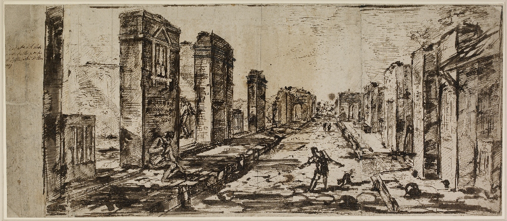
Into these elaborately staged and dramatic scenes he introduced groups of vases, altars, tombs and other baroque details that were never actually present in ancient Rome, in order to produce finely detailed, elaborate and often fantastical views. (Note the very small chariot and people at the bottom centre of this amazingly cluttered composition.)
Fantastical view of the Via Appia. Engraving by Giovanni Battista Piranesi
The Enlightenment taste for ruins
It is fascinating to learn that the taste for ‘views’ of Roman ruins was growing in order to cater for the growing numbers of rich northern Europeans making the Grand Tour of classical sites. To cater for this growing market, Italian artists developed and named a new set of artistic genres, including:
veduta – a highly detailed print of a cityscape
capriccio – a whimsical aggregate of monumental architecture and ruin which never existed in real life
veduta ideata – idealised and larger-than-life depictions of the ancient ruins in their supposed glory
veduta di fantasia – architectural fantasies
As this list suggests, the taste of the times was for the fantastical, the awe-inspiring in age and size, curly-cued with fantastical details and elaborations. In fact so exaggerated were the size of many of Piranesi’s images of Roman ruins that when Northern tourists actually arrived, they were sometimes disappointed to discover the actual remains were far more modest in scale.
Goethe is mentioned as one of many Northerners who formed their ideas about Rome from Piranesi’s fabulously successful books of prints and, on finally arriving at the Eternal City, being disappointed.
Interior view of the Flavian Amphitheater, called the Colosseum (1766) by Giovanni Battista Piranesi
Antiques dealer
Although he was born and educated in Venice, Piranesi came to Rome as a young man and made his career there. Not only a frustrated architect and very successful print-maker, Piranesi was also an antiquarian and antiques dealer. He not only dealt in the large number of Roman antiques to be found in and around the city (especially Hadrian’s Villa outside the city which was being uncovered during his lifetime) but he a) incorporated these vases and sarcophagi and reliefs and other detail into his prints and b) he restored many of the antiques to his idea of how they ought to look, often adding his own elaborations.
Thus there are a couple of pieces of sculpture in the exhibition (like the enormous marble horned lion emerging from a lotus) but the commentary also recommends you drop into the Enlightenment galleries back on the Ground Floor of the Museum to check out the two Piranesi vases there.
I’m glad I did, because they are vast, twice the height of a man and so monstrously heavy that, apparently, they simply could not be moved up to the Print Rooms and, if they’d tried, would have broken the floor.
The Piranesi Vase at the British Museum. The vase was discovered at the Villa Hadrian, then restored in Piranesi’s workshop, where other monumental elements were added. It is enormous.
Elements of Piranesi’s style
From below
Architecture is most impressive if seen from below, looking up, especially if features like arches loom over the viewer’s head, as they do in most of the Imagined Prisons pictures.
From the side
Classical art and classical architecture liked to view classical buildings head on, emphasising the clarity and balance of their design, and Piranesi did just that in some of the earliest architectural drawings in this exhibition. But as he matured, Piranesi preferred to look at buildings from the side, creating a more dynamic affect. Here’s a fairly mild example, View of the Campidoglio from the Side.
View of the Campidoglio from the Side. Etching by Piranesi (1761)
You can see how the subject matter is overwhelmingly architectural. Piranesi trained as an architect and throughout his life produced huge numbers of architectural plans, some sensible, some wildly extravagant, yet only once was he actually commissioned to practice some architecture (between 1764 to 66 he carried out restoration work on the Santa Maria del Priorato Church in Rome). There are people in this print, but they’re in a rather disorganised heap at the bottom left and their main contribution is to being out the scale and monumentality of the architecture and the architectural composition.
Light in the distance
Another trick Piranesi used regularly was to make the foreground of an image dark and clotted with the middle distance light and airy. This gives the visual impression of size and scale, as if the building is rising up into a more sunlit region. It’s a trick he used in what are probably his most famous series, the Carceri d’invenzione or Imaginary Prisons, a series of 16 prints that show enormous subterranean vaults with stairs and awesome machines. (And look at the size of the tiny human figures shuffling along floor or gesticulating on various walls and platforms; it looks like an illustration for an H.G. Wells story about the distant future.)
Carceri Plate VI, The Smoking Fire by Giovanni Battista Piranesi (1745)
The Imaginary Prisons series went on to inspire the Romantics and, a lot later, the Surrealists, with their sense of mysterious but looming forces.
People are small
So obvious it barely needs mentioning, but just review how minuscule the human figures are in the Appian Way or the Colosseum or the Imaginary Prisons: this is a monumental architecture of the imagination which is intended to dwarf and overawe mere mortals, including the viewer.
Defender of Roman art
It was fascinating to learn that during the 18th century a controversy developed among critics and writers and artists about the relative merits of ancient Roman and Greek art. More was being learned about ancient Greek architecture and ideas, and its defenders claimed it had greater purity and simplicity, and accused the later Romans of copying everything that was good about Greek architecture and then blowing it up to elephantine proportions and encrusting it with unnecessary details.
By his stage Piranesi had established his reputation as one of the great illustrators of Roman buildings and art, not least via the successful four-volume series Roman Antiquities. he had been elected an Honorary Fellow of the Royal Society of Antiquarians in London, and a member of the Accademia di San Luca in Rome, so it was not, maybe surprising, that he found himself drawn into controversy with the French Hellenophile Pierre-Jean Mariette.
Piranesi defended the more advanced technology used by the Romans to build larger buildings; the awe-inspiring magnificence of their buildings; but also the Romans’ willingness to absorb motifs from other cultures: not just ancient Greek, but Etruscan and even Egyptian, creating a rich and original synthesis.
In other words, it’s fascinating to learn that his works aren’t just whims and fancies, but the putting-into-practice of a thoroughly worked-out theory of art and art history resulting in the conviction that borrowings from exotic sources and bizarre combinations are the paths to originality and creativity.
Piranesi’s drawings
All the foregoing is by way of introducing Piranesi, his main achievements, his interest in architecture and the fantastical, and his patriotic defence of Rome and its artistic legacy.
But this is not an exhibition of Piranesi’s famous prints. It is a comprehensive display of the British Museum’s entire collection of Piranesi drawings.
Throughout his career Piranesi made detailed architectural drawings, first as an apprentice draughtsman and then for all sorts of reasons: as preparations for the prints, as working sketches of antique pieces to either market them or as studies for larger compositions. Some drawings are huge and portrays vast, fantastical, imaginary scenes which he later converted into prints, while others are relatively small detailed studies of particular aspects, like the drawing here of a sword, or a vase.
The 51 drawings are placed in simple chronological order so the visitor can track Piranesi’s artistic evolution from sensible architectural draughtsman to impresario of the fantastical. Here he is in his early 20s, being sensible and factual.
Ten years later, here is the source drawing for the hyper-fantastical vision of an Appian Way that I opened this review with, a helter-skelter surfeit of impossible buildings and exotic details.
If we compare this drawing with the print the differences are immediately apparent. The composition is the same but drawn with surprising freedom and vim, with multiple lines sketching out perspectives and shapes, and with a very loose colour wash creating light and shade.
This lightness of touch and freedom characterises all the drawings which have an expressive charm of their own. I particularly liked the early design for a temple he had drawn, along with careful notes on scale and aspect and then, right at the end, he thought ‘Blow it’ and added a pyramid to the composition.
‘If in doubt, add a pyramid,’ is not a bad rule for life.
When he came to Rome he adopted a yellow paper and washes (as opposed to the more factual white tonalities of his earliest Venetian work) and this palette is compounded in the many later drawings where he used red ink or crayon to really ram home the vibrancy of the composition.
Although the exhibition features nine prints (including the ones of the Colosseum and the Side View of the Campidoglio and several of the Imaginary Prisons) to give context and show what some of the drawings were preparatory drawings for, many of the 51 drawings weren’t preparations for prints at all, but were finished works in their own right, or studies of details.
There’s are some of the scores of drawings he did of human figures (Standing man in profile), the detailed studies of a Roman sword I mentioned above, studies of ancient vases and what are called candelabra, multi-storeyed stone confections – and countless experiments in architectural fantasy, taken from a wide range of perspectives and points of view – as well as a selection of drawings he did when he visited the newly excavated ruins of Pompeii.
By the time of his death Piranesi was one of the most influential interpreters of ancient Rome. His prints and treatises were popular across Europe and his grand, and grandiose, visions of the Eternal City would define the idea of Rome for generations of travellers and armchair tourists.
This exhibition is a fascinating glimpse into the engine room of his creativity, a look behind-the-scenes of the brightly finished and smooth prints at the much more creative, extempore, roughly finished and, in many ways, more exciting drawings.
This exhibition is a revelation and a treat. Valloton made lots of immensely pleasing, teasing, entertaining, beautiful and slightly puzzling images, enough to make it hard to leave the show. Normally I have half a dozen highlights from an exhibition, but I wanted to take twenty or thirty of Vallotton’s images away with me, wanted to be able to revisit them regularly, especially the woodcuts, and so I bought the catalogue (which is currently selling at the knock-down price of £12.50).
The exhibition is in six rooms so, rather than reinvent the wheel, I might as well follow the academy’s structure, with comments and observations along the way.
Early works
Félix Vallotton was born in 1865 into a Swiss Protestant family in Lausanne. At 16 he headed off for Paris, the art capital of the world, where he showed prodigious talent. He rejected studying at the prestigious École des Beaux-Arts and enrolled in the more informal Academie Julian. His early works are realistic and figurative in a way which completely ignored the avant-garde of the day, the (by now) prevailing style of Impressionism, or the various post-Impressionist styles which were on the horizon. From the start he went his own way, and his style right to the end would be realistic and, in many ways, deeply conservative. (Note, by the way, the large plain background to this confident self portrait; we’ll come back to it later…)
The Nabis was a group of French painters who rejected Impressionism in favour of lofty spiritual goals, and were more aligned with the late-nineteenth century movement of Symbolism.
The Nabis (from the Hebrew and Arabic term for ‘prophets’) were a Symbolist, cult-like group founded by Paul Sérusier, who organized his friends into a secret society. Wanting to be in touch with a higher power, this group felt that the artist could serve as a ‘high priest’ and ‘seer’ with the power to reveal the invisible. The Nabis felt that as artists they were creators of a subjective art that was deeply rooted in the soul of the artist. While the works of the Nabis differed in subject matter from one another, they all ascribed to certain formal tenets – for example, the idea that a painting was a harmonious grouping of lines and colours. (from the Art Story website)
The Nabis’ most famous members were Édouard Vuillard and Pierre Bonnard. Valloton became involved with the Nabis in the early 1890s and their ideas produced a dramatic change in his style, as he experimented with non-naturalistic ways of playing with colour, pattern and form to try and convey the higher spiritual ideas the Nabis aspired to. Some of these are wonderful, for example an exquisite small stylised painting of a beach by moonlight, and a highly experimental painting of Parisians ice skating to waltz music, their gyrations throwing up sparkly fragments of ice which shimmer with multiple colours.
Waltz by Félix Vallotton (1893) Musée d’art moderne André-Malraux (MuMa), Le Havre, France. Source: Wikimedia Commons.
By far the oddest of these paintings is Bathing on a summer evening which combines all kinds of influences (from Old Master bathing scenes to the Pointillism of his contemporary Seurat, and maybe something of the naive style of Le Douanier Rousseau) to produce something very strange and ‘modern’. The curators point out the influence on many artists of this time of classic Japanese prints, which liberated Western painters from Renaissance perspective and helped them rethink the picture plane as a flat arrangement of lines and blocks of colours.
However, as the exhibition progresses you realise that early works like this are the exception rather than the rule. Or maybe that they were stepping stones towards his more mature and rather mysterious style. The oddity and ‘spiritual’ aspect of these Nabis works (if that’s what it is) become subsumed into a return to realism, but of a highly stylised variety.
Woodcuts
Valloton began making woodcuts in 1891 and quickly became an acknowledged expert in the medium, which was undergoing a revival across Europe. Changes in printing technology led in the 1880s and especially 1890s to a proliferation of illustrated journals and magazines.
(It was the proliferation of literary and popular magazines in London which led to the market for, and sudden florescence of, brilliant short fiction commissioned from the likes of Oscar Wilde, Rider Haggard, Conan Doyle and Rudyard Kipling. And in fact, Vallotton was also a writer, producing three novels and eight plays. He was also heavily involved in the theatre, designed stage sets, took photographs and made sculpture. In his best-known novel, The Murderous Life, the protagonist, Jacques Verdier, has a power which causes everyone in his path to die in a tragic accident. Vallotton illustrated the novel himself in the darkly humorous style of his woodcuts. All this is reminiscent of the black humour of exactly contemporary English works like The Picture of Dorian Grey or of Aubrey Beardsley’s black and white prints.)
Valloton turned out to have a gift for woodcut as a form, being able to produce images which were entertaining, troubling, moody, artistic or humorous, as required. He became principal illustrator for the influential journal La Revue Blanche and, as such, came into contact with and befriended many of Paris’s artistic, musical and literary élite – Mallarmé, Debussy, Proust, Satie and so on.
‘This newcomer, who is not a beginner, engraved on blocks of soft pearwood various scenes of contemporary life with the candour of a sixteenth-century woodcut.’ (French critic Octave Uzanne describing Vallotton’s exceptional talent for printmaking)
The exhibition contains some forty of Vallotton’s woodcuts, arranged by series.
Paris life
I can’t find a figure for how many illustrations he created for La Revue Blanche but presumably it was lots. Included here are all kinds of street scenes including crowds caught in downpours and rioters attacking the police, schoolgirls laughing, swans in the park, a sudden downpour of rain, and so on. My favourite was a beautifully clear and precise image of a naked woman lying on her front on a highly patterned coverlet and reaching out to scratch a cat, titled Laziness.
Laziness (1896) by Félix Vallotton
Musicians
The Musicians series shows starchy Victorian ladies and gents playing the violin or piano or trumpet. The one that caught my eye was a man playing the flute but keeping a wary eye on a cat which looks like it’s about to pounce on him or his sheet music.
The Flute (1896) by Félix Vallotton
Worlds Fair
There’s a series of six woodcuts on the subject of the 1900 Paris World Fair, showing visitors gawping at jewels, having a picnic lunch, caught in a sudden rain shower, a recreation of a street scene in Algiers, a footbridge between displays, and, finally, a vivid woodcut depicting fireworks. All these illustrations are wonderfully vivid and characterful and fascinating social history.
Intimacies
Most famous is the series of ten graphic woodcuts he titled Intimacies. These portray the sexual mores of Parisians, and the moral and psychological intensity of late-Victorian affairs. Each one shows a scene fraught with sexual or psychological tension (I say ‘sexual’ – there’s no nudity; everything is implied).
Below is maybe the most striking and intriguing one, Money. What money, where? Is the man handing her money (doesn’t look like it) or offering her money verbally? For what? Sex? To buy her silence? Is she his mistress? Or an unhappy wife?
The curators point out Valloton’s striking use of black. It’s simple but extremely effective to have about two-thirds of the image, the whole right side, jet black. Thus the man doesn’t stand against a backdrop or shadow, but emerges out of the blackness. He is part of the blackness. All the others in the Intimacies series are just as strange and teasing and suggest complex psychodramas on which we are eavesdropping.
Vallotton’s extensive experience churning out woodcuts recording and satirising contemporary Paris life, fed over into his paintings. During this period they stopped being either the rather stiff portraits and still lifes of his first years in Paris, or the experimental paintings mentioned above like the Waltzers or Bathers, and became more like accompaniments in paint of the contemporary social themes he was depicting in the woodcuts. Especially the Intimacies theme of the complexity of male-female relations, the complex lies and deceptions of the Paris bourgeoisie as they go about their affairs and infidelities. One is titled Five O’Clock which, we learn from the wall label, was the time of day when the Parisian bourgeois left their offices and went to visit their mistresses for an hour of pleasure, before returning home to their wives and families. Another shows a naked woman curled up in a very red chair, in a sort of defensive or foetal posture. You can’t help asking why. Has something bad happened to her, has she received good or bad news, or is it her usual comforting position?
Uncertainties
This is the theme or feeling which is present in his earlier paintings but comes more and more to the fore during the 1890s – which is that, although his technique remained pretty conservative (especially if you consider what was happening around him in Paris, with Picasso and Matisse just over the horizon), nonetheless, there is a very modern sense of unease and ambiguity about his paintings from the 1890s.
A good example is The Visit from 1899. Three points: 1. What is going on in this painting? Has she just arrived? Are they dancing? Or is he pushing her towards the open door at the left which we can assume leads into a bedroom? So is it an illicit visit from a mistress?
2. Note the bold colours. This is what Valloton had in common with the other Nabis: it’s a figurative scene alright, but all the colours are too overbright and simplified. It is this overlit colouring which creates the unsettling mood as much as the composition.
3. As are the faces. You can see the influence of all those hundreds of popular woodcuts, which required often cartoon-like simplicity of faces, spilling over into a simplification of the faces and indeed the outlines of the bodies in his paintings. It’s a painting of a real scene but all done with overbright simplifications of colour and outline which bring to mind, say, the style of American painter Edward Hopper. The clothes and decor have changed but the mood of lassitude or ambiguity, the troubled atmosphere between a man and a woman, are very similiar and above all, conveyed by simplifying the shape and colour of the figures, and leaving their faces blurred and shadowed.
Room in New York by Edward Hopper (1932)
Marriage
In 1899 Valloton dumped the Bohemian mistress he had lived with during the 1890s, and married Gabrielle Rodrigues-Henriques. This was an excellent career move in two ways. 1. She was the widowed daughter of Alexandre Bernheim, one of the most successful art dealers in Europe, and her brothers still ran the immensely successful art dealership. 2. She was rich.
At a stroke Vallotton moved from a garret studio with a mistress into a grand city house with a wife and step-children. He entertained. He became a good bourgeois and family man.
And his style changed, too. For a start he stopped making the woodcuts which had provided his livelihood during the 1890s, and ceased working for La Revue Blanche. Freed from financial worries he concentrated all his energies on painting.
A lot of these new paintings feature his wife, in a variety of respectable family poses, on the family sofa, or at the family dinner table. These portraits show the enduring influence on him of one of his heroes, Ingres, the painter of crystal-clear nudes and women’s faces.
But alongside these respectable paintings are others, also apparently sensible and polite, which nonetheless exude a strange unease and sense of foreboding. It is as if the psychological tensions he had investigated so ably in the Intimacies woodcuts has been driven underground to become merely implicit, barely implicit, only just noticeable.
The curators single out one particular painting from this period, The Ball, which shows a little girl in a garden chasing after a ball. What could be more innocent? And yet, when you look at it in the flesh, there is something very eerie about the way the shadow is creeping across the grass from the left and onto the gravel drive – almost as if it’s reaching out for her. And the darker shadows lurking at the bottom of the shrubbery above the girl. And something a little uncanny about the two figures in the distance…
This unsettling effect is much more obvious in a brilliant painting titled simply The Pond. A realistic painting of a pond, what could be more plain and simple? And yet (once again, more in the flesh than in this flat reproduction) once you’ve noticed the way the blackness of the pond water is seeping weirdly towards you, it’s impossible not to be a little worried by it. It’s like a still from the Disney film Fantasia, it looks like the shadow of the mountain coming to life, with big devil’s horns, rearing towards you…
The Pond (1909) by Félix Vallotton
Nudes
Also, from about 1904 onwards, alongside the many fully clothed and respectable portraits of his wife and step-children, Valloton began to focus his energies on the nude, the female nude.
If you realise that Picasso and Matisse were just launching their careers at just this time, it is astonishing just how conservative and traditional Valloton’s style was. If you do a quick google search of Félix Vallotton+nude it is astonishing to discover that he did so many of them.
Many of the nudes explicitly refer to the great tradition of Old Masters from his favourite, Ingres, through to Manet’s Olympia. In all of them there is a cold, detached, calculating air. The largest of the half dozen or so on display here is the wonderful White Woman and Black Woman of 1913.
1. The clarity There is hardly any shadow in the room. Everything is depicted in the exact crystalline light of Ingres.
2. The technical virtuosity Look at him show off his ability to paint folds of cloth, one of the litmus tests of the Old Masters stretching back to Titian.
3. Psychology In the Olympia of Manet the fully clothed black servant is bringing flowers to the naked prostitute Olympia, very obviously serving her. But what on earth is the relationship here, between the black woman who’s very casually dressed and – for God’s sake – smoking a fag!? All kinds of speculation is possible, the curators’ favourite one being that they are lesbian lovers, but it looks much more complex and weird than that.
4. The nude The depiction of the white woman’s naked body is quite simply stunning. It is a masterwork in the depiction of fleshtones, and the way they vary across the naked body, rising towards her flushed red cheeks. Why are her cheeks flushed and red?
You remember me pointing out about the first painting in this review, how the background is a flat, bare wash? Well, same here. Once I’d processed the lavish sensual appeal of the naked body in this painting, and then wondered about the relationship between the two figures, than I turned to consider a third level or avenue of approach, which is to see it purely as a composition of colours – and surely the most striking thing is the huge size of the aquamarine wall behind both figures. Against which is set the black woman’s brilliant orange headscarf. And then her bright blue wrap, for sure. If it is a virtuoso display of folds and shadows in fabric, it is also, on another level, an exercise in big blocks of colour. Once I’d noticed this fondness for slabs of colour, I began to notice it in many of his paintings, and also link it up with his decisive use of solid black in the woodcuts. It’s an entire visual approach to see things as blocks rather than broken up into the multitude of details.
Landscapes
In 1909, alongside his prodigious output of nudes, Valloton turned his attention to landscapes. As with so many of his earlier depictions of people, these were done in a simplified style which often brought out the basic shapes underlying messy nature and, as with the nude above, done in primary or elemental colours.
A good example is The Pond, above, with its radical simplification of pond, grass, shrubs and trees to create an almost cartoon-like image.
He called them composed landscapes. He had taken to using a box camera at the turn of the century and now it became a habit to take photos of a scene and then use that, once developed, to paint the scene from the simplified (black and white) photo and from memory. He dreamed, he said, ‘of a painting free from any literal respect for nature.’
The result was landscapes reduced to broad ‘zones’ or shapes of colour which recall the simplifications of the woodblock. And also hark back to the principles of the Nabis from a decade or more earlier, the idea that art needn’t be realistic, but was more a matter of finding the colours and patterns which replicated your inner feelings.
A late landscape which really got me was Last Rays painted at Honfleur where Vallotton spent many of his summers and where he made several versions of this scene of umbrella pine trees overlooking the Bay of the Seine. In its simplification and strong sense of design it subtly references the clarity of the Japanese prints which had so influenced him in the 1890s.
But, also, looking round any of the rooms, I kept being amazed at how… conventional Vallottin is. It’s as if Impressionism or any other modern art movement had never happened. Towards the end of the exhibition, I began to realise why I’d never heard of Félix Vallotton before – because he stands so totally outside the classic narrative of Modern Art, and its core lineage from Impressionism thru Post-Impressionism, to the eruption of Picasso and Matisse, and then into Cubism, Futurism etc etc.
None of this seems to have had any impact on Vallotton, and if you look at his Wikipedia article, you do get the impression that many if not most of his paintings can be read as utterly traditional and ‘straight’.
Which set me wondering whether the curator’s attempt to rebrand Vallotton as the painter of ‘unease’ quite stacks up. There’s nothing particularly uneasy about the trees at sunset above, nor about many of the nudes which are just skillful paintings of naked women, often in not very flattering postures, but depicted with beautiful fluency.
Maybe it would be impossible just to stage an exhibition of Vallotton’s work ‘cold’ as it were; maybe it would come across as too conventional and, possibly, in some cases, kitsch, as reworkings of Ingres-style nudes and Flemish-style still lifes being painted in the 1910s.
Maybe the curators had to find an angle, some kind of modernist theme, to make him appear edgy and relevant.
The Great War
Then the Great War broke out. Vallotton was swept up in the patriotic fervour (he had become a French citizen in 1900) but was dismayed to discover he was too old (49) to enlist. Interestingly, the war sparked the decision to create a new series of woodcuts, a genre he hadn’t touched since 1900. Maybe he associated the woodcut with journalism, with the immediate depiction of a society’s life, with the everyday activities of its citizens, and so with the journalistic immediacy of the war and its horrors. In fact the images were copied from newspaper photos or articles before he worked them up into woodcuts.
The result was a series of six woodcuts, collectively titled This is War! and consisting of: The Trench, The Orgy (being a piss-up in a wine cellar), Barbed wire, In the Darkness, the Lookout, and The Civilians.
In their stylised simplification, all six are cartoon-like and almost comic. They remind me a little of the Great War cartoons of William Heath-Robinson. They certainly evince the kind of visual humour which characterised the woodcuts of the 1890s and which largely disappeared from his paintings after 1900. It’s interesting to think that it was there all along, this impish humour, but that he had consciously suppressed it in order to become ‘a serious artist’.
In 1917 Vallotton managed to secure a government commission to tour the trenches in the Champagne region, which led to paintings of the battlefields of Verdun, of ruined churches behind the lines and so on.
Haunted realism
In line with the curator’s thesis that Vallotton is the painter of quiet unease, they end with an image which combines everything we’ve learned so far. It is an astonishingly realistic depiction of peppers on a plate, summarising his prodigious gift as a draughtsman and colorist, and his reverence for the naturalistic tradition of the Old Masters. (Also, I note, the blank slablike colouring of the neutral background.)
But this dazzling work of photorealism was painted during the appalling blood-letting of the Great War, and the curators draw our attention to the knife. Nothing in the picture justifies the way the knife blade is half covered in something red. Is it blood, symbolising the immense bloodletting going on all across the once peaceful civilised continent of Europe? Or just a reflection of the peppers next to it?
The popular illustrative woodblocks he made for La Revue Blanche don’t display a trace of ‘disquiet’, they’re entertaining and very straightforward pictures of Parisians in parks or rain showers or at the Worlds Fair. But the Intimacies series of woodcuts are all about bourgeois guilt, hypocrisy and unease.
Some of the landscapes are just simplified landscapes stylised in the way he had made his own. But others, yes, some of the others are strange and a little… disconcerting.
And many of the paintings made during the 1890s definitely depict fully-dressed bourgeois couples in ambiguous situations. Or single individuals in rather… puzzling moods.
Of the half dozen nudes here, most are just paintings of women without their clothes on, highlighting the way women’s tummies or boobs can hang very unromantically downwards if they’re lying on their sides. But some of them hint at something a little more… mysterious and teasing…
So are the curators justified in labelling Vallotton ‘the painter of disquiet’? It’s hard to say. You’d have to review all 70 or so works on display here with this thesis in mind: maybe… And then are you allowed to review the rest of his works which are readily available online and most of which seem remarkably… un-disquieting…
All I can say with certainty is that this exhibition is a revelation of a painter I’d never heard of before – whose woodcuts are entertaining, charming and evocative – and whose range of paintings, from mysterious interiors to stunningly accurate nudes, through to the entrancing simplicity of the ‘composed landscapes’, from family portraits to slightly unnerving still lives – present an array of accessible, attractive, memorable and subtly haunting images. Wow. Very enjoyable. Well worth the price of admission.
This is a really brilliant exhibition. Kollwitz is a genius and this is a searing, dazzling, breath-taking exhibition of 48 of her best prints – and it is FREE! You should go see it.
Biography
Kollwitz (1867 to 1945) was the fifth child of Karl Schmidt, a radical Social democrat, and Katherina Schmidt, daughter of a freethinking pastor. She was born and raised in Koenigsberg in East Prussia. Two key points: her family were committed socialists who exposed her to the social realist novels of Zola et al, as well as discussing the social issues of the day – supported her through her art school studies.
The result was that her work, throughout her life, was devoted to the suffering of the poor – especially poor women – and a particular interest in moments of rebellion and uprising and social conflict.
After studying art in Berlin and Munich, in 1891 Kollwitz moved permanently to Berlin, when she married Karl Kollwitz, a doctor. They lived near his practice in a poor working class district of the rapidly growing city. They were both politically committed special democrats, and it shows, God it shows, in a series of dark, raw and intense prints showing the harrowing poverty and squalor of working class life.
Between 1908 and 1910 she made fourteen drawings in this realist style for the satirical magazine Simplicissimus, on social realist themes such as unemployment, alcoholism, unwanted pregnancy and suicide, including this one.
One of the captions refers to the plasticity of her style, the superb modelling of faces and bodies. In a work like Unemployment this comes over in the dramatic contrast between the faces of the two toddlers and the baby on the bed, and the sparseness and vagueness of other areas of the composition, notably the hard troubled faces of the two adults. These key areas are soft and sensitive, while the surroundings – and the brooding figure on the left – feel harsher, darker, rebarbative.
As early as 1888, aged 21 and at the Women’s Art School in Munich, she had realized her strength was not as a painter, but a draughtswoman, and the strength and shape and depth of all the compositions here is wonderful. Thus her increasing focus on the techniques of etching, lithography and woodcuts.
Series
Paintings are often one-off affairs which can be sold at a premium (especially if commissioned by a rich patron), but the effort required in making prints, etchings and woodcuts has meant that artists often conceive of them as series, to be produced and sold in limited runs, and maybe collected into books.
The Weavers: Six prints, 1897 to 1898
Kollwitz based her first series on a play by Gerhart Hauptmann, The Weavers, which dramatized the oppression of the Silesian weavers in Langenbielau and their failed revolt in 1844. She produced three lithographs (Poverty, Death, and Conspiracy) and three etchings with aquatint and sandpaper (March of the Weavers, Riot, and The End). See the grim image which opens this review. When they were exhibited in 1898 they made her name.
The Peasants War: Seven prints, 1902 to 1908
Kollwitz’s second major cycle of works was the Peasants War which occupied her from 1902 to 1908. This was another rebellion of the workers, in this case the maltreated peasants who rose up against their feudal lords in the wake of the Protestant Reformation, in 1525, and were eventually defeated in a bloodbath.
At first sight there is a tremendous dynamism in this image, with the figure of the woman rousing and encouraging the men dominating the foreground. Looking closer I was struck by the ape-like clumpiness of many of the peasants – look at the man on the right. This heaviness, this simian Neanderathal appearance, seems to bespeak their status as oppressed serfs, as people who are in fact, barely human, so low have they been degraded.
All the images are tremendous but I was thrilled by Arming in the vault where she uses dark and light to convey the sense of a great horde of proletarians emerging from the underworld, armed to the teeth, ready to cause havoc.
And there is a detailed and devastating print titled simply Raped which shows the foreshortened body of a woman lying amid dead leaves in an orchard or garden, wearing a skirt but her hard peasant’s feet and calves and knees towards us, while lost in the overhanging trees, her young son looks down at her ravaged body. Note how the woman’s head is set at an unnatural angle, lying back into the leaves.
But alongside the historical-political series, Kollwitz also produced images of startling sensuality. They date from the early 1900s after she had made several trips to Paris and been amazed at the colourfulness and vivacity of its streets and social life as well as its brilliant Impressionist and Post-Impressionist painting. The experience inspired experiments in sensual and also with colour. This female nude is stunning. I found the pinpoint accuracy of the draughtsmanship breathtaking.
Kollwitz made a total of 275 prints, in etching, woodcut and lithography, of which about 50 are self-portraits. The wall labels tell us that she also kept extensive diaries and wrote many letters describing and analysing her own feelings, her art and career.
One wall of the show is devoted to half a dozen or so self-portraits which showcase her tremendous draughtsmanship and accuracy, along with a deep brooding gaze, and the ability to capture mood and personality to a spooky extent. She is as harsh and unforgiving on herself as she is on her grim peasants and mourning mothers. What technique! What a godlike gift for capturing the intensity of the human soul!
Then Europe went to war and her youngest son, Peter, aged 18, volunteered, marched off, and was killed in October 1914. The suffering of poor mothers had been a constant topic of her social-realist work, and – eerily enough – a decade earlier she had created this haunting image of a mother cradling a dead son, for which she had herself modelled, holding the self-same Peter as a seven-year-old boy.
In fact the exhibition contains three of the eight working versions of this work, which demonstrate how she created, modelled and evolved her way towards the final image, a fascinating insight into her technique.
The War series: Seven woodcuts, 1922 to 1923
The loss of her son, and the slow strangulation of Germany caused by the Allied blockade, the loss of so many sons and husbands, as well as the gradual impoverishment of the entire nation, burned and purified her art to its essence, resulting in the scathing series of woodcuts she titled simply War.
God! How searing and blistering are her stark woodcut prints of mourning mothers and starving people, carved out of what look like blocks of coal, or ancient fossilised trees, images which reach right down into the roots of the earth, deep into the lineage of human experience.
All the light and shade, the modelling and depth and (sometimes brutal) sensuality of the earlier works has been burnt away in the fires of war. Now Anguish speaks in stark flat images dominated by lignite black, from which lined and haggard faces emerge like nightmares.
All seven of the War prints are here – The Sacrifice, The Volunteers, The Parents, The Widow I, The Widow II, The Mothers, and The People – ranged along the opening wall, bringing a new visual intensity to her approach.
It’s that emotional intensity and the stark black and white of the images which leads some histories to group her with the German Expressionists, except that the Expressionists were mostly a pre-war movement, and Kollwitz’s pre-war images had been much more smooth and naturalistic, as we have seen.
In fact Kollwitz went on producing work into the 1930s and indeed up till her death, in 1945. Her last great series of prints was the Death cycle of the mid-1930s.
Death Cycle, Eight prints, 1930s
Her last great cycle rotated around the figure of Death and consisted of: Woman Welcoming Death, Death with Girl in Lap, Death Reaches for a Group of Children, Death Struggles with a Woman, Death on the Highway, Death as a Friend, Death in the Water, and The Call of Death.
It marks a return to lithographs, with their ability to give depth and shade, unlike the medieval starkness of the war woodcuts. And also a return of the Neanderthal or simian quality which recurs throughout many of the harsher works, gaunt images of creatures who are barely human, with thick, knotty hands and feet. Big, clunky hands and especially feet, bony feet, huge knuckled feet, used to carrying burdens and long days of physical labour, are a trademark feature of her work, even in so ‘tender’ an image as Woman holding a dead child, the knees and feet are prominent and brutal.
This one, Call of Death, reminded me of Holocaust or Gulag or prisoner of war imagery. Homo redux, reduced by the crimes and the atrocities of the twentieth century to a bare minimum, barely human rump. And reminded me of the great poem, Death is a Master from Germany, written at the end of the war by Paul Celan.
death is a master from Germany his eyes are blue
he strikes you with leaden bullets his aim is true
Summary
All of the images in this exhibition are brilliant. I honestly can’t think of another exhibition I’ve ever been to where the quality of all the works is so uniformly high. The images of peasants pulling ploughs in muddy, wet fields, with harnesses round their necks are searing.
The woodcut she made commemorating the funeral of Communist agitator Karl Liebknecht is a great piece of popular art, albeit in a dubious cause (Liebknecht wanted to bring Leninist rule to Germany, but was murdered by right-wing militias in 1919 during the chaotic street fighting which followed the collapse of the German Empire. Same year Kollwitz was the first woman elected to the Prussian Academy of Arts. In letters she is recorded as explaining she had no sympathy for his cause, but was moved by the huge crowds of working class mourners who attended his funeral, the class she had been depicting for decades.)
Even before the Great War Kollwitz was a well-established artist in her genre, acknowledged by her receiving the position at the Prussian Academy immediately the war ended. But between the wars she developed a reputation not only in America (land of the rich collector) but, amazingly, in inter-war China, riven by civil war and Japanese invasions, where her blistering images of the poorest of the poor peasants working the land influenced the Woodcut Movement among socially conscious artists in that vast, peasant-based country. Her Peasants War work was seen by, and directly influenced, the Chinese artist Li Hua, who founded the Modern Woodcut Society at the Guangzhou Art School in 1934.
Kollwitz made a total of 275 prints, in etching, woodcut and lithography. This exhibition features 48. Why these 48 and no others? Because these prints were collected by Campbell Dodgson, former Keeper of the Department of Prints and Drawings (1893 to 1932) who then bequeathed them to the British Museum in 1948. Dodgson was influenced by his colleague Max Lehrs of the Dresden and Berlin Print Rooms – Kollwitz’s first and greatest champion – and acquired as many of her works as he could.
And then donated them to the museum. And now all 48 are on display here, along with generous picture captions and labels which give full explanations of her life and work and the motivation and process behind each one of these wonderful works. She is a really great, great artist. This exhibition is FREE. I can’t recommend it too highly.