Impressionists on Paper: Degas to Toulouse-Lautrec @ the Royal Academy

This exhibition in is in the smaller set of three rooms at the back of the Royal Academy building i.e. it’s more of an amiable stroll through three rooms of relatively small drawings, rather than, say, the full-on assault course of the 11 big rooms of the extraordinary Marina Abramović show.

It does what it says on the tin, brings together 80 or so works by all the famous Impressionist and post-Impressionist artists plus quite a few I’d never heard of before, experimenting with different media on paper.

Exhibitions need an aim or project and this one aims to explore how Impressionist and Post-Impressionist artists in late 19th-century France didn’t just use paper works as studies but radically transformed the status of works on paper. Previously, drawings were mostly conceived as preparations for paintings; in the hands of the Impressionists drawings, pastels, watercolours, temperas and gouaches were increasingly perceived as more than just preparatory techniques, and became autonomous works of art, claiming a shared aesthetic with painting.

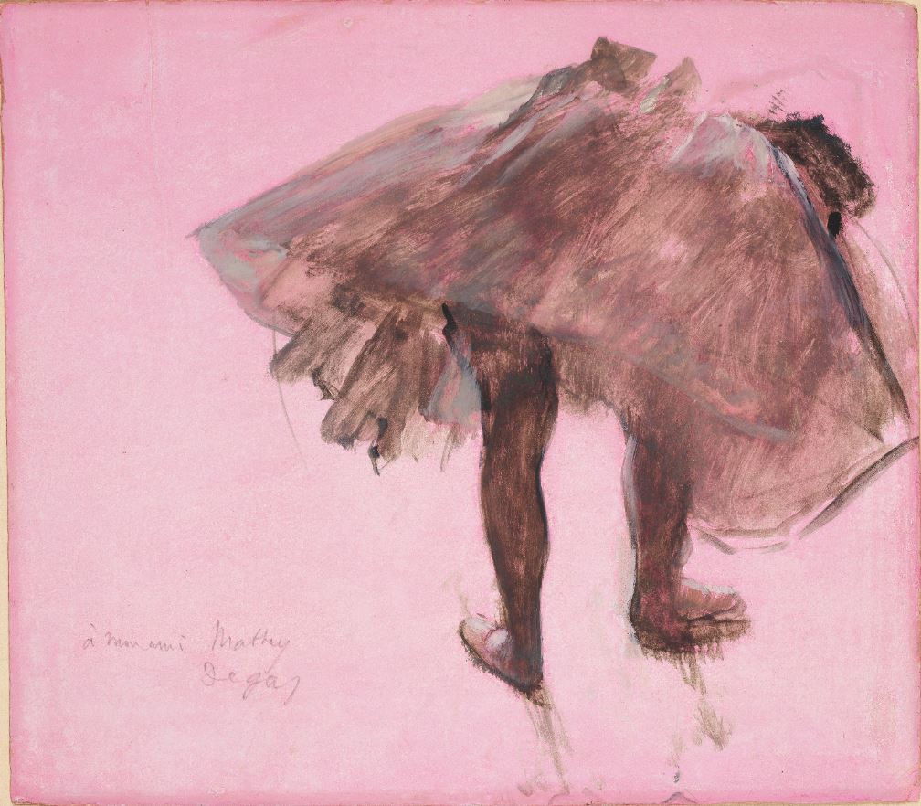
Dancer Seen from Behind by Edgar Degas (c. 1873). Essence (diluted oil paint) on prepared pink paper. Collection of David Lachenmann

Who are we talking about? The eye-catching famous artists are: Mary Cassatt, Paul Cézanne, Edgar Degas, Paul Gauguin, Eva Gonzalès, Claude Monet, Berthe Morisot, Camille Pissarro, Odilon Redon, Pierre-Auguste Renoir, Georges Seurat, Henri de Toulouse-Lautrec and Vincent van Gogh.

Less well known are the likes of Albert Lebourg, Jacques Emile-Blanche, Armand Guillaumin, Frederico Zandemeneghi.

Impressionists recap

As the curators explain:

The avant-garde artists known as the Impressionists came to prominence during the late 1860s and early 1870s, first exhibiting in Paris as a group in 1874. They shared a concern to depict scenes from everyday life and to address contemporary issues, which encouraged them to challenge traditional attitudes to drawing and seek innovation. Vivid colour, a quick, loose touch, and daring viewpoints, together with a deliberate lack of finish, were their means of capturing the fugitive effects of nature as well as vignettes of modern life.

The portability of drawing materials greatly facilitated direct observation and the recording of scenes on the spot. The eight Impressionist exhibitions, held in Paris between 1874 and 1886, included a large number of works on paper and reflected their shift in status. This was also encouraged by dealers who recognised the economic advantage of exhibiting and selling works on paper.

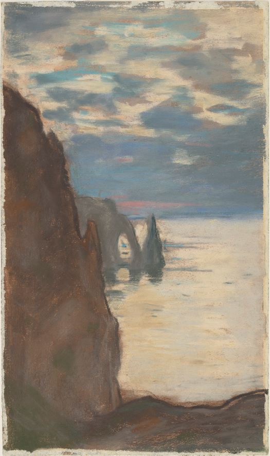
Cliffs at Etretat: The Needle Rock and Porte d’Aval by Claude Monet (c. 1885). Pastel on wove paper. National Galleries of Scotland

What it’s like

The most striking thing, for me, was how the drawings faithfully echo the style of each artist’s paintings i.e. the way each of the artists have strong signature styles or vision no matter what medium they’re working in.

So you see a hazy landscape of cliffs by the sea and instantly know it’s Monet; charcoal images of ballet dancers posed at striking angles and know its Degas; a round-faced woman’s face smiling at some outdoors dance and know it’s Renoir; a grotesque, angular woman in an urban setting and you know it’s Toulouse-Lautrec; a light and airy landscape made out of cubes and rectangles of colour and you know it’s Cezanne.

So you can play an entertaining game of standing far away from the wall to try and identify the artist by their style, then stroll over to the wall label to find out if you were correct. For example, who would you think this is by?

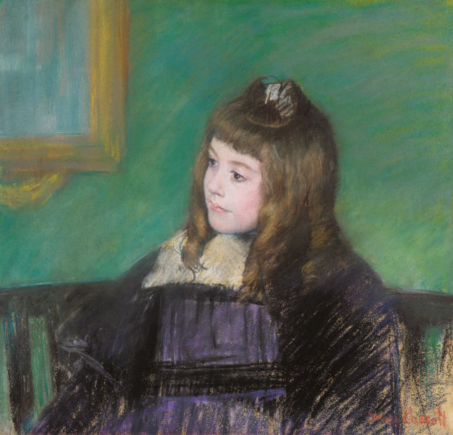
Portrait de Marie-Thérèse Gaillard by Mary Cassatt (1894) Pastel on paper. Private collection. Photo © 2007 Christie’s Images Limited

In this case it’s a trick question. You might have thought Renoir, from the treatment of the face, but it is in fact by Mary Cassatt. Note the striking difference in finish between the face – expertly and completely rendered – and the clothes, rendered in a completely different, hurried, unfinished style, with the background wall hovering somewhere between the two.

What I liked

The most striking work in room 1 is the Portrait of Madame Henri Wallet by Jacques Emile-Blanche simply because of its size. It’s a John Singer Sargent-style and sized portrait of an elegant society woman, and so stands out in a room full of much smaller, much more hazy and impressionistic images.

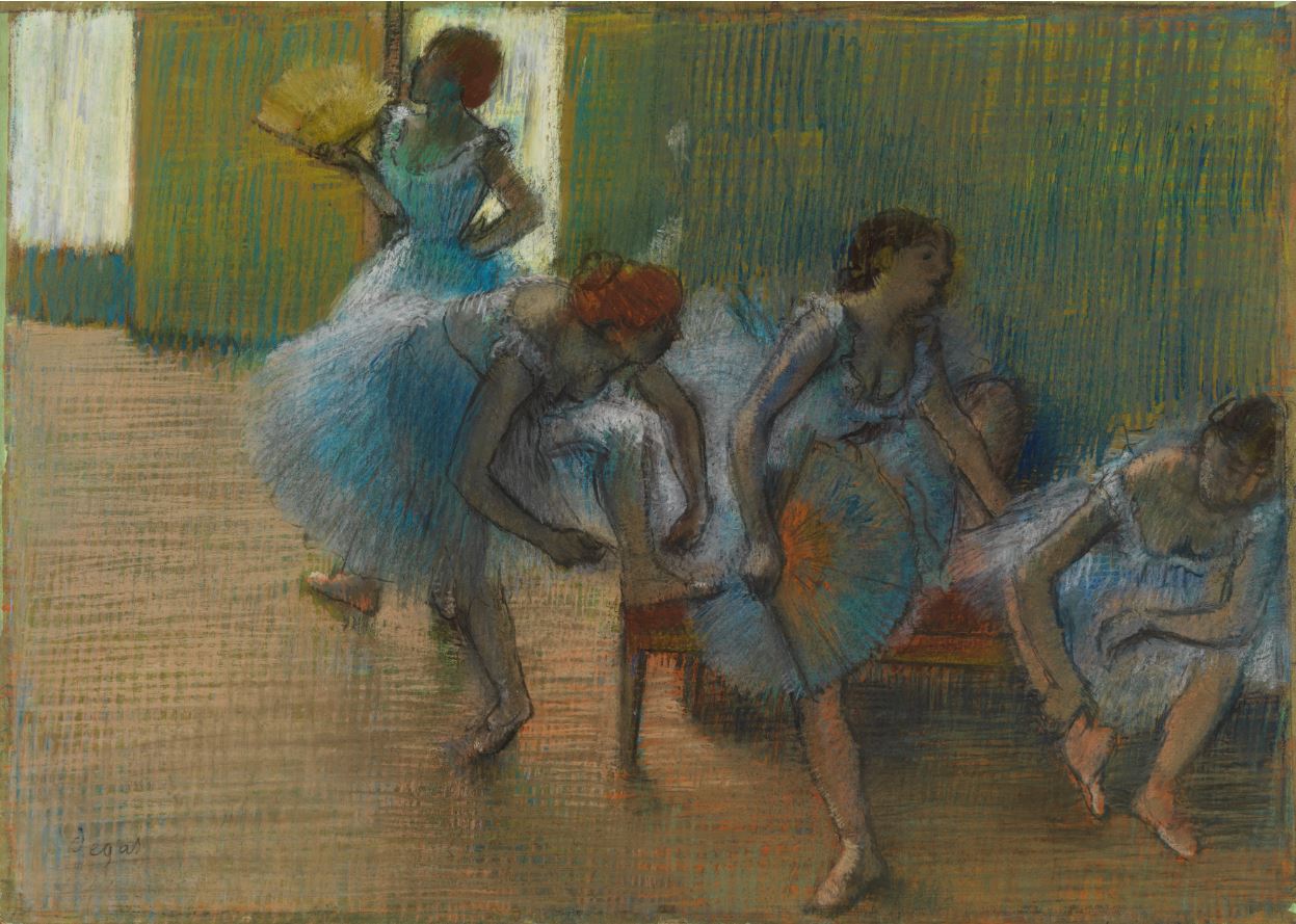
Degas sketched and drew things around him so compulsively that his colleagues nicknamed him Monsieur Pencil and, appropriately, there are more works by him in this exhibition than any other  artists, 12 in total, all of which I liked.

I love sketches and drawings, I love art which is half-finished, ghostly, hinting at a half-grasped reality, which is why I’ve always loved Degas’ strange and mysterious Woman at a Window (1871), which used to be tucked away in a side room at the Courtauld Gallery. Here it is presented in all its pregnant mystery and an epitome, for me, of the power of paintings or drawings which are better left unfinished, full of hints and implication.

But I’d forgotten, if I ever knew, about Degas’s friend Frederico Zandemeneghi (1841 to 1917). Zandemeneghi was invited by the Impressionists to exhibit at four of their 8 exhibitions. He was particularly close to Degas. They shared an interest in depicting scenes of modern life featuring women subjects, seen from unconventional viewpoints, often cropping the image unexpectedly, and using vibrant colourful pastels.

This example has several of those characteristics in spades, namely the dramatic cropping which makes the subject feel really close-up and in your face. And the very bright colours, blue, yellow, orange, red, making the most of the range of human sight.

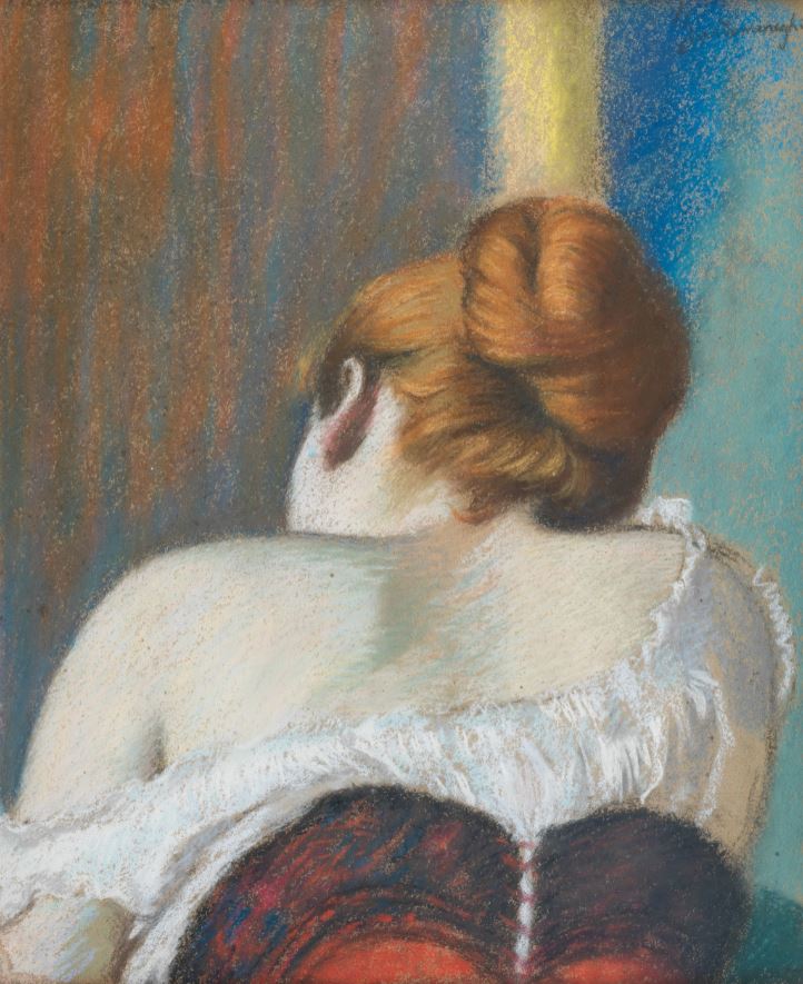
Study of a Woman from Behind by Federico Zandomeneghi (1890 to 1897) Pastel on cardboard. Galleria D’Arte Moderna, Milan. Photo © Comune di Milano

The show is in chronological order, starting with works from the 1870s. Room 2 contains works from the 1880s. The highlight for me was van Gogh’s ‘The Fortifications of Paris with Houses’ from 1887, made from a combination of graphite, chalk, watercolour and gouache. This reproduction in no way conveys the glowing brightness of the original. Then I liked the contrast between the architecturally accurate apartment block on the left and the vague ‘impressionistic’ grass in the foreground. Then I noticed the way the big fortification wall is not made of bricks but of hundreds of vertical dabs of orange and grey. And then I noticed the ghostly couple walking past in the foreground, ghosts of the millions of people who lived and died in the great cities of Europe, leaving barely a trace of chalk on paper. At which point I realised that there’s a kind of spectrum of solidity, from the super-solid apartment blocks on the right, to the more dabbed and impressioned fortifications themselves, and then to the human beings, the least permanent or impactful things in the picture or in history, hundreds of millions of us leaving less trace than walls or buildings.

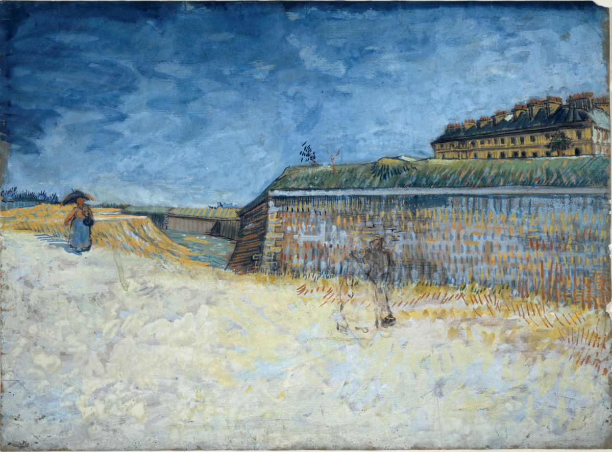
The Fortifications of Paris with Houses by Vincent van Gogh (1887) Graphite, black chalk, watercolour and gouache on paper. The Whitworth, The University of Manchester. Photo by Michael Pollard

The exhibition concludes in room 3 with works from the 1890s and 1900s, which saw an ever-growing appreciation of works on paper and a proliferation of exhibitions of the medium. There’s a lot more Degas who emerges as probably the strongest and most consistent artist on paper. Off in one corner is a set of quiet, thoughtful, washed-out watercolours by Cézanne from late in his career. At the opposite corner of the room, both literally but also in terms of subject matter is a small set of three vivid, scratchy, angular images of the louche underworld of Montmartre by Toulouse-Lautrec.

But floating above this world of human troubles is the work I liked the best, a classic of what, during the 1890s came to be known as Symbolist art, the wonderful, visionary ‘Ophelia among the flowers’ by Odilon Redon.

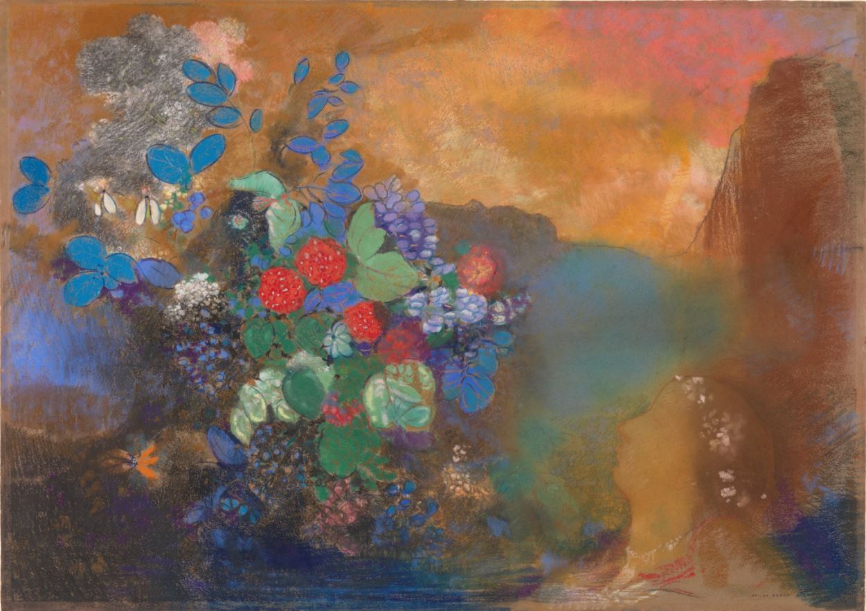
Ophelia Among the Flowers by Odilon Redon (1905 to 1908) Pastel. The National Gallery, London

The Impressionists were trying to capture the truths of the modern world, applying light quick touches to capture the fleeting moment. Redon, by complete contrast, sought out ‘the light that never was on land or sea’, depicting images from the inner world of fantasy and dream. So I thought he was pretty out of place in an exhibition of impressionists. But his inclusion makes sense if we forget the exhibition’s main title for a moment and think of it more as a study of the evolution of drawing and painting on paper in France from the 1870s to the 1900s. From that perspective the inclusion of Redon makes sense for his technical prowess. The flowers are obviously the dominant element in the work, but after a while you realise that it’s the peculiar quality of the light in the top middle and right of the image which give it its haunting, apocalyptic quality.

Consequences

According to the curators:

The French avant-garde artists’ interest in drawing and the remarkable range of their production had far-reaching consequences. The hierarchical distinction made between painting and drawing ceased to exist. Freedom of execution and a laissez-faire attitude to materials provided an impetus that allowed the world to be depicted in more imaginative ways, leading to developments in 20th-century art such as Abstract Expressionism.

So as we progress through the works in chronological order, we are not just witnessing the development of visual styles, generally away from figurativism and towards greater abstraction, but the evolution of the medium of drawing itself, as it prepares for the great lift-off of modern art at the start of the twentieth century.

It’s not all masterpieces. Some are not-great early works (for example, by van Gogh or Gauguin) which are of largely scholarly interest, others are wishy-washy landscapes which are a bit meh (Armand Guillaumin). But overall it’s a lovely civilised way to spend an hour, enlivened by a regular stream of masterpieces. It’s worth visiting just to see the 12 Degas works and the 3 or 4 pieces by Frederico Zandemeneghi and the van Gogh. But other visitors will find other works to marvel at and cherish.

Dancers on a Bench by Edgar Degas (around 1898) Pastel on tracing paper © CSG CIC Glasgow Museums Collection


Related links

Related reviews

A Closer Look: Colour by David Bomford and Ashok Roy (2009)

This is another superbly informative, crisply written and lavishly illustrated little book in The National Gallery’s A Closer Look series. To quote the blurb:

A Closer Look: Colour explores how painters apply colour, describes different types of pigments, and outlines optical theories and artists’ treatises. The authors explain the effect on colour of the artist’s chosen medium, such as oil, water or egg tempera, and the dramatic impact of new pigments.’

It ranges far and wide across the National Gallery’s vast collection of 2,300 art works, selecting 80 paintings which illustrate key aspects of colour, medium and design. The quality of the colour reproductions is really stunning – it’s worth having the book almost for these alone and for the brief but penetrating insights into a colour-related aspect of each one.

They include works by Seurat, Holbein the Younger, Corot, Duccio, David, Chardin, Ghirlandaio, Monet and Van Dyck in the first ten pages alone!

Aspects of colour

Colour quite obviously has been used by painters to depict the coloured world we see around us. But it has other functions, too. Maybe the two most obvious but easily overlooked are: to represent depth and create the optical illusion of three dimensions on a two dimensional surface; and to reinforce this by indicating sources of light.

Depth A common indication of depth is recreating the common observation that objects at a distance fade into a blue-ish haze. This is often seen in Renaissance paintings depicting increasingly hazy backdrops behind the various virgins and main figures. This is known as aerial perspective.

Light Sources of light need to be carefully calculated in a realistic painting. The book shows how the effect of light sources is achieved by showing glimmers of white paint on metallic objects or even on duller surfaces like wood. There is a particularly wondrous example in Lady Elizabeth Thimbelby and her Sister by Anthony Van Dyck. The authors give a close-up to show how the colour of the yellow dress worn by the main subject is reflected on the bare skin of of the little angel, and even in the catchlight in his right eye, an indication of the depth of thought which goes into his compositions.

Shadows turn out to be an entire subject in themselves. For centuries painters improved their depiction of shadows, at first using grey colours for the shadows of buildings, but quickly realising that the most shadowed things around us are fabrics. Dresses, cloaks all the paraphernalia of costume from the Middle Ages to the turn of the 20th century, involved reams of material which folded in infinite ways, all of them a challenge to the painters’ skill. At the very least, painting a fabric requires not one but three colours: the core colour of the fabric itself, the fabric in shadow, the fabric in highlight, reflecting the light source.

The human eye is not a mechanical reproducer of the world around us. It has physiological quirks and limitations. The book evidences the way that, dazzled by orange sunsets, the human eye might well see evening shadows as violet. Quirks and oddities like this were known to various painters of the past but it was the Impressionists who, as a group, set out to try and capture not what the rational mind knew to be the colour, but the colours as actually perceived by the imperfect eye and misleadable mind.

Emotion In the later 19th century artists across Europe made the discovery that intensity of colour can be used to reflect intensity of emotion. Probably the most popular painter to do this was van Gogh whose intense colours were intended to convey his own personal anguish. This approach went on to become the central technique of the German Expressionist painters (although they aren’t represented in the book, along with all 20th century art, because the National Gallery’s cut-off point is 1900).

Symbolism In earlier centuries, more than its realistic function, colour had an important role in a painting’s symbolism i.e. certain colours are understood to have certain meanings or to be associated with certain people or qualities. The most obvious period is the Renaissance, when the Virgin Mary’s cloak was blue, Mary Magdalene’s cloak was red, St Peter’s cloak was yellow and blue, and so on. From early on this allowed or encouraged Renaissance painters to create compositions designed not only to show a (religious) subject, but to create harmonious visual ‘rhythms’ and ‘assonances’ based on these traditionally understood colour associations.

Pigments and Media

This is dealt with quite thoroughly in another book in the series, Techniques of Painting. There we learn that paint has two components, the binding medium and the pigment. Over the centuries different pigments have been used, mixed into different binding mediums, including egg, egg yolks, oil, painting directly into wet plaster (fresco) and so on.

Painting is done onto supports – onto walls, plaster, or onto boards, metal, canvas or other fabrics. All of these need preparing by stretching (canvas) or smoothing (wood), then applying a ground – or background layer of paint – to soak into the support. Painters of the 14th and 15th centuries used a white ground. In the 16th, 17th and 18th centuries, artists experimented with varying the tone of the ground, which significantly alters the colour of the works painted onto them.

Hardening Binding mediums dry out in two ways: watercolours and synthetic resin paints by simple evaporation. Drying oils such as linseed, walnut or poppy oil harden by chemical reaction with the oxygen in the air. Egg tempera, used extensively in the 14th and 15th century, dries by a combination of both.

This may sound fairly academic but it profoundly affects the whole style and look of a painting. Because tempera dries so quickly (especially in hot, dry Italy) shapes and textures are best built up by short hatched strokes.

This is a detail from the Wilton Diptych (1397) where you can see the way the skin of the Virgin and child and angels has been created by multiple short paint strokes of egg tempera.

Whereas, because oils are slow drying, they allow the artist to merge them into smooth, flowing, continuous transitions of colour. Oil paints = more flowing.

In this detail from Belshazzar’s Feast by Rembrandt, you can see how the gold chain has been rendered with a really thick layer of gold paint. Laying on very thick layers of oil paint is called impasto.

In general, oil paint looks darker and richer than paint made using water-based media such as egg tempera, glue or fresco, which appear lighter and brighter.

Age and decay Painting was, then, a highly technical undertaking, requiring the painter to have an excellent knowledge of a wide range of materials and chemical substances. Different media dry and set in different ways. Different pigments hold their colour – or fade – over time. And this fading can reveal the ground painted underneath.

One of the most interesting aspects of the book is the specific examples it gives of how some pigments have faded or disappeared – sometimes quite drastically – in Old Master paintings.

In Duccio’s The Virgin and Child with Saints Dominic and Aurea, the face and hands of the figures show clearly how the lighter pigments painted in tempera have faded or flaked off allowing the green underpaint to come through. The Virgin was not meant to look green!

Bladders to tubes Pigments had to be ground by hand and mixed in with binders in studios for the medieval and Renaissance period. There are numerous prints showing a Renaissance artist’s studio for what it was, the small-scale manufactory of a craftsman employing a number of assistants and making money by taking on a number of students.

In the 18th century ready-mixed pigments could be transported inside pigs’ bladders. The early 19th century developed the use of glass or metal syringes. But it was in 1841 that an American, John Rand, developed the collapsible metal tube. This marked a breakthrough in the portability of oil paints, allowing artists to paint out of doors for the first time. A generation later a new school arose – the Impressionists – who did just this. Jean Renoir quotes his father, the painter Pierre-Auguste, as saying:

Without paints in tubes there would have been no Cézanne, no Monet, no Sisley or Pissarro, nothing of what the journalists were later to call Impressionism.

Biographies of colours

Primo Levi wrote a classic collection of short stories based on The Periodic Table of chemical elements. It crossed my mind, reading this book, that something similar could be attempted with the numerous pigments which artists have used down the ages.

This book gives a potted history of the half a dozen key colours. It explains how they were originally produced, how different sources became available over the centuries, and how the 19th century saw an explosion in the chemical industry which led to the development of modern, industrially-manufactured colours.

Blue

  • Prime source of blue was the ultramarine colour extracted from the mineral lapis lazuli, which was mined in one location in Afghanistan and traded to the Mediterranean.
  • A cheaper alternative was azurite, which was mined in Europe but had to be ground coarsely to keep its colour, and is also prone to fade into green, e.g. the sky in Christ taking Leave of his Mother by Albrecht Altdorfer (1520). Many artists painted a basic wash of azurite and then used the much more expensive ultramarine to create more intense highlights.
  • Indigo is a dye extracted from plants. At high intensity it is an inky black-blue, but at a lesser intensity also risks fading.
  • A cheaper alternative was smalt, manufactured by adding cobalt oxide to molten glass, cooling and grinding it to powder. It holds its colour badly and fades to grey.
  • In the early 1700s German manufacturers stumbled across the intense synthetic pigment which became known as Prussian blue (the book gives examples by Gainsborough and Canaletto).
  • Around 1803 cobalt blue was invented.
  • In 1828 an artificial version of ultramarine was created in France

Thus the painters of the 19th century had a much wider range of ‘blues’ to choose from than all their predecessors.

The book does the same for the other major colours, naming and explaining the origin of their main types or sources:

Green

  • Terre verte was used as an underpaint for flesh tones in early Italian paintings
  • malachite
  • verdigris, a copper-based pigment was prone to fade to brown and explains why so many Italian landscapes have the same orangey-brown appearance
  • emerald green (a pigment developed in the 19th century containing copper and arsenic)
  • viridian (a chromium oxide)

Red

  • Vermilion, obtained by pulverising cinnabar, liable to fade to brown as has happened with the coat of Gainsborough’s Dr Ralph Schomberg (1770), which should be bright red.

Yellow

  • Lead-tin yellow in the Renaissance
  • from the 17th century lead-based yellow containing antimony known as Naples yellow
  • from the 1820s new tints of yellow became available based on compounds of chromium of which chrome yellow is the most famous
  • cadmium yellow

White

  • Lead white was used from the earliest times. It forms as a crust on metallic lead exposed to acetic acid from sour wine – highly poisonous
  • only in the twentieth century was it replaced by non-toxic whites based on zinc and later, titanium. Unlike all the pigments named so far, lead white keeps its colour extremely well, hence the bright white ruffs and dresses in paintings even when a lot of the brighter colour has gone.

Black 

  • A large range of black pigments was always available, most based on carbon as found in charcoal, soot and so on. Carbon is very stable and so blacks have tended to remain black.

Summary of colours

  1. Over the past 500 years there has been a large amount of evolution and change in the source of the pigments artists use.
  2. Colour in art is a surprisingly technical subject, which quite quickly requires a serious knowledge of inorganic chemistry and, from the 19th century, is linked to the development of industrial processes.
  3. Sic transit gloria mundi or, more precisely, Sic transit gloria artis. The net effect of seeing so many beautiful paintings in which the original colour has faded – sometimes completely – can’t help but make you sad. We live among the wrecks or decay of thousands of once-gloriously coloured artworks. Given the super-duper state of digital technology I wonder if anywhere there exists a project to restore all these faded glories to how they should look!

Disegno versus colore

Vasari, author of The Lives of the Great Artists (155) posed the question, ‘Which was more important, design or colour?’ As a devotee of Michelangelo, the godfather of design, he was on the side of disegno and relates a conversation with Michelangelo about some paintings by Titian (1488-1576) they had seen where Michelangelo praises Titian’s use of colour but laments his poor composition.

The art history stereotype has it that Renaissance Florence was the home of design, while Venice (where Titian lived and worked) put the emphasis on gorgeous colours. This was because Venice was a European centre for the production of dyes and pigments for a wide range of manufacturing purposes, not least glass and textiles.

In late-17th-century France the argument was fought out in the French Academy between Rubénistes (for colour) and Poussinistes (for drawing). Personally, I am more moved by drawing than colour, and a little more so after reading this book and realising just how catastrophically colour can fade and disappear – but, still, there’s no reason not to love both.

Optical theories

Isaac Newton published his Optics in 1704, announcing the discovery that when white light is projected through a prism it breaks down into primary colours, which can then be turned back into white light. Among its far-ranging investigations, the book contained the first schematic arrangement of colours and their ‘opposites’. It wasn’t until well into the 19th century, however, that colour charts began to proliferate (partly because they were required by expanding industrial manufacture, and the evermore competitive design and coloration of products).

And these colour charts bore out Newton’s insight that complementary colours – colours opposite each other on the circle – accentuate and bring each other out.

Colour Circle by Michel Eugène Chevreul (1839)

Colour Circle by Michel Eugène Chevreul (1839)

Colour circles like this systematised knowledge which had been scattered among various artists and critics over the ages. It can be shown that Eugène Delacroix (1798-1863) made systematic use of contrast effects, pairing colour opposites like orange-blue, red-green or yellow-violet, to create stronger visual effects.

On a simplistic level it was the availability of a) new, intense colours, in portable tin tubes, along with b) exciting new theories of colour, which explains the Impressionist movement.

The Impressionists were most interested in trying to capture the changing quality of light, but the corollary of this was a fascination with shadow. Apparently, impressionist painters so regularly (and controversially) paired bright yellow sunlight with the peculiar tinge of violet which is opposite it on the colour charts, that they were accused by contemporary critics of violettomani.

Some examples

The book lists the pigments used to create Titian’s Bacchus and Ariadne. The intense blue sky is made from ultramarine lapis lazuli, as is Ariadne’s drapery and the flowers at the lower right. The blue-green sea is painted with the cheaper azurite. Vermilion gives Ariadne’s sash its red colour. The Bacchante’s orange drapery was painted with a rare arsenic-containing mineral known as realgar.

Titian was aware of the power of colour contrasts long before the 19th century colour wheels, something he demonstrates by placing Ariadne’s red and blue drapery above the primrose yellow cloth by the knocked-over urn at her feet (painted using lead-tin yellow). The green of the tree leaves and the grassy background are created from malachite over-painted with green resinous glazes. An intense red ‘lake’ is used to give Bacchus’s red cloak its depth.

These coloured ‘lakes’ were an important element in Renaissance painting but I had to supplement the book’s information with other sources.

From this I take it that ‘lakes’ were translucent i.e. you could see the colour beneath, and so were used as glazes, meaning you would lay down a wash of one colour and then paint over potentially numerous ‘lakes’ to add highlights, depths or whatever. This build-up of ‘lake’ glazes allowed the layering of multiple variations of colour and so the intensely sensual depiction of the folds on fabrics, the light and shade of curtains and clothes which is so characteristic of Old Master painting.

The book then applies this detailed analysis of colour pigments to a sequence of other Old Masterpieces by Rubens, Velázquez, Rembrandt, Tiepollo, Canaletto, Monet and Seurat.

Conclusion

A Closer Look: Colour makes you appreciate the immense amount of knowledge, science, craft and technique which went into painting each and every one of the National Gallery’s 2,300 artworks (and the depth of scholarship which modern art historians require to analyse and unravel the technical background to each and every painting).

It’s a revelation to read, but also pure joy to be prompted to look, and look again, in closer and closer detail, at so many wonderful paintings.


Related links

Reviews of National Gallery exhibitions

Making Colour @ The National Gallery

This is one of the most purely didactic exhibitions I’ve been to. Usually, the curators tell you lots about the movement or biography of whoever’s featured, but you are essentially left to decide whether you enjoy the art by yourself.

Making Colour is more like a lecture, or a short degree course, compressed into half a dozen rooms. It is a fascinating, thorough and rather exhausting explanation of how coloured oil paints were and are made, where the raw ingredients came from in medieval and renaissance Europe, and then how discoveries by chemists throughout the 19th century introduced new shades and tones to the artist’s palette which are still in use today.

There are several strands or themes:

The growth in scientific understanding

Of how the human eye sees colour, how it is detected by the cones and rods in our retinas – there is a short film about perception in a cinema to one side of the gallery, which goes into colour blindness and the dramatic difference the ambient light we see a painting in has on our perception of it: thought-provoking as, for most of their history most of these paintings will have been seen either by partial daylight or candlelight  certainly not by the flat fluorescent light of modern galleries.

Theories of colour

I.e. how colours complement each other. It was only in the late 1600s that Isaac Newton broke white light up into the spectrum, and placed the study of light and colours on a scientific basis. Various art theorists produced lists or descriptions of spectrums, often arranged into colour wheels.

Illustration from 'The Natural System of Colours Wherein is displayed the regular and beautiful Order and Arrangement, Arising from the Three Primitives, Red, Blue and Yellow, The manner in which each colour is formed, and its Composition by Moses Harris (1769 2nd edition 1776)

Illustration from ‘The Natural System of Colours Wherein is displayed the regular and beautiful Order and Arrangement, Arising from the Three Primitives, Red, Blue and Yellow, The manner in which each colour is formed, and its Composition by Moses Harris (1769 2nd edition 1776)

Complementary colours

Apparently, the most influential work on colour was published by the dyer Michel Eugène Chevreul in 1839, not only containing colour wheels but systematically showing how colours opposite each other on the wheel complement or enhance each other. These ideas had a big impact on the Impressionists and post-Impressionists and the show demonstrates how with two very different paintings embodying the theory.

Renoir’s The Skiff (1875) deliberately contrasts blues of sky and river, with the vibrant orange of the boat. You can see from the colour wheel above that these colours are directly opposite each other, and this helps understand why the colours of both seem so bright and vibrant. (The other example is Van Gogh’s Crabs, see below.)

The Skiff by Pierre-Auguste Renoir (1875) © The National Gallery, London

The Skiff by Pierre-Auguste Renoir (1875) © The National Gallery, London

Chemistry

Chemistry turns out to have played a vital role: during the 19th century industrial chemists in particular were researching ways of generating effective dyes etc for industrial purposes and these discoveries – often complete accidents – were quickly translated into new shades available as paints. Thus Renoir is using two new paints, cobalt blue and chrome orange, which were invented in the 19th century.

Paint availability

Until the mid-1700s painters had to mix powdered pigments with either oil or egg themselves, to create the paint they were going to use. This was a fiddly business and not suited to doing outdoors where paint often dried too quickly and so almost all painting was done inside, in studios or churches etc. In the mid-1700s there was a breakthrough of sorts when ready-mixed paints became available in pig’s bladders, allowing greater outdoor painting. But it was not till the mid-1800s that ready-mixed paints became available in tin tubes which were light and easy to transport anywhere.

This technical breakthrough in paint’s portability and convenience contributed to the movement in France to paint out of doors, the movement which came to be known as Impressionism.

A room per colour

How to tackle such a massive subject? Well, the National Gallery has given a room to each of the major colours and in that room explains the history of how those colours were made, from earliest times. And each of these colour rooms has a selection from the full breadth of the National Gallery’s collection, illustrating the different shades of blue, red, green etc as actually applied by the world’s greatest painters in a wide selection of paintings from the 1400s to around 1900.

A personal selection

Rather than rewrite the entire exhibition catalogue, I’ve made a personal selection of favourite paintings, with what they tell us about the sources and uses of colours in their time.

Purple

This medieval painting is used to demonstrate a few aspects of colour. 1. It was part of an altar piece on public display in a church, therefore the brightness of the colours helps bring out the clarity of the composition, making the image easier to read (almost like a cartoon). 2. The image uses purple, usually associated with royalty, for the executioner’s dress. At this early period purple was made by mixing ultramarine with red ‘lakes’ and white.

The Beheading of Saint Margaret (?) about 1409 by Gherardo di Jacopo Starnina © The National Gallery, London

The Beheading of Saint Margaret (?) about 1409 by Gherardo di Jacopo Starnina © The National Gallery, London

Blue

This is a stunning use of the main source of blue in the early Modern period, ultramarine. As the name indicates this was sourced from lapis lazuli rock mined in what is now Afghanistan and brought to Europe along trade routes. By the time it reached Europe this material was more expensive than gold, and is therefore an indication of the wealth of the sponsor of the painting. Its value led to its association with the Virgin Mary, the Queen of Heaven.

But these raw pigments could only be converted into paint by mixing with a medium of which there were two common ones:

  • mixing pigment with egg creates tempera which gives a flat matt affect
  • mixing pigment with oil produces varieties of glaze

The stunning blue of this painting is testament to Sassoferrato’s mastery of the techniques of mixing as much as to his eye and ability at composition.

History of blue

Early painters who couldn’t afford ultramarine used Azurite, cheaper but with a greenish hue, or smalt, a blue glass pigment, more affordable but unstable. In the early 18th century Prussian blue was discovered and could be manufactured in bulk, but ultramarine remained the gold standard of blues. In the early 1800s a method was developed for creating a synthetic cobalt blue, and then an artificial version of ultramarine was developed: French ultramarine is still used to this day.

The Virgin in Prayer (1640-50) by Sassoferrato © The National Gallery, London

The Virgin in Prayer (1640 to 1650) by Sassoferrato © The National Gallery, London

Yellow

Yellow was sourced either from earth ochres or or from compounds of lead tin and antimony. In this Gainsborough from 1756 the dress of the painter’s daughter on the right is done with a shade called Naples yellow, mixed with lead white to create the lighter areas. The panel tells us Gainsborough mixed it well and it has lasted, but Naples yellow contained impurities that, over time, can turn orange or even pink.

The Painter’s Daughters chasing a Butterfly (about 1756) by Thomas Gainsborough © The National Gallery, London

The Painter’s Daughters chasing a Butterfly (about 1756) by Thomas Gainsborough © The National Gallery, London

The show includes the paintbox of JMW Turner, found in his studio after his death in 1851. It is a fascinating insight into the actual practical tools of the painter’s trade, showing the pigment bottles and the oils he used to mix them with. Incredible to believe Turner created his marvellous, transcendent works with such a small range of pigments available to him.

Paintobx belonging to Joseph Mallord William Turner (1775 – 1851) © Tate, London

Paintobx belonging to Joseph Mallord William Turner (1775 – 1851) © Tate, London

Green

Green was sourced from verdigris, a kind of clay, or from green earth, a tarnishing of copper. It is fascinating to learn that Renaissance painters often used green earth in particular as the underlay for skin, but the whites and pinks painted on top sometimes fade to reveal the underlay and this is why the faces of many renaissance paintings have a greenish tinge. Later artists were able to take advantage of the inventions of emerald green and viridian.

This stunning painting by Van Gogh of two crabs is used to show a) the vibrant greens and ready-made oil paints available to a late Victorian artist and b) the artist’s application of colour theory. As well as the depiction of its subject, it is a study in complementary colours, for the vivid greens of the background lie opposite the reddy oranges on the colour wheel.

It is striking to see how the same colour theory has been applied with radically different results by Renoir (1875) and van Gogh (1889). Figurative though the image is, it’s clear that for van Gogh experimenting with colour has become the prime focus. He is quoted as saying, ‘a painter had better start from the colours on his palette rather than the colours of Nature’, and that sounds.

Two Crabs (1889) by Vincent van Gogh © Private Collection

Two Crabs (1889) by Vincent van Gogh © Private Collection

Right at the end of the 19th century Dégas was experimenting with colour as this fantasia in red demonstrates. It uses bright red vermilion for the dress and curtain, along with red lead and orange-red, with Venetian reds for the background and the brusher’s blouse made from red ‘lakes’ mixed with white.

The painting can be analysed in terms of colour theory, in terms of the way the actual available paints have been mixed by the artist. Also biographically, as towards the end of his life Dégas was losing his sight before going completely blind, and the intensity of the reds is possible over-compensation for his failing sight. And psychologically, for the contrast between the theoretically relaxing atmosphere of a woman having her hair combed, contrasting with the emotional impact the image actually makes on the spectator, of the scene being somehow intense and highly charged.

Combing the Hair (1896) by Hilaire Germain Edgar Degas © The National Gallery, London

Combing the Hair (1896) by Hilaire Germain Edgar Degas © The National Gallery, London

Conclusion

Most people, me included, stroll round a gallery or exhibition deciding whether I like something on the basis of its subject matter, or on its immediate visual impact, its form and design.

The take-home message from this thorough and fascinating exhibition is that there is a huge extra dimension to art appreciation, a whole realm of appreciation based on a real understanding of the physical components of a painting; of the actual paints, the colours and pigments – and the theory of colours – which were available to the artist, which makes the attempt to understand their achievements a lot more complicated and demanding.


Related links

Reviews of other National Gallery exhibitions