
One aspect of being a successful artist is establishing a look, a style, a brand. This exhibition, the first devoted to Burne-Jones at Tate Britain since 1933, brings together over 150 objects including some of his greatest paintings, a roomful of drawings, wall-sized tapestries, even a grand piano he decorated – which all go to prove that he established the ‘Burne-Jones look’ early on, and then stuck to it.
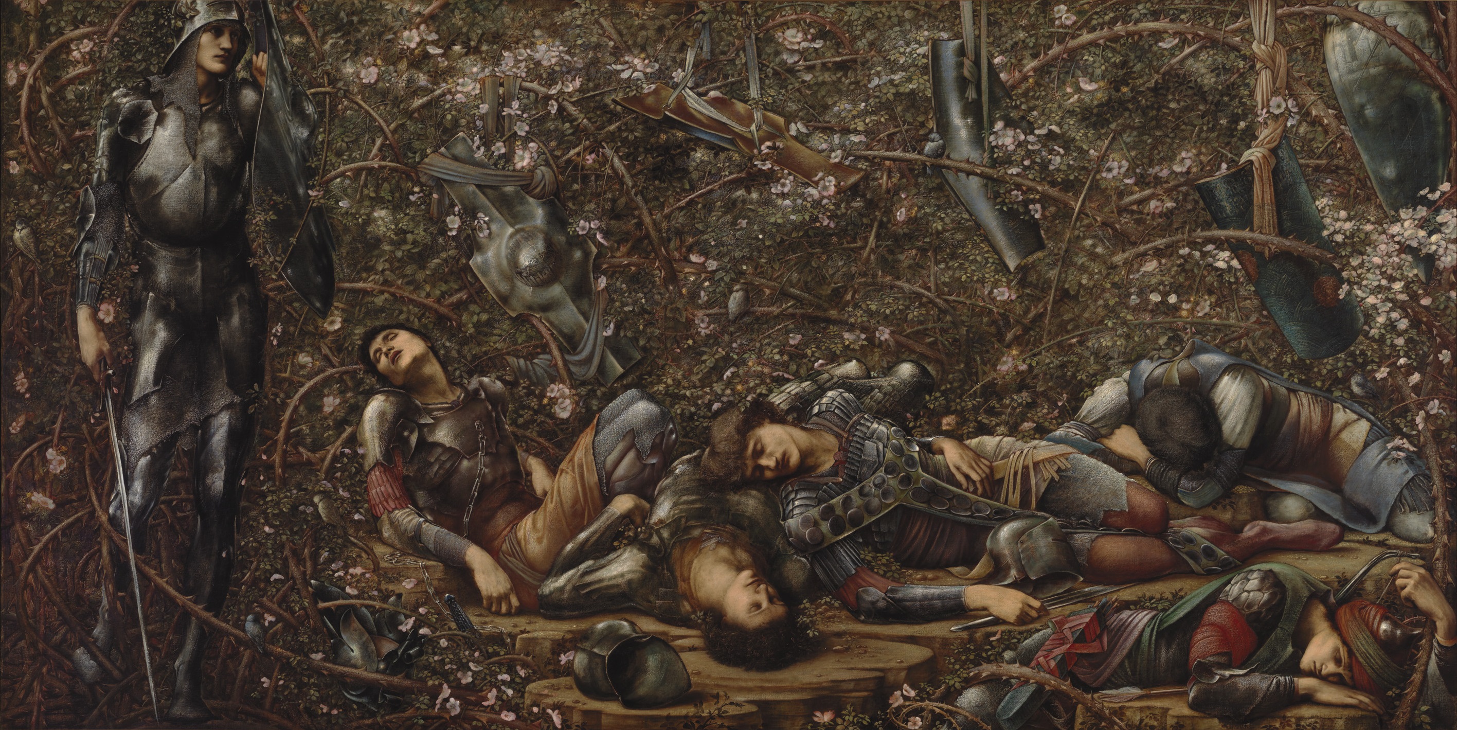
The Briar Wood (1874 to 1878) Picture one in the Briar Rose series, by Edward Burne-Jones. The Faringdon Collection Trust
People sleeping and dreaming are his subjects. Even when supposedly awake, all his figures look as if they’re sleep-walking through the situations he places them in.
The figures are tall, statuesque, rather elongated. If nude, they have beautifully defined musculature, if clothed the men, in particular, are often wearing fascinatingly detailed armour, while the women wear long gowns whose convoluted folds he captures with shimmering sensuality.
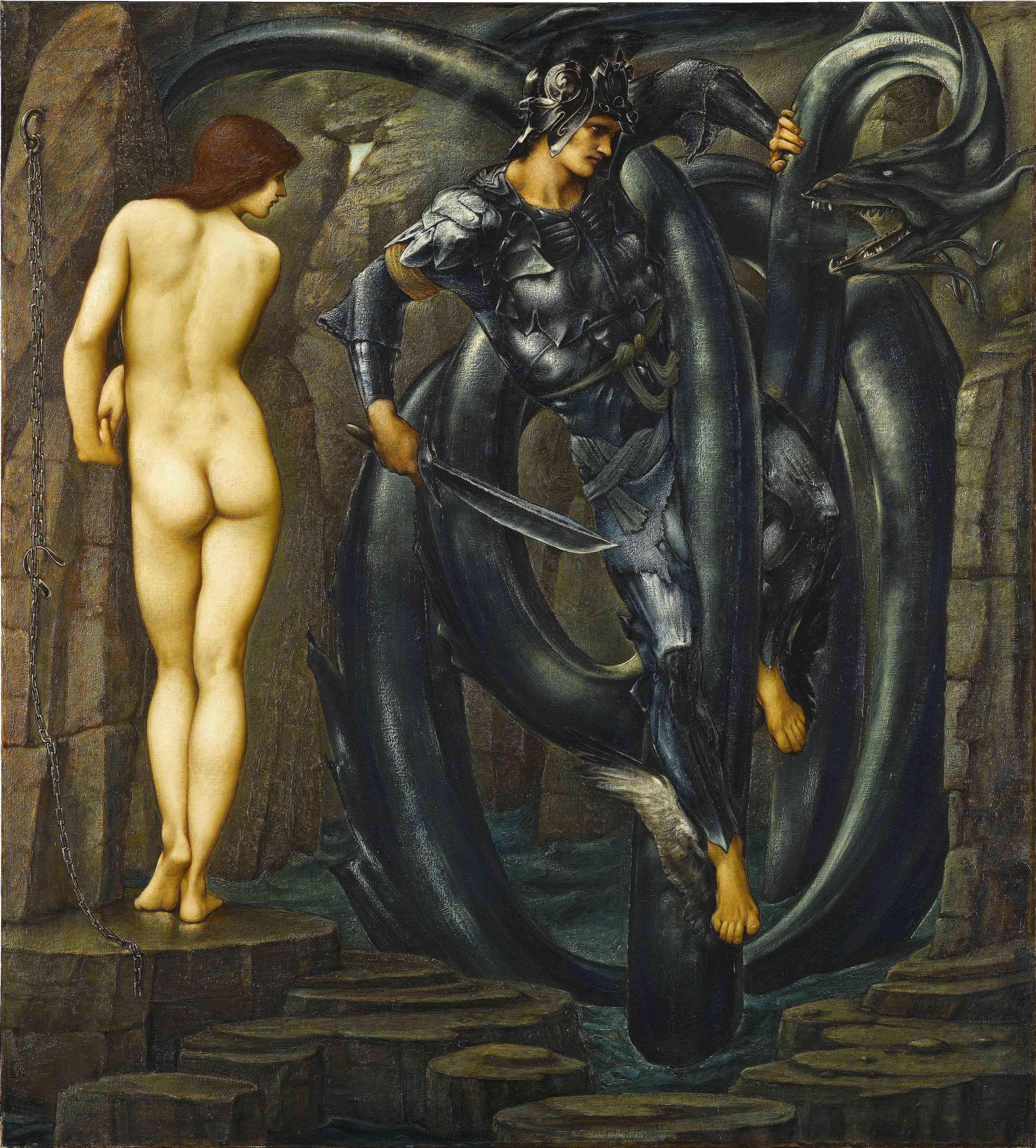
This painting, from a series depicting the legend of Perseus and Andromeda, shows all these features – human figures elongated, the (admittedly delicate but well-defined) musculature of the nude woman, and the fascinating style of armour Perseus is wearing, like no armour any real medieval warrior ever wore, almost cyber-punk in its fetishistic detail.
The Doom Fulfilled by Edward Burne-Jones (1888). Staatsgalerie, Stuttgart
Many exhibitions I’ve been to at Tate Britain set out to prove a thesis, but this show is a return to an older, more traditional type of curating, which sets out simply to explain and delight.
Serena Thirkell
I recommend buying the audioguide. It has four voices on it:
- exhibition curator Alison Smith
- an art scholar who’s a long-standing fan of Burne-Jones but whose name I didn’t get
- novelist Tracey Chevalier
- but by far the most interesting voice is that of Burne-Jones’s great, great, grand-daughter, Serena Thirkell
Serena’s memories are fascinating of growing up in a house where some of these famous paintings hung in the hall or dining room, and how she and the other small children were attracted, frightened and fascinated by them.
I particularly liked her take on the amazingly sumptuous painting, King Cophetua and the Beggar Maid. To the adult eye there are all kinds of things going on in it, from the (typically strange) armour of the king to the (typically blank) expression on the beggar maid’s face, to the heads-together pose of the two figures at the balustrade – obviously inspired by pre-Raphael Renaissance paintings – and ditto the carefully delineated leaves of the olive branches poking in from the left.
But what Serena remembered was the avenues of escape from the picture, the way she and her little friends could imagine scampering up the stairs to the gallery, and then through the window into the lovely Italian landscape you can glimpse outside. And how this sense of escape was balanced by the sense of threat created at the other end of the painting – caused by the narrowing, claustrophobic steps going down, past the king’s knees and feet, down, down towards… what scary darkness?
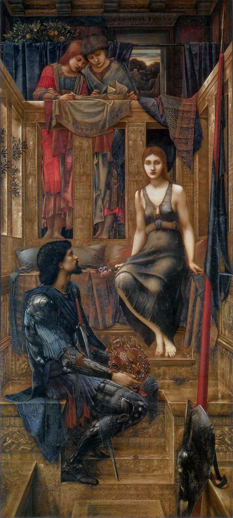
King Cophetua and the Beggar Maid by Edward Burne-Jones (1884)
Her memories remind the listener that you don’t always have to respond to art with sophisticated theories or abrasive gender politics. Sometimes you can let yourself be swept off your feet to fairyland. Few artists devoted as much energy to creating that effect as Burne-Jones.
Seven rooms
The exhibition is arranged into seven rooms:
- 1856 to 1870 Apprentice to Master
- Burne-Jones as a draughtsman
- 1877 to 1898 Exhibition paintings
- Portraits
- The series paintings – The Perseus series
- The series paintings – The Briar Rose
- Burne-Jones as a designer
Unusually, Burne-Jones didn’t attend art school at all. He began studying theology at university, before packing it in and essentially teaching himself art.
His theological knowledge and the iconography of Christianity i.e. the figurative depiction of key moments – the Annunciation, various saints though not, tellingly, the Crucifixion itself – stayed with him for the rest of his career.
Later in life Burne-Jones collaborated on designing stained glass windows for churches, which were produced in the factory of his close friend, William Morris. It’s estimated that he produced the designs for over 650 stained glass windows, which is why many of the patterns and designs in the final room, ‘Burne-Jones as designer’, seem so familiar. Anyone who visits English parish churches will have been exposed to his pervasive influence.
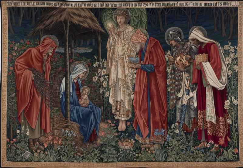
Adoration of the Magi (1894) by Edward Burne-Jones. Victoria and Albert Museum
Room two shows how much effort Burne-Jones put into practicing drawing and sketching, especially on the four big trips he made to Italy during the 1870s, where he copied and studied extensively from the Renaissance Old Masters. Some of the sketches are breath-taking – of hands in different poses, or feet, the elaborate depictions of the folds of dresses, not to mention a standout sketch of a flowering plant and a page of sketches of birds. What an eye, what a hand!
Desiderium (1873) by Edward Burne-Jones. Tate
This room also contains some surprisingly comic insights into his private life. Burne-Jones enjoyed a long friendship with the novelist Elizabeth Gaskell, and the exhibition shows some of the comic cartoons he included in his letters to her. He depicts himself in these as a skinny, long-bearded, mournful man, which creates an irresistibly comic effect when placed next to the caricatures of his bosom buddy, the big, super-energetic, wild-haired William Morris. I laughed out loud at the cartoon he drew of himself falling asleep in a chair while Morris passionately declaims one of his interminable epic poems.
Room three is amazing – full of massive ‘exhibition’ paintings, made to stun his contemporaries and sell to rich patrons. Love Amid the Ruins, The Beguiling of Merlin, The Golden Stairs, Laus Veneris, The Wheel of Fortune and half a dozen other enormous, strange, haunting, remote, dreamy images, pregnant with meaning, in which movement isn’t really movement at all.
Reminiscent, it occurred to me, of Botticelli whose Spring or Birth of Venus both show supposedly dynamic images in which, in fact, nothing is really moving.
The Tree of Forgiveness by Edward Burne-Jones
Perseus
But the real Burne-Jones’ fan will be transported to heaven by rooms five and six. These recreate in their entirety the two most important series of paintings which Burne-Jones created. Room five contains the ten paintings he created to depict the Greek myth of Perseus between 1875 and 1885. The original idea was to hang ten oil paintings, interspersed with four relief panels on oak wood, all carefully arranged and lit so as to transport you into a mythic world of the imagination.
Only four of the planned ten were worked up into finished oil paintings (including The Doom Fulfilled, shown above) and the curators have hung these four, along with cartoons (actual size preparatory works) of the other six, plus one completed oak relief, placing them all in order so you can follow Burne-Jones’s huge and powerful depiction of the story through in order.
It’s a great bit of curating, which really works. Above all it shows you how muted, dulled and misty his palette was. And makes you realise this was always his style.
The Laus Veneris, which is used as a poster for the show, is in fact quite unrepresentative of most of the other paintings here, in its use of bright orange for Venus’s dress. Even in the first room of early works, his faces are softened and blurred, the colours are dark and misty. As the years passed he perfected the technique of using colour, but making all the colours submit to the same muted tonality.
The briar rose
A kind of silvery blue-black dominates the Perseus series and helps them to cohere, tonally. Whereas, when you step into room six, you are enveloped in the Briar Rose series, four massive paintings depicting the early parts of the Sleeping Beauty fairy story, where a kind of muddy brown dominates and unites the compositions.
The Garden Court (1874 to 1884) by Edward Burne-Jones. The Faringdon Collection Trust
There are scores of incidental pleasures to be had along the way, noticing how the sketched birds are incorporated into later paintings, spotting the influence of Michelangelo in the more muscular figures, or of Mantegna in some of the amazingly detailed swirling gowns.
The room of portraits caters to people who like gossip about artists, featuring as it does portraits of his daughter Margaret, his long-suffering wife Georgiana, several of the lady friends with whom he enjoyed passionate friendships (Amy Gaskell and Lady Windsor) his longstanding patron, William Graham, and so on, with a bit of juicy gossip behind each one.
Burne-Jones and European symbolism
But what interested me more was the link the exhibition helps you to make between later Burne-Jones and the European Symbolist painters of the 1880s and 1890s. The subject matter of both is generally the figurative depictions of human beings – realistic, easy to decode and relate to.
And yet stylised in powerful ways which seem charged with mysterious meanings. Especially all those women with the same faces, the same large eyes, the same vacant stare, the same elongated bodies draped, folded, bent in positions of sleep and languor – compositions pregnant with a meaning just beyond the mind’s grasp.
Some of the unfinished Perseus series, especially the one about Perseus’ encounter with Atlas, could be by a European Symbolist, transmuting what ought to be the straightforward telling of a well-known myth into something altogether new and haunting. The figures inside the globe Atlas is holding are depictions of the signs of the Zodiac, and yet they are the Zodiac symbols come to life and seeming to interact in strange and unknowable ways…
Atlas Turned to Stone by Edward Burne-Jones (1872), a peculiarly Symbolist work. Southampton City Art Gallery
Some people don’t like Burne-Jones’s big-eyed damsels, or jewelled dreamscapes. They see his entire visions as a creative dead end which helped maintain a kind of anti-modern, British philistinism right up to the end of the 19th century and beyond, while, throughout this period, the French were busy inventing modern art just 50 miles across the Channel.
But it is now 2018. We are well into post-post-modern art, into the era when the internet makes everything available to everyone, when there are no longer movements with fierce adherents and bitter opponents. The stakes are no longer so high or so intense. We can like whatever we want to. I thought this was an absolutely wonderful exhibition – the room of the Sleeping Beauty panels is worth the admission price alone.
The promotional video
This shaky handheld video gives you a good sense of what the show is like.
Related links
- Edward Burne-Jones continues at Tate Britain until 24 February 2019
- Room by room guide to the exhibition
Newspaper reviews
- Evening Standard review by Melanie McDonagh
- Guardian review by Jonathan Jones
- Telegraph review by Mark Hudson

