Inspired by the East: how the Islamic world influenced Western Art @ the British Museum

European explorers

As John Darwin’s brilliant history of Eurasian empires, After Tamerlane, makes clear, in the centuries after the death of Tamerlane the Great in 1405, quite a few things distinguished European culture from the cultures of the other Eurasian empires (i.e. the Ottoman Empire based in Turkey, the Safavid Empire in Persia, the Moghul Empire in northern India, the Chinese Empire and the Japanese Empire).

Just two of them were 1) a readiness, on the part of the Europeans, to travel and explore, and 2)  an endless curiosity which led to almost obsessive collecting and categorising and curating and exhibiting.

No Chinese explorers visited Europe during the 19th century and were so dazzled by its history and architecture and art that they made copious sketches and drawings, took photographs, bought up every quaint European curio they could get their hands on, and carried them all back to China to catalogue and categorise and trigger an artistic renaissance.

That kind of thing just didn’t happen because few Chinese travelled abroad. Very few wanted to, or had the means to, and anyway it was frowned upon because every educated Chinese knew that the Celestial Empire was the centre of the universe, the possessor of a perfect culture, which didn’t need or want to know anything at all about the outside world, overrun as it was by cultureless barbarians.

And Darwin shows how this complacent and self-centred attitude was echoed by the cultural and political elites of Japan, Moghul India, the Safavid Empire and the sprawling Ottoman Empire, for centuries.

No, the wandering, exploring, collecting bug seems to have affected Europeans on a completely different scale from any of the world’s other civilisations.

Thus it was that from the 1500s onwards a steadily increasing stream of travellers, explorers, soldiers and sailors, archaeologists and artists travelled all over the Muslim lands lining the North African coast and the Middle East – territory nominally under the control of the extensive Ottoman Empire – to explore and describe and paint and buy and plunder.

Inspired by the East

This ambitious exhibition delves into one aspect of this huge European enterprise by looking at the long and complex history of cultural interchanges between the Islamic Middle East and Europe from about 1500 onwards.

Not surprisingly several of the earliest objects are swords and helmets since the single most important fact about Islam is that it was a conqueror’s religion, spread by highly organised and zealous Arabs as they exploded out of Arabia in the 7th and 8th centuries to seize the Christian Middle East and North African coastline.

Gilt-Copper helmet, Turkey (about 1650) © Islamic Arts Museum Malaysia

The Ottoman Empire

The Ottoman dynasty which began its rise to prominence in the 1200s was itself just the last in a line of dynasties which had vied for leadership of the Muslim world since the birth of Islam in the 630s.

The Ottoman Turks rose to dominate the area we call the Middle East during the period 1300 to 1453 (the year when the Ottomans seized Christian Constantinople and made it into their capital, Istanbul). I’ve reviewed several books about the decline of the Byzantine Empire as it came under relentless pressure from successive Muslim rulers, until its eventual fall to the Ottomans.

The Ottoman heyday is usually dated from the year of the fall of Byzantium – 1453 – to around 1600, during which they extended their power across all of North Africa and deep into Europe. It’s salutary to remember that twice the Ottoman army besieged Vienna, in 1526 and 1683, and was only just defeated both times i.e. they could have penetrated even further into Christian Europe.

As it was, throughout this period the Ottomans ruled the extensive territory of former Christian Europe which we call the Balkans, as well as Christian Greece and Christian subjects in numerous Mediterranean islands.

Mainly Victorian

A handful of pieces and a few wall labels in the exhibition gesture towards this long and complex early history of Ottoman rise and conquest and domination, including the striking portrait of Sultan Bayezid I by a painter from the school of Veronese, which has been used as the poster for the show.

A Portrait of Sultan Bayezid I by a member of the School of Veronese (c. 1580) © Islamic Arts Museum Malaysia

But the exhibition really focuses on works from the much later period of the 19th and early 20th centuries, partly for the simple reason that the period 1800 to the outbreak of the Second World War saw a steadily increasing number of European travellers to North Africa and the Middle East.

Some of this was simply a function of continually improving transport, sailing ships giving way to steamships, the steady spread of railways, the industrial revolution creating a new leisured class, especially in Britain and France, who wanted to see the world, helped along by firms like Thomas Cook which launched its first cruises in the 1870s.

Many devout Victorians, such as the Pre-Raphaelite artist William Holman Hunt, wanted to tour the Holy Land and see for themselves the places where Our Lord had stood. Flocks of visitors drew and sketched and painted watercolours and oils and bought all manner of souvenirs, carpets and clothes, tiles and glasswork. By the time of the Great Exhibition of 1851 the British public was highly aware of the extremely diverse and colourful cultures of the peoples it ruled over.

But the thesis of this exhibition is that the Islamic culture of the Ottoman Empire bore a uniquely close and fractious relationship with Europe, was the predominant colonial and foreign cultural ‘Other’ for Europe throughout the period – a kind of backward cousin, a slothful and declining ‘Orient’ against which we could measure our ever-growing knowledge, technology and power. And that a huge number of craftsmen and artists and metalworkers and glassblowers and designers and artists and architects were particularly dazzled and influenced and inspired by Islamic and Middle Eastern art and culture.

So this exhibition, Inspired by the East, aims to bring together a wealth of artifacts to show a) some of the original Islamic arts and crafts from the era and b) the impact Islamic architecture, designs and patterns had on European craftsmen, artists and designers through a large selection of European objects.

Enamelled glass lamp made by Philippe-Joseph Brocard, France (about 1877)

Thus the exhibition includes wonderful, ornate and beautiful examples from a whole range of media and crafts such as:

  • tiles
  • glasswork
  • ceramics
  • metalwork
  • jewellery
  • clothing
  • architecture
  • design

I was interested to learn there was a genre called ‘costume books’ which simply showed the costumes of all the new races and peoples Europeans had discovered as they expanded and explored from the 1500s onwards and which, of course, featured books devoted to the clothes and garments of the Middle East.

I learned that all kinds of products by Islamic artisans were prized in the West from early on, such as Egyptian metalwork and Persian ceramics. During the 19th century Western craftsmen could use developing technology to reproduce much of this work. The exhibition includes Arab-inspired ceramics by Théodore Deck, a leading French ceramicist who in the late nineteenth century created a range of pieces directly inspired by Islamic originals.

Nearby is a section devoted to Owen Jones, one of the most influential tastemakers of the Victorian era. His pioneering studies on colour theory, geometry and form still inspire designers to this day. Jones was an architect, designer and design theorist and was Superintendent of Works for the 1851 Great Exhibition. His masterpiece was Grammar of Ornament, a huge and lavish folio displaying stunning patterns, motifs and ornaments in 112 illustrated plates, many of which featured Islamic decorations and motifs. Some of the Islamic plates from the book are on display here.

But but but… I was struck by several obvious problems.

Number one was that most of the works on display are by Europeans. They are not original works by the Islamic craftsmen and artists who are so praised. They are European copies, displayed with the intention of showing how widespread the impact of Islamic styles and motifs was on the European arts. If you’re looking for a world of authentically Islamic arts and crafts you’d do better to go the V&A.

Number two was that, despite the beauty of individual works, it became difficult to avoid a sense of scrappiness, a sense that the curators are trying to cover a lot of ground, in fact an enormous subject – the impact of the Muslim world on the art and culture of the West – with a surprisingly small range of exhibits.

Take my home area, history: A few helmets and a sword are accompanied by a paragraph or two about the extent of the Ottoman Empire – but this, the military rise and dominance of the Ottoman Empire, is a huge, a vast subject, which I felt was barely scratched and whose omission made the entire show feel one-sided i.e. presented only the Europeans as aggressive colonialists whereas, as I’ve explained, it was the Muslims who originally conquered half the Christian Mediterranean.

Similarly, the friend I went with is mad about Islamic tiles so was pleased to see a display of half a dozen beautiful and ornate tiles – but disappointed that they turned out to be made by a Victorian British manufacturer using Islamic motifs – and that that was it when it came to tiles.

Islamic architecture is distinctive and beautiful and exists over half the world, but it was dealt with via just a few British buildings which used Islamic motifs, such as the well-known artist Lord Leighton’s famous house in West London which he had modelled inside to recreate some of the rooms from the Alhambra in Spain, namely ‘the Arab Hall’. Leighton had the place covered in Islamic tiles designed by William de Morgan. There are photos of the interior and a lovely wooden model but… is that it?

The single most dominant impression was made by the paintings, a few scattered in the early sections but then leading up to a huge wall displaying about 20 classic, late-Victorian, Orientalist paintings.

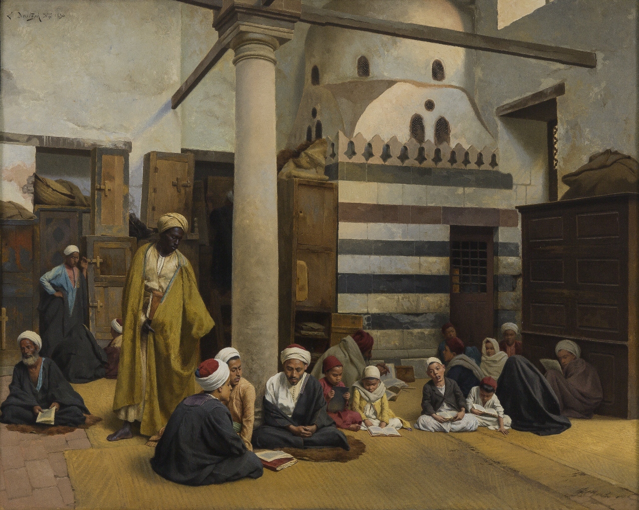
In the Madrasa by Ludwig Deutsch (1890) © Islamic Arts Museum Malaysia

Orientalism

This brings us to the several meanings of ‘Orientalism’, a word and idea which are raised early in the exhibition and then referenced throughout.

1. The word Orientalism was originally, during the 19th century and first half of the 20th, a value-neutral term applied to all or any scholars, linguists, archaeologists or artists who specialised in ‘the Orient’, a vague expression generally taken to be Islamic North Africa and Middle East but sometimes stretching to include India. It survives in this neutral sense in many places to this day, for example in the name of London’s School of Oriental and African Studies.

2. However, the term underwent a revolutionary change in 1978 when the Palestinian-American scholar Edward Said published his academic study Orientalism. In this book Said subjected the so-called ‘scholarly’ works of 19th century Orientalist academics to in-depth analysis in order to support one big radical idea: that almost all the supposedly scholarly and academic books and ideas produced by European scholars about the Orient were the witting or unwitting handmaids of Western Imperialism.

Almost all the nineteenth-century Orientalists declared the Ottoman Empire corrupt and stagnant, Islam itself incapable of change. The people living there were stereotyped as somehow more primitive, dressing in loose but colourful clothing, slothful and lazy and corrupt.

Probably the most notable idea was the fascination the institution of the harem had for repressed Westerners who projected all kinds of sexual fantasies onto Oriental woman and painted no end of soft porn depictions of the sultan and his slaves and concubines and slave auctions and so on.

So powerful was Said’s critique that it spread and prospered in the academy, becoming the new orthodoxy and casting a critical shadow back over everything written or painted about the Middle East in the previous 200 years or more. Since its publication almost everything any European said, wrote or painted about the Ottoman Empire has been reappraised to appear in a much more sinister light, either furthering malicious racist stereotypes, aiding in imperial exploitation, or the shameless appropriation of a weaker culture’s art and designs.

Schizophrenia

Now the woke young curators of this exhibition are fully paid-up subscribers to Said’s unforgiving views about Western exploitation of the Middle East. This isn’t a guess on my part. They quote page one of Orientalism in the very opening wall label which introduces the exhibition:

The Orient is not only adjacent to Europe; it is also the place of Europe’s greatest and richest and oldest colonies, the source of its civilizations and languages, its cultural contestant… The Orient is an integral part of European material civilization and culture.

And every other wall label takes pains to remind us that the plate or vase or tile or translation of The 1001 Nights or any other cultural product which we’re looking at and which references Islam may well seem beautiful to us but, tut tut, we should be aware that it was part of the wicked European fashion to appropriate Islamic patterns for vases or the exploitative trend for mock Moorish architecture, or the thieving use of Arabic script in picture frames and so on.

And that behind all of this detail, all of these individual examples of cultural appropriation, lies the huge looming shadow of Western Imperialism!

Four tiles by William De Morgan & Co, Britain (1888 to 1897)

Cumulatively, these hectoring labels and panels created, for me at any rate, a strange sense of schizophrenia. In one and the same wall label the curators might both praise the craftmanship of a western tile maker or architect – and yet accuse them of being part of the general movement of cultural appropriation. Praise and damn almost in the same breath.

As so often in modern exhibitions, I began to feel that I got more visual and aesthetic enjoyment if I just stopped reading the hectoring labels – felt less harangued and nagged to feel guilty about things which happened 150 years before I was even born.

Orientalist painting

It’s probably in painting that the Orientalist issue is most obvious, or most familiar to most of us because the antique shops of the West are awash with third-rate late-Victorian depictions of the Arab world, of mosques, old men in long gowns with even longer beards, camels crossing the desert, Oriental markets, scantily dressed concubines and so on.

Said’s idea is that, although these images are fairly harmless looked at individually, taken together they become condescending, sexist and racist, depicting a fantasy world of harems and sultans, long-gowned scholars in picturesque mosques, colourful markets or the desert at dawn – all of which, taken together, creates a patronising distortion of the complex realities of the many peoples and tribes and ethnic groups and nations scattered across North Africa and the Middle East.

Moreover, taken together, they all tend in the same direction, promoting an ideology claiming that all these cultures and peoples might well be noble and beautiful, but were also backward and in decline, and therefore needed to be taken in hand, taken over, guided and ruled by us, the enlightened West.

At Prayer by Ludwig Deutsch (1923)

The big wall hanging of twenty or so massive Orientalist paintings which I mentioned earlier are obviously meant to represent a kind of ‘Wall of Shame’. Tut tut, we are encouraged to think: look at all these stereotypical markets and mosques and rugs and carpets. Look how oppressive they are.

However, I just didn’t feel the moral outrage I think the curators intend us to feel. The real impact of hanging so many Orientalist paintings next to each other was, in my opinion, to make you feel a bit sick, as if you’d been let loose in a sweetshop and eaten everything in sight. They are self-consciously opulent and gorgeous to the point of absurdity.

Another, more objective result of examining so many of these over-ripe productions was that, pace Said, most of them are not from the imperial nineteenth century, nor, surprisingly, were many of them produced by the classic imperialist powers who carved up the Middle East between them, France and Britain.

At least half of them were from the twentieth century, many from after the Great War (the two above are from 1913 and 1923). And quite a few were by either German or American painters, not by the cultural Anglo-French cultural appropriators. Neither the Germans nor the Americans had any colonial presence in the Middle East till well after the Great War and even then, not very much.

Orientalism or Romanticism?

As I read yet another wall label pointing out how the Orientalist painters fantasised and romanticised and embellished lots of the subjects they painted, as if this was a shockingly immoral and exploitative thing to do, a simple thought occurred to me: Didn’t all 19th century artists?

There are thousands and thousands of Victorian genre paintings which romanticise and glamorise all kinds of subjects, from their own working classes (cf the exhibition of cheesy paintings of Victorian children I saw earlier this year at the Guildhall) to windswept Hebridean crofters.

In other words, wasn’t the entire artistic movement of Romanticism about, well, stereotypically romantic subject matter – about mountains and storms at sea and heroic adventures and tormented heroes and shy maidens with heaving bosoms who needed rescuing from dragons (I’m thinking of the amazing late-Victorian fantasies of Edward Burne-Jones as recently displayed at Tate Britain).

The same exaggerated depiction of popular conceptions of subjects was applied to everything – I bet medieval knights weren’t as manly and knightly as they appear in Victorian paintings, that Highland crofters weren’t as proud and noble, or our brave soldiers quite as manly and beautifully kitted out, as they appear in those big hearty late-Victorian paintings.

Don’t all Victorian paintings depict extravagant stereotypes in lush and glamorous colours? In other words, there is nothing particular or exceptional about this hyper-romantic style being applied to ‘Oriental’ subjects: it was applied to countless other subjects as well.

The Guard by Antonio María Fabrés y Costa (1889)

The harem

I was especially looking forward to the section about the harem, not because I was expecting to be particularly titillated but because I was looking forward to the riot of outraged feminist commentary it would provoke.

After all, one of the most obvious and much-repeated claims of anti-orientalist literary critics, feminists and curators is that Western white men used the Ottoman institution of the harem as a pretext to concoct a vast number of soft porn, erotic fantasies which bore no relation to reality at all, but merely satisfied the gloating gaze of fat, rich, white, male collectors. Pale, male and stale. Gammons etc.

So a surprising single thing about this exhibition of Western depictions of the Orient is the complete absence of even one decent painting showing a classic, late-Victorian harem scene. Not one. No book about Orientalism is complete without a cover depicting a sexist Orientalist image or a chapter of objectifying Oriental women, so I was puzzled.

I thought I must have missed a room somewhere and went back through the exhibition to check, but eventually realised that the little collection of five or so chaste drawings and one painting – none of which show a nude woman, all of them very restrained – is all they have! There’s a tiny photo of one of the classic nude-in-a-Turkish-bath paintings by Ingres, but none of the thousands of huge colourful harem scenes by him or Eugène Delacroix or John Frederick Lewis or any number of their followers and copiers.

At some point it dawned on me the the feminist curators of the exhibition might simply have been enacting their own principles, and not hanging pictures they deplore. Maybe the absence of those kinds of stereotyped images was itself a statement of intent.

Off to one side there is one little drawing of a woman playing a musical instrument by a French artist we are assured, by the conscientious curators, was a notorious Orientalist. Does this image strike you as being offensively racist and sexist, stereotyping the Orient and providing visual underpinning for Western imperialism? Because that is the intellectual framework or ideology within which the entire exhibition exists.

Study of a girl playing a stringed instrument by Jean Léon Gérôme (1886)

This little sketch sort of raises a politico-aesthetic question, because the curators point out that the artists, Jean Léon Gérôme, was well known for the meticulous sketches and drawings which he made, preparatory to creating an oil painting. Which made me reflect: in what way can these artists be accused of peddling lazy stereotypes if they were carefully and meticulously depicting what they saw, what was actually in front of them?

The sex object bites back (or photographs itself wearing clothes)

The absolute of real killer harem scenes is all the more puzzling because it is meant to set up the final part of the exhibition, which is devoted to contemporary works by modern Muslim women artists.

The curators have chosen to interpret these contemporary Muslim women artists as responding to the despicable tradition of Western Orientalism. They are ‘speaking back to Orientalist representations of the east’. They are ‘subverting and undermining works by earlier European and North American artists’.

But alas the curators’ plan doesn’t really work because we have not seen any of the sexy, sexist Orientalist representations of the east which these contemporary artists are kicking back against. We pretty much have to imagine them, or remember them from other exhibitions or books.

In fact I thought all four of the women artists on display here were very good, very very good, in their way better than the rest of the exhibition. Best of the four was a triptych of images by Lalla Essaydi, part of a large series of works titled Women of Morocco.

In them Essaydi, or her models, adopt the poses of the scantily-clad women draped around in famous Orientalist paintings, only here the women are chastely and Islamically dressed and – and this is the distinctive thing, from a visual point of view – both they, their clothes and the studio backcloths are covered in Islamic script. I thought it was a brilliant idea, brilliantly executed, to produce really vibrant and exciting images.

Les Femmes du Maroc by Lalla Essaydi (2005) © Lalla Esaydi

Conclusion

Inspired by the East feels, in the end, like a rather thin exhibition.

Firstly, it claims to be a look at the interaction between East and West, so you’d expect it to be divided into two parts; How East affected West and how West affected East.

As noted, there’s plenty of examples of the way Westerners appropriated Eastern designs and motifs and patterns, architecture and design (although this felt like a much larger subject which really deserved to be investigated in much greater depth – All over London are buildings which incorporate Islamic motifs; if you add in tiling and ceramics and metalwork you have a huge subject).

But as to West affecting East, this section felt very skimpy indeed, with just one small room showing a couple of photo albums by pioneering photographers in Istanbul and a map or two. Is that it?

Secondly, there is the big shadow of Edward Said and his embittering theory of Orientalism threaded throughout the show, the premise that all depictions of the Middle East and all forms of appropriation of its culture were handmaidens to the wicked, Western imperial exploitation of the area.

But this rather harsh and inflexible approach militates against the more nuanced vibe of the ‘cultural interactions’ parts of the show. One minute the curators are praising Western craftsmen; the next they are berating the subtle cultural imperialism of copying Islamic designs.

Hence my comment about the unsettling schizophrenia I thought the show suffered from.

3. And when I got to the section on the harem and realised how tragically thin it was, it suddenly crystallised for me how skimpy the rest of the exhibition feels. It feels like it’s trying to address two or three really big issues and not quite doing any of them quite properly.

Alhambra vase, Spain 1800–1899 © Islamic Arts Museum, Malaysia

Writing versus art

I read Orientalism at university four or five years after it was published, when it still had ‘the shock of the new’, before it settled down to become the new orthodoxy taught to each new generation of humanities and art students.

And Said’s book is almost entirely concerned with Orientalist writing – with the supposedly factual works of Orientalist ‘scholars’ (who he systematically debunks) and with the Western literary writers who perpetuated stereotypes about the Exotic East (Byron, Nerval, Flaubert just for starters).

A lot of this kind of writing was produced in the nineteenth century and so Said had a rich vein to draw on, and was able to show how the supposedly ‘scholarly’ writing, and the literary works, easily morphed into official, governing and imperial writing, could be co-opted into government reports and assessments, how anthropological studies could be quoted in business cases for invading Egypt, say, or Iraq.

But it is much harder to divine a particularly patronising, racist or imperialist motive behind a set of porcelain which just happens to use an Islamic motif, or in picture frames which use Arabic script as decoration, or in glassware which incorporates Islamic patterns.

It’s easier to imagine that they were just one among the millions of other ranges of pottery and ceramics and frames produced during the consumer boom of the nineteenth century, which cannibalised motifs and patterns from all available sources – from India and China and Japan to name just a few – if it produced something which would sell.

To see most of the objects in this exhibition as part of an enormous explosion of art and crafts products which catered for the burgeoning middles classes as, to some extent, they still do today.

So my last thought is that maybe the bittiness and thinness of the exhibition is owing to the fact that the curators are trying to illustrate a basically literary theory with works of art and museum objects. And not nearly enough of them to really round out the argument.

Whatever the reason, for me this exhibition contained an entertaining pot-pourri of lovely objects, but didn’t really hang together either as history, or as a sustained exploration of the themes it purports to address.

Promotional video


Related links

More British Museum exhibition reviews

A Closer Look: Colour by David Bomford and Ashok Roy (2009)

This is another superbly informative, crisply written and lavishly illustrated little book in The National Gallery’s A Closer Look series. To quote the blurb:

A Closer Look: Colour explores how painters apply colour, describes different types of pigments, and outlines optical theories and artists’ treatises. The authors explain the effect on colour of the artist’s chosen medium, such as oil, water or egg tempera, and the dramatic impact of new pigments.’

It ranges far and wide across the National Gallery’s vast collection of 2,300 art works, selecting 80 paintings which illustrate key aspects of colour, medium and design. The quality of the colour reproductions is really stunning – it’s worth having the book almost for these alone and for the brief but penetrating insights into a colour-related aspect of each one.

They include works by Seurat, Holbein the Younger, Corot, Duccio, David, Chardin, Ghirlandaio, Monet and Van Dyck in the first ten pages alone!

Aspects of colour

Colour quite obviously has been used by painters to depict the coloured world we see around us. But it has other functions, too. Maybe the two most obvious but easily overlooked are: to represent depth and create the optical illusion of three dimensions on a two dimensional surface; and to reinforce this by indicating sources of light.

Depth A common indication of depth is recreating the common observation that objects at a distance fade into a blue-ish haze. This is often seen in Renaissance paintings depicting increasingly hazy backdrops behind the various virgins and main figures. This is known as aerial perspective.

Light Sources of light need to be carefully calculated in a realistic painting. The book shows how the effect of light sources is achieved by showing glimmers of white paint on metallic objects or even on duller surfaces like wood. There is a particularly wondrous example in Lady Elizabeth Thimbelby and her Sister by Anthony Van Dyck. The authors give a close-up to show how the colour of the yellow dress worn by the main subject is reflected on the bare skin of of the little angel, and even in the catchlight in his right eye, an indication of the depth of thought which goes into his compositions.

Shadows turn out to be an entire subject in themselves. For centuries painters improved their depiction of shadows, at first using grey colours for the shadows of buildings, but quickly realising that the most shadowed things around us are fabrics. Dresses, cloaks all the paraphernalia of costume from the Middle Ages to the turn of the 20th century, involved reams of material which folded in infinite ways, all of them a challenge to the painters’ skill. At the very least, painting a fabric requires not one but three colours: the core colour of the fabric itself, the fabric in shadow, the fabric in highlight, reflecting the light source.

The human eye is not a mechanical reproducer of the world around us. It has physiological quirks and limitations. The book evidences the way that, dazzled by orange sunsets, the human eye might well see evening shadows as violet. Quirks and oddities like this were known to various painters of the past but it was the Impressionists who, as a group, set out to try and capture not what the rational mind knew to be the colour, but the colours as actually perceived by the imperfect eye and misleadable mind.

Emotion In the later 19th century artists across Europe made the discovery that intensity of colour can be used to reflect intensity of emotion. Probably the most popular painter to do this was van Gogh whose intense colours were intended to convey his own personal anguish. This approach went on to become the central technique of the German Expressionist painters (although they aren’t represented in the book, along with all 20th century art, because the National Gallery’s cut-off point is 1900).

Symbolism In earlier centuries, more than its realistic function, colour had an important role in a painting’s symbolism i.e. certain colours are understood to have certain meanings or to be associated with certain people or qualities. The most obvious period is the Renaissance, when the Virgin Mary’s cloak was blue, Mary Magdalene’s cloak was red, St Peter’s cloak was yellow and blue, and so on. From early on this allowed or encouraged Renaissance painters to create compositions designed not only to show a (religious) subject, but to create harmonious visual ‘rhythms’ and ‘assonances’ based on these traditionally understood colour associations.

Pigments and Media

This is dealt with quite thoroughly in another book in the series, Techniques of Painting. There we learn that paint has two components, the binding medium and the pigment. Over the centuries different pigments have been used, mixed into different binding mediums, including egg, egg yolks, oil, painting directly into wet plaster (fresco) and so on.

Painting is done onto supports – onto walls, plaster, or onto boards, metal, canvas or other fabrics. All of these need preparing by stretching (canvas) or smoothing (wood), then applying a ground – or background layer of paint – to soak into the support. Painters of the 14th and 15th centuries used a white ground. In the 16th, 17th and 18th centuries, artists experimented with varying the tone of the ground, which significantly alters the colour of the works painted onto them.

Hardening Binding mediums dry out in two ways: watercolours and synthetic resin paints by simple evaporation. Drying oils such as linseed, walnut or poppy oil harden by chemical reaction with the oxygen in the air. Egg tempera, used extensively in the 14th and 15th century, dries by a combination of both.

This may sound fairly academic but it profoundly affects the whole style and look of a painting. Because tempera dries so quickly (especially in hot, dry Italy) shapes and textures are best built up by short hatched strokes.

This is a detail from the Wilton Diptych (1397) where you can see the way the skin of the Virgin and child and angels has been created by multiple short paint strokes of egg tempera.

Whereas, because oils are slow drying, they allow the artist to merge them into smooth, flowing, continuous transitions of colour. Oil paints = more flowing.

In this detail from Belshazzar’s Feast by Rembrandt, you can see how the gold chain has been rendered with a really thick layer of gold paint. Laying on very thick layers of oil paint is called impasto.

In general, oil paint looks darker and richer than paint made using water-based media such as egg tempera, glue or fresco, which appear lighter and brighter.

Age and decay Painting was, then, a highly technical undertaking, requiring the painter to have an excellent knowledge of a wide range of materials and chemical substances. Different media dry and set in different ways. Different pigments hold their colour – or fade – over time. And this fading can reveal the ground painted underneath.

One of the most interesting aspects of the book is the specific examples it gives of how some pigments have faded or disappeared – sometimes quite drastically – in Old Master paintings.

In Duccio’s The Virgin and Child with Saints Dominic and Aurea, the face and hands of the figures show clearly how the lighter pigments painted in tempera have faded or flaked off allowing the green underpaint to come through. The Virgin was not meant to look green!

Bladders to tubes Pigments had to be ground by hand and mixed in with binders in studios for the medieval and Renaissance period. There are numerous prints showing a Renaissance artist’s studio for what it was, the small-scale manufactory of a craftsman employing a number of assistants and making money by taking on a number of students.

In the 18th century ready-mixed pigments could be transported inside pigs’ bladders. The early 19th century developed the use of glass or metal syringes. But it was in 1841 that an American, John Rand, developed the collapsible metal tube. This marked a breakthrough in the portability of oil paints, allowing artists to paint out of doors for the first time. A generation later a new school arose – the Impressionists – who did just this. Jean Renoir quotes his father, the painter Pierre-Auguste, as saying:

Without paints in tubes there would have been no Cézanne, no Monet, no Sisley or Pissarro, nothing of what the journalists were later to call Impressionism.

Biographies of colours

Primo Levi wrote a classic collection of short stories based on The Periodic Table of chemical elements. It crossed my mind, reading this book, that something similar could be attempted with the numerous pigments which artists have used down the ages.

This book gives a potted history of the half a dozen key colours. It explains how they were originally produced, how different sources became available over the centuries, and how the 19th century saw an explosion in the chemical industry which led to the development of modern, industrially-manufactured colours.

Blue

  • Prime source of blue was the ultramarine colour extracted from the mineral lapis lazuli, which was mined in one location in Afghanistan and traded to the Mediterranean.
  • A cheaper alternative was azurite, which was mined in Europe but had to be ground coarsely to keep its colour, and is also prone to fade into green, e.g. the sky in Christ taking Leave of his Mother by Albrecht Altdorfer (1520). Many artists painted a basic wash of azurite and then used the much more expensive ultramarine to create more intense highlights.
  • Indigo is a dye extracted from plants. At high intensity it is an inky black-blue, but at a lesser intensity also risks fading.
  • A cheaper alternative was smalt, manufactured by adding cobalt oxide to molten glass, cooling and grinding it to powder. It holds its colour badly and fades to grey.
  • In the early 1700s German manufacturers stumbled across the intense synthetic pigment which became known as Prussian blue (the book gives examples by Gainsborough and Canaletto).
  • Around 1803 cobalt blue was invented.
  • In 1828 an artificial version of ultramarine was created in France

Thus the painters of the 19th century had a much wider range of ‘blues’ to choose from than all their predecessors.

The book does the same for the other major colours, naming and explaining the origin of their main types or sources:

Green

  • Terre verte was used as an underpaint for flesh tones in early Italian paintings
  • malachite
  • verdigris, a copper-based pigment was prone to fade to brown and explains why so many Italian landscapes have the same orangey-brown appearance
  • emerald green (a pigment developed in the 19th century containing copper and arsenic)
  • viridian (a chromium oxide)

Red

  • Vermilion, obtained by pulverising cinnabar, liable to fade to brown as has happened with the coat of Gainsborough’s Dr Ralph Schomberg (1770), which should be bright red.

Yellow

  • Lead-tin yellow in the Renaissance
  • from the 17th century lead-based yellow containing antimony known as Naples yellow
  • from the 1820s new tints of yellow became available based on compounds of chromium of which chrome yellow is the most famous
  • cadmium yellow

White

  • Lead white was used from the earliest times. It forms as a crust on metallic lead exposed to acetic acid from sour wine – highly poisonous
  • only in the twentieth century was it replaced by non-toxic whites based on zinc and later, titanium. Unlike all the pigments named so far, lead white keeps its colour extremely well, hence the bright white ruffs and dresses in paintings even when a lot of the brighter colour has gone.

Black 

  • A large range of black pigments was always available, most based on carbon as found in charcoal, soot and so on. Carbon is very stable and so blacks have tended to remain black.

Summary of colours

  1. Over the past 500 years there has been a large amount of evolution and change in the source of the pigments artists use.
  2. Colour in art is a surprisingly technical subject, which quite quickly requires a serious knowledge of inorganic chemistry and, from the 19th century, is linked to the development of industrial processes.
  3. Sic transit gloria mundi or, more precisely, Sic transit gloria artis. The net effect of seeing so many beautiful paintings in which the original colour has faded – sometimes completely – can’t help but make you sad. We live among the wrecks or decay of thousands of once-gloriously coloured artworks. Given the super-duper state of digital technology I wonder if anywhere there exists a project to restore all these faded glories to how they should look!

Disegno versus colore

Vasari, author of The Lives of the Great Artists (155) posed the question, ‘Which was more important, design or colour?’ As a devotee of Michelangelo, the godfather of design, he was on the side of disegno and relates a conversation with Michelangelo about some paintings by Titian (1488-1576) they had seen where Michelangelo praises Titian’s use of colour but laments his poor composition.

The art history stereotype has it that Renaissance Florence was the home of design, while Venice (where Titian lived and worked) put the emphasis on gorgeous colours. This was because Venice was a European centre for the production of dyes and pigments for a wide range of manufacturing purposes, not least glass and textiles.

In late-17th-century France the argument was fought out in the French Academy between Rubénistes (for colour) and Poussinistes (for drawing). Personally, I am more moved by drawing than colour, and a little more so after reading this book and realising just how catastrophically colour can fade and disappear – but, still, there’s no reason not to love both.

Optical theories

Isaac Newton published his Optics in 1704, announcing the discovery that when white light is projected through a prism it breaks down into primary colours, which can then be turned back into white light. Among its far-ranging investigations, the book contained the first schematic arrangement of colours and their ‘opposites’. It wasn’t until well into the 19th century, however, that colour charts began to proliferate (partly because they were required by expanding industrial manufacture, and the evermore competitive design and coloration of products).

And these colour charts bore out Newton’s insight that complementary colours – colours opposite each other on the circle – accentuate and bring each other out.

Colour Circle by Michel Eugène Chevreul (1839)

Colour Circle by Michel Eugène Chevreul (1839)

Colour circles like this systematised knowledge which had been scattered among various artists and critics over the ages. It can be shown that Eugène Delacroix (1798-1863) made systematic use of contrast effects, pairing colour opposites like orange-blue, red-green or yellow-violet, to create stronger visual effects.

On a simplistic level it was the availability of a) new, intense colours, in portable tin tubes, along with b) exciting new theories of colour, which explains the Impressionist movement.

The Impressionists were most interested in trying to capture the changing quality of light, but the corollary of this was a fascination with shadow. Apparently, impressionist painters so regularly (and controversially) paired bright yellow sunlight with the peculiar tinge of violet which is opposite it on the colour charts, that they were accused by contemporary critics of violettomani.

Some examples

The book lists the pigments used to create Titian’s Bacchus and Ariadne. The intense blue sky is made from ultramarine lapis lazuli, as is Ariadne’s drapery and the flowers at the lower right. The blue-green sea is painted with the cheaper azurite. Vermilion gives Ariadne’s sash its red colour. The Bacchante’s orange drapery was painted with a rare arsenic-containing mineral known as realgar.

Titian was aware of the power of colour contrasts long before the 19th century colour wheels, something he demonstrates by placing Ariadne’s red and blue drapery above the primrose yellow cloth by the knocked-over urn at her feet (painted using lead-tin yellow). The green of the tree leaves and the grassy background are created from malachite over-painted with green resinous glazes. An intense red ‘lake’ is used to give Bacchus’s red cloak its depth.

These coloured ‘lakes’ were an important element in Renaissance painting but I had to supplement the book’s information with other sources.

From this I take it that ‘lakes’ were translucent i.e. you could see the colour beneath, and so were used as glazes, meaning you would lay down a wash of one colour and then paint over potentially numerous ‘lakes’ to add highlights, depths or whatever. This build-up of ‘lake’ glazes allowed the layering of multiple variations of colour and so the intensely sensual depiction of the folds on fabrics, the light and shade of curtains and clothes which is so characteristic of Old Master painting.

The book then applies this detailed analysis of colour pigments to a sequence of other Old Masterpieces by Rubens, Velázquez, Rembrandt, Tiepollo, Canaletto, Monet and Seurat.

Conclusion

A Closer Look: Colour makes you appreciate the immense amount of knowledge, science, craft and technique which went into painting each and every one of the National Gallery’s 2,300 artworks (and the depth of scholarship which modern art historians require to analyse and unravel the technical background to each and every painting).

It’s a revelation to read, but also pure joy to be prompted to look, and look again, in closer and closer detail, at so many wonderful paintings.


Related links

Reviews of National Gallery exhibitions

Delacroix and the Rise of Modern Art @ the National Gallery

‘The seeds of almost every art movement current in 19th century Paris were sown by artists copying and emulating Delacroix’s work.’

Ferdinand Victor Eugène Delacroix (1798 to 1863) was the leading exponent of Romanticism in French art, active from his first exhibition at the annual Salon de Paris in 1823 through to his last appearance in 1853. He pioneered a colourful, vibrant, spontaneous-feeling approach to depicting historical subjects, scenes from the ‘exotic East’, landscapes, nudes and still lifes.

Self Portrait by Eugène Delacroix (about 1837) Musée du Louvre, Paris (RF 25) © RMN-Grand Palais (musée du Louvre) / Jean-Gilles Berizzi

Self Portrait by Eugène Delacroix (about 1837) Musée du Louvre, Paris © RMN-Grand Palais (musée du Louvre) / Jean-Gilles Berizzi

I thought the title of this exhibition was a bit modish, that the tag ‘…and the rise of modern art’ could be applied to umpteen 19th century painters simply by living before the deluge of Modernism – but in fact the show completely convinces you that Delacroix really was instrumental in the rise of modern art.

It does this by avoiding a straightforwardly chronological survey of his career. Instead the exhibition consists of six rooms, each of which addresses a specific theme or subject – and then hangs Delacroix paintings from the 1830s, 40s and 50s next to works which strikingly resemble them, refer to them or incorporate their techniques, by artists of the next two generations, including Renoir, Monet, Cézanne, Van Gogh, Gauguin, Matisse and Kandinsky, along with the lesser-known Symbolist artists, Gustave Moreau and Odilon Redon.

What the exhibition makes clear is that later artists didn’t just copy or learn from Delacroix in subtle and obscure ways, visible only to scholars and experts. They paid direct homage to him, copying his subjects and compositions and styles and ideas in ways which are immediately visible to even an untrained eye. They wrote letters, commentaries, essays and articles explicitly acknowledging their debt to him, and even made paintings showing him being levitated to heaven or showered with awards by a grateful posterity. As Cézanne, a really devout follower, said: ‘We all paint in Delacroix’s language’.

Apotheosis of Delacroix by Paul Cézanne (1890-4) Paris, Musée d’Orsay, on loan to the Musée Granet / Aix-en-Provence (RF 1982-38) © RMN-Grand Palais (musée d'Orsay) / Hervé Lewandowski

Apotheosis of Delacroix by Paul Cézanne (1890 to 1894) © RMN-Grand Palais (Musée d’Orsay) / Hervé Lewandowski

After Delacroix’s death the contents of his studio were sold off and revealed a wealth of previously unknown outdoors paintings, which had a strong impact on the young Impressionists who were just starting out on their careers. They found in Delacroix a liberation from the official Salon art of the day, the inspiration to capture the warmth and vibrancy of the everyday, the exotic, the exciting, instead of the glacial cool of the perfectly poised subjects concocted in the artist’s studio.

When a later generation wanted to move beyond Impressionism in the 1890s, Delacroix’s sometimes blurry use of paint pointed the way for Symbolist painters seeking misty, portentous shapes and mythological images – but also provided inspiration for the Post-Impressionists (Gauguin, van Gogh) who were interested in bold experiments with colour for its own sake.

Still Life with a Sketch after Delacroix by Paul Gauguin (1887) Musée d'Art moderne et contemporain de Strasbourg © Photo Musées de Strasbourg, M. Bertola

Still Life with a Sketch after Delacroix by Paul Gauguin (1887) Musée d’Art moderne et contemporain de Strasbourg © Photo Musées de Strasbourg, M. Bertola

And when his collected writings on art, painting technique and broader aesthetics were published in three volumes between 1893 and 1895, the depth and variety of ideas contained in their 1,438 pages crystallised Delacroix’s position as a key thinker, who could be plundered by all the various schools of modern art.

Rough not smooth

As his Wikipedia entry makes clear:

In contrast to the Neoclassical perfectionism of his chief rival Ingres, Delacroix took for his inspiration the art of Rubens and painters of the Venetian Renaissance, with an attendant emphasis on colour and movement rather than clarity of outline and carefully modelled form.

Rather than smooth perfection, Delacroix developed a technique of painting au premier coup, trying to complete a work in one sitting, or over a few days at most. This makes a lot of his paintings quite rough to look at – in fact not that many of the Delacroixs on show here are, in themselves, that appealing.

The Death of Sardanapalus (reduced replica) by Eugène Delacroix (1846) © Philadelphia Museum of Art, Pennsylvania. The Henry P. McIlhenny Collection in memory of Frances P. McIlhenny, 1986 (1986-26-17)

The Death of Sardanapalus (reduced replica) by Eugène Delacroix (1846) © Philadelphia Museum of Art, Pennsylvania

The above is a small-scale copy of the large original. The exhibition juxtaposes it with the The Eternal Feminine by Cézanne, pointing out the way that both works feature a still figure on a bed regarding the mayhem of activity around them.

The Eternal Feminine by Paul Cézanne (about 1877) © The J. Paul Getty Museum, Los Angeles, California (87.PA.79)

The Eternal Feminine by Paul Cézanne (about 1877) © The J. Paul Getty Museum, Los Angeles

Close up

Some paintings are best viewed from a distance, like a lot of the Impressionist works at the Inventing Impressionism show hanging in these very rooms a year ago. But if I learned one thing about Delacroix’s paintings it is that they are best looked at very close up. At medium distance often the composition looks a bit shabby, the figures not too convincing and the background sketched in. But really close up – a foot from the canvas – you can see the confidence of the quick, flicking brushstrokes.

Thus the poster for the show is a big close-up of a lion’s head, its glaring eye set among a mesh of bold strokes. But when you see the source work you realise the lion’s head is only about two inches square – tiny – and the overall impression a bit murky, the composition of the bodies very staged, the landscape in the background looking like waves.

Lion Hunt by Eugène Delacroix (1861) © The Art Institute of Chicago, Illinois Potter Palmer Collection, 1922.404

Lion Hunt by Eugène Delacroix (1861) © The Art Institute of Chicago

Unless you go close. Close up you can see and enjoy the flicks and flecks of the brush which create the overall image.

Detail from Lion Hunt by Eugène Delacroix (1861) © The Art Institute of Chicago, Illinois Potter Palmer Collection, 1922.404

Detail from Lion Hunt by Eugène Delacroix (1861) © The Art Institute of Chicago

Once I’d grasped this was the best way to enjoy Delacroix’s paintings, I spent more and more time with my nose a foot from the surface, marvelling at the dexterity and energy of the quick confident brushstrokes, in a way more entranced by them than by the ostensible subject matter. And looking at them this closely also helps you to understand why later painters found his approach so liberating: you can see the freedom of the way he paints echoed or repeated in Renoir, Cézanne and many others. There’s a particularly direct line from the Delacroix flecks and flicks of paint to van Gogh’s striking use of strong, well-defined, directional brushstrokes in bold un-naturalistic colours, having taken Delacroix’s example and turned it into a whole style.

Pietà (after Delacroix) by Vincent van Gogh (1889) © Van Gogh Museum (Vincent Van Gogh Foundation), Amsterdam (s168V/1962)

Pietà (after Delacroix) by Vincent van Gogh (1889) © Van Gogh Museum

Comparisons

So throughout the exhibition, we are invited to compare and contrast numerous originals by Delacroix with works by later artists which directly or indirectly pay homage or rework his themes, subjects or handling: especially the rough improvised handling of the paint, and the use of bright and unexpected colour.

Compare Delacroix’s treatment of a classical Greek myth – the shaping of the figures, above all the amazing bursts of orange and yellow at the heart of it…

Apollo Slaying Python, Preliminary Sketch by Eugène Delacroix (1850) Van Gogh Museum, Amsterdam (purchased with support from the BankGiro Lottery) (s526 S2012) © Van Gogh Museum, Amsterdam

Apollo Slaying Python, Preliminary Sketch by Eugène Delacroix (1850) © Van Gogh Museum

…with the treatment of a similar subject done 45 years later by the Symbolist painter, Odilon Redon.

Pegasus and the hydra Odilon Redon (after 1900) Collection Kröller-Müller Museum, Otterlo, The Netherlands (KM 104.067) © Collection Kröller-Müller Museum, Otterlo. Photo Rik Klein Gotink

Pegasus and the hydra by Odilon Redon (after 1900) © Collection Kröller-Müller Museum, Otterlo. Photo Rik Klein Gotink

The not very good, characteristically rushed Ovid among the Scythians (1862) is hung next to similar compositions by, among others, Degas: Alexander and Bucephalus (1862), and Young Spartans Exercising (1860).

Delacroix’s Bathers of 1854 is compared with a series of later depictions of the same subject…

Bathers by Eugène Delacroix (1854) © Wadsworth Atheneum Museum of Art, Hartford, Connecticut. The Ella Gallup Sumner and Mary Catlin Sumner Collection Fund, 1952.300

Bathers by Eugène Delacroix (1854) © Wadsworth Atheneum Museum of Art, Hartford, Connecticut

… including Cezanne’s Battle of Love.

The Battle of Love by Paul Cézanne (about 1880) National Gallery of Art, Washington, DC. Gift of the W. Averell Harriman Foundation in memory of Marie N. Harriman, 1972.9.2. Image courtesy of the Board of Trustees, National Gallery of Art, Washington, DC.

The Battle of Love by Paul Cézanne (about 1880) Courtesy of the Board of Trustees, National Gallery of Art, Washington, DC

To reiterate, it’s not the brilliance of the finished compositions which are important – it’s the freedom of those swiftly administered flecking brushstrokes, and the bold use of colour, which later painters dwelt on.

Flowers

One particular Delacroix quote crops up several times in the wall panels – ‘The primary merit of a painting is to be a feast for the eye’ – and this seems particularly appropriate to the room devoted to paintings of flowers, a modest but vibrant genre which Delacroix is credited with bringing back into fashion.

In this room hang just seven paintings and we can play the exhibition game of comparing a Delacroix from the early century with a selection of gorgeous paintings by his inheritors, including Gauguin, van Gogh and Redilon. Here’s a Delacroix flower painting:

A Basket of Fruit in a Flower Garden by Eugène Delacroix (1848-9) © Philadelphia Museum of Art, Pennsylvania. John G. Johnson Collection, 1917 (1917,974)

A Basket of Fruit in a Flower Garden by Eugène Delacroix (1848 to 1849) © Philadelphia Museum of Art, Pennsylvania. John G. Johnson Collection, 1917 (1917,974)

Compare and contrast with:

A Vase of Flowers by Paul Gauguin (1896) © The National Gallery, London (NG 3289)

A Vase of Flowers by Paul Gauguin (1896) © The National Gallery, London

And my favourite, Ophelia among the flowers by Odilon Redon. This is done with pastel on canvas and, close up, you can see how the crayon effect creates the misty washes of colour across the canvas, which add to the sense of mysteriousness but also to the sense of colour creating shapes from its own logic.

Ophelia among the Flowers by Odilon Redon (about 1905-8) © The National Gallery, London, Bought with a contribution from The Art Fund, 1977 (NG 6438)

Ophelia among the Flowers by Odilon Redon (about 1905 to 1908) © The National Gallery, London

Throughout the show, in the rooms devoted to landscapes, or his trip to North Africa, or music and aesthetics, there are many, many more beautiful paintings, including masterpieces by Gauguin and van Gogh and Monet and Cézanne and Signac and Matisse, a wonderful array of colour and composition which, one by one and systematically, not only validate the curator’s argument for the massive influence of Delacroix on later generations of artists, but are also objects of joy and wonder in their own right.

The Mural Projects

Most of the paintings in the exhibition are on the small side, the exception which proves the rule being the two life-size full length portraits by Delacroix and John Singer Sargent which I mentioned at the start.

The main surprise of the show is the revelation that Delacroix also created a range of enormous murals as public commissions, wall and ceiling paintings as big as Michelangelo’s in the Sistine Chapel. They obviously can’t be packed up and shipped along to these exhibition rooms in London and so we learn about them in a dark room off to the side of the exhibition, in which a high quality US-made video is projected onto an enormous screen to show the vast panoramas Delacroix created for:

  • The Salon du Roi
  • The Library of the Deputy of Chambers
  • the Galère d’Apollon
  • The Chapel of Holy Angels, in the church of Saint-Sulpice

Conclusion

This is a lovely exhibition, which both proves its point and is also a sumptuous visual feast. At 63 paintings it is on the small side, which is all the better because it gives you time to really soak up some of the masterpieces on display.

The final painting is a direct tribute to Delacroix by Fantin-Latour, celebrating the unveiling of a monument to Delacroix in the Luxembourg Gardens. Delacroix’s name is just about visible in capitals at the bottom left, the skyline of Paris visible in the bottom right, but the dominant figure is the kindly goddess of Posterity sprinkling flowers – made doubly significant, as we have seen, because of the achievement of Delacroix’s own flower paintings – to immortalise his name.

Immortality by Ignace-Henri-Théodore Fantin-Latour (1889) © Amgueddfa Cymru - National Museum Wales (NMWA 2462)

Immortality by Ignace-Henri-Théodore Fantin-Latour (1889) © Amgueddfa Cymru – National Museum Wales


Related links

Reviews of other National Gallery exhibitions