This exhibition is pure visual, intellectual and emotional pleasure. It is beautifully hung and really informatively labelled and guided. In particular the American scholar who curated it, David Solkin, is pitch perfect in his audioguide commentary, telling you exactly what you need to know about each key painting, and about Gainsborough’s wider family background.
It’s a simple enough idea: Thomas Gainsborough (1727 to 1788) was one of the 18th century’s most successful portrait painters, rising from modest beginnings in Sudbury Suffolk, to owning a mansion on Pall Mall and being painter to Britain’s aristocracy, rivalled only by the towering figure of his contemporary, Sir Joshua Reynolds.
But alongside his formal commissions he painted an unusual number of portraits of his immediate and extended family. This exhibition brings together some 50 of these paintings and a few drawings, some familiar from national collections, some never before publicly displayed, to tell the story of his changing and evolving painterly style, as well as the biographies of himself, his wife and daughters, parents, brothers and sisters, and other members of the extended family.
It’s not quite a portrait of the age but it’s certainly a portrait of a charming, sometimes tragic, often comic and endearing family, told via sketches, drawings and paintings which are sometimes breath-takingly beautiful.
The two Gainsboroughs
It’s always seemed to me there are two Gainsboroughs: the early paintings from the 1740s feature beanpole figures with Woodentop faces which I personally find difficult to take seriously.
‘The artist with his wife Margaret and eldest daughter Mary’ by Thomas Gainsborough (1748) © The National Gallery, London
Then something seismic happened to his technique during the 1750s, so that within a decade his handling of the human face had become marvellously expressive, and his handling of the volume and shape of the human body, masterful.
The following is one of my all-time favourite paintings, one of the best depictions of love and affection and innocence I know of. it looks and feels as if by a completely different artist from the painting above.

‘Mary and Margaret Gainsborough, the artist’s daughter, with a cat’ by Thomas Gainsborough (1760 to 1761) © The National Gallery, London
It demonstrates several of Gainsborough’s qualities. One is the characteristic ‘feathering’ of the trees and clouds in the background. Another is that it is unfinished – a lot of the paintings in this exhibition are unfinished. They demonstrate his sprezzatura, his ability to rough out an image at astonishing speed.
And for me, personally, I love the way you can see the artist at work. I almost like the rough sketching of the arms and hands as much as the smooth finish of the seraphic faces. They remind me of the quick evocative charcoal sketches by Degas which were exhibited next door at the National Gallery earlier this year. I love draughtsmanship, outlines, the miraculous way a few lines on a flat surface can conjure up the look and feel of warm human bodies, and many of even the most mature paintings on display here have an unfinished quality, which allows you to enjoy Gainsborough’s terrific verve and confidence.
Gainsborough’s speed
In fact Gainsborough’s legendary speed often caused him problems. One was that, even once he was famous, his clients regularly complained that he’d left his paintings unfinished. There’s an example here of his wife, done in sumptuous silks but, when you look closer, lacking hands, as if he was in too much of a hurry to bother.
As to sheer speed the commentary tells us that he made this painting of his nephew and protégé, Gainsborough Dupont, in one hour. One hour. It is riveting to be able to examine this painting really closely and observe the nerveless precision of his draughtsmanship and the dash and confidence of his brushstrokes. The eyes and eyebrows in particular dazzled me. Note the ‘feathering’ effect of the background and the quick, dashed-off impression of the boy’s ‘cavalier’ costume.
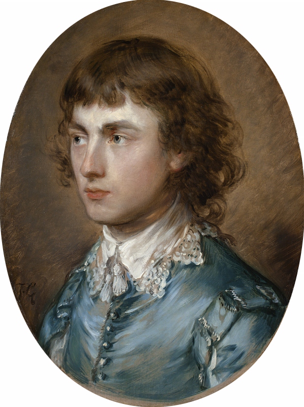
‘Gainsborough Dupont, the artist’s nephew’ by Thomas Gainsborough (1773) Waddesdon (the Rothschild family)
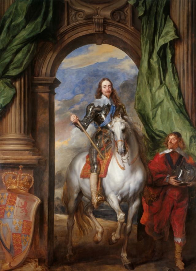
The influence of van Dyck
As he became more successful the young painter moved from his Suffolk home to the fashionable spa resort of Bath. Here he made important contacts with rich clients and also got the opportunity, when visiting the aristocracy, to see their collections of Old Masters.
Of all the past masters, the one that struck him most was Sir Anthony van Dyck, the Flemish painter who came over to work at the court of Charles I in the 1630s. I’d love to know whether it was the deliberate attempt to copy van Dyck which led to the revolution in his work which I indicated above. Certainly Gainsborough revered van Dyck till his dying day. In fact the exhibition tells us that, as his death from terminal cancer approached, he told those around him he wanted to be measured against van Dyck, and apparently his very last words were ‘Van Dyck is right’.
The commentary on the Gainsborough Dupont portrait mentions that van Dyck used flicks of red to create depth of colouring of human skin and then points out just such red flecks which you can see if look closely above the figure’s left eye. It’s the type of opportunity to lean right into the real paintings, and to really appreciate their subtle technique – to see at first hand exactly how paint is laid onto the canvas – which makes visiting exhibitions like this so worthwhile.
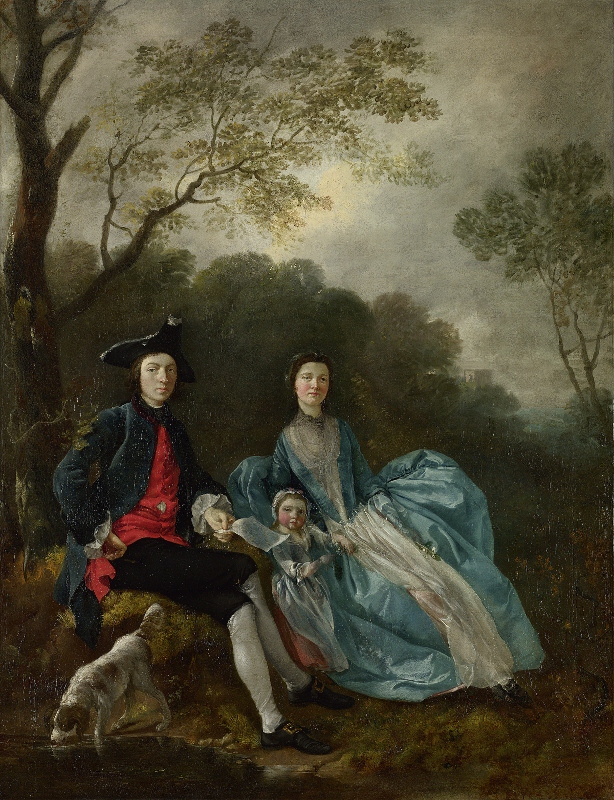
Gainsborough’s daughters
The exhibition brings together all twelve surviving portraits Gainsborough made of his beloved daughters. The ones of them as children are wonderful (see above) but the portraits follow them through into young womanhood and then maturity. We learn at one point that he taught them both how to paint landscapes so that they would have a trade to fall back on in case he should be struck down. Later on we learn that the younger sister married but the marriage broke down after just two years. She suffered mental illness and moved in with her older sister who never married and cared for her for the rest of her life.
In this painting I was drawn to the peripheral details, to Gainsborough’s ‘feathery’ treatment of the trees’ foliage, and to the shaggy dog, a symbol, we are told, of fidelity, to the extraordinary finish on the shimmering silk of the daughter on the left. But keep returning to the faces, especially of the daughter on the right, which seems to frank and open and candid.
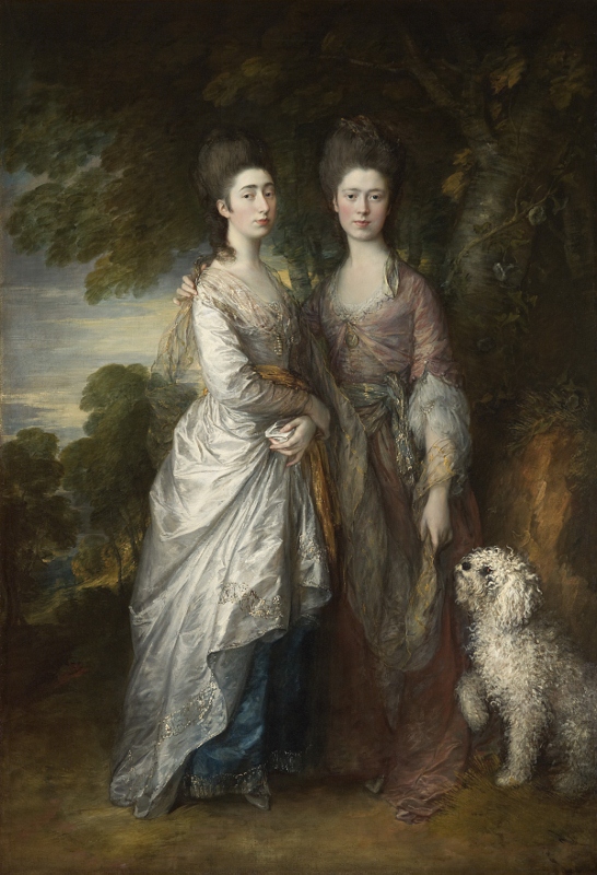
‘Mary and Margaret Gainsborough, the artist’s daughters’ by Thomas Gainsborough (1770 to 1774) Private collection
Gainsborough’s wife
Family tradition had it that Gainsborough painted a portrait of his wife every year and gave it to her as a present on their wedding anniversary.
The commentary doesn’t make a meal of it but strongly hints that Gainsborough was serially unfaithful to his wife who was well known for having a fierce temper. Maybe the paintings were a form of atonement.
Rather beautifully, their relationship is discussed in terms of their dogs because Thomas owned a brisk alert collie which he called Fox (maybe because it looked a bit fox-like but also in humorous reference to the fat radical politician of the day, Charles James Fox). His wife owned a spaniel, which she named Tristram after the hero of the wildly popular contemporary novel, Tristram Shandy. Moreover:
‘Whenever [Gainsborough] spoke crossly to his wife …he would write a note of repentance, sign it with the name of his favourite dog, ‘Fox’, and address it to his Margaret’s pet spaniel, ‘Tristram’. Fox would take the note in his mouth and duly deliver it…’
In 1746, aged just 19, Gainsborough had married Margaret Burr, an illegitimate daughter of the Duke of Beaufort, who settled a £200 annuity on the couple. The commentary points out that at various tight moments in the 1750s and before he became successful, the couple had to borrow extensively against the promise of this annuity.
Apparently, Margaret was the tough-minded, business-minded person in the relationship, with Gainsborough being the more slothful and phlegmatic. He casually had affairs. She went mad with anger.
None of this is present in the later portraits of her, quite a few of which are gathered here, which really beautifully capture the flavour of mature married love, of mutual forgiveness and affection. Next to the daughters with the invisible cat, this painting of Margaret Gainsborough was my favourite work in the show. It is marvellous how he has captured (or invented or created) the impression of deep and affectionate character in her face, in the deep calm accepting maturity of her gaze.
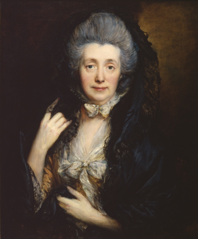
‘Margaret Gainsborough, the artist’s wife’ by Thomas Gainsborough (1777) The Courtauld Gallery, London
Other points
The exhibition has other themes. Although he made his living as a Society portrait painter, throughout his life Gainsborough’s first love was landscape painting, and the exhibition contains a massive unfinished landscape, included on the pretext that two of the figures in its central incident of a farm cart pulled by unruly horses are based on his two daughters (the white-chested figure looking up, and the woman being pulled up into the cart).
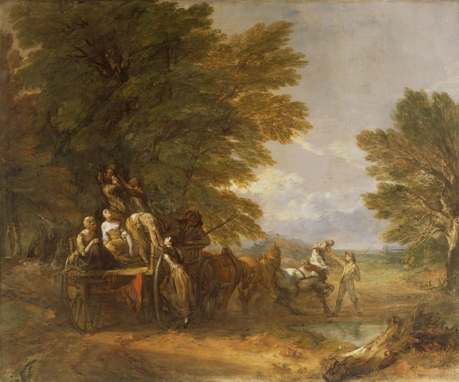
‘The Harvest Wagon’ by Thomas Gainsborough. (1767) The Barber Institute of Fine Arts
We learn an awful lot about Gainsborough’s extended family and there is a big family tree at the start of the show showing just how extensive it was. The wall labels give us interesting anecdotes about his father and mother (he went bankrupt) about his sisters (one was a milliner which gave him a lifelong interest in fabrics and women’s dresses) about one brother, Humphrey, who became a non-conformist minister and was also a noted inventor, while the other one, John, became known in the family as ‘Scheming Jack’ because of his endless moneymaking plans and schemes all of which came to nothing with the result that Scheming Jack and his family lived on handouts from his siblings.
In other words, there’s a lot of fascinating gossip-cum-social history mixed in with the art appreciation.
And then there is the steady sequence of self-portraits, not quite as profound and searching as, say, Rembrandt’s, but stretching from his earliest works in the 1740s right to the end of his life in 1788, which take you on a fascinating journey from ambitious neophyte, to proud father, to accomplished craftsman, to ageing husband.
The exhibition tells us that he wanted this self-portrait to be the approved one, with (as the commentary points out) its rather quizzical raised eyebrow, and the air of a calm mature man, confident in his powers and conscious of a life well lived (and note the jazzy, unfinished squiggles which depict his neckerchief. Dazzling sprezzatura and confidence right to the end!)
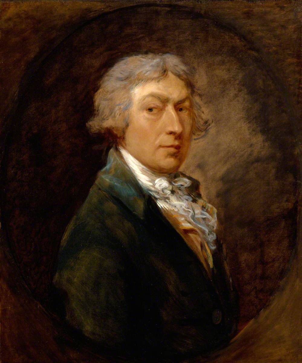
Self Portrait by Thomas Gainsborough (1787) Royal Academy of Arts, London
This is a wonderful, gossipy, beautiful and life-affirming exhibition.
Battle of the videos
NPG have commissioned an official video of the show:
But there’s also an informal review by Visiting London Guide which shows more pictures and gives more information.
Related links
- Gainsborough’s Family Album continues at the National Portrait Gallery until 3 February 2019
- Gainsborough: A Portrait by James Hamilton (2017)