‘The Ugly Duchess: Beauty and Satire in the Renaissance’ is a one-room, free display at the National Gallery in London. Go in the main entrance, up the stairs to the mezzanine level, then turn right and up more stairs to room 46.
It’s amazing how much you can cram into one room in a gallery, in this case ten or so paintings, 4 or 5 drawings and several sculptures which, taken together, open up whole imaginative worlds and intellectual vistas. Amazing how much you can extrapolate from one work of art, about an entire era’s attitudes to men and women, ageing, its sense of humour, its fear of the supernatural.
The Ugly Duchess
It all starts by considering one of the best-known faces in the National Gallery: Quinten Massys’s early 16th-century depiction of an old woman, popularly known as ‘The Ugly Duchess’. Made in Antwerp in about 1513, it is an extremely striking image.
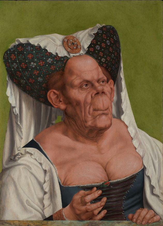
An Old Woman (‘The Ugly Duchess’), about 1513 by Quinten Massys © Photo: The National Gallery, London
Ugly
Quite obviously this is an exaggerated and grotesque caricature. Focusing just on the features, you’d have thought it was the face of an old man, but the closer you look you realise all kinds of things are going on in this picture. The most obvious element is probably the woman’s mannish, ugly face but you quickly move o to notice the very low-cut dress revealing her ample but wrinkled bosom.
It’s obviously a satire or caricature of the stock standard Renaissance portrait, which, of course, showed the sitter to best advantage, flattering them by smoothing out wrinkles and omitting blemishes. Quite obviously this painting is doing the exact opposite, packing in as many unflattering details as possible – big ears, stubby nose, disappeared lips, as many wrinkles as the human neck can cope with, a huge expanse of neck and bosom revealing the mannish solidity of her shoulders and the wrinkled bust.
The ‘philtrum’ is the technical name for the groove which runs between nose and lips, but it’s not only this which is long but the entire space or stretch of face from nose to mouth which is as huge as possible, almost giving her the prognathous appearance of a chimpanzee.
So there’s an implicit contrast with the genre of the standard Renaissance flattering portrait. But there’s another contrast worth mentioning, which is the contrast between the gargoyle grotesqueness of the face and body and the immaculately naturalistic detailing of the headdress and cascading wimple.
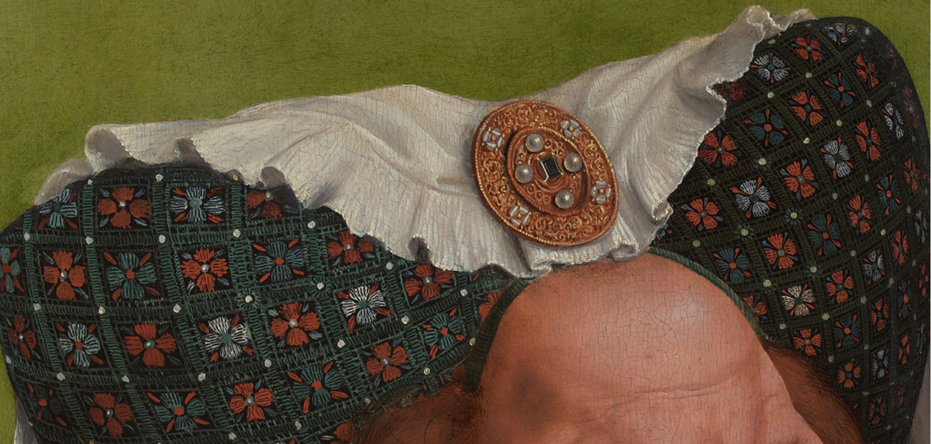
Detail of An Old Woman (‘The Ugly Duchess’), about 1513 by Quinten Massys © Photo: The National Gallery, London
Seeing a painting like this in the flesh allows you to go right up to it and marvel at the extreme detailing of the fabric of the headdress – you can virtually see each thread of the fabric, the detail of each one of the embroidered flowers; to marvel at the intricate working of the diadem or broach including the glints of light on the lovingly crafted pearls – which are, when you look really closely, echoed by the pearls studding the ring she’s wearing on her right forefinger.
So, to put it crudely, there’s another contrast at work here, between the deliberate grotesqueness of the face and the breath-taking filigree detail of the setting (headdress, broach, and amazing depiction of light and shade in the folds of the linen wimple).
Talking of her finger, there’s one last relevant detail which is the flower. In her right hand, between finger and thumb, she is delicately holding the flower of a rose which hasn’t yet opened. This is a traditional symbol of budding love i.e. a visual signal appropriate for a very young woman, a teenage virginal girl. Here it works as another element emphasising the grotesqueness of the portrait and satirising the entire genre.
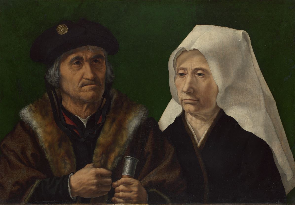
Her husband
Mention of the rose leads us to the next factor, which is her partner. The exhibition has obtained on loan from a private collection in America the painting which originally partnered the duchess, namely Massys’s portrait of an old man.
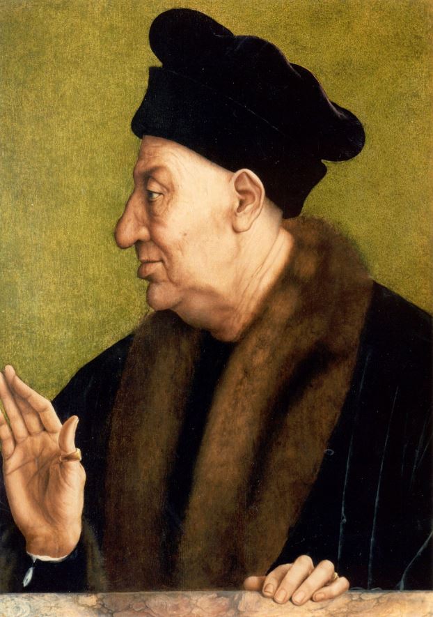
An Old Man, about 1513 by Quinten Massys. Photo © Evan Read, Department of Paintings Conservation, The Metropolitan Museum of Art
Sexism and unfairness
Now, you don’t have to be an art scholar to notice that, although it isn’t exactly flattering, although he too has a lugubrious nose and plentiful wrinkles, the husband portrait isn’t in the same class of grotesque as the old woman. Feminists interpret this as unfairness: why is the old man acceptable but the old woman grotesque?
One way of answering this is to say, with feminists, that Western society has always been sexist and patriarchal, with continuous misogynist tendencies. That age in women was treated far more harshly, seen as far more negative, than in men, and that an older man’s efforts to dress well and make the most of himself was respected whereas the same behaviour in an older woman was derided.
Artistic licence
But there’s another way of thinking about the issue, regarded as an artistic problem or genre. This is that ‘the old woman’, as subject, afforded Renaissance painters opportunities for invention, play and satire that portraits of more ‘normal’ people didn’t allow. As the curators put it, the ‘unruly bodies’ of older women, no longer smooth and supple as in standardised models of beauty, can be seen as metaphors for social disorder, for the topsy-turvey world which attracted medieval and Renaissance culture as much as its hierarchies of order.
There is undeniable joy in beholding ‘the Ugly Duchess’ trample beauty standards, social conventions and gender expectations.
Flower and fur
Back to the husband, and art scholars debate whether the posture of his right hand is politely rejecting the budding rose which the duchess is offering him.
Away and above these debates about symbolism is a simpler fact about this work which is the amazing depiction of the fur around his neck. Again it isn’t so clear in a reproduction, but in the flesh, standing in front of the actual painting, you can really see the difference between the depiction of the fur lining his coat and what appears to be the black velvet of the coat itself. it’s stunningly sensual and alive.
Contemporary couples
There’s a number of reasons why I strongly prefer the art of the Northern Renaissance to the Italian Renaissance. One is the rocky barrenness of the settings of so many Italian paintings, compared with the lush grass, flowers and verdure of northern paintings. I like the flowers and animals, the little rabbits and whatnot you tend to get in the background of northern Renaissance art.
Portraits like this don’t have animals and pastures in them, but they exemplify two other aspects of northern art I like. One is the extraordinary fine detailing of fabric, embroidery, jewellery and so on. The other is the ugliness of the people. Italian Renaissance paintings capture the handsomeness of Italian people, but I live in grotty northern Europe among people who are, by and large, not fashion models. Therefore I like the frank depiction of non-beautiful people. The exhibition gives an example of an older couple by a contemporary of Massys, Jan Gossaert.
An Elderly Couple, about 1520 by Jan Gossaert © The National Gallery, London
It’s hard to think your way into the mindset of the man on the left who probably paid a lot for this painting and was presumably, happy enough to pay for this pretty unflattering depiction. It bespeaks a mindset different from the Italian Renaissance, one which prioritises honesty at all costs. For me it’s something to do with the northern Protestant, or even Puritan, spirit. Truth over gloss. Epitomised by the arch Puritan Oliver Cromwell telling his portrait painter to depict him ‘warts and all’. It is the humanist tradition, accepting of human weakness, frailty and imperfection.
As to its relevance to the Ugly Duchess, this painting epitomises some of the conventions of double portraits which the Duchess flouts. The older woman is modestly dressed (her clothes covering her up to the neck). Her eyes are modestly cast down. And, crucially, she is standing behind and on the left side of her husband.
Left and right
In double portraits of couples like this, it was the convention to depict the man standing on the right, the hierarchically superior position, our left as we look at it. Therefore the duchess’s position on the right hand side of her husband (in the world of the picture) is another way in which the composition subverts or mocks conventional standards of portraiture.
Leonardo, the source
But talking of the Italian Renaissance links to the rather surprising presence of Leonardo da Vinci in the exhibition. Why? Because among his multifarious other interests, Leonardo had a well-attested interest in ‘the grotesque’. His notebooks contain page after page filled with sketches of a spectrum of non-attractive people, ranging from old and gnarly, through ‘ugly’ people and then beyond the bounds of plausibility to monsters who could have come from the island of Dr Moreau.
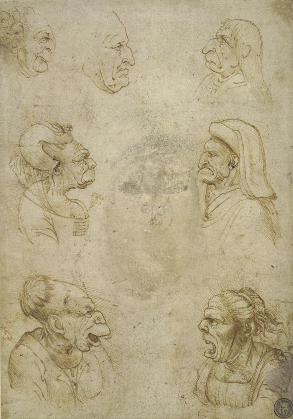
Grotesque caricature heads of five men and two women by Leonardo da Vinci © The Trustees of the British Museum
Leonardo’s grotesques were surprisingly popular. Many copies were made of his sketches and distributed around art workshops all over Europe. Thus Massys’s image, which I take to be quintessentially north European, turns out to derive almost directly from a sketch by the quintessentially Italian artist, Leonardo.
The debt owed by Massys to Leonardo isn’t trivial. Although the Leonardo original has disappeared, the exhibition includes copies of a Leonardo grotesque woman which, as you can see, are the direct source of Massys’s painting. Hardly anything about the Massys version is original except precisely the aspects I like, the fantastic detailing.
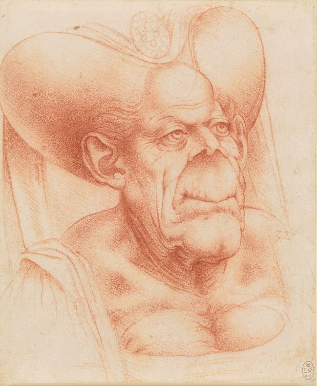
Bust of a grotesque old woman (1510 to 1520) by Francesco Melzi, after Leonardo. Royal Collection Trust © His Majesty King Charles III 2023
May – December couples
Western societies have often found the notion of the old and decrepit vaunting their attractiveness and flirting as if they’re still teenagers worthy of satire. ‘Mutton dressed as lamb’, as the proverbial saying has it. In fact, like everything else, the Middle Ages codified this into a genre, calling it the May-December relationship. To my surprise, a few seconds on Google show me that this term is still widely used to describe:
‘an amorous relationship between two people with a considerable age difference. The months symbolize the seasons, with spring representing youth and winter representing old age.’
In medieval art and literature the unequal relationship of an older man and a younger woman was often mocked (as, maybe, in our day, the marriage between Rupert Murdoch at the age of 85 to former model, Jerry Hall, or the references I keep reading about Leonardo de Caprio’s alleged penchant for much younger girlfriends). Less often described (and mocked) was the pairing of an older woman and a younger man (in our day and age, often referred to as a toy boy’). In medieval literature Chaucer’s Wife of Bath is one such older woman who takes a young male lover for explicitly sexual reasons.
Mention of the theme, as a popular one of the day, allows the curators to include a visual illustration, The Unequal Couple by by Israhel van Meckenem which shows an older woman (left) being cosied up to by a handsome young blade. The way he is reaching out to touch the bag of coins she is jealously guarding very heavily conveys the satirical thrust of the picture, that this kind of relationship is ‘against nature’ and could only exist because the May partner wants to get their hands on December’s money.
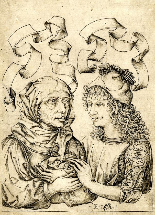
The Unequal Couple, about 1490 by Israhel van Meckenem, after the Master of the Housebook © Ashmolean Museum, University of Oxford
Feminist interpretation
You won’t be surprised to learn that there is a revisionist feminist interpretation of the painting. Feminist art scholars agree that it can be read as a cruel joke in which the viewer is invited to laugh at this woman’s pathetic attempts to appear young and sexy, so we are being invited to mock her implied self-delusion.
But there is an alternative way to read the painting, which is as depicting an old woman who refuses to accept either the biological facts of aging or the social conventions which define what a woman, of any age, may or may not wear, and how she may or may not think of herself. If she regards herself as a winsome beauty, shyly offering her man a symbol of her budding love, then…why not?
To echo what I wrote above, a feminist interpretation sees a duchess who is also subversive of standard notions of beauty, defiantly flouting the conventions of her day.
Witches
But old women have been, for much of recorded history, quite ambivalent figures. (In fact, arguably any category of human being can be ambivalent. A young man may be smooth and debonair like Romeo or a thuggish killer like Edmund in King Lear. Humans have many sides, stereotypes, avatars, expectations.)
Anyway, old women have can be mocked for their pretensions (as the duchess appears to be) respected for their wisdom or even feared as uncanny figures. This fear can go to the extreme of thinking they have uncanny supernatural powers, in other words, are witches.
And it’s in order to highlight the similarities and differences in Renaissance iconography of older women – between an old woman satirised and an old woman feared – that the display includes an iconic image of a witch, made by Albrecht Dürer around the same time as Massys was doing his entertaining grotesque.
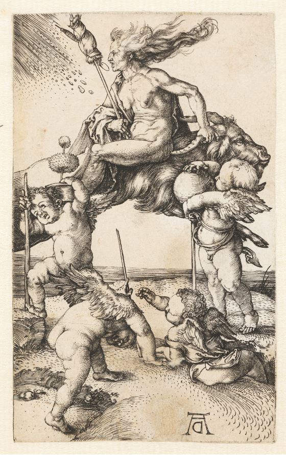
A Witch Riding Backwards on a Goat, about 1500 by Albrecht Dürer © Victoria and Albert Museum, London
As with most Dürer this image is packed with symbolism representing the inversion of traditional values and decorum. The woman is naked but not in the sexy manner of Renaissance nudes; the naked body of an older woman is seen as repellent and disgusting. The broom between her legs and her grip on a goat’s horn suggest the uncontrolled and inappropriate nature of lust in an older woman. She is rising the goat backwards but her hair is flowing in the wrong direction, into rather than with the wind. It is an image of reversal and chaos. Whereas the Massys painting was made for comedy and entertainment, the Dürer takes some of the same themes and treats them with horror, repulsion and fear.
Alice
Even this inclusion of witches hasn’t exhausted the ramifications and connections unravelling from this one painting. I think I knew but had forgotten an important fact about it which is that Massys’s portrait directly inspired the figure of the Duchess in ‘Alice in Wonderland’, as portrayed in Sir John Tenniel’s classic illustrations.
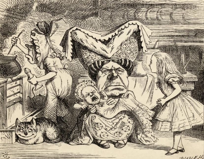
Alice, the Duchess, and the Baby by Sir John Tenniel (1865)
Here, in a sense, the Ugly Duchess found her spiritual home. As a painting she was only available for centuries to a handful of viewers. Even hung up in the National Gallery she was only seen by a small number of people. But as published in the Alice books and very widely distributed, she entered a kind of rogues’ gallery of all the other fantastical characters dreamed up by Lewis Carroll. Beyond fear or ridicule she is transformed into an object of pure, delightful entertainment.
Video
In this 10 minute long video National Gallery restorer Britta New discusses the conservation treatment of ‘The Ugly Duchess’, describing discoveries made during the conservation process, and the painting’s connection to sketches by Leonardo da Vinci and John Tenniel’s illustrations.
Related links
- The Ugly Duchess:Beauty and Satire in the Renaissance continues @ the National Gallery until 11 June 2023
- The Art of the Northern Renaissance by Craig Harbison (1995)