Edvard Munch: love and angst @ the British Museum

The fin-de-siecle

The last decade of the 19th century is famous for its fin-de-siecle, decadent, dark imagery. In Imperial Britain this was epitomised by the decadent sexuality associated with the notorious trial of Oscar Wilde and the Yellow Book magazine and the pornographic prints of Aubrey Beardsley. In France there was a reaction against Impressionism which took many forms including the urban posters of Toulouse-Lautrec and the swarthy nudes of Paul Gauguin down in the South Seas. All were well-known and public artists, working in cosmopolitan cities which were the capitals of far-flung empires – London, Paris. They were famous and playing on large stages.

In the other countries of northern Europe, however, one of the most powerful artistic currents was Symbolism.

As the exhibition notes:

Symbolism was a literary and artistic movement that rejected representations of the external world for those of imagination and myth. Symbolists looked inwards in order to represent emotions and ideas.

In Belgium, north Germany and the Scandinavian countries, artists developed a wide range of techniques and styles, but tended to fixate on a handful of themes, namely sex and death. Death awaits with his scythe. Empty boats arrive at forbidding islands. Youths waste away from frustrated love. Beautiful young women turn out to be vampires.

Sex and death and anguish and despair, these are all much more personal, introverted, emotions. Wilde was a flamboyant public personality, Beardsley’s art was defiantly clear and elegant, both were immensely sophisticated and urban and cosmopolitan, confident doyens of the largest, richest city in the world.

Whereas much of the fin-de-siecle art from Belgium, Germany, Scandinavia was much darker, more personal. Of course they produced urban and sophisticated art as well – the 1890s is characterised by an explosion of diverse art movements – but there was also a big strand of empty lakes and immense dark pine forests and brooding skies and agonised artist-heroes.

Edvard Munch

Munch is slap bang in the middle of this social and cultural movement. His most famous work is The Scream, which was first made as a painting in 1893 and then turned into a lithograph in 1895 which was reproduced in French and British and American magazines and made his reputation.

The Scream is probably among the top ten most famous images produced by any artist anywhere, and has been parodied and lampooned and reproduced in every medium imaginable (pillow slips and duvet covers, posters, bags, t-shirts). It featured in an episode of The Simpsons, clinching its status as one of the world’s best known art icons. It’s up there with the Mona Lisa.

The Scream (1895) by Edvard Munch. Private Collection, Norway. Photo by Thomas Widerberg

Why? Why is it so powerful? Well:

  1. It is highly stylised and simplified – it barely looks like a human being at all, more like some kind of ghost or spirit of the woods.
  2. The rest of the landscape is drawn with harsh single lines, whose waviness seems to echo the long O of the protagonist’s mouth.
  3. Thus ‘primitiveness’ of the technique of wood carving – with its thick, heavy ‘crude’ lines – somehow echoes the primalness of the emotional state being described.

The exhibition

This exhibition brings together nearly 50 prints from Norway’s Munch Museum, making this the largest exhibition of Munch’s prints seen in the UK for 45 years.

It also includes sketches, photos and a few oil paintings, not least a big haunting portrait – The Sick Child – of his favourite sister, Johanne Sophie, who died of tuberculosis when she was just 13. These are set alongside works by French and German contemporaries, to present a powerful overview of Munch’s troubled personality, the artistic milieu he moved in, and his extraordinary ability to turn it into powerful images conveying intense, primal, human emotions.

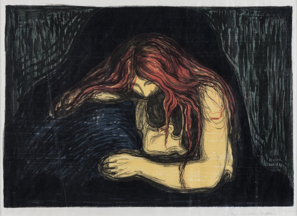
Vampire II (1896) by Edvard Munch. The Savings Bank Foundation DNB, on loan to Henie Onstad Kunstsenter, Oslo

Claustrophobic

The exhibition is up in the top gallery in the Rotunda, a relatively small space, which was divided into smallish sections or rooms, the prints hung quite close together on the walls, and the place was packed, rammed, with silver-haired old ladies and gentleman. It was hard to move around. More than once I went to move on from studying a print and found I couldn’t move, with people studying the next-door prints blocking me to left and right and a shuffle of pedestrians blocking any backward movement. Imagine the Tube at rush hour. It was like that.

Possibly, in fact, a good atmosphere to savour Munch’s work. Trapped, claustrophobic, slightly hysterical. it forced me to look up at the quotes from his letters or diaries which have been liberally printed up on the exhibition walls. Just reading these immediately gives you a sense of where Munch was coming from, his personality and the motivation for his art.

For as long as I can remember I have suffered from a deep feeling of anxiety which I have tried to express in my art. (1908)

I was walking along the road with two friends – the sun was setting – suddenly the sky turned blood red – I paused, feeling exhausted – and leaned on the fence – there was blood and tongues of fire above the blue-black fjord and the city – my friends walked on, and I stood there, trembling with anxiety – and I sensed an infinite scream passing through nature. (22 January 1892)

The angels of fear, sorrow, and death stood by my side since the day I was born.

All art, like music, must be created with one’s lifeblood – Art is one’s lifeblood. (1890)

I would not cast off my illness, because there’s much in my art that I owe it.

We do not want pretty pictures to be hung on drawing-room walls. We want… an art that arrests and engages. An art of one’s innermost heart.

Sexual anxiety

There’s plenty more where this came from. The exhibition gives a lot of biographical detail about his early life, describing the Norwegian capital of Kristiana, how it was connected to the rest of Europe by sea routes, how it was a small provincial town whose every aspect was dominated by the stiflingly respectable Lutheran church, but how young Edvard was attracted to its small bohemian, artistic set of poets and writers and artists, how he conceived a massive sequence of works about love and sex and death which he titled The Frieze of Life –

The Frieze is intended as a poem about life, about love and about death. (1918)

How he travelled to Paris and to Berlin and scandalised respectable opinion with the exhibitions he held there, but created a stir and won admirers for the stark, elemental quality of his woodcuts and prints. (The exhibition includes a map of Europe showing Munch’s extensive travels during the 1890s and 1900s, along with a selection of Munch’s personal postcards and maps.)

We are told Munch was born and brought up in a fiercely religious and conservative bourgeois family which was horrified when he fell in with Kristiania’s bohemian layabouts. These bohos practiced sexual promiscuousness, had numerous affairs, and so were plagued by jealousy and infidelity and fights – all exacerbated by the way they drank too much, far too much.

It seemed obvious to me that Munch’s anxiety was caused by the crashing conflict between his extremely repressed bourgeois upbringing and the chaotic and promiscuous circles he moved in as a young man. On the one hand was a young man’s desire and lust, on the other were all the authority figures in his culture (and inside his head) saying even looking at a woman with lust in his heart would lead to instant damnation.

The scores of images he made of women as vampires and weird gothic presences and looming succubi emerging from the shadows, represent a repeated attempt to confront the epicentre of that clash – sex, embodied – for a heterosexual young man – by sexualised young women. They attracted him like a drug, like heroin – but all these compulsive thoughts about them triggered the terror of physical disease – the appalling ravages of syphilis for which there was no cure – along with the certainty of eternal damnation – and all these led to anxious, almost hysterical thoughts, about the only way out, the only way to resolve the endless nightmare of anxiety – and that was release and escape into death, the death which he had seen at such close quarters in the deaths of his beloved mother and sister from tuberculosis.

The obsessiveness of his sexual thoughts, and their violent clash with orthodox Christianity, is most evident in the hugely controversial Madonna, an obviously erotic image to which he blasphemously misapplies the title of the chaste Mother of God. And, when you look closely, you realise that those are sperm swimming round the outside of the frame, and a miserable looking foetus squatting at the bottom left. Sex versus Religion! It’s amazing he wasn’t arrested for blasphemy and public indecency. In fact his 1892 exhibition in Berlin so scandalised respectable opinion that it was shut down after just a week.

Madonna (1895/1902) by Edvard Munch. Munchmuseet

So Munch’s vampire women aren’t real women, of course they’re not. They are depictions of male anxiety about women, namely the irreconcilable conflict between the demanding, drug-addiction-level lust many young, testosterone-fueled men experience, whether they want to or not – and the multiplicity of feelings of shame about having such strong pornographic feelings and experiences, and regret at handling relationships with women badly, and anxiety that you are a failure, as a man and as a decent human being, and terror that – if there is a God – you are going straight to hell for all eternity.

Plus, as the wall labels indicate, there really was a lot of heavy drinking in his circle and by him personally, which led to chaotic lifestyles among the bohemian set, and Munch became a clinical alcoholic. And this addiction – to alcohol – will, of course, have exacerbated all the psychological problems described above.

Exposure to so many of Munch’s prints – alongside detailed explanations of how he made them, the Norwegian and north European tradition they stem from, and so on – really rubs in the fact that he was a great master of the form. It’s not just The Scream. Lots of the other prints have the same archetypal, primitive power, and the exhibition brings it out by setting Munch’s work beside prime examples by other leading printmakers of the time, in France and Germany (many of which are themselves worth paying the price of admission to see).

The subtle prints

It tends to be the extreme images we are attracted to – The Scream, The Madonna, the numerous vampire women, the worrying image of a pubescent girl sitting on a bed. But some decades ago we crossed a threshold into being able to accept all kinds of erotic and extreme images, so these no longer scandalise and thrill us in the same way they did their initial viewers, although they still provide powerful visual experiences.

But having had a first go around the exhibition taking in these greatest hits, I slowly came to realise there was another layer or area of his work, which is – in a word – more subtle. If the most obvious and impactful of his images are about stress and anxiety mounting to open hysteria – there were also plenty of images which were far more restrained. In which – to point out an obvious difference – the women are wearing clothes.

Instead of vampire women whose kisses are turning into bites, these tend to be of fully dressed, utterly ‘respectable’ late-nineteenth century types, set outdoors, in open air situations where… somehow, through the placing and composition of the figures, a more subtle sense of aloneness and isolation is conveyed. They capture the mood of a couple who are, for some reason, not communicating, each isolated in their brooding thoughts.

The Lonely Ones (1899) by Edvard Munch. Munchmuseet

Like the complex ways relationships between the sexes fail, become blocked and painful in the plays of Munch’s fellow Norwegian, Henrik Ibsen. (Munch, as a leading artist of the day, was acquainted with both Ibsen and the younger playwright, Strindberg. It crosses my mind that if Munch’s more hysterical images can be compared to the highly strung characters in a Strindberg play, the more subdued and unhappy images in some way parallel Ibsen’s couples.)

Having processed the extreme images of vampire women, sex and death in my first go round, on this second pass I warmed to these less blatant images.

I noticed that the naked women images are almost always indoors (as, I suppose, naked women mostly had to be, in his day). But that the more ‘respectable’ and subtle images were all set outside, and often by primal landscapes – namely The Lake and the Forest – the kind of primeval landscape we all associate with Scandinavia and which really was available right on Kristiana’s doorstep.

The exhibition ends with a set of prints which perform variations on his characteristically hunched, half-abstract human figures – characteristically, showing one man and one woman – but in this series hauntingly isolated, leaning on each other – or against each other – in something which doesn’t look at all sensual but more like the survival techniques of characters from a play by Samuel Becket.

Towards the Forest II (1897/1915) by Edvard Munch. Munchmuseet

Less striking than the vampires and naked women and girls, I thought these strange, half-abstract, ‘lost souls in the landscape’ images had a kind of purity and haunting quality all their own.

Breakdown and rebirth

It comes as no surprise to learn that in 1908 Munch had a nervous breakdown. His anxiety, compounded by excessive drinking and sometimes fighting, had become acute, and he was experiencing hallucinations and persecution mania. He entered a clinic and underwent a comprehensive detoxification which lasted nearly eight months.

When he left, he was a new man. Well, new-ish. His work became more colourful and less pessimistic and the wider public of Kristiania for the first time began to appreciate his work. Critics were supportive. His paintings sold. Museums started to buy his back catalogue. His life improved in all measurable ways. But in a textbook case of the artist who needs his anxieties and neuroses to produce great works, everything he carved and painted from then on – portraits of rich friends, of the farm he bought, murals for factories – lacked the intensity and archetypal power of his early years.

Years later all that storm and stress and hysteria seemed so distant as almost to be inexplicable.It is typical that, decades later, he told the story of how his famous painting, Vampire II, got its title. He himself had simply titled it Love and Pain. Pretty boring, eh? But Munch’s friend, the critic Stanisław Przybyszewski, and clearly a man with a flair for publicity, described it as ‘a man who has become submissive, and on his neck a biting vampire’s face.’ And, looking back, Munch comments:

It was the time of Ibsen, and if people were really bent on revelling in symbolist eeriness and calling the idyll ‘Vampire’ – why not?

A man in remission from alcoholism and mental illness, the older Munch can be forgiven for not wanting to revive unhappy memories, and for wanting to palm off the idea for lurid titles onto his friends. But the prints themselves, and all his early writings, don’t lie. The later work is interesting and decorative – but it is the unhappy period covered by this exhibition which produced the intense and troubled works which seem to take you right into the heart of the tortured human condition.

Older, wiser and sober. Munch among his paintings at the end of his life

The promotional video


Related links

Other British Museum reviews

Mantegna and Bellini @ the National Gallery

This is a rich, complex and demanding exhibition in all kinds of ways. For a start it was packed out. I took the ticket lady’s advice to go see the 18-minute long film introduction to the show, off in the auditorium to one side of the Sainsbury Gallery, but this meant I didn’t enter the exhibition proper till 10.30, by which time it was so packed that it was difficult to move around and you had to queue to see many of the paintings.

Secondly, it requires you to listen to a daunting amount of art history and scholarship. The art history is central for this is an exhibition which traces the development of the two painters, pointing out with minute attention to detail their differing interests, styles, areas of expertise and actual careers i.e. the cities they lived in, the courtly patrons they worked for, and so on.

In addition there are quite a few paintings and drawings whose accreditation has until recently, or is still, disputed i.e. you are looking at works which may or may not be by either Mantegna or Bellini, and find yourself listening to learned arguments about who, when and why this or that drawing or painting was made.

Biographies

Giovanni Bellini (1435? to 1516) and Andrea Mantegna (1431 to 1506) were two of the greatest artists of the Italian Renaissance.

In the 1440s the Bellini family ran the most established and successful artistic workshop in Venice. It was overseen by Giovanni’s father, Jacopo Bellini, one of the greatest artistic inventors of his day, pioneering new visual and intellectual ideas in his influential drawing books.

So Giovanni Bellini was born into what was in effect artistic royalty, and given every possibly chance of a good start in his career. By contrast, Andrea Mantegna was born the son of a humble carpenter, and was an entirely self-made man. Born near Padua his prodigious talent brought him into the workshop of Francesco Squarcione – who in fact adopted him as his own son – and inspired in him a lifelong love of the art and architecture of the antique world.

News of the up-and-coming prodigy reached Jacopo Bellini, who made the entirely practical business move of marrying his daughter Nicolosia to the budding genius in 1453. Bellini and Mantegna were now brothers-in-law, and spent the rest of their lives in contact, in artistic rivalry, borrowing ideas, themes and details from each other’s works right to the end of their lives.

For a decade or so they worked in close physical proximity and the exhibition pairs their paintings on the same subjects, showing how they exchanged motifs and techniques – ways of handling figures, animals, elements of landscape – until, in 1460, Mantegna left to spend the rest of his life working for the Gonzaga family which ruled Mantua.

Two styles

Throughout its six rooms the exhibition brings together major works by both artists, from Britain and abroad, paintings as well as rare sketches and drawings and sculptures and friezes – which allow you to trace a) their similarities and differences b) their individual evolutions c) their lasting influence on later art.

You can get a quick understanding of the two approaches by comparing two depictions of Christ’s agony in the garden. Apparently the notion of depicting Christ in the Garden of Gethsemane waiting, while the apostles slept, for Judas to come and betray him, probably derived from the inventive drawing books of Jacopo Bellini, but it is fascinating to have the two artists’ treatments of the identical subject hanging side by side and the audio-commentary gives a detailed comparison.

The Agony in the Garden (about 1455–6) by Andrea Mantegna. Egg tempera on panel © The National Gallery, London

The Agony in the Garden (about 1455 to 1456) by Andrea Mantegna. Egg tempera on panel © The National Gallery, London

In Mantegna’s version you notice:

  • the architectural feel of the composition, with very detailed rocks creating a claustrophobic, full feel to the composition and tightly framing the sleeping apostles
  • the foreshortening of the body of the sleeping apostle – Mantegna was one of the first artists in the West to systematically experiment with painting foreshortened figures in perspective: he was so proud of this that he signed the painting in the rocks directly above the sleepers
  • the tightness of the way the road curves from the sleepers round the rocks to the crowd of soldiers and citizens being led by Judas Iscariot to betray Jesus
  • the architectural details of the city of Jerusalem in the background which, when you look closely, has been done with great precision, including a campanile and a copy of the Roman Colosseum
  • there are some rabbits in the road next to one of the apostle’s feet; there are lots of rabbits in Mantegna’s works

No contrast with Bellini’s treatment of the same subject.

The Agony in the Garden by Giovanni Bellini (about 1458-60) Egg tempera on panel © The National Gallery, London

The Agony in the Garden by Giovanni Bellini (about 1458 to 1460) © The National Gallery, London

Whereas Mantegna’s is packed and stacked with lines and planes – of the busy terraces of rocks and road and distant buildings – Bellini’s composition is much more open, and the central slope Christ is praying on is surprisingly bland and smooth. The audio-commentary points out that Bellini had a go at a Mantegna-style foreshortened figure in the centre, but hasn’t brought it off as well as the Paduan.

Instead, the audio-commentary points to the clouds. They are a surprisingly realistic depiction of the pinkness of dawn, drawing on contemporary Flemish landscape painting. The clouds are not just part of the background as in the Mantegna, but carefully crafted in order to create an atmosphere. Same with the city on the hill to the left. If you look closely (and the joy of visiting exhibitions is that you can look really closely at all these wonderful paintings) you see that the buildings lack detail (windows or doors) and are soft and hazy – much as you would actually see buildings in the far distance in sunny Italy.

This comparison brings out the way that Mantegna is interested in architectural detail and framing, of not only buildings but of people. His works have great clarity and are often full of learned details – he is an intellectual painter – but can also feel harsh and forbidding.

By comparison all Bellini’s works have a softness about them. Whereas Mantegna is interested in line and content, Bellini is interested in tone and atmosphere.

Mantegna = compositional innovation
Bellini = atmospheric, natural landscapes

Mantegna versus Bellini

By and large, whenever I saw a painting from a distance, before I could read the label, I could tell the two artists apart: Bellini’s always have soft outlines, Mantegna’s always have much more defined, sometimes almost cartoon-clear outlines.

By and large I much preferred the Mantegna. Wherever possible the exhibition places paintings on similar subjects by the pair together, so you can compare and contrast, for example their contemporaneous depictions of Saint Jerome in the Desert. Mantegna’s Jerome is set among characteristically lined, striated, and precise rock and is packed with detail – Bellini’s image is much sparer and softer and the composition is emptier, less busy, more atmospheric.

Really looking at these, again, I think I prefer the Mantegna because it is more medieval: he is interested in the saint’s flat-brimmed red hat, in his wooden sandals, in the wooden rack hanging from nails in his cave, in the owl – presumably signifying wisdom – perching at the top of the cave, and so on. I find these details interesting, diverting, charming – and so find the Bellini empty and bland and so you are left solely to concentrate on the bad draughtsmanship of both man and lion.

Similarly, there are direct comparisons between their treatments of Christ’s descent into hell, and the presentation of the infant Christ at the Temple.

Here’s an early Mantegna which shows his love of classical architecture and the way he uses it to frame his compositions. You can look at this painting for quite a long time, enjoying the use of the pillar and broken arch to support the punctured saint. The detailing of the frieze on the stonework is exquisite, as it is in the rubble at his feet or the faces in the broken frieze behind him. The more you look, the more breath-taking the detail becomes. And that’s before you begin to investigate the background, where you can see the three archers who have just done Sebastian to death, strolling casually along the road to the left on their way back to the city across the river, which is itself painted in tiny finicky detail. But it’s the architectural solidity of the composition which is dominant.

Saint Sebastian by Andrea Mantegna (about 1459–60) Egg tempera on poplar © Gemäldegalerie, Kunsthistorisches Museum, Vienna

Saint Sebastian by Andrea Mantegna (about 1460) © Gemäldegalerie, Kunsthistorisches Museum, Vienna

The future of painting

I preferred Mantegna all the way through until we came to the last few rooms. Here, suddenly, Bellini metamorphosed into the Future of Painting and Mantegna suddenly looked old and wooden. Suddenly Bellini was making paintings of Greek mythical subjects which had a softness and haziness, a kind of sweetness about them, which looks like Titian, which looks forward to the next hundred years.

In my ignorance, when I saw this across a crowded room, I thought the bucolic setting and very bright colours meant it was by Poussin. It is in fact still a Bellini, but worlds away from the stilted drawing of Jerome. That was 1460. Now it is nearly fifty years later and Bellini has made extraordinary strides in the art of composition and colouring. Instead of an empty desert he gives us a lazy relaxed pagan landscape in which a whole host of Greek mythical characters are lounging and flirting.

The Feast of the Gods (1514–29) Giovanni Bellini, with later additions by Dosso Dossi and Titian. Image courtesy of the Board of Trustees, National Gallery of Art, Washington, DC

The Feast of the Gods (1514–29) Giovanni Bellini, with later additions by Dosso Dossi and Titian. Image courtesy of the Board of Trustees, National Gallery of Art, Washington, DC

The commentary tells us that Titian (1488 to 1576) was much influenced by Bellini whose workshop he trained in from 1507, and that Titian almost certainly ‘refined’ and ‘improved’ this work by Bellini. You can feel one master handing on the baton to Titian, who will have a transformative effect on Western art. Suddenly, in late Bellini, you feel like you are confronting the future of Western art.

On the opposite wall of this, the fourth and largest room in the exhibition, are hanging three enormous, absolutely huge (2.66 x 2.78 m) paintings depicting the Triumph of Caesar. Mantegna originally created nine of these monster paintings between 1484 and 1492 for the Gonzaga Ducal Palace in Mantua. Acknowledged from the time of Mantegna as his greatest masterpiece, they remain the most complete pictorial representation of a Roman triumph ever attempted.

The Triumphs of Caesar IV: The Vase-Bearers (mid-1480s – before 1506) by Andrea Mantegna. Royal Collection Trust / © Her Majesty Queen Elizabeth II 2018

The Triumphs of Caesar IV: The Vase-Bearers (mid-1480s to before 1506) by Andrea Mantegna. Royal Collection Trust / © Her Majesty Queen Elizabeth II 2018

The structured nature of the composition is awesome. You can feel the intelligence and care which has gone into positioning every element, and Mantegna’s unparalleled knowledge of every element of classical life, which he had spent a lifetime studying.

Still, placed next to the Bellini gods, it feels stagey, and it feels dated. In them Mantegan reaches a kind of peak of magnificence of the architectural composition which he pioneered, and this kind of grand historical painting will go on to be perfected by artists like Veronese. But a glance at the softer, subtler shapes of the Bellini feast tells you that it is his style which will go on to dominate future art.

To see what I mean compare these portraits from the final room of the exhibition. Here is Mantegna demonstrating, as throughout his career, an interest in line and composition. Note the amazing detail on the fabric of the Madonna, and the gauntly ‘realistic’ expressions of the faces of her parents.

The Holy Family by Andrea Mantegna (about 1490–1500) © bpk / Staatliche Kunstsammlungen Dresden / Elke Estel / Hans-Peter Klut

The Holy Family by Andrea Mantegna (about 1490 to 1500) © bpk / Staatliche Kunstsammlungen Dresden / Elke Estel / Hans-Peter Klut

Now compare with a Virgin and child (with Saints Catherine and Mary Magdalene thrown in for good measure) by Bellini.

The Virgin and Child with Saints Catherine and Mary Magdalene (about 1490) by Giovanni Bellini © Su concessione del Ministero dei beni e delle attività culturali e del turismo, Museo Nazionale delle Gallerie dell'Accademia di Venezia

The Virgin and Child with Saints Catherine and Mary Magdalene (about 1490) by Giovanni Bellini © Museo Nazionale delle Gallerie dell’Accademia di Venezia

This reproduction doesn’t do it any justice. In the flesh this is a quite hauntingly, atmospheric painting. The way the softly painted women emerge from the Stygian background is quite magical.

The commentary emphasises that Mantegna’s portraits were often painted with egg tempera or using glue, a technique which resulted in an often dull matt finish, a finish which brought out the line and composition he considered so important.

By sharp contrast, by his later years, Bellini has mastered the use of oil paint to create works of tremendous atmosphere and depth. Although the figures in this painting are not exactly naturalistic, the use of oil joins them together with a real psychological power. Plus Bellini has become a real master of painting details in oil. I marvelled at the exquisite detailing of the pearls and jewels lining the cloaks of Catherine and the Magdalene. This reproduction doesn’t begin to convey what an intense and powerful painting this is in the flesh.

Bellini wins

If this was a football match I’d have said Mantegna was leading 1-0 until the 89th minute and then Bellini stole up and won it with a late equaliser and a winning goal in extra time.

All the way through I had preferred Mantegna’s statuesque line figures and his use of classical architecture and symbolism to adorn paintings historical and mythological. Then, in the last couple of rooms, in his full maturity, Bellini seems to soar to an entirely new place in terms of technique.

Doge Leonardo Loredan by Giovanni Bellini (about 1501-2) Oil on poplar © The National Gallery, London

Doge Leonardo Loredan by Giovanni Bellini (about 1502) Oil on poplar © The National Gallery, London

This reproduction also doesn’t do justice to the original. You could stand for hours just marvelling in Bellini’s use of oil paint in this large portrait, especially in the unbelievable detailing of the Doge’s gown.

The commentary makes the subtle point that the left side of his mouth, in sunlight, is firm and set, whereas the right side, in relative shade, bears the hint of a smile. This can be taken as an allegory of the character required to be leader of a city, a mixture of light (justice) with shade (forgiveness and humour).

In these last few works you can see why the curators claims that without these works imbued with their creativity and innovation, Renaissance art by the likes of Titian, Correggio, and Veronese, would not exist as it does today.

There is much, much more to see at this terrific exhibition, much which repays really intense historical, scholarly, intellectual and aesthetic engagement. It’s an effort, but the rewards are tremendous.

Room one. Beginnings

Introduces the cultural environments of the two cities that shaped Mantegna and Bellini – Padua and Venice. Shows how the tastes of dominant patrons and their working environments (including the family-run workshop) played a role in the development of the artists. Highlight: ‘The Jacopo Bellini album’ on loan from the British Museum (which has lent 18 works to the exhibition). Jacopo’s sketchbook is a key starting point for ‘Mantegna and Bellini.’

Room two. Explorations

Examines the mutual impact of each artist on the other during the years of their closest creative exchange, around the time of the marriage that made them brothers-in-law. A number of juxtapositions compare and contrast their approach to near identical compositions e.g. ‘The Descent into Limbo’ and ‘The Crucifixion’.

Room Three. Pietà

Focuses on the origins and development of a distinctive new type of image in Christian art, the Dead Christ supported by Angels. Works include sculptural reliefs (such as Mantegna’s ‘Grablegung Christ’) as well as works on paper (Mantegna’s Pietà, 1456–9) and Bellini’s tempera on panel ‘Pietà’ from the Uffizi Gallery.

Room Four. Landscape

Explores the enormous importance of Bellini’s particular contribution to the history of art – the depiction of beautifully observed landscape, natural light, and atmosphere as a key element of the composition and meaning of religious works, including Bellini’s ‘Resurrection of Christ’

Highlight: first chance to see the newly restored National Gallery work, ‘The Assassination of Saint Peter Martyr’ (about 1507).

A number of pairings will reveal the differences in approach to landscape between the two artists – and also reveal the ways in which Bellini’s exceptional talent had a lasting effect on Mantegna (such as in his astonishingly accurate view of Mantua in his ‘Death of the Virgin’, 1462).

Room Five. Devotional Paintings and Portraits

A focused insight into a particular contribution to Italian Renaissance art – the development of the ‘sacra conversazione’ in which the seated Virgin and Child appear in the company of saints (‘in conversation’) as if occupying the same space and breathing the same air.

Mantegna’s ‘Holy Family’ (1495 to 1500) and ‘Madonna and Child’ (1455 to 1460) will be placed next to Bellini’s ‘Madonna and Child with two Saints’ and ‘The Virgin and Child’ (about 1475).

Room Six. Antiquity

Features some of the largest and most spectacular loans, which showcase Mantegna’s particular brilliance in the use of antique models and subjects to drive innovation in his art.

Highlight: three of his great ‘Triumphs of Caesar’ (The Bearers of Standards and ‘Siege Equipment’, ‘The Vase-Bearers’, and ‘The Elephants’, c.1484–92) , monumental tempera on canvas works measuring almost three metres square, lent by Her Majesty The Queen.

Contrasted with these will be sculptural monochromes by Bellini, including ‘An Episode from the Life of Publius Cornelius Scipio’ (about 1506) and ‘Two men in antique dress’, along with one of his final paintings, ‘The Drunkenness of Noah’ (about 1515).

In case you need any more persuading, Dr Caroline Campbell, Director of Collections and Research at the National Gallery and curator of ‘Mantegna and Bellini’, says:

Exhibitions focusing on 15th-century art are rare as the works involved are often fragile and so cannot travel very often – therefore ‘Mantegna and Bellini’ really is a once-in-a-lifetime chance to explore the relationship and work of these two artists who played such a pivotal role in the history of art.

Curator’s introduction


Related links

Reviews of other National Gallery exhibitions

The Art of the Northern Renaissance by Craig Harbison (1995)

The period covered is 1400 to 1600.

‘Northern’ means north-west of the Alps, excluding Eastern Europe which had its own development, and Spain, ditto. So it includes the many different little German medieval states, France, but especially the northern part of the Duchy of Burgundy (modern-day Netherlands and Belgium). In these rich northern cities the wealth from the wool and textile trade created patrons who wanted paintings of themselves, decorations for their houses, but especially grand altarpieces for the big churches they built.

The Renaissance in Italy was closely linked to a rebirth of interest in classical statuary, architecture and literature, examples of which lay all around its Italian artists. This revival of learning led to new experiments in building in the pure classical style, to the introduction of mathematically precise perspective in painting, along with unprecedented anatomical accuracy in the human form. The paintings, like the architecture, were big, grand, monumental. At its peak, think of St Peter’s Basilica in the Vatican. Many Renaissance paintings are vast and use classical architectural features to emphasise their monumentality and to bring out the artist’s clever knowledge of perspective. I often find this art sterile.

By contrast, northern art is more continuous with the medieval art which preceded it. Curly Gothic architecture continues to provide its frame of reference and design. The figures often still have the elongated, willowy S-shape of medieval statuary rather than the new, muscular bodies being pioneered in Italy by the likes of Michelangelo et al. Harbison says that northern art of the 15th century is in many ways a transfer of late-medieval innovations in manuscript illustration to the public spaces of altarpieces, painted boards and frescos.

What I love northern art for is:

  1. its more flattened, less perspective-obsessed images allow for the surface of the work to be covered by gorgeous decorative schemes, particularly sumptuous fabrics and carpets
  2. it is always teeming with life – there are always tiny figures in the distance riding into a wood or firing a crossbow – every time you look you notice something else
  3. the faces – the people in northern art have much more rugged individuality than in Italian art – another way of saying this is that they are often plain and sometimes positively ugly in a way few Renaissance portraits are

As an example of gorgeousness of decorative design, I suggest Virgin among virgins in the rose garden by the unknown artist known from one of his other works as the Master of the St Lucy Legend.

There’s perspective of a sort, in that the wooden pergola covered with climbing roses creates a proscenium arch through which we can see an idealised version of the city of Bruges in the middle distance. But the overall affect of the foreground is more flat than in an Italian work. This brings out the wonderful detail of every leaf and petal of the dense rose hedge behind the characters; and emphasises the decorative layout of those figures, two on either side of the Virgin and in similar poses but with enough variation to please the eye. It allows the eye to rest on the sumptuous gold dress of St Ursula sitting left and contrast it with the plain white dress of St Cecilia sitting right. As to my ‘teeming with life’ point, I love the tiny figures of the two horse riders departing the city in the distance. In this work, I admit, the faces lack the individuality I mentioned, but I like this kind of demure medieval oval facial style.

Harbison contrasts this northern work with a contemporary Italian work, Madonna and child with saints by Domenico Veneziano (c.1445)

For me, all the human figures are dwarfed and subordinated to the ruthless application of the new knowledge of mathematical perspective. I find all those interlocking pillars and arches exhausting. And, ironically, somehow for me this does not give the image the desired depth of field but makes it appear flat and cluttered. The orange trees peeping up over the back wall don’t make up for the clinical sterility of the architectural setting. And although the human figures are obviously individualised and their clothes, the folds of their cloaks and gowns, are done with fine accuracy, these aren’t enough to overcome what I see as the overall flat, arid, washed-out and sterile effect.

As Harbison puts it:

In place of the clear, open, even and often symmetrical Italian representation, northerners envisioned subtly modulated, veiling and revealing light effects, intriguing nooks and crannies, enclosed worlds of privacy and preciousness. (p.35)

As an exemplar of this Harbison gives Rogier van der Weyden’s wonderful three-part St John Altarpiece (1450 to 1460).

The dominant feature in all three scenes in this altarpiece is obviously the Gothic arch. (These repay study by themselves, with a different set of saints and small scenes depicted on each of the three arches.) The three main scenes depict, from left to right, the presentation of the newborn John the Baptist to his father; John the Baptist baptising Jesus; and then John’s head being chopped off and given to Salome.

The figures are given quite a lot of individuation, especially the balding executioner with his stockings half fallen down which gives a bizarrely homely touch. But the foreground scenes are really only part of the composition. Equal emphasis is given to the detailed backgrounds of all three. Perspective is used, but not ruthlessly – with enough poetic license to allow the backgrounds to be raised, tilted upwards, so we can see and savour them better.

In the left panel St Elizabeth being tucked into bed (a typically homely northern detail) is good, but better is the deep landscape behind Jesus in the central panel, with its church perched on cliffs on the right in the middle distance and city on a cliff in the remote distance left. But best of all is the right-hand panel, where our eye is drawn by the steps and tiled floors of King Herod’s palace, complete with a lounger staring out a window, a bored dog lying near the table where courtiers appear to be feasting.

And, as always, at the very bottom, in the corners, the humble, everyday, weedy flowers of northern Europe which I love so much.

The St John Altarpiece is a prime example of the richness of detail which characterises northern art and makes it – to me – so much more enjoyable, homely, decorative and domestic – funny, even, with its wealth of humanist touches.

The Art of the Northern Renaissance

The book is divided into four parts addressing different topics:

  1. Realism
  2. Physical production & original location
  3. Religious behaviour and ideals
  4. Italy and the North.

Within these there are 35 separate sections addressing issues like ‘artist and patron’, ‘manuscript illumination’, ‘the production of a panel painting’, ‘the pilgrimage’, ‘landscape imagery’, ‘the naked body’, and so on. From these sections we we learn lots of detail about specific areas of medieval life and their depiction, but nothing which affects the basic thesis that at the core of northern art is, as Harbison puts it, ‘a love of detailed description’.

It is as if one is always catching sight of something out of the corner of the eye. The ideal is not simple harmony but complex polyphony. (p.39)

Northern art is fragmentary, interested in detail. Italian art is more unified, classical and spare. Take this masterpiece by Rogier van der Weyden.

For a start it was a north European convention to depict the Deposition within an architectural frame (see The descent from the cross by the Master of the Bartholomew altarpiece) which gives it a kind of continuity with the Gothic architecture of the church where it is located.

I love everything about this painting, the cleverness with which ten human figures are composed so as to make a polyphony without excessive artifice; the colour of the clothes e.g. the olive green and high cord of the woman holding the fainting Mary, the sumptuous fur-lined cloak of the rich burgher (Nicodemus) on the right. Harbison points out the detail of Christ’s pierced bloody hand hanging parallel to the Virgin’s long white hand, providing a powerful and moving real and symbolic contrast.

And, as always, I love the flowers in the foreground – is that yarrow at bottom left and herb bennet at bottom right? Harbison gives a detailed analysis of another northern masterpiece:

The detail of daily life, the sense of real people in an actual community, is what I love about this art: the unashamed flat-faced ugliness of the three shepherds, the (married?) couple standing by the gate in the background beside the shepherds; the wrinkled face and hands of old Joseph praying on the left.

As always, flowers in the foreground, here the highly symbolic lilies and irises (symbolising the passion), columbine (representing the Holy Spirit) and three small dark red carnations symbolising the nails of the cross.

Harbison makes the interesting point that the shadows of the two vases fall sharply to the right as if the floor of the stable (incongruously tiled) is almost flat; whereas, somehow behind the sheaf of wheat the floor suddenly tips upwards, presenting a much more flattened surface than strict perspective would suggest – which is then ‘decorated’ with the various figures. There are perspective points in it, but the painting ignores a strict rule of perspective in order to create a more effective, colourful and ‘rhythmic’ composition.

Top artists of the northern renaissance

If I summarised every one of Harbison’s analyses this post would be as long as the book. Instead here’s a quick overview of the key players and some major works:

Early Netherlands masters

Robert Campin (1375 to 1444) ‘the first great master of Flemish painting’.

  • The wonderful Seilern Tryptich can be seen at the Courtauld Gallery in London. I love the gesture of the angel on the right, in the central panel, wiping the tears from his eye in such a naturalistic manner, and the phenomenal detailing of the grass and flowers, as well as the intricacy of the briar hedge on the right panel.
  • The Portrait of St Veronica is an astonishingly sumptuous, rich and detailed work.
  • His A man and a woman, two paired works, have to be seen to be believed. They are, for me, the best things in the National Gallery’s Renaissance wing. People. Real people.

Jan van Eyck (c. 1390 to 1441) The most famous of the early Flemish masters.

  • The scale, varied composition and sumptuous detailing of the Ghent Altarpiece (1432)
  • Look at the incredible detail of the Virgin Mary in the Ghent Altarpiece; obviously we are meant to be dazzled by the many jewels in her dress, but I also notice fine details like the folds of flesh at her wrist.
  • The wonderful naturalism of Portrait of a Man with a Blue Chaperon (1430 to 1433)

Rogier van der Weyden (1400 to 1464) – ‘the most influential Northern painter of the 15th century’

Hans Memling (c. 1430 to 1494) all of whose madonnas have the same oval, high-browed, smooth white face. It’s a slightly acquired taste, but I’ve come to like them. I like his grace and gentleness.

The weird

From the generation following the deaths of these early fathers of Netherlands painting comes the one-off genius of Hieronymus Bosch.

Hieronymus Bosch (c. 1450 to 1516) The religious triptych was the most common format of painting in this period, and Bosch produced at least sixteen, of which eight are fully intact, and another five in fragments. The most famous is the weird and wonderful Garden of earthly delights. No one has adequately explained where his bizarre fantasies came from.

The Germans

I find the Germans a lot less pleasing than the Flemish or French painters of this period. They lack grace and delicacy. Their depictions of the human body, especially of the crucified Christ, seem to me unnecessarily brutal. Albrecht Dürer is meant to be the great genius but I like hardly anything that he did.

Matthias Grünewald (c. 1470 to 1528) A really dislikeable artist, only ten paintings by him survive.

  • Large Crucifixion (1523 to 1525) In colour, composition and design, in the faces, clothes and poses of the two mourners, but overwhelmingly in the pitted, tortured, badly drawn and clumsily cruel depiction of Christ, this is surely a terrible painting.

Albrecht Dürer (1471 to 1528) All his portraits are distinctive enough, but lack grace, are knobbly. They are technically finished but feel crude. I much prefer his drawings and watercolours.

Lucas Cranach the Elder (c. 1472 to 1553). Cranach’s paintings have that German crankiness, an uncomfortable angularity of body – and all his faces have the same slitty eyes, witness this portrait of his friend, Martin Luther, who he painted many times.

That said there is something nonetheless appealing about his slant-eyed people with their late-medieval drooping posture, and especially in the medieval, heraldic posture of his animals:

After the Reformation

The Reformation forms a watershed halfway through the period 1400 to 1600, usually dated with great specificness to 31 October 1517, when the monk Martin Luther sent 95 theses systematically attacking Roman Catholic theology to his superior, the archbishop of Mainz. His arguments became a rallying cry and focus of decades of growing discontent with the corruption and over-complex theology of the Catholic church. His ideas spread quickly and were taken up by other theologians, who were often protected by German princes who had their own secular reasons for rejecting Papal authority, until it had become an unstoppable theological and social movement.

In artistic terms the Reformation’s rejection of the grandeur of Roman Catholic theology and the authority of the super-rich Papacy played to the strengths of the northern artists, who already produced an art often characterised by its relative smallness and intimacy.

Harbison very usefully brings out the fact that fifteenth century art was so dominated by images of the Madonna seated holding the Christ child because such a static image encouraged silent devotion and meditation – in contrast with the more dynamic and emotionally upsetting images of the Crucifixion and Resurrection.

He points out how the corruption of the official church had already alienated many Christians from public worship and created through the 15th century a cult of private devotion. It was onto this fertile ground that the anti-establishment teachings of Luther and his followers fell, and proved so fruitful.

Thus Reformation theology tended to foreground personal piety, meditation and reflection – moving away from bravura displays of big ostentatious public ritual. And so while the Counter-Reformation in Italy (the theological and artistic reaction against the northern Reformation) was marked by the increasing ornateness and vast, heavy, luxury of the Baroque in art and architecture, in northern Europe – although Christian subjects continued as ever – there was also a growth in depictions of ‘ordinary life’, in domestic portraits and still lifes.

It was during the post-Reformation 16th century that landscapes and still lifes came into existence as genres in their own right.

Quentin Matsys

A figure who straddles the pre- and post-Reformation era is Quentin Matsys (1466–1530) (also spelt Massys) founder of the Antwerp school of painting. His mature work dates from the period of the High Renaissance (1490s to 1527) but is the extreme opposite of the vast panoramas of human history being painted in the Vatican (the Sistine Chapel, the Raphael Stanza). Instead, Massys typifies for me the virtues of northern painting, with its small-scale atmosphere of domesticity, its focus on real, living people – not the Prophets and Philosophers of Michelangelo and Raphael – and its portraits not of heroic archetypes, but of plain ordinary and, sometimes, ugly people.

Quentin Matsys (1466 to 1530)

Pieter Bruegel the Elder

This increasing valuing of secular life is one way of explaining the rise of the genre of ‘peasant paintings’, which was, apparently, more or less founded by the teeming peasant panoramas of the wonderful Pieter Bruegel the Elder.

Pieter Bruegel the Elder (c. 1525/1530 to 1569) Growing up in a post-Reformation northern Europe, Bruegel’s paintings are quintessential images of daily peasant life, vistas of the late medieval scene crammed with incident and character. I’m attracted to cartoons and there’s no denying that much Bruegel has a comic cartoon element.

Hans Holbein the younger

The northern Reformation was suspicious of religious imagery. In many places it was stripped out of churches and burned; in others merely covered up. Certainly the market for grand altarpieces collapsed, and the period saw a rise in other more specialised subjects. Critics from centuries later define these as genre paintings.

Portraits also became more secular and more frequent, a trend which produced one of the most wonderful portraitists of all time, Hans Holbein the Younger.

Hans Holbein the Younger (c. 1497 to 1543) Holbein’s portraits from the court of Henry VIII are surely the most brilliantly realistic of any painter ever.

Technique

Harbison explains a lot about the technicality of northern Renaissance painting. Some of the most notable learnings for me were:

Panel painting

Almost all northern renaissance artworks were painted on wooden panels, ‘panel paintings’ as they’re called. It wasn’t until the 17th century that prepared canvas became the surface of choice for artists. Some works were painted on linen but almost all of these have been lost. A small number were painted directly onto metal and some onto slate.

The rise of oil painting

Most 15th century paintings were made with tempera. Tempera, also known as egg tempera, is a permanent, fast-drying painting medium consisting of coloured pigments mixed with a water-soluble binder medium, usually egg yolk. Tempera also refers to the paintings done in this medium. But as the 1400s progressed, northern artists experimented with using oil as the binding material – first mixing colour pigment with oil then applying it to prepared surfaces.

Most of these new ‘oil’ paintings were built up from multiple layers. This required paintings to be put to one side for weeks at a time to fully dry before the next level could be done – a repetitive process which explains the incredibly deep, rich and luminous colours you see in these works.

Most Renaissance sources credited the northern European painters of the 15th century, and Jan van Eyck in particular, with the ‘invention’ of painting with oil media on wood panel supports (‘support’ is the technical term for the underlying backing of a painting). There is ongoing debate about where precisely it originated but it was definitely a northern invention which headed south into Italy.

Destruction and loss

The vast majority of European art has been lost.

  • Much of it was created for ephemeral purposes in the first place – for ceremonies, processions, pageants or plays – and thrown away once the occasion had passed.
  • Thus, much effort and creativity was expended painting on fabrics, such as linen or flags, on backdrops and sets and panels, which have rotted and disappeared.
  • Huge numbers of paintings in the churches of northern Europe were lost forever when they were painted over with whitewash during the Reformation. Outbreaks of popular or state-sanctioned iconoclasm also saw the systematic destruction of statues, wooden tracery and decorative features – all defaced or thrown out and burned in the decades after 1520.
  • Successive wars wreaked local havoc, destroying in particular castles which would have held collections of art sponsored by rich aristocrats. As an example, only ten paintings and thirty-five drawings survive of the entire life’s work of Matthias Grünewald – ‘many others were lost at sea in the Baltic on their way to Sweden as war booty’.
  • The destruction of the Great War – epitomised by the German army’s deliberate burning of the manuscript library at Louvain – was essentially localised to north-west Europe.
  • But the destruction of the second World War ranged all across Europe, deep into Russia and involved the destruction of countless churches, galleries, museums, libraries, stately homes, castles and chateaux where art works could be stored. Dresden. Hamburg. Monte Cassino. The loss was immense.

It’s always worth remembering that the comfortable lives we live now actually take place amid the ruins of an almost incomprehensibly destructive series of wars, religious spasms and conflagrations, and that the art we view in the hushed environments of art galleries is not an accurate reflection of what was painted and created in Europe, but are the scattered remnants and lucky survivors from a continent of incessant destruction and artistic holocaust.


Where to see some Northern Renaissance art

You can see some masterpieces from this period for free in the Sainsbury Wing of the National Gallery (in London):

You can see the fabulous Seilern Triptych by Robert Campin in room 1 of the Courtauld Gallery, off the Strand, which currently costs £7 admission price, but is worth it for the stunning collection of masterpieces from these medieval pieces through the French post-Impressionists.

Other medieval reviews