This is a rich, complex and demanding exhibition in all kinds of ways. For a start it was packed out. I took the ticket lady’s advice to go see the 18-minute long film introduction to the show, off in the auditorium to one side of the Sainsbury Gallery, but this meant I didn’t enter the exhibition proper till 10.30, by which time it was so packed that it was difficult to move around and you had to queue to see many of the paintings.
Secondly, it requires you to listen to a daunting amount of art history and scholarship. The art history is central for this is an exhibition which traces the development of the two painters, pointing out with minute attention to detail their differing interests, styles, areas of expertise and actual careers i.e. the cities they lived in, the courtly patrons they worked for, and so on.
In addition there are quite a few paintings and drawings whose accreditation has until recently, or is still, disputed i.e. you are looking at works which may or may not be by either Mantegna or Bellini, and find yourself listening to learned arguments about who, when and why this or that drawing or painting was made.
Biographies
Giovanni Bellini (1435? to 1516) and Andrea Mantegna (1431 to 1506) were two of the greatest artists of the Italian Renaissance.
In the 1440s the Bellini family ran the most established and successful artistic workshop in Venice. It was overseen by Giovanni’s father, Jacopo Bellini, one of the greatest artistic inventors of his day, pioneering new visual and intellectual ideas in his influential drawing books.
So Giovanni Bellini was born into what was in effect artistic royalty, and given every possibly chance of a good start in his career. By contrast, Andrea Mantegna was born the son of a humble carpenter, and was an entirely self-made man. Born near Padua his prodigious talent brought him into the workshop of Francesco Squarcione – who in fact adopted him as his own son – and inspired in him a lifelong love of the art and architecture of the antique world.
News of the up-and-coming prodigy reached Jacopo Bellini, who made the entirely practical business move of marrying his daughter Nicolosia to the budding genius in 1453. Bellini and Mantegna were now brothers-in-law, and spent the rest of their lives in contact, in artistic rivalry, borrowing ideas, themes and details from each other’s works right to the end of their lives.
For a decade or so they worked in close physical proximity and the exhibition pairs their paintings on the same subjects, showing how they exchanged motifs and techniques – ways of handling figures, animals, elements of landscape – until, in 1460, Mantegna left to spend the rest of his life working for the Gonzaga family which ruled Mantua.
Two styles
Throughout its six rooms the exhibition brings together major works by both artists, from Britain and abroad, paintings as well as rare sketches and drawings and sculptures and friezes – which allow you to trace a) their similarities and differences b) their individual evolutions c) their lasting influence on later art.
You can get a quick understanding of the two approaches by comparing two depictions of Christ’s agony in the garden. Apparently the notion of depicting Christ in the Garden of Gethsemane waiting, while the apostles slept, for Judas to come and betray him, probably derived from the inventive drawing books of Jacopo Bellini, but it is fascinating to have the two artists’ treatments of the identical subject hanging side by side and the audio-commentary gives a detailed comparison.
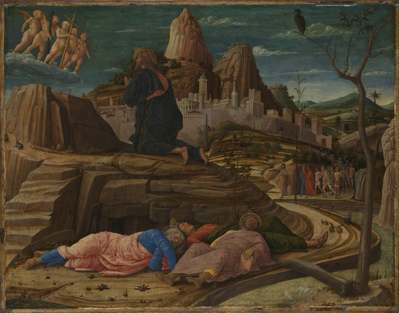
The Agony in the Garden (about 1455 to 1456) by Andrea Mantegna. Egg tempera on panel © The National Gallery, London
In Mantegna’s version you notice:
- the architectural feel of the composition, with very detailed rocks creating a claustrophobic, full feel to the composition and tightly framing the sleeping apostles
- the foreshortening of the body of the sleeping apostle – Mantegna was one of the first artists in the West to systematically experiment with painting foreshortened figures in perspective: he was so proud of this that he signed the painting in the rocks directly above the sleepers
- the tightness of the way the road curves from the sleepers round the rocks to the crowd of soldiers and citizens being led by Judas Iscariot to betray Jesus
- the architectural details of the city of Jerusalem in the background which, when you look closely, has been done with great precision, including a campanile and a copy of the Roman Colosseum
- there are some rabbits in the road next to one of the apostle’s feet; there are lots of rabbits in Mantegna’s works
No contrast with Bellini’s treatment of the same subject.
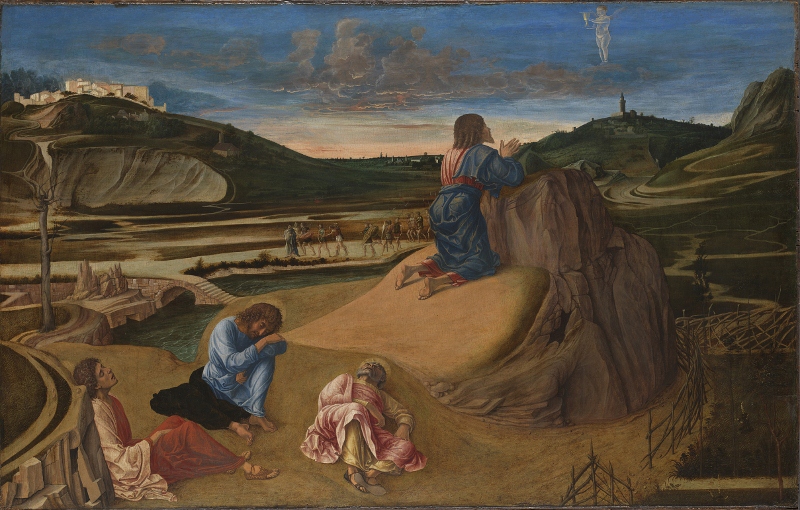
The Agony in the Garden by Giovanni Bellini (about 1458 to 1460) © The National Gallery, London
Whereas Mantegna’s is packed and stacked with lines and planes – of the busy terraces of rocks and road and distant buildings – Bellini’s composition is much more open, and the central slope Christ is praying on is surprisingly bland and smooth. The audio-commentary points out that Bellini had a go at a Mantegna-style foreshortened figure in the centre, but hasn’t brought it off as well as the Paduan.
Instead, the audio-commentary points to the clouds. They are a surprisingly realistic depiction of the pinkness of dawn, drawing on contemporary Flemish landscape painting. The clouds are not just part of the background as in the Mantegna, but carefully crafted in order to create an atmosphere. Same with the city on the hill to the left. If you look closely (and the joy of visiting exhibitions is that you can look really closely at all these wonderful paintings) you see that the buildings lack detail (windows or doors) and are soft and hazy – much as you would actually see buildings in the far distance in sunny Italy.
This comparison brings out the way that Mantegna is interested in architectural detail and framing, of not only buildings but of people. His works have great clarity and are often full of learned details – he is an intellectual painter – but can also feel harsh and forbidding.
By comparison all Bellini’s works have a softness about them. Whereas Mantegna is interested in line and content, Bellini is interested in tone and atmosphere.
Mantegna = compositional innovation
Bellini = atmospheric, natural landscapes
Mantegna versus Bellini
By and large, whenever I saw a painting from a distance, before I could read the label, I could tell the two artists apart: Bellini’s always have soft outlines, Mantegna’s always have much more defined, sometimes almost cartoon-clear outlines.
By and large I much preferred the Mantegna. Wherever possible the exhibition places paintings on similar subjects by the pair together, so you can compare and contrast, for example their contemporaneous depictions of Saint Jerome in the Desert. Mantegna’s Jerome is set among characteristically lined, striated, and precise rock and is packed with detail – Bellini’s image is much sparer and softer and the composition is emptier, less busy, more atmospheric.
- St. Jerome in the Wilderness (1460) by Giovanni Bellini
- St. Jerome in the Wilderness (1450) by Andrea Mantegna
Really looking at these, again, I think I prefer the Mantegna because it is more medieval: he is interested in the saint’s flat-brimmed red hat, in his wooden sandals, in the wooden rack hanging from nails in his cave, in the owl – presumably signifying wisdom – perching at the top of the cave, and so on. I find these details interesting, diverting, charming – and so find the Bellini empty and bland and so you are left solely to concentrate on the bad draughtsmanship of both man and lion.
Similarly, there are direct comparisons between their treatments of Christ’s descent into hell, and the presentation of the infant Christ at the Temple.
Here’s an early Mantegna which shows his love of classical architecture and the way he uses it to frame his compositions. You can look at this painting for quite a long time, enjoying the use of the pillar and broken arch to support the punctured saint. The detailing of the frieze on the stonework is exquisite, as it is in the rubble at his feet or the faces in the broken frieze behind him. The more you look, the more breath-taking the detail becomes. And that’s before you begin to investigate the background, where you can see the three archers who have just done Sebastian to death, strolling casually along the road to the left on their way back to the city across the river, which is itself painted in tiny finicky detail. But it’s the architectural solidity of the composition which is dominant.
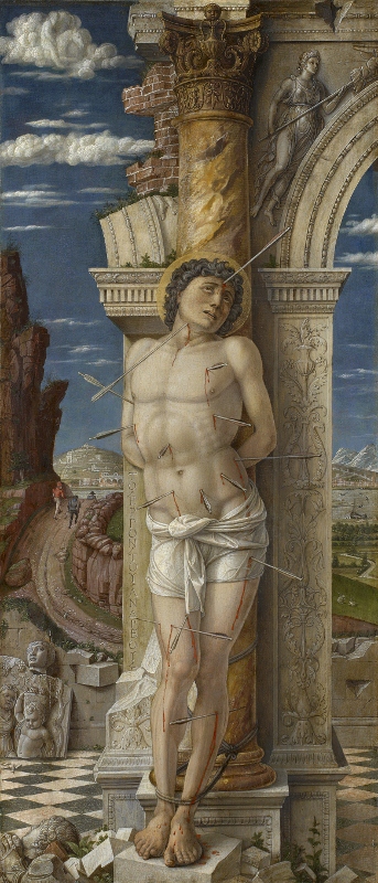
Saint Sebastian by Andrea Mantegna (about 1460) © Gemäldegalerie, Kunsthistorisches Museum, Vienna
The future of painting
I preferred Mantegna all the way through until we came to the last few rooms. Here, suddenly, Bellini metamorphosed into the Future of Painting and Mantegna suddenly looked old and wooden. Suddenly Bellini was making paintings of Greek mythical subjects which had a softness and haziness, a kind of sweetness about them, which looks like Titian, which looks forward to the next hundred years.
In my ignorance, when I saw this across a crowded room, I thought the bucolic setting and very bright colours meant it was by Poussin. It is in fact still a Bellini, but worlds away from the stilted drawing of Jerome. That was 1460. Now it is nearly fifty years later and Bellini has made extraordinary strides in the art of composition and colouring. Instead of an empty desert he gives us a lazy relaxed pagan landscape in which a whole host of Greek mythical characters are lounging and flirting.
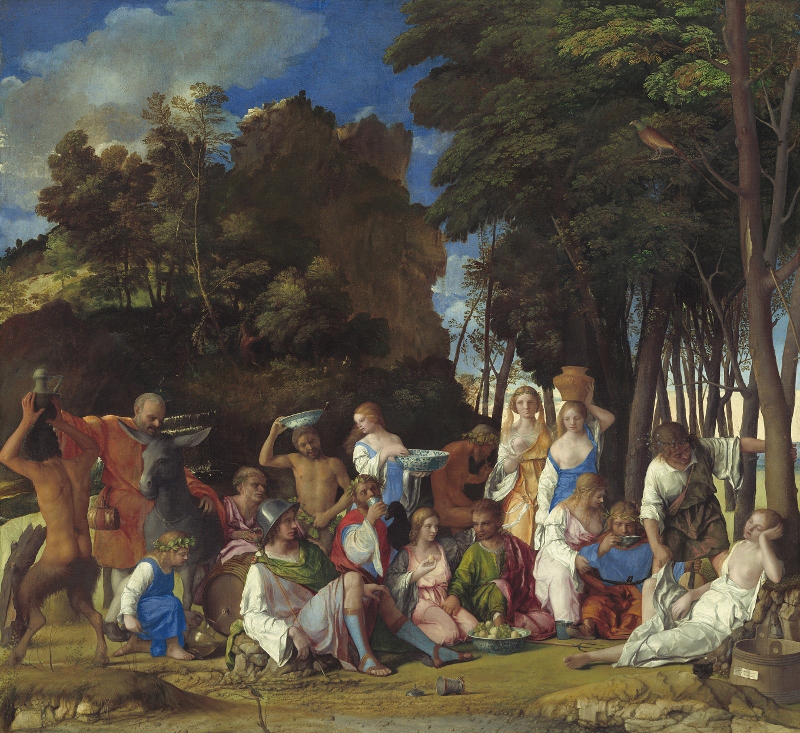
The Feast of the Gods (1514–29) Giovanni Bellini, with later additions by Dosso Dossi and Titian. Image courtesy of the Board of Trustees, National Gallery of Art, Washington, DC
The commentary tells us that Titian (1488 to 1576) was much influenced by Bellini whose workshop he trained in from 1507, and that Titian almost certainly ‘refined’ and ‘improved’ this work by Bellini. You can feel one master handing on the baton to Titian, who will have a transformative effect on Western art. Suddenly, in late Bellini, you feel like you are confronting the future of Western art.
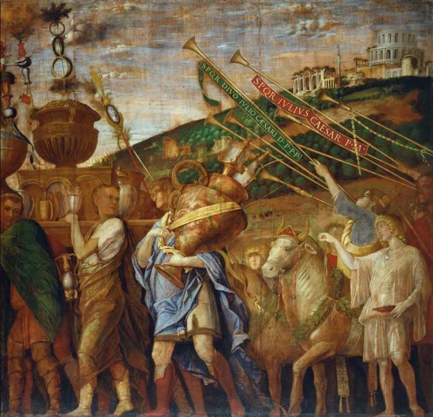
On the opposite wall of this, the fourth and largest room in the exhibition, are hanging three enormous, absolutely huge (2.66 x 2.78 m) paintings depicting the Triumph of Caesar. Mantegna originally created nine of these monster paintings between 1484 and 1492 for the Gonzaga Ducal Palace in Mantua. Acknowledged from the time of Mantegna as his greatest masterpiece, they remain the most complete pictorial representation of a Roman triumph ever attempted.
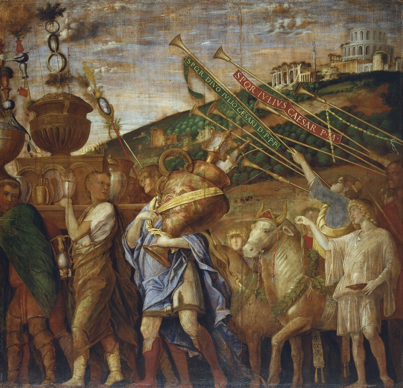
The Triumphs of Caesar IV: The Vase-Bearers (mid-1480s to before 1506) by Andrea Mantegna. Royal Collection Trust / © Her Majesty Queen Elizabeth II 2018
The structured nature of the composition is awesome. You can feel the intelligence and care which has gone into positioning every element, and Mantegna’s unparalleled knowledge of every element of classical life, which he had spent a lifetime studying.
Still, placed next to the Bellini gods, it feels stagey, and it feels dated. In them Mantegan reaches a kind of peak of magnificence of the architectural composition which he pioneered, and this kind of grand historical painting will go on to be perfected by artists like Veronese. But a glance at the softer, subtler shapes of the Bellini feast tells you that it is his style which will go on to dominate future art.
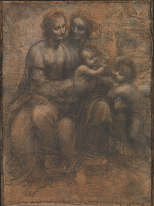
To see what I mean compare these portraits from the final room of the exhibition. Here is Mantegna demonstrating, as throughout his career, an interest in line and composition. Note the amazing detail on the fabric of the Madonna, and the gauntly ‘realistic’ expressions of the faces of her parents.
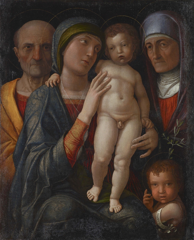
The Holy Family by Andrea Mantegna (about 1490 to 1500) © bpk / Staatliche Kunstsammlungen Dresden / Elke Estel / Hans-Peter Klut
Now compare with a Virgin and child (with Saints Catherine and Mary Magdalene thrown in for good measure) by Bellini.
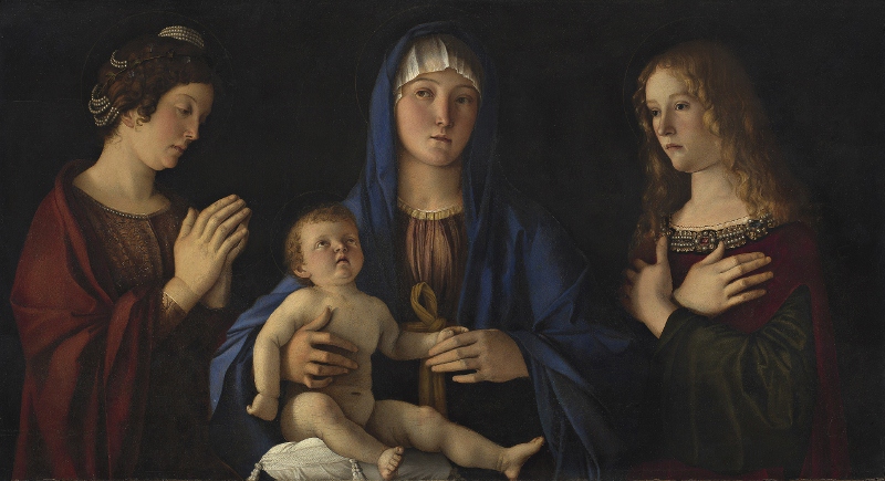
The Virgin and Child with Saints Catherine and Mary Magdalene (about 1490) by Giovanni Bellini © Museo Nazionale delle Gallerie dell’Accademia di Venezia
This reproduction doesn’t do it any justice. In the flesh this is a quite hauntingly, atmospheric painting. The way the softly painted women emerge from the Stygian background is quite magical.
The commentary emphasises that Mantegna’s portraits were often painted with egg tempera or using glue, a technique which resulted in an often dull matt finish, a finish which brought out the line and composition he considered so important.
By sharp contrast, by his later years, Bellini has mastered the use of oil paint to create works of tremendous atmosphere and depth. Although the figures in this painting are not exactly naturalistic, the use of oil joins them together with a real psychological power. Plus Bellini has become a real master of painting details in oil. I marvelled at the exquisite detailing of the pearls and jewels lining the cloaks of Catherine and the Magdalene. This reproduction doesn’t begin to convey what an intense and powerful painting this is in the flesh.
Bellini wins
If this was a football match I’d have said Mantegna was leading 1-0 until the 89th minute and then Bellini stole up and won it with a late equaliser and a winning goal in extra time.
All the way through I had preferred Mantegna’s statuesque line figures and his use of classical architecture and symbolism to adorn paintings historical and mythological. Then, in the last couple of rooms, in his full maturity, Bellini seems to soar to an entirely new place in terms of technique.
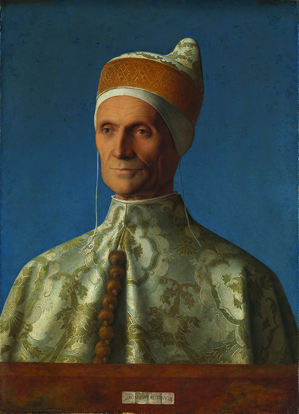
Doge Leonardo Loredan by Giovanni Bellini (about 1502) Oil on poplar © The National Gallery, London
This reproduction also doesn’t do justice to the original. You could stand for hours just marvelling in Bellini’s use of oil paint in this large portrait, especially in the unbelievable detailing of the Doge’s gown.
The commentary makes the subtle point that the left side of his mouth, in sunlight, is firm and set, whereas the right side, in relative shade, bears the hint of a smile. This can be taken as an allegory of the character required to be leader of a city, a mixture of light (justice) with shade (forgiveness and humour).
In these last few works you can see why the curators claims that without these works imbued with their creativity and innovation, Renaissance art by the likes of Titian, Correggio, and Veronese, would not exist as it does today.
There is much, much more to see at this terrific exhibition, much which repays really intense historical, scholarly, intellectual and aesthetic engagement. It’s an effort, but the rewards are tremendous.
Room one. Beginnings
Introduces the cultural environments of the two cities that shaped Mantegna and Bellini – Padua and Venice. Shows how the tastes of dominant patrons and their working environments (including the family-run workshop) played a role in the development of the artists. Highlight: ‘The Jacopo Bellini album’ on loan from the British Museum (which has lent 18 works to the exhibition). Jacopo’s sketchbook is a key starting point for ‘Mantegna and Bellini.’
Room two. Explorations
Examines the mutual impact of each artist on the other during the years of their closest creative exchange, around the time of the marriage that made them brothers-in-law. A number of juxtapositions compare and contrast their approach to near identical compositions e.g. ‘The Descent into Limbo’ and ‘The Crucifixion’.
Room Three. Pietà
Focuses on the origins and development of a distinctive new type of image in Christian art, the Dead Christ supported by Angels. Works include sculptural reliefs (such as Mantegna’s ‘Grablegung Christ’) as well as works on paper (Mantegna’s Pietà, 1456–9) and Bellini’s tempera on panel ‘Pietà’ from the Uffizi Gallery.
Room Four. Landscape
Explores the enormous importance of Bellini’s particular contribution to the history of art – the depiction of beautifully observed landscape, natural light, and atmosphere as a key element of the composition and meaning of religious works, including Bellini’s ‘Resurrection of Christ’
Highlight: first chance to see the newly restored National Gallery work, ‘The Assassination of Saint Peter Martyr’ (about 1507).
A number of pairings will reveal the differences in approach to landscape between the two artists – and also reveal the ways in which Bellini’s exceptional talent had a lasting effect on Mantegna (such as in his astonishingly accurate view of Mantua in his ‘Death of the Virgin’, 1462).
Room Five. Devotional Paintings and Portraits
A focused insight into a particular contribution to Italian Renaissance art – the development of the ‘sacra conversazione’ in which the seated Virgin and Child appear in the company of saints (‘in conversation’) as if occupying the same space and breathing the same air.
Mantegna’s ‘Holy Family’ (1495 to 1500) and ‘Madonna and Child’ (1455 to 1460) will be placed next to Bellini’s ‘Madonna and Child with two Saints’ and ‘The Virgin and Child’ (about 1475).
Room Six. Antiquity
Features some of the largest and most spectacular loans, which showcase Mantegna’s particular brilliance in the use of antique models and subjects to drive innovation in his art.
Highlight: three of his great ‘Triumphs of Caesar’ (The Bearers of Standards and ‘Siege Equipment’, ‘The Vase-Bearers’, and ‘The Elephants’, c.1484–92) , monumental tempera on canvas works measuring almost three metres square, lent by Her Majesty The Queen.
Contrasted with these will be sculptural monochromes by Bellini, including ‘An Episode from the Life of Publius Cornelius Scipio’ (about 1506) and ‘Two men in antique dress’, along with one of his final paintings, ‘The Drunkenness of Noah’ (about 1515).
In case you need any more persuading, Dr Caroline Campbell, Director of Collections and Research at the National Gallery and curator of ‘Mantegna and Bellini’, says:
Exhibitions focusing on 15th-century art are rare as the works involved are often fragile and so cannot travel very often – therefore ‘Mantegna and Bellini’ really is a once-in-a-lifetime chance to explore the relationship and work of these two artists who played such a pivotal role in the history of art.
Curator’s introduction
Related links
- Mantegna and Bellini continues at the National Gallery until 27 January 2019