The Renaissance Nude @ the Royal Academy

In this review I intend to make three points:

  1. This exhibition is without doubt a spectacular collection of outstanding Renaissance treasures, gathered into fascinating groups or ‘themes’ which shed light on the role of the body in Renaissance iconography.
  2. It confirms my by-now firm conviction/view/prejudice that I don’t really like Italian Renaissance art but adore North European late-medieval and Renaissance art.
  3. Despite being spectacular and full of treasures, the exhibition left me with a few questions about the underlying premise of the show.

1. Spectacular Renaissance treasures

The exhibition brings together works by many of the great masters of the Renaissance, including Titian, Raphael, Michelangelo, Leonardo da Vinci, Donatello, Dürer and Cranach. The small sketch by Raphael of the three graces is seraphic, the two pages of anatomical drawings by Leonardo da Vinci are awe-inspiring and the Venus Rising by Titian is wonderful full scale and in the flesh.

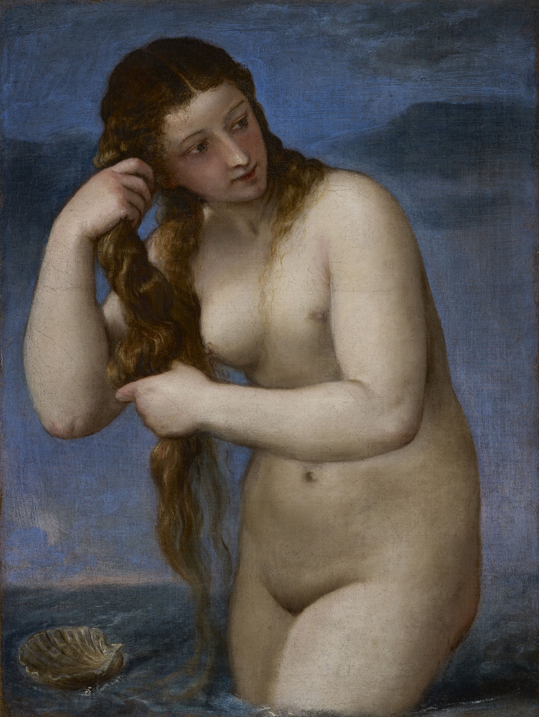
Venus Rising from the Sea (‘Venus Anadyomene’) by Titian (1520) National Galleries of Scotland

However, it isn’t just a parade of greatest hits. The exhibition includes works by lots of less-famous figures such as Perugino, Pollaiuolo and Gossaert, and lots of minor works or works which aren’t striving for greatness at all.

Indeed, there are quite a few rather puzzling or perplexing prints and images, like Dürer’s woodcut of naked men in a bath-house, or a battle scene from the ancient world where all the axe-wielding men are naked. The exhibition is more notable for its diversity and range than its concentration on well-known names.

And it is far from all being paintings. There are also large numbers of prints and engravings, alongside drawings and sketches, statuettes in metal and wood, some bronze reliefs, and fifteen or so invaluable books of the time, propped open to display beautiful medieval-style, hand-painted illustrations.

There’s even a case of four or five large circular plaques from the period, showing the patron’s face on one side and nude allegorical figures on the other. There are some 90 works in total.

In other words, this exhibition brings together pieces from across the widest possible range of media, and by a very wide range of artists, famous and not so famous, in order to ponder the role of the naked human body in Renaissance art, showing how the depiction of the nude in art and sculpture and book illustration changed over the period from 1400 to 1530.

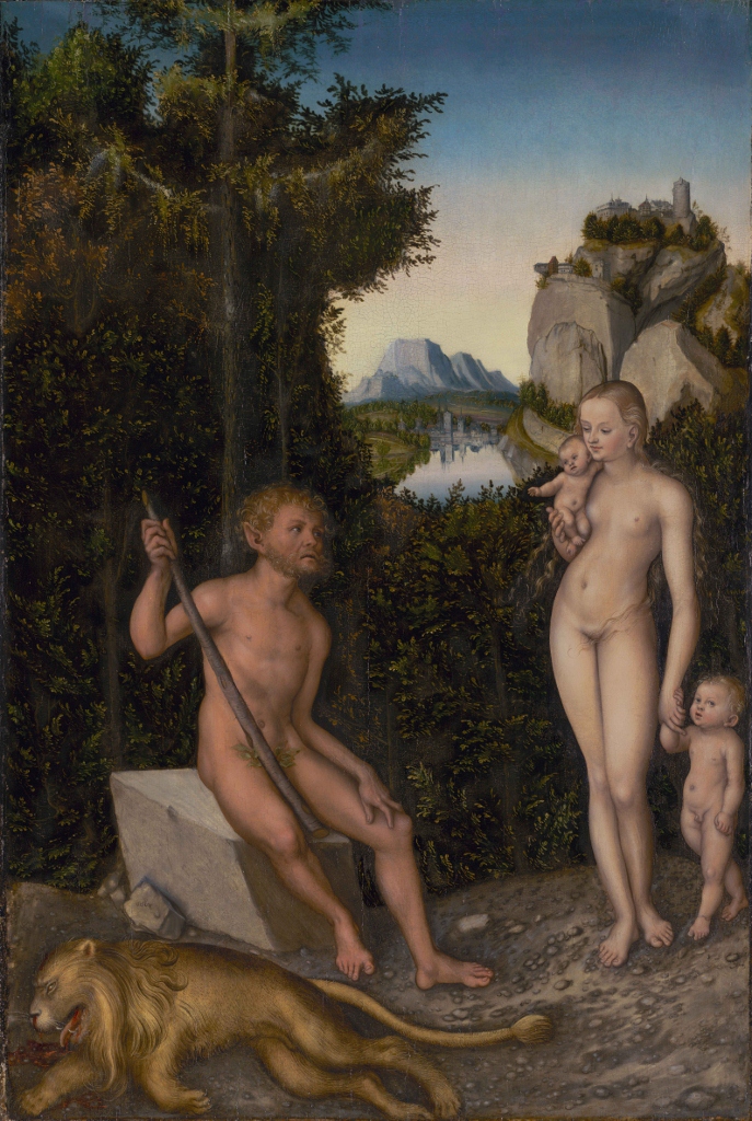
A Faun and His Family with a Slain Lion (c. 1526) by Lucas Cranach the Elder. The J. Paul Getty Museum, Los Angeles

It does this by dividing the works into five themes.

1. The nude and Christian art

Medieval art had been concerned almost exclusively with depicting either secular powers (kings and emperors) or religious themes. For the most part the human figure had been covered up. So a central theme in the exhibition is documenting the increasing ‘boldness’ or confidence with which artists from the period handled subjects involving nudity, and the increasing technical knowledge of the human body which gave their images ever-greater anatomical accuracy.

You can trace this growing confidence in successive depictions of key Christian stories such as the countless depictions of Adam and Eve in the Garden of Eden, probably the locus classicus of nudity in the whole Christian canon.

This version by Dürer seems more motivated by the artist showing off his anatomical knowledge and skill at engraving (and learnèd symbolism) than religious piety.

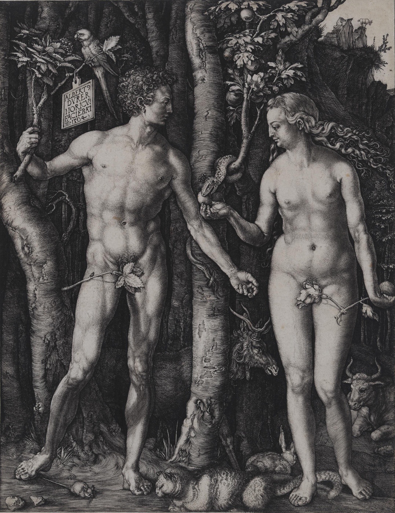
Adam and Eve by Albrecht Dürer (1504) Los Angeles County Museum of Art

Of course the Christian Church still ruled the hearts and imaginations of all Europeans and the Pope’s blessing or anathema was still something to be hoped for or feared. From top to bottom, society was dominated by Christian ideology and iconography. And so alongside Adam and Eve there are quite a few versions of of other subjects which provided an opportunity for nudity, such as Christ being scourged or crucified, or the large number of Last Judgements with naked souls being cast down into Hell.

In fact for me, arguably the two most powerful pictures in the entire show were the images of damned souls being stuffed down into Hell by evil demons, by the two Northern painters Hans Memling and Dirk Bouts.

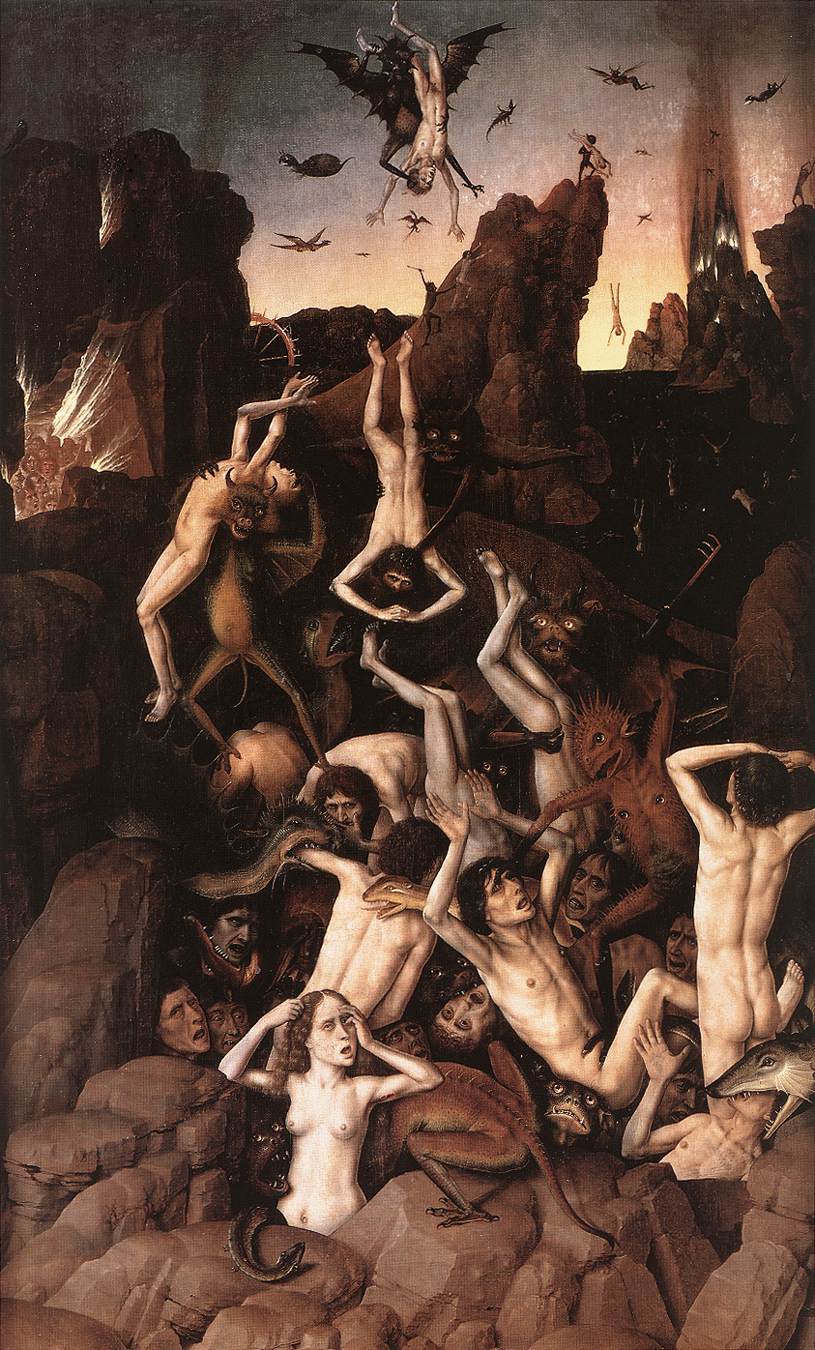
The Fall of The Damned by Dirk Bouts (1450)

In these images the fact that the men and women have been stripped naked is an important part of their message. It symbolises the way they have been stripped of their dignity and identity. They have become so much human meat, prey for demons to torture and even eat. Paintings like this always remind me of descriptions of the Holocaust where the Jews were ordered to strip naked, men and women and children, in front of each other, and the pitiful descriptions I’ve read of women, in particular, trying to hang on to their last shreds of dignity before being murdered like animals. The stripping was an important part of the psychological degradation which reduced humans to cowed animals which were then easier to shepherd into the gas chambers.

2. Humanism and the expansion of secular themes

Humanism refers to the growth of interest in the legacy of the classical world which began to develop during the 1400s and was a well-established intellectual practice by the early 1500s.

Initially, humanism focused on the rediscovered writings of the Greeks and especially the Romans, promoting a better understanding of the Latin language and appreciation of its best authors, notably the lawyer and philosopher Cicero.

But study of these ancient texts went hand in hand with a better understanding of the classical mythology which informed them. In the 1500s advanced thinkers tried to infuse the ancient myths with deeper levels of allegory, or to reconcile them with Christian themes.

Whatever the literary motivation, the movement meant that, in visual terms, the ancient gods and goddesses and their numerous myths and adventures became increasingly respectable, even fashionable, subjects for the evermore skilful artists of the Renaissance.

In addition, classical figures also became a kind of gateway for previously unexpressed human moods and feelings. For some painters a classical subject allowed the expression of pure sensual pleasure, as in the Titian Venus above.

In this wonderful drawing by Raphael something more is going on – there is certainly a wonderful anatomical accuracy, but the drawing is also expressing something beyond words about grace and gracefulness, about eloquence of gesture and poise and posture, something quite wonderful. It’s relatively small, but this little drawing is among the most ravishing works in the exhibition.

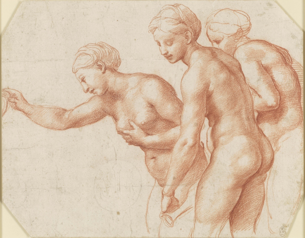
The Three Graces by Raphael (1517 to 1518) Royal Collection Trust © Her Majesty Queen Elizabeth II 2019

The replacement of sex by desire in artspeak

About half way round the exhibition, I began to notice that the words ‘sex’ or ‘sexy’ do not appear anywhere in the wall labels or on the audioguide. This began to seem increasingly odd because some of the paintings are deliberately sexy and sensual, blatant pretexts for the artists to show off their skill at conveying the contours and light and shade of naked human bodies, often deliberately designed to arouse and titillate.

The word ‘sex’ was completely absent from both the wall labels and the audioguide. You get the strong impression that in curatorland it is banned, swept under the carpet. Art scholars prefer to use the vague and willowy term ‘desire’. Not only that, but you also get the strong impression that ‘same-sex desire’ is the optimum form of this, especially when it comes to men. After a good couple of hours you begin to realise that ‘same sex desire’ is preferred to ‘desire’ and wonder if it’s because (predominantly women) art curators and scholars are more comfortable dealing with women’s desire and same-sex desire, than with heterosexual male ‘desire’.

Not just in this exhibition, but in any other you attend nowadays, any way in which a straight man can look at a woman is, certainly in modern art scholarship, immediately brought under the concept of the wicked, controlling, shaping, exploitative, objectifying, judgmental and misogynistic Male Gaze.

The English language possesses many other words to describe these feelings and activities surrounding sex but I was struck how they are all banned from the chaste world of artspeak. Here’s an example:

Within humanist culture, much art created around the nudes was erotic, exploring themes of seduction, the world of dreams, the power of women and same-sex desire.

‘The power of women and same-sex desire.’ These are very much the values promoted by art institutions and art scholars in most of the art exhibitions I go to, and the values which the narrow world of contemporary art scholarship projects back onto all of history.

The sexy or horny male has been quietly and subtly elided from the picture.

I don’t even really disagree with this view, as such; up with empowering women, bully for same-sex male desire. It’s more the narrowness of perception I’m complaining about: the sense that the world of legitimised responses has narrowed down to the same constricted interpretations and carefully limited vocabulary.

For me art is about opening up – perceptions, possibilities; it’s about expanding my sense of visual and conceptual possibility, new ideas, strange feelings. Whereas the repetitive, stock, predictable use of a handful of approved ideas and buzzwords limits and closes down analysis and discussion and enjoyment. It’s not the vocabulary itself, it’s its limitedness and endless repetition which I find depressing.

Saint Sebastian

A good example of the unashamed sensuality of Renaissance art is the image the Academy has chosen for the posters for the exhibition, Saint Sebastian by Agnolo Bronzino.

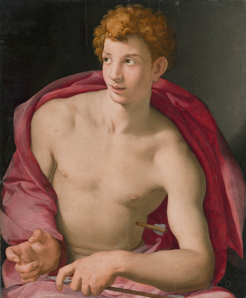
Saint Sebastian by Agnolo Bronzino (1533) Museo Nacional Thyssen-Bornemisza, Madrid

Saint Sebastian was an early Christian convert who was killed by Roman soldiers by being shot to death with arrows (around the year 288 AD, according to legend). There are four or five depictions of the arrow-peppered saint in the exhibition and what comes over powerfully in all of them is the way that the supposedly tortured saint is obviously experiencing absolutely no pain whatsoever. In fact, in the hands of Renaissance painters, the subject has become an excuse to display their prowess at painting (or sculpting) beautiful, lean, muscular, handsome young men, often seeming to undergo a sexual rather than religious experience.

Bronzino’s painting takes this tendency – the conversion of brutal medieval legend into Renaissance sensuality – to an extreme. The audioguide points out that the unusually large ears and distinctive big nose of this young man suggest it is a portrait from life, maybe the gay lover of Bronzino’s patron?

Whatever the truth behind this speculation, this painting is quite clearly nothing at all to do with undergoing physical agony, torture and dying in excruciating pain in order to be closer to the suffering of our saviour. Does this young man look in agony? Or more as if he’s waiting for a kiss from his rich sugar daddy? It is easy to overlook the arrow embedded deep in his midriff in favour of his hairless sexy chest, his big doe eyes, and Bronzino’s show-off depiction of the red cloak mantled around him.

It is a stunningly big, impactful, wonderfully executed image – but it also epitomises a kind of slick superficiality which, in my opinion, is typical of Italian Renaissance art – a point I’ll come back to later.

3. Artistic theory and practice

This is a scholarly room which explains how Renaissance artists began to submit the human body to unprecedented levels of systematic study and also to copy the best of classical precedents. We see examples of the sketches and sculptures made by Renaissance artists copying newly discovered classical statues, such as the Laocoön and the Boy with a Thorn in his Foot.

At the start of the period covered (1400) life drawing was unheard of, which is why so much medieval art is stylised and distorted and sometimes dismissed as rather ‘childish’. By the end of the period (1530) drawing from life models was standard practice in all reputable artists’ workshops.

It is in this section of the exhibition that we see the enormous guide to anatomy, the Vier Bucher von menschlicher Proportion created by Albrecht Dürer, in a display case, and two examples of Leonardo da Vinci’s extraordinarily detailed drawings of human anatomy (in the example below, of a man’s shoulder).

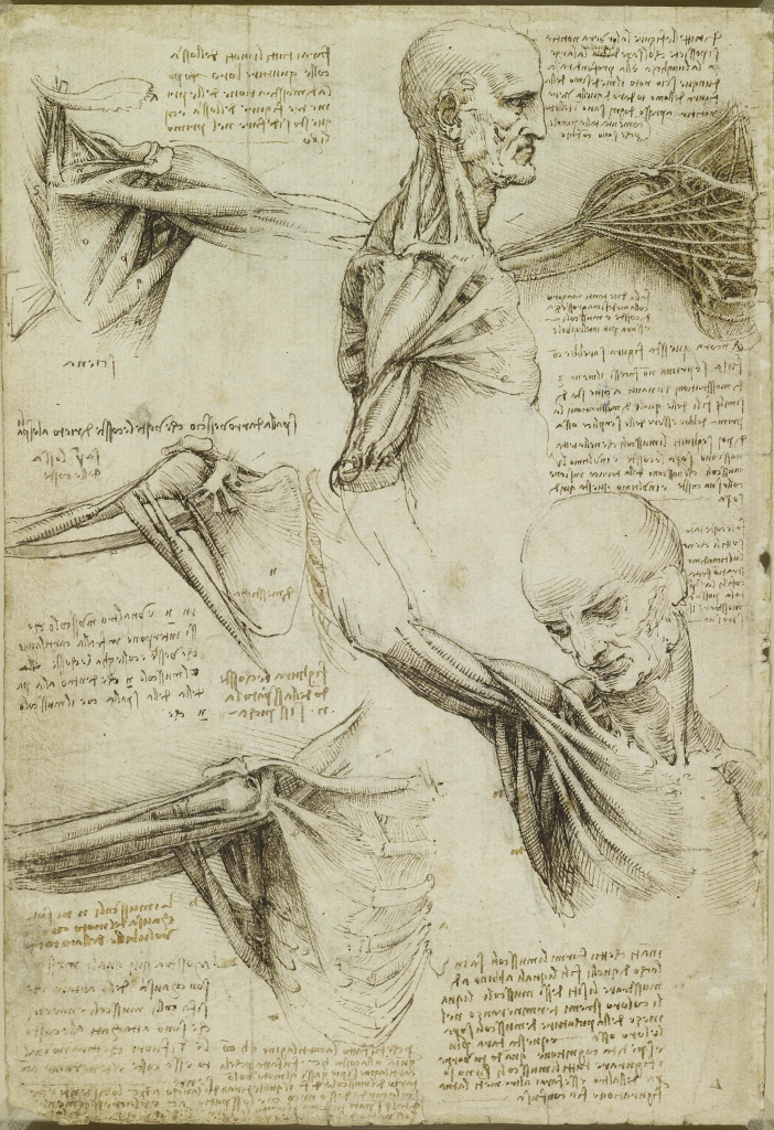
The Anatomy of the Shoulder and Neck by Leonardo da Vinci (1510 to 1511) Royal Collection Trust © Her Majesty Queen Elizabeth II

It was a fleeting idea, but it crossed my mind that there is something rather steampunk about Leonardo’s drawings, in which intimately depicted human figures are almost turning into machines.

4. Beyond the ideal nude

This small section examines images of the human body being tortured and humiliated. The founding motif in this subject in the Western tradition is of Christ being stripped, whipped, scourged, stoned, crucified and stabbed with a spear as per the Gospel accounts of his interrogation, torture and execution.

There is an exquisite little book illustration in the Gothic style of a Christ naked except for a loincloth tied to the pillar and being scourged. If you can ignore the half naked man being scourged within an inch of his life at the centre, the detail on the faces and clothes and the pillar and architecture are all enchanting.

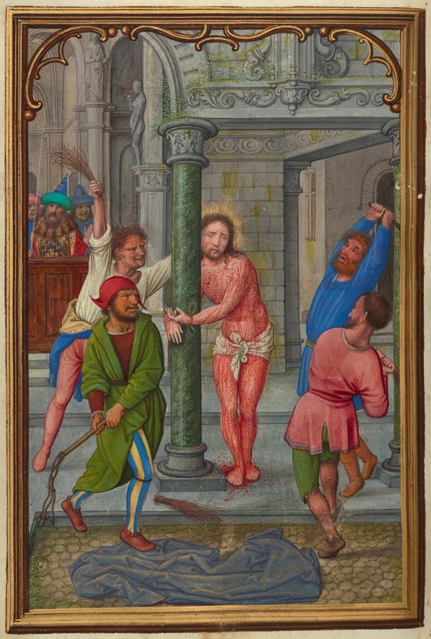
The Flagellation by Simon Bening (1525–1530)

This room is dominated by a vast depiction of the legend of the ten thousand martyrs who were (according to Christian legend) executed on the orders of the Emperor Hadrian by being spitted and transfixed on thorn bushes. The odd thing about images like this is the apparent indifference of those being skewered and tortured, but there is no denying the sadism of the torturers and, by implication, the dark urges being invoked in the viewer.

Here again, I felt that modern art scholarship, fixated as it is on ‘desire’ and, in particular, determined to focus on women’s desire or the ‘safe’ subject of ‘same-sex desire’, struggles to find the words to describe human sadism, brutality and cruelty.

I had, by this stage, read quite a few wall labels referring to the subtle sensuality and transgressive eroticism and same-sex desire of this or that painting or print. But none of them dwelt on what, for me, is just as important a subject, and one much in evidence in these paintings – the human wish to control, conquer, subjugate, dominate, punish, and hurt.

Reflecting the civilised lives lived by art scholars, wafting from gallery to library, immersed in images of erotic allure and same-sex desire, art criticism tends to underestimate the darker emotions, feelings and drives which exist out here in the real world. The universal use of the bluestocking word ‘desire’ instead of the cruder words which the rest of the English-speaking word uses for the same kind of thing, is a small token of this sheltered worldview.

These thoughts were prompted by the scenes of hell, the numerous battle scenes and the images of martyrdoms and whippings on display in this room. They were crystallised by this image, which was the first one to make me really disagree with the curators’ interpretations.

This is Hans Baldung Grien’s etching of a Witches’ Sabbath. The curators claim the image represents ‘male anxiety’ at the thought of ‘powerful women’ and ‘presents women as demonic nudes, rather than as beauties to be desired’. (Note the buzz word ‘desire’ being shoehorned into the unlikely context of even this dark image.)

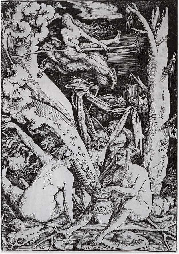
Witches’ Sabbath by Hans Baldung Grien (1510)

Anyway, the curators’ interpretation is so bedazzled by feminist ideology as to misread this image in at least two ways.

Number one

Is it really the women’s nudity which is so scary? No. It is the thought that these are humans who have wilfully given themselves to the power of the devil, to Satan, and become his agents on earth to wreak havoc, blighting harvests, infecting the healthy, creating chaos and suffering. That was a terrifying thought to folk living in a pre-scientific age where everyone was utterly dependent on a good harvest to survive. The nudity is simply a symbol of the witches’ rejection of conventional notions of being respectably clothed. The fact that the curators completely miss the religious threat and complexities of the picture in order to focus on the ‘power’ of naked women typifies everything about the shallowness , body obsession and unimaginativeness of their worldview.

Number two

The nudity is surely the least interesting thing in the entire image. Surely the print is packed full of arcane and fascinating symbolism: what are the two great streams issuing up the left-hand side, and ending in what looks like surf? Are they some kind of wind, or actual waves of water? And why does the lower one contain objects in it? Are they both issuing from the pot between the woman’s legs and does the pot bear writing of some sort around it, and if so, in what language and what does it say? Why is the woman riding the flying ram backwards and what is in the pot held in the tines of her long wooden fork? What is lying on the plate held up in the long scraggy arm of the hag in the middle? Is it just a cooked animal or something worse (i.e. a human body part)? Are those animal bones and remains at the witches’ feet? What is the pot at the left doing and what are hanging over another wooden hoe or fork, are they sausages or something more sinister?

Feminist art criticism, by always and immediately reaching for a handful of tried-and-trusted clichés about ‘male anxiety’ or ‘the male gaze’ or ‘the patriarchy’ or ‘toxic masculinity’, all-too-often fails to observe the actual detail, the inexplicable, puzzling and marvellous and weird which is right in front of their eyes. Sometimes it has very interesting things to say, but often it is a way of smothering investigation and analysis under a blanket of tired clichés and corporate buzz words.

5. Personalising the nude

During the Renaissance individual patrons of the arts became more rich and more powerful. Whereas once it had only been Charlemagne and the Pope who could commission big buildings or works of art, by 1500 Italy was littered with princes and dukes and cardinals all of whom wanted a whole range of works to show off how fabulous, rich, sophisticated and pious they were, from palaces and churches, to altarpieces and mausoleums, from frescos and murals to coins and plaques, from looming statues to imposing busts and big allegorical paintings and small, family portraits.

Thus it is that this final room includes a selection of works showing the relationship between patrons and artists, especially when it came to commissioning works featuring nudity.

The most unexpected pieces were a set of commemorative medals featuring the patron’s face on one side and an allegorical nude on the other.

Next to them was a big ugly picture by Pietro Perugino titled The Combat Between Love and Chastity. Apparently, Isabella d’Este, Marchioness of Mantua, was one of the few female patrons of her time and commissioned a series of allegorical paintings for her studiolo, a room designated for study and contemplation.

Isabella gave the artist detailed instructions about what must be included in the work, including portraits of herself as the goddesses Pallas Athena (left, with spear) and Diana (centre, with bow and arrow), as well as various scenes from Ovid’s Metamorphoses which have been chucked into the background (for example, in the background at centre-left you can see what appears to be Apollo clutching the knees of the nymph Daphne who is turning into a laurel tree.)

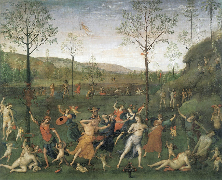
The Combat Of Love And Chastity Painting by Pietro Perugino (1503)

Maybe the curators included this painting an example of the way nudity had become fully normalised in Western painting by about 1500, but it is also an example of how misguided devotion to ‘the classics’ can result in a pig’s ear of a painting. And this brings me to my second broad point.

I prefer northern, late-medieval art to Italian Renaissance art

Why? Because of its attention to sweet and touching details. Consider The Way To Paradise by Dirk Bouts, painted about 1450. This reproduction in no way does justice to the original which is much more brightly coloured and dainty and gay.

In particular, in the original painting, you can see all the plants and flowers in the lawn which the saved souls are walking across. You can see brightly coloured birds perching amid the rocks on the left. You can even see some intriguingly coloured stones strewn across the path at the bottom left. There is a loving attention to detail throughout, which extends to the sumptuous working of the angel’s red cloak or the lovely rippled tresses of the women.

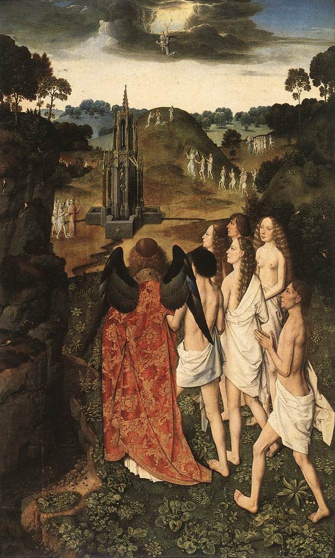
The Way to Paradise by Dirk Bouts (1450)

So I think one way of expressing my preference is that paintings from the Northern Renaissance place their human figures within a complete ecosystem – within a holistic, natural environment of which the humans are merely a part.

The people in these northern paintings are certainly important – but so are the flowers and the butterflies and the rabbits scampering into their holes. Paintings of the Northern Renaissance have a delicacy and considerateness towards the natural world which is generally lacking in Italian painting, and which I find endlessly charming.

Take another example. In the centre of the second room is a two-sided display case. Along one side of it is a series of Christian allegorical paintings by the Netherlandish painter, Hans Memling. I thought all of them were wonderful, in fact they come close to being the best things in the exhibition for me. They included this image of Vanity, the age-old trope of a woman looking in a mirror.

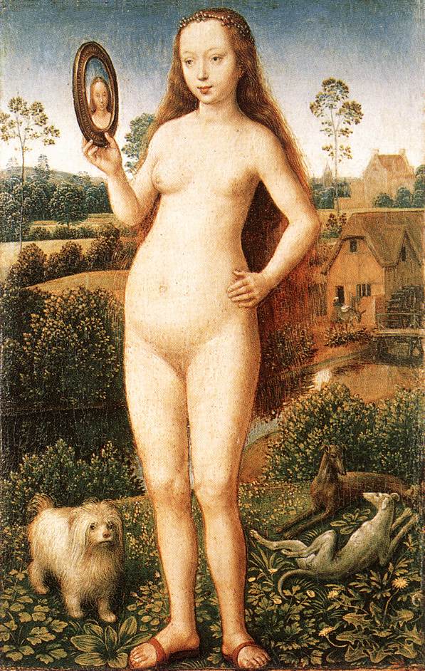
Vanity by Hans Memling (1485)

I love the sweet innocence of the central figure, untroubled by Leonardo da Vinci’s scientific enquiries into human anatomy, undisfigured by flexed tendons or bulging musculature.

And I like the little doggy at her feet and the two whippets lounging further back. And I really like the plants at her feet painted with such loving detail that you can identify a dandelion and a broad-leaved plantain and buttercups. And I love the watermill in the background and the figure of the miller (?) coaxing a donkey with a load on its back towards the little bridge.

The other side of this display case shows a series of allegorical paintings by the famous Italian artist Giovanni Bellini, titled Allegories of Fortune (below).

In the image on the left, of a semi-naked figure in a chariot being pulled by putti, you can see the direct influence of ancient Roman art and iconography which infused all Bellini’s work. It is learnèd and clever and well-executed.

But my God, isn’t it dull! The figures are placed in generic settings on generic green grass with generic mountains in the distance. All the enjoyment of the life, the loving depiction of natural detail, has – in my opinion – been eliminated as if by DDT or Agent Orange. Unless, maybe, you find the little putti sweet and charming, but I don’t. Compared to the delicacy of medieval art, I find Renaissance putti revolting.

Thinking about these pesky little toddlers gives me another idea. They are sentimental. Northern gargoyles and kids and peasants and farmers and figures are never sentimental in the same way these Italian bambini are. There is something a bit rotten about the Italian paintings, they have the official dullness of those packs of Medici Christmas cards you get in charity shops. Sterile. Dead.

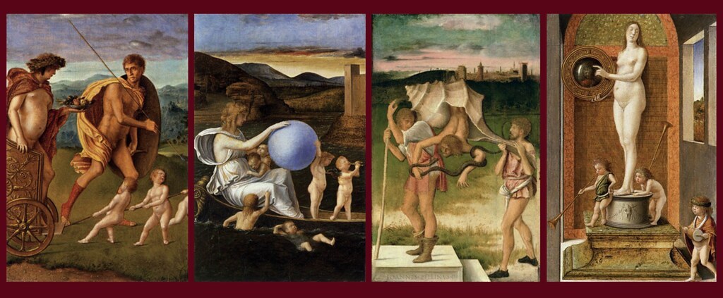
Four Allegories by Giovanni Bellini (1490)

In my opinion, by embracing the pursuit of a kind of revived classicism, many Renaissance paintings lost forever the feel for the decorative elements of the natural world and a feel for the integration of human beings into the larger theatre of nature, which medieval and Northern Renaissance art still possesses.

Reservations about the basic theme of the exhibition

This is without doubt a wonderful opportunity to see a whole range of masterpieces across all forms of media and addressing or raising or touching on a very wide range of topics related to the iconography of nudity.

The curators make lots of valid and interesting points about nudity: they invoke the revival of classical learning, the example of classical sculpture, they describe the importance of nudity in Christian iconography, the way the almost-nudity of Christ on the cross was deliberately echoed in depictions of the almost-nudity of countless saints who are shown being tortured to death.

The curators discuss nudity as symbolic, nudity as allegorical, nudes which appear to be portraits of real people (often the belovèd of the patrons paying the painter), nudes which warn against the evils of sin, nudes which revel in the beauty of the naked male or female body, nude old women acting as allegorical reminders of the passage of Time, nude witches exemplifying ‘male anxiety’ at the uncontrolled nakedness of women – all these points and more are made by one or other of the numerous exhibits, and all are worth absorbing, pondering and reflecting on.

And yet the more varied the interpretations of the nude and naked human form became, the more I began to feel that it was all about everything. Do you know the tired old motto you hear in meetings in big corporations and bureaucracies – ‘If everything is a priority, then nothing is a priority’? Well, I began to feel that if the nude can be made to mean just about anything you want to, maybe it ends up meaning nothing at all.

According to the exhibition, nude bodies can represent:

  • the revival of classical learning – and yet also the portrayal of Christian heroes
  • the scientific study of anatomy – and yet also unscientific, medieval terrors
  • clarity and reason and harmony – and yet also the irrational fears of witches and devils
  • key moments in the Christian story – but also key moments in pagan myth
  • warnings against lust and promiscuity – but also incitements to lust and promiscuity
  • warnings against the effects of Time and old age – and celebrations of beautiful young men and women in their prime

Nakedness can be associated with Christ or… with witches. With the celebration of sexy, lithe young men… or with stern images of torture and sacrifice. With suffering martyrs… or with smirking satyrs tastefully hiding their erections.

In other words, by the end of the exhibition, I felt that nudity in fact has no special or particular meaning in Western art, even in the limited art of this period 1400 to 1530.

The opposite: by the end the exhibition has suggested that nudity had an explosion of meanings, a tremendous diversity of symbols and significances which artists could explore in multiple ways to the delight of their many-minded patrons, and which we are left to puzzle and ponder at our leisure. Nudity, in other words, could be made to mean almost anything an artist wanted it to.

When is a nude not a nude?

There is another, glaringly obvious point to be made, which is that a lot of the figures in the exhibition are not nudes.

  • The Bronzino Saint Sebastian is not nude, he is wearing a cloak which obscures his loins.
  • Christ is always shown wearing a loincloth, never naked.
  • Adam and Eve are held up as examples of the nude but they are, of course, almost never depicted nude but, as in the Dürer woodcut, wearing strategically placed loincloths. 
  • None of the figures in Dirk Bouts’s Way to Paradise is actually nude.
  • In fact one of the several medieval illustrations of Bathsheba shows her fully dressed except that she’s pulled up her dress a bit to reveal some of her thighs. That’s not nude.

So I became, as I worked my way round, a little puzzled as to how you can have an exhibition titled The Renaissance Nude in which quite a few of the figures are not, in fact… nude.

The more you look, the more you realise that something much more subtle is going on in the interplay between fully dressed, partially dressed and completely naked figures, and I felt the full complexities of the interrelationships between total nudity and the various forms of dress and bodily covering to be found in the pictures wasn’t really touched on or investigated as much as it could have been.

Take the Perugino painting, The Combat Of Love And Chastity. I count sixteen figures in the foreground (not counting the irritating cupids). Of these sixteen no fewer than eight are fully dressed, two are partially dressed and only six are nude. So this is not a study in the naked human body. It is a far more subtle study of the interplay between dressed, partially dressed, and fully nude figures, each of these statuses drenched in complex meanings and symbolism.

Again, I wondered whether the curators’ modish obsession with sensuality and desire and ‘the erotic’, and their requirement to assert that this period saw The Rise of the Daring Naughty Nude as a genre, has blinded them to other, far more subtle and interesting interplays between nudity and clothing, which are going on in many of these works.

Summary

This is a fascinating dance around the multiple meanings of nakedness and (near) nudity in Renaissance iconography, and a deeply rewarding immersion in the proliferation of new techniques and new belief systems which characterised the period 1400 to 1530.

But, in the end, as always, the visitor and viewer is left to dwell on with what they like and what they don’t like.

For me, the Renaissance marked a tragic break with the gloriously detailed and eco-friendly world-view of the high Middle Ages, a world (in its iconography) which often achieved a lovely delicacy and innocence.

This late-medieval world is represented in the exhibition by the works by Memling and Bouts which I’ve mentioned, but also by a clutch of exquisite, tiny, illuminated illustrations from a number of medieval books of hours which, we learn, continued to be made and illuminated well into the period of the High Renaissance (around 1500).

So I marvelled, as I am supposed to, at the skill of Bronzino and his sexy Saint Sebastian, at the subtle use of shadow to model the face and torso, at the way the artist shows off his ability to paint the complex folds of the red cloak which sets off the young man’s sexy, hairless chest, and so on.

But I got more genuine pleasure from studying the tiny illuminations in these books of hours, including this wonderful image by Jean Bourdichon, showing the Biblical figure of Bathsheba having her famous bath (in the Bible story she is ‘accidentally’ seen by King David who proceeds to take her to bed).

Yes but note the details – the apples on the tree in the centre and the cherries (?) on the tree on the right. And the flowers on the hedge of bushes across the middle, and the careful detailing of the lattice-work fence. The filigree work of the cloth hanging out the window where King David appears. And the shimmering gold of Bathsheba’s long, finely-detailed tresses as they fall down her back.

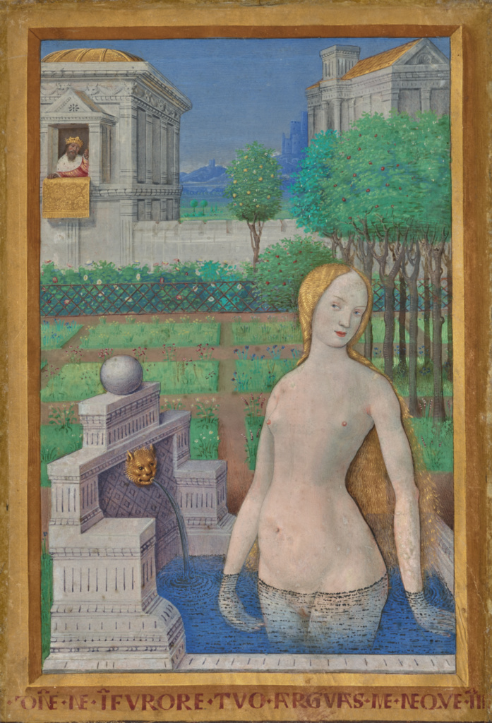
‘Bathsheba Bathing’ from the Hours of Louis XII by Jean Bourdichon (1498) The J. Paul Getty Museum, Los Angeles

Compare and contrast the modesty and sweetness of Bourdichon’s image with the big, grandiose, heavy, dark and foreboding symbolism of a classic Italianate Renaissance painting like this one.

Allegory of Fortune by Dosso Dossi (c. 1530) The J. Paul Getty Museum, Los Angeles

The final room is dominated by this enormous painting by Dosso Dossi, the kind of sombre, portentous allegory you could, by the mid-1500s, order by the yard from any number of artists’ workshops, the kind of thing you can nowadays find cluttering up the walls of countless stately homes all across England, helping to make dark, wood-panelled rooms seem ever darker. I find this kind of thing heavy, stuffy, pretentious, dark and dull. The triumph of soulless perfectionism.

But that’s just my personal taste. You may well disagree. Go and see this fabulous exhibition – it is packed with wonders – and decide for yourself.

Curators

The exhibition is curated by Thomas Kren, Senior Curator Emeritus at the J. Paul Getty Museum, in collaboration with Per Rumberg, Curator at the Royal Academy of Arts.


Related links

More Royal Academy reviews

Reflections: Van Eyck and the Pre-Raphaelites @ the National Gallery

This is a smallish (just 33 works) but really beautiful and uplifting exhibition.

It’s devoted to showing the influence of the northern Renaissance painter, Jan van Eyck, on the Victorian Pre-Raphaelite painters. Well, I love Northern Renaissance art and I love later Victorian art, so I was in seventh heaven.

In the mid-19th century Jan van Eyck was credited as the inventor of oil painting by the Italian painter and historian Giorgio Vasari, author of the Lives of the Great Painters (1550). We now know this not to be strictly true; a more realistic way of putting it is that Van Eyck and his contemporaries in the mid-15th century Netherlands brought oil painting to an extraordinary level of refinement and brilliance. They were the first to use multiple ‘glazes’ (building up successive layers of partly translucent paint) and to pay astonishing attention to detail, producing works which combined amazing precision and sumptuous colour, with an intoxicating sense of depth.

Van Eyck versus del Piombo

The exhibition opens with a ten-minute film (shown in a dark room off to one side) which explains the idea succinctly. In the 1840s the National Gallery only owned one work by any of the Netherlandish masters – Jan van Eyck’s Arnolfini Wedding, which it acquired in 1842 when the National Gallery itself was only 18 years old.

Portrait of Giovanni Arnolfini and his Wife (1434) by Jan van Eyck

Portrait of Giovanni Arnolfini and his Wife (1434) by Jan van Eyck

At that point, the Royal Academy’s School of Art was located in the same building as the small National Gallery collection. All the art students of the day had to do was walk along a few corridors to view this stunning masterpiece. Among these art students were Dante Gabriel Rossetti, John Everett Millais, William Holman Hunt and others who went on to form the Pre-Raphaelite Brotherhood, in 1848.

Nearby hung the very first painting acquired by the Gallery, this enormous work from the High Renaissance, The Raising of Lazarus (1517 to 1519) by Sebastiano del Piombo. The PRBs thought that works like this had become so stylised and formalised as to have become meaningless and devoid of emotion. They disliked the artificial poses, the pious sentiments, the sickly colouring, the simplified pinks and blues and greens.

The raising of Lazarus typified everything the PRBs disliked in painting, a sterile academicism. Compare and contrast the van Eyck, with its precision of detail (look at the pearls hanging on the wall, the candelabra, the fur trimming of husband and wife), the humane mood and emotion, and the realistic use of light.

The PRBs rejected Piombo, Michelangelo, Raphael, all the masters of the High Renaissance and, as a group, made a concerted effort to return to the twinkling detail and humanity of medieval painting. (A trend which was helped by the medievalising tendency in Victorian culture generally, epitomised by the poetry of Tennyson, the historical novels of Scott, and which would be carried through into the Arts and craft movement by William Morris).

The appeal of the Northern Renaissance

In total the exhibitions comprises a room or so of works by van Eyck and contemporaries (Dirk Boults, Hans Memling) before three rooms look at masterpieces by the PRBs which pay homage to the Arnolfini Wedding; and a final room looks at its influence on art at the turn of the century.

Pride of place in the first room goes to van Eyck’s stunning self-portrait. For me this epitomises the strength of northern Renaissance painting in that it is humane and realistic. Unlike Italian Renaissance paintings which tend to show idealised portraits of their sitters, this presents a genuine psychological portrait. The more you look the deeper it becomes. His wrinkles, the big nose, the lashless eyelids – you feel this is a real person. For me, this has extraordinary psychological depth and veracity.

Portrait of a Man (Self Portrait) (1433) by Jan van Eyck © The National Gallery, London

Portrait of a Man (Self Portrait?) (1433) by Jan van Eyck © The National Gallery, London

Near to it is a Virgin and Child by fellow northerner, Hans Memling. I love the medieval details which cling to these works, the toy sailing ship in the background such as might have been used in the Hundred Years War. Note the way there is perspective in the picture (things further away are smaller) but it is not the mathematically precise perspective which Italian Renaissance painters liked to show off. In particular the floor is set at an unrealistically sloping angle. Why? To show off the detail of the black and white tiling, and especially of the beautifully decorated carpet.

As well as the humanity of the figures and faces, it is this attachment to gorgeous detail which I love in north Renaissance art.

The Virgin and Child with an Angel, Saint George and a Donor by Hans Memling (1480) © The National Gallery, London

The Virgin and Child with an Angel, Saint George and a Donor by Hans Memling (1480) © The National Gallery, London

The convex mirror

Next we move on to the first of the Victorian homages to van Eyck and it immediately becomes clear why the exhibition is titled Reflections. The curators have identified a thread running through major early, later and post-Pre-Raphaelite paintings – use of the CONVEX MIRROR.

If you look closely at the Arnolfini Wedding, you can see not only the backs of the married couple but a figure who is usually taken to be a self-portrait of the artist. It adds an element of mystery (nobody is completely certain it is the artist in the mirror), it expands the visual space by projecting it back behind us, so to speak, and painting an image distorted on a convex surface, along with the distorted reflection of the window, is an obvious technical tour de force.

Now look at this early Pre-Raphaelite masterpiece, the Awakening Conscience by William Holman Hunt (1853) in which a ‘kept woman’ is suddenly stirring from the lap of the rich bourgeois who keeps her (in this instance, in a luxury apartment in St John’s Wood).

The Awakening Conscience by William Holman Hunt (1853) © Tate, London

The Awakening Conscience by William Holman Hunt (1853) © Tate, London

Note the sloping floor which gives full scope to a gorgeous depiction of the patterned carpet; the hyper-realistic detailing of every one of the cluttered elements in the room, for example the grain of the piano, the gilt clock on top of it, the crouching cat, which recalls the dog in the van Eyck. But behind the figures is an enormous mirror which adds a tremendous sense of depth to the main image.

Maybe it is a symbol in a painting packed with religious symbolism: maybe the window opening into sunlight and air is an allusion to the woman’s possible redemption from her life of shame.

The curators have selected works which demonstrate the way the mirror theme is repeated by all the pre-Raphaelites, famous and peripheral. Here’s an early Burne Jones watercolour where he’s experimenting with a complex mirror which consists of no fewer than seven convex mirrors each reflecting a different aspect of the main event (the capture of Rosamund by Queen Eleanor).

Fair Rosamund and Queen Eleanor (1862) by Sir Edward Burne-Jones © Tate, London

Fair Rosamund and Queen Eleanor (1862) by Sir Edward Burne-Jones © Tate, London

The exhibition explains that this type of convex mirror became highly fashionable among the PRBs and their circle. Rossetti was said to have over 20 mirrors in his house in Chelsea, including at least ten convex ones. In fact we have a painting done by his assistant Henry Treffry Dunn which shows a view of Rossetti’s own bedroom as reflected in one of his own convex mirrors.

Dante Gabriel Rossetti’s Bedroom at Tudor House, 16 Cheyne Walk (1872) by Henry Treffry Dunn © National Trust Images/ John Hammond

Dante Gabriel Rossetti’s Bedroom at Tudor House, 16 Cheyne Walk (1872) watercolour by Henry Treffry Dunn © National Trust Images/ John Hammond

A generation after The Awakening Conscience Holman Hunt uses a mirror again, this time because it is part of the narrative of the influential poem by Tennyson, The Lady of Shalott. In Tennyson’s poem the eponymous lady lives her life in a high tower, shut off from real life outside, devoting her life to creating an enormous tapestry, seeing the world outside only as it is reflected in a grand mirror. One day along comes the heroic knight Sir Lancelot, the mirror cracks and the lady rises up, leaves her ivory tower and ventures out into ‘real life’.

(A relevant fable for our times, maybe, when so many of us are addicted to computer screens and digital relationships that we have coined an acronym, IRL [in real life] to depict the stuff that goes on outside the online realm.)

The Lady of Shalott (1886-1905) by William Holman Hunt © Manchester City Galleries/Bridgeman Images

The Lady of Shalott (1886 to 1905) by William Holman Hunt © Manchester City Galleries / Bridgeman Images

Note the wooden sandals or ‘pattens’ on the floor which are a direct quote from the Arnolfini Wedding, as is the candelabra on the right.

This painting is hanging in a room devoted to the story of the Lady of Shalott since, obviously enough, the mirror plays a central part in the narrative, and so gave painters an opportunity to explore ideas of distortion, doubling and reflection, ways to convey complex psychological drama.

Nearby is hanging another masterpiece by a favourite painter of mine, John William Waterhouse.

The Lady of Shalott (1888) by John William Waterhouse © Leeds Museums and Galleries (Leeds Art Gallery) Bridgeman Images

The Lady of Shalott (1888) by John William Waterhouse © Leeds Museums and Galleries (Leeds Art Gallery) / Bridgeman Images

In the mirror we can see what the lady sees i.e. the window through which she can see dashing Sir Lancelot and the green fields of the real world. But we are looking at her looking at him although, in fact, she seems to be looking at us. And in her eyes is conveyed the haunting knowledge that, although her life to date may have been a sterile imprisonment – in fact, her emergence into ‘real life’ – in the poem – leads to her mysterious and tragic death.

I love Waterhouse’s faces – like Burne-Jones he hit on a distinctive look which is instantly identifiable, in Waterhouse’s case a kind of haunted sensuality.

By this stage, we are nearly 40 years after the first Pre-Raphaelite works, and Waterhouse’s art shows a distinctively different style. Among the things the PRBs admired in van Eyck was the complete absence of brushstrokes; the work was done to such a high finish you couldn’t see a single stroke: it was a smooth flat glazed surface, and they tried to replicate this in their paintings. Forty years later Waterhouse is not in thrall to that aesthetic. He has more in common with his contemporary, John Singer Sargent, in using square ended brushes and being unafraid to leave individual strokes visible (if you get up close enough), thus creating a looser, more shimmering effect.

In the final room the curators attempt to show that van Eyck’s convex mirror remained a source of inspiration for the next generation of artists, including Mark Gertler, William Orpen, and Charles Haslewood Shannon. These artists incorporated the mirror into their self-portraits and in domestic interiors well into the early 1900s, as seen in Orpen’s The Mirror (1900) and Gertler’s Still Life with Self-Portrait (1918).

Still Life with Self-Portrait (1918) by Mark Gertler © Leeds Museums and Galleries (Leeds Art Gallery) U.K. Bridgeman Images

Still Life with Self-Portrait (1918) by Mark Gertler © Leeds Museums and Galleries (Leeds Art Gallery) U.K. Bridgeman Images

Conclusion

In the final room the curators include a massive copy of Velázquez’s masterpiece Las Meninas (1656) on the basis that the van Eyck was for a time hung in the Spanish Royal Collection and so might have directly inspired Velázquez’s use of the mirror motif.

At moments I became confused whether this was an exhibition about van Eyck’s overall stylistic impact on the Pre-Raphaelites – or a history of ‘the mirror’ in painting. You feel the exhibition doesn’t quite do either theme thoroughly: ‘the mirror in art’ would be a vast subject; ‘van Eyck’s convex mirror’ would result in probably a smaller show than the one here, whereas ‘van Eyck’s influence on the PRBs’ would have stopped earlier, certainly not including the 20th century works and probably not the Waterhouse.

So in the end I was left slightly confused by the way the exhibition had two or three not-totally-complete threads to it. But who cares: on the upside it includes a number of absolutely beautiful masterpieces. The mirror theme is kind of interesting, but I found the alternative thread – the direct relationship between van Eyck’s meticulous realism and that of the early PRBs – much the most visually compelling theme.

It is epitomised in this wonderful masterpiece by John Everett Millais, painted when he was just 22.

Mariana (1851) by John Everett Millais © Tate, London

Mariana (1851) by John Everett Millais © Tate, London

No convex mirror in sight, but what is in evidence is a luminous attention to naturalistic detail (the needle in the embroidery on the table, the leaves on the floor, the wee mouse, bottom right, echoing van Eyck’s doggie) and the technique.

The curators explain that Millais used a resin-based paint for the stained glass and especially the blue velvet dress, comparable to van Eyck’s use of layers of ‘glaze’ – both of them seeking – and achieving – an incredible sensation of depth and colour and sensual visual pleasure which only oil painting can convey.

Videos

Here’s the one-minute promotional film, with funky three-dimensional techniques.

And the 50-minute-long presentation by the exhibition’s co-curators.

There are a few other short films the National Gallery has produced on aspects of the show, all accessible from this page.


Related links

Reviews of other National Gallery exhibitions

Rogier van der Weyden by Stephan Kemperdick (2013)

‘The most influential painter of the 15th century.’
(Rogier van der Weyden by Stephan Kemperdick, page 6)

The Northern Renaissance

When I went around the Renaissance wing at the National Gallery in London I found myself drawn again and again to works by the Netherlands and Flemish masters from the so-called ‘Northern Renaissance’ – in particular, Robert Campin (A man and a woman, 1430), Jan van Eyck (The Arnolfini portrait, 1434) and Rogier van der Weyden (The Magdalen Reading, before 1438). There’s something magical about the 1430s and 1440s…

For in 1400 Netherlandish art still shared the late medieval International Style, but in the first third of that century a new school of art arose, led by van Eyck and van der Weyden, which introduced:

  • light and shade used to give people and objects three-dimensionality
  • individualised modelling of faces
  • realistically depicted interiors
  • extensive landscapes in the background extending into the distance

Campin is a shadowy figure, whose name appears in the documentary record and who, only after a lot of research, has been identified by modern scholars with the master of Flemelle. Van Eyck made the sensible career move of signing all his paintings, thus guaranteeing his identity as their creator.

So for centuries after their deaths Van Eyck was seen as the founding father, and many paintings now attributed to others were credited to him. Only in recent generations have Campin and van der Weyden emerged as credible artists in their own right. For both we are only certain of a relatively small number of core works which can definitely be attributed to them – followed by a larger number of works which may be by them or from their workshops – and then an outer nimbus of works which may be by followers, or not connected at all. All these decisions are liable to potentially endless scholarly debate.

Despite controversy at the edges, the core assertion is secure – that these three artists were responsible for introducing a revolutionary new spirit of realism into northern painting, an approach which went on to flower in the next generation of Netherlandish painters – notably Hans Memling (b.1440) and Hugo van der Goes (b.1440).

Given the longevity of Van Eyck’s authentication and fame it’s no surprise that there are scores of books about him. There don’t appear to be any in print about the shadowy figure of Campin, and only one I could find about van der Weyden.

The book

The book is 140 pages long, printed on glossy paper which brings out the best in the 130 or so glorious full-colour images. There are also ten or so black-and-white reproductions of cartoons and sketches, along with a one-page chronology of Rogier and a handy three-page glossary of terms.

The text goes chronologically through what is known of Rogier’s career, with a final chapter on his reputation and influence. But this narrative is interrupted by 2- or 3-page ‘insets’ on related topics e.g. a useful background on the kingdom of Burgundy, one on how an artist’s workshop of the time functioned, on contemporary manuscript illumination and tapestries, and so on.

It was written and published in German and was translated by Anthea Bell OBE, a prolific translator from French and German who is probably most famous for her translation of the 35 Asterix books.

Rogier van der Weyden

Rogier was born in 1399 or 1400 in French-speaking Tournai in northern France. From 1427 to 1432 there is documentary evidence that he worked as an apprentice in the workshop of master painter Robert Campin. Having ‘graduated’, Rogier moved to Brussels, where he lived and worked till the end of his life in 1464. There are enough scattered mentions of him in old records to be able to sketch out his life story: the birth of a son in 1437; the purchase of a house in 1444; an Italian writer records seeing the Deposition in Ferrara in 1449; the philosopher Nicolas of Cusa mentions seeing Rogier’s (now lost) Scenes of Justice in Brussels and calls him ‘the greatest of painters; the Italian humanist Bartolomeo Fazio mentions that Rogier travelled to Rome in the Jubilee year of 1450; there’s records of a legal dispute with the Italian painter Zanetto Bugatto in 1461; in 1462 he becomes a member of a religious order in Brussels, and lends money to a local monastery; and we know that he died on 18 June 1464 and is buried in the church of St Gudule.

More biographical information than for many medieval figures, and enough to begin to sketch out a chronology of his works. We know that he was prosperous (from his donations to religious houses), eminent (the dispute with Bugatto was settled by the Dauphin i.e. heir apparent to the throne of France, no less), and famous – a number of Italian historians refer to him, works were commissioned from him by the Medici family, and by the king of Spain.

The Deposition

The earliest work we can definitely identify is also his greatest, his most copied and most influential – the Deposition or Descent from the cross.

The Descent from the Cross (or Deposition of Christ) by Rogier van der Weyden created (c. 1435)

The Descent from the Cross (or Deposition of Christ) by Rogier van der Weyden created (c. 1435)

The ten figures are placed in a shallow box as of a niche in a church. The background is covered with gold leaf. It is a masterpiece because of the flow or rhythm of the composition, with the two groups of three one either side of the cross, subtly reflecting each other, for the way the Virgin Mary’s swooning body echoes Christ’s body – and for the stunning detail of their hands, almost touching, hers white and pure, his hideously mutilated. For the sumptuous detail of the clothes, for example the gorgeous pattern of gold brocade on Nicodemus’s fur-lined gown and – my personal favourite – the high, tight belt around the vertically ribbed green dress of Mary Salome (if that’s who she is). It’s hard to see in this reproduction but the tears were important and influential, capturing the real grief of the mourners. The combination of the strange Gothic box setting, the foreshortening of the space and the gorgeousness of detail set it apart from Italian renaissance painting.

Scholarly tone

As you read on, you realise this is quite a scholarly work, which goes into considerable detailed discussion of every aspect of Rogier’s work, including a comprehensive review of the evidence for and against the attribution of each of the 70 or so works it discusses. Since none of these attributions are straightforward, and often involve assessing the reliability of 18th or 19th century copies of archives which were themselves written a century after the events they record and which frequently contain palpable errors of chronology, names and attributions – well, it means the text can get quite heavy-going.

Kemperdick also explains modern scientific methods which are applied to medieval paintings, namely:

  • dendrochronology – since almost all these works were painted on wood (almost always oak wood, generally imported from the Baltic) it is possible to date individual works by counting the number of annual growth rings on the planks – although it turns out to be a little more complicated than that.
  • infrared reflectography – this process pings infrared rays through the work and records the images which bounce back. These black and white images allow scholars (and us, since Kemperdick includes reflectographs of some of the key paintings) to see the underdrawings for each piece, and – if you’re lucky – also to show how the artist changes and adapts the composition during its creation.

The techniques are interesting but the results are of limited interest (e.g. at some point the forefinger of John the Baptist was changed from pointing to heaven to pointing towards the Christ child; there was originally going to be a wall at the back of the Miraflores Tryptich – but it was changed to open landscape in the final version). In fact the results of both these techniques don’t really add anything to our appreciation of the work; they are used mostly to add into the extraordinarily dense web of discussion of the relative styles, attribution, provenance, dating and possible authorship of the rather confusing array of works by Rogier, his workshop, or by other contemporary and generally anonymous artists. As the text progresses this involves increasing numbers of comparisons between details of different pictures. (The angular folds of the Virgin in figure 53 are reminiscent of the so-and-so altarpiece in figure 11, but the change in hand position suggests the influence of the later work shown in figure 85, although recent dendrochronology evidence pushes both of them back before the latest possible date of composition as suggested by the 18th century copy of the original archive record of the commission of the painting from the Monastery of such and such. And so on.)

Stunning pictures

For students and fellow scholars this is important stuff, but as an amateur fan I found myself drifting away from the text to just luxuriate in the wonderful images on display, flicking over the pages to discover another treasure to absorb yourself in. And not necessarily sticking to Rogier, though he is the subject of the book; there are plenty of works by other contemporaries, reproduced here in excellent high quality colour illustrations.

For example, I find the painting of St Veronica displaying the veil on which Christ’s face was miraculously imprinted – nowadays attributed to Robert Campin – frankly astonishing. The characterisation of the face and the gorgeous orange background bring early John Everett Millais to mind (for example, the famous Lorenzo and Isabella of 1849). It is hard to believe it is from the early 15th century, 400 years earlier.

Saint Veronica Displaying the Sudarium (c.1430) by Robert Campin

Saint Veronica Displaying the Sudarium (c.1430) by Robert Campin

Van der Weyden’s largest work is the Beaune Altarpiece, which shows a vivid and striking depiction of the Last Judgement.

The Wikipedia article gives a comprehensive account of the altarpiece’s genesis and meaning – and is a good example of the way these artefacts are not just works of art but important exemplars of social history. For me the two most striking elements are the oval-faced archangel St Michael balancing the scales of Justice directly under the Judging Christ.

Jesus Christ and the Archangel Michael in judgement by Rogier van der Weyden

Jesus Christ and the Archangel Michael in judgement by Rogier van der Weyden

But also the amazing spectacle of the buried dead burrowing themselves up out of the ground like worms. Normally in Day of Judgement scenes we see coffins opening; but here the dead are like moles erupting directly out of the soil. For me medieval and northern art often has this weird, unexpected, half-mad quality – think of Hieronymus Bosch (1450 to 1516). Similarly, the really horrified look of the naked people being dragged (by their hair in one case) down into the burning pits of hell.

Learnings

  • Archivolt – the moulding or band around the inside of an arch. In many of the altarpieces the figures are framed by a Gothic arch and inside the archivolt are depicted scenes from the life of Christ which relate to the scene depicted in the main image.
  • Dendrochronology or tree-ring dating – the scientific method of dating tree rings (growth rings) to the exact year they were formed
  • Infrared reflectology – applied to paintings to reveal the under layers in a non-destructive manner.
  • Most of the Netherlands was, at this period, part of the Duchy of Burgundy, and the Duke of Burgundy who ruled during this period was Duke Philip the Good, who had a long reign from 1419 to 1467. He commissioned altarpieces, portraits and illuminated manuscripts from Rogier and his workshop.
  • Grisaille – a painting executed entirely in shades of grey or another neutral colour, such as brown. Mostly used to duplicate the effect of sculpture e.g. the statues in the bottom two central panels of van Eyck’s Ghent Altarpiece (when closed) or this image of St Lawrence, on the reverse side of a full-colour portrait of Jean de Froimont.
  • Halos – towards the end of the book I noticed that all the holy figures in contemporary Italian paintings have big round solid halos, which emphasise the hieratic staginess of the figures e.g. The Entombment of Christ by Fra Angelico (c. 1440), whereas there are few if any haloes in the northern paintings and then they are either transparent or bursts of golden rays, for example it’s quite hard to see the golden rays emanating from the head of the Virgin at the centre of the St Columba Altarpiece (c.1455).
  • Medieval painters whose names we don’t know are often named ‘the master of x’ where x is a particular work with a distinctive style. For centuries scholars referred to ‘the master of Flémalle’ after three painted panels, now in Frankfurt, said to have come from a monastery in Flémalle. Controversy has raged for over a century as to whether the master of Flémalle is one and the same as the Robert Campin who we know ran a workshop in Tournai, modern Belgium. Nowadays most scholars think they are one and the same.
  • Tears – there is evidence that Italian nobles, who commissioned works from Rogier, particularly valued the realism of the tears he gave to Christ’s followers:
  • Tryptich (i.e. three-part) altars fold out. The two side wings are hinged so the tryptich can be ‘closed’ or ‘opened’ to reveal the gorgeous colours of the interior. They were usually closed and only opened on special Holy Days. The outside of the closeable doors were also painted – but generally in drabber colours – and often with portraits of the donors who commissioned the work. For example, the relatively drab but beautifully modelled exterior of the Beaune Altarpiece features portraits of Nicolas Rolin, the powerful Chancellor to Philip the Good, and his wife. Roline was in fact portrayed several times by both Rogier and Jan van Eyck. A tough and powerful man, and van Eyck captures that wonderfully.

In later generations Rogier was venerated for the delicacy and artfulness of his compositions, along with the ability to convey the intense emotion and anguish of the characters in the Passion (all those weeping Marys). But I love the beauty, the calmness, the delicacy, and the quiet intimacy of the best of his portraits. Nearly 600 years later his people still live and breathe.

Portrait of a young woman (c.1435) by Rogier van der Weyden

Portrait of a young woman (c.1435) by Rogier van der Weyden


Other medieval reviews

The Art of the Northern Renaissance by Craig Harbison (1995)

The period covered is 1400 to 1600.

‘Northern’ means north-west of the Alps, excluding Eastern Europe which had its own development, and Spain, ditto. So it includes the many different little German medieval states, France, but especially the northern part of the Duchy of Burgundy (modern-day Netherlands and Belgium). In these rich northern cities the wealth from the wool and textile trade created patrons who wanted paintings of themselves, decorations for their houses, but especially grand altarpieces for the big churches they built.

The Renaissance in Italy was closely linked to a rebirth of interest in classical statuary, architecture and literature, examples of which lay all around its Italian artists. This revival of learning led to new experiments in building in the pure classical style, to the introduction of mathematically precise perspective in painting, along with unprecedented anatomical accuracy in the human form. The paintings, like the architecture, were big, grand, monumental. At its peak, think of St Peter’s Basilica in the Vatican. Many Renaissance paintings are vast and use classical architectural features to emphasise their monumentality and to bring out the artist’s clever knowledge of perspective. I often find this art sterile.

By contrast, northern art is more continuous with the medieval art which preceded it. Curly Gothic architecture continues to provide its frame of reference and design. The figures often still have the elongated, willowy S-shape of medieval statuary rather than the new, muscular bodies being pioneered in Italy by the likes of Michelangelo et al. Harbison says that northern art of the 15th century is in many ways a transfer of late-medieval innovations in manuscript illustration to the public spaces of altarpieces, painted boards and frescos.

What I love northern art for is:

  1. its more flattened, less perspective-obsessed images allow for the surface of the work to be covered by gorgeous decorative schemes, particularly sumptuous fabrics and carpets
  2. it is always teeming with life – there are always tiny figures in the distance riding into a wood or firing a crossbow – every time you look you notice something else
  3. the faces – the people in northern art have much more rugged individuality than in Italian art – another way of saying this is that they are often plain and sometimes positively ugly in a way few Renaissance portraits are

As an example of gorgeousness of decorative design, I suggest Virgin among virgins in the rose garden by the unknown artist known from one of his other works as the Master of the St Lucy Legend.

There’s perspective of a sort, in that the wooden pergola covered with climbing roses creates a proscenium arch through which we can see an idealised version of the city of Bruges in the middle distance. But the overall affect of the foreground is more flat than in an Italian work. This brings out the wonderful detail of every leaf and petal of the dense rose hedge behind the characters; and emphasises the decorative layout of those figures, two on either side of the Virgin and in similar poses but with enough variation to please the eye. It allows the eye to rest on the sumptuous gold dress of St Ursula sitting left and contrast it with the plain white dress of St Cecilia sitting right. As to my ‘teeming with life’ point, I love the tiny figures of the two horse riders departing the city in the distance. In this work, I admit, the faces lack the individuality I mentioned, but I like this kind of demure medieval oval facial style.

Harbison contrasts this northern work with a contemporary Italian work, Madonna and child with saints by Domenico Veneziano (c.1445)

For me, all the human figures are dwarfed and subordinated to the ruthless application of the new knowledge of mathematical perspective. I find all those interlocking pillars and arches exhausting. And, ironically, somehow for me this does not give the image the desired depth of field but makes it appear flat and cluttered. The orange trees peeping up over the back wall don’t make up for the clinical sterility of the architectural setting. And although the human figures are obviously individualised and their clothes, the folds of their cloaks and gowns, are done with fine accuracy, these aren’t enough to overcome what I see as the overall flat, arid, washed-out and sterile effect.

As Harbison puts it:

In place of the clear, open, even and often symmetrical Italian representation, northerners envisioned subtly modulated, veiling and revealing light effects, intriguing nooks and crannies, enclosed worlds of privacy and preciousness. (p.35)

As an exemplar of this Harbison gives Rogier van der Weyden’s wonderful three-part St John Altarpiece (1450 to 1460).

The dominant feature in all three scenes in this altarpiece is obviously the Gothic arch. (These repay study by themselves, with a different set of saints and small scenes depicted on each of the three arches.) The three main scenes depict, from left to right, the presentation of the newborn John the Baptist to his father; John the Baptist baptising Jesus; and then John’s head being chopped off and given to Salome.

The figures are given quite a lot of individuation, especially the balding executioner with his stockings half fallen down which gives a bizarrely homely touch. But the foreground scenes are really only part of the composition. Equal emphasis is given to the detailed backgrounds of all three. Perspective is used, but not ruthlessly – with enough poetic license to allow the backgrounds to be raised, tilted upwards, so we can see and savour them better.

In the left panel St Elizabeth being tucked into bed (a typically homely northern detail) is good, but better is the deep landscape behind Jesus in the central panel, with its church perched on cliffs on the right in the middle distance and city on a cliff in the remote distance left. But best of all is the right-hand panel, where our eye is drawn by the steps and tiled floors of King Herod’s palace, complete with a lounger staring out a window, a bored dog lying near the table where courtiers appear to be feasting.

And, as always, at the very bottom, in the corners, the humble, everyday, weedy flowers of northern Europe which I love so much.

The St John Altarpiece is a prime example of the richness of detail which characterises northern art and makes it – to me – so much more enjoyable, homely, decorative and domestic – funny, even, with its wealth of humanist touches.

The Art of the Northern Renaissance

The book is divided into four parts addressing different topics:

  1. Realism
  2. Physical production & original location
  3. Religious behaviour and ideals
  4. Italy and the North.

Within these there are 35 separate sections addressing issues like ‘artist and patron’, ‘manuscript illumination’, ‘the production of a panel painting’, ‘the pilgrimage’, ‘landscape imagery’, ‘the naked body’, and so on. From these sections we we learn lots of detail about specific areas of medieval life and their depiction, but nothing which affects the basic thesis that at the core of northern art is, as Harbison puts it, ‘a love of detailed description’.

It is as if one is always catching sight of something out of the corner of the eye. The ideal is not simple harmony but complex polyphony. (p.39)

Northern art is fragmentary, interested in detail. Italian art is more unified, classical and spare. Take this masterpiece by Rogier van der Weyden.

For a start it was a north European convention to depict the Deposition within an architectural frame (see The descent from the cross by the Master of the Bartholomew altarpiece) which gives it a kind of continuity with the Gothic architecture of the church where it is located.

I love everything about this painting, the cleverness with which ten human figures are composed so as to make a polyphony without excessive artifice; the colour of the clothes e.g. the olive green and high cord of the woman holding the fainting Mary, the sumptuous fur-lined cloak of the rich burgher (Nicodemus) on the right. Harbison points out the detail of Christ’s pierced bloody hand hanging parallel to the Virgin’s long white hand, providing a powerful and moving real and symbolic contrast.

And, as always, I love the flowers in the foreground – is that yarrow at bottom left and herb bennet at bottom right? Harbison gives a detailed analysis of another northern masterpiece:

The detail of daily life, the sense of real people in an actual community, is what I love about this art: the unashamed flat-faced ugliness of the three shepherds, the (married?) couple standing by the gate in the background beside the shepherds; the wrinkled face and hands of old Joseph praying on the left.

As always, flowers in the foreground, here the highly symbolic lilies and irises (symbolising the passion), columbine (representing the Holy Spirit) and three small dark red carnations symbolising the nails of the cross.

Harbison makes the interesting point that the shadows of the two vases fall sharply to the right as if the floor of the stable (incongruously tiled) is almost flat; whereas, somehow behind the sheaf of wheat the floor suddenly tips upwards, presenting a much more flattened surface than strict perspective would suggest – which is then ‘decorated’ with the various figures. There are perspective points in it, but the painting ignores a strict rule of perspective in order to create a more effective, colourful and ‘rhythmic’ composition.

Top artists of the northern renaissance

If I summarised every one of Harbison’s analyses this post would be as long as the book. Instead here’s a quick overview of the key players and some major works:

Early Netherlands masters

Robert Campin (1375 to 1444) ‘the first great master of Flemish painting’.

  • The wonderful Seilern Tryptich can be seen at the Courtauld Gallery in London. I love the gesture of the angel on the right, in the central panel, wiping the tears from his eye in such a naturalistic manner, and the phenomenal detailing of the grass and flowers, as well as the intricacy of the briar hedge on the right panel.
  • The Portrait of St Veronica is an astonishingly sumptuous, rich and detailed work.
  • His A man and a woman, two paired works, have to be seen to be believed. They are, for me, the best things in the National Gallery’s Renaissance wing. People. Real people.

Jan van Eyck (c. 1390 to 1441) The most famous of the early Flemish masters.

  • The scale, varied composition and sumptuous detailing of the Ghent Altarpiece (1432)
  • Look at the incredible detail of the Virgin Mary in the Ghent Altarpiece; obviously we are meant to be dazzled by the many jewels in her dress, but I also notice fine details like the folds of flesh at her wrist.
  • The wonderful naturalism of Portrait of a Man with a Blue Chaperon (1430 to 1433)

Rogier van der Weyden (1400 to 1464) – ‘the most influential Northern painter of the 15th century’

Hans Memling (c. 1430 to 1494) all of whose madonnas have the same oval, high-browed, smooth white face. It’s a slightly acquired taste, but I’ve come to like them. I like his grace and gentleness.

The weird

From the generation following the deaths of these early fathers of Netherlands painting comes the one-off genius of Hieronymus Bosch.

Hieronymus Bosch (c. 1450 to 1516) The religious triptych was the most common format of painting in this period, and Bosch produced at least sixteen, of which eight are fully intact, and another five in fragments. The most famous is the weird and wonderful Garden of earthly delights. No one has adequately explained where his bizarre fantasies came from.

The Germans

I find the Germans a lot less pleasing than the Flemish or French painters of this period. They lack grace and delicacy. Their depictions of the human body, especially of the crucified Christ, seem to me unnecessarily brutal. Albrecht Dürer is meant to be the great genius but I like hardly anything that he did.

Matthias Grünewald (c. 1470 to 1528) A really dislikeable artist, only ten paintings by him survive.

  • Large Crucifixion (1523 to 1525) In colour, composition and design, in the faces, clothes and poses of the two mourners, but overwhelmingly in the pitted, tortured, badly drawn and clumsily cruel depiction of Christ, this is surely a terrible painting.

Albrecht Dürer (1471 to 1528) All his portraits are distinctive enough, but lack grace, are knobbly. They are technically finished but feel crude. I much prefer his drawings and watercolours.

Lucas Cranach the Elder (c. 1472 to 1553). Cranach’s paintings have that German crankiness, an uncomfortable angularity of body – and all his faces have the same slitty eyes, witness this portrait of his friend, Martin Luther, who he painted many times.

That said there is something nonetheless appealing about his slant-eyed people with their late-medieval drooping posture, and especially in the medieval, heraldic posture of his animals:

After the Reformation

The Reformation forms a watershed halfway through the period 1400 to 1600, usually dated with great specificness to 31 October 1517, when the monk Martin Luther sent 95 theses systematically attacking Roman Catholic theology to his superior, the archbishop of Mainz. His arguments became a rallying cry and focus of decades of growing discontent with the corruption and over-complex theology of the Catholic church. His ideas spread quickly and were taken up by other theologians, who were often protected by German princes who had their own secular reasons for rejecting Papal authority, until it had become an unstoppable theological and social movement.

In artistic terms the Reformation’s rejection of the grandeur of Roman Catholic theology and the authority of the super-rich Papacy played to the strengths of the northern artists, who already produced an art often characterised by its relative smallness and intimacy.

Harbison very usefully brings out the fact that fifteenth century art was so dominated by images of the Madonna seated holding the Christ child because such a static image encouraged silent devotion and meditation – in contrast with the more dynamic and emotionally upsetting images of the Crucifixion and Resurrection.

He points out how the corruption of the official church had already alienated many Christians from public worship and created through the 15th century a cult of private devotion. It was onto this fertile ground that the anti-establishment teachings of Luther and his followers fell, and proved so fruitful.

Thus Reformation theology tended to foreground personal piety, meditation and reflection – moving away from bravura displays of big ostentatious public ritual. And so while the Counter-Reformation in Italy (the theological and artistic reaction against the northern Reformation) was marked by the increasing ornateness and vast, heavy, luxury of the Baroque in art and architecture, in northern Europe – although Christian subjects continued as ever – there was also a growth in depictions of ‘ordinary life’, in domestic portraits and still lifes.

It was during the post-Reformation 16th century that landscapes and still lifes came into existence as genres in their own right.

Quentin Matsys

A figure who straddles the pre- and post-Reformation era is Quentin Matsys (1466–1530) (also spelt Massys) founder of the Antwerp school of painting. His mature work dates from the period of the High Renaissance (1490s to 1527) but is the extreme opposite of the vast panoramas of human history being painted in the Vatican (the Sistine Chapel, the Raphael Stanza). Instead, Massys typifies for me the virtues of northern painting, with its small-scale atmosphere of domesticity, its focus on real, living people – not the Prophets and Philosophers of Michelangelo and Raphael – and its portraits not of heroic archetypes, but of plain ordinary and, sometimes, ugly people.

Quentin Matsys (1466 to 1530)

Pieter Bruegel the Elder

This increasing valuing of secular life is one way of explaining the rise of the genre of ‘peasant paintings’, which was, apparently, more or less founded by the teeming peasant panoramas of the wonderful Pieter Bruegel the Elder.

Pieter Bruegel the Elder (c. 1525/1530 to 1569) Growing up in a post-Reformation northern Europe, Bruegel’s paintings are quintessential images of daily peasant life, vistas of the late medieval scene crammed with incident and character. I’m attracted to cartoons and there’s no denying that much Bruegel has a comic cartoon element.

Hans Holbein the younger

The northern Reformation was suspicious of religious imagery. In many places it was stripped out of churches and burned; in others merely covered up. Certainly the market for grand altarpieces collapsed, and the period saw a rise in other more specialised subjects. Critics from centuries later define these as genre paintings.

Portraits also became more secular and more frequent, a trend which produced one of the most wonderful portraitists of all time, Hans Holbein the Younger.

Hans Holbein the Younger (c. 1497 to 1543) Holbein’s portraits from the court of Henry VIII are surely the most brilliantly realistic of any painter ever.

Technique

Harbison explains a lot about the technicality of northern Renaissance painting. Some of the most notable learnings for me were:

Panel painting

Almost all northern renaissance artworks were painted on wooden panels, ‘panel paintings’ as they’re called. It wasn’t until the 17th century that prepared canvas became the surface of choice for artists. Some works were painted on linen but almost all of these have been lost. A small number were painted directly onto metal and some onto slate.

The rise of oil painting

Most 15th century paintings were made with tempera. Tempera, also known as egg tempera, is a permanent, fast-drying painting medium consisting of coloured pigments mixed with a water-soluble binder medium, usually egg yolk. Tempera also refers to the paintings done in this medium. But as the 1400s progressed, northern artists experimented with using oil as the binding material – first mixing colour pigment with oil then applying it to prepared surfaces.

Most of these new ‘oil’ paintings were built up from multiple layers. This required paintings to be put to one side for weeks at a time to fully dry before the next level could be done – a repetitive process which explains the incredibly deep, rich and luminous colours you see in these works.

Most Renaissance sources credited the northern European painters of the 15th century, and Jan van Eyck in particular, with the ‘invention’ of painting with oil media on wood panel supports (‘support’ is the technical term for the underlying backing of a painting). There is ongoing debate about where precisely it originated but it was definitely a northern invention which headed south into Italy.

Destruction and loss

The vast majority of European art has been lost.

  • Much of it was created for ephemeral purposes in the first place – for ceremonies, processions, pageants or plays – and thrown away once the occasion had passed.
  • Thus, much effort and creativity was expended painting on fabrics, such as linen or flags, on backdrops and sets and panels, which have rotted and disappeared.
  • Huge numbers of paintings in the churches of northern Europe were lost forever when they were painted over with whitewash during the Reformation. Outbreaks of popular or state-sanctioned iconoclasm also saw the systematic destruction of statues, wooden tracery and decorative features – all defaced or thrown out and burned in the decades after 1520.
  • Successive wars wreaked local havoc, destroying in particular castles which would have held collections of art sponsored by rich aristocrats. As an example, only ten paintings and thirty-five drawings survive of the entire life’s work of Matthias Grünewald – ‘many others were lost at sea in the Baltic on their way to Sweden as war booty’.
  • The destruction of the Great War – epitomised by the German army’s deliberate burning of the manuscript library at Louvain – was essentially localised to north-west Europe.
  • But the destruction of the second World War ranged all across Europe, deep into Russia and involved the destruction of countless churches, galleries, museums, libraries, stately homes, castles and chateaux where art works could be stored. Dresden. Hamburg. Monte Cassino. The loss was immense.

It’s always worth remembering that the comfortable lives we live now actually take place amid the ruins of an almost incomprehensibly destructive series of wars, religious spasms and conflagrations, and that the art we view in the hushed environments of art galleries is not an accurate reflection of what was painted and created in Europe, but are the scattered remnants and lucky survivors from a continent of incessant destruction and artistic holocaust.


Where to see some Northern Renaissance art

You can see some masterpieces from this period for free in the Sainsbury Wing of the National Gallery (in London):

You can see the fabulous Seilern Triptych by Robert Campin in room 1 of the Courtauld Gallery, off the Strand, which currently costs £7 admission price, but is worth it for the stunning collection of masterpieces from these medieval pieces through the French post-Impressionists.

Other medieval reviews