The British Society of Wood Engravers (SWE) was founded just over 100 years ago, in 1920, by leading artists including Lucien Pissarro and John Nash. Its aim was to promote wood engraving for modern artists.
This lovely exhibition, ‘Scene Through Wood’, was first shown at Oxford’s Ashmolean Museum in 2020 to commemorate the Society’s centenary. Now, a few years later, it has come to the small but beautifully formed Heath Robinson Museum in Pinner, north west London and you really should go and see it.
‘Scene Through Wood’ brings together about 70 wood engravings, from the 19th and 20th centuries, from the Society of Wood Engravers’ collection as well as private collections, and by artist engravers around the world, including Britain, Europe, Russia, Canada, the USA, China and Japan. It is curated by noted engraver and artist Anne Desmet (RA).
The exhibition amounts not only to a visual feast of some of the finest wood engravings from the past 100 years, but introduces you to some 50 not-so-well-known artists who have specialised in this format. And, as you slowly patiently make your way round the exhibits, you begin to get a feel of the great variety of styles and approaches which are possible in this monochrome format.
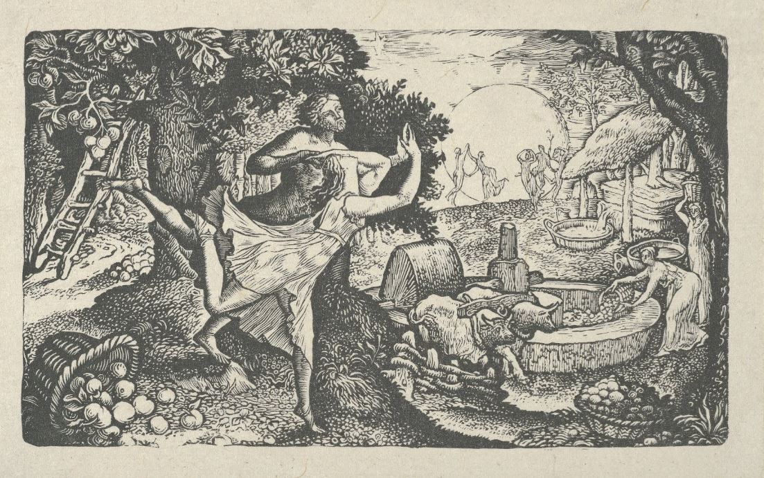
‘The Cyder Feast’ by Edward Calvert (1828)
Sections
The exhibition is arranged into a number of sections and so is my review.
1. Beginnings
‘Beginnings’ starts with by far the earliest piece in the exhibition, ‘Christ in Limbo’ by Albrecht Dürer from 1510. Dürer was one of the first European artists to use printmaking and produced produced around 346 woodcuts during his career.
But woodcuts are different from wood engravings, and wood engraving, apparently, has the distinction of being one of the only art forms to have been invented in Britain. By the 1770s Thomas Bewick was engraving end-grain boxwood using bespoke tools. His ‘invention’ quickly spread around the industrialised world and was adapted for a variety of purposes, commercial and fine arts. The first display case contains a selection of steel engraving tools, and a roundel of end-grain boxwood the surface of which has been ground perfectly smooth and level and ready for engraving.
Put very simply, the artist etches a design into the hardwood which is then inked. The wood which has remained etched takes the ink and this part is printed on paper when the inked block is applied to it. The parts of the wood which have been gouged, striated, etched or scratched do not take the ink and thus show up white in the print.
Early experimenters included the prolific poet-artist, William Blake, Edward Calvert and the wonderful painter Samuel Palmer, all represented here. When I was a teenager I read the Complete William Blake, memorised the Songs of Innocence and Experience, devoted many hours to memorising Blake’s convoluted personal mythology. But later, in my 30s, I found myself warming very much to the delicate, mysterious magic of Samuel Palmer’s paintings. ‘Harvesters under a Crescent Moon’ is the only wood engraving Palmer ever made and it’s tiny.
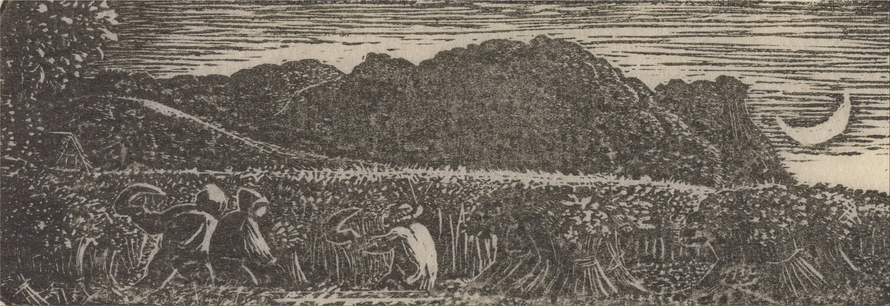
‘Harvesters under a Crescent Moon’ by Samuel Palmer (1826)
Size matters
This brings me to a general point about the exhibition as a whole, which is size. It would be easy for your initial impression of the exhibition to be that all the works are a bit samey. Almost all the exhibits are black and white. And they also tend to be on the small size, A4 size or so. Half a dozen are strikingly bigger than this but plenty are smaller and some are minuscule.
Hence the gallery supplies a number of magnifying glasses because the thing about wood prints, as a general rule, is that you really have to lean and and study them. Oil paintings and watercolours can afford to be on a huge scale and make great sweeping gestures of colour which immediately leap out and grab you. Almost all these wood engravings, by contrast, require you to lean in and pay attention.
2. A sense of scale
In fact the second section in the exhibition is called ‘A sense of scale’ and explores the question of size, exploring the range of sizes possible with wood engravings, juxtaposing the tiny Samuel Palmer with the biggest thing in the show, ‘Mirage I’ (2014) by the Chinese artist Shi Lei. From a distance the Shi Lei piece looks like the face of a man wearing glasses regarding us with a withering look, except that the entire image appears to be bubbling and melting, maybe some post-nuclear holocaust atrocity.
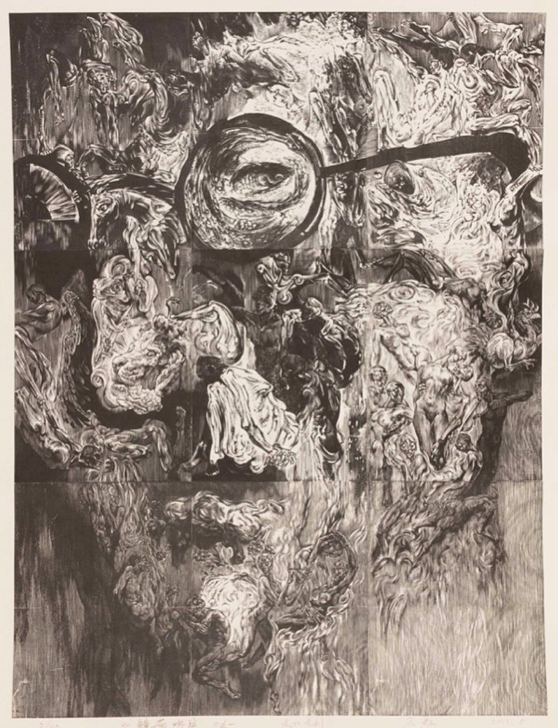
‘Mirage I’ by Shi Lei (2014)
Only when you look closely do you realise that a) it’s a composite image which has been created out of nine separate blocks and then stuck together, and b) that the overall image is, rather in the style of Salvador Dali, itself made up of figures of writhing naked bodies. Because of the uneasy, rather sickening effect, this was by far my least favourite image in the exhibition.
David Gentleman
In fact, talking of size and scale, arguably both the largest and the smallest engravings cited in the show were produced by the same artist, David Gentleman (born 1930), one of the most successful commercial artists of his day. Because among his huge range of work are:
1. Postage stamps commissioned by Royal Mail, in this case a 9p Christmas stamp from 1977 showing a partridge in a pear tree.
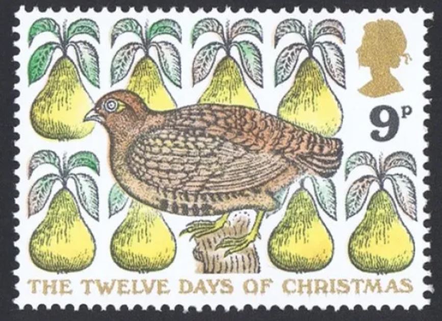
Christmas stamp by David Gentleman (1977)
2. And the huge mural lining the platforms at Charing Cross underground station in London. I doubt if many other wood engravings have been reproduced at such scale.
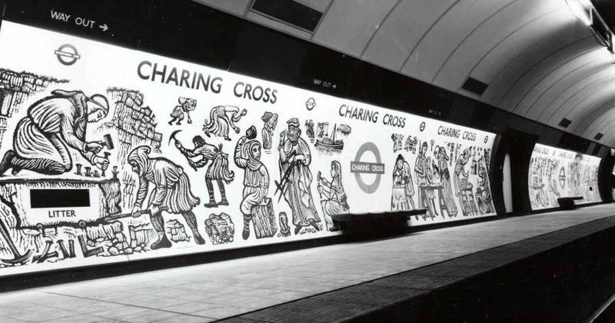
Mural at Charing Cross underground station by David Gentleman (1979)
3. The theatre of life
This is followed by a wall of images all falling under the loose heading ‘The theatre of life’. This brings together images of types of people or human activities, such as:
- Peter Blake’s engravings of four characters from a circus (1974 to 78)
- dark and powerful images from the 1930s depicting the Great Depression in America Clare Leighton
- images of ‘Bowlplayers in Sunlight’ by Gwendolen Raverat (1922), the first woman engraver to come to prominence
Comparing and contrasting these figures made you realise that engraving does best when it goes with the tendency to stylisation intrinsic in the form. Trying to achieve the sinuous curves and slow of organic objects is a big ask for an art form which works with chisels and incising tools, and so I thought a piece like Point-to-Point by Rachel Reckitt (1936) didn’t really work. Or I didn’t like the way it worked. By contrast in Le Sporting Bar (1929), it seemed to me that Ian Macnab had worked with the grain of the form to create a kind of semi-geometric stylisation which I enjoyed. But then I love Wyndham Lewis, the Vorticists and all varieties of geometric modernism.
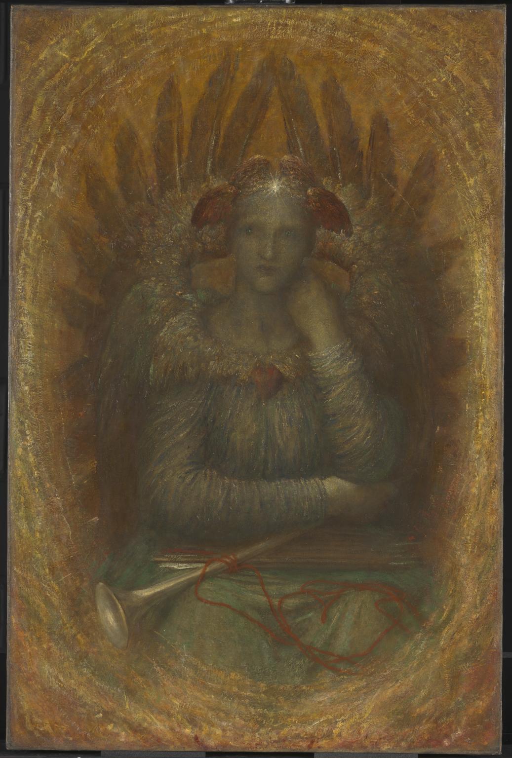
The standout piece in this section was a much more recent work, ‘Fallen Angel’ (2006) by Hilary Paynter, not particularly geometric, certainly not a thing of hard edges and angles, a showcase of how soft and mysterious and rather wonderful a wood engraving can be.
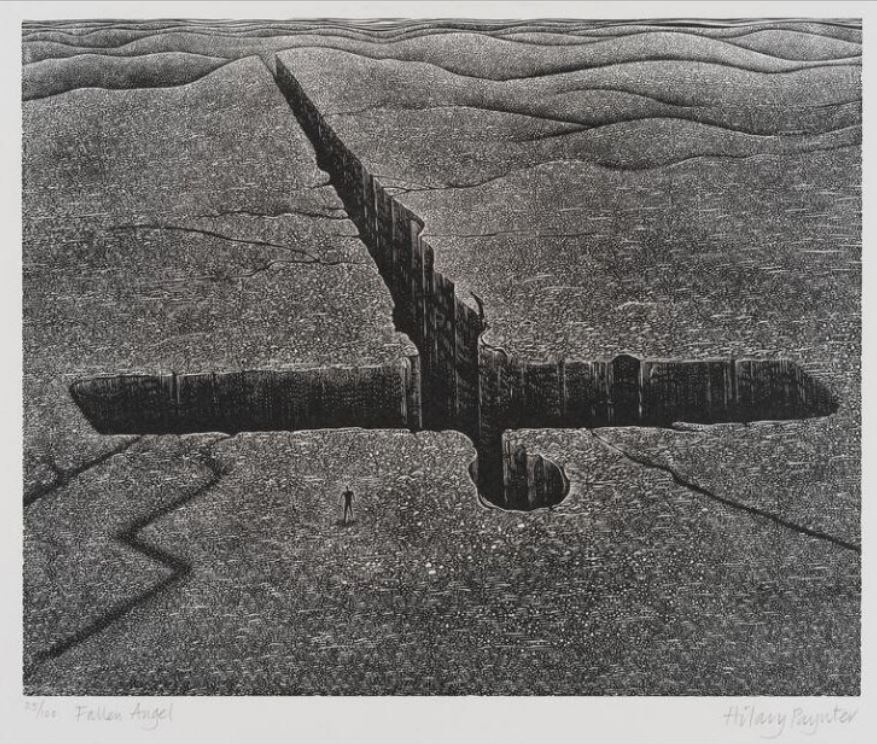
Fallen Angel’ by Hilary Paynter (2006)
4. Construction and destruction
Following on from this is a section titled ‘Construction and destruction’. If we’ve just been looking at human recreation, sports and leisure time, here are people at war, or coping with fires and floods. It includes:
- ‘Minesweeping Gear’ by James Taylor Dolby (1947)
- ‘Northern Waters’ (1942) and ‘Sharp Attack’ (1944) by Geoffrey Wales
- ‘Mill Fire’ (1997) and ‘Deluge’ (2000) by Ian Corfe-Stephens
- ‘Shot’ (2010) by Chris Pig where ambulancemen and bystanders crowd round someone lying on a stretcher who has, apparently, just been shot
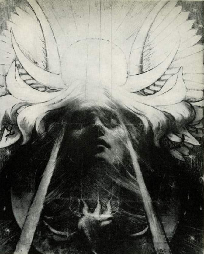
For me the standout piece, and one which typifies many of the strengths of wood engraving, is a marvellous piece by Hilary Paynter, titled ‘Tree with a Long Memory’ (2003).
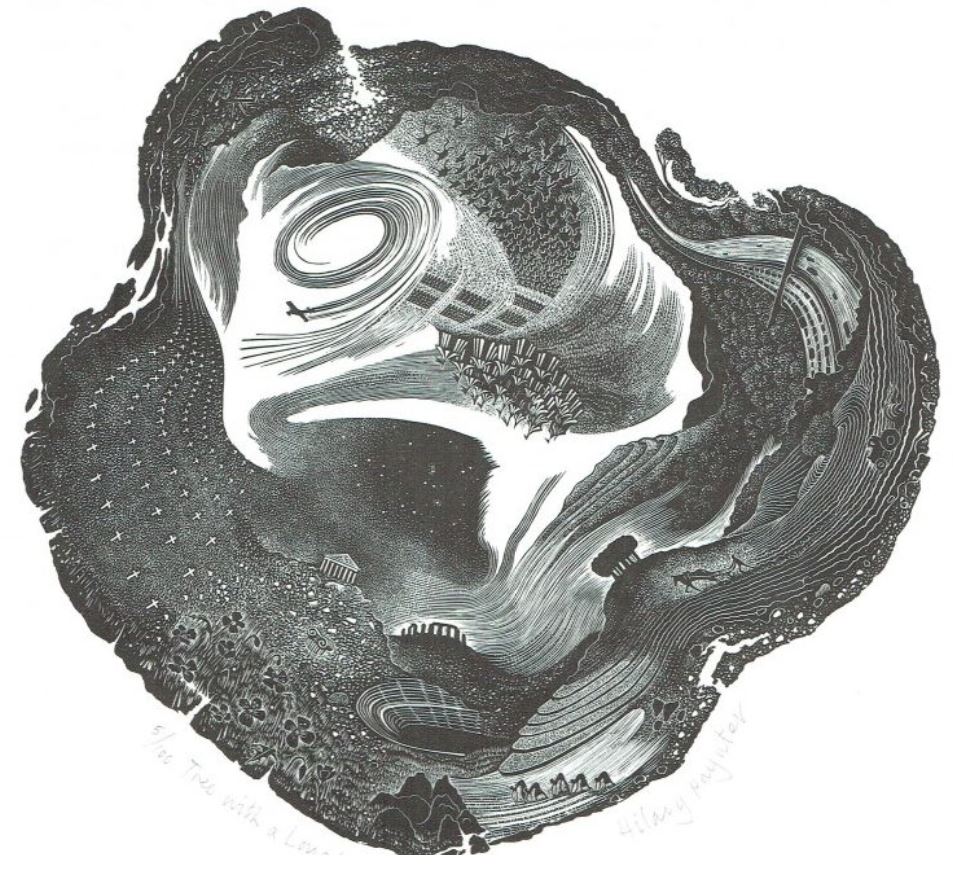
Tree with a Long Memory’ by Hilary Paynter (2003)
This is a classic example of the need to lean in and look closer at a wood engraving. The more I looked, the more the piece delivered up its wonders. For a start it took me a few moments to realise that the shape of the image represents the trunk of a mature tress which has been sliced across, as when a tree is cut down with a chainsaw revealing the rings of growth for you to count.
Anyway, only when I really peered into the image did I realise that it contains a wonderful set of symbols of humanity’s achievements over the past 3,000 years or so, namely Stonehenge, the Parthenon and a Roman amphitheatre (at the bottom), what might be a Renaissance encampment such as the Field of the Cloth of Gold hanging upside down in the middle, on the left rows and rows of white crosses as in a First World War cemetery, in the top left a jet plane looping the loop, and on the top right the sinewy shape of a 6-lane motorway snaking into the distance. And on the lower right-hand side the timeless labour of working the land, ploughing and sowing which was once done by horse-drawn ploughs, now by diesel-driven machinery, but the eternal round of sowing and reaping which is the basis of all civilisation, the row upon row of furrows echoing the growth lines of the tree.
5. The built environment
Next up is a section titled ‘The built environment’. Given the form’s predisposition to angles and edges, buildings, rooftops, windows, streets of terraced houses and so on are tailor made subjects for engraving. Thus I loved the very first piece in this section, ‘Yorkshire’ (1920) by the noted Modernist artist Edward Wadsworth.
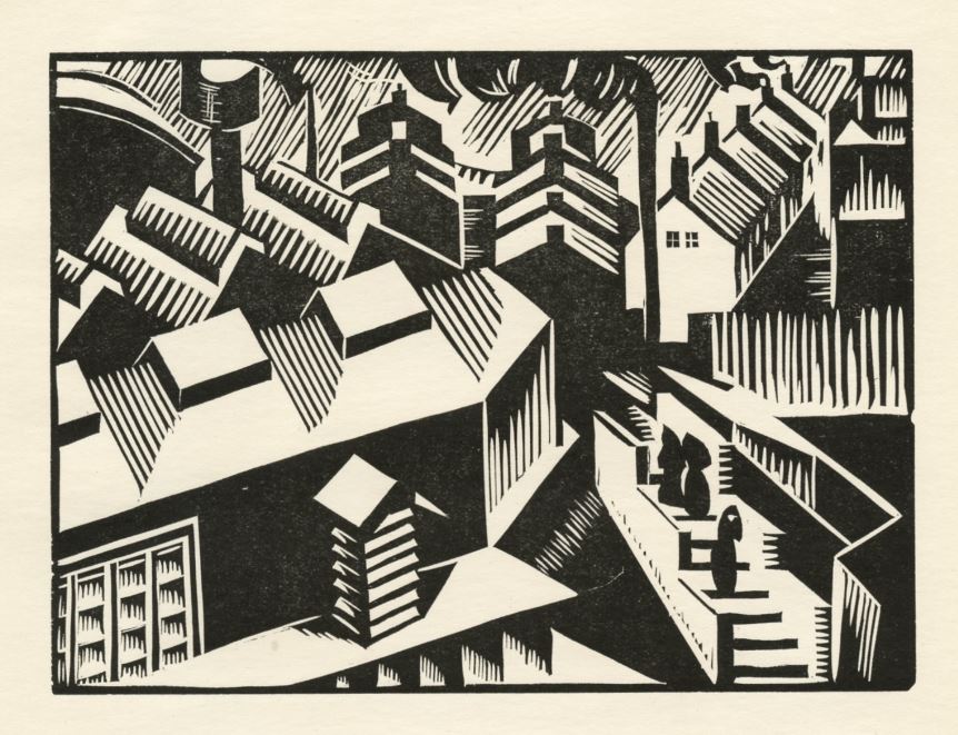
‘Yorkshire’ by Edward Wadsworth (1920)
This section is dominated by an impressive set of unusually large engravings of a view of the Brooklyn Bridge in New York, each coloured differently, by the exhibition curator, Anne Desmet. Desmet is on record as saying the sequence was in part inspired by Monet’s set of paintings of the facade of Rouen Cathedral at different times of day. They can be viewed on Desmet’s website.
This section also contains some interesting technical experiments by Desmet. ‘Babel Tower Revisited’ (2018) is round and uses slightly convex glass cover so give the impression the image is bulging out into the room. ‘Fires of London’ (2015) in which slender prints of engravings of the Great Fire have been cut out to form narrow tall images and glued onto 18 razor shells.
It also contains the striking (and tinted) ‘Petra I’ by Geri Waddington (2004).
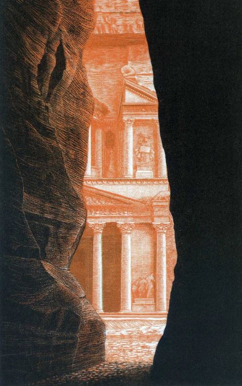
‘Petra I’ by Geri Waddington (2004)
6. Storytelling (books)
Wood engraving is nowadays both an independent, creative art form and a versatile medium for commercial images. A display case demonstrates how the tendency to simplify and abstract subject matter can result in very striking images which can be used for book illustration. There are illustrations of Coleridge’s Ancient Mariner (by Garrick Palmer, 1994) and Goblin Market (Hilary Paynter, 2003).
More commercially, editions of J.K. Rowling’s Harry Potter books have been printed with dramatic wood engraved front covers by Andrew Davidson (2013). And, best of all, the fabulous engravings produced by Chris Wormell for Philip Pullman’s ‘His Dark Materials’ sequence of novels, which are outstanding.
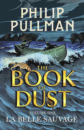
‘La Belle Sauvage.’ Cover illustration for ‘The Book of Dust’ by Philip Pullman (2017) based on a wood engraving by Chris Wormell
This section also contains:
- ‘The Crucifixion’ (1927) by the famous poet-artist David Jones
- ‘The Entombment’ (1930) by Claughton Pellew
- ‘The Adventures of the Black Girl in Her Search for God’ (1932) by John Farleigh, for George Bernard Shaw
- Illustrations for ‘The Famous Tragedy of the Rich Jew of Malta’ (1933) by Eric Ravilious
- a vivid scene from ‘Moby Dick’ (1974) by Garrick Palmer
- Illustrations for ‘Erewhon’ (1932) by Blair Hughes-Stanton
And another series or set of images (cf Desant’s Brooklyn Bridge), this time a set of 9 highly detailed studies of a bust of the Roman emperor ‘Marcus Aurelius’, depicted with the opposite of abstraction, with astonishing photographic accuracy by Simon Brett (2002).
Another part of the display tells us that wood engravings have been used to create entirely text-free books of illustration, where the reader is free to verbalise a sequence of images, exemplified by the work of the Belgian artist, Franz Masereel, whose text-free books of narrative images – such as ‘The Idea’ and ‘Story Without Words’, both on display here – were very popular, especially in Germany, during the era of silent movies, and can be counted among the forerunners of modern graphic novels.
I’d never really given it much thought but those labels you get which you can write your name on and stick in the front page of good quality books, bookplates, often feature exquisite miniature wood engravings. Examples included here are by Joan Hassall, 1946, Vladimir Kortovitch, 1990, and Grigory Babitch, 2004.
7. Abstraction and detail
This section is dominated by a work by a very distinctive artist who produced woodcuts and engravings of wonderful, beguiling and mind-bending visual puzzles, the Dutch artist Maurits Cornelis Escher.
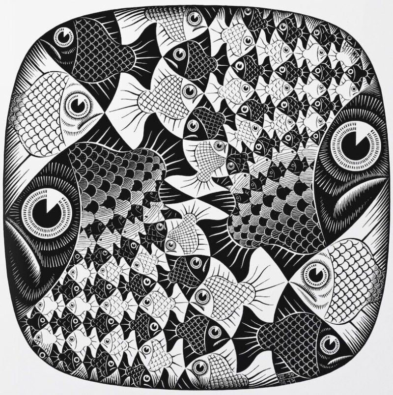
‘Fish and Scales’ by Maurits Cornelis Escher (1959)
8. The natural world
This is the biggest section, with the most examples, and so a fascinating opportunity to analyse and compare the very wide range of wood engraving styles available. There’s a ‘Stonehenge’ from 1962 by Gertrude Hermes which looks as if the sky is made out of angrily cross-hatched icebergs.
By complete contrast is ‘Dead Trees – Sheppey’ by Monica Poole (1976) where the trees look as if they’re touching a sky which is like an inverted pond, with dynamic ripples spreading out from the trees’ touch in a surreal manner which echoes Paul Nash in the 1930s.
There are also two different artist’s views of a car headlights at night illuminating a road scene through the windscreen, ‘Through the Windscreen’ (1929) by Gertrude Hermes and ‘The Night Drive’ (1937) by Joan Hassall.
Probably my favourite work was ‘Long-tailed Duck and Whiting’ by Colin See-Paynton (1988), possibly because the fish look identical to the fish in Tintin and the Red Sea Sharks. Aren’t the ducks extraordinarily realistic? From that level of precise naturalistic detail to another large and pleasing, semi-abstract image, in the slightly mysterious Paul Nash style:
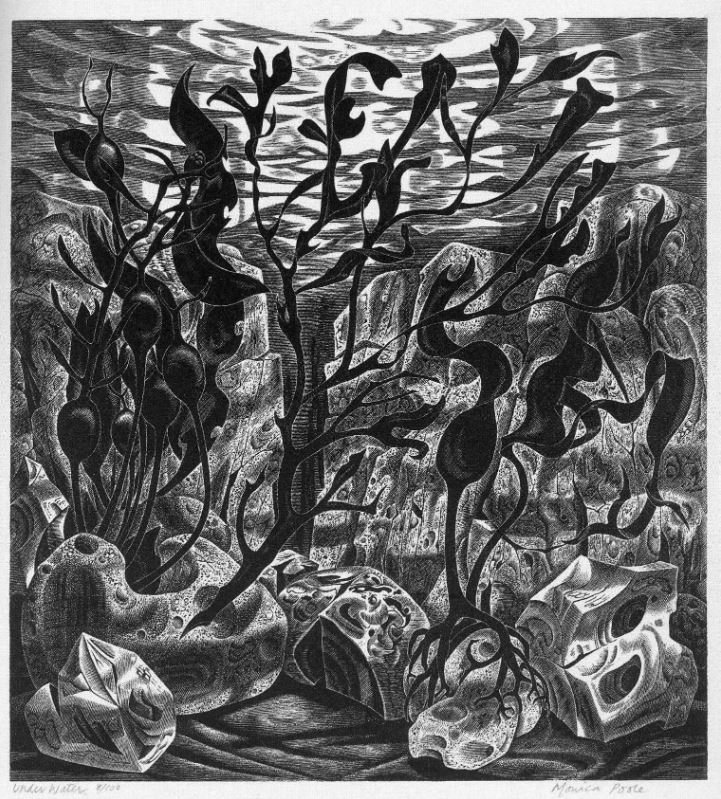
‘Under water’ by Monica Poole (1986)
Go see and enjoy this lovely, fascinating, eye-opening and deeply pleasurable exhibition.
The video (6’24”)
Anne Desmet RA is one of only three wood engravers to be elected as Academicians in the Royal Academy’s nearly 250-year history. In this video she takes us through each step in creating a wood engraving, from tracing the original drawing through to printing a first proof.
Related links
- Scene Through Wood continues at the Heath Robinson Museum until 11 December 2022
- Scene Through Wood: A Century of Modern Wood Engraving: the catalogue on Amazon
- Ashmolean web page for the catalogue with a selection of images