Natalia Goncharova @ Tate Modern

This is the UK’s first ever retrospective of the Russian avant-garde artist Natalia Goncharova. It’s huge, bringing together over 160 international loans which rarely travel, including works from Russia’s State Tretyakov Gallery which houses the largest collection of Goncharova’s work.

The exhibition is imaginatively laid out with some lovely rooms, and it certainly gives you a good sense of her range of styles, not only in painting, but in lithographs, fashion and costume design, especially for modern ballet, posters, pamphlets and much more. But it also leaves you with a few nagging questions…

Peasants Picking Apples by Natalia Goncharova (1911) State Tretyakov Gallery, Moscow © ADAGP, Paris and DACS, London 2019

Fabric design

Goncharova was born in Russia in 1881. She grew up on her family’s country estates in Tula province, 200 miles from Moscow. Her family were impoverished aristocrats who made their fortune through textiles, in fact the name of Goncharova’s family estate, Polotnianyi Zavod, means ‘cloth factory’. From early childhood, Goncharova witnessed the rhythms the farmers’ lives – working the land, planting and harvesting – and also became deeply familiar with all the stages of textile production, from shearing sheep to weaving, washing and decorating the fabric.

Hence two threads to her artistic practice:

  1. fabric design, which ran through the 1910s and led to her wonderful designs for the Ballets Russes in the 1920s and 30s, as well as commissions from fashion houses
  2. a profound feel for the rhythms of agricultural labour, which she depicted in a number of early paintings (like Peasants picking apples, above)

The first room epitomises both threads with several paintings showing agricultural labourers, in a highly modernist style, alongside a display case containing an example of the kind of traditional costume worn by the peasant women on Goncharova’s estate.

Installation view of Natalia Goncharova at Tate Modern

Cubo-futurism

What comes over is Goncharova’s very quick artistic development from about 1908, when she was doing stylised but essentially traditional paintings of peasant subjects, to 1911 when she had transformed herself into one of the leading lights of the Moscow avant-garde.

Her swift development was helped by two Moscow industrialists – Ivan Morozov and Sergei Shchukin – who had built up extensive art collections of leading European artists such as Cézanne, Gauguin, Picasso and Derain, and made their collections accessible to the public. These French works had an electrifying effect on young Russian avant-garde artists, which was accentuated by news of the new movement of Italian Futurism, which they could read about in international art magazines.

Goncharova swallowed both influences whole and became the leader of what contemporaries came to call Russian ‘cubo-futurism’. Various contemporaries are quoted commenting that she was the leader of the younger generation, not only in painting, but in self-presentation, creating an avant-garde ‘look’, as well as happenings, given walking through Moscow’s streets wearing stylised tribal markings on her face, or involved in volumes of avant-garde poetry published just before the Great War.

A work like Linen from 1913 seems to be a straight copy of Picasso-style cubism, cutting up an everyday domestic scene into fragments and pasting in some text, as if from a newspaper or advertising hoarding. The main differences from a cubist work by Picasso or Braques is that the text is in Russian, and the bright blue is completely unlike the cubist palette of browns and greys.

Linen (1913) by Natalia Goncharova. Tate © ADAGP, Paris and DACS, London 2019

The 1913 exhibition and ‘everythingism’

This exhibition feels logical and well designed, and features at least two particularly striking rooms. The first one is dedicated to recreating the landmark retrospective Goncharova was given in September 1913 at the Mikhailova Art Salon in Moscow. The 19193 show included more than 800 works (!) and was the most ambitious exhibition given to any Russian avant-garde artist up to that date. Goncharova was thirty-two years old.

The curators have brought together thirty big paintings which featured in the 1913 show and created a central column in the style of those circular bulletin boards you get in Paris, on which they have plastered copies of some of the posters and reviews of the original exhibition.

Here we learn that Goncharova’s fellow artist and long-time partner, Mikhail Larionov, invented the term ‘everythingism’ to describe her openness to diverse styles and sources, the way her paintings invoke all kinds of sources from the folk designs of her family farm, through to the latest ideas from Paris and Rome.

Thus the thing which comes over from the 30 or so works in this room is their tremendous diversity. There’s a striking female nude which reminded me of something similar by Matisse, there’s a pipe smoker at a table, a motif familiar from Cézanne, there’s a surprising work which looks like a dappled impressionist painting. It really is a little bit of everything and so ‘everythingism’ seems an accurate label.

You could claim this is as a positive achievement, indeed one of the wall labels praised the lack of ‘hierarchy’ in Goncharova’s diverse styles and I understood what they were getting at. There was the implication that it is somehow masculine to want to be the leader of the avant-garde, at the cutting edge, always one step ahead: and somehow a slave of capitalist or consumer culture to need to create a unique brand or style.

By contrast, Goncharova is praised for her more easygoing, unmasculine and uncapitalist stance – allowing herself to be open and receptive to all kinds of visual approaches, mixing Cézanne with Russian icons, or cubism with peasant designs, or futurism as applied to distinctly Russian cityscapes. She was presented as ‘a universal artist’.

You can see how, at the time, she seemed to contemporaries to be a one-woman explosion of all the latest visual breakthroughs and trends because she was covering so much territory.

The drawback of this approach is that Goncharova risks, in retrospect, appearing to be a Jill of all trades but a mistress of none. Lots of the works in this room were interesting but you found yourself thinking, ah, that’s the cubist influence, that’s the futurism, that’s a touch of Cézanne, and so on. They all had her mark, but not so many seemed entirely her, if that makes sense.

For me the most distinctive work in the room was the series of paintings she called Harvest, which was originally made up of nine large works which were designed to be hung together. Two have gone missing but Tate have hung the other seven together on one wall and the effect is stunning.

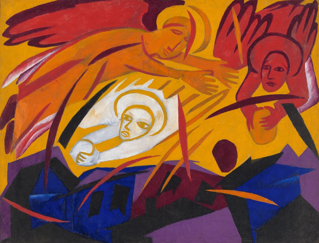
Harvest: Angels Throwing Stones on the City (1911) by Natalia Goncharova. State Tretyakov Gallery, Moscow © ADAGP, Paris and DACS, London 2019

The palette of red, orange and tan runs across all seven paintings and gives them a tremendous visual unity. Also note the highly stylised, almost child-like depiction of the human figure, with simplified arms and legs and big simple eyes. The same big wide white eyes with huge jet black irises which appear in Peasants picking apples. This is maybe her core visual style.

Harvest uses Christian motifs. It was inspired by popular prints and the frescoes in Russian cathedrals and takes its images from the Book of Revelation in which the end of the world is presented as a symbolic harvest with the grapes of human souls being gathered and thrown into the winepress of God’s anger.

All in all, surprisingly religious, unironically religious, for an avant-garde artist. It comes as no surprise to discover that room six of the exhibition is devoted to just her religious paintings, featuring half a dozen enormous works she did on Christian subjects, notably four tall narrow full-length portraits of the four evangelists. I can see the way she has applied her distinctive cubo-futurist style to a very traditional Russian subject – I note her characteristic way with big white eyes – but I didn’t really warm to them.

The Four Evangelists by Natalia Goncharova (1911)

Fashion and design

Room four picks up the theme of Goncharova the fashion designer, showing work commissioned from her by the couturier to the Imperial court, Nadezhda Lamanova, in 1911 to 1912. This room also includes work commissioned from Goncharova after the war by Marie Cuttoli, whose design house Myrbor showcased carpets and fashion designs by famous contemporary artists.

There’s a series of sketches from the 1920s, haute couture-style sketches which make the women subjects look as tubular as a Fairy Liquid bottle, with no hips or waist or bust, which were utterly unlike her modernist paintings, and looked more or less like any other fashion sketches for stick-thin flappers from the Jazz Age.

But on the opposite wall was a piece which I thought might be my favourite from the whole show, a study Goncharova did for a textile design in the later 1920s. I loved the vibrancy of the colours and the primitiveness of the design. In fact it’s only one of a series she did using bird motifs but, to me, it was a standout piece.

Design with birds and flowers: Study for textile design for House of Myrbor 1925 to 1928 by Natalia Goncharova. State Tretyakov Gallery, Moscow © ADAGP, Paris and DACS, London 2019

The Great War

In April 1914, Goncharova and Larionov were invited to Paris by the famous ballet impresario Sergei Diaghilev to work on designs for his opera-ballet The Golden Cockerel. This was presented in Paris to great acclaim and the pair followed it up with an exhibition. But then the Great War broke out, and both were forced to return to Moscow. Larionov was called up for military service and sent to the front line, was wounded within weeks and invalided out of the army.

Goncharova responded to the crisis by creating a series of prints titled Mystical Images of War which brought together symbols Britain, France and Russia together with images from the Book of Revelation and Russian medieval verse. They use her trademark stylisation of the human face and eyes, and throw in the religious iconography which we’ve by now realised was a big part of her psyche.

The fourteen or so prints on display in room five are a really interesting mix of modern warfare and traditional Orthodox iconography, featuring angels wrestling biplanes, the Virgin Mary mourning fallen soldiers, and the Pale Horse from the Apocalypse. She chose to create prints in order to reach a broad popular audience with what are, essentially, patriotic rallying cries, which also feature patriotic heroes who defended Mother Russia against invaders.

‘Angels and Aeroplanes’ from Mystical Images of War by Natalia Goncharova (1914) © ADAGP, Paris and DACS, London 2019

Books and photos

Room seven is a narrow corridor between the conventionally-shaped rooms six and eight. As in other exhibitions, this corridor makes a good space not to hang works of art, but to place books, pamphlets, photos, prints and posters related to the artist under review, in the long rack of display cases lining the wall.

For this exhibition the curators have displayed artist manifestos, exhibition catalogues and a number of books of poetry which Goncharova was involved in writing or designing or illustrating. The later part of the case displays the ephemera she produced for a series of artists’ balls in Paris, including posters, tickets and programmes. There’s a speaker on the wall from which comes a Russian voice reciting some of the avant-garde poetry included in the pamphlets on display. (It is, apparently zaum or ‘transrational’ poetry, from ‘World Backwards’ by Alexey Kruchenykh and Velimir Khlebnikov, and Vzorval or ‘Explodity’ also by Kruchenykh.)

Cubo-futurism

Room eight is devoted to another series of cubo-futurist works, highlighting classic Modernist-style depictions of factories and machines and cars and bicycles, all those implements of power and speed which were fetishised by the Italian founder of Futurism, Marinetti.

There are some great pieces here, classic Futurist depictions of machines and factories, a big painting of a bicyclist, another titled Aeroplane over a Train, and a vivid depiction of rowers on the river (which reminded me of the similar treatment given the same subject by Cyril Powers, the British printmaker, twenty years later, as featured in the current exhibition of the Grosvenor School of Modern Art at Dulwich Picture Gallery).

Cyclist (1913) by Natalia Goncharova (1881 to 1962) State Russian Museum © ADAGP, Paris and DACS, London 2019

Admirable though many of these paintings were, I began to be nagged or puzzled by something. Usually in a major retrospective, you are shown samples of the artist’s work throughout their career. Goncharova was established as a leader of the Russian avant-garde by the time of her huge exhibition in 1913, and lived on until 1962, producing works well into the 1950s.

So where are they? Where are all the later works? Here we are in room eight of ten and we are still… only at 1913?

The first eight rooms of this ten-room survey have all hovered around the years 1910 to 1914. Nowhere does the exhibition say so explicitly, but are we to conclude from this lack of later content that her golden years were a brilliant but brief period, from 1911 to 1914 or 1915?

Goncharova in Paris

Only in this, the ninth and penultimate room, do we learn what happened to Goncharova as a result of the Russian Revolution, namely that she and Larionov were on a tour with Diaghilev’s Ballets Russes through Switzerland, Italy and Spain when the October Revolution broke out. The revolution, and then the civil war, prevented them from returning home, and in 1919 Goncharova moved into a flat in Paris that would remain her home for the rest of her life.

This penultimate room contains half a dozen works from the 1920s during which Goncharova received more commissions for ballet costume, some from fashion houses (as mentioned earlier) and a few funky commissions for interior design, including an impressive painted screen made in 1928 for the American patron Rue Winterbotham Carpenter. She did the interior designs for the Paris house of Serge Koussevitsky, exploring the motif of the Spanish Lady on a monumental scale.

When she had accompanied the Ballet Russe in Spain, Goncharova had become fascinated by the clothes of the Spanish women she saw, and ‘the Spanish woman’ became a recurring motif in her inter-war years, maybe because the vividness and ethnic distinctiveness of the outfits reminded her of the Russian peasant look she knew so well.

By far the most impressive work was a huge abstract work titled Bathers from 1922. It is immense, at least fifteen feet across, and reminded me of all kinds of other modernist abstract painters though I couldn’t quite put my fingers on who. First time it’s ever been exhibited in the UK and a coup for the exhibition organisers.

Bathers by Natalia Goncharova (1922)

Ballet designs

Anyway, the point remains – why isn’t there more of her work from the 1920s, 30s, 40s and 50s? You might have expected the last room in the show to cover the later part of her career but, instead, the exhibition takes an unexpected detour to make this final room, arguably the best in the exhibition.

It is a big space which has been specially darkened to create an atmospheric setting in which to review Goncharova’s work for the ballet and the theatre. Lining the walls are drawings and sketches for costumes Goncharova designed for productions of The Golden Cockerel (Rimsky-Korsakoff) and Les Noces (Stravinsky). There are some videos of her costumes and backdrops being used in revivals of the ballets, The Golden Cockerel footage is a silent but colour film of a production dressed in Goncharova’s costumes which toured Australia in the late 1930s.

But the highlights of the room are four or five of the actual costumes themselves, the costumes Goncharova designed for these classic ballet productions, which are featured in display cases around the room. They are all wonderfully bright and imaginative, drawing on the (to us) exotic and fanciful traditions of Russian legend and folklore.

Theatre costume for Sadko (1916) by Natalia Goncharova. Victoria and Albert Museum, London © ADAGP, Paris and DACS, London 2019

And, last but not least, the room is filled with music, with clips from the famous ballet scores in question, wonderful Russian melodies filling the air as you stroll from wonderful costume to fascinating set designs, or stop to watch footage of actual performances using Goncharova’s colourful and vivid costumes.

The music, the darkened atmosphere, the videos of performances, and the glass cases of costumes – all make this room completely unlike the previous nine and a very evocative space to be in.

Summary

This is a major exhibition by a leading Russian artist who, for a period before the Great War, epitomised the avant-garde for her compatriots. She produced a lot of striking paintings, as well as pioneering designs for ballet costumes and sets, and a wealth of prints and posters and pamphlets and poetry books.

And yet I was left with two nagging questions: first, from such a profusion of images and designs, not that much really rang my bell. A lot of it was striking and thought-provoking and interesting – but possibly only the design with birds and flowers really set me alight.

The stylised human figures with those big eyes is the nearest Goncharova comes to having a recognisable ‘look’ and I liked it, but only up to a point. I actively disliked its application to the icons and evangelists and wasn’t, at the end of the day, that taken with the Great War prints, either.

Comparison with Käthe Kollwitz

Great War prints by a woman artist made me think of the epic prints created by the German woman artist Käthe Kollwitz. These are infinitely more powerful. Comparing the two made me think that maybe Goncharova was held back by her attachment to the Russian Orthodox tradition and its Christian iconography. Kollwitz, by contrast, has broken free of all traditional or religious straitjackets in order to create spartan images of humanity under stress which still speak to us today with horrifying force.

The Survivors by Käthe Kollwitz (1923)

Then again, maybe I’m comparing apples and oranges. Goncharova’s works were created at the very start of the war, when it was thought of as a religious crusade, and everyone thought it would be over by Christmas. Whereas Kollwitz’s haunting images were made nearly ten years later after not only bitter defeat, but collapse of the German state and descent into semi-civil war. So it’s not a fair comparison at all. But you can see why, if you set the two side by side – as we latecomers a hundred years later are able to – Kollwitz’s images are vital, a necessary record of a horrifying period; whereas Goncharova’s are an interesting and nice inclusion in a retrospective of her work, but have nowhere near the same importance or force.

Where is the later work?

And second, where was the work from the later years? Are we to deduce from its almost complete absence from this exhibition, that the curators consider Goncharova’s work from the 1930s, 40s and 50s to be poor or sub-standard? Or is it for some reason hard to borrow and assemble for an exhibition like this?

As far as I could see, the only work dating from either the 1940s or 1950s was one medium-size set design for Stravinsky’s ballet The Firebird, which Goncharova drew in 1954.

Set design for the final scene of The Firebird by Natalia Goncharova (1954) Victoria and Albert Museum, London © ADAGP, Paris and DACS, London 2019

I thought this was brilliant, vivid and fun, in a completely different style from everything which preceded it, like a highly stylised illustration for a children’s book. So is this what Goncharova’s work from the 1950s looked like?

Having devoted eight or so rooms to going over with a fine tooth comb the intricacies of her output from 1911 to 1915 or so, it’s a shame we didn’t get at least one room telling us what happened to her style in the entire last thirty years of her career.

Video

‘Visiting London Guide’ produce handy two-minute video surveys of all London’s major exhibitions. I include them in my blog because they give you an immediate sense of what the exhibition looks like.


Related links

More Tate Modern reviews

Symbolist Art by Edward Lucie-Smith (1972)

Symbolist art does not depict nature as it actually exists, but brings together various impressions received by the mind of the artist, to create a new and different world, governed by its own subjective mood. (Symbolist Art, page 151)

Although this book is 45 years-old, I picked it out in a second-hand bookshop deliberately to compare and contrast with Michael Gibson’s more recent account of Symbolism (1995). Gibson’s massive book is packed with brilliant full-colour reproductions but, as I read it, I did increasingly find myself wondering where ‘Symbolism’ ended and where the simply fantastic or morbid or sensationalist began. So I read this book to further explore whether Symbolism was really a movement in a narrow definable way or is just the word given to a kind of mood or feeling of other-worldliness apparent in a huge range of artists between about 1880 and 1910.

The World of Art series

Symbolist Art is a typical product of Thames and Hudson’s renowned ‘World of Art series’ in that, although there are 185 illustrations, only 24 of them are in colour. So you’re not buying it for the pictures, which can be better seen, in full colour, in numerous other books (or online); you’re buying it for the text.

Edward Lucie-Smith

Lucie-Smith was born in 1933 and is still alive (aged 84). Public school, Oxford, the RAF during the war, then freelance poet, art critic, essayist, author and curator, he has written over 100 books. His book comes over as significantly more learned and informative than Gibson’s.

Symbolism in Renaissance painting

He starts with a history of symbols in art starting way back in the Renaissance. Renaissance art is packed with symbols – classical gods and goddesses are accompanied by their attributes, kings and queens are shown in allegorical paintings accompanied by war or peace or the triumph of the arts and so on.

To get the most out of Renaissance art you have to have a good eye for its religious, political and cultural symbolism. For example, spot the symbolism in this masterpiece by Rubens.

(In this picture the portrait of Marie de’ Medici – daughter of the Grandduke of Tuscany – is being presented to Henry IV, the king of France, and her future husband. The gods of marriage and love – Hymen and Amor (Cupid), to the left and right – hover in mid-air. From up in heaven the king and queen of the gods, Jupiter and Juno, look down in approval. Jupiter’s symbol, the eagle of war, clutching lightning bolts in his talons, is literally being squeezed out of the picture, to the left, while Juno’s symbols, the peacocks of love and peace strut (the male) and look down at the scene of love (the female). A pink ribbon symbolising their marriage binds them together. The chariot the peahen sits in bears a gold relief on the front showing Cupid standing on/triumphing over (another) eagle, and holding a garland (symbol of marriage). Behind Henry stands the personification of France, wearing French blue silk embroidered with gold fleur-de-lys (the coat of arms of the French monarchy). She is reassuring Henry that it is a good match for the nation. The burning town in the distance and the dark clouds to the left of the picture, beneath the eagle, symbolise War, as do the helmet and shield at the foot of the painting. These must all be abandoned so that Henry can concentrate on the lighter, feminine arts of peace, subtly emphasised by the light source for the whole scene coming from the right, the side of the Future, peace and harmony.)

Lucie-Smith makes a useful distinction between ‘closed’ and ‘open’ symbolism.

Open symbolism

The use of publicly available and traditional imagery. All of the symbolism in the Rubens picture is ‘open’ in the sense that any educated person could spot it.

Closed symbolism

Refers to ‘secret’ knowledge, available only to ‘initiates’. Renaissance and post-Renaissance art features numerous painters who included closed symbolism in their works: some has been investigated and explicated by later scholars; some remains obscure to this day.

Watteau

In other words, symbolism in its broadest sense, as a strategy or technique, is absolutely intrinsic to the Western artistic tradition. What Lucie-Smith brings out is the strand of artists over the past few hundred years who brought something extra to the idea: who incorporated open symbolism or straightforward allegory (where x stands for y; where, for example, an hourglass stands for ‘Time’), but something else as well.

He takes an example from the wonderful Jean-Antoine Watteau (1684 to 1721). On the face of it Watteau was painting fashionable fête galantes for the French aristocracy, scenes of dressing up and carefree flirtations in an idealised classical setting, thus:

Yet (apart from the fabulous rhythmic compositions, the draughtsmanship of the figures, the wonderful use of colour) what makes Watteau ‘magical’ is the sense he achieves of a deeper meaning which somehow diffuses a mysterious influence around itself. According to Lucie-Smith, Watteau:

had already abandoned conventional allegory in favour of a use of symbolism which was more pervasive, more powerful and more mysterious. (p.21)

Something else is conveyed above and beyond the ostensible subject and its overt symbolism. Somehow it achieves a sense of mystery.

The Romantic roots of Symbolism

There follows a chapter about Romanticism, a movement which I, personally, find boring, maybe because I’ve read too much about it and seen too many times the same old paintings by Fuseli (The Nightmare), Goya (The sleep of reason produces monsters) or Caspar David Friedrich (The Cross in the mountains).

Lucie-Smith’s purpose is to show that ‘Romanticism’ is (quite obviously) the godfather to modern Symbolism: in its use of obscure but meaningful images, nightmares and dreams, scary women and looming monsters; in its use of pseudo-religious imagery which has lost its literal meaning but acquired a spooky, Gothic, purely imaginative resonance.

Victorian symbolists

The next chapter looks at symbolist currents in British art during the 19th century, starting with the self-taught mythomane, William Blake. It then moves on to consider the group of artists who claimed to be his followers and called themselves ‘the Ancients’, including Edward Calvert and the wonderful Samuel Palmer, with his strange visionary depictions of rural Kent (Coming from Evening Church).

Then we arrive at the Pre-Raphaelites. Lucie-Smith identifies Dante Gabriel Rossetti as the most ‘symbolist’ of these young idealistic painters, not least because his technique was quite limited. Rossetti wasn’t very good at perspective or realistic settings and so his mature paintings often have a vague, misty background which helps to emphasise the ‘timeless other-worldliness’ of the main subject (generally cupid-lipped, horse-necked ‘stunners’ [as the lads used to call them] as in Astarte Syriaca).

Astarte Syriaca by Dante Gabriel Rossetti (1877)

Astarte Syriaca by Dante Gabriel Rossetti (1877)

Burne-Jones and Watts

Lucie-Smith credits Edward Burne-Jones (1833 to 1898) with developing the medieval and dream-like elements of Pre-Raphaelitism to their fullest extent and in so doing creating a stream of late works devoted to expressionless women moving through heavily meaningful landscapes.

The Golden Stairs by Sir Edward Burne-Jones (1880)

Burne-Jones exhibited at the Paris Universal Exhibition in 1889, where he won a first-class medal. (Intriguing to think the Impressionists were almost entirely excluded from this show and forced to mount an exhibition at the nearby Café Volpini – as described in in Belinda Thompson’s book about the Post-Impressionists.)

French symbolist artists were well aware of Burne-Jones’s work. But the most overtly ‘symbolist’ of the late Victorian artists was George Frederick Watts. He was quite clear about his intentions and his own words give quite a good summary of the symbolist impulse:

I paint ideas, not things. I paint primarily because I have something to say, and since the gift of eloquent language has been denied me, I use painting; my intention is not so much to paint pictures which shall please the eye, as to suggest great thoughts which shall speak to the imagination and to the heart and arouse all that is best and noblest in humanity. (quoted page 47)

His many contemporary fans and supporters considered Watts a ‘seer’ and suggested his work be hung in a temple not a gallery (an ambition which sort of came true with the dedication of his final home and studio in the village of Compton, Surrey, to his work, a venue you can now visit – the Watts Gallery).

The dweller of the innermost by Watts (1886)

The dweller of the innermost by Watts (1886)

‘The dweller of the innermost’ is obviously someone important, and something very meaningful is going on in this painting – but who? and what?

Symbolism

All this background is covered in the first 50 pages of this 220-page book in order to get us to the Symbolist movement proper.

Symbolism in the narrow sense was a literary movement, embodied in the poetry of Paul Verlaine and Stéphane Mallarmé in the 1870s and 1880s. They used real-world images but set in shimmering, vague and allusive contexts. By the late 1880s this kind of literary worldview overlapped strongly with a revival of a so-called ‘decadent’ style, in both writing and painting. It was largely to distinguish between the two outlooks that the minor poet Jean Moréas in 1886 wrote the essay which introduced the term ‘symbolist’ and ‘symbolism’.

According to Moréas, both symbolism and decadence turned away from the oppressive mundaneness of the everyday bourgeois world, but whereas the symbolists emphasized dreams and ideals, the Decadents cultivated heavily ornamented or hermetic styles and morbid subject matter.

Lucie-Smith asserts that the first phase of symbolism lasted from Moréas’s 1886 essay until he himself rejected the name in 1891. Its central figure was the poet Mallarmé. Lucie-Smith lists the qualities of Mallarmé’s poetry, and points out how they can also be found in the symbolist painters of the day:

  • deliberate ambiguity
  • hermeticism (i.e. the poems are closed to easy interpretation)
  • use of the symbol as catalyst i.e. to prompt a reaction in the soul of the beholder
  • the idea that art exists in a world separate and apart from the everyday one
  • synthesis not analysis i.e. while the Impressionists analysed light and its effects, the symbolists brought together elements of the real world – from tradition, myth and legends – into strange and new combinations or syntheses

An important element of synthesis was not only the unexpected combination of real-world elements, but the notion that all the arts could and should borrow from each other. Symbolism always hovered around the idea of a ‘total work of art’ which combines music, dance, art, even smells and touches. Everyone in the 1880s was entranced by Wagner’s massive operas which aspired to just this condition of being Gesamtkunstwerks or ‘total works of art’. The idea was very powerful and lingered through to the First World War – the Russian composer Scriabin composed works deliberately designed to evoke colourful visual fantasias and artists like Wassily Kandinsky in the 1900s developed theories about the closeness of painting and music.

Here’s a Symbolist depiction of the hero of one of Wagner’s massive operas, the pure and holy knight Parsifal.

Parsifal by Jean Delville (1890)

Gustave Moreau (1826 to 1898)

Moreau is the painter most associated with the first phase of Symbolism. He developed an ornate jewel-studded style of treating subjects from the Bible or classical legend.

Jupiter and Semele by Gustave Moreau (1895)

Jupiter and Semele by Gustave Moreau (1895)

Reviewing the Salon of 1880, the novelist Joris-Karl Huysmans singled out Moreau’s work for being mysterious and disturbing. Four years later, in his classic novel A Rebours, which describes a decadent aristocrat who retires to his country house to cultivate sensual pleasures and experiences, Huysmans singled out Moreau as the patron painter of his decadent lifestyle, using a lexicon of late-19th century decadent terms: Moreau’s art is ‘disquieting…sinister…sorrowful symbols of superhuman perversities’ and so on.

Of his own painting Jupiter and Semele, Moreau wrote:

‘It is an ascent towards superior spheres, a rising up of superior beings towards the Divine – terrestrial death and apotheosis in Immortality. The great Mystery completes itself, the whole of nature is impregnated with the ideal and the divine, everything is transformed.’ (quoted page 66)

That gives you a strong sense of Symbolist rhetoric.

Odilon Redon (1840 to 1916)

Huysmans also includes Redon in his short list of artists favoured by his decadent hero, Jean des Esseintes. Redon seems to me by far the more symbolist painter of the two, and the polar opposite of Moreau. Whereas Moreau paints relatively conventional mythical subjects in a super-detail-encrusted fashion, Redon strips away all detail to portray the subject in a genuinely mysterious and allusive simplicity.

The Cyclops by Odilon Redon (1914)

Redon wrote of his own work:

The sense of mystery is a matter of being all the time amid the equivocal, in double and triple aspects, and hints of aspects (images within images), forms which are coming to birth according to the state of mind of the observer. (quoted page 76)

Pierre Puvis de Chavannes (1824 to 1898)

Puvis wanted to revive the academic tradition, and his compositions of figures in landscapes in one way hearken back to the posed landscapes of Nicolas Poussin (1594 to 1661). But he did so in a strange dreamlike way which pointed forward, towards the semi-abstraction of Cézanne. He wrote to a friend that he preferred low skies, solitary plains, bad weather – a temperament which resulted in melancholy and often mysterious paintings.

The Dream by Puvis de Chavannes (1883)

I don’t like Puvis because of what I take to be his rather ropey draughtsmanship – his figures seem angular and uncomfortable, especially the faces.

Eugène Carrière (1849 to 1906)

Lucie-Smith doesn’t like Carrière much because he developed one subject – family members, especially mother and baby – and painted them over and over again, in a very distinctive way, as if seen through a thick brown mist. I can see how this would quickly grow tiresome, but in brief selections Carriere comes over as a powerful element of the symbolist scene.

At about this point in the book it struck me that a quick way of distinguishing between post-Impressionist and Symbolist painters is that the former were experimenting with ways of depicting reality, whereas the latter are experimenting with ways to try and depict what lies behind reality. Of the former, contemporary critics asked, ‘What is it meant to be depicting?’, of the latter they would ask, ‘I can see what it’s depicting – but what does it mean?’

Paul Gauguin and the Pont-Aven school

Gauguin the post-Impressionist is included? Yes, because in the several summers he spent painting at Pont-Aven in Brittany, Gauguin attracted young disciples who both inspired him to become more abstract and ‘primitive’, and who then went back to Paris to spread his influence.

The young Paul Sérusier organised a group of like-minded young artists at the private art school of Rodolphe Julian, which included Pierre Bonnard, Édouard Vuillard, and Maurice Denis, and christened them the ‘Nabis’ (Hebrew for ‘prophets’). Without really intending to, Gauguin found himself being lauded as a ‘prophet’ to the Symbolists. When he set off for the Pacific he was given a going-away party by the Symbolists, presided over by the symbolist poet par excellence, Mallarmé himself. Here’s a work from Gauguin’s South Sea period.

Contes barbares by Pau Gauguin (1902)

Lucie-Smith says it is symbolist work because it has mystery, ambiguity and is clearly an invitation to seek some deeper meaning lying beneath the surface. Well, yes… I find several works by other Nabis more convincingly symbolist:

Lucie-Smith devotes a chapter to the Salon of the Rose+Cross founded by Joséphin Péladan in 1892, which held a series of six exhibitions from 1892 to 1897 at which they invited Symbolist painters to exhibit. Featured artists included Arnold Böcklin, Fernand Khnopff, Ferdinand Hodler, Jan Toorop, Gaetano Previati, Jean Delville, Carlos Schwabe and Charles Filiger.

The Salon combined rituals and ideas from Medieval Rosicrucianism with elements of Kabbala and other aspects of esoteric lore. Charming and distracting though much of this arcane knowledge may be to devotees, it is also, at bottom, a profoundly useless waste of time and intellect. However, the Salon of the Rose+Cross’s practical impact was to bring together and promote a wide range of painters who shared the symbolist mindset:

More impressive are Soul of the Forest by Edgar Maxence (1898) and:

Orpheus by Jean Delville (1893)

Orpheus by Jean Delville (1893)

Aubrey Beardsley (1872 to 1898)

An illustrator who created line drawings in black ink, Beardley’s big breakthrough came in 1894 when Oscar Wilde’s play, Salome, was published in a version with Beardsley’s woodcuts and caused a succès de scandale. Well aware of fashionable taste, Beardsley tackled favourite Symbolist themes like the medieval dreamworld of King Arthur, the femme fatale, Wagner’s operas, and pretty risqué pornography, as in his illustrations to the classic play, Lysistrata. Beardsley’s clarity of line and hard-edged arabesques make him one of the founders of Art Nouveau.

Salome by Aubrey Beardsley (1894)

Symbolists in other countries

This summary only takes us up to half way through the book which starts to risk – like Gibson’s book – turning into simply a list of fairly relevant painters, with a paragraph or so on each.

Part of this is because Symbolism was so thoroughly international a style, with offshoots all across Europe. Lucie-Smith makes the point that it was a little like the Mannerism of the end of the 16th century – the product of a unified and homogenous culture, and of a social and artistic élite determined to emphasise the gap between itself – with all its sensitivity and refinement – and the ghastly mob, with its crude newspapers and penny-dreadful entertainments.

Later chapters describe the Symbolist artists of America, Holland (Jan Toorop, Johan Thorn Prikker), Russia (Diaghilev, Bakst and the World of Art circle), Italy (Giovanni Segantini, Gaetano Previati), Czechoslovakia (Franz Kupka), Germany-Switzerland (Arnold Böckin, Max Klinger, Otto Greiner, Alfred Kubin, Ferdinand Hodler, Franz von Stuck).

The kiss of the Sphinx by Franz von Stuck (1895)

The kiss of the Sphinx by Franz von Stuck (1895)

I particularly liked:

The books ends with extended sections devoted to James Ensor, Edvard Munch (who Lucie-Smith considers the most avant-garde painter working anywhere in the mid-1890s) and Gustav Klimt.

Modernists who had symbolist phases

Like Gibson, Lucie-Smith points out that a number of the great Modernists first passed through identifiable symbolist phases before finding their final styles.

Two great examples are Wassily Kandinsky, whose pre-abstract paintings are admittedly influenced by Fauve and Divisionist techniques as well but also, Lucie-Smith points out, depict undeniably Arthurian and medieval subject matter, and so qualify for the symbolist team.

The other is Piet Mondrian, the Dutchman nowadays known for his black-lined grids of white squares and rectangles, enlivened with the occasional yellow or red exception. But before he perfected the style that made him famous (about 1914), Mondrian had gone through a florid Symbolist period in the 1910s – in fact he was a keen theosophist (member of a spiritual movement akin to Rosicrucianism).

In a final, surprise move, Lucie-Smith makes a claim for Picasso, no less, to have gone through a Symbolist phase, before becoming the father of modern art.

He quotes Evocation, which does look remarkably like something by Odilon Redon (Picasso was only 19 at the time) and whose subject is a characteristically fin-de-siecle one of suicide and death. Or take Life, which uses a handful of meaningful figures to address this rather large topic, not unlike the confessional approach of Edvard Munch just a few years earlier.

Life by Pablo Picasso (1903)

Life by Pablo Picasso (1903)

Finale

As with Michael Gibson’s book, I felt that Lucie-Smith pulled in so many outriders and fringe symbolists that he eventually watered down the core vision and essence of Symbolism.

Beardsley? Gauguin? Whistler? Ye-e-e-s… but no. Beardsley is an illustrator who anticipates Art Nouveau design. Gauguin is a post-Impressionist. Whistler is a type of decadent Impressionist with little or no interest in ‘religion’ or ‘the beyond’…

But that is the difficulty with the Symbolism as an -ism, it is extremely broad and covers themes, topics, ideas which spilled over from earlier movements, spilled over from contemporary movements, which touched artists (and illustrators and designers) of all types and genres. At its broadest, it was the spirit of the age. All we can say with complete certainty is that the Great War utterly destroyed it, and ushered in a new, anti-spiritual age, in literature, poetry, music and the visual arts.

And, turning back to the immense and beautifully illustrated Gibson coffee-table book, I’d say that if you were only going to own one of these books, Gibson’s is the one: Lucie-Smith’s text is scholarly, intelligent and informative but Gibson’s illustrations are to die for.


Related links