The Big City @ the Guildhall Art Gallery

What’s the largest painting you know? What’s the biggest picture you can think of? Monet’s huge water lilies? Mark Rothko’s Seagram murals at Tate Modern? Juan Miro’s huge canvases of biomorphic shapes? These canvases are so big that if you ever find yourself sitting on an exhibition bench in front of a trio of them, as I have done with Monet and Miro, you realise entire field of vision is filled with them. It is an immersive experience. You are in Miroworld or Monetland.

Is size important? When it comes to art? Does a big painting really do a lot more than a medium-sized one? What, exactly? At what size does a big painting become an immersive one? Have psychologists or art colleges done research into viewers’ psychological and aesthetic responses to size? Is there a recognised point at which a painting goes from ‘big’ to ‘massive’ or is it subjective i.e according to the viewer’s physical size and visual range?

Do artists, collectors or galleries categorise paintings by size? Have there been fashions for huge canvases? Or historical periods particularly associated with them? Are there particular artists famous for their monster canvases? Is there a record for the biggest painting ever made? By who? Why?

These are some of the questions raised by ‘The Big City’, an exhibition at the little known but well-worth-a-visit Guildhall Art Gallery, a hop, skip and a jump from Bank tube station.

The gallery is owned by the Corporation of London, which possesses some 4,500 works of art. Fifty or so of these are on display in the gallery’s permanent exhibition, itself packed with gems, and then the gallery runs rotating exhibitions of selections of the others, alongside exhibitions of new, original art works.

The Big City

This exhibition is titled ‘The Big City’. It is housed in three rooms, respectively small, medium and large. The small room, the third one you come to, houses a display which comes first in terms of chronology:

Sir James Thornhill

Sir James Thornhill (1676 to 1734) was the premier exponent of the Italian Baroque style in Britain in the early 1700s. Much of this took the form of site-specific allegorical murals for public or grand buildings. He supervised large painting schemes in the dome of St Paul’s, in the hall of Blenheim Palace, at Chatsworth House.

In the early 1720s Thornhill was commissioned to create an Allegory of London for the ceiling of the council chamber at the Guildhall where the Lord Mayor and aldermen held their meetings. He used the established style of Baroque allegory to create a central image of London, represented by a topless woman, being advised by the goddess of wisdom, Pallas Athena, and women symbolising Peace and Plenty. It features putti or podgy winged toddlers who often flit around Baroque paintings. Here they are depicted at the bottom right among images of: the City insignia, the sword bearer’s fur cap, a pearl sword and the City mace.

Allegory of London by Sir James Thornhill (1725) © Guildhall Art Gallery, City of London

This oval painting was fixed in the middle of the ceiling and was accompanied by four smaller pieces, one in each corner of the ceiling, depicting flying cherubs or putti representing the four cardinal virtues: Temperance, Prudence, Fortitude and Justice.

We know what the whole design looked like because there’s a painting of the room by John Philipps Emslie showing how it looked in 1886. The story is that the centrepiece and four smaller parts were dismantled and stored during the Second World War. The building was damaged in the Blitz and the original decorative scheme destroyed but these individual pieces were saved, along with some preparatory sketches by Thornhill. All of this is on display here.

It would be easy to say the figures ‘looked down’ on the City officials meeting below but a glance at the image shows they’re not looking down at all, they are tied up in their own conversations in their own world.

The piece’s content, size and position are obviously connected with values – moral and social values. The size not so much of the individual elements, but the way they were arranged over the entire roof, were designed to act as a constant reminder to the officials below, of the longevity and depth of the values associated with the City and its officials and business. This is what we stand for: commerce and prosperity, bringing justice and peace.

So the images aren’t instructive, they are aspirational. It wasn’t a case of the gods looking down but of ordinary mortals looking up and, whenever they did, being reminded of the traditions and values they were meant to be aspiring to. (Also, a point often not made about Baroque painting – they’re quite playful.)

Prudence from The Allegory of London by Sir James Thornhill (1725) © Guildhall Art Gallery, City of London

Grand occasions

Before you get to the Thornhill room you walk through the medium-sized first room in the show. This has a completely different look and feel. It contains nine big paintings of ceremonies associated with the City of London from the late Victorian period through to the 1960s. They depict lots of old white men wearing formal clothes, gowns and regalia, chains of office, wigs and so on.

The paintings depict different types of event which the curators usefully itemise: civic, royal, state, ceremonial, funeral.

They are big, and their size is more obviously connected to notions of power than the relatively benign Thornhill. By power I don’t mean images of solders or Big Brother looming threateningly, not direct power. But the soft power implicit in grand occasions which serve to bolster and underpin ideas of hierarchy. The pictures are big because the event was big.

Take ‘Queen Victoria at St. Paul’s Cathedral on Diamond Jubilee Day 22 June 1897’ by Andrew Carrick Gow, completed in 1899. The painting was commissioned to capture the magnificence and the magnificence is exemplified in the extraordinary scene of the packed steps of St Paul’s. Not just packed but, as you look closer, you realise arranged in a highly structured way, as was the event, to include representatives of the army, the Church, politicians and academics, arranged in groups and hierarchies. The crème de la crème, the top figures in all the important fields of state.

Queen Victoria at St. Paul’s Cathedral on Diamond Jubilee Day 22 June 1897 by Andrew Carrick Gow (1899) © Guildhall Art Gallery, City of London Corporation

The curators point out that a massive royal state occasion like this transformed the centre of London into a stage, a set on which the thousands of figures here, and lining the route of the royal procession to the cathedral, were arranged – and which the painter then has to capture as best he can. Put this way I sympathise with the scale of the challenge the artist faced. He had to be in complete control of the old values of structured composition and extremely detailed naturalism.

There’s another super-simple way to categorise the paintings on display here, which is: inside or outside. The Gow is a good example of outdoor magnificence; ‘The Coronation Luncheon to Her Majesty Elizabeth II in the Guildhall, London, 12 June 1953’ by Terence Cuneo is a good example of magnificence in an indoors setting.

The Coronation Luncheon to Her Majesty Queen Elizabeth II in the Guildhall, London, 12 June 1953 by Terence Cuneo. © Guildhall Art Gallery, City of London Corporation. Image © Terence Cuneo

Once again the size of the painting is an attempt to match the scale of the actual event and, as you can see here, the size of the actual banqueting hall which is, as it is intended to be, awesome. And, leaving aside the ostensible splendour of the occasion, it’s hard not to be awed by the photographic realism of Cuneo’s painting. There’s a ‘Where’s Wally’ element to looking closely at the hundred or more individual guests, how they’re sitting, what they’re going (eating, talking, turning to their neighbour and so on).

(It might be worth pointing out that the word ‘magnificence’, like so many English words used to describe this kind of thing, has a Latin root, and so carries with it the connotation of learning and cultural capital which Latinate words always bestow. It derives from magnus meaning big or great [the Roman general Gnaeus Pompeius Magnus is translated into English as Pompey the Great] and facere meaning ‘to make or do’. So at its root ‘magnificence’ means ‘to make big’. At its origin, it is about size. During 2,000 years of evolution through medieval Latin, French and into English it has come to mean ‘splendour, nobility and grandeur’, themselves all Latinate words.)

Terence Cuneo OBE (1907 to 1996) was a prolific English painter noted for his scenes of railways, horses and military actions. He was the official artist for the coronation of Queen Elizabeth II in 1953 and the Queen’s favourite portraitist. Including ceremonial occasions he painted her no fewer than 17 times. He’s represented by two works here, the coronation lunch (above) and:

Frank O. Salisbury (1874 to 1962) was an English artist who specialised in portraits, large canvases of historical and ceremonial events, stained glass and book illustration. In his heyday he made a fortune on both sides of the Atlantic and was known as ‘Britain’s Painter Laureate’. He painted over 800 portraits (!) and painted Churchill more times than any other artist.

What you’ll have realised by now is that most of these works are, by modern standards, barely what we’d call art at all. Sure they’re well composed, efficiently worked paintings, but they are in a style that was old fashioned by 1900 and completely moribund by the 1960s.

In this respect, despite their size and detail and polish, they epitomise the opposite of what was intended; rather than impressing with awe and magnificence they tend, to the modern viewer, to emphasise how remote and out of touch these figures of power were with the wider world of the 40s, 50s and 60s.

You could argue that the grand old panelled rooms in which they suited old boys had their gala dinners protected and insulated them from a world moving beyond their grasp and even their understanding.

Churchill, who features in two of the paintings here (one alive, one dead) fought the Second World War to preserve the empire. Fifteen short years later he lived to see it being dismantled and the influx of immigrants from the former colonies who would bring new voices and new perspectives to Britain. None of that historic change is even hinted at in these old-fashioned depictions of old-fashioned institutions carrying out their time-honoured ceremonies.

There are some older paintings on the same type of subject. These, as it were, have permission to be dated, or are easier to take ‘straight’ because they are in styles appropriate to their day.

In this latter painting, apparently Paton, a noted painter of maritime scenes and naval occasions, did the composition and painted the main scene while Wheatley, famous for a series of paintings called ‘The Cries of London‘, did the figures in the foreground.

Contemporary art

The third and biggest room contains the biggest variety of paintings and the biggest single works. Size is not the only factor for their inclusion here, since each of the paintings also has a specific setting or story and these to some extent represent different aspects of life in the city.

I counted 18 paintings in this big room. I won’t list them all but will select some highlights and themes.

Ken Howard’s ‘Cheapside 10.10 am. 10 February 1970‘ is big and sludgy. It shows the north side of Cheapside looking west on the kind of cold overcast February morning typical of London. This reproduction softens the impact of the paint which Howard has laid on in thick dollops, makes it look a much cleaner, slicker object than it is in real life. A reproduction also brings out instantly what is less obvious in the flesh, which is the fact that it’s a painting about a mirror, namely the way St Mary le Bow church on the left is reflected in a shop window on the right.

Howard is quoted as saying that urban landscapes give more scope for an artist interested in shape, tone and colour than the countryside. This is exemplified in the next work, which is a splendid depiction of Fleet Street in the 1930s.

Fleet Street, London, 1930s by unknown artist © Guildhall Art Gallery, City of London

There’s quite a backstory to this painting. It was commissioned by Viscount Rothermere, owner of the Evening Standard and Daily Mail, to depict the hustle and bustle of Fleet Street, then centre of Britain’s newspaper industry. But the artist intended to include portraits of real Fleet Street luminaries down at the bottom right, and one of the first to be completed was a portrait of Rothermere’s rival press baron, Lord Beaverbrook, owner of the Express group. At which point Rothermere took the painting from the artist, which explains why, if you look closely, you realise it is unfinished, many of those figures without faces and some little more than ghosts. Which in its own way, makes the image quite haunting.

What is finished is the central vista along the ‘Street of Shame’ and, in particular, the gleaming Art Deco glass and steel building on the left. This was the newly opened Daily Express building (1932) which features, thinly disguised, in Evelyn Waugh’s great satire on the 1930s newspaper industry, Scoop.

What does size have to do with it? Well, at 2.13 metres tall this is a big painting, but clearly the scale doesn’t aim to do the same as the Thornhill (embody inspiring moral values) or the civic paintings we saw earlier (impress the viewer with rank and hierarchy).

I suggest its implicit aim is to do with modernism whose fundamental driver is excitement about life in the modern city, in this instance the new technologies and new designs and new architecture represented by Art Deco. It is an image of hustle and bustle and energy. Since it was commissioned by a multi-millionaire media baron I suppose you could also say it represents a capitalist’s, a plutocrat’s view of the city, full of folk hustling and bustling to make him money for him, his class, society at large. It is a celebration of the system.

This enjoyable work was succeeded by a sequence of paintings which I didn’t like at all, in fact actively disliked.

1. Walk by Oliver Bevan (1995) is certainly big (2.29m high, 2.13 m wide). It is a depiction of the pedestrian crossing in front of the Barbican tube station. Apparently Bevan specialises in the depiction of ‘non-personal urban spaces’. Actually, the tiny reproduction I’ve linked to makes it look a lot better than it does in real life. Confronting the 2 metre high thing in real life makes you all too aware of the crudity of the painting and the unsatisfying randomness of the arrangement of the people. I know people mill about randomly all the time but this has been carefully arranged to look gauche and clumsy.

I’m guessing the intention of doing such a humdrum scene on such a large scale is somehow democratic, to say that size isn’t limited to the high and mighty but that any moment in our everyday lives is worthy of record and depiction, can be made ‘monumental’ in scale and implication.

Maybe. But in this instance the size of the piece did the exact opposite of almost all the earlier works, which was impress me with its graceless lack of design and poor finish. Its size worked against it.

2. Jock McFadyen is represented by a work called Roman (1993). McFadyen depicts scenes around his flat and studio in Bethnal Green. This murky painting is of a block of flats in Roman Road nearby. It’s horrible. Again, the tiny online reproduction intensifies and clarifies the image. In reality it’s 2 metres square and an offence to the eye. Everything possible has been done to make it feel shitty. The left vertical of the flats is wonky, which is upsetting. The flats themselves are depicted with wobbly lines which completely fail to capture the hard geometric shape of such blocks which is their only redeeming feature. The human figure on a balcony is poorly drawn. The red VW in the street is appallingly badly drawn. And the decision to paint railings across the bottom spoils the entire composition even more and made me turn away quickly. I actively like scenes of urban devastation, graffiti and whatnot. But this just felt shoddy and amateurish.

3. Worse is to come. Flyover St Peter’s (1995) by Paul Butler is a whacking 2.74 metres wide and a big donkey turd of a painting. Regular readers of my blog know I actively like pictures or sculptures to be textured or incorporate detritus like dirt, wood, glass or whatever (see Hepher, below); but that I fiercely dislike the paintings of Frank Auerbach and Leon Kossof with their inch-deep sludges of filthy puddle-coloured oils.

They seem to me to do dirt on the entire idea of painting. They deny clarity, structure, composition, delicacy, skill, light, everything which makes painting worthwhile. The Ken Howard painting, earlier on in this room, was well on the way to achieving Auerbach levels of sludge, but Butler goes full throttle and annihilates the human spirit in a disgusting refuse tip of stricken oil spillage. Again, the reproduction you’re looking at flattens and clarifies the image so that it almost becomes appealing. In the flesh it’s like someone has spent a year blowing their nose and menstruating on a canvas to produce a thick layer of rotting mucus and menses. Yuk.

(All three of these works, plus a few others nearby, are, in their different ways, poor. This in itself is quite interesting. Most exhibitions you pay to go to in London represent the best of the best – tip-top Surrealist works at the Design Museum or Cezanne’s greatest hits at Tate Modern. You don’t often get to see a collection of art works that are average or plain bad, and it was interesting to dwell on what made all these works so sub-standard or actively objectionable.)

Anyway, this little set of poor works contrast dramatically with the series of paintings on the opposite wall, which are much cleaner, airier panoramas of London. Indeed, the canvas of London as seen from the top of the Shell Centre by David Thomas (1968) is the widest painting in the show, at a whopping 4.88 metres.

London from the top of the Shell Centre by David Thomas (1968) © Guildhall Art Gallery, City of London Corporation. Image © David Thomas

But it’s not this that impresses; it’s the lightness and the clarity of the image, which was like walking out of a dark room (Bevan, McFadyen, Butler) into the light and clarity of a lovely spring day. The painting feels wonderfully lucid, with all the buildings lining the Thames in central London depicted with thrilling geometric accuracy, almost like an architect’s conspectus come to life.

For people who like a bit of gossip or social history with their art, the label tells us that the picture shows at the centre bottom the Royal Festival Hall – the most enduring legacy of the 1951 Festival of Britain – to its right the daring Hayward Gallery which had just opened, and to the right of Waterloo Bridge a brown open space which had just been cleared to make way for construction of the new National Theatre.

What size does here is introduce the notion of the panorama, a particular genre of art which has reappeared in urban centres over the centuries. It embodies the pleasure of being up at a viewing platform looking over a city we mostly only get to see from ground level. The same kick which has people queuing up to buy tickets to the (disappointing) London Eye.

It begins a little series of urban panoramas which include a view over Clerkenwell by Michael Bach. The thrill or bite in something like this has to come from the architectural accuracy of the depiction. Bach, like Thomas’s, is very accurate and it’s big (2 metres wide) but…something (for me) is lacking.

Possibly that something is demonstrated in a much older work, the classic ‘Heart of Empire’ by Niels Moeller Lund. Though born in Denmark (hence the name) Lund grew up in Newcastle-upon-Tyne before moving to Paris to study painting. He is best known for his impressionistic paintings of England, particularly London and the North-East and ‘The Heart Of The Empire’ is his best-known painting.

The Heart of the Empire by Niels Moeller Lund (1904) © Guildhall Art Gallery, City of London Corporation

The view is taken from the roof of the roof of the Royal Exchange looking west across London. There are several obvious points to be made: I suppose the most obvious one is that panoramas over cities taken from up high, like this, give the viewer a sense of freedom, as if we can fly, as if we are gods flying above the mob and the crowd, freed from the cramped dictates of the busy streets, the traffic, the jostling with strangers, flying free. There’s a kind of psychological release.

Second and allied with it is some kind of sense of power. I don’t mean direct power like we’ve been elected president, I mean a kind of psychological empowerment, a sense of somehow owning what we survey. We know we don’t but it feels like it. This is my city with all its awesome hustle and bustle, its millions of lives, its buying and selling and wealth and poverty.

Why, then, do I get that feeling about this painting but not when looking at the view from the Shell building or over Clerkenwell? It’s something to do with the composition and, especially, the style. Lund’s work is described as ‘impressionist’ though it’s nowhere near as hazy as the classic French impressionists.

What he achieves is a soft focus, gauzy effect. The light isn’t champagne-clear as in Thomas’s bright somewhat clinical treatment; it creates a softening, blurring effect. This is evidenced in numerous ways, for example the buildings shimmer and face into the distance.

And after looking at it for a while I noticed the smoke issuing from chimneys across the vista and especially in the foreground. These may or may not be contributing to the blurry hazy effect, but they epitomise another aspect of the painting which is that it is anecdotal. What I mean is there are things going on in the painting. To be precise, note the flight of white birds (presumably pigeons) in front of the neo-classical Mansion House in the lower left. Once you’ve seen them your eye is drawn past them to the blurry throng of horses and carts and red omnibuses below.

The life of the city is dramatised. Because I happen to have watched the Robert Downey movie recently, it makes me think of Sherlock Holmes and a million details of late Victorian London life. When I look at the Thomas painting I get absolutely no sense whatever of the life of London 1968, there don’t appear to be any people in it at all.

So these are preliminary suggestions about how the same type of painting – the big urban panorama – can have dramatically different impact on the viewer depending on the sense of composition and painterly style.

David Hepher

I’ve left the best thing about the exhibition till last. The main room in the exhibition space is a kind of atrium in the sense that the ceiling has been removed to create a hole which lets you see into the floor above. Or, conversely, the floor above requires a modern glass railing to stop people falling down into the floor below, a railing which allows them to look down into the room below and view the artworks from above.

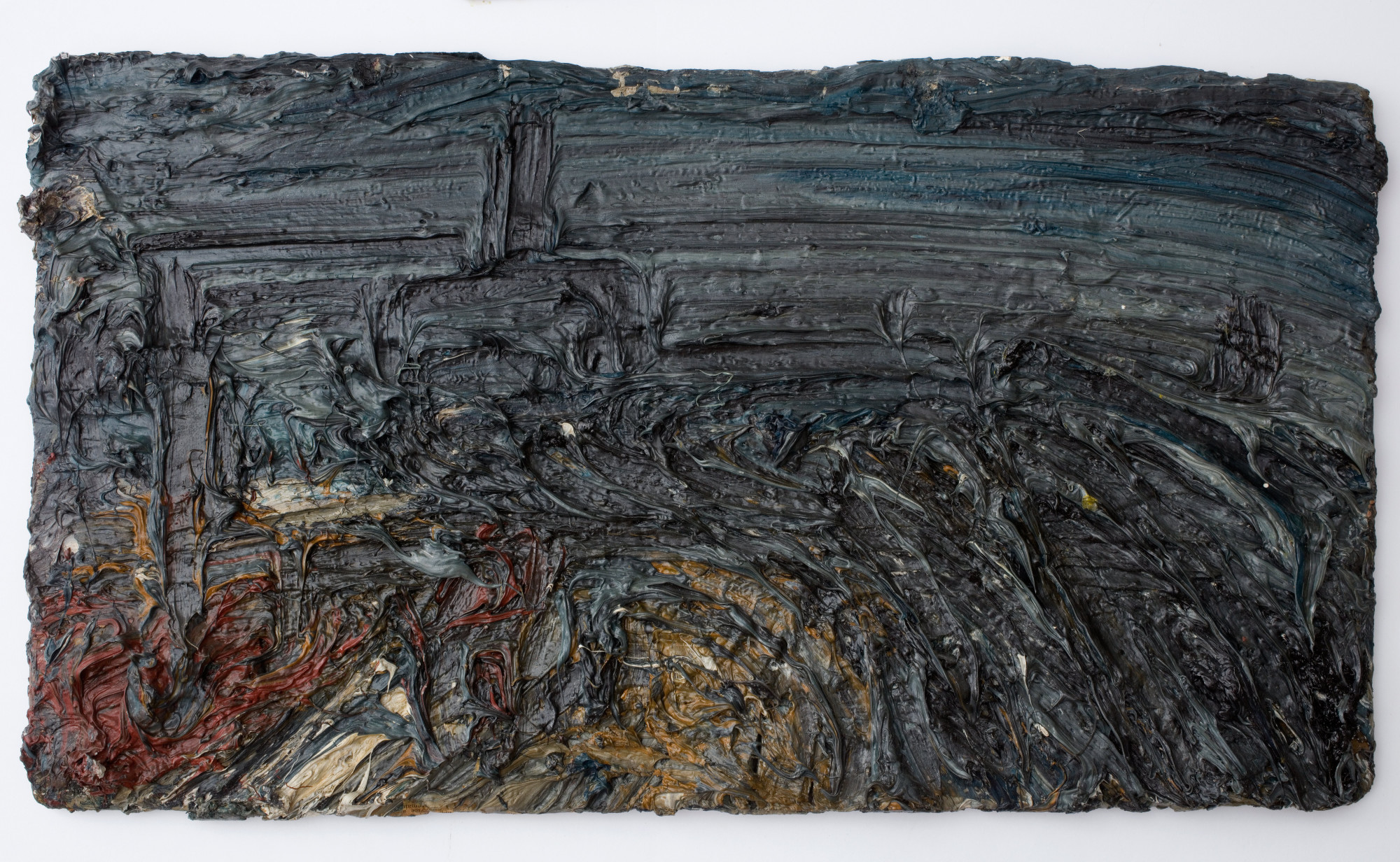
Anyway the point is that this removed ceiling has allowed the curators to place here a big wooden block supporting the three biggest paintings in the exhibition, three fabulous and very big paintings depicting modern brutalist blocks of flats by artist David Hepher.

Born in 1935, over the past 40 years Hepher has established a reputation for painting inner city estates of the 1960s and 70s. The three works here are 3 metres high. They’ve been attached to a wooden display stand to create an enormous triptych which dominates the room and is the biggest and most convincing thing in the exhibition. It’s worth making the journey to the gallery just to see this.

Gordon House East Face; Gordon House Nocturne; Gordon House West by David Hepher (2013) © Guildhall Art Gallery, City of London Corporation. Image © David Hepher

I loved these works for half a dozen reasons. For a start this it the real London, the appalling 70s tower blocks which millions of Londoners are forced to live in every day and which enables London’s intense population density: one seventh of the UK’s population lives in London, the most populous city in Europe, which has a population density of 145,000 per square mile, and it feels like it.

Secondly, tower blocks, like much modern architecture, is a fantastic subject for composition, because it comes ready-made with grids, squares, geometric shapes, which can either be dealt with in an arty modernist style (for example, photographs of their many motifs from unexpected angles as in lots of 20s and 30s photography) or dealt with straight-on, as here. They are just thrilling artefacts – or thrilling to those of us who like lines, symmetries, geometric regularities and angles.

Thirdly, there’s a fabulously dystopian vibe to them. You don’t need to be familiar with J.G. Ballard’s depictions of urban collapse and psychic displacement (Crash, Concrete Island and High Rise‘) to see, realise and feel concrete tower blocks as powerful symbols of social collapse and anomie. You don’t need to know much about the Grenfell Tower disaster to learn that tower blocks have become the cheap, under-maintained dumping ground for the poor, immigrants and the powerless.

They’re real world equivalents of the tower atop Mount Doom in Lord of the Rings, real world sentinels of poverty and deprivation. The broken lifts and urine-stained stairwells and broken pavements littered with dog turds and broken glass, the whole ensemble liberally decorated with impenetrable graffiti create an overwhelming sense of a society which has given up on itself.

The people who designed, built and shunted the poor into these cheap, shoddy death traps are obviously war criminals but in a special kind of war, a kind of below-the-radar class war which has been going on for decades and has become increasingly mixed up with institutional racism and the war on refugees to produce a toxic, and at Grenfell fatal, brew.

In their betrayal of the art, design and architectural utopianism of the 50s, 60s and 70s, in their magical transformation into symbols of social apartheid, exemplifying the scapegoating of the poorest in society, tower blocks like this are absolutely central to the urban experience in cities all around the western world.

The logistics of their size meant they had to be placed in the centre of the atrium, but the positioning also has a deeply symbolic meaning: all the other images, swish modernism of the 1930s, of flyovers and pedestrian crossings, of slick aerial panoramas, are all spokes rotating round the axle of these monster images.

To zero in on the works, another crucial and thrilling aspect of them is that they aren’t just paintings. Hepher has incorporated all the tricks of modern painting to make them rough textured objects. They aren’t flat paintings, they use wood and PVA to give texture to the surface. The graffiti symbols have genuinely been spraypainted over the images. He has dripped green slime down the front of the images to represent the unstoppable decay, concrete cancer and dilapidation which turned out to be a central aspect of these buildings. And most importantly of all he’s used actual concrete to produce rough-hewn, raw grey sections to either side of the central images. I couldn’t resist touching it, as cold and unyielding, as thrillingly alien as the raw concrete in the National Theatre or Barbican centre, as cold as the touch of the devil.

These three huge paintings strike me as classics of their type, of their subject matter and style. On the wall nearby is the Lund ‘Heart of Empire’ painting which I also really liked for its depth and evocative power. It seemed to me they form two ends of a spectrum: London traditional and London modern, London as romantic fantasy and as brutal reality, bourgeois London and chav London, the sublimely uplifting and the sordidly degraded, flying and falling.

I felt a kind of electrical energy crackling between the two completely different imaginative spaces they inhabit which was utterly thrilling. I found it hard to leave. I kept walking back into the room, walking round the stand, viewing these great looming canvases from different angles, drawn back to their thrilling, angry, visionary dystopian energy.


Related links

Other Guildhall Art Gallery reviews

Postwar Modern: New Art in Britain 1945 to 1965 @ the Barbican

Layout

The Barbican gallery is a big exhibition space, spread over two floors. On the ground floor, as you come in, there’s the ticket desk and shop, then you walk through a doorway on your right into the ground floor display space. This is divided into three successively larger ‘rooms’, the third and final one being a fairly big atrium. You then emerge from these into a corridor which runs back alongside the atrium spaces back to the shop, and off which are three alcove rooms or ‘bays’.

Back by the shop there are stairs up to the first floor gallery which runs round the walls and allows you to look down onto the atrium space you’ve just left, so you can see paintings and sculptures from above. You can walk right round this gallery but there are only alcoves or bays on along two sides of it, four bays on one side and four on the other. 3 + 3 + 4 + 4 = 14 distinct display spaces.

14 rooms, 14 themes

So when the curators set out to design this exhibition of post-war British art they had 14 spaces to play with and have come up with 14 topics or subject areas, accordingly. Starting in room 1, the visitor walks through 14 themed aspects of post-war British art, which are also arranged in a loosely chronological order, starting just after the end of the Second World War and ending in 1965.

‘Cyborg collages’: First Contact by John McHale (1958) Collection Albright-Knox Art Gallery, Buffalo, New York © Estate of John McHale

The new

The curators have made one key decision which defines the entire show: believing that post-war artists had to cope with the aftermath of ‘a cataclysmic war that called into question religion, ideology and humanity itself’, they have consciously chosen to focus on THE NEW ARTISTS of the period. They have ignored artists who’d come to prominence between the wars (so no Henry Moore or Barbara Hepworth, for example; no Paul Nash, Graham Sutherland, no Stanley Spencer, Surrealists or Bloomsburyites).

Instead the curators have tried to catch the mood conveyed by The New Generation of young artists who emerged immediately after the war and set a new tone. The result is that, although the exhibition contains the huge number of 200 works of painting, sculpture and photography, by an overwhelming number of artists (48) it has a surprising unity of feel.

Leaving aside the (excellent) photographers, the paintings in particular demonstrate what you could call a kind of damaged abstraction. There’s a blurred, grey and brown, muddy quality to much of the work. There are lots of earth tones, earth grey, earth cream, earth browns.

West Indian waitresses by Eva Frankfurther (1955) Ben Uri collection, presented by the artist’s sister Beate Planskoy © the Estate of Eve Frankfurther

The war hadn’t pulverised a specific landscape, as in the images of the Western Front made famous during and after the First World War. It had ranged far more widely than that. Crucially, it had permanently damaged mankind’s view of itself.

It was hard to be optimistic about people or ‘culture’ or ‘civilisation’ after news of the concentration camps broke in May 1945, and then the atom bombs were dropped in August 1945. And then the H bombs and the start of the incredibly fearful and menacing Cold War. Many artists struggled to believe in anything positive and channelled their energies into devising novel ways to express their horror and despair.

With so many works by so many artists, there are some exceptions, but overall I’d say this is quite a grim, depressing exhibition, with much to be justifiably depressed about. If you put the (five) photographers to one side, then there’s hardly any figurative work, and when there is (Auerbach, Freud, Bacon, Bratby, Cooke, Souza) it is heavily stylised or deliberately distorted. There are certainly no landscapes. It is an accumulation of damaged psyches.

From murk to clarity

It occurred to me that you could arrange almost all the works along a spectrum from Murk to Clarity. Then you further could sub-divide these categories. What I mean is that the murky end of the spectrum could be divided into images which look like:

  • bodies melted in a nuclear blast (Eduardo Paolozzi, Peter King)
  • bodies eviscerated in some grotesque medical calamity (Magda Cordell)
  • people drowning in Holocaust concentration camp mud (Frank Auerbach and Leon Kossoff)
  • bodies blurring into hunks of meat (Francis Bacon)
  • bodies reimagined as abstract shapes, blots, drabs and dribbles of paint (Gillian Ayres)
  • bodies combined with inorganic materials such as metal to become ominous cyborgs (Lynn Chadwick’s semi-abstract sculpture of a demonic bird, John McHale’s robotic family, Elisabeth Frink’s menacingly humanoid Harbinger Birds and the St Sebastian sculptures by Eduardo Paolozzi)

The murkiest of the murk

I’ve always heartily disliked the paintings of Frank Auerbach and Leon Kossoff. Both applied unbelievable amounts of paint to their canvasses to create nightmare brown meringues of mud. They themselves in interviews claimed they were seeking to get at the essence of the subject or to capture the fleeting nature of reality or some such. They obsessively painted London scenes such as two big muddy paintings here, of the Shell building on the South Bank and Willesden railway junction.

But for me the key fact is that both were Jewish refugees from Nazi Germany and, to me, all their paintings powerfully, oppressively convey the feel of the grim Polish winter mud in which so many of their fellow Jews were worked to death, starved to death and exterminated.

‘Drowning in the mud of the Holocaust’: Head of Gerda Boehm by Frank Auerbach (1964) Sainsbury Centre for Visual Arts © The Artist

Clarity

At the other end of the spectrum is what I’ve called Clarity, which can be sub-divided into maybe three rooms or artists:

  • artists in the Concrete room
  • Lucian Freud
  • Surface / Vessel room

In the room called Concrete are a set of surprisingly calm, clean, crisp, white abstract images. Victor Pasmore was a celebrate figurative artist when, in the late 1940s, he underwent a conversion to abstraction. By 1951 Pasmore had established a circle of younger artists who were equally committed to the cause of geometric abstraction, which they referred to variously as ‘Concrete’, ‘Constructionist’ or ‘Constructivist’ art, artists including Mary Martin, Adrian Heath, Anthony Hill, Robert Adams and Denis Williams.

Concrete is right next to the death camp vibe of the Auerbach room, Scars, and I really needed it. The white geometric shapes projecting from the canvas as Modernist friezes reminded me of Ben Nicholson (famous between the wars and so banned from this show).

Lucian Freud may seem an odd artist to group under the heading of clarity, but the exhibition features three of his earliest works which do, in fact feature this quality. Edgy, though. Distorted. The curators put it well when they say that ‘Freud’s forensic attention to small details suggests an uneasy vigilance, revealing anxieties just below the surface.’

‘Neurotic clarity’: Girl with Roses by Lucian Freud (1948) Courtesy of the British Council Collection © The Lucian Freud Archive/ Bridgeman Images, photograph

The third ‘calm’ room is titled Surface/Vessel. It features the paintings by William Scott and ceramic vessels by Lucie Rie and Hans Coper. What they have in common is the withdrawal of all bright colours and a return to the colour of canvas and clay, textured surfaces and irregular forms. I might have liked them because 15 years later they set the tone for the kind of abstract prints you could buy at Habitat and Ikea and my parents decorated my childhood home with reproductions of these kind of gentle, cream and earth brown soothing shapes.

Installation view of Postwar Modern showing two works by William Scott: Message Obscure I (1965) and Morning in Mykonos (1961)

Room guide

The themed rooms are:

1. Body and cosmos

The first three rooms are the three progressively bigger ones on the ground floor. Each is dominated by a big signature work. This first room is dominated by Full Stop by John Latham. This seems pretty meh in reproduction which doesn’t convey its size. It’s huge, monumental, 3.5 metres by 2.5 metres, a Mark Rothko of a painting, and a hypnotic image. Is it a solar eclipse, a black hole, an enormously magnified piece of typography. Something has ended – but what?

‘The death of colour’: Full Stop by John Latham (1961) Tate © the Estate of John Latham

Much smaller is the set of three prints by Eduardo Paolozzi, born in 1924 the son of Italian immigrants, so an impressionable teenager during the war. It’s impossible to make the prints out as heads because the images look eroded and decomposed as if by acid or, as wall label suggests, evaporated in the atomic blast so many around the world feared was coming.

2. Post atomic garden

The second room is bigger, contains more but is dominated by the mutant bird sculpture by Lynn Chadwick named The Fisheater (1951). It was commissioned for the 1951 Festival of Britain. It’s set on a slender tripod and aerial assembly, a slender outline of a bird made from thin metal rods and sheets of metal, looking a bit like the skeleton of Concorde, very slightly swaying in the ambient air, beakily looking down at us soft and vulnerable humans.

Installation view of Postwar Modern at the Barbican showing The Fisheater by Lynn Chadwick (1951)

Fisheater epitomises the combination of light, modern industrial elements with unnerving menace which is one of the threads which runs through the show, as in the Paolozzi robots and the robot-humanoid nuclear family grimly depicted in John McHale’s First Contact (above).

3. Strange universe

The third ground floor space is the biggest, lined with huge paintings by a variety of artists, but it is dominated by a signature work, three metal sculptures, about man-size mutant cyborgs made out of complex metal and engineering detritus, welded together and melting at the edges as if they’re robots which have been brought to a halt and slightly melted in the ultimate nuclear apocalypse. They’re by Eduardo Poalozzi who, I think, has more pieces than anyone else in the exhibition and emerges as its presiding spirit.

‘Humanoid figures assembled from electrical scraps and castoffs’: Installation view of Postwar Modern showing Saint Sebastian by Eduardo Paolozzi (1957)

This room also features some enormous paintings by Magda Cordell which are splashed with red and orange and look like the freshly flayed and eviscerated carcass of a humanoid life form.

Figure 59 by Magda Cordell (1958)

4. Jean and John

The first of the bays off to the side of the ground floor corridor contains 8 or so paintings by the husband and wife artists Jean Cooke and John Bratby. Bratby’s stylised but basically figurative still lifes of their home, with boxes of cereals on the kitchen table, were nicknamed ‘Kitchen Sink’ art, presumably before kitchen sink drama came along. Although figurative and colourful, these paintings somehow bespeak the horrible, pokey domesticity of English life and it came as no surprise to learn that Bratby was jealous of his wife’s talent, destroyed much of her work and beat and abused her. See what I mean by grim?

5. Intimacy and aura

This is the room with the neurotic early paintings by Lucian Freud which I mentioned above.

But it also features the first of the photographers, Bill Brandt. Photography, with its figurative realism, comes as a big relief after four rooms loaded with paintings of bleakness, despair, mutant robots and huge abattoir paintings. But it is even more of a relief to discover that Brandt is represented here by a series of photos of female nudes. It’s not that they’re nude so much as that they’re studies of people who are young, fit and healthy. It is a sudden oasis in a desert of radioactive despair.

Apparently Brandt had been renowned in the 1930s for his photojournalism (thus breaking the curators’ self-imposed rule that no-one from between the wars has a place) but 1945 saw a radical shift in his practice as he began experimenting with nude studies indoors. Not only indoors, but in spare, spartan uncarpeted rooms. So, although fully realistic, these studies also have a strange, spooky, spectral mood. Arguably these photos, although entirely naturalistic, manage to share the same sense of nervy ominous as so many of the paintings and sculptures.

The Policeman’s Daughter, Hampstead, London 1945 by Bill Brandt © Bill Brandt Archive

6. Lush life

This room is a surprise. One entire wall is a hugely blown up photo of the interior of a new model home designed by the visionary architects Alison and Peter Smithson. It’s a photo of their stand at the 1956 Daily Mail Ideal Home Exhibition. It was titled ‘House of the Future’ and the furniture was created using plaster, plywood and paint masquerading as the moulded plastic they’d like to have used but couldn’t afford, the kind of new super-slimmed-down ideals for living designs which were being pioneered and mass produced in America and which featured in the Barbican exhibition about Charles and Ray Eames.

Installation view of Postwar Modern showing the wall-sized photo of Alison and Peter Smithson’s 1956 ‘House of the Future’, with just one yellow ‘egg chair’, made from moulded reinforced polyester, on the low dais.

The American theme is echoed in a series of humorous collages created by Eduardo Paolozzi (is he the most represented artist in the show?). It’s a series of A4 sized collages he created by cutting up images from glossy American consumer magazines, titling the series Bunk. Of course they’re meant to be ironic and subversive and whatnot, but what really comes over is the power and optimism of the original images. Particularly when set against the post-atomic, post-Holocaust nihilism of so much of the rest of the show.

Bunk! Evadne in Green Dimension by Eduardo Paolozzi (1952) Victoria and Albert Museum, © The Paolozzi Foundation

7. Scars

As described above, the Auerbach and Kossoff, drowning in mud, Holocaust despair room.

The room also has a little TV on which is playing a film of a 1961 event carried out by another Jew (the curators emphasis the common ethnicity of these three artists), Gustav Metzger. Metzger pioneered an art of ‘auto-destruction’ in the late 1950s, staging works that enacted their own disintegration, mirroring the violence he felt in a world hell bent on its own destruction. In the grainy old film Metzger is wearing a gas mask, with St Paul’s in the background, while he sprays acid onto canvas which promptly shrivels and dissolves. ‘Happenings’ had been happening in America among beatnik audiences art colleges throughout the 1950s. This appears to be Metzger’s variation on the idea which – as so often in this exhibition – accentuates the negative.

8. Concrete

As described above, a roomful of works by Victor Pasmore and his fellow ‘Concrete’ artists. I especially enjoyed the small-scale, abstract sculptures by Robert Adams. Calm and healing.

Installation view of Postwar Modern at the Barbican showing works by Robert Adams, being: Divided form (1951), Rectangular bronze form number 7 (1955) and Balanced bronze forms (1955).

9. Choreography of the street

More photography, thank God. The black and white snaps of Nigel Henderson and Roger Mayne who specialised in capturing children at play in the gritty, ruin-infested post war streets. Mayne’s most famous body of work was created between 1956 and 1961, capturing the working-class community of Southam Street in North Kensington, west London. One of his photos was used for the cover Colin MacInnes’s novel, Absolute Beginners (1959), a copy of which is here in a glass case.

Street scene 1957 by Roger Mayne © Roger Mayne Archive / Mary Evans Picture Library

Reminds me a bit of the photo of young toughs in Finsbury Park, 1958, which marked the start of Don McCullin’s career.

The lovely and hugely evocative photos of kids playing in bomb sites are interspersed with a series of collages by Robyn Denny and Eduardo Paolozzi (surely Paolozzi is the most featured artist in the show?). And alongside these, collages and in the radical print designs created by Henderson and Paolozzi for their company Hammer Prints Ltd (1954 to 1962).

10. Two women

The two women in question are German refugee painter Eva Frankfurther and home-grown Mancunian photographer, Shirley Baker. Baker documented the changing face of Manchester in the 1950s and early 60s as the old slums were demolished and cleared for high rises and social housing. She walked the streets with a camera always in her bag, taking wonderfully evocative black and white photos of wretched slums and the old-style, working class inhabitants. In 1965 she started experimenting with colour photography and some of her colour photos are feature here.

I was lucky enough to go to the Shirley Baker exhibition at the Photographers Gallery a few years ago – none of the colour photos here are as good as her black and white ones. In a funny kind of way, colour shots of this kind of scene look oddly older, more technologically dated, than the pure black and white ones.

Anyway, the point is… look at the rubble! And in 1965! Twenty years after the war, large parts of England were still struggling to drag themselves into the modern age.

Hulme 1965 by Shirley Baker © Nan Levy for the Estate of Shirley Baker

11. Cruise

The wall label in this room informs us that:

Cruising, or looking for a casual sexual encounter in a public place, was central to the expression and exploration of male same-sex love and desire in the postwar years…

And so it is that one wall features a couple of early works by David Hockney, large browny-black background with all kinds of graffiti, words, lines and squiggles drawn across them:

The title My Brother is Only Seventeen (1962) was derived from graffiti that Hockney read on the toilet walls of Earl’s Court station, a popular cruising spot.

My Brother is only Seventeen by David Hockney (1962) © Royal College of Art

But the real revelation of this room is arguably the best thing in the exhibition. In 1954 Francis Bacon painted a series of seven huge paintings depicting a man in a dark suit sitting at the bar of a hotel, although the background has been stylised to become the slender bars of some kind of cage set against a very dark background. Three of the series are hung here, side by side.

Man in Blue I by Francis Bacon (1954) Collection Museum Boijmans Van Beuningen, Rotterdam © The Estate of Francis Bacon

A photo like this doesn’t do the paintings any kind of justice. They are not only enormous but also, despite their stylised subject matter, have the depth and resonance of Old Master paintings. It took me a while to realise that, unlike all the other rooms in the show, the walls of this room are painted black, as if we are in a very old museum or gallery, and these three Man in Blue paintgins have the power and depth of Old Masters.

Black upon black, depths of blackness, inky impenetrability and ominousness. Possibly the best part of the entire exhibition was standing in front of these three enormous variations on a dark, baleful image and letting it soak right in to your soul.

12. Surface/vessel

As described above, a calming, peaceful room of the paintings by William Scott and ceramic vessels by Lucie Rie and Hans Coper.

13. Liberated form and space

Big colourful paintings by Gillian Ayres, Patrick Heron and Frank Bowling. From the reproductions I thought I’d like the Ayres, but in the flesh I found them a too big and I didn’t warm to her use of ‘dribbles, splashes and stains’ of paint, as the curators themselves describe her work.

‘A world of abstract shapes and dripping paint’: Break-off by Gillian Ayres (1961) Tate © the Estate of Gillian Ayres, courtesy of Marlborough Gallery, London

By the same token, I didn’t warm to the press release photos of paintings by Patrick Heron, but in the flesh found them to be some of the very few genuinely colourful, vibrant and life affirming paintings in the entire exhibition. The wall label explains that, like Pasmore and other post-war artists, when he moved from figurative to abstract painting Heron experienced a great sense of liberation.

June Horizon by Patrick Heron (1957) Wakefield Council Permanent Art Collection (The Hepworth Wakefield) © The Estate of Patrick Heron

14. Horizon

The exhibition ends on an oddity.

We met Gustav Metzger in the Scars room, represented by a film of one of his auto-destructive events. Here, at the end of the exhibition is a blacked out room with half a dozen film projectors projecting onto two walls a series of abstract swirling shapes, which were to become super familiar in the Psychedelic movement and subsequently in the lava lamps of millions of suburban bedrooms. Metzger had moved away from the ‘auto-destructive art’ of the 1950s and towards what he now titled ‘auto-creation’, in which the work of art takes on its own life. This immersive room, complete with bean bags (but no spliffs) is titled Liquid Crystal Environment and was created in 1965 using heat-sensitive chemicals sandwiched between rotating glass slides in a projector.

It’s an odd piece to end on because it seems so out of synch with the rest of the show. It feels like a little bit of the Psychedelic Sixties which has got lost in an exhibition which is overwhelmingly about the grim psychic damage, the anxieties and angst of the early Cold War, with the long memory of the Holocaust festering under the shadow of nuclear apocalypse.

Maybe it’s meant to feel cheerful but it doesn’t, which might explain why the two or three times I walked past I didn’t see anybody on the numerous beanbags.

Immigrants

An impressive number of the artists were refugees from Nazi Europe (Auerbach. Kossoff, Metzger, Lucie Rie, Hans Coper, Eva Frankfurther, Magda Cordell). But the curators go out of their way to include artists from colonial backgrounds, non-white immigrants from what was still the British Empire. These include:

  • Francis Newton Souza (India), with his intimidating, highly stylised black Christs (1958) in the first room
  • Anwar Jalal Shemza (Pakistan) with a series of Islam-inspired abstracts in the same room as Heron and Ayres
  • Kim Lim (Singapore Chinese) with her delicate abstract sculptures

The Barbican’s birthday show

The curators point out that the exhibition has been timed to coincide with the fortieth birthday of the Barbican’s opening, for it was in the grim post-war period that the Barbican Estate was first conceived, to occupy what was at the time an enormous bombsite in the heart of London.

The Barbican itself, a grim, forbidding, concrete bunker, on an oppressive grey, rainy day, was the perfect setting for an exhibition about the damaged lives, damaged psyches and damaged country which – despite occasional bursts of colour – is what comes over so powerfully in this show.


Related links

Other Barbican reviews

Lucian Freud: The Self-portraits @ the Royal Academy

‘By the turn of the millennium, Freud was widely acknowledged to be Britain’s greatest living painter.’
(Alex Branczik, Head of Contemporary Art for Sotheby’s Europe)

Contrary to the implications of the title, this exhibition does not include all of Lucian Freud’s self-portraits, nowhere near. Given that Freud was interested in self portraiture throughout his long career, the selection here is a only relatively small percentage. Also, contrary to the title, the exhibition also includes a number of portraits not of himself, in fact arguably the best room is the one devoted to portraits of other people.

Lucian and me

I didn’t use to like Lucian Freud. I associate him with Frank Auerbach and the other dreary, depressing post-war British artists, a kind of visual equivalent of Harold Pinter, who I was force-fed at school. Their dreary, depressed, rainy English miserabilism nearly put me off contemporary art and literature for life.

But this exhibition made me change my mind (a bit) for two reasons:

1. It is told in a straightforward chronological order, which allows us to see the quite remarkable evolution of his style over 60 years of painting. Stories are always interesting and, by stopping to investigate each stage along his journey, the exhibition does a good job of making his development interesting.

2. By luck I got into conversation with another visitor who happened to be an amateur painter and she, for the first time, made me understand how his journey had been one of technique. It dawned on me that, to use a cliché, he may be a painter’s painter. Certainly the last couple of rooms make you think that his paintings may well depict men or women, naked or clothed, including himself, as subjects – but the real subject is the adventure of painting itself.

And this made me go back and really examine the technique of the paintings in the last few rooms and come to respect, in fact to marvel, at the complex painterly effects of his mature style.

A brief outline

Freud was born in Berlin in 1922 and fled Nazi Germany with his family in 1933, coming to London. He held his first solo show as early as 1944. In the late 1940s he chose to make portraiture the focus of his practice.

Drawing

Drawing was central to Freud’s style from the late 30s through to the early 1950s. His drawings from this era are strikingly different from the later work. This is a rare opportunity to see a whole roomful of them together and they come from a different world. They have a graphic sharpness, an economy of line which makes them very like cartoons. Look at the careful shading in the ears and on the cheek, and the extraordinary attention he’s devoted to each individual hair. Critic Herbert Read called him ‘the Ingres of Existentialism’.

Startled Man: Self-portrait (1948) by Lucian Freud © The Lucian Freud Archive / Bridgeman Images

This clear style lent itself to illustration so it’s no surprise to learn that he illustrated a number of books, several of which are in a display case here, Cards of Identity by Nigel Dennis (1955) and Two Plays and a Preface by Nigel Dennis (1958) and that Startled Man was one of five illustrations for a novella by William Sansmon titled The Equilibriad (1948).

Apart from the strikingly clean graphic style, what’s obvious is how performative these pictures are – the male head in them is always striking a pose, adopting an attitude, sometimes with props like a feather, in one dramatic case posing as Actaeon for a book on Greek myths.

Back to painting

Around the mid-1950s Freud turned his attention from drawing to painting and for a period of seven years or so stopped drawing altogether. Initially he painted sitting down using fine brushes. This enabled a smooth finished graphic style, very much in line with the clean defined outlines of his drawings, and the people in them share the same slightly distorted, rather frog-like faces as many of the drawings, more like caricatures than paintings.

Hotel Bedroom by Lucian Freud (1954) © The Lucian Freud Archive / Bridgeman Images

The wall label tells us that Freud associated with fellow painters Frank Auerbach and Francis Bacon. Like him they were figurative painters working against the grain of Abstract Expressionism and, later on, ignoring experimental and conceptual art. That, in a sentence, explains precisely why I don’t like them.

Bigger brushes

Anyway, Bacon inspired Freud to switch from soft sable-hair brushes to hog’s hair brushes which are capable of carrying more paint. This, it seems, was the physical, technical spur for the decisive change in his style. Between the late 1950s and mid-1960s his painting left behind the draughtsmanlike precision, so close to drawing, of paintings like Hotel Bedroom, and became far looser, a matter of large looser brushstrokes, which create more angular images, images made out of clashing planes and angles with an almost modernist feel about them.

Man’s Head (Self-portrait III) by Lucian Freud (1963) © The Lucian Freud Archive / Bridgeman Images

This is the third of three self-portraits which the exhibition reunites for the first time since they were shown together in 1963. You can see how the interest is now in structure more than likeness. There is no attempt to create a realistic background (his studio or a bedroom) which is now a plain matt surface. Similarly, his face has its familiar long, rather hawkish look, but here transformed into a semi-abstract mask.

Watercolours

Surprisingly, in 1961 he took up watercolours alongside paint. Both were ways of escaping from the linearity of pen-and-ink drawing. The exhibition includes a number of watercolours where he is obviously exploring the effect of broad washes, and the dynamic contrast that creates with more sharply defined faces.

In both types of work he drops the symbols and props which had abounded in the drawings. The subject matter is simpler and in a way starker. The paintings still feel pregnant with meaning but their force or charge is achieved by different means, purely by the arrangement of brushstrokes.

Mirrors

Mirrors have been used by artists since time immemorial to paint accurate self-portraits, and countless artists have gone one step further to include mirrors in their paintings to highlight the artifice and paradox or making images which, on one level, claim to be true, claim to be reality, but on another, are patent artifice.

Quite a few Freud self portraits include mirrors or depict himself from angles clearly designed to bring out the mirrorly artifice. When you learn that he did this increasingly from the mid-1960s it makes a kind of sense; you can see the echo of similar experiments going on in in contemporary film posters and album covers. This instance using a mirror on or near the floor is striking enough, but made disturbing by the inclusion of small portraits of two of his children perched ‘outside’ the main frame.

Reflection with Two Children (Self-portrait) by Lucian Freud (1965) © The Lucian Freud Archive / Bridgeman Images

In the studio

The penultimate room is the best and it’s the one which has no self portraits. Instead there’s two massive portraits of naked women on sofas, a huge standing male nude (his son, Freddy), and an eerie portrait of two fully clothed Irish gentlemen.

The wall label emphasises that by the 1970s Freud had established a definite approach. He painted people he had some kind of connection with, himself, some members of his family and friends, and sometimes people he met through chance encounters but who held a special visual importance for him.

They are all painted indoors, in his studios, not outside, not at their houses or in a neutral space. They are always in the familiar space of his studio, whose props and space and dimensions he knows inside out. This allowed him to focus on what he stated in interviews was his aim, which was to recreate in paint a physical presence.

So the obvious things about the paintings you see as you walk into this room of late works is that:

  • they’re huge, compared to what came before
  • they’re of other people
  • they’re full length instead of face portraits
  • they’re (mostly) naked

But, among this surfeit of impressions, maybe the most striking is the extraordinary poses and postures he has put his naked subjects in. In his mature works, this became his trademark – the rather tortured and certainly uncomfortable poses of naked women, which creates an uncomfortable, unsettling psychological affect on the viewer.

Naked Portrait with Reflection by Lucian Freud (1980)

What is going on? Is he torturing and exploiting these naked women, demonstrating his male power, as feminist critics have it? Or is he twisting their bodies round to create symbols of his personal unhappiness or anguish, as psychological critics might have it? Or had he stumbled across a new kind of motif, which he realised he could make uniquely his own, a ‘look’ which he could use to consolidate his ‘brand’ in the highly competitive London art market, as a Marxist critic might have it? (It is rather staggering to learn that this painting fetched over £11 million at auction in 2008. God knows what it’s worth now.)

Cremnitz white

But the wall label draws attention another, more technical feature of his painting from this period.

In 1975 he began using Cremnitz white, a heavy paint which, when mixed with other paints, creates a thick granular affect. Armed with this information, look again at the sprawling nude above. Look at the white highlights on her body. Two things:

1. Identifying the area of pure white prompts you to look closely at how they relate to the other colours around them. Obviously there’s a lot of pink but, when you look closely, there’s a lot of yellow and, looking more closely, brown and grey and even green. In fact, the more you look, the more entranced you become by the interplay of colours which make up her flesh, a panoply of creams and ochres and bistre tones.

It dawns on you that maybe Freud posed his naked women (and men, he painted a lot of naked men, too) in this contorted sprawling style and lying down rather than sitting up, because this way he exposes the maximum amount of flesh. Maybe these distorted poses have nothing to do with misogynist exploitation or twisted sexuality or psychological symbolism. Maybe they simply create the largest possible expanse of human flesh for him to paint.

2. Go up close, right up to the painting, and what becomes strikingly obvious is the immensely contoured, nubbly, grainy nature of the surface of the work. It is as if someone has thrown small gravel or stones onto the surface which have got embedded in the paint. It is immensely grainy and rubbly and tactile.

Here’s a close-up of the shadow along the right-hand side of the model’s body. You can see:

1. the lumps and bobbles of solid matter in the paint of the darker shadow near the middle of the image

2. the grooves of the thick brushstrokes moving up out of that dark patch to form her tummy or, at the bottom left, the long smooth but very visible and ridged strokes which create her thigh

3. the tremendous variety of colours and tints: granted, they’re all from the same tonal range of brown: but when you look closely you can see the extraordinary dynamism and interplay of shades. There’s barely a square inch of the same colour, but a continual variety, and a tremendous interest and even excitement created by the plastic, three-dimensional, raised and very tactile way different areas of colours stroke and swadge and brush, and daub and paste and are modelled and placed over and against each other.

Detail from Naked Portrait with Reflection by Lucian Freud (1980)

As I mentioned above, this was partly the result of chatting to the painter I met at the show. It was her enthusiastic description of Freud as a painter as a handler of paint, as the creator of such drama on the canvas, which made me go back and look at these last paintings in more detail.

Same thing can be seen in the other big nude in the room, Flora with Blue Toenails. Armed with this new way of seeing, what I noticed about this painting were 1. that the surface is so granular and lumpy you can see it even in a reproduction 2. the striking difference in timbre between her light torso and her much darker, more shaded legs. The keynote seemed to me to be grey. Follow the lines of grey. A solid line of grey goes from her cleavage, down her sternum and snakes around the top of her tummy almost creating a circle, where it almost joins to another long serpent of the same grey which snakes across her left thigh and curls round at her knee before reappearing across her right shin.

Flora with Blue Toe Nails by Lucian Freud (2000 to 2001)

My point is that, by this stage I was seeing these compositions as adventures in paint, as incredibly complex interplays of an astonishing range of colours, applied in a thick dense impasto, with heavy brushstrokes and entire regions raised and nubbled with grains and lumps of solid matter.

Here’s a close-up of Flora’s elbow, as transformed by Freud’s painterly prestidigitation. I found it quite thrilling to step right up to the painting and examine small areas in great detail, revelling in the adventures of the tones and surfaces – look at the myriad colours intermingling in the broad horizontal strokes at the top of her forearm, it’s almost like a rainbow, the multi-levelled mixing of colours is so advanced. And all this combined with the gnarly gritty, deliberately granular surface.

Detail of Flora with Blue Toe Nails by Lucian Freud (2000 to 2001)

Which meant that by the time I entered the final room, a collection of self-portraits from his final years, I wasn’t at all interested in either the biographical or supposedly psychological elements to them (‘ruthlessly honest, apparently) but instead was riveted by the extraordinarily vibrant, confident, sweeping, dashing painterliness of the things.

Here’s a medium close-up of the 1985 work, Reflection (Self portrait) which is a prime example of his thickly-painted and complex technique. Note the green – green blodges either side of his nose and the pouches under his eyes.

Detail of Reflection (Self portrait) by Lucian Freud (1985)

I became irrationally fascinated by the patterned edge to the image, to his shoulders which is presumably created by a spatula of some kind to model the border between the figure and the background, and which created the kind of crimping effect you see around the edge of pies.

Detail of Reflection (Self portrait) by Lucian Freud (1985)

But everywhere you look in the painting you see the same supremely confident use of paint, applied in apparently slapdash thick strokes and in a blather and combo of colours which seems almost chaotic when seen from really close up…

Detail of Reflection (Self portrait) by Lucian Freud (1985)

… but you only have to step back a few paces to see how these thick, spattered applications meld, at the ideal viewing distance, into extremely powerful, and even haunting, images.

Reflection (Self-portrait) by Lucian Freud (1985) © The Lucian Freud Archive / Bridgeman Images

So I’m still not sure that I particularly like Lucian Freud’s paintings, but now, thanks to this handy exhibition, I have a much better grasp of the shape of his career, and a completely different way of seeing and conceptualising his paintings – not as the grim and dreary products of a troubled claustrophobe with dubious psychosexual issues, but as thrilling and masterly exercises in painterly technique.

I am not very interested in him as a painter of portraits per se – I couldn’t care less about the various marriages or children which the wall labels tell us about. But this exhibition did help me see how Freud really was one of the greatest painters of human flesh who ever put brush to canvas.


Related links

More Royal Academy reviews

All Too Human @ Tate Britain

Britain is a collection of chilly rainswept islands in the North Atlantic, on the same latitude as Moscow (as we may learn to our cost in the decades to come, if global warming really does disrupt the Gulf Stream). For more than half the year the sky is overcast and grey. Whereas the inhabitants of southern countries like Spain or Italy have a tradition of living outside for much of the year, and dressing their finest every night for the evening stroll or passeggiata, ours is a country of fusty pubs for the working class and dinner parties for the posh. Ours is an indoors country.

This basic fact about life in Britain come across very strongly in Tate Britain’s new exhibition, All Too Human: Bacon, Freud And A Century Of Painting Life. It is a show of some 93 paintings, one sculpture and half a dozen black-and-white photographs by some of the most celebrated British artists of the past 100 years who have painted depictions of the human body. In roughly chronological order the artists are:

  • Walter Sickert b.1860
  • David Bomberg b.1890
  • Stanley Spencer b.1891
  • Chaim Soutine b.1893
  • Giacometti b.1901
  • William Coldstream b.1908
  • Francis Bacon b.1909
  • John Deakin b.1912
  • Lucian Freud b.1922
  • Francis Souza b.1924
  • Leon Kossoff b.1926
  • Dorothy Mead b.1928
  • Michael Andrew b.1928
  • Frank Auerbach b.1931
  • Dennis Creffield b.1931
  • Euan Uglow b.1932
  • R.B. Kitaj b.1932
  • Paula Rego b.1935
  • Celia Paul b.1959
  • Cecily Brown b.1969
  • Jenny Saville b.1970
  • Lynette Yiadom-Boakye b.1970

Mud or Mad

A reviewer of Tennyson’s long poem, Maud (1855) sardonically commented that it would have been more accurately named if either of the vowels had been removed. As I walked round this grim, dark and oppressive exhibition, I began to think most of the works on display could similarly be divided into ‘Mud’ or ‘Mad’, with maybe the additional category of ‘Livid Corpse’.

1. Mud

The School of Mud was inaugurated by Walter Sickert, leader of the so-called Camden Town Group. While John Singer Sargent was painting evocative portraits of fine society ladies or women with parasols lounging in the Mediterranean sunshine, Sickert painted prostitutes in dingy attics or leering crowds in half-lit music halls. The three works by him here are deliberately squalid, dark and dingy, so dark you have to peer up close to see any detail.

Nuit d'Été by Walter Richard Sickert (c.1906) Private Collection, Ivor Braka Ltd

Nuit d’Été by Walter Richard Sickert (c.1906) Private Collection, Ivor Braka Ltd

Rooms five and six of the exhibition explore the work of David Bomberg as artist and teacher at Borough Polytechnic, where his emphasis on the tactile quality of paint influenced his students Leon Kossoff and Frank Auerbach.

Bomberg is represented by Vigilante, which I quite liked because of its powerful vertical lines, which reminded me of the Vorticist work of Wyndham Lewis or Jacob Epstein. But it was his use of thick impasto which influenced his students and went on to become the distinguishing characteristic of the paintings of Kossoff and Auerbach.

Head of Jake by Frank Auerbach (1997) © Frank Auerbach, courtesy Marlborough Fine Art

Head of Jake by Frank Auerbach (1997) © Frank Auerbach, courtesy Marlborough Fine Art

These murky, smeary, thick abortions of the darkest browns and blacks possible made me think of an explosion in a sewage farm. Some of them made me feel physically sick. The joke is that many of them are meant to be outdoors scenes. Is this how you see or experience London?

Early Morning Willesden Junction by Leon Kossoff

Early Morning Willesden Junction by Leon Kossoff

Or this?

Mornington Crescent by Frank Auerbach (1965)

Mornington Crescent by Frank Auerbach (1965)

The commentary claims that:

Both Auerbach and Kossoff display great sensitivity to the conditions of light, convey the dynamism of city life and reflect the mood of a specific moment

which I thought might be a joke. Let’s look again at Kossoff’s sensitive depiction of light.

Early Morning Willesden Junction by Leon Kossoff

Early Morning Willesden Junction by Leon Kossoff

Not quite so muddy, but still revelling in gloom, bleakness of mood, greys and blacks splattered with neurotic blotches of colour, is the handful of works later in the show by Celia Paul.

Painter and Model by Celia Paul (2012) © Celia Paul, courtesy the artist and Victoria Miro, London / Venice

Painter and Model by Celia Paul (2012) © Celia Paul, courtesy the artist and Victoria Miro, London / Venice

Cheerful stuff, eh? The smear-and-daub tradition (Sickert-Bomberg-Auerbach) which this exhibition reveals to be a major thread in modern British art is represented in our day by the bang up-to-date works of Cecily Brown.

Boy with a Cat by Cecily Brown (2015) © Cecily Brown. Photo by Richard Ivey

Boy with a Cat by Cecily Brown (2015) © Cecily Brown. Photo by Richard Ivey

2. Mad

Only room one deals with the depiction of the human figure between 1918 and 1945. That’s not much space for nearly thirty years, is it? Murky Sickert, distorted Soutine and blue-veined Stanley Spencer are the only artists included (We’ll come back to Spencer under the category of ‘livid corpses’) thus omitting quite a lot of other artists active during this period.

Then it’s quickly on to Francis Bacon, who dominates rooms two and seven with his screaming popes, tortured dogs and baboons, men turning into hunks of meat. All depicted against precise geometric backgrounds as if caught in cages or on stage as specimens. Angst. Existential despair etc.

Portrait by Francis Bacon (1962) © The Estate of Francis Bacon. All rights reserved. DACS, London

Portrait by Francis Bacon (1962) © The Estate of Francis Bacon. All rights reserved. DACS, London

In the hall outside the exhibition there’s a loop of videos playing which show interviews with some of the featured artists, alongside display cases and wall displays showing photographs of the artists’ studios. Bacon’s was a notoriously filthy, dirty, messy cave with only a skylight allowing the grey light of Soho to penetrate down into the torture chamber. It tends to confirm your prejudices to learn that Lucian Freud’s studio, also in Soho, was nearly as dirty and scrappy.

The room after the early Bacon is devoted to Francis Souza whose strikingly large paintings are done in an edgy, angular, primitive style. The room is dominated by an enormous Crucifixion and a full figure painting of a naked black woman. Reproductions can’t convey how enormous, dark and menacing they are.

Again – dark dark dark, intense or even demented. I actually liked them, they have a terrific style, but God the mood they convey is wretched.

Room ten of the exhibition is devoted to paintings by Paul Rego. To quote the curators (there are three curators, all women):

Women’s lives and stories have often been overlooked in art as a historically male-dominated activity. Rego places them at the centre of her work. Women are portrayed as undertaking a variety of activities, in a broad range of moods and temperaments, as victims, culprits, carers, passive observers and sexually-charged creatures. As viewers we are drawn into and become complicit in an unruly world shaped by patriarchal power.

Here’s an example: can you feel yourself being drawn into it and becoming complicit in an unruly world shaped by patriarchal power?

The Family by Paula Rego (1988) Marlborough International Fine Art © Paula Rego

The Family by Paula Rego (1988) Marlborough International Fine Art © Paula Rego

Obviously, the more you look at it, the more disturbing it becomes. Maybe that’s what the commentary meant. For me the disturbing element is the way the schoolgirl fiddling with the man’s trousers in a way which in recent times we’ve been taught to think of as paedophilia, as being a sex crime. Yet she has the head of an adult woman. So…

Livid corpses

There aren’t any actual corpses on display, that’s just a short hand way of describing a style of painting human skin and bodies which emphasises the whiteness of English complexions, the lack of exposure to sunlight which leaves so many English bodies pale, pallid and covered in blue veins.

The exhibition decisively shows the strong tradition in English art of arranging and depicting the naked human body in the most unflattering way possible, as if it was a corpse just been pulled out of the Thames. It is as unsensual and unsexy as it is possible to be.

One recurrent cliché or trope of this styleis to depict a woman mostly wearing clothes but revealing one slack, white, veined breast in the most unappealing way possible. We see Stanley Spencer establishing this tradition in room one.

Nude Portrait of Patricia Preece by Stanley Spencer (1935)

Nude Portrait of Patricia Preece by Stanley Spencer (1935)

(There’s a lot more to Spencer than his full frontal nudes, as any visitor to the Stanley Spencer Gallery in Cookham or even to the 1910 room in Tate Britain will discover – but for some reason it’s always the saggy-boobed and flaccid-penised nudes which feature in exhibitions like this, never the scores of paintings he did of the cheerfully clothed men and women of his native Cookham.) Anyway, saggy blue-veined boobs was a motif picked up by young Lucian Freud fifteen years later.

Girl with a White Dog by Lucian Freud (1950-1) © Tate

Girl with a White Dog by Lucian Freud (1950-1) © Tate

Freud makes his first appearance as a pupil of art school teacher William Coldstream in room four, and then has the largest room in the show – room seven ‘Lucian Freud: In the Studio’ – devoted to him, with 13 big paintings.

It is interesting to learn that Freud’s mature style was the result of his switching from the small brushes which produced the smooth finish of paintings like the one above, to using bigger, coarser brushes which produced a more modern, slightly blotchy style. And that he moved away from the sitter – instead of being close and smooth, his portraits become more distant, more mottled.

Those changes by themselves, however, don’t account for the drastic change from the smooth, light palette of the painting above to his fascination with all the hues of brown, orange, grey and white which result in the characteristic blotched skin of his mature work.

David and Eli by Lucian Freud

David and Eli by Lucian Freud

The Freud room is full of paintings which revel in the ungainliness and the sheer ugliness of raw, naked, gawky, livid English bodies. Feet with their corns, legs with varicose veins, the tanned face and chest contrasting with the rest of the pallid body, the livid puce of this man’s flaccid cock and balls. In all of Freud’s ugly nudes I get the feeling the painter is daring you to come out and say how disgusted you are. Just how ugly can he make his people, before the viewer cries ‘Enough!’

Recognisably in the same tradition of ‘English ugly’ are the paintings of Jenny Saville although, unlike Freud, for reasons I can’t quite define, I’ve always loved Saville’s work.

Saville broke through in the fabulous Sensation exhibition of 1997, with paintings of grotesquely fat people who seemed to be pushing right up against the surface of the canvas, squeezed and compressed right into your face. All her works are awesomely big.

For some reason, although Freud’s blotchy nudes with their hairy penises and ragged vulvas make me feel like I’m in a butcher’s shop, I find Saville’s work visually thrilling and exciting. But it’s still from the very English ‘school of ugly’.

Reverse by Jenny Saville (2002-3) © Jenny Saville. Courtesy of the artist and Gagosian

Reverse by Jenny Saville (2002to 2003) © Jenny Saville. Courtesy of the artist and Gagosian

A little light

Is there any light in this gallery of murk, madness and tormented flesh? Yes, some. I’d never heard of Michael Andrews. In line with the general vibe two of his paintings here are of gloomy roughly-sketched interiors in Soho, namely the notorious Colony Club where Bacon et al. hung out, drank and bitched. But there is also this surprisingly touching outdoors scene.

Melanie and Me Swimming by Michael Andrews (1978-9) Tate © The estate of Michael Andrews

Melanie and Me Swimming by Michael Andrews (1978 to 1979) Tate © The estate of Michael Andrews

It was admiring the grace and tenderness in this painting which brought home to me how much the qualities of gentleness or grace are missing from almost all of these paintings – certainly from all the screaming Bacons, blotchy Freuds, oily Kossoffs, murky Auerbachs and mad Regos.

And for that matter, scenes simply set outdoors are few and far between in this show: there are none in the Bacon room, none in the Freud room. Even when there are supposedly outdoor scenes, as in the Auerbach and Kossoff rooms, you wouldn’t really know it, so buried are the motifs in layers of industrial thickness sludge.

No – happy, light, outdoor scenes are conspicuous by their complete absence, as is the depiction of the human body as a thing of beauty. Think of Aubrey Hepburn. Think of a ballerina. Think of Lionel Messi nutmegging a defender. Think of a hundred images of people in outdoors settings, laughing at cafes, walking through woods, gardening, sunbathing.

All of that, almost all of actual human life, is consciously excluded from this parade of horrors and corpses.

It’s odd that anyone takes ‘Art’ as being in any way representative of the actual life of its era when it is quite obviously the opposite – the product of a cloistered, hermetically-sealed world which almost makes a virtue of not capturing or depicting the actual lives of the people around it.

The only room which provided a relief from torture and turpitude was room four, devoted to the teachings of William Coldstream at the Slade School of Fine Art. Coldstream developed a process for marking out the canvas with precise grids to help construct a realistic image, deliberately leaving bits of grid visible to hint at the geometric framework beneath the ‘reality’.

Seated nude by William Coldstream (1973)

Seated nude by William Coldstream (1973)

I liked the precision of his draughtsmanship and the way you can see original lines of the sketch showing through the oil colours. That sense of outlines and shape. Three or four of Coldstream’s relatively light and airy works are included, alongside some by his pupil Euan Uglow.

Georgia by Euan Uglow (1973) © The Estate of Euan Uglow

Georgia by Euan Uglow (1973) © The Estate of Euan Uglow

In the flesh, up close, you can see traces of the lines of the grid which Uglow created across the canvas and many of the little crosses formed by the crossing of lines remain visible through the paint. I like that sense of the mechanical or mathematical emerging from the picture – or the sense of the work being unfinished, a work in progress.

As to the actual image, it’s another unsmiling person. In an exhibition devoted to the depiction of human beings over the past 100 years of English art not one person is smiling, let alone laughing (apart from the mad mother in the Paul Rego painting).

All confirming that ‘Art’ is a bloody serious, sombre, tragic business, you know.

Contemporary artists

The eleventh and final room is devoted to works by four younger or contemporary artists, all four of them women – including Jenny Saville, Cecily Brown and Celia Paul (all mentioned and illustrated above).

The Saville I loved, the Brown and Paul a lot less so. And, alas, as so often with contemporary artists, their work turns out – according to the (female) curators – to be all about sexuality and identity.

In their representations of figures they explore what it is to be human from a contemporary perspective. Throughout their work, they investigate and stretch stereotypical views on femininity, masculinity, race and many other categories that define and constrain identity.

Last word for Lynette Yiadom-Boakye, born in 1970 and so, along with Saville, the youngest artist in the show. According to the wall label she knocks out her paintings in a day of rapid and intense work. I liked both her pieces on display here, because I like disegno, the ability to conceive and carry out accurate line drawings. Both her works here display extremely skilled draughtsmanship, a handy way with oil paints, and the ability to create mood and expression.

Coterie Of Questions by Lynette Yiadom-Boakye (2015) © Lynette Yiadom-Boakye

Coterie Of Questions by Lynette Yiadom-Boakye (2015) © Lynette Yiadom-Boakye

Still, though – very dark aren’t they? Britain is for much of the year a dark and gloomy place which, at least according to this exhibition, has inspired a lot of dark and gloomy art – and the sombre palette of Yiadom-Boakye’s work fits right into that tradition.

The promotional video


Related links

Reviews

More Tate Britain reviews

Frank Auerbach @ Tate Britain

Frank Auerbach was born in 1931 and is a German-born British painter. He has been a naturalised British citizen since 1947. He was sent from Germany to England aged 7, as part of the Kindertransport scheme for the children of persecuted Jews. His parents died in a concentration camp in 1942. This might partly explain the misery of his earliest paintings, which is only slowly transmuted, as his career progresses, into depressing gloominess.

This major retrospective brings together some 62 oil paintings and 11 charcoal works in seven rooms at Tate Britain. They were arranged in rough chronological order from the 1950s to the present day (he is still very active) by the artist with the final large room chosen and arranged by curator Catherine Lampert.

Frank Auerbach, Head of J.Y.M II (1984-85) Private collection © Frank Auerbach

Frank Auerbach, Head of J.Y.M II (1984 to 1985) Private collection © Frank Auerbach

Oil like mud

Auerbach’s painting is famous for piling on layer after layer of oil paint until it is centimetres thick. In the earliest works it stands up off the canvas in swirls and gloops, which he scrapes and reshapes and then pours more oil onto. The colours he chooses are black and brown and ochres, creating the impression of thick mud which has been mixed with carburettor oil from a particularly ancient car.

In the first room, the 1950s, this technique is put to the purpose of portraits of people who look like they have been incinerated at Belsen or Hiroshima. The impression is certainly of horror and extreme unease.

Or London ‘landscapes’, which look similarly blasted.

As we move into the 1960s the oil, if anything, gets deeper and gloopier. A woman I spoke to, herself an artist, said one of the pieces looked like an much-used artist’s palette, about 18 inches square with twills and swirls of oil paint randomly splurged onto it in overlapping and murky tones. Imagine a meringue before it’s cooked, and spattered with black and brown and blue and red colours all mixed together.

His three subjects appear to be portraits, interiors of his studio in Mornington Crescent North London, and the streets nearby. These he has been painting obsessively for the past 60 years. Primrose Hill Spring Sunshine (1964) made me laugh. Was there ever a painting that looked less spring-y and less sunshine-y?

In a way I admired the boldness of Studio with figure on bed because he appears to have simply squeezed thick red paint onto the already deeply mired canvas as a child might do elementary icing. There is a definite progression or change in the style over the decades: the paint gets a lot less thick, though the approach is still to lay it on thick and then draw great lines across it with an implement. And the tonal range lightens up to introduce muddy yellows.

Frank Auerbach, Head of William Feaver (2003) Collection of Gina and Stuart Peterson© Frank Auerbach, courtesy Marlborough Fine Art

Frank Auerbach, Head of William Feaver (2003) Collection of Gina and Stuart Peterson © Frank Auerbach, courtesy Marlborough Fine Art

But the style remains recognisable and the subject matter monotonously the same right up to the present day.

When the commentary said that Auerbach ‘exercises special vigilance to avoid repetition’ I at first thought that was a joke, since one of the most obvious features of his subjects is their obsessive repetitiveness, treating the same London streets and the same people to the same ‘landscape’ approach and the same ‘portrait’ approach, again and again, as the numbering of the paintings themselves indicate.

Charcoal works

In the first room were more or less the only works I liked, two charcoal-on-paper heads. I responded to the damaged surface, the torn edges, the distortion of a recognisably human face. I always enjoy strong lines, line drawing, lines used figuratively, but I also like the implication in them of extreme damage by the trauma of war.

There are some 11 charcoal works in the show, all portraits, in later years some of them coming close to the scoured portraits of Giacometti recently on show at the National Portrait Gallery.

Conclusions

Auerbach was one of the painters of murky, gloomy, depressed, dark gloopy paintings who put me off pursuing art at school. Thirty years later this body of work looks like the absolute fag end of the decline of western art. Although the palette lightens a bit and the amount of oil splodged onto the canvas decreases into the 1980s and 90s, all of his work for me lacks focus, precision, insight, wit or charm. It is very Germanic in its grim humourlessness. It felt like Francis Bacon without Bacon’s showmanship. There’s an old story about the philistine British classical music conductor, Sir Thomas Beecham, who was asked if he’d ever conducted any Stockhausen, and replied, ‘No, but I’ve trodden in some.’ This show made me feel the same.


Related links

More Tate Britain reviews

Every room in the Courtauld Gallery

The aim of doing all the rooms in a gallery isn’t necessarily to look at every exhibit in the place. It is to:

  • discover the out-of-the-way corners where treasures are sometimes hidden
  • get a feel for the complete geography of a place, to understand how it fits together as a building
  • and understand how the works exhibited in it fit together to tell a story (or multiple stories)

Background

The Courtauld Gallery houses the art collection of the Courtauld Institute of Art, a self-governing college of the University of London specialising in the study of the history of art.

The Courtauld collection was formed largely through donations and bequests and includes paintings, drawings, sculptures and other works from medieval to modern times. It’s a kind of miniature National Gallery, following the same story of Western art through a much smaller selection of, in many ways more exquisite, pieces. It’s best known for its French Impressionist and Post-Impressionist paintings; those rooms are always packed.

In total, the collection contains some 530 paintings and over 26,000 drawings and prints, displayed in 12 rooms over three floors reached via the charming old stone circular staircase.

The rooms

Room one:13th to 15th century

30 paintings and altar pieces, a big statue of the crowned Virgin Mary, 12 exquisite little ivory carvings, five caskets, a marriage chest and 12 pieces of Islamic metalwork. I liked:

  • The ivory Virgin and child with a chaffinch. I understand the symbolism, having seen the same subject at the V&A ie the chaffinch was thought to eat seeds from thorny plants, thus prefiguring the crown of thorns which the little baby Jesus was destined to wear 33 years later.
  • An ivory depicting ‘Scenes from the life of Jesus’, with an Ascension scene where the crowd are, Monty Python-style, looking up at a tunic and pair of sandals disappearing out of the frame (top left section).
  • What I liked about the medieval ivories is that the figures are cramped and packed into the composition, yet important ones, the Virgin in particular, are still willowy and sinuous; it’s the combination of cramped with willowy which is one of their appeals.
  • I discovered I like Robert Campin at the National Gallery: here, I liked his Seilern Triptych (1425). The most obvious thing is how dark it is; he uses an intense black to create variety or drama across the picture plane. On a separate level, I also liked the use of the grapes motif in the gilt background. And homely details like the handmade hedge in the bottom right.
  • Compare, in terms of light, with the nearby Coronation of the Virgin by Lorenzo Monaco, amazingly sumptuous and golden, but without the extremes of black, the density and drama of the Campin.
  • I realised at the National Gallery that I like northern European medieval and Renaissance painting for its concern for individuals. A good example here is the portrait of Guillaume Fillastre from the workshop of Roger van der Weyden (1430s)
  • Ugliest baby award went to Virgin and Child with angels by Quentin Massys

Mezzanine room: ‘Panorama’

Half-way up the stairs to the first floor is a small room which holds changing displays of prints. Currently it houses 14 drawings or prints on the theme of ‘the panoramic view’, including Canaletto, two Turners, a Towne etc. The wall label said the panorama derives from Dutch interest in landscapes, confirming my view of northern Europe as being humanist, interested in individuals and places, as opposed to Italy and Spain, home to countless images of the simpering Madonna, weeping saints and the limp corpse of Jesus, all set in rocky, barren deserts.

Room two: 16th century Renaissance Europe

19 paintings and some painted marriage chests, objects whose long narrow front panels are well suited to paintings depicting processions or battle scenes. There are also 23 Renaissance ceramics in an exhibition case, but the room is dominated by Botticelli’s Trinity with saints. As I discovered in the National Gallery, I like Botticelli as a cartoonist but not as a serious painter of the human condition.

Room three: 17th century Rubens and the Baroque

18 paintings, 11 of them Rubens, and a chest. My favourites were:

  • Cranach Adam and Eve (1526) for the medieval feel, the sumptuous northern flora, and the symbolic animals. Although it’s a well known story, the painting has a strange mysterious air, as if pregnant with additional, hidden meanings.
  • Hans Mielich Portrait of Anna Reitnor (1539) A typically north European, humanistic and individualistic portrait of a specific person. Compare and contrast with…
  • Rubens Cain killing Abel The wall label can go on about what Rubens had learned from his visit to Italy and his debt to Michelangelo – this still seems to me an over-muscled, deformed account of the human body, glorifying in a kind of murder porn.
  • Similarly, I disliked the nine sketches by Tiepolo, typified by St Aloysius Gonzaga. Words can’t convey the kitsch nastiness of this Catholic propaganda.

Room four: 18th century Enlightenment

As at the National Gallery, it is a great relief to walk from rooms full of tortured saints, crucified Christs and weeping Maries into the common sense, calmness and reason of the English Enlightenment. This rooms contains a pleasant selection of comfortable, bourgeois paintings by Romney, Ramsay, Gainsborough and display cases full of silver plate, cups and so on. I liked:

Room five: 19th century Early Impressionism

And now for something completely different, the rooms the Courtauld is famous for, this one holding 6 paintings, 2 sculptures. I liked:

  • Degas Two dancers on stage (1874) He did hundreds of studies and oils of this subject, this one is good.
  • Renoir La Loge (1874) When I went to see the Inventing Impressionism show at the National Gallery, Renoir emerged for me as the most consistent of the Impressionists, finding his style early and sticking to it, in paintings that look more consistently finished than his colleagues’ ones.
  • Monet Autumn effect at Argenteuil (1873) Exactly the kind of Monet which looks better compacted onto a computer screen or chocolate box, than how it appears here, in the flesh, where it is much larger, much blurrier and wispier.
  • Compare and contrast with Manet’s Banks of the Seine at Argenteuil (1874). The wall label says this is the most impressionist painting Manet ever did, made while he was staying at Monet’s house at Argenteuil. Although using the same short dabs of paint and showing the same hazy disregard for detail, as his friend, the striking thing is the quality of the black in the painting, a really deep, intense, black black, there in the boat but especially the woman’s hat, and giving the other colours, especially the blue, a darker hue. This gives the whole painting a greater intensity. It kind of roots it into a starker world, a firmer world, than anything in the pink and yellow creations of Monet’s which are hanging near it.

Room six :19th century Impressionism and post-impressionism

  • Manet The bar at the Folies Bergers (1880) This isn’t a very good reproduction, but again it highlights the importance of black in Manet’s compositions.
  • Cézanne The card players (1896) The stylisation of the human form is completely convincing.
  • Cézanne Mont St Victoire (1887) Characteristic deployment of the blocks and rectangles of colour which anticipate cubism.
  • Gauguin Te Rerioa (1897) I didn’t like Gauguin when I was young. I think exposure to lots and lots of tribal and native art has helped me ‘read’ him better, so that now I just accept and enjoy the whole composition.
  • Gauguin Nevermore (1897)

Room seven: 19th century Post-impressionism

Just seven paintings, the standout specimen being Self-portrait with a bandaged ear by Vincent van Gogh. I like the strong back lines and the forceful, not necessarily realistic colouring.

Room eight:

An exhibition room this is currently dedicated to Bridget Riley: learning from Seurat.

Room nine: 20th century French painting

12 paintings and statues by among others Derain, Braque, early Matisse, Vlaminck.

Room ten: 20th century French painting 1905 to 1920

12 paintings, including specimens by Dufy, Bonnard, Picasso, Léger, all dominated by the Modigliani.

  • Modigliani Female nude (1916) Perfectly and completely itself.

Room eleven a: Late 19th-early 20th century painting

8 paintings.

  • Cézanne Route tournante (1905) a) Unfinished, so I like it. b) Even more of Cézanne’s characteristic cubes and blocks of paint, creating a powerfully dynamic image.
  • Degas Woman at a window Unfinished and with strong black lines, a wonderful visionary image.

Room eleven b: 19th century

Seurat sketches. A small room with 8 tiny paintings by Seurat (died 1891)

Room 12: 20th century German Expressionists

A bit of a relief to emerge from the fuzziness of France into the bright, barbarian virility of strident German expressionism. 12 big bold crude paintings.

Room 13: 20th century British painting

Half a dozen big horrible paintings by Leon Kossof and Frank Auerbach, with an early Lucien Freud to brighten the gloom.

Rooms 14 and 15

Devoted to temporary exhibitions, earlier in the year Goya’s Witches and Old Women Album, currently the wonderful show of Peter Lanyon’s gliding paintings.

Conclusions

If I didn’t know before, spending three hours walking slowly through these wonderful rooms packed with treasures, made me realise a few simple things about my taste:

  • I like unfinished paintings, sketches and cartoons, where the image/work/composition is struggling to emerge, struggling to create order and beauty from the chaos of perception, or has the pathos and fragility of incompletion.
  • I like firm lines which define the subject, especially the human subject, as in Degas or van Gogh.
  • I like works which contain deep black blacks: for some reason its presence makes the entire work seem deeper, as if the spectrum from a really deep black to the light which illuminates the object is wider, and so makes the experience of the colours on the canvas or wood, deeper and richer.

Related links

Every room in other museums and galleries

Other Courtauld Gallery reviews