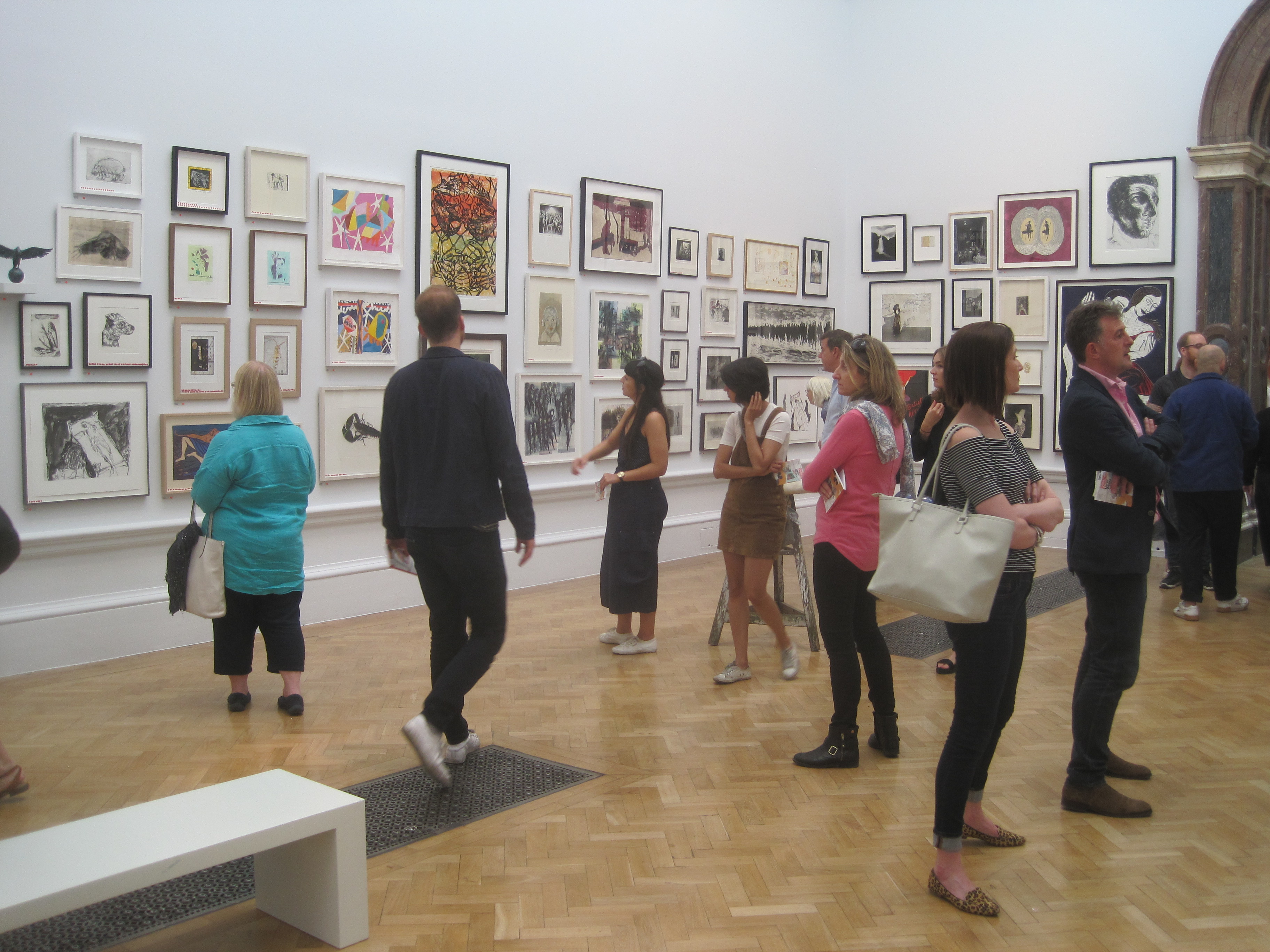
Layout
The Barbican gallery is a big exhibition space, spread over two floors. On the ground floor, as you come in, there’s the ticket desk and shop, then you walk through a doorway on your right into the ground floor display space. This is divided into three successively larger ‘rooms’, the third and final one being a fairly big atrium. You then emerge from these into a corridor which runs back alongside the atrium spaces back to the shop, and off which are three alcove rooms or ‘bays’.
Back by the shop there are stairs up to the first floor gallery which runs round the walls and allows you to look down onto the atrium space you’ve just left, so you can see paintings and sculptures from above. You can walk right round this gallery but there are only alcoves or bays on along two sides of it, four bays on one side and four on the other. 3 + 3 + 4 + 4 = 14 distinct display spaces.
14 rooms, 14 themes
So when the curators set out to design this exhibition of post-war British art they had 14 spaces to play with and have come up with 14 topics or subject areas, accordingly. Starting in room 1, the visitor walks through 14 themed aspects of post-war British art, which are also arranged in a loosely chronological order, starting just after the end of the Second World War and ending in 1965.

‘Cyborg collages’: First Contact by John McHale (1958) Collection Albright-Knox Art Gallery, Buffalo, New York © Estate of John McHale
The new
The curators have made one key decision which defines the entire show: believing that post-war artists had to cope with the aftermath of ‘a cataclysmic war that called into question religion, ideology and humanity itself’, they have consciously chosen to focus on THE NEW ARTISTS of the period. They have ignored artists who’d come to prominence between the wars (so no Henry Moore or Barbara Hepworth, for example; no Paul Nash, Graham Sutherland, no Stanley Spencer, Surrealists or Bloomsburyites).
Instead the curators have tried to catch the mood conveyed by The New Generation of young artists who emerged immediately after the war and set a new tone. The result is that, although the exhibition contains the huge number of 200 works of painting, sculpture and photography, by an overwhelming number of artists (48) it has a surprising unity of feel.
Leaving aside the (excellent) photographers, the paintings in particular demonstrate what you could call a kind of damaged abstraction. There’s a blurred, grey and brown, muddy quality to much of the work. There are lots of earth tones, earth grey, earth cream, earth browns.

West Indian waitresses by Eva Frankfurther (1955) Ben Uri collection, presented by the artist’s sister Beate Planskoy © the Estate of Eve Frankfurther
The war hadn’t pulverised a specific landscape, as in the images of the Western Front made famous during and after the First World War. It had ranged far more widely than that. Crucially, it had permanently damaged mankind’s view of itself.
It was hard to be optimistic about people or ‘culture’ or ‘civilisation’ after news of the concentration camps broke in May 1945, and then the atom bombs were dropped in August 1945. And then the H bombs and the start of the incredibly fearful and menacing Cold War. Many artists struggled to believe in anything positive and channelled their energies into devising novel ways to express their horror and despair.
With so many works by so many artists, there are some exceptions, but overall I’d say this is quite a grim, depressing exhibition, with much to be justifiably depressed about. If you put the (five) photographers to one side, then there’s hardly any figurative work, and when there is (Auerbach, Freud, Bacon, Bratby, Cooke, Souza) it is heavily stylised or deliberately distorted. There are certainly no landscapes. It is an accumulation of damaged psyches.
From murk to clarity
It occurred to me that you could arrange almost all the works along a spectrum from Murk to Clarity. Then you further could sub-divide these categories. What I mean is that the murky end of the spectrum could be divided into images which look like:
- bodies melted in a nuclear blast (Eduardo Paolozzi, Peter King)
- bodies eviscerated in some grotesque medical calamity (Magda Cordell)
- people drowning in Holocaust concentration camp mud (Frank Auerbach and Leon Kossoff)
- bodies blurring into hunks of meat (Francis Bacon)
- bodies reimagined as abstract shapes, blots, drabs and dribbles of paint (Gillian Ayres)
- bodies combined with inorganic materials such as metal to become ominous cyborgs (Lynn Chadwick’s semi-abstract sculpture of a demonic bird, John McHale’s robotic family, Elisabeth Frink’s menacingly humanoid Harbinger Birds and the St Sebastian sculptures by Eduardo Paolozzi)
The murkiest of the murk
I’ve always heartily disliked the paintings of Frank Auerbach and Leon Kossoff. Both applied unbelievable amounts of paint to their canvasses to create nightmare brown meringues of mud. They themselves in interviews claimed they were seeking to get at the essence of the subject or to capture the fleeting nature of reality or some such. They obsessively painted London scenes such as two big muddy paintings here, of the Shell building on the South Bank and Willesden railway junction.
But for me the key fact is that both were Jewish refugees from Nazi Germany and, to me, all their paintings powerfully, oppressively convey the feel of the grim Polish winter mud in which so many of their fellow Jews were worked to death, starved to death and exterminated.

‘Drowning in the mud of the Holocaust’: Head of Gerda Boehm by Frank Auerbach (1964) Sainsbury Centre for Visual Arts © The Artist
Clarity
At the other end of the spectrum is what I’ve called Clarity, which can be sub-divided into maybe three rooms or artists:
- artists in the Concrete room
- Lucian Freud
- Surface / Vessel room
In the room called Concrete are a set of surprisingly calm, clean, crisp, white abstract images. Victor Pasmore was a celebrate figurative artist when, in the late 1940s, he underwent a conversion to abstraction. By 1951 Pasmore had established a circle of younger artists who were equally committed to the cause of geometric abstraction, which they referred to variously as ‘Concrete’, ‘Constructionist’ or ‘Constructivist’ art, artists including Mary Martin, Adrian Heath, Anthony Hill, Robert Adams and Denis Williams.
Concrete is right next to the death camp vibe of the Auerbach room, Scars, and I really needed it. The white geometric shapes projecting from the canvas as Modernist friezes reminded me of Ben Nicholson (famous between the wars and so banned from this show).
Lucian Freud may seem an odd artist to group under the heading of clarity, but the exhibition features three of his earliest works which do, in fact feature this quality. Edgy, though. Distorted. The curators put it well when they say that ‘Freud’s forensic attention to small details suggests an uneasy vigilance, revealing anxieties just below the surface.’

‘Neurotic clarity’: Girl with Roses by Lucian Freud (1948) Courtesy of the British Council Collection © The Lucian Freud Archive/ Bridgeman Images, photograph
The third ‘calm’ room is titled Surface/Vessel. It features the paintings by William Scott and ceramic vessels by Lucie Rie and Hans Coper. What they have in common is the withdrawal of all bright colours and a return to the colour of canvas and clay, textured surfaces and irregular forms. I might have liked them because 15 years later they set the tone for the kind of abstract prints you could buy at Habitat and Ikea and my parents decorated my childhood home with reproductions of these kind of gentle, cream and earth brown soothing shapes.

Installation view of Postwar Modern showing two works by William Scott: Message Obscure I (1965) and Morning in Mykonos (1961)
Room guide
The themed rooms are:
1. Body and cosmos
The first three rooms are the three progressively bigger ones on the ground floor. Each is dominated by a big signature work. This first room is dominated by Full Stop by John Latham. This seems pretty meh in reproduction which doesn’t convey its size. It’s huge, monumental, 3.5 metres by 2.5 metres, a Mark Rothko of a painting, and a hypnotic image. Is it a solar eclipse, a black hole, an enormously magnified piece of typography. Something has ended – but what?
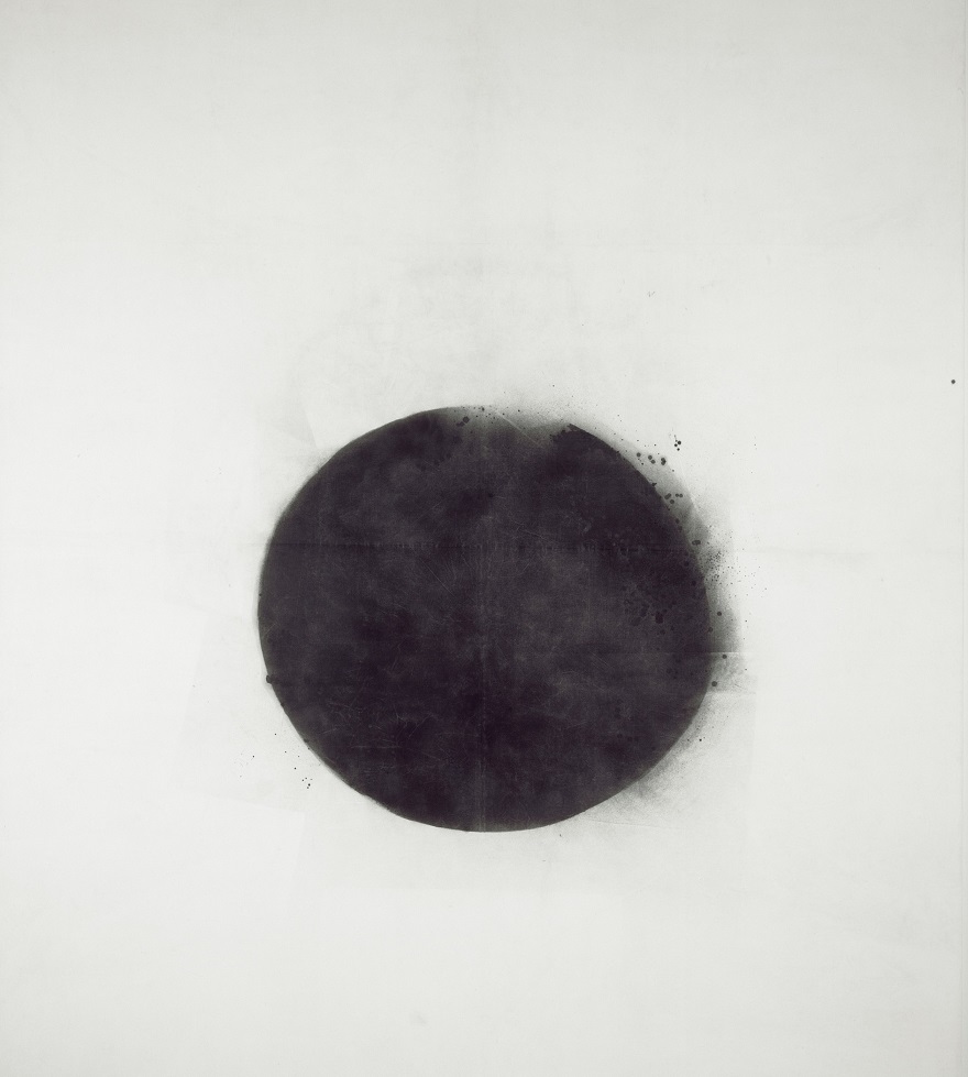
‘The death of colour’: Full Stop by John Latham (1961) Tate © the Estate of John Latham
Much smaller is the set of three prints by Eduardo Paolozzi, born in 1924 the son of Italian immigrants, so an impressionable teenager during the war. It’s impossible to make the prints out as heads because the images look eroded and decomposed as if by acid or, as wall label suggests, evaporated in the atomic blast so many around the world feared was coming.
2. Post atomic garden
The second room is bigger, contains more but is dominated by the mutant bird sculpture by Lynn Chadwick named The Fisheater (1951). It was commissioned for the 1951 Festival of Britain. It’s set on a slender tripod and aerial assembly, a slender outline of a bird made from thin metal rods and sheets of metal, looking a bit like the skeleton of Concorde, very slightly swaying in the ambient air, beakily looking down at us soft and vulnerable humans.

Installation view of Postwar Modern at the Barbican showing The Fisheater by Lynn Chadwick (1951)
Fisheater epitomises the combination of light, modern industrial elements with unnerving menace which is one of the threads which runs through the show, as in the Paolozzi robots and the robot-humanoid nuclear family grimly depicted in John McHale’s First Contact (above).
3. Strange universe
The third ground floor space is the biggest, lined with huge paintings by a variety of artists, but it is dominated by a signature work, three metal sculptures, about man-size mutant cyborgs made out of complex metal and engineering detritus, welded together and melting at the edges as if they’re robots which have been brought to a halt and slightly melted in the ultimate nuclear apocalypse. They’re by Eduardo Poalozzi who, I think, has more pieces than anyone else in the exhibition and emerges as its presiding spirit.

‘Humanoid figures assembled from electrical scraps and castoffs’: Installation view of Postwar Modern showing Saint Sebastian by Eduardo Paolozzi (1957)
This room also features some enormous paintings by Magda Cordell which are splashed with red and orange and look like the freshly flayed and eviscerated carcass of a humanoid life form.

Figure 59 by Magda Cordell (1958)
4. Jean and John
The first of the bays off to the side of the ground floor corridor contains 8 or so paintings by the husband and wife artists Jean Cooke and John Bratby. Bratby’s stylised but basically figurative still lifes of their home, with boxes of cereals on the kitchen table, were nicknamed ‘Kitchen Sink’ art, presumably before kitchen sink drama came along. Although figurative and colourful, these paintings somehow bespeak the horrible, pokey domesticity of English life and it came as no surprise to learn that Bratby was jealous of his wife’s talent, destroyed much of her work and beat and abused her. See what I mean by grim?
5. Intimacy and aura
This is the room with the neurotic early paintings by Lucian Freud which I mentioned above.
But it also features the first of the photographers, Bill Brandt. Photography, with its figurative realism, comes as a big relief after four rooms loaded with paintings of bleakness, despair, mutant robots and huge abattoir paintings. But it is even more of a relief to discover that Brandt is represented here by a series of photos of female nudes. It’s not that they’re nude so much as that they’re studies of people who are young, fit and healthy. It is a sudden oasis in a desert of radioactive despair.
Apparently Brandt had been renowned in the 1930s for his photojournalism (thus breaking the curators’ self-imposed rule that no-one from between the wars has a place) but 1945 saw a radical shift in his practice as he began experimenting with nude studies indoors. Not only indoors, but in spare, spartan uncarpeted rooms. So, although fully realistic, these studies also have a strange, spooky, spectral mood. Arguably these photos, although entirely naturalistic, manage to share the same sense of nervy ominous as so many of the paintings and sculptures.

The Policeman’s Daughter, Hampstead, London 1945 by Bill Brandt © Bill Brandt Archive
6. Lush life
This room is a surprise. One entire wall is a hugely blown up photo of the interior of a new model home designed by the visionary architects Alison and Peter Smithson. It’s a photo of their stand at the 1956 Daily Mail Ideal Home Exhibition. It was titled ‘House of the Future’ and the furniture was created using plaster, plywood and paint masquerading as the moulded plastic they’d like to have used but couldn’t afford, the kind of new super-slimmed-down ideals for living designs which were being pioneered and mass produced in America and which featured in the Barbican exhibition about Charles and Ray Eames.

Installation view of Postwar Modern showing the wall-sized photo of Alison and Peter Smithson’s 1956 ‘House of the Future’, with just one yellow ‘egg chair’, made from moulded reinforced polyester, on the low dais.
The American theme is echoed in a series of humorous collages created by Eduardo Paolozzi (is he the most represented artist in the show?). It’s a series of A4 sized collages he created by cutting up images from glossy American consumer magazines, titling the series Bunk. Of course they’re meant to be ironic and subversive and whatnot, but what really comes over is the power and optimism of the original images. Particularly when set against the post-atomic, post-Holocaust nihilism of so much of the rest of the show.

Bunk! Evadne in Green Dimension by Eduardo Paolozzi (1952) Victoria and Albert Museum, © The Paolozzi Foundation
7. Scars
As described above, the Auerbach and Kossoff, drowning in mud, Holocaust despair room.
The room also has a little TV on which is playing a film of a 1961 event carried out by another Jew (the curators emphasis the common ethnicity of these three artists), Gustav Metzger. Metzger pioneered an art of ‘auto-destruction’ in the late 1950s, staging works that enacted their own disintegration, mirroring the violence he felt in a world hell bent on its own destruction. In the grainy old film Metzger is wearing a gas mask, with St Paul’s in the background, while he sprays acid onto canvas which promptly shrivels and dissolves. ‘Happenings’ had been happening in America among beatnik audiences art colleges throughout the 1950s. This appears to be Metzger’s variation on the idea which – as so often in this exhibition – accentuates the negative.
8. Concrete
As described above, a roomful of works by Victor Pasmore and his fellow ‘Concrete’ artists. I especially enjoyed the small-scale, abstract sculptures by Robert Adams. Calm and healing.

Installation view of Postwar Modern at the Barbican showing works by Robert Adams, being: Divided form (1951), Rectangular bronze form number 7 (1955) and Balanced bronze forms (1955).
9. Choreography of the street
More photography, thank God. The black and white snaps of Nigel Henderson and Roger Mayne who specialised in capturing children at play in the gritty, ruin-infested post war streets. Mayne’s most famous body of work was created between 1956 and 1961, capturing the working-class community of Southam Street in North Kensington, west London. One of his photos was used for the cover Colin MacInnes’s novel, Absolute Beginners (1959), a copy of which is here in a glass case.

Street scene 1957 by Roger Mayne © Roger Mayne Archive / Mary Evans Picture Library
Reminds me a bit of the photo of young toughs in Finsbury Park, 1958, which marked the start of Don McCullin’s career.
The lovely and hugely evocative photos of kids playing in bomb sites are interspersed with a series of collages by Robyn Denny and Eduardo Paolozzi (surely Paolozzi is the most featured artist in the show?). And alongside these, collages and in the radical print designs created by Henderson and Paolozzi for their company Hammer Prints Ltd (1954 to 1962).
10. Two women
The two women in question are German refugee painter Eva Frankfurther and home-grown Mancunian photographer, Shirley Baker. Baker documented the changing face of Manchester in the 1950s and early 60s as the old slums were demolished and cleared for high rises and social housing. She walked the streets with a camera always in her bag, taking wonderfully evocative black and white photos of wretched slums and the old-style, working class inhabitants. In 1965 she started experimenting with colour photography and some of her colour photos are feature here.
I was lucky enough to go to the Shirley Baker exhibition at the Photographers Gallery a few years ago – none of the colour photos here are as good as her black and white ones. In a funny kind of way, colour shots of this kind of scene look oddly older, more technologically dated, than the pure black and white ones.
Anyway, the point is… look at the rubble! And in 1965! Twenty years after the war, large parts of England were still struggling to drag themselves into the modern age.

Hulme 1965 by Shirley Baker © Nan Levy for the Estate of Shirley Baker
11. Cruise
The wall label in this room informs us that:
Cruising, or looking for a casual sexual encounter in a public place, was central to the expression and exploration of male same-sex love and desire in the postwar years…
And so it is that one wall features a couple of early works by David Hockney, large browny-black background with all kinds of graffiti, words, lines and squiggles drawn across them:
The title My Brother is Only Seventeen (1962) was derived from graffiti that Hockney read on the toilet walls of Earl’s Court station, a popular cruising spot.

My Brother is only Seventeen by David Hockney (1962) © Royal College of Art
But the real revelation of this room is arguably the best thing in the exhibition. In 1954 Francis Bacon painted a series of seven huge paintings depicting a man in a dark suit sitting at the bar of a hotel, although the background has been stylised to become the slender bars of some kind of cage set against a very dark background. Three of the series are hung here, side by side.

Man in Blue I by Francis Bacon (1954) Collection Museum Boijmans Van Beuningen, Rotterdam © The Estate of Francis Bacon
A photo like this doesn’t do the paintings any kind of justice. They are not only enormous but also, despite their stylised subject matter, have the depth and resonance of Old Master paintings. It took me a while to realise that, unlike all the other rooms in the show, the walls of this room are painted black, as if we are in a very old museum or gallery, and these three Man in Blue paintgins have the power and depth of Old Masters.
Black upon black, depths of blackness, inky impenetrability and ominousness. Possibly the best part of the entire exhibition was standing in front of these three enormous variations on a dark, baleful image and letting it soak right in to your soul.
12. Surface/vessel
As described above, a calming, peaceful room of the paintings by William Scott and ceramic vessels by Lucie Rie and Hans Coper.
13. Liberated form and space
Big colourful paintings by Gillian Ayres, Patrick Heron and Frank Bowling. From the reproductions I thought I’d like the Ayres, but in the flesh I found them a too big and I didn’t warm to her use of ‘dribbles, splashes and stains’ of paint, as the curators themselves describe her work.
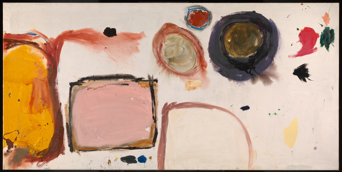
‘A world of abstract shapes and dripping paint’: Break-off by Gillian Ayres (1961) Tate © the Estate of Gillian Ayres, courtesy of Marlborough Gallery, London
By the same token, I didn’t warm to the press release photos of paintings by Patrick Heron, but in the flesh found them to be some of the very few genuinely colourful, vibrant and life affirming paintings in the entire exhibition. The wall label explains that, like Pasmore and other post-war artists, when he moved from figurative to abstract painting Heron experienced a great sense of liberation.

June Horizon by Patrick Heron (1957) Wakefield Council Permanent Art Collection (The Hepworth Wakefield) © The Estate of Patrick Heron
14. Horizon
The exhibition ends on an oddity.
We met Gustav Metzger in the Scars room, represented by a film of one of his auto-destructive events. Here, at the end of the exhibition is a blacked out room with half a dozen film projectors projecting onto two walls a series of abstract swirling shapes, which were to become super familiar in the Psychedelic movement and subsequently in the lava lamps of millions of suburban bedrooms. Metzger had moved away from the ‘auto-destructive art’ of the 1950s and towards what he now titled ‘auto-creation’, in which the work of art takes on its own life. This immersive room, complete with bean bags (but no spliffs) is titled Liquid Crystal Environment and was created in 1965 using heat-sensitive chemicals sandwiched between rotating glass slides in a projector.
It’s an odd piece to end on because it seems so out of synch with the rest of the show. It feels like a little bit of the Psychedelic Sixties which has got lost in an exhibition which is overwhelmingly about the grim psychic damage, the anxieties and angst of the early Cold War, with the long memory of the Holocaust festering under the shadow of nuclear apocalypse.
Maybe it’s meant to feel cheerful but it doesn’t, which might explain why the two or three times I walked past I didn’t see anybody on the numerous beanbags.
Immigrants
An impressive number of the artists were refugees from Nazi Europe (Auerbach. Kossoff, Metzger, Lucie Rie, Hans Coper, Eva Frankfurther, Magda Cordell). But the curators go out of their way to include artists from colonial backgrounds, non-white immigrants from what was still the British Empire. These include:
- Francis Newton Souza (India), with his intimidating, highly stylised black Christs (1958) in the first room
- Anwar Jalal Shemza (Pakistan) with a series of Islam-inspired abstracts in the same room as Heron and Ayres
- Kim Lim (Singapore Chinese) with her delicate abstract sculptures
The Barbican’s birthday show
The curators point out that the exhibition has been timed to coincide with the fortieth birthday of the Barbican’s opening, for it was in the grim post-war period that the Barbican Estate was first conceived, to occupy what was at the time an enormous bombsite in the heart of London.
The Barbican itself, a grim, forbidding, concrete bunker, on an oppressive grey, rainy day, was the perfect setting for an exhibition about the damaged lives, damaged psyches and damaged country which – despite occasional bursts of colour – is what comes over so powerfully in this show.
Related links
- Postwar Modern: New Art in Britain 1945 to 1965 continues at the Barbican until 26 June 2022