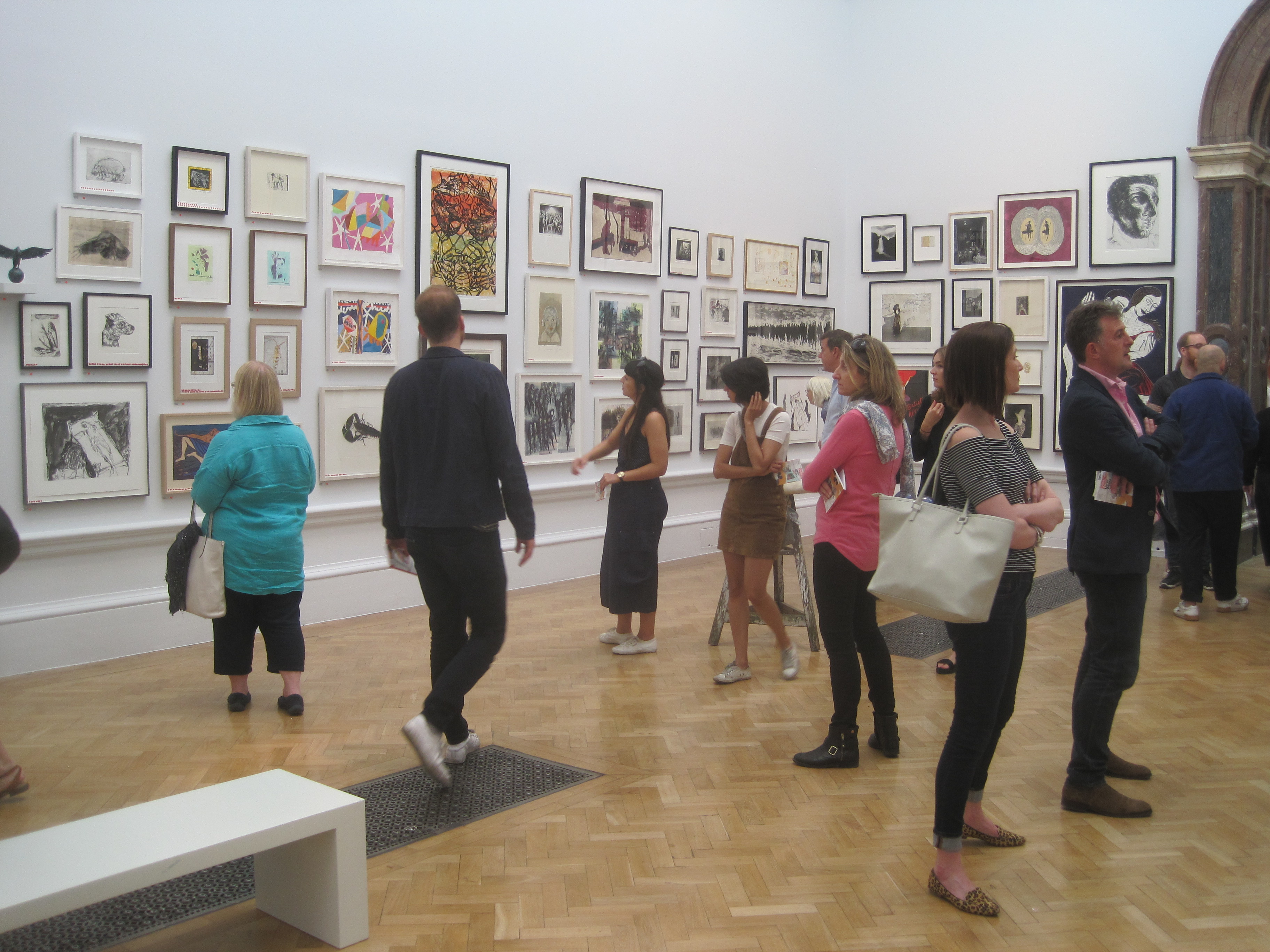
Last year the writer, curator (and sometime expert on The Antiques Roadshow) Jeremy Cooper donated his quirky collection of 1,000 postcards designed by artists from the 1960s to the present day, to the British Museum.
This FREE exhibition presents a selection of 300 works from the collection, and features a wide range of artists and artist collectives from the past five decades including Gilbert & George, Richard Hamilton, Yoko Ono, Guerrilla Girls, Tacita Dean, Andy Warhol, Bruce Nauman, Dieter Roth, Carl Andre, Claes Oldenburg, Gavin Turk, Rachel Whitehead and many more.
The collection – which took 10 years to assemble – now means that the British Museum has one of the world’s leading collections of this rather unexpected art form. I, for one, certainly hadn’t realised how widespread and flexible an art form ‘the postcard’ had become.

Dada Land (1975/1977) by Bill Gaglione and Tim Mancusi. Reproduced by permission of the artists
The idea is that, since the radical conceptual and political breakthroughs of the 1960s, artists have found the postcard to be a cheap, flexible, democratic, accessible and fun format to present a whole range of ideas, whether satirical, subversive, silly or surreal.
Hence, if only at the level of invitation to an art show, many of the most famous artists of the past years have used the format, while others have gone to town with whole conceptual explorations of its possibilities.
The exhibition is divided into the following categories or headings:
Richard Hamilton (1992 to 2011)
In an early work such as Whitley Bay 1996, Hamilton used details of commercially produced postcards in his pop collages. Two years later he produced a concertina, ‘pull-out’ postcard. You unclipped it and eight postcard-sized unfolded, each showing a commercial image of Whitley Bay, which was progressively blown up larger and larger until the image became just an abstract blur of dots and patches.
Dieter Roth (1930 to 1998)
Swiss-born Roth produced various postcard art. He collaborated with Richard Hamilton on paintings made in Spain, and then produced postcards depicting the paintings, but conceived of as artworks in their own right. In a series titled 120 postcards Roth overpainted and reworked a clichéd tourist image of Piccadilly, to create a set of independent artworks.
Fluxus
The Fluxus art movement drew in a large number of artists, composers, designers and poets during the 1960s and 1970s who engaged in experimental art performances. Japanese artist On Kawara made a series titled ‘I GOT UP’ in which he simply sent postcards to hundreds of friends around the world marked with a date stamp declaring ‘I got up at…’ and then the time and date. He continued the series from 1968 to 1979.
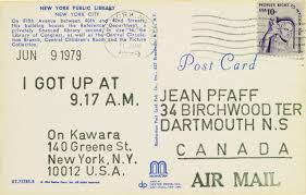
An example of the I Got Up series by On Kawara (1979)
These postcards now fetch extraordinary sums at auction. The one above, sent in 1979, was part of a lot of On’s I GOT UP postcards which sold for £162,500. Wish I’d known him and he’d sent me one! As with so much ‘subversive’ art which was going to change the world, it is now bought and sold by Russian oligarchs and Chinese billionaires for sums you and I can only gawk at.
Ben Vautier created a postcard titled The Postman’s Choice with an address box and stamp space on both sides, so you filled in two addressees. Who should the post office send it to?
I liked the extended-size postcard, Beached, by Lawrence Wiener (b.1942). It was made to publicise a video he made in five sections of himself throwing, pulling, lifting, dragging, and levering natural materials to make a sculpture on a beach in Holland.

Beached by Lawrence Weiner (1970)
Feminism
Postcard art was a way for women artists of the 1960s and 70s who felt excluded from the male art world to bypass the traditional gallery system.
From 1971 to 1973 American artist Eleanor Antin (b.1935) sent fifty-one postcards of her hundred-boots project to a thousand people in the art world. During a two-and-a-half year roadtrip round California she placed the hundred boots in various incongruous settings and photographed them. What a brilliant idea!
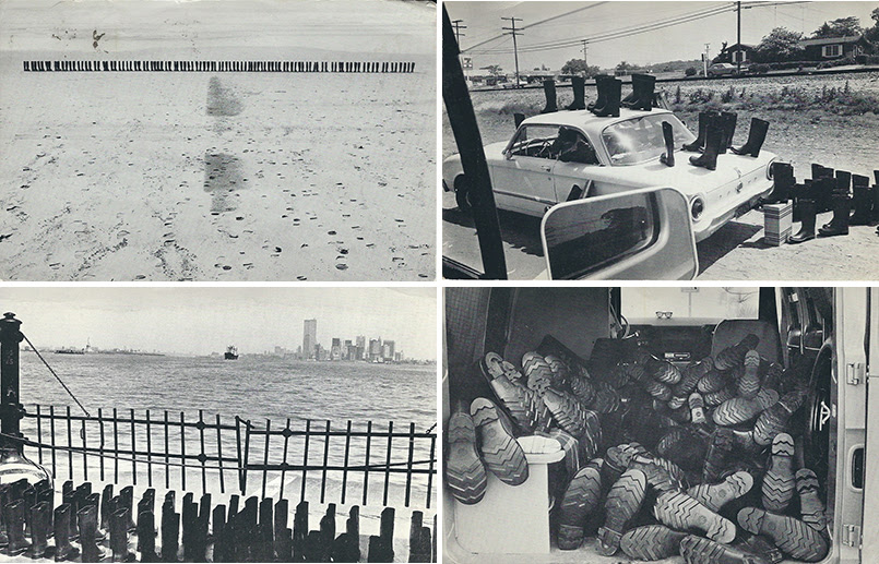
Four details from 100 Boots (1971-73) by Eleanor Antin
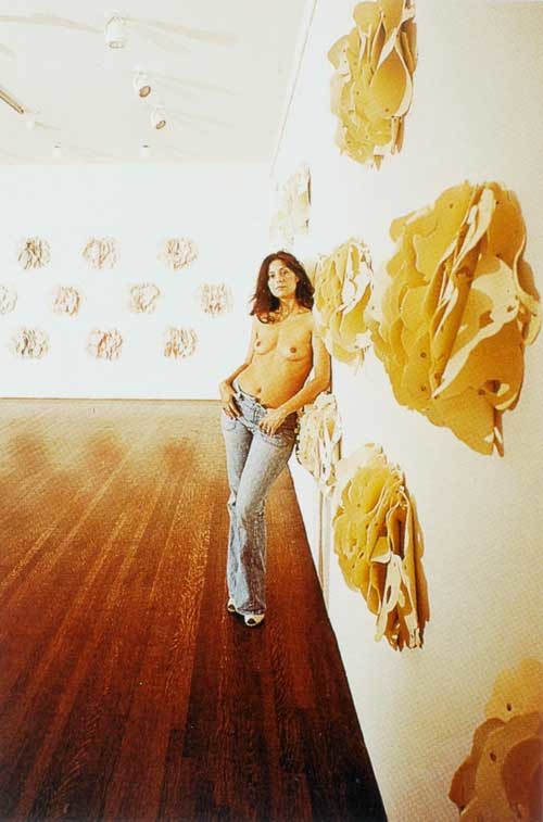
Lynda Benglis (b.1941) and Hannah Wilke (b.1940) made postcards of themselves naked.

Lynda Benglis nude postcard
They were working to ‘challenge the idea of female objectification, often using their own bodies to explore sexuality in their work’.
Ponder-r-Rosa series by Hannah Wilke (1977)
Yes, I always find that pictures of naked young women help me to stop thinking about women in terms of their appearance or sexuality. Male gaze duly obliterated.
Performance
Stelious Arcadiou (b.1946) grew up in Melbourne, Australia, changed his name to Stelarc in 1972, and specialised in self-inflicted performances in which his body was suspended from flesh hooks. And his preferred way of promoting these performances was via photos on postcards distributed to other artists, galleries and critics.

Stelarc, Event for lateral suspension (1978)
In 1979 artist Chris Burden gave an art performance in which he described his relationship with a truck named ‘Big Job’, while clutching a gigantic wrench, and sent out postcards recording the event.

Big Wrench by Chris Burden (1979)
Conceptual I
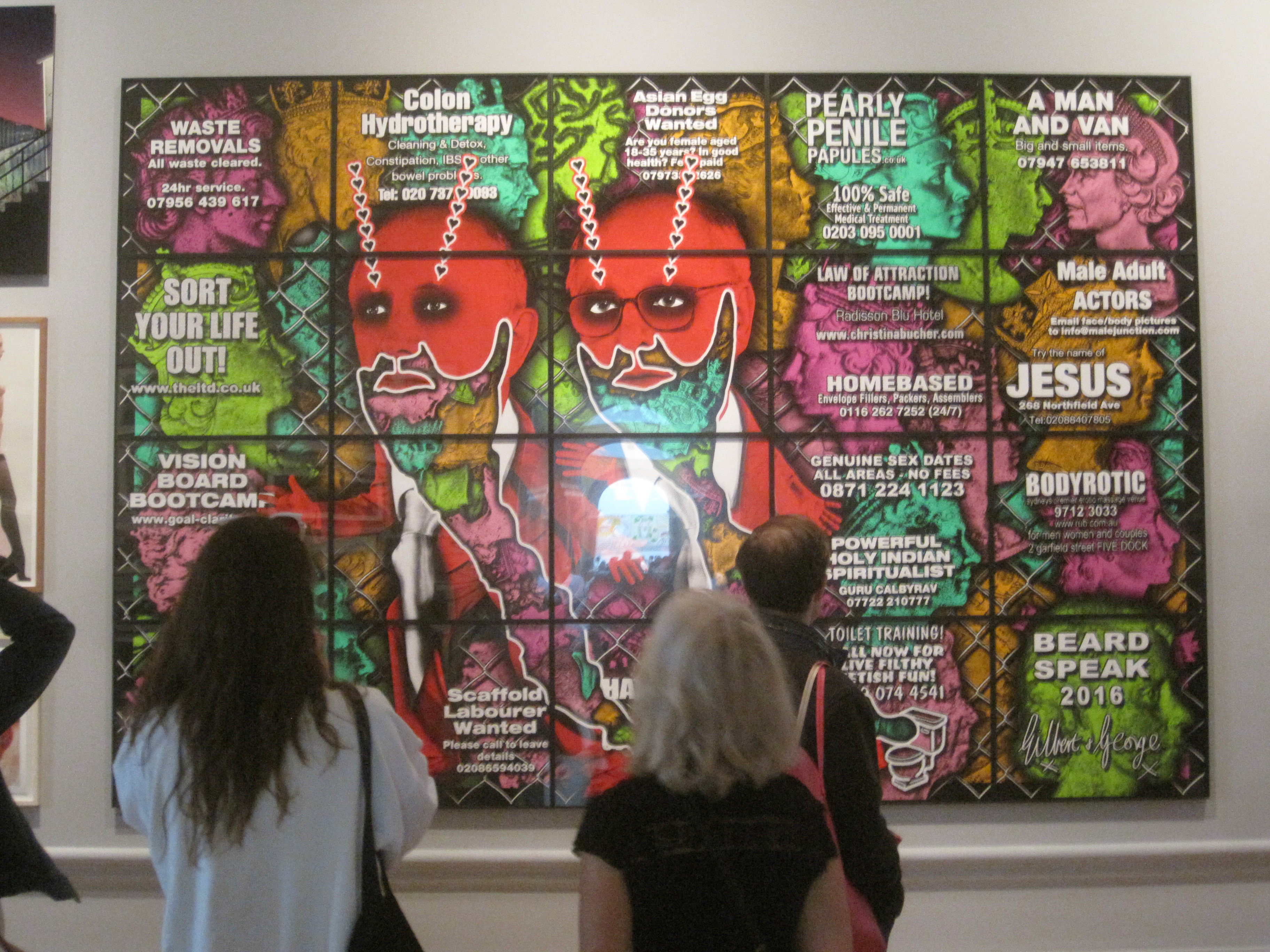
This category includes Carl Andre – who made postcards of bricks or sections of concrete arranged in urban and landscape settings – landscape art by Richard Long, showing photos of places he’s visited and sculptures he’s made from natural materials in remote locations – and quite a few by Gilbert and George in a variety of settings and with text subverting their own status as artists and the whole point of art. Silly but oddly compelling, as usual.
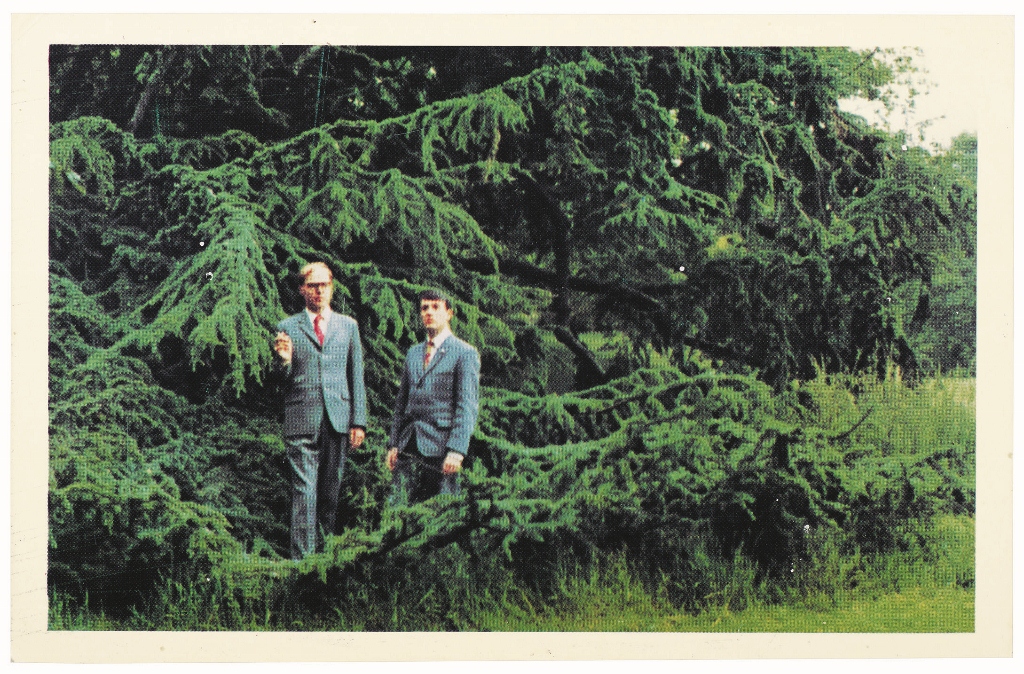
Gilbert and George in a rural setting (1972)
Richard Long’s postcards of artworks he’d made as part of his long treks, in places as different as rural Devon and Mongolia, struck me as clever use of the medium. Some of his artworks were temporary, made of mud or stones which would decompose or be assimilated back into the landscape. Some resulted in no tangible work whatever, just the record of the walk. Long’s postcards were, therefore, postcards from nowhere, mementos of things which never existed or would soon cease to exist. One of the things I’ve loved about Richard Long’s walking art since I first came across it is the way he captures the spooky, empty, vanishing nature of long-distance walks. You are intensely here, now, in this place. And yet half an hour later you are a mile away, over hill and dale, and the hereness and the nowness… are just memories… or photographs… or postcards…
Conceptual II
American artist Geoff Hendricks (b.1930) made a series of seven postcards depicting beautiful photographs of clouds. He styles himself a ‘cloudsmith’. Very relaxing.
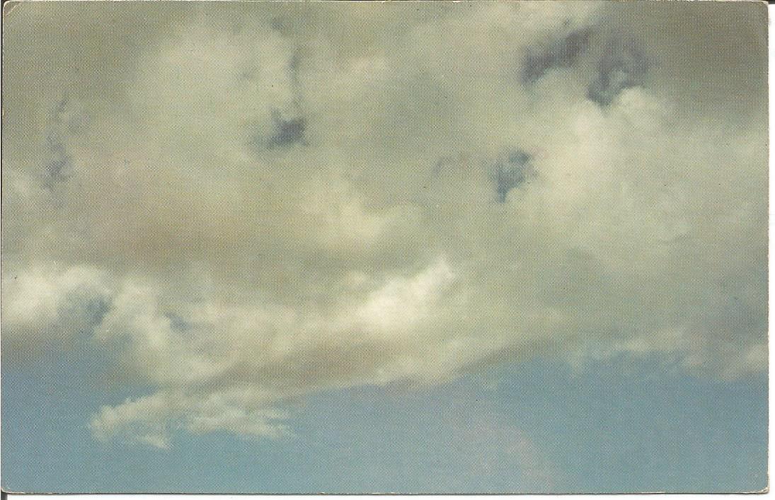
Sky Post Card #7 by Geoff Hendricks (1974)
Endre Tót
Born in Hungary in 1937, Endre Tót trained as a painter but became involved with the Fluxus group. He is represented by possibly the best works in the exhibition, a 1974 series titled One Dozen Rain Postcards.
In these Tót made Xerox copies of photos from newspapers, printed them in purple, and then typed dots and dashes onto the surface of the copies in order to give the effect of rain. Each variation of the rain motif is deliberately humorous: some show heavy rain falling in just one place, or it raining indoors, and so on.
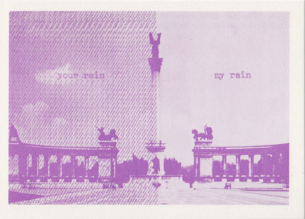
One of the One dozen rain postcards by Endre Tót (1971 to 1973)
These were all very witty – with other subjects including horizon rain (the dashes all running horizontally parallel to the horizon of a sea postcard) and new rain/old rain – but they also struck me as a genuinely innovative use of the size and shape of the postcard format.
Paradise regained
American photographer Duane Michals (b.1932) made a series of six postcards which starts out with a fully clothed couple in a modern office and, in each one, items of clothing are removed from the people while the office becomes more full of pot plants and foliage, until they are naked in an apparent forest.

Paradise regained by Duane Michals (1968)
Graphic postcards
Some of the most innovative postcard art comes in graphic form i.e. text only, or text over minimal imagery. Hence the bold declarative text The World Exists To be Put On A Postcard by Simon Cutts which gives the show its title. Personally, I liked the extreme minimalism of this graphic postcard, made all the funnier by that fact that it required not one but two modern artists to create it, Peter Doig and Matthew Higgs.

There’s a painting on the wall by Peter Doig and Matthew Higgs (1996)
Postcard invitations
In a more traditional use of the format, artists often sent out invitations to art exhibitions (or happenings or performances) in the shape of postcards, detailing the location and time of the exhibition. Many of these were treated like ephemera and lost, only years later did collectors start to value them.

Invitation to Holy Cow! Silver Clouds!! Holy Cow! (1966) by Andy Warhol © 2018 The Andy Warhol Foundation for the Visual Arts, Inc. / Licensed by DACS, London
There’s the original invitation card for the now legendary Freeze exhibition organised by Damien Hirst which introduced the world to the (YBAs) (Young British Artists), and a funky 3-D postcard Julian Opie sent out as an invitation to his 1996 exhibition Walking Dancing Undressing Smoking showing the cartoon of a trim woman in his trademark strong black outlines, but done in that process where, if you shift your point of view, the figure appears to move.
Political postcards I
Because they are cheap and, by their very nature, designed to be distributed, postcards have been an appropriate format for all kinds of artists promoting their political agendas. Using the postal system they can easily be circulated thereby evading traditional gallery and museum networks, which is why many postcard artworks were often politically subversive or carried a social message. Images satirising and lambasting Ronald Reagan and Mrs Thatcher abound.
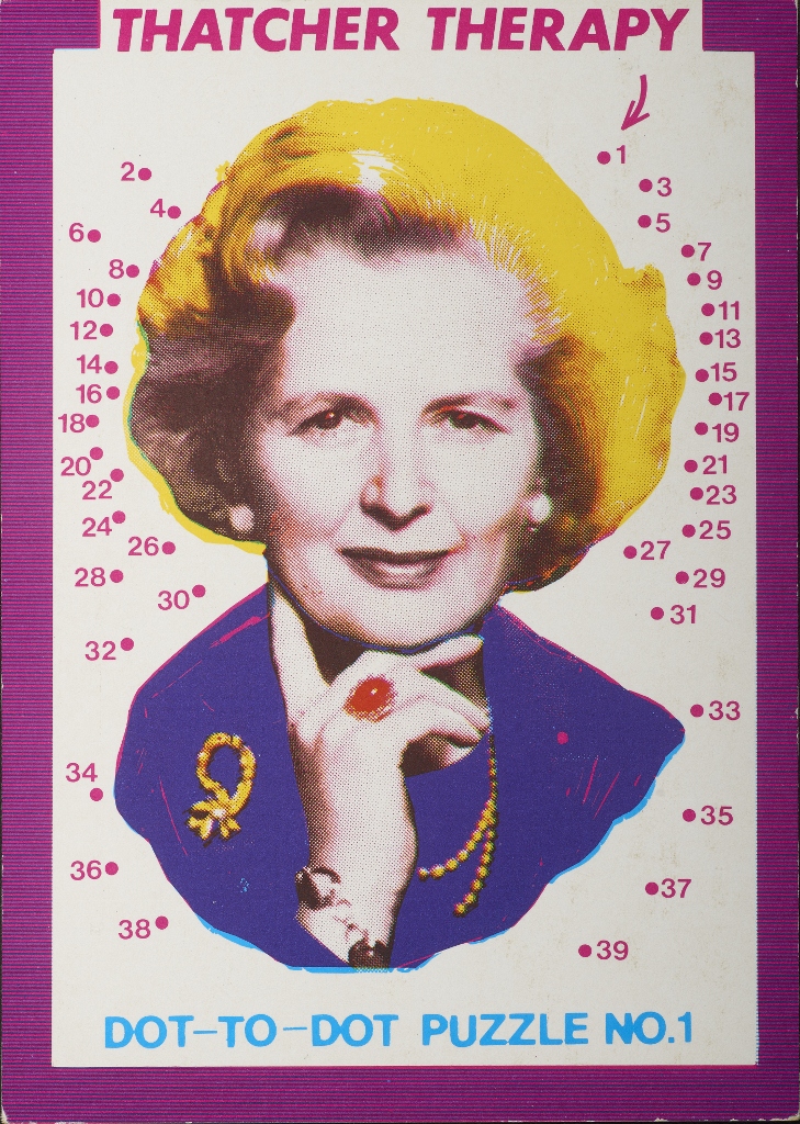
Thatcher Therapy Dot-to-Dot Puzzle No. 1 (1984) by Paul Morton. Reproduced by permission of the artist. Courtesy Leeds Postcards
There’s a post-card designed by John Lennon and Yoko Ono with the simple text WAR IS OVER. Its optimistic innocence is counterpointed by a completely different pair of postcards by photo-montage artist Peter Kennard of a) some cruise missiles plonked on the back of the hay cart in Constable’s painting The Haywain and b) the super-famous montage of Tony Blair taking a selfie against the backdrop of Iraqi oil wells going up in flames.
There’s another really vivid one with the big angry text I DON’T GIVE A SHIT WHAT YOUR HOUSE IS WORTH (by Leeds Postcards, 1988).
Political postcards II: Feminism
Back in the gritty 1970s artist Alison Knowles and composer Pauline Oliveros published a set of cards commenting on the outsider status of women in the world of classical music. The idea was to take photos of women composers and to attach a big text describing each classical male composer with the kind of derogatory comment they felt women composers were all-too-frequently dismissed with e.g. she’s a lesbian.

Beethoven was a lesbian by Pauline Oliveros with Alison Knowles (1974)
Similar outsider anger is the unique selling point of the Guerrilla Girls collective with their well-known poster slogans such as ‘Do women have to be naked to get into the Met Museum?’
But best of all is the set of works by Jill Posener who, in the 1980s, sprayed witty graffiti ‘with political, feminist, lesbian and anti-consumerist themes’ onto billboards, defacing irritating, sexist and patronising advertising campaigns with hilarious jokes.

Saw his head off by Jill Posener (1981)
Altered postcards
Because they’re so cheap and cheerful artists have felt free to manipulate, transform, burn, cut up, deface, collage, paint over and generally muck about with postcards. Yoko Ono published a white postcard with a little hole in the middle for you to look through at the sky. Ray Johnson cut up, pasted and wrote over whatever printed material he could find. Genesis P/Orridge made a series of postcards in which the same black and white images of his mum and dad were positioned closer and closer to each other, until they merged.
In the 1980s Michael Langenstein (b.1947) made a series titled Fantasy and Surreal Postcards, collages of commercial postcards in which iconic images are made to do funny things, for example the Statue of Liberty is shown on her back in the Hudson River apparently dong the backstroke, or Concorde is shown having flown into and got stuck half-way through one of the great pyramids at Giza.

Excalibur by Michael Langenstein (1986)
Portrait postcards
Portraits often appeared on exhibition invitations, for example there’s one of David Hockney inviting to an exhibition in the 1960s. American artist Carolee Schneeman (1939 to 2019) and Anthony McCall made their own Christmas postcards. Again, the best of the bunch was, for me, the funniest one, which showed British artist Peter Hutchison (b.1930) being showered with foot-high letters in a work titled Struggling with language from 1974.

Struggling with language by Peter Hutchison (1974)
Recent postcards
Despite being overtaken by digital technology, emails, texts and numerous forms of social media, the postcard continues to thrive, in the real world out there, as well as in the art world. This last section showcases recent postcard art by Tacita Dean and Frances Alÿs, by Braco Dimitrijevic and Alison Wilding, Gillian Wearing and Jeremy Deller.
Sarah Lucas and Tracey Emin are pictured wearing scruffy anoraks and each holding a pair of big balls, in the tradition of the smutty seaside postcard. Meanwhile, Rachel Whiteread – an avid collector of postcards, apparently – has punched holes into innocuous scenic postcards thus turning them into miniature sculptures.
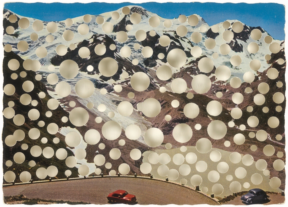
Untitled (2005) by Rachel Whiteread. Photograph © 2018 Rachel Whiteread
Thoughts
Who knew so much work existed in this area, who knew that ‘the postcard’ was a modern art genre in itself. Sceptical to being with, I am now totally converted. The categories I listed above aren’t exhaustive: there were quite a few one-off creative and experimental projects which come under no particular category but are also included.
A test of an exhibition is whether, at the end of it, you want to go round again, and I did. Having gone round once carefully reading the labels, I then went round again, just for fun, stopping at the ones which made me smile or laugh out loud (smiling at the rain postcards, guffawing at Jill Posener’s brilliant anti-sexist cards from the 80s).
It’s fun and it’s FREE. Pop along for an entertaining and enlightening experience.
Related links
- The World Exists to Be Put On A Postcard continues at the British Museum until 4 August 2019