This is one of the most powerful and moving exhibitions I’ve ever been to.
Chris Killip was one of the UK’s most important and influential post-war documentary photographers. He was born in 1946 and died in October 2020. He is best known for his gritty photos of working class life in the north of England in the 1970s and 80s and we really mean ‘gritty’ – portraits of people living in the depths of poverty, immiseration, neglect, illness, marginalisation, scraping a living in grim, depressed, forgotten communities.
Spread over the top two floors at the Photographers’ Gallery, including some 150 black and white photographs as well as a couple of display cases of ephemera (magazines, posters, publicity flyers) works, this exhibition amounts to the most comprehensive survey of Killip’s work ever staged. And dear God, it’s devastating.
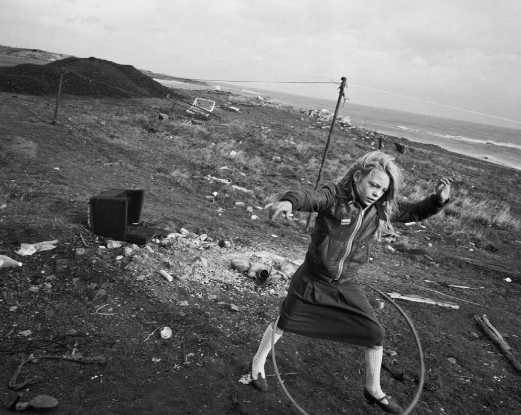
Helen and her hula-hoop, Seacoal Camp, Lynemouth, Northumbria, 1984 © Chris Killip, Photography Trust. All images courtesy Martin Parr Foundation
I’m going to replicate the structure of the exhibition and summarise the wall labels because it’s important to get a good understanding of time and place to really appreciate the work.
Off to London 1964
In 1963, aged 17 and living on the Isle of Man, Killip opened a copy of Paris Match looking for news about the Tour de France and instead came across the famous photo by Henri Cartier-Bresson of the little boy carrying two bottles of wine along the Rue Mouffetard in Paris. On the spot he realised he wanted to be a photographer. He bought a cheap camera and worked that summer as a beach photographer saving up the money to move to London in 1964, just at the start of Swinging London.
Here he found work as an assistant to the commercial photographer Adrian Flowers. They were heady times and he was at the heart of London, arranging commercial photoshoots for magazines, fashion, commercials.
New York 1969
In autumn 1969 he went on a visit to New York which changed his life. He went to see the exhibition of Bill Brandt photos at the Museum of Modern Art but it was the museum’s permanent collection which made his head spin. Here he saw photos by Paul Strand, August Sander, Walker Evans and others like them, documentary photographers who tried to depict the life of the common people in communities often remote from flashy urban living.
He returned to England, quit his job in flash London and returned to his homeland, the Isle of Man, a man with a mission, to photograph his truth, to record the traditional peasant lifestyle of the island before it was eroded and swept away by the very commercialism he had formerly served.
Isle of Man 1970 to 1972
Between 1970 and 1972 Killip photographed the island and its inhabitants during the day and worked at his dad’s pub by night. In 1973 he completed his book, Isle of Man.
This was the first of the long-form or long-term projects which form the basis of his achievement. the next few decades would see him applying the same in-depth approach to capturing marginalised communities on film, living in them, getting to know them, sharing their privations, getting under the skin of their physically and spiritually impoverished lives.
As you would expect, many of the photos of the Isle of man are landscapes but they are not that great, they are not as powerful as, say, Don McCullin’s louring, threatening studies of his adopted region of Somerset. But it’s not the landscapes that matter, it’s the people.
Mr ‘Snooky’ Corkhill and his son © Chris Killip Photography Trust. All images courtesy Martin Parr Foundation
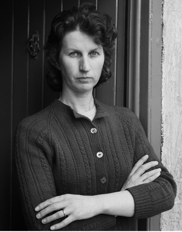
My God, what a wonderful, wonderful collection of portraits, warm, humane, detailed, candid but compassionate portraits of the kind of plain-living, rural workers who were dying out as a breed even as he photographed them. You know those lines from Yeats’s poem, Easter 1916:
We know their dream; enough
To know they dreamed and are dead;
And what if excess of love
Bewildered them till they died?
I write it out in verse:
Invoking that mood of respect, it feels like an act almost of worship to write out the names of the people Killip photographed, the children, teenagers, farmers, wives and widows:
- My cousin, Stanley Quirk, Cooil-Sleau Farm, Greeba
- Laurence and Judith Quilliam, two children
- Mr Radcliffe
- Mrs Pitts, Slieu Whuallian
- Miss Redpath, Regaby
- Sonja Corrin, a small girl in her best white dress with a white bow in her hair
- Mr John Willie Garrett holding a wrench and spanner
- a host of old men in caps at The Mart
- Mr and Mrs Corlett, Ballakilleyclieu
There is no God, no plan and no redemption. But images like this, full of understated dignity and wholeness on the part of the sitters, and respect and humanity on the part of the photographer, make you think maybe human love and compassion does redeem something, save something from the human wreck, raise us above our everyday lives into a higher realm blessed by more than human love.
(Note the way in the list above all the people are given titles, Mr, Mrs, Ms. It’s an old-fashioned mark of respect.)
Mrs Hyslop, Ballachrink Farm, the Braid © Chris Killip Photography Trust. All images courtesy Martin Parr Foundation
Immersion
He became an immersive photographer, living for months or more among the communities he sought to depict. His mission and his sympathies were not with the well-educated and well-heeled who run the country and write about it, but with ‘those who have had history done to them‘, the proles and chavs and pikeys and white trash who are dismissed by all commentators, make no impact on official culture, live and die in caravans or shitty council houses on sink estates at the arse end of nowhere.
Huddersfield 1972
In 1972 the Arts Council commissioned Killip to do a photo essay comparing and contrasting Huddersfield in Yorkshire with Bury St Edmunds in Suffolk for the exhibition ‘Two Views: Two Cities’. As far as I could see there was just one photo from Bury in the show, a neat-looking shot of some nice castle ruins. By contrast, as you can imagine, the rundown streets of Huddersfield with its mills, tenement housing, crappy high streets, boarded up shops and sad bus shelters grabbed Killip’s sympathies.
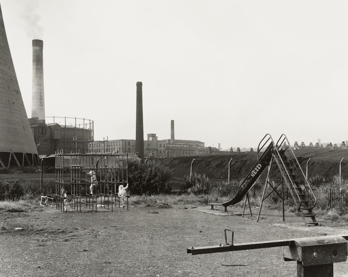
Playground in Huddersfield, 1974 © Chris Killip Photography Trust. All images courtesy Martin Parr Foundation
Newcastle 1975 to 1979
In 1975 Killip was commissioned to undertake a British Gas/Northern Arts fellowship. In his spare time from this commission he roved the streets and suburbs and slums of the city and as far afield as Castleford and Workington. My God, the squalor, the neglect, the decline, the decay, the old Victorian slums being demolished and the new cut-price, cheap council estates falling to pieces before your eyes. A landscape of vandalism and graffiti.
Demolished housing, Wallsend, August 1977. © Chris Killip Photography Trust. All images courtesy Martin Parr Foundation
Killip stayed in Newcastle for years, getting to know the area. For two years, 1977 to 1979, he served as director of a photo gallery, Amber’s Side Gallery. The May 1977 issue of Creative Camera was entirely devoted to Killip’s North East photos (a copy of it is one of the ephemera gathered in the display cases I mentioned earlier).
- Children and terraced housing
- Terraced house and coal mine
- Two men on a bench
- Looking East on Camp Road, Wallsend, 1975
There is a huge difference between the Manx series and this one. The Manx photos are dominated by large portraits of people who fill the screen, who are at home in their surroundings, their crofts or workshops. They’re big. They fill the photos as they fill their lives, at ease with who they are. They are fully human.
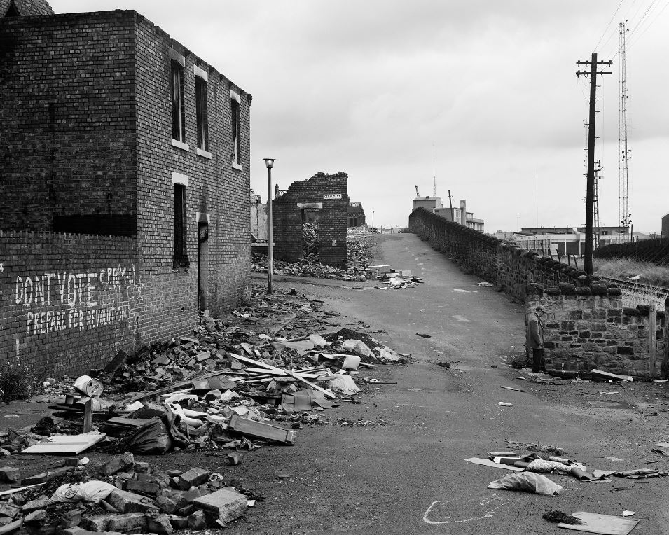
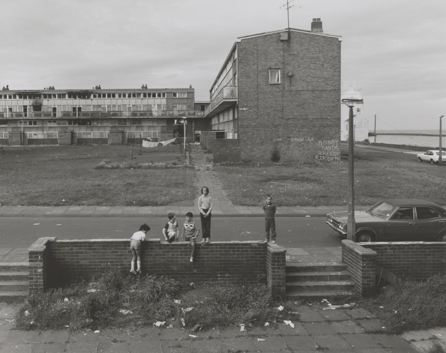
In the North East photos what dominates is the built environment. People are reduced to puppets, physically small against the backdrop of the enormous or decaying buildings. The buildings come in two types, terrible and appalling. The terrible ones are the old brick terraces thrown up in a hurry by the Victorian capitalists who owned the mines and steel works and shipbuilding yards and needed the bare minimum accommodation to keep their workers just about alive – badly built, no insulation, draughty windows, outside toilets and all.
Though Killip didn’t plan it, his time in Newcastle coincided with the wholesale destruction of the old brick terraces and their replacement with something even worse: the concrete high rises with broken lifts reeking of piss, the windswept plazas, dangerous underpasses, and oppressive network of toxic, child-killing urban highways, all the products of 1960s and 70s urban planners and brutalist architects.
May 5, 1981, North Shields, Tyneside © Chris Killip Photography Trust. All images courtesy Martin Parr Foundation
This is why I call the architects room at the Royal Academy Summer Exhibition the room of shame. Go on a tour of British cities to see for yourself the destruction of historic centres and their replacement with brutal concrete urban highways full of thundering traffic, concrete underpasses tailor made for muggers and rapists, bleak open spaces where the wind blows dust and grit into your eyes, the concrete facias of a thousand tragic shopping precincts and, looming above them, the badly built tower blocks and decaying office blocks. Concrete cancer.
This isn’t an architecture for people, it’s an architecture for articulated lorries. Thus the human beings in Killip’s harrowing photos of these killing precincts are reduced to shambling wrecks, shadows of humanity, scarecrows in raincoats, harassed mums, bored teenagers hanging round on street corners sniffing glue. This is what Killip captures, the death of hope presided over by a thousand architects and town planners who could quote Le Corbusier and Bauhaus till the cows came home and used them to build the most dehumanised environment known to man.
Killingworth new town, 1975 © Chris Killip Photography Trust. All images courtesy Martin Parr Foundation
As Philip Larkin wrote of young northern mums in their headscarves supervising their unruly children in some suburban playground:
Their beauty has thickened.
Something is pushing them
To the side of their own lives.
(from Afternoons by Philip Larkin, 1959)
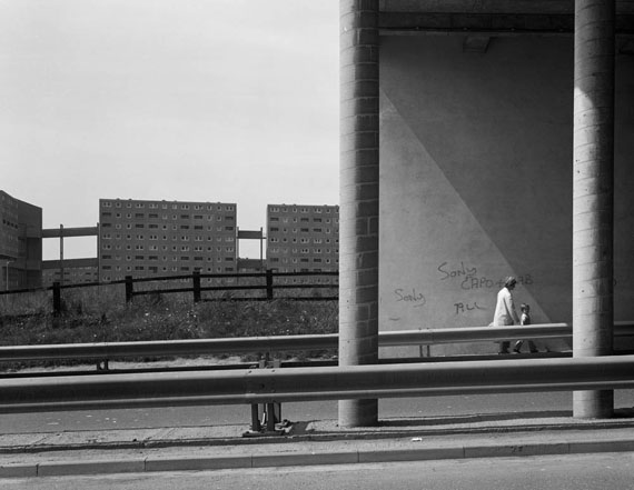
It’s epitomised by the photo of the silhouette of an old lady sitting in a half vandalised bush shelter in Middlesbrough. She’s wearing a headscarf and slumped forwards because her life, in this gritty, alienated environment, is bereft.
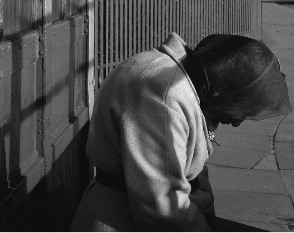
Woman in a bus shelter, Middlesborough, Teeside © Chris Killip Photography Trust. All images courtesy Martin Parr Foundation
Compare and contrast with the proud, erect, unashamed men and women of the Isle of Man. Pretty much all the humanity has been stolen from the mainlanders.
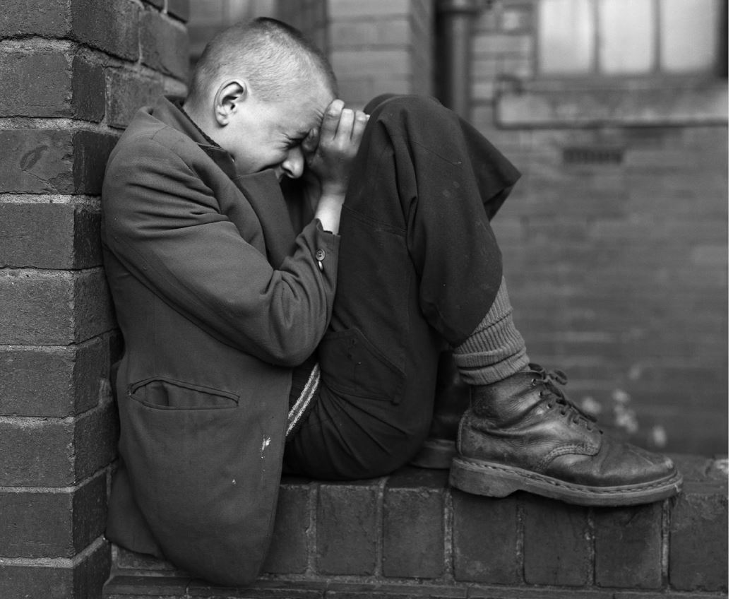
At some point I realised a lot of these grim Tyneside photos show a disproportionate number of children, children imprisoned in squalid houses, hanging round on derelict streets, trying to play in a crappy playground overshadowed by mines and factories, left outside the crappy, rundown bingo parlour, the cheapest nastiest, knockoff 60s architecture, complete with collapsing concrete canopy. A landscape of blighted lives and stunted childhoods.
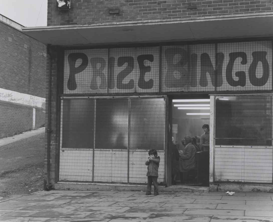
Boy outside Prize Bingo Parlour, Newcastle 1976 © Chris Killip Photography Trust. All images courtesy Martin Parr Foundation
- Two girls in Grangetown
- Terraced house and coal mine, Castleford, 1976
- Terraced housing, County Durham, 1976
- Children and terraced housing, Byker, Newcastle, 1975
- Butchers shop, Byker, Tyneside, 1975
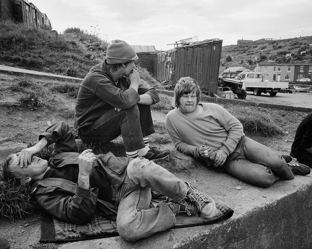
Skinningrove 1982 to 1984
Skinningrove is a fishing community on the North Yorkshire coast. Killip had noticed its striking landscape on a drive up the east coast back in 1974 but found it difficult to penetrate the community. In fact locals chased him off the couple of times he tried to photograph them. His way in was through friendship with a young local named Leso, who made Killip feel welcome and reassured locals of his good intentions. Between 1982 and 84 Killip documented the crappy, poor, hard scrabbling lives of Leso and his mates – Blackie, Bever, Toothy, Richard, Whippet – as they fixed nets, repaired boats and hung around bored.
Leso and mates waiting for the tide to turn, Skinningrove, 1986 © Chris Killip Photography Trust. All images courtesy Martin Parr Foundation
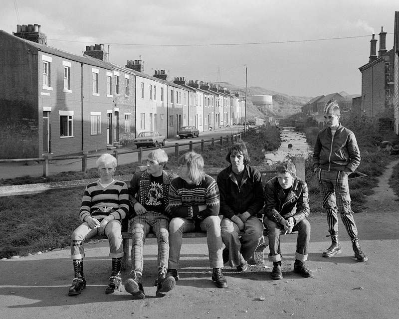
This is an extraordinary, remarkable, amazing portrait of a dead-end community, poverty, low expectations and young people bored off their faces. No wonder they took to sniffing glue and as the 80s moved on and adopted the punk look pioneered down in London to express some kind of sense of identity and worth, rebellion against grey-clad council houses, the grey sky and the unremitting rhythms of the grey, cold, freezing sea.
This section is given tragic force when we learn that Leso, who got Killip his ‘in’ into the community and of whom there are many photos, fixing nets, waiting round for the tide to turn, hanging with his punk mates, walking across a dirty road carrying a rifle, he died tragically during Killips’s stay.
The fishing boat he and some mates were in was overturned at sea and Leso and David were drowned, tubby Bever made it back to shore. In tribute Killip made Leso’s grieving mother an album of three dozen photos of her lost son.
Leso, Blackie, Bever, ?, David, on a bench, Whippet standing, Skinningrove, 1986 © Chris Killip Photography Trust. All images courtesy Martin Parr Foundation
- Family on a Sunday walk, Skinningrove (1982)
- Leso with his dogs and a gun, Skinningrove (1983)
- Skinningrove photos
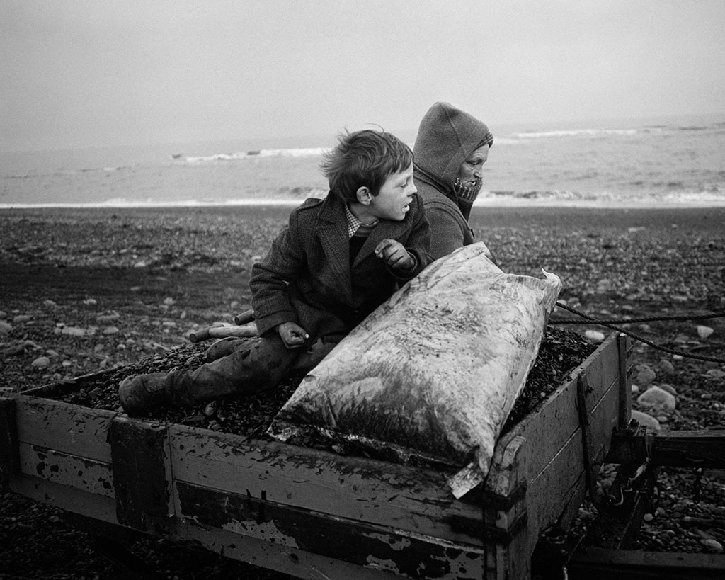
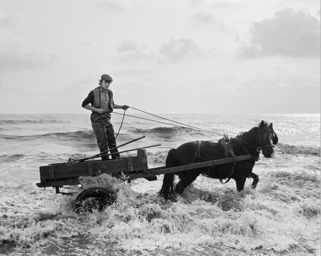
Seacoal Camp 1981 to1984
Killip discovered Lynemouth, Northumberland, in 1976. It had a strange and eerie vibe because there was a massive coalmine not far from the sea and waste coal was expelled into the sea, only to be brought back to shore on the incoming tides.
And a community of travellers or extremely poor people living in caravans and using horse-drawn wagons in and near the sea had sprung up which made a living scavenging this coal, using it to heat their homes, cook food, and to sell to other locals. An entire lifestyle based on coal scavenging.
Once again Killip had trouble penetrating this closed and fiercely protective community. From 1976 when he first came across it he made repeated attempts to photograph the people but was chased away. Only in 1982 was he finally accepted when, on a final visit to the local pub he was recognised by a man who’d given him shelter from a rainstorm at Appleby Horse fair and vouched for his good intentions.
So Killip set about taking photos, delicately tactfully at first. But in winter 1983 he bought a caravan of his own and got permission to park it alongside the community’s ones. Once really embedded he was able to record all the different types of moments experienced by individuals or between people engaged on this tough work, at the mercy of the elements, permanently dirty with coal muck.
Rocker and Rosie Going Home, Seacoal Beach, Lynemouth, Northumberland, 1984 © Chris Killip Photography Trust. All images courtesy Martin Parr Foundation
In the unpublished preface to the volume of poems he was working on when he was killed in the last days of the Great War, Wilfred Owen wrote:
Above all I am not concerned with Poetry. My subject is War, and the pity of War. The Poetry is in the pity.
Same, with modifications, goes for Killip. The poetry, the deep, deep poetry of these photographs, derives from the immense love and compassion they evince, love of suffering humanity, the candour and accuracy of the shots, finding moments of piercing acuity amid the grinding poverty and mental horizons which are hemmed in on every side by slag heaps, metal works and the four walls of a cramped caravan.
Gordon in the water, Seacoal Beach, Lynemouth, 1983 © Chris Killip Photography Trust. All images courtesy Martin Parr Foundation
- Boo with his rabbit (1984)
- Rocker and his toad, Lynemouth, Northumberland
- Nini and Helen sorting coal (1983)
- Rocker hand-picking coal (1984)
- Helen and her hula hoop (at the top of this review)
- Alison and two carts, 1983
- Selection of images
- Killip’s caravan and car, 1983, with huge aluminium smelter in the background
- Three lads in Killip’s caravan
Photography and music
Photography is like music. Regarding music you can describe the notes and cadences, the technical manoeuvres and key changes, the invocation of traditions and forms and write at length about the ostensible subject (the Pastoral symphony, the Moonlight sonata etc). But in the end you have to let go of all of that and experience it as music, let the music do its work, what only it can do, triggering emotions, memories, fragments of feelings or thoughts, stirring forgotten moments, making all kinds of neural connections, filling your soul.
Same with these photographs. I’ve described what he was trying to do, bring respect and compassion to people right on the margins of society, the lost, the abandoned, the forgotten. He’s quoted as saying he had no idea he would end up recording the process of de-industralisation, it just happened to be going on as he developed his method and approach as a social photographer. Long essays could be written about class in England, about deindustrialisation and then, of course, about the Thatcher government which supervised the destruction of large swathes of industry and British working class life alongside it.
But at some point you pack all that way and let the photos do their work, which is to lacerate your heart and move you to tears. This is the best our society could offer to God’s children. What shame. What guilt.
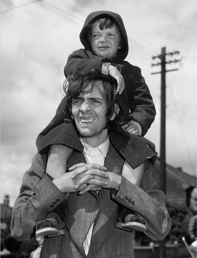
Father and son watching a parade, West End of Newcastle, Tyneside, 1980 © Chris Killip Photography Trust. All images courtesy Martin Parr Foundation
The Miners Strike 1984 to 1985
A friend of mine at school in the Home Counties, his older sister was married to a copper. He told us the Miners Strike was great. They were bussed to Yorkshire, put up in army barracks, paid triple time wages and almost every day there was a fight, which he and his mates always won because they had the plastic shields, big truncheons and if things got really out of control, the cavalry. Killip apparently treated the long strike as another project with a view to producing another long-form series.
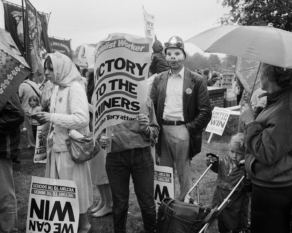
Durham Miners Gala, 1984 © Chris Killip Photography Trust. All images courtesy Martin Parr Foundation
But images from the Miners Strike project aren’t treated separately as the other projects are. Instead they’re rolled into the In Flagrante section.
In flagrante 1988
In 1985 the publisher Secker and Warburg told Killip they’d be interested in publishing his next book. This would mean access to a larger audience than previously and Killip was inspired. He worked with editor Mark Holborn and designer Peter Dyer to produce the 1988 book In Flagrante. Unlike all his previous projects which were heavily themed around specific communities and locations, In Flagrante deliberately cut his images adrift from their source projects to create a randomised cross-section of his career (although anyone who’d studied the previous projects has a good idea where each of them come from).
- Glue sniffing, Whitecraven, Cumbria (1980)
- Royal wedding celebrations, North Shields, 1981
- Selection from In Flagrante
- Slideshow of images
- Images from Gateshead’s punk venue, The Station
- Leso at sea, 1983
- Seven images with commentary
For the bitter bleakness and the unerring accuracy of the images, In Flagrante has been described as ‘the most important book of English photography from the 1980s.’ I was particularly taken by the set of photos of miserable English people from the 70s and 80s on various English beaches, at Whitley Bay, and so on. Narrow lives, no expectations, the quiet misery of the English working classes. They’ve come to the seaside for a break, for a ‘holiday’ and none of them know what to do there. Images of a nation at a loss what to do with the land it finds itself in.
Revolt
Respect goes to the tribes of young people who forged ways of rebelling against the poverty and low to zero expectations of their environment. In Flagrante contains a surprising number of photos of young punks who took the form to baroque extremes long after it was abandoned in London. There are lots of shots of the Angelic Upstarts of all bands, playing sweaty punk gigs in Gateshead. In fact the gallery shop has a music paper-size fanzine-style publication entirely full of shots he did of sweaty punk gigs in the mid-80s. ‘We’re the future, your future.’
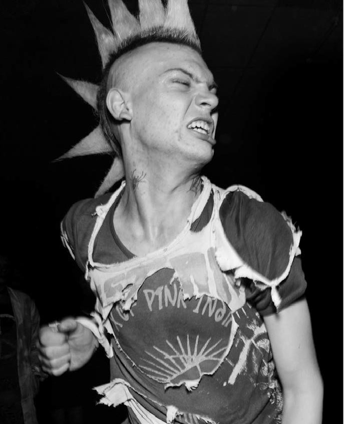
The Station, Gateshead, 1985 © Chris Killip Photography Trust. All images courtesy Martin Parr Foundation
America 1991
What happened to Killip after that? America. I was disappointed to read that in 1991 he was invited to be a Visiting Lecturer at the Department of Visual and Environmental Studies in Harvard University. In 1994 he was made a tenured professor and was department chair from 1994 to 1998. He only retired from Harvard in 2017. Well, no doubt taking the Yankee dollar was the right move for him, but it meant the abrupt end of the sequence of breath-taking portfolio projects which had begun in 1970.
Summary
Killip’s oeuvre represents not only an invaluable document of social history 1970 to 1985 and, as such, a blistering indictment of an incompetent, uncaring, bewilderingly lost society – but it is also a testament to love and the redeeming possibilities of art.
The compassion and humanity of his work is embodied in its closeness and intimacy with its subjects, not the fake intimacy of eroticism, but being right there with poor suffering humanity; right up close as the dirty kids play in their abandoned playgrounds, the dispirited losers chain-smoke in a wretched bingo hall, an old lady loses the will to live in a vandalised bus shelter, bored young men sniff glue in a remote fishing town, and lost children spend all day every day clambering over filthy mounds of coal to help their mums and dads scrape a flimsy living The poetry is in the pity.
Youth on wall, Jarrow, Tyneside, 1975 © Chris Killip Photography Trust. All images courtesy Martin Parr Foundation
Levelling up
In the 50 years since Killip took these photos generations of politicians have come and gone, promising to narrow the North-South Divide and level up the whole country. All bollocks. Life expectancy for babies born in the North-East, like per household income, remain stubbornly below the national average. Pathetic, isn’t it. What a sorry excuse for a country.
Go and see this marvellous, searing, heart-rending exhibition.
The promotional video
Related links
- Chris Killip retrospective continues at the Photographers’ Gallery until 19 February 2023
- Chris Killip’s website
- Chris Killip photos at the V&A
- Chris Killip article and photos at Tate
- Chris Killip photos at the Martin Parr Foundation
- A selection of images with audio commentary by Killip himself