Aladdin Sane: 50 Years Exhibition @ Festival Hall

This surprisingly extensive and greatly enjoyable exhibition on the ground floor of the Royal Festival Hall is premised on the notion that the cover to David Bowie’s 1973 album, ‘Aladdin Sane’ – the photo of Bowie’s face with the ‘lightning bolt’ drawn across it – was an epoch-making, benchmark-setting, game-changing, epochal work of art. On the wall labels and in the exhibition publicity the curators go so far as to claim that the cover photo is ‘the Mona Lisa of Pop’. Do you agree? This exhibition tries its damnedest to persuade you.

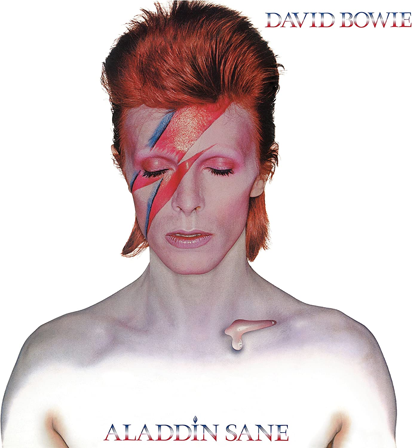
Cover of Aladdin Sane by David Bowie, released 19 April 1973

The album

‘Aladdin Sane’ was Bowie’s sixth studio album, released on 20 April 1973 on RCA Records. The previous albums had been:

  • David Bowie (1967)
  • David Bowie/Space Oddity (1969)
  • The Man Who Sold the World (1970)
  • Hunky Dory (1971)
  • The Rise and Fall of Ziggy Stardust and the Spiders from Mars (1972)

The concept album ‘Ziggy’, creating an elaborate mythology about an ill-fated, fictional rock musician, was Bowie’s breakthrough LP. It sold over 100,000 copies and catapulted him into the realm of real stardom. Concerts sold out, the music press started to treat him as a player, his fan base exploded. It established him as a leader of the more thoughtful, cerebral, art student end of Glam Rock, far more ambitious in his skilful deployment of a persona and concept than rivals like Marc Bolan, let alone the pure pop end of Glam such as Sweet or Slade.

The follow-up, ‘Aladdin’, is closely linked to ‘Ziggy’. Bowie recorded it with the same backing band (led by guitarist and arranger Mick Ronson) and it was recorded between gigs of his extensive Ziggy Stardust tour. The songs were mostly written on the road in the US between shows. This explains why the subject matter is often directly American (‘Panic in Detroit’) and also has a heavier, harder rock feel than Ziggy. The track listing is:

Side one:

Side two:

It contains one solid gold hit, ‘The Jean Genie’, which is a classic of a certain kind of style of repetitive, one-riff rock. It started with Mick Ronson fooling around with a Bo Diddley riff on the tour bus. Back in New York Bowie developed lyrics to entertain Andy Warhol acolyte, Cyrinda Foxe. In fact the way the lyrics describe a certain New York type is strongly reminiscent of Lou Reed, whose album Transformer, full of such portraits, Bowie had just finished producing and playing on. A cursory listen to both shows that Transformer is, quite obviously, much better than Aladdin, more varied, more interesting tunes (‘Perfect Day’, ‘Walk on the Wild Side’), has stood the test of time far better.

The bassist on the Jean Genie session later claimed it was recorded in an hour and a half flat. It went to number 2 in the UK chart (a chart which, one of the many entertaining and nostalgic wall labels tells us, had recently featured Sweet’s ‘Blockbuster’ and Jimmy Osmond’s ‘Long-Haired Lover From Liverpool’). But I find most of the other tracks on the album boringly repetitive and too long. And the lyrics?

Crack, baby, crack, show me you’re real
Smack, baby, smack, is that all that you feel
Suck, baby, suck, give me your head
Before you start professing that you’re knocking me dead

It was ‘daring’ and ‘risqué’ at the time to describe blowjobs in a song, 50 years later…not so much. And ‘professing’?

It’s surprising that this contrived performer, this cracked actor, so keen to display a glammed-up, self-consciously theatrical character, should include a Rolling Stones track, ‘Let’s Spend the Night Together’, on the album. He said in interviews it was a tribute to the Stones-inspired feel of many of the songs, but it’s dire, isn’t it? The main difference is Bowie swallowing or snatching the word ‘together’ in contrast to Mick Jagger’s lazy sexy drawl, which is definitely worse, and the spoken ad lib at the end:

They said we were too young
Our kind of love was too young
But our love comes from above
Let’s make love

This sounds like a blatantly commercial play for the adoration (and money) of pimply misunderstood 15-year-olds everywhere.

Who is Aladdin Sane? In interviews Bowie simply described him as ‘Ziggy Stardust goes to America’, where he discovered urban decay, drugs, sex and violence on a scale you couldn’t get in Britain. Critic Kevin Cann is quoted describing him as ‘a kind of shell-shocked remnant of his former self’.

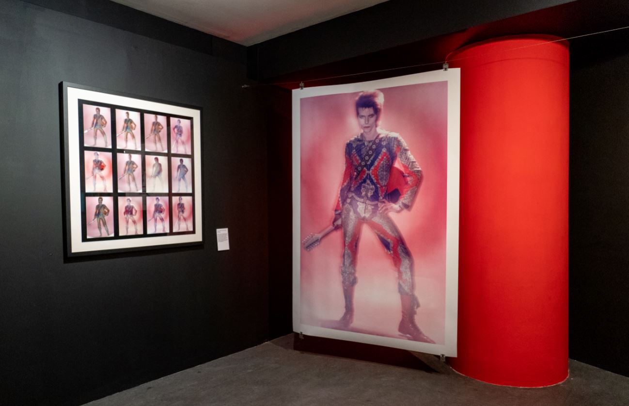
Installation view of ‘Aladdin Sane 50 Years’ at the Southbank Centre showing a contact sheet and blown-up images of Bowie dressed for his performance of ‘Starman’ on Top of the Pops. Note the red-and-blue colour scheme already much in evidence. Installation photo by Pete Woodhead. Bowie photo by Duffy © Duffy Archive & The David Bowie Archive ™

The album had 100,000 advance orders which meant it went ‘gold’ and to number 1 in the UK album charts, staying there for 5 weeks and in the top 10 for 27. It’s estimated to have sold 4.6 million copies in total, the kind of figures record companies, accountants, and rock music geeks adore.

The exhibition includes an area dominated by a fantastic old-style hi fi system comprising record player, amp and big speakers, on which the album was playing. (For techies, the deck is a Michell Transcriptor, with Celestion 66 loudspeakers and a Rotel RX-1203 amplifier.) Someone must have been continually turning it over or putting the needle back to the start of the side. There are bean bags to slump on. Tellingly I came across someone’s daughter, obviously not very interested in the exhibition, slumped on a bean bag with headphones on, and when I asked her what she was listening to, it wasn’t Bowie.

However, the thing about this exhibition is that it isn’t really about the music. The actual content of the album is barely discussed. The focus of the exhibition is the cover art for the album. This, we quickly discover, was shot by fashion photographer Brian Duffy, was the most expensive rock album cover made to date and, according to the curators, is one of the most iconic rock images of all time.

Brian Duffy

Thus an immense amount of time is devoted to the background and build-up to the famous cover image. I counted no fewer than 84 photos devoted to telling the story. First the context and key personnel. So there are photos of each of the band members with wall labels explaining who they are and their contribution, the largest number devoted to the extremely photogenic Mick Ronson in various rock star poses, but also shots of the bassist and drummer. (The curators speculate that some of these shots were meant to be used in the gatefold of the album sleeve, but the power of the final slash image swept them aside.) There’s photos of Bowie’s producer, Ken Scott, manager Tony Defries, two photos of Bowie’s wife, Angie.

So much for the music. More central to the story of the iconic cover is the extensive section devoted to the photographer of the iconic image, Brian Duffy. We learn about his career before the shoot, that he was one of a trio of young London photographers, what older photographer Norman Parkinson called ‘the Black Trinity’ – the others being David Bailey and Terence Donovan – with contemporary newspaper clippings to that effect.

We learn that Duffy, as he was universally known, was a leading fashion photographer, which is backed up by a wall of 27 of his very impressive fashion photos. These powerfully convey not only the style of the day as found in glossy mags such as Vogue and Cosmopolitan, Elle and the Sunday Times, but also indicate the fashion, rock and celebrity figures of the era, such as John Lennon, Michael Caine, politicians.

There’s a cornucopia of 1960s gossip: Duffy’s collaboration with Len Deighton on the 1969 movie ‘Oh What A Lovely War!’, technical influences such as the way graphic artist Philip Castle used an airbrushing technique on the poster for A Clockwork Orange, which Duffy was to ask him to repeat on the Aladdin cover, the way the cover of Hunky Dory was printed as black and white and then hand coloured by Terry Pastor, how the cover photo of Transformer was taken by ‘legendary’ rock photographer Mick Rock, was accidentally over-exposed but Reed liked it that way, and so on.

The shoot

But there’s more, lots more, as the exhibition zeroes in on the creation of the iconic image. We learn about Duffy’s studio manager Francis Newman, and designer Celia Philo. We are treated to photos of the interior and exterior of the Duffy’s studios at 151a King Henry’s Road, Swiss Cottage NW3. where the famous shoot took place.

We learn about the canny strategic thinking of Bowie’s manager, Tony Defries. They shared a vision of how the marketing of a pop performer could be transformed into high art – or at least a good impression of what pop music consumers thought of as art. One extremely practical and canny reason is that Defries knew that, the more they spent on the cover art, the more record label RCA would be forced to cough up to boost sales in order to recoup their investment. Hence he and Duffy agreed on using an extremely expensive seven-colour printing technique which was then only available in Switzerland.

In order to justify the process the image had to be simple and striking. It had to make maximum use of bold colour. Hence the development of a bright red (with some blue shading) against artificially pale bare skin.

This explains why nobody on the shoot saw the final version on the day because the negatives had to be sent away for commercial processing to achieve that hyper-real effect.

Then we’re on to the photo session itself. An immense amount of resources go to describing in great detail how the shoot was conducted and where the idea for the famous zigzag across Bowie’s face came from. Bowie was 26, had hit new peaks of fame, was deeply aware of the importance of image and media presentation. He wanted something striking and new but didn’t know what. The shoot was crammed in between dates on an international tour.

Duffy had never done a shoot for an album cover before. Both star and photographer were in new territory. So the most striking thing about the shoot this whole exhibition is making such a song and dance about is it was all over in an hour,

In fact, rather disappointingly, or maybe fittingly, right at the heart of the story is uncertainty/mystery. Turns out nobody really knows where the idea for the iconic red flash came from. There are several possible sources. Bowie shared his birthday with Elvis and the King had developed a motto, ‘Taking Care of Business – In A Flash’, and accompanying logo:

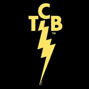
Elvis Presley’s Taking Care of Business logo

Rather more prosaically, Duffy’s studio had a National Rice cooker and their logo was a red flash. In 1970 the company had created the world’s largest neon sign depicting the logo on the side of an office building in Hong Kong. From some source, Duffy conjured up the idea of painting a flash across Bowie’s face. It took make-up artist Pierre Laroche to achieve a first draft, establishing a pale ground for his face and chest, and then the red flash.

Then the background was brightly lit in order to burn it out or render it invisible. Bowie was positioned against it wearing only his underpants and Duffy started snapping (as the curators carefully inform us) using his Hasselblad 500 EL camera, using a David Cecil ring flash unit on Ektachrome ASA 64 120-format film. Turn to the left, turn to the right, look straight ahead, two rolls, 24 images, all knocked off in well under an hour. Clean make-up, free to go.

The exhibition features a wall of contact prints of the ‘outtakes’ or unused images i.e. other almost identical shots of made-up Bowie which were rejected for various reasons. The decisive factor was the eyes. In all the rejected versions Bowie has his eyes open. Seeing the final version among all the rejected ones makes you realise that the one with his eyes shut is head and shoulders more powerful than the rest. Why?

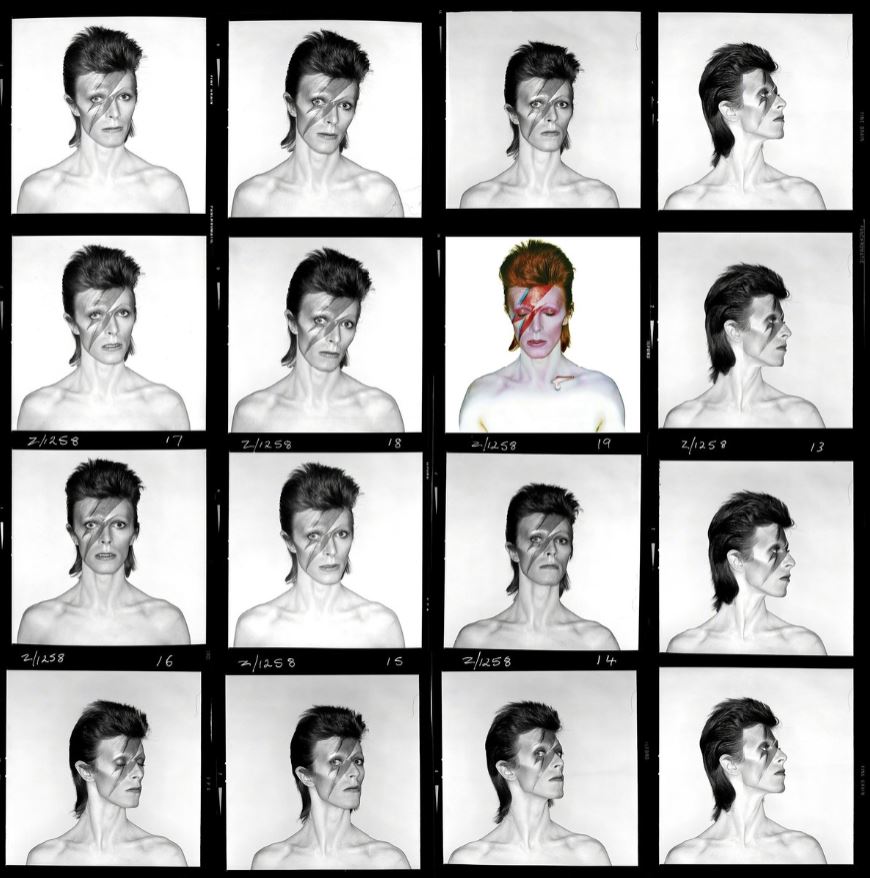
Aladdin Sane contact sheet by Brian Duffy

The curators explain that using the image of Bowie with his eyes closed broke with all the conventions of portrait photography. Usually there’s some kind of eye contact with the viewer, the eyes establishing contact or rapport. Even if they’re looking away, we get a stronger sense of someone’s character if we can see their eyes. Thus choosing the eyes shut image immediately created an aloofness and mystery about Bowie, exactly the kind of androgynous, alien effect he and Defries were cultivating.

The second big artistic decision Duffy took was to add the blob of mercury on Bowie’s collarbone. It was added by graphic artist Philip Castle. The curators, like all modern art curators, obsessed with sex, describe this blob as ‘phalliform’ i.e. shaped like a penis*. Is it, though? If it’s the shape of anything, I’d pick up on Bowie’s obsession with aliens and interpret it as being a a ray gun. At the time, this kind of special graphic effect was relatively new, and so I think I interpreted it as a sort of science fiction detail, the kind of thing you might get on a Hawkwind or Emerson, Lake and Palmer album.

Anyway, it certainly emphasises the other-worldly, disembodied vibe of the whole image. For the curators, constricted by their framework of gender and sexual identity, the image emphasises Bowie’s gender fluidity. Not being so constrained, I see it as far more playing to Bowie’s alien from another world schtick.

Anyway, any interpretation is equally irrelevant to the actual music which I outlined above, grimy, gritty portraits of New York types, the Jean Genie or Lady Grinning Soul. You only have to listen to half the album to realise that the cover image is wildly misleading as to its contents.

Last word about the lettering. This is Rémy Peignot Cristal with a blue-white-red gradient. It was Duffy who changed the dot over the i of Aladdin into a small flame shape.

Why the fuss? Gender, obvz

Personally, I was never that particularly struck by this album cover because it came from an era overflowing with striking album cover art. At the time it seemed just one among many amazing, imaginative and striking images, so I don’t quite get the fuss.

What comes over with increasing insistence as the show progresses is that the arguable over-valuation of this one image is in part because it is also being considered and valued as an emblem of gender, queer and identity politics. Aha. This explains why the actual music – its composition, production and performance, its lyrics and its value – are more or less ignored by the exhibition. Nobody says whether the album is any good, probably because it isn’t really.

Instead, as you progress into the second half of the exhibition you realise the whole thing is being seen through the lens of contemporary concerns about gender and identity. Seen from this perspective you see its value in a completely different light, namely that Bowie’s poses in the early 1970s, as bisexual, asexual, strange and alien (the aspect of his persona which was foregrounded in Ziggy, Aladdin, Diamond Dogs, ‘The Man Who Fell To Earth’ and, maybe, ‘Low’) helped a lot of people who were struggling with their sexuality. It’s made pretty plain in the show’s press blurb:

With a focus on the photo session that gave us Bowie’s ‘lightning bolt’ portrait, this exhibition explores the continuous reshaping of Bowie’s image, and his part, along with Duffy’s, in a reimagining of sexual and gender identity.

It explains why in the last part of the show – once we’ve got past the 80 or so large photos of the band members, manager, wife, and all the contact images from the shoot itself, past the wall-sized blow-ups of Bowie in full glam pose, and past the room with the hi-fi system playing the album – we come to a space with sheets hanging from the ceiling bearing quotes from people who grew up in the 70s and 80s, who struggled with their sexuality and identity, and who found solace in Bowie’s confidence and unashamedness and bravura performance of alternative sexualities.

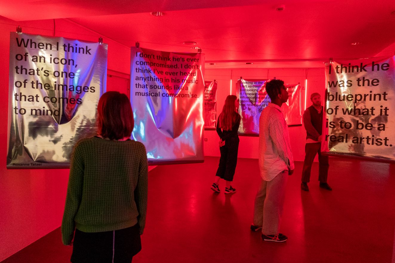
Personal testimony room in the ‘Aladdin Sane 50 Years’ exhibition at the Southbank Centre. Installation photo by Pete Woodhead

In a world dominated by macho movie stars and football hooligans, Bowie offered an alternative, an imaginative way out, a refuge. He made a lot of troubled, embattled people realise they weren’t alone. Bowie showed that you could not only feel confused and uncertain and not fit into any of society’s categories, but become a star on your own terms, appear on the telly, pack out concert halls, and make a fortune.

As the curators out it, Bowie’s message for generations of outsiders, not just sexual outsiders but alienated, unhappy teenagers, was:

Ignore what society wants you to be. Be what you want to be – including how you look to the outside world.

This part of the show – and the first-person tributes from young people who Bowie, with his many-changing masks and fluid sexual identity, helped and reassured and inspired – was genuinely moving, but also a bit disorientating. It was weird walking from the world of trash glam throwaway pop hits into quite a more serious and troubled realm, a world of gender anxiety and liberation, freedom but worry, which seems to be with us more than ever.

I doubt if Bowie set out to be sex therapist to a generation but, this exhibition suggests, that was the impact he had, for a lot of people.

Nostalgia

For me, though, being neither troubled by my sexuality (no more than average, anyway) and no particular fan of Bowie’s early music, I thoroughly enjoyed this exhibition because it is an absolute riot of nostalgia. The opening rooms set the scene for the Great Photoshoot by establishing the social and political and music context of 1973.

Probably younger visitors walked swiftly past the background panels describing Britain in the 1970s, the collage of newspaper headlines from the period, the oil crisis, the four day week, Harold Wilson and Ted Heath, the endless strikes, but I lingered long and lovingly, reliving the long-ago days of my boyhood.

Next to the politics was a similar size panel with a collage of contemporary music paper articles, giving an impressionistic sense of who was who in rock music, circa 1973, many of them, apparently about Elton John, whatever Paul McCartney and John Lennon were up to, a new young band named Queen, and so on.

Far more visually striking, though, was another collage establishing the context of classic rock album covers from the period. These included actual vintage copies of Sergeant Pepper, Abbey Road, Black Sabbath, King Crimson, Dark Side of the Moon, Led Zeppelin IV, Sticky Fingers by the Rolling Stones, What’s Going On by Marvin Gaye, Slider by T Rex, early Roxy Music, Music from Topographic Oceans by Yes and many more. This is what I meant by the Aladdin Sane cover image being just one among many. Surely the cover of Dark Side of The Moon is as, if not far more, iconic than Aladdin Sane, is far more widespread in the culture, you’re more likely to see it on t-shirts or spoofed in cultural references.

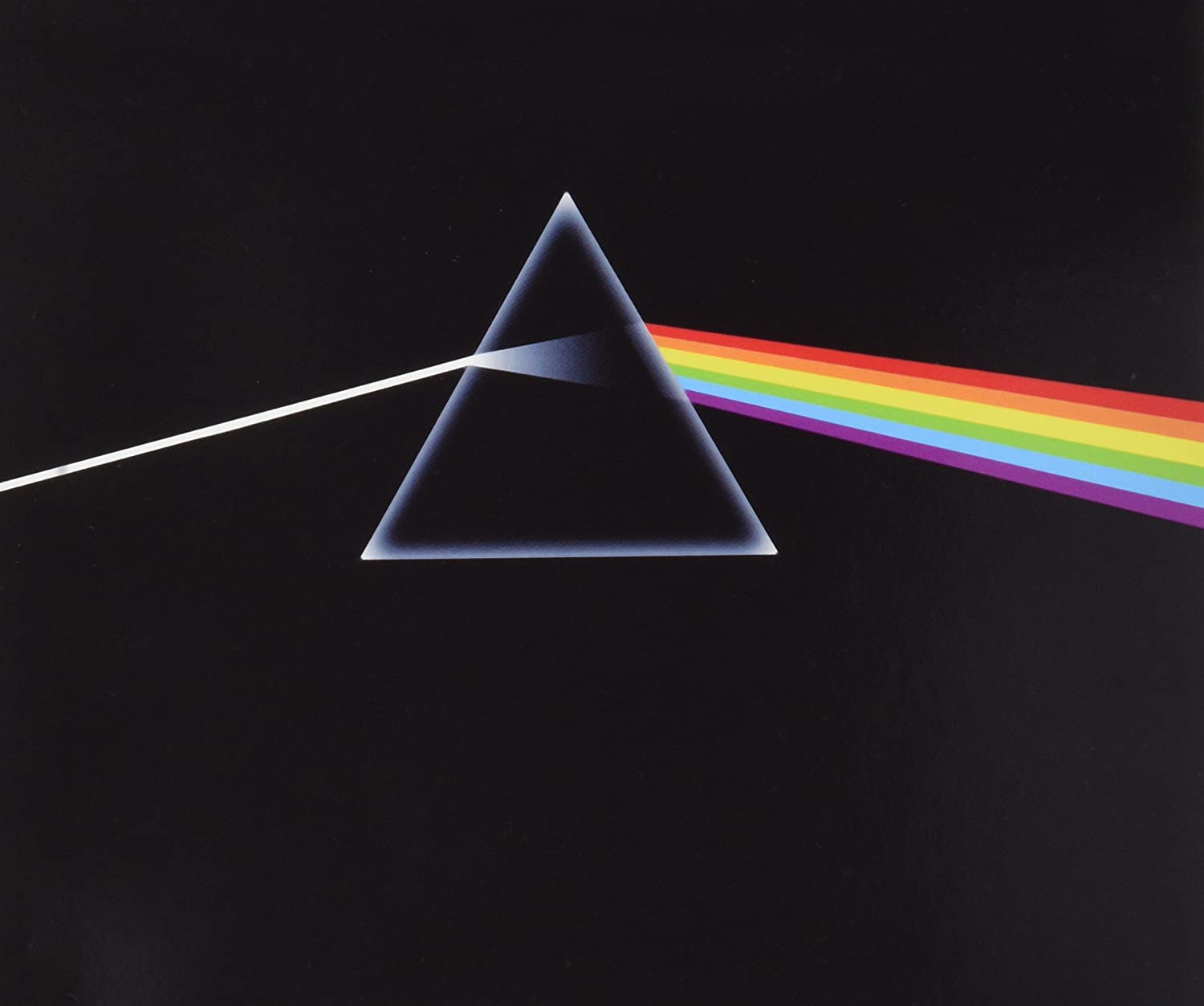
Album cover of ‘Dark Side of the Moon’ by Pink Floyd, released 1 March 1973, 6 weeks before Aladdin Sane (19 April 1973)

And indeed the exhibition confirms that the Music Week Sleeve Design Award 1973 gave first place to Dark Side (with Aladdin coming a very creditable second). Looking more broadly, a quick internet search for rock albums of 1973 turns up:

  1. Gram Parsons – GP (January 1, 1973)
  2. Little Feat – Dixie Chicken (January 25, 1973)
  3. John Martyn – Solid Air (February 1, 1973)
  4. Iggy & The Stooges – Raw Power (February 7, 1973)
  5. John Cale – Paris 1919 (March 1, 1973)
  6. Pink Floyd – The Dark Side of the Moon (March 1, 1973)
  7. King Crimson – Larks’ Tongues in Aspic (March 23, 1973)
  8. Roxy Music – For Your Pleasure (March 23, 1973)
  9. Led Zeppelin – Houses of the Holy (March 28, 1973)
  10. Mahavishnu Orchestra – Birds of Fire (March 29, 1973)
  11. The Beatles – 1962-1966 (April 2, 1973)
  12.  The Beatles – 1967-1970 (April 2, 1973)
  13. David Bowie – Aladdin Sane (April 13, 1973)
  14. Mike Oldfield – Tubular Bells (May 25, 1973)
  15. Steely Dan – Countdown to Ecstasy (July 1, 1973)
  16. Mott The Hoople – Mott (July 20, 1973)
  17. Carlos Santana & John McLaughlin – Love Devotion Surrender (July 20, 1973)
  18. New York Dolls – New York Dolls (July 27, 1973)
  19. Lynyrd Skynyrd – (Pronounced ‘Lĕh-‘nérd ‘Skin-‘nérd) (August 13, 1973)
  20. Faust – Faust IV (September 21, 1973)
  21. The Who – Quadrophenia (October 19, 1973)
  22. Paul McCartney & Wings – Band on the Run (December 5, 1973)

Of which you’d have thought the cover art for Dark Side, Raw Power, Houses of the Holy, Tubular Bells, the two Beatles compilation albums and Band on the Run are getting on for being as ‘iconic’ as Aladdin Sane.

And a quick Google also turns up Rolling Stone’s list of top ten rock album covers of all time which doesn’t even include Aladdin Sane.

Consideration of general album covers from the period then moves onto another section focusing on album covers specifically by or closely related to Bowie i.e. the covers of his previous albums, especially the androgynous or sexually ambivalent ones such as The Man Who Sold The World where he’s lying on a divan wearing a dress, or Hunky Dory; and the equally ambivalent, but in a different, far more butch way, cover art for Lou Reed’s Transformer, produced by Bowie, which he and Mick Ronson both played on, and released a few months before Aladdin, in November 1972.

Front and back cover of Transformer by Lou Reed

All this is great fun, to see the great album art and play in your mind all the great tracks from long ago. There’s also a guilty pleasure: off to one side of the ‘classics of rock’ album covers is a montage of ‘square’ albums from the period, to remind us older guys how dire most music and entertainment of the period was. So there are the covers of albums by The Black Watch, the TV show Opportunity Knocks, the musical Godspell, Break-Through, character-based albums by Alf Garnett, Benny Hill and Tony Hancock, by Ken Dodd and his Diddymen and, a bit more acceptably, by ‘pop sensation’ Gilbert O’Sullivan. Half a century ago.

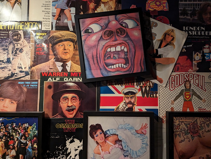
Montage of retro 1970s album covers at the ‘Aladdin Sane 50 Years’ exhibition at the Southbank Centre

*Camille Paglia

A little further on into the exhibition I discovered the curators’ use of the word ‘phalliform’ is lifted from one of the lengthy quotes from American feminist academic, social critic and renatagob, Camille Paglia which are printed on the walls.

I remember Paglia’s presence on the scene in 1980s TV and magazines, touring her leather-jacketed, spike-haired form of aggressive New York feminism, and churning out page after page of mashed-up, hot-wired Beat prose poetry. The exhibition relies very heavily on her for its central premise, namely that the Aladdin Sane photo:

with its red-and-blue lighting bolt across Bowie’s face, has become one of the most emblematic and influential art images of the past half century, reproduced and parodied in advertising, media and entertainment worldwide.

This is the premise of the entire exhibition. Here’s another slice of Paglia’s all-about-everything, showily eclectic, name-dropping prose:

It contains all of Romanticism, focused on the artist as mutilated victim of his own febrile imagination. Like Herman Melville’s Captain Ahab, whose body was scarred by lightning in his quest for the white whale, Bowie as Ziggy is a voyager who has defied ordinary human limits and paid the price.

‘…and paid the price’ – this is sentimental tripe, a facile, clichéd, pre-modern view of the artist as specially damned and cursed for his gift, the kind of thing that Byron invented in the 1810s, felt a little ridiculous when Baudelaire did it in the 1850s, lived on into the poets maudits (damned poets) of the late nineteenth century (Rimbaud bunking off to Africa, Verlaine crying into his absinthe); was a thorough-going cliché worthy of mockery a hundred years ago.

It’s superficial magazine writing, rewarded for being exaggerated, over-written, sentimental and stereotyped. But, like wearing a leather jacket and having a spiky haircut, it was enough to persuade many people that Paglia was cool and has something to say, back in the Reagan-Thatcher 1980s. If you like this kind of 6th form showing off, then it usefully underpins the exhibition; if you don’t (and you might have noticed that I don’t) then it undermines it.

Afterlife of an image

But back at the exhibition we haven’t finished yet. There’s more. This really is an exhibition for Aladdin Sane completists, because the exhibition goes on to chart further highlights of Bowie’s career after the album was released, and the long afterlife of the Aladdin image. For a start the curators aren’t backward in pointing out that Bowie himself had long links with the South Bank Centre, from his debut in 1969 in the recently opened Purcell Room, to his curation of Meltdown, their annual contemporary music festival, in 2002.

In the same year that the album came out, 1973, Radio 1 broadcast a series called ‘the Story of Pop’ in 26 episodes, and the cover of the first part of the associated part-work featured the Aladdin Sane image.

As to Duffy, he went on to work with Bowie on two further album covers, namely: Lodger (1979), Scary Monsters And Super Creeps (1980).

In 2002 Absolut Vodka ran an advertising campaign which used classic album covers, and one used the Aladdin Sane image.

In 2003 Kate Moss appeared on the front cover of Vogue sporting her version of the Aladdin Sane lightning to celebrate 30 years of its impact on culture and fashion (fourth photo down on this page).

After the 2008 financial crisis some parts of Britain issued their own local currency (news to me). Apparently a currency was issued local to just Brixton in south west London. Since Bowie was actually born in Brixton (at 40 Stansfield Road) the Aladdin Sane image featured on the Brixton £10 note.

In 2013 the Victoria and Albert Museum staged a huge exhibition about Bowie, titled David Bowie Is. it ‘set a new benchmark for immersive music exhibitions’ and was a sellout, going on tour round the UK and then abroad.

Bowie passed away on 10 January 2016. The following year Royal Mail issued a set of ten commemorative stamps for what would have been Bowie’s 70th birthday year. Six stamps featured album covers, including Aladdin Sane. The first day cover was franked with a copy of the lightning bolt logo.

All these occasions are lovingly recorded, with appropriate illustrations and detailed captions. Bowie has been turned into an institution. All images have to be licensed by ‘the David Bowie Archive’. To quote the Clash, ‘turning rebellion into money’.

Chris Duffy

Things fall into a place a bit more when you learn that the exhibition is curated by Duffy’s son, Chris Duffy, and accompanies a book of the same name. Ah. And that it was Chris who described his Dad’s work as ‘the Mona Lisa of Pop’. Ah. And that Chris Duffy has set up the Duffy Archive to preserve his father’s work and legacy. Ah.

I loved this exhibition. It’s a lot of fun. It’s a relaxing, easy-going wallow in 1970s rock and pop and social nostalgia, full of nuggets and gossip and factoids. It’s a broad walk down memory lane. Like everything, it’s capable of multiple meanings and interpretations. The curators go heavy on the gender liberation aspect, which I see and understand. I responded more fully to the nostalgia elements. But once I understood the lead involvement of Duffy’s son, I also came to see it as a rather touching act of filial respect.

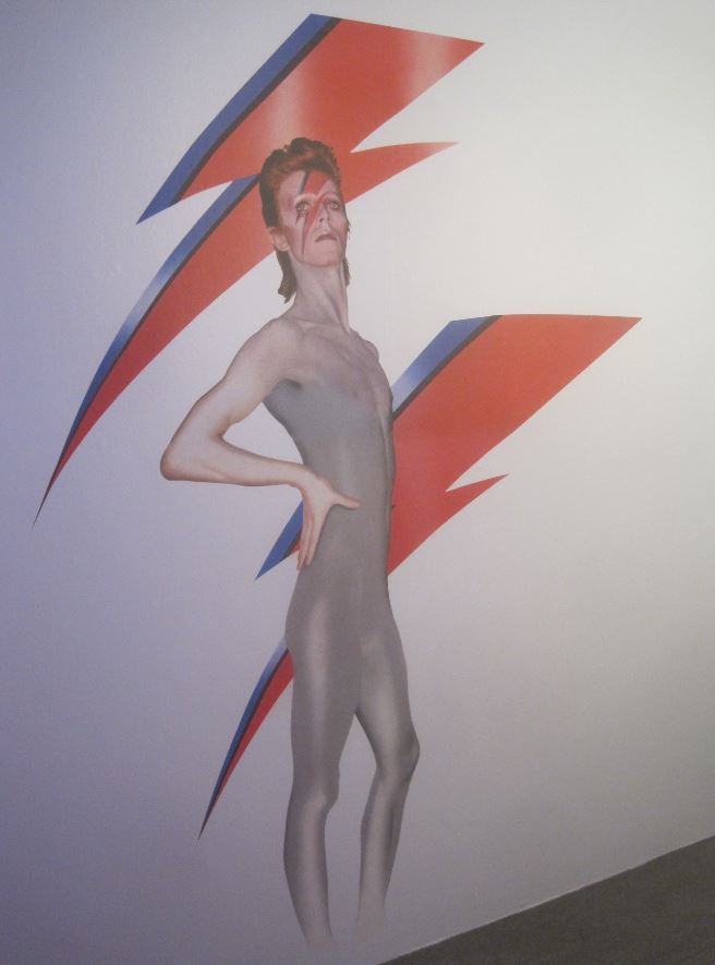
Installation view of ‘Aladdin Sane 50 Years’ at the Southbank Centre showing Bowie posing in the flash make-up against a flash backdrop. Installation photo by Pete Woodhead. Bowie photo by Duffy © Duffy Archive & The David Bowie Archive ™


Related links

Rock reviews

Texts

The Big City @ the Guildhall Art Gallery

What’s the largest painting you know? What’s the biggest picture you can think of? Monet’s huge water lilies? Mark Rothko’s Seagram murals at Tate Modern? Juan Miro’s huge canvases of biomorphic shapes? These canvases are so big that if you ever find yourself sitting on an exhibition bench in front of a trio of them, as I have done with Monet and Miro, you realise entire field of vision is filled with them. It is an immersive experience. You are in Miroworld or Monetland.

Is size important? When it comes to art? Does a big painting really do a lot more than a medium-sized one? What, exactly? At what size does a big painting become an immersive one? Have psychologists or art colleges done research into viewers’ psychological and aesthetic responses to size? Is there a recognised point at which a painting goes from ‘big’ to ‘massive’ or is it subjective i.e according to the viewer’s physical size and visual range?

Do artists, collectors or galleries categorise paintings by size? Have there been fashions for huge canvases? Or historical periods particularly associated with them? Are there particular artists famous for their monster canvases? Is there a record for the biggest painting ever made? By who? Why?

These are some of the questions raised by ‘The Big City’, an exhibition at the little known but well-worth-a-visit Guildhall Art Gallery, a hop, skip and a jump from Bank tube station.

The gallery is owned by the Corporation of London, which possesses some 4,500 works of art. Fifty or so of these are on display in the gallery’s permanent exhibition, itself packed with gems, and then the gallery runs rotating exhibitions of selections of the others, alongside exhibitions of new, original art works.

The Big City

This exhibition is titled ‘The Big City’. It is housed in three rooms, respectively small, medium and large. The small room, the third one you come to, houses a display which comes first in terms of chronology:

Sir James Thornhill

Sir James Thornhill (1676 to 1734) was the premier exponent of the Italian Baroque style in Britain in the early 1700s. Much of this took the form of site-specific allegorical murals for public or grand buildings. He supervised large painting schemes in the dome of St Paul’s, in the hall of Blenheim Palace, at Chatsworth House.

In the early 1720s Thornhill was commissioned to create an Allegory of London for the ceiling of the council chamber at the Guildhall where the Lord Mayor and aldermen held their meetings. He used the established style of Baroque allegory to create a central image of London, represented by a topless woman, being advised by the goddess of wisdom, Pallas Athena, and women symbolising Peace and Plenty. It features putti or podgy winged toddlers who often flit around Baroque paintings. Here they are depicted at the bottom right among images of: the City insignia, the sword bearer’s fur cap, a pearl sword and the City mace.

Allegory of London by Sir James Thornhill (1725) © Guildhall Art Gallery, City of London

This oval painting was fixed in the middle of the ceiling and was accompanied by four smaller pieces, one in each corner of the ceiling, depicting flying cherubs or putti representing the four cardinal virtues: Temperance, Prudence, Fortitude and Justice.

We know what the whole design looked like because there’s a painting of the room by John Philipps Emslie showing how it looked in 1886. The story is that the centrepiece and four smaller parts were dismantled and stored during the Second World War. The building was damaged in the Blitz and the original decorative scheme destroyed but these individual pieces were saved, along with some preparatory sketches by Thornhill. All of this is on display here.

It would be easy to say the figures ‘looked down’ on the City officials meeting below but a glance at the image shows they’re not looking down at all, they are tied up in their own conversations in their own world.

The piece’s content, size and position are obviously connected with values – moral and social values. The size not so much of the individual elements, but the way they were arranged over the entire roof, were designed to act as a constant reminder to the officials below, of the longevity and depth of the values associated with the City and its officials and business. This is what we stand for: commerce and prosperity, bringing justice and peace.

So the images aren’t instructive, they are aspirational. It wasn’t a case of the gods looking down but of ordinary mortals looking up and, whenever they did, being reminded of the traditions and values they were meant to be aspiring to. (Also, a point often not made about Baroque painting – they’re quite playful.)

Prudence from The Allegory of London by Sir James Thornhill (1725) © Guildhall Art Gallery, City of London

Grand occasions

Before you get to the Thornhill room you walk through the medium-sized first room in the show. This has a completely different look and feel. It contains nine big paintings of ceremonies associated with the City of London from the late Victorian period through to the 1960s. They depict lots of old white men wearing formal clothes, gowns and regalia, chains of office, wigs and so on.

The paintings depict different types of event which the curators usefully itemise: civic, royal, state, ceremonial, funeral.

They are big, and their size is more obviously connected to notions of power than the relatively benign Thornhill. By power I don’t mean images of solders or Big Brother looming threateningly, not direct power. But the soft power implicit in grand occasions which serve to bolster and underpin ideas of hierarchy. The pictures are big because the event was big.

Take ‘Queen Victoria at St. Paul’s Cathedral on Diamond Jubilee Day 22 June 1897’ by Andrew Carrick Gow, completed in 1899. The painting was commissioned to capture the magnificence and the magnificence is exemplified in the extraordinary scene of the packed steps of St Paul’s. Not just packed but, as you look closer, you realise arranged in a highly structured way, as was the event, to include representatives of the army, the Church, politicians and academics, arranged in groups and hierarchies. The crème de la crème, the top figures in all the important fields of state.

Queen Victoria at St. Paul’s Cathedral on Diamond Jubilee Day 22 June 1897 by Andrew Carrick Gow (1899) © Guildhall Art Gallery, City of London Corporation

The curators point out that a massive royal state occasion like this transformed the centre of London into a stage, a set on which the thousands of figures here, and lining the route of the royal procession to the cathedral, were arranged – and which the painter then has to capture as best he can. Put this way I sympathise with the scale of the challenge the artist faced. He had to be in complete control of the old values of structured composition and extremely detailed naturalism.

There’s another super-simple way to categorise the paintings on display here, which is: inside or outside. The Gow is a good example of outdoor magnificence; ‘The Coronation Luncheon to Her Majesty Elizabeth II in the Guildhall, London, 12 June 1953’ by Terence Cuneo is a good example of magnificence in an indoors setting.

The Coronation Luncheon to Her Majesty Queen Elizabeth II in the Guildhall, London, 12 June 1953 by Terence Cuneo. © Guildhall Art Gallery, City of London Corporation. Image © Terence Cuneo

Once again the size of the painting is an attempt to match the scale of the actual event and, as you can see here, the size of the actual banqueting hall which is, as it is intended to be, awesome. And, leaving aside the ostensible splendour of the occasion, it’s hard not to be awed by the photographic realism of Cuneo’s painting. There’s a ‘Where’s Wally’ element to looking closely at the hundred or more individual guests, how they’re sitting, what they’re going (eating, talking, turning to their neighbour and so on).

(It might be worth pointing out that the word ‘magnificence’, like so many English words used to describe this kind of thing, has a Latin root, and so carries with it the connotation of learning and cultural capital which Latinate words always bestow. It derives from magnus meaning big or great [the Roman general Gnaeus Pompeius Magnus is translated into English as Pompey the Great] and facere meaning ‘to make or do’. So at its root ‘magnificence’ means ‘to make big’. At its origin, it is about size. During 2,000 years of evolution through medieval Latin, French and into English it has come to mean ‘splendour, nobility and grandeur’, themselves all Latinate words.)

Terence Cuneo OBE (1907 to 1996) was a prolific English painter noted for his scenes of railways, horses and military actions. He was the official artist for the coronation of Queen Elizabeth II in 1953 and the Queen’s favourite portraitist. Including ceremonial occasions he painted her no fewer than 17 times. He’s represented by two works here, the coronation lunch (above) and:

Frank O. Salisbury (1874 to 1962) was an English artist who specialised in portraits, large canvases of historical and ceremonial events, stained glass and book illustration. In his heyday he made a fortune on both sides of the Atlantic and was known as ‘Britain’s Painter Laureate’. He painted over 800 portraits (!) and painted Churchill more times than any other artist.

What you’ll have realised by now is that most of these works are, by modern standards, barely what we’d call art at all. Sure they’re well composed, efficiently worked paintings, but they are in a style that was old fashioned by 1900 and completely moribund by the 1960s.

In this respect, despite their size and detail and polish, they epitomise the opposite of what was intended; rather than impressing with awe and magnificence they tend, to the modern viewer, to emphasise how remote and out of touch these figures of power were with the wider world of the 40s, 50s and 60s.

You could argue that the grand old panelled rooms in which they suited old boys had their gala dinners protected and insulated them from a world moving beyond their grasp and even their understanding.

Churchill, who features in two of the paintings here (one alive, one dead) fought the Second World War to preserve the empire. Fifteen short years later he lived to see it being dismantled and the influx of immigrants from the former colonies who would bring new voices and new perspectives to Britain. None of that historic change is even hinted at in these old-fashioned depictions of old-fashioned institutions carrying out their time-honoured ceremonies.

There are some older paintings on the same type of subject. These, as it were, have permission to be dated, or are easier to take ‘straight’ because they are in styles appropriate to their day.

In this latter painting, apparently Paton, a noted painter of maritime scenes and naval occasions, did the composition and painted the main scene while Wheatley, famous for a series of paintings called ‘The Cries of London‘, did the figures in the foreground.

Contemporary art

The third and biggest room contains the biggest variety of paintings and the biggest single works. Size is not the only factor for their inclusion here, since each of the paintings also has a specific setting or story and these to some extent represent different aspects of life in the city.

I counted 18 paintings in this big room. I won’t list them all but will select some highlights and themes.

Ken Howard’s ‘Cheapside 10.10 am. 10 February 1970‘ is big and sludgy. It shows the north side of Cheapside looking west on the kind of cold overcast February morning typical of London. This reproduction softens the impact of the paint which Howard has laid on in thick dollops, makes it look a much cleaner, slicker object than it is in real life. A reproduction also brings out instantly what is less obvious in the flesh, which is the fact that it’s a painting about a mirror, namely the way St Mary le Bow church on the left is reflected in a shop window on the right.

Howard is quoted as saying that urban landscapes give more scope for an artist interested in shape, tone and colour than the countryside. This is exemplified in the next work, which is a splendid depiction of Fleet Street in the 1930s.

Fleet Street, London, 1930s by unknown artist © Guildhall Art Gallery, City of London

There’s quite a backstory to this painting. It was commissioned by Viscount Rothermere, owner of the Evening Standard and Daily Mail, to depict the hustle and bustle of Fleet Street, then centre of Britain’s newspaper industry. But the artist intended to include portraits of real Fleet Street luminaries down at the bottom right, and one of the first to be completed was a portrait of Rothermere’s rival press baron, Lord Beaverbrook, owner of the Express group. At which point Rothermere took the painting from the artist, which explains why, if you look closely, you realise it is unfinished, many of those figures without faces and some little more than ghosts. Which in its own way, makes the image quite haunting.

What is finished is the central vista along the ‘Street of Shame’ and, in particular, the gleaming Art Deco glass and steel building on the left. This was the newly opened Daily Express building (1932) which features, thinly disguised, in Evelyn Waugh’s great satire on the 1930s newspaper industry, Scoop.

What does size have to do with it? Well, at 2.13 metres tall this is a big painting, but clearly the scale doesn’t aim to do the same as the Thornhill (embody inspiring moral values) or the civic paintings we saw earlier (impress the viewer with rank and hierarchy).

I suggest its implicit aim is to do with modernism whose fundamental driver is excitement about life in the modern city, in this instance the new technologies and new designs and new architecture represented by Art Deco. It is an image of hustle and bustle and energy. Since it was commissioned by a multi-millionaire media baron I suppose you could also say it represents a capitalist’s, a plutocrat’s view of the city, full of folk hustling and bustling to make him money for him, his class, society at large. It is a celebration of the system.

This enjoyable work was succeeded by a sequence of paintings which I didn’t like at all, in fact actively disliked.

1. Walk by Oliver Bevan (1995) is certainly big (2.29m high, 2.13 m wide). It is a depiction of the pedestrian crossing in front of the Barbican tube station. Apparently Bevan specialises in the depiction of ‘non-personal urban spaces’. Actually, the tiny reproduction I’ve linked to makes it look a lot better than it does in real life. Confronting the 2 metre high thing in real life makes you all too aware of the crudity of the painting and the unsatisfying randomness of the arrangement of the people. I know people mill about randomly all the time but this has been carefully arranged to look gauche and clumsy.

I’m guessing the intention of doing such a humdrum scene on such a large scale is somehow democratic, to say that size isn’t limited to the high and mighty but that any moment in our everyday lives is worthy of record and depiction, can be made ‘monumental’ in scale and implication.

Maybe. But in this instance the size of the piece did the exact opposite of almost all the earlier works, which was impress me with its graceless lack of design and poor finish. Its size worked against it.

2. Jock McFadyen is represented by a work called Roman (1993). McFadyen depicts scenes around his flat and studio in Bethnal Green. This murky painting is of a block of flats in Roman Road nearby. It’s horrible. Again, the tiny online reproduction intensifies and clarifies the image. In reality it’s 2 metres square and an offence to the eye. Everything possible has been done to make it feel shitty. The left vertical of the flats is wonky, which is upsetting. The flats themselves are depicted with wobbly lines which completely fail to capture the hard geometric shape of such blocks which is their only redeeming feature. The human figure on a balcony is poorly drawn. The red VW in the street is appallingly badly drawn. And the decision to paint railings across the bottom spoils the entire composition even more and made me turn away quickly. I actively like scenes of urban devastation, graffiti and whatnot. But this just felt shoddy and amateurish.

3. Worse is to come. Flyover St Peter’s (1995) by Paul Butler is a whacking 2.74 metres wide and a big donkey turd of a painting. Regular readers of my blog know I actively like pictures or sculptures to be textured or incorporate detritus like dirt, wood, glass or whatever (see Hepher, below); but that I fiercely dislike the paintings of Frank Auerbach and Leon Kossof with their inch-deep sludges of filthy puddle-coloured oils.

They seem to me to do dirt on the entire idea of painting. They deny clarity, structure, composition, delicacy, skill, light, everything which makes painting worthwhile. The Ken Howard painting, earlier on in this room, was well on the way to achieving Auerbach levels of sludge, but Butler goes full throttle and annihilates the human spirit in a disgusting refuse tip of stricken oil spillage. Again, the reproduction you’re looking at flattens and clarifies the image so that it almost becomes appealing. In the flesh it’s like someone has spent a year blowing their nose and menstruating on a canvas to produce a thick layer of rotting mucus and menses. Yuk.

(All three of these works, plus a few others nearby, are, in their different ways, poor. This in itself is quite interesting. Most exhibitions you pay to go to in London represent the best of the best – tip-top Surrealist works at the Design Museum or Cezanne’s greatest hits at Tate Modern. You don’t often get to see a collection of art works that are average or plain bad, and it was interesting to dwell on what made all these works so sub-standard or actively objectionable.)

Anyway, this little set of poor works contrast dramatically with the series of paintings on the opposite wall, which are much cleaner, airier panoramas of London. Indeed, the canvas of London as seen from the top of the Shell Centre by David Thomas (1968) is the widest painting in the show, at a whopping 4.88 metres.

London from the top of the Shell Centre by David Thomas (1968) © Guildhall Art Gallery, City of London Corporation. Image © David Thomas

But it’s not this that impresses; it’s the lightness and the clarity of the image, which was like walking out of a dark room (Bevan, McFadyen, Butler) into the light and clarity of a lovely spring day. The painting feels wonderfully lucid, with all the buildings lining the Thames in central London depicted with thrilling geometric accuracy, almost like an architect’s conspectus come to life.

For people who like a bit of gossip or social history with their art, the label tells us that the picture shows at the centre bottom the Royal Festival Hall – the most enduring legacy of the 1951 Festival of Britain – to its right the daring Hayward Gallery which had just opened, and to the right of Waterloo Bridge a brown open space which had just been cleared to make way for construction of the new National Theatre.

What size does here is introduce the notion of the panorama, a particular genre of art which has reappeared in urban centres over the centuries. It embodies the pleasure of being up at a viewing platform looking over a city we mostly only get to see from ground level. The same kick which has people queuing up to buy tickets to the (disappointing) London Eye.

It begins a little series of urban panoramas which include a view over Clerkenwell by Michael Bach. The thrill or bite in something like this has to come from the architectural accuracy of the depiction. Bach, like Thomas’s, is very accurate and it’s big (2 metres wide) but…something (for me) is lacking.

Possibly that something is demonstrated in a much older work, the classic ‘Heart of Empire’ by Niels Moeller Lund. Though born in Denmark (hence the name) Lund grew up in Newcastle-upon-Tyne before moving to Paris to study painting. He is best known for his impressionistic paintings of England, particularly London and the North-East and ‘The Heart Of The Empire’ is his best-known painting.

The Heart of the Empire by Niels Moeller Lund (1904) © Guildhall Art Gallery, City of London Corporation

The view is taken from the roof of the roof of the Royal Exchange looking west across London. There are several obvious points to be made: I suppose the most obvious one is that panoramas over cities taken from up high, like this, give the viewer a sense of freedom, as if we can fly, as if we are gods flying above the mob and the crowd, freed from the cramped dictates of the busy streets, the traffic, the jostling with strangers, flying free. There’s a kind of psychological release.

Second and allied with it is some kind of sense of power. I don’t mean direct power like we’ve been elected president, I mean a kind of psychological empowerment, a sense of somehow owning what we survey. We know we don’t but it feels like it. This is my city with all its awesome hustle and bustle, its millions of lives, its buying and selling and wealth and poverty.

Why, then, do I get that feeling about this painting but not when looking at the view from the Shell building or over Clerkenwell? It’s something to do with the composition and, especially, the style. Lund’s work is described as ‘impressionist’ though it’s nowhere near as hazy as the classic French impressionists.

What he achieves is a soft focus, gauzy effect. The light isn’t champagne-clear as in Thomas’s bright somewhat clinical treatment; it creates a softening, blurring effect. This is evidenced in numerous ways, for example the buildings shimmer and face into the distance.

And after looking at it for a while I noticed the smoke issuing from chimneys across the vista and especially in the foreground. These may or may not be contributing to the blurry hazy effect, but they epitomise another aspect of the painting which is that it is anecdotal. What I mean is there are things going on in the painting. To be precise, note the flight of white birds (presumably pigeons) in front of the neo-classical Mansion House in the lower left. Once you’ve seen them your eye is drawn past them to the blurry throng of horses and carts and red omnibuses below.

The life of the city is dramatised. Because I happen to have watched the Robert Downey movie recently, it makes me think of Sherlock Holmes and a million details of late Victorian London life. When I look at the Thomas painting I get absolutely no sense whatever of the life of London 1968, there don’t appear to be any people in it at all.

So these are preliminary suggestions about how the same type of painting – the big urban panorama – can have dramatically different impact on the viewer depending on the sense of composition and painterly style.

David Hepher

I’ve left the best thing about the exhibition till last. The main room in the exhibition space is a kind of atrium in the sense that the ceiling has been removed to create a hole which lets you see into the floor above. Or, conversely, the floor above requires a modern glass railing to stop people falling down into the floor below, a railing which allows them to look down into the room below and view the artworks from above.

Anyway the point is that this removed ceiling has allowed the curators to place here a big wooden block supporting the three biggest paintings in the exhibition, three fabulous and very big paintings depicting modern brutalist blocks of flats by artist David Hepher.

Born in 1935, over the past 40 years Hepher has established a reputation for painting inner city estates of the 1960s and 70s. The three works here are 3 metres high. They’ve been attached to a wooden display stand to create an enormous triptych which dominates the room and is the biggest and most convincing thing in the exhibition. It’s worth making the journey to the gallery just to see this.

Gordon House East Face; Gordon House Nocturne; Gordon House West by David Hepher (2013) © Guildhall Art Gallery, City of London Corporation. Image © David Hepher

I loved these works for half a dozen reasons. For a start this it the real London, the appalling 70s tower blocks which millions of Londoners are forced to live in every day and which enables London’s intense population density: one seventh of the UK’s population lives in London, the most populous city in Europe, which has a population density of 145,000 per square mile, and it feels like it.

Secondly, tower blocks, like much modern architecture, is a fantastic subject for composition, because it comes ready-made with grids, squares, geometric shapes, which can either be dealt with in an arty modernist style (for example, photographs of their many motifs from unexpected angles as in lots of 20s and 30s photography) or dealt with straight-on, as here. They are just thrilling artefacts – or thrilling to those of us who like lines, symmetries, geometric regularities and angles.

Thirdly, there’s a fabulously dystopian vibe to them. You don’t need to be familiar with J.G. Ballard’s depictions of urban collapse and psychic displacement (Crash, Concrete Island and High Rise‘) to see, realise and feel concrete tower blocks as powerful symbols of social collapse and anomie. You don’t need to know much about the Grenfell Tower disaster to learn that tower blocks have become the cheap, under-maintained dumping ground for the poor, immigrants and the powerless.

They’re real world equivalents of the tower atop Mount Doom in Lord of the Rings, real world sentinels of poverty and deprivation. The broken lifts and urine-stained stairwells and broken pavements littered with dog turds and broken glass, the whole ensemble liberally decorated with impenetrable graffiti create an overwhelming sense of a society which has given up on itself.

The people who designed, built and shunted the poor into these cheap, shoddy death traps are obviously war criminals but in a special kind of war, a kind of below-the-radar class war which has been going on for decades and has become increasingly mixed up with institutional racism and the war on refugees to produce a toxic, and at Grenfell fatal, brew.

In their betrayal of the art, design and architectural utopianism of the 50s, 60s and 70s, in their magical transformation into symbols of social apartheid, exemplifying the scapegoating of the poorest in society, tower blocks like this are absolutely central to the urban experience in cities all around the western world.

The logistics of their size meant they had to be placed in the centre of the atrium, but the positioning also has a deeply symbolic meaning: all the other images, swish modernism of the 1930s, of flyovers and pedestrian crossings, of slick aerial panoramas, are all spokes rotating round the axle of these monster images.

To zero in on the works, another crucial and thrilling aspect of them is that they aren’t just paintings. Hepher has incorporated all the tricks of modern painting to make them rough textured objects. They aren’t flat paintings, they use wood and PVA to give texture to the surface. The graffiti symbols have genuinely been spraypainted over the images. He has dripped green slime down the front of the images to represent the unstoppable decay, concrete cancer and dilapidation which turned out to be a central aspect of these buildings. And most importantly of all he’s used actual concrete to produce rough-hewn, raw grey sections to either side of the central images. I couldn’t resist touching it, as cold and unyielding, as thrillingly alien as the raw concrete in the National Theatre or Barbican centre, as cold as the touch of the devil.

These three huge paintings strike me as classics of their type, of their subject matter and style. On the wall nearby is the Lund ‘Heart of Empire’ painting which I also really liked for its depth and evocative power. It seemed to me they form two ends of a spectrum: London traditional and London modern, London as romantic fantasy and as brutal reality, bourgeois London and chav London, the sublimely uplifting and the sordidly degraded, flying and falling.

I felt a kind of electrical energy crackling between the two completely different imaginative spaces they inhabit which was utterly thrilling. I found it hard to leave. I kept walking back into the room, walking round the stand, viewing these great looming canvases from different angles, drawn back to their thrilling, angry, visionary dystopian energy.


Related links

Other Guildhall Art Gallery reviews

Family Britain: The Certainties of Place by David Kynaston (2009)

Two more massive ‘books’ contained in one hefty 700-page paperback describing Britain after the war, the first one – The Certainties of Place, under review here – covering the period 1951-5 in immense detail. The main historical events are:

  • The Festival of Britain (May – August 1951)
  • October 1951 the Conservatives just about win the general election, despite polling quarter of a million fewer votes than Labour
  • Death of George VI (6 February 1952) and accession of young Queen Elizabeth II
  • 3 October 1952 Britain explodes its first atom bomb (in Western Australia)
  • The Harrow and Wealdstone rail crash on the morning of 8 October 1952 – 112 were killed and 340 injured – the worst peacetime rail crash in the United Kingdom
  • The North Sea flood on the night of Saturday 31 January / Sunday, 1 February
  • Rationing: tea came off the ration in October 1952 and sweets in February 1953, but sugar, butter, cooking fats, cheese, meat and eggs continued on the ration
  • 2 June 1953 coronation of Queen Elizabeth II
  • 27 July 1953 end of Korean War
  • 12 August 1953 Russia detonates its first hydrogen bomb

The book ends in January 1954, with a literary coincidence. On Monday 25 Lucky Jim, the comic novel which began the career of Kingsley Amis was published and that evening saw the BBC broadcast the brilliant play for voices Under Milk Wood by Dylan Thomas who had in fact died two months earlier, on 9 November 1953.

Tumult of events and impressions

But reading Kynaston’s books is not to proceed logically through the key events of the period accompanied by political and economic and diplomatic analysis: it is to be plunged into the unceasing turbulent flow of day-to-day events, mixing the trivial with the serious, it’s to see the world from the point of view of a contemporary tabloid newspaper – the Mirror and the Express competing for the title of Britain’s best-selling newspaper – with the big political issues jostling for space with the winner of the Grand National and gossip about the stars of stage and radio – and above all, to read quotes from a thousand and one contemporary voices.

Without any preface or introduction, the text throws you straight into the hurly-burly of events, festooned with comments by an enormous casts of diarists, speech-makers, article-writers, commentators, eye-witnesses and so on.

Thus at the top of page one it is Saturday 28 April 1951 and King George VI is presenting the F.A. Cup to the winners, Newcastle. Three days later, on Tuesday 1 May 1951 he is at Earls Court for the British Industries Fair. On Thursday 3 he is on the South Bank to open the new Royal Festival Hall and inaugurate the five-month-long Festival of Britain – ‘a patriotic prank’, according to the song Noel Coward wrote about it, ‘madly educative and very tiring’, according to Kenneth Williams (25).

What makes Kynastons’s books hugely enjoyable is the vast cavalcade of people, from kings to coal miners, via a jungle of ordinary housewives, newspaper columnists, industrialists, famous or yet-to-be-famous writers, actors, civil servants and politicians.

a) They are fascinating on their own account b) Kynaston deploys them not just to discuss the big issues of the day but quotes them on day to day trivia, the appearance of London, the menu at posh clubs, the ups and downs of rationing, the tribulations of shopping in the High Street. The breadth of witnesses, and the range of activities they describe, helps to make the reader feel that you really have experienced living in this era.

Labour exhausted, Conservatives win

Overall, the big impression which comes across is the way the Labour Party had run out of ideas by 1951, and how this contributed to their defeat in the October 1951 general election. (It is fascinating to learn that they only held an election that October because the king told Attlee he was going on a prolonged tour of the Commonwealth in 1952 and would prefer there to be an election while he was still in the country. Attlee duly obliged, and Labour lost. Thus are the fates of nations decided). (There is, by the by, absolutely nothing whatsoever about the Commonwealth or the British Empire: this is a book solely about the home front and domestic experiences of Britain.)

Labour were reduced to opposition in which they seem to waste a lot of energy squabbling between the ‘Bevanites’ on the left of the party, and the larger mainstream represented by Hugh Gaitskell. The bitter feud stemmed from the decision by Gaitskell, when Chancellor, to introduce charges for ‘teeth and spectacles’ in order to pay for Britain’s contribution to the Korean War (started June 1950).

The quiet Labour leader, Clement Attlee, now in his 70s, was mainly motivated to stay on by his determination to prevent Herbert Morrison becoming leader.

The most important political fact of the period was that the Conservatives accepted almost every element of the welfare state and even of the nationalised industries which they inherited from Labour.

Experts are quoted from the 1980s saying that this was a great lost opportunity for capitalism i.e. the Conservatives failed to privatise coal or steel or railways, and failed to adjust the tax system so as to reintroduce incentives and make British industry more competitive. To these critics, the 1950s Conservatives acquiesced in the stagnation which led to Britain’s long decline.

Rebuilding and new towns

What the Conservatives did do was live up to their manifesto promise of building 300,000 new houses a year, even if the houses were significantly reduced in size from Labour’s specifications (much to the growling disapproval of Nye Bevan), and to push ahead with the scheme for building twelve New Towns.

I grew up on the edge of one of these New Towns, Bracknell, which I and all my friends considered a soulless dump, so I was fascinated to read Kynaston’s extended passages about the massive housing crisis of post-war Britain and the endless squabbles of experts and architects who claimed to be able to solve it.

To some extent reading this book has changed my attitude as a result of reading the scores and scores of personal accounts Kynaston quotes of the people who moved out of one-room, condemned slums in places like Stepney and Poplar and were transported to two bedroom houses with things they’d never see before – like a bathroom, their own sink, an indoor toilet!

It’s true that almost immediately there were complaints that the new towns or estates lacked facilities, no pubs, not enough shops, were too far from town centres with not enough public transport, and so on. But it is a real education to see how these concerns were secondary to the genuine happiness brought to hundreds of thousands of families who finally escaped from hard-core slum conditions and, after years and years and years of living in squalor, to suddenly be living in clean, dry, properly plumbed palaces of their own.

At the higher level of town planners, architects and what Kynaston calls ‘activators’, he chronicles the ongoing fights between a) exponents of moving urban populations out to new towns versus rehousing them in new inner city accomodation b) the core architectural fight between hard-line modernist architects, lackeys of Le Corbusier’s modernism, and various forms of watered-down softer, more human modernism.

It is a highly diffused argument because different architects deployed different styles and solutions to a wide range of new buildings on sites all over the UK, from Plymouth to Glasgow: but it is one of the central and most fascinating themes of the Kynaston books, and inspires you to want to go and visit these sites.

Education

The other main issue the Conservatives (and all right-thinking social commentators and progressives) were tackling after the war was Education. The theme recurs again and again as Kynaston picks up manifesto pledges, speeches, or the publication of key policy documents to bring out the arguments of the day. Basically we watch two key things happen:

  1. despite the bleeding obvious fact that the public schools were (and are) the central engine of class division, privilege and inequality in British society, no political party came up with any serious proposals to abolish them or even tamper with their status (a pathetic ineffectiveness which, of course, lasts to the present day)
  2. instead the argument was all about the structure of the state education system and, in Kynaston’s three books so far, we watch the Labour party, and the teachers’ unions, move from broad support for grammar schools in 1944, to becoming evermore fervently against the 11-plus by the early 1950s

Kynaston uses his sociological approach to quote the impact of passing – or failing – the 11-plus exam (the one which decides whether you will go to a grammar school or a secondary modern school) on a wide variety of children from the time, from John Prescott to Glenda Jackson.

Passing obviously helped propel lots of boys and girls from ‘ordinary’ working class backgrounds on to successful careers. But Kynaston also quotes liberally from the experiences of those who failed, were crushed with humiliation and, in some cases, never forgave society.

The following list serves two purposes:

  1. To give a sense of the huge number of people the reader encounters and hears quoted in Kynaston’s collage-style of social history
  2. To really bring out how the commanding heights of politics, the economy, the arts and so on were overwhelmingly ruled by people who went to public school, with a smattering of people succeeding thanks to their grammar school opportunity, and then a rump of people who became successful in their fields despite attending neither public nor grammar schools and, often, being forced to leave school at 16, 15, 14 or 13 years of age.

Public school

Politicians

  • Clement Attlee (Haileybury and Oxford)
  • Anthony Wedgwood Benn (Westminster and New College, Oxford)
  • Anthony Blunt (Marlborough and Trinity College, Cambridge)
  • Guy Burgess (Eton and Trinity College, Cambridge)
  • Richard Austen Butler (Marlborough and Cambridge)
  • Winston Churchill (Harrow then Royal Military College, Sandhurst)
  • Kim Cobbold (Governor of the Bank of England 49-61, Eton and King’s College, Cambridge)
  • Stafford Cripps (Winchester College and University College London)
  • Anthony Crosland (Highbury and Oxford)
  • Richard Crossman (Winchester and Oxford)
  • Hugh Dalton (Eton and Cambridge)
  • Sir Anthony Eden (Eton and Christ Church, Oxford)
  • Michael Foot (Leighton Park School Reading and Wadham College, Oxford)
  • Sir David Maxwell Fyfe ( George Watson’s College and Balliol College, Oxford)
  • Hugh Gaitskell (Winchester and Oxford)
  • Gerald Kaufman (Leeds Grammar School [private] and Queen’s College, Oxford)
  • Harold Macmillan (Eton)
  • Harold Nicholson (Wellington and Oxford)
  • Sir John Nott-Bower (Metropolitan Police Commissioner, Tonbridge School then the Indian Police Service)
  • Kim Philby (Westminster School and Trinity College, Cambridge)
  • Enoch Powell (King Edward’s School, Birmingham and Trinity College, Cambridge)
  • John Profumo (Harrow and Oxford)
  • Shirley Williams (St Paul’s Girls’ School and Somerville College, Oxford)

The arts etc

  • Lindsay Anderson (film director, Saint Ronan’s School and Cheltenham College then Wadham College, Oxford)
  • Diana Athill (memoirist, Runton Hill School and Lady Margaret Hall, Oxford)
  • John Betjeman (poet, Marlborough and Oxford)
  • Cecil Beaton (photographer, Harrow and Cambridge)
  • John Berger (art critic, St Edward’s School, Oxford and Chelsea School of Art)
  • Michael Billington (theatre critic, Warwick School and Oxford)
  • Raymond Chandler (novelist, Dulwich College, then journalism)
  • Bruce Chatwin (travel writer, Marlborough)
  • Dr Alex Comfort (popular science author, Highgate School, Trinity College, Cambridge)
  • Richard Davenport-Hynes (historian, St Paul’s and Selwyn College, Cambridge)
  • Robin Day (BBC interviewer, Bembridge and Oxford)
  • Richard Dimbleby (Mill Hill School then the Richmond and Twickenham Times)
  • Richard Eyre (theatre director, Sherborne School and Peterhouse Cambridge)
  • Ian Fleming (novelist, Eton and the Royal Military College at Sandhurst)
  • John Fowles (novelist, Bedford School and Oxford)
  • Michael Frayn (novelist, Kingston Grammar School and Cambridge)
  • Alan Garner (novelist, Manchester Grammar School and Magdalen College, Oxford)
  • Graham Greene (novelist, Berkhamsted School and Balliol College, Oxford)
  • Joyce Grenfell (Francis Holland School and Mlle Ozanne’s finishing school in Paris)
  • Alec Guinness (actor, Fettes College)
  • Frank Richards (writer for popular comics, Thorn House School in Ealing then freelance writing)
  • Christopher Hill (Marxist historian, St Peter’s School, York and Balliol College, University of Oxford)
  • David Hockney (artist, Bradford Grammar School [private], Bradford College of Art, Royal College of Art)
  • Ludovic Kennedy (BBC, Eton then Christ Church, Oxford)
  • Gavin Lambert (film critic, Cheltenham College and Magdalen College, Oxford)
  • Humphrey Lyttelton (Eton, Grenadier Guards, Camberwell Art College)
  • David Kynaston (historian, Wellington College and New College, Oxford)
  • Kingsley Martin (editor of New StatesmanMill Hill School and Magdalene College, Cambridge)
  • Frances Partridge (Bloomsbury writer, Bedales School and Newnham College, Cambridge)
  • Raymond Postgate (founder of Good Food Guide, St John’s College, Oxford)
  • V.S. Pritchett (novelist, Alleyn’s School, and Dulwich College)
  • Barbara Pym (novelist, Queen’s Park School Oswestry and Oxford)
  • William Rees-Mogg (editor of The Times 1967-81, Charterhouse and Balliol College, Oxford)
  • Richard Rogers (architect, St Johns School, Leatherhead then the Architectural Association School of Architecture in London)
  • Anthony Sampson (social analyst, Westminster and Christ Church, Oxford)
  • Raphael Samuel (Marxist historian, Balliol College, Oxford)
  • Maggie Smith (actress, Oxford High School, then the Oxford Playhouse)
  • David Storey (novelist, Queen Elizabeth Grammar School, Wakefield then Slade School of Fine Art)
  • AJP Taylor (left wing historian, Bootham School in York then Oriel College, Oxford)
  • E.P. Thompson (Marxist historian, Kingswood School Bath and Corpus Christi College, Cambridge)
  • Alan Turing (computer pioneer, Sherborne and King’s College, Cambridge)
  • Kenneth Tynan (theatre critic, King Edward’s School, Birmingham and Magdalen College, Oxford)
  • Chad Varah (founder of Samaritans, Worksop College [private] Nottinghamshire then Keble College, Oxford)
  • Angus Wilson (novelist, Westminster School and Merton College, Oxford)
  • Colin St John Wilson (architect of the British Library, Felsted School and Corpus Christi College, Cambridge)
  • Laurence Olivier (actor, prep school and choir school of All Saints, Margaret Street)

Grammar school

Politicians

  • Barbara Castle (Bradford Girls’ Grammar School and and St Hugh’s College, Oxford)
  • Roy Jenkins (Abersychan County Grammar School and Balliol College, Oxford)
  • Margaret Thatcher (Grantham Girls’ School and Oxford)
  • Harold Wilson (Royds Hall Grammar School and Oxford)

The arts etc

  • Paul Bailey (novelist, Sir Walter St John’s Grammar School For Boys, Battersea and the Central School of Speech and Drama)
  • Joan Bakewell (BBC, Stockport High School for Girls and Cambridge)
  • Stan Barstow (novelist, Ossett Grammar School then an engineering firm)
  • Alan Bennett (playwright, Leeds Modern School and Exeter College, Oxford)
  • Michael Caine (actor, Wilson’s Grammar School in Camberwell, left at 16 to become a runner for a film company)
  • David Cannadine (historian, King Edward VI Five Ways School and Clare College, Cambridge)
  • Noel Coward (dance academy)
  • Terence Davies (film director, left school at 16 to work as a shipping office clerk)
  • A.L. Halsey (sociologist, Kettering Grammar School then London School of Economics)
  • Sheila Hancock (actress, Dartford County Grammar School and the Royal Academy of Dramatic Art)
  • Tony Harrison (poet, Leeds Grammar School and Leeds University)
  • Noddy Holder (musician, Walsall Grammar school until it closed, then T. P. Riley Comprehensive School)
  • Ted Hughes (poet, Mexborough Grammar School and Pembroke College, Cambridge)
  • Lynda Lee-Potter (columnist, Leigh Girls’ Grammar School and Guildhall School of Music and Drama)
  • Roy Porter (historian, Wilson’s Grammar School, Camberwell then Christ’s College, Cambridge)
  • Terence Stamp (actor, Plaistow County Grammar School then advertising)
  • John Sutherland (English professor, University of Leicester)
  • Dylan Thomas (poet, Swansea Grammar School)
  • Dame Sybil Thorndike (actress, Rochester Grammar School for Girls then the Guildhall School of Music and Drama)
  • Philip Toynbee (communist writer, Rugby and Christ Church, Oxford)
  • Colin Welland (actor, Newton-le-Willows Grammar School then Goldsmiths College)
  • Kenneth Williams (actor, Lyulph Stanley Boys’ Central Council School)
  • Raymond Williams (Marxist social critic, King Henry VIII Grammar School, Abergavenny and Trinity College, Cambridge)

Secondary modern / left school early

  • Alice Bacon (Labour MP in favour of comprehensive schools, Normanton Girls’ High School and Stockwell Teachers’ Training College)
  • Raymond Baxter (BBC presenter, Ilford County High School, expelled after being caught smoking)
  • Aneurin Bevan (major figure in the Labour Party, left school at 13)
  • Jim Callaghan (Labour Prime Minister 1976-79, Portsmouth Northern Secondary School, left school at 17)
  • Ossie Clarke (fashion designer, Beamont Secondary Technical School then Regional College of Art in Manchester)
  • Hugh Cudlipp (Howard Gardens High School for boys, left at 14)
  • Ian Jack (Dunfermline High School, left to become a journalist)
  • Clive Jenkins (left school at 14, Port Talbot County Boys’ School)
  • Stanley Matthews (cricketer, left school at 14 to play football)
  • Herbert Morrison (St Andrew’s Church of England School, left at 14 to become an errand boy)
  • Joe Orton (playwright, Clark’s College in Leicester)
  • John Osborne (playwright, Belmont College, expelled aged 16)
  • John Prescott (failed 11 plus, Grange Secondary Modern School and Hull University)
  • Alan Sillitoe (novelist, left school at 14)

Sociology

There are definitely more sociologists quoted in this book than in the previous two, especially in the very long central section devoted to class, which seems to have been the central obsession of sociologists in that era. Kynaston quotes what seems to be hundreds but is probably only scores of sociologists who produced a flood of reports throughout the 1940s and 50s, as they went off to live with miners or dockers or housewives, produced in-depth studies of the social attitudes of East End slums, the industrial north, towns in Wales or Scotland, and so on and so on.

The central social fact of the era was that about 70% of the British population belonged to the manual working class. And therefore, for me, the obvious political question was and is: why did this country, which was 70% ‘working class’, vote for Conservative governments from 1951 to 1964? What did Labour do wrong, in order to lose the votes of what should – on paper – have been its natural constituency?

This central question is nowhere asked or answered. Instead I found myself being frequently distracted by the extreme obviousness of some of the sociologists’ conclusions. Lengthy fieldwork and detailed statistical analysis result in conclusions like such as the working class are marked off from the ‘middle class’ by:

  • lower income
  • by taking wages rather than a salary
  • their jobs are often precarious
  • they are more likely to belong to trade unions
  • have distinctive accents
  • wear distinctive types of clothes (e.g. the cloth cap)
  • have poorer education
  • have distinct manners and linguistic usages (for example calling the mid-day meal dinner instead of lunch)

Other revelations include that the children of working class parents did less well at school than children of middle-class parents, and were less likely to pass the 11-plus, that rugby league is a northern working class sport compared with the middle-class sport of rugby union, that cricket was mostly a middle and upper middle class interest while football was followed obsessively by the proles, that the proles read the News of the World and the People rather than the Times and Telegraph.

As to the great British institution of the pub, in the words of the Truman’s website:

Saloon bars were sit-down affairs for the middle class, carpets on the floor, cushions on the seats and slightly more expensive drinks. You were served at the table and expected to dress smart for the occasion. You would also pay a premium on the drinks for this and usually there would be some entertainment be it singing, dancing, drama or comedy. You would generally be served bitter and in half pints.

Public bars, or tap rooms, remained for the working class. Bare wooden floorboards with sawdust on the floor, hard bench seats and cheap beer were on offer. You didn’t have to change out of your work wear so this was generally were the working class would go for after work and drink in pints, generally of mild.

Altogether this central section about class in all its forms takes some 150 pages of this 350-page book – it is a seriously extended analysis or overview of class in early 1950s Britain drawing on a multitude of studies and surveys (it’s almost alarming to see how very, very many studies were carried out by academic sociologists during this period, alongside the regular Mass-Observation surveys, plus ad hoc commercial surveys by Gallup and a number of less well-known pollsters).

And yet almost nothing from this vast body of work comes as a surprise: Most kids in grammar schools were upper-middle or middle class i.e. it’s a myth to say grammar schools help the working and lower working classes. IQ tests can be fixed by intensive coaching. The working classes liked football. The most popular hobbies (by a long way) were gardening for men, and knitting for women. Pubs were a place of comforting familiarity, where you would find familiar friends and familiar drinks and familiar conversations in familiar surroundings.

Compared to all the effort put into these studies, there is remarkably little that comes out of them.

Some of the sociologists mentioned or discussed in the text

  • Kenneth Allsop reported on Ebbw Vale
  • Michael Banton, author of numerous studies of race and ethnic relations
  • LSE sociologist Norman Birnbaum, criticising positive interpretations of the Coronation
  • Betting in Britain 1951 report by The Social Survey
  • Maurice Broady, sociologist who studied Coronation Day street parties (p.305)
  • Joanna Bourke, socialist feminist historian
  • Katherine Box, author of a 1946 study of cinema-going
  • British Institute of Public Opinion survey
  • Professor of cultural history, Robert Colls, author of When We Lived In Communities
  • Coal is our Life sociologial study of Featherstone in Yorkshire by Norman Dennis, Fernando Henriques and Cliff Slaughter
  • Mark Clapson, historian of suburbia and Milton Keynes
  • David Glass author of Social Mobility in Britain (1954)
  • Geoffrey Gorer 1950-51 People survey of what class people saw themselves as belonging to
  • historian Richard Holt writing about football
  • 1949 Hulton Survey on smoking
  • Roy Lewis and Angus Maude authors of The English Middle Classes (1949)
  • F.M. Martin’s 1952 survey of parental attitudes to education in Hertfordshire
  • Mass-Observation 1949 survey, The Press and Its Readers
  • Mass-Observation survey 1947-8 on drinking habits
  • Mass-Observation survey 1951 on drunkenness in Cardiff, Nottingham, Leicester and Salford
  • Peter Townsend, social researcher (p.118)
  • Margaret Stacy studied Banbury (p.136)
  • T.H. Pear author of English Social Differences (1955)
  • Hilde Himmelweit study of four grammar schools in London
  • Richard Hoggart, author of The Uses of Literacy (1957) which reminisces about working class Hunslet
  • sociologist Madeline Kerr’s five-year study The People of Ship Street in Liverpool (1958)
  • Tony Mason, football historian
  • Leo Kuper vox pops from Houghton in Coventry
  • John Barron Mays’ study of inner-city Liverpool in the early 1950s
  • Ross McKibbin author of Classes and Cultures: England 1918-1955
  • Gavin Mellor research into football crowds in the north-west 1946-62
  • Peter Miskell’s study of the cimema in Wales
  • John Mogey, author of a study of the Jolly Waterman pub in St Ebbe’s, a suburb of Oxford
  • Alison Ravetz, author if a study of the model Quarry Hill estate in Leeds
  • Doris Rich authored a study of working men’s clubs in Coseley
  • James Robb, author of a study of Bethnal Green in the late 1940s
  • Elizabeth Robert conducted extensive interviews in north-west England into education (p.161)
  • Robert Roberts, author of The Classic Slum (1971) about Salford either side of the war
  • Rowntree and Lavers, author of the study English Life and Leisure
  • Alice Russell, historian of occupational welfare
  • sociologist Mike Savage (pp.148, 159)
  • American sociologist Edward Shils
  • Brian Simon, communist teacher then at Leicester University
  • Eliot Slater and Moya Woodside interviewed 200 servicemen just as the war ended about education
  • 1953 report on Southamptons’s housing estates
  • Peter Stead, author of a study of Barry in south Wales
  • Avram Taylor, historian of working class credit
  • Philip Vernon, professor of Educational Psychology at London University’s Institute of Education
  • John Walton, historian of Blackpool landladies
  • Michael Young, author of Is This the Classless Society (1951) among many others
  • Ferdynand Zweig, wide-ranging sociological investigator of the post war years

As far as I could see all of these studies were focused on the working class, their hobbies, activities, beliefs and attitudes – as well as an extended consideration of what ‘community’ meant to them. This latter was meant to help the town planners who agonised so much about trying to create new ‘communities’ in the new estates and the new towns, and so on – but two things are glaringly absent from the list of topics.

One is sex. Not one of the researchers mentioned above appears to have made any enquiries into the sex lives of their subjects. Given our modern (2019) obsession with sex and bodies, it is a startling omission which, in itself, speaks volumes about the constrained, conservative and essentially private character of the time.

(There are several mentions of homosexuality, brought into the public domain by several high-profile prosecutions of gays for soliciting in public toilets, which prompted a) righteous indignation from the right-wing press but b) soul searching among liberal politicians and some of the regular diarists Kynaston features, along the lines of: why should people be prosecuted by the law for the way God made them?)

Secondly, why just the working class? OK, so they made up some 70% of the population, but why are there no studies about the behaviour and belief systems of, say, architects and town planners? Kynaston quotes critics pointing out what a small, inbred world of self-congratulatory back-scratchers this was – but there appears to be no study of their educational backgrounds, beliefs, cultural practices – or of any other middle-class milieu.

And this goes even more for the upper classes. What about all those cabinet ministers who went to Eton and Harrow and Westminster? Did no one do a sociological study of private schools, or of the Westminster village or of the posh London clubs? Apparently not. Why not?

And this tells you something, maybe, about sociology as a discipline: that it consists of generally left-wing, middle-class intellectuals and academics making forays into working class territory, expeditions into working class lives as if the working class were remote tribes in deepest New Guinea. The rhetoric of adventure and exploration which accompanies some of the studies is quite comic, if you read it in this way. As is the way they then report back their findings in prestigious journals and articles and books and win prizes for their bravery as if they’ve just come back from climbing Everest, instead of spending a couple of weeks in Middlesborough chatting to miners.

It’s only right at the end of the 150 or so pages of non-stop sociological analysis of ‘the working classes’ that you finally get some sociologists conceding that they are not the solid communities of socialist heroes of the revolution that so many of these left wingers wanted them to be: that in fact, many ‘working class’ communities were riven by jealousies, petty feuds and a crushing sense of snobbery. Umpteen housewives are quoted as saying that so-and-so thought she was ‘too good’ for the rest of us, was hoity-toity, told her children not to play with our kids etc. other mums told researchers they instructed their children not to play with the rough types from down the road.

People turned out to be acutely aware of even slight differences of behaviour or speech and drew divisive conclusions accordingly. The myth of one homogenous ‘working class’ with common interest turns out to be just that, a myth. THis goes some way to answering my question about why 70% of the population did not all vote for the workers’ party, far from it.

Above all, what comes over very strongly in the voices of ordinary people, is the wish to be left alone, to live and let live, and for privacy – to be allowed to live in what Geoffrey Gorer summed up as ‘distant cordiality’ with their neighbours.

‘You don’t get any privacy in flats,’ declared Mrs Essex from number 7 Battersea Church Road  (p.339).

Contrary to the ‘urbanists’, like Michael Young, who wanted to help working class communities remain in their city centres, large numbers of the ‘working classes’ were about to find themselves forced (by the ‘dispersionists’, the generation of high-minded, left-wing planners and architects who Kynaston quotes so extensively and devastatingly, p.340) to move into windy new estates miles from anywhere with no shops or even schools. Those that did remain near their old communities found themselves forced into high-rise blocks of flats with paper-thin walls and ‘shared facilities’ next to new ‘community centres’ which nobody wanted and nobody used and were quickly vandalised. It is a bleak picture.

Love/hate

Lindsay Anderson (b.1923) was ‘a British feature film, theatre and documentary director, film critic, and leading light of the Free Cinema movement and the British New Wave’ (Wikipedia).

But in Kynaston’s opinion, Anderson’s 10-minute film O Dreamland, shot in the Margate amusement park of the same name, ‘marked the start of a new, increasingly high-profile phase in the long, difficult, love-hate relationship of the left-leaning cultural elite with the poor old working class, just going about its business and thinking its own private, inscrutable thoughts (p.220).

Here it is, disapproval and condescension dripping from every frame.

Lady authors

For some reason women authors seem more prominent in the era than male authors. It was easy to compile a list of names which recurred and whose works I really ought to make an effort to familiarise myself with.

  • Jean Rhys b.1890 (private school and RADA)
  • Sylvia Townsend Warner b.1893 (home schooled by her father, a house-master at Harrow School)
  • Elizabeth Bowen b.1899 (private school and art school)
  • Catherine Cookson b.1906 (left school at 14 to take a job as a laundress at a workhouse)
  • Barbara Pym b.1913 (private school and Oxford)
  • Doris Lessing b.1919 (private school till she left home at 15)
  • Lorna Sage b.1943 (grammar school and Durham)
  • Sue Townshend b.1946 (secondary modern South Wigston High School, left school at 14)

Links

I’m Still Here @ Royal Festival Hall

On the ground floor (Level 1) of the Royal Festival Hall is a suite of rooms rather hidden away opposite the loos and cloakroom. It turns out to be a linear and surprisingly big exhibition space. It is currently displaying artworks from the 2018 Koestler Awards.

The Koestler Trust is the UK’s best known prison arts charity. Each year, it encourages over 3,000 people from inside the criminal justice system, as well as ‘secure forensic and immigration removal settings’, to express themselves creatively, and learn new skills by entering work to the annual Koestler Awards.

The Mental Health Hydra, a collaborative work by members of the Bluebird House secure mental health unit

The Mental Health Hydra, a collaborative work by members of the Bluebird House secure mental health unit

This year there were 7,236 entries. Rather then whittle this down themselves, the curators asked three wives and two families who’ve each supported a family member though a prison sentence, to select the works from this huge array which really spoke to them about the experience.

Since the five groups each chose around 40 works, the exhibition contains some 200 pieces, many of them for sale, many of them profoundly imaginative and moving.

AAAAARGH! by Michael at Bolton Probation Office

AAAAARGH! by Michael at Bolton Probation Office

There’s a really wide range of styles and types and sizes of work on display, including paintings and sculpture, poems and videos, animation and craft.

Left: Lift by the Spinney (secure mental health unit) Right: Circle by Gordon from HM Prison Edinburgh

Left: Life by the Spinney (secure mental health unit) Right: Circle of Life by Gordon from HM Prison Edinburgh

Many of the works are done to a very high standard indeed. Anthony Gormley curated last year’s show. This work – Night at the chippy by ‘Brian’ – won the Grayson Perry Highly Commended Award for ceramics. In other words, the project has secured the co-operation of some of Britain’s leading artists.

Night at the chippy by Brian (The State Hospital)

Night at the chippy by Brian (The State Hospital)

I don’t know why, but writing that sentence made me cry. So much talent, so many young lives, gone astray.

Disconnected by Peter at HM Prison Dovegate

Disconnected by Peter at HM Prison Dovegate

If you’re passing by the South Bank Centre, make the effort to go visit this exhibition. It’s open from 10am till 11pm, and is FREE.


Related links

The Rest Is Noise 11: Superpower

Last weekend it was composers in Russia and the Soviet bloc; this weekend The Rest Is Noise festival focused on composers in 1970s and 80s America – which meant overwhelmingly the minimalism of Steve Reich and Philip Glass who were both in town to perform live with their ensembles, one on Saturday, one on Sunday night. As usual, each day was crammed with lectures, presentations, discussion panels, free concerts and film screenings and it’s the work of several hours just to decide which one to go to and which ones, therefore, to miss.

Saturday 9 November 2013

10.30-11.30 Robert Spitzer: Superpower? Robert Spitzer, Professor of Political Science at the State University of New York, dapper in his pressed brown trousers, blue blazer and poppy, gave a learned, even-handed overview of the main themes in US politics between 1960 and the 1980s:

  • Nuclear war The most amazing fact of the 20th century is that we’re still here and alive, despite the fact that two military giants armed to the teeth with nuclear weapons faced each other in hostility for 45 years. The Cuban Missile Crisis of October 1962 is where it came closest to the brink and JFK deserves huge credit for rejecting the ‘first strike’ recommendation of his military and demanding a third way, the face-saving climbdown which was finally adopted.
  • Civil rights Following Martin Luther King’ speech in Washington 1963, black civil rights became a dominant political issue in the 60s, the subject of numerous Constitutional amendments and state laws to free Afro-Americans from discrimination. 50 years later, in 1912, the number of black votes for the first time exceeded the number of whites, and America had a black President.
  • Women’s Liberation Through the 1970s the Women’s Movement campaigned for change and, through the ’80s and ’90s a series of legislation was passed to give women full equal rights. Politically the tipping point is 1980 when for the first time more women voted than men and with a detectably distinct agenda: suspicion of foreign wars and support of social welfare programmes. Despite all this the gender pay gap remains obstinately stuck at women earning an average 80% of men’s average earnings.
  • Vietnam 1969 represented the peak of US commitment to the Vietnam War, with some 550,000 troops in theatre. Spitzer says part of the problem was President Lyndon Johnson lacked confidence, unsure what to do next but certain that he didn’t want to go down in history as the first US president to lose a war. The war cast a huge shadow; socially it divided the country and spawned a generation of radicalism. The social radicalism may all be long gone now, but the shadow still influences the US military who want to avoid putting boots on the ground if possible and want to have a clear exit strategy from foreign entanglements.
  • Richard Nixon without doubt the strangest man to occupy the presidency: credit to him for his policy of Détente with the Soviet Union and to the breakthrough discussions with up-till-then dangerously isolationist China. However, the Watergate break-in in 1972 led through a long series of court proceedings to the threat of impeachment at which point he was forced to resign in August 1974.
  • Fiscal crisis The mid-70s saw America experience a new type of financial crisis, Stagflation: economic depression combined with inflation (presumably in part caused by the oil crisis) with widespread unemployment and a sense of urban decay and pessimism (see Luc Sante’s talk, below).
  • Ronald Reagan was elected president in 1980 with a remit to restore Americas pride, battered by Vietnam, and to sort out the economy. He succeeded in both which is why he remains an icon to many Americans to this day.
    • Trickle down economics Reagan was influenced by the economist Arthur Laffer who said if you cut taxes to a bare minimum you will increase government revenue because entrepreneurs and business will keep more money, circulate it to their shareholders and employees who will earn more and spend more and generate more tax. So Reagan slashed taxes. History has proved him wrong. In fact government revenue declined and what happened was the richest 1% of the US became steadily richer until nowadays the US is entrenched as the most unequal society on earth, with no sign of that changing.
    • Star wars But at the same time Reagan embarked on a vast refunding of the US military, including ambitious plans for a Strategic Defense Initiative, a space-based defence against missile attack. In part the scale of the US commitment to its military helped decide the new Soviet leader Mikhael Gorbachev that an arms race against the Americans was unwinnable. In the conservative view it was Reagan’s staunch standing up for the West that led the USSR to crumble and fall.
    • The deficit From 1789 to 1980 the US racked up $1 trillion in government debt: Reagan’s vast spending on the military combined with his tax cutting meant that by 1984 the US deficit was $2 trillion, and by 1988 $3 trillion. And so the US was set on the course it has followed up to the present day of trying to cut taxes to please conservatives but continue paying for the biggest military in the world and its evergrowing welfare bill. Result: the largest government deficit in history and recurrent political crises as the political classes fail to untie this knot. In this respect all US fiscal policy has been footnotes to the fundamental change of mindset inaugurated by Reagan.

12-1pm Keith Potter: The Birth of Minimalism Goldsmiths University lecturer Keith Potter has written widely about minimalism and edited academic books on the subject. His talk was dense and allusive and a little hard to follow at times. Highlights seemed to be: there is a well-acknowledged Big Four of minimalism – La Monte Young, Terry Riley, Steve Reich and Philip Glass of whom the first two have remained in underground, experimental cult status and the latter two have gone on to global superstardom. Predictably, of all The Rest is Noise’s 100 concerts the Glass one and the Reich one sold out immediately. They are pop stars.

The Big Four were all born between 1935 and 1937 ie are now well into their 70s. La Monte Young comes from an avant-garde background in which there was an influence of drugs, mystic states, Eastern religion, meditation, happenings and performance art. He developed an interest in drones, notes sustained for a long time, sometimes hours, sometimes in experimental pieces for days or even months. Terry Riley’s In C calls for the repetition of small cells or fragments, a performance lasts well over an hour. Reich’s early tape pieces It’s Gonna Rain (1965) and Come Out (1966) have been studied to death but Potter points out that they aren’t the slow steady phase shift which Reich himself claims, more a kind of stuck-record affect. But Reich then applies the phasing insight to Clapping Music (1972) and Four Organs (1970) and the rest is history as he explores the impact of minute additive processes ie various instruments playing the same thing but going very slightly out of sync, something which had never been tried before in classical music and is difficult to notate. From this insight comes his extraordinarily successful career producing numerous works of clean, bright, repetitive, pulsing music.

Reich and Glass knew each other, worked with each other, put on performances in 60s art galleries and Potter referred to the well-known connection with the parallel movement of minimalism in Art associated with Donald Judd, Sol LeWitt, Richard Serra and Robert Morris. Back to basic, clearly laid out, distinct elements of art: blocks, fabrics, big bits of metal. Glass, as everybody knows, developed a more lucid, poppy, instantly accessible version of the style based on repetitive arpeggios and simple harmonic progressions, which as made his style immediately recognisable and easily applied in adverts and any TV documentary about cities.

think Potter said the breakthrough year is variously ascribed to 1974 or 1976, the latter year seeing Reich’s Music for 18 Musicians and Glass’s opera Einstein on the Beach, both of which feature a return to complete tonality especially in the closing sections ie the definitive ending of serialism and the whole atonal experiment. A return to music everyone can understand and relate to. Hence their popularity. Potter namechecked Robert Fink who has, apparently, situated the rise of minimalist music in the wider US culture of soundbites, clips and excerpts, particularly of short repetitive television themes and stings, and in a wider culture based on the repetitive, semi-automated nature of industrial processes.

1-2.30pm Koyaanisqatsi The famous 1983 film was shown in the Clore Ballroom, ie the open space opposite the bar. I sat with the crowd and watched as I ate my sandwich. It certainly endorses Fink’s theory that minimalist music is particularly apt at describing the widespread repetitivity of late industrial society.

2-3pm Elliott Carter: An American Pioneer The four young wind players who make up Notus Winds played solo pieces by Carter interspersed with percussion:

I went to this concert in the Purcell Room see if I’d ‘get’ Elliott Carter this time, but I still didn’t. Whereas I’ve learned to like Boulez and love Ligeti and give Stockhausen a chance, Carter just seems like Modernism for its own sake. Brief virtuoso pieces on each instrument, which are there, force you to be alert and hear each unrepeated sequence of notes or squawks – and is forgotten as soon as experienced. It made me think there’s something wrong if ‘serious’ music forces you to choose between two equal extremes: between squawks and squalls of unrepeated sounds like Carter or barrages of insistent repetition in Reich and Glass. No wonder most of us are happy with our traditional classics and particular favourites in rock and popular music.

3.30-4.30 Luc Sante A noted writer, apparently, with a specialism in the history of New York (see his Amazon page and this interview in The Believer magazine), Luc read out a highly mannered essay (“The phrase du jour was ‘bad vibes’… weasels like us had the freedom of the city… the 1960s with their promise of effortless glamour and eternal youth….”) designed to give a sense of how rundown and rancid New York was in the 1970s, how all sorts of creative people could live among its urban ruins in poverty, and how it was all swept away by Reagan’s Yuppies and property developers in the 1980s. He was joined by American writer Sarah Schulman who suggested that the post-war GI Bill which helped returning soldiers buy homes in the newly laid-out suburbs triggered the well-known ‘White Flight‘ to the suburbs, hollowing out the city centres, which itself left them wonderfully cheap and easy for an army of developers to move in and bulldoze and refurbish and sell to the Yuppies and bankers of the 1980s. And thus the kind of cool poor Bohemia Sante and many others enjoyed was swept away, and forever, and from every major city: Paris and London are just the same, the colourful neighbourhoods made up of mixed races, social types, mixed housing arrangements, families, singletons, artists etc. All gone.

Eminent and authoritative about ‘the scene’ as Luc was, I now wish I’d gone to see the conductor Richard Bernas playing and explaining excerpts from composers of the 70s and 80s. But this is the kind of painful choice between multiple attractive events on at the same time which The Rest Is Noise forces you to make.

*****************************

Sunday 10 November

10.30-11.30am Breakfast with Glass and Reich The disturbingly young and enthusiastic composer John Barber had us all on our feet performing the opening of Reich’s Clapping Music (1972). He repeated Reich’s well-known assertion that there was no point pretending 1960s New York was 1900 Vienna or 1945 Berlin. On Broadway were glamorous shows, round the corner John Coltrane was playing. Reich felt he had to make music appropriate to his country and time.

Glass went to study in India, learning about ragas, music of great circularity and, ultimately, timelessness; Reich went to Ghana to learn about drumming and pulse. Barber said that, in his view, Glass’s music is about Being, Reich’s about Becoming. Reich’s music is very Western: it takes you on a journey from A to B, very slowly, carefully showing you everything that happens in the music. Glass’s music is higher, with its shimmer of arpeggios; Reich’s is deeper, embedded in the same groove or pulse.

Barber used the same early tape piece, It’s Gonna Rain (1965), as Professor Potter yesterday, to demonstrate the discovery of phasing, which was a bit boring. He mentioned the other phase pieces – Piano Phase (1967), Violin Phase (1967) – but then made the new (to me) point that after Steve’s trip to Ghana (1970) he came back and the phasing stopped: the new pieces just jump from one sequence to the next. And by the time of Music for 18 Musicians (1976) there is much more harmonic and dynamic variation.

11.45-12.45 Steve Reich in conversation with South Bank’s Head of Classical Music, Gillian Moore Impossible not to warm to this great, relaxed, open guy with his unstoppable enthusiasm and who just happens to be the most important composer of the late twentieth century. He described himself as “a fast talking New Yorker with a fast metabolism” and over the course of more than an hour it was hard to keep up with the flood of stories, jokes, questions, explanations and insights:

  • became a composer because he loved Bach, Stravinsky and bebop
  • people don’t pay composers till they’re old but they do pay musicians: hence he set up his own ensemble in 1966, also because he kept hearing tapes of friends’ compositions played by badly rehearsed musicians not in sympathy with the work: determined his own stuff would be performed by enthusiasts determined to play it to the highest standard.
  • he referenced John Coltrane and Africa Brass for being played on the one chord for 15 minutes and asked if people in the audience knew it and I appeared to be almost the only one, owning as a I do the disc with alternative versions of this awesome piece.
  • the Tyranny of Modernism: from 66 to 76 you HAD to compose in the International Style policed by Boulez and Stockhausen: even Stravinsky bent to it int he last works, Copeland tried and couldn’t do it; young composers had to but he didn’t want to. The thaw set in around 1976 through the 90s.
  • Can Music help us understand the Times (a premise of the entire festival)? “Not in the slightest.” If you’re writing pure music, No. If you’re writing music with a text, or opera then you choose a text which interests you and that may reflect a bit on the times. Maybe not.
  • He said loud and clear that Clapping Music (1972) was the end of phasing. He didn’t want to end up limited to being the guy who plays with tapes.
  • always liked the rhythm of the human voice, like Stockhausen’s Gesang der Junglinge for that reason and Berio (his teacher)’s Visages. Sang the praises of Berio’s wife Cathy Berberian.
  • led to an account of the origin of Different Trains (1988): was commissioned by the Kronos Quartet and initially thought of something based round recordings of Bartok in New York, but then realised writing a quartet invoking the shade of Bartok was a bad idea (laughter); then wondered if there were tapes of Wittgenstein talking, but no. Then drawn to the train journeys he took across America from one divorced parent to another and the voice of his nanny. Interviewed and taped her, then discovered other voices, notably of the conductor on those 1930s trains. And of course thought of the other trains criss-crossing Europe in the late 30s which led him to search out voices of survivors of the Holocaust. So is it his Holocaust piece? No. It’s about voices and rhythms and the rhythms of voices. But it has the Holocaust in it.
  • 1976 a breakthrough year, with Pärt’s Cantus for Benjamin Britten, Ligeti’s Self-portrait with Reich and Reich’s own Music for 18 Musicians.

Andrew Zolinsky: America’s Great Originals A concert of piano music by some late twentieth century American experimental composers, played by virtuoso pianist Andrew Zolinsky. He insisted on playing all the pieces through, with no breaks for applause. Afterwards, in conversation with BBC Radio 3’s Sarah Mohr-Pietsch, he explained they’d been chosen to create an aural journey.

Unlike the Elliott Carter yesterday, I enjoyed this, I ‘got’ the music from Meredith Monk’s very accessible jazz-inspired pieces, through the gaps and absences of Cage, to the cool, soft, melancholy fragments of the long, wonderful Feldman piece. This inspired me to seek out more works by all the composers and to keep my eyes open for future recitals by Zolinsky.

Which I guess is one of the points of the festival – to inspire and enthuse.

Milano, Teatro degli Arcimboldi. Philip Glass - Book of Longing. Immagini di Leonard Cohen ©Lelli e Masotti (Wikimedia Commons)

Milano, Teatro degli Arcimboldi. Philip Glass – Book of Longing. Immagini di Leonard Cohen ©Lelli e Masotti (Wikimedia Commons)

A Timeless Beauty @ Royal Festival Hall

To the Royal Festival Hall for a concert by the London Philharmonic Orchestra titled ‘A Timeless Beauty‘, part of the year-long The Rest Is Noise festival of 20th century music. This evening was part of the theme of ‘Politics and Spirituality’ which looks at composers behind the Iron Curtain in the 70s and 80s.

1. Before the evening event, at 6pm, there was a free concert in the Festival Hall given by the London Philharmonic Foyles Future Firsts, ie promising young music students, and I found this much better than the evening concert. The informality of being able to wander in and sit wherever you fancied created a relaxed atmosphere, much more open and receptive than the formal evening event. The players were young and relaxed, they made a few mistakes, no one cared, because:-

Oh the wonderfulness of Ustvolskaya! Symphony 4 goes right through me like a knife, its bareness, like trees in winter, its emptiness, its strident repetitiveness, breaking into gaps of complete silence… This seems to me completely new, Samuel Becket in music, extraordinary wonderful bleak sounds. Whereas the words for symph 4 were sung in Russian, in symphony 5 young Rhys Cook spoke fragments of the Lord’s Prayer in English. His stricken, spastic iterations of ‘Our Father’ over the broken, chamber sounds captured the terror, the impossible-to-repair, horror of the 20th century, hair-raisingly. After that Gubaidulina’s Concordanza seemed clever but superficial.

Galina Ustvolskaya: Symphony No.4 (Prayer) for trumpet, tam-tam, piano & orchestra
Galina Ustvolskaya: Symphony No.5 (Amen) for reciter, violin, oboe, trumpet, tuba & percussion
Sofia Gubaidulina: Concordanza

Performers
London Philharmonic Orchestra Foyle Future Firsts
Ben Gernon conductor
Georgia Bishop contralto
Rhys Cook speaker

****************************

2. The 7.30 evening concert was by the London Philharmonic Orchestra under Tõnu Kaljuste with Sergej Krylov on violin and the London Philharmonic Choir.

Sofia Gubaidulina: Offertorium (Violin Concerto)
—Interval
Arvo Pärt: Magnificat
Arvo Pärt: Cantus in Memory of Benjamin Britten
Arvo Pärt: Berliner Messe

The Offertorium is a violin concerto, quite long, felt about 40 minutes. There is no discernible melody, for many stretches it felt like Standard Modernism, a wide variety of instruments, quite  a lot of percussion, some fearful crescendos and fffs. But it is lifted above the average by two things:

  • it demands real virtuoso performing from the violinist, in this case Tõnu Kaljuste who staggered and attacked his instrument very dramatically in a piece which seemed to demand endless swoops and stabs
  • Gubaidulina’s consistent discovery of new sonorities, new sounds, new affects. I was led on from one interesting new combination of sound to the next, intrigued and wondering where she would take us next. The 82 year old composer is in town for these performances and took a bow after the Future Firsts concert and again here. That did feel very special. Boy, the things she’s seen, the people she’s known and the music she’s written!

I’m guessing most people had come for the Pärt. The Magnificat was about 5 minutes long, the Cantus the same, and the Berlin Mass only about 20 minutes, so it was a minimal amount of Pärt. Two things:

  • After the Ustvolskaya and Gubaidulina, the Pärt sounded very very tame. Anything would.
  • Having bought and listened to quite a lot of Pärt in chronological order it’s clear to me that the so-called tintinnabulation period in the 70s, when he used bell sounds and overtones, is his Greatest Hits period. He hit on a new combination of simplicity, with interesting overtones and partials to create stunning short pieces like Spiegel Im Spiegel, the Cantus and Fratres and Tabula Rasa. Later, in the 80s and 90s, his works become more overtly religious – are given traditional religious titles, masses, passions – and somehow lose the freshness. And so it was here: the Berlin Mass was sweet and light, reminiscent of the medieval and Renaissance music Pärt famously immersed himself in the 60s – but after the avant-gardeism of Gubaidulina and the other planet bleakness of Ustvolskaya, the Berlin mass sounded like Christmas carols, like nursery rhymes. Without knowing the score, it sounded like it doesn’t contained a Dies irae, symptomatic of Pärt’s positive and beatific disposition. Fine, but as the choir sang Alleliua and Agnes Dei I was overcome with boredom. The world has hundreds of Masses, many of them among the greatest music ever written: hearing yet again the threadbare Latin phrases about this marvellous God I grew impatient.

I thought I liked Pärt until I heard him on the same evening as Ustvolskaya and realised one of them takes you to a completely different place, unlike anything I’ve heard in a concert hall before, somewhere off-world, intense and extreme and it ain’t Pärt.

Sofia Gubaidulina (Wikimedia Commons)

Sofia Gubaidulina (Wikimedia Commons)

Britten’s War Requiem @ the Royal Festival Hall

To the Royal Festival hall to see the London Philharmonic Orchestra under Vladimir Jurowski with Evelina Dobraceva soprano, Ian Bostridge tenor, Matthias Goerne baritone and Neville Creed conducting the chamber orchestra. along with the London Philharmonic Choir and Trinity Boys Choir perform Benjamin Britten’s War Requiem.

It was premiered in 1962 at the opening of the new cathedral in Coventry, built on the ruins of the old one, demolished like half the city in a catastrophic German air raid.

Among requiems it is notable because Britten intersperses the texts of the Latin requiem (the Missa pro Defunctis) – the ones set by Mozart, Brahms, Verdi and numerous other composers – with poems by the greatest poet of the Great War, Wilfred Owen. Thus it harks back to, or can be seen as a summation of, Britten’s lifelong interest in creating song cycles.

What struck me in performance was:

  • The size of the chorus – I counted 145 choristers – when they sang forte in unison as during the Dies irae and the climax, before Strange Meeting, I was pushed back in my seat by the power, and the power of Britten’s intentions to overwhelm us.
  • By striking contrast, the smallness of the chamber orchestra of about 8 players who accompanied the tenor and baritone when they sang the poems. And the way, throughout the requiem, Britten used tics and habits which I associate with Peter Grimes and Billy Budd – the use of little trills on trumpet or horn to punctuate phrases, of a snare drum to accompany phrasing – both these and other tics have the affect of distancing and alienating the music so it is not lush and orchestral and comforting. There’s something of Stravinsky’s ‘Histoire du Soldat’ or Weill’s Weimar songs in their deliberately patchy, scratchy orchestration.
  • I am not sure this was a great production. Despite myriad high points (including the piercing soprano voice in the Lacrymosa and the swaying orchestration of the final Let us sleep) the offstage voices of the boys choir (which I take to be intended as a heavenly choir) were so offstage that at moments it became inaudible; I found the deep notes of the baritone in the Abraham poem so low that I wouldn’t have been able to understand it if I hadn’t had the text in front of me.

There was a minute’s silence after the last notes died away. Maybe that is traditional and it was certainly well observed here. And as the applause started I felt a tear well up in my eye. My great uncle fought at the Somme. “Such a waste, a bloody waste,” he said on the only occasion he was ever known to swear. But I wasn’t as moved as I have been listening to the CD in the privacy of my home. As soon as the clapping died away the usual audience chit-chat started up and I felt we hadn’t been as traumatised as we should have been.

John Eliot Gardiner conducts the North German Symphony Orchestra in Britten’s War Requiem on Youtube

Three years after the War Requiem‘s premiere, in 1965, Gyorgi Ligeti published his Requiem. Innovative though Britten’s introduction of Owen’s poetry might have been, comparison with Ligeti makes it clear that it is an innovation by moving backwards, towards 50-year old (and very traditional) English poetry and using the small-scale orchestration which appears throughout the operas. It is an innovation from Britten’s roots, a recapitulation: whereas Ligeti has invented a dazzling new way for music to exist altogether and, arguably, a more appropriate sonic response to the horror of 20th century war.

Related links

Wilfred Owen 1893-1918 (source: Wikimedia Commons)

Wilfred Owen 1893-1918 (source: Wikimedia Commons)

Steve Reich: Radio Rewrite @ the Royal Festival Hall

Setting the scene The Royal Festival Hall is sold out. My son and I have remaindered seats in the Choir ie along the side of the stage which is close enough to the performers to read the sheet music. Amid the rustling and coughing and scraping of programmes two old guys dressed in black trousers and shirts walk onstage and over to a music stand. Everyone applauds. The guys focus for a moment, nod at each other, then start clapping in unison quite a complicated rhythm. After 30 seconds the one wearing the baseball cap nods to the other and one of them starts clapping a different pattern. In fact the initial simplicity begins to change into a shifting complex of overlapping rhythms, phasing in and out of unison. On an instrumental level, this is primitive music. All you need is hands. Yet it is ultra-sophisticated. You need to be trained to a high level to learn the patterns and then implement their slow mutations while someone else is clapping something completely different right next to you.

The piece is Clapping Music (1972), an early classic from New York composer Steve Reich, founding father and grand old man of musical minimalism and Steve is here, tonight, wearing his trademark baseball cap, and performing it in person.

Steve (the Reich is pronounced with a soft -sh sound at the end, as I discovered at a day of Reish events last year – and everyone calls him Steve) will turn 77 this year but he’s still very active, both composing and performing. He’s a frequent visitor to England, with concerts of his work every year at the Barbican or South Bank.

Photo of Steve Reich against the New York skyline

Steve Reich (photo credit: Jeffrey Herman)

The concert But this concert wasn’t looking back to those early days when his pieces were created for minimal instruments because that’s all he could afford; instead it had a much more modern, rocky feel, dominated by the electric guitar, bass and drums used in all the other 4 pieces. At this concert the London Sinfonietta, well-known for its performance and commissioning of contemporary classical music, performed two pieces from the past few years as well as the World Premiere of ‘Radio Rewrite’, a co-commission by the London Sinfonietta along with New York’s Alarm Will Sound. Eyebrows were raised when people learned that ‘Radio Rewrite’ is based on two songs by the rock band Radiohead, see the Q&A, below.

The concert was taped by BBC Radio 3 and was available for 7 days, but now only the Radio rewrite section seems to be available. I link to it below and to YouTube versions of the other tracks.

Part One

Clapping Music (1972)
Electric Counterpoint (1987)
2×5 (2008)

Part Two

Radio Rewrite (2012) (after an interview with Radio 3’s Andrew McGregor)
Double Sextet (2007)

A review If you listen to a piece like 2×5 (written six years ago for New York bass ensemble, Bang On A Can) you can hear why Reich is so popular with a wide “crossover” audience. With its drums, bass and guitar, it is in effect a piece of experimental rock music. It reminds me of the early 70s King Crimson I’ve been listening to recently in its unrelentingness, its singlemindedness. The interest isn’t in melody or harmony – what most people want from their classical or pop music. It’s in the phasing or overlapping changing of rhythmic fragments – it’s in the piling on of instrumentation to create layers of sound – it’s in shifting rhythms and textures.

(Speaking of textures and prog rock, the rumbly bass sound of a bass playing picky, non-swining ostinati, set against lattices of filigree guitar notes, reminded me a lot of the rumbly bass in some passages of Tubular Bells.)

I confess I find some Reich works hard to listen to. I’ve got the Nonesuch box set and the obsessively tight repetition of tones and rhythms of some of the pieces – or of too many pieces listened together – can give you a headache. But I found all the pieces tonight very listenable and none too long.

I think I agree with my son that ‘Electric Counterpoint’ stood out because of the clarity of the textures. Pat Metheny recorded 10 guitars and 2 basses performing complicated tessalations of sound onto a backing tape, and then an electric guitarist – tonight Swedish guitarist Mats Bergstrom – performs an 11th part live, against the tape. A tracery of fine and precise notes are set against insistent and complex dotted rhythms which themselves grow louder and softer according to a much larger, slower pulse – like fine lace floating on an advancing and receding wave.

‘Radio Rewrite’, like so many of Reich’s pieces is divided into sections named simply slow or fast, in this case fast-slow-fast-slow-fast, the fast sections based on the song Jigsaw, the slows ones on Everything. It has the lightness of his later, rockier work, a sense of the instruments dancing daintily – but countering that is the distinctively edgy timbre created by combining violin and clarinet, almost screechy at time – then again given a strange luminosity of sound by the twinned vibraphones glowing around them. I don’t think I know anything by Reich as slow and thoughtful as the slow movements of this new piece. We loved it!

Q&A Nice surprise after the gig was a 10 minute Q&A with the great man. When asked why he was working with songs written by a rock band,

  • Steve explained why the specific chord structures of the two songs in question (Everything In its Right Place and Jigsaw Falling Into Place) piqued his interest and set his juices flowing (he also admitted there was not much of the songs left once he’d finished with them. I listened very closely and I didn’t recognise a single aural reference to either); but then…
  • Steve went on to give a potted history of Western music from medieval times to the present day, pointing out that all the great composers enjoyed a two-way relationship with the popular and folk music of their times right up until the 1950s and the dominance of the International Serialist music effectively banned melody, harmony and anything the ear could latch onto – and that this one, exceptionally ivory-tower period just happened to be when he was studying music 😦 This got a big laugh, all the more so for being true. The way he sees it, he and Philip Glass and a few others were consciously overthrowing the International Style and restoring a much more open relationship with the music they heard all around them in New York – jazz and rock and film music. Creating composed music from the pop music of the day? – he’s only returning to the practice of almost all classical composers.

Steve Reich’s website

Alex Petridis interviews Steve Reich in the Guardian

Mahler, Schoenberg and Webern @ the Royal Festival Hall

23 January 2013

To the Royal Festival Hall to see ‘Extreme Expression‘, one of the 92 concerts featured in their fabulous year-long festival of 20th century music, The Rest Is Noise. Far from being extreme these three pieces represent the lush last years of Germanic Romanticism before Schoenberg and his acolytes opened the door to atonality and then to Serialism.

Anton Webern: Im Sommerwind – idyll for orchestra
Arnold Schoenberg: 5 Orchestral Pieces, Op.16
Interval
Gustav Mahler: Das Lied von der Erde

The Webern is a very early (1904) ten-minute piece of late Romanticism inspired by stays in the country, and suppressed by the later, wildly radical composer, until rediscovered in the 1960s. It shows what Webern might have been, a pasticheur of the Tradition, of the dominant musical Austrian, Richard Strauss – full of jaunty tunes and lush orchestration. Lovely, but dead.

The Schoenberg (1909) comprises five short pieces which experiment with atonality, timbre, unusual dynamics and sounds ie moving beyond the rich chromaticism of Mahler and Strauss. Their first audiences were outraged by Schoenberg’s deliberate rejection of melody, harmony, smooth orchestration in favour of impenetrable logic, abrupt changes of timbre and assonance, sudden eruptions of loudness, pieces ending on half finished phrases. But to the listener in 2013 it seems full of special affects which will be plundered by composers of film and TV music for countless thrillers and sci fi movies.

‘The Song of the Earth’ by Mahler is the name he gave to a symphonic setting of six songs. It follows his Eighth Symphony, though Mahler was superstitious about calling it his 9th. (All Germanic composers lived in the long shadow of Beethoven and his unsurpassable Ninth Symphony.)

Despite some shorter, jovial drinking songs among the first five, the piece is dominated by the half-hour long final song, ‘Das Abschied’, or ‘The Farewell’, the last of Mahler’s mournful meditations on death. The whole was premiered in November 1911, after the composer’s death in May of that year.

It was pretty much the last symphony in the great German tradition which stretched back to Haydn. After Mahler, Schoenberg and his disciples Berg and Webern were to take German music to completely new places, while composers like Eissler and Weill concentrated on songs and Paul Hindemith did his own thing. Then it’s Stockhausen!

So this concert was about the peak, the acme, the zenith of the German symphonic tradition – and the moment of its dissolution and abrupt, mysterious disappearance. The last words of The Farewell (which Mahler himself wrote) take on a biographical resonance for the dead composer, but also for the entire tradition:

“The beloved Earth blooms forth everywhere in Spring, and becomes green anew! Everywhere and endlessly blue shines the horizon! Endless… endless…”

The three pieces were performed by the London Philharmonic Orchestra under Sir Mark Elder, joined by mezzo-soprano Lilli Paasikivi and tenor Paul Groves for Das Lied. The Webern was pretty; the Schoenberg was fascinating but not radical enough; the first five songs of Das Lied I’ve always thought trivial and non-descript, full of Mahler mannerisms but without the melodies or big themes which make his earlier songs and symphonies. But Der Abschied was absolutely tremendous. Lilli Paasikivi was just fabulous, moving and trembling with the music, and there was special applause for key instruments the flute, clarinet and horn, all of whom played delicately and wonderfully during the quiet, almost silent passages of this marvellous piece.

The concert was broadcast by BBC Radio 3, so you should be able to hear it here.