Hiroshi Sugimoto: Time Machine @ the Hayward Gallery

This is an outstanding exhibition. For once all the superlatives like ‘landmark’ and ‘definitive’ are true. I massively recommend it.

Hiroshi Sugimoto

Born in 1948, Hiroshi Sugimoto is a Japanese photographer, who has also been involved in architecture and set design. He’s famous in the art world for the way that, over the past 50 years, he has created a body of carefully crafted, subtly thought-provoking and quietly subversive photographs. The central point about his photography is that it is not ‘documentary’ in the sense of recording the world as he finds it. Instead Sugimoto’s photography is proactive, creative, staged and invented. It is expressive, expressing ideas and feelings from within, in this respect more like a kind of poetry than what we usually think of as photography.

‘Usually photographers capture something. I use the camera to project my inner idea of reality.’

Staged and carefully conceptualised as his photography is, Sugimoto’s work tends to come in sets or series. He’s had scores of exhibitions but they have tended to focus on specific series. This is the first one to display key works from all the series spanning his entire career. It’s a triumph. It’s dazzling.

Time

I initially thought the exhibition title ‘Time Machine’ was a bit contrived but it turns out to be extremely accurate and apposite. Over the different series, Sugimoto explores history, prehistory, the origin of life, the power of natural forces, compresses 2 hour movies into one image, in hugely inventive ways. They really do amount to an exploration of time, light and space. In his visual universe the ancient ancestors of man come to life while talismanic modern buildings take on the aura of archaeological runs.

He is a majestically playful artist, playing with the technology of camera, our understanding of what a photograph is and what it can depict. The old cliché has it that the camera never lies. No, but it can invent and subvert and tell stories, and Sugimoto must be one of the most beguiling and mind-opening storytellers to ever use a camera.

Sugimoto is quoted as saying:

‘The camera is a time machine capable of representing the sense of time… The camera can capture more than a single moment, it can capture history, geological time, the concept of eternity, the essence of time itself… The more I think about that sense of time, the more I think this is probably one of the key factors  of how humans became humans.’

The Director of the Hayward Gallery, Ralph Rugoff, is quoted as saying:

His photographs ingeniously recalibrate our basic assumptions about the medium, and alter our sense of history, time and existence itself. Amidst all his peers, his work stands apart for its depth and striking originality of thought.

And for once this kind of hyperbole is completely true.

Big and black and white

All Sugimoto’s are big, really big, often four or five feet square. And almost all of them are in beautifully crisp black and white, except for the very last room, which forms a kind of climax to the show and where his images explode into vivid vibrant colour.

This makes them very immersive. That word is often bandied about but here it’s true. Whether it’s a huge photo of an empty movie theatre, or a vast image of the Eiffel Tower or the soothing, calming series of seascapes, the longer you look, the calmer you feel and the more you feel mesmerically drawn into the image and into its teasing, beguiling worldview.

Manatee by Hiroshi Sugimoto (1994) © Hiroshi Sugimoto, courtesy of the artist

Diorama

Shortly after arriving in New York in 1974 Sugimoto visited the American Museum of Natural History. Here he discovered an array of Victorian-era dioramas which display stuffed animals in what are effectively stage sets of their natural habitat. he was beguiled by the way the animals looked stuffed, static and fake and yet, if you stepped back and deliberately blurred your focus or took just a quick look, they seemed to come to life.

Thus began the photographic series which he was to call Dioramas. His first piece was a shot of a stuffed polar bear. Using an old large-format camera and black and white film, he set up like a Victorian photographer. He exposed the film for 20 minutes during which he made careful lighting adjustments to capture texture and tonal differences between the stuffed bear and its artificial background. Thus was born an entire approach, an entire aesthetic.

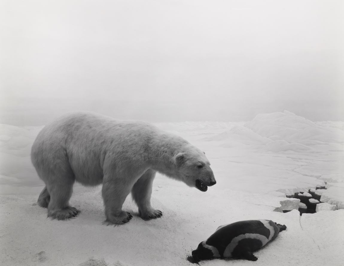
Polar Bear by Hiroshi Sugimoto (1976) © Hiroshi Sugimoto, courtesy of the artist

The Diorama photos draw attention less to the natural world than to its theatrical representation in museums. In Sugimoto’s hands what was intended by its creators to be dramatically realistic becomes eerily false. These are depictions of the unnatural world. He himself is quoted as saying these works being out a subtle fleeting sense of ‘ the fragility of existence’. They certainly give a flavour of its eeriness.

Theatres

In 1976 Sugimoto made another experiment. He set up his big old-fashioned black-and-white camera at the back of a New York movie theatre and here’s the thing – he set the exposure time not to a fraction of a second but to the length of the entire film, some two hours. The 178,000 or so frame required to project a 2-hour long movie are reduced back to one fixed image. All the dramatic action which so much work and imagination has gone into crafting is reduced to a kind of timeless essence, to a single image of radiant whiteness. Two hours of time are compressed down to the the eternity of one photographic image.

UA Playhouse, New York by Hiroshi Sugimoto (1978) © Hiroshi Sugimoto, courtesy of the artist

It’s impossible to convey, you have to see them in the flesh, but in the ten or so variations on the theme on display here the white screen at the centre of the composition glows, eerily, incandescently, ominously. Some kind of optical illusion is going on because I swear the white rectangles glowered and shimmered and seemed to overflowing the frames.

The whiteness is a kind of absence, the absence of the movie you’re used to consuming a frame at a time. But it’s also an image of excess, of the too-muchness of all those multicoloured images which have collapsed into a white glare, too much for the camera to take in, overflowing with artifice.

And, of course, on a more obvious level, the white light from the blank screens illuminates the wonderful interior architecture of these movie palaces, and part of the pleasure of the series is enjoying the different styles and decorations to be found under the one category ‘cinema’.

Drive-ins

Later the idea led to a spin-off, which was applying the same kind of prolonged exposure technique to drive-in movies. Here, while the movie is reduced to a glowing rectangle, the camera records the vapour trails of planes flying overhead and the passage of stars through the night sky. So at least three different types of time are recorded in the same image.

Union City Drive-in, Union City by Hiroshi Sugimoto (1993) © Hiroshi Sugimoto, courtesy of the artist

This in turn gave rise to a series titled ‘Opera House’ (2014) which records the fancy filigree decoration of Europe’s grand opera houses, decorative details which was copied for a long time by cinemas. And then of ‘Abandoned Theatres’ which records the many movie houses which have fallen into neglect and ruin as entertainment goes in home.

Installation view of the ‘Theatres’ series at ‘Hiroshi Sugimoto: Time Machine’ at the Hayward Gallery (photo by the author)

Portraits

In 1999 Sugimoto approached Madame Tussauds, famous home of wax portraits of the famous. The intention was similar to the Diorama series which was to imbue the utterly fake and artificial with an eerie kind of life.

Sugimoto was given permission to work at night, removing the figures from their naturalistic settings and set them against a black backdrop. He then used sophisticated studio lighting to recreate the effect of professional portrait photography, softening the reflections from the waxy skin, and highlighting the realistic fabric of their clothes.

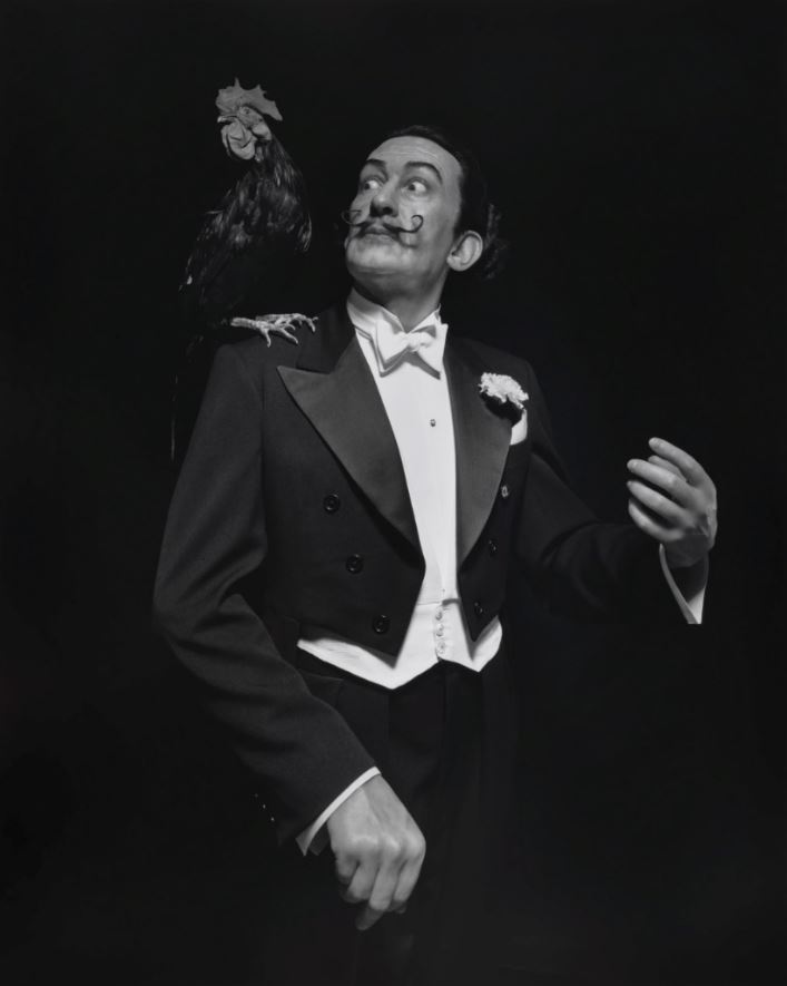
Salvador Dalí by Hiroshi Sugimoto (1999) © Hiroshi Sugimoto, courtesy of the artist

The resulting images are not quite lifelike; they achieve an eerie state of being artificially lifelike, or lifelikely artificial, a peculiar combination of contrive stage setting, poised lighting, realistic figures, gives the whole thing an eerily real unreality. Despite claims to the contrary, the camera always lies and this is a prime example. Sugimoto says: ‘However fake the subject, once photographed, it’s as good as real.’

For some reason I wrote down the full list of people given this eerie treatment, namely: Henry VIII, Anne Boleyn, Queen Elizabeth II, Queen Victoria, the Duke of Wellington, Napoleon, Fidel Castro, Yasser Arafat, Salvador Dalí, Darcey Bussell, Oscar Wilde and Princess Diana.

Diana, Princess of Wales by Hiroshi Sugimoto (1999) © Hiroshi Sugimoto, courtesy of the artist

Architecture

In 1997 Sugimoto began  another series based on a brilliant insight. As a practicing architect himself Sugimoto knows that every building starts with a germ, an idea, a sketch in the mind of its ideal shape and size. He discovered that if he took images of classic buildings deliberately out of focus then he could, in a kind of magical mystical way, recapture the initial vision behind the finished structure.

He discovered that the optimum effect was achieved by setting the focal length of his old-fashioned box camera to twice infinity which creates maximum blur. And discovered that the best buildings, or at least the biggest and most striking, survive the onslaught of this corrosive, detail-destroying approach.

Engineers have to stress test new buildings. Sugimoto subjected a selection of classic Modernist buildings to a kind of image stress test, visual stress test, conceptual stress test.

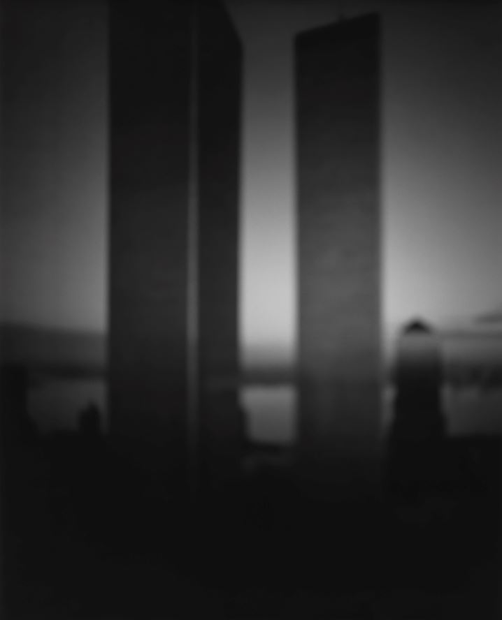
World Trade Centre by Hiroshi Sugimoto (1997) © Hiroshi Sugimoto, courtesy of the artist

With my obsessive-compulsive hat on I made a complete list of the buildings given this treatment, namely: the SC Johnson building, the Brooklyn Bridge, the Eiffel Tower, the Chapel Notre Dame du Haut, the Woodland Chapel, Barragan House, the Seagram Building, the World Trade Centre and the Chrysler Building.

You don’t need very much of a science fiction tendency to also interpret these images as the result of some kind of destruction, some kind of blurring of the pinprick precision we associate with architectural photography. Sugimoto himself suggests that they gesture towards an ‘architecture after the end of the world.’

Thus by only half the way round the exhibition we have covered the huge historical span from the dawn of man (back in the Diorama section) to the post-human age hauntingly suggested by these blurred buildings.

Installation view of the ‘Architecture’ series at ‘Hiroshi Sugimoto: Time Machine’ at the Hayward Gallery (photo by the author)

Lightning Fields

Sugimoto’s inspiration for this series came from a common technical problem in photography. Sometimes when a photographer pulls out a sheet of film from its folder the friction causes a spark of static electricity to flash across the film. This can leave a permanent scar and ruin the image. Sugimoto wondered what would happen if he set out to deliberately create such sparks.

To this end he bought a 400,000 volt van der Graaff generator. Once set up he used this to send bursts of electric charge across unexposed plates of film which was stood on a grounded metal plate. The result is the big and awesome Lightning Fields series, in effect photographs taken without a camera.

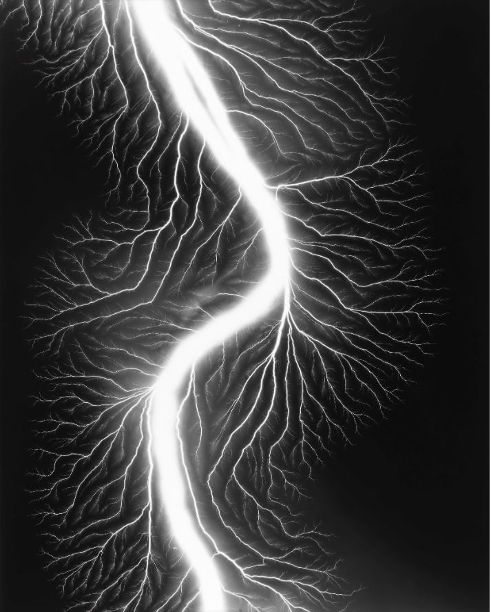
Lightning Fields 225 by Hiroshi Sugimoto (2009) © Hiroshi Sugimoto, courtesy of the artist

What do they depict, what do they resemble? It’s a Rorschach test, it can be whatever comes to mind, from a dramatic lightning strike, as the title suggests, or at the opposite end of the spectrum of life and danger, maybe depictions of tiny organisms seen under a microscope; maybe tributaries to huge meandering rivers; maybe X-rays of blood systems in strange animals.

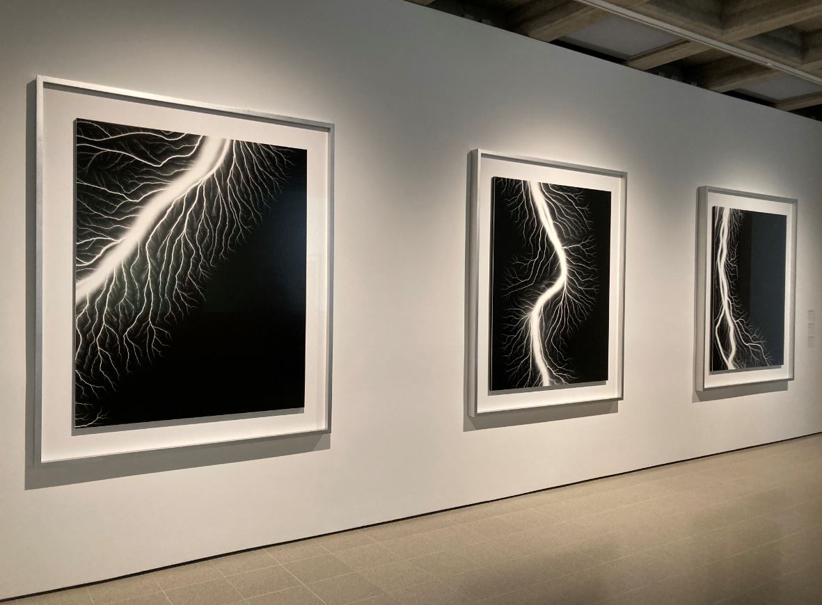
Installation view of the ‘Lightning Fields’ series at ‘Hiroshi Sugimoto: Time Machine’ at the Hayward Gallery (photo by the author)

Seascapes

Sugimoto’s series Seascapes has become particularly well known. These photos depict the horizon where sea and sky meet. There is no land to anchor the image or orientate the viewer, no indication of human existence. Just the three great timeless primeval forces, ocean and sky and – the photographer’s element – light!

Bay of Sagami, Atami by Hiroshi Sugimoto (1997) © Hiroshi Sugimoto, courtesy of the artist

Despite their apparent simplicity they have been technically challenging to make. Sugimoto erects his large-format camera on a cliff and arranges the composition so that there is even balance between sea and sky, a balance of the elements, if you like. All extraneous elements are eliminated, such as land, cliff edge, shore or beach, ships or birds. Nothing to interfere with the primeval simplicity of the imagery.

They prompt lots of comparisons such as to abstract paintings, but also to the Zen Buddhist vibe of his homeland. As I mentioned above, I found that if you go up close to them you can make out the fine susurration of the waves, just barely visible in the grey sea. Somehow, being that close and making out such delicate filigree and evanescent objects, was profoundly moving.

Sugimoto is quoted as saying they depict views that ‘are before human beings and after human beings.’ Maybe, but I prefer another quote where he says that the seascapes don’t depict the world in photographs, ‘but rather project my internal seascapes onto the canvas of the world.’ Yes. That feels right.

And the relevance to the time machine is that, if some of the diorama images take us back to the dawn of human consciousness, if the blurred buildings take us into a post-human world, if the movie theatre photos compress hours and hours of time into one single image, then the seascapes escape from time, convey the sense of a realm of timelessness, eternity, an eternity of elemental forces quite indifferent to human measurements and concerns.

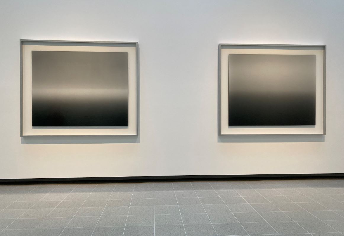
Installation view of the ‘Seascapes’ series at ‘Hiroshi Sugimoto: Time Machine’ at the Hayward Gallery (photo by the author)

Sea of Buddha

Towards the end and next to the seascapes is a room devoted to human attempts to convey timelessness, namely statues of the god of detachment, the Buddha. The photo series Sea of Buddha (1995) all depict the interior of a 12th century Buddhist temple in Kyoto.

The temple contains a thousand and one wooden statues of Kanon, the boddhisattva of compassion, seated in an almost identical pose. Having seen them Sugimoto wanted to see if he could recapture their appearance when they were brand new.

To achieve this, over a period of ten days in midsummer, Sugimoto made a series of 49 pictures. He took these each morning at dawn just as the sun rose over the eastern mountains. This first light filtered through under the eaves of the temple, momentarily illuminating the gold leaf on all of the statues, filling the gloomy temple with a golden glow.

The photos thus play with time in two ways: 1) they depict a specific moment of each day, first light, first sun; and, in a broader way 2) are an attempt to travel back in time to the glories of the temple when first built.

Sea of Buddha 049 (Triptych) by Hiroshi Sugimoto (1995) © Hiroshi Sugimoto, courtesy of the artist

Sculptures

Alongside the photographs, there’s a room of his sculptures. These turn out to be highly geometric. They came about after Sugimoto was introduced to the collection of plaster mathematical models which are used in maths and science courses at Tokyo University.

These kinds of models were developed as teaching aids in Germany at the end of the nineteenth century and are designed to give concrete tangible form to mathematical concepts. They are an aid to design and engineering students, among others.

Conceptual Forms 0003 Dini’s surface – a surface of constant negative curvature obtained by twisting a pseudosphere by Hiroshi Sugimoto (2004) © Hiroshi Sugimoto, courtesy of the artist

In fact the abstract beauty of these forms had already been spotted by Modernist artists in the 1920s and 30s, by Surrealists like Man Ray who made a series of studies. But whereas they tended to bring out the artefacts’ anthropomorphic qualities Sugimoto was interested in their architectural and monumental feel, which is why his studies are shot a) at close range and b) from below.

Hence a series of black and white studies on display here, alongside just a handful of abstract geometric shapes Sugimoto has himself designed and created.

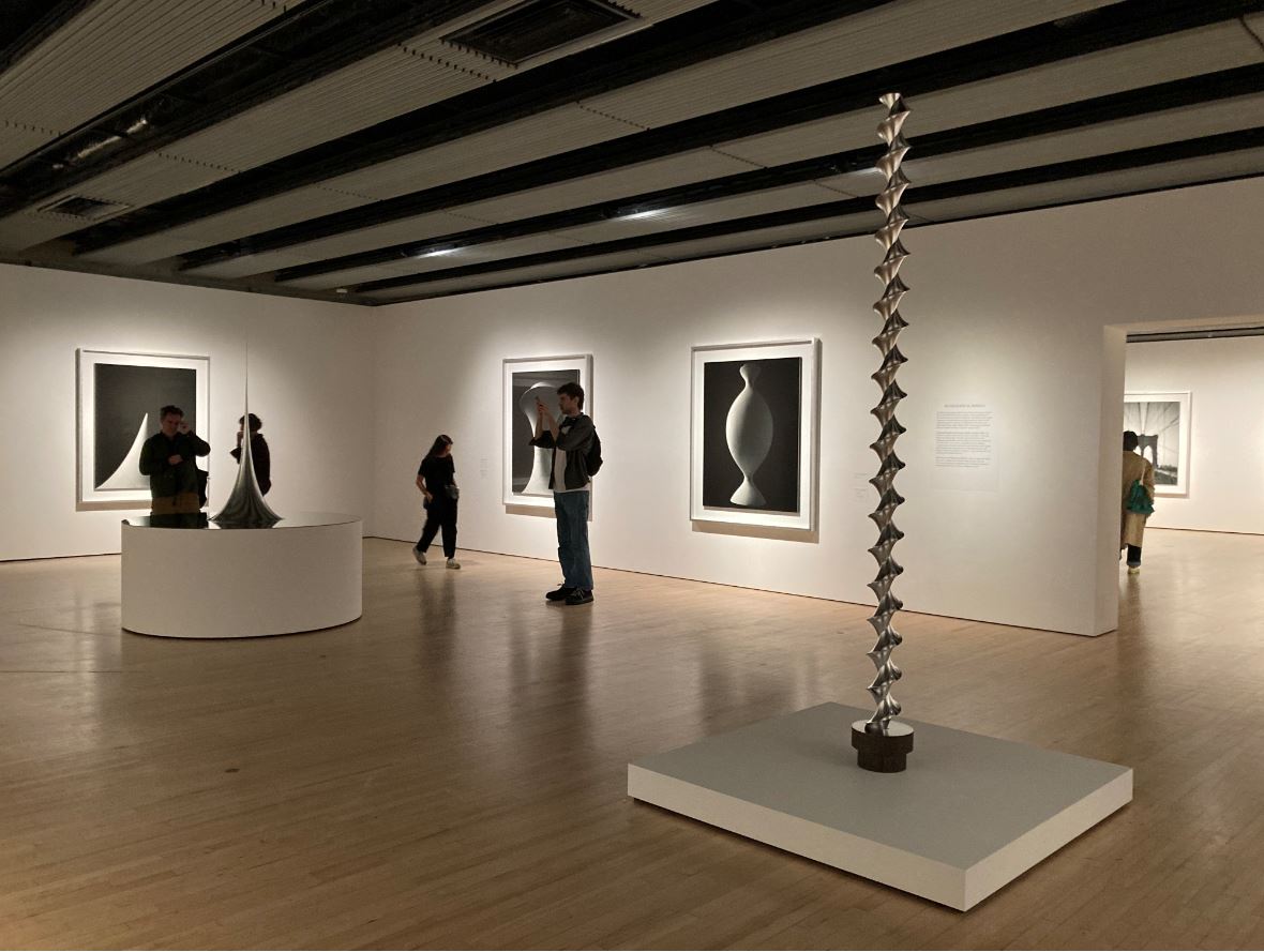
Installation view of the sculpture room at ‘Hiroshi Sugimoto: Time Machine’ at the Hayward Gallery (photo by the author)

Opticks

The exhibition builds up to a climax with gallery which for the first time displays colour images. This is  Sugimoto’s most recent series, Opticks, dating from 2018. I got chatting to one of the gallery’s visitor assistants who told me that Sugimoto was at an auction when an early edition of Sir Isaac Newton’s classic work on optics was up for sale. Sugimoto bought it and read it and found it full of interesting ideas.

Above all, Newton’s discovery and proof that natural light is not pure white but is made up of the seven constituent colours of red, orange, yellow, green, blue, indigo and violet. In 2009 Sugimoto began to investigate the practical consequences of this. After a while he realised that he wanted to dispense with ‘form’ i.e. an actual subject, altogether, and record colour, just colour, solely colour and its effects.

So in his studio he set up a massive prism which could be suspended and moved about to different heights and angles, which he used to project the shades of colour onto clean backgrounds. Then, in a break with his usual practice, instead using a big old-fashioned lens camera, Sugimoto used a Polaroid camera. The visitor assistant told me this was because Polaroid was closing down and gifted him a lot of unsold stock.

Opticks 163 by Hiroshi Sugimoto (2018) © Hiroshi Sugimoto, courtesy of the artist

Sugimoto discovered that the small format of the Polaroid allowed him to create condensed and vivid compositions of colours in their purest form. And not just Sir Isaac’s conical seven. Anyone who’s played with a prism knows there are other colours at the junction of the main ones, in fact blow the spectrum up large enough and you realise it is just that, an entire spectrum of colour.

‘The world is filled with countless colours, so why did natural science insist on just seven? I seem to get a truer sense of the world from those disregarded intracolours.’

After almost a decade of experimentation Sugimoto enlarged his Polaroid photos into huge digital chromogenic prints and it’s nine or so of these big vibrant prints which are on display here. In the flesh they are much more vivid and immediate than my rubbish photo (below) indicates, and they are hung in a room with lovely bright natural daylight. It’s a brilliant and immersive affect which almost has you believing the photographer’s claim that he has invented a new form of painting. Has he?

Installation view of the ‘Opticks’ series at ‘Hiroshi Sugimoto: Time Machine’ at the Hayward Gallery (photo by the author)

Exquisite detail

Hopefully this selection whets your appetite, but it really is worth travelling to London and paying to see the images in the flesh. It’s one thing to see them on a little screen and quite another to experience them at their proper size, four foot or more square and beckoning you into their imaginative worlds.

And the closer up you go, the more exquisite the detail you see. This is particularly true of the seascapes which look a bit boring reproduced in a blog like this. But go right up close to the real thing and you can make out the tiny, barely visible, filigree detail of the waves, the small waves lapping at the distant horizon, taking you with them out to the farthest point of the ocean. There is an exquisite Japanese attention to detail and a calm Zen poetry in all of Sugimoto’s images which reward looking closely, and then more closely still.

The video


Related link

Related reviews

Raúl Cañibano: Chronicles of an Island @ the Photographers’ Gallery

Downstairs at the Photographers’ Gallery is the print shop, whose function is to put on displays of work by contemporary or modern photographers in quality prints which are for sale. The print room is currently hosting the first UK solo exhibition for Raúl Cañibano, one of Cuba’s most famous and prolific photographers.

Malecón series: Havana, 1994 by Raúl Cañibano. Courtesy of the Photographers’ Gallery

The room contains fifteen of Cañibano’s prints (more are available to view on request) and they’re all marvellous.

Cañibano is a people’s photographer, down and dirty among peasants and workers. There’s no studio work or models or posing. He works in black and white capturing the grit and feel of life for ordinary, generally pretty poor, Cubans.

Tierra Guajira series: Manatí, 1999 by Raúl Cañibano. Courtesy of the Photographers’ Gallery

So first of all I responded to them as gritty images of the labour and enjoyments of the Cuban working classes. Only slowly did certain patterns or approaches to emerge.

There are two obvious tricks or techniques he uses. The first is the use of multiple levels. In the photo above there are, pretty obviously four levels: the old guy’s face right up close to the lens, the guy on the right swinging an axe, the horse in the middle distance, and then the mountains on the horizon. You could say these multiple levels draw you into the image, but they also emphasis the photos’ artificiality: an odd combination of the naturalistic and the heavily contrived.

Secondly, there is Cañibano’s use of shadows. In the photo below the shadow of the woman washing her hair is reasonable enough. But the shadow of the horse and rider is unexpected, suggesting all sorts of interesting stuff going on outside the frame, and adding an air of mystery, of almost symbolic power, to the image.

Vinales, Cuba, 2013 by Raúl Cañibano. Courtesy of the Photographers’ Gallery

What Cañibano’s use of both shadows and the multiple levels or depths do is to disrupt the predictability of the images. To disconcert and decentre them.

By comparison, behind the sales desk in the Print Room are photos from previous exhibitions, including some by the great Mexican photographer Manuel Álvarez Bravo. Bravo’s compositions tend to have a lovely flat, calm and classical feel. They are artfully composed.

The Daughter of the Dancers (1933) by Manuel Álvarez Bravo

Comparing the Bravo images with Cañibano’s brings out the dynamism not only of the Cuban’s subjects (all his people are generally doing things) but the dynamism of the compositions themselves, starting with the two elements mentioned above – the multiple levels and the shadows. His people are doing things, but the image is doing things as well.

Another favourite disruptive element in Cañibano’s photos is translucent fabrics. Sometimes kids are wrapping it round themselves for fun, or making a cape out of it. Or it is just there in the background or as a feature, maybe mosquito netting or fine muslin used as an awning, as in this photo which seems to be depicting age and youth, at least we think it’s a child silhouetted in the window. (Note the multiple levels: foreground, sheet, background silhouette and, very faintly in the distance, the horizon of trees.) The woman friend I went with said it reminded her of a pre-natal scan.

Raúl Cañibano, Tierra Guajira series: Manatí, 1999. Courtesy of the Photographers’ Gallery

Cañibano was born and raised in a poor family in the rural province of Las Tunas on the eastern side of Cuba. He had little formal education and worked as a welder until 1989, when a visit to an exhibition of Alfredo Sarabia’s surrealist photographs at the Fototeca de Cuba inspired him, at the age of thirty, to consider a career in photography.

It paid off. In 1999 he won the Grand Prix in the Cuban National Photography Exhibit for his project on the life of rural workers, Tierra Guajira.

Thus Cañibano had little or no formal training and picked it up as he went along. His first art photograph, depicting the shadow of an equestrian statue cut off in the middle to reveal an array of modern lamp-posts against a clear cloudless sky, established his style but also hints at his socio-political concerns.

After the collapse of communism in 1990 Cuba’s role as the pioneer of communism in Latin America lost its rationale. For generations the population had put up with travel restrictions and the shortage of consumer goods because they were told they were building a better society. Then communism collapsed. Now what? In Cañibano’s photograph the general riding his proud horse into the dream of a perfect future has been cut in half.

De su serie Ciudad (1992) © Raúl Cañibano. Courtesy of the Photographers’ Gallery

The print gallery assistant explained to me that, because of the restrictions on imports of photographic equipment into Cuba, Cañibano initially had to use expired film and materials, and didn’t have the correct printing resources to hand when starting out. So he tended to convert the negatives straight into digital images which could be stored and distributed.

And so, this year, the Photographers’ Gallery made the decision to fly Cañibano to England, bringing his precious negatives in a cigar box. Once here the negatives were turned into limited-edition silver gelatin prints in collaboration with master printer Robin Bell, who has worked with such big name photographers as David Bailey, Don McCullin and Terence Donovan. So this exhibition is a real first, creating high quality prints of Cañibano’s work, and making them available in the UK, for the first time.

All the prints are for sale, starting at £1,250 + VAT. I can’t afford anything like that but I can well imagine people who would pay that sum for a limited edition, high-quality print of one of these wonderful, vivid and evocative images.

Malecon Habanero, Cuba, 2006 by Raúl Cañibano. Courtesy of the Photographers’ Gallery


Related links

More Photographers’ Gallery reviews

Dave Heath: Dialogues with Solitudes @ the Photographers’ Gallery

‘The fact that I never had a family, a place or a story that defined me, inspired a need in me to join the community of mankind. I did so by inventing a poetic form linking this community, at least symbolically, in my imagination, through this form.’
(Dave Heath)

This is the first major UK exhibition dedicated to the work of American photographer Dave Heath (1931 to 2016).

New York City, 1960 by Dave Heath © Dave Heath / Courtesy of Howard Greenberg Gallery, New York, and Stephen Bulger Gallery, Toronto

New York City, 1960 by Dave Heath © Dave Heath / Courtesy of Howard Greenberg Gallery, New York, and Stephen Bulger Gallery, Toronto

Heath started taking photos towards the end of his stint in the Korean War (1950 to 1953). All his photos from Korea ignore battlefield heroics, firefights, explosions and hardware – instead showing the average grunt as isolated individuals caught in moments of thought, looking down, looking sad.

Korea, 1953 by Dave Heath © Dave Heath, Courtesy Howard Greenberg Gallery, NYC

Korea, 1953 by Dave Heath © Dave Heath, Courtesy Howard Greenberg Gallery, NYC

And this is the sensibility he brought back to civilian life. Of the 109 photos on display here, I only saw three where the subject is smiling or laughing. The other hundred and six show individuals or couples looking moody, intense, sullen, lost in thought. Inhabitants of solitude. Aficionados of introspection.

Elevated in Brooklyn, New York City, 1963 by Dave Heath © Dave Heath / Courtesy of Howard Greenberg Gallery, New York, and Stephen Bulger Gallery, Toronto

Elevated in Brooklyn, New York City, 1963 by Dave Heath © Dave Heath / Courtesy of Howard Greenberg Gallery, New York, and Stephen Bulger Gallery, Toronto

Even the handful of photos which aren’t of people, but of buildings or the sidewalk, manage to make them look lost in thought and downbeat. The result is tremendously atmospheric if, on occasion, a bit samey.

Biography

The downbeat tone was set early in Heath’s life. He was born in Philadelphia in 1931 to very young parents who abandoned him at the age of four after which he was sent to a series of foster homes before being placed in an orphanage. From then on he carried a sense of loss and abandonment which he projected, very successfully, onto everything around him.

Heath became interested in photography as a teenager, and joined an amateur camera club. He read the photo essays in Life magazine and cites one in particular as having a decisive impact on his future. Bad Boy’s Story by Ralph Crane depicted the emotional experiences of a young orphan not unlike young Heath.

In a flash Heath realised that photography could be a means of self-expression, a way of shaping the external world to fit his experiences, and a way of connecting to others.

In his early twenties he set about becoming an expert in photographic techniques, taking courses in commercial art, working in a photo processing lab, and studying paintings at the Philadelphia Museum of Art. His stint in the army as a machine gunner interrupted his career for a few years, but crystallised his approach to subject matter, his skill at capturing a wide range of people in moments of thought and vulnerability.

On his return, Heath developed this aptitude for capturing an ‘inner landscape’, seeking out the lonely and lost and fragile on the streets of big city America. Most of the photographs on display here were taken on the streets of Chicago and New York (where he moved to in 1957).

Heath’s subjects seem eerily detached from their physical context, shot either singly or in couples, but always intensely aware of – almost physically projecting – their isolation.

Washington Square, New York, 1960 by Dave Heath © Dave Heath / Collection Torosian, courtesy Howard Greenberg Gallery, New York, and the Stephen Bulger Gallery, Toronto

Washington Square, New York, 1960 by Dave Heath © Dave Heath / Collection Torosian, courtesy Howard Greenberg Gallery, New York, and the Stephen Bulger Gallery, Toronto

Heath is quoted as saying:

My pictures are not about the city but from the city. I’ve always seen it as a stage and I’ve always seen the people in the streets as being actors, not acting out a particular play or story, but somehow being the story itself…

It would be wrong to think that all his photos are close-ups of alienated individuals or couples. There’s more variety than that. At the busy end of the spectrum there’s a photo of a crowd gathering round a policeman in Central Park guarding the spot where a suicide has been discovered. At the other end of the spectrum, sometimes he picked out just details, lost property, street detritus, close-ups of parts of people’s bodies, which manage to convey a tremendous sense of loss and abandonment.

California, 1964 by Dave Heath © Dave Heath / Courtesy of Howard Greenberg Gallery, New York, and Stephen Bulger Gallery, Toronto

California, 1964 by Dave Heath © Dave Heath / Courtesy of Howard Greenberg Gallery, New York, and Stephen Bulger Gallery, Toronto

Heath’s photos capture that eerie moment in American history just before the 1960s exploded, just around the time JFK was assassinated and Civil Rights began to become an enormous, society-sundering issue and then, of course the growing opposition to the Vietnam War.

He had always been interested in exploring how individual photos could be tied together into sequences which created something larger than the sum of its parts. Heath once wrote that ‘the central issue of my work is sequence’ and thought that the rhythm of images arranged in collages or montages created a deeper and more complex psychological state than a single image.

A master printer – so good that other photographers asked him to make their prints for them – Heath also crafted handmade books and experimented with multimedia slide presentations. All this thinking and experimentation culminated in the book which is considered his masterpiece, A Dialogue with Solitude, published in 1965.

A Dialogue With Solitude

A Dialogue with Solitude was conceived in 1961 but not published till 1965. Heath chose 82 of his best or most characteristic photographs taken between 1952 and 1962 and grouped them into ten chapters dedicated to variations on the theme of solitude, being: violence, love, childhood, old age, poverty, war, race and death.

Each one is preceded by a short quote from a literary giant including: Matthew Arnold, James Baldwin, T.S. Eliot, William Hazlitt, Herman Hesse, Rilke, Yeats and so on. In other words, all the names you’d meet in a basic undergraduate course in comparative literature – or at least before the explosion of feminist and black and queer studies added a lot more women and marginalised writers to the canon.

The book is commemorated here by a wall-seized display which places scores of photos next to the bookish quotes, to create a sort of immersive visual and literary experience.

Installation view of Dave Heath: Dialogues with Solitudes at the Photographers Gallery, showing the wall-sized display of photos and texts from the book, Dialogue with Solitude. Photo by the author

Installation view of Dave Heath: Dialogues with Solitude at the Photographers Gallery, showing the wall-sized display of photos and texts from the book, Dialogue with Solitude. Photo by the author

In the opinion of the writer whose wall label accompanies this display, Francesco Zanot:

The primacy of montage and sequencing in Heath’s work is made obvious. The result has nothing to do with linear narration, but rather resembles a vast poem, rhapsodic and tormented. Heath merges together on the space of a page references as refined as they are distant from one another. The book, then, becomes the ideal medium by which to carry out a reflection both through and upon photography.

Thoughts

I liked the Korean War photos best. Soldiers in a war really have got something to be pissed off about. Guys lying on their bunks or sitting on a crate smoking a fag reminded me of all the crappy labouring jobs I’ve had, and how it feels when you get a break and five minutes to just sit staring into space, too tired to think about anything, too tired or too mind numblingly bored to say or do or think anything.

The photos of sad people in Philadelphia and Chicago and New York are undoubtedly atmospheric and poignant, beautifully composed and printed with a grainy effect that carries the viewer back back back to a historic era.

And yet… and yet…. I think I’ve seen too many photographs of unhappy Americans recently – the hundred or more photos by Diane Arbus currently at the Hayward Gallery, or the long career of Dorothea Lange devoted to documenting American misery and injustice, celebrated at the Barbican last summer, or the enormous brightly coloured images of alienation and being lost in the crowd created by Alex Prager.

Upstairs at the Photographers’ Gallery, right now, the works of Mark Ruwedel don’t feature any people but they, also, convey a tremendous sense of loss and abandonment via pictures of run-down shacks in the desert or the abandoned sites of military tests.

Abandonment, loneliness, isolation, solitude, unhappiness. These seem to be the default subjects of American art photographers.

Washington Square, New York City, 1960 by Dave Heath © Dave Heath / Courtesy of Howard Greenberg Gallery, New York, and Stephen Bulger Gallery, Toronto

Washington Square, New York City, 1960 by Dave Heath © Dave Heath / Courtesy of Howard Greenberg Gallery, New York, and Stephen Bulger Gallery, Toronto

Independent movies

Off to one side of the main display rooms is a dark room where you can watch clips from cult independent films from the 1960s, contemporary with Heath’s works, which also focus on theme of solitude. These include:

1. Portrait of Jason by Shirley Clarke (1966), Jason being ‘a gay African-American hustler and aspiring cabaret performer’.

2. Salesman by Albert and David Maysles and Charlotte Mitchell Zwerin (1968) a creepy depiction of slimy American salesman.

3. The Savage Eye by Ben Maddow, Sidney Meyers and Joseph Strick (1960)

Interview with Senior Curator, Karen McQuaid

Curators

  • Curated by Diane Dufour, Director of LE BAL.
  • Senior Curator for the Photographers’ Gallery, Karen McQuaid

Related links

More Photographers’ Gallery reviews

More photography reviews

Taylor Wessing Photographic Portrait Prize 2017 @ the National Portrait Gallery

Introduction

Every year the National Portrait Gallery holds an exhibition displaying the 60 or so photographs which made the shortlist for the international Taylor Wessing Photographic Portrait Prize, a leading international photographic portrait competition.

5,717 photos were entered for the 2017 competition, from a total of 2,423 photographers, based in 66 countries. The exhibition of this top 60 opened in mid-November and continues until 8 February.

A first, second and third prize are awarded, along with the John Kobel prize for best work by a photographer aged under 35.

This is the third year when they’ve also had an ‘In Focus’ feature, profiling a specific photographer. This year it is Todd Hido, an American photographer represented by four big studio shots of women.

I guess there are several ways to approach an exhibition like this. Since it happens every year, you could compare it with last year’s and the year before’s exhibitions with a view to spotting changing trends and developments. Alas, I don’t have a firm enough grasp of previous years to do that.

If you’re a photography buff you will be interested in technique or device, for example the use of digital versus film photography, or the use of new lenses, maybe new ways of using light and shadow, of composition etc. Alas, I know next to nothing about cameras. But also, the information panels next to each photo, often four or five paragraphs long, give little or no technical information but instead focus on the psychology, the mood and feel of the photos, and often discuss the ‘issues’ they raise or ‘investigate’.

You can just saunter round seeing what takes your fancy – which plenty of people were doing on the day I visited, including a gaggle of junior school children who were having a great time being asked by their teachers what they liked and why.

Or you could regard it as what Roland Barthes called a corpus, a body of work to be analysed, a set of 60 photographs to be analysed as a group or cohort, finding themes and patterns in it, maybe hazarding a guess at how it indicates ‘signs of the times’ and the ‘Zeitgeist’.

In this respect, it was notable that two of the three prizewinning photos addressed the issue of refugees and war.

Amadou Sumaila by César Dezfuli © César Dezfuli

Amadou Sumaila by César Dezfuli © César Dezfuli

First prize went to César Dezfuli for his portrait of a migrant rescued in the Mediterranean off the Libyan coast. His photo is of Amadou Sumaila, a sixteen-year-old from Mali, who’s just been plucked from a refugee boat by an Italian rescue vessel and is looking understandably troubled. César received £15,000 for his photograph, I wonder how much Amadou got.

Second prize (£3,000) went to Abbie Trayler-Smith for her photograph of a girl fleeing ISIS in Mosul, Iraq. Abbie, a former BBC producer, was working for Oxfam at the Hasan Sham displaced persons camp in Iraq, documenting the charity’s work helping people fleeing ISIS. A bus was bringing in people who had, only hours earlier, been in a battle zone. For me this was probably the best photo in the show, in the sense of the deepest and most haunting image, the streaks of sand left by rainwater trickling down the bus window contrasting with the detached beauty of the woman’s face.

Fleeing Mosul from the series Women in War: Life After ISIS by Abbie Trayler-Smith © Abbie Trayler-Smith

Fleeing Mosul from the series Women in War: Life After ISIS by Abbie Trayler-Smith © Abbie Trayler-Smith

But these two were the exceptions – there weren’t many other photos from combat zones, trouble spots or areas of distress e.g. Afghanistan, Iraq, Syria, Somalia, Yemen or Bangladesh. Periodically I flick through the couple of books I have by war photographer Don McCullin. There was nothing that intense or first hand here. Surfing through the websites of the featured photographers I came across some tough images by Adam Hinton of street gangs in El Salvador and the ruins of Kiev. There was nothing that gritty on display here.

Also, I happen to have recently visited the Tate Modern exhibition about Russian revolutionary art, a lot of which – films, photos and posters – depicts the proletariat and peasants at work, in fields, in factories, driving combine harvesters or sweating near blast furnaces. In this whole exhibition I think there was only one photograph of a person actually working, a black guy in South Africa holding a garden strimmer.

And despite two shots of boys in football strip, there were no shots of sports actually taking place, or in fact of any activities at all. A guy washing his feet in a sink. A mother in a natural pool with her baby and son. Four ladies holding floats in a swimming pool. That’s about as energetic as it got.

Maybe portraits have to be static. But can’t you have portraits of people doing something? Most of the photos here seemed posed and passive, exuding calm and poise. Take the third prize, which went to Maija Tammi from Finland for her portrait of a Japanese android called Erica. Android!? Yes, Erica is a robot made by Japanese scientists. Tammi had half an hour in the lab with Erica and one of her designers to take photos of the (disturbingly lifelike) android. The curators claim the photo ‘addresses issues’ of human versus robot etc, but for me, as an image, its main quality is its supreme calm and placidness.

One of Them Is a Human #1 by Maija Tammi (Erica: Erato Ishiguro Symbiotic Human-Robot Interaction Project) © Maija Tammi

One of Them Is a Human #1 by Maija Tammi (Erica: Erato Ishiguro Symbiotic Human-Robot Interaction Project) © Maija Tammi

Static

Quite a few of the photos just showed people in static positions, posed face-on to the camera or only slightly turned and positioned. Take, for example, the two photos from Owen Harvey’s series of Skins and Suedes. This one combines teenage surliness (‘Who you lookin’ at?’) with vulnerability, a kind of tough helplessness. Fine – except that quite a few of the other photos in the exhibition use exactly the same pose and approach.

Chelsea, Skinhead, Hyde Park, London, from the series Skins & Suedes by Owen Harvey 2017 © Owen Harvey

Chelsea, Skinhead, Hyde Park, London from the series Skins & Suedes by Owen Harvey 2017 © Owen Harvey

Some of them were very static indeed, posed with a kind of deliberately geometric sterility.

Anna and Helen, Blue Earth County Fair, Minnesota, 2016 by R. J. Kern 2016 © R. J. Kern

Anna and Helen, Blue Earth County Fair, Minnesota, 2016 by R. J. Kern 2016 © R. J. Kern

The overwhelming vibe of the show was of this placid, sterile, posed, numb effect. Maybe this is a ‘sign of the times’.

American dominance

This latter photo brings us to the issue of America’s representation in the show.

Since the introduction makes much of numbers – 5,717 photos submitted etc – I did a little counting of my own. Of the 60 or so photos on display, no fewer than 22 are from or about America – starting with Todd Hido’s four studio portraits.

There’s a whole wall of six or so American political photos, including ones of Trump, Obama and Hillary Clinton – the latter a worryingly big close-up of the lady in full campaign mode, reminding us of her hawkish foreign policy record, and that she is 70 years old (albeit younger than Trump, 71, or Bernie Saunders, 76: America the Gerontocracy).

Campaign #1 Hillary Rodham Clinton, West Palm Beach, FL from the series Ambition, Charm, and the Will to Power by Alan Mozes 2016 © Alan Mozes

Campaign #1 Hillary Rodham Clinton, West Palm Beach, FL from the series Ambition, Charm, and the Will to Power by Alan Mozes 2016 © Alan Mozes

These figures of power were placed next to a pair of photos of poor women taken against, or rather through, the metal grilles of part of the wall between the US and Mexico, as well as shots of blue collar Trump supporters, a teenage American gun fan, and so on.

The very first photo in the exhibition is by an American of a classic American subject – two drum majorettes caught in a casual moment. There’s a shot of a young black guy posed on a horse, a stylishly dressed black girl on Venice beach, the naked mum in a pool in Idaho. There, in other words, are lots of Yanks in this show.

This latter photo (below) is striking because it is, for this show, an unusually dynamic composition, the outstretched arm and leg making striking diagonal lines and the swimming boy nearly making three sides of an X shape. It is a rare example of a relatively unposed photo, the woman reaching for her glasses (are they glasses) giving it an air of precariousness and risk missing from almost all the other works here.

Jennifer, Lur, and Emile, Warm Spring Creek, Idaho from the series Water's Edge by Matthew Hamon 2016 © Matthew Hamon

Jennifer, Lur, and Emile, Warm Spring Creek, Idaho from the series Water’s Edge by Matthew Hamon 2016 © Matthew Hamon

Having brought up two children since they were babies, I wasn’t charmed by this image of primal innocence (if that’s the intention): I was mainly worried about the safety of the baby!

Anyway, health and safety aside, my point is: how come so many Americans?

The US population is 323 million, just 4.25% of the global population of 7.6 billion. Why, then, were over 30% of the photos in this international competition by or about Americans?

Maybe because we in Britain are so drenched in Americana, through movies, TV shows, pop and rock and country music and so on, through the voices of academics and journalists on radio and TV, that we half believe these images and icons are ours. We somehow believe that we have a special claim on, or connection with, American culture. Maybe this is why British intellectuals get so very cross about Donald Trump almost as if he’s president of our country, and we hear so much about American domestic policy, about its race relations, or its abortion clinics, or the endless coverage of every new scandal from Hollywood, as if it directly affects us in Clapham and Cleethorpes and Clovelly.

Or maybe America is just so big and rich that it has a disproportionately large number of well-educated graduates of art and photography courses, plus an enormous network of magazines of all shapes and sizes and styles, and competitions and prizes and money – an entire ecosystem which can sustain tens of thousands of photographers. And so the quality of the best American photographers just is among the best in the world, and so they just deserve to dominate every international photography competition.

George S. Texas 2016 from the series "Age of Innocence" Children and guns in the USA by Laurent Elie Badessi 2016 © Laurent Elie Badessi

George S. Texas 2016 from the series Age of Innocence: Children and guns in the USA by Laurent Elie Badessi 2016 © Laurent Elie Badessi

Having counted the number of photos with American subject matter, I then turned to examine the list of photographers. I counted 51 photographers, responsible for 62 photographs (see below for a complete list of photographers and how many photos they have in the show). Of those 51 photographers, 31 are British and 9 are American. I.e. 40 out of the 51 photographers in the exhibition (78%) are British or American.

This is a bit disappointing. What about China (pop. 1.4 billion), India (pop. 1.3 billion), Indonesia or Brazil? And although it’s less populous (144 million), I always wish there was more coverage of Russia in shows like this, Russia being the largest country in the world, with its vast Siberian hinterland occupied by all sorts of interesting tribes and ethnic groups.

Considering that China will become the economic powerhouse of the world, and Putin’s Russia presents a distinct threat to the West, in both military and digital terms, I think the more we see and understand about these countries and their people the better; and so – fairly or unfairly – I can’t help thinking that supposedly ‘global’ competitions which don’t adequately represent them are missing a trick.

Maybe the disproportionately high number of British and American entrants is for the simple reason that the competition is well publicised in these countries, which after all have a large cultural overlap. Maybe the competition is just not very well promoted in other countries (even in other Anglo countries like Canada, Australia, New Zealand, which didn’t have any representatives here). Maybe the Anglo bias of the show reflects the difficulty of publicising it elsewhere.

All I know for sure is that, against this Anglocentric backdrop, the handful of colourfully non-Anglo subjects really stood out.

Kijini Primary School students learn to float, swim, and perform rescues in the Indian Ocean off of Mnyuni, Zanzibar by Anna Boyiazis, 2016 © Anna Boyiazis

Kijini Primary School students learn to float, swim, and perform rescues in the Indian Ocean off of Mnyuni, Zanzibar by Anna Boyiazis, 2016 © Anna Boyiazis

Cool photo. By an American, though.

Humour

Not many people in these photos are smiling let alone laughing. Just like in last year’s BP Portrait Award show (for painted portraits), happiness seems to be verboten. Maybe it’s a function of the highly posed nature of most of the photos: the subjects obviously felt they had to be on their best behaviour.

Green chalk stripe suit from the series You Get Me? by Mahtab Hussain 2017 © Mahtab Hussain

Green chalk stripe suit from the series You Get Me? by Mahtab Hussain 2017 © Mahtab Hussain

Having recently read a few books about Surrealism my head is also full of bizarre images created by yoking together unexpected juxtapositions, as in the numerous cutouts and collages of Max Ernst.

Only one photo of the 60 or so here really played at all with these possibilities of photography as a medium. Typically, it was not only a) American but b) very earnest.

It represents the experience of Swedish photographer Alice Schoolcraft who visited her American relatives only to discover that they were Bible-thumping, gun-toting Republicans, and particularly fond of their German Shepherd dog. Hence this photomontage which, I felt, was neither as weird or as convincingly photoshopped as it ought to be.

Halo from the series The Other Side by Alice Schoolcraft 2017 © Alice Schoolcraft

Halo from the series The Other Side by Alice Schoolcraft 2017 © Alice Schoolcraft

Women’s bodies

Women appear to be much more interested in their bodies than men are in theirs, as facts and figures from GPs, hospitals, pharmacies, the fashion and beauty industries, and anecdotal evidence, all suggest. Probably because women’s bodies are so much more interesting than men’s bodies, dominated as they are by the great fact of childbirth, which overshadows women’s lives – from the advent of menstruation to the onset of the menopause, via a lifetime worrying about contraception, with maybe one or more pregnancies to live through, babies to deliver in agony, and then the long, wearing years of child rearing.

All this to cope with before you even consider the non-stop pestering and objectifying by boys and men, and the great weight of social pressure to conform, be polite and submissive, dress well and look good at all times. What a nightmare!

These thoughts were prompted by the fact that buried in the show is an unobtrusive strand about girlhood, womanhood, motherhood and old age. I wonder if the organisers knew it was there – it would be nice to think it was a very subtle piece of thematic planning. But deliberate or not, ten or so of the pictures could be arranged to form a kind of ‘life cycle of a woman’. They kick off with this graphic photo of childbirth.

Sophie's first breath by Sean Smith 2017 © Sean Smith

Sophie’s first breath by Sean Smith 2017 © Sean Smith

I’ve referred to the photo of the mum swimming with a baby, above, which stands for babies and toddlers. Next in this ‘life cycle’ would come photos showing:

  • a pre-pubescent girl in a swimsuit in a poolside shower
  • a clutch of sulky punk girls from London’s streets (the third photo in this review)
  • the stylish young black woman in torn jeans posing on Venice beach

Then there’s another medical shot, focusing on a specifically female condition – a photo of a woman’s stomach indicating operations resulting from her endemetriosis. In fact it’s the photographer’s own body, Georgie Wileman having suffered from this horrible condition and turned her plight into a photographic project.

Early in my career I produced and directed a dozen medical videos which involved researching some pretty horrible conditions, looking at hundreds of photos of disfigured bodies, and filming a number of surgical procedures (the operation to treat piles was probably the most gruesome). This disabused me of any naive innocence about the human body. All of us, no matter how young and beautiful, are medical patients in waiting.

2014 - 2017 from the series Endometriosis by Georgie Wileman 2017 © Georgie Wileman

2014 to 2017 from the series Endometriosis by Georgie Wileman 2017 © Georgie Wileman

In terms of thinking about themes and trends, this photo made me realise that there is probably a whole modern genre here, the ‘Woman’s body as a medical battlefield’ genre. In the past people wrote books about ‘The Nude’. Nowadays you could fill a book with art photos of women’s bodies after mastectomies, caesarian sections and so on.

Further on in the exhibition, a photo of a family picnic on Southwold beach can be taken as symbolising motherhood and middle age, all making sandwiches and the school run.

And, to complete the cycle, tucked away among other, brasher photos, is an unobtrusive but moving picture of an old woman dying.

I found this hard to look at since it reminded me too much of holding my own mother’s hand as she passed away in a cold, white hospital room. The lifeless white hair. The skin like parchment.

Untitled from the series Mother by Matthew Finn 2016 © Matthew Finn

Untitled from the series Mother by Matthew Finn 2016 © Matthew Finn

Once I’d noticed this women’s life cycle – almost like one of Hogarth’s moral tales – the many photos of lads and men alongside them seemed callow and trite by comparison. Maybe these reflect the way many boy’s and men’s lives are indeed a succession of shallow thrill-seeking, dares and accidents. Fast cars, football and fags.

A number of the photographers here seemed to have had the idea of focusing on teenage boys, hanging out, smoking tabs, wondering how much that camera’s worth. I grew up among lads like this, so I liked this strand. ‘Oi mate, want some blow?’ Is he a nice boy who loves his Mum – or is he about to stab you? ‘Teenagers’ was another noticeable theme of the exhibition.

Kieran from Bolton aged 18 from the series Blackpool 2016 by Adam Hinton 2016 © Adam Hinton

Kieran from Bolton aged 18 from the series Blackpool 2016 by Adam Hinton 2016 © Adam Hinton

Artists

And smoking brings us neatly to a little suite of photos of creative types. To be precise, there are photos of two artists and a writer in the show:

The Sunday Times columnist A.A. Gill is photographed in his Chelsea garden in the advanced stages of the cancer that was shortly to kill him. He was a recovering alcoholic who, at one point, smoked 60 tabs a day. He died of lung cancer.

The popular but critically slated painter Jack Vettriano is photographed looking grey-haired and gaunt in his home in Battersea having only recently, the wall label tells us, recovered from his chronic alcoholism. Also a heavy smoker.

But my favourite was a cracking photo of artist Maggi Hambling CBE, aged 72 and still smoking like a trooper. Here she is in the garden of her home in Suffolk. She insisted on smoking throughout the shoot and, apparently, got through a pack and a half of fags before the photographer had the bright idea of setting up a smoke machine to give the surreal impression that her ciggies are blotting out the entire landscape. Maybe I liked it because it’s virtually the only humorous photo in the show.

Maggi Hambling by Harry Cory Wright 2016 © Harry Cory Wright

Maggi Hambling by Harry Cory Wright 2016 © Harry Cory Wright

I was mildly interested to read who the judges were:

  • Dr Nicholas Cullinan, Chair (Director, National Portrait Gallery, London)
  • Dr David Campany (Writer, Curator and Artist)
  • Tim Eyles, Managing Partner, Taylor Wessing LLP
  • Dr Sabina Jaskot-Gill (Associate Curator, Photographs, National Portrait Gallery, London)
  • Fiona Shields (Head of Photography, The Guardian)
  • Gillian Wearing (Artist)

50% women – but no black or Asian judges. Blackness is seen via white photographers selected by white judges. But then that does seem to be par for the course for London galleries (see my blog post on Women and ethnic minorities in the art world).

Conclusion

If you’re interested in photography this is an excellent snapshot of work from around the world (well, by Americans and Brits who travel round the world).

All of the photos are technically very finished, well lit, focused, clear and crisp.

A handful (the winners) are really stunning.

I found the American presence oppressive, maybe other people will like it.

I detected a hidden theme of womanhood; maybe other visitors will find other themes. (The winning photo of César Dezfuli suggests the theme of migrants, emigrants and refugees, with quite a few shots of British or American blacks and Asians finding their place in the predominantly white culture and – on the anti-immigrant side – photos of Trump and his supporters – there’s enough material here to write an essay just on this very timely theme – but this review is long enough already).

If my review comes over as dismissive, I don’t intend it to be: I found the show fascinating in all kinds of ways and, more tellingly, I’ve found its effects lingering on. Following up the three prize winners and some of the others via the internet has opened my eyes to the dazzling world of contemporary photography. In this respect the exhibition can be used as a valuable gateway, as an introduction and incitement to explore further.

Having looked, read and thought carefully about all 61 photos, maybe the biggest take-home message is:

Smoking is really, really bad for you.

List of photographers

  • Abbie Trayler-Smith, UK (1 photo)
  • Adam Hinton, UK (2)
  • Alan Mozes, USA (2)
  • Alejandro Cartagena, Mexico (2)
  • Alice Schoolcraft, Sweden/USA (1)
  • Alva White, UK (1)
  • Alys Tomlinson, UK (1)
  • Anna Boyiazis, USA (1)
  • Baud Postma, UK (1)
  • Benjamin Rasmussen, USA (1)
  • Camille Mack, UK (1)
  • Catherine Hyland, UK (2)
  • César Dezfuli, Spain (1)
  • Charlie Bibby, UK (1)
  • Charlie Clift, UK (1)
  • Cian Oba-Smith, UK (1)
  • Cig Harvey, UK (1)
  • Craig Bernard, UK (1)
  • Craig Easton, UK (2)
  • Danny North, UK (2)
  • Davey James Clarke, UK (1)
  • David Vintiner, UK (1)
  • Debbie Naylor, UK (1)
  • Georgie Wileman, UK (1)
  • Hania Farrell, Lebanon/UK (1)
  • Harry Cory Wright, UK (1)
  • Ian McIlgorm, UK (1)
  • Joel Redman, UK (1)
  • Jon Tonks, UK (1)
  • Keith Bernstein, South Africa (1)
  • Kurt Hörbst, Germany (2)
  • Laurence Cartwright, UK (1)
  • Laurent Elie Badessi, France (1)
  • Mahtab Hussain, UK (1)
  • Maija Tammi, Finland (1)
  • Matthew Finn, UK (1)
  • Matthew Hamon, USA (1)
  • Mitchell Moreno, UK (2)
  • Monika Merva, USA (1)
  • Nancy Newberry, USA (1)
  • Natasta Alipour-Faridani, UK (1)
  • Owen Harvey, UK (2)
  • Paola Serino, Italy (1)
  • R. J. Kern, USA (1)
  • Richard Beaven, USA (1)
  • Sean Smith, UK (1)
  • Simon Urwin, UK (1)
  • Thom Pierce, UK (1)
  • Todd Hido, USA (4)
  • Tom Craig, UK (1)
  • Tommy Hatwell, UK (1)

Caveats

This list is taken from promotional material given out by the NPG press office; it may not be 100% complete. 2. Nationalities are as per the photographers’ entries on the internet; some of these, again, may not be 100% accurate (i.e. someone might have been born in one country and changed nationality). I apologise for any errors and will correct any, if pointed out to me.


Related links

More National Portrait Gallery reviews

More photography reviews

Shaped by War by Don McCullin (2010)

I felt I was in the right place at the right time. I had an almost magnetic emotional sense of direction pulling me to extraordinary places.
(Shaped by War, page 37)

In 2010 the Imperial War Museum held an exhibition of the war-related photos of Don McCullin. This is the large-format, coffee table book of the exhibition. It features a lot of his best-known work but also a number of previously unpublished photos, alongside some of his less well-known colour photos, and documentary records of his numerous trips, including passport photos and the covers of the magazines the work ended up appearing in. The final pages feature a selection of the powerful black-and-white photos he’s been taking more recently around his home, a renovated farmhouse in Somerset.

Many of the wars are introduced with explanations of the situations Don flew into and what he observed there, and so this handsome book amounts to an autobiography told through pictures of war. It’s divided into five sections:

  1. Early years 1935 to 1957
  2. Discovering photojournalism 1958 to 1966
  3. The Sunday Times 1967 to 1978
  4. Changing Times 1976 to 1983
  5. A new direction 1983 to 2009

The photos are printed large and on good quality glossy paper. They come across much powerfully than in his autobiography, Unreasonable Behaviour. The bigger pages, and gloss shine, makes a surprising difference.

I’ve read criticism of this book about the way that many of the photos are shown in the context of the original newspaper or magazine pages where they were first published. But, for me, seeing the yellowed pages of old Sunday Times magazines, and the words that journos and sub-editors have put round them, vastly increases their impact. Plus there’s an element of nostalgia for me, as I began to read newspapers in the early 1970s and so the layout and typefaces and picture quality reminds me of my youth.

The inclusion of the original magazine spreads also reminds you that McCullin was a jobbing photographer, going to sometimes extraordinary lengths to get the shot that conveyed a situation, a plight, a crisis. Not an artist. He is very insistent about this. Commenting on his single most famous image, the shell-shocked American soldier at Hue in Vietnam, he comments:

There’s an iconic look about it and you have to be careful about icons, because they can border on art. I have to be mindful about playing that card because I don’t want to be associated with art. I’m a photographer. I’m a photojournalist or whatever you want to call me. But I don’t belong to the world of art. (p.82)

Below are links to some of the images in the book. After an opening sketching out McCullin’s very tough, deprived childhood in squalid Finsbury Park, each section of the book has introductory text explaining the background to the war in question, as well as anecdotes about how he got to the scene, what he witnessed, the struggle to get the defining shot. There are also memories of colleagues he worked with, quite a few of whom died along the way, highlighting how many times he just made it, was lucky, avoided bullets, shells and grenade while those about him were not so lucky.

Another notable thing about the book is the number of colour photos, from a man known mainly for his preference for black and white. The coloured ones are just as good.

The photos are grim and powerful but what comes over most from the text is how much he is now ashamed, embarrassed and even disgusted at the way he sometimes behaved, at the situations he found himself in, at the continual nagging feeling that he was exploiting people and their terrible suffering.

I’m ashamed of it, of all the things I’ve seen in my life, all the blood, all the burnt children. I’m disgusted with the whole business. (p.160)

Which begs the question – How should we feel? The people who buy and look at these photos for ‘pleasure’?

The short last section concludes with a few of his landscapes and still lifes: louring photos of the Somerset countryside around his farmyard home, and still lifes he has carefully arranged, unique combinations of traditional English flowers and fruits with artefacts brought back from his travels.

He only photographs the landscapes in winter. He likes the skeletal structure of the trees and the spareness of the landscape. Also, he dislikes it if people compare the landscapes to war photos or imply they contain the psychological damage of his war experiences.

I like my landscape photographs to have the most perfect composition, because I want them to be kind on the eye. I want you to fall in love with them. You’re not going to love one of my war photographs, because they were never made for that reason. But my landscapes are for you to enjoy. (p.185)

As with the autobiography, the book ends with a hymn of appreciation to the beauty of the landscape around his house. It is very moving, after all the mayhem he has witnessed and described, for him to end the book watching the trout dance in the nearby stream, and for us to learn that he bought the land on the other side of the stream so that no-one could hunt and shoot the deer who sometimes cross it.

Enough of killing.


Credit

Shaped by War by Don McCullin Don McCullin was published by Jonathan Cape in 2010. All references and quotes are to the 2010 hardback edition.

Related links

More photography reviews