
This is an epic, awesome exhibition, maybe the best exhibition currently on in London, certainly the most visually stunning one I’ve been to this year. It is not just a ‘photography exhibition’ but a display of masterpieces by a photographer of genius.

Typically awesome aerial photograph of Thjorsá River #1, Iceland (2012) photo © Edward Burtynsky. Courtesy Flowers Gallery, London
Largest ever Burtynsky exhibition
It is the largest exhibition ever mounted of the work of world-renowned photographic artist, Edward Burtynsky. Born in Canada in 1955, Burtynsky has spent over 40 years documenting the generally ruinous impact of human industry around the planet, in series of projects focused on environment-changing human activities such as mining, oil production, agriculture and so on.

Nickel Tailings #34, Sudbury, Ontario, Canada (1996) photo © Edward Burtynsky. Courtesy Flowers Gallery, London
It’s a big exhibition in every sense. They’ve brought together 94 of Burtynsky’s large-format photographs and the thing to grasp is that his photos are not just big, they’re massive, huge, enormous. You can only fit so many of these monsters into one space so the show is spread across 6 big galleries over two floors.
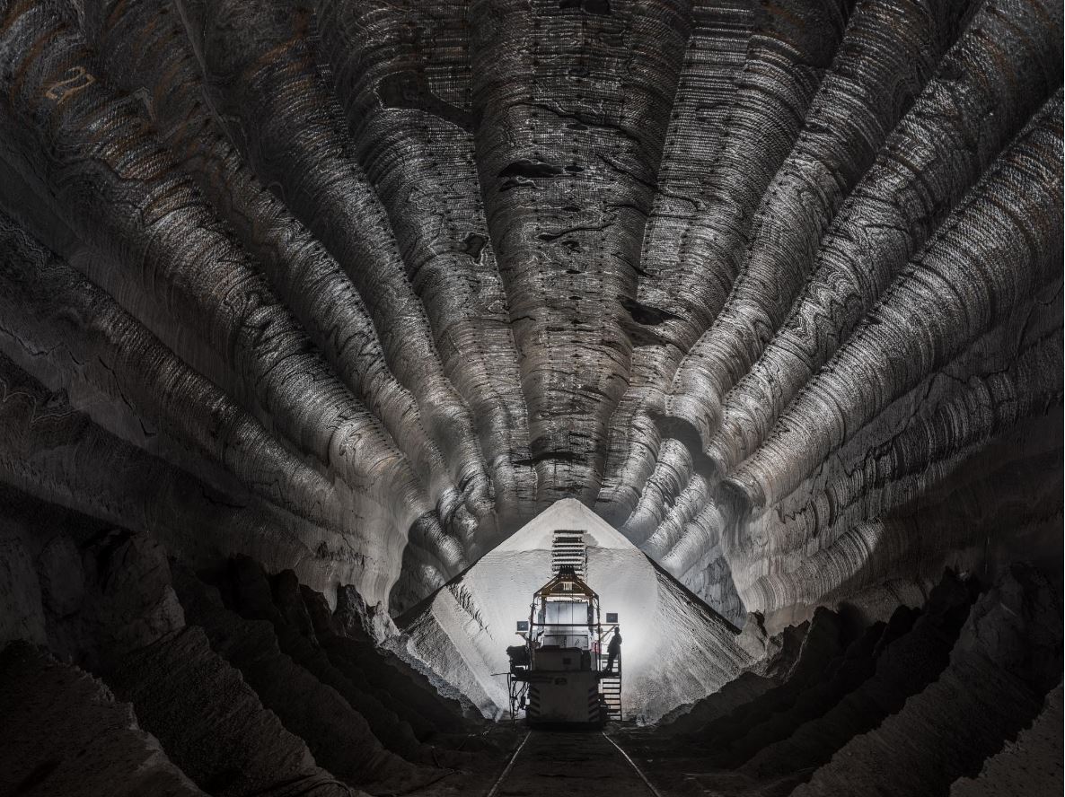
Uralkali Potash Mine #1, Berezniki, Russia (2017) photo © Edward Burtynsky. Courtesy Flowers Gallery, London
In addition to the 80 or so enormous digital prints there are 13 high-resolution murals i.e. photos blown up to cover entire walls, which overawe you with their scale and then draw you in to study the incredibly fine digital detailing.

Example of a wall-size ‘mural’ photo at ‘Burtynsky: Extraction/Abstraction’ giving a sense of the size of the ‘mural’ photos. Photo © Justin Piperger (2024) Image courtesy of the Saatchi Gallery, London
Factual captions
Each photo comes with a fact-packed wall label which explains the human activity we’re looking at. Often curatorial wall labels are barely worth reading or contain tiresome lectures from the curators about the tired old subjects of race or gender. By complete contrast, the wall labels in this exhibition are head and shoulders above the usual ruck because every one tells a fascinating story and gives you the hard facts without moralising. The facts are enough.
So, for example, the piece below is an aerial photo taken just outside the Atlantic port city of Cadiz in south-west Spain. The city is surrounded by salt marshes which once brought prosperity to the region by making it a major producer of sea salt. Snaking through the salt marshes are streams of turquoise sea water. Around these are a complex series of ridges which divide the marshes into ‘fields’ where salt can be harvested, some of which date from 1,200 BC. At the start of the 20th century some 160 artisanal sea salt producers worked these salt pans, now it’s down to just a handful.
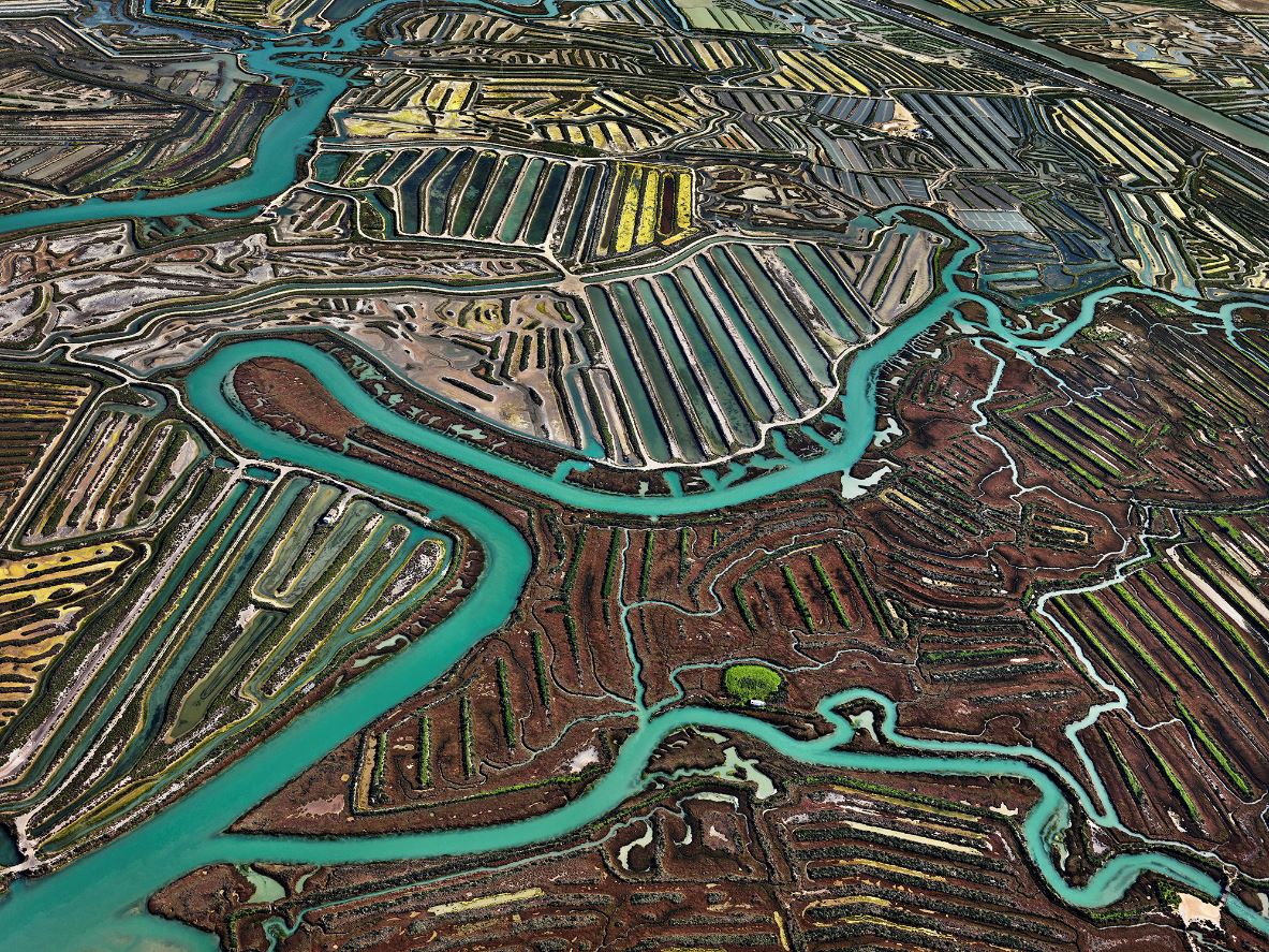
Salinas #2, Cádiz, Spain (2013) photo © Edward Burtynsky. Courtesy Flowers Gallery, London
Extraction and the environment
It is a highly environmentalist exhibition (where environmentalist is defined as ‘concerned with or advocating the protection of the environment.’) Almost all the pieces show the catastrophic impact of human activity on the natural world, each image accompanied by fascinating, often profoundly dismaying information. Because every exhibition needs organising principles, the pictures, and so the accompanying information captions, are divided into themes, being:
- Agriculture
- Extraction
- Manufacturing and infrastructure
- Waste
The facts described in the picture captions are often mind-boggling. For example, there’s a photo of a vast array of plastic greenhouses in Ziway, Ethiopia, which covers an enormous 450 hectares in total. Up to 4 million roses are cut and shipped each day from here, almost all destined for the European market, where unknowing consumers buy bunches of Ethiopian-grown roses for their impressionable partners, both heedless of the enormous environmental cost behind every one of them.
Or take the wall label introducing the gallery devoted to Agriculture. This tells us that there are over 8 billion people on the planet and we all need to eat, preferably several meals a day. Approximately 75% of the global population eats meat, which corresponds to roughly 23 billion animals kept as livestock. Adding up all the people, livestock and, of course, pets, global agriculture must feed over 31 billion hungry creatures every day.
Creating enough agricultural land to cater to this vast, relentless need is the cause of endless environmental catastrophe:
- mass cutting down of ancient forests
- devastation of biodiversity
- depletion of one-off resources such as aquifers
- leaching of toxic pesticides and fertilisers into the water supplies
- constant emission of greenhouse gases at every step of production, processing and transport
Abstraction
So far, so environmentalist. But there’s another whole layer to the exhibition and to Burtynsky’s practice, which is indicated in the exhibition title (Extraction/Abstraction) and underpins much of his work. This is that, from the early days of his career he came to realise that large-scale photographs of landscapes, taken from high vantage points like mountains or from helicopters or drones, often look very like the abstract art produced by the various movements of abstract art in the twentieth century, from Paul Klee teaching at the Bauhaus in the 1920s to Jackson Pollock getting drunk in New Jersey in the 1950s.

Installation view of ‘Burtynsky: Extraction/Abstraction’ showing two works which look like mid-20th century abstract paintings but are in fact 21st century aerial photos of the Texas panhandle. Photo by the author
The curators have some characteristically clear and intelligent things to say about this:
Abstract art emerged in the early twentieth century as a radical break with the old ways of making pictures. Rather than depicting recognisable figures, objects or landscapes, abstract painting explores form, texture and colour for their own sakes.
Over the same period industrial agriculture, mass production, surface mining and the internal combustion engine also emerged, changing our way of life forever. Today technology is rapidly propelling us into the future in every sector…
While modern artists invented new expressive and emotional languages, modern engineers, technicians and industrialists were developing a new reality, divorced from the ancient ways of being, alien to the natural world and wholly unsustainable.
Among the appealing elements of Burtynsky’s thrilling photos is his invocation of and toying with the conventions of abstract art. Many of his photos can be appreciated for their abstract beauty first, before we delve further into the ruined landscapes and human toil which lies behind them.
And it’s true. Look at the photos I’ve included so far in this review and you can see how the vivid, colourful landscapes often approach or fully appear as abstract designs. To be honest, this turns out to be more true of the first floor of works, less true of the second floor which depicts more ‘realistic’ scenes, such as vast waste mountains in Nigeria, the world’s biggest dump of used tyres in America, dehumanisingly vast factories in China and Bangladesh, and so on.
So this abstract aspect is not to be found in all of his works, but the abstract qualities which are to the fore in the early rooms continue to haunt the later, more realistic works, appearing round their edges so to speak, hinting at the deeper, unexpressed patterns and subtle regularities which emerge from the chaos of human activity.
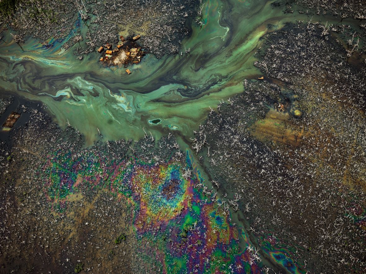
Oil Bunkering #9, Niger Delta, Nigeria (2016) Photo © Edward Burtynsky. Courtesy Flowers Gallery, London
‘In the Wake of Progress’
In between the two floors of big stunning photographs, on a mezzanine floor, is a large room which has been blacked out in order to host what the curators call an augmented reality (AR) experience but you and I might think of as an old-fashioned film, the gimmick being that it is divided into three separate screens alongside each other, sometimes depicting the same subject, sometimes showing different angles of the same thing, sometimes changing and moving on before the other two screens can catch up, a dynamic triptych. It is a musical and rhythmic way of presenting moving images.
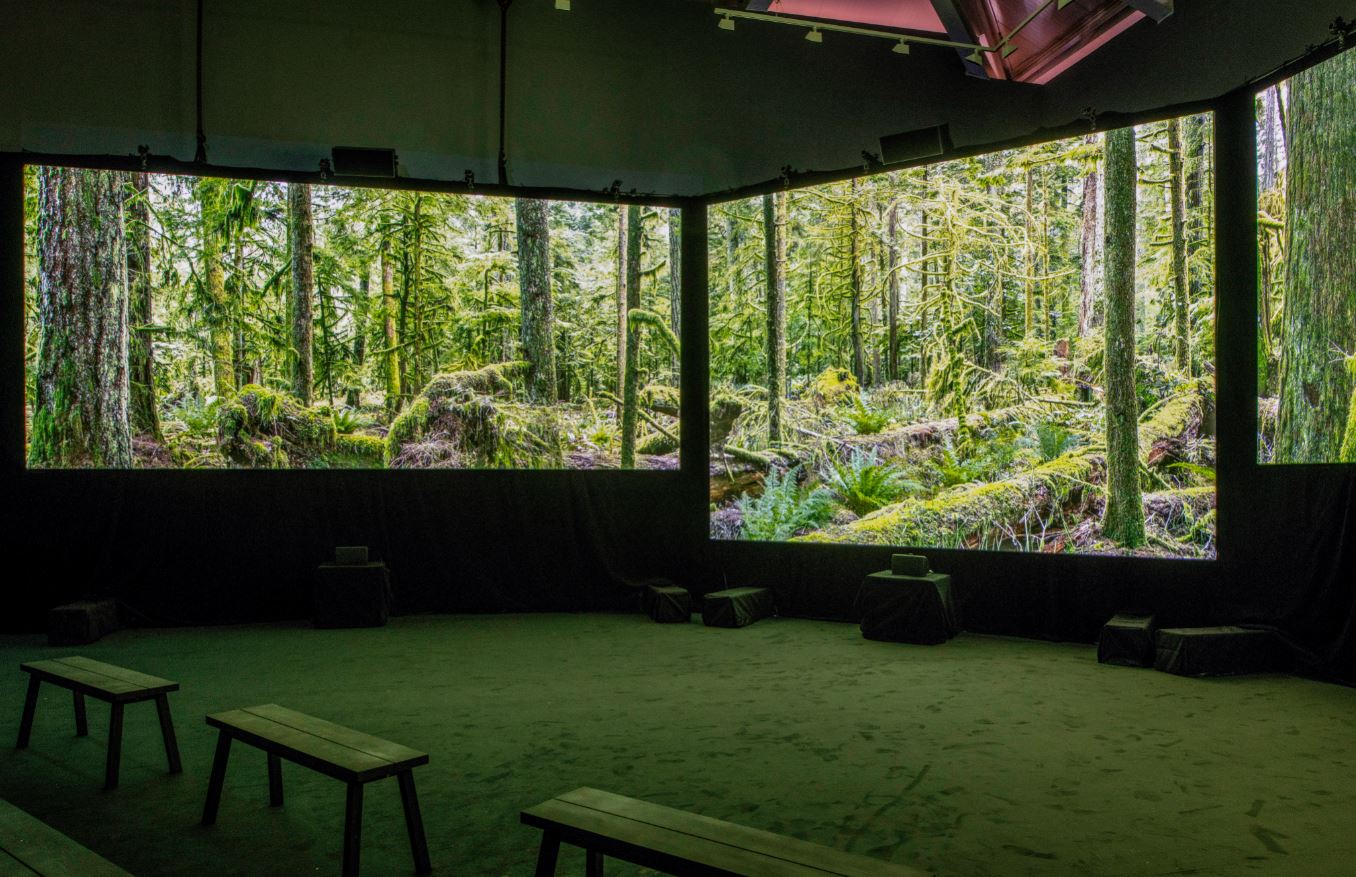
Installation view of ‘In the Wake of Progress’ showing on three screens at ‘Burtynsky: Extraction/Abstraction’ showing the viewing room for ‘In the Wake of Progress’. Photo © Justin Piperger (2024) Image courtesy of the Saatchi Gallery, London
The film is titled ‘In the Wake of Progress’ and, as the name suggests, shows the vast wake of destruction and dehumanisation left by the unstoppable exploitation of the planet’s natural resources. Unusually for me, I sat and watched the entire half-hour thing through in its entirety. It is an absolutely stunning, commentary-free, wordless series of beautifully shot sequences depicting the same kinds of scenes we’ve seen in the photos, devastation, waste and pollution everywhere.
It starts with four or five minutes of a static shot in an unspoiled northern forest (as captured in the photo above), all moss-covered trees and hovering insects, calming the viewer and lulling us into a false sense of security (it was actually shot in a place called Avatar Grove on Vancouver island, British Columbia, Canada).
But then the destruction commences, with shots of forests much like this being logged and reduced to muddy bare hillsides; vast numbers of logs being floated downriver to huge lumber yards; and on to open cast mining; dynamiting rocks in quarries; oil spills rainbowing rivers; vast dumps of rusting oil cans, plastic phones, used tyres; terrifyingly huge inhuman factories; oil production; vast megacities criss-crossed by urban freeways choked with traffic – a bombardment of images of human destructiveness.
The promotional material makes much of the fact that the film and music were created with the help of ‘legendary’ Canadian music producer Bob Ezrin. I thought this phrasing was a tad counter-productive and made it sound like a self-congratulatory speech at the Oscars (‘And now ladies and gentleman, the one and only, the legendary music producer, Boooob Ezrin!‘). The wall label also explains that the haunting wordless vocals which thread through the soundtrack are by ‘award-winning Cree Métis artist iskwē’, which is interesting enough, I suppose.
But the single most obvious thing about ‘In the Wake of Progress’ is how very similar it is, in visual themes and in even the repetitive, arpeggio-heavy soundtrack, to the great 1982 film Koyaanisqatsi, by ‘legendary’ director Godfrey Reggio, with music by ‘legendary’ minimalist composer Philip Glass. All it needed was the slow-motion sequence of Las Vegas casino workers and it would have become virtually the same film.
My point is nothing about plagiarism or anything like that, in fact I have two points. 1) What the similarity of both films suggest is that if you set off with the aim of depicting mankind’s destruction of the natural world, you’re going to end up shooting the same kinds of sequences (open cast mining, oil production, hyper-highways in mega-cities) i.e. there will be an inevitable sameyness about films like this because they are covering the same subject.
Secondly 2) the two films were produced and released exactly forty years apart (1982, 2022). Me and my like-minded liberal friends were obsessed with Koyaanisqatsi – I went to see it in the cinema at least five times when it came out. Being young, we thought immensely powerful cultural products like this would change the world and bring its rulers to their senses. Now, being old, I know that’s never going to happen. Films like this are nice to look at, trigger strong emotions, and change absolutely nothing.
Burtynsky the technological innovator
For photography buffs there’s a section of the show devoted to listing and explaining Burtynsky’s technical innovations. It turns out that he has not only adapted to the huge changes which have taken place in the technical side of photography over the past 40 years (the arrival of digital technology revolutionising everything) but has often been at the forefront of that innovation – working with the technical teams who accompany him on his projects to develop engineering and design solutions to the challenges of creating such huge photos, often taken from a great height.
This latter fact (height) explains the presence of not one but several drones in the display case, along with interesting explanations of how his engineers have changed and adapted them to fly stably and horizontally, while carrying ever-more powerful digital cameras.

Installation view of ‘Burtynsky: Extraction/Abstraction’ showing the display case of cameras and drones used by Burtynsky over the years. Photo © Justin Piperger (2024) Image courtesy of the Saatchi Gallery, London
In the photo above, on the wall on the right you can see a timeline of Burtynsky’s projects, starting with the earliest while he was still at Ryerson Polytechnic (1979 to 1981) and then listing each of his major projects and publications, year by year, with a paragraph or so detailing what technical innovations he brought to each of them.
Self overcoming
Years ago I read half a dozen books by the German philosopher Friedrich Nietzsche. I wouldn’t pretend to be any kind of expert but my understanding is that a fundamental principle of Nietzsche’s philosophy is the notion of ‘self overcoming’. It’s the idea that in order to become who you want to be, you first need to overcome who you are. In order to realise your full potential, you must consciously conquer the aspects of your character and mind which limit and hold you back.
So far, so much like a Californian self-help video. Where Nietzsche pushes on is in holding the view that most of us are held back from a full understanding of the world we live in by a whole network of conventional thinking, commonplace morality, sentimental attitudes, wishful thinking, moral cowardice and intellectual weakness. In a thousand ways we hide from the truth of who we are and what we are doing.
Nietzsche said we should face the truth about ourselves and embrace it no matter how negative and destructive it may appear. Only by embracing the totality of our real natures can we live in truth.
Well, OK, then. All the facts indicate that we are destroying the planet, wrecking every ecosystem we’ve ever encountered and exterminating our fellow life forms at an unprecedented rate – and, following Nietzsche, I think we should embrace the fact. We should fully admit to being world killers and planet destroyers. We should own it and admit to being the nature-hating, species-exterminating, habitat-trashing creatures that all the evidence suggests we are.
In my opinion most people, especially in the pampered West, live in complete denial about what monsters the human race are – as my recent reviews of modern African or Middle Eastern history show time and time again, or the situation in Ukraine or Gaza demonstrate beyond dispute – we are planet-destroying locusts but locusts with machine guns and nukes, committed to the devastation of the planet and the mass killing of our own species.
I would rather it isn’t so, but it is so and any attempt to deal with the situation must start by acknowledging this truth. This position explains why, for me, the only weak point in the exhibition was where Burtynsky, disappointingly, joined in with the chorus of trite truisms, the sentimental bromides, and the wilful optimism of the wishy-washy liberal who still has hope:
‘I have spent over 40 years bearing witness to how modern civilization has dramatically transformed our planet. At this time, the awareness of these issues presented by my large format images has never felt more urgent… I hope the exhibition experience will continue to provide inflection points for diverse conversations on these issues and move us all to a place of positive action.’
‘Diverse conversations’ – does he really think ‘diverse conversations’, at dinner parties, down the pub or on social media, even at high-level gatherings like the COP conferences, are going to make a blind bit of difference to anything, because they absolutely aren’t and it’s disappointing that an artist who’s made such original art out of the disaster, still holds such weakly conventional opinions about it.
‘Add your thoughts to the conversation’
In the spirit of sentimental optimism which I’ve just explained why I despise, the exhibition contains two big blackboards with cups of white chalk sticks, and encourages us to write uplifting messages on the boards and ‘add your thoughts to the conversation’. Examples included: ‘Turn your phone off now’, ‘It’s easy to be green,’ ‘Be nice to the environment’ and other such gift card slogans. True to my blunt Nietzschean approach, I wrote ‘Exterminate all the brutes’.
To anybody who doesn’t get the reference, these are the words scrawled at the end of the high-minded missionary pamphlet written by the deranged colonial ivory agent, Kurtz, in Joseph Conrad’s novella ‘Heart of Darkness’. I wrote it in a spirit of Swiftian satire, for in the novel Kurtz has been driven completely mad by the sub-human savagery he encountered in the heart of the Congo, which he has assimilated and then taken to a whole new level of nihilistic destructiveness. He started out with the highest aims of bringing ‘civilisation’ to the heart of Africa and ended up with a mad vision of killing every one of the local people.
Everything I’ve read about the Congo backs up Kurtz’s feelings about the human race. If in any doubt you should make a study the Rwanda genocide and its aftermath in the two Congo wars and the Great War of Africa, which, even after the loss of up to 5 million lives, in eastern Congo lingers on to this day. And what lay behind this series of disasters? Greed to rape Congo of its natural resources.
First it was white Europeans enslaving, mutilating and massacring Africans in order to extract Congo’s vast rubber production; but then it was Africans looting, impoverishing, massacring and murdering each other in order to loot Congo’s other, mineral, resources. The colours of the skin and the names of the rulers (Leopold, Lumumba, Mobutu, Kabila), the ideologies they used to justify themselves (Christianity, communism, pan-Africanism, capitalism), all changed with the passing decades, but one constant remained the same: the murderous, nature-killing intensity of human greed. Vast wars were fought, immense human suffering caused, and large areas of the country ravaged by man’s endless quest for the blood diamonds, copper, gold and the rare metals which the world needs to carry on its course of untrammeled consumption.
Which is why bromides like ‘Save Earth, Save Life!’, ‘Protect Our Planet, Preserve Our Future’ and ‘There is no planet B’ seem to me wholly inadequate to capture the brutal truth of the world we live in, the terrible violence man deals out to man every day (and worse to unprotected women and children), the appalling misery endured by the slaves who produce the components of our luxury goods, the daily murder of tens of millions of dumb animals so we can eat them, and the relentless degradation of every ecosystem on the planet.
Hence the saeva indignatio of my crayoned comment, scrawled across the blackboard in the same way that Kurtz, driven mad by seeing into the complete darkness of the human heart, ended his utopian pamphlet with the most nihilistic comment he could conceive of – ‘Exterminate all the brutes’ – a comment less on the natives of Congo than on the shallow, inadequate Christian ‘civilisation’ he was meant to be representing.
(The phrase saeva indignatio popped into my memory at this point and prompted me to look it up. It is Latin for ‘savage indignation’ and is a phrase used in the Latin epitaph of the great 18th century satirist Jonathan Swift, to denote his ‘intense feeling of contemptuous anger at human folly’.
So that’s what I wrote on the blackboard of this powerful, terrifying exhibition, and why – the last words of a deranged idealist, quoted to express my ‘intense feeling of contemptuous anger at human folly’.)
The merch irony
A last point about those exhibition blackboards: the way children, or those with a childlike understanding of the world, had covered them with infant-school slogans like ‘End consumerism’ and ‘Just stop buying stuff’ meant I couldn’t help laughing out loud when this breath-taking exhibition shunted me out, at the end, into the huge, clean and well-stocked Saatchi Gallery shop, a big room overflowing with classy merchandise and shiny products.
Here, as at all art exhibitions, you can find a range of posters and postcards and bags and books relating to the exhibition, which all lead up to a collectable box set of stylishly produced Burtynksy books and memorabilia. This will set back the well-heeled art fan a tidy £15,000.
As I reeled from the cognitive dissonance between everything I’d just been seeing and reading, between all those high-minded ‘green’ sentiments on the blackboards, and this riot of unashamed consumerism – a posh couple sauntered by and stopped at the pile of exhibition catalogues (a snip at £38). ‘Oh my God,’ gushed the young lady, flicking through the pictures of ruination made beautiful, ‘this would make such a fabulous coffee table book!’
And there, in a nutshell, you have it. Middle-class people queuing up to buy postcards, t-shirts, tote bags, fridge magnets, mobiles, videos and earnest books all advocating the end of the consumerism. Swift would be looking on, nodding and chuckling.
Thoughts
This is an awesome, amazing, must-see exhibition for at least four reasons:
1) Every single photo is a masterpiece. Each one of them is breath-takingly beautiful.
2) Each photo is accompanied by short but hugely informative wall captions which are all fascinating in their own right but also build up into an astonishingly encyclopedic overview of all types of human activity around the planet – hugely interesting and mercifully devoid of the moralistic hectoring you are subjected to at so many other exhibitions.
3) It is about the most important subject on earth, which is the way we humans are destroying it.
4) Unlike most art films, ‘In the Wake of Progress’, is a powerful, thrilling, devastating, hopeless, exhilarating watch.
I emerged reeling. I wanted to shake someone’s hand for organising such an overwhelming experience and bow down before Burtynsky’s awesome genius. ‘Extraction/Abstraction’ is quite brilliant.
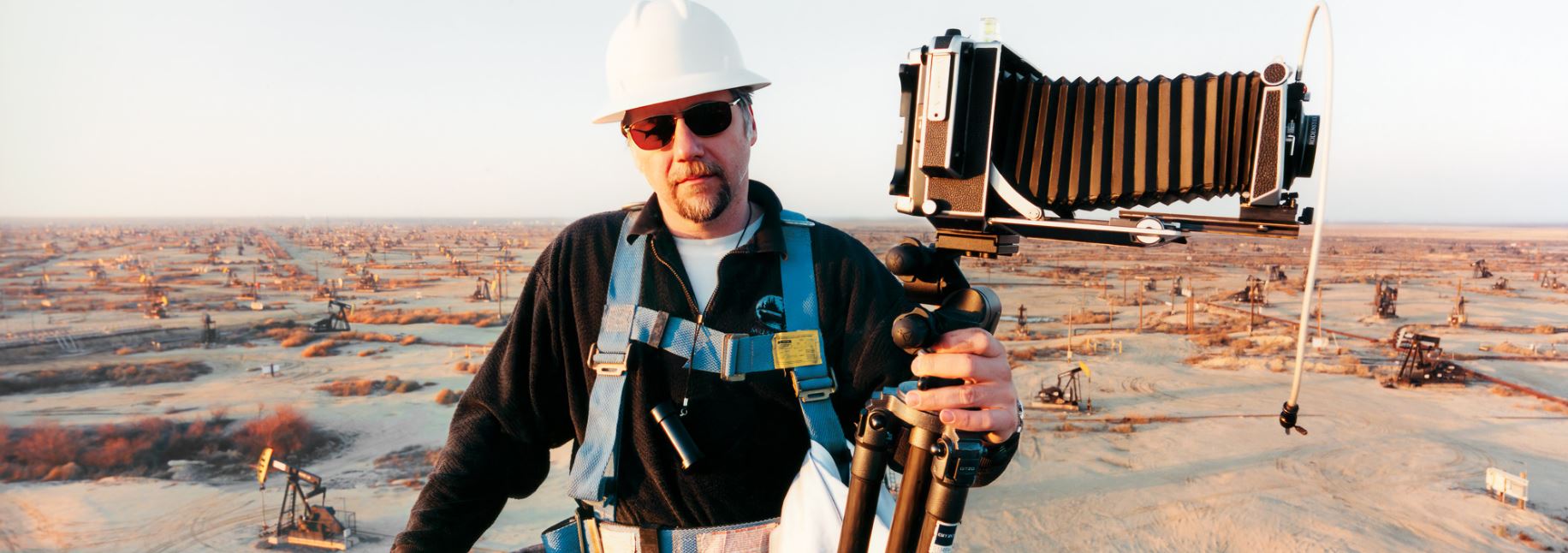
Our hero at work on location in Belridge, California, site of hundreds of small oil wells (2003) Photo by Noah Weinzweig, courtesy of the Studio of Edward Burtynsky
Related links
- Extraction/Abstraction by Edward Burtynsky continues at the Saatchi Gallery until 6 May 2024
- Edward Burtynsky’s website
Environment-related reviews
Exhibitions
- Eco-Visionaries: confronting a planet in a state of emergency @ the Royal Academy (January 2020)
- Dear Earth: Art and Hope in a Time of Crisis @ the Hayward Gallery (July 2023)
- RE/SISTERS: A Lens on Gender and Ecology @ the Barbican (October 2023)
- A World In Common: Contemporary African Photography @ Tate Modern (November 2023) [in the last section, with its photos of rubbish dumps and environmental collapse]
- Wilfred Ukpong: Niger-Delta/Future-Cosmos @ Autograph ABP (March 2024)


‘Thinking of You. I Mean Me. I Mean You.’ by Barbara Kruger @ Serpentine South
When hippies go bad…
Barbara Kruger is an American artist. She was born in Newark in 1945, the same year as Rod Stewart, Eric Clapton and Pete Townsend i.e. she is 78 years old and from the generation which made their names in the later 1960s and 1970s.
At the start of her career Kruger worked as a graphic designer for American magazines, and when she branched out into fine art she brought with her a feel for the impact of combining images and words. Over the decades she’s developed a powerful visual language that borrows, adapts and expands the techniques and aesthetics of advertising and other media.
It comes as no surprise to learn that, as a white American female artist of the 60s generation, her artworks have, to quote the curators, ‘continually explored mechanisms of power, gender, class, consumerism and capital’ – in other words, exactly what you’d expect.
Installation view of ‘Thinking of You. I Mean Me. I Mean You.’ by Barbara Kruger at Serpentine South. Photo by George Darrell
‘Thinking of You. I Mean Me. I Mean You’ at Serpentine South is Kruger’s first solo show in London in over twenty years, so an opportunity for Kruger fans (and a friend of mine did describe himself to me as ‘a Kruger fan’) to catch up with her work this century.
These aren’t pictures hanging on a wall so that you stroll from one to the next, they are massive installations plastered across entire walls and, in some cases, round corners and into the next alcove or room. It feels like a total environment and one in which really important messages are being SHOUTED at you from disturbing and challenging billboards or hoardings.
Installation view of ‘Thinking of You. I Mean Me. I Mean You.’ by Barbara Kruger at Serpentine South. Photo by George Darrell
So you feel you’re being bombarded with really important messages, the only problem being that it’s quite frequently hard to make out what they are, although the general vibe is disillusioned, cynical, confrontational, an outpouring of negativity and doom. Take the text in the big room with black and white text all over the wall:
This is about loving and longing, about shaming and hating, about the promises of kindness and the pleasures of doing damage. This is about crazy desire and about having a gift for cruelty…
Already my attention is wandering but it goes on, covering the entire wall:
This is about the difference between the figure and the body, about the fickleness of renown, about who gets what and who owns what, about who is remembered and who is forgotten, here, in this place, this is about you, I mean me, I mean you.
Now, words are words and unavoidably spawn meanings and intentions, triggering our instinct for decoding and interpretation whether we want to or not. It is fairly common for modern art works to feature words, or be entirely made up of text, or even hoarding-sized presentations like this. (I immediately think of current Royal Academy exhibition which includes a set of 8 or so picture frames containing coloured paper on which are printed the names of native American tribes. That’s it, just the names, no images. Words on a coloured background.) Here in Kruger’s works the variety of layout and design is visually pleasing, up to a point – although the use of the same tone of red for all the frames and captions quickly becomes monotonous and wearing.
But the main experience of reading these words, which we are condemned by our literacy to do, is of struggling with their calculated, in-your-face negativity and either responding to them or giving up. How much of the following should you read before you realise you don’t care?
You. You are here looking through the looking glass, darkly. Seeing the unseen, the invisible, the barely there. You. Whoever you are. Wherever you are. Etched in memory, until you, the looker, is gone. Unseen. No more. You too.
The texts are not rubbish. They are obviously aspiring to a kind of poetic, not a million miles away from Samuel Beckett’s minimalist and repetitive prose. But I liked neither their style nor their content. If the message of this black-and-white piece is that you, the gallery visitor, are seeing (and taking part in) a series of choices and selections which include some artefacts (based on certain institutional and cultural values) but excludes other things (for the same reason), this is fair enough, if a bit obvious, like a lot of the other sentiments on display.
But having read hundreds of examples of prose poetry in my lifetime, I think Kruger’s stuff is on the poor side. Putting the meaning to one side, it lacks any rhythm or flow. It’s often staccato. In fact it’s remarkable how many words there are on display and how few of them are at all memorable or striking. Which is the exact opposite of advertising, where immense time and effort goes into trying to coin short phrases which will catch our distracted attention and burrow into our minds (‘Every little helps’, ‘Domino ooh hoo’).
Instead, all the texts have that dire, stricken quality of so much art text, emotionally numb phrasing conjuring up a dire sense of crisis and emergency. It’s like reading the gasped utterances of a Kafka character having a panic attack.
Installation view of ‘Thinking of You. I Mean Me. I Mean You.’ by Barbara Kruger at Serpentine South. Photo by George Darrell
That’s when it’s not being patronisingly dumb, as in the set of wall panels presumably satirising the self-righteousness of American Republicans, or maybe ‘the West’ in general, sixth-form sarcasm expressed in the big red panel reading:
Our people are better than your people. More intelligent, more powerful, more beautiful, and cleaner. We are good and you are evil. God is on our side, our shit doesn’t stink, and we invented everything.
Presumably this a satire on the imagined attitude of ideological defenders of America, for example the circle round George Bush who launched the fabulous invasion of Iraq, or maybe of Western conservatives in general. Or maybe it’s a critique of anyone of any nation or race who adopts these kinds of chauvinistic attitudes. But the triteness of its attitude undermines your faith in the level of her analysis or interpretation. Makes you realise you’re dealing with not very sophisticated stuff.
In the same vein of crushing obviousness, the three panels on the left contain the entire texts of 1) the marriage vows 2) the US pledge of allegiance and 3) the oath you take in a court of law. They are presented without any comment but, in the context of this exhibition, you can almost feel the irony and sarcasm dripping from them. It reminds me of the famous shots of House Speaker Nancy Pelosi sarcastically ‘applauding’ Donald Trump after he made his State of the Union address. It has the same feel of self-undermining childishness. Because some people actually do want to get married and do mean their vows; some people actually do feel patriotic about their country. And from an aesthetic point of view, having the words slowly appear one by one, in the style of a lame PowerPoint presentation, doesn’t make them any more intelligent or interesting.
Kruger’s works are visually striking but textually weak, and most of them are made of text or heavily rely on text, so the overall effect was, for me, limp and disappointing.
‘No Comment’
The exhibition marks the UK premiere of ’Untitled (No Comment)’ (2020). This is an immersive (i.e. a room containing a) three-channel video installation. This kind of thing is pretty common nowadays: right now in London there’s a huge and stunning three-video installations in the Edward Burtynsky exhibition at the Saatchi Gallery, and one by John Akomfrah (‘Vertigo Sea’) in the Royal Academy’s ‘Entangled Pasts’ exhibition.
Kruger’s piece is much more modest in scope than those two pieces (which are huge, world-encompassing depictions of a) man’s destruction of the natural environment and b) cruelty to animals, respectively). Much more narrowly, ‘No Comment’ is about the brave new digital world, conceived as exploring ‘contemporary modes of creating and consuming content online’.
It combines text, audio clips, and a barrage of found images and memes, ranging from blurred-out selfies to animated photos of cats. Cats. Yes, there are definitely more cats in this piece than in the Burtynsky or Akomfrah films. This piece includes a barrage of nihilistic slogans, hippy idealism turned very sour indeed, warnings about how FAKE NEWS can turn us AGAINST OURSELVES, yawn. I was standing next to three student-age young women who were recording it on the smart phones and the only bit they reacted to was when the cats started talking, which made them explode with giggles, nudge each other and try to capture it on video so as to TikTok or Instagram it. This stuff doesn’t interrogate or subvert anything, it’s just tired slogans and strained sight gags.
Installation view of ‘Thinking of You. I Mean Me. I Mean You.’ by Barbara Kruger at Serpentine South. Photo by George Darrell
The exhibition also features recent video ‘reconfigurations’ – or what the artist calls ‘replays’ – of several of Kruger’s most iconic pieces from the 1980s. I think this refers to the collage-type assemblages of magazine photos all splattered with controversial slogans, and includes ‘Untitled (I shop therefore I am)’ (1987) and ‘Untitled (Your body is a battleground)’ (1989). (Personally, I find it irritating when an artist calls their work ‘untitled’ and then immediately gives it a title.)
I think the ‘updating’ of these amounts to the fact that they are no longer static artefacts but videos of these ancient works which assemble the originally static images from jigsaw pieces, each piece of the jigsaw slotting into place with an amusingly literal click. Again, like a basic PowerPoint animation.
Anyway, the titles of these pieces alone indicate Kruger’s intention to ‘subvert’, ‘interrogate’ and generally question the consumer capitalism and sexualised imagery which have shaped our culture for decades. But after forty years of challenging this consumer culture and these sexualised images, have they been erased from the face of the earth, has the good fight been won – or are they more ubiquitous and powerful than ever before? Obviously the latter so, to be a little harsh, the content and aim of most of these pieces began to feel like art school whining rather than anything which might have any impact outside a lecture hall or gallery.
Installation view of ‘Thinking of You. I Mean Me. I Mean You.’ by Barbara Kruger at Serpentine South. Photo by George Darrell
The wall labels tell us that over the past 40 years, Kruger has displayed her work in numerous types of urban settings, including on buildings, billboards, hoardings, buses, in skate parks and so on. So a feature of her work is how adaptable it is to the setting or environment. Which explains why, for this exhibition, we are not, as I said, strolling between individual pictures hung on a wall, but, at several points, ‘immersed’ in works which have been adapted to the scale and layout of the Serpentine Gallery’s rooms, very impressively designed to fit around them.
Installation view of ‘Thinking of You. I Mean Me. I Mean You.’ by Barbara Kruger at Serpentine South. Photo by George Darrell
Massive works. Clever videos. Loud audio. Images interspersed with text. The same monotonous tone of red everywhere. And the same monotonous, psychologically null, Kafka expressions of art school alienation:
You ask a question. You wait for an answer. You want to keep on breathing. You want a room with a view. You want to change your life. You try to be generous. You never lie. You fall in love.
Installation view of ‘Thinking of You. I Mean Me. I Mean You.’ by Barbara Kruger at Serpentine South. Photo by George Darrell
Suddenly I knew who all these texts remind me of – Talking Heads lyrics:
And you may find yourself living in a shotgun shack
And you may find yourself in another part of the world
And you may find yourself behind the wheel of a large automobile
And you may find yourself in a beautiful house, with a beautiful wife
And you may ask yourself, ‘Well, how did I get here?’
The same dumb repetition, the same American suburban nervous breakdown aesthetic, the same panic attack chic. If you think Talking Heads are cutting edge (the song this lyric is from, ‘Once in a Lifetime’, dates from 1980, 44 years ago), then Kruger’s approach is for you.
Text and commentary
One room contains what looks like a ‘brief’ from an art school lecture, a text which is packed with buzzwords such as ‘globalised world’, ‘post identity’, ‘post gender’ and so on, which has been blown up and pasted onto two boards. And then Kruger has crudely circled all these buzzwords and written in notes querying and questioning them. For example:
[Sentence in the text]: ‘It’s clear that identity is back.’
[Kruger’s commentary]: When and where did it go? Its new renditions come with the added features of agency, disruption and exchangeability. In what venues, locations, events and discourses was identity missing and mistaken?
Installation view of ‘Thinking of You. I Mean Me. I Mean You.’ by Barbara Kruger at Serpentine South. Photo by George Darrell
Three points:
1. The Biter Bit
It is a bit rich of Kruger, an American artist committed to ‘subverting’ and ‘interrogating’ ‘modes of discourse’ around ‘gender’, ‘identity’, ‘consumer capitalism’ and so on to suddenly notice the riot of sociological jargon which has overtaken and infested the humanities, and then to object to it – because this is her intellectual environment, the one created by decades of hyper-intellectualising, left-wing, feminist and post-colonial critique in the academic and art worlds, the kind of thing to which she and her work have made a notable contribution
And this runaway discourse above all stems from the United States, her United States, which pioneered this clotted, exclusionary jargon and then exported it to universities and humanities departments around the world, where it now runs rampant. Kruger herself is deeply imbrued in this jargon and the art world she operates and flourishes in is itself a global epicentre of this sociological-cum-aesthetic discourse, as a glance at the wall labels, let alone the exhibition catalogue, instantly reveals.
2. Cultural politics turn out to be stunningly counter-productive
So when it comes to mocking academic jargon, she is like a fly stuck in the flypaper of the impenetrable postmodern jargon which she and her generation helped to create. But, after decades of bubbling in the background (where I was taught it all decades ago) this kind of sociological argot is now spilling over into mainstream politics. And what’s interesting about our times is how this is creating the same toxic divisions as it has done in academia for decades, but now out in the wider world – triggering unwinnable arguments in which everyone accuses everyone else of antisemitism, Islamophobia, sexism, racism, bigotry, transphobia, xenophobia – a world, especially down in the sewer of social media, in which the campaigns in favour of wokeness, Black Lives Matter, #metoo, no matter how well-intentioned, have in practice created a whole roster of toxic touchstones by which the zealous can judge and accuse others, while the ones accused can fight back with their own forms of toxic catchphrases and slogans – calling out, wokeness, slagging off the ‘Guardian reading, tofu eating wokerati’ and so on and so on.
No matter how well-intentioned and morally right all these left-liberal campaigns may be (as well as all the environmental ones like Just Stop Oil and Extinction Rebellion) the practical, real world impact has been to alienate huge numbers of people who feel (or are manipulated into feeling by the right-wing media) that their core values and identities are being got at, threatened, denied.
This, in the cultural sphere (along with stagnant economies and ecosystems coming under stress in the economic and environmental spheres) helps to explain the rise of nationalistic right-wing populism around the world. Technology is changing fast, the planet is fucked, and everywhere pressure groups are attacking the conservative staples of the religion, family and racial identity. Hence, in Kruger’s US of A, 50 years of feminism, anti-racism and university Marxism are more than likely going to result later this year in…the return of President Trump.
It seems like the more hyper-complex and impenetrable the radical academic jargon becomes, and the more it spreads throughout all the humanities and then leaks out into the real world, the more the very forces it sets out to question and undermine (capitalism, consumerism, environmental destruction, inequality, racism and sexism and homophobia) triumph, going from strength to strength, as if there is some deep, voodoo social law at work, some law of paradoxes so that the more feminists write about the male gaze (and the more you read the phrase on caption after caption at exhibition after exhibition), the more sexist and objectifying the media become; the more post-colonial studies books pour from the presses, the more openly racist leading politicians become.
I can’t be the only one feeling we’re living through a kind of death vortex of ever-accelerating abuse and anger, claim and counter-claim, outrage and cancelling, naming and shaming, whose clamour drowns out all moderate conversations.
‘Your body is a battlefield’ by Barbara Kruger. Photo by the author
3. It’s a generational thing
As I pointed out at the start, Kruger was born in 1945 and began her career in the late 1960s. This makes her a second wave feminist:
My daughter is a Sociology student and fourth wave feminist, extremely sensitised to the third wave issues of race and intersectionality, and in addition a fourth wave child of the internet and social media. She calls Woman’s Hour white feminism, a term she cheerfully interchanges with ‘BBC feminism’ – nice, clean, middle-class, private school-educated and white feminism. Emma Barnett.
Having had so many conversations with her on the subject(s), having helped her revise for her Sociology A-level and proofread her essays for her Sociology degree, I now see many issues, articles, movies, books and art works through her eyes. Above all, I recognise how completely different the worldview and assumptions of people under 25 are from those of me and my generation, even the supposed ‘radicals’ or ‘left wingers’ of my generation. We have been left waaaaaay behind by cultural and sociological assumptions which have moved on, light years on, sometimes – in the every day, every minute, every second use of social media and how that affects communication and perception and people’s sense of themselves and of the world they’re moving through with their smartphones set permanently to ALERT – beyond anything I can really understand or take in.
All I really know is that the assumptions, beliefs and worldviews of my 20-something daughter (and my son, too) are radically different from mine, far more switched on, plugged in and attuned to the subtleties and complexities of issues around race and gender in polyglot multicultural societies than my clodhopping old ’70s leftism ever dreamed of.
I’m sharing all this because it explains why, as I moved through this exhibition of Barbara Kruger, I felt like I was listening to the sound of a white, second-wave, American feminist tutting and disapproving of a world, and of a discourse, which have moved on and left her far behind, as it’s left most of us behind.
Reading Kruger’s cranky comments on these huge billboards (what else are we intended to do?) was not only:
1) Tedious – too much like my day job of proofreading government documents where I spend a good deal of time reading the impenetrable original text and then breaking my head trying to understand the cryptic, sometimes bad-tempered comments scrawled over them.
2) Amusing – but not in the way she intended it to be. It felt like listening to my Dad complaining about how football is nowadays all about Saudi money and American owners and nothing like the simple, honest sport it used to be in his day. Or listening to Rod Stewart complain that modern music’s all made by kids with laptops in their bedrooms, instead of honest bands performing in front of live audiences in their local clubs, like back in the good old days.
‘Thinking of You. I Mean Me. I Mean You’ felt, in other words, like the voice of the old generation railing against the new-fangled jargon and technology of the young – the take-home message of the annotated comments artwork I described above could be summarised as ‘Things were so much simpler and more honest in my day’.
Kruger’s installations complaining about tired old subjects like the perils of consumer capitalism (‘I shop therefore I am’) read like tattered old banners from the Miners’ Strike or posters from CND marches – relics from a bygone era, beautifully presented, stylishly designed, and completely out of date.
Installation view of ‘Thinking of You. I Mean Me. I Mean You.’ by Barbara Kruger at Serpentine South. Photo by the author
The merch
It goes without saying that after you’ve been bombarded with slogans and messages telling you to Stop Consumer Capitalism Now, Our Earth Is Not A Trash Can, I Shop Therefore I am etc, you emerge from the exhibition into the, er, gallery shop. Here you can buy loads of Barbara Kruger merchandise, such as anti-consumerist tote bags, posters, postcards, t-shirts and the expensive glossy catalogue. There! That’s your ‘continually explored mechanisms of power, gender, class, consumerism and capital’ all wrapped up in a tidy box and good to go. Have a nice day, sir.
Night falls
Dusk falls over Serpentine South gallery, highlighting one of Kruger’s text-heavy works.
Installation view of ‘Thinking of You. I Mean Me. I Mean You.’ by Barbara Kruger at Serpentine South. Photo by George Darrell
Related link
Related reviews
Share this:
Posted by Simon on March 13, 2024
https://astrofella.wordpress.com/2024/03/13/thinking-of-you-i-mean-me-i-mean-you-barbara-kruger-serpentine-south/