
This is a spectacular exhibition, by turns absorbing, inspiring, fascinating and deeply educational about the individuals, their lives and their times. Not all the work on display is good, some is positively poor, but there are good things throughout, and it’s huge – featuring over 150 paintings and drawings as well as photography, design, wallpapers, furniture, rare books, printed and spoken poetry and more. And then, in the last few rooms, it turns into a spectacular celebration of Dante Gabriel Rossetti’s huge, sumptuous paintings of stunning pre-Raphaelite women, an orgy of masterpieces to leave you reeling. More than just an exhibition it feels like a sustained immersion in their lives and times.
I thought the exhibition might disintegrate into a general splurge about the extended network of artists and models which made up the Pre-Raphaelite Brotherhood – surely, the most written-about subject in British art – the gift shop is heaving with books about the Pre-Raphaelites.
But I was wrong. The exhibition remains very, very focused on the Rossetti family and, above all, on the favoured son, Gabriel. (Only in adult life did Gabriel move his middle name, Dante, to the front of his three names – maybe partly to catch up with triple-barrelled friends like John Everett Millais and William Holman Hunt – but the curators refer to him as Gabriel throughout and so shall I.)
Firsts
Tate owns a lot of Pre-Raphaelite paintings and drawings so it’s surprising to learn that this is the first retrospective of Rossetti ever held at Tate, and the largest exhibition of his iconic pictures in two decades. Less surprising to learn that this is also the most comprehensive exhibition of Elizabeth Siddal’s work for 30 years, featuring rare watercolours and important drawings, because most of us have never hear of her.
The rooms devoted to them show how Gabriel and Elizabeth’s relationship and works intertwined and reflected each other. If you like reading about the lives of great artists, then this deep dive into biographical minutiae will be right up your street.
Immigrants
First of all, they were immigrants. Gabriele Rossetti (1783 to 1854) arrived in London in 1824, as a political refugee from Italy. More than that he was an Italian nobleman, poet, constitutionalist, scholar, and founder of the secret society, the Carbonari. A noted Dante scholar he secured the post of Professor of Italian at King’s College London from 1831 as well as teaching Italian at King’s College School. He and his wife Frances Polidori Rossetti had four children, two sons and two daughters. Raised in a home drenched in poetry and literature, all four children went on to become artists or writers in their own right. They were: the writer Maria Francesca Rossetti (1827 to 76); poet, artist and designer Gabriel Charles Dante Rossetti (1828 to 1882); artist and critic William Michael Rossetti (1829 to 1919); and poet Christina Rossetti (1830 to 1894).
The curators add into this gang of four the figure of Elizabeth Siddal, model, artist and poet, who posed for many of the Pre-Raphaelites (most famously as Ophelia in the classic painting by John Everett Millais) but who enjoyed a lengthy relationship with Gabriel, in which they drew and painted the same subjects, copying and learning from each other. They married in 1860 at which point she became Elizabeth Rossetti and this, from a naming point of view, justifies her inclusion in the exhibition.
Christina Rossetti
The curators do something genuinely bold and interesting which is to start a major art exhibition with a room devoted almost entirely to poetry. Never seen that before. They are mostly by Christina Rossetti and are not only printed directly onto the walls in very large font size but, if you stand in places marked by signs on the floor, you can hear the poems being recited by what must be very cleverly focused loudspeakers, which seem to be addressing you and you alone.

Installation view of ‘The Rossettis’ at Tate Britain, showing Room One which features just three paintings because it is devoted to the poetry of Christina Rossetti, which are reproduced on all the walls. Photo by Madeleine Buddo © Tate
All four Rossetti children were artistic and wrote and drew from early ages, but it was Christina who had the earliest success, having a volume of 42 poems published when she was just 16, some of which were written when she was as young as 11!
Remember by Christina Rossetti
Remember me when I am gone away,
Gone far away into the silent land;
When you can no more hold me by the hand,
Nor I half turn to go yet turning stay.
Remember me when no more day by day
You tell me of our future that you plann’d:
Only remember me; you understand
It will be late to counsel then or pray.
Yet if you should forget me for a while
And afterwards remember, do not grieve:
For if the darkness and corruption leave
A vestige of the thoughts that once I had,
Better by far you should forget and smile
Than that you should remember and be sad.
This bold start does two things. One, it fulfils Tate’s feminist aims of promoting women, bringing women out from the shadow of more famous men, giving women more of a voice etc (as the promotion of Elizabeth Siddal later in the show also does). Two, it vividly demonstrates the extraordinary combination of sensitivity and sensuality which, arguably, were to be distinguishing features of the family, and especially the arch-sensualist, Gabriel.
Christina’s talent peaked with the volume containing her most famous poem, Goblin Market, of 1859. During her career she published over 900 poems, a phenomenal output. Taking five minutes to read all the works written on the walls here, and let them alter and direct your thoughts towards her strange combination of Victorian piety, with astonishing sensuality, is a rare and lovely experience.
Early sketches
The narrow but scholarly depth of the exhibition’s focus is established in the second room which contains 30 or so very early drawings and sketches by the boy Gabriel, alongside some by his sister, and two by his brother William. They demonstrate his precocious skill and his enthusiasm for original voices like William Blake and Edgar Allan Poe. Gabriel was an early devotee of the small cult of Blake, who didn’t become widely known until the 1860s. And he did numerous illustrations of Edgar Allen Poe stories and poems, notably The Raven.

The Raven by Dante Gabriel Rossetti (1848) © Victoria and Albert Museum, London
These are very uneven: some have great verve but many of them are cranky and cramped. So I suppose the idea of a progression of beautiful young girl ghosts, on the left, is well done, but nothing about the figure on the right is good, his tangled legs, the odd posture of his hands. But they’re all very interesting in a dry, scholarly way. You rarely get to see the early beginnings of a major painter in such detail and for this reason alone I found myself taking the time to study each of the sketches. I liked two sketches drawn with thick black lines which reminded me of Goya, but these were exceptions.
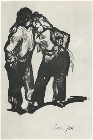
Man with a Woman Wearing Trousers by Dante Gabriel Rossetti (1844)
To buck the curators a bit, possibly the best things in this room are two marvellous charcoal and white chalk drawings by brother William, studies of Yarmouth beach. These far exceed in sophistication, depth and technique anything by Gabriel. And they are outdoors, giving them an airiness and lightness unlike anything by brother Gabriel. I can’t find them anywhere on the internet 😦
Gabriel’s unevenness
Maybe it’s worth making the point now, early on, that Gabriel Rossetti is strangely patchy or uneven as an artist. Many of these sketches are positively poor. What I mean is their depiction of the human frame is awkward and cranky. Gabriel’s figures are often bent at improbable or at least uncomfortable angles. His faces are sometimes smooth and angelic but sometimes angular and amateurish.
Later on there’s a room devoted to the period he spent living and working with Elizabeth Siddal, originally a model but, as this exhibition goes to great lengths to demonstrate, an artist in her own right. The curators place sketches, drawings and small paintings by Gabriel and Siddal alongside each other but I had the same experience as in Room 2 i.e. a lot of both of their work seemed to me poor, amateurish, ungainly, badly modeled figures and badly drawn faces.
The sketches introduce another theme which is how cramped and confined so much of Gabriel’s art is. At one point the curators point out that The Artist In His Study was a recurring theme of Gabriel’s work, but it’s not just the artist trapped indoors. In sketch after drawing after painting, the subject (always people, never landscapes or still lifes) has to bend over, lean in, wry their neck into the claustrophobic confines of the framing space. Almost all of his people are indoors and in a very cluttered, cramped and confined indoors at that.
All these qualities are on display in Ecce Ancilla Domini. It’s indoors; in a very cramped narrow room, emphasised by the vertical line of the narrow bed and, of course, the standing figure. Look how tightly frame it is with the picture edge right up against the left side of the angel’s gown and the red stand on the right, and the terrified woman pressed up tight against the hard cold whitewashed wall. I can barely breathe.

Ecce Ancilla Domini (The Annunciation) by Dante Gabriel Rossetti (1850)
© Tate
What’s so odd as to be barely believable is that the artist who produced these small cramped images, up to and beyond his Pre-Raphaelite phase in the late 1840s and 50s, then blossomed into the artist of the big, lush, sensual masterpieces of the 1870s and 1880s. It’s as if they were two completely different people.
The Pre-Raphaelite Brotherhood (the PRBs)
The exhibition has to cover Gabriel’s involvement with the Pre-Raphaelite Brotherhood which he founded in 1848 along with soul mates William Holman Hunt, John Everett Millais, James Collinson, Frederic George Stephens and Thomas Woolner, but it keeps it under control, as it were, not splurging but maintaining its focus on Gabriel (and to a lesser extent Christina).
This room is the one place where the curators bring in other works, by Millais and Hunt in particular, in order to explain the shared aims of the group. The idea was to reject the shadowy forms and stylised poses of the Italian Mannerist artists who succeeded Raphael and Michelangelo. The PRBs believed the classical poses and elegant compositions of Raphael, in particular, had been a corrupting influence on the academic teaching of art, hence their ambition to go back before Raphael to recapture the clean, detailed and precise style of artists who preceded the High Renaissance.
This led to a kind of super-realism where you can make out every hair on the head of the figures, where the background isn’t shady and blurred to indicate distance, but everything is seen in full detail, sparkling with a kind of universal light. This is one of the 3 or 4 paintings that the curators include as examples of the early, radical style of the Pre-Raphaelite Brotherhood, a typical selection of a medieval subject by William Holman Hunt. Note the hallucinatory clarity of every detail, of the flowers at bottom centre, the hair of the horseman on the right, the loving detail of the light reflecting on all the armour.
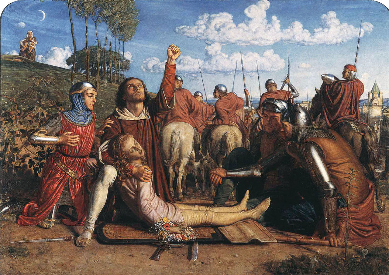
Rienzi vowing to obtain justice for the death of his young brother, slain in a skirmish between the Colonna and the Orsini factions by William Holman Hunt (1849) Private collection of Mrs E. M. Clarke
Realists and rebels – or inventors of a new form of escapism
A comment on the wall caption made me smile. The curators state that ‘The men and women in the Pre-Raphaelites’ circle wanted to express themselves authentically, with art and poetry based on lived experience and nature.’ Elsewhere they talk about the PRB’s commitment to depict the life of their times, and imply that this or that painting is a piercing critique of Victorian sexism, social inequality, poverty and so on. And indeed some, a very small number of paintings and drawings, can be interpreted in this way.
But a wider truth is conveyed in the wall label’s very next sentence: ‘Their paintings and writings explored stories from the Bible and medieval books that resonated with their modern lives.’ That’s closer to the mark because what comes over is the PRB’s commitment to flee the social realities of their time. The curators themselves point out how Gabriel, his family and friends sought inspiration in anything but their own time, in stories from the Bible, fairy tales, folk tales, Greek myths and legends and, above all, by escaping into a beautifully rendered and idealised version of the Middle Ages.
The Decameron, The Canterbury Tales, The Roman de la Rose, the Arthurian legends and, above all of them, a lifelong obsession the 14th century Dante Alighieri – all this was about as far away as you could possibly get from the political, economic or social life of their times.
The PRB’s speciality was escapism, and in this they followed the other poets of their day who mined John Keats’s lush sensuality to produce the medievalising monologues of Robert Browning but above all the tremulous emissions of the presiding poet of the era, Alfred Lord Tennyson. Take Browning’s poem ‘Pippa Passes’, allegedly written ‘to speak for the masses … cuffed and huffed from morn to midnight’. but whose subject, Pippa, is a silkworker who walks through the medieval Italian town of Asolo, singing and inspiring good. Or Tennyson’s log work the ‘Idylls of the King’, the king in question being King Arthur. While the British army subjugated more and more parts of the world, Britain’s poets vapoured about knights and damsels. And the Rossettis? Well, could they have made more drawings, sketches and paintings of knights in armour and damsels in distress?
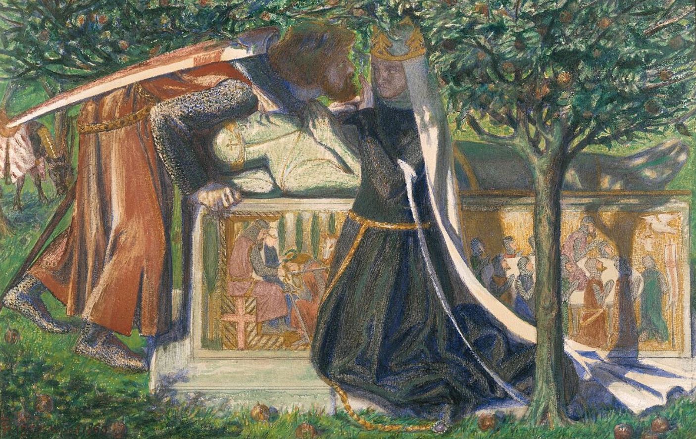
Arthur’s Tomb by Dante Gabriel Rossetti (1860) © Tate
No, for actual lived experience of the mid-Victorian period the Rossettis and Pre-Raphaelites are the very last source you would consult. You would look in the novelists – the poet laureate of London, Dickens, to a lesser extent Thackeray, or the gritty novels of Mrs Gaskell with their harrowing accounts of working class life.
So taken at face value the notion that the PRBs were radicals who sought ‘authenticity’ and to depict life with a new realism in defiance of the conventions of the society around them and of the artistic establishment represented by the Royal Academy seems nonsensical.
But maybe I’m missing the point. I think PRB fans would point out that the realism and authenticity they were seeking was an emotional and psychological realism. In the subjects of their art they fled the reality of their times to Greek legends and medieval stories in order to capture complex, fleeting, intense and evanescent emotions which the banality of day-to-day living in industrialising London seemed to crush and stifle.
Thus Gabriel’s very strange painting of Arthur’s Tomb, above, is radical in the sense that it rejects the entire tradition of Salon art, of the huge Grand Historical or Mythological Subjects promoted by the founder of the Royal Academy, Sir Joshua Reynolds, with their grand gestures and beautiful finish. Instead the characteristically cramped and claustrophobic composition, the sense that both figures are being squashed by the tee above, the awkward bending of Lancelot, Guinevere’s hand fending him off – the cramped awkwardness of the entire thing conveys a very modern, complex psychological moment, fraught with tensions.
So the flight into the Middle Ages which is enacted in painting after painting, was it a flight from contemporary reality – or was it the adoption of distant subjects the more easily to convey complex modern psychological states? Discuss.
Elizabeth Siddal
Following new research, Elizabeth Siddal’s surviving watercolours are shown in a two-way dialogue with contemporary works by Gabriel, exploring modern love in jewel-like medieval settings. As a working class artist who was largely self-taught, Elizabeth’s work was highly original and inventive, but has often been overshadowed by her mythologisation as a tragic muse (see, for example, this BBC article, The tragedy of art’s greatest supermodel).
According to the curators Siddal and Gabriel’s work together marks a turning point from Pre-Raphaelitism to the new, more imaginative and expressive Aesthetic style which emerged in the 1870s.

Lady Affixing Pennant to a Knight’s Spear by Elizabeth Eleanor Siddal (1856) © Tate
Aestheticism – Gabriel’s second revolution
There’s such a huge difference between Gabriel’s often clunky, cramped compositions of the 1850s and the huge, gorgeous flowing masterpieces of the 1870s that it’s as if they’re by two completely different people. The curators clarify that, a generation after helping found the Pre-Raphaelite Brotherhood, Rossetti was at the epicentre of a second great artistic revolution, this time the Aesthetic Movement with its credo ‘Art for Art’s Sake’.
He went on to lead a new avant-garde group even more influential than the Pre-Raphaelites: the aesthetic movement. This would change ideas, art and design around the world.
Already in 1864 the hazy light, colour and heavy symbolism of Beata Beatrix looked forward to the Aestheticism and the international Symbolist movement later in the century.
Gabriel’s portraits [in the later 1860s and 1870s] reflected the aesthetic movement’s ideals of ‘art for art’s sake’ and a new modern beauty. He adapted the likenesses of working-class women of unconventional appearance, notably model Alexa Wilding, into fantasies of enchanting femininity. Inspired by Renaissance portraiture and mythological texts, these sensual portraits suggested touch, sound and scent as well as vision. They emphasised the pleasure of form and colour, looking ahead to the abstract art of the following century.
This is the thinking behind the final two rooms which amount to an orgy of spectacular Rossetti classics.

Installation view of ‘The Rossettis’ at Tate Britain, showing Room Seven which features ten stunning paintings from Rossetti’s sensual prime. Photo by Madeleine Buddo © Tate
We learn about the art collector Frederick Leyland who owned the three paintings in the photo above plus two more which are hanging nearby. He displayed all five in the drawing room of his mansion at Princes Gate, London, and the exhibition features a contemporary photograph to prove it. Apparently it’s the first time all five paintings have been reunited in one space since Leyland’s heyday in the 1880s.
Originally from a modest background, Leyland rose to run one of the largest transatlantic shipping companies of his day. Because they see it as their job to take every opportunity to remind us of woke and feminist issues, the curators tell us that much of Leyland’s trade was based on the cotton that fed textile manufacturing in northern British towns and that the cotton came from the American South where exploitative labour continued long after the abolition of slavery.
Leyland used the money he made from his business to become a key figure in the aesthetic movement, transforming his Liverpool and London homes into palaces of modern art. It was Leyland who commissioned The Beguiling of Merlin by the Pre-Raphaelite painter Edward Burne-Jones and commissioned the architect Thomas Jeckyll and the American ‘aesthetic’ painter James McNeill Whistler to decorate his dining room, a commission which resulted in the Peacock Room, considered one of Whistler’s greatest works. A really key figure, then, and purchaser of some of Gabriel’s most stunning and sensuous portraits of beautiful, strong-jawed, thick-necked, frizzy-haired aesthetic beauties.
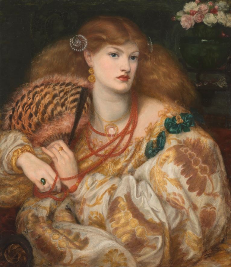
Monna Vanna by Dante Gabriel Rossetti (1866) © Tate
The femme fatale
Uneasy with these lush and opulent depictions of sensual, semi-erotic women, the curators take refuge in a familiar feminist trope. This is the notion that some of Gabriel’s paintings in his mature late style are of femmes fatales. This allows the curators to take refuge in familiar tropes about sexual objectifying of women and gender stereotyping and male anxiety about female sexuality, the usual shopping list.
Gabriel engaged with the idea of the dangerous, sexualised ‘fatal woman’ or the ‘femme fatale’. This usually negative figure of feminine power responded to Victorian anxieties about social change. It became a popular fantasy figure towards the end of the century, and persists in literature and art today.
Persists in literature and art today? Tut tut. And despite all the brave attempts of feminist curators to change the world. Shame. Sometimes I wonder how old art curators think their readers are. 10?
The kind of painting we’re talking about is Gabriel’s depiction of Lady Lilith. The ancient story has it that Lilith was Adam’s independent-minded first wife who he put away and replaced with Eve. In revenge, Lilith seduced and persuaded the serpent to tempt Eve which led to Adam and Eve’s expulsion from Eden’s bower and the fall of mankind. Naughty Lilith.
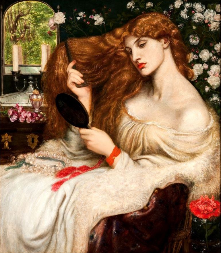
Lady Lilith by Dante Gabriel Rossetti (1866 to 1868) Delaware Art Museum, Samuel and Mary R. Bancroft Memorial, 1935
If you allow yourself to get worked up about millennia-old stories this is obviously a sexist trope designed to demean and blacken independent women everywhere. For those not so easily upset, it’s a pretext for a staggeringly sensual painting, rich in details of fabric, hair and flowers. Doesn’t look much like a denizen of prehistoric Mesopotamia, does she? Desert, snake, tree? The picture could, frankly, be given the name of almost any woman from myth and legend and make as much sense.
In fact, my view would be that this is a painting about money and luxury. These are the kind of extraordinarily richly coloured, beautifully detailed, dreamily luxurious images of extremely attractive women which Gabriel sold by the cartload to mega-rich patrons like Leyland. It is a luxurious depiction of luxury for those rich enough to live in luxury.
The magic of exhibitions like this is that we poor peasants, for the hour or so that we spend strolling round masterpieces like this, are also lifted into a realm of luxury, beauty, sensuality that has never existed with this kind of other-worldly perfection but which we, for a tenner, can for fleeting moments, enter and inhabit. The scent of the roses! The texture of that silk dress! The luxury of those endless tresses!
Lilith poem
As we’ve learned, Gabriel and many of his friends and lovers often wrote poems about the subjects they were painting or painted their poems, the two art forms interpenetrating. Thus next to this amazing painting there’s a striking sonnet by Gabriel. If you stand in the right spot (on one of the signs on the carpet) you magically trigger a reading of the poem in the lugubrious tones of actor Bill Nighy.
Lilith by Dante Gabriel Rossetti
Of Adam’s first wife, Lilith, it is told
(The witch he loved before the gift of Eve,)
That, ere the snake’s, her sweet tongue could deceive,
And her enchanted hair was the first gold.
And still she sits, young while the earth is old,
And, subtly of herself contemplative,
Draws men to watch the bright web she can weave,
Till heart and body and life are in its hold.
The rose and poppy are her flowers; for where
Is he not found, O Lilith, whom shed scent
And soft-shed kisses and soft sleep shall snare?
Lo! as that youth’s eyes burned at thine, so went
Thy spell through him, and left his straight neck bent
And round his heart one strangling golden hair.
The slightly knotty syntax takes a couple of readings to get quite straight (it took me a couple of goes to understand the importance od ‘not found in the 9th line) but then, wow. You could argue the slight entanglement of the lines deliberately mimics the strangling effect of Lilith’s golden hair. Maybe. Presumably Lilith’s hair is golden in the poem because ‘golden’ sounds good, but orange-auburn in the painting because orange is such a dramatic and deeply luxurious colour as, for example, in Frederick Leighton’s famous painting, Flaming June.
Special attractions
Curators not only need a theme or pretext with which to concoct an art exhibitions but score extra points if they can come up with rare or unique or special features that make the show extra-special. The curators of this exhibition have excelled themselves with four or five of these ‘special features’ to look out for / be impressed by.
1. The wallpaper
Dante Gabriel Rossetti’s previously unrealised work as a designer is brought to life in The Rossettis. A wallpaper he designed 160 years ago has been created for the first time especially for Tate Britain’s exhibition. Intended to decorate the home that Dante Gabriel shared with Elizabeth Siddal after their marriage, the artist sketched and described the design for this unusual wallpaper in close detail but ever, it was never put into production and only existed as a drawing until now.
Now Tate Britain has worked with illustrator and designer llyanna Kerr to bring Rossetti’s design to life. The design depicts a grove of apple trees at dusk, with stars appearing in the deep blue sky above, in a style that looks forward to the Art Nouveau movement at the end of the 19th century.
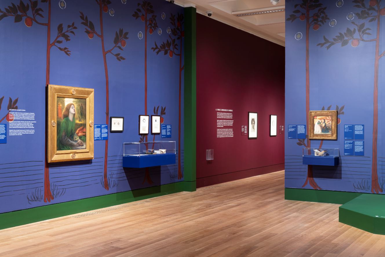
Installation view of ‘The Rossettis’ at Tate Britain, showing Room Five which showcases a wallpaper designed by Gabriel but never produced in his lifetime. Photo by Madeleine Buddo © Tate
And it’s not just wallpaper. This room also includes some big bits of furniture, namely a Rossetti-related cabinet, chair, and sofa.

Installation view of ‘The Rossettis’ at Tate Britain, showing King René’s Honeymoon Cabinet (photo by the author)
King René’s Honeymoon Cabinet (1861)
J.P. Seddon (1827 to 1906) designed this architect’s desk, including the metalwork and inlay, in 1861 for his own use. Seddon had the desk made at his father’s cabinet-making firm. He also commissioned ten painted panels depicting the Fine and Applied Arts from Morris, Marshall, Faulkner & Co. Ford Madox Brown, who also designed the panel representing ‘Architecture’, suggested the overall theme. The ‘Painting’ and ‘Sculpture’ panels were by Edward Burne-Jones, while Gabriel was responsible for ‘Music’ and ‘Gardening’. Morris designed the decorative background for each panel. (Text from the V&A article about the cabinet.)

Installation view of ‘The Rossettis’ at Tate Britain, showing chair and sofa designed and decorated by Gabriel (photo by the author)
The chair and sofa
The conspicuous consumption that characterised fashionable Victorian interior design did not suit Elizabeth and Gabriel’s ideal of a more authentic life. They sought out and adapted furniture that was basic and true to its materials and methods of making. They found beauty in handcraft rather than elaborate ornamentation and liked open, gracefully turned wood.
Gabriel collaborated with William Morris’s design firm to create rush-seated chairs like the one on display here, and this early-19th-century style sofa for his and Elizabeth’s home. On the sofa backrests are insets representing Love, the Loving or Lover, and the Beloved, painted by Gabriel.
Honeysuckle wallpaper
The big blue wallpaper isn’t the only one created specially for this exhibition. Room 8 has a wall covered in honeysuckle wallpaper made specially for this exhibition. It’s based on an embroidered hanging designed by William Morris and sewn by Jane Morris. Jane, her sister Bessie and her daughters May and Jenny played a key creative role in the making of textiles and embroideries for the family firm Morris & Co. This collective approach makes it difficult to identify individuals’ work. We know Jane was embroidering Honeysuckle around the end of Gabriel’s life. The finished embroidery was exhibited at the first Arts and Crafts exhibition in 1888.

Installation view of ‘The Rossettis’ at Tate Britain, showing the honeysuckle wallpaper in Room Eight. Photo by Madeleine Buddo © Tate
The blue wallpaper, the closet and the sofa had one overwhelming impact on me which was to get rid of them. ‘Chuck out your chintz’ as the old Ikea ad had it. This was precisely the kind of heavy, dark, wooden, over-decorated clutter which the Modernist designers of the Bauhaus had to reject in order to create the modern, clean, simple design aesthetic of the twentieth century. It has great historical interest, and kudos to Tate for recreating it, but I cordially disliked all of it.
2. A handwritten poem
A handwritten poem by Gabriel is exhibited for the first time, on loan from the University of Delaware Library, Museums and Press. Entitled The Portrait, this is believed to be one of the pages which were buried with Elizabeth Siddal’s body in Highgate Cemetery in 1862. The coffin was later exhumed in October 1869 to retrieve the pages when Gabriel was preparing to publish his first collection of poetry. The manuscript shows his frantic revisions ahead of its publication, including editing out some of the more sensual lines like ‘our hair had to be untangled when we rose’.
The poem describes the ability of a portrait painting to inspire memories of an absent lover and bring her to life. It is closely associated with Gabriel’s iconic painting of Elizabeth, Beata Beatrix, which was created at the time of the poem’s retrieval, seven years after her death. The two are now brought together in this show, and their paring is typical of the way both Gabriel and Elizabeth conceived of poems accompanying paintings and paintings made to accompany poems.
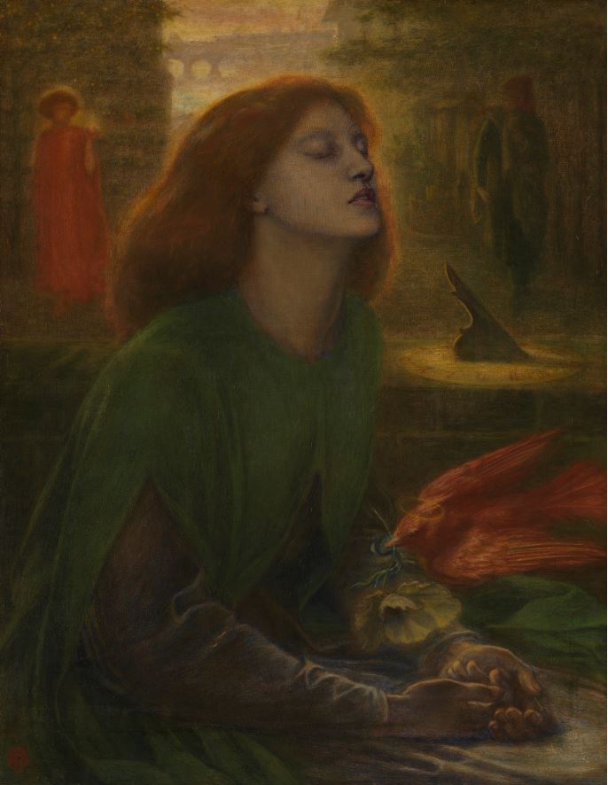
Beata Beatrix by Dante Gabriel Rossetti (1864) © Tate
3. Three Proserpines brought together
Tate’s famous Rossetti painting of Jane Morris as the mythological figure Proserpine has been brought together with two later paintings of the same subject, both on loan from private collections. They reveal the artist’s obsessive attention to detail and his fondness for revision and experimentation, developed over multiple versions spanning many years. The languid yet studied pose, and the amazing finish of the dress, went on to influence many modern artists who wanted to express emotion in art through colour and shape.

Proserpine by Dante Gabriel Rossetti (1874) © Tate
Gabriel first began depicting Jane as Proserpine around the time they became lovers in 1870. Her sadness and longing for the summer months is perhaps intended to evoke the time Jane and Dante Gabriel are not able to be together. The painting is also a study in melancholy, a subject the two often spoke about. The exhibition includes a book on the subject, Robert Burton’s famous ‘Anatomy of Melancholy’, which Dante Gabriel gave to Jane as a Christmas present in 1873. An ink drawing of her, intended for her eyes only, was hidden inside.
4. Portrait of Fanny Eaton
The exhibition is a rare opportunity to see one of Gabriel’s finest drawings. On loan from Stanford University in California, this portrait of Fanny Eaton is one of a series of portrait studies of working-class professional models whose likenesses reappear in paintings throughout the exhibition. Eaton was one of the most successful and sought-after of these models, often shown by other artists in expressive and dramatic roles, but Rossetti here depicts her in a private moment of quiet thought. It is one of the finest images in the show.
Born in 1835 in Surrey, Jamaica, probably the daughter of an enslaved mother, Eaton came to Britain after abolition and set up home with James Eaton, a coach driver. She bore him 10 children who she continued to provide for on her own after James died in his 40s. Her grave in Margravine Cemetery, Hammersmith, was finally marked with a headstone 6 months ago, followed by a blue plaque on her last home near Shepherd’s Bush.

Head of a Young Woman [Mrs. Eaton?] by Dante Gabriel Rossetti (1863 to 1865) © Cantor Arts Center, Stanford University
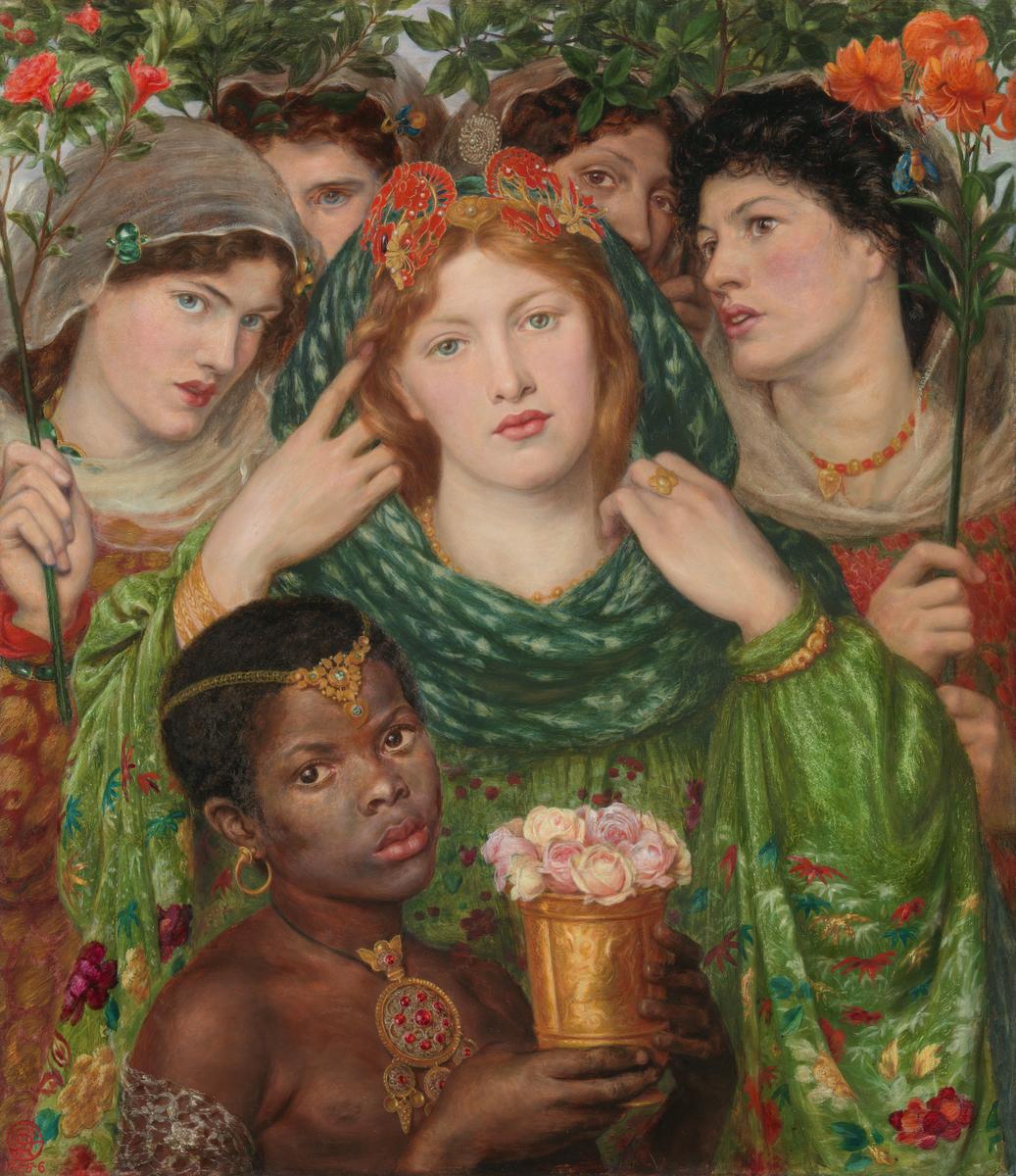
The Beloved (‘The Bride’) by Dante Gabriel Rossetti (1866) © Tate
To quote the curators:
Gabriel’s composition for ‘The Beloved’ was inspired by Renaissance artist Titian’s painting ‘Woman with a Mirror’ (1515) conceived as a Venus figure surrounded by many mirrors. He adapted this into an image inspired by the biblical ‘Song of Solomon’, about a young woman meeting her bridegroom, surrounded by attendants. In his eyes, the seven figures represented a universal vision of female beauty’. Created at a time when Britain was more connected to the globe through travel and colonial expansion, ‘The Beloved’ is Gabriel’s only oil painting to include models of colour. The work was conceived during the American Civil War (1861 to 1865) when newspapers debated universal freedom and the liberation of Black people enslaved in the Southern US states. The figures, flowers and accessories in the painting are appropriated from cultures around the world, particularly those from Asia and North Africa. They represent an ‘orientalist’ fantasy which mis-imagined these areas as archaic, exotic and interchangeable.
There you have a good example of the censorious, scolding tone of modern art scholarship. The purpose of devoting a room to this one painting is that the curators have assembled Gabriel’s preparatory sketches for each of the six heads which appear in the finished painting. It’s in this context that the stunning Head of a Young Woman appears a study of Mrs Eaton who appears in the final work as the third head from the left, with a completely different expression.
Thus there’s also a study of the black boy at the front of the painting. We don’t know his name but, as you can imagine, the Tate curators are super-alert to all the possible negative implications of his appearance:
Little is known of this boy, a visitor to London. Gabriel met him outside a hotel. Children had few rights in Victorian times. In this case, Gabriel negotiated the boy’s modelling work with an American described as his ‘master’, suggesting he was a student, servant or born into slavery. His gaze engages the viewer strongly, but Gabriel’s main intention was aesthetic. He wanted a model with what he described as ‘pure’ African heritage to add a different skin tone to the composition [giving him a] decorative and dehumanising role…
They go on to say something which slightly puzzled me:
Little is known of the boy’s experience of sitting. Gabriel is believed to have said he was both playful and tearful, and wondered whether he missed his mother. Where the girl models were drawn clothed, the boy was required to pose partly undressed. This may have contributed to his discomfort, expressed, perhaps, in the serious gaze. For the artist, the nudity objectified his appearance, displayed his dark skin and removed him from the present to the archaic fantasy space.
The bit that puzzles me is the idea that just this one boy, because he is black, has suffered a unique and grievous crime in being removed ‘from the present to the archaic fantasy space.’ Hang on. Haven’t the other four models been just as removed ‘from the present to the archaic fantasy space’? In fact, a moment’s reflection suggests that pretty much every model who ever posed for Gabriel and his friends was removed from the gritty realities of 1860s London and magically recreated in, the generally medieval, ‘fantasy space’.
I was genuinely puzzled why this ‘removal to fantasy space’ is absolutely fine and not worthy of comment on the hundreds and hundreds of occasions when it happens to white models, but troubles the curators so much that they comment on it in two separate captions, when the subject is black.
5. Rarely seen photographs of Elizabeth Siddal’s lost drawings
After Elizabeth Siddal’s death, Gabriel collected her drawings, had them photographed, printed and pasted into albums. Three pages of these albums are on display for the first time in this exhibition, on loan from the Ashmolean Museum in Oxford. Many of the original drawings have since been lost, such as her evocative depictions of the knight’s enchantment with the femme fatale from Keats’ poem ‘La Belle Dame Sans Merci’. New research into these drawings has revealed the ‘call and response’ of ideas between Elizabeth and Gabriel, with poses she used in her work reappearing in his later work.
The inclusion of these dozen or so photos of Siddal drawings is important to the curators because it furthers their deep aim of boosting women in art, in this particular instance adding just that bit more evidence to their case for the importance of Elizabeth Siddal, as an artist in her own right, and as a creative partner with Gabriel. They’re not, to be honest, anything special, but I appreciate where the curators are coming from.
Summary
I’m not a particular fan of the PRBs nor of Rossetti but, even as a semi-sceptic, I was blown away. This is a lovingly assembled, deeply intelligent and learned exhibition, beautifully designed and laid out, which includes many fascinating digressions and diversions, before leading up to the final rooms packed with staggering masterpieces. Wonderful. Amazing.
The video
Related links
- The Rossettis continues at Tate Britain until 24 September 2023
- Room by room guide
- Complete wall captions (PDF)
- Who were the pre-Raphaelites?


-josephine-baker.jpg)


