Aubrey Beardsley must be the most distinctive British artist. If you see any of his mature works, they are immediately recognisable and almost always deeply satisfying, their elegance of line and composition emphasised by the stylish use of huge areas of unmediated black or white, and the sophistication of his sensually charged portrayal of the human figure.

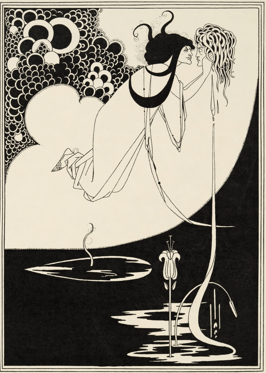
The Black Cape, illustration for Oscar Wilde’s Salome (1893) Photo © Tate
This exhibition is a feast of Beardsleiana, bringing together 200 spectacular works to make the largest display of his original drawings in over 50 years and the first exhibition of his work at Tate since 1923.
The wall labels to the fifteen or so sections the exhibition is divided into are available online:
And it contains a detailed timeline of his career. Rather than repeat all that, I’ll just single out what were, for me, the key learnings or best bits.
Key learnings
As he turned 18 and needed a job, Beardsley got a job working in an insurance office which, as you might imagine, he hated. What other early modern ‘great’ worked in an insurance office, created a distinctive body of work, and died of tuberculosis? Franz Kafka
Arts and Crafts
It is interesting to see Beardsley’s tremendous indebtedness to Arts & Crafts ideas of total design, and the importance of intertwining flower and stem motifs. And considering he was only 19!

Withered Spring by Aubrey Beardsley (1891)
Beardsley began his career just as William Morris was producing his luxury designed books from the Kelmscott Press. The curators usefully summarise the elements of a Kelmscott production as:
- elaborate decorated borders
- decorated initial letters
- full page illustration
The hair-line style
The exhibition shows how Beardsley quickly moved from this relatively ‘heavy’ line to move to the extreme opposite, to complex compositions which are covered in a crazy network of super-fine lines. The curators call this his ‘hair line’ style.

How Arthur saw the Questing Beast by Aubrey Beardsley (1893) Victoria and Albert Museum
It is also an early example of Beardsley slipping surreptitious rudeness or irrelevancies into his pictures. At the bottom left of the ‘river bank’, right up against the frame, is the silhouette of an erect penis and scrotum. Towards the top right is a concealed treble clef.
Morte d’Arthur
The picture above is one of the Morte d’Arthur series which made Beardsley’s reputation. He was commissioned to make a hefty 353 illustrations for a new edition of the Morte by publisher J.M. Dent, including full and double-page illustrations, elaborate border designs and numerous small-scale ornamental chapter headings.
However, Beardsley quickly became bored and irked by the subject limitations and began introducing extraneous elements and flights of fancy. Thus the picture above is supposed to be of a medieval knight and a dragon though you wouldn’t really think so. Most disruptive of all is the presence of a pan or satyr from Greek mythology, absolutely nothing to do with medieval legend.
Japanese influence
The exhibition includes one print by Utagawa Kuniyoshi, a lovely coloured woodblock which exemplifies the kind of Japanese influence which impacted European art from the 1870s onwards, and influenced everyone with their:
- abstract depiction of pictorial space
- linear intricacy
- emphasis on flat pattern
Kakemono
A kakemono is a Japanese hanging scroll used to display and exhibit paintings and calligraphy inscriptions and designs mounted usually with silk fabric edges on a flexible backing, so that it can be rolled for storage. It is a distinctly different shape from traditional Western portrait shape, and Beardsley was to incorporate it into many later works.
Mantegna
Andrea Mantegna (1431 to 1506) was a key influence for Beardsley. The Italian was famous for his frescos and murals showing parades and processions and groups of people, and Beardsley used ideas and figures and compositions from Mantegna throughout his career. Even in his last accommodation, a hotel room in the south of France, he had a set of photos of works by Mantegna pinned to his wall. Indeed Beardsley produced several Mantegna-style processions, notably The Procession of Joan of Arc which was included as a foldout supplement to the second edition of The Studio magazine in 1892.
Wagnerite
Beardsley was a keen fan of Wagner, attending productions of his operas and illustrating scenes from them. He had ambitions as a writer as well as illustrator and in his last few years worked at a text which was a comic version of the legend of Tannhäuser which Wagner had made into an opera. Given the working title of the Story of Venus and Tannhäuser, excerpts were eventually published in The Savoy magazine under the title Under The Hill, an oddly Hobbit-like title for such a grand Wagnerian subject.
Photo Lineblock
Just as important for the quick evolution of Beardsley’s style was the introduction in the 1890s of the new technology of photo lineblock printing, a photomechanical process. Beardsley was disappointed at the poor reproduction of his washes and shading using this new method, but quickly adapted and made a virtue of leaving large areas of a page completely untouched, others pure black, and ensuring the lines and patterns were crisp and clear. The result is startling.

How la Beale Isoud Wrote to Sir Tristram by Aubrey Beardsley (c.1893) Alessandra and Simon Wilson
In fact this picture is singled out by the curators as exemplifying another of Beardsley’s traits which was his extraordinary ability to assimilate influences and make them his own. Thus the curators point out in this image:
- Isoud resembles Jane Morris, with the classic pre-Raphaelite jutting chin and mountain of frizzy hair
- the Germanic form of the desk is borrowed from Albrecht Dürer’s engraving St Jerome in his Study
- the flattened use of space recalls the influence of Japanese prints
- whereas the elaborate border of intertwining flower motifs recalls Arts & Crafts designs
Salomé
In 1892 Beardsley made a drawing in response to Salomé, Oscar Wilde’s play, originally written in French and based on the biblical story. Wilde admired the drawing and he and his publisher, John Lane, chose Beardsley to illustrate the English translation of the play. Beardsley produced eighteen designs in total, of which only ten appeared in the first printing of the play. Publisher John Lane suppressed or censored three of Beardsley’s illustrations for their overt sexual references, in particular when female characters’ hands are wandering towards their privates, as if about to masturbate, or unnecessary depictions of the male characters’ phalluses.

The Climax: illustration for Oscar Wilde’s Salome (1893) by Aubrey Beardsley. Photo © Tate
The Yellow Book
The exhibition clarified the timeline around the Yellow Book, and has an entire room devoted to it. Beardsley was made its art editor at its inception in 1894 and contributed the front and back covers for the first five editions. But Beardsley was closely associated with Oscar Wilde (having contributed a suite of illustrations for Wilde’s ‘immoral’ play about Salome), and so soon after Wilde’s arrest in May 1895, Beardsley was fired from the Yellow Book.
On one of the days of his trial, Wilde was seen going into court holding a copy of the Yellow Book and that clinched it for the angry mobs and journalists outside. The offices of the Yellow Book’s publishers, Bodley Head, were attacked by a mob who smashed its windows. In order tonsure the survival of the firm, and its staff, and the continuity of publication of the magazine and all his other titles, publisher John Lane had little choice but to distance himself from Beardsley. The sixth volume, of July 1895, still had the cover and several illustrations by Beardsley but he no longer worked for it. (Later it transpired that Wilde hadn’t been holding a copy of the Yellow Book at all, but a French novel, which tended to be published with yellow covers.)

The Yellow Book Volume I (1894) bound volume. Photo © Tate
It looks as if you can examine every volume of the Yellow Book, all its literary and art contents, online
The room has an example of all five volumes of the Yellow Book that Beardsley was involved with. I’ve read about it ever since I was a teenager at school forty years ago, but I don’t think I’d ever seen a copy before and certainly not six. I’d always envisioned it as magazine-size, but it does indeed look like a hardback book, in size and shape and leather binding.
Beardsley’s work desk
The exhibition includes the very table or desk which Beardsley used during his glory years. Standing a few feet from it, it is hard to imagine that the man produced all these pitch-perfect works without the aid of architects’ tools or computers – just him, a ruler and a pen.
Beardsley’s address
With the money he made from the Salome illustrations and a small legacy Beardsley bought a house at 111 Cambridge Street, Pimlico with his mother and sister, Mabel, to both of whom he remained very close throughout his short life. Only a few hundred yards from Tate Britain where this exhibition is being held…
Oscar Wilde
Wilde was an established writer when he saw the first of Beardsley’s drawings and immediately liked them. He approved the suggestion that Beardsley illustrate the original French version of Salomé and they socialised. So far, so well known. I hadn’t realised that Beardsley satirised Wilde quite so much. There are straightforward lampoons of the increasingly fat and pompous aesthete, but he also slyly slips Wilde’s epicene features into numerous other illustrations, in one giving the moon the eyes and nose of Wilde.

The Woman in the Moon by Aubrey Beardsley (1894)
The Rape of The Lock
This is the title of Alexander Pope’s mock-heroic 18th century satire. I suppose it’s worth clarifying that ‘rape’ in the title doesn’t mean rape in our modern sense, but the older sense of ‘theft’ or stealing away. Thus Pope conceived an extended poem which uses all the devices and machinery of the classical epic to describe how one jaded aristocrat cuts a lock of hair from the head of another jaded aristocrat, and this leads to a feud between their families. Believe it or not this elaborate literary joke extends to five cantos with many extended scenes. Beardsley created nine photo-engravings for an 1896 republication of the poem, five of which are on display here for the first time.
Beardsley had been a fan of 18th century rococo prints, maybe because they – like him – are sophisticated, worldly, stylish and much more open about sexuality than the Victorians. The exhibition shows us some of the original 18th century prints which Beardsley bought at auction in Paris, and then goes on to show all the Pope pictures.

The Dream by Aubrey Beardsley (1896) The J. Paul Getty Museum, Los Angeles
What’s immediately obvious is the that the stark clarity of the Salome illustrations has been abandoned for a much more elaborate style, characterised above all by the stippling that creates a sort of lace doily effect on almost all the fabrics. And look at the patterning of the carpet. A long way from the stark black and white of the Salome illustrations. Many critics thought these his best works as an illustrator.
Posters
The 1890s were the glory decade for poster design in Paris, led by Henri Toulouse-Lautrec and Jules Chéret. I didn’t realise Beardsley produced a number of posters which modified his own style to take on board the need for a) size b) colour.
There’s a room devoted to half a dozen of his posters, none of which match the quality of Lautre or Chéret, and most of which are advertiser’s promotions of new ranges of childrens books or books by women, alongside promotional posters for The Yellow Book and several plays and operas. The section contains the telling quote:
I have no great care for colour, but [in posters] colour is essential.
‘I have no great care for colour’. Worth pondering. And relevant to the one and only oil painting Beardsley is known to have made.
Oil painting
There’s a rare outing for Beardsley’s only oil painting and you can see why – it’s rubbish. His entire style was built around absences, around huge areas of untouched whiteness. Trying to translate that into oil, which specialises in depth and shadow, was a hopeless task.
Porn
After Beardsley was sacked from The Yellow Book, almost the only publisher who would use his drawings was Leonard Smithers. Smithers operated on the fringes of the rare book trade, issuing small, clandestine editions of risqué books with the boast: ‘I will publish the things the others are afraid to touch’. Smithers encouraged Beardsley’s already growing interest in risqué French, Latin and Greek texts and commissioned drawings to illustrate the Satires of the late Roman poet Juvenal and, most famously, Aristophanes’s bawdy satirical play Lysistrata.
In Lysistrata the women of Athens go on a sex strike, refusing to have sex with their menfolk until they stop the ridiculous war against Sparta. Beardsley made eight outrageously sexual illustrations for Smithers’ edition. Among other subjects, this is the set which includes start, beautifully made black and white line drawings of ancient Greeks with humongous erect penises. Maybe if you’re very young or innocent these are ‘shocking’ images, but to the modern viewer they are vaguely reassuring, certainly humorous. The two figures on the right are mildly realistic but it’s the guy on the left who gets the attention, not because of his phallus as such but because the entire character is obviously created for grotesque comedy.

Illustration for Lysistrata by Aubrey Beardsley (1896)
The grotesque
He knew he was attracted to ‘the grotesque’ and there is a wall label which usefully explains the origins of the grotesque in art. Grotesque originally referred to the decoration of grottos, and came to denote the depiction of deliberately hybrid and monstrous forms, which often combined body parts from different animals, like a centaur or mermaid. As the man himself said:
I see everything in a grotesque way. When I go to the theatre, for example, things shape themselves before my eyes just as I draw them. .. They all seem weird and strange to me. Things have always impressed me in this way.
Foetuses
Nobody knows to this day why he drew so many foetuses, either as insets in frames or as characters in the more grotesque illustrations. Maybe it was simply because they are a kind of quintessence of the grotesque.
My favourite
Venus framed by two statues of male gods in the form of herms (a sculpture with a head and perhaps a torso above a plain, usually squared lower section’). I like it because of its formal precision, its symmetry which is, however, broken by the asymmetric sway of Venus’s long dress. I like it because there is no indecency, boobs or penises in sight. Instead there is a sense of genuine menace from the devil eyes of the two herms. And I like it because it is a kind of reversion or revisiting of the Arts & Crafts theme of incredibly ornately interwoven bushes, stems and flowers of (I think) roses. But mostly because it is a pleasingly complete, formal, complex and rather threatening image.

Venus between Terminal Gods (1895) Drawing with india ink by Aubrey Beardsley. The Cecil Higgins Art Gallery, Bedford
Walter Sickert
Almost the best thing in the exhibition is the full-length portrait painting of Beardsley made by the English painter Walter Sickert, after they’d both attended a commemoration ceremony for John Keats. Its sketchy unfinished quality makes it a haunting gesture to the memory of the dandy and artist who died aged just 25.

Aubrey Beardsley by Walter Sickert (1894)
Crucifix
The exhibition includes the last photo of Beardsley, taken in the hotel room in the Hotel Cosmopolitain in Menton where he had gone in search of a warmer dryer climate which would be more favourable to his tuberculosis. The photo shows Beardsley looking tremendously smart in a suit and well-polished shoes opposite a wall on which are pinned reproductions of his beloved Mantegna, and a mantelpiece on which sits a crucifix.
Because although I’ve probably read it numerous times, I’d forgotten that in his last months Beardsley converted to Catholicism. He died holding a crucifix. Just a few days before he died he wrote a letter to Leonard Smithers asking him to destroy all of Beardsley’s risqué images, the Lysistrata illustrations etc. Smithers refused and so they were saved for generations of schoolboys to giggle over.
Who does a deathbed request to destroy his works which its address completely ignored remind you of? Franz Kafka.
Film
There is a room with benches so you can watch Charles Bryant and Alla Nazimova’s 1923 silent movie version of Salomé immediately following the room of Beardsley’s illustrations. For some reason the gallery lights had been left on full power in this room which made it harder to see the image on the screen.
Legacy
The exhibition closes with a sketchy overview of Beardsley’s legacy from his influence on the long sinuous lines of Art Nouveau via a string of now mostly forgotten book illustrators who copied his style (Harry Clarke, Hans Henning Voigt) through the revival of Beardley’s reputation and style which was sparked by a major retrospective of his work at the Victoria and Albert Museum in 1966 which led to the incorporation of Beardsleyesque black and white swirling lines into lots of psychedelic posters and, most famously of all, into the portrait of the four Beatles in the cover art for their LP Revolver.

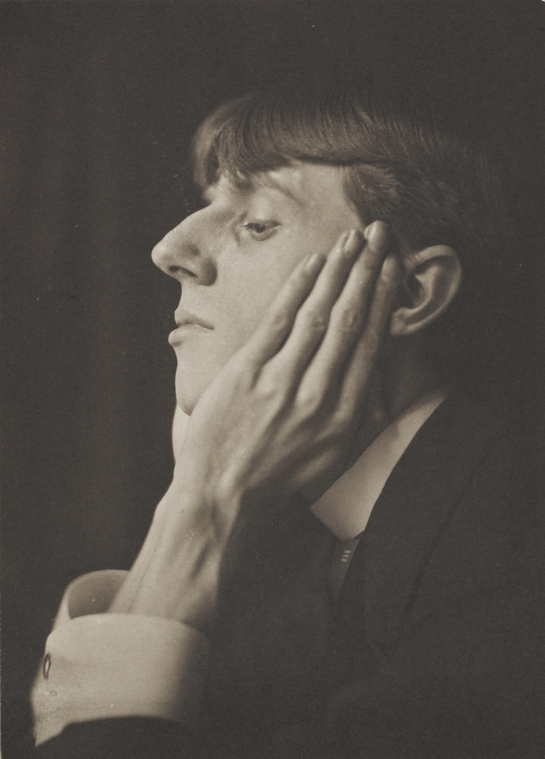
Portrait of Aubrey Beardsley 1893 by Frederick Evans. Wilson Centre for Photography
This is a long, very thorough, exhaustive and informative exhibition about a truly world class and utterly distinctive English artist.
Related links
More Tate Britain reviews