Hilma af Klint and Piet Mondrian @ Tate Modern

‘Nature or, that which I see, inspires me, puts me, as with any painter, in an emotional state so that an urge comes about to make something, but I want to come as close as possible to the truth and abstract everything from that…’
(Piet Mondrian, 1914)

‘The more we discover the wonders of nature, the more we become aware of ourselves.’
(Hilma af Klint, 1917)

Mondrian is obviously one of the masters of modern art; most educated people would immediately recognise one of his characteristic abstract paintings. By contrast, Hilma af Klint is a lot less well-known. What they have in common, though, was that they both journeyed from late-Victorian figurative i.e. realistic art, to abstraction, albeit completely different styles of abstraction. And, as with so many pioneers of abstraction, they developed their modern abstract styles in response to surprisingly old-fashioned spiritual motivations, to deeply-held mystical and Theosophical beliefs about Nature and Truth which this excellent exhibition explores in great detail.

I didn’t expect to like this exhibition that much and, from the publicity photos had taken a little against af Klint. How wrong I was! This is a brilliant exhibition – af Klint emerges as a huge artist in her own right – and, above all, I had no idea that two artists could have produced such a range and variety of styles. There are so many different types of painting to savour and enjoy.

Landscape painters

Hilma af Klint (1862 to 1944) and Piet Mondrian (1872 to 1944) began their careers as academically trained landscape painters in the late nineteenth century, before developing radically new models of painting in the twentieth century. Although they did not know each other – or of the other’s work – the exhibition shows how they began their careers very firmly rooted in naturalistic depictions of the natural world, and how they slowly, steadily took different but parallel paths away from these roots to arrive at highly stylised abstraction.

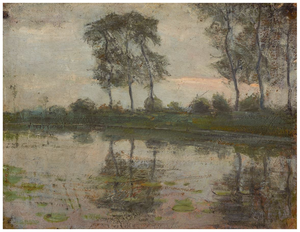
‘The Gein: Trees along the water’ by Piet Mondrian (c.1905) Kunstmuseum Den Haag

Flowers and trees

Both artists spent a lot of time painting flowers. Room three devotes a whole wall to displaying 20 wonderfully accurate botanical watercolours done by af Klint, the kind of thing which still illustrates guides to wildflowers I’ve bought recently.

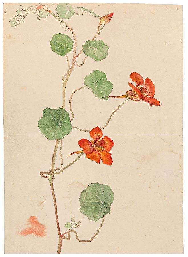
Botanical drawing by Hilma af Klint (c.1890) Courtesy of The Hilma af Klint Foundation

Marvellous, isn’t it? A whole wall of lovely paintings of buttercups, nasturtiums, stonecrop, thistle, saxifrage, apple blossom and many more. I wanted to buy the entire wall and take it home with me.

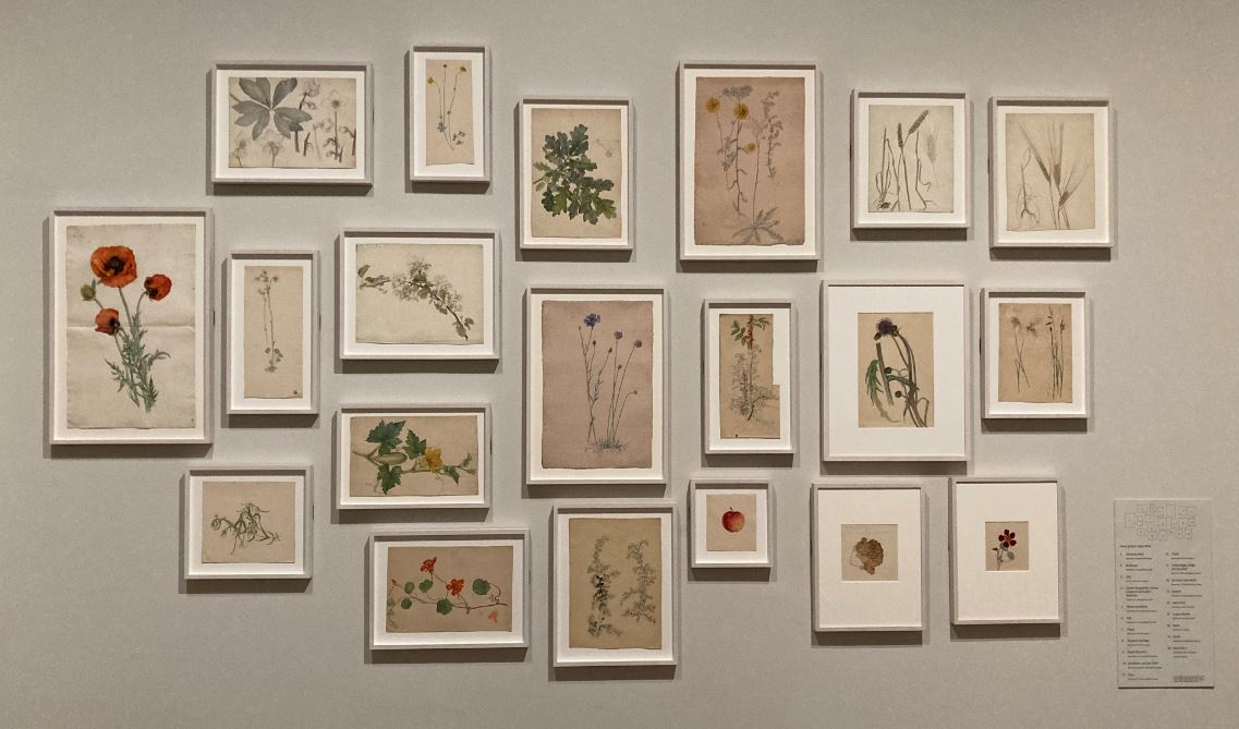
Installation view of ‘Hilma af Klint and Piet Mondrian’ at Tate Modern, showing the wall of botanical paintings by af Klint (photo by the author)

On the opposite wall are 15 flower paintings by Mondrian which are more full-bodied and intense. According to the curators:

Many of these paintings and drawings of flowers that Mondrian made in 1908 to 1909 are full of symbolism, mainly relating to Theosophy. Shortly afterwards, he moved away from symbolist representations, but continued to portray flowers until his death, selling them for income at times of financial difficulty. He repeatedly returned to the same varieties, such as chrysanthemums and arum lilies.

Some of these are really standout pieces. Take this stunning amaryllis.

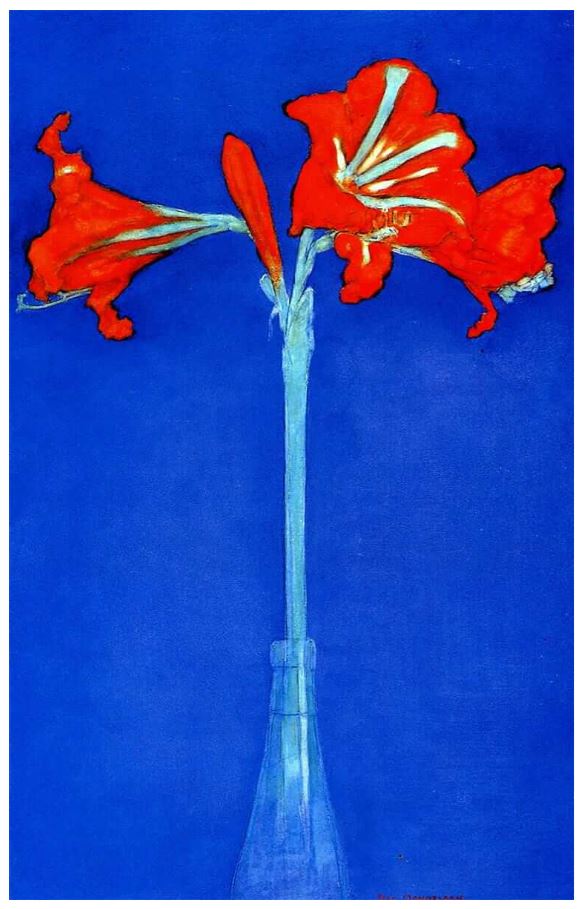
‘Red amaryllis with blue background’ by Piet Mondrian (1909 to 1910) Private Collection

After staring at it for some time I realised I really liked the depiction of the bottle the flower is standing, a beautifully pure and evocative rendition, almost a piece of 1960s Pop Art.

The Ether

During their careers, new technologies such as the microscope, X-ray radiography and photography were challenging human perception. The evidence of worlds invisible to the human eye catalysed shifts across science, spirituality and the arts. These discoveries in the sciences meshed with slightly earlier schools of thought, especially the theories of Theosophy. The Theosophy Society was founded in 1875 its chief thinker, Helena Blavatsky, published works developing the theory during the 1880s and 90s.

The exhibition devotes an entire room to exploring various aspects of Theosophical belief and its impact on our two artists, and it wasn’t a peripheral impact: in 1904, af Klint joined the Stockholm lodge of the Theosophical Society and Mondrian Amsterdam Lodge in 1909. A central belief, which meshed with the science of the time, was that all living things are connected by an invisible, imperceiveable force, which they called ‘the ether’, and that’s why this gallery has been called The Ether.

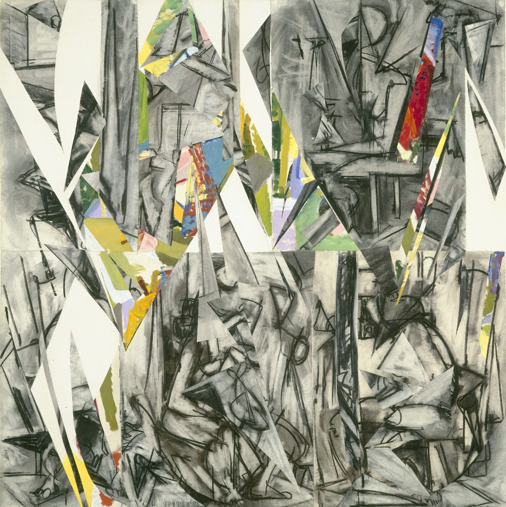
One among many aspects of this was an anthropomorphised version of Darwin’s theory of evolution which lent it a spiritual aspect, optimistically hoping that all life forms were evolving and yearning towards higher spiritual truths. Hence af Klint’s series titled ‘Evolution’. Here you can see how zoomorphic shapes and botanical motifs have been simplified and stylised to form the basis of complex but abstract designs.

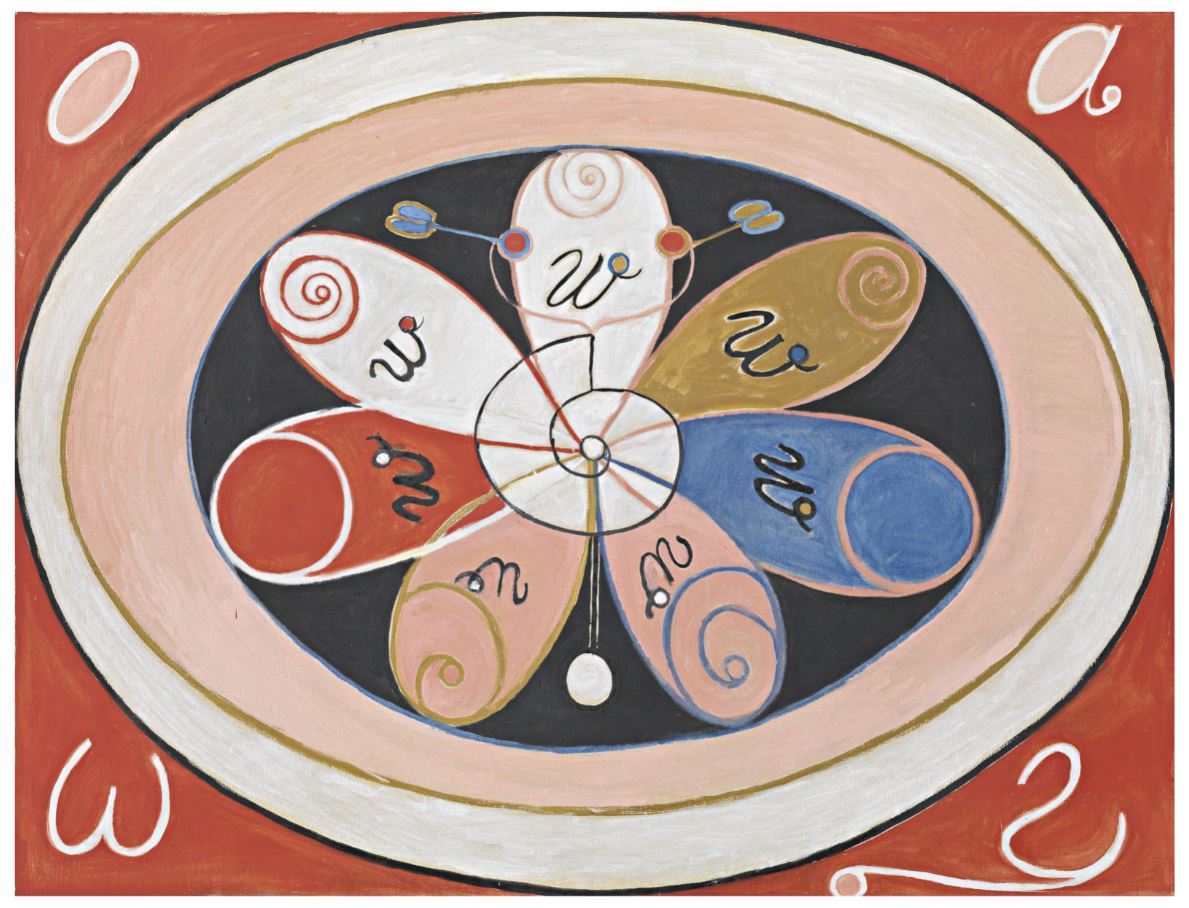
‘The Evolution, The WUS/Seven-Pointed Star Series, Group VI, Number 15’ by Hilma af Klint (1908) Courtesy of The Hilma af Klint Foundation

This spiritualised version of evolution attracted many writers, artists and thinkers at the turn of the century. The Great War had yet to dent, or demolish, people’s romantic faith in progress and improvement. Mondrian gave the title to a strikingly different kind of work, one depicting three highly stylised female forms.

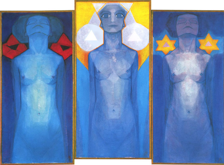
‘Evolution’ by Piet Mondrian (1911) Kunstmuseum Den Haag – bequest Salomon B. Slijper. X83910

Mondrian wrote of this painting: ‘It’s not so bad, but I’m not there yet.’ The figures represent the stages in evolution from the physical to the spiritual realm, as promoted in Theosophy. The triangular nipples and navels of the women, which point upwards and downwards, symbolise their spiritual and earthly orientation. The central figure embodies the fulfilment of the evolutionary process, to the spiritual realm. The flowers on the left panel are symbols of purity, while those on the right symbolise tragic suffering.

Incidentally, among many other treasures in the Ether Room is the surprising inclusion of four small paintings by the famous psychotherapist and guru Carl Jung. To quote the curators:

Carl Jung’s Liber Novus is now known as ‘The Red Book’, due to the colour of its cover. It is not certain that he ever intended to publish this account and interpretation of his years of personal crisis between 1913 and 1916. The book is full of illustrations combining symbols from various religions, such as mandalas and trees encased in egg-like forms that resonate with af Klint’s work. It is regarded as the seed of the analytical psychology Jung would later develop, in which the conscious and unconscious are assimilated into the whole personality.

The four works by Jung are surprisingly powerful and certainly fit right in, in this context.

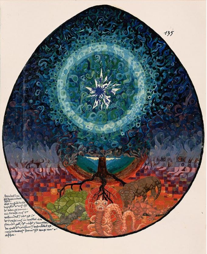
Illustration from Carl Jung’s Red Book © The Foundation of the Works of C.G. Jung

Abstraction 1. The impact of cubism

How did Mondrian arrive at his final style? In stages. He travelled to Paris in 1911 and was immediately galvanised by cubism which he reinterpreted with a spiritualist slant. He began reworking drawings and paintings of trees in the new style. the catalogue has a nifty quote from Guillaume Apollinaire assessing a small show of Mondrian’s drawing attention to the obvious cubist influence, but cannily predicting that Mondrian was using it for other ends and would probably develop his own version.

There are many cubist-era works by Mondrian on show. Here you can see cubism hitting his naturalistic depictions of flowers and trees like a freight train, taking it somewhere completely new.

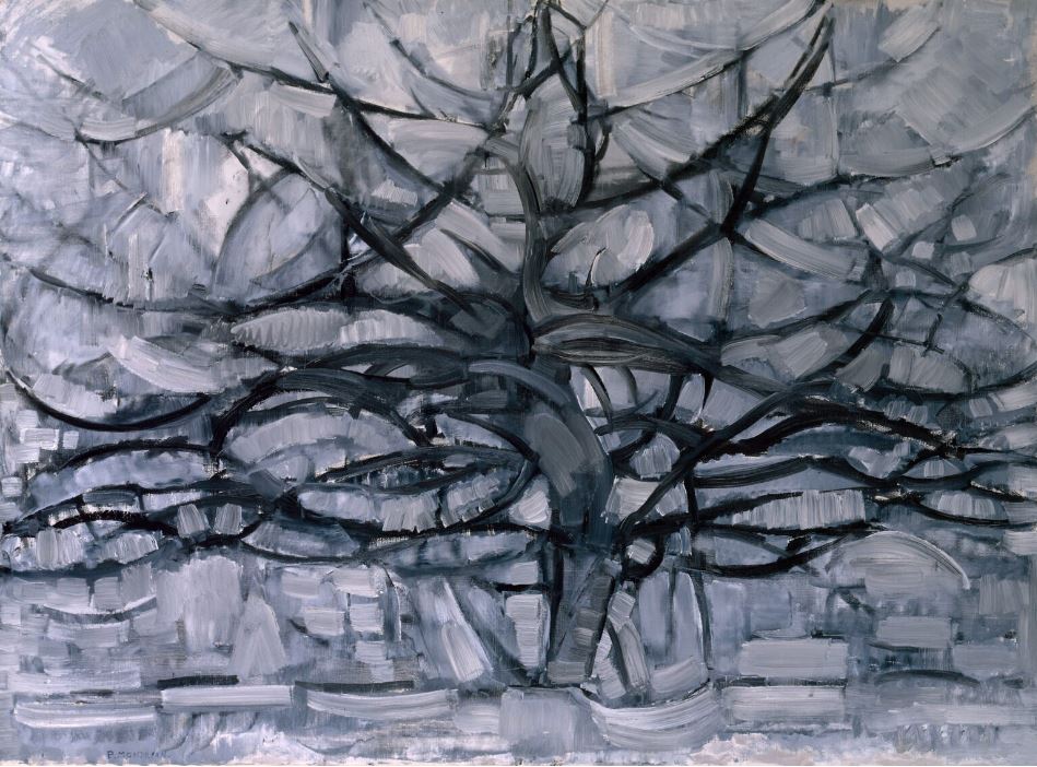
‘Grey tree’ by Piet Mondrian (1911) Kunstmuseum Den Haag

The exhibition includes examples of the many interim steps, fascinating and often beguiling abstracts in their own right, which move towards this, six years later, in the midst of the Great War, when the discrete elements of the earlier paintings have become solidified into blocks, blocks of abstract colour, floating against an empty background (or a background flooded with invisible ether, which joins the disparate entities?)

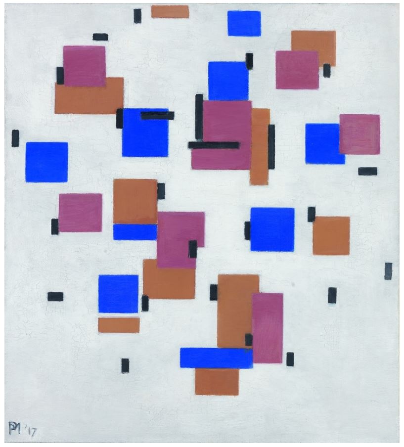
‘Composition in colour B’ by Piet Mondrian (1917) Collection Kröller-Müller Museum, Otterlo, the Netherlands

Abstraction 2. Mondrian reaches his mature style

‘By the unification of architecture, sculpture and painting a new plastic reality will be created.’ (Piet Mondrian, 1917)

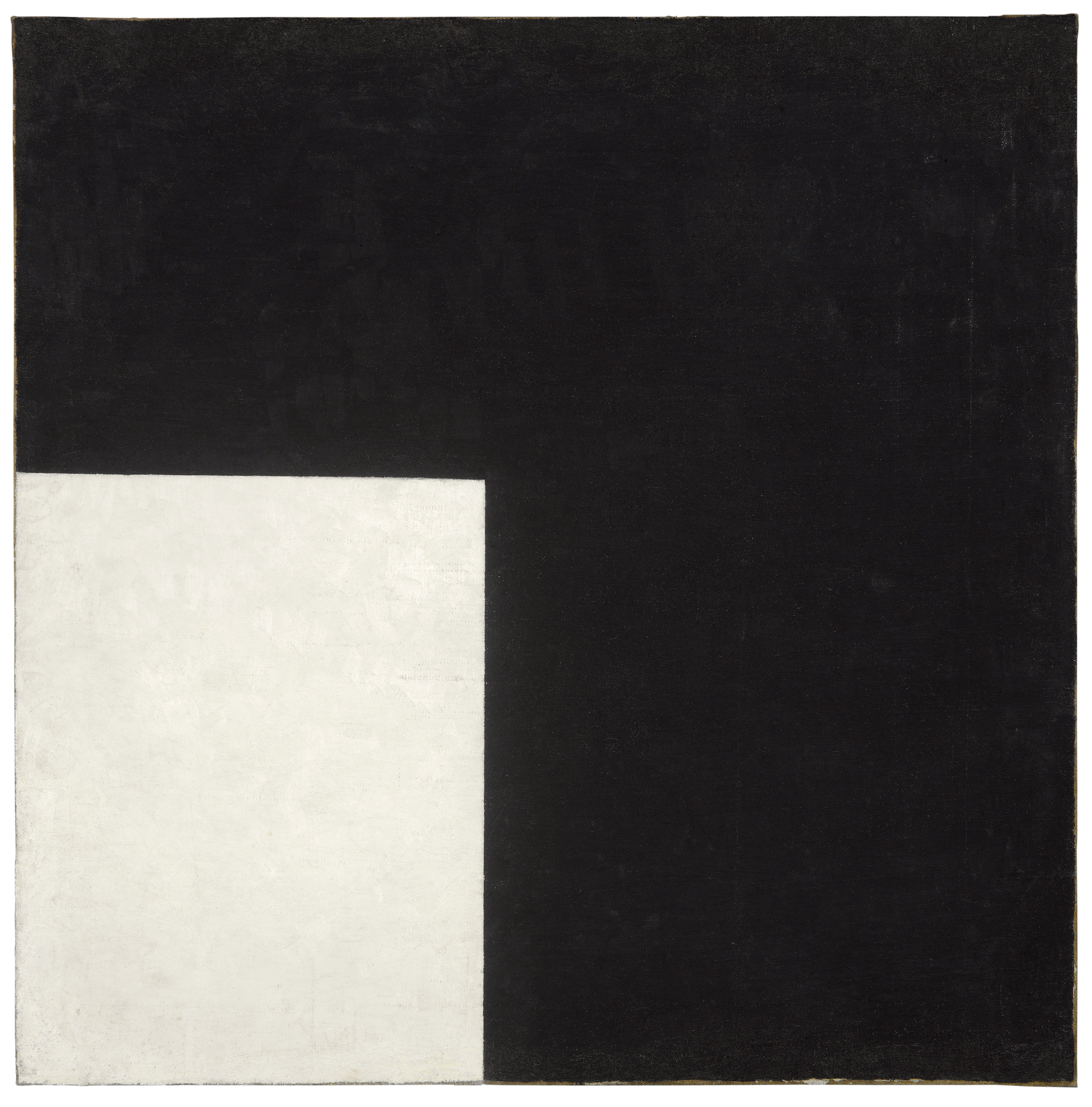
Around 1920 everything came together in the new style of rectangular grids separated by thick straight black lines, a visual language of ‘pure relationships’ which he called ‘neo-plasticism’. These paintings abandoned any form of symbolism as they become irregular grids. He set out to reduce painting to its basic principles, removing individual aspects (which he called ‘tragic’) to express the ‘universal’.

In 1921 he published an essay titled ‘Le Néo-Plasticisme: Principe général de l’équivalence plastique’ which explains neo-plasticism as an approach to representing the ‘universal’ through balancing oppositions of the most basic elements of painting: position, size and colour.

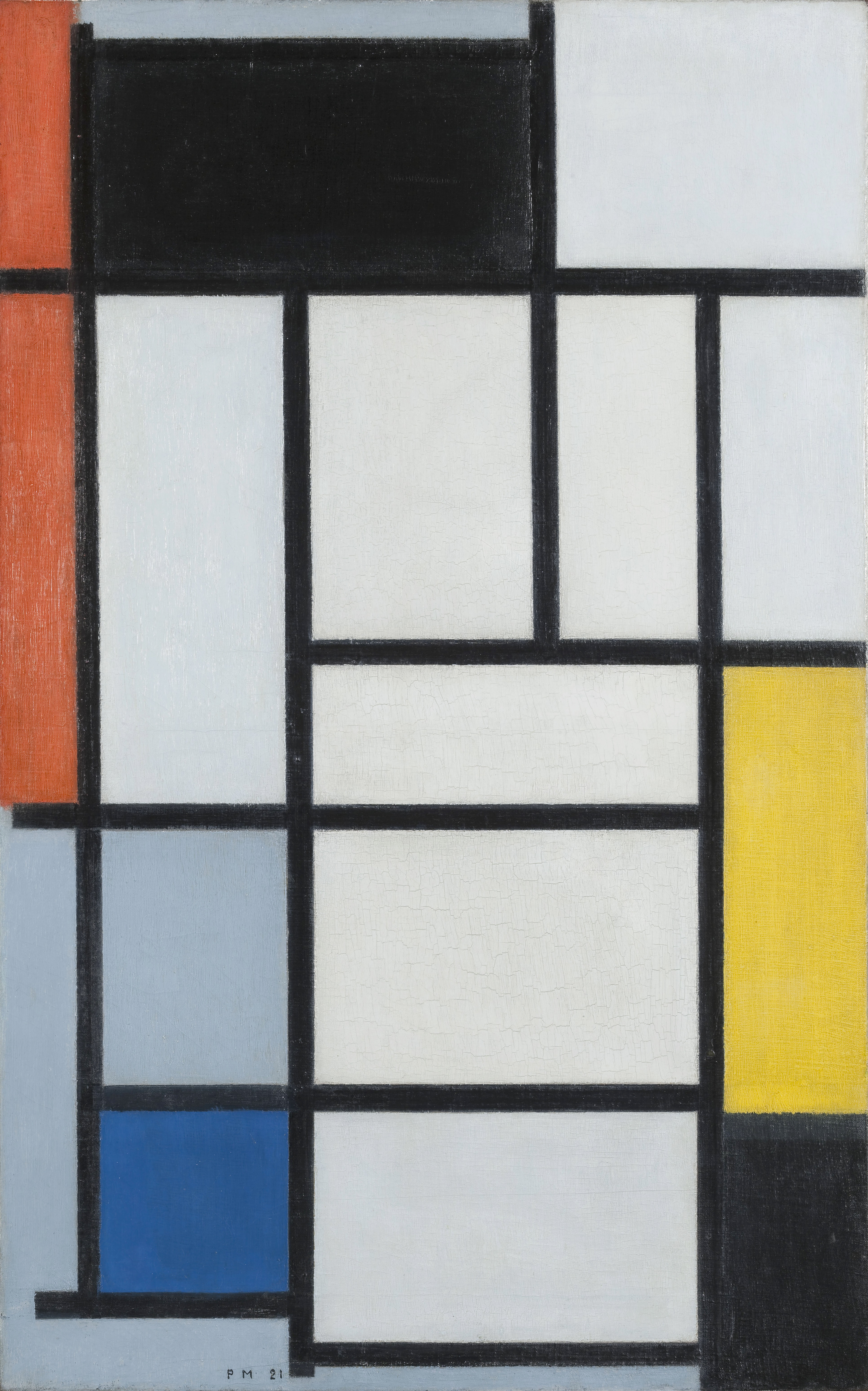
‘Composition with Red, Black, Yellow, Blue and Grey’ by Piet Mondrian (1921) Kunstmuseum Den Haag

Mondrian believed that neo-plastic principles were destined to define the world around us. Some critics described the paintings as having ‘jazz rhythms’ and I’ve seen modern jazz album covers with Mondrians on them, both of them expressing something about the clean pure and yet somehow dynamic lines of modernity. The Tate bookshop includes ‘The Afterlife of Piet Mondrian’ by Nancy Troy which looks interesting, an examination of how the Mondrian style was curated, copied and publicised, of how ‘the popular appeal of Mondrian’s instantly recognizable style in fashion, graphic design, and a vast array of consumer commodities’.

One room is devoted to Mondrian’s mature style and there’s a very noticeable difference between the works from the 1920s and 30s. In both the works from the 1920s, not all the lines extend to the very edge of the canvas. Petty detail though this may seem, it makes a lot of difference, because in the next space are three classic Mondrians from the 1930s and in each instance the black lines do extend all the way to the edge. Trivial though it sounds, they look more complete, more finished, more total.

It’s a mystery to me and something the curators don’t address which is how come such rigid geometric shapes are so very pleasing to the eye and mind. they feel calming, deep, completing in a way which is hard to convey. Mondrian himself commented:

‘Vertical and horizontal lines are the expression of two opposing forces; they exist everywhere and dominate everything; their reciprocal action constitutes “life”. I recognised that the equilibrium of any particular aspect of nature rests on the equivalence of its opposites.’ (Piet Mondrian, 1937)

Not sure that helps explain why this look immediately struck everyone as clean and classic and has remained so for 80 years.

Abstraction 3. The Ten Largest

‘My mission, if it succeeds, is of great significance to humankind. For I am able to describe the path of the soul from the beginning of the spectacle of life to its end.’ (Hilma af Klint, 1917)

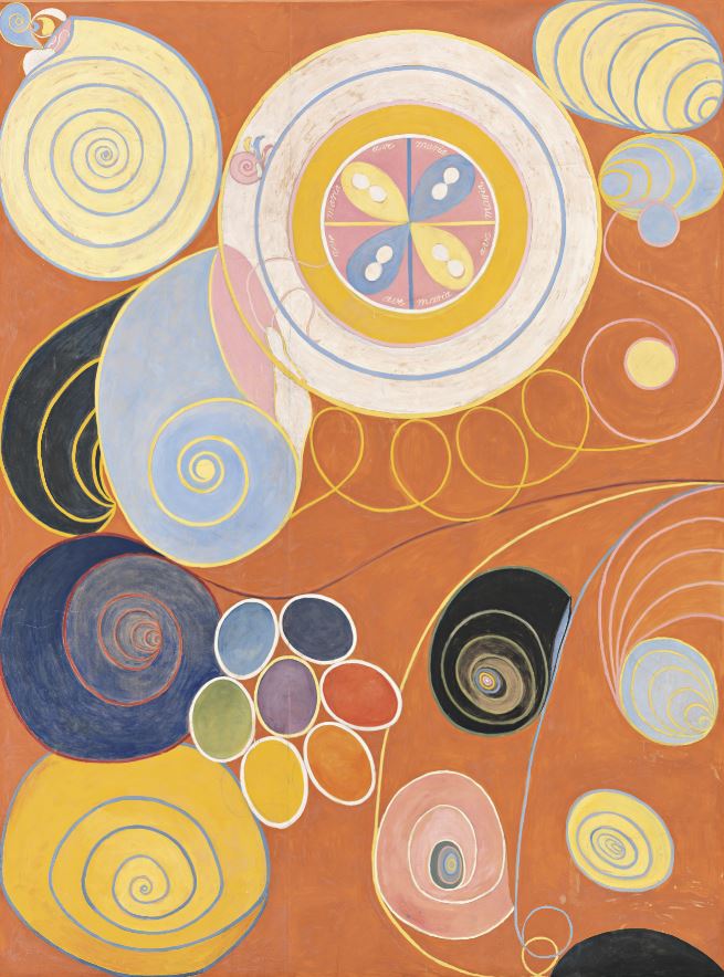
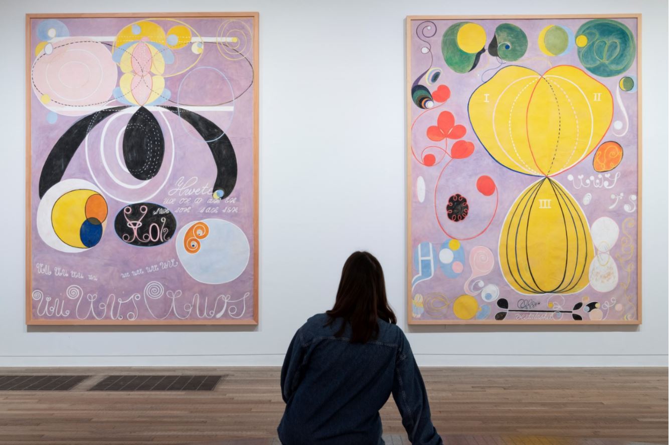
I thought the climax of Mondrian’s development in those three classic works from the 1930s, presented in a clean white rectangular space, would be difficult, but in the event the curators completely trump them with the last room in the exhibition. This is devoted to a set of ten enormous, huge and overwhelming canvases by af Klint, titled ‘The Ten Largest’.

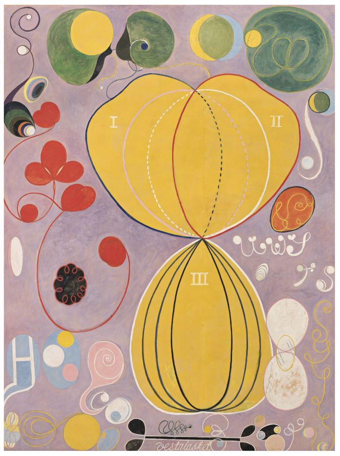
The Ten Largest, Group IV, Number 7, Adulthood by Hilma af Klint (1907) Courtesy of The Hilma af Klint Foundation

These ten huge paintings represent the stages of life, with two each representing Childhood, two devoted to Youth, four to Adulthood, and the final pair to Old Age. I thought I wouldn’t like these at all but, somehow, the preceding nine rooms, showing the slow development of her style, explaining the mystical and spiritual beliefs behind it, had softened me up and prepared me. I thought they were magnificent.

The Ten Largest, Group IV, Number 3, Youth by Hilma af Klint (1907) Courtesy of The Hilma af Klint Foundation

‘The Ten Largest’ are part of ‘The Paintings for The Temple’, a body of works af Klint believed was commissioned by her spiritual guides (we have learned about her spiritual guides throughout the show). Af Klint dreamed of building a temple in the form of a spiral where her paintings could be hung together as a ‘beautiful wall covering’. To ascend through the temple would mean moving towards a higher state of being.

Installation view of ‘Hilma af Klint and Piet Mondrian: Forms of Life’ at Tate Modern showing two of the four Adulthood works.  Photo: Tate (Jai Monaghan)

It took me a while to realise that the four ages are colour coded: the Childhood pair have a lovely deep blue background, the two Childhood works have an orange background, the four Adulthood paintings the lilac colour you can see in the photo above, and the final Old Age pair have a pink background. Then I realised that the colour in each set fades and becomes paler in the second or later work in each set, as if that era’s virility fades as it prepares to transmute to the next stage of life. None of that, none of the richness or intensity of the colour, and the dramatic sense of their changing hues, comes over in these photographs.

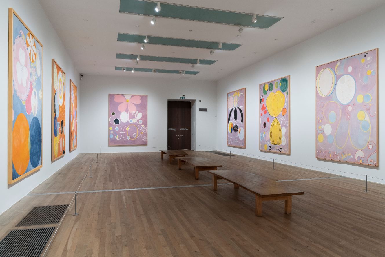
Installation view of ‘Hilma af Klint and Piet Mondrian: Forms of Life’ at Tate Modern showing, from left to right, the second Childhood (blue), the two Youth (orange) and the four Adulthood (lilac) paintings. Photo: Tate (Jai Monaghan)

As you can see each painting consists of arrangements of completely abstract designs and patterns and yet, slowly, as you study them, you realise certain motifs recur in each set, giving them a thematic unity.

I spent a lot of time wondering why the final two paintings, the Old Age set, were the ones with the most conspicuous use of symmetry. Is it because, after the storms of life, your knowledge settles into a balanced wisdom?

And the even more puzzling fact that the very last painting is the only one to contain  a square or rectangular feature, namely a grid of squares like a chessboard. Is it because the swirling zoomorphic shapes of active life give way, in one’s last years, to a harder, adamantine, inflexible knowledge?

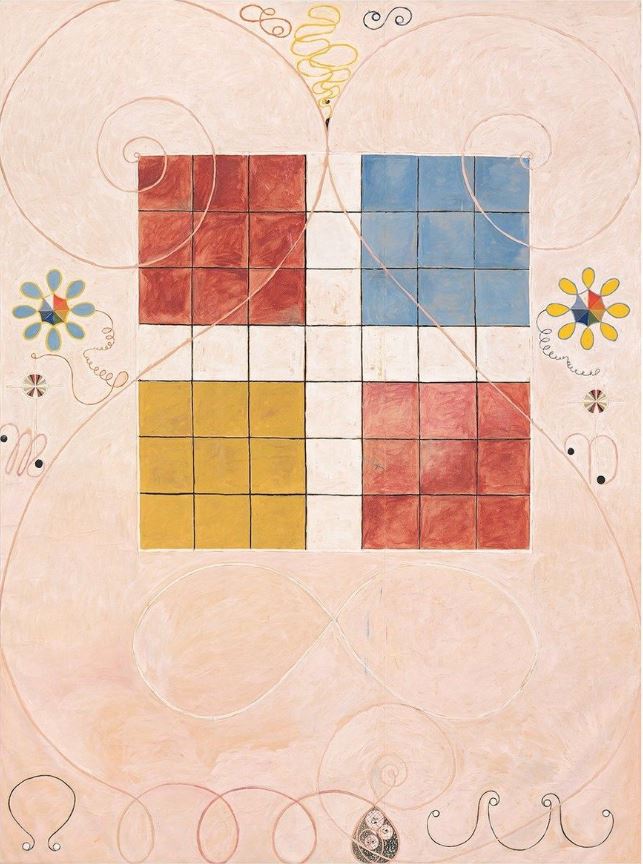
The Ten Largest, Group IV, Number 10, Old Age by Hilma af Klint (1907) Courtesy of The Hilma af Klint Foundation

Almost certainly not, but I was beguiled. I found myself walking round, sitting and staring, getting up and reviewing them slowly, again and again. I couldn’t tear myself away, an experience I’ve had with only a few other exhibitions – I remember not wanting to leave a room full of Monet paintings of the River Thames years ago. Same here. I found this final room completely absorbing, entrancing and didn’t want to leave.

There’s lots and lots of lovely paintings, in an amazingly wide range of styles, sizes, and intentions, throughout this wonderful show. But this final room is worth the admission price by itself.

The video


Related links

More Tate Modern reviews

After Impressionism: Inventing Modern Art @ the National Gallery

This is a lavish and deeply enjoyable exhibition portraying the great explosion of creativity in West European painting which took place in the decades between the last Impressionist exhibition in 1886 and the outbreak of the First World War in 1914.

Critics then and now struggled to find a blanket term for the period, as Belinda Thompson explains in her excellent survey of the period, ‘The Post-Impressionists’. The term ‘post-impressionism’ persists because the only thing all these different artists had in common was that they were painting after the great Impressionist breakthrough of the 1860s and 1870s and were clearly influenced by it. Beyond that it’s difficult to generalise, except that they were all experimenting and innovating and following through on the countless possibilities inherent in the act of putting oil paint on canvas.

Mont Sainte-Victoire by Paul Cezanne (1902 to 1906) © Philadelphia Museum of Art

Structure

The exhibition structure is simple: it opens by celebrating the artists who have emerged, in retrospect, as the great gods of the period – Paul Cézanne, Vincent van Gogh, Paul Gauguin – and then examines the influence they had on the younger generations of artists, in the hotbed of modern art, Paris.

Where this exhibition strikes out and is distinctive from many surveys of the period is that it then makes a conscious effort to broaden its scope, geographically, with rooms or sections dedicated to other capital cities where exciting experimentation was taking place, namely Barcelona, Berlin, Brussels and Vienna. The curators point out that there was more cross-fertilisation than ever before due to the steadily increasing numbers of exhibitions and exhibiting societies, illustrated periodicals and commercial dealerships.

For once there isn’t a particularly strong central thread or thesis being propounded in the show, just a lot of wall labels describing art movements and groups and trends in all these different places, and then picture captions going into detail on individual works.

The show is, therefore, in effect, just a feast of fabulous post-impressionist masterpieces, and strolling through it is a quite wonderful, mind-blowing, eye-filling experience.

Specific movements are mentioned along the way (the Nabis, Symbolism, Die Brücke, the Fauves), in passing, but towards the end the show crystallises, as it were, presenting examples of the radical Modernism which supplanted what had come before in the form of works by Picasso, Matisse, and Mondrian.

What characterised post-impressionist art?

Impressionism began the movement away from traditional Salon art which a) depicted high historical or mythological subject matter or b) monumental nudes in c) an intensely figurative realistic manner. Instead the Impressionists were interested not in what was there, but in what we see, which is a different thing, trying to capture the shimmer and play of light.

The post-impressionists continued this departure from the conventional representation of the external world. In a host of different ways they developed non-naturalist visual languages, emphasising shape or pattern or colour which don’t exist in the real world. Some of them were interested in line and form, some became obsessed with colour, some with pattern bringing out the decorative potential of art, some focused on symbols and meanings. Once you walked away from the idea of figurative, realistic depiction of the ‘real world’ a thousand doors opened.

All this was helped by the swift development of photography, with many artists realising that their traditional role as makers of portraits, recorders of events, annotaters of landscapes was being superseded by the new technology. But this was entirely positive: it freed them up to explore the expressive potential of paint on flat surfaces in a thousand new ways.

Artists

With almost 100 works, many lent from institutions abroad and seen in London for the first time, the show features a host of big name artists like Paul Cezanne, Vincent Van Gogh, Edgar Degas, Pablo Picasso, Henri Matisse, Gustav Klimt, Käthe Kollwitz, Sonia Delaunay, Wassily Kandinsky, Piet Mondrian, Edvard Munch. It’s mostly paintings  but there’s a selection of ten or so sculptures carefully chosen to demonstrate innovation in that medium, too (notable sculptures by Rodin, Gauguin and Kollwitz).

I’m going to list the rooms, indicate what they contain i.e. which movements and artists, and then pick personal highlights.

Introduction

The introductory room contains just four works, a painting each by Pierre Puvis de Chavannes and Paul Cezanne, framed by two sculptures by Auguste Rodin (‘Monument to Balzac‘, 1898, and ‘Walking man‘, 1907). Cezanne’s ‘Mont Sainte-Victoire’ (1906) is obviously a greatest hit but after the recent Cezanne exhibitions at Tate Modern and the National Portrait Gallery I’m a bit Cézanned out. The Rodin pieces confirm my very strong dislike; I object to because of the lumbering clumsy size of his works and the crude, horrible unfinished nature. In terms of modern sculpture I like Epstein, Gill and Gaudier-Brzeska, small, smooth, beautiful lines and angles, the opposite of everything Rodin stands for.

Therefore I preferred the Puvis work, ‘The Sacred Grove’ from 1885, although this struck me as a very odd choice, because its idyllic classical setting, figurative approach, use of perspective etc seem completely contrary to everything which follows.

The Sacred Grove, Beloved of the Arts and the Muses by Pierre Puvis de Chavannes (1884) Art Institute of Chicago

Room 2: Cézanne, van Gogh, Degas, Gauguin

Greatest hits from some of Western art’s biggest names. Cezanne is represented by a classic version of The Bathers (1905) where he is transforming human figures, trees and landscape into geometric shapes, leaning rectangles of paint, the semi-abstract human figures having blank masks. You can clearly see the origins of Picasso and Braque’s cubism. A still life of a sugar bowl and apples, plus another of his numerous views of Mont Saint-Victoire.

There are 4 works by Van Gogh: ‘Snow-Covered Field with a Harrow (after Millet)‘ (1890) had the classic van Gogh wavy paint, as did ‘Sunset at Montmajour‘ and ‘Enclosed field with ploughman‘. But I found myself more drawn to ‘Houses in Saintes-Maries-de-la-mer’. Apparently the tight, constricted feel of the composition is a new thing in his style. It was painted in the south of France where the bright light made him realise he could exaggerate colour effects even more than he’d been doing previously.

Houses in Saintes-Maries-de-la-mer by Vincent van Gogh (1890)

An oddity I noticed is that the National Gallery itself owns some outstanding van Gogh masterpieces, such as the chair, and sunflowers and these aren’t in the exhibition. The only reason I can think of is that they’re part of the permanent collection which tourists quite possibly come to London to see and so the curators took the decision to exclude them from the exhibition and keep them on general display.

The caption to his ‘Woman from Arles’, a portrait of the owner of the Café de la Gare in Arles, raises an interesting point. Apparently, when they were sharing a house in the south of France, Gauguin and van Gogh had an ongoing argument about the nature of art: Gauguin argued that the artists is like a priest questing for the spiritual essence of a subject and therefore it was best to paint from memory, distance from the actual object freeing the artist to bring out the essential shapes and colours. Van Gogh, on the contrary, argued it is the artist’s sacred duty to paint what they see, as they see it.

No such scruples with the little selection of Degas works, the biggest example of which is the famous ‘Combing the Hair (Le Coiffure)’, an orgy of reds and oranges. It’s accompanied by a good example of his ballet dancers, ‘Dancers practicing in the foyer’. But my favourite piece was a small but exquisite piece, ‘Woman reading’ (1885).

Femme lisant by Edgar Degas (1883 to 1885)

It’s tightly focused, cropping the figure at the knee. Degas applied layers of pastel over a monotype print

Taken together this room makes a strong case for the dazzling impact these artists had both in Paris and elsewhere in Europe, with their reconsiderations of form, surface and space. The strokes are called ‘gestural’ because they convey the actual strokes by the artists as much as the object. Strong short dark lines make it look as if elements of the image have been stitched together. The use of bold pure colours and highly gestural strokes were very influential on later artists.

Then onto the Gauguin section. I was bowled over. Gauguin strikes me as less covered than Cezanne, van Gogh or Degas, maybe because he is the boldest, most radical, most muscular and controversial of them. He’s represented by a greatest hit, ‘Nevermore’, ‘The Wave’, ‘Fête Gloanec’, ‘The Wave’, ‘The Wine Harvest’ and his expressive ‘primitive’ carving in the circular shape of a totem, ‘The afternoon of a faun’. But it was the huge and amazing ‘Vision of the Sermon (Jacob Wrestling with the Angel)’ which bowled me over.

Vision of the Sermon (Jacob Wrestling with the Angel) by Paul Gauguin (1888) © National Galleries of Scotland, Edinburgh

As per the explanation on the van Gogh caption, you can see how Gauguin has taken real elements, such as peasant women from his native Brittany, a cow, a tree, but placed them in an abstract ‘symbolic’ landscape where the grass is bright orange and perspective is gestured at but mocked or transcended. And, contrary to all traditional rules, the nominal subject, the wrestling match, doesn’t take place at the front and centre of the painting, but is a strange, obscure, garbled struggle happening off in the middle distance.

Degas is more consistently sensually and visually pleasing, but Gauguin is bracing and weird. He is a godfather of the pictorial Symbolism which was a major strand of the 1890s with its concern for Big (if often nebulous) Ideas and a completely non-naturalistic treatment, both combining to convey a strong if indefinable emotion.

Room 3: Different paths

Side by side are placed dark, heavily outlined depictions of the city, and the tremendously light and airy works of the ‘divisionists’ or ‘pointillists’.

Part of the enjoyment of visiting art exhibitions is to test out my own tastes. Over the years my tastes have changed, and are also liable to vary from day to day depending on mood and circumstance (e.g. pressure of work). Something which appears to remain consistent is I am instantly drawn to works with strong outlines. This is part of the reason I like Gauguin over van Gogh and Degas over Cezanne.

So in this room I really liked the works by Emile Bernard and Louis Anquetin with their ‘intensified colour and flattened forms bounded by strong outlines’.

‘Avenue de Clichy: five o’clock in the evening’ by Louis Anquetin (1887)

The strong black lines defining figures or folds of clothes were described by some critics as cloisonné work. According to the curators it anticipates and to some extent influence Gauguin.

By contrast I found the works by pointillists Georges Seurat and Paul Signac pallid and limp. These were ‘Setting sun: sardine fishing’ and ‘Bertaud’s Pine’ by Signac, alongside ‘By the Mediterranean by Henri-Edmond Cross. I know they’re great works in their own right. I understand that they called themselves Neo-Impressionists because they saw themselves as applying ‘scientific’ rigour and analysis to the depiction of sunlight and shade. I appreciate that the pointillists were, surprisingly, associated with workers’ rights and socialism and thought of themselves as depicting a better lighter world for all. But it’s the dark urban night-time visions of Louis Anquetin which pull my daisy.

The Channel of Gravelines, Grand Fort-Philippe by Georges Seurat (1890) © National Gallery, London

Room 4:The Nabis

Beside them are two works showing the highly stylised approach of Toulouse Lautrec, ‘Tristan Bernard at the Vêlodrome Buffalo‘ and ‘The Reader‘. The room contains a partitioned-off section about the Nabis or ‘prophets’. According to Wikipedia, the Nabis were:

a group of young French artists active in Paris from 1888 until 1900, who played a large part in the transition from impressionism and academic art to abstract art, symbolism and the other early movements of modernism. They included Pierre Bonnard, Maurice Denis, Paul Ranson, Édouard Vuillard, Ker-Xavier Roussel, Félix Vallotton, Paul Sérusier and Auguste Cazalis.

The show includes what is commonly thought to be the first ‘Nabis’ painting, ‘Le Bois d’Amour à Pont-Aven or Le Talisman’ of 1888 by Paul Sérusier. You can see why it was widely felt to have pushed painting significantly beyond figurativism into an entirely new place where colour and pattern became the main aim of a painting. Serusier painted it under the supervision and direct encouragement of Gauguin at Pont-Aven in Brittany. This fact and the almost complete abstraction of the work itself had a dramatic impact on his friends back in Paris and helped crystallise the new movement.

‘Le Bois d’Amour à Pont-Aven or Le Talisman’ by Paul Sérusier (1888)

And so the show includes comparable works by other members of the Nabis, including ‘Island and village of Le Pecq‘ and ‘The evening wash by lamplight‘ by Maurice Denis. Nearby there’s a work by Pierre Bonnard, ‘Madame Claude Terrasse and her son Charles‘ (1893). I went to the Bonnard exhibition at Tate Modern back in 2019 and, eventually, overcome my initial dislike to sort of ‘get’ his messy way with colour and pattern but this specimen epitomised that lack of draughtsmanship which I find hard to overcome. Next to it are two pieces by Edouard Vuillard, ‘Figures in an interior: Music‘ (1896), ‘Lugny-Poe‘ (1891) and ‘Lady of Fashion‘ (1892), both of which highlight his interest in pattern and design over strict realism. No likee.

Room 5: New voices – Barcelona and Brussels

By my count there were 6 paintings from Barcelona and 5 from Brussels.

Barcelona

Barcelona is represented by works by Hermenglido Anglada-Camaras, Ramon Casas i Carbo, Santiago Rusiñol I Prats, Isidro Nonell i Monturio and Pablo Picasso. The exhibition goes heavy on the enormous painting by Casas i Carbo, ‘The Automobile’.

The Automobile by Ramón Casas i Carbó (about 1900) © Círculo del Liceo / photo Fotogasull

It’s imposingly big and has a long backstory. Casas, a leading figure in the Barcelona avant-garde, was commissioned to the series of 12 paintings for the private club, Círculo del Liceu in Barcelona, depicting modern musical life. In this one a woman dressed in modern (1900) clothes drives that amazing new invention, the automobile. Casas was one of the first in the city to own a motor car and, of course, the curators point out how ‘radical’ it was to depict a woman driving one. The link to ‘music’? She’s meant to be driving to or from a concert. You can see it in the background on the right. The bold simplicity of the design is said to represent ‘Catalan Modernism’ and to have impressed the young Picasso.

Picasso is represented by an early work, ‘The absinthe drinker‘ and a portrait of ‘Gustave Coquiot‘, Hermenglido Anglada-Camaras by ‘The White Peacock‘ (1904), Isidre Nonell by a tough naturalistic depiction of poverty titled ‘Hardship‘. But I particularly liked the portrait of Modesto Sanchez Ortiz by Santiago Rusiñol, not particularly radical or modernist but just very powerful. Ortiz’ eyes followed me round the room.

Brussels

As to Brussels, the curators tell us it was home to progressive exhibiting societies like The Twenty and The Free Aesthetic which fostered close links with the Paris avant-garde. The Twenty was an exhibition society founded in 1883 by 20 artists who wanted to break away from the conventional art establishment. It was in Brussels that van Gogh made his only sale during his lifetime. The five pieces felt very light and pointillist. They include the decorative and soothing ‘The Scheldt upstream from Antwerp‘ by Theo van Rysselberghe (1892), the political motive behind ‘The eve of the strike‘ by Jan Toorop (1889), and a strikingly pointillist work, ‘Going to church’ by Henry van de Velde (1892). As you can see, although pointillist in technique, it has a much darker, gloomier vibe than the sun-drenched works of Signac and Seurat.

Woman in front of the Church by Henry Van de Velde (1889)

Off in a corner is a single work by the outlier James Ensor, ‘Astonishment of the Mask Wouse‘ (1889). As you can see, Ensor’s art goes beyond satire into the weird and the grotesque.

Room 6: New voices – Vienna and Berlin

In both Vienna and Berlin at the start of the 20th century artists withdrew from the traditional art academies and salon exhibitions and set up breakaway organisations, the Secessions.

Vienna

Dominating the left side of the room are two huge portraits of women by Gustav Klimt in his trademark style, combining a highly realistic sensual face with a luscious depiction of stylised dress and fabric: ‘Hermine Gallia (1904) and ‘Adele Bloch-Bauer II‘ (1912). I loved Klimt when I first discovered him at school but move quickly on to prefer his disciple Egon Schiele and eventually found him too sweet and chocolate box. Also from Vienna is ‘The Artist’s Mother‘ by Broncia Koller-Pinell (1907).

Surprisingly, there are some works by Norwegian depressive Edvard Munch. Why? Because Munch actually exhibited and sold his works in Berlin. The works here show a healthy lack of interest in traditional perspective and preference for pattern and design, but aren’t particularly impressive: ‘Consul Christen Sandberg‘. More characteristic is ‘The death bed‘ (1896). I was interested to learn that Munch eventually had a complete nervous breakdown (in 1908) and that, when he returned to painting, it was in a far looser style and of relatively unemotional landscapes: ‘Cabbage field‘ (1915).

Berlin

I was surprised by this room because so many of the works seemed the opposite of ‘modern’ but surprisingly old fashioned. Thus the two works by Lovis Corinth are, maybe, a bit candid and honest about the female body but they are, nonetheless, female nudes in the time-honoured tradition, without a hint of the stylisation we’ve seen throughout the show up to this point: ‘Perseus and Andromeda‘ (1900).

Nana by Lovis Corinth (1911) St Louis Art Museum

There’s a portrait of historian and philosopher George Brandes by Max Liebermann (1901) and ‘Danae‘ (1895) where I really admired the frank peasant ugliness of the servant, and ‘Children by the Pond: The Garden in Godramstein‘ (1909) by Max Slevogt.

I was surprised by this entire room because it all seemed so reactionary and old fashioned. A glimmer of modernism was given by the sole piece by the great German artist Käthe Kollwitz, not a painting but a tightly conceived sculpture, ‘Pair of Lovers‘ from 1913 to 1915. I’m a huge fan.

Room 7: German Expressionism

The penultimate room is a small one tucked off to the side of the flow of big rooms but it came to me as a huge relief after the retro kitsch of the previous room, a sudden burst of vibrant colour and exciting non-conformity.

Why stick to traditional methods of compositions? Why not use blaring flagrant primary colours! Why bother to cover the whole canvas when leaving blank spots creates a sense of urgency and drama! Bang!!

Many of the works are by members of Die Brücke (The Bridge), a group of German expressionist artists formed in Dresden in 1905. Founding members were Fritz Bleyl, Erich Heckel, Ernst Ludwig Kirchner and Karl Schmidt-Rottluff. What they had in common was interest in primitivist art and expressing extreme emotion through high-keyed colours that were non-naturalistic. God, this is the dog’s bollocks, I thought, what a relief after the stodgy naturalism of the previous room!

Here are splendidly bold and unfettered works by Erich Heckel – ‘The house in Dangast‘ (1908) – and Karl Schmitt-Rottluf – ‘Break in the dyke‘) (1910). I loved Sonia Delaunay’s ‘Jeune Finlandaise’ (1907). In this small room experienced a physical sense of liberation.  This is the real McCoy.

Young Finnish woman by Sonia Delaunay (1907)

It’s significant that this painting captures Delauney on her journey towards pure abstraction which she would achieve a few year later. Part of the thrill of paintings like this is you can feel the future in them, ready to burst through. In the same vein is the National Gallery’s portrait of Charlotte Cuhrt by Max Pechstein (1910).

Two outliers are a portrait by Henri Rousseau (‘Joseph Brum’), whose ‘naive’ self-taught style became very popular in turn of the century Paris where ‘primitivism’ of all kinds was becoming fashionable.

And, off to one, side, the eerie and disturbing ‘Seated girl with a white shirt and standing nude girl’ by Paula Modersohn-Becker (1906).

8: New Terrains

Finally the exhibition closes with a big room drawing together strands which have emerged during the exhibition to date, and pointing forwards to the radical ruptures of Modernism.

Thus there’s a work by Wassily Kandinsky which is well on the way of his journey towards abstraction – ‘Bavarian Village with Field‘ (1908).

There are three paintings by Matisse, highlighting his move towards decoration, colour and pattern:

There are three little works by Piet Mondrian which neatly capture his progression from traditional figurativism in a realistic depiction of a tree by a river bank; to a half-way house, a tree painted in a style influenced by van Gogh’s broad brushstrokes; and finally onto pure abstraction:

In a similar spirit there are four Picassos which capture his progression from deliberate ‘primitivism’ of 1907 on to the invention of cubism in 1911:

But dominating the room is the enormous work ‘The Dance’ by André Derain. Derain was one of the group of Parisian artists who, in a review of a 1905 exhibition, were mockingly called ‘les Fauves’ (which simply means ‘the wild things’) by a Parisian critic and adopted the name as a badge of pride. Other works by Derain are included:

But it’s ‘The Dance’ which dominates the entire room and is your lasting, lingering visual image of it. Wild, high-toned colours, a cheerful disregard for perspective and, in this image in particular, a complete transition to fantasy, fairy-tale, exotic subject matter.

‘The Dance’ by André Derain (1906) Private Collection © ADAGP, Paris and DACS, London 2023

It’s funny but, although the curators started out by claiming there was a great explosion of styles and approaches from the late 1880s onwards, the works chosen for this final room suggest that all along there were in fact just two threads or streams or approaches.

For me the drab colouring and obsessive interest in volumes, hard-edged angles, facets and geometry found in the cubism of Picasso and Braque relates directly back to the exploration of volumes, forms, rectangles and blocks developed by Cézanne. Maybe we can call this the Analytic tradition and define it as stretching from (on one wing) the scientific approach of the Neo-Impressionists and, on the other, the pure, geometric abstraction of Mondrian.

Whereas the wild children’s drawing of brightly coloured figures dancing in the jungle obviously comes from a completely different place, clearly relates directly back to Gauguin’s symbolic exoticism. Maybe we could call this the Expressive tradition. Obviously, it incorporates, in Germany, the Bridge artists who we saw in the previous room, and includes the other Fauves, besides Derain.

Analytical versus expressive. Composition versus colour. Well, that’s the neat and simple pattern which struck me as I came to the end of this brilliant, exhilarating exhibition.


Related links

Related reviews

Nineteenth century France reviews

More National Gallery reviews

Lee Krasner: Living Colour @ Barbican Art

‘I like a canvas to breathe and be alive. Be alive is the point.’ Lee Krasner

On 11 ‎August 1956 the world-famous artist and leader of the school of Abstract Expressionism, Jackson Pollock, crashed his Oldsmobile convertible while driving drunk. His wife of 11 years, Lee Krasner, also an accomplished artist, heard the news while away in Europe, and hurried home to New York to sort out the arrangements for his funeral and Pollock’s affairs.

Lee Krasner at the WPA Pier, New York City, where she was working on a WPA commission (about 1940) Photo by Fred Prater

She moves into the big barn

Ten years earlier, and soon after marrying (in 1945), the couple had moved to the Springs area of East Hampton on the south shore of Long Island, and bought a wood-frame house and barn, which they converted into studios.

Of the buildings at their disposal, Pollock had early on nabbed the biggest available space – the barn – as a studio, and it was here that he created many of the masterpieces that made his name in the later 1940s and early 1950s. Sometime in 1957, the year after his death, Krasner moved Pollock’s paints and equipment out of the big barn and her own stuff in, and began to paint in the largest space she’d ever had at her disposal.

The result is a decade’s worth of quite extraordinarily powerful and enormous abstract paintings which make up the core of the major retrospective of Lee Krasner’s art, which is currently being held at the Barbican Centre in London. They are absolutely stunning. Breathtaking. Wonderful. Huge!

Installation view of Another Storm (1963) by Lee Krasner at the Barbican. Photo by the author

A light and airy space

For this exhibition the Barbican has removed some of the partitions which usually divide up the main ground floor exhibition space, and also removed some of the temporary walls which previously concealed wall-sized windows in the exhibition shop and at the end of the main gallery. The combined effect of this decluttering is to make the big central space (technically ‘room 10’ of the exhibition) feel long and bright and airy. From the moment you arrive at the ticket desk, the new lighter, brighter space feels like the perfect environment in which to hang Krasner’s huge and awe-inspiring works.

It is a genuinely uplifting and life-affirming experience to wander among these paintings, I felt like a mortal wandering dazzled through a mansion of the gods.

Siren by Lee Krasner (1966) Hirshhorn Museum and Sculpture Garden, Smithsonian Institution © The Pollock-Krasner Foundation. Photo by Cathy Carver

Her early years in self portraits

The exhibition is arranged in broadly chronological order, and you are directed to start on the upper floor of the Barbican galleries, which houses eight living-room-sized spaces. These eight rooms take us from Krasner’s birth, in 1908, in New York, into a family of Orthodox Jewish Russian émigrés, and onto the early art school training she got (at the Women’s Art School at Cooper’s Union, Art Students League, National Academy of design. From her student days there’s a room of self-portraits in oil, which are OK.

Nudes classical and modern

After the Wall Street Crash of 1929 (when she was 21) Krasner began training as a teacher and attended life school classes. On one wall of room four are the extremely accomplished nude studies she did in the style of the Renaissance Masters in 1933 – very accomplished, very traditional. On the opposite wall is a selection of charcoal nudes she did just six years later, in 1939, which are completely different in style, riven by big abstract angular lines, showing a complete assimilation of European modernist trends.

By 1942 she was a respected member of New York’s artistic community. She had been included in an exhibition of contemporary painting in New York alongside friends Willem de Kooning and Stuart French. Piet Mondrian admired her work. As a result she was given a number of commissions by President Roosevelt’s Public Works of Art Project, including a job to oversee the design and execution of twenty department-store window displays in Manhattan advertising war training courses. She adopted a cut-up-and-paste collage approach, and room five shows blow-ups of photos of these wartime artworks. Well, sort of interesting as a) social history b) if you really a completist looking for evidence of every step of her artistic development.

The Little Images

She knew most of the exhibitors in that 1942 show except one, a guy named Jackson Pollock, so she dropped round to his Greenwich Village studio to seek him out and say hi. One thing led to another and they were married in 1945. They moved to the farm on Long Island and, in the winter of 1947, Krasner embarked on what became known as the ‘Little Images’ series, abstract paintings made up of tightly meshed squares and shapes which some critics described as ‘hieroglyphic’. Rooms one and two kick off the show with some fine examples of these ‘Little Images’ and it’s amazing what a variety of design and visual effect you can achieve from such a seemingly simple premise.

Composition (1949) by Lee Krasner © Philadelphia Museum of Art

The collage paintings

Krasner was given her first one-woman show at the Betty Parsons Gallery in October 1951. The work didn’t sell and, although she began a new series soon afterwards, she quickly became despondent and ended up tearing some of the new work to shreds in frustration.

Weeks later, returning to the studio, she realised that the torn strips lying about on the floor got her juices flowing. Quickly she began incorporating them into a new series of collages. She layered pieces of fabric over the paintings shown at the Betty Parsons show, adding pieces of burlap, torn newspaper, heavy photographic paper and some of Pollock’s discarded drawings. The resulting ‘collage paintings’ were exhibited in another gallery show in 1955, and there are several rooms of them on display here.

Blue Level (1955) by Lee Krasner © The Pollock-Krasner Foundation. Photo by Diego Flores

Strikingly different from the ‘Little Images’, aren’t they? The very tightly-wound hieroglyphs of the Images are completely different from the violently torn strips of the collages.

Prophecies

In the summer of 1956 Krasner began work on a new series. The dominant tone of pink made me think of human flesh and nudes, but nudes severely chopped up and filtered via Demoiselles d’Avigon-era Picasso.

The first example of this new style was on Krasner’s easel when she left for France that summer. In the first half of their marriage, her husband’s career had gone from strength to strength, peaking around 1951, as he became world famous for his ‘drip paintings’, getting on the front cover of Time magazine, promoted by the American government as a home-grown genius, snapped up by collectors. But when, after 1951, Pollock tried to change this winning formula, he met with incomprehension and sales slumped. Pollock lost confidence, his drinking increased, he began an affair, which Krasner knew about, in early ’56.

That was the troubled background to the first of these flesh paintings and then – mid-way through her visit to Europe, she got the call that he had died in the car crash. Just weeks after the funeral, Krasner returned to the style and quickly made three more big, torn-up flesh paintings which she titled Prophecy, Birth, Embrace and Three In Two.

In the last room of the first floor of the exhibition, these four paintings are reunited, one hanging on each of the four walls, and it is impossible not to be powerfully affected by their eerie, agonised power.

Prophecy (1956) by Lee Krasner © The Pollock-Krasner Foundation. Courtesy Kasmin Gallery, New York. Photo by Christopher Stach

The night journeys

So Jackson dies and Lee moves into the big barn studio and she is afflicted with insomnia and can only work at night, and she decides not to use any colour in her new paintings because she prefers to judge colours by daylight – and so, from the late 1950s, Krasner began to make a series of paintings combining just black and umber and creamy white onto huge, unstretched canvases.

Wow! These are great swirling, turd-coloured pieces, full of energy and despair. A poet friend of hers labelled them ‘Night Journeys’ and to follow any of the angled, curved or circular lines which strike across the surface is, indeed, to go on a churning, bitter journey though a landscape in torment.

Polar Stampede (1960) by Lee Krasner. Doris and Donald Fisher Collection, San Francisco MoMA © The Pollock-Krasner Foundation. Courtesy Kasmin Gallery, New York.

Krasner exhibited these big brown works in 1960 and 1962 to critical praise, and half a dozen of them dominate the first half of the enormous ground floor space in this show. You can stand in front of them, or there are benches where you can sit down, meditate on them, and be drawn into their drama and action.

Primary series

But the jewel in the crown is the Primary series. In the early 1960s Krasner replaced umber with a range of vivid primary colours. When she broke her right arm in a fall, she taught herself to work with her left, squirting paint directly from the tube, using her right hand to guide the movements.

Critics often use the word ‘gesture’ or ‘gestural’ but in this case it really is justified. As you follow the great sweeping arcs and patterns of paint, and note their dribbles and dynamic interactions, you can almost feel and see the great sweeps of the arm they must have required, the leaning of the whole body, the straining, the movement from one zone of focus to the next. They are extraordinarily vibrant and exciting paintings.

Icarus (1964) by Lee Krasner. Thomson Family Collection, New York © The Pollock-Krasner Foundation. Courtesy Kasmin Gallery, New York. Photo by Diego Flores

I couldn’t get enough of these paintings. I wandered up and down the central room, enjoying all the views of the works offset against each other, glimpsed behind the one central supporting wall of the main exhibition space, addressed front on, strolled past, studied up close, looked at from the other side of the room.

Wow! What a space, and what works of staggering brilliance to fill them with!

Later works

The Umber paintings and the Primary series cover the decade from the late 50s to the late 60s. What a brilliant decade it was for her.

Then, in 1968 Krasner discovered a stash of handmade paper in the farmhouse, and decided to make a new series of works, on a much, much, much smaller scale. She decided to experiment by making each of these small, crafted works from just one or two pigments. A dozen or so of them are in a room off to one side (room 11).

They require a completely different way of looking. Much more conventional in size they require the viewer to step forwards and examine the detail, rather than step back and admire the scale, as with the Primary series.

The dozen or so examples on display here are all lovely – free-spirited dances of colour, and interplays of defined brushstrokes against broader washes, all given a wonderful background texture by virtue of the expensive paper they’re painted on.

Untitled (1969) by Lee Krasner © The Pollock-Krasner Foundation. Courtesy Kasmin Gallery, New York

In the early 1970s, Krasner made a significant step change in style. Still completely abstract, her works changed from soft biomorphic shapes to hard-edged abstract forms. I found them a shock to the system after the huge works in the central hall.

I liked even less the works in the final room, dating from 1974. In that year she stumbled across a portfolio of work from her art school days, the kind of angular nude studies which we saw examples of way back in room four.

Now Krasner took a pair of scissors to these early studies and cut them up into jagged shapes. Most of the source material was black and white drawings, but she interspersed some coloured strips into the collages, and also left other areas blank, apparently ‘echoing the empty space around the nude model’ which had served as the subject for many of the original drawings.

They were exhibited in 1977 under the title Eleven Ways To Use The Words To See. I didn’t warm to them.

Imperative (1976) by Lee Krasner © The Pollock-Krasner Foundation. Courtesy National Gallery of Art, Washington D.C.

No, I went back up to the first floor and walked back through the eight rooms soaking up the evolution of those early works and admiring, in particular, the ‘Little Images’ series. And I revisited the rooms holding these later 1970s works, trying to give them the benefit of the doubt – but all the time I just wanted to go back into the massive main gallery space and be swept off my feet and ravished all over again by the huge, vibrant, dancing works of the 1960s.

Summary

This is the first European retrospective of Lee Krasner’s career for over 50 years. It brings together nearly 100 works from some 50 galleries, institutions and private collections. It must have been a labour of love to assemble them all, and was totally worth it.

The exhibition ends with a 15-minute video made up from various interviews with Krasner towards the end of her life. She was one tough lady, and she told it like it was, still, in her 70s, harbouring a bitter resentment at the sexism of the New York art world which she had to combat all her career.

If you start reading up about her life you quickly find people claiming that, far from being overshadowed by her famous husband, Krasner was in fact the driving force behind his career. And, from some of the interviews, you get the impression that, having seen what really high-profile high pressure publicity did to an artist (Pollock), she was quite content to avoid that level of scrutiny, and just get on with what she loved doing.

The publicity material accompanying the exhibition quotes the playwright Edward Albee commenting at her memorial at the Metropolitan Museum of Art, that in both her life and her work, Krasner ‘looked you straight in the eye, and you dared not flinch’.

That seems a perfect description of both a tough lady, and of her extraordinarily resolute, exuberant and unsentimental art.

A short film about Lee Krasner


Related links

Other Barbican reviews

Cubism by Philip Cooper (1995)

Browsing through books about Cubism in either a bookshop, library or second-hand shop can be a bit dispiriting because there are just so many of them. Where to begin? Should you read them all? And shouldn’t you know all about the most famous art movement of the twentieth century already?

The Colour Library look and layout

Cubism is a volume in Phaidon’s ‘Colour Library’ series. I came across it in a second-hand bookshop and snapped it up for £3, mainly because the size and format means it includes lots of full-page, full-colour illustrations – something often lacking in longer, more text-based accounts (e.g. the ‘World of Art’ volume, Cubism and Culture).

It’s coffee-table-sized (22.9 x 30.5 cm) but, being a paperback, is light and easy in the hand. It’s divided into two sections:

  1. Pages 5 to 25 give a surprisingly thorough history of the Cubism movement, surprising because I’d forgotten, or never knew, there was quite so much to it, nor that it spread to have quite so many exponents.
  2. Then there are 48 double-page spreads with a full-colour plate on the right-hand page, and commentary, artist biography, sometimes a b&w illustration of a related work, on the left.

Altogether the 48 illustrations show a surprising range of paintings and sculptures by precursors, core cubists and peripheral members of the movement, namely:

  • Cézanne (2 paintings)
  • Picasso (9)
  • Braque (7)
  • Léger (4)
  • Juan Gris (5)
  • Robert Delaunay (3)
  • Chagall (1)
  • Marcel Duchamp (1 – 1912)
  • Gino Severini (1 – 1912)
  • Natalia Gontcharova (1 – 1912)
  • Albert Gleizes (1 – 1912)
  • Jean Metzinger (1 – 1912)
  • Alexander Archipenko (1 – 1913)
  • Francis Picabia (1 – 1913)
  • Piet Mondrian (1 – 1913)
  • Lyonel Feininger (1 – 1913)
  • Franz Marc (1 – 1913)
  • Emil Filla (1 – 1915)
  • Edward Wadsworth (1 – 1915)
  • Max Weber (1 – 1915)
  • Henri Laurens (1 – 1920)
  • Stuart Davis (1 – 1921)
  • Amédée Ozenfant (1 – 1925)
  • Ben Nicholson (1 – 1947)

Cubist forebears

  • The Impressionists tried to capture fleeting impressions of objects in changing light, as they appeared to the artist, not as they objectively were (e.g. as depicted in the increasingly prevalent photographs).
  • Post-Impressionists – specifically van Gogh and Paul Gauguin, used unrealistic colours and vivid brushstrokes or strong black outlines and stark colour schemes to express emotion.
  • The Fauves (1905-8) took the colour idea further to represent real-life scenes or people in garishly bright and deliberately unrealistic colours.
  • The German Expressionists depicted real people or scenes in harsh, primitive woodcuts or angular ugly paintings.

The single greatest source of Cubism was the later painting of Paul Cézanne, who used a variety of techniques to bring out the geometric forms, the planes and rectangles implicit in a subject, to the fore – not least by creating patches of paint which look like facets of a view.

For example, Mont Saint-Victoire (1904) where the notion of realistically depicting the foliage of trees or houses has long since disappeared to be replaced by the idea of blocks or chunks of paint. The effect is to undermine the idea of a painting as ‘a window on the world’, and replace it with the arrangement of units of paint for semi-abstract aesthetic purposes.

In Cézanne’s still lifes he painted, for example, the bowl of fruit, the table it sat on, and the floor or background wall, all at different angles, with different implied perspectives – Still life with plaster cupid (1895).

The invention of Cubism

Cubism takes these trends a decisive step further. Cubism abandoned 450 years of the careful development of Renaissance techniques for creating a sense of perspective in a painting – rejected the notion of one particular vanishing point towards which all lines in the image converge which gives the viewer the illusion they are looking through a ‘window on the world’ – and instead set about representing the same subject from multiple points of view depicting all sides, top and bottom as required solely to create an aesthetic composition. Abandoning realism or naturalism. Conceiving the work as a purely aesthetic creation.

Cézanne had died in 1906, and 1907 saw two major retrospective exhibitions of his work held in Paris. It is a neat coincidence (or maybe no coincidence) that the first, proto-Cubist painting was made the same year, Les Demoiselles d’Avignon by Picasso. In this seismic work the idea of a coherent perspective giving depth and shape to the objects depicted has obviously been ripped up in favour of a stylised depiction of space and objects which is is impossible to relate to in any of the traditional ways of ‘seeing’ art.

In 1907 Braque saw Les Demoiselles in Picasso’s studio. He was also bowled over by the big Cézanne retrospective. By the next year he was painting landscapes at the village of L’Estaque in a kind of exaggerated Cézanne style, converting houses, trees and roads into increasingly stylised geometric forms. – Houses in l’Estaque (1908)

Thus began a period from about 1908 to 1914 when Braque and Picasso worked very closely together, to begin with both living in rented rooms in a rundown building in Montmartre, the bohemian area in northern Paris, named the Bateau Lavoir. Here they spent the days painting and the nights drinking, partying, joking, discussing ideas, and often spending the summers painting in the same or similar locations.

Very quickly they moved towards painting a relatively small selection of objects:

  • common-or-garden objects from their lives – jugs, newspapers, guitars
  • interiors – so few if any landscapes
  • in muted tones of grey and brown

If Matisse and the other ‘Fauves’ (Vlaminck and Derain) were continuing to explore colour in all its garish vibrancy, B and P undertook an almost scientific analysis of what happens if you paint things after abandoning the idea of there being one point of view in either time or space, if you bring in facets from every angle, if you abandon the idea of producing one coherent perspective on an object and instead, use your artistic power to depict whatever elements you want.

In 1910 Braque painted Violin and pitcher, the palette restricted to grey or brown, the entire composition broken up into numerous clashing planes, with only hints of the ostensible subject (actually, the violin is fairly easy to make out). The trompe l’oeil image of a nail hammered into the top of the painting (complete with its own shadow) conveys the ideas that a painting is a two-dimensional artefact.

Analytic cubism

Violin and pitcher is an example of so-called ‘analytical cubism’ i.e. the subject has been taken to pieces and the resulting fragments reassembled so as to seem splayed out, so as to emphasise a multitude of clashing picture planes.

Now objects can be seen from all points of view at once. Or denoted by one or two scattered attributes – a moustache for a man, an eye for a human being, a fragment of text to denote a newspaper, and so on.

The effect was liberating and seismic. It spread right across the art world like wildfire. As early as 1912 Gleize and Metzinger published a book On Cubism. Contemporary critics and artists related it to Einstein’s undermining of the traditional world of Newtonian physics with his new theory of relativity. Others related it to the philosopher Henri Bergson’s idea that Time isn’t made up of discreet, definable moments measured by clocks and human reason, but is instead an endless flux in which perception of the present moment is flooded with memories of the past and anticipations of the future: all happening at once, as all sides of an object can be depicted simultaneously in a cubist picture.

In 1911 Braque and Picasso went on to break objects down into constituent parts and not even reassemble them, making it almost impossible to see what they are. This further stage is referred to as ‘hermetic’ or ‘high analytical’ cubism. Thus Woman Reading (1911) by Braque – you can make out the curlicues at left and right indicating the wings of the chair, but after that…

It created the notion of the painting as puzzle, with only the title giving the viewer any help in identification.

It’s all the same to me whether a form represents a different thing to different people or many things at the same time. (Braque)

the book reinforces how cubism really was a joint venture by the artists, the look of their works converging into the same style. They often didn’t sign works, giving rise to a century of confusion and misattribution.

In 1912 Braque introduced several further techniques:

  • the use of stencilled lettering, which he had learned as an apprentice housepainter, and which further flattens the surface
  • a method of using steel combs to create the effect of wood grain (faux bois)

There were also three major innovations in materials:

  • Collage, i.e. attaching real objects and non-artistic elements onto the canvas. – Still Life with Chair Caning (May 1912) by Picasso.
  • Paper sculptures – Braque pioneered the idea of making sculptures of paper and then drawing or painting on them i.e. paper is no longer a flat surface i.e. the picture itself can be folded and sculpted.
  • papiers collé where collé means pasted. You paste a flattish medium onto paper and then paint or draw on that. Braque pasted imitation wood-grain wallpaper onto white paper and drew on it; Picasso, always the brasher and more experimental of the two, used newspaper pages. –
  • They mixed sand with paint to give the paintwork a real texture.

All these experiments with medium move the work of art away from being a flat, illusionistic window on the world into being a fully autonomous object in its own right, completely divorced from all previous aesthetic theories. It was a volcanic upheaval in art.

Picasso extended these techniques into the sculpture, Guitar, a) made from scrap metal b) with a rough finish c) inverting space (the sound hole should go into the guitar; instead it protrudes out from the surface like a tin can.

All these deliberate rejections of the entire history of Western sculpture were to have seismic repercussions and affect sculpture right down to the present day.

Synthetic cubism

These latter works are examples of what the critics came to call ‘synthetic cubism’. Whereas ‘analytic cubism’ reduced a given object to its constituent elements and then reassembled them according to a new aesthetic, ‘synthetic cubism’ took elements which had nothing to do with each other (newspaper, sand, spare metal) and assembled them into new objects, which were the end result of the process, not the starting point.

1913 saw Braque and Picasso experimenting with introducing more colour into analytical works, and experimenting further with sculpture and synthetic works.

Montmartre cubism and Salon cubism

But these stunning innovations had not gone unnoticed. Juan Gris was living in the same building as B&P, observing their innovations, and decided to give up his career as an illustrator and commit to becoming a painter.

In 1912 Gris painted a cubist portrait of Picasso. Immediately you can see the difference between his approach and that of B&P – how the idea of breaking down an object (here a human being) into facets can be done in completely different ways by different artists with different personal styles. The facets here are bigger and arranged in a much more orderly way – to the line across the top and the lines off at diagonals create a very regular geometric space of a kind never found in Picasso or Braque. (Cooper points out that Gris trained as an engineer and this may explain his love for architectural regularity.)

This is what now happened – at first a trickle and then a flood of other artists began to incorporate one or other aspect of analytical of synthetic cubism into their own practice.

While B&P didn’t exhibit their new works in 1912 or 1913, another group of artists, based around Jean Metzinger and Albert Gleizes, was exhibiting regularly at the various Paris art shows and/or had dealers who promoted them. They quickly soaked up the lessons of cubism and incorporated them into their own works. Other members of Salon cubism at the time loosely include Robert Delaunay, Henri le Fauconnier, Jacques Villon, Marcel Duchamp, Francis Picabia, Roger de la Fresnaye, Louis Marcoussis and Alexander Archipenko.

Salon Cubism is characterised by:

  • size – B&P’s works are often small and intense: Salon Cubist works are often immense, metres across
  • ambitious subject matter
  • less severe, demanding and complex

They also theorised and wrote about their work, something B&P never did. Thus it was Metzinger and Gleizes who co-authored On Cubism, which put the ideas into phrases which are still quoted. They had realised they were working in the same direction when their works were hung more or less by accident near each other in the 1910 Salon des Indépendants.

They recruited like-minded colleagues and then lobbied the hanging committee to get their works deliberately hung together in one room for the next year’s (1911) show. The effect of having a roomful of the new style hung together was to cause scandal (as so often in Paris art history). The poet Guillaume Apollinaire wrote a long defence of the show and thus came to be seen as a spokesman for the movement.

As to the name, Matisse, who was on the hanging committee of the 1908 Salon which B&P submitted some early works to, is said to have dismissed them as little more than a bunch of ‘cubes’.

The art critic Louis Vauxcelles (who has the distinction of having made the throwaway remark about the paintings of Matisse, Derain and Vlaminck looking like the works of wild things – thus naming the art movement of Fauvism) in 1910 referred to the collected works of Metzinger, Gleizes, Delaunay, Léger and Le Fauconnier as ‘ignorant geometers, reducing the human body, the site, to pallid cubes.’

Whatever the precise origin, the book On Cubism cemented the term and promoted it to a wide book-reading public.

La section d’Or

The Salon cubists held another show in October 1912, named the Section d’Or, French for ‘Golden ratio’, a mathematical concept which had fascinated artists for 2,500 years. It contained over 200 works and was designed as a deliberate retrospective, showing the evolution of a number of artists from 1909 to 1912, and also to establish cubism as a much broader range of styles and approaches than the narrow high cubism of Picasso and Braque.

Its strength (its diversity) was also its weakness. By 1913 many of these artists were pursuing their own visions and interpretations, so much so that Apollinaire’s book of 1913 – The Cubist Painters – was forced to divide the movement into four distinct categories.

Robert and Sonia Delaunay named their experiments in colour combination – painting interlocking or overlapping patches or planes of contrasting (or complementary) colours – Simultanism. Apollinaire called it Orphism or Orphic cubism insofar as it was interested in abstract shape and colour, and the play of colours was identified – by Delaunay and Apollinaire (as by Kandinsky, who Delaunay corresponded with) with music.

Meanwhile, a work like Metzinger’s Dancer in a café (1912) uses cubist rhetoric but is obviously much more decorative and accessible than P&B’s more demanding experiments – the lamp at top right is pure Art Nouveau.

Contemporary movements affected by cubism

Futurism The impresario of Futurism, Filippo Marinetti, published his loudmouth Futurist manifesto in 1909, then took his gang of painters and poets to Paris to see the latest work. Well organised and polemical, the Futurists adapted many of cubism’s tricks but focused on the modern world of machines and on the challenge of depicting movement. They were soon attacking cubism for being quaint and staid and conservative (ladies with mandolins, newspapers on cafe tables, how dull!).

  • States of mind: the Farewell by Umberto Boccioni (1911) breaks down the subject into facets (and uses a very obvious bit of stencilling) but in order to convey the dynamic and modern subject of a fast steam train gathering steam in a railway station.

Rayonism Russian artists wanted to create a home-grown brand of modern art. In 1911 Mikhail Larionov invented Rayonism, an attempt to depict the rays of light reflected from objects using spiky splintered forms. Kasimir Malevich experimented with this angular look and in 1913 he would invent Suprematism, starting from the radical ground zero of his famous black square. Many other contemporary works are described as Cubo-Futurist, for combining elements of both.

Expressionism Cooper sees the influence of cubism on the German Expressionist painter Franz Marc, whose rather naive paintings of animals from 1910 or so, become steadily more involved and broken up by complex sheets or facets as the cubist vision influenced him.

In fact Cooper attributes this highly colourful use of facets and planes more to Robert Delaunay’s version of cubism, than to the grey and brown style of Picasso or Braque.

Vorticism Established in London by the Canadian writer and artist Wyndham Lewis, named by the American poet Ezra Pound, Vorticism published on edition of its bombastic journal, Blast, trying to outdo the Futurists at their own game, and (inevitably) pouring scorn on cubism for being pale and passive. Nonetheless, in its brief life Vorticism attracted impressive talents including Henri Gaudier-Brzeska, Edward Wadsworth, David Bomberg, C.R.W. Nevinson and Jacob Epstein.

The Great War

World War One brought modern art to a grinding halt – Vorticism ceased to exist, Futurism’s key artists were enlisted; two of the key artists of German Expressionism (Marc and Macke) were killed.

Many of the French artists were called up (the Spaniard Picasso being lucky in this respect) and ceased working for the duration. Across Europe there was a reaction against the avant-garde in face of an understandable rise in patriotic nationalism. In France this was called the rappel a l’ordre.

The best example I know of this move to order is in the music of Igor Stravinsky, who moved from the barbaric primitivism of the Rite of Spring (1914) to the orderly, post-war, neo-classical ballet Pulcinella of 1920, which is still recognisably Stravinksian, but made orderly and sensible.

Something similar can be seen by comparing any of Picasso’s pre-war cubist works with Three Musicians of 1921. The later painting keeps many of the elements of cubism, but is somehow completely different. Every object now has a solid outline unlike the swirling blurring of facets in the pre-war work. There are brighter colours instead of the earth browns and greys of high cubism. The colours themselves are painted in solid unshaded blocks, unlike the very rough dabs and strokes of paint in pre-war work. All these changes go to make the later work much more readable that the esoteric ‘hermetic cubist’ works of the pre-war.

The use of much more clear and precise forms has given rise to the term crystal cubism to describe this late style.

Braque fought in the war, and survived. On his return he was never again so close to Picasso and continued to plough a traditionalist cubist furrow, earth colours and all, reworking the same still lifes, becoming maybe a bit more decorative. For example, Fruit on a table cloth with a fruit dish (1925). You can see why Picasso’s style would be more popular.

Léger, meanwhile, was perfecting the ‘shiny tube’ style which was to last the rest of his career. – The card players (1917)

These and other post-war ‘cubist’ works are included in the forty-eight colour plates of this impressive little book.

After cubism

By 1919 the poet Blaise Cendrars wrote a piece saying Cubism had been hugely important but was now finished. Artists were looking elsewhere. In Russia socially-committed Constructivism influenced the new post-revolutionary avant-garde. In Germany the airily ‘spiritualist’ Expressionists were succeeded the grotesque social satire of Otto Dix and George Grosz, which came to be called Neue Sachlichkeit.

In Zurich, Berlin and New York, the Dada movement (1915-20) ridiculed everything, all previous art included, in an outburst of nihilism whose most enduring artistic legacy was the invention of photomontage by John Heartfield in Berlin, a sort of spin-off of cubist collage but focusing exclusively on elements found in newspapers and magazines.

And when Dada fizzled out it was replaced by a new anti-rational movement, Surrealism, led by the imperious writer André Breton in Paris, and exploring dreams, automatic writing and drawing, which also criticised Cubism for being tame and passive.

Around 1918 the Purist movement was founded by Edouard Jeanneret (better known as the modern architect Le Corbusier) and Amédée Ozenfant who co-authored a book, After Cubism in which they criticised the fragmentation of the object in cubism and the way in which cubism had become, in their view, decorative by that time.

They proposed a kind of painting in which objects were represented as powerful basic forms stripped of detail. Purism reached a climax in Le Corbusier’s Pavilion of the New Spirit built in 1925 for the International Exposition of Decorative and Industrial Arts in Paris which contained works by the three principals and the cubists, Juan Gris and Jacques Lipchitz. Soon afterwards the movement lapsed and the painters went their separate ways. – Still life with jug by Amédée Ozenfant (1925).

But it didn’t really matter what these or any other art movements said about Cubism – its historical important is still vast, as seismic as the French Revolution. It definitively ended a centuries-old way of thinking about art as naively representational, and opened up a whole range of strategies and ideas and opportunities, and the use of new media and materials, which are still playing out to this day.

But that’s the subject of another book (in fact, whole libraries of books). This Phaidon volume combines a fact-filled and intelligent introduction with a generous selection of works to show how cubism influenced an entire generation of artists.


Related links

Related book reviews

Related exhibition reviews

Every room in Tate Modern

Tate Modern, housed in the famous converted power station building on the South Bank near London Bridge, contains six levels. But as levels 0 and 1 are shops and cafes, and 5 and 6 are, respectively, the members’ level and restaurant, that leaves only 2, 3 and 4 to actually display art. Level 3 is given over to temporary exhibitions (currently Alexander Calder and The World Goes Pop) and some small, one-room displays (currently George Baselitz) – which leaves floors 2 and 4 to house the permanent collection.

Each level is divided into two wings, west and east, grouped around a broad theme and housing 10 or 11 rooms: thus level 2 west is Citizens and States, level 2 east is Making Traces; level 4 east is Energy and Process and level 4 west is Material Worlds.

So Tate Modern contains about 42 rooms, plus 3 or 4 one-room displays between each wing, say 46 in all.

Audio guide

The audio guide costs £4.25 (£3.75 for concessions eg students). It has audio commentary on a relatively small number of selected works. The woman selling it said it lasts 45 minutes but that can’t be true. My one had one or two minute-long items on 38 works, and half or more of the entries consisted of more than one track eg 90 seconds on the art work, with an additional quote from the artist, and then maybe some music (the Mark Rothko item has two pieces of music, one of which was five minutes long). Surely more than 45 mins – and very useful…

Personal highlights

As with my recent trips to the British MuseumNational Gallery and Tate Britain, the following are obviously not any kind of official highlights, just a list of things that made me stop and think or admire or want to make a note.

I used to think I knew about modern art, but this visit confirmed my feeling that I have been completely overtaken by the explosion of post-modern art since the 1980s. There has been a vast expansion in the numbers of artists and artworks and types and styles of practice over the last thirty years, as well as a massive expansion in the types of discourses available to make sense of new movements and artists from around the world.

Also there has been a significant movement to reconsider and revalue the past, especially as regards rediscovering or rehabilitating women artists – a process exemplified by the current The World Goes Pop exhibition, which is designed to promote hitherto little-known artists from around the world, and goes out of its way to foreground women artists and gender issues.

So this attempt to visit every room at Tate Modern felt like it shed a bit of new light on some old favourites and familiar faces, but mostly introduced me to new names. A lot of new names.

1. Citizens and States

Who doesn’t love Piet Mondrian? But I didn’t know he was a theosophist nor that the calm grids of black lines dividing rectangles of white or red or yellow or blue are representations of an ideal society. A psychologist was interviewed to say they’ve done experiments turning Mondrian squares onto the diagonal and people really don’t like them: there’s something powerful about horizontal and vertical lines, our brains react to them more deeply than to diagonals. Compare the impact, the pleasing sense of order and clarity in any Mondrian, with that of fellow De Stijl member Theo van Doesburg’s Counter-Composition VI (1925). Not nearly so pleasing.

Composition B (No.II) with Red 1935 The cool structured grids can be interpreted as a way of establishing order on a chaotic world. That aim reminded me of the images I saw recently in the British Museum, the wall paintings of Nebamun hunting and the friezes of king Ashurbanipal of Assyria’s lion hunt. In both, hunting is a way for aristocratic or royal man to establish order out of nature’s chaos and the painting re-enacts that function. Striking that the same impulse links painting from 800 BC and 1940 AD. The movement he belonged to in Holland, de Stijl, is pronounced ‘dare stale’.

When Barbara Hepworth moved to Cornwall, ovals replaced circles in her work, which gave them two centres or focal points, instead of one, making them more complex and interesting. Oval Sculpture (No. 2) 1943, cast 1958

Tate had an exhibition of Hélio Oiticica back in 2007, which I was fool enough not to go to. The three abstracts by her here, from the 1950s, show not quite perfect geometric shapes jostling and balanced on plain backgrounds, creating a lovely impression of jazzy movement. Metaesquema 1958

Tate also had an exhibition of Saloua Raouda Choucair a few years ago, another show by a woman artist which I should have gone to. In room two I liked Composition with Two Ovals 1951. On the audio guide we hear her insisting her work comes from Islamic, not Western, sources of inspiration. A couple of her works were included in 2015’s Adventures of the Black Square show at the Whitechapel art gallery last year, where I liked Poem (1965).

Joseph Beuys was one of the dour Germans who put me off contemporary art in the 1970s and 80s. There are not one but two whole rooms devoted to him at Tate Modern, mainly documenting his tireless activities as an educator, organiser of student events, giver of marathon interviews, supporter of alternative political parties, green enthusiast and so on. How tiresome all that 1970s student politics looks now; how ultimately futile. The main artwork is the massive Lightning with Stag in its Glare (1958 to 1985). The audio commentary usefully explained Beuys’s cryptic personal mythology: the metal sheet is the lightning, the ironing board is the stag, the clay lumps represent lumpish unintelligent creatures.

A lot more up to date, Theaster Gates’s Civil Tapestry 4 (2011) is a tapestry made of vertical strips taken from the fire hoses which were turned on civil rights protesters in the deep south of America in May 1963. Reminded me of Ai Weiwei’s enormous sculpture made of steel poles salvaged from the wreckage of schools destroyed in the Szichuan earthquake. A similar sense of unimpeachable righteousness.

Artur Zmijewski (b.1966) has made various films, including the one featured here, Democracies (2009), splicing together footage shot at a variety of political rallies in his native Poland, from feminist and environmentalist campaigners, to right-wing nationalist rallies. Watching the Catholic nationalist rallies, I recall political commentators interpreting last October’s election of the Law and Justice Party to government in Poland as a ‘lurch to the right’. Zmijewski’s film shows you why. It is an interesting documentary film but, like all film and video, I wonder about its relevance as ‘art’.

A room devoted to Latin American Photobooks, testament to the turmoil in Latin America throughout the 1960s, 70s and 80s, collected by British photographer Martin Parr.

I saw Richard Hamilton’s The Citizen (1981 to 193) in Tate Britain’s recent Fighting History exhibition. The audio commentary here made the neat point that the patterns the dirty protesters made with their own faeces on their prison walls echoed the patterns of Celtic designs – although what Celtic art is turns out to be hard to define, as the British Museum’s exhibition on Celtic Art and Identity showed. How genuinely subversive it would have been it Tate had bought an actual prison wall covered in IRA prisoner shit, and exhibited it, smell and all.

Sheba Chhachhi b.1958, was represented by Seven lives and a dream, photos inspired by the rape of an Indian woman in the 1970s, and other large b&w photos of Indian women.

Teresa Margolles (b.1963) is represented by Flag I, a big flag coloured with blood, earth and other matter from the murder sites of various people killed in Mexico’s bloody drug wars, a death rate which currently runs at around 20,000 a year.

Reflections on Citizens and States i.e. the failure of radical politics

It is my belief that the forces for radical change have everywhere been comprehensively defeated and, in fact, that even moderately liberal bourgeois democracy is itself under attack from religious extremists at one end and home-grown nationalists at the other. Neo-liberal capitalism defeated and buried not only the communist regimes of Russia and Eastern Europe but the very idea of any kind of socialist / communist alternative.

The student radicalism of the Joseph Beuys rooms, and in evidence throughout the Pop Art exhibition from the heady 1960s, is irrelevant to the world of Putin, growing right-wing forces in eastern Europe, to the Refugee Crisis, to the permanent collapse of big parts of the Middle East and the state of terrorist threat which we are going to have to live with indefinitely.

The economic engine of the world, China, whose meteoric industrialisation has been underpinning rising standards of living throughout the West for the last generation, is coming stuttering to a halt. If you haven’t done well over the past twenty years, that was a one-off golden age and chances are you’re going to get a lot worse off in the coming era.

And underlying everything is evidence that man-made climate change is kicking in now, unchangeable and unavoidable, with unforeseeable but potentially cataclysmic consequences.

Against this backdrop it’s hard to avoid thinking that much of the art in this section is trivial or, at best, irrelevant. Nothing is going to stop Mexicans (or Colombians) murdering each other over drugs. President Nixon announced his nationwide War on Drugs as long ago as 1971: how’s that war progressing? Nothing is going to stop Indian men raping Indian women. Sheba Chhachhi’s photographs were sparked by rapes in the 1970s but gang rapes by Indian men have been in the news for the past few years. And Theaster Gates’s sentiments about historical injustices in the Alabama of the 1960s might be impeccably correct, but seem irrelevant in light of the ongoing inability of American police to stop their officers beating up and shooting dead a seemingly endless stream of unarmed black men.

Activists have been protesting these issues for decades and not only has nothing changed, lots of things have got worse. Considered as political activism, then, most of this art is a complete failure. Considered as art, it relies so much on the worthiness and impeccable liberalism of its credentials, that the failure of its causes in the real world makes it almost comical. Nice flag. Shame even more Mexicans will be murdered his year. Nice hoses. Shame even more black men will be shot by police.

It was a relief to emerge from the politically charged, fraught, upsetting and ultimately depressing Citizens and States wing and cross over to the less contentious Making Traces.

2. Making Traces

Magda Cordell (Hungary 1921 to 2008). Woman artist, her Figure (Woman) is, according to the wall label, ‘an image of heroic femininity’.

Korean woman artist Lee Bul’s Untitled (Craving White) (2011) is a gargoyle assembly of sacks of fabric, with wood and steel, twisted into weird shapes. She wore it to do performances, the weird bulges and squiggles intended to ‘deconstruct ideals of the female body’.

Avis Newman, woman artist born 1946, is represented by The Wing of the Wind of Madness (1982).

Lee Krasner, woman artist apparently overshadowed in her lifetime by her husband, Jackson Pollock, is now being rediscovered with works like Gothic Landscape (1961).

Woman artist Hilla Becher (1931 to 2007) spent most of her adult career travelling with husband Bernd around Europe and America taking series of black-and-white photos of industrial buildings eg Coal bunkers (1974). I wonder whether they inspired the black-and-white photos of abandoned nuclear bunkers and wartime defences by Jane and Louise Wilson?

Woman artist Hedda Sterne made lovely semi-abstracts, including NY No. X (1948).

Joan Miro is a big name from the modernist mid-century and represented here by the large and colourful Letter from a friend. After the post-modern works in the previous gallery, this type of Modernism looks reassuringly old-fashioned.

At the heart of this display is the big room showing Mark Rothko’s Seagram paintings (1958 to 1960). Rothko was commissioned to decorate the restaurant in the new Seagram building in New York and was half way through making them when he went along to the restaurant himself, and was horrified to find it full of ‘rich bastards’, as he described them, eating dinner. What did he expect? He turned down the commission, returned the money and was contacted by various museums who wanted to buy them, of whom he favoured Tate because of a sentimental fondness for British art. He committed suicide the same day in 1970 that the paintings arrived in London. The audio guide plays Perilous Night by John Cage, favourite composer of so many modern artists. Of the 8 or so works here, my favourite was Red on Maroon, Mural Section 4 (1959).

By complete contrast, woman artist Rebecca Horn (b.1944) specialised in making strange imaginative extensions of the human body, for example Cockfeather Mask (1973). A room is devoted to her strange inspiring creations. A film shows cockfeather being used to do a sort of fan dance-cum-striptease over a man’s penis, a rare appearance of the male member in these galleries.

Simryn Gill (b.1959) has a whole room devoted to a series of large colour photos he took in the Malaysian town of Port Dickson, A Small Town at the Turn of the Century (1999 to 2000) showing its citizens in normal or portrait style poses but with large fruits concealing their faces. I liked number 5, number 34, number 24.

The American artist Mark Bradford (b.1961) is represented by Riding the cut vein, an entrancing large image, owing something to the street layout of Los Angeles where, according to the wall label, freeways cut through the city dividing rich neighbourhoods from poor ones.

The last room in this mind-bending tour of 20th century art is devoted to six massive paintings by Gerhard Richter (b.1932) Cage I-VI, named after the American composer and philosopher John Cage, ever-popular with the avant-garde. Prepared for them to be dirty smears, I was in fact entranced. There’s a film showing Richter at work using a metre-wide squeegee to smear the paint across the surfaces, which sounds unpromising, but the results are actually full of countless details, imperfections, unknown unnameable elements, insights and peculiarities. Close up.

3. Energy and Process

The wall labels explain that this suite of rooms is based around the 1960s Italian art movement, Arte povera, which used industrial by-products, or found materials, to create large, generally abstract sculptures. It was deliberately distinct from the grandiosely ‘heroic’ American Abstract Expressionism of the 1950s, but also different from the American Minimalism of the 1960s, which is smooth and cerebral. The main works are in the big, well-lit room 3:

  • Lynda Benglis Quartered meteor (1969) This woman artist’s lump of dull lead is a deliberate riposte to the smooth geometric shapes of American minimalism.
  • Kishio Suga’s Ren-Shiki-Tai
  • Giuseppe Penone’s Tree of 12 Metres (1980 to 192)

According to the wall labels, Arte Povera ‘upset traditional ideas’ about how art should be distributed and displayed. Well, here they are being displayed in an international art gallery. Doesn’t seem to have upset or challenged that pretty traditional idea.

Niki de Saint Phalle (1930 to 2002) was a groovy French woman artist whose website shows the full range of her colourful imaginative oeuvre and who is represented here by one of her ‘shooting paintings’. She filled bags with colour pigment, attached them to a canvas and covered the lot in white plaster, hung the canvas outside on a wall and then invited friends to shoot it with .22 rifles. The colour bags exploded and spurted colour over the work. Shooting Picture (1961)

Michael Baldwin is represented by a board with a mirror attached, Untitled Painting (1965). The commentary tells us with a straight face that this work is ‘questioning a long-held action of painting transcending reality’. OK.

In a similar radical, subversive, revolutionary etc vein is the anti-art tea tray of Július Koller (1939 to 192007), Question Mark b. (Anti-Painting, Anti-Text) 1969. Here it is in a major art gallery, subverting away like mad. Funny in its way, but also funny in its quaint utopianism.

Lucio Fontana (1899 to 1968) experimented with lots of slits in otherwise untouched canvas. Spatial Concept ‘Waiting’ (1960).

In room ten is the rather marvellous motor engine covered in crystals of copper sulphate, known as Untitled 2006 by Roger Hiorns, born in 1975.

Nicholas Hlobo is a gay black man, born in 1975 in South Africa. I enjoyed the works where he’s used embroidery or sewing using pink ribbon onto canvas to create shapes and flows, although I was disappointed that the curators instantly say this work ‘challenges gender-based assumptions about the division of labour’. Does it? Really? Ikhonkco (2010)

A small room is devoted to Emilio Prini (b.1943), who took countless experimental b&w photos in the 60s and 70s. According to the label, ‘Throughout his career Emilio Prini was engaged intensively with photography and photographic processes.’ Not ‘experimented with photographic techniques’, but was engaged with… And not just engaged. Engaged intensively. Lots of photos of parts of his body.

In these rooms, as in various other exhibitions of 20th century art, you get a powerful feeling from the wall labels and commentary of the curators’ nostalgia and regret for an era when art really meant something, when it was part of wider social movements genuinely upsetting old traditions and assumptions.

Now, when there is more art and more artists than ever before, more women artists, more artists from around the world, working in every conceivable medium, all trying to establish a marketable brand which can be sold to Saudi oil and Russian mafia and Colombian drug lord investors, it is impossible to recapture the heady idealism of, in particular, the 1960s and early 70s.

These galleries reek not of revolutionary exhilaration, but of the mournful nostalgia for, and the comic over-excitement about, the truly ‘revolutionary’ art of a bygone era, on the part of a generation of curators and critics born too late to experience it.


Related links

Other museums

More Tate Modern reviews

Adventures of the Black Square @ Whitechapel Art Gallery

I wrote about the big retrospective of Malevich at Tate Modern in August last year. This is rather like the sequel: Malevich II – The Square Goes Global.

Kazimir Malevich (1879 to 1935) was a Russian avant-garde artist, architect, designer and writer. From early naturalistic paintings of peasants, farm scenes etc he evolved quickly towards the legendary exhibition – titled The Last Futurist Exhibition of Paintings 0.10 – in 1915 which exhibited 39 paintings of black squares, rectangles and other geometric shapes on a pale cream background.

Up in the corner of the room, where the Russian icon was traditionally situated, was placed the famous black square painting. Famous because it declared the end of four or five centuries of Western art struggling to create and exploit the idea of depth and perspective in an oil painting. Malevich tore up the entire notion that a painting is a realistic window onto the world. Painting is shapes on a flat plane. Shapes, colours, whatever you want. They can do anything. There is infinite scope. Painting set free. He called his version of the new, geometric art, Suprematism.

(The work below isn’t the black square, but one of Malevich’s other black and white geometric works which featured in the famous show.)

Kazimir Malevich Black and White. Suprematist Composition 1915 Oil on canvas 80 x 80 cm Moderna Museet, Stockholm Donation 2004 from Bengt and Jelena Jangfeldt

Black and White. Suprematist Composition by Kazimir Malevich (1915) Moderna Museet, Stockholmonation 2004 from Bengt and Jelena Jangfeldt

This exhibition at the lovely, airy Whitechapel Gallery, right next to Aldgate East tube, takes Malevich’s iconic square and tracks its influence through the hundred years since its début, right up to the present day. 1915 to 2015. The catalogue says the show is divided into four themes:

  • ‘Utopia’: the black square as founder of new aesthetic and political horizons
  • ‘Architectonics’: floating geometries that suggest new social spaces as imagined by Lyubov Popova or Piet Mondrian
  • ‘Communication’: the flood of early 20th century manifestos and avant-garde graphics
  • The ‘Everyday’: the square around us, for example in textiles by Sophie Taeuber-Arp, in abstract motifs painted on Peruvian lorries, in random white squares photographed in cities around the world etc

In practice the show consists of one or two works each by over a hundred artists. A hundred! From the past hundred years. From all around the world (Europe, America, Brazil, China). That’s a lot of names, a lot of countries, a lot of styles, to get anywhere near grasping.

Therefore, I found it easier to manage – and I found the division of four rooms fell easily into – a simpler, binary schema: the first room shows the Early Modernism of Malevich and his generation of likeminded experimenters, in painting, sculpture, architecture, photography, ballet and music, in Europe (and Russia).

The other three rooms show geometric art from The Rest of the Twentieth Century, from around the world, in all its bewildering variety.

Part 1. Early Modernism

Malevich’s name is one among a flood of other innovators from the period just before the Great War to the mid-1930s. Other pioneers given passing mention or featured by one choice work here include El Lissitsky and the Hungarian-born Laszlo Moholy-Nagy (who took up a post at the Bauhaus when it was formed in 1919) and Wassily Kandinsky – breath-taking experimenters, as well as the often overlooked woman artist Lyubov Popova.

Lyubov Popova Painterly Architectonic 1916 Oil on board 59.4 × 39.4 cm Scottish National Gallery of Modern Art, Edinburgh

Painterly Architectonic by Lyubov Popova (1916) Scottish National Gallery of Modern Art, Edinburgh

Gustav Klutsis produced a number of designs and images which make clear the avant-garde’s association with revolutionary politics, with the wish to use new ways of seeing, building and designing to create a new society, whose socialist mechanistic schemas have been revived periodically ever since, in posters, and album covers, and other art school-inspired media.

Gustav Klutsis Design for Loudspeaker No.5 1922 Coloured ink and pencil on paper 26.6 × 14.7 cm Greek State Museum of Contemporary Art – Costakis Collection, Thessaloniki © ARS, New York and DACS, London 2014

Design for Loudspeaker No.5 by Gustav Klutsis (1922) Greek State Museum of Contemporary Art – Costakis Collection, Thessaloniki © ARS, New York and DACS, London 2014

Surprisingly, maybe, alongside the German and Russian avant-garde was a thriving Dutch one, epitomised in De Stijl, founded in 1917. Its most famous member was indubitably Piet Mondrian, who developed the grid paintings of rectangles of white, yellow, red or blue which are one of Modernism’s most immediately recognisable achievements.

Piet Mondrian Composition with Yellow, Blue and Red 1937–42 Oil paint on canvas 72.7 × 69.2 cm © DACS, London/VAGA, New York 2014 Courtesy Tate Collection: Purchased 1964

Composition with Yellow, Blue and Red by Piet Mondrian (1937 to 1942) © DACS, London/VAGA, New York 2014. Courtesy Tate Collection

Modernist magazines

The show features quite an array of magazines from Germany, Russia, France, Britain, from the Modernist moment during the Great War until well into the 1930s, including Ezra Pound’s Blast, which I reverenced at school in the 1970s; the Little Review, home to Eliot and Pound; transition, containing another instalment of the long experimental work by James Joyce which became Finnegan’s Wake – these I know from their literary associations – but also on display were a lot of others I’d never heard of from across Europe, featuring the trademark experimental typefaces, designs and layouts of the period.

Modernist photos

As well as paintings and magazines, the exhibition has a fine selection of photos pinned to the wall as well as a large video screen showing a large slideshow selection of early modernist pioneers at work. the visitor can spend a happy 6 or 7 minutes just standing watching the procession of wonderful black and white photos from the 1910s, 20s, and 30s. Most memorable from the slideshow were shots of Piet Mondrian’s apartment-cum-studio and Wassily Kandinsky supervising students at the Bauhaus painting sets for a theatrical production.

But it also made me think all over again (like the Malevich exhibition, like the Bauhaus exhibition did) that whereas a lot of these super-famous paintings turn out to be quite small and quite amateurish, and a lot of the buildings were never built or are crumbling Art Deco ruins that you’d walk past without a second look, and all the magazines seem surprisingly small, plain and dusty – the photographs of the period still pack a tremendous punch and are maybe the best medium for conveying the unbridled energy and experimentalism of the 1920s and 1930s.

I especially liked three by Werner Mantz, who I’d never heard of before. ‘During the 1920s and ’30s Mantz photographed functionalist architecture such as houses, factories, bridge constructions and motorways. The pictures are extremely detailed with .. bold cropping and angles.’ Wonderful.

Photos like this made architecture far more exciting than it could possibly be in real life, and helped to encourage the notion that architecture could create new societies, new politics, new human nature. All of which turned out to be desperately wrong.

Room 1 with its priceless examples of early Modernist geometric art

Room 1 with its priceless examples of early Modernist geometric art

Part 2. The rest of the century

So far the show is a highly enjoyable refresher course in Modernist Art. You could leave now, pick up a book on the subject in the airy bookshop, and spend the rest of the day reminding yourself of the glories of European Modernist art.

But the real point of the show is the remaining rooms, which contain a bewildering smörgåsbord of styles and approaches and media and artists, old and young, male and female, from Europe, the Middle East, South America, from schools and movements I had never heard of, from the 60 plethoric years since the end of World War Two.

Quite overwhelmed and spoilt for choice, I could only give them each a fair crack of the whip and see what made an impact, what lingered. I’ve placed the following in chronological order:

Hélio Oiticica Metaesquema 464 1958 Gouache on board 29.8 x 33cm Courtesy of Catherine & Franck Petitgas Photo: Todd White Photography © the Artist. All rights reserved

Metaesquema 464 by Hélio Oiticica (1958) Photo: Todd White Photography © The Artist.

  • Swatch of Snap Fasteners by Běla Kolářová (1964) Very funny, very striking, very light and imaginative and visual.
  • Third Syntagmatic by Jeffrey Steele (1965): his career has been spent creating geometric images according to complex mathematical formulae. BBC slideshow of Jeffrey Steele paintings
  • Poem by Saloua Raouda Choucair (1965): Simple. Brilliant. Yes. A rounded geometry.
  • Homage to the Square by Joseph Albers: Albers appears to have done quite a few homages to the square, the one exhibited here being in shades of orange.
  • Roberto Burle Marx: never heard of him before, and why not, when he appears to have made wonderfully colourful paintings of abstract but sinuous and organic shapes, very life-full, very Brazilian.
  • 10 x 10 by Carl André (1967): slender square slate tiles laid out in a square and which we are allowed to walk on (unless we are wearing stilletos). Minimalism. Flat. Open. There. No secrets.
  • Monument for Tatlin (1969) by Dan Flavin: a tribute to the famous ideal Russian avant-garde plan for a vast building-cum-radio transmitter for the new Soviet state, cast in Flavin’s trademark ‘minimalist’ fluorescent tubing. Though a properly trained art student might be able to argue this is subversive of something, from our perspective in 2015 it looks a lot like the real political threat of Tatlin’s building (broadcasting revolutionary propaganda to Europe) has been completely subsumed into the fluorescent department store and office lighting of consumer capitalism.
Dóra Maurer Seven Rotations 1–6 1979 Six gelatin silver prints 20 × 20 cm each Collection of Zsolt Somlói and Katalin Spengler © Dóra Maurer

Seven Rotations 1 to 6 by Dóra Maurer (1979) © Dóra Maurer

This striking image from the eminent Hungarian artist Dóra Maurer consists of seven iterations of her holding a large photo in front of her face, and in each iteration it has become populated by versions of the photo, increasing in number and density. So striking it is used for the poster of the entire exhibition, not Malevich’s square. Another reminder of the power of black and white photography.

  • Dmitri Prigov: locked up in an insane asylum in 1986, Prigov was a post-War dissident Russian artist, represented here by images of books in the cold Russian snow, an image I can’t find on Google.
  • Shrunk by Angela de la Cruz: experiments with breaking up the wooden frames which hold canvases in a rigid rectangle, preserving and sometimes painting the resultant wreckage of the traditional mechanism of Western art.
  • Sceaux Gardens Estate by Keith Coventry (1995) One of less well-known of the 1997 Sensation artists, Coventry has made paintings out of the architect’s designs for big housing estates in London, implicitly satirising the utopian hopes of the early Modernist architects who intended to make Ideals For Living and socialist paradises for the workers with their concrete and steel tower blocks.
Gabriel Orozco Light Signs #1 (Korea) 1995 Synthetic polymer plastic sheet and light box 100 × 100 × 19.7 cm Courtesy Marian Goodman Gallery, New York © the Artist

Light Signs #1 (Korea) by Gabriel Orozco (1995) © The Artist

  • I Don’t Remember by Clay Ketter (2006) There appear to be numerous works with this title, so I’ve linked to a bunch of them on Google Images: I always like painting which is rough-finished, the canvas frayed round the edges like Paul Klee’s, or the readymade painting surfaces of Alfred Wallis, which featured the St Ives exhibition at Dulwich Picture Gallery, or Jasper John’s works with stencils and bits of flag or crate or found material stuck to the surface. Ketter’s are large photographs of the walls of derelict or half-demolished buildings with panels of real world materials stuck on, to create a mix of naturalism and collage. Big. Striking.
  • Rings by Sarah Morris (2008) Now I google it I find Morris seems to have done numerous works featuring rings and titled rings. To be honest, I didn’t like the shiny Duluz gloss finish of what could, possibly, be 1960s Pop Art paintings, but there’s no denying their vigour and impact.
  • Top Secret 32 by Jenny Holzer (2010) a satire on the numerous ‘redacted’ documents which have featured in public life in recent years, from dodgy Iraq dossiers to the Edward Snowden revelations, as well as vast troves of documents involved in bank scandals
  • Leadlight by Adrian Esparza (2012) Esparza appears to have created a mode of art from disassembling woven tapestries and displaying the constituent threads into shapes, squares and so on, displayed across whole walls of galleries.
Zhao Yao Spirit Above All 1-93A 2012 Acrylic on denim 200 × 222 × 8 cm Private Collection © Zhao Yao Courtesy Pace London

Spirit Above All 1-93A by Zhao Yao (2012) © Zhao Yao. Courtesy Pace London

  • October Colouring-In Book by David Batchelor (2012) The art magazine October has been published since 1976 but never featured an illustration in colour. To take ‘revenge’, British artist David Batchelor dismantled an edition of the magazine and coloured every page with different shapes and outlines and colours, and the 20 or so separate framed pages take up one wall of a room, and are lovely and bright and inventive and unthreatening and funny.
Gallery 8, including works by Keith Coventry, Clay Ketter and Angela de la Cruz.<br /> Photo Stephen White

Gallery 8, including works by Keith Coventry, Clay Ketter and Angela de la Cruz. Photo Stephen White

Thoughts and reflections

1. Stepping out into the gritty diesel sunlight of Commercial Road and then strolling along the backstreets to Petticoat Lane and so between the forest of tall, commercial buildings towards Liverpool Street Station, made me notice how modern architecture, in particular, is made up of squares and rectangles, whether of glass or concrete slabs, squares and rectangles everywhere. How so much of the hard-edged geometry of the vision of Modernist architecture has been completely assimilated into the buildings that surround us.

2. BUT – as in Hannah Starkey’s large photos of women alienated in the stark steel and glass atriums and waiting rooms of modern commercial buildings – how that Modernist vision of soaring glass and steel buildings, far from offering the liberation from bourgeois convention and society which the early Modernists envisioned, turned out to be the perfect style for fascism, communism or, in our time, corporate capitalism. In all its guises, a style equated with power and control. Sure it successfully replaced the fussy decorativeness of Victorian and Edwardian architecture – with a new brutalism, a physical setting for the worship of youth, power, money, control.

3. One of the last items was a video by Karthik Pandian, bang up to date as it was completed this very year. Reversal Red Square Video (2015) is a highly finished sequence of photos of cool looking dudes in darkened bars or studio spaces, across which float red rectangles of varying sizes and shapes with a minimal humming soundtrack. Simple idea, but with production values much higher than your usual art video, and calmingly mesmeric in effect.

As I sat watching these red shapes drift across the screen I thought, What about the biggest and most blindingly obvious embedding of the black square in our lives today – the screen? Most of us spend most of our day looking at the screens of desktop computers, laptops, ipads, ipods, or our smart phones (as I am as I write this, as you are as you read this).

I was surprised there didn’t appear to be a single work reflecting on the omnipresence of the rectangular screen in every aspect of modern life, and all the issues of power, control, connectivity, superficiality versus depth, speed versus reflection, and so on which we are all having to engage with whether we want to or not.


Related links

More Whitechapel Gallery reviews