Rivera by Andrea Kettenmann (1997)

The German art publishers Taschen recently repackaged their Basic Art range into a standardised, large, hardback format, retailing at £10. Each volume in the series focuses on one famous painter or art movement.

The attraction of Taschen editions is that the text is factual, accurate and sensible, and the books have lots of good quality colour reproductions. Even if you don’t bother to read the text, you will be able to skim though plenty of paintings, alongside photos where relevant, of the artist or movement being discussed. The text of this one was written (as usual) in Germany, back in 1997, then translated into English.

Rivera’s life story is brilliantly told in the imaginative, sardonic and whimsical Dreaming With His Eyes Open: A Life of Diego Rivera by journalist Patrick Marnham, published in 1998, so not much in the text surprised me, although, being much shorter, it had the effect of making the sequence of government buildings which Rivera created murals for a lot clearer, and it also explained the last decade or so of Rivera’s life (he died in 1957) a bit better.

What I wanted was a record of Rivera’s paintings. I’ve read and seen a lot about the murals, but they generally overshadow his easel paintings. I wanted to see more of the latter.

Rivera was immensely gifted, started drawing early (the earliest work here is a very good goat’s head, drawn when he was 9) and enrolled at the Academy of San Carlos in Mexico when he was just ten, quickly hoovering his way through late academic styles. He went to Spain in 1907, aged 21, and studied Velasquez and El Greco. And then onto Paris in 1910, where he quickly discovered the avant-garde and was an early adopter of cubism.

For the first 20 years of his life, he was an omnivore, a chameleon, and I am impressed by the ability,and variety, of these early works.

French impressionism

The House on the Bridge by Diego Rivera (1909)

The House on the Bridge by Diego Rivera (1909)

Psychological realism

Head of a Breton Woman by Diego Rivera (1910)

Head of a Breton Woman by Diego Rivera (1910)

Cubism

Adopting the cubist style wasn’t just a fad. From 1913 to 1917 Rivera painted solely in the cubist style, completing some 200 works, took part in impassioned debates about various types of cubism, was friends with Picasso and Juan Gris. When he exhibited some of the works in Madrid in 1915, they were the first cubist paintings ever seen in Spain.

Zapatista Landscape by Diego Rivera (1915)

Zapatista Landscape by Diego Rivera (1915)

Futurism

Futurism is different from cubism because whereas the latter started out as a new way of seeing very passive objects – landscapes, but particularly Parisian still lifes, wine bottles and newspapers on café tables – Futurism uses a similar visual language of dissociated angles and fractured planes, but in order to depict movement. Also, if this makes sense, its angular shapes are often more rounded, a bit more sensuous (it was, after all, an Italian movement).

Woman at a Well by Diego Rivera (1913)

Woman at a Well by Diego Rivera (1913)

Russian modernism

Rivera experimented with a brighter, more highly coloured, more nakedly geometric types of modernism, a style that reminds me of Malevich. Maybe influenced by conversations with Russians in Paris, including Voloshin and Ilya Ehrenburg. And the fact that Rivera’s mistress, Angelina Beloff, was Russian. This is her suckling their baby.

Motherhood by Diego Rivera (1916)

Motherhood by Diego Rivera (1916)

Mural style

In 1917 Rivera definitively broke with cubism. He studied Cézanne, and the earlier Impressionists. Deprived of the sense of belonging to a communal avant-garde he was at a loss, stylistically.

Toying with returning to Mexico after 13 years in Europe, in 1920 Rivera gained funding to go on a long tour of the frescos of Italy.

In 1921 he finally arrived back in Mexico, and was one of several leading artists taken by the new Minister of Education and Culture, José Vasconcelos, on a tour of pre-Columbian ruins, studying the carvings of men and gods.

At last Rivera felt he had come ‘home’. The Italian frescos, but especially the pre-Colombian art, and the encouragement of the left wing populist minister all crystallised his new approach. He would completely reject all the stylistic avant-gardes of Europe, and melding everything he had learned into a new simple and accessible art for the public. He wanted to:

‘reproduce the pure basic images of my land. I wanted my painting to reflect the social life of Mexico as I saw it, and through my vision of the truth to show the masses the outline of the future.’

The Mexican revolutionary government wanted to commission public murals to educate a largely illiterate population. Rivera received a commission to create murals depicting Mexican art and culture and history and festivals at the Mexico City Ministry of Education, and thus began his long career as a public muralist, and as one of the leaders of what was soon a Mexican school of mural painting.

Mural of exploitation of Mexico by Spanish conquistadors in the Palacio Nacional, Mexico City by Diego Rivera

Part of the mural titled Exploitation of Mexico by Spanish conquistadors, in the Palacio Nacional, Mexico City by Diego Rivera

But he was surprisingly badly paid ($2 per day) and so had to continue selling sketches, drawings and paintings to tourists and collectors. Often they were sketches or trials for individual subjects which would then appear in murals.

Bather of Tehuantepec is well known because it marks such a radical break with the immense sophistication of his earlier work. It is highly stylised but not so as to make it almost unreadable (as in cubism). The opposite. It is stylised to make it simple, ‘naive’, peasant, and accessible. Note the child-like simplicity, the primal colours. And the child-like use of space, the plants at the bottom simply giving structure and space to the bending body. It points to the mural style which incorporate elements not for any ‘realism’ but subordinated to narrative and message. Here the message is the primal simplicity, the utter lack of pretension, of the Mexican Indian washing.

Bather of Tehuantepec by Diego Rivera (1923)

Bather of Tehuantepec by Diego Rivera (1923)

Lilies

Rivera liked flowers. Calla lilies are, in a way, highly schematic plants. Big, tall and simple, with simple bold flowerheads, Rivera featured them in a whole series of paintings. This picture uses an immensely sophisticated grasp of perspective, colour and volume to create a strikingly ‘simple’ picture.

Flower Day by Diego Rivera (1925)

Flower Day by Diego Rivera (1925)

After looking at it for a while I noticed the compact, squarely arranged feet of the peasants at the bottom of the picture. Showing the way Rivera’s interest in cubes and angles and blocs of paint, was transmuted into the semi-cartoon simplification of the mural style.

Mexican realism

Rivera was expelled from the Mexican Communist Party after a difficult trip to the Soviet Union in 1927. In the early 1930s he went to America and painted murals in San Francisco, Detroit and New York, but these commissions came to a grinding halt when he fell out with the Rockefellers in New York after painting the face of Lenin into a mural in the new RCA skyscraper in 1933. He was fired and the mural was pulled down.

Back in Mexico in the 1930s, Rivera found government commissions hard to come by and developed a profitable sideline in a kind of Mexican peasant realism. He painted hundreds of pictures of Mexican-Indian children, sometimes with their mothers – selling them by the sackful to sentimental American tourists. They kept the wolf from the door while he tried to get more mural commission but… it’s hard to like most of them.

Modesta and Inesita by Diego Rivera (1939)

Modesta and Inesita by Diego Rivera (1939)

Surrealism

I know from the Marnham book that André Breton, godfather of the Surrealists, came to stay with Rivera and Frida in 1938. I didn’t know that Rivera made an excursion into the Surrealist style and exhibited works in a major 1940 exhibition of Surrealist art.

The Hands of Dr Moore by Diego Rivera (1940)

The Hands of Dr Moore by Diego Rivera (1940)

Society portraits

Right to the end he made important and striking murals, such as the striking Water, The Origin of Life of 1951, an extraordinary design for the curved floor and walls of a new waterworks for Mexico City.

But at the same time – the late 1940s and into the 1950s – Rivera also produced commissions, usually portraits, for rich people, especially society women, which are surprisingly at odds with his commitment to the violent rhetoric of the Stalinist Communist Party.

Portrait of Natasha Gelman by Diego Rivera (1943)

Portrait of Natasha Gelman by Diego Rivera (1943)

Obviously, the striking calla lilies a) echo the slender elegant shape of the svelte millionaire’s wife b) echo their use in quite a few earlier paintings. But there’s no getting round the contradiction between this kind of rich society portrait and the intense engagement with the poor, with landless Indians, with the conquered Aztecs, of so many of his murals.

Having slowly trawled through his entire career, I admire the murals, and am often snagged and attracted by this or that detail in the immense teeming panoramas he created – the Where’s Wally pleasure of detecting all the narratives tucked away in a panoramic work like the Exploitation of Mexico, above.

But, given a choice, it’s the early cubo-futurist, or futuro-cubist works, which give me the purest visual pleasure.

Portrait of Adolfo Best Maugard (1913) by Diego Rivera

Portrait of Adolfo Best Maugard (1913) by Diego Rivera


Related links

Related reviews about Diego, Frida and Mexico

Cubism by Philip Cooper (1995)

Browsing through books about Cubism in either a bookshop, library or second-hand shop can be a bit dispiriting because there are just so many of them. Where to begin? Should you read them all? And shouldn’t you know all about the most famous art movement of the twentieth century already?

The Colour Library look and layout

Cubism is a volume in Phaidon’s ‘Colour Library’ series. I came across it in a second-hand bookshop and snapped it up for £3, mainly because the size and format means it includes lots of full-page, full-colour illustrations – something often lacking in longer, more text-based accounts (e.g. the ‘World of Art’ volume, Cubism and Culture).

It’s coffee-table-sized (22.9 x 30.5 cm) but, being a paperback, is light and easy in the hand. It’s divided into two sections:

  1. Pages 5 to 25 give a surprisingly thorough history of the Cubism movement, surprising because I’d forgotten, or never knew, there was quite so much to it, nor that it spread to have quite so many exponents.
  2. Then there are 48 double-page spreads with a full-colour plate on the right-hand page, and commentary, artist biography, sometimes a b&w illustration of a related work, on the left.

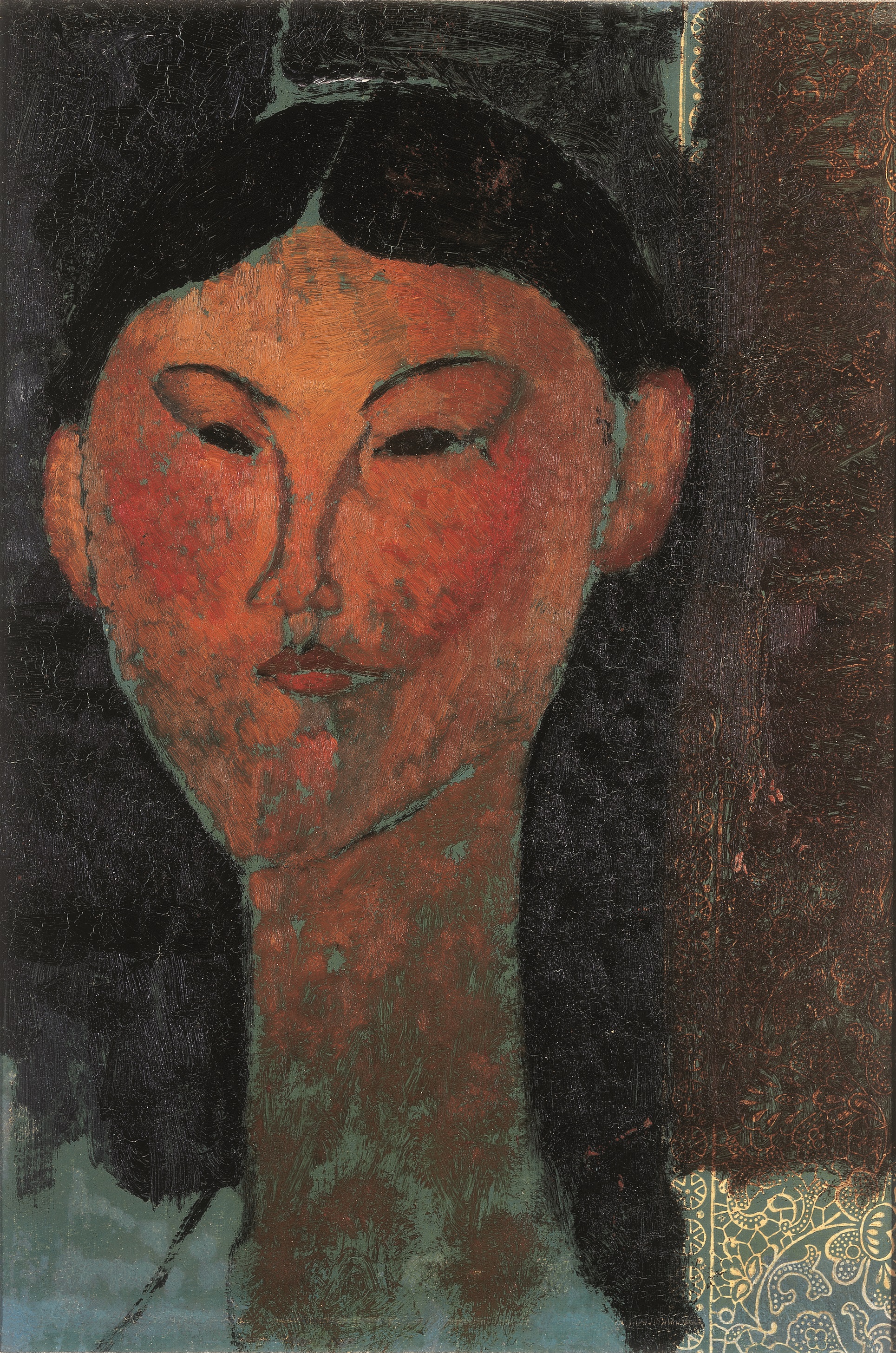
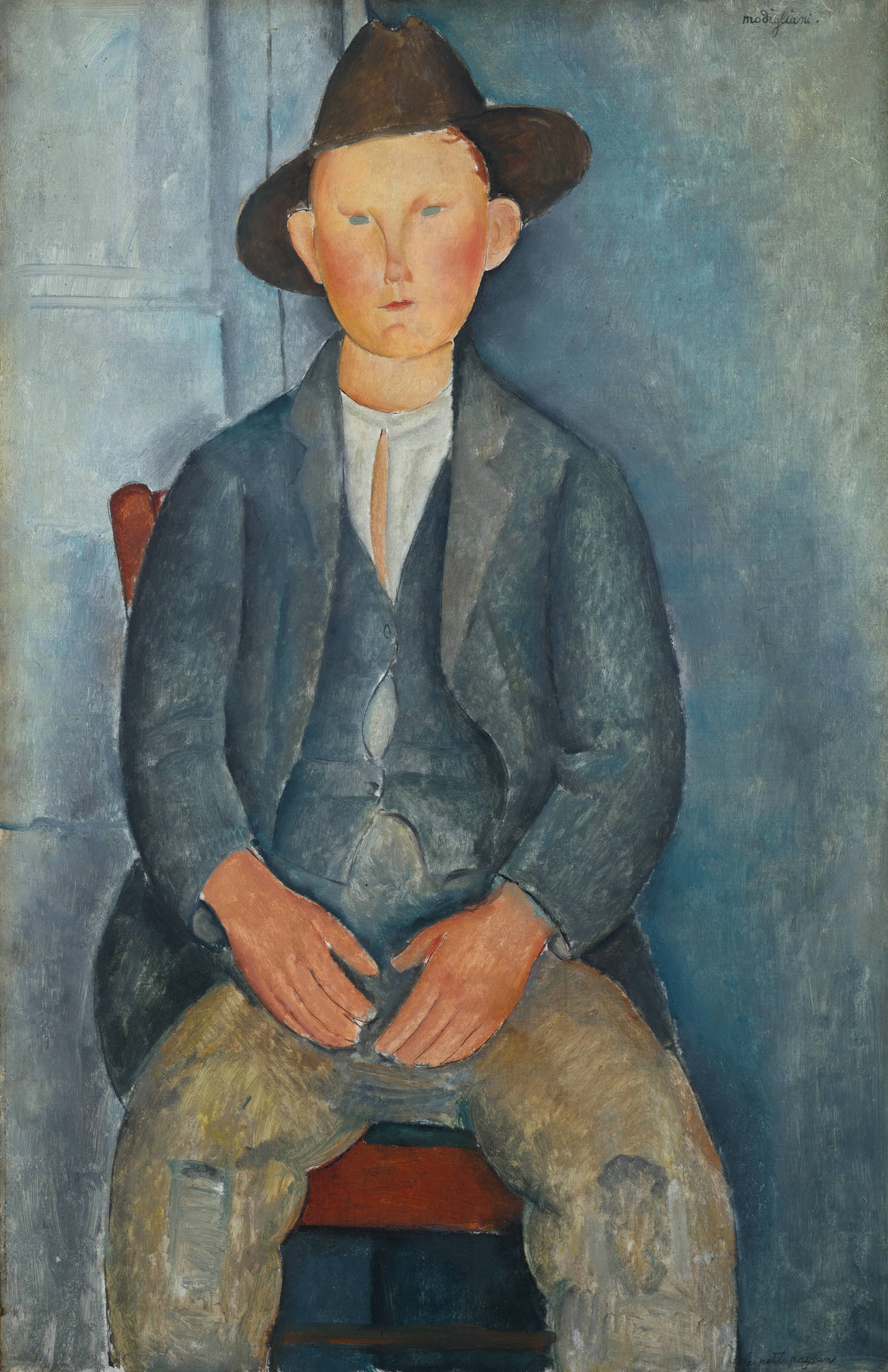
Altogether the 48 illustrations show a surprising range of paintings and sculptures by precursors, core cubists and peripheral members of the movement, namely:

  • Cézanne (2 paintings)
  • Picasso (9)
  • Braque (7)
  • Léger (4)
  • Juan Gris (5)
  • Robert Delaunay (3)
  • Chagall (1)
  • Marcel Duchamp (1 – 1912)
  • Gino Severini (1 – 1912)
  • Natalia Gontcharova (1 – 1912)
  • Albert Gleizes (1 – 1912)
  • Jean Metzinger (1 – 1912)
  • Alexander Archipenko (1 – 1913)
  • Francis Picabia (1 – 1913)
  • Piet Mondrian (1 – 1913)
  • Lyonel Feininger (1 – 1913)
  • Franz Marc (1 – 1913)
  • Emil Filla (1 – 1915)
  • Edward Wadsworth (1 – 1915)
  • Max Weber (1 – 1915)
  • Henri Laurens (1 – 1920)
  • Stuart Davis (1 – 1921)
  • Amédée Ozenfant (1 – 1925)
  • Ben Nicholson (1 – 1947)

Cubist forebears

  • The Impressionists tried to capture fleeting impressions of objects in changing light, as they appeared to the artist, not as they objectively were (e.g. as depicted in the increasingly prevalent photographs).
  • Post-Impressionists – specifically van Gogh and Paul Gauguin, used unrealistic colours and vivid brushstrokes or strong black outlines and stark colour schemes to express emotion.
  • The Fauves (1905-8) took the colour idea further to represent real-life scenes or people in garishly bright and deliberately unrealistic colours.
  • The German Expressionists depicted real people or scenes in harsh, primitive woodcuts or angular ugly paintings.

The single greatest source of Cubism was the later painting of Paul Cézanne, who used a variety of techniques to bring out the geometric forms, the planes and rectangles implicit in a subject, to the fore – not least by creating patches of paint which look like facets of a view.

For example, Mont Saint-Victoire (1904) where the notion of realistically depicting the foliage of trees or houses has long since disappeared to be replaced by the idea of blocks or chunks of paint. The effect is to undermine the idea of a painting as ‘a window on the world’, and replace it with the arrangement of units of paint for semi-abstract aesthetic purposes.

In Cézanne’s still lifes he painted, for example, the bowl of fruit, the table it sat on, and the floor or background wall, all at different angles, with different implied perspectives – Still life with plaster cupid (1895).

The invention of Cubism

Cubism takes these trends a decisive step further. Cubism abandoned 450 years of the careful development of Renaissance techniques for creating a sense of perspective in a painting – rejected the notion of one particular vanishing point towards which all lines in the image converge which gives the viewer the illusion they are looking through a ‘window on the world’ – and instead set about representing the same subject from multiple points of view depicting all sides, top and bottom as required solely to create an aesthetic composition. Abandoning realism or naturalism. Conceiving the work as a purely aesthetic creation.

Cézanne had died in 1906, and 1907 saw two major retrospective exhibitions of his work held in Paris. It is a neat coincidence (or maybe no coincidence) that the first, proto-Cubist painting was made the same year, Les Demoiselles d’Avignon by Picasso. In this seismic work the idea of a coherent perspective giving depth and shape to the objects depicted has obviously been ripped up in favour of a stylised depiction of space and objects which is is impossible to relate to in any of the traditional ways of ‘seeing’ art.

In 1907 Braque saw Les Demoiselles in Picasso’s studio. He was also bowled over by the big Cézanne retrospective. By the next year he was painting landscapes at the village of L’Estaque in a kind of exaggerated Cézanne style, converting houses, trees and roads into increasingly stylised geometric forms. – Houses in l’Estaque (1908)

Thus began a period from about 1908 to 1914 when Braque and Picasso worked very closely together, to begin with both living in rented rooms in a rundown building in Montmartre, the bohemian area in northern Paris, named the Bateau Lavoir. Here they spent the days painting and the nights drinking, partying, joking, discussing ideas, and often spending the summers painting in the same or similar locations.

Very quickly they moved towards painting a relatively small selection of objects:

  • common-or-garden objects from their lives – jugs, newspapers, guitars
  • interiors – so few if any landscapes
  • in muted tones of grey and brown

If Matisse and the other ‘Fauves’ (Vlaminck and Derain) were continuing to explore colour in all its garish vibrancy, B and P undertook an almost scientific analysis of what happens if you paint things after abandoning the idea of there being one point of view in either time or space, if you bring in facets from every angle, if you abandon the idea of producing one coherent perspective on an object and instead, use your artistic power to depict whatever elements you want.

In 1910 Braque painted Violin and pitcher, the palette restricted to grey or brown, the entire composition broken up into numerous clashing planes, with only hints of the ostensible subject (actually, the violin is fairly easy to make out). The trompe l’oeil image of a nail hammered into the top of the painting (complete with its own shadow) conveys the ideas that a painting is a two-dimensional artefact.

Analytic cubism

Violin and pitcher is an example of so-called ‘analytical cubism’ i.e. the subject has been taken to pieces and the resulting fragments reassembled so as to seem splayed out, so as to emphasise a multitude of clashing picture planes.

Now objects can be seen from all points of view at once. Or denoted by one or two scattered attributes – a moustache for a man, an eye for a human being, a fragment of text to denote a newspaper, and so on.

The effect was liberating and seismic. It spread right across the art world like wildfire. As early as 1912 Gleize and Metzinger published a book On Cubism. Contemporary critics and artists related it to Einstein’s undermining of the traditional world of Newtonian physics with his new theory of relativity. Others related it to the philosopher Henri Bergson’s idea that Time isn’t made up of discreet, definable moments measured by clocks and human reason, but is instead an endless flux in which perception of the present moment is flooded with memories of the past and anticipations of the future: all happening at once, as all sides of an object can be depicted simultaneously in a cubist picture.

In 1911 Braque and Picasso went on to break objects down into constituent parts and not even reassemble them, making it almost impossible to see what they are. This further stage is referred to as ‘hermetic’ or ‘high analytical’ cubism. Thus Woman Reading (1911) by Braque – you can make out the curlicues at left and right indicating the wings of the chair, but after that…

It created the notion of the painting as puzzle, with only the title giving the viewer any help in identification.

It’s all the same to me whether a form represents a different thing to different people or many things at the same time. (Braque)

the book reinforces how cubism really was a joint venture by the artists, the look of their works converging into the same style. They often didn’t sign works, giving rise to a century of confusion and misattribution.

In 1912 Braque introduced several further techniques:

  • the use of stencilled lettering, which he had learned as an apprentice housepainter, and which further flattens the surface
  • a method of using steel combs to create the effect of wood grain (faux bois)

There were also three major innovations in materials:

  • Collage, i.e. attaching real objects and non-artistic elements onto the canvas. – Still Life with Chair Caning (May 1912) by Picasso.
  • Paper sculptures – Braque pioneered the idea of making sculptures of paper and then drawing or painting on them i.e. paper is no longer a flat surface i.e. the picture itself can be folded and sculpted.
  • papiers collé where collé means pasted. You paste a flattish medium onto paper and then paint or draw on that. Braque pasted imitation wood-grain wallpaper onto white paper and drew on it; Picasso, always the brasher and more experimental of the two, used newspaper pages. –
  • They mixed sand with paint to give the paintwork a real texture.

All these experiments with medium move the work of art away from being a flat, illusionistic window on the world into being a fully autonomous object in its own right, completely divorced from all previous aesthetic theories. It was a volcanic upheaval in art.

Picasso extended these techniques into the sculpture, Guitar, a) made from scrap metal b) with a rough finish c) inverting space (the sound hole should go into the guitar; instead it protrudes out from the surface like a tin can.

All these deliberate rejections of the entire history of Western sculpture were to have seismic repercussions and affect sculpture right down to the present day.

Synthetic cubism

These latter works are examples of what the critics came to call ‘synthetic cubism’. Whereas ‘analytic cubism’ reduced a given object to its constituent elements and then reassembled them according to a new aesthetic, ‘synthetic cubism’ took elements which had nothing to do with each other (newspaper, sand, spare metal) and assembled them into new objects, which were the end result of the process, not the starting point.

1913 saw Braque and Picasso experimenting with introducing more colour into analytical works, and experimenting further with sculpture and synthetic works.

Montmartre cubism and Salon cubism

But these stunning innovations had not gone unnoticed. Juan Gris was living in the same building as B&P, observing their innovations, and decided to give up his career as an illustrator and commit to becoming a painter.

In 1912 Gris painted a cubist portrait of Picasso. Immediately you can see the difference between his approach and that of B&P – how the idea of breaking down an object (here a human being) into facets can be done in completely different ways by different artists with different personal styles. The facets here are bigger and arranged in a much more orderly way – to the line across the top and the lines off at diagonals create a very regular geometric space of a kind never found in Picasso or Braque. (Cooper points out that Gris trained as an engineer and this may explain his love for architectural regularity.)

This is what now happened – at first a trickle and then a flood of other artists began to incorporate one or other aspect of analytical of synthetic cubism into their own practice.

While B&P didn’t exhibit their new works in 1912 or 1913, another group of artists, based around Jean Metzinger and Albert Gleizes, was exhibiting regularly at the various Paris art shows and/or had dealers who promoted them. They quickly soaked up the lessons of cubism and incorporated them into their own works. Other members of Salon cubism at the time loosely include Robert Delaunay, Henri le Fauconnier, Jacques Villon, Marcel Duchamp, Francis Picabia, Roger de la Fresnaye, Louis Marcoussis and Alexander Archipenko.

Salon Cubism is characterised by:

  • size – B&P’s works are often small and intense: Salon Cubist works are often immense, metres across
  • ambitious subject matter
  • less severe, demanding and complex

They also theorised and wrote about their work, something B&P never did. Thus it was Metzinger and Gleizes who co-authored On Cubism, which put the ideas into phrases which are still quoted. They had realised they were working in the same direction when their works were hung more or less by accident near each other in the 1910 Salon des Indépendants.

They recruited like-minded colleagues and then lobbied the hanging committee to get their works deliberately hung together in one room for the next year’s (1911) show. The effect of having a roomful of the new style hung together was to cause scandal (as so often in Paris art history). The poet Guillaume Apollinaire wrote a long defence of the show and thus came to be seen as a spokesman for the movement.

As to the name, Matisse, who was on the hanging committee of the 1908 Salon which B&P submitted some early works to, is said to have dismissed them as little more than a bunch of ‘cubes’.

The art critic Louis Vauxcelles (who has the distinction of having made the throwaway remark about the paintings of Matisse, Derain and Vlaminck looking like the works of wild things – thus naming the art movement of Fauvism) in 1910 referred to the collected works of Metzinger, Gleizes, Delaunay, Léger and Le Fauconnier as ‘ignorant geometers, reducing the human body, the site, to pallid cubes.’

Whatever the precise origin, the book On Cubism cemented the term and promoted it to a wide book-reading public.

La section d’Or

The Salon cubists held another show in October 1912, named the Section d’Or, French for ‘Golden ratio’, a mathematical concept which had fascinated artists for 2,500 years. It contained over 200 works and was designed as a deliberate retrospective, showing the evolution of a number of artists from 1909 to 1912, and also to establish cubism as a much broader range of styles and approaches than the narrow high cubism of Picasso and Braque.

Its strength (its diversity) was also its weakness. By 1913 many of these artists were pursuing their own visions and interpretations, so much so that Apollinaire’s book of 1913 – The Cubist Painters – was forced to divide the movement into four distinct categories.

Robert and Sonia Delaunay named their experiments in colour combination – painting interlocking or overlapping patches or planes of contrasting (or complementary) colours – Simultanism. Apollinaire called it Orphism or Orphic cubism insofar as it was interested in abstract shape and colour, and the play of colours was identified – by Delaunay and Apollinaire (as by Kandinsky, who Delaunay corresponded with) with music.

Meanwhile, a work like Metzinger’s Dancer in a café (1912) uses cubist rhetoric but is obviously much more decorative and accessible than P&B’s more demanding experiments – the lamp at top right is pure Art Nouveau.

Contemporary movements affected by cubism

Futurism The impresario of Futurism, Filippo Marinetti, published his loudmouth Futurist manifesto in 1909, then took his gang of painters and poets to Paris to see the latest work. Well organised and polemical, the Futurists adapted many of cubism’s tricks but focused on the modern world of machines and on the challenge of depicting movement. They were soon attacking cubism for being quaint and staid and conservative (ladies with mandolins, newspapers on cafe tables, how dull!).

  • States of mind: the Farewell by Umberto Boccioni (1911) breaks down the subject into facets (and uses a very obvious bit of stencilling) but in order to convey the dynamic and modern subject of a fast steam train gathering steam in a railway station.

Rayonism Russian artists wanted to create a home-grown brand of modern art. In 1911 Mikhail Larionov invented Rayonism, an attempt to depict the rays of light reflected from objects using spiky splintered forms. Kasimir Malevich experimented with this angular look and in 1913 he would invent Suprematism, starting from the radical ground zero of his famous black square. Many other contemporary works are described as Cubo-Futurist, for combining elements of both.

Expressionism Cooper sees the influence of cubism on the German Expressionist painter Franz Marc, whose rather naive paintings of animals from 1910 or so, become steadily more involved and broken up by complex sheets or facets as the cubist vision influenced him.

In fact Cooper attributes this highly colourful use of facets and planes more to Robert Delaunay’s version of cubism, than to the grey and brown style of Picasso or Braque.

Vorticism Established in London by the Canadian writer and artist Wyndham Lewis, named by the American poet Ezra Pound, Vorticism published on edition of its bombastic journal, Blast, trying to outdo the Futurists at their own game, and (inevitably) pouring scorn on cubism for being pale and passive. Nonetheless, in its brief life Vorticism attracted impressive talents including Henri Gaudier-Brzeska, Edward Wadsworth, David Bomberg, C.R.W. Nevinson and Jacob Epstein.

The Great War

World War One brought modern art to a grinding halt – Vorticism ceased to exist, Futurism’s key artists were enlisted; two of the key artists of German Expressionism (Marc and Macke) were killed.

Many of the French artists were called up (the Spaniard Picasso being lucky in this respect) and ceased working for the duration. Across Europe there was a reaction against the avant-garde in face of an understandable rise in patriotic nationalism. In France this was called the rappel a l’ordre.

The best example I know of this move to order is in the music of Igor Stravinsky, who moved from the barbaric primitivism of the Rite of Spring (1914) to the orderly, post-war, neo-classical ballet Pulcinella of 1920, which is still recognisably Stravinksian, but made orderly and sensible.

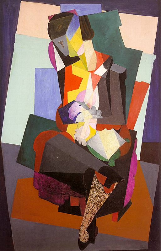
Something similar can be seen by comparing any of Picasso’s pre-war cubist works with Three Musicians of 1921. The later painting keeps many of the elements of cubism, but is somehow completely different. Every object now has a solid outline unlike the swirling blurring of facets in the pre-war work. There are brighter colours instead of the earth browns and greys of high cubism. The colours themselves are painted in solid unshaded blocks, unlike the very rough dabs and strokes of paint in pre-war work. All these changes go to make the later work much more readable that the esoteric ‘hermetic cubist’ works of the pre-war.

The use of much more clear and precise forms has given rise to the term crystal cubism to describe this late style.

Braque fought in the war, and survived. On his return he was never again so close to Picasso and continued to plough a traditionalist cubist furrow, earth colours and all, reworking the same still lifes, becoming maybe a bit more decorative. For example, Fruit on a table cloth with a fruit dish (1925). You can see why Picasso’s style would be more popular.

Léger, meanwhile, was perfecting the ‘shiny tube’ style which was to last the rest of his career. – The card players (1917)

These and other post-war ‘cubist’ works are included in the forty-eight colour plates of this impressive little book.

After cubism

By 1919 the poet Blaise Cendrars wrote a piece saying Cubism had been hugely important but was now finished. Artists were looking elsewhere. In Russia socially-committed Constructivism influenced the new post-revolutionary avant-garde. In Germany the airily ‘spiritualist’ Expressionists were succeeded the grotesque social satire of Otto Dix and George Grosz, which came to be called Neue Sachlichkeit.

In Zurich, Berlin and New York, the Dada movement (1915-20) ridiculed everything, all previous art included, in an outburst of nihilism whose most enduring artistic legacy was the invention of photomontage by John Heartfield in Berlin, a sort of spin-off of cubist collage but focusing exclusively on elements found in newspapers and magazines.

And when Dada fizzled out it was replaced by a new anti-rational movement, Surrealism, led by the imperious writer André Breton in Paris, and exploring dreams, automatic writing and drawing, which also criticised Cubism for being tame and passive.

Around 1918 the Purist movement was founded by Edouard Jeanneret (better known as the modern architect Le Corbusier) and Amédée Ozenfant who co-authored a book, After Cubism in which they criticised the fragmentation of the object in cubism and the way in which cubism had become, in their view, decorative by that time.

They proposed a kind of painting in which objects were represented as powerful basic forms stripped of detail. Purism reached a climax in Le Corbusier’s Pavilion of the New Spirit built in 1925 for the International Exposition of Decorative and Industrial Arts in Paris which contained works by the three principals and the cubists, Juan Gris and Jacques Lipchitz. Soon afterwards the movement lapsed and the painters went their separate ways. – Still life with jug by Amédée Ozenfant (1925).

But it didn’t really matter what these or any other art movements said about Cubism – its historical important is still vast, as seismic as the French Revolution. It definitively ended a centuries-old way of thinking about art as naively representational, and opened up a whole range of strategies and ideas and opportunities, and the use of new media and materials, which are still playing out to this day.

But that’s the subject of another book (in fact, whole libraries of books). This Phaidon volume combines a fact-filled and intelligent introduction with a generous selection of works to show how cubism influenced an entire generation of artists.


Related links

Related book reviews

Related exhibition reviews

Modigliani @ Tate Modern

His name is pronounced Mod-ill-ee-arn-ee – the ‘g’ is silent. This is the most comprehensive Modigliani exhibition ever held in the UK, bringing together a really comprehensive range of portraits, sculptures and the largest ever group of nudes (12) to be shown in this country.

Modigliani

Modigliani

Top brand

Amedeo Modigliani died very young, on January 1920, aged just 35. By that time he had developed a look, a brand, a style, which was instantly recognisable and has made him one of the most valued of ‘modern’ painters, with two entries in the top twenty-five most expensive paintings of all time:

No. 9: Nu Couché $170 million
No. 21: Reclining Nude With Blue Cushion $118 million

Art capital of the world

In the 1900s Paris was the acknowledged capital of the art world, full of artists who’d flocked there from all over Europe (for example, the Spaniard Picasso, the Romanian Brancusi). Modigliani moved from his native Italy to Paris in 1906, when he was 21.

The second room in this big exhibition shows an excellent five minute video montage of black and white photos and very basic movie footage of the Paris of the day, starting with grand scenes of the Eiffel Tower and the buildings left over from the Great Exhibition of 1900, then moving to the ramshackle buildings up the side of the hill of Montmartre, the white Sacre Coeur church still being completed, cabarets and theatres, the back alleys and tenements where the artists rented apartments and studios, and then shots of key figures of the time, Picasso, Brancusi, Gertrude Stein from the family of art collectors, Modigliani himself and some moving footage of workers manhandling lumps of the limestone he carved into sculptures.

Experiments in styles

With a good feel for the life and times of 1900s Paris we move on into a room which shows Modigliani experimenting with the variety of looks and styles on offer. Loose brushwork and abstracted figures testify to the pervading influence of Cézanne on everyone at the time. This is apparent in the very visible diagonal brushstrokes which draw attention to themselves of this early nude, or of his study of Brancusi, who soon became a good friend.

Sculpting

Between 1909 and 1911, heavily influenced by Brancusi, Modigliani went through an intense phase of sculpting. Like many others he was caught up in the fashion for exotic, non-European art, supposedly ‘primitive’ sculptures from ancient Egypt or from France’s colonial possession like Cambodia or the Ivory Coast. It had only been in 1906/7 that Matisse and Picasso both began to incorporate non-European masks and body shapes in their work. Two rooms are devoted to this phase, one showing the lovely preparatory sketches he made, showing Modigliani’s wonderful way with elegant curved but geometric lines, the other showing a dozen or so sculptures which are, without exception, faces, some squat square ones, but most a highly characteristic elongated, narrow face with a long pendulous nose ending in a little round pouting mouth.

The commentary tells the story that sometimes visitors to his studio at night found that Modigliani had placed lighted candles atop each of the sculptures. He told friends he planned to create a kind of pagan temple decorated with them. On a few occasions, at hashish parties, he was seen to embrace them.

In all, Modigliani made about 25 of these highly characteristic heads. A handful were included in the 1912 Salon d’Automne, the only time they were displayed in his lifetime. There are several theories why he abandoned sculpture in 1913 – possibly the constant dust of a sculptor’s studio exacerbated the childhood tuberculosis which he was always holding at bay. Possibly it was just too expensive compared to painting.

The Modigliani look

But the extensive sketches, and the really physical engagement with sculpture, had set in stone (as it were) what was now established as the Modigliani ‘look’ – elongated faces with swan-like necks and blank almond-shaped eyes were to characterise all his paintings from now to the end of his life.

This is already apparent in the many portraits he painted of fellow artists, mistresses, and the collectors and art dealers who were important in launching his career. The commentary gives a good deal of background information about each of them, for example about the several portraits of his dealer, Paul Alexandre, a leading promoter of African art. I particularly liked the ‘naive’ way Modigliani writes on the paintings: he writes the name of the subject (Picasso, Paul), his own signature, and then often writes a comment, for example writing ‘Novo Pilota’ – meaning ‘guiding star’ – onto his portrait of Paul Guillaume.

Portrait of Paul Guillaume, Novo Pilota (1915) Musée de l’Orangerie, Paris. Collection Jean Walter et Paul Guillaume

Portrait of Paul Guillaume, Novo Pilota (1915) Musée de l’Orangerie, Paris. Collection Jean Walter et Paul Guillaume

The elongated, cylinder-like neck, the perfectly almond-shaped face especially the pointed chin, the simple one-line depiction of the nose and eyes and eyebrows and especially the slate grey or blacking out of the eyes to emphasise the impassive mask-like effect – all these are apparent in his several portraits of his mistress-lover Beatrice Hastings who, the commentary tells us, was a British-born writer and editor who covered the Paris art scene for British magazines.

Beatrice Hastings (1915) Private Collection

Beatrice Hastings (1915) Private Collection

There are three rooms devoted to his artistic peers, to colleagues, collectors and dealers, friends and lovers and patrons, featuring his portraits of such luminaries as Jean Cocteau, Juan Gris and the Mexican muralist Diego Rivera. By the time war broke out in 1914 Modigliani was very well-connected, an ‘insider’ in the Paris art world, friends with the leaders of the avant-garde, beneficiary of regular commissions from the cognoscenti.

A people person

What these three rooms really crystallise is the fairly obvious point that he only painted portraits – heads or busts or full bodies, but only individual people. Landscapes such as had obsessed the godfather of modernism, Cézanne? None. Still lives such as absorbed the Cubists, Picasso and Braque? None. Cityscapes such as dominated the Futurists from his own native land, Italy (the first Futurist manifesto was published in 1909)? None. On the strength of this exhibition it seems that he never sketched, drew, painted or sculpted anything but the human form and face. And although highly stylised, they are always recognisable, with recognisable clothes (or not), in chairs or leaning on tables in a recognisable space.

Compared to the wild experiments going on around him (Fauves, Cubism, Futurism) Modigliani’s art seems – well ‘conservative’ is the wrong word, a genuinely die-hard conservative style continued to be produced by academic painters – but understandable, assimilable, acceptable.

Modigliani’s nudes

It was with this in mind that I walked into the big room displaying ‘the largest ever group of Modigliani nudes to be shown in this country’, 12 of them, to be precise.

The commentary would have us believe that these are ‘shocking’ and ‘provocative’ works and tells the story that the one and only exhibition of them – held at Berthe Weill’s gallery in 1917 – was closed down by the police on the grounds of indecency. Apparently, this was specifically because Modigliani showed his models having pubic hair and underarm hair.

Reclining Nude (1919) Museum of Modern Art, New York

Reclining Nude (1919) Museum of Modern Art, New York

To be honest, I found this a little hard to credit (not that the show was closed down, but that the works were particularly shocking or provocative). I’ve just read a book about the Fauves which included plenty of Fauvist nudes which a) are really wild pictures, sometimes difficult to make out amid the riot of colour; and b) where you can, quite routinely show depict pubic hair.

Compared with any of these works from at least ten years earlier, Modigliani’s nudes seem very tame – in terms of colour (which is very restrained and ‘realistic’ – the flesh is generally flesh-coloured), in terms of line (Modigliani’s nudes are all clearly defined by wonderfully crisp, curving outlines), in terms of facial features (which are stylised but not, actually, that much), even in terms of crudity, none of the Modiglianis are as in-your-face as that final nude by Camoin.

On the contrary – they all share a similar warm orange body, lovely curves, ample bosoms, pink nipples, all depicted with super-clear, well-defined black outlines. If they so show women’s pubes, they are as neat and geometric as their oval faces. Actual women’s pubic hair is a lot more unkempt and varied than Modigliani’s tasteful version.

No, what struck me about all of Modigliani’s nudes was their restraint, their tastefulness, and several of them really did strike me as deeply conservative, particularly the nudes where he is consciously referencing the European tradition, like this one which is based on Ingres’ famous Odalisque.

Reclining Nude (1919) Museum of Modern Art, New York

Reclining Nude (1919) Museum of Modern Art, New York

All four curators of this exhibition are women and so you have a strong feeling in the audio commentary that they feel duty bound to discuss how women’s bodies were a battlefield in the 1910s (prompting the thought, When have women’s bodies not been battlefields, according to feminist history?), but, at the same time, want to assert that the women Modigliani depicts are not helpless victims of ‘the male gaze’ – these women are strong independent women, as evidenced by their wearing lipstick, make-up and – in some of them – necklaces or ear rings.

The commentary compares the lot of the average model to the really grim lives of working class women slaving away in factories or as laundresses etc (Modigliani’s models earned about double the daily working wage for spending a day lying on a couch).

But none of this semi-political feminist interpretation really changes the fact that these are cartoons. The simple black outline, the stylised and fairly flat colouring – they could almost come from a Tintin cartoon, or from any number of subsequent comic strips. Compare and contrast with the genuinely experimental way nudes had been portrayed for at least a decade.

If the Berthe Weill show was raided and closed down it was, if anything, because the nudes were – in artistic terms – so conservative, so realistic, so figurative and so traditional in style – that they really did teeter on the brink of pornography.

No one could mistake the Matisse, Derain or Picasso nudes for soft porn, they are all very obviously far more interested in experimenting with new ways of seeing and new ways of painting than with titillation. You can’t really confidently say that about the Modigliani nudes. They are all pretty sexy and sexiness is their subject, although the curators prefer the more polite word ‘seductive’.

By this, room 8 of the 11-room exhibition, it seemed to me that Modigliani had progressed far beyond his earlier experiments, incorporated all the stylisation he’d learned from studying ‘primitive’ art and sculpting, and had emerged to produce a really consistent brand of very quaffable female nudes. Their naive simplicity makes them extremely enjoyable and explains, I think, the extraordinary prices they fetch at modern auction, tasteful, soft-porn works which any self-respecting billionaire would be proud to hang in his luxury apartment in New York, Paris, Moscow or Beijing. (Nu Couché was bought by the Chinese billionaire Liu Yiqian for $170 million, Reclining Nude with Blue Cushion was bought by Russian billionaire Dmitry Rybolovlev for $118 million.)

The curators can use feminist tropes all they like to try and defend these nudes but there seems no doubt that they are now, as they were then, designed for the visual pleasure of rich men.

The warm South

Towards the end of the war Modigliani was sent to the Mediterranean coast by his new art dealer, Léopold Zborowski, as a precaution against increasing Zeppelin raids on Paris and also because of his worsening health. Modigliani was worried about leaving behind his well-developed network of friends and artistic accomplices, but in fact soon settled in to a new life, not least because he was accompanied by his mistress, Jeanne Hébuterne.

Again he painted nothing but portraits and, deprived of the network of professional models in Paris, took to painting local adults and then a series of children. He seems to have reacted to the far brighter light of the south by using warmed Mediterranean colours and also applying the paint much more thinly, both of which make these portraits seem light and airy.

The Little Peasant (c.1918) Tate

The Little Peasant (c.1918) Tate

Children and peasants. Is there not something a little, well, twee about some of these works? (Looking it up I see that ‘twee’ is defined as ‘excessively or affectedly quaint, pretty, or sentimental’.)

Again compare and contrast with his contemporaries or, in this case, with the Master, Cézanne. With the current exhibition of Cézanne portraits at the National Portrait Gallery in mind, we can see how Modigliani has learned the lessons of the old Frenchman v the patches of colour, the visible brush-strokes, the steep foreshortening of the subject and backdrop, the confrontational – full-on pose, but made it somehow, well babyish. Toy-like. Here’s a Cézanne.

Man with Pipe (1891-6) by Paul Cézanne. The Courtauld Gallery, London

Man with Pipe (1891 to 1896) by Paul Cézanne. The Courtauld Gallery, London

Comparing the two it seems to me the main difference is in the face. Not only does Modigliani use his simplified mask design, but, by this stage, he’s often painting his faces in a unified flesh tone (true of almost all the nudes) which gives them quite literally a baby-faced freshness. Again compare and contrast with the complex brushwork Cézanne has applied to the face of his old bloke with a pipe, let alone the wild blues and greens which the Fauves used in their portraits. Compared to all of them, surely Modigliania is tame.

In fact it’s only really the use of the mask motif which prevents his works toppling over into kitsch. In particular I felt it was only the blacking out of the eyes of the portraits (which gives them a weird voodoo science fiction vibe) which prevents them from turning into the kind of Modernism light paintings you see being hawked on the streets of any tourist trap European city.

Last works

The final room shows his last works, painted back in Paris after the war, depictions of more rich patrons and commissions, alongside a suite of portraits of his mistress, Jeanne Hébuterne, who was pregnant with their second child.

Jeanne Hébuterne (1919) The Metropolitan Museum of Art, New York

Jeanne Hébuterne (1919) The Metropolitan Museum of Art, New York

It’s notable that the flesh tones have moved away from the warm pinks of the nudes, back towards a more ‘experimental’ colouring. But the most striking thing about these last paintings is that the almond-shaped face and swan neck are taken to new extremes. Some of the people look like giraffes.

The colouring is richer and denser than in the South of France paintings. But each work, no matter how varied the subject, is now totally identifiable as a Modigliani. Who knows how his work would have continued to evolve and develop; he was half-way towards the kind of crisp neo-classical feel which so many French artists would adopt after the war.

But we’ll never know. Modigliani died from tubercular meningitis on 24 January in 1920. In a grim note we learn that just a few days later, his mistress Jeanne, nine-months pregnant, committed suicide by jumping from the fifth floor of an apartment building.

This is a really enjoyable, carefully and thoughtfully curated overview of a wonderful artist, whose draughtsmanship is a joy to look at, from his earliest works, and whose mature geometric style produced painting after painting which fills the eye with pleasure.

Modigliani Virtual Reality

Towards the end of the exhibition is an ambitious innovation – a room where about ten visitors at a time can sit and have a visitor assistant clamp onto their head a kind of helmet with built-in 3-D goggles. These give you a virtual reality tour of a computer-generated recreation of Modigliani’s studio. It’s a bld new idea and a first for Tate.

Inevitably, there was a fairly long queue for this brave new digital experience, with an estimated waiting time of 25 minutes so I’m afraid I decided not to. Some of the content can be seen on the video screen outside the exhibition which is running a film about the making of the VR experience (which I’ve embedded, below).

So my advice would be to go the exhibition soon after opening (at 10am) and go straight to the queue for the VR, do it, and then go back to do the exhibition in order.

Seated Nude (1917) Royal Museum of Fine Arts Antwerp, Lukasart in Flanders. Photo credit: Hugo Maertens

Seated Nude (1917) Royal Museum of Fine Arts Antwerp, Lukasart in Flanders. Photo credit: Hugo Maertens

Videos

Introduction to the exhibition by curator Simonetta Fraquelli.

Video showing how the virtual reality experience was made.


Related links

More Tate Modern reviews