
The German art publishers Taschen recently repackaged their Basic Art range into a standardised, large, hardback format, retailing at £10. Each volume in the series focuses on one famous painter or art movement.
The attraction of Taschen editions is that the text is factual, accurate and sensible, and the books have lots of good quality colour reproductions. Even if you don’t bother to read the text, you will be able to skim though plenty of paintings, alongside photos where relevant, of the artist or movement being discussed. The text of this one was written (as usual) in Germany, back in 1997, then translated into English.
Rivera’s life story is brilliantly told in the imaginative, sardonic and whimsical Dreaming With His Eyes Open: A Life of Diego Rivera by journalist Patrick Marnham, published in 1998, so not much in the text surprised me, although, being much shorter, it had the effect of making the sequence of government buildings which Rivera created murals for a lot clearer, and it also explained the last decade or so of Rivera’s life (he died in 1957) a bit better.
What I wanted was a record of Rivera’s paintings. I’ve read and seen a lot about the murals, but they generally overshadow his easel paintings. I wanted to see more of the latter.
Rivera was immensely gifted, started drawing early (the earliest work here is a very good goat’s head, drawn when he was 9) and enrolled at the Academy of San Carlos in Mexico when he was just ten, quickly hoovering his way through late academic styles. He went to Spain in 1907, aged 21, and studied Velasquez and El Greco. And then onto Paris in 1910, where he quickly discovered the avant-garde and was an early adopter of cubism.
For the first 20 years of his life, he was an omnivore, a chameleon, and I am impressed by the ability,and variety, of these early works.
French impressionism
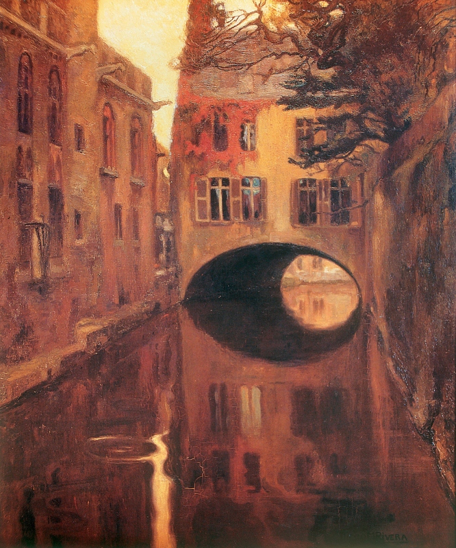
The House on the Bridge by Diego Rivera (1909)
Psychological realism
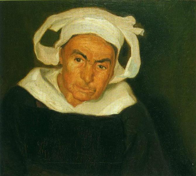
Head of a Breton Woman by Diego Rivera (1910)
Cubism
Adopting the cubist style wasn’t just a fad. From 1913 to 1917 Rivera painted solely in the cubist style, completing some 200 works, took part in impassioned debates about various types of cubism, was friends with Picasso and Juan Gris. When he exhibited some of the works in Madrid in 1915, they were the first cubist paintings ever seen in Spain.
Zapatista Landscape by Diego Rivera (1915)
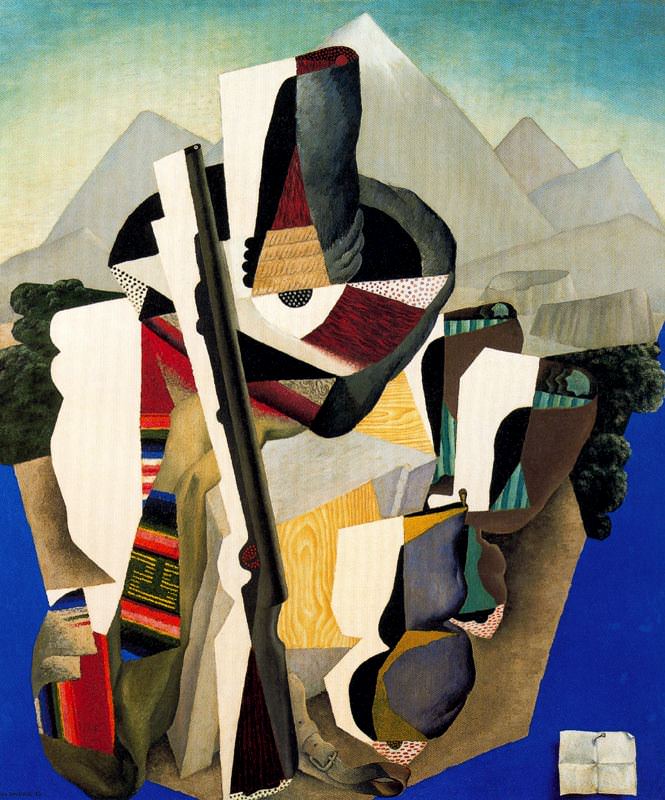
Futurism
Futurism is different from cubism because whereas the latter started out as a new way of seeing very passive objects – landscapes, but particularly Parisian still lifes, wine bottles and newspapers on café tables – Futurism uses a similar visual language of dissociated angles and fractured planes, but in order to depict movement. Also, if this makes sense, its angular shapes are often more rounded, a bit more sensuous (it was, after all, an Italian movement).
Woman at a Well by Diego Rivera (1913)
Russian modernism
Rivera experimented with a brighter, more highly coloured, more nakedly geometric types of modernism, a style that reminds me of Malevich. Maybe influenced by conversations with Russians in Paris, including Voloshin and Ilya Ehrenburg. And the fact that Rivera’s mistress, Angelina Beloff, was Russian. This is her suckling their baby.
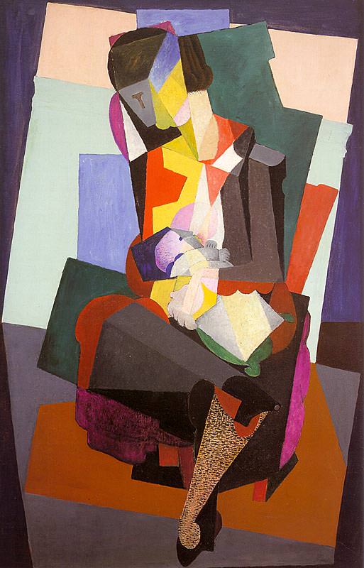
Motherhood by Diego Rivera (1916)
Mural style
In 1917 Rivera definitively broke with cubism. He studied Cézanne, and the earlier Impressionists. Deprived of the sense of belonging to a communal avant-garde he was at a loss, stylistically.
Toying with returning to Mexico after 13 years in Europe, in 1920 Rivera gained funding to go on a long tour of the frescos of Italy.
In 1921 he finally arrived back in Mexico, and was one of several leading artists taken by the new Minister of Education and Culture, José Vasconcelos, on a tour of pre-Columbian ruins, studying the carvings of men and gods.
At last Rivera felt he had come ‘home’. The Italian frescos, but especially the pre-Colombian art, and the encouragement of the left wing populist minister all crystallised his new approach. He would completely reject all the stylistic avant-gardes of Europe, and melding everything he had learned into a new simple and accessible art for the public. He wanted to:
‘reproduce the pure basic images of my land. I wanted my painting to reflect the social life of Mexico as I saw it, and through my vision of the truth to show the masses the outline of the future.’
The Mexican revolutionary government wanted to commission public murals to educate a largely illiterate population. Rivera received a commission to create murals depicting Mexican art and culture and history and festivals at the Mexico City Ministry of Education, and thus began his long career as a public muralist, and as one of the leaders of what was soon a Mexican school of mural painting.
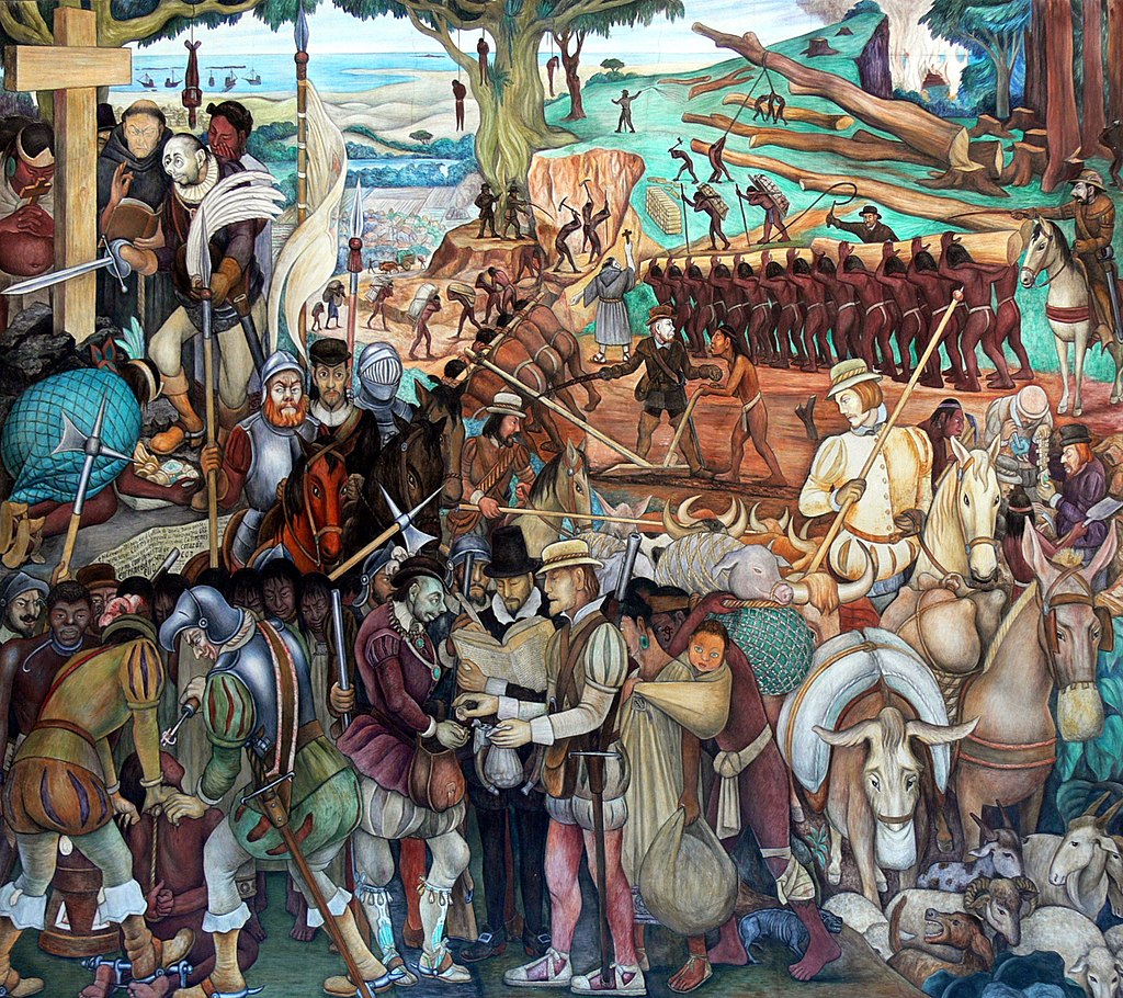
Part of the mural titled Exploitation of Mexico by Spanish conquistadors, in the Palacio Nacional, Mexico City by Diego Rivera
But he was surprisingly badly paid ($2 per day) and so had to continue selling sketches, drawings and paintings to tourists and collectors. Often they were sketches or trials for individual subjects which would then appear in murals.
Bather of Tehuantepec is well known because it marks such a radical break with the immense sophistication of his earlier work. It is highly stylised but not so as to make it almost unreadable (as in cubism). The opposite. It is stylised to make it simple, ‘naive’, peasant, and accessible. Note the child-like simplicity, the primal colours. And the child-like use of space, the plants at the bottom simply giving structure and space to the bending body. It points to the mural style which incorporate elements not for any ‘realism’ but subordinated to narrative and message. Here the message is the primal simplicity, the utter lack of pretension, of the Mexican Indian washing.
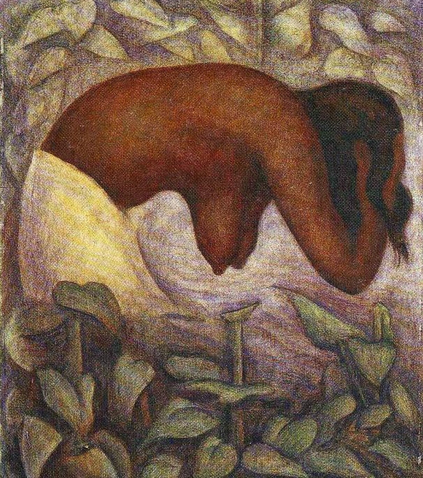
Bather of Tehuantepec by Diego Rivera (1923)
Lilies
Rivera liked flowers. Calla lilies are, in a way, highly schematic plants. Big, tall and simple, with simple bold flowerheads, Rivera featured them in a whole series of paintings. This picture uses an immensely sophisticated grasp of perspective, colour and volume to create a strikingly ‘simple’ picture.
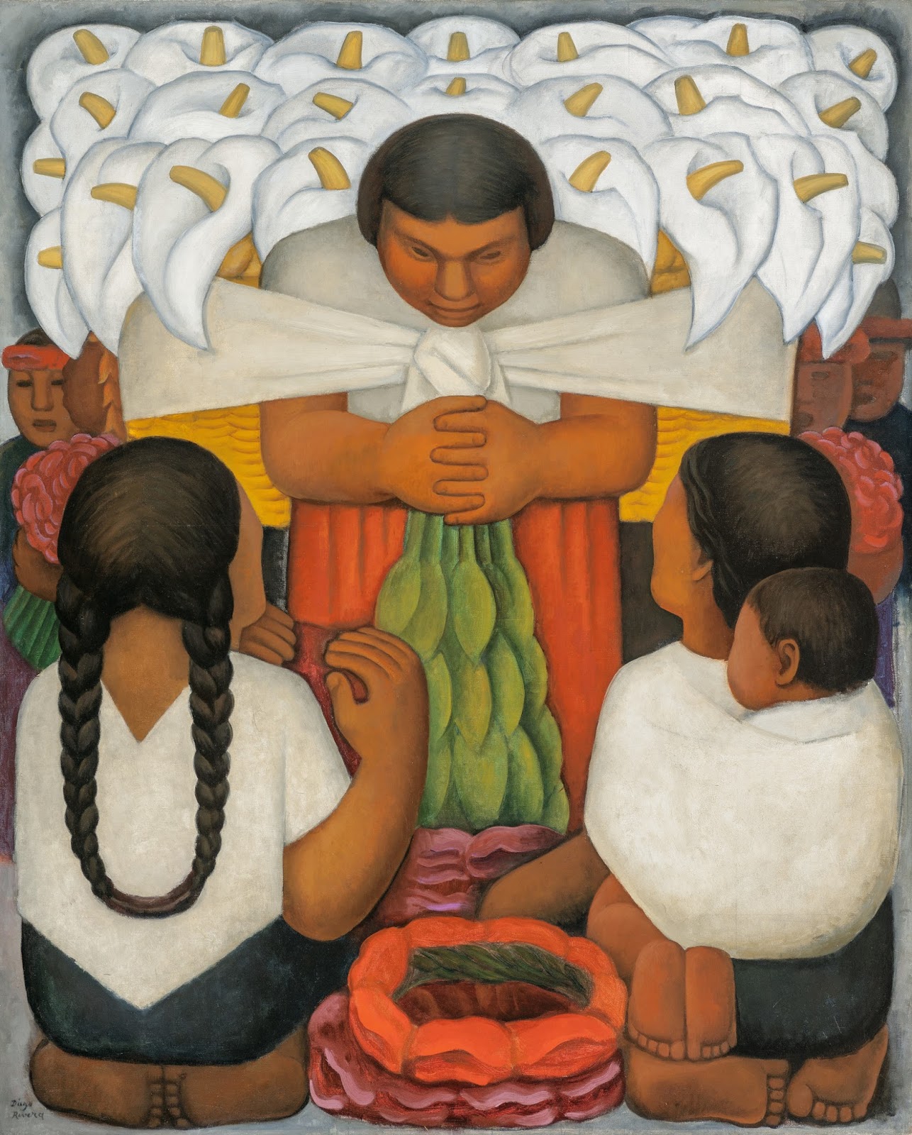
Flower Day by Diego Rivera (1925)
After looking at it for a while I noticed the compact, squarely arranged feet of the peasants at the bottom of the picture. Showing the way Rivera’s interest in cubes and angles and blocs of paint, was transmuted into the semi-cartoon simplification of the mural style.
Mexican realism
Rivera was expelled from the Mexican Communist Party after a difficult trip to the Soviet Union in 1927. In the early 1930s he went to America and painted murals in San Francisco, Detroit and New York, but these commissions came to a grinding halt when he fell out with the Rockefellers in New York after painting the face of Lenin into a mural in the new RCA skyscraper in 1933. He was fired and the mural was pulled down.
Back in Mexico in the 1930s, Rivera found government commissions hard to come by and developed a profitable sideline in a kind of Mexican peasant realism. He painted hundreds of pictures of Mexican-Indian children, sometimes with their mothers – selling them by the sackful to sentimental American tourists. They kept the wolf from the door while he tried to get more mural commission but… it’s hard to like most of them.
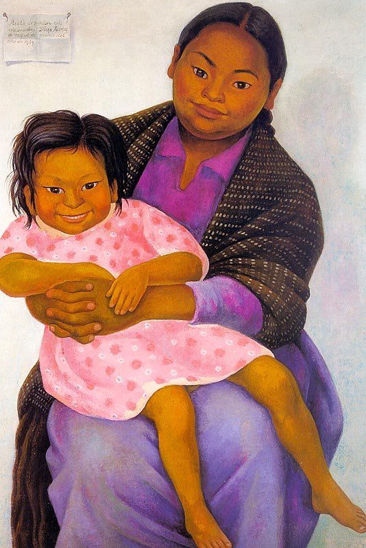
Modesta and Inesita by Diego Rivera (1939)
Surrealism
I know from the Marnham book that André Breton, godfather of the Surrealists, came to stay with Rivera and Frida in 1938. I didn’t know that Rivera made an excursion into the Surrealist style and exhibited works in a major 1940 exhibition of Surrealist art.
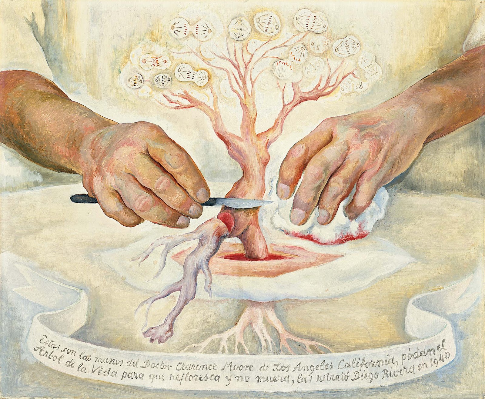
The Hands of Dr Moore by Diego Rivera (1940)
Society portraits
Right to the end he made important and striking murals, such as the striking Water, The Origin of Life of 1951, an extraordinary design for the curved floor and walls of a new waterworks for Mexico City.
But at the same time – the late 1940s and into the 1950s – Rivera also produced commissions, usually portraits, for rich people, especially society women, which are surprisingly at odds with his commitment to the violent rhetoric of the Stalinist Communist Party.
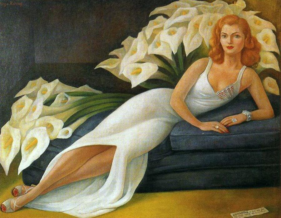
Portrait of Natasha Gelman by Diego Rivera (1943)
Obviously, the striking calla lilies a) echo the slender elegant shape of the svelte millionaire’s wife b) echo their use in quite a few earlier paintings. But there’s no getting round the contradiction between this kind of rich society portrait and the intense engagement with the poor, with landless Indians, with the conquered Aztecs, of so many of his murals.
Having slowly trawled through his entire career, I admire the murals, and am often snagged and attracted by this or that detail in the immense teeming panoramas he created – the Where’s Wally pleasure of detecting all the narratives tucked away in a panoramic work like the Exploitation of Mexico, above.
But, given a choice, it’s the early cubo-futurist, or futuro-cubist works, which give me the purest visual pleasure.
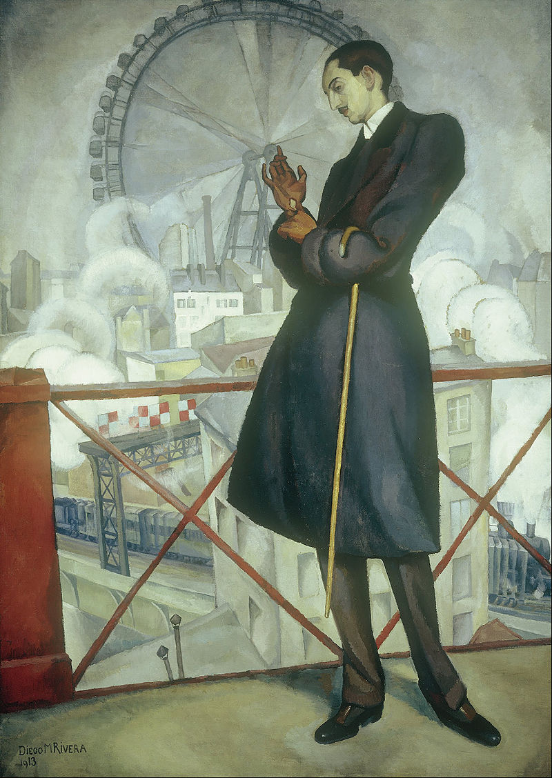
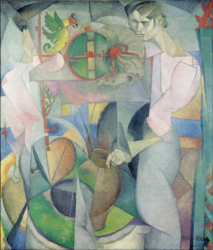
Portrait of Adolfo Best Maugard (1913) by Diego Rivera
Related links
- Rivera on Amazon
- Diego Rivera website
- Murals by Diego Rivera in the Palacio Nacional de Mexico – Index and Introduction
- Taschen art books
Related reviews about Diego, Frida and Mexico
- Frida Kahlo, Diego Rivera and Mexican Modernism: The Jacques and Natasha Gelman Collection (2001)
- Villa And Zapata: A Biography of the Mexican Revolution by Patrick McLynn (2000)
- Diego Rivera: The Detroit Industry Murals by Linda Bank Downs (1999)
- Diego Rivera: The Detroit Industry Murals and the Nightmare of War controversy
- Dreaming With His Eyes Open: A Life of Diego Rivera by Patrick Marnham (1998)
- The Murals of Diego Rivera by Desmond Rochfort (1987)


