The curators think the American artist Philip Guston (1913 to 1980) was one of the most remarkable artists of the twentieth century. Usually I can see what they’re getting at, even if I don’t like an artist much, but this a rare occasion when I really didn’t get it at all.
On the evidence of this huge, major retrospective, which contains more than 100 paintings and drawings from across Guston’s 50-year career, it feels like he toyed with or experimented with a series of 20th century styles, never an innovator, seeming much more like a follower who did copied styles invented by other people, often very competently, until, in the late 60s, he had painted himself into a corner, had reached the end of road copying other people, and had a massive block, painting nothing for a couple of years.
When he re-emerged it was with a radically new style, because he had discovered cartoons. The curators call it ‘drawing’ and there’s plenty of drawings here, a roomful of the studies which got him back into the groove, but, in my opinion, all in a cartoon style, and certainly it eventuated in hundreds and hundreds of paintings which look like this.
In this brief review I’ll reprise the shape of his career so you can judge for yourself.
Early years
He was the son of dirt poor Jewish immigrants, the Goldsteins, who had experienced antisemitic pogroms in the Ukraine, and then the tragic deaths of family members when they made it to America, crossing all the way over to Los Angeles to settle in 1922, when our guy was just 9 years old.
So he was raised in a hard-working, socially conscious, left-wing environment, with a particular sensitivity to racism of all forms (which was to come out, a lot later, in the form of a weird obsession with the white hooded figures of the Ku Klux Klan – see below).
Picasso
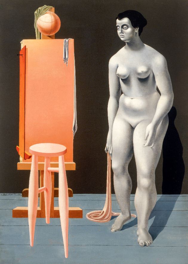
His early works seem to me to straight copies of Picasso’s neo-classical 1920s style with some surrealism thrown in. Thus this woman seems Picasso while the stitched head or ball on top of the easel looks like de Chirico.
The 1930s were a very political decade, and he was also drawn to the large-scale and very socially conscious mural art of the Mexican Diego Rivera. In fact Rivera helped Guston get a commission, alongside Reuben Kadish and Jules Langsner, to create a large mural in Mexico in 1934.
The result, ‘The Struggle Against Terrorism’ (1934 to 1935) was later painted over by the Mexican authorities. Only recently has restoration work made it available again, and this exhibition features a massive video projection of it, highlighting its theme of the oppressive nature of the Mexican church.
Back in the States Goldstein changed his name to Guston, precisely to avoid a growing swell of antisemitism in America and moved to New York. Moving among artists and writers and intellectuals boosted his left-wing attitudes even more and led, among other works, to a defining work of the era, ‘Bombardment’ from 1937, which combines the clear sheets of colour from the classical Picasso with the large-scale composition of his mural approach and a popular (cartoony?) treatment.
Then came a massive change in his style. He began teaching at universities in lowa City and Saint Louis and turned away from public political art. He continued doing portraits (in their quiet way, maybe these are the best bits of the show). But, like so many of his generation, appalled by the trauma of the Second World War and the revelation of the Holocaust, he turned to increasingly abstract compositions. It was the birth of Abstract Expressionism and Guston chucked his old figurative style(s) and threw himself into the new way of seeing and working.
The exhibition has two rooms of his abstract expressionist paintings, one from the 1940s, then moving on to the 1950s and it seemed to me blindingly obvious that he got steadily worse. In the winter of 2016 the Royal Academy hosted a blockbuster exhibition of Abstract Expressionism and it came as a revelation; I was blown away; room after room of masterpieces; a revelation that paintings which don’t depict anything could be so varied and so exciting.
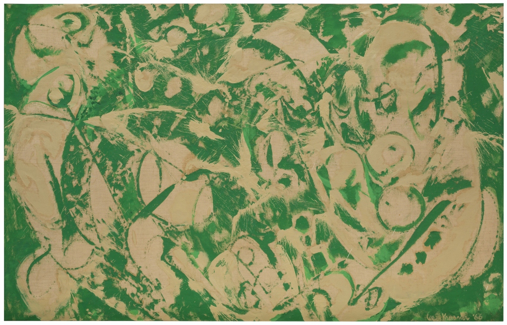
None of Guston’s abstract paintings did it for me. He hadn’t the excitement of Jackson Pollock, the meditative power of Mark Rothko, the dynamic patterning of Lee Krasner, or the stark drama of Clyfford Still. In my opinion the first room of Guston abstracts is bad and the second one is horrible.
Nonetheless, he was, apparently, an influential figure in the New York School alongside his high school friend Jackson Pollock, Willem de Kooning and Mark Rothko.
Disillusion
As the gusty 1960s turned into the colourful 1960s, though, Guston got sick of painting in the same mode. For me, it really shows, his abstract paintings start off poor, become terrible, and then it feels like he gives up in disgust. The exhibition compensates for the poor quality of the art with a great deal about Guston’s political views. He was not, as you might have guessed, a big fan of the Vietnam War, but in fact it was the resurgence of racism back home in the states which really got to him.
Extras
The curators have done their best to make this a really defining, landmark exhibition of the full range of Guston’s work, along with all kinds of supporting material and documentation. The show is accompanied by commentary, stories, and personal reflections from Tate curators and guest contributors, including:
the artist’s daughter Musa Mayer
writer Olivia Laing
art historian and curator Aindrea Emelife
artist Charles Gaines
Tate paintings conservator Anna Cooper
illustrator and artist Blk Moodie Boi
chef and family friend of Guston’s, Ruth Rogers
Also included in the exhibition are specially commissioned responses from musician Anja Ngozi and poet Andra Simons, inspired by Guston’s collaborative spirit.
In his 1950s abstract phase he was friends with avant-garde composers –John Cage, of course, everyone knew Cagey, but also Morton Feldman and one of the abstract rooms plays bits from the very long (four hours) piece by Feldman which the composer wrote specially for Guston. It is characteristically serialist or abstract, but quiet and lovely. I like Morton Feldman. As one of the commenters on YouTube says, it ‘sounds like an alien trying to make human music’, which is precisely the quality I like, away off the edge of something.
Blockage
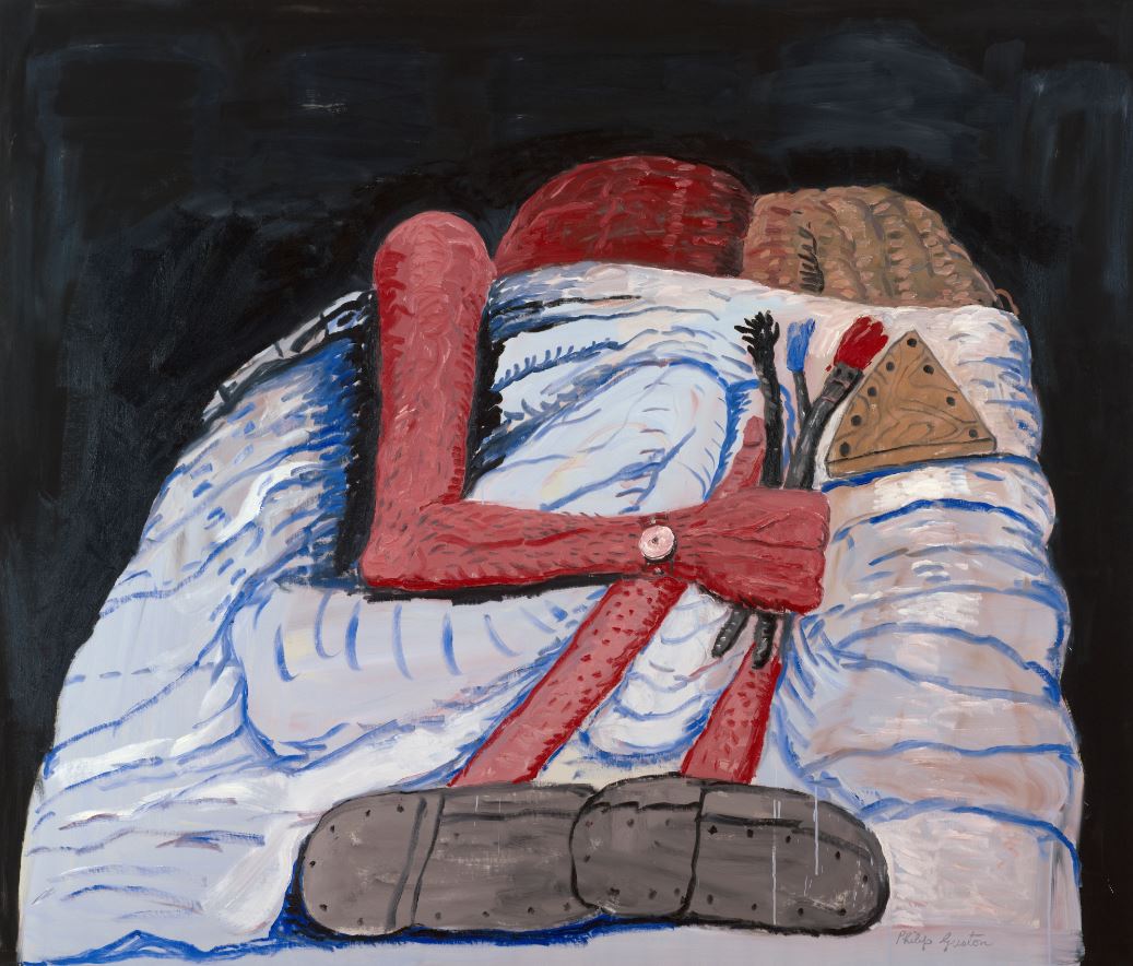
A wall label tells us that in the late 60s Guston abandoned painting altogether for 18 months or so. But during that period he continued drawing and sketching obsessively, mainly the objects in his own apartment, tables and chairs and shelves and beds but above all, books.
Note the vertical black lines in the book, and lying around on the (invisible) table. Using these lines as decoration, to create space, to define objects, would become a signature trick of his final style. Because out of this drawing came a way out of the corner he’d painted himself into. He embraced figuratism again, but of a very, very simplified, reductive type. He expanded the drawings into paintings, and then suddenly found himself painting unstoppably. The dam had broken. His block was over. for the next ten years he would paint hundreds and hundreds of really big paintings all taking the new approach.
Note several things. The colour is pink, pinks and reds, a worrying shade of pink skin, pink flesh, a world of burned or flayed human skin. Then the dotted lines, like the nails in hobnailed boots. Are those boots piled up behind the bed? Certainly the use of dots and dashes to fill and decorate objects became a signature.
The Ku Klux Klan
The Klan was a symbol of evil racism for the young Guston. Now in the era of the Vietnam War, of the ferocious racist pushback against the Civil Rights Movement, and the tide of violence sweeping across America, they make a startling reappearance in Guston’s work, as disturbing cartoon emblems of the banality and ludicrousness of evil.
So: 1) pink, very pink, buildings, sky, road all shades of pink, so a kind of abstraction. 2) The obviously ‘naive’, untrained, outsider cartoon style. 3) Those lines of dashes, giving definition to everything from the windows in the skyscraper, the wheels of the car (or tractor?), the eyeslits of the Klansmen, and the odd dotted lines on the back of their hoods.
In 1970 Guston showed 30 of these works at a now infamous show at New York’s Marlborough Gallery. Almost all the critics and his friends were appalled. Abstract Expressionism was closely connected with an immensely serious, ‘committed’ attitude to life and art and politics, a tragic worldview mixed up with European existentialism.
All of that had (apparently) been chucked out in the name of what most critics thought a disastrous turn to a naive, crudely cartoony style. But Guston persisted, and the last four rooms of this huge exhibition are stuffed with scores of examples of the same approach applied again and again.
Many of them are depictions of interiors but coloured with a kind of naive surrealism, giant eyes, mountains of legs, abandoned shoes, and everyday objects rendered both familiar and strange. There’s a lot of him or some human being in bed, like ‘Couple in Bed’ that I opened with.
I found that once you’d assimilated the approach, the pink worldview with dots and dashes, men in pointy hats, other men curled up in bed, er, there wasn’t much more to take in. To try and be positive, there’s no doubting that he had finally created a signature style – his early works seem to me straight copies of Picasso, de Chirico-style surrealism, Rivera-style social murals, and then Pollock and Rothko abstraction. In all of them he seems, to me, a follower. Here, though, in his last fertile decade, he emerges as utterly original and distinctive. I can see that much, and I managed to like some of the images, the best of them, but most of the ones in these four big rooms left me indifferent.
The last room contains one of the best uses of his new style which has, justifiably, been chosen as the poster and promotional image. On its own it looks great. Set amid 30 or so other very similar images in a closely related palette and style, not so much.
If you’re anywhere near Tate Modern and fancy an exhibition, I wouldn’t go and see this – see the outstanding exhibition of African photography, instead.
Related links
Philip Guston continues at Tate Modern until 25 February 2024
‘I like a canvas to breathe and be alive. Be alive is the point.’ Lee Krasner
On 11 August 1956 the world-famous artist and leader of the school of Abstract Expressionism, Jackson Pollock, crashed his Oldsmobile convertible while driving drunk. His wife of 11 years, Lee Krasner, also an accomplished artist, heard the news while away in Europe, and hurried home to New York to sort out the arrangements for his funeral and Pollock’s affairs.
Lee Krasner at the WPA Pier, New York City, where she was working on a WPA commission (about 1940) Photo by Fred Prater
She moves into the big barn
Ten years earlier, and soon after marrying (in 1945), the couple had moved to the Springs area of East Hampton on the south shore of Long Island, and bought a wood-frame house and barn, which they converted into studios.
Of the buildings at their disposal, Pollock had early on nabbed the biggest available space – the barn – as a studio, and it was here that he created many of the masterpieces that made his name in the later 1940s and early 1950s. Sometime in 1957, the year after his death, Krasner moved Pollock’s paints and equipment out of the big barn and her own stuff in, and began to paint in the largest space she’d ever had at her disposal.
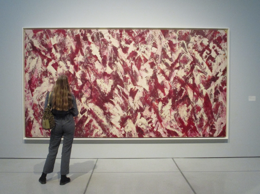
The result is a decade’s worth of quite extraordinarily powerful and enormous abstract paintings which make up the core of the major retrospective of Lee Krasner’s art, which is currently being held at the Barbican Centre in London. They are absolutely stunning. Breathtaking. Wonderful. Huge!
Installation view of Another Storm (1963) by Lee Krasner at the Barbican. Photo by the author
A light and airy space
For this exhibition the Barbican has removed some of the partitions which usually divide up the main ground floor exhibition space, and also removed some of the temporary walls which previously concealed wall-sized windows in the exhibition shop and at the end of the main gallery. The combined effect of this decluttering is to make the big central space (technically ‘room 10’ of the exhibition) feel long and bright and airy. From the moment you arrive at the ticket desk, the new lighter, brighter space feels like the perfect environment in which to hang Krasner’s huge and awe-inspiring works.
It is a genuinely uplifting and life-affirming experience to wander among these paintings, I felt like a mortal wandering dazzled through a mansion of the gods.
The exhibition is arranged in broadly chronological order, and you are directed to start on the upper floor of the Barbican galleries, which houses eight living-room-sized spaces. These eight rooms take us from Krasner’s birth, in 1908, in New York, into a family of Orthodox Jewish Russian émigrés, and onto the early art school training she got (at the Women’s Art School at Cooper’s Union, Art Students League, National Academy of design. From her student days there’s a room of self-portraits in oil, which are OK.
Nudes classical and modern
After the Wall Street Crash of 1929 (when she was 21) Krasner began training as a teacher and attended life school classes. On one wall of room four are the extremely accomplished nude studies she did in the style of the Renaissance Masters in 1933 – very accomplished, very traditional. On the opposite wall is a selection of charcoal nudes she did just six years later, in 1939, which are completely different in style, riven by big abstract angular lines, showing a complete assimilation of European modernist trends.
By 1942 she was a respected member of New York’s artistic community. She had been included in an exhibition of contemporary painting in New York alongside friends Willem de Kooning and Stuart French. Piet Mondrian admired her work. As a result she was given a number of commissions by President Roosevelt’s Public Works of Art Project, including a job to oversee the design and execution of twenty department-store window displays in Manhattan advertising war training courses. She adopted a cut-up-and-paste collage approach, and room five shows blow-ups of photos of these wartime artworks. Well, sort of interesting as a) social history b) if you really a completist looking for evidence of every step of her artistic development.
The Little Images
She knew most of the exhibitors in that 1942 show except one, a guy named Jackson Pollock, so she dropped round to his Greenwich Village studio to seek him out and say hi. One thing led to another and they were married in 1945. They moved to the farm on Long Island and, in the winter of 1947, Krasner embarked on what became known as the ‘Little Images’ series, abstract paintings made up of tightly meshed squares and shapes which some critics described as ‘hieroglyphic’. Rooms one and two kick off the show with some fine examples of these ‘Little Images’ and it’s amazing what a variety of design and visual effect you can achieve from such a seemingly simple premise.
Krasner was given her first one-woman show at the Betty Parsons Gallery in October 1951. The work didn’t sell and, although she began a new series soon afterwards, she quickly became despondent and ended up tearing some of the new work to shreds in frustration.
Weeks later, returning to the studio, she realised that the torn strips lying about on the floor got her juices flowing. Quickly she began incorporating them into a new series of collages. She layered pieces of fabric over the paintings shown at the Betty Parsons show, adding pieces of burlap, torn newspaper, heavy photographic paper and some of Pollock’s discarded drawings. The resulting ‘collage paintings’ were exhibited in another gallery show in 1955, and there are several rooms of them on display here.
Strikingly different from the ‘Little Images’, aren’t they? The very tightly-wound hieroglyphs of the Images are completely different from the violently torn strips of the collages.
Prophecies
In the summer of 1956 Krasner began work on a new series. The dominant tone of pink made me think of human flesh and nudes, but nudes severely chopped up and filtered via Demoiselles d’Avigon-era Picasso.
The first example of this new style was on Krasner’s easel when she left for France that summer. In the first half of their marriage, her husband’s career had gone from strength to strength, peaking around 1951, as he became world famous for his ‘drip paintings’, getting on the front cover of Time magazine, promoted by the American government as a home-grown genius, snapped up by collectors. But when, after 1951, Pollock tried to change this winning formula, he met with incomprehension and sales slumped. Pollock lost confidence, his drinking increased, he began an affair, which Krasner knew about, in early ’56.
That was the troubled background to the first of these flesh paintings and then – mid-way through her visit to Europe, she got the call that he had died in the car crash. Just weeks after the funeral, Krasner returned to the style and quickly made three more big, torn-up flesh paintings which she titled Prophecy, Birth, Embrace and Three In Two.
In the last room of the first floor of the exhibition, these four paintings are reunited, one hanging on each of the four walls, and it is impossible not to be powerfully affected by their eerie, agonised power.
So Jackson dies and Lee moves into the big barn studio and she is afflicted with insomnia and can only work at night, and she decides not to use any colour in her new paintings because she prefers to judge colours by daylight – and so, from the late 1950s, Krasner began to make a series of paintings combining just black and umber and creamy white onto huge, unstretched canvases.
Wow! These are great swirling, turd-coloured pieces, full of energy and despair. A poet friend of hers labelled them ‘Night Journeys’ and to follow any of the angled, curved or circular lines which strike across the surface is, indeed, to go on a churning, bitter journey though a landscape in torment.
Krasner exhibited these big brown works in 1960 and 1962 to critical praise, and half a dozen of them dominate the first half of the enormous ground floor space in this show. You can stand in front of them, or there are benches where you can sit down, meditate on them, and be drawn into their drama and action.
Primary series
But the jewel in the crown is the Primary series. In the early 1960s Krasner replaced umber with a range of vivid primary colours. When she broke her right arm in a fall, she taught herself to work with her left, squirting paint directly from the tube, using her right hand to guide the movements.
Critics often use the word ‘gesture’ or ‘gestural’ but in this case it really is justified. As you follow the great sweeping arcs and patterns of paint, and note their dribbles and dynamic interactions, you can almost feel and see the great sweeps of the arm they must have required, the leaning of the whole body, the straining, the movement from one zone of focus to the next. They are extraordinarily vibrant and exciting paintings.
I couldn’t get enough of these paintings. I wandered up and down the central room, enjoying all the views of the works offset against each other, glimpsed behind the one central supporting wall of the main exhibition space, addressed front on, strolled past, studied up close, looked at from the other side of the room.
Wow! What a space, and what works of staggering brilliance to fill them with!
Later works
The Umber paintings and the Primary series cover the decade from the late 50s to the late 60s. What a brilliant decade it was for her.
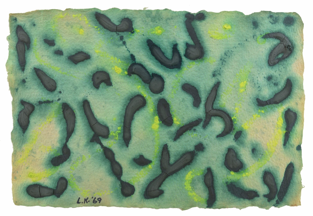
Then, in 1968 Krasner discovered a stash of handmade paper in the farmhouse, and decided to make a new series of works, on a much, much, much smaller scale. She decided to experiment by making each of these small, crafted works from just one or two pigments. A dozen or so of them are in a room off to one side (room 11).
They require a completely different way of looking. Much more conventional in size they require the viewer to step forwards and examine the detail, rather than step back and admire the scale, as with the Primary series.
The dozen or so examples on display here are all lovely – free-spirited dances of colour, and interplays of defined brushstrokes against broader washes, all given a wonderful background texture by virtue of the expensive paper they’re painted on.
In the early 1970s, Krasner made a significant step change in style. Still completely abstract, her works changed from soft biomorphic shapes to hard-edged abstract forms. I found them a shock to the system after the huge works in the central hall.
I liked even less the works in the final room, dating from 1974. In that year she stumbled across a portfolio of work from her art school days, the kind of angular nude studies which we saw examples of way back in room four.
Now Krasner took a pair of scissors to these early studies and cut them up into jagged shapes. Most of the source material was black and white drawings, but she interspersed some coloured strips into the collages, and also left other areas blank, apparently ‘echoing the empty space around the nude model’ which had served as the subject for many of the original drawings.
They were exhibited in 1977 under the title Eleven Ways To Use The Words To See. I didn’t warm to them.
No, I went back up to the first floor and walked back through the eight rooms soaking up the evolution of those early works and admiring, in particular, the ‘Little Images’ series. And I revisited the rooms holding these later 1970s works, trying to give them the benefit of the doubt – but all the time I just wanted to go back into the massive main gallery space and be swept off my feet and ravished all over again by the huge, vibrant, dancing works of the 1960s.
Summary
This is the first European retrospective of Lee Krasner’s career for over 50 years. It brings together nearly 100 works from some 50 galleries, institutions and private collections. It must have been a labour of love to assemble them all, and was totally worth it.
The exhibition ends with a 15-minute video made up from various interviews with Krasner towards the end of her life. She was one tough lady, and she told it like it was, still, in her 70s, harbouring a bitter resentment at the sexism of the New York art world which she had to combat all her career.
If you start reading up about her life you quickly find people claiming that, far from being overshadowed by her famous husband, Krasner was in fact the driving force behind his career. And, from some of the interviews, you get the impression that, having seen what really high-profile high pressure publicity did to an artist (Pollock), she was quite content to avoid that level of scrutiny, and just get on with what she loved doing.
The publicity material accompanying the exhibition quotes the playwright Edward Albee commenting at her memorial at the Metropolitan Museum of Art, that in both her life and her work, Krasner ‘looked you straight in the eye, and you dared not flinch’.
That seems a perfect description of both a tough lady, and of her extraordinarily resolute, exuberant and unsentimental art.
This is the catalogue or book of the 2016 Royal Academy exhibition of Abstract Expressionism – ‘arguably the most significant movement of the twentieth century’ (Christopher Le Brun) – the first large retrospective in this country since 1959.
It’s a massive hardback book, 320 pages long, and containing:
four long essays – by exhibition curator David Anfam, Susan Davidson, Jeremy Lewison, Carter Ratcliff
a twenty-page chronology of the movement
followed by 200 pages of illustrations of paintings and sculptures, then a further section of watercolours and sketches, and then key photographs from the era
Several thoughts arise from a slow careful perusal of this enormous tome.
Earlier than realised
Although I associate it with the 1950s, and the style did indeed dominate that decade, the creation, labelling, and publicising of Abstract Expressionism all happened in the 1940s. It was as early as 1946 that the art critic Robert Coates, writing in The New Yorker, first used the term ‘Abstract Expressionism’, perceptively describing how the new school took the anti-figurative aesthetic of modernist French and Dutch artists but combined it with the emotional intensity of the German Expressionists.
It was even earlier, in 1943, that Jackson Pollock was talent spotted by the rich heiress Peggy Guggenheim, signed up to her gallery and given his first one-man exhibition, invited to paint a mural in the entrance to her New York apartment (Mural – ‘the first outstanding large-scale painterly abstraction ever created in America’, p.33). This was seen by umpteen influential visitors including the critic Clement Greenberg who promptly wrote an article declaring Pollock ‘the greatest painter this country had produced.’ To step back a bit, this was all happening in the same year as the Battle of Stalingrad i.e. the first decisive defeat of Nazi Germany, and the Allied invasion of Italy. The Second World War hadn’t even finished yet. Nobody knew about the Holocaust.
It was still only in the 1940s that Abstract Expressionism was reaching a mass audience – August 8, 1949 to be precise – when Pollock was given a four-page spread in Life magazine that asked, ‘Is he the greatest living painter in the United States?’ and which projected him to nationwide superstar-artist fame. The next year he dropped his trademark ‘drip’ technique, which in fact only lasted the short period from 1947 to 1950, in order to explore new styles. Neither the critics nor buyers were interested. They wanted more drips. ‘Play us the old songs, Jackson.’ Given the pressures and the spotlight, it’s surprising that he soldiered on till 1956 before dying in a drunken car crash which might have been suicide.
This all lends support to the revisionist view of Stephen Polcari, that the Abstract Expressionists were not responding to the crises of the Cold War – though that is how they were marketed and perceived at the time – but in fact had their roots in the social, economic, and political crises of the 1930s, when they were all impressionable young men. If they shared a tragic sense it was shaped by the Great Depression, the rise of Fascism, the war in Spain and then the descent into darkness of the entire continent whence ‘civilisation’ supposedly originated.
It was well before the Cold War and the A-Bomb, way back in 1943 that Rothko and Gottlieb wrote a letter published in the New York Times which expressed the kind of doom-laden intensity which all the AEs seem to have shared, asserting that:
the subject matter is crucial and only that subject matter is valid which is tragic and timeless. (quoted p.21)
Is Abstract Expressionism a good label?
As usual with many art ‘movements’, many of the key players weren’t particularly happy with the label imposed on them – Abstract Expressionism – and others went the rounds, like ‘the New York school’ or ‘Tenth Street painters’. But AE stuck. They never produced a manifesto or exhibited together, and there’s no one photo with the main players together. But people – curators, collectors, galleries, journalists, and us – the poor uninformed public – we all need labels to hang on to, especially in the middle of the century when art movements came and went with such dizzying rapidity.
And the artists certainly all knew each other, lived in the same area of Downtown Manhattan, hung around in the same taverns and bars, and were subject to the same washes of influence as America experienced the Depression, the great influx of refugee artists from the Nazis, reacted (in different ways) against the naive nationalist art of the 1930s, against Regionalism and Social realism, but engaged in highly individual struggles to find a new idiom, new ways of seeing and doing art.
The paintings
This brings us to the actual art and the obvious conclusion that the mature styles of the four or five main players were very different and extremely distinctive. There were a lot of second string artists floating around, who produced good work or influenced the Big Boys in one way or another – and the generous selection in the RA exhibition and this book goes out of its way to include works by Adolph Gottlieb, Richard Pousette-Dart, William Baziotes, Joan Mitchell, Conrad Marca-Relli, Jack Tworkov, Milton Resnick, some 20 artists in all.
But leafing through the beautiful reproductions, again and again the works of five key names stood out for me, emerging as titans above the crowd. (In essay four, the gallery owner Betty Parsons who played a key role in promoting AE, is quoted describing Pollock, Rothko, Still and Newman as ‘the Four Horsemen’.)
A word about aesthetics
It’s challenging and entertaining to try and put into words what it is that makes some paintings canonical and some redundant or not-quite-there. The latter phrase gives a clue to my approach. I find that, for most art or museum objects I see, some give the sense of being finished and completely themselves. Thus among my favourite works of art anywhere are the Benin bronzes at the British Museum. They seem to me to have set out to do something and to do it perfectly and completely. They are completely themselves, impossible to alter or improve. Similarly, the famous helmet from Sutton Hoo completely (ominously, threateningly) says what it sets out to, bespeaks an entire world and civilisation.
So if I have any aesthetic theory it is not the application of any external guidelines of beauty, requiring a work of art to conform to this, that or the other rule. It is something to do with a work coming entirely into its own, its own space and design. Having suggested a certain form or subject or shape, then delivering on that idea, completely. Fulfilling its premises.
Jackson Pollock (1912 – 1956)
Pollock’s best drip paintings dominate the era and all his contemporaries as clearly as Andy Warhol dominated Pop Art. Possibly others were better artists, showed more consistent artistic development and certainly others have their fans and devotees – but nobody can deny Pollock and Warhol’s works are immediately recognisable not just as art, but as icons of a particular period and place.
And, in my opinion, they fulfil my theory of completeneness – that an artist has a moment when they crystallise a signature style by fully developing the tendencies implicit in their approach (as discerned in their earlier developing works).
Thus it is very obvious that there is a long run-up of pre-drip Pollock (Male and Female 1942, Eyes in the heat 1946) as he groped his way in the dark from works whose size and shape was influence by his mentor, Thomas Hart Benton the mural-maker, but whose content is often dominated by Guernica-period Picasso — and there is a hangover of post-drip Pollock (when he experimented for a while with just black – Number 7, 1952). Both of them are interesting, but so-so.
But then there is drip Pollock. Blue Poles (1952) is a masterpiece, a completely immersive experience, as completely itself as the huge lily ponds of Monet. Immersive because it is vast and its size is an important factor. After splatting the surface with a preliminary network of black, white, yellow and red loops, Pollock used the edge of a plank dunked in blue paint to create the eight poles. Like Matisse’s dancing cutouts, this is an example of perfect taste, perfectly ‘getting’ the possibility of a visual rhythm. It isn’t classical or symmetrical or figurative of anything – it is a pure design which, for some reason to do with perceptual psychology, just works. Close up you can appreciate the extraordinary lacework of other colours dripped across the canvas, trademark yellow, red and whites, to create a dense tapestry weave of texture and colour. It is entirely itself. It is a summation of everything implicit in the drip approach to painting. And it is this sense of completing all the potential of the method which gives it its thrilling excitement, which makes it a masterpiece, and also a ‘classic’ of this style.
Along with works like Summertime (1948) and Number 4 (1949) these seem complete expressions of what they’re meant to be, of a certain Gestalt. Once you’ve thought of dripping raw paint across the canvas, then it turns out that certain levels of complete coverage and a certain level of complexity of the interlinking lines is somehow optimum, others less so. Too much and it is just mess; too little and it looks empty. At his peak Pollock produced a string of works which experiment with colours, shape of canvas and so on, but which all display an innate feel for just how to do this kind of painting.
Mark Rothko (1903 – 1970)
Rothko, also, is up there in the recognisability stakes in the sense that his final, achieved style is instantly distinctive. He too struggled to find his way from a sort of blocky blurry realism (Interior, 1936) on a journey via a completely different look in a work like Gethsemane (1944), which looks like washed-out surrealism, before coming to the brink of his mature style with experiments in big blotches of soft-edged colour (No.18 1948, Violet, Black, orange, Yellow on White and Red, 1949).
But then – bang! – he hits it, he finds his voice, he claims his brand, he crystallises his vision, he stumbles upon the formula of big rectangular blocks of shimmering colours which will last the rest of his life, what Anfam calls his ‘chromatic mirages’ (p.21).
Rothko left the murals he’d prepared for the restaurant in the new Seagram building to London’s Tate Gallery. There’s a darkened room containing all of them in Tate Modern and you can sit staring into them for hours. Critics saw in them the same kind of existentialist anxiety (all those massive blocks terrifying threatening the viewer, all the anxiety of those unknown fraying edges) that they saw in Pollock — but these days they are more like aids to calm reflection and meditation, and the audioguide plays very quiet meditative music by American experimental composer Morton Feldman. From Cold War angst to post-modern pleasure.
But however you read them, there’s no denying that Rothko stumbled upon (worked his way through to) an entirely new way of conceiving of coloured paint on canvas, a discovery and a formula – and then spent twenty years working through hundreds of variations, exploring and stumbling across further discoveries. Big, bright, abstract, moody. And a world away from Pollock’s splats. the casual viewer could be forgiven for asking how the two could ever be bracketed together, where the one is very much about the dynamic power of vibrantly interlacing lines and the other is very much about the calming meditative effect of enormous blocks of shimmering colour.
Clyfford Still (1904 – 1980)
The much-told story about Still is that he was prickly and difficult, went his own way, argued with all the other AEs, in the early 1950s terminated his contract with a commercial gallery and ended up neither exhibiting nor selling any of his pieces, but working away steadily in provincial obscurity in Maryland. He died in possession of 95% of everything he’d ever painted and made a will leaving his life’s work to whichever organisation could create a museum dedicated to housing and showing it. After numerous negotiations this turned out to be the City of Denver and it was only in 2011 that there finally opened a museum dedicated to Still, and that this vast reservoir of work was made available to critics and the public. In the short time since then his reputation has undergone a major revaluation and the room devoted to his work at the Royal Academy exhibition was, arguably, even more impactful then the displays of Pollock and Rothko. Still was a revelation.
Like the others, Still took a long journey, and his early work is represented by another semi-figurative work from the 30s, PH-726 (1936). But by 1944 he has stumbled upon his formula – sharp rips or tears against solid fields of colour, PH-235 (1944), all done in a really thick impasto or thick layer of paint which adds to the sense of presence and impact.
What are they? Wikipedia says his mature works ‘recall natural forms and natural phenomena at their most intense and mysterious; ancient stalagmites, caverns, foliage, seen both in darkness and in light lend poetic richness and depth to his work.’ Because the commentary goes heavy on his upbringing in the mid-West and of the associations of Denver, Colorado, I saw in several of them the pattern of cattle hides, the tans and blacks and beiges which you see in some Indian art, teepees, shields. Just a fancy.
Newman had his first one-man show in 1948, the year he broke through to his mature style with the Onement series. Again, his was a long journey out of 1930s figurativism, until he made a discovery / stumbled across an idea / achieved a mature style (delete as applicable), creating what Anfam calls his ‘transcendent spatial continuums’ (p.21). Once he’d found it, repeated it through countless iterations.
A classic Barnett Newman has a vertical line – or ‘zip’ as he himself called them – dividing a field of colour – initially drab colour but becoming brighter and brighter as the 1950s progressed. The zip defines the picture plane, separates the composition yet binds it together, sunders it yet gives it a weird tremulous unity.
Why does it work? I’d give good money to read an analysis by a psychologist or expert in the psychology of perception, of shapes and colours, who could explain the effect they have on the mind of the viewer.
According to this book, among the big-name AEs, Newman was rather overlooked in favour of the brasher bolder works of his peers. Also, Pollock and Still, to name two, used highly expressive brushwork and thick or spattered layers of paint. Standing close you can see the thick clots of oil on the surface. Newman’s paintwork is flat and restrained. In fact his colourfulness and geometric designs link him more to the school of ‘post-painterly abstraction’ which emerged in the 1960s and are almost connected to the cool understatement of minimalism.
Franz Kline (1910 – 1962)
Kline’s breakthrough moment is much mythologised. Working as a commercial illustrator in New York while struggling to work his way towards some kind of abstract language, Kline was visited by Willem de Kooning who suggested he use a projector to blow up & project his complicated paintings onto the wall and then select small details to reproduce as full scale canvases. Taking this insight, Kline quickly worked out a style of broad black brushstrokes on white, which continually seem to gesture towards something yet are abstract. Are they fragments of larger designs and shapes? Or references to Japanese calligraphy (which Kline always denied)? Or dramatic actions in themselves?
Like all the other AEs, Kline’s work is big, really really BIG. Whatever the differences in style and approach, the AEs had this one thing in common – their work is huge and immersive. (A sign at Barnett Newman’s second exhibition at the Betty Parson’s Gallery in May 1951 actually requested visitors to stand close up to the picture; visitors had been requested to do the same at the Pollock exhibition which immediately preceded it – p.93.)
Kline is further evidence for my theory that artists often reach a recognisable defining style and produce a number of works which somehow express the quintessence of their voice or vision, only after a journey upwards and, alas, sometimes a later decline or wandering away… Having perfected the black and white calligraphy style – so instantly recognisable – by the time he was just 40, after a while at the top of his game, Kline had nowhere to go except back into colour, and these later colour works, although fine in their own way, represent a really noticeable falling away of the energy which the stark black-and-white contrasts produced. For some reason this style looks terribly dated, very late 50s early 60s, whereas the black and white calligraphic works look timeless to me.
De Kooning is the one big AE I couldn’t get on with at all, and the more I saw the more I disliked his stuff. Partly because I think he never did develop a defined style. To me, all of his stuff looks like messy sketches on the way towards something better, they all look like the dispensable journey works on the way to… nowhere. The same horrible messy scrawl effect is his one signature effect.
All the other AEs strike me as having a purpose, a direction. Pollock’s works are far more artful than they appear, Rothko’s are careful experiments, Newman achieved a kind of classic restraint and Still’s jagged compositions are unerringly ‘right’, conveying something much bigger than the images seem to warrant.
Only de Kooning’s works, out of the whole show and this long book, consistently look to me like a slapdash mess, a dog’s dinner, victims of what Anfam calls his ‘lacerating sweeps’ (p.21). And the series of depictions of women – his ‘wrenching engagements with the female sex’ (Anfam, p.22) – which are often singled out by the critics for praise, to me could hardly be uglier and more repellent if they tried.
Apparently Gottlieb is perceived as a second string AE, his career weaving through a series of styles, including surrealism in the 1930s, a spell in the Arizona desert simplifying images to a primal essence, and the development of ‘pictographs’ representing psychologically charged shapes and patterns. It was as late as 1956 that he developed the ‘burst’ style, dividing the canvas into two halves, with a round sun-like object above and a busy earth-like mass below – creating a dialectic between calm and busy, with the use of bright colours to interfere and resonate.
Hundreds of bursts resulted and I can see why critics looking for world-shattering angst and grand existentialist statements might deprecate them, but I like him for devising a new ‘look’ and then producing fascinating variations on it.
Neglected women
One of the most pressing concerns of our times, in the arts and elsewhere, is restoring the reputations, the overlooked achievements and untold stories, of neglected woman. Four women artists worked in and around Abstract Expressionism and are included here:
Janet Sobel (1894 – 1968) began painting at the mature age of 43 when her son left home leaving behind his copious art materials. She progressed from figurative paintings featuring dreamy rather Chagall-like faces enmeshed in zoomorphic patterns, through to pure abstraction and eventually the technique of dripping paint. Some scholars claim it was Sobel who arrived at the drip technique before Jackson. That’s one for the scholars. All her works have a lightness. Maybe it was the light decorative effect as opposed to the Big Boys’ existentialist histrionics more than the fact she was a woman which wrote her out of the story for so long.
Lee Krasner (1908 – 1984) Krasner evolved through a series of styles. During the heyday of the AEs she tended to be overlooked by virtue of the fact that she was married to the top dog, Jackson Pollock. But the works included here show she had a related but distinct vision of her own.
Just living with Jackson sounds like a demanding job, but creating alongside him, in a related but clearly distinctive style, is little less than heroic. The next two are to one side for the simple reason that they were of a younger generation
Joan Mitchell (1925 – 1992) You can see the importance of the gesture but, a little like de Kooning, I don’t see it going anywhere.
They’re big, one of the simplest criteria for being an abstract expressionist. But arriving at Salut Tom at the end of the exhibition felt like we’d moved a long way from late-40s existentialism into a brighter more decorative world. Same style, different world.
Helen Frankenthaler (1928 – 2011) She painted onto unprimed canvas so that the paint soaked into it, thus creating a very flat surface.
The fourth essay in the book is in many ways the most interesting, telling the complementary stories of two hugely important gallery owners who promoted the work of the Abstract Expressionists from the first – the Jewish millionairess Peggy Guggenheim and the scion of a wealthy WASP family, Betty Parsons. Peggy lived in Paris between the wars, becoming fantastically well-connected among the city’s avant-garde, arranging exhibitions and starting her own staggering collection, before fleeing ahead of the Nazi invasion in 1940, back to New York, where in 1942 she set up The Art of This Century Gallery.
Like Peggy, only without the millions, Betty went to live in Paris, where she herself pursued a career as an artist, taking lessons, before losing her money in the Wall Street Crash and being forced back to the States, to teach, and then to work in commercial galleries. She learned the trade, becoming popular among artists for her good taste and business sense (i.e. selling their pictures and making them money). In 1945 she set up the Betty Parsons Gallery which ran till her death in 1982. When Guggenheim returned to Paris after the war, Parsons took on many of ‘her’ artists, and the article turns into an impressive roster of the exhibitions she put on for one after another of all the key artists of the time, working hard to promote them and get them sales.
The essay is a fascinating insight not only into the achievements of these two vital women, but into the art world in general. It’s shocking to learn how little the artists sold at these shows – they’d display a dozen or 16 new works, for between $250 and $1,400 – and quite frequently none would sell at all. Or only small watercolours would sell to what turn out to be friends of the artist or the gallery owner herself. Works which now fetch tens of millions of dollars at auction.
In a fascinating detail, the book mentions several times that one problem was the paintings’ sheer scale: it was one thing to create a fourteen foot square canvas in the space of a half derelict loft-cum-studio, quite another thing to expect even quite rich people in New York to find enough wall space to hang it, back in the cluttered 1940s and 1950s. It was only well into the 1960s and more so in the 1970s that ideas of interior design changed significantly, that clutter was thrown out and rooms knocked together to create large airy spaces, often painted white, in which the vast canvases of the Abstract Expressionists suddenly made sense.
But by this point the AEs were up against the equally large creations of Post-painterly Abstraction, Pop Art, Op Art, Minimalism and so on and New York was established as the centre of a fast-moving, big money art culture.
I bought this as a Bantam paperback back in 1976 when it cost 65p. Now it costs nearly £11.
Tom Wolfe and the New Journalism
Tom Wolfe was one of the founding fathers of the New Journalism, a style of reporting which became fashionable in the 1960s, in which the ‘reporter’ a) was increasingly central to the story itself b) reported in the loose, slangy street style of the day. I recently read Michael Herr’s Dispatches, whose phantasmagorical prose style tried to capture the deranged, trippy experience of the Vietnam War. In fact, it was only a few years earlier, in 1973, that Wolfe had edited and published the collection, The New Journalism, which crystallised the movement’s reputation.
Wolfe’s version was always urban and urbane. He used literary devices – sarcasm, irony, outrageously subjective opinions, and a dandy style incorporating onomatopoeia, multiple ornate phrases piled up between ellipses or dashes – to cover his subjects. His breakthrough piece in 1963 was a magazine piece about Californian hot rod and custom car culture titled The Kandy-Kolored Tangerine-Flake Streamline Baby. He followed this with 1968’s The Electric Kool-Aid Acid Test, a highly experimental account of the counter-culture author Ken Kesey and his hippy Merry Pranksters.
In 1970 he published Radical Chic, a scathing description of a party given by Leonard Bernstein to raise money for the radical Black Panther Party, in which classy, upper class New York intellectuals bathed in the glory of consorting with radical revolutionaries and – my dear! – such charming young black men!!
The Painted Word
The Painted Word continues the theme of skewering the pretentions of New York’s glitzy upper-class liberal elite. In this short book (actually just a long article printed in Harper’s Magazine in April 1975) Wolfe rips into the pretentiousness of the New York art scene, its struggling artists and its oh-so-precious upper-class devotees.
Wolfe identifies several trends in the art world.
The Boho Dance Since the end of the 19th century the myth had grown up about struggling artists making do with bread and candles in unheated attics while they grind their brains to portray the Truth. Above all the Bohemian (shortened to ‘boho’) artist knows that a key part of the character is scorning the despised bourgeois values, being anti-respectability, dressing scruffy, identifying with the people and so on.
The Consummation But in fact, without exception, all these struggling artists yearn for one thing and one thing only which is to be recognised and acknowledged. How does that happen? You are taken up by the rich elite, particularly the elite of gallery owners and their very rich sponsors.
Schizophrenia But having spent a lifetime cultivating the personality of the struggling artist, many find it difficult to cope with suddenly being showered with prizes, grants, exhibitions, books and magazine articles. Especially since a lot of the showering comes from the very people you’ve spent tour adult life despising and denigrating.
Picasso is the prime example of an artist who made the transition with style, buying suits at the finest London tailors, living in style with his numerous mistresses, and still managing to convey a raffish bohemian air. Jackson Pollock is a tragic example of the Boho artist who couldn’t cope with this sudden clash of identities. Wolfe describes the time Pollock arrived at the uptown apartment of his mega-rich sponsor Peggy Guggenheim to find a dinner party full of Top People. Pollock promptly stripped naked and pissed in the fireplace – but the Top People were delighted: this was precisely the outrageous artistic antics that, by the 1950s, the haute bourgeoisie expected from its pet artists. Spiralling into alcoholism, Pollock died by crashing a car which he was driving when drunk, in 1956.
No modern artist can escape his fate – which is to a) adopt the Bohemian pose until b) he or she is taken up by the art-loving elite, and finds their anti-bourgeois snarling is rewarded by dinner party invitations and cocktails. Neutered. Caged.
Cultureberg because the art world is run by a tiny clique of super-rich patrons and sponsors, who pay for the little galleries, commission grand works, fund little magazines, hold lavish opening night parties, and support the big museums. In a spirit of mockery Wolfe calculates that the entire global art elite – the culturati, the denizens of Cultureberg – number 750 in Rome, 500 in Milan, 1,750 in Paris, 1,250 in London, 2,000 in Berlin, Munich and Dusseldorf, 3,000 in New York and maybe 1,000 scattered round the rest of the world. Say, 10,000 in all. A large village-sized population of artistic elite which decide who and what is the New Thing.
Wolfe makes the telling point that their decisions are generally announced in the pages of various magazines, as profiles and features, and in galleries as major shows or retrospectives. The public – which votes with its wallet when it comes to music, theatre, books or movies – has no such choice when it comes to art. The decisions are all made by the tiny art elite and only then do we, the public, get presented with a fait accompli.
Big money and high art
Thus, as he puts it, Modern Art – which was largely begun before the Great War – only became widely known after the Great War, not because anyone understood it better – but because the global elite found a use for it. It was only in the 1920s that the word ‘modern’ became so tremendously fashionable (as, Wolfe points out, ‘now’ was a buzz word of the 1960s – the ‘Now Generation’, and possibly ‘digital’ is the word of our era).
New York’s Museum of Modern Art was founded in 1929 having been developed by three rich women, Abby Aldrich Rockefeller (wife of John D. Rockefeller, Jr., son of the founder of Standard Oil), Lillie P. Bliss (daughter of a U.S. Secretary of the Interior) and Mary Quinn Sullivan (wife of a lawyer specialising in large wealth trusts). Its first president was Anson Conger Goodyear, Director and Vice-President of various railroad companies and he recruited Paul Sachs, son of the founder of Goldman Sachs, and Frank Crowninshield, editor from 1914 to 1935 of Vanity Fair.
Art has always gone hand in hand with money, back through Renaissance princes to medieval kings, through the monuments built to commemorate Caesars and pharaohs. What is distinctive about modern art – and especially in America – is the hilarious contradiction between the aggressively anti-bourgeois stance of so many Boho artists, and the staggering wealth of their patrons and sponsors.
A cartoon history of modern art
Barely had this trend got going, claims Wolfe, than it stalled with the regrettable interruption of the Wall Street Crash and the Great Depression. During the 1930s a lot of artists were put on the spot about their actual anti-bourgeois sentiments and found themselves churning out scores of images of brawny workers and downtrodden blacks. Fortunately (says Wolfe, in his breezily ironic tone) the Second World War came to America’s rescue, destroying Europe and making God’s own country the world’s first superpower but also – from the modern artists point of view – sweeping away the social realism of the 1930s which was now – in the cold light of the Cold War – looked suspiciously like commie art.
And so it was, with a loud whooshing sound, that the forward march of Modern Art resumed its stomp with the advent of Abstract Expressionism, a dazzlingly new style which foxed the general public (as all good new art should) but drove Cultureburg wild with excitement. Jackson Pollock, Willem de Kooning, Franz Kline, Mark Rothko, Philip Guston, Hans Hofmann, Clyfford Still and Barnett Newman – in their significantly different ways – produced a complete revolution in thinking about art which was a) God’s gift to intellectual theorists b) a specifically American look which Peggy Guggenheim and indeed the Federal Government could back and support c) and whose repercussions are still with us.
The battle of the bergs
The central and longest section of the essay is a deliberately distorted lampoon on the work of the two fashionable critics who promoted Abstract Expressionism – Clement Greenberg and Harold Rosenberg. First Wolfe caricatures the way the two men supported different artists in the movement by writing analyses of every-more dizzying intellectual abstruseness. For Greenberg the Cubists et al had correctly rejected Victorian realism and the absurd notion that a painting is a doorway into life, into a scene; but they had not gone far enough – you can still make out sort-of realistic objects in Cubism and related movements.
The Abstract Expressionists had gone one decisive step further and acknowledged that the painting is just a flat surface on which shapes and colours are arranged. In fact the flatter, the better, and Wolfe satirises Greenberg’s writings as increasingly shrill demands for evermore flatness, while at the same time decrying the great American public for not understanding the heroic work being done by this handful of tortured geniuses in Downtown New York.
Rosenberg entered the scene early in the 1950s and is responsible for a crucial extra element – he reintroduced psychology into what was in danger of appearing a very stale formal pursuit by coining the term ‘action painting’ (p.51). The painting isn’t a thing (no matter how flat). It is the record of an event and that event is the heroic manly painter wrestling with the inchoate materials of the universe to express his own deep existential angst.
Wow. So puzzled millionaires could now feel liberated to buy these splats of paint across huge canvasses (Pollock), these shimmering blocks of colour (Rothko), these disturbing lightning flashes against washes of plain colour (Newman), these blown-up black gestures which defied the universe (Franz Kline) because a) this showed how clever and up to the minute they were b) this showed how much soul and feeling and emotion they had and c) it showed how goddam American they were, and proud of it!
As early as 1949 poor Pollock was being hailed as the greatest American painter ever, not only in the art press, but to the wider world in a four-page spread in Life magazine. His famous drip paintings were made in the relatively short period 1947-50 and his later experiments, first with totally black works, then a return to more figurative, were not welcomed by critics or the art coteries who expected him to keep delivering the good. In a way it’s surprising he soldiered on till 1956.
And he died just as the new kids arrived on the block. Apparently Pop Art is dated to Jasper Johns’ one man show at the Castelli Gallery in 1958. American flags, numbers, letters, targets. He was quickly taken up by another berg, this time Leo Steinberg who, in Wolfe’s jokey narrative, manages to trounce both Greenberg and Rosenberg by declaring Abstract Expressionism not flat enough! This was because, despite the fact that it was all about the action on the surface of the canvas, in fact the Abstract Expressionist paintings still – if looked at a certain way – still had a sort of depth. You can be drawn into a Pollock or a Rothko.
However, the new young guys – led by Jasper Johns and Robert Rauschenberg – painted things which were already flat – the flag, numbers, target, letters or the photographs which Rauschenberg liberally sprinkled in his works. It was flat on flat. Flat squared. Ha! Gotcha!
But while Steinberg developed an arcane theory around Pop – claiming that it didn’t depict household objects in a realistic way, no, no no, no no, that would be a retreat back to figurativism, no no, Pop caught the interplay ofsigns which were such a feature of American life – a nod to the semiotics and structuralism becoming fashionable over in France – while Steinberg laboured to give Pop a sophisticated intellectual rationale, Wolfe sniggers that in fact rich collectors liked Pop Art because it was about super-recognisable and, ultimately, very reassuring things. It was American, it was fun, it was cool and above all, it was great to look at. Marilyn Monroe’s face blown up big and coloured in. What’s not to love?
Wolfe satirises Steinberg’s own confession that he resisted at first; he clung, like a virgin, onto his old beliefs, his devotion to action painting as revelation of the agonising struggle of the Great Artist. The shallowness of the new work upset him, but then – bang! – he got it. This was the next thing. Abstract Expressionism died overnight and all the galleries filled up with earnest Pops. Who also sold like hot cakes, much to the disgruntlement of the AEs who a) had never in fact sold that much and b) suddenly found themselves in the embarrassing position of being the old fuddy-duddies.
The Turbulence Theorem
Wolfe lampoons Steinberg’s resistance-then-submission story, saying it embodies what could be called the Turbulence Theorem of modern art:
If a work of art or a new style disturbed you, it was probably good work. If you hated it – it was probably great. (p.88)
The ever-increasing pace of art theory
Wolfe remembers attending the 1965 Museum of Modern Art show which launched Op Art, short for Optical Art, but which its practitioners preferred to call Perceptual Abstraction. The catalogue recapitulated the history of modernism – the cubists rejected the window-on-the-world idea, Abstract Expressionists had established the art work as an object as real as a table or chair – now Perceptual Abstraction reduced art to an experiment in the science of perception – to the response of cones and rods within the eye and to synapses of the retinal nerves as they processed the deliberately mesmerising geometric patterns of Perceptual Abstraction. Hence the name.
But Greenberg and Rosenberg fought back with their own post-Pop style, which they christened Post-Painterly Abstraction, also known as Colour Field Abstract or Hard Edge Abstract which was painting with the brushstrokes and everything expressive taken out. Not quick enough, though, because in the mid to late 60s another big school emerged which came to be called Minimalism. In his cartoon way of telling the story, Wolfe invokes the Turbulence Theory i.e. it can’t be any good unless you hate it. Thus the critic Robert Scull was walking down Madison Avenue and saw a wall of pictures which were apparently completely white. They were in fact white paper with a few super-faint words ghostly written in a corner, by someone called Walter de Maria. Scull disliked them so much he realised they must be genius, bought them all, phoned the artist and became his sponsor on the spot!
But even as Op Art got publicity Minimalism was stirring. Colour? Pattern? Canvases? How derriere-garde, how bourgeois! Paint direct on the gallery wall (Sol Lewitt). Put a pile of bricks on the floor (Carl Andre). A stack of metal shelves up the wall (Donald Judd). Neon tubes in a corner (Dan Flavin).
But these can still be bought and sold like any other commodity and displayed in art galleries, yuk, to be silently revered by the hypocritical bourgeoisie! Reject the art gallery, comrades! And so began Earth Art – a circle of rocks in the desert (Richard Long). A spiral made of mud and salt into the Great Salt Lake (Robert Smithson). Photographs of the work would have to be enough for the smug uptown liberal elite.
But then, why have an actual object at all? How very bourgeois! Why not just have the idea for a work? Conceptual art.
And each successive wave prompted shrieks of outrage from the middle-brow press? Excellent! We must be doing something right. Classic conceptual art reduced the whole enterprise to words – documentation – describing and explaining what the art work would or could be. There was fierce competition to be the most conceptual of the conceptualists, which Wolfe thinks was won by Lawrence Weiner with his Declaration of Intent (1968).
1. The artist may construct the piece. 2. The piece may be fabricated. 3. The piece need not be built. Each being equal and consistent with the intent of the artist the decision as to condition rests with the receiver upon the occasion of receivership.
No paint. No canvas. No gallery. Nothing but words. And with this – Wolfe jokes – Art disappeared up its own fundament and re-emerged as pure theory, as words shorn of anything representational at all.
Epilogue
Where do you go after you’ve completely abolished your form? Well, post-modernism turns out to be the answer. The best explanation I heard of this troubled idea is that the core idea of MODERNISM is that there is ONE NARRATIVE – from Cezanne through Cubism, Fauvism, Futurism, Dada, Suprematism, De Stijl, Abstract Expressionism, Pop Art, Op Art, Minimalism and Conceptual Art, you can argue the case that there has been a steady series of waves, all operating under broadly the same parameters, each one represented by an avant-garde of pioneers who critics, collectors and public perceived as a kind of unified set of experiments on a single journey forwards, towards…
And post-modernism just stepped away from this whole story. Turns out there are hundreds of stories, thousands of stories, why get hung up about this particular one? You can have all or any of them, like flavours in an ice cream parlour. The very idea of ONE avant-garde which everyone had to look out for, keep up with, and which represented the latest step in an exciting voyage of discovery… over. Finished. Kaput!
Maybe the most interesting aspect of Wolfe’s hilarious romp through (then) recent art history is that he shows you how quickly it happened and how long ago all this is – and that by the time he wrote it in 1975, something like post-Modernism had set in. Meaning, a return to guilt-free figurative realism. He singles out the Photo-realism of Richard Estes, who takes colour photos of banal street scenes (generally shop facades) blows them up very big, projects them on a screen and then carefully paints them.
In the recent exhibition of American prints at the British Museum, some prints of Estes’ Photo-realist works follow the black and white lines of the Minimalist room and are accompanied by artists who returned to the deeply unfashionable genre of portrait painting, namely Alex Katz and Chuck Close. Their work just seems very, well, relaxed, after the existential agonies of the Abstract Expressionists. You look back at the tortured artists of the 1950s and think – to use the American expression – ‘Oh, just get over yourselves.’
The return of the repressed Boho
So what happened next? In the British Museum exhibition post-modernism is represented by a return to Estes’ street scenes, a load of portraits and various realistic depictions of the human form. What interested me was that around 1980 the show stopped being chronological and became thematic, collapsing into three isshoos – gay art around AIDS, feminism and gender, and African American art.
The casual viewer can’t help feeling that these represent a return of the wish to épater le bourgeoisie – the rallying cry of the late-19th century French avant-garde – i.e. to shock the middle classes. Reading the captions here and at the numerous other art exhibitions I go to, you get the sense that artists, and especially critics and curators, wish they were back in the age of modernism, when art genuinely did shock and stun and amaze, when it genuinely ‘transgressed’ and ‘subverted’ something, when it counted for something, goddammit, when it did shock and change wider society a little – and weren’t living now, in the age of finance capitalism, the age of Trump and post-factual politics, the age of Instagram and Facebook and instant liking and friending, when nothing much has any meaning or depth.
I looked around at my fellow ageing, white middle-class visitors to the American prints exhibition at the British Museum: were any of them shocked and outraged by graphic depictions of AIDS or slave ships or a feminist from the 1970s subverting gender stereotypes? Nope. To coin a typically powerful American phrase, I think the curators are confusing us with someone who gives a shit.
The term ‘Abstract Expressionism’ was coined by the art critic Robert Coates in 1946 to describe a large group of American artists who came to maturity just after the Second World War, mostly based in New York City. In 1958 New York’s Museum of Modern Art organised a big show of ‘the New American Painting’ which featured a lot of these artists, and the show travelled to Europe, appearing at the Tate Gallery in 1959.
This is the first large scale overview exhibition of the Abstract Expressionists since then, and it is an epic, awesome experience. As the commentary points out early on, the Royal Academy not has the space in terms of number of rooms to cope with this many artists, but also the size of rooms to accommodate works which are often very, very big.
Born in the first decade of the century, these artists grew to maturity during the Great Depression and lived through the rise of Fascism, the Second World War, the revelation of the Holocaust, the detonation of the first atomic bombs and the beginning of the Cold War.
They almost all held a very intense tragic view of life, indeed the forerunner Ashile Gorky hanged himself in 1948 and the superstar of the movement, Jackson Pollock, died aged 44 in a car crash which many thought a form of suicide. The often stark, huge, bleak images address what one of the movement’s stars, Mark Rothko, summed up as the proper subject of Art – ‘ecstasy, tragedy, doom’. This was what the poet Auden christened ‘The Age of Anxiety’, life in the shadow of a rapid arms race and deepening Cold War.
Improvised or composed?
The commentary brings out the new freedom and expressiveness the painters felt and revelled in, and the emphasis on the artist’s gestures and physical actions, epitomised by Jackson Pollock twisting and splatting paint on the canvas, a necessarily big canvas. All this is a world away from the fine gestures at the wrist or fingertips which characterised traditional paintwork.
Some critics compared this big-gesture, expressive freedom with contemporary developments in modern jazz, the new style of be-bop or post-bop which provided a backdrop for flamboyant soloists like Charlie Parker or John Coltrane to fly off in ever-giddier flights of fancy. And, of course, like Abstract Expressionism, jazz was an entirely American form. To demonstrate, the audio-guide plays a clip from John Coltrane’s 1960 track Giant Steps.
1. Most jazz is in fact strongly bound by rules of harmony, rhythm, counterpoint etc which are all entirely European in origin. If you need a musical comparison, I’d compare these paintings to the stark,violent, unpredictable musical gestures of the post-war serialists, led by the two iconoclasts, Karl-Heinz Stockhausen and Pierre Boulez.
2. If anything, the detailed analysis which the audio-commentary applies to about 14 key paintings tends to contradict this idea of wild improvisation. The reverse: the commentary spends some time detailing the care with which Pollock composed his late masterpieces – and when you get close to a huge work like Blue Poles you can in fact see the way successive layers of composition have been applied: first the grey background; then a maze of yellows and whites; then the poles, made by applying a plank lined with dark blue paint to create the work’s eight lines, poles which create an eerie, primitive, tribal sense of rhythm; and then a further layer of paint, particularly white paint, which laces and binds the poles into the composition. The more you look, the more complex it appears, and one of the joys of this exhibition is that you can get very close to the works and really appreciate the intricacy of detail.
Same goes for the half dozen Franz Kline works. These look at first glance like instant if graceful, daubs, epitomising the phrase ‘Action Painting’, which was also applied to these artists. But once again the commentary helps you see that Klein made the big black gestures on white but then went back and carefully painted white over some of the black, to make the gesture sharper, and then repainted more black over some of the white, each time intensifying the image.
Abstract Expressionism was the first wholly American art movement and there was no shortage at the time, and since, of art critics prepared to champion it and write at great length about it. America had emerged from the war the new world power and the deep anxiety of the intellectuals was accompanied, paradoxically, by an extraordinary boom in the economy, the birth of a consumer society which brought security, wealth and a host of life-enhancing appliances (fridge, hoover, TV) to this vast thrusting nation. The art market boomed, critics rose to prominence, the artists made big names and careers for themselves.
The Big Four
Early on the audioguide points out that although around 30 mostly New York-based artists are associated with Abstract Expressionism, there are four who stand head and shoulders above the others: Jackson Pollock, Mark Rothko, Clyfford Still, and Willem de Kooning. Accordingly, each one has a room devoted to themselves, while most of the other painters have to share hanging space.
Among the ‘sharers’, I liked Ad Reinhardt’s black squares. The commentary explained how a) they are in fact built up from other colours, which Reinhardt b) then used a technique on to drain the gloss or shine from, thus creating his very distinctively light-absorbing works, matt beyond matt. Reinhardt was an intensely earnest German, convinced that painting needed to be ‘purified of all other-than-art meanings’ and his quest led him to this logical conclusion.
All this emphasis on ‘Action Painting’ and ‘Tragic Suffering’ went hand-in-hand with a Hemingwayesque tough guy pose among many of the painters, and certainly among their critical devotees. But the commentary emphasised that the movement not only included a number of women but that the male artists themselves respected their female peers, and many of them featured as complete equals in contemporary exhibitions. These included:
Lee Krasner, Pollock’s partner (see The Eye is the First Circle, above)
Janet Sobel, known for her ‘calligraphic fields’, much more controlled and interlaced (and smaller) works than many of the others
Joan Mitchell, who moved to France – her massive late painting Salut Tom, was a welcome splash of light yellow airy colour among a generally dark palette
Louise Nevelson was represented by a striking wall-sized installation made up of a kind of cabinet of curiosities with all sorts of odd-shaped shelves and objects inserted, displayed and hanging from it, all sprayed the quintessential colour of the movement, matt black – Sky Cathedral
Anti-Europe
Size mattered. A lot of these Yanks disliked the prissiness and fussiness and bourgeois finish of European painting. For example Pollock made a point of using normal household paint, as did Kline – real men didn’t use those prissy little tubes you have to buy in ‘art’ shops, Hell no. And why paint small, when you can paint BIG? Or MASSIVE? Room after room features enormous canvases. They had to be big to bear the Sweeping Gestures and Archetypal Forms and Primitivist Impulses of a generation determined to stamp their Tragic Worldview on an uncaring world, to make the Great American Painting, bigger and better than anything effete and devastated post-war Europe could manage.
Although a lot of the artists seem to have been depressive and liberal with statements about Tragedy and Despair, in fact the physical impact of room after room is of the sheer SIZE and brashness and confidence of the movement as a whole.
Mark Rothko
The anti-European feeling took many forms. The room devoted to Mark Rothko is wonderful, a shrine, a chapel to sit in and be filled with wonder, and admire the numerous ways Rothko reworked his trademark image, big canvases (naturally) with rectangles of colour fizzing and shimmering against a one-colour backdrop.
But it is also fascinating to learn that Rothko insisted that his paintings of must a) have no frames b) have no glass over them c) be hung low – the aim being to make them more enterable.
The big revelation of the show for me was the work of Clyfford Still, who I’m not conscious of having seen before. The commentary explained that Still resisted the New York art scene and stayed far away, based in Colorado and the West, and – crucially – only sold a handful of paintings in his lifetime, gifting 95% of his output to a purpose-built gallery in Denver where they are to this day. Hence we haven’t seen much of it.
The Still room, along with the Rothko room, made the biggest impact on me: the paintings are enormous, wall-size, and – liberated from all figurativeness – explore the effect of great jagged slabs of colour, often divided into two main tones but with flashes and flickers of other primary colours flaring at unexpected but somehow, totally appropriate locations. Almost all the ten or so huge paintings in his room felt, despite their deliberate rough edges and unfinished appearance, somehow marvellously composed and just right. Like Rothko and Pollock, he seems to have found a completely new visual language.
It’s not all fabulous. A fair proportion of the works here are pretty horrible. If the show highlights geniuses like Pollock, Rothko, Still and features attractive work by many others, it also shows how yukky, dismal and depressing a lot of the art of this period and of this movement could be.
I reacted very badly to the de Kooning room, which featured among others several of his ‘Women’ paintings’, to which phrases like ‘horror of the feminine’ were attached in the commentary. De Kooning was born in Holland, only moving to America when he was 23, and I think you can see in the horrible women paintings the strong influence of early 20th century European Expressionism, all those angst-ridden Germans sensing the advent of the Great War. De Kooning’s canvases are big alright, and very free with their paint strokes – but for me he doesn’t achieve the genuine breakthrough into an entirely new confident, achieved visual language which Pollock, Rothko and Still so obviously do.
David Smith seems to have been the only major sculptor associated with the movement and the curators have very cannily placed one of his sculptures in almost every room or at turning points between rooms, with four big pieces dominating the Academy courtyard outside.
They are too diverse to effectively sum up, but the example below gives a feel for the way they make no attempt at figurative depiction, but use different tricks and approaches to explore the space which they create around themselves.
This is a massive, awe-inspiring exhibition, which allows you to wander around encountering masterpiece after masterpiece, working out for yourself how new avenues in painting were opened up, new visual possibilities explored, and deciding what works for you and why. Liberating and exciting.