Laura Knight: A Working Life @ the Royal Academy

Laura Knight was the first woman to be elected to full membership of the Royal Academy of Arts (in 1936) and the first woman to receive a large retrospective exhibition at the Academy, in 1965. She was awarded a Damehood in 1929.

Born in 1877, Knight had a long life (passing away in 1970) and a long and successful career, working in oils, watercolours, etching, engraving and drypoint until well into the 1960s.

She never departed from the figurative, realist tradition of her youth and was, for this reason, in her heyday, one of the most popular painters in Britain.

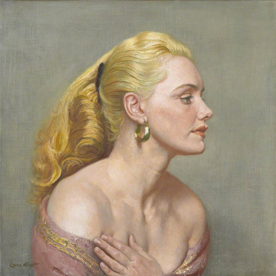
Portrait of Joan Rhodes by Laura Knight (1955) © The estate of Dame Laura Knight. Photo credit: Royal Academy of Arts

Given Knight’s mid-century fame, and her role as a pioneering woman artist, it is a little surprising that this FREE display of some of her work is a) so small and b) tucked away in a dingy room through a doorway off of the main first floor landing. There was no signage, I had to ask an RA staffer where it was hidden.

If you google Knight or look at her Wikipedia article, you immediately see a series of highly realistic and vivid oil paintings, starting with the cracking Self Portrait with Nude of 1913, and including the evocative paintings she did during the Second World War (she became an official war artist at the outbreak of war, and her portrait of Ruby Loftus operating industrial machinery was picture of the year at the Academy’s 1943 summer exhibition).

As you explore further online you come across lots and lots of oil paintings of chocolate box scenes of the countryside, especially of the Cornish coast, featuring soulful looking ladies with parasols (before the First War) or in flapper style dresses and chapeaux (after the First War).

In this little display there are only three oil paintings on display here, although they include the very striking portrait of Joan Rhodes (above) and an equally realistic and sensual double nude, Dawn. (It is hard not to be struck by the firm pink bosoms in this painting, though maybe I am meant to be paying attention to the women’s soulful gazes…)

Dawn by Dame Laura Knight (1932 to 1933) © The Artist’s Estate. Photo by John Hammond

No, the bulk of this display is made up of display cases of Knight’s drawings and sketchbooks of which the Academy holds a substantial collection – small, monochrome, often unfinished sketches, which are – to be frank – of variable quality and finish, some were very appealing, some seemed, well, a bit scrappy.

The works are grouped into three distinct themes from Knight’s long working life – the countryside, the nude and scenes from the theatre, ballet and circus.

Countryside

Knight had several spells of living in the countryside – in the 1890s she moved to the Yorkshire fishing village of Staithes and painted scenes of the coast and life among the fishermen and their wives. In 1907 Knight and her husband moved to Cornwall and became central figures in the artists’ colony known as the Newlyn School. In the 1930s she and her husband settled in the Malvern Hills, where she remained for the rest of her life.

Thus the exhibition includes sketches she did of Mousehole in Cornwall, alongside sketches of a ploughed field, trees beside a river, Richmond Park, Bodmin Moor, two land girls in a field, seeding potatoes, and so on.

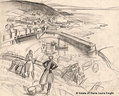
Mousehole Harbour, Cornwall, with Figures in Foreground by Laura Knight (mid-1920s or early 1930s) © The Estate of Dame Laura Knight

It was only later, when I googled her many finished paintings of Mousehole and other Cornish scenes that I realised where these sketches were heading, and what I was missing. I wish the exhibition had included at least one finished painting of this kind of scene alongside the sketches, to help you understand the process better, and the purpose of the sketches.

Nudes

We’ve already met the two dramatic nude women in Dawn. There are a small number of other nude sketches and studies on display, which I thought were a bit so-so. Like the countryside sketches, they strongly suggest that the ‘magic’ of Knight’s paintings was precisely in the painting, in her skill at creating an airy, light and luminous finish with oil paints.

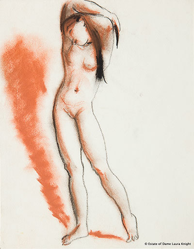
Standing Nude with Her Arms Behind her Head by Laura Knight (mid-1950s) © The Estate of Dame Laura Knight

Theatre, ballet and circus

This broad subject area contains the largest number of sketches and drawings. Knight sketched ballet dancers, and circus performers, there are drawings of boxing matches held among soldiers training during World War One, and ice skaters and trapeze artists and many other performers. The wall labels tell us that she even spent some months travelling with famous circuses of the Edwardian era, drawing and sketching every day.

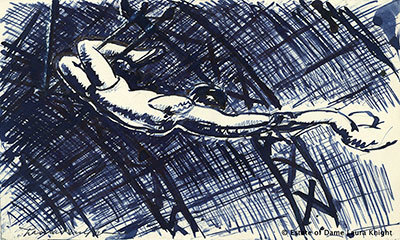
Trapeze Artists by Laura Knight (1925) © The Estate of Dame Laura Knight

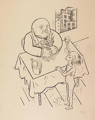
They’re all competent. Some of them piqued my interest. But none of them seemed to me as vivid as the drawings of, say Edward Ardizzone, who had a comparable sketching style, using multitudes of loosely drawn lines to build up form and composition.

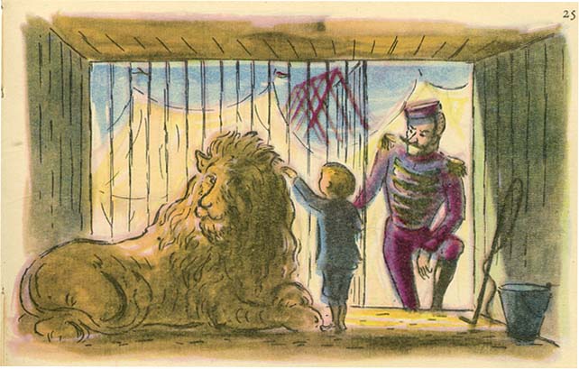
The Lion Tamer by Edward Ardizzone (1948)

Maybe I’m mixing up fine art (Knight) with book illustration (Ardizzone) and maybe I’m giving away my failings of taste in saying so, but I much prefer the Ardizzone. It’s more vivid, more evocative, more physically pleasing (more tactile), more fun.

Also, as with the nudes and landscapes, a quick search online reveals that Knight converted her sketches into scores and scores of paintings of the circus, and I immediately found the paintings much more pleasurable than the sketches – a little cheesy and old-fashioned, like vintage Christmas cards, but much more finished and complete than the sketches.

Grievance

The introductory panel and all the wall labels exude what you could call the standard feminist spirit of grievance and offence. There’s a long list of offences to absorb.

The curators point out that Knight, despite her success with the public, was only granted membership of the Royal Academy in 1936! That she was the first woman to achieve this accolade (why so late Royal Academy)! But that, even then, she wasn’t invited to Academicians’ Annual Dinner until 1967!

We are told that, as a woman art student before the Great War, she was forbidden to paint or sketch from real naked models but had to work from sculptures and statues! It was only in the 1930s, in Newlyn, that she was able local people to pose nude for her! And so a work like Dawn can be seen as an act of defiance against a male-dominated art world!

I’m sure all of this, and much more along the same lines, is true and scandalous and we should all be outraged by it. But, seen from another perspective, all this righteous indignation amounts to a skilful evasion of the rather obvious question, which is whether Knight’s art is any good – or is of anything of other than antiquarian interest, dusted off and used as a pretext for the righteous anger of modern curators?

This tricky question is not addressed anywhere in the (very informative) wall labels, but, when you think about it, is amply answered by:

  1. The Academy’s choice of location for this little ‘exhibition’ – tucked away in a dark and dingy side-room.
  2. The fact that it is more of a ‘display’ of half a dozen notebooks, three paintings and a poster, than a full-blooded exhibition. An after-thought.

If Laura Knight is so eminent and so worthy of consideration, why didn’t the Academy give her a larger exhibition in a more prominent space?

Ironically, the curators who complain that Knight was overlooked and patronised in her own time, have done quite a good job of repeating the gesture – of displaying only a small and not very persuasive part of her output, in a hidden-away side room which nobody in a hurry to see the blockbuster shows on Anthony Gormley or Helena Schjerfbeck or Félix Vallotton is in too much danger of stumbling across.

Suggestion

In all seriousness, why not give Laura Knight a much bigger exhibition? If you look at the paintings embedded in the Wikipedia article or all across Google, it’s clear that she painted absolutely brilliantly, but in a straightforward naturalistic style which was completely outdated and provincial by the 1930s, let alone the 40s or 50s – in a style which carried on its Edwardian naturalism into the atomic age as if the rest of modern art had never existed.

But despite that – or more likely, because of it – Knight was very popular and successful with the public. Her paintings of Edwardian children playing on the beach or soulful ladies standing on clifftops sold by the dozen and – from a Google search of them – look immensely pleasing and reassuring in a lovely, airy, chocolate-box kind of way. And her wartime paintings perfectly capture the earnest heroism of the conflict, and of the social realism, the committedness, of the wartime artists.

To me this all suggests a whole area of investigation, an enquiry into why British artistic taste remained so isolated and uncosmopolitan for so long, which would reference:

  • the way the director of Tate in the 1930s could proudly say that Tate would only buy work by the young whippersnapper Henry Moore ‘over his dead body’
  • or Sir Alfred Munnings, the horse-painting president of the Royal Academy, addressing the academy’s 1949 annual banquet, delivered a drunken rant against all modern art, and invoked the support of Winston Churchill (sitting next to him) who he claimed, had once asked him: ‘Alfred, if you met Picasso coming down the street would you join me in kicking his … something, something?’ ‘And I said ‘Yes, sir! Yes I would!’

A big exhibition of Knight’s work would:

  1. put to the test the curators’ claims about her importance and relevance
  2. be very popular among the sizeable audience, who still like their art extremely traditional (think of the sales of prints and other merchandise!)
  3. allow the curators to explore and analyse the long-lasting appeal and influence of the anti-continental, anti-modernist, anti-avant-garde tradition in 20th century English art of which, for all her skill and ability, Laura Knight appears to have been a leading example

This – the philistinism of English art, the determined rejection of all 20th century, contemporary and modern trends in art and literature in preference for the tried and tested and traditional – is something you rarely hear discussed or explained, maybe because it’s too big a subject, or too vague a subject, or too shameful a subject. But it’s something I’d love someone better educated and more knowledgeable in art history to explain to me. And I’d really enjoy seeing more of Laura Knight’s lovely airy innocent paintings in the flesh. Why not combine the two?

For once mount an exhibition which is not about a pioneer or explorer or breaker of new ground, but about a highly capable painter of extremely traditional and patriotic and reassuring paintings, and explain how and why the taste which informed her and her audience remained so institutionally and economically and culturally powerful in Britain for so long.


Related links

More Royal Academy reviews

Lee Krasner: Living Colour @ Barbican Art

‘I like a canvas to breathe and be alive. Be alive is the point.’ Lee Krasner

On 11 ‎August 1956 the world-famous artist and leader of the school of Abstract Expressionism, Jackson Pollock, crashed his Oldsmobile convertible while driving drunk. His wife of 11 years, Lee Krasner, also an accomplished artist, heard the news while away in Europe, and hurried home to New York to sort out the arrangements for his funeral and Pollock’s affairs.

Lee Krasner at the WPA Pier, New York City, where she was working on a WPA commission (about 1940) Photo by Fred Prater

She moves into the big barn

Ten years earlier, and soon after marrying (in 1945), the couple had moved to the Springs area of East Hampton on the south shore of Long Island, and bought a wood-frame house and barn, which they converted into studios.

Of the buildings at their disposal, Pollock had early on nabbed the biggest available space – the barn – as a studio, and it was here that he created many of the masterpieces that made his name in the later 1940s and early 1950s. Sometime in 1957, the year after his death, Krasner moved Pollock’s paints and equipment out of the big barn and her own stuff in, and began to paint in the largest space she’d ever had at her disposal.

The result is a decade’s worth of quite extraordinarily powerful and enormous abstract paintings which make up the core of the major retrospective of Lee Krasner’s art, which is currently being held at the Barbican Centre in London. They are absolutely stunning. Breathtaking. Wonderful. Huge!

Installation view of Another Storm (1963) by Lee Krasner at the Barbican. Photo by the author

A light and airy space

For this exhibition the Barbican has removed some of the partitions which usually divide up the main ground floor exhibition space, and also removed some of the temporary walls which previously concealed wall-sized windows in the exhibition shop and at the end of the main gallery. The combined effect of this decluttering is to make the big central space (technically ‘room 10’ of the exhibition) feel long and bright and airy. From the moment you arrive at the ticket desk, the new lighter, brighter space feels like the perfect environment in which to hang Krasner’s huge and awe-inspiring works.

It is a genuinely uplifting and life-affirming experience to wander among these paintings, I felt like a mortal wandering dazzled through a mansion of the gods.

Siren by Lee Krasner (1966) Hirshhorn Museum and Sculpture Garden, Smithsonian Institution © The Pollock-Krasner Foundation. Photo by Cathy Carver

Her early years in self portraits

The exhibition is arranged in broadly chronological order, and you are directed to start on the upper floor of the Barbican galleries, which houses eight living-room-sized spaces. These eight rooms take us from Krasner’s birth, in 1908, in New York, into a family of Orthodox Jewish Russian émigrés, and onto the early art school training she got (at the Women’s Art School at Cooper’s Union, Art Students League, National Academy of design. From her student days there’s a room of self-portraits in oil, which are OK.

Nudes classical and modern

After the Wall Street Crash of 1929 (when she was 21) Krasner began training as a teacher and attended life school classes. On one wall of room four are the extremely accomplished nude studies she did in the style of the Renaissance Masters in 1933 – very accomplished, very traditional. On the opposite wall is a selection of charcoal nudes she did just six years later, in 1939, which are completely different in style, riven by big abstract angular lines, showing a complete assimilation of European modernist trends.

By 1942 she was a respected member of New York’s artistic community. She had been included in an exhibition of contemporary painting in New York alongside friends Willem de Kooning and Stuart French. Piet Mondrian admired her work. As a result she was given a number of commissions by President Roosevelt’s Public Works of Art Project, including a job to oversee the design and execution of twenty department-store window displays in Manhattan advertising war training courses. She adopted a cut-up-and-paste collage approach, and room five shows blow-ups of photos of these wartime artworks. Well, sort of interesting as a) social history b) if you really a completist looking for evidence of every step of her artistic development.

The Little Images

She knew most of the exhibitors in that 1942 show except one, a guy named Jackson Pollock, so she dropped round to his Greenwich Village studio to seek him out and say hi. One thing led to another and they were married in 1945. They moved to the farm on Long Island and, in the winter of 1947, Krasner embarked on what became known as the ‘Little Images’ series, abstract paintings made up of tightly meshed squares and shapes which some critics described as ‘hieroglyphic’. Rooms one and two kick off the show with some fine examples of these ‘Little Images’ and it’s amazing what a variety of design and visual effect you can achieve from such a seemingly simple premise.

Composition (1949) by Lee Krasner © Philadelphia Museum of Art

The collage paintings

Krasner was given her first one-woman show at the Betty Parsons Gallery in October 1951. The work didn’t sell and, although she began a new series soon afterwards, she quickly became despondent and ended up tearing some of the new work to shreds in frustration.

Weeks later, returning to the studio, she realised that the torn strips lying about on the floor got her juices flowing. Quickly she began incorporating them into a new series of collages. She layered pieces of fabric over the paintings shown at the Betty Parsons show, adding pieces of burlap, torn newspaper, heavy photographic paper and some of Pollock’s discarded drawings. The resulting ‘collage paintings’ were exhibited in another gallery show in 1955, and there are several rooms of them on display here.

Blue Level (1955) by Lee Krasner © The Pollock-Krasner Foundation. Photo by Diego Flores

Strikingly different from the ‘Little Images’, aren’t they? The very tightly-wound hieroglyphs of the Images are completely different from the violently torn strips of the collages.

Prophecies

In the summer of 1956 Krasner began work on a new series. The dominant tone of pink made me think of human flesh and nudes, but nudes severely chopped up and filtered via Demoiselles d’Avigon-era Picasso.

The first example of this new style was on Krasner’s easel when she left for France that summer. In the first half of their marriage, her husband’s career had gone from strength to strength, peaking around 1951, as he became world famous for his ‘drip paintings’, getting on the front cover of Time magazine, promoted by the American government as a home-grown genius, snapped up by collectors. But when, after 1951, Pollock tried to change this winning formula, he met with incomprehension and sales slumped. Pollock lost confidence, his drinking increased, he began an affair, which Krasner knew about, in early ’56.

That was the troubled background to the first of these flesh paintings and then – mid-way through her visit to Europe, she got the call that he had died in the car crash. Just weeks after the funeral, Krasner returned to the style and quickly made three more big, torn-up flesh paintings which she titled Prophecy, Birth, Embrace and Three In Two.

In the last room of the first floor of the exhibition, these four paintings are reunited, one hanging on each of the four walls, and it is impossible not to be powerfully affected by their eerie, agonised power.

Prophecy (1956) by Lee Krasner © The Pollock-Krasner Foundation. Courtesy Kasmin Gallery, New York. Photo by Christopher Stach

The night journeys

So Jackson dies and Lee moves into the big barn studio and she is afflicted with insomnia and can only work at night, and she decides not to use any colour in her new paintings because she prefers to judge colours by daylight – and so, from the late 1950s, Krasner began to make a series of paintings combining just black and umber and creamy white onto huge, unstretched canvases.

Wow! These are great swirling, turd-coloured pieces, full of energy and despair. A poet friend of hers labelled them ‘Night Journeys’ and to follow any of the angled, curved or circular lines which strike across the surface is, indeed, to go on a churning, bitter journey though a landscape in torment.

Polar Stampede (1960) by Lee Krasner. Doris and Donald Fisher Collection, San Francisco MoMA © The Pollock-Krasner Foundation. Courtesy Kasmin Gallery, New York.

Krasner exhibited these big brown works in 1960 and 1962 to critical praise, and half a dozen of them dominate the first half of the enormous ground floor space in this show. You can stand in front of them, or there are benches where you can sit down, meditate on them, and be drawn into their drama and action.

Primary series

But the jewel in the crown is the Primary series. In the early 1960s Krasner replaced umber with a range of vivid primary colours. When she broke her right arm in a fall, she taught herself to work with her left, squirting paint directly from the tube, using her right hand to guide the movements.

Critics often use the word ‘gesture’ or ‘gestural’ but in this case it really is justified. As you follow the great sweeping arcs and patterns of paint, and note their dribbles and dynamic interactions, you can almost feel and see the great sweeps of the arm they must have required, the leaning of the whole body, the straining, the movement from one zone of focus to the next. They are extraordinarily vibrant and exciting paintings.

Icarus (1964) by Lee Krasner. Thomson Family Collection, New York © The Pollock-Krasner Foundation. Courtesy Kasmin Gallery, New York. Photo by Diego Flores

I couldn’t get enough of these paintings. I wandered up and down the central room, enjoying all the views of the works offset against each other, glimpsed behind the one central supporting wall of the main exhibition space, addressed front on, strolled past, studied up close, looked at from the other side of the room.

Wow! What a space, and what works of staggering brilliance to fill them with!

Later works

The Umber paintings and the Primary series cover the decade from the late 50s to the late 60s. What a brilliant decade it was for her.

Then, in 1968 Krasner discovered a stash of handmade paper in the farmhouse, and decided to make a new series of works, on a much, much, much smaller scale. She decided to experiment by making each of these small, crafted works from just one or two pigments. A dozen or so of them are in a room off to one side (room 11).

They require a completely different way of looking. Much more conventional in size they require the viewer to step forwards and examine the detail, rather than step back and admire the scale, as with the Primary series.

The dozen or so examples on display here are all lovely – free-spirited dances of colour, and interplays of defined brushstrokes against broader washes, all given a wonderful background texture by virtue of the expensive paper they’re painted on.

Untitled (1969) by Lee Krasner © The Pollock-Krasner Foundation. Courtesy Kasmin Gallery, New York

In the early 1970s, Krasner made a significant step change in style. Still completely abstract, her works changed from soft biomorphic shapes to hard-edged abstract forms. I found them a shock to the system after the huge works in the central hall.

I liked even less the works in the final room, dating from 1974. In that year she stumbled across a portfolio of work from her art school days, the kind of angular nude studies which we saw examples of way back in room four.

Now Krasner took a pair of scissors to these early studies and cut them up into jagged shapes. Most of the source material was black and white drawings, but she interspersed some coloured strips into the collages, and also left other areas blank, apparently ‘echoing the empty space around the nude model’ which had served as the subject for many of the original drawings.

They were exhibited in 1977 under the title Eleven Ways To Use The Words To See. I didn’t warm to them.

Imperative (1976) by Lee Krasner © The Pollock-Krasner Foundation. Courtesy National Gallery of Art, Washington D.C.

No, I went back up to the first floor and walked back through the eight rooms soaking up the evolution of those early works and admiring, in particular, the ‘Little Images’ series. And I revisited the rooms holding these later 1970s works, trying to give them the benefit of the doubt – but all the time I just wanted to go back into the massive main gallery space and be swept off my feet and ravished all over again by the huge, vibrant, dancing works of the 1960s.

Summary

This is the first European retrospective of Lee Krasner’s career for over 50 years. It brings together nearly 100 works from some 50 galleries, institutions and private collections. It must have been a labour of love to assemble them all, and was totally worth it.

The exhibition ends with a 15-minute video made up from various interviews with Krasner towards the end of her life. She was one tough lady, and she told it like it was, still, in her 70s, harbouring a bitter resentment at the sexism of the New York art world which she had to combat all her career.

If you start reading up about her life you quickly find people claiming that, far from being overshadowed by her famous husband, Krasner was in fact the driving force behind his career. And, from some of the interviews, you get the impression that, having seen what really high-profile high pressure publicity did to an artist (Pollock), she was quite content to avoid that level of scrutiny, and just get on with what she loved doing.

The publicity material accompanying the exhibition quotes the playwright Edward Albee commenting at her memorial at the Metropolitan Museum of Art, that in both her life and her work, Krasner ‘looked you straight in the eye, and you dared not flinch’.

That seems a perfect description of both a tough lady, and of her extraordinarily resolute, exuberant and unsentimental art.

A short film about Lee Krasner


Related links

Other Barbican reviews

George Grosz: The Berlin Years by Ralph Jentsch (1997)

This big heavy paperback is the glossy catalogue to a comprehensive exhibition of Grosz’s work which was held in the Peggy Guggenheim Collection back in 1997. The long and detailed text was written by Ralph Jentsch, who is ‘managing director of the Grosz Estate, author of a number of catalogues and books on George Grosz, and a well-known expert in German Expressionism.’

It is a massive compendium of works by Grosz in all media – cartoons, caricatures, book illustrations, oil paintings, watercolours, sketches, drawings, collages and so on, not just from his mature years but starting with his earliest surviving sketches of cowboys and Indians and the heroes of boys’ own adventure stories which he loved as a lad.

There’s also plenty of evocative black-and-white photos of Grosz during the first 40 years of his life (1893 to 1933), featuring lots of semi-private shots of him messing about in his studio or playing the banjo – and also photos which give context to the story, from a typical German pub interior of the 1890s of the sort his father ran, to street scenes in Berlin, where he made the first half of his career.

In total there are 410 numbered works and photos in the main text, plus an additional 67 b&w photos in the 16-page potted biography at the end. It’s a visual feast, as they say, giving you a real sense of the visual universe he inhabited and the one he created.

(This book is the first volume of a two-volume and two-exhibition project – this one covers the Berlin years, the second one covers his time in exile in America, 1933-1959. Later, they were combined into one portmanteau book, link below.)

I’ve summarised Grosz’s life story in my review of his autobiography, A Small Yes and a Big No, no need to do it again. Instead, I’ll just mention half a dozen or so themes, issues or ideas which arise from a careful reading of this big book.

Transition from soft to hard lines

The first thirty or so pages include still life sketches Grosz did in conventional pencil or charcoal using multiple lines and hatching to create light and shade. These go alongside a consciously different style he developed for commercial caricatures, still very formal and multi-lined with an Art Nouveau feel. He had a different style again for the pictures he was hoping to use to start a career as a book designer.

Among the multitude of early sketches there are pub scenes, brawls in the street, and some gruesome (imaginary) murders. The point is – they’re all done in a much scribbled over, blurry, multi-line style.

What’s fascinating is to see how, during the war, he quickly and decisively changed his style to one of spare, scratchy single lines. Stylistically, it’s the decisive move: before – smudgy, obscure, feverishly drawn and overdrawn figures; after – scratchy, one-line figures, buildings, objects.

Evening in Motzstraße (1918)

Evening in Motzstraße (1918)

It’s fascinating to read his own account of how and why the change came about.

In order to attain a style that reproduced the hardness and insensitivity of my subjects, I studied the most direct expressions of art: I copied the folkloristic drawings in the urinals; they seemed to me the expression and most immediate rendering of strong emotions. I was also stimulated by the unequivocalness of children’s drawings. So I gradually reached my knife-hard style that I needed to draw what I saw. (Art in Danger, 1925)

I wonder if any other major artists, anywhere, ever, has credited their style as being derived from the drawings in public lavatories?

This is just one revealing quote from the many which Jentsch gives us from Grosz’s own autobiography, from the prefaces to the books, to the justificatory notes he prepared for each of his court cases, and to the countless letters he wrote to all his friends. We learn that Grosz wrote a vast correspondence to all his friends and acquaintances, kept copies of it all (which survive) and expected long and detailed replies in return – or else the friends were liable to get a none-too-polite reminder.

Grosz is a really fluent and enjoyable prose writer – his descriptions of holidays on the Baltic or the threatening atmosphere of Depression Berlin are a joy to read in their own right.

America

Jentsch’s quotes very liberally from Grosz’s autobiography (it is, after all, extremely jocular and readable) in bringing out Grosz’s obsession with America and its pop culture. As a boy he devoured James Fenimore Cooper’s Leatherstocking novels, as well as the pulp westerns of Karl May, the detective hero Nick Carter, and loved everything American.

Having just read John Willett’s two books about Weimar art and culture, I can see that Grosz’s enthusiasm was part of a much broader cultural trend: the Germans loved American culture. Not only was there jazz which took everyone by storm, but the radio and gramophone were American inventions and everyone round the world fell in love with Charlie Chaplin’s silent comedies.

Later, for the avant-garde designers and architects which Willett’s book describes, America remained the beacon of all things modern, particularly the staggering efficiency of its industry and design. Henry Ford’s many books were bestsellers in Germany, as were the innovations of Frederick Winslow Taylor’s time and motion and efficiency studies.

I always think the most incongruous fan of America in this milieu was the Marxist playwright Brecht, who wrote loads of poems about a fantasy America, devoted a play to Chicago gangsters, as well as setting a number of plays and oratorios there, such as his oratorio about Lindbergh’s famous solo flight across the Atlantic. American jazz, cars, fashions and technology all stood for the exciting and new, liberated from the dead hand of Old Europe and its defunct empires.

Towards the end of his Weimar career (and in the depths of the Great Depression) Grosz’s attitude towards America (like Brecht’s) had become a good deal more satirical and critical. Now he sees all mankind as blindly greedily chasing after the consumer capitalism which America has perfected and exported to the world. But although the attitude has hardened – it’s still America which is at the centre of his thoughts.

Dreams, romantically dispensed and advertised a thousand times over: comfortable living, bath-tub, sports, utility car, and at best a weekend with cocktails and beauty queen. America has shown the way, we’re following after – due to war somewhat behind – in our naturally slow way. Even in Marxist Russia, America is the model and ardently desired goal. The goal is: rational exploitation of all raw material sources so as to procure comfort for the little man on the basis of mass machine production. (quoted page 135)

Just one year later – 1933 – Grosz was himself in America, beginning the long struggle to make a new career, which is described in his autobiography and in the second of these two volumes.

Alas, several of Grosz’s biggest most colourful fantasias on American themes (from the end of the Great War and featuring cowboys with six-shooters, wizened old trappers, gold miners and saloon whores) were confiscated by the Nazis and have never been found, so we only know them from old photos.

Misanthropy

Boy, Grosz hated people, he always hated people, he really hated people. Jentsch’s book clarifies that Grosz never saw action during the Great War, he had a nervous breakdown before he reached the front and ended up back in Berlin making sketches, caricatures and paintings which expressed his virulent hatred for people, for men, and for Germany in particular, for the state which had committed its young men to this suicidal folly and which had wanted to force him into the meat grinder.

It was a combination of loathing Germany and obsessing about America which made him change his name from the original Georg Groβ to the Anglicised George Grosz (just as his close friend and collaborator Helmut Herzfeld changed his name to the Anglicised John Heartfield).

Grosz’s misanthropy makes a mockery of his so-called communist beliefs. He joined the German communist party the day it was set up in November 1918 and played a role in the 1918 Berlin revolution, signing a revolutionary declaration published by a collective of revolutionary artists. But after his trip to the USSR in 1922 (where he actually met Lenin), Grosz quickly lost any political faith and lapsed into a universal contempt for mankind.

Hatred for humanity drips from the hundreds and hundreds of drawings from this era, and from the watercolours in particular, which show a relentless parade of corrupt and ugly old men, apparently surrounded by grim, half-naked prostitutes.

Before sunrise (1922)

Before sunrise (1922)

As Grosz wrote to his friend J. B. Neuman:

My drawings will naturally stay true – they are fireproof. They will later be seen as Goya’s work [is]. They are not documents of the class struggle, but eternally living documents of human stupidity and brutality.

Red

In 1916 to 1918 Grosz went through a red phase, lots of paintings done almost entirely in shades of blazing red. The house is on fire, the city is going up in flames. It didn’t last too long, but while it did it was very, very red.

Metropolis (1917)

Metropolis (1917)

A painting like this displays a raft of his characteristics. The knife-hard outline styling of all the figures is well established. Humans are caricatures with hardly any attempt at naturalistic shading or modelling. Perspective has been thrown away in preference for a crazy vortex of planes which gives the sense of a crashing chaos of urban architecture. Women are more often than not half or completely naked, with a little pubic bush in sight just to ram home the point. Corruption, sex, seediness. Everywhere.

Nudes

Grosz did a surprising number of nude studies, almost all of them unflattering or verging on the grotesque.

More surprisingly, he did a large amount of pornographic sketches and drawings, pornographic in the sense that they show men and women very explicitly and enthusiastically engaging in sexual practices, his misanthropy coming over loud and clear in the fat ugliness of everyone involved.

But there’s also something haunted about portraying men and women again and again at the feverish, pleasure-filled but somehow empty, tragic and futile copulations which obsess humanity, and to what end.

The obsessive reworking of the same theme (he liked women bending over and displaying their big wobbly buttocks) give the sense of a man questing, searching, trying to find the answer to the reason – why? Why are we animals? Why do we behave like farmyard beasts? What is behind this absurd farce?

The sex drawings cross over with a set of disturbing sketches and paintings of a cartoon character called ‘John the slayer of women’, who was much in his thoughts in 1917 and 1918. He claimed the set was inspired by a notorious murder of the time – or was it just a misogynist way to let off steam and vent the huge amount of anger he had permanently burning inside?

John, The Lady Killer (1918)

John, The Lady Killer (1918)

Dada and collage

Grosz was a central figure in the Berlin branch of Dada which got going about 1918. He formed a close working partnership with the Herzfeld brothers who set up a publishing house for avant-garde work – the Malik-Verlag – where Grosz was able to publish a series of ‘albums’ of lithographs throughout the 1920s (nearly all of which were confiscated and banned by the authorities).

He collaborated with Helmut Herzfeld aka John Heartfield in the invention and development of photo-montage i.e. cutting out objective pictorial elements like photos or text or headlines from newspapers or magazines and pasting them into grotesque and satirical combinations.

Grosz considered the painting below as one of his most important, and it had pride of place at the Dada exhibition in June 1920.

You can see the way any idea of perspective has been completely abandoned in the name of a potentially endless collage of objects, images and planes. The collage element of newspaper cuttings and magazine images is made particularly obvious on the table. There is the characteristically bitter satire of the so-called ‘pillars’ of the establishment at the bottom. And there is a naked woman with boobs and the characteristic hint of pubic hair to the left of the main figure.

Apart from anything else, there’s a ‘Where’s Wally’ pleasure to be had in deciphering all the visual elements in these, the most cluttered works of his career.

Germany: A Winter's Tale (1918)

Germany: A Winter’s Tale (1918)

Watercolours

Grosz had a number of styles – or a number of ways of deploying his basic vision. Thus the book juxtaposes the intense oil paintings (above) with the just as savage watercolours, but the latter have a very different feel. Watercolour makes the images lighter and Grosz has a very stylish way of letting the colour leach and bleed around the central subjects, something not possible in oils.

Waltz dream (1918)

Waltz dream (1918)

The nipples and bush of a scantily-clad woman/prostitute are probably the most prominent visual element, but what I like is the variety and inventiveness of the colours and the way they are arranged in patches or facets. Surprisingly decorative, isn’t it?

De Chirico vistas and mannequins

In 1919 and 1920 Grosz experimented with a series of works which combined receding vistas of perfect multi-story buildings, as developed by the Italian painter Giorgio de Chirico, with the photo-montage technique he’d been developing with Heartfield.

The result is uncanny, weird and grotesque objects made out of material cut from newspapers and magazines. The final, unsettling element is the omission of faces from the human figures, their heads instead the blank ovals of the shop-window mannequins of the day.

Republican Automatons (1920)

Republican Automatons (1920)

In a completely different style from the raging, red fractured cityscapes, here Grosz presents man as a faceless robot, a characterless shop-window dummy in a soulless landscape of factories and houses, a heartless automaton made up of interchangeable parts (as Jentsch puts it, on page 122).

To ram the message home Grosz stopped signing these automaton paintings and had a stamp made which said GEORGE GROSZ CONSTRUIERT, emphasising their machine-like quality.

Portfolios and collections

Drawing can be an effective weapon against the brutal Middle Ages and stupidity of man of our time, provided that the hand is trained and the will is clear.

As early as 1916 Grosz had a plan for a vast three-volume collection of drawings to be titled The Ugliness of the Germans. In the event he managed to get published the First George Grosz Portfolio and The Little George Grosz Portfolio in small editions. As you can imagine, original copies of these are worth a fortune today.

One of the great virtues of Jentsch’s book is that it includes nearly all the drawings from all his major collections, including the later ones which caused such a scandal – Gott mit uns (1920), In the shade (1921), The Brigands (1922), Ecce Homo (1923), The Mirror of the Bourgeoisie (1925) The New Face of the Ruling Class (1930).

This allows you to see what all the fuss was about and judge for yourself. It also lets you see each of the series in the context of the others, building up a cumulative effect.

Jentsch goes into detail about each of the trials, giving dates and places where Grosz and his publishers were arraigned and their punishments on each occasion (fines and confiscations). He devotes quite a few pages to a chronology of one of the longest court cases in the history of the Weimar Republic, the prosecution of Grosz and his publisher Herzfeld for some of the illustrations created for a stage adaptation of the classic novel, The Good Soldier Svejk, which started in 1928 and went through four separate trials on into 1932.

Grosz really was a thorn in the side of respectable society and it’s worth buying the book for the portfolios alone, which in their spare directness brutally convey seething his seething anger at man’s inhumanity to man.

Lions and leopards feed their young from The Brigands (1922)

‘Lions and leopards feed their young’ from The Brigands (1922)

Grosz was lucky, very lucky to happen to be offered a job in New York in 1932, and to persuade his wife and children to join him early in 1933, just two weeks before Hitler came to power.

He’d been taking the mickey out of Hitler for over ten years. On the day of Hitler’s accession SA troops broke into both Grosz’s flat and Berlin studio. If he’d been there he would have been taken off for interrogation, torture, prison and probable death. Lucky man.

Siegfried Hitler by George Grosz (1922)

Siegfried Hitler by George Grosz (1922)

And he was right when he compared himself to Goya. To later ages, to our age, his drawings and paintings are comparable with Goya’s, as ‘eternally living documents of human stupidity and brutality’.


Related link

Related reviews