
Frida Kahlo (1907 to 1954) has a unique international appeal, as both an artist, personality and icon. Her image in oil paintings and photographs is instantly recognizable.
This is a beautifully curated and designed exhibition which left me with a much deeper understanding of Kahlo’s life, her work, her toughness in the face of terrible adversity, and the Mexican roots of her distinctive and powerful self-image.
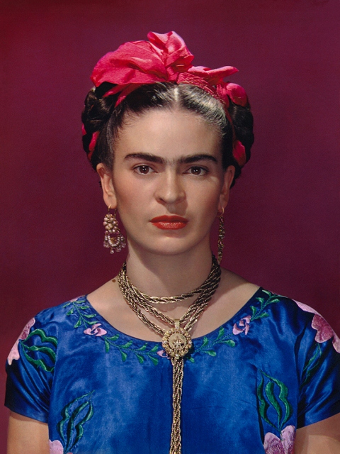
Frida Kahlo in blue satin blouse, 1939, photograph by Nickolas Muray © Nickolas Muray Photo Archives
The treasure trove
The pretext or premise or prompt for the exhibition was the discovery of a treasure trove. After Frida died at the horribly early age of 47, her mourning husband, the famous Mexican mural painter, Diego Rivera, ordered all her belongings in the famous ‘Blue House’ they shared together, to be locked up and sealed away.
Rather incredibly, it was only in 2004 that this room was re-opened, to reveal a treasure trove of Kahlo-iana – including her jewellery, clothes, prosthetics and corsets, along with self-portraits, diary entries, photos and letters. Together they shed a wealth of new light on her life, personality, illness and endurance, on her art and on her extraordinary achievement in fashioning herself into an iconic image and brand.
And this is what the exhibition is based on.
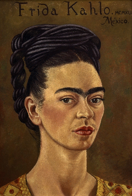
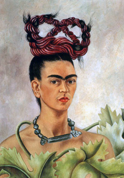
Self-portrait by Frida Kahlo (1941) © The Jacques and Natasha Gelman Collection of 20th Century Mexican Art and The Vergel Collection
Biography
The show is smaller than some recent ones at the V&A. Not so much a blockbuster, as an intimate portrait. It starts with a corridor-like room divided into small recesses, each of which take us briskly through a chapter in her early life, using black and white photos, a few early paintings and some home movies.
The key elements for me were that:
- Her father was German, emigrated to Mexico in the 1890s and set up a photographic studio. She helped him and learned photographic technique, how to compose and frame a subject. No accident, maybe, that she is best known for her painted and photographic self portraits.
- Her full name was Magdalena Carmen Frida Kahlo y Calderón. She always preferred Frida because it her father’s name for her. I was mulling this over when I came to the section describing her marriage to the, by then, already famous Mexican mural painter, Diego Rivera, in 1928, who was a lot older than her, 43 to her 22. I.e. a big, reassuring father figure. Daddy.
- When Frida was 6 she contracted polio and was seriously ill. She was left with one leg shorter than the other.
- When she was 18 she was on a bus which was in a collision with a tram, resulting in her being both crushed against the window and having a piece of metal penetrate her abdomen. This accident and her long recovery put paid to the idea of studying to become a doctor. Confined to bed for months, she began to expand the sketching, drawing and painting she’d already been toying with.
In the late 1920s she developed a kind of naive, symbolic style, drawing inspiration from Mexican folk culture. After marrying Rivera, she accompanied him on a number of trips to the United States, where he had been commissioned to paint murals, socially conscious murals being a big part of 1930s American artistic activity.
Here’s a good example, from 1932. I don’t know if I like it. I understand the fairly simple ideas: on the left are images of Mexico, Aztec ruins and figurines, flowers and agricultural produce, with their roots in the good earth: on the right is Detroit, highly industrialised ‘Motor City’ (the name FORD is spelled out on the smoking chimneys), the American flag, skyscrapers, and growing out of the soil are not beautiful flowers but lamps and fans.
And in between is a self portrait of Frieda in a formal pink dress holding the Mexican flag. Between two worlds, eh? I get it.
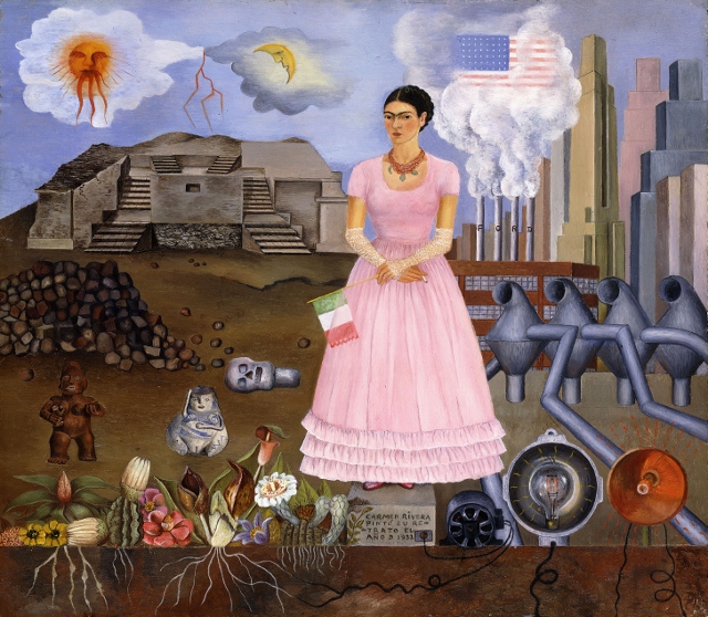
Self-portrait on the Border between Mexico and the United States of America by Frida Kahlo (1932) © Modern Art International Foundation
Her naive symbolism matches the simple-minded ‘political’ attitude of Rivera’s murals. They both thought of themselves as communists and went on marches supporting strikers etc, but, nonetheless, liked visiting the heart of capitalism, America – or ‘Gringolandia’, as Frida called it. The money was good and there were lots of opportunities for Rivera to get commissions. And it was in New York, in 1939, that Frida held her first successful one-woman show. Capitalism is an awful thing – unless you can get money, commissions, promotions and sales out of it: the attitude of many 20th century artists.
One of the most interesting biographical facts is that Lev Davidovich Bronstein, known to the world as Leon Trotsky, having been exiled from the Soviet Union, was offered refuge by the revolutionary government of Mexico and came to stay with the Riveras, not for a few weeks, but for two years.
The exhibition includes a black-and-white film of Comrade Trotsky explaining, in English, how badly he has been treated by comrade Stalin. He insists he is really a man of honour – as anyone whose family was murdered by the Red Army he set up, would surely have testified.
Mexican roots
These early biographical roots are interesting but they are eclipsed by the power of the later rooms.
These start with the room on Kahlo’s Mexican roots. It explains that during the 1920s and even more so the 1930s, Mexico underwent a cultural renaissance. Part of this was the exploration and promotion of the country’s pre-Colombian culture, but it also included the first real appreciation of the folk customs and costumes of peasants and the poor around the country.
Interest in the country spread abroad, with American artists, photographers and film makers attracted to its sunny, bright and passionate culture. John Huston made films here. Even the young British writer Graham Greene made a tour of the country (he hated it) and then set his most powerful early novel here, The Power and the Glory. I’ve reviewed them both.
Frida and Diego were part of this revival of interest in Mexico’s culture and history. They both sought inspiration in the folk and workers culture of their country. In particular they were attracted to the area called Tehuantepec in the Oaxaca region. People here followed traditional ways, and the exhibition includes a whole wall of traditional icons of the Virgin Mary, establishing a link between these images of saintly femininity and Kahlo’s self portraits and explorations of her identity.
The dress room
The final room in the show is the biggest and I involuntarily exclaimed ‘wow’ as I walked into it.
Centre stage is a huge central glass case displaying some 20 of Frida’s dresses. Full length, made of colourful fabrics and bright designs, each one has been carefully displayed and annotated, giving a powerful sense of Frida’s sense of colour and dress.
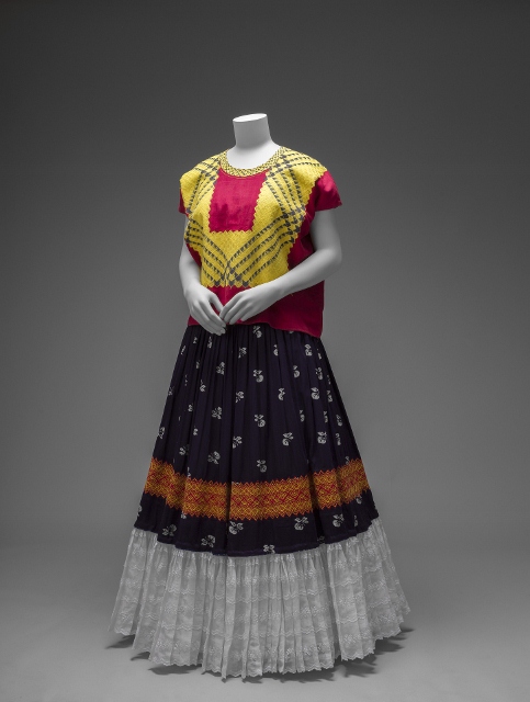
Cotton huipil with machine-embroidered chain stitch; printed cotton skirt with embroidery and holaün (ruffle) Museo Frida Kahlo
There are only 10 or so paintings in the whole exhibition and six of them are in this room. They’re later works, when she had realised that she was her own best subject and that self portrait was her best medium.
Looking out at the viewer, flat and unemotional, her iconic features by now well established – the monobrow, the faint moustache on her top lip, her strong brown eyes, the sideways pose – she is flatly, unashamedly, blankly herself.
In the painting below even the tears don’t really affect the expressionless face. Or they appear as surreally detached embellishments of the fundamental design. Much weirder is the ‘ruff’ dominating the image. The exhibition explains that this is a huipil de tapar, a traditional Mexican item popular in Tehuantepec, designed to frame the face and extend over the neck and shoulders. There is another larger painting of her wearing the same outfit and a full scale example of a huipil de tapar on a display mannequin for us to compare and contrast reality with painted depiction.
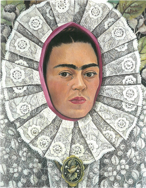
Self-Portrait by Frida Kahlo (1948) © Private Collection
Kahlo is, you realise, a perfect subject for the V&A because she was not only an artist, but someone with a fascination for clothes and costumes – in her case, of her native Mexico. The exhibition is less about the ar per se and more about how she drew heavily on these costume traditions and elaborated them into a highly colourful style of her own.
Hence there are more than twice as many dresses as there are Kahlo artworks. Hence, also, the display cases devoted to the heavy and ornate jewelry she wore, the elaborate ear-rings and thick heavy necklaces, set off against the bright and colourful hair ribbons.
In this respect it is fascinating to watch the 9-minute tourist film from the Tehuantepec region which is on view just next to the dresses and necklaces. Look at the colours and designs of the dresses, the heavy gold jewellery, and the brightly coloured ribbons in the women’s hair. In a flash you understand. Kahlo was a conduit for these traditional dresses, colours, fabrics and jewellery, into the international art world.
She gave it her own style. She combined it in her own way and, above all, gave it the imprimatur of her own face, of her very distinctive features (eyes, monobrow, moustache) and her unsmiling, detached, dream-like appearance.
But a great deal of her ‘look’ quite obviously stems directly from the traditions of the women of Tehuantepec.
Frida Kahlo on a bench (1938) Photo by Nickolas Muray © The Jacques and Natasha Gelman Collection of 20th Century Mexican Art and The Verge, Nickolas Muray Photo Archives
The sick room
The big dress room is the climax of the exhibition, in terms of dresses, design, jewellery, paintings and photos.
But arguably the biographical core of the exhibition is the room before it, entitled ‘Endurance’. In an imaginative but spooky display, the curators have commissioned the creation of six small four-poster beds and made each into a display case which, along with photos and text along the walls, give a quite harrowing account of Kahlo’s many illnesses, ailments, treatments, and lifelong suffering.
The polio left her with a limp. The bus accident left her with serious internal injuries. In the 1930s she began to experience back problems and underwent a series of treatments and operations to fix them. At the end of her life one foot became infected and then gangrenous, requiring the whole leg to be amputated. It’s gruesome stuff.
This room includes examples of the medical equipment she was forced to wear or endure. There are platform shoes for the shorter leg, a prosthetic leg made for her to wear after the amputation but, most evocative of all, a series of corsets, plaster casts and back braces to help support her failing spine.
Kahlo decorated, painted and embellished as many of these as she could. The plaster casts, in particular, are painted with abstract patterns. The most elaborate one carries a painted hammer and sickle of the Soviet Union and, underneath, an image of the foetus she was carrying before she had a miscarriage in 1932.
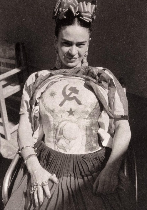
Frida Kahlo wearing a plaster cast, which she decorated with the hammer and sickle (c.1950) photo by Florence Arquin
The record of her illnesses and, in her later years, the almost constant pain she endured, make for harrowing reading, but there are also two really powerful insights in this room.
1. Painting in bed
One is that she was, at various periods, confined to her bed, it being too painful for her to walk or even stand. (Imagine!) So she had a mirror rigged up in the canopy above her and an easel on the side of the bed. From here she could paint, but paint what?
The answer is dreams – surreal images based on dreamlike symbolism, repeated images of her or a body in a bed – and her face. Over and over again the face of someone in discomfort or pain, staring, blankly, inscrutably, down from the ceiling.
Photos show the actual set-up, with Frida lying in bed, beneath a big mirror, the easel right next to her, on which she is painting.
This sheds quite a lot of light on her subject matter, and lends a depth and dignity to the pictures. Modern critics, obsessed with feminism and identity, may well write about the paintings ‘transgressing’ this or that convention and ‘subverting’ ‘gender stereotypes’.
But they are also the image of someone in tremendous pain. Knowing this, getting the really deep feel for her physical suffering which the ‘Endurance’ room gives you – lends tremendous depth of character and meaning to the detached, slightly dream-like expression you encounter again and again in her paintings.
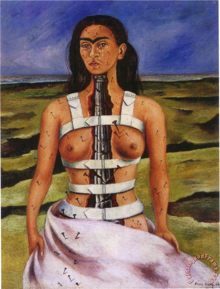
The Broken Column by Frida Kahlo (1944)
2. The construction of the self
The other insight is easy to miss. Off to one side is a set of three black and white photos taken of Frida topless. They were taken by Julien Levy, the owner of the New York art gallery where she had her first solo show in 1939 and with whom she had an affair.
The insight comes in the text underneath, where Levy is quoted describing Frida doing and undoing her braids. First she undid the braids, carefully removing all the objects which were in them and held them in place, arranging them all carefully and in order on the dressing table. Later, she remade the braids, carefully and meticulously taking the ribbons and clips and other elements from their place on the dressing table, and putting them back in just the right places to create just the right effect.
In the context of the ‘Endurance’ room, next to so much physical pain and discomfort and demoralising bad luck – this ritual takes on a whole new significance.
You realise it was a way of controlling and ordering her life, a life of illness and pain which might so easily slip into indiscipline, depression or addiction. Instead she maintained control by paying minute attention to every element of her self-presentation. There are several cases showing the lipstick, and makeup, and nail polishes and eye liner and other accoutrements she used to create her image. To make herself up. To control, create and bolster herself.
Might sound stupid, but this knowledge makes the dazzling inventiveness of her self-creation seem genuinely heroic.
3. Long dresses
That’s why she liked to wear long dresses – because they hid her polio limp. This explains why all twenty dresses in the dress room are full length, reaching right down to and covering the feet. It’s a very Victorian effect, in some of the photos every inch of her body is covered save for her hands and face. But a Victorian outfit on acid, blitzed with brilliantly coloured fabrics and designs.
Conclusion
If you like Frida Kahlo this exhibition is a dream come true. There was a long queue to get in and the rooms were quickly packed out.
That said, there is remarkably little about her art, as art. A few mentions of the influence of Rivera’s socialist murals, a bit about Mexican symbolism, mention that the Godfather of Surrealism, André Breton, heavily promoted her, writing at length about the more surreal and dreamlike of her fantasy paintings (none of which are on display here).
But all in all, surprisingly little commentary or analysis of the paintings as paintings, except for comments about the dresses she’s wearing in them, the hair, the jewellery, the way she presents herself in them.
Self Portrait with Braid ( 1941) by Frida Kahlo
A moment’s googling shows that Frida Kahlo painted hundreds of paintings. Only ten are on show here. This exhibition is much more about the creation of her image, all the exhibits inhabit concentric circles spreading out from that premise.
I found it hard to get very worked up about 70 or 80 year-old makeup sets (in the outer circle). Her dresses and fabrics are colourful and interesting but, at the end of the day, not really my thing – though I could see plenty of women visitors being riveted by their designs and fabrics. Kahlo’s mural-style, political or symbolic art is sort-of interesting – although murals aren’t a format I warm to – and I found them less compelling than comparable murals by Stanley Spencer or Thomas Hart Benton.
No, it’s only when I came to her paintings of herself that I felt a real power and forcefulness in the image, the way they bring out her stern, unsmiling expression.
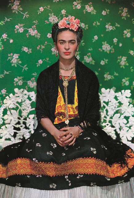
But even more central than her self portraits, and – in my opinion – at the absolute heart of the exhibition are the contemporary photos of Frida. It is the photos which bring together all the elements mentioned above, her great taste for colourful fabrics, bright designs, adventurous headgear, stunning jewellery and vivid lipstick to match, her deep sense of Mexican folk art and culture – all this funneled, channeled and focused in a series of stunning and powerful photos.

Frida Kahlo with Olmec figurine (1939) by Nickolas Muray © Nickolas Muray Photo Archives
Nickolas Muray
Thus it was often the photos which impressed me most in any given room. And looking closely, it quickly became clear that the photos we know, the ones we’re familiar with, and by far the best ones, were taken by Nickolas Muray.
There is almost no information about Muray in the exhibition, which is a shame because his images are iconic. According to Wikipedia, Muray had a ten-year-long affair with Frida, from 1931 to 1941. (During this period she divorced, then remarried Rivera. And sometime in there, she also managed to have the affair with Levy, which led to the nude photos. Those bohemian artists, eh?)
The only flicker of recognition of Muray’s role in helping to crystallise the Kahlo brand is a wall label next to one of the portraits. Here Muray is quoted as saying
colour calls for new ways of looking at things, at people
This struck me as pointing towards something very profound. Most of Kahlo’s paintings are striking in composition (and for their generally ‘naive’ style) but are surprisingly drab, especially the earlier, political ones. the later paintings are marvellously colourful and inventive. But in a way it is these photos alone which do justice to the tremendous colourfulness of her self-presentation.
According to Wikipedia, Muray was:
famous for his creation of many of the conventions of colour advertising. He was considered the master of the three-color carbro process. (Nikolas Muray Wikipedia article)
In other words, Muray wasn’t just quite a good colour photographer – he was one of the inventors of colour photography for the modern age.
This knowledge goes a long way to understanding why Muray’s photos of Kahlo stand out from the other contemporary photos of her, done at the same time, by other photographers. The coming together of Muray and Kahlo’s bodies in their long affair is trivial compared to the coming together of their shared understanding of colour and design – with phenomenal results.
The (admittedly black and white) photo of her by Florence Arquin makes her look like a person, an ordinary human being, squinting in the sun. But the three photos I’ve included by Muray give Kahlo a feeling of power, self-control, majesty, an almost goddess-like calm. In Muray’s hands Kahlo becomes an icon to be worshiped.
You can imagine these images of Frida Kahlo carrying on being iconic for a very long time. Iconic of what, exactly? Whatever you want: our current cultural obsessions are with gender, sexuality, race, identity and so on. But I think her image transcends any one set of ‘issues’ and lends itself to infinite reformulation. Which is one of the characteristics of great art.
The movie
A film of her life was released in 2002. According to the trailer, Frida was ‘one of the most seductive, and intriguing women, of ours or any time’, and it features numerous clips of her jumping into bed with men and women, with little of no mention of the physical disabilities and ailments.
The merch
Kahlo was an ardent communist. Today she is marketed as a fashion icon, feminist saint, and, more to the point, the inspirer of a whole world of merchandise.
In the shop you can buy some 134 items of merchandise including at least 20 books about her, notebooks, greeting cards, pencils, lapel badges, earrings, necklaces, brooches, jewellery, sunglasses, scarves and shawls, t-shirts, handbags, tote bags ( I counted 20 different design of bag), a Mexican cookbook and ingredients, pillows and socks – yes, Frida Kahlo socks. You too can ive the dream. Here’s the full list of Kahlo merch:
Related links
Frida Kahlo: Making herself up continues at the Victoria and Albert Museum until 4 November 2018
More V&A reviews
Frida, Diego and Mexico reviews
- Frida Kahlo, Diego Rivera and Mexican Modernism: The Jacques and Natasha Gelman Collection
- Diego Rivera: The Detroit Industry Murals by Linda Bank Downs (1999)
- Diego Rivera: The Detroit Industry Murals and the Nightmare of War controversy
- Dreaming With His Eyes Open: A Life of Diego Rivera by Patrick Marnham (1998)
- Rivera by Andrea Kettenmann (1997)
- The Murals of Diego Rivera by Desmond Rochfort (1987)
- Manuel Álvarez Bravo: Photopoetry @ the Photographers’ Gallery (July 2019)


