
At the very start of the 16th century Giovanni Bellini was still the leading artist in rich, imperial Venice. But a younger generation was emerging in his wake, including Tiziano Vecellio, known as Titian, and another newcomer, later referred to as ‘Giorgione’.
Little is known about Giorgione and there is little agreement on which works can be firmly attributed to him. According to the National Gallery website, he came from Castelfranco in the Veneto, and is referred to as ‘maistro Zorzi da Castelfranco’ in an inscription dated to 1506, Zorzi being Venetian dialect for Giorgi. Giorgione means ‘Big George’.
Giorgione in his time
This exhibition brings together 39 oil paintings, 6 drawings and one carved relief to set Giriogione in the context of the Venice of the day, among his eminent peers, Bellini and Titian, as well as other contemporaries such as Sebastiano del Piombo and Lorenzo Lotto and the largely neglected Giovanni Cariani, with mention of notable visitors to the city at around this time, namely Albrecht Dürer and Leonardo da Vinci (there are several portraits and drawings by Dürer, to show his influence, nothing actually by Leonardo).
Attribution
Giorgione was only active from around 1500 to 1510 when he died, probably in his 30s, probably from the plague. During that time he developed a style notable for its intimacy, sensuality and mystery. But study of Giorgione is plagued by problems of attribution. Numerous paintings here have had contested attributions: Is it Titian? Bellini? Big George? Listening to the audio commentary became quite confusing after a while because so many of the paintings have been attributed first to one, then to the other.
You think you’ve got the hang of Giorgione’s style from the second work in the exhibition, and maybe the best, the Terris portrait.
This is one of the few really brilliant works in an otherwise disappointing show and well worth the admission just to see it in the flesh. The use of shadow on the right side of the face, by the nose, the stubble, the darkness of the chin and jowls, create a tremendous sense of personality and depth. The commentary says the work appears to use or have been influenced by Leonardo’s technique of sfumato, or smokiness.
But having established this as Giorgione’s signature style, surprisingly few of the subsequent works attributed to him show this degree of subtlety and mastery.
Compare and contrast with the Giustiniani Portrait, below. The gaze is striking as is the pose with the hand on the lintel in the foreground, but it is not a complete masterpiece like the Terris portrait, it lacks the amazing modelling of the features, the softness and depth. And there’s something childish, almost naive, about the overall image, unlike the tremendous maturity of the Terris portrait.
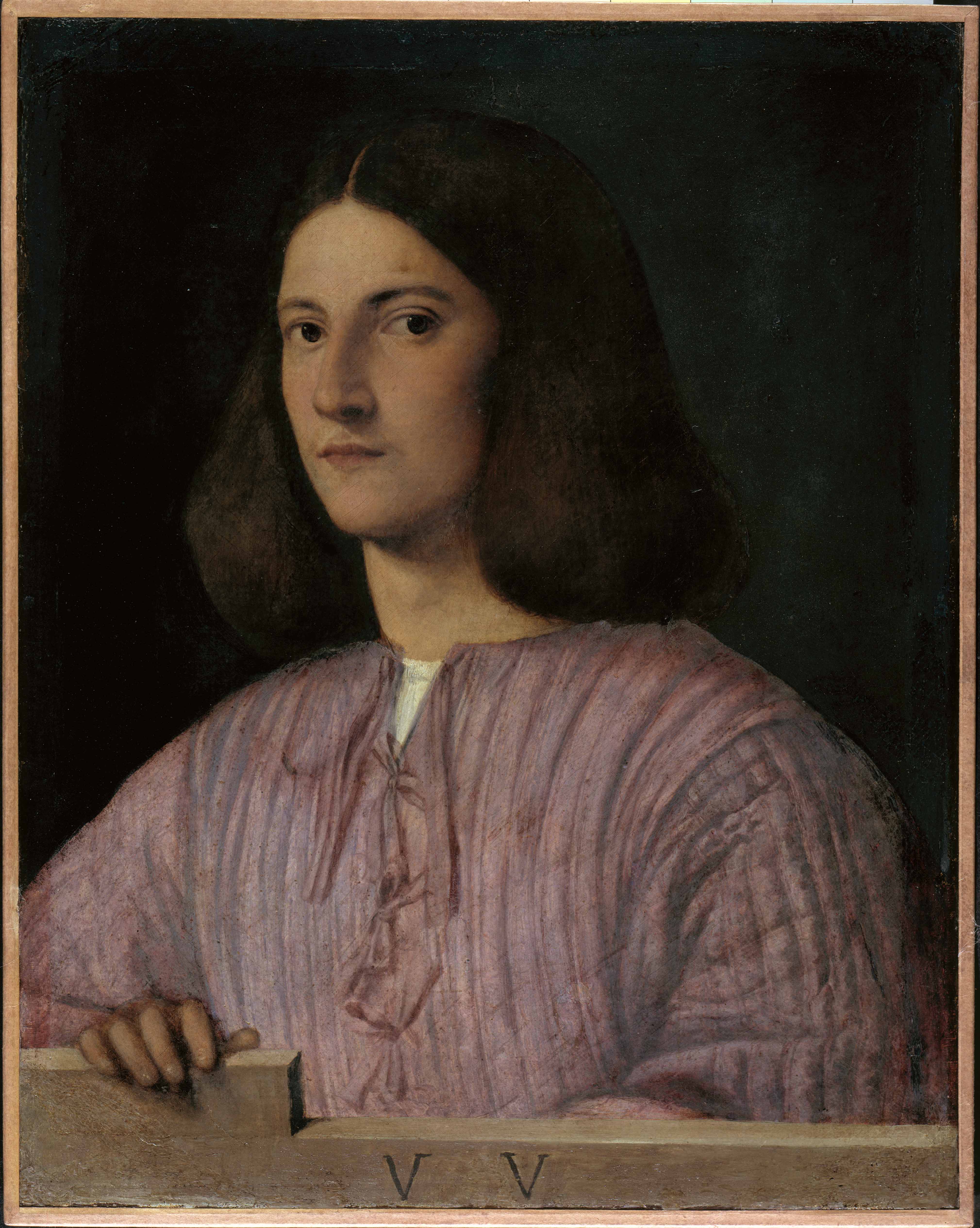
Portrait of a Young Man (‘Giustiniani Portrait’) by Giorgione. Gemaldegalerie, Staatliche Museen zu Berlin, Preubischer Kulturbesitz. Photo © Jorg P. Anders
The exhibition is divided into sections: Portraits; Landscape; Devotional works; Allegorical portraits. The room on landscapes includes a lot of bad paintings by contemporaries, and some so-so drawings by Domenico Campagnola and Titian. Look at the musician’s face and his post-Michelangelo weightlifter’s legs in this Arcadian idyll, attributed to Titian.
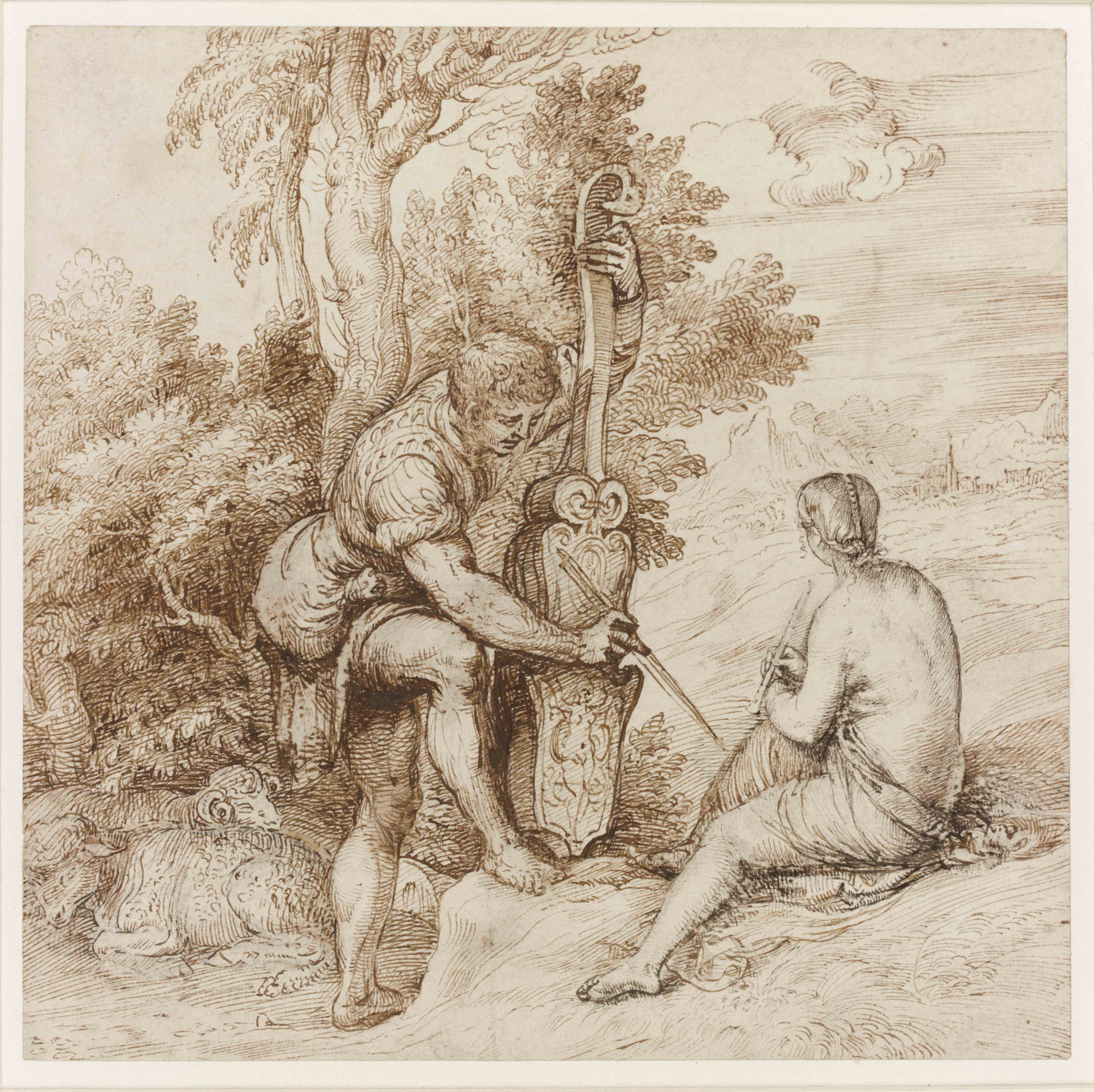
Two Arcadian Musicians in a Landscape by Titian © The Trustees of the British Museum
Maybe Giorgione’s most famous painting is The Tempest, a puzzling and haunting work, the hazily realistic depiction of an unexplained and strangely symbolic scene, pregnant with meaning. Who is the woman suckling the baby? Who is the man watching (or guarding) them? What city lies (half ruined?) in the background? Why is it set during a storm?
This work isn’t in the exhibition. The nearest thing is the large and nearly as strange work, The Sunset.
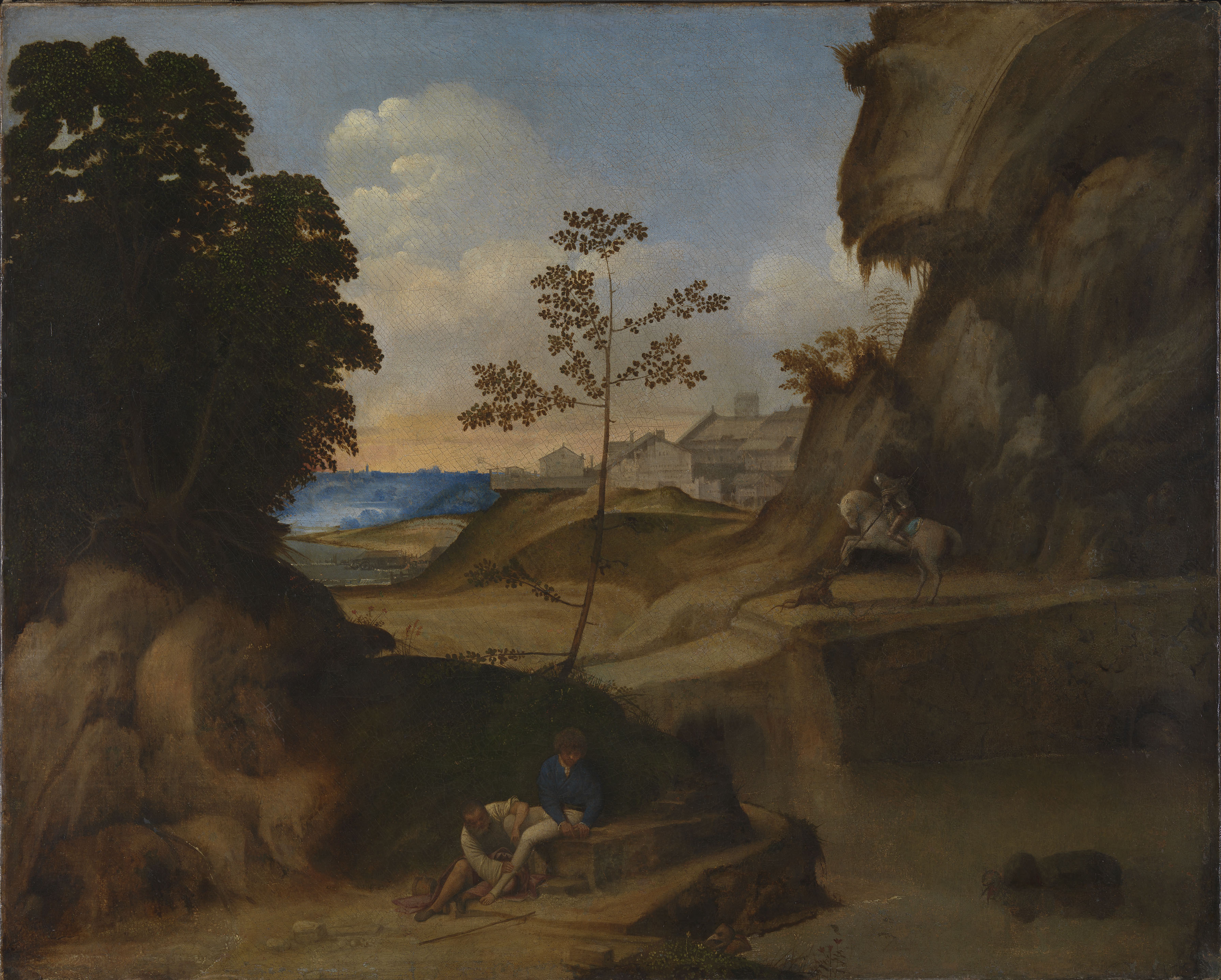
Il Tramonto (The Sunset) by Giorgione Photo © The National Gallery, London
Only in the flesh can you appreciate its strange details: a tiny big-beaked bird in the centre right at the bottom, a strange beast emerging from a cave in the bottom right, another weird creature lying on the surface of the pond at the bottom right. The commentary complicates matters by saying the painting was only discovered in the 1930s in a badly degraded condition and was sent off to Rome to be restored. When it reappeared much improved it did so with the completely new figures of St George on horseback lancing the dragon in the centre right! Why? Did the restorer think it needed improving? Did the dealer who went on to sell it think it would sell better if it had a bit of narrative excitement?
And to the amateur eye, although the subject matter is obscure, the overall visual feel of this painting is very different from the Tempest, in at least two striking ways: in The Tempest the focus is very much on the human figures, especially the suckling woman looking at us; here the human figures are an afterthought in what is basically a strange landscape; and the Tempest is green, very green, green grass, green trees, even the river is green; this whole painting is a muddy brown.
This is just one of the most striking examples of the problems of attribution and authenticity which afflict Giorgione’s works.
Devotional works
The biggest room focuses on devotional and religious works by Giorgione and his peers. All of these struck me as ugly and clumsy. At one end is the big work, Jacopo Pesaro being presented by Pope Alexander VI to Saint Peter which is attributed to Titian.
Close up, I didn’t like it at all: the clumsiness of the composition eg the dais St Peter is sitting on is wonky, the way it cuts into the floor tiles is not convincing. Worse still is the way the floor ends and the sea just begins, as if about to pour over the floor at any moment: something is badly wrong with the perspective.
Then there’s the subject matter: this painting glorifies the Pope presenting to St Peter, one Jacopo Pesaro, bishop of Paphos who led the Venetian navy to victory over the Ottoman Turks at the battle of Santa Maura on 28 June 1502. I think it’s a hilariously unsuitable subject for an oil painting: a portrait of the victorious admiral would be one thing: the Pope blessing the victorious admiral would work; but the badly drawn Pope presenting the victorious admiral to St Peter, depicted as sitting on a wonky dais decorated with scenes from Greek mythology, seems tackily ill conceived.
The paintings in this room glorify a Roman Catholic Papacy which was already a byword for rapacity and corruption. Only ten years or so after this painting was made, Martin Luther would rebel against the systematic theological and financial corruption of the Italian church, leading to the wholesale rejection of its organisation, theology and practice by the north of Europe – the Reformation; an upheaval which would then lead to the shambolic attempts to reform the Catholic church known as the Counter-Reformation.
Thus the religious paintings of Giorgione and his peers celebrate the Catholic church at the most corrupt period of its long history. Maybe we could overlook this fact if the paintings were of a ravishing and transcendent perfection. But they aren’t. Here’s Bellini (1430 to 1516) at his best – Virgin and Child with Saint Peter, Saint Mark and a Donor. Not a very appealing painting, I think; the faces of the Madonna and baby Jesus are, in my opinion, actively unpleasant to look at, like looking at photos of deformed people. The commentary points out that the donor’s hand isn’t quite touching the baby Jesus’s feet, but is everso slightly overlapping them, as if this is clever, or as if it it redeems the unattractiveness of the painting. I know it was traditional in the Middle Ages, the Renaissance and beyond for rich people to pay for themselves to be included in paintings of the Madonna, of the Crucifixion and other key moments in Jesus life (less so the Sermon on the Mount or when Jesus attacked the moneylenders in the Temple) but to the liberal mind it always looks phenomenally crude, arrogant and blasphemous.
It is included in the exhibition to demonstrate Bellini’s clarity and crispness of image, the sharp outlines of the figures against the bright blue background, the detailing of the stone plinth behind the Madonna, a clarity which Giorgione and Titian were replacing with their more shady, smoky visions.
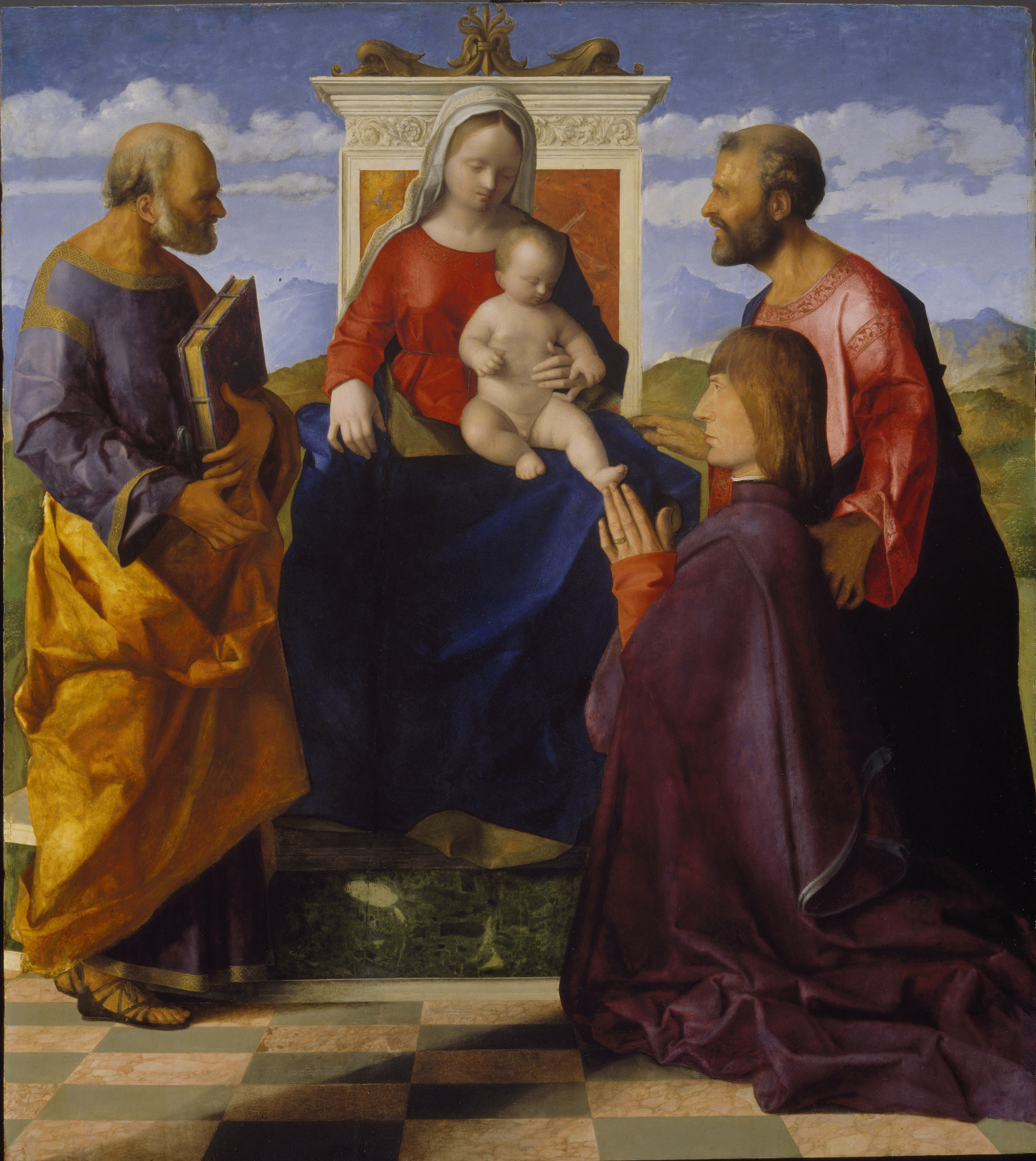
Virgin and Child with Saint Peter, Saint Mark and a Donor by Giovanni Bellini. Birmingham Museum and Art Gallery. Photo © Birmingham Museums
The Bellini and Titian are hung alongside 10 or so other religious paintings, but directly contrasted with the big painting at the other end of the room, Christ and the Adulteress, which is also attributed to Titian.
Christ and the Adulteress by Titian. Glasgow Life (Glasgow Museums) Photo © CSG CIC Glasgow Museum Collections
There is something appealing about the frank posture of the man with the red pantaloons but I am not much moved by the fainting adulteress, let alone the head of the old man in the middle or the dead-looking person at the far left. The audio commentary tells us that for a long time this painting wasn’t attributed to Titian, and even an amateur can see why, because it does seem completely different from the crisp sharp outlines of The Presentation of Jacopo Pesaro. (I was gratified to see the mismatch between these two paintings highlighted in the London Review of Books review of the show by Charles Hope, link below.)
It’s yet another contested attribution which undermines your confidence in a lot of the works here. As if that weren’t enough, the commentary then continues with the stunning revelation that we’re not even sure the painting is depicting the scene of Christ and the adulteress; just possibly it’s depicting the Old Testament scene of Daniel judging Susannah. We’re not sure who painted this painting and we’re not even sure what it depicts!
Mystery, intimacy and sensuality
Nonetheless, through the slightly confusing fog of problematic attribution and doubtful naming, I had just about got the general message that Giorgione’s works are notable for their use of shade and shadow to create a special closeness, a sense of ‘mystery, intimacy and sensuality’, when I came to almost the last painting in the show, an unsparing portrait of an old lady (maybe the artist’s mother, maybe not).
Probably, as so often in an exhibition about a specific artist, we are meant to approach the final works with a hushed feeling of sympathy and pathos, as if last works carry a special message from a genius who has plumbed the depths of wisdom to us, his earthly followers (cf the final work in the big National Gallery Goya exhibition which showed the artist and his doctor in a would-be moving scene).
Certainly La Vecchia is an appealingly vivid picture, a poignant depiction of old age – but surely it’s completely at odds with the smoky use of shadow, with the mystery and sensuality which we first saw in the Terris portrait and have been hearing about ever since. The clarity of the wrinkles, the lined flesh, the detailing of the sparse hair, the quality of the even, unshadowed light, these all look like the work of a completely different artist. Another case of mistaken attribution? Time will tell…
Conclusions
I thought hardly any of the paintings on show here were beautiful: none of them took the breath away for their masterful depiction of the human face, or evocation of the sights and smells of landscape, or pleasing composition or ravishing use of colour. Rather, this exhibition is quite a demanding lesson in art history; it sets out to illustrate the birth of a new, more smooth, sensual and mysterious style in the Venice in the early 1500s, but turns out to be as much or more about quite knotty problems of attribution and authentication.
Related links
- In the Age of Giorgione continues at the Royal Academy until 5 June 2016
- Giovanni Bellini on the National Gallery website
- Giorgione on the National Gallery website
- London Review of Books review by Charles Hope

apwwest
/ March 26, 2016I liked the exhibition, but having read this I’ll go again with a more critical eye. The room of Devotional Works worked well for me just because of the use of colour. Do you think it matters that they were painted for a corrupt church ? I admire the paintings of Nolde, unaffected by his sympathies.
Simon
/ March 28, 2016Thanks for your comment. I agree about the use of colour but I thought almost all the devotional paintings had shortcomings of composition or detail which flawed them. It’s not so much that the donor was painted into the Madonna work – I know that’s commonplace – it’s more that the commentary highlighted relatively trivial aspects like the position of his hands while ignoring the obvious fact that the Madonna and baby’s head are painted very badly. As to ideology and art I agree that we can enjoy works regardless of the maker’s beliefs, but I thought the Madonna and Presentation to Peter were just so bad in composition and execution that all that was left was the social attitude or culture underlying them which – as you noticed – I disagree with. Similarly, I loved the Russian portraits at the National Portrait Gallery, but only a few years after these pictures of very rich connoisseurs of the luxurious and exquisite were painted the catastrophic deluge of the Great War and then the Russian Revolution was to sweep their world away. So it is not irrelevant to reflect that all the paintings in it were only possible in a fragile culture based on breath-taking inequality. Thus the Presentation to St Peter can either be seen as a masterpiece of composition and colouring – or as an example of the kind of absurd egotism, a kind of grandiose blasphemy, which Martin Luther was to rail against and which led to 150 years of European civil war.
apwwest
/ March 28, 2016Your blog on the Russian portraits has made me want to visit. I also read a very positive review in the FT. I knew nothing about these artists. With regard to the backstory of the paintings, I think perhaps it does matter more when it’s so overt, as in your St Peter example. My comparison to Nolde doesn’t really work as you would never know his sympathies from his pictures, there is no political message that I can recognise. I am quite a fan of donor portraits in general – I’m fascinated by the arrogance of placing oneself amongst the saints.. and I suspect most of these donors have something pretty murky to atone for.