
I wrote about the big retrospective of Malevich at Tate Modern in August last year. This is rather like the sequel: Malevich II – The Square Goes Global.
Kazimir Malevich (1879 to 1935) was a Russian avant-garde artist, architect, designer and writer. From early naturalistic paintings of peasants, farm scenes etc he evolved quickly towards the legendary exhibition – titled The Last Futurist Exhibition of Paintings 0.10 – in 1915 which exhibited 39 paintings of black squares, rectangles and other geometric shapes on a pale cream background.
Up in the corner of the room, where the Russian icon was traditionally situated, was placed the famous black square painting. Famous because it declared the end of four or five centuries of Western art struggling to create and exploit the idea of depth and perspective in an oil painting. Malevich tore up the entire notion that a painting is a realistic window onto the world. Painting is shapes on a flat plane. Shapes, colours, whatever you want. They can do anything. There is infinite scope. Painting set free. He called his version of the new, geometric art, Suprematism.
(The work below isn’t the black square, but one of Malevich’s other black and white geometric works which featured in the famous show.)
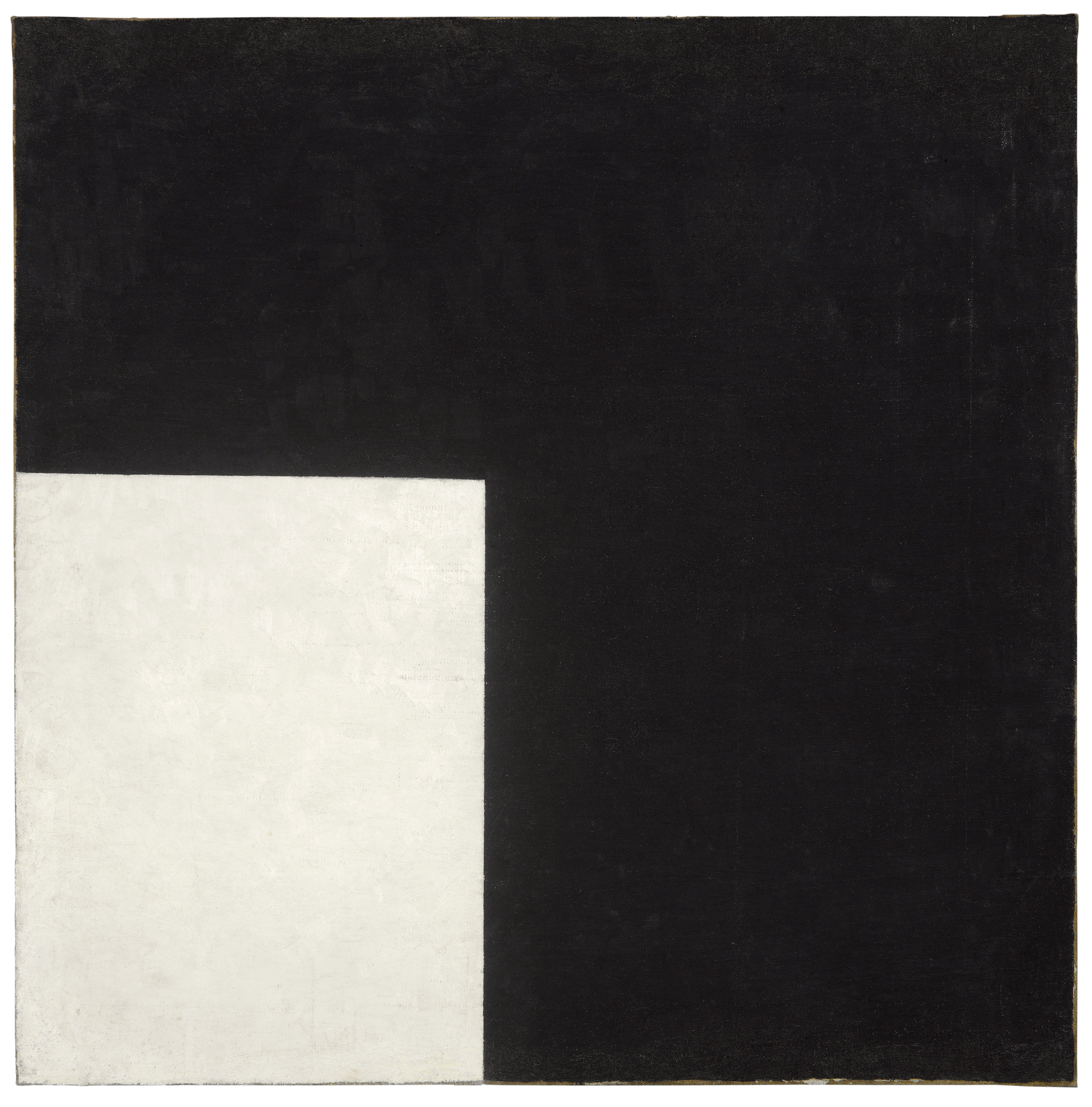
Black and White. Suprematist Composition by Kazimir Malevich (1915) Moderna Museet, Stockholmonation 2004 from Bengt and Jelena Jangfeldt
This exhibition at the lovely, airy Whitechapel Gallery, right next to Aldgate East tube, takes Malevich’s iconic square and tracks its influence through the hundred years since its début, right up to the present day. 1915 to 2015. The catalogue says the show is divided into four themes:
- ‘Utopia’: the black square as founder of new aesthetic and political horizons
- ‘Architectonics’: floating geometries that suggest new social spaces as imagined by Lyubov Popova or Piet Mondrian
- ‘Communication’: the flood of early 20th century manifestos and avant-garde graphics
- The ‘Everyday’: the square around us, for example in textiles by Sophie Taeuber-Arp, in abstract motifs painted on Peruvian lorries, in random white squares photographed in cities around the world etc
In practice the show consists of one or two works each by over a hundred artists. A hundred! From the past hundred years. From all around the world (Europe, America, Brazil, China). That’s a lot of names, a lot of countries, a lot of styles, to get anywhere near grasping.
Therefore, I found it easier to manage – and I found the division of four rooms fell easily into – a simpler, binary schema: the first room shows the Early Modernism of Malevich and his generation of likeminded experimenters, in painting, sculpture, architecture, photography, ballet and music, in Europe (and Russia).
The other three rooms show geometric art from The Rest of the Twentieth Century, from around the world, in all its bewildering variety.
Part 1. Early Modernism
Malevich’s name is one among a flood of other innovators from the period just before the Great War to the mid-1930s. Other pioneers given passing mention or featured by one choice work here include El Lissitsky and the Hungarian-born Laszlo Moholy-Nagy (who took up a post at the Bauhaus when it was formed in 1919) and Wassily Kandinsky – breath-taking experimenters, as well as the often overlooked woman artist Lyubov Popova.

Painterly Architectonic by Lyubov Popova (1916) Scottish National Gallery of Modern Art, Edinburgh
Gustav Klutsis produced a number of designs and images which make clear the avant-garde’s association with revolutionary politics, with the wish to use new ways of seeing, building and designing to create a new society, whose socialist mechanistic schemas have been revived periodically ever since, in posters, and album covers, and other art school-inspired media.

Design for Loudspeaker No.5 by Gustav Klutsis (1922) Greek State Museum of Contemporary Art – Costakis Collection, Thessaloniki © ARS, New York and DACS, London 2014
Surprisingly, maybe, alongside the German and Russian avant-garde was a thriving Dutch one, epitomised in De Stijl, founded in 1917. Its most famous member was indubitably Piet Mondrian, who developed the grid paintings of rectangles of white, yellow, red or blue which are one of Modernism’s most immediately recognisable achievements.

Composition with Yellow, Blue and Red by Piet Mondrian (1937 to 1942) © DACS, London/VAGA, New York 2014. Courtesy Tate Collection
Modernist magazines
The show features quite an array of magazines from Germany, Russia, France, Britain, from the Modernist moment during the Great War until well into the 1930s, including Ezra Pound’s Blast, which I reverenced at school in the 1970s; the Little Review, home to Eliot and Pound; transition, containing another instalment of the long experimental work by James Joyce which became Finnegan’s Wake – these I know from their literary associations – but also on display were a lot of others I’d never heard of from across Europe, featuring the trademark experimental typefaces, designs and layouts of the period.
Modernist photos
As well as paintings and magazines, the exhibition has a fine selection of photos pinned to the wall as well as a large video screen showing a large slideshow selection of early modernist pioneers at work. the visitor can spend a happy 6 or 7 minutes just standing watching the procession of wonderful black and white photos from the 1910s, 20s, and 30s. Most memorable from the slideshow were shots of Piet Mondrian’s apartment-cum-studio and Wassily Kandinsky supervising students at the Bauhaus painting sets for a theatrical production.
But it also made me think all over again (like the Malevich exhibition, like the Bauhaus exhibition did) that whereas a lot of these super-famous paintings turn out to be quite small and quite amateurish, and a lot of the buildings were never built or are crumbling Art Deco ruins that you’d walk past without a second look, and all the magazines seem surprisingly small, plain and dusty – the photographs of the period still pack a tremendous punch and are maybe the best medium for conveying the unbridled energy and experimentalism of the 1920s and 1930s.
I especially liked three by Werner Mantz, who I’d never heard of before. ‘During the 1920s and ’30s Mantz photographed functionalist architecture such as houses, factories, bridge constructions and motorways. The pictures are extremely detailed with .. bold cropping and angles.’ Wonderful.
Photos like this made architecture far more exciting than it could possibly be in real life, and helped to encourage the notion that architecture could create new societies, new politics, new human nature. All of which turned out to be desperately wrong.

Room 1 with its priceless examples of early Modernist geometric art
Part 2. The rest of the century
So far the show is a highly enjoyable refresher course in Modernist Art. You could leave now, pick up a book on the subject in the airy bookshop, and spend the rest of the day reminding yourself of the glories of European Modernist art.
But the real point of the show is the remaining rooms, which contain a bewildering smörgåsbord of styles and approaches and media and artists, old and young, male and female, from Europe, the Middle East, South America, from schools and movements I had never heard of, from the 60 plethoric years since the end of World War Two.
Quite overwhelmed and spoilt for choice, I could only give them each a fair crack of the whip and see what made an impact, what lingered. I’ve placed the following in chronological order:

Metaesquema 464 by Hélio Oiticica (1958) Photo: Todd White Photography © The Artist.
- Swatch of Snap Fasteners by Běla Kolářová (1964) Very funny, very striking, very light and imaginative and visual.
- Third Syntagmatic by Jeffrey Steele (1965): his career has been spent creating geometric images according to complex mathematical formulae. BBC slideshow of Jeffrey Steele paintings
- Poem by Saloua Raouda Choucair (1965): Simple. Brilliant. Yes. A rounded geometry.
- Homage to the Square by Joseph Albers: Albers appears to have done quite a few homages to the square, the one exhibited here being in shades of orange.
- Roberto Burle Marx: never heard of him before, and why not, when he appears to have made wonderfully colourful paintings of abstract but sinuous and organic shapes, very life-full, very Brazilian.
- 10 x 10 by Carl André (1967): slender square slate tiles laid out in a square and which we are allowed to walk on (unless we are wearing stilletos). Minimalism. Flat. Open. There. No secrets.
- Monument for Tatlin (1969) by Dan Flavin: a tribute to the famous ideal Russian avant-garde plan for a vast building-cum-radio transmitter for the new Soviet state, cast in Flavin’s trademark ‘minimalist’ fluorescent tubing. Though a properly trained art student might be able to argue this is subversive of something, from our perspective in 2015 it looks a lot like the real political threat of Tatlin’s building (broadcasting revolutionary propaganda to Europe) has been completely subsumed into the fluorescent department store and office lighting of consumer capitalism.

Seven Rotations 1 to 6 by Dóra Maurer (1979) © Dóra Maurer
This striking image from the eminent Hungarian artist Dóra Maurer consists of seven iterations of her holding a large photo in front of her face, and in each iteration it has become populated by versions of the photo, increasing in number and density. So striking it is used for the poster of the entire exhibition, not Malevich’s square. Another reminder of the power of black and white photography.
- Dmitri Prigov: locked up in an insane asylum in 1986, Prigov was a post-War dissident Russian artist, represented here by images of books in the cold Russian snow, an image I can’t find on Google.
- Shrunk by Angela de la Cruz: experiments with breaking up the wooden frames which hold canvases in a rigid rectangle, preserving and sometimes painting the resultant wreckage of the traditional mechanism of Western art.
- Sceaux Gardens Estate by Keith Coventry (1995) One of less well-known of the 1997 Sensation artists, Coventry has made paintings out of the architect’s designs for big housing estates in London, implicitly satirising the utopian hopes of the early Modernist architects who intended to make Ideals For Living and socialist paradises for the workers with their concrete and steel tower blocks.

Light Signs #1 (Korea) by Gabriel Orozco (1995) © The Artist
- I Don’t Remember by Clay Ketter (2006) There appear to be numerous works with this title, so I’ve linked to a bunch of them on Google Images: I always like painting which is rough-finished, the canvas frayed round the edges like Paul Klee’s, or the readymade painting surfaces of Alfred Wallis, which featured the St Ives exhibition at Dulwich Picture Gallery, or Jasper John’s works with stencils and bits of flag or crate or found material stuck to the surface. Ketter’s are large photographs of the walls of derelict or half-demolished buildings with panels of real world materials stuck on, to create a mix of naturalism and collage. Big. Striking.
- Rings by Sarah Morris (2008) Now I google it I find Morris seems to have done numerous works featuring rings and titled rings. To be honest, I didn’t like the shiny Duluz gloss finish of what could, possibly, be 1960s Pop Art paintings, but there’s no denying their vigour and impact.
- Top Secret 32 by Jenny Holzer (2010) a satire on the numerous ‘redacted’ documents which have featured in public life in recent years, from dodgy Iraq dossiers to the Edward Snowden revelations, as well as vast troves of documents involved in bank scandals
- Leadlight by Adrian Esparza (2012) Esparza appears to have created a mode of art from disassembling woven tapestries and displaying the constituent threads into shapes, squares and so on, displayed across whole walls of galleries.

Spirit Above All 1-93A by Zhao Yao (2012) © Zhao Yao. Courtesy Pace London
- October Colouring-In Book by David Batchelor (2012) The art magazine October has been published since 1976 but never featured an illustration in colour. To take ‘revenge’, British artist David Batchelor dismantled an edition of the magazine and coloured every page with different shapes and outlines and colours, and the 20 or so separate framed pages take up one wall of a room, and are lovely and bright and inventive and unthreatening and funny.

Gallery 8, including works by Keith Coventry, Clay Ketter and Angela de la Cruz. Photo Stephen White
Thoughts and reflections
1. Stepping out into the gritty diesel sunlight of Commercial Road and then strolling along the backstreets to Petticoat Lane and so between the forest of tall, commercial buildings towards Liverpool Street Station, made me notice how modern architecture, in particular, is made up of squares and rectangles, whether of glass or concrete slabs, squares and rectangles everywhere. How so much of the hard-edged geometry of the vision of Modernist architecture has been completely assimilated into the buildings that surround us.
2. BUT – as in Hannah Starkey’s large photos of women alienated in the stark steel and glass atriums and waiting rooms of modern commercial buildings – how that Modernist vision of soaring glass and steel buildings, far from offering the liberation from bourgeois convention and society which the early Modernists envisioned, turned out to be the perfect style for fascism, communism or, in our time, corporate capitalism. In all its guises, a style equated with power and control. Sure it successfully replaced the fussy decorativeness of Victorian and Edwardian architecture – with a new brutalism, a physical setting for the worship of youth, power, money, control.
3. One of the last items was a video by Karthik Pandian, bang up to date as it was completed this very year. Reversal Red Square Video (2015) is a highly finished sequence of photos of cool looking dudes in darkened bars or studio spaces, across which float red rectangles of varying sizes and shapes with a minimal humming soundtrack. Simple idea, but with production values much higher than your usual art video, and calmingly mesmeric in effect.
As I sat watching these red shapes drift across the screen I thought, What about the biggest and most blindingly obvious embedding of the black square in our lives today – the screen? Most of us spend most of our day looking at the screens of desktop computers, laptops, ipads, ipods, or our smart phones (as I am as I write this, as you are as you read this).
I was surprised there didn’t appear to be a single work reflecting on the omnipresence of the rectangular screen in every aspect of modern life, and all the issues of power, control, connectivity, superficiality versus depth, speed versus reflection, and so on which we are all having to engage with whether we want to or not.
Related links
- Adventures of the Black Square @ Whitechapel Art Gallery
- Financial Times review
- Guardian review
- Saturation Point review
- An Instagram page
