A Hard Man is Good to Find! @ the Photographers Gallery

‘The many men, so beautiful…’
(from The Rime of the Ancient Mariner by Samuel Taylor Coleridge)

A Hard Man is Good to Find! charts over 60 years of gay photography in London from the 1930s to the 1990s.

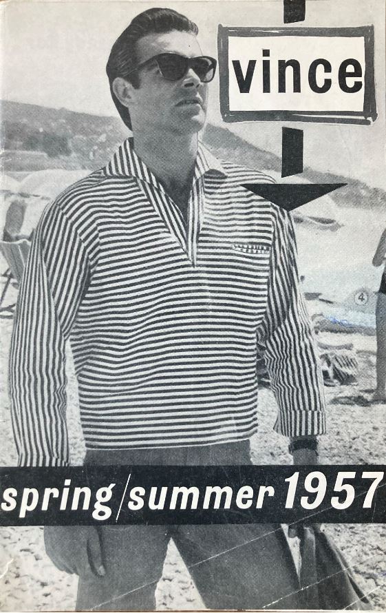
You don’t have to be naked to be butch, you don’t even have to be gay to be an object of gay attraction. Vince Man’s Shop catalogue, Spring/Summer 1957 edition, featuring model Sean Connery, photo by Bill Green. Courtesy the Alistair O’Neill Collection

Homosexuality illegal and legal

For the first half of the period homosexuality was a criminal activity which was severely punished, with the threat of exposure hanging over hundreds of thousands of gay men, and making them susceptible to blackmail and intimidation. The 1967 Sexual Offences Act partially decriminalised gay sexual activity but left in place many forms of legal and social discrimination and so gave rise to the gay liberation movement which campaigned for full social equality.

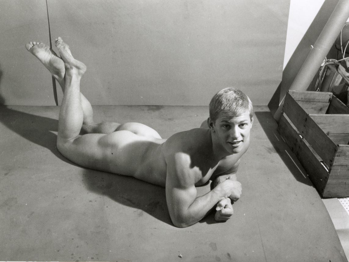
Personal note: In 1978 I joined the Campaign for Homosexual Equality, enjoyed going on marches, signing petitions and spending time at Windsor’s only gay pub. Through all this I discovered that I am not gay but discovered a susceptibility to gorgeous men, hunky men, specially young working class men, the kind that you used to see doing labouring jobs with a wonderfully carefree physical exuberance, the kind of young bloke photographed in the 1960s by Anthony C. Burls (see below).

The Obscene Publication Act remained in force

Anyway, back at the exhibition: it brings together more than 100 photos of men’s bodies, taken with a distinctly gay or queer sensibility. The thing to really understand is that throughout the period, from the 1930s till well into the 1980s, despite the 1967 law about homosexual acts, risqué images of male nudity – taking them, owning them, distributing them, publishing them – remained a criminal offence under the 1857 Obscene Publications Act.

A lovely boy. John Hamill by John S Barrington (about 1966) Courtesy Rupert Smith Collection

A secret history

All this explains why, as the tools of photography became cheaper and more widely available, from the 1920s and 30s onwards a clandestine visual culture emerged. During the 1930s stunning images of athletic male physiques could be associated with the general social trend towards hiking and healthy outdoor activities. During the Second World War photographers were encouraged to take photos of our brave boys looking butch and manly. After the war publishers gained more confidence but were still liable for arrest and confiscation of stock. It was only really in the later 1960s that, along with so many other social movement, gay men felt increasing confidence in depicting their lifestyles and objects of desire openly.

Throughout the period there is a continual interplay and overlap between licit and illicit ways of visualising the male body: the naked athlete trope ultimately derived from statues of ancient Greek and Roman men. Images of tough soldiers could walk a narrow line between being heterosexual propaganda and gay adoration. Young men sunbathing could be following European models of health and fitness. Models and precedents from heterosexual art and culture were continually being subtly reworked, the borderline between legal art and illegal ‘obscenity’ shimmered and wavered within individual images, different definitions of desire fight in single photographs.

Anyway, the repression gay photos were liable to be subject to at any moment explains why a good deal of this visual culture was underground or hidden. Some gay publications were subscription only, others were available as a sideline in otherwise ‘respectable’ book and art shops. In the 60s and 70s more magazines and specialist shops came out of the closet.

The male nude as fine art. David Dulak by Angus McBean (1946) Courtesy Rupert Smith Collection

London locations

The exhibition takes an interesting approach which is to divide the photos, and the gay magazines and bookshops which distributed them, by area of London. Thus it’s divided into sections which deal with Highgate, between Chelsea and Wellington Barracks, in Soho, Brixton, Marylebone, Portobello, the Serpentine and Euston.

Highgate

Apparently Hampstead Heath is London’s most renowned cruising spot for gay men. Young artist Keith Vaughan bought a Leica camera and set up a dark room in his bedroom. Aged just 21 he then made a n album of photos of gorgeous young men at Highgate Men’s Pond in the summer of 1933.

Highgate Men’s Pond Album by Keith Vaughan (1933) Courtesy Aberystwyth University School of Art Museum and Galleries

John S. Barrington trained as an artist at St Martin’s School of Art. In 1938 he persuaded two men he’d met on the Charing Cross Road, dancer David Dulak and his friend Vik, to accompany him to Highgate Men’s Pond so he could photograph them nude – and thus began a long career as a ‘physique photographer’. Dulak was later photographed by Angus McBean, see two photographs above.

John Mckay made studies of ballet dancers and performers.

Between Chelsea and Wellington Barracks

I.e. Pimlico, an area of boarding houses and rented rooms, an enclave of queer life. Angus McBean opened his photographic studio on Belgrave Road in 1935.

Montague Glover had served in the First World War where he was awarded a medal. He went on to practice as an architect with photography on the side. His military career gave him easy access to the barracks where he recruited like-minded Guards to return to his studio or rented rooms and pose in less than full uniform. Squaddies available for gay sex were known as ‘a bit of scarlet’.

In the 1950s Basil Clavering ran a cinema on the Charing Cross Road but he also built a photographic studio in the basement of his house on Denbigh Street, Pimlico. Here they recruited military men to pose in genuine uniforms and also act out various scenarios, some kinky, some humorous. He and his partner John Charles Pankhurst, invented the ‘storyette’, a series of stills, as from a movie, which told a story, often saucy, sometimes featuring corporal punishment.

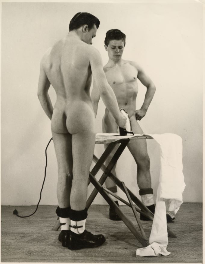
Just doing the housework. Storyette EX FJSS print, 1950s by Basil Clavering (aka Royale). Courtesy Rupert Smith Collection

The Serpentine

In the 1950s British bodybuilding magazines catered for two audiences, straight bodybuilders and a gay readership. As well as the obvious photos and articles, in their back pages these magazines offered discreet mail order services for ‘original physique studies’. This section features the work of mail order publisher William Domenique (trading as Lon of New York) and gay erotic artist Bill Ward.

Paul Hawker came from Bristol, moved to London, and took photos of young men preening and parading at the Serpentine Open Air swimming pool, another well-known gay haunt. He is represented by some of the photos he took of his friend, body builder Spencer Churchill. Apparently Churchill was one of the first to adopt the American fashion for denim workware jeans as regular casual clothing.

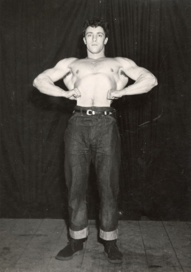
Spencer Churchill, 1951 by Paul Hawker. Courtesy Rupert Smith Collection

Marylebone

‘The City of Quebec’ pub in Marylebone is supposed to be London’s oldest gay pub. It opened in 1946 and was popular with gay RAF men. Bill Green learned photography and wrestling in the RAF and in 1946 set up Vince Studio at 46 Manchester Street, soon establishing a name for ‘physique photography’. He advised beginners to use a little oil to help highlight the contours of male musculature.

In 1954 Green opened a men’s fashion boutique in Foubert’s Place, Soho. In 1956 his assistant, John Stephen, opened another fashion store. According to the exhibition’s curator, Alistair O’Neill, Professor of Fashion History and Theory at Central Saint Martins, these sparked ‘the peacock revolution’ in men’s fashion. They helped turn Carnaby Street into the centre of modern fashion.

Artist Patrick Prockter also had a studio on Manchester Street. He took photos as preparatory studies for paintings, especially of his boyfriend Gervase Griffiths. He cultivated an artistic circle which included painter David Hockney, fashion designer Ossie Clark, and physique model Peter Hinwood. The veteran photographer Cecil Beaton was attracted to this young group of openly queer men. The exhibition includes sets of colour photos of Griffiths on a beach, and two by Beaton which are among my favourites, not because they’re nude, camp or gay – simply because they’re beautiful.

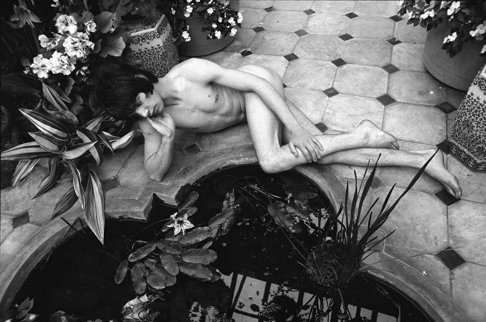
Photo of Gervase Griffiths, titled ‘Narcissus of 1967’ by Cecil Beaton

Earl’s Court

This was the location of BDM publications, set up by Alexander McKenna and partners, which published a range of styles, from the lifestyle magazine ‘Jeffrey’ to more explicit titles such as ‘Hung Heavy’, ‘Taste of Beefcake’ and ‘Leather Studs’.

Notting Hill

Became known after the war for its combination of bachelor housing and growing immigrant community. In the early 1980s ceramics artist Emmanuel Cooper picked up a set of negatives at Portobello Market. It turned out to be a set of studies of nude or partially clothed young men with an obvious queer vibe taken in the late 1950s and early 1960s in North Kensington. Cooper titled it ‘The Portobello Boys’ and arranged for its publication. They are surprisingly homely, unguarded, intimate studies of everyday life.

One of the Portobello Boys, hopefully only fiddling with his zip. The Portobello Boys, early 1960s. Courtesy The Bishopsgate Institute Special Collections and Archives

Euston Road

Martin Spenceley photographed young men in Euston in the 1980s, scouting for Teds, punks and skinheads, persuading them to pose by cheekily lying that he worked for Vogue America. David Gwinnutt started taking photos of the post-punk gay scene as an art student. Patrick Prockter introduced him to his generation of artists.

Thomas Mervyn Horder (Baron Horder) was the chairman of Duckworths, the literary publisher in in the 1950s and 60s. He also had a sideline as a physique photographer under the pseudonym Larry Knight, publishing in specialist magazines with titles like ‘Grecian Guild Pictorial’ and ‘Der Kreis’.

History of the posing pouch

In line with the unwritten law that absolutely all exhibitions these days must either be about America or feature Americans, there’s a little annex off to the side of the main gallery which gives an amusing history of the posing pouch. In this version of the story this skimpy little piece of fabric, barely enough to cover a man’s meat and two veg with the thinnest of fabrics going round the waist, was invented in America.

It developed from the aim of American gay physique photographers to show as much of the male body as legally possible. In 1945 Bob Mizer started the Athletic Model Guild, a model agency for bodybuilders for the film industry. In 1951 he launched a quarterly magazine, Physique Pictorial. For his photoshoots Mizer developed the skimpiest possible garment which dwindled down to the posing pouch. The exhibition explains that the earliest versions were sewn for him by his mother who, nonetheless, strongly disapproved of his sexuality.

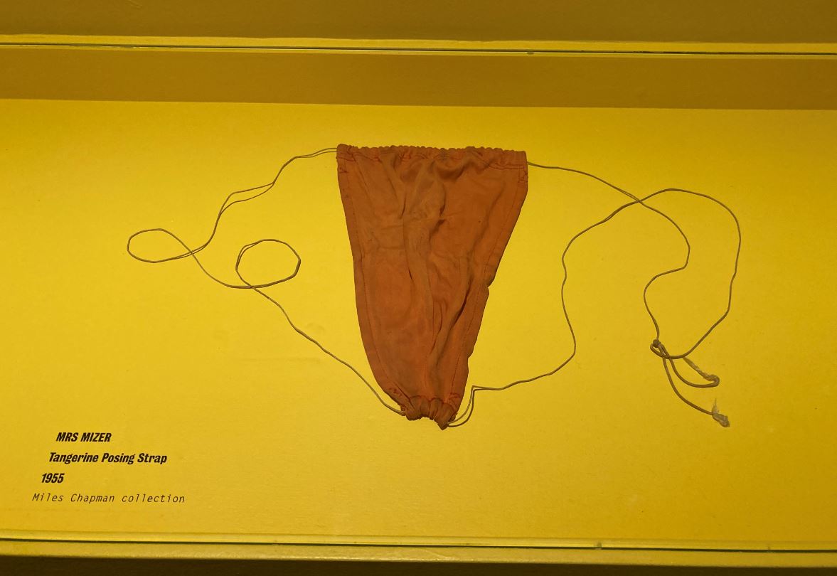
Original 1955 posing pouch as sewn by Bob Mizener’s mum (or mom)

We are told that the shape and tan colour of the pouch was often lightly drawn on photos over the willy of nude models in order to avoid prosecution if the parcel they were distributed in was stopped and searched by the authorities; but that the happy recipient could then easily, in the safety of their own home, rub the little patch off and glory in the sight of total male nudity!

Slightly spoiling the effect, there is a small mention of the photographic evidence that this kind of super-minimalist covering was, in fact, being worn by sunbathing men in London in the early 1930s. Still. American has to be shoehorned in somehow.

Mixed media

It’s not just photos. Within each part of London the curators identify gay photographers who lived and worked in that area, but also includes catalogues, print ordering sheets, personal albums, magazines and publications to show how the photographs were circulated, exchanged and shared. In the 1970s publishers of gay photos send out catalogue sheets like this one to customers, who then ordered full-sized body shorts and prints of the guys they fancied.

Which one would you send off for? 1970s catalogue sheet by John S Barrington. Courtesy Rupert Smith Collection

White Brixton

Anthony C. Burls was an interesting character. In the 1960s he ran a coffee shop at the World’s End in Chelsea, got odd jobs working at funfairs, and attended a gym in Brixton. In all these settings he asked working class men if he could photograph them and the result is a series of full length, mostly fully clothed studies which I think I liked most out of the exhibition. He named the series ‘The Londoners: Official reports’, including not just the photos but the man’s job description and a pen profile. His first business address was Studio 200 on Railton Road, also home to the South London Gay Community Centre.

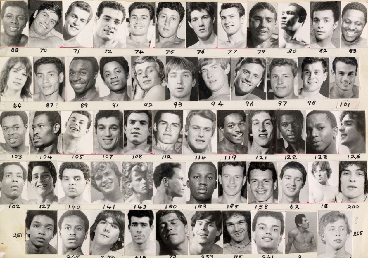
Back to John S. Barrington. In the later 70s he set up the 252 Gallery on Brixton Hill, which included photographs but also drawings and sculptures. He sent out catalogues listing his many gay models and categorising them by race as well as arranging them by head and masked torso. They’re included here as an interesting example of the taxonomy of desire.

Black Brixton

Rotimi Fani-Kayode lived in Brixton from 1983 to 1989. His work explores the paradoxes of the Black queer experience. He’s represented by a work called the Golden Phallus.

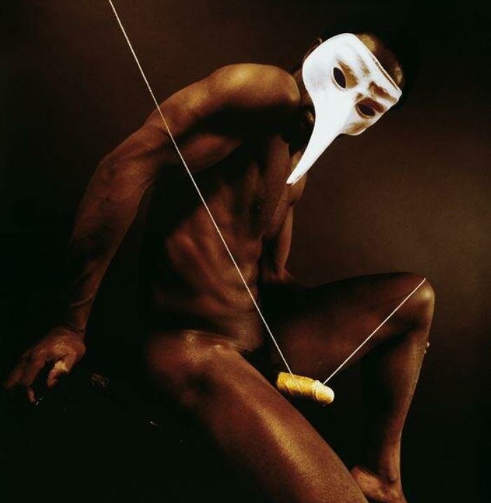
The Golden Phallus by Rotimi Fani-Kayode ( 1989) © Rotimi Fani-Kayode / Autograph ABP

Guy Burch was director of the Brixton Art Gallery from 1985 to 1988. Artist, writer and curator, he’s represented by photo study drawings and collages.

Frank B came to prominence for his performances which involved blood letting, performed in the late 1980s in gay fetish clubs and is represented by photographic invitation cards to a private screening of a 6-minute art movie.

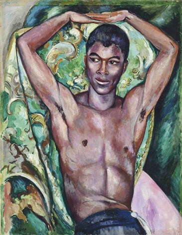
Ajamu X is an artist, curator, archivist and activist whose work explores ‘the nuances of intersectional experience as a Black British queer man’. He is represented by contact sheets which show him playfully wearing a white cotton bra and panties.

Thoughts

To be quite honest this exhibition wasn’t quite as sexsationally fabulous as I was expecting it to be. A lot of the images are quite small, many are only on contact sheets of 20 or 30 tiny, tiny images which I had to lean right up to in order to see properly. Take the contact sheet of 40 or so images of Black artist Ajanu X who is, unexpectedly, wearing a white bra and panties in various states of disarray. Funny and sexy but tiny, each image only an inch square or less.

I enjoyed the staggering physiques of some of the Greek athlete-style photos from the 1930s and 40s. I liked the couple of photos by Cecil Beaton of Gervase Griffiths lazing by a fountain or posing among cow parsley in some field, because they were so redolent of a kind of Pink Floyd 1960s.

I liked Anthony C. Burls’ set of photos of the rough, dirty, tough-looking young men you get working at  funfairs and such, swaggering among the dodgems in tight jeans, unbuttoned shirts and rocker brylcreemed hair.

There were several sequences of young men, obviously soldiers, in full uniform and then various stages of undress, hanging out together. There was a whole set of young blokes around the house, sitting, reading, smoking, half dressed or with their cocks hanging out their trousers, the Portobello Boys. Mildly interesting, but I went to an all-boys school and shared houses with blokes at university; admittedly we didn’t spend social time with our willies hanging out of our trousers – at least not when sober.

Overall, I think the interest is not so much in the images, per se, as in their variety, and also in the extraordinary density and complexity of the clandestine networks of gay photographers, subjects, printers, publishers and distributors which the wall labels describe and explain. That’s interesting social history.

And then, when you lay the complex mesh of legal and cultural and visual parameters over the images you get, as it were, another layer of complexity beyond the images themselves; you get to see them as varying visual strategies and approaches and sublimations of very powerful male urges of desire and sexuality.

Two learnings

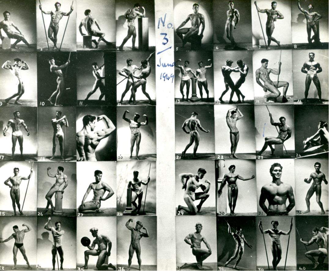
I don’t think I’d ever noticed the phrase ‘physique photography’ before, but here it kept recurring and being explained as a style of photography which goes beyond the passive idea of the ‘nude’ to celebrate a kind of effortful, muscular, athletic masculinity. Think body-building.

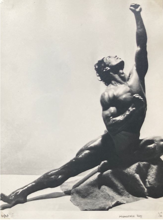
Stunning example of ‘physique photography’. Indian bodybuilder Monotosh Roy shot by Bill Green (Vince) in the 1950s

Related to it was a comment in a wall label right at the end making a simple but devastating point that, as LGBTQ+ culture gained confidence in the 1990s, photographers, publishers and consumers felt more confident in producing and consuming gay pornography.

The point being that the delicate balancing act, the hints and subtleties of the preceding decades, the self-imposed restraint which made ‘physique photographs’ walk such an exciting fine line between factual depiction of male anatomy and objects of lust from the 1930s to the 80s – all this tended to be swept away as gay art gained confidence in the 1990s. Now artists could depict explicit photos of erect penises and men doing all kinds of things with them to other men. Obviously delicacy and subtlety continue in a thousand flavours, but the era of constrained delicacy and obligatory subtlety came to an end with the arrival of explicit gay pornography.

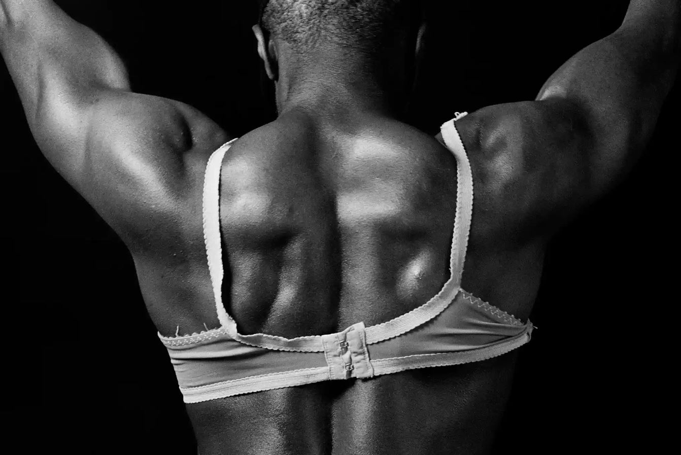
Bodybuilder in Bra by Ajamu X (1990)

A note on nomenclature

The introduction explains that ‘queer’ is now the accepted academic term for non-normative sexualities but the curators acknowledge that it used to be a term of abuse (as it was when I was growing up) and so older visitors might be offended by its use. At the same time, they acknowledge that the more factual, legalistic term ‘homosexual’, which older visitors might be comfortable with, is ‘problematic’ for the younger generation.

The need for this note prompts the reflects the ongoing (and, I imagine, eternal) struggle human beings have to make sense of the disruptions, embarrassments and irrational instincts of sex which we find ourselves saddled with.

Willies

Having been to hundreds and hundreds of exhibitions curated by feminist curators and read thousands of wall labels written by feminist curators, I have had the notions of toxic masculinity, of the poisonous affect of the male gaze, of the evils of male sexual attention, of male sexual harassment, and the unspeakable terror of seeing a penis from which some women, apparently, never recover, drummed into me again and again and again. Even the shamefully biased mega-exhibition about so-called ‘Masculinities’ at the Barbican didn’t include one single image of a penis for fear of offending sensitive visitors.

It was, therefore, rather disorientating, gave me a sense of vertigo, to walk into a pair of rooms absolutely flooded with this object of terror and fear – showing a proliferation of penises, peckers and plonkers, willies and winkles and weenies, cocks and tools and todgers.

Like all the other ‘banned’ part of the human anatomy, like women’s breasts and, more so, vulvas, if images of penises are strictly rationed and you only occasionally see one, it can all too easily be overloaded with lust and desire. Whereas if you freely see scores, then hundreds of them, in all their variety and humanity and mundaneness, quite quickly you get used to the sight, and then a bit bored.

From a visual point of view penises obviously come in two states, flaccid and bored or aroused and erect. Presumably this is, or was, in the period under study, the threshold between images which could be justified as art or at least decorative (flaccid) and pornography (erect).

Anyway, it’s worth mentioning that I don’t think there’s a single erect penis in the show. Maybe this is because the exhibition itself had to tread a fine line and the inclusion of erect penises would have crossed that line (? I don’t know the law on the matter). Maybe because pretty much all the photographers on show here used the flaccid/erect distinction as a simple rule of thumb (were there legal precedents under the Obscene Publications Act regarding the exact angle of arousal of the member? Again, not being a lawyer, I don’t know.)

For whatever reason, no erections at all are on display here and probably over half the images didn’t show penises at all (e.g. all the athletic, posing pouch-style photos; or a lot of the fully dressed soldiers or fairground workers; or just the many portraits which focused on faces) and all the ones that did include a penis showed it only as a slack, slumping, limp willy.

These kinds of images captured what I imagine is most men’s attitude to their penises; on rare and special occasions it may be roused and primed for action, but most of the time it’s just another part of the body which you barely think about unless you have to pee, or you inadvertently squash it while riding a bike or some such activity. Ouch!

In this respect a lot of the photos seemed (to me) to be surprisingly stripped of the urgency of sexual desire (lust) and instead conveyed quite a homely, almost domestic vibe of what it is to be a young man, to be naked and to lark around with other men. I’ve been to scores and scores of exhibitions making polemical points about women’s bodies, depicting them from every angle and analysing in immense detail the way women’s bodies are depicted in all sorts of media and the never-ending iniquity of the male gaze, as a matter of burning social and political importance.

This exhibition is a rare opportunity to look at scantily clad bodies without feeling a soupcon of guilt; and and space where the visitor can just accept and enjoy the sight of the male body, in all its variety, for what it is.

Catalogue sheet 3, 1949, by Bill Green (Vince). Stephen Cartwright collection

Last thought

This exhibition triggers nostalgia for an age before the internet: talk of photography as an activity restricted to a talented few, of hard copy magazines and subscriptions, of mail order catalogues, of the extraordinary lengths you had to go to to get sight of a photo of a naked man – all this consigns the entire exhibition to a past which is rapidly retreating.

For now we have 1) smartphones and 2) the internet. 1) More or less everyone has access not just to cameras, but to extremely high-quality cameras and amazingly sophisticated image manipulation softwares. Everyone’s a photographer these days. 2) And any image of anything, alive or dead or ever conceived, can now be accessed at the touch of a screen, including as many naked bodies, male, female or whatever, as your hard drive can cope with.

This entire exhibition bespeaks not just a world of repression and restraint, but of rarity and difficulty. Now nothing is rare and everything is available. Soon the subtle aesthetics of constraint and tact described in this exhibition will seem as dated and historical as the pictorial conventions of Georgian England.


Related links

Related reviews

More Photographers’ Gallery reviews

Neo-Romantic Book Illustration in Britain 1943 to 1955 @ the Heath Robinson Museum

Although the Heath Robinson Museum is a relatively small gallery, this is a major exhibition. It is the first time a substantial collection of work by the Neo-Romantic book illustrators of the 1940s has been gathered together in one place. With nearly 50 prints, drawings, paintings and lithographs, and over 20 original book jackets from the period, this is a unique opportunity to sample a special and distinctive moment in English publishing and art history.

Neo-Romanticism in England

To paraphrase Wikipedia:

In British art history, the term ‘neo-romanticism’ is applied to a loosely affiliated school of landscape painting that emerged around 1930 and continued until the early 1950s. It was first labeled in March 1942 by the critic Raymond Mortimer in the New Statesman. These painters looked back to 19th-century artists such as William Blake and Samuel Palmer, but were also influenced by French cubist and post-cubist artists. The movement was part a response to the threat of invasion during World War II. Artists associated with the initiation of the movement include Paul Nash, John Piper, Henry Moore, Ivon Hitchens and especially Graham Sutherland. A younger generation followed in the same vein, including John Minton, Michael Ayrton, John Craxton, Keith Vaughan, Robert Colquhoun and Robert MacBryde.

This new visual style was most obvious to the general public in the form of book and magazine illustrations, particularly during the Second World War. The spirit of romanticism – a focus on nature, emotion and individual expression – was in part a reaction against the gloom of the blackout and rationing (and, possibly, against the very urban and politicised art of the 1930s).

Neo-Romantic artists looked back to the tradition of English landscape painting, drawing inspiration partly from the mystical Kent countryside portrayed by Samuel Palmer, and from the heavily stylised illustrations of William Blake.

But it’s not that simple – they also subtly acknowledged the visual possibilities opened up by more recent European art movements such as cubism and surrealism.

Book illustration for 'Time Was Away' by John Minton (1947)

Book illustration for Time Was Away by John Minton (1947)

Government sponsorship

The war itself played a key role. It cut English artists off from all contact with European art for six long years. And it forced many artists and writers to reconsider what it meant to be English, across all the arts (for example, George Orwell’s long essay on the English character, The Lion and the Unicorn, published in 1941).

This impulse received official support when, in 1940, the British government commissioned artists including John Craxton, Leslie Hurry, David Jones, John Minton, Paul Nash and Ceri Richards, to document lives in towns and villages across the country for a project called ‘Recording Britain.’ It was intended to boost national morale during the Second World War by celebrating the nation’s landscape and architecture.

In other words, a large number of artists in the 1940s became aware, through friendships, their own experiences and official commissions, that they shared certain values and artistic approaches to romantic ideas of English landscape, English culture, English art and English writing.

Neo-Romantic book illustration

Book and magazine publishers weren’t slow to pick up on the new look, seeing an opportunity to commission illustrations from this new wave of exciting illustrators in order to make both classics and new books appear up-to-date. The result is a very distinctive style of book illustration which is immediately recognisable, and powerfully evocative of the period (say 1940 to 1955), but hard to put into words.

The style is definitely figurative, not abstract – but the figures, the landscapes and buildings, have been through the wringer of Modernism and have emerged leaner, tauter, more stylised and simplified.

Depth and perspective don’t have to be depicted with punctilious precision, as in Victorian or Edwardian illustration. Hatching and shading, colour and tinting don’t have to be perfect, but can hint and gesture towards the subject.

Cover design for Vicky Lancaster's novel Short Lease, by Eric Fraser (1950)

Cover design for Vicky Lancaster’s novel Short Lease, by Eric Fraser (1950)

There’s an article about Neo-Romanticism on the Tate website which uses the word ‘sombre’ and I think this opens up one way of thinking about the style. It is often mysterious, sometimes a bit threatening, often psychologically intense. There is a lot of black in many of the illustrations, often a hint of menace, of threat.

Possibly this derived from the six-year-long threat of Nazi invasion, but it was there in the 1930s work of Graham Sutherland, one of the godfathers of the new look – a darkness, a blotty inkiness,and it spills over as a vague and disturbing presence in many of the illustrations here.

Of course, this ability to convey menace and mystery was perfectly suited to many modern books, of both poetry and fiction, or travelogue – somehow conveying the troubled mood of mid-century life. And not only adult books – the ability to conjure a sense of danger is intrinsic to many children’s books, particularly adventure and mystery books.

The exhibition

The exhibition contains work by about twenty artists, to wit:

  • Keith Vaughan (12 b&w prints)
  • John Minton (8 colour, 4 b&w illustrations for Time Was Away, 3 other prints and book covers)
  • Michael Ayrton (3 illustrations to John Nashe’s The Unfortunate Traveller)
  • Eric Fraser (4 big colour illustrations)
  • John Piper (one dramatic ink and watercolour of an Oxfordshire tomb)
  • Edward Bawden (5 original artworks for book covers)
  • Barnett Freedman (4 colour lithographs)
  • Robin Jacques (three fine pen and ink illustrations, two for Don Quixote, in a very different style from most of the other artists)

These are the big names. They each get a substantial wall label detailing their biography, artistic career, describing their style and the books which they illustrated or provided cover art for, and so on.

Also featured, but with less commentary, are:

  • Julian Trevelyan (two Gothic illustrations for a work by poet Kathleen Raine)
  • John Elwyn (2 small drawings)
  • John Bantin (1 book cover)
  • Bryion Winter (1 drawing)
  • Rigby Graham (three or four illustrations)
  • Leonard Rosman (two small pen and ink drawings for the Radio Times)
  • Henry Moore (four studies for illustrations to a book by Edward Sackville-West titled The Rescue, as well as a copy of the book open so we can see some of Moore’s characteristically lacerated mannequins in situ)

Several additional illustrators feature in the three display cases, which present vintage books in order to show the Neo-Romantic style of their cover art. Among them is an early edition of Mani, the travel book by Patrick Leigh Fermor, whose jacket was done by his good friend John Craxton. (Leigh Fermor and Craxton are the subject of a fascinating exhibition currently running at the British Museum.)

Display case of Neo-Romantic book covers

Display case of Neo-Romantic book covers

John Minton (1917 to 1957)

Minton emerges as the strongest presence and the exhibition features more examples of his work than anyone else. An entire wall is devoted to the colour illustrations he did for a travel book, Time Was Away, the result of a tour he made with the writer Alan Ross around Corsica in 1947.

Minton combines a kind of rough but keen descriptive line, which is then touched and dabbed by colour washes which:

a) are in a very distinctive and limited palette (mustard yellow, dull dark green, sky blue, orange-brown)
b) only partially colour the picture

The way his colour washes deliberately don’t fill the lines creates a sense of spontaneity and openness. ‘Scrappy’ isn’t the right word, but a sense of roughness. This deliberate lack of finish contrasts oddly with the actual lines of the drawing which are quite… stiff.

Both features are clear in the picture below. The drawing is highly figurative yet stylised, not quite ‘real’. The colour is a) deliberately unnaturalistic and b) only applied in patches or washes. And look at the pose of the boy – it isn’t fluent and graceful, it is somehow stiff and hieratic, almost clunky.

Oh, and Minton likes to draw people with Roman noses, I noticed a number of classic silhouettes in his pictures. The result of all these effects is an odd sort of classicism, hard to describe but instantly recognisable.

Minton was prolific, which may explain why he is the most represented artist in the show, which itself reinforces the sense of his art being one of the most memorable. There’s a copy of the edition of Treasure Island which he illustrated, open to the dramatic, full-colour, double-page illustration on the end papers.

And it was Minton who did the jacket covers for Elizabeth David’s epoch-making cookery books, which brought recipes from the Mediterranean into middle-class households across Britain. These are always cited in social histories as defining cultural products of the age, reminding grimly snowed-in Brits of the delights of sunshine and fresh fruit in far-off, exotic locations, such as Greece. A whole generation learned to cook (or at least fantasise about cooking) Mediterranean food from David – and visualised these luxury landscapes via Minton’s depictions.

Jacket illustration for Elizabeth David's Book of Mediterranean Food by John Minton (1950)

Dust jacket illustration for Elizabeth David’s Book of Mediterranean Food by John Minton (1950)

Keith Vaughan (1912 to 1977)

Next to the Minton is a set of black-and-white illustrations by Keith Vaughan for the children’s novel The Spirit of Jem by P.H. Newby. According to the fascinating wall label, Newby wrote 17 books, as well as being a full-time senior manager at the BBC, eventually rising to become Managing Director of BBC Radio. (He was also the recipient of the first ever Booker Prize, in 1969.)

'I wedged myself into a fork and waited' from The Spirit of Jem, illustration by Keith Vaughan (1947)

‘I wedged myself into a fork and waited’ from The Spirit of Jem, illustration by Keith Vaughan (1947)

The intense design of Vaughan’s drawings, like the one above – the wildness of the trees and the semi-abstract treatment of the leaves – remind me of Graham Sutherland’s intense landscapes, and reach back past him to Samuel Palmer.

You don’t necessarily need to know that Vaughan was gay and lived for some time with Minton, but it does shed light on the closeness of the artistic as well as personal relationships of the period.

Michael Ayrton (1921 to 1975)

Speaking of close friendships, Michael Ayrton shared a studio in Paris with Minton in Paris just before the war. Ayrton went on to illustrate over 35 books as well and worked for leading magazines of the day such as the Listener, the Radio Times and Penguin New Writing.

He’s represented here by some of the illustrations he made for Thomas Nashe’s Elizabethan picaresque adventure, The Unfortunate Traveller and by some book covers, including the cover art he did for a book called The Problems of Lieutenant Knap by the Czech writer Jiri Mucha, which really caught my eye.

In this drawing the moon appearing in a kind of flame of cloud reminds me of Paul Nash or Sutherland and harks back to Samuel Palmer’s rural visions, but whatever visionary element there is in that symbolism is obviously and brutally contrasted with the random piece of military equipment leaning against the doorway and the casual bored posture of the smoking soldier.

Barnett Freedman (1901 to 1958)

The son of poor Jewish immigrants, Freedman developed a really distinctive variation on the Neo-Romantic look, a compositional style which features curled scrolls or decorative borders around his often cartoonish and childlike illustrations. Take an example of both in this fabulous poster promoting cheese which he made for the Milk Marketing Board. Look at the houses, the church spire. Childish innocence.

Real Farmhouse Cheese poster by Barnett Freedman

Real Farmhouse Cheese poster by Barnett Freedman

The scroll and especially the font whose letters contain shading and decoration put me in mind of the posters and promotional material for the Ealing Comedies of this period, and the wall label points out that Freedman did, indeed, help to create the Ealing Studios look and logo.

Freedman also created a host of eye-catching book covers during the period, the most distinctive example being the cover for a complete edition of the nonsense verse of Edward Lear.

Cover of the Complete Nonsense of Edward Lear designed by Barnett Freedman

Cover of The Complete Nonsense of Edward Lear designed by Barnett Freedman

One Freedman piece which stood out for me was a wonderful colour illustration, apparently for a Christmas card. For its precision, its gentleness, its warm vision of the English scene, and for its use of the gentle, understated palette which so many of these pictures used (was it a limitation of the printing technology of the day?) I found myself returning to this particular picture again and again.

Christmas card by Barnett Newman

Christmas card by Barnett Newman

Edward Bawden (1903 to 1989)

I’ll be writing at length about Edward Bawden when the retrospective exhibition devoted to him opens at the Dulwich Picture Gallery in May.

What the five book covers by him here bring out is something of the childishness of some of these covers. None of these illustrators were amateurs – the opposite, many of them made very successful careers as commercial artists. But many of the illustrations and covers deliberately accentuate a kind of hand-drawn, childish or naive style. This is one of the things that give them such a strong sense of nostalgic warmth and comfort – they are sub-consciously infantilising – you want to say ‘aaaah’ at so many of them. Atmosphere of the nursery. And the artlessness of the imagery deliberately connects them with an older tradition of English arts and crafts, foregrounding the hand-made and the hand-drawn.

Take this cover by Bawden for Richard Hughes’s novel A High Wind In Jamaica. Everything about it is deliberately hand made and naive – the very hand-drawn figures of the centaurs, the simplicity of the horizontal mustard-coloured bands representing the fields, but above all the highly decorative border round the main illustration, with its deliberately artless use of details i.e. sheafs of wheat or clumps of grapes woven into the composition.

Edward Bawden's cover art for A High Wind in Jamaica by Richard Hughes

Edward Bawden’s cover art for A High Wind in Jamaica by Richard Hughes

What came next

In the second half of the 1950s, a new look came in. Book covers and magazines began to reflect the influx of new consumer goods into Britain, and the rise of consumer culture. Harsher covers using the language of Abstract Expressionism became popular and, by the end of the 1950s, imagery inspired by the shiny high gloss look of American advertising and movies.

The world became modern, shiny and urban – the exact opposite of Neo-Romantic imagery showing an underpopulated countryside or Mediterranean harbours or childish, hand-drawn figures – a shininess which went on to be celebrated and/or mocked in the plastic brightness of Pop Art.

The Neo-Romantic look was old hat by 1955 and quickly disappeared, surviving as dog-eared copies of beautiful old editions in the kind of provincial library where I first came across them as a boy.

Conclusion

This exhibition chronicles a relatively brief period of highly distinctive book covers and illustrations which, looking back, now seems classic, warm and overdue for a revival.

It has clearly been a labour of love on the part of exhibition curator, Geoffrey Beare, to track down and retrieve many of the prints and paintings, drawings and lithographs from public and private collections around the country, and bring them all together for our enjoyment. And it’s been a very worthwhile effort.

This is a lovely exhibition, which inspires you to explore further, to find out more about Minton, Craxton, Vaughan, Freedman – about this whole generation of wonderful and under-appreciated illustrators.

The promotional video


Related links

Note one: there is currently an excellent exhibition about Craxton and Leigh Fermor which features many examples of Craxton’s art and illustrations from this period, at the British Museum.

Note two: A major retrospective of Edward Bawden opens at the Dulwich Picture Gallery in May this year.

More Heath Robinson Museum reviews

Queer British Art 1861 to 1967 @ Tate Britain

Can you tell whether this painting was done by a man or a woman, lesbian or gay, bisexual or transsexual?

Female Figure Lying on Her Back

Female Figure Lying on Her Back

And does it matter?

If by a man, is it a horrible example of the Male Gaze, encouraging male ‘ownership’ and mastery of the female figure, encouraging lascivious thoughts in the male viewer, reducing women to sexualised objects, exploiting women for semi-pornographic purposes?

If by a woman, is it a joyously unashamed celebration of the female body, the lazy posture and yawning stretch of the subject marvellously capturing a moment of real, unvarnished intimacy?

Does knowledge of the painter’s gender or sexual orientation change your ‘reading’ of this picture, your enjoyment of it, your ‘understanding’ of it? And why?

These are just some of the questions raised by this fascinating and thought-provoking exhibition.

Declaration of interest

I was a member of the Campaign for Homosexual Equality back in the 1970s, going on marches, signing petitions, habituating Windsor’s only gay pub, campaigning for gay rights – the central one being getting the age of gay consent brought down in line with the age for straights. In the years since, I’ve supported gay marriage, gay and women priests, and so on. It’s always been obvious to me that LGBT people should be treated absolutely the same as anyone else, and benefit from exactly the same rights and life opportunities. I am not myself gay but it’s always seemed obvious to me that a) no-one should judge any form of sexual practice among consenting adults b) no-one should be allowed to discriminate in any way against anyone on account of their sexual orientation or sexual practices.

The jargon of desire

In the late 1960s French structuralist literary criticism began to morph into post-structuralist criticism and theory. Reflecting the move from the politicised 1960s into the more narcissistic 1970s, and an ongoing obsession with Freudian psychoanalysis – and also being French and proud of it – a lot of this criticism became more personal, about identity, as constituted in texts and wider society, and a lot more about sex.

The works of literary critics like Roland Barthes (b.1915, The Pleasure of the Text), the historian Michel Foucault (b.1926 A History of Sexuality), the philosopher Jacques Derrida (b.1930), the psychoanalyst Jacques Lacan (b.1901), feminist theorists like Hélène Cixous (b.1937) and Julia Kristeva (b.1941 Desire in language), and the pioneer of Queer Studies, Judith Butler (b.1956, Subjects of desireGender trouble, Undoing gender), plus many others have led to the vast proliferation of the ‘discourse of desire’, to countless books and articles and conferences and degree and postgraduate courses about gender and sexuality, demonstrating how this, that or the other work of art or fiction or film ‘subverts’ or ‘challenges’ or ‘confronts’ gender conventions and ‘transgresses’ gender stereotypes and ‘rewrites’ gender narratives.

With the collapse of communism in the early 1990s, young students wanting to prove how rebellious and subversive they were found themselves bereft of an ideological alternative to consumer capitalism, and so found themselves forced towards the only two games in town, anti-sexism and anti-racism, embodied in Women’s Studies/Gender Studies, and Post-Colonial Studies, respectively.

For at least thirty years humanities departments – literature, art, philosophy – have been teaching courses showing how all Western writing, art, philosophy was riddled with racist/sexist assumptions, and built on evil imperialism and slavery. Many graduates of these courses, imbued with this way of thinking, moved on into the media and press, into film and theatre and the art world, where in the pages of the Guardian or the Huffington Post or the Independent, and in galleries and theatres across the West, they can be seen every day writing scandalised articles, producing documentaries, putting on plays angry about the persistence of sexism and racism and homophobia.

But there are more women than immigrants in this country and, as a result, more Feminist Studies, Women’s Studies, Gender Studies courses than Post-Colonial courses – and so books and articles and films and documentaries about the multiple unfairnesses and injustices perpetrated on women throughout the ages by the ever-present Patriarchy, continue to thrive and proliferate.

On one level this exhibition represents a triumph of this kind of discourse, a discourse a) obsessed by sex, conceived of in a rather dry and boring theoretical way b) driven and animated by a fathomless sense of grievance and injustice. Exhibitions about any aspect of sexuality represent a perfect marriage of victim politics with the high-flown ‘discourse of desire’.

Why use the word ‘queer’?

To quote the curators:

Queer has a mixed history – from the 19th century onwards it has been used both as a term of abuse and as a term by LGBT people to refer to themselves. Our inspiration for using it came from Derek Jarman who said that it used to frighten him but now ‘for me to use the word queer is a liberation’. More recently, of course, it has become reclaimed as a fluid term for people of different sexualities and gender identities. Historians of sexuality have also argued that it is preferable to other terms for sexualities in the past as these often don’t map onto modern sexual identities. In addition to carrying out audience research, we took advice from Stonewall and other LGBT charities and held focus groups with LGBT people. The advice from all of these sources was overwhelmingly that we should use it. While we tried other titles, no other option captured the full diversity of sexualities and gender identities that are represented in the show.

What is a queer work of art?

Does it have to portray a homosexual or lesbian act i.e. be pornographic (as a small number of the works here do, some rude sketches by Keith Vaughan and the super well-known big phalluses of Aubrey Beardsley’s illustrations to Lysistrata)?

Is queer art any work by an overtly gay or lesbian or bi or trans artist? But how many Victorian and Edwardian and Georgian painters thought of themselves in those terms? Don’t the curators run the risk of – in fact aren’t they running headlong into – defining, naming and limiting people from the past a) by our own modern 2017 categories of sexuality (Yes); and b) of defining people entirely by their ‘sexuality’, whatever that is. I thought that was precisely what CHE and Gay Rights and their successors were trying to escape from: from being tied down, limited, constrained and defined solely in terms of your sexual preferences, as if that were the only important part of your life, as if society is correct to pigeonhole all of us on the basis of this one attribute.

And what if the queer artist’s subject matter is not only not particularly erotic, what if it’s not even of human body? For example, is this queer art?

Hannah Gluckstein, known as Gluck (1895 to 1978) was a lesbian painter. So is her painting of flowers a work of queer art?

Should queer art also include works which just look ‘sort of’ homoerotic or a bit lesbian, either a) in the eyes of contemporary viewers (in which case it might have caused a ‘scandal’ and ‘shocked Victorian society’), or b) in the eyes of modern curators trained to spot the slightest sign of gender stereotypes being ‘subverted’ and gender norms being ‘transgressed’ and narratives of heterosexuality being ‘questioned’ and ‘interrogated’?

Either way, categorising art in terms of the audience’s response to it, is dicey. What constitutes ‘art’ has changed out of all recognition the past 150 years. People’s responses to ‘art’ have become similarly complex and varied.

Tricky questions. In the event, this exhibition includes works chosen by all these criteria, and more.

The drawbacks of telling history through art

This decade Tate Britain has run a series of exhibitions based not around artists or movements, but on broad themes and topics. Thus they’ve staged exhibitions about: folk art, the aesthetic of ruins, the British Empire, Victorian sculpture, the destruction of art works, the depiction of war. Many of them had an amusingly random element, delicate watercolours of Tintern Abbey placed next to vast photos of Nazi war bunkers (Ruin Lust), or some maps of the Empire next to some flags of the Empire next to random artifacts from the Empire (Artist and Empire).

Although they put a brave face on it, the cumulative impression of visiting all these shows raises the suspicion that the curators are under orders to find pretexts to bring out the more obscure and neglected works languishing in Tate’s vast archives, and display them in exhibitions with eye-catching and ‘controversial’ themes.

While the aim of rotating their (doubtless huge) collection for us to view is laudable, the pretexts the curators come up with are sometimes ambitiously wide-ranging and grand-sounding, while the collection of artifacts actually on display often turns out to be rather patchy and random. The history of the British Empire is an enormous subject: the Tate exhibition about it amounted to a jumble sale of odds and sods from across the huge geographic reach and vast periods of time involved: the Empire used maps, here’s some maps; the Empire had flags, here’s half a dozen flags; the Empire allowed botanists and naturalists to travel the world and see exotic species so here’s a painting of tiger; here’s some native spears; and so on.

Although Tate calls in plentiful loans from other collections to create the exhibitions, the core of these shows tends to be focused on dusting off and displaying many of it hidden assets, themselves bought at various times for various reasons, hence the feeling they give of a patchwork quilt made from odds and ends. Sometimes it feels as if they’re trying do a vast jigsaw without most of the pieces.

Written histories can conjure up anything with words, creating continuities, linking themes and ideas at will: in words, anything is possible. Histories told through objects, however, immediately limit which areas can be covered, and which stories can be told, by virtue of what is available, what has survived. And histories told through works of ‘art’ are even more limited by the random nature of any particular art collection, as well as biases intrinsic in what kind of subjects get turned into ‘art’ and what don’t (the experiences of most ‘ordinary’ people, for example, or the entire world of work, especially housework).

All these limitations apply to this exhibition, with the additional challenge that sex, sexuality, gender, desire – call it what you will – is, by and large, quite a private part of most people’s lives. Artists and performers, by the nature of their work and output, are a kind of exception to the rule that most people keep their sex lives pretty private. And forms of sexuality which were banned by law and subject to harsh punishments are all the more likely to be hidden and suppressed, to not leave traces in the written – and especially the painted – record.

In other words, even more than Tate’s other wide-ranging historical exhibitions, this one feels haunted by gaps and absences.

The dates

In 1861 the death penalty for sodomy was abolished; in 1967 sex between men was (partially) decriminalised. These provide handy end dates.

The exhibition is in eight rooms

1. Coded desires

This covers the later Victorian period. This was dominated by the Aesthetic Movement and the group of painters known as the Olympians, who specialised in sensuous paintings of lightly-clad women lounging around in a dreamy ancient Roman baths or terraces. Just thinking about either of these interlinked movements brings to mind the extraordinary sensuality present in so much art of this period, along with a worship of the classical world, in pictures and in words, which stretched towards a feel for the same-sex relationships present in, especially, the writings of the Greeks, where a sexual relationship between an older man and a younger man or boy was socially acceptable. This may or may not be present in the works here, But the bigger story about most late Victorian art is the remarkable extent to which ‘desire’, physical sensuousness, in all shapes and forms, was more openly depicted than ever before in this period.

The exhibition has some striking works by the king of the Olympians, Frederick Leighton, on the basis that he sometimes depicted sensual male nudes – although many of his works are characterised by sensuality for men or women.

Leighton was rumoured to be gay, but then again it’s thought he had an affair with one of his female models. Tricky, therefore, to shoehorn him into modern categories of straight, gay, bi etc. One of the liberating things about studying history, past lives, is they did things differently, thought, wrote, spoke, painted, perceived, differently to us. Don’t fit into our modern categories.

The bulk of works in the room are by Simeon Solomon, who was unfortunate enough to be arrested in a public lavatory off Oxford Street, charged with attempting to commit sodomy and fined £100, then a year later arrested in Paris and sentenced to three months in prison. This makes him a bona fide gay hero. To the viewer, however, his works seem mostly sub-standard examples of the Olympian style done much more smoothly by the likes of Alma-Tadema or Albert Moore.

Sappho and Erinna in a Garden at Mytilene (1864) by Simeon Solomon (Watercolour) Tate

Sappho and Erinna in a Garden at Mytilene (1864) by Simeon Solomon (Watercolour) Tate

William Blake Richmond (1842 to 1921) is a painter you don’t hear about much. He also painted supremely sensual paintings on sunny classical themes, e.g. Hera in the House of Hephaistos or just sumptuous late-Victorian portraits, for example, Mrs Luke Ionides. Nothing particularly ‘transgressive’ about these, in the way our curators want to see ‘gender norms’ being ‘transgressed’, but they’ve included one big painting The Bowlers.

Apparently, this scandalised the Victorians (didn’t everything ‘scandalise’ the Victorians?) for its inclusion of naked women (you can see some breasts) and naked men in the same scene. And some of the men have their arms round each other. Shock horror. Richmond was married and wasn’t arrested in any toilets, so not a transgressive hero per se. After looking at it for a while I noticed the way a line drawn along the top of the heads of the figures on the right forms a diagonal going down towards the centre of the composition, while the heads of the women on the left line up as a mirror diagonal heading down towards the centre: at the very centre is a black vase against a thick central pillar, to the left of which is a woman in a see-through toga and on the right the zigzagging black trunk of a wisteria tree. Which means or symbolises? Who knows.

My favourite things in this room were the three paintings by the marvellous Henry Scott Tuke (1858 to 1929). Tuke was one of a group of artists who settled in Newlyn in Cornwall and painted en plein air. Almost all are of young men, nude or half-undressed, by the sparkling sea in the sunshine. In the permanent gallery upstairs they display August Blue (1893), a wonderful composition in terms of the draughtsmanship of the figures, also the figurative accuracy of the rowboat and the ships on the horizon, and also of course the wonderfully clear blues and greens – you can smell the sea, you can feel the sun on your skin. There are three of his paintings here alongside a cabinet showing some of the many photographs he took of gorgeous-looking young men.

The Critics (1927) by Henry Scott Tuke. Warwick District Council (Leamington Spa, UK)

The Critics (1927) by Henry Scott Tuke. Warwick District Council (Leamington Spa, UK)

2. Public indecency

This ‘looks at ways in which sexuality and gender identity did – and did not – go public from the 1880s to the 1920s.’

Thus we have the trial of Oscar Wilde (who has not heard of the trial of Oscar Wilde? How many films have been made of it?) the prosecution of Radclyffe Hall for her lesbian novel The Well of Loneliness (1928), and we get some of Aubrey Beardsley’s ‘scandalous’ illustrations for the Greek play Lysistrata thrown in.

This is the kind of thing you should learn in 6th form and certainly early in an English or humanities degree course, so that you can tut and fret and criticise horrible dead white men for repressing ‘transgressive’ sexualities. But it’s worth remembering that this period also saw the persecution of male heterosexual artists as well – James Joyce’s Ulysses went on trial in 1921 because of its description of a man masturbating, the police raided an exhibition of paintings by D.H. Lawrence and (admittedly not in England) the Austrian artist Egon Schiele was arrested and 100 of his art works were confiscated – one of them was burned by the judge in court in front of the artist – for their sexual explicitness.

It was an era when many artists of all persuasions were pushing at the boundaries of what society thought was acceptable depiction of sexuality, and many artists, gay, straight or what-have-you – fell foul of the authorities.

Alongside the Wilde and Beardsley are testaments to the work of the sexologists Richard von Krafft-Ebbing and Havelock Ellis, who collaborated with the gay writer John Addington Symonds on his book Sexual Inversion (1896). These ‘scientific’ works can either be seen (optimistically) as the start of a ‘modern’ liberal attitude to a wide range of sexual practices or (pessimistically) as ‘science’ and the State beginning to move into areas of private life, with a view to defining and categorising all possible practices (or perversions as they’d have been called) and the human ‘types’ which engage in them.

You don’t have to be Michel Foucault to suspect that the ‘liberating’ effects of writing about varieties of sexuality can be accompanied by new types of definition, surveillance and control.

3. Theatrical types

The theatre and performing arts have long offered a refuge for exhibitionists, people who like to dress up, fantasise, play act and generally behave in ways which would not be acceptable in everyday life. So the theatre has long attracted gay men and this room features photos of famous performers who were gay, photographers who were gay, with a special case devoted to cross-dressing entertainers.

There’s a lot of photos by Angus McBean (1904 to 1990) the fabulous black-and-white photographer, who did lots of semi-surreal fashion shots before the war (his ‘surrealised portraits’), was arrested in 1942 for homosexual acts and served two years in gaol, before emerging to resume his career post-war in a rather more traditional vision. But everything he did is touched by class and style. The show includes a typically weird portrait of the now-forgotten actor Robert Helpmann as Hamlet, though I know him for his appearances in Powell and Pressburger’s two extraordinary films, The Red Shoes and The Tales of Hoffmann.

The British have a problem with sex, full stop, whether straight or gay, and have long had a reputation for gross hypocrisy, with the ‘respectable’ classes enforcing repressive laws at home then vacationing in Paris where they could sleep with countless courtesans (as squeaky clean Charles Dickens was reputed to do and the heir to the throne, Prince Albert certainly did) or swanning off to North Africa, to Algeria or Morocco where there was an endless supply of boys for sex.

This nervousness, shame and embarrassment may be part of what lies behind the long tradition of men dressing up as women for vaudeville entertainment, a tradition which goes back a long way, but is certainly present in the Victorian music hall, through the pre-war years and was still going strong in my boyhood in figures like Danny La Rue, Dick Emery (‘Oh you are awful… but I like you!’), Kenny Everett (‘and then all my clothes fell off!’), Dame Edna Everage, Lily Savage. And that’s without mentioning the vast tradition of English pantomime with its Widow Twanky and Ugly Sisters, traditionally played by men and a huge opportunity for all kinds of blue, risqué and ‘transgender’ comedy.

A display case here presents a dozen or so photos and posters illustrating some of the cross-dressing stars of yore, most of which I’d never heard of simply because they were before the days of TV. Here, as elsewhere in the show (and as often in the Tate ‘history’ exhibitions) you feel this is an absolutely vast subject which has been only briefly sketched and hinted at, and possibly not one which is necessarily best approached through the medium of ‘art’ at all.

Douglas Byng (1934) by Paul Tanqueray. Vintage bromide print © Estate of Paul Tanqueray

Douglas Byng (1934) by Paul Tanqueray. Vintage bromide print © Estate of Paul Tanqueray

4. Bloomsbury and beyond

I am prejudiced against Bloomsbury because of their snobbery and their smug, self-congratulatory elitism. They all slept with each other and described each other, in private letters and public reviews, as geniuses. What’s lasted has tended to be the writings of figures on the periphery – the economics of John Maynard Keynes, the novels of E.M. Forster, the novels of Virginia Woolf, though she was a core member. The art work of figures like Dora Carrington, Vanessa Bell (recently featured in a handsome exhibition at the Dulwich Picture House), Duncan Grant, Roger Fry, hasn’t really stood the test of time.

The catalogue says this room is meant to represent:

a generation of artists and sitters exploring, confronting and coming to terms with themselves and their desires.

Which makes it sound much more exciting and dynamic than most of their sleepy decorative pictures. Ethel Sands’s Tea with Sickert symbolises everything pretty, decorative and forgettable which I tend not to like about Bloomsbury art. Perhaps I just can’t slow myself down to this atmosphere of coma-like inaction. The commentary on the other hand, because Sands was in a queer relationship with fellow painter Nan Hudson, claims it is a ‘quietly subversive’ work, with ‘queer undercurrents’. Can you spot the queer undercurrents?

The commentary makes the case that, although not overtly sexual in the least, these tranquil interiors are a) painted by queer artists and b) if you look closely, very closely, you can see small hints and traces of ‘queer lives’ which ‘history has long neglected’. Maybe…

That said, I did find myself, on repeated viewings and to my surprise, warming to the selection of works by Duncan Grant on show here. These ranged from small, explicitly gay pornographic sketches to a vast mural, commissioned to decorate the dining room of the new Borough Polytechnic in 1911.

It’s a huge work – and the more I looked at it the more I admired the mix of abstract and figurative elements to achieve an overall decorative effect, and came to understand that it follows the action of a single diver from standing poised on the shore, at right, through diving in, and swimming to the boat which he clambers into at top left.

Bathing (1911) by Duncan Grant © Tate

Bathing (1911) by Duncan Grant © Tate

Similarly, I was impressed by the sheer size of the massive Excursion of Nausicaa by Dame Ethel Walker. It’s 18 metres wide by almost 4 high and makes a dramatic impact. It’s just as well a bench is provided for you to sit and take it all in. Although, when you look closer, it seems an uncomfortable mix of Gauguin-style primitivism with Art Deco style neo-classical figures, it is still at first sight, an enormous and confident composition.

There is a vibrant portrait by Glyn Warren Philpot (1884–1937) of his servant, Henry Thomas (1935). Note: his servant. In fact there were half a dozen Philpots scattered through the show, though this is the most vivid.

Similarly, the South African artist Edward Wolfe is represented by a portrait of Pat Nelson, his model and thought to be his gay lover.

The Bloomsburyites’ pursuit of ‘unconventional’ sexual arrangements (i.e. being bisexual, living with several lovers at once, and so on) through the Great War and into the twenties, led in to the cultural dominance of gay writers, poets and artists during the 1930s, given extra bite by the availability of the ‘decadent’ Weimar Republic in post-war Germany, whither trekked a generation of young gay men like Auden, Christopher Isherwood and so on.

5. Defying convention

This room shows how early 20th century British artists ‘challenged gender norms’ i.e. by being lesbians, living with other women, having ‘open marriages’ and so on. For example, Laura Knight, the curators claim, in this picture is laying ‘claim to traditional masculine sources of artistic authority by depicting [herself] in the act of painting nude female models’. It’s another very big painting and very red.

Self portrait and Nude (1913) by Laura Knight. National Portrait Gallery

Self portrait and Nude (1913) by Laura Knight. National Portrait Gallery

There is a factual background to the image in that Knight was prevented from attending the life classes at Nottingham Art College because she was a woman; only when she moved to Newlyn was she able to hire life models, and so this composition is a sort of act of defiance. That changes our attitude to the image. Still, in and of itself, would you know that it lays claims to masculine sources of artistic authority, if it hadn’t been carefully explained. Maybe…

Anyway, on pretexts solid or flimsy, a number of big, colourful and attractive works are on show in this room, especially of the phenomenally posh women who populated early 20th century feminism.

  • Lady with a Red Hat (1918) by William Strang – the lady being the lesbian and gardening writer Vita Sackville-West, the Honourable Mrs Harold Nicholson, Companion of Honour, daughter of the third Baron Sackville. She is holding her recently published book of poems – Poems of West and East – showing the influence of Tennyson’s world-weariness, A.E. Housman’s lad poems, and the childlike orientalism of John Masefield and other Georgians. They’re sweet and melancholy.
  • Dame Edith Sitwell (1916) by Alberto Guevara – daughter of Sir George Sitwell, 4th Baronet, of Renishaw Hall, and Lady Ida Emily Augusta (née Denison), a daughter of the Earl of Londesborough and a granddaughter of Henry Somerset, 7th Duke of Beaufort.
  • Romance (1920) by Cecile Walton – Walton doesn’t appear to have been gay, having had two marriages (to men) but this self-portrait is ‘challenging’ and ‘subverting’ ‘gender norms’ surrounding birth. Having been present at the birth of my daughter, I can testify that it certainly challenges the reality of childbirth which is a lot less calm and dignified than this static scenario.

6. Arcadia and Soho

‘London was a magnet for queer artists’.

The most striking works here are by the neglected surrealist artist Edward Burra (1905 to 1976). According to a review of his biography, his sensibility was gay, and his closest friend was a male ballet dancer, ‘but they were never lovers’. Am I alone in finding this modern inquisitiveness about the exact nature of other people’s sexuality, and the precise borders of their sexual activity, prurient and controlling? Who cares? His art is weird and extra, a really stunning, outlandish vision.

  • Soldiers at Rye (1941) Burra incorporates masks from Venetian carnival, fabric from Spanish baroque, with a kind of sado-military hugeness to create this monstrous surreal panorama.
  • Izzy Orts (1937) Burra was introduced to the portside bars of Charleston, with their mix of jazz musicians, pimps and dealers, and sailors in tight-fitting uniforms. Perfect!

The opposite wall is devoted to a trio of gay artists – John Craxton, John Minton and Keith Vaughan – who were loosely described as ‘neo-romantics’ in the 1940s. They were certainly gay. There’s a display case of overtly gay and pornographic pencil sketches by Vaughan, as well as a handful of photos he took of gorgeous young men.

Drawing of two men kissing (1958–73) by Keith Vaughan © DACS, The Estate of Keith Vaughan

Drawing of two men kissing (1958–73) by Keith Vaughan © DACS, The Estate of Keith Vaughan

At an exhibition years ago I saw a whole stand of the b&w photos Vaughan took of beautiful young men lounging around classic 1930s lidos, at Hampstead Pools or the Serpentine, and have been haunted by them ever since.

Next to the figurative sketches are his much more abstract paintings:

In these Vaughan seems to me to have developed a new and exciting way of depicting the (mostly male) figure. Alongside Vaughan are some lighter, more ‘naive’ works by John Craxton.

Head of a Greek Sailor (1940) by John Craxton © Estate of John Craxton. All rights reserved, DACS 2016. Photo credit: London Borough of Camden

Head of a Greek Sailor (1940) by John Craxton © Estate of John Craxton. All rights reserved, DACS 2016. Photo credit: London Borough of Camden

Craxton, Minton and Vaughan are three interesting figures, maybe worthy of a joint exhibition some time.

7. Public/private lives

In the decade leading up to the 1967 Sexual Offences Act gay men lived a strange twilight life. In many places gay relationships among the famous, especially the arty, were permitted – the eminent actor John Gielgud was arrested for indecency in a public toilet in 1953, was fined, released and was roundly applauded the next time he took to the stage. Maybe the most famous example was the close ‘friendship’ between England’s leading composer Benjamin Britten and the singer Peter Pears. The fuzz couldn’t go arresting the nation’s premier composer. But they did continue to arrest and imprison a steady stream of less well-known gay men, creating the trickle of protest which grew louder and more widespread for the law to be repealed or abolished.

This room goes heavy on the lurid relationship of gay playwright Joe Orton and his jealous lover Kenneth Halliwell, because it ended in a garish tragedy. But in the whole room the most powerful image for me was a still from the 1961 movie Victim, a genuinely taboo-breaking work starring Dirk Bogarde as an impeccably upper-middle class lawyer married to the fragrant Sylvia Sims, but who is photographed in a compromising situation with good-looking young Peter McEnery, and blackmailed. I saw this film as a boy and it left a lasting impression of the needless pain and suffering caused by bigots and criminals given license by a stupidly interfering state. It influenced me to join the Campaign for Homosexual Equality.

8. Francis Bacon and David Hockney

I think we all know about these bad boys. This final room gives us the opportunity to marvel again at the bleak power of Bacon’s nihilistic paintings and the scratchy undergraduate humour of Hockney’s early Pop style.

Life Painting for a Diploma (1962) by David Hockney © Yageo Foundation

Life Painting for a Diploma (1962) by David Hockney © Yageo Foundation

Scholarship or prurient gossip?

As I progressed through the exhibition, reading every wall label carefully, a theme began to emerge (above and beyond the obvious ones about ‘gender fluidity’ and ‘same-sex desire’):

  • ‘De Morgan’s repeated images of Hales have encouraged speculation about the nature of their relationship…’
  • ‘There is some evidence that Henry Bishop was attracted to men…’
  • ‘Beardsley does not seem to have had relationships with men…’
  • ‘There has been much speculation about Tuke’s relationships with his Cornish models although nothing has been substantiated…’
  • ‘Little is known about Meteyard’s sexuality, other than the fact that he was married…’
  • ‘Leighton’s sexuality has been the subject of much speculation from his own times to the present, but he guarded his privacy closely…’
  • ‘Glen Byam Shaw had almost certainly been the lover of the poet Siegfried Sassoon…’
  • ‘The exact nature of Thomas and Philpot’s relationship is unknown…’
  • Duncan Grant’s ‘close friend and possible lover Paul Roche…’
  • ‘There has been a lot of speculation about the nature of Walker’s relationship with the painter Clara Christian with whom she lived and worked in the 1880s although little evidence survives…’
  • ‘The poet Edith Sitwell does not seem to have had sexual relationships…’

What does it matter to an appreciation of their work what an artist did or did not do with their penis or vagina, or to someone else’s penis or vagina? Why do scholars obsess about the sexual act being a vital threshold in a relationship? On one level, this breathless fascination with the precise nature of people’s relationships, and whether they ever did the deed together, is just a highbrow form of gutter gossip, an educated equivalent to who’s shagging who in The Only Way Is Essex or Celebrity Big Brother, little different to the tittle-tattle of the tabloid press.

On a more disturbing level, this intrusion of scholarly enquiry into the heart of people’s private lives is because modern art critics and curators need to know precisely who had sex with who and when, so that they can categorise and define artists, writers, poets, photographers, performers and so on according to their tidy definitions. So that artists can be neatly arranged into canons and genres and books and essays and exhibitions about straight or gay or queer or whatever art.

  • ‘[Dirk Bogarde] never publicly affirmed a sexual identity and his personal life has to be inferred from his long relationship with his manager Tony Forwood (1915 to 1988) with whom he shared his home.’

Has to be? Who says it has to be? Why this compulsion? Why must everyone’s sexuality be nailed down and defined?

To be a bit fierce, you could say that modern art scholars and curators talk the talk about gender fluidity and multiple narratives and transgressing this, that or the other – but in practice, it is they more than any other group in British society who are obsessed with tracking down their subjects’ every sexual act and desire in order to categorise, limit, define and control both artists and their works.

I found the obsessive probing into these dead people’s private lives unpleasant and disturbing.

Conclusion

The repetition over and again, in the introductions to each room and on labels for individual works, of the phrases ‘same-sex desire’ and ‘gender norms’, all of which are ‘challenged’ and ‘confronted’ and ‘transgressed’, of artists ‘fearlessly stripping away’ convention and ‘pushing the boundaries’ – all this gets pretty monotonous after a while.

Luckily, the art itself is much more varied, stimulating and unexpected than the ideological monomania of the commentary would suggest. If the downside of these historically-themed Tate exhibitions is that they take on vast subjects which they then struggle to adequately cover, the upside is that they turn up all sorts of unexpected treasures by relatively unknown figures, and make you want to see more.

For example, I’d love to see an exhibition devoted to Craxton, Minton and Vaughan, exploring that strange sensibility of the 1940s, surely the most overlooked of 20th century decades. An exhibition devoted to the late Victorian ‘Olympian’ artists would not only be a feast of sensuality but could explore in more detail the complex areas of sexuality and sensuality which were so present in Victorian art, yet so repressed in Victorian life.

Edward Burra, can we have a show dedicated to him, please, his last retrospective was in 1973. How about a show devoted to Tuke and the Newlyn School, what a wonderful treat that would be for the dark English winter. The more I looked at the Angus McBean photos, the more wonderful they seemed – how about an exhibition of him – or a broader exhibition about Theatre and Photography? Or, as simple an idea as ‘Neglected Women Artists 1860 to 1960’, showcasing the work of less well-known women artists (Laura Knight, Cecile Walton, Ethel Walker) from this era, gay, straight or whatever.

In conclusion, I was irritated by the curator-speak but I thought it was a wonderful show, went back to see it twice, bought the catalogue, and am still being pleasantly beguiled by many of the wonderful paintings, large and small, brash or quiet. What an extraordinary, and huge, contribution gay/lesbian/queer artists have made to every aspect of British culture.


Related links

More Tate Britain reviews