RE/SISTERS: A Lens on Gender and Ecology @ the Barbican, version 2

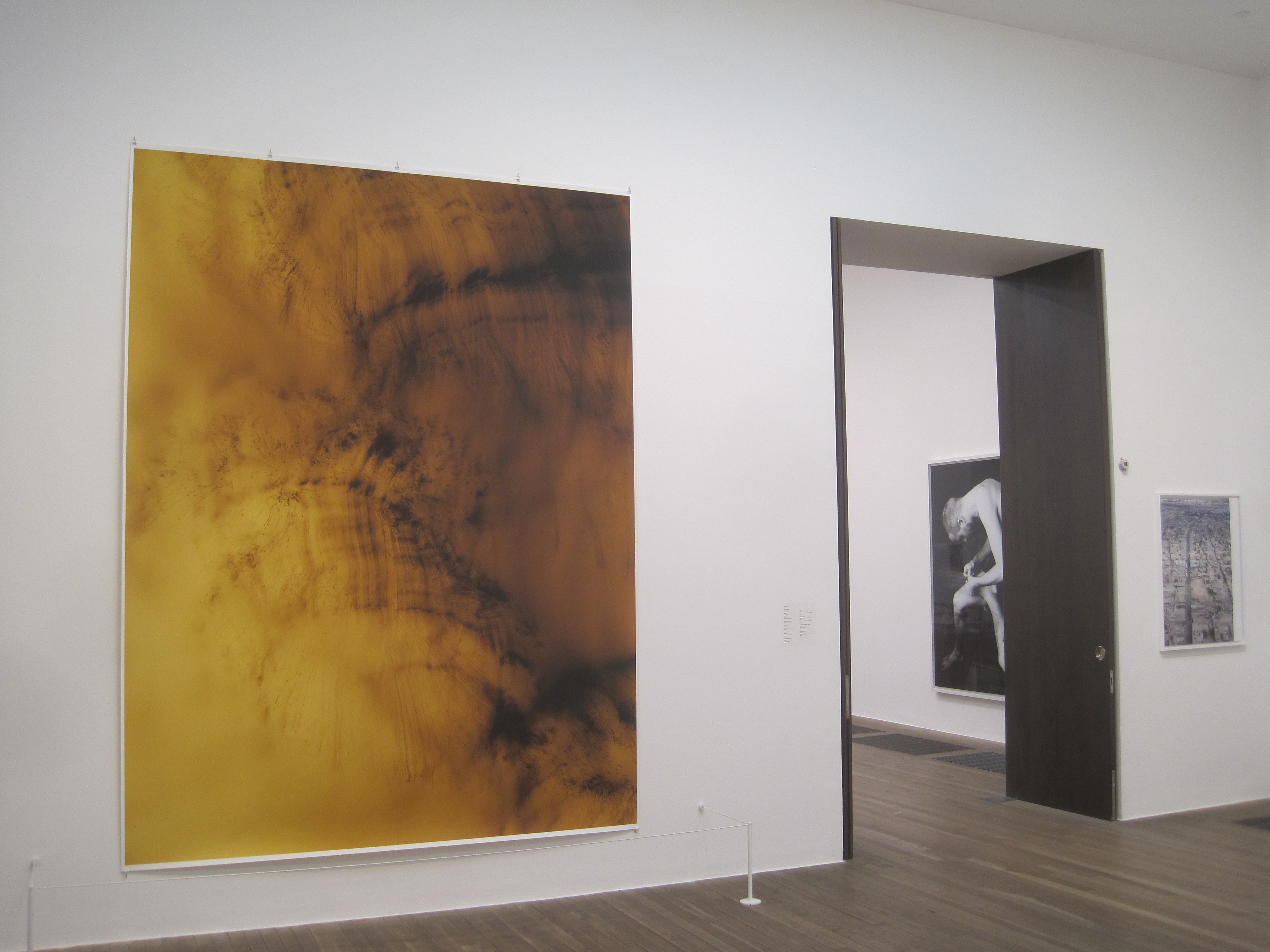
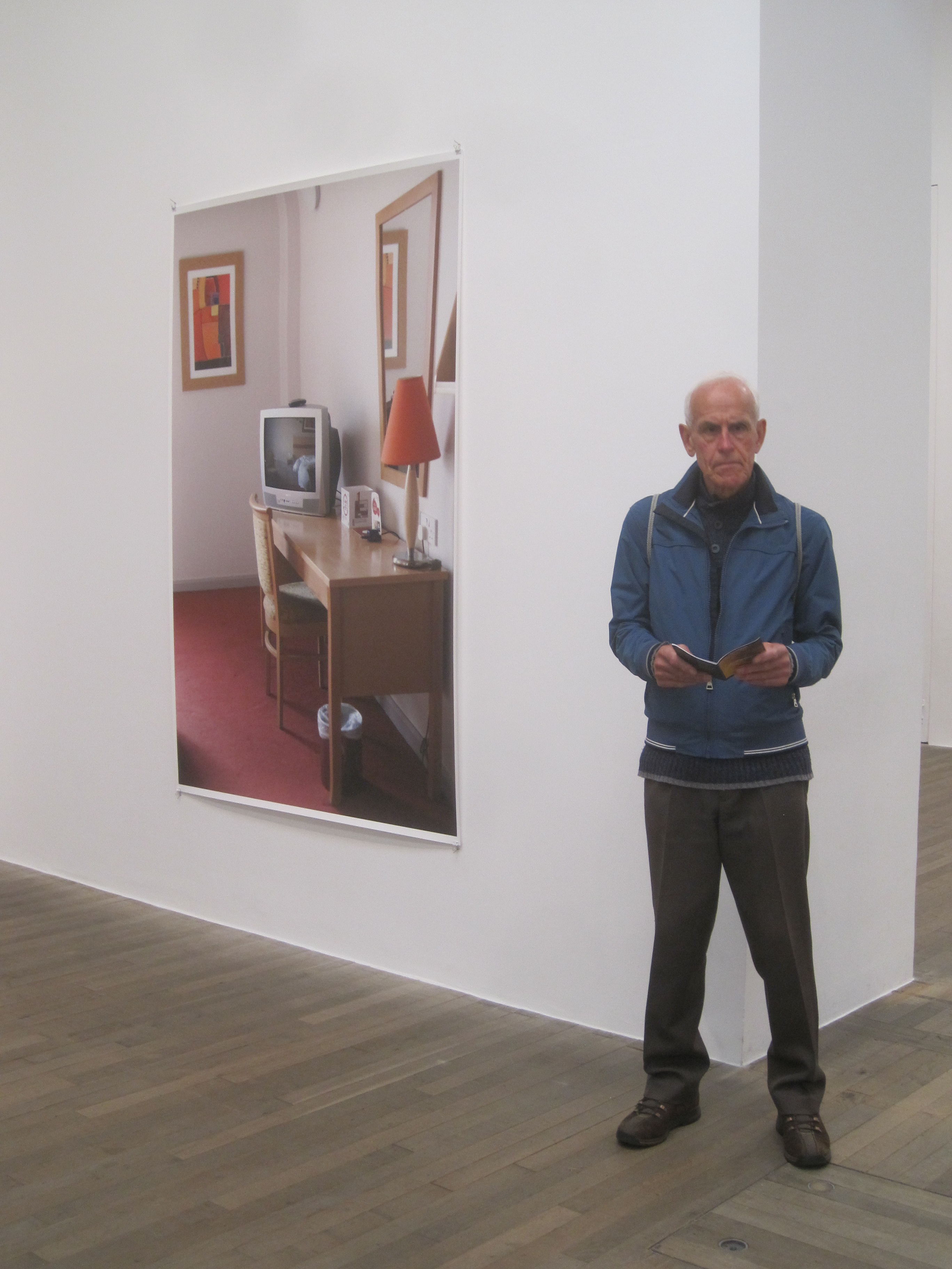
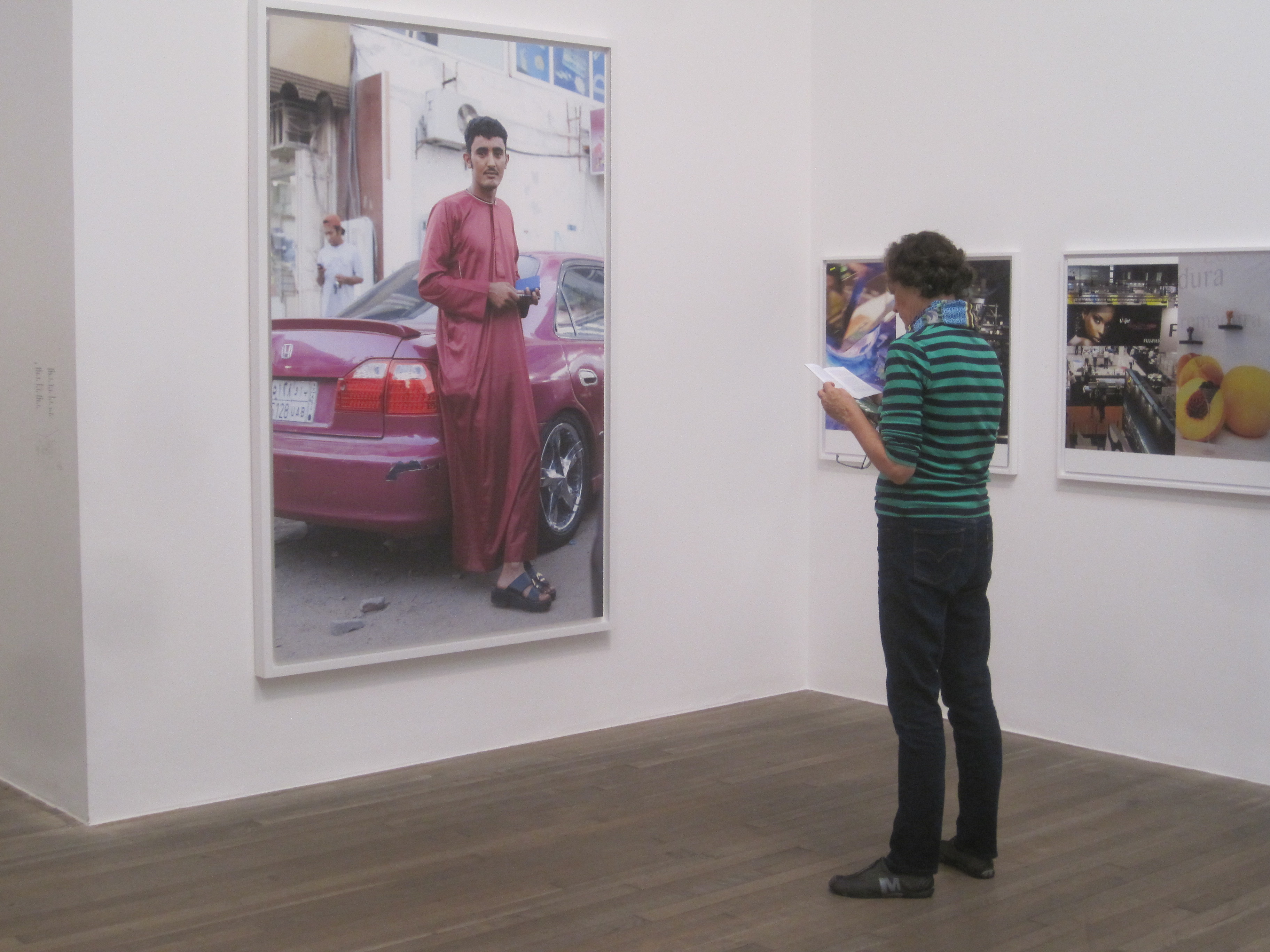
This is a huge, stunning, world-bestriding and often very challenging exhibition. Its 250 photographs (and some films and video installations) cover the subject of women and the environment, providing a wide-ranging survey of the multiple ways the planet is being exploited and degraded, how women too often bearing the brunt of environmental destruction, and the scores of ways women artists and activists are fighting back, often creating a sense of female community in the process – hence the punning title of the show which is designed to promote the work of re-sisters, in the realms of social politics and art.

Huge volume of material

It’s a challenging exhibition to get your head around because the curators interpret the notion of environment in such a wide way as to bring together a huge variety of specific instances and examples of environmental degradation, each one of which is like reading a Sunday supplement feature. You could say it’s like reading about 50 serious magazine articles in a row i.e. quite demanding on your ability to process facts and figures. But it’s challenging in other ways, which I list below.

Environmental stories

Firstly, it’s about such a huge subject, the industrial-scale destruction of the environment, which comes in such a huge variety of forms and prompts some pretty big and scary thoughts.

Eyes and Storms #1 by Simryn Gill (2012)

Some of the subjects, such as vast open-cast mining in places like Australia or Namibia (in photo series by Simryn Gill and Otobong Nkanga), or the catastrophic impact of oil extraction in the Ogoniland area of southern Nigeria (depicted in the photos of Zina Saro-Wiwa), I knew about already.

Similarly, the ruinous pollution of the world’s oceans, as conveyed in a video given a room of its own, A Draught of the Blue by Minerva Cuevas (2013) is a topic I feel I’ve been reading about for years.

But other subjects were completely new to me, such as the ruinous extraction of sand from places like the Mekong Delta in Vietnam (photos by Sim Chi Yin); or the impact of oil extraction in Azerbaijan. Although I knew about Azerbaijan’s historic importance, going as far back as the First World War, I don’t think I’d seen pictures of the area and its culture as evocative as the series of photos on display here by Chloe Dewe Matthews.

From the series Caspian: The Elements by Chloe Dewe Matthews (2010) Courtesy of the artist

I don’t think I’d come across the word extractivism before, which the curators define thus:

‘Extractivism is the exploitation, removal or exhaustion of natural resources on a massive scale. Rural, coastal, riverine, and Indigenous communities are disproportionately impacted by mining and other extractive industries, resulting in severe negative consequences on local livelihoods, community cohesion and the environment.’

There was lots and lots of new information about numerous aspects of environmental destruction to be read, understood and processed.

Women as victims

The curators move on to claim that environmental destruction or ‘ecocide’ particularly targets women, and especially women from Indigenous communities, and they’ve chosen exhibits and stories to back up this claim. Shanay Jhaveri, Head of Visual Arts at the Barbican, is quoted as saying:

‘In this era of deepening ecological crisis, we are proud to present RE/SISTERS which interrogates the disproportionate detrimental effects of extractive capitalism on women and in particular Global Majority groups.’

The curators claim there is a direct link between men’s degradation of the planet and men’s oppression of women. They are part of the same oppressive system. They call for the same kinds of resistance.

Straight men as culprits

Because the exhibition asserts (repeatedly) that the environmental crisis is caused by men, that it derives from male capitalism, from a male colonial and imperial mindset, from masculinism and white supremacism, from male-led multinational corporations, all of which are underpinned by patriarchal, masculinist, cis-heterosexual ideologies.

In the 80 or so very wordy, very theory-laden wall labels and picture captions, the curators claim that only men run ‘the mechanical, patriarchal order that is organised around the exploitation of natural resources’ and deploy the ‘masculine cultural imperialism’ that underpins it.

‘Terms such as Capitalocene, Plantationocene and Anthropocene act as cultural-geological markers that make clear that the violent abuses inflicted upon our ecological processes are inherently gendered, and shine a light on the toxic combination of globalised corporate hegemony and destructive masculinities that characterise the age of capitalism.’ (Catalogue page 16)

‘The violent abuses inflicted upon our ecological processes are inherently gendered’ and that gender is male.

‘Ecofeminist scholars have long critiqued feminised constructions of “nature” while challenging patriarchy, the masculinism of capitalism, and colonial abuses against nature, women and marginalised communities.’

And:

‘Caycedo’s photographs of rivers and waterfalls are remixed into pulsating, fractal, perception-shifting images that invite the viewer to reflect on the fluidity of bodies of water, which consistently resist the phallogocentric logic of extraction.’

The exhibition is based on notion of:

‘the connections between patriarchal domination and the violence perpetrated against women and nature’

The notion that the ongoing destruction of the environment, ravaging of nature, destruction of ecosystems and disruption of traditional ways of life of Indigenous peoples around the globe is a distinctively heterosexual male practice, with which women have no share or responsibility, is obviously controversial and debatable. It may be true in many aspects, and certainly when viewed through the exhibition’s strongly feminist lens, but surely some women somewhere are a bit involved in the capitalist extractive system, buy products, run companies, benefit from consumer capitalism?

Can the destruction of the earth really be blamed on just one gender? That’s what the curators are claiming. Along with the idea that only by overthrowing male power can the world be saved:

‘Critical of the term “revolution”, in 1974 the French ecofeminist Françoise D’Eaubonne proposed the term “mutation”, which, she argued, would enact a “great reversal” of man-centred power. This grand reversal of power does not imply a simple transfer of power from men to women, instead it suggests the radical “destruction of power” by women – the only group capable of executing a successful systemic change, one that could liberate women as well as the planet.’

Women as political resisters

But women aren’t just victims, no feminist would leave it at that. The curators move on to give lots of examples of the way women as individuals or groups are fighting back against all this ecocide. They are, in the curators’ words, practicing ‘a radical and intersectional brand of eco-feminism that is diverse, inclusive, and decolonial’.

I also found this theme challenging to get my head around because the examples of women’s resistance were so varied. For example, there are two big sections devoted to the anti-nuclear weapons protests led by women in the 1980s, one in the UK, one in the US (as documented by American photographer Joan E. Biren). The UK one was the women’s camp at Greenham Common airbase.

Greenham Common Women’s Peace Camp: Embrace the Base action 12/12/1982 by Maggie Murray (1982) © Maggie Murray / Format Photographers Archive at Bishopsgate Institute Courtesy of Bishopsgate Institute

I worked my way along the wall of photographs from the camp’s heyday and the display case of posters and leaflets and badges and was a bit confused. I suppose this is an early example of women very consciously organising as women to resist an obviously destructive technology, but it felt different from protesting the environmental degradation of the mines or oil pollution or ocean pollution. OK, the nuclear missiles imported into the base threatened nuclear armageddon but…It felt slightly askew from the theme of the environment.

Not only that, it felt very old and a bit, well, clichéd. Greenham has been trotted out in umpteen different contexts, in anti-war exhibitions I’ve been to or shows about the 1980s or about political art and, well, it feels like trotting out a tired old favourite. Better to have had much more up-to-date and specifically environment-focused content.

Third World resistance

This was highlighted, somehow, by the series of photos in the same room by Poulomi Basu’s who has been documenting the activities of the People’s Liberation Guerrilla Army who are fighting, with actual guns, against the activities of mining companies in south central India and the Indian security forces. Women take a lead role in the group and are depicted looking very warrior-like. But this obviously jarred with the message that conflict is somehow a very male creation, which emanated from the Greenham Common display.

Untitled from the series Centralia (2010 to 2020) by Poulomi Basu

It was also at odds with the other striking exhibit in the same room, which is a series of black-and-white documentary photos taken by Pamela Singh of the Chipko movement of women from the villages of the Garhwal Hills in the Himalayas in Uttarakhand, northern India. These protesters took to peacefully embracing trees to save them from state- and industry-sanctioned loggers.

Chipko Tree Huggers of the Himalayas number 4 by Pamela Singh © Pamela Singh Courtesy of sepiaEYE

According to the curators, these women ‘became emblematic of an international ecofeminist movement eager to showcase the subordination of women and nature by global multinationals while underscoring women’s environmental consciousness.’

Women artists

So far I’ve given the impression that this is a very political exhibition, and it is, and movements such as Greenham Common or the People’s Liberation Guerrilla Army or the Chipko treehuggers are obviously collective movements or organisations which brought women together to achieve social and political goals.

However, this is an art exhibition in an art gallery and half or more of it has a significantly different feel from the early sections I’ve been describing with their factual, documentary feel.

Interwoven from the start are works by all kinds of artists who interpret the subject of the environment in the widest possible way and generate a very wide range of environment and protest-themed art. So in the early sections about mining and ‘extractivism’ are hung huge long flowing abstract fabrics by Carolina Caycedo.

Installation view of ‘Multiple clitoris’ by Carolina Caycedo (2016) (Photo by the author)

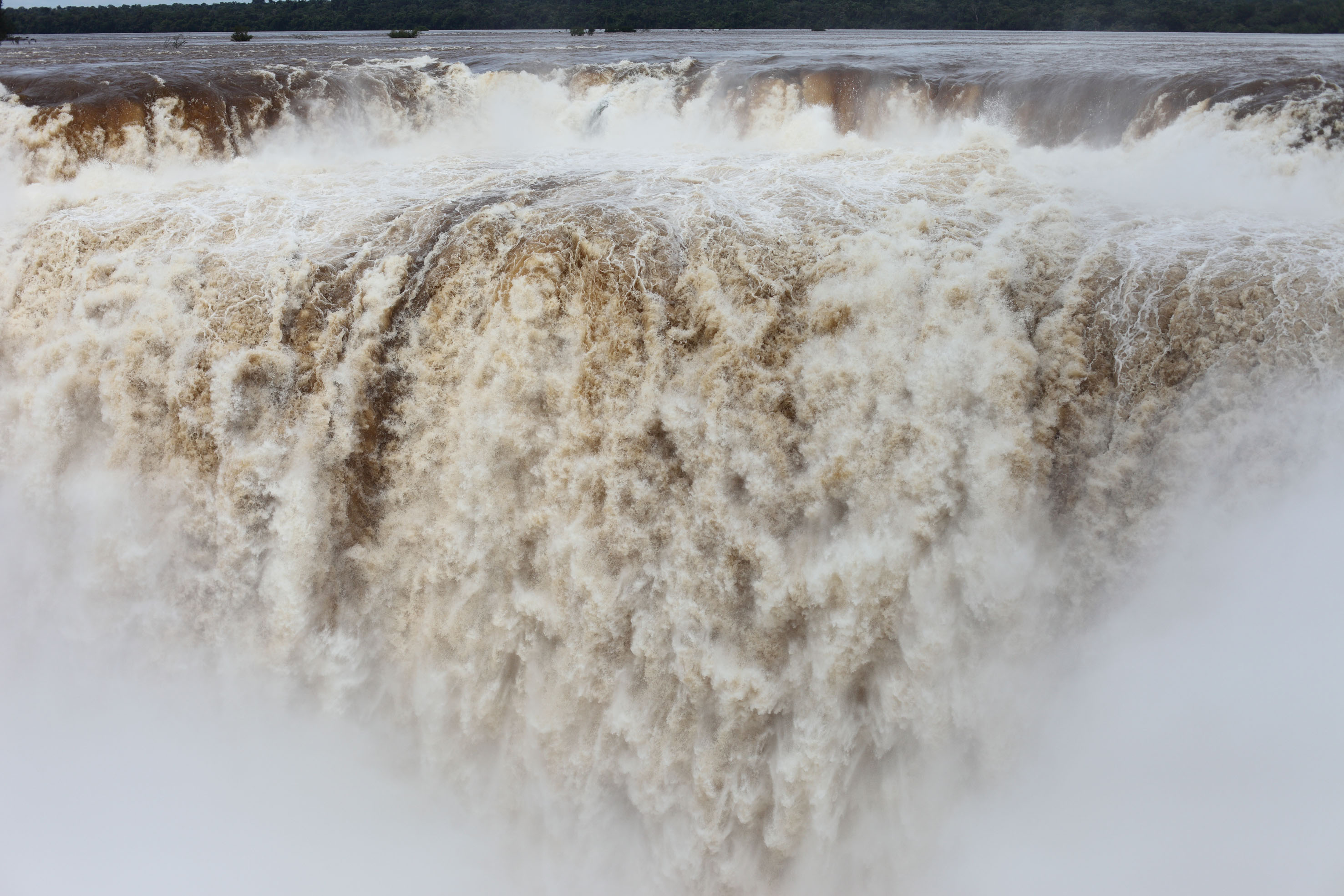
These, we are told, are part of her multidisciplinary project Be Dammed, which critiques the ‘mechanics of flow and control of dams and rivers’ to address ‘the privatisation of waterways and the social and environmental impact of extractive, large-scale infrastructural projects’.

These specific hangings are part of a series titled Water Portraits (2015 to the present), printed on silk, cotton or canvas and portray the water that carves through the long, narrow chasm known as Garganta del Diablo (Devil’s Throat), a canyon in the Iguazú Falls, on the border between Argentina and Brazil.

Now this is conceptually challenging because how are we meant to understand these lovely, colourful, semi-abstract hangings (there are 3 or 4 hanging from the ceiling throughout the show) as in any way really ‘resisting’ the activities of mining companies. They obviously don’t, or not in the same way that the Greenham women or the tree huggers were carrying out ‘direct action’ and explicit protest.

These kinds of works exist purely in the realm of art and art galleries, a realm which is, above all these days, extremely conceptual and intellectual. What I mean is Caycedo’s work is the result of a deep training in modern art and in turn triggers lengthy commentary from the art curators.

It’s a different world and a different type of discourse from that surrounding the political activity of Greenham and the huggers, which itself felt very different from the opening sections about the mining of oil and sand and ore.

What I’m getting at is there’s not just a lot of stuff and stories to read and process, but that they are drastically different types of information, from the kind of engineering stuff about extraction, to the rather nostalgic politics of the 1980s anti-nuke protests, through to something like this, what you could call traditional contemporary art, which asks to be processed and assessed partly for its ‘political’ intent, maybe (addressing ‘the privatisation of waterways and the social and environmental impact of extractive, large-scale infrastructural projects’) but also as works of art i.e. how you react to the size and shape and pattern and design, the fabric and the way it hangs in space. Whether you like it.

This requires activating a different part of your brain, a more floaty open receptive part, than the bit which had just been reading about mining techniques, or the bit which is activated by nostalgic photos from the 1980s.

Art about women’s bodies

But that’s not all. As the name of the work suggests, Multiple Clitoris is also saying something not just about women’s politics but about women’s bodies. According to the curators, Caycedo’s fabrics evoke ‘the feminist, orgasmic energy of our “corporeally connected aqueous community”‘ and are an example of the importance women artists give to their bodies.

It’s a truism of healthcare that women are more aware of, and take better care of, their bodies than men do. This is reflected in much contemporary art where women artists, and especially consciously feminist women artists, often take their own bodies as their subject, finding endless material in reflecting on and depicting their own or other women’s bodies.

This gender difference in attitudes stands out to me, in so many of the art exhibitions I’ve visited, because I’m a typical bloke and think of my body as a dumb machine which I use to carry around my mind, which is the thing which interests me. I consider my body boring. Not so many many many feminist artists.

Thus it is that, as the exhibition develops, the idea of organised political resistance which we encounter in the first few rooms develops into the idea that women’s bodies are themselves somehow a force of resistance or sites of resistance.

Whenever you go to an exhibition of women’s art you are going to read about ‘the male gaze’ and women’s attempts to escape, evade it and reclaim their own bodies, not as objectivised objects for male pleasure, but as the vehicles for their own perceptions and thoughts, to do with as they please. To reclaim ‘agency’ over their bodies.

And so it is that on the upper floor of the show that the visitor comes to a room devoted to feminist body art i.e. women artists who get naked, paint themselves, carry out performances naked, and so on. A good example is ‘Immolation’ from the series ‘Women and Smoke’, where, in the dim distant past of 1972, performance artist Faith Wilding got naked in the Californian desert, painted her body, set off smoke bombs and had herself photographed by artist and photographer Judy Chicago.

Immolation from Women and Smoke. Fireworks performance Performed by Faith Wilding in the California Desert by Judy Chicago (1972) © Judy Chicago/Artists Rights Society (ARS), New York Photo courtesy of Through the Flower Archives Courtesy of the artist; Salon 94, New York; and Jessica Silverman Gallery, San Francisco

The curators explain that:

‘In Immolation Chicago captures the performance artist Faith Wilding sitting cross-legged in the desert, enveloped in orange smoke. This work referenced the ongoing Vietnam War, the self-immolation of Buddhist monks, and similar acts by people in the United States, who were setting themselves alight to protest the war and advocate for peace, while the orange smoke alludes to Agent Orange, the herbicide that was sprayed to devastating effect in Vietnam.’

Women’s bodies and nature

I’ve always been confused by the disagreement among feminists themselves as to whether women – because their bodies are designed to conceive and bear children and they have historically done most if not all of the child care – are uniquely nurturing and caring and, therefore, have a kind of mystical understanding of Mother Nature unavailable to men. Or whether that’s a load of patronising, sexist, stereotyping garbage cooked up by the heteropatriarchy to keep women in their place.

The great universe of feminist thought seems to contain both, completely opposed, points of view. This exhibition seems to lean towards the women-as-nurturing and close-to-nature view. Here’s another example. I include the curator’s commentary in full.

Nature Self-Portrait #5 by Laura Aguilar (1996)

‘For Laura Aguilar, photography was instrumental in visualising her identity, and in the mid-1990s she began creating powerful black-and-white nude self-portraits in nature. In contrast to the heteropatriarchal settler-colonial tradition of landscape photography, Aguila’s portraiture homes in on her identity as a large-bodied, working class, queer Chicana woman. Mirroring the natural forms of the rocky desert landscape of the American Southwest, in her Nature Self-portrait series, Aguilar inserts herself into a “racially stratified landscape” to become a boulder or perform as a tree. As Macarena Gomez-Barris notes, Aguilar seems to want us to “trespass into the territory that feminists have long considered taboo by considering a profound relationship between the body and territory, one that provides a possibility for ecology of being in relation to the natural world. In that sense, her self-portraits provide a way to foreground modes of seeing that move away from capitalism, property and labour altogether, into a more unifying relationality that allows for haptic and sensuous relations with the natural world.” Ultimately, by affiliating her body with the natural beauty of the landscape, Aguilar’s work both empowers and transcends the various categories of her identification.’

Of this specific photo they say:

‘In these works, Aguilar photographs herself resting beside large boulders that seem to echo her curvaceous bodily form. Facing away from the camera, and folding inward, her body emulates the cracks and dents of the boulders while the shadows cast from her body intensify the affinity with the stones before her. In a sense she has “grounded” herself in a landscape that oscillates with “the largeness of her own body”.’

Nature Self-Portrait #5 by Laura Aguilar (1996) © Laura Aguilar Trust of 2016

The sequences of photos of women taking their clothes off and painting themselves in natural settings could be considered as the kind of entry level of the women-and-nature theme. However, some of the artists here have gone one step further to play with the idea of women turning into nature or natural objects; certainly moving beyond the merely human. Here’s what I mean:

The Body Covered with Straw by Fina Miralles (1975)

‘Fina Miralles’s conceptual photo-performance works from the 1970s embody a return to a profound relationship with nature. As she wrote in 1983 following a transformative five-month journey travelling through Argentina, Bolivia and Peru: “I am abandoning bourgeois culture and embracing Indigenous culture. The World Soul, Mother Earth and the protective and creative Pachamama.” Read through this lens, Miralles’s series Relating the Body and Natural Elements, in which the artist cocoons herself in straw, as seen here, or surrenders her body to sand or grass until she disappears, her body merging with the land, illustrates Donna Haraway’s concept of “becoming with” and offers a metaphysics grounded in connection, challenging the illusion of separation – the erroneous belief that it is somehow possible to exempt ourselves from earth’s ecological community.’

Relationship: The Body’s Relationship with Natural Elements. The Body Covered with Straw by Fina Miralles (1975) Courtesy of MACBA

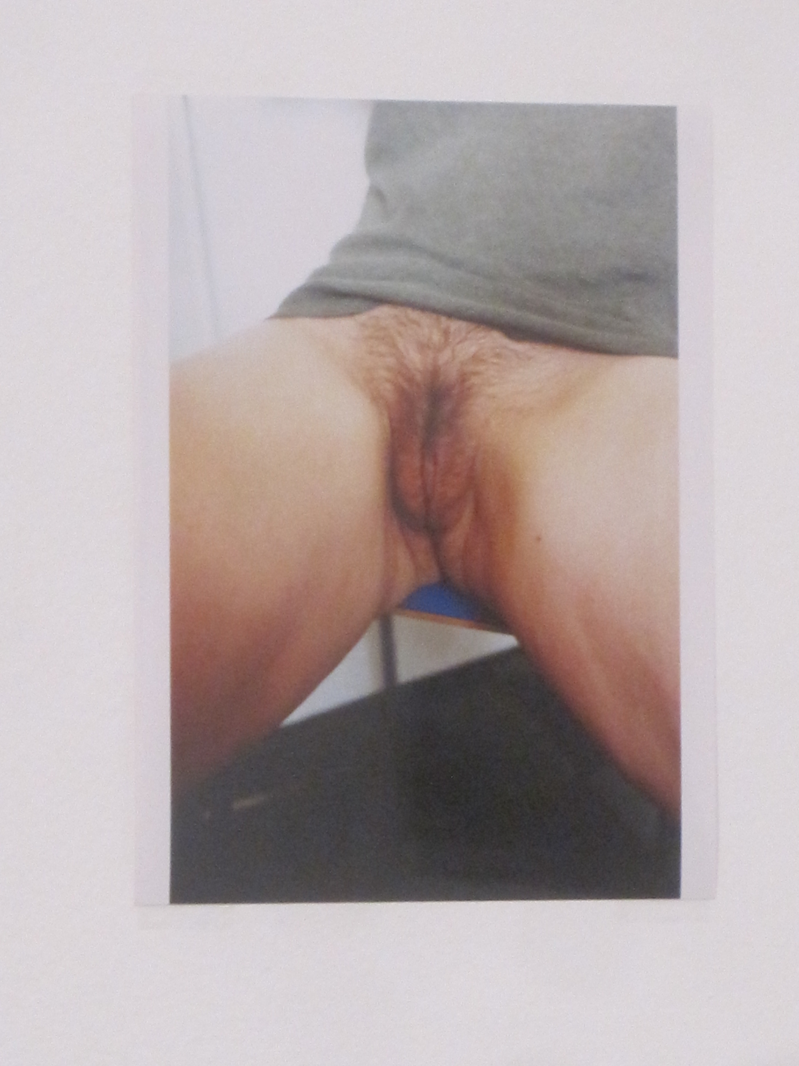
The most striking variation on this theme of women-as-nature is the series of photos by Tee A. Corinne, titled Isis, where she photoshopped large close-up photos of a woman’s vulva into traditional landscape compositions so as to create surreal, disturbing (and beautiful?) juxtapositions.

Isis in the Woods by Tee A. Corinne (1986)

The curators explain that landscape painting has not only long been historically dominated by men, but in its very conception contains the idea of land ownership, precisely the kind of capitalist-colonial mindset which has brought the earth to the brink of ruin. So these ‘vulva landscapes’ are a way of subverting the male tradition of landscape painting and reclaiming it. They’re certainly about as in-your-face as the women-as-nature theme can be.

It is typical of the curators that they can’t explain the purpose of this kind of women’s art without taking a pop at  the men’s equivalent. I was saddened that they have a go at Land art which I love and have always thought of as promoting the value of walking through unsullied nature, leaving environmentally friendly, transient works, like a circle of stones. But, alas, Land art has mostly been created by men and so, in the eyes of the curators, is invalid:

‘In contrast with much Land art, which has staged large-scale and controlled interventions into the natural environment predominantly by men, the ecologically oriented works presented here by women artists place the body in communion with the land.’

Anyway, to go back up a couple of levels, my overall point is that all these women stripping off in the desert have brought us a long, long way from the highly factual documentary items which opened the show and recorded actual political resistance to open cast mines or oil exploitation in Nigeria, to tree felling in India or the deployment of nukes to Britain.

Taking photos of yourself naked in the woods or superimposing the image of a vulva onto landscapes is obviously a different register of information: it’s a different kind of subject matter, treated in a different way, to be processed with a different part of the mind.

It was this continual switching of subject matter, approaches, tones and registers which I found so challenging and exhausting about this exhibition. Which explains why, having read my way through the extensive wall captions on the ground floor, I realised I needed a break. I walked out of the gallery and spent five minutes staring out over the grey Barbican pond at the church of St Giles Cripplegate, trying to let all this information and babel of concepts soak in, before going back in to tackle the 12 further rooms on the first floor.

Other-than-human

Up here, on the first floor of the show, the curators arrive at the idea of the animals who live in these destroyed environments. In fact animals and wildlife in general are surprisingly absent from the exhibition. Maybe wildlife is excluded because the focus is overwhelmingly on women as the endangered species in this narrative.

When plants and trees, animals, birds and fish do crop up, it’s under the slightly odd terms of ‘other-than-human entities’, ‘other-than-human organisms’, ‘other-than-human habitats’, ‘other-than-human communities’ and so on.

The only exhibit which actually focuses on all the animals we’re driving to extinction is a film, ‘Ziggy and the Starfish’ by Anne Duk Hee Jordan (2018) which, characteristically, isn’t about pollution or extinction, but the curators’ number one subject, which is gender and sexuality. The curators turn animals into symbols of the kind of gender-fluid, anti-binary type of sexuality we are all nowadays meant to admire:

‘Taking its name from Ziggy Stardust, the androgynous, extraterrestrial rock star persona that musician David Bowie personified in the early 1970s , Anne Duk Hee Jordan’s sculptural video environment that houses the film Ziggy and the Starfish (2018) celebrates the fluidity of marine sexuality. The film pictures the sexual exploits of various ocean creatures with an exuberance and playful excitement, recalling the earlier work of the French photographer and filmmaker of marine life, Jean Painlevé. The effects of human-made climate change on the hydrosphere have become a key factor impacting the reproductive lives of marine animals, and by focusing on this aspect of the ecosphere Jordan underscores our deep entwinement with our fellow earthly inhabitants. In response to the present ecological crisis, the work offers a portal into the vivid world of our nonhuman cohabitors and looks to their colourful erotic lives as an example of how not only to think against binary dualisms, but to desire the seductively plural.’

Referring to other life forms on earth as other-than-human, defining them solely in terms of the species that is destroying them, feels like an odd conceptual strategy. I doubt whether the feminist curators would like being referred to as other-then-men.

The rights of ice

The theme of the non-human reaches a kind of logical conclusion with Susan Schuppli’s film reflecting on ‘the right of ice to remain cold’, as advocated by the Inuk activist Sheila Watt-Cloutier. Conceptually mind-bending though this sounds, in reality it is a lament for the global warming-triggered melting of sea ice of a pretty conventional, David Attenborough kind.

Queer art

It is axiomatic of contemporary art that the only good man is a gay man, preferably Black. Toxic heterosexual white men have been oppressing women and destroying the planet for centuries so what we need is the opposite; gay Black men. So it is that a handful of men were allowed into this exhibition about women resisters, on the strict condition that they are gay.

This reminded me very much of the last big exhibition I came to here, the ‘Masculinities’ exhibition where, after a sustained and prolonged rubbishing of white heterosexual men, the ideal of masculinity held up by the curators was the writer James Baldwin, American, Black and gay. Same mentality here: white heterosexual men bad; Black gay (ideally American) men good.

Looking for ‘Looking for Langston’ by Ada M. Patterson (2021)

‘Looking for “Looking for Langston” by Ada M. Patterson is both inspired by and directly references Isaac Julien’s eponymous 1989 film, which offers a meditation on the life of the queer poet Langston Hughes and the wider cultural scene of the Harlem Renaissance in 1920s New York. As the title of the work suggests, Patterson, whose quest to learn more about the film ended in failure, constructs her own response that borrows from Hughes’s poetic imaginary as well as fragments she’s gleaned about Julien’s film. The result is a surreal and phantasmagoric exploration of Blackness and desire, using symbols such as the sailor and the sea to explore the fluidity of queerness. Patterson’s film also incorporates allusions to the histories of colonialism extant not only in Barbados (the artist’s birthplace and where this film was mostly shot) but also in Hughes’s United States and Julien’s United Kingdom. The film pays homage to these forebears, connected through oceanic bodies, legacies of Blackness and queerness, and the forever speculative pursuit of desire.’

Looking for ‘Looking for Langston’ by Ada M. Patterson (2021) Courtesy of Maria Korolevskaya and Copperfield

Personal favourite

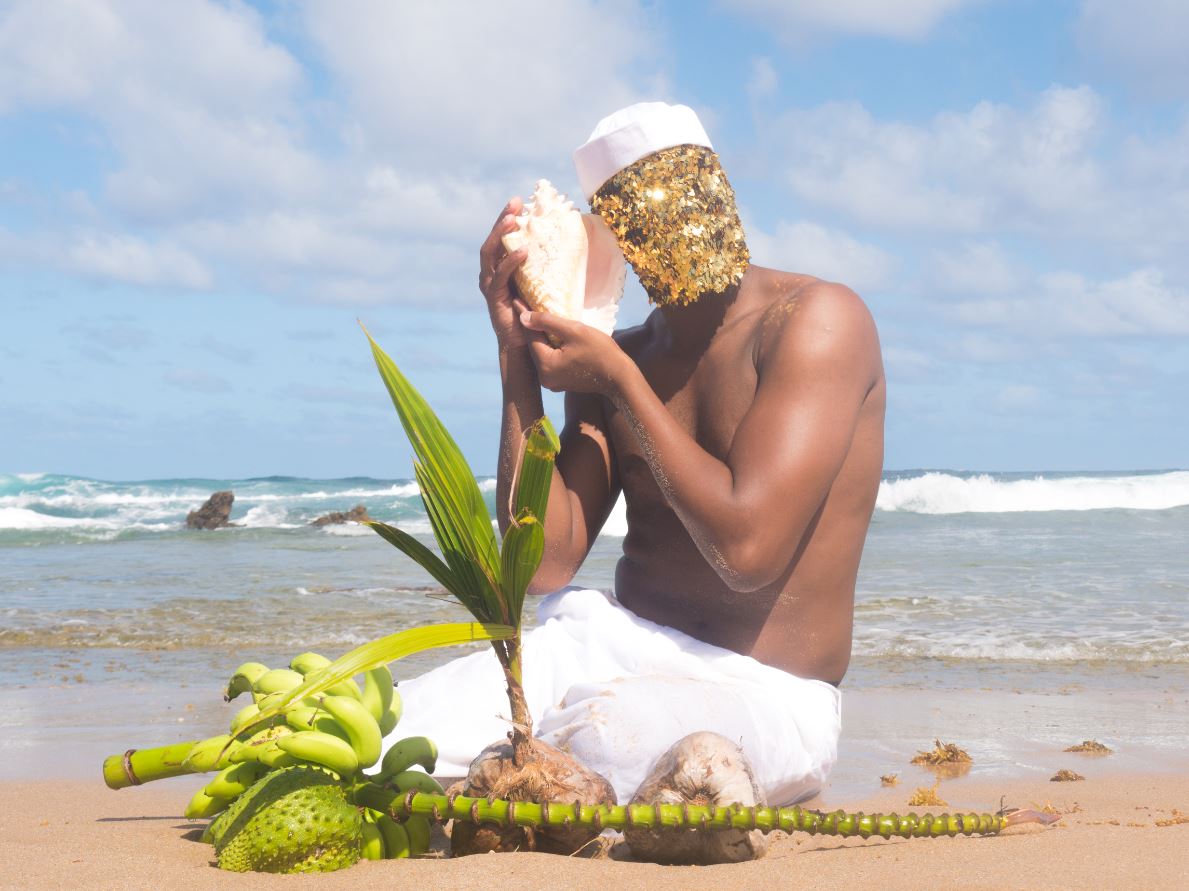
A lot of the photography, especially the documentary photography, was good, very professional, but didn’t really pull my chain. My favourite image from the whole exhibition was this:

Mud by Uýra (2018)

‘Uýra is an indigenous artist, biologist and educator from Brazil who works in and around the riverine communities of the Amazon region. In these photo-performances, Uýra transforms into multi-species characters, fluidly merging the human and non-human by adorning herself with organic matter. Borrowing from the aesthetic language of drag, and its ability to disrupt the stasis of gender-normativity, Uýra exuberantly shows how other binaries, such as the one between human and nature, can also be understood to be fluid states that are performatively constructed. As an educator, Uýra also uses her works as pedagogical tools to uncover different forms of knowledge about the land that have been suppressed by the logic of Western extractive capitalism. In doing so, the works call for a material and spiritual restoration of the ravaged ecologies to which we belong.’

Lama (Mud) by Uýra (2018) Courtesy of the artist

Last word

Although I of course understand what the curators are getting at, and wouldn’t dispute the claims that women, especially in the developing world, often suffer most from the rapacious activities of multinational extractive corporations and of environmental destruction in general.

(It’s such a sweeping claim, it’s difficult to see how you’d even start to gather the evidence for the other side of the debate. I guess you’d start by pointing out that plenty of countries have or have had women leaders; plenty of multinational companies are run or staffed by women; plenty of women benefit from the products of all this extractivism e.g. cars, airplane flights, cheap clothes, cheap food, digital gizmos, that kind of line of argument).

But granted the truth of a lot of what the curators say, nonetheless, I still think I fundamentally disagree with their premises or, rather, I approach the whole situation from a different, more totalising angle.

For me it is blindingly obvious that it’s not heterosexual white men, it’s humans who are the problem. Whether they’re men or women, gay or straight, white or Black, from the developed or the developing world, humans everywhere are degrading and destroying the environments and ecosystems they live in.

I can see that the curators have a gallery to fill and so need clear, strong propositions to hang their exhibitions on. I appreciate that they are women, and feminists, so naturally see the environmental crisis through their personal and professional biases, through the ‘lens’ of their title. I can understand that women artists, even contemporary ones, might be considered overlooked and under-represented and so an exhibition which pulls together works from half a century by 50 or more women photographers and artists a) redresses the balance b) promotes the specifically womanist point of view and c) creates a sense of community and continuity between them. I think I do understand where this is all coming, and the sizeable merits of a feminist exhibition like this.

But, in my opinion, trying to portray all men as capitalist villains and all women as heroic resisters is not only patronisingly simplistic, it misses the bigger, more obvious point: that it’s people, people of all genders and skin colours who are destroying the world, the Chinese and Indians and Brazilians every bit as much as the wicked white Eurowesterners.

By trying to exempt women from any blame and cast them either as tragic victims or heroic resisters, I think the exhibition seeks to hide a bigger, bleaker truth: If you want to overthrow something, it isn’t the subset of issues to do with the cis-heteropatriarchy or white Western neo-colonialism, it isn’t one particular gender who you can pin everything onto – you should be trying to overthrow the tyranny of Homo sapiens over all the organisms of the world. We have to abolish ourselves.


Related links

Related environmental reviews

Books

Exhibitions

Related art reviews

A Hard Man is Good to Find! @ the Photographers Gallery

‘The many men, so beautiful…’
(from The Rime of the Ancient Mariner by Samuel Taylor Coleridge)

A Hard Man is Good to Find! charts over 60 years of gay photography in London from the 1930s to the 1990s.

You don’t have to be naked to be butch, you don’t even have to be gay to be an object of gay attraction. Vince Man’s Shop catalogue, Spring/Summer 1957 edition, featuring model Sean Connery, photo by Bill Green. Courtesy the Alistair O’Neill Collection

Homosexuality illegal and legal

For the first half of the period homosexuality was a criminal activity which was severely punished, with the threat of exposure hanging over hundreds of thousands of gay men, and making them susceptible to blackmail and intimidation. The 1967 Sexual Offences Act partially decriminalised gay sexual activity but left in place many forms of legal and social discrimination and so gave rise to the gay liberation movement which campaigned for full social equality.

Personal note: In 1978 I joined the Campaign for Homosexual Equality, enjoyed going on marches, signing petitions and spending time at Windsor’s only gay pub. Through all this I discovered that I am not gay but discovered a susceptibility to gorgeous men, hunky men, specially young working class men, the kind that you used to see doing labouring jobs with a wonderfully carefree physical exuberance, the kind of young bloke photographed in the 1960s by Anthony C. Burls (see below).

The Obscene Publication Act remained in force

Anyway, back at the exhibition: it brings together more than 100 photos of men’s bodies, taken with a distinctly gay or queer sensibility. The thing to really understand is that throughout the period, from the 1930s till well into the 1980s, despite the 1967 law about homosexual acts, risqué images of male nudity – taking them, owning them, distributing them, publishing them – remained a criminal offence under the 1857 Obscene Publications Act.

A lovely boy. John Hamill by John S Barrington (about 1966) Courtesy Rupert Smith Collection

A secret history

All this explains why, as the tools of photography became cheaper and more widely available, from the 1920s and 30s onwards a clandestine visual culture emerged. During the 1930s stunning images of athletic male physiques could be associated with the general social trend towards hiking and healthy outdoor activities. During the Second World War photographers were encouraged to take photos of our brave boys looking butch and manly. After the war publishers gained more confidence but were still liable for arrest and confiscation of stock. It was only really in the later 1960s that, along with so many other social movement, gay men felt increasing confidence in depicting their lifestyles and objects of desire openly.

Throughout the period there is a continual interplay and overlap between licit and illicit ways of visualising the male body: the naked athlete trope ultimately derived from statues of ancient Greek and Roman men. Images of tough soldiers could walk a narrow line between being heterosexual propaganda and gay adoration. Young men sunbathing could be following European models of health and fitness. Models and precedents from heterosexual art and culture were continually being subtly reworked, the borderline between legal art and illegal ‘obscenity’ shimmered and wavered within individual images, different definitions of desire fight in single photographs.

Anyway, the repression gay photos were liable to be subject to at any moment explains why a good deal of this visual culture was underground or hidden. Some gay publications were subscription only, others were available as a sideline in otherwise ‘respectable’ book and art shops. In the 60s and 70s more magazines and specialist shops came out of the closet.

The male nude as fine art. David Dulak by Angus McBean (1946) Courtesy Rupert Smith Collection

London locations

The exhibition takes an interesting approach which is to divide the photos, and the gay magazines and bookshops which distributed them, by area of London. Thus it’s divided into sections which deal with Highgate, between Chelsea and Wellington Barracks, in Soho, Brixton, Marylebone, Portobello, the Serpentine and Euston.

Highgate

Apparently Hampstead Heath is London’s most renowned cruising spot for gay men. Young artist Keith Vaughan bought a Leica camera and set up a dark room in his bedroom. Aged just 21 he then made a n album of photos of gorgeous young men at Highgate Men’s Pond in the summer of 1933.

Highgate Men’s Pond Album by Keith Vaughan (1933) Courtesy Aberystwyth University School of Art Museum and Galleries

John S. Barrington trained as an artist at St Martin’s School of Art. In 1938 he persuaded two men he’d met on the Charing Cross Road, dancer David Dulak and his friend Vik, to accompany him to Highgate Men’s Pond so he could photograph them nude – and thus began a long career as a ‘physique photographer’. Dulak was later photographed by Angus McBean, see two photographs above.

John Mckay made studies of ballet dancers and performers.

Between Chelsea and Wellington Barracks

I.e. Pimlico, an area of boarding houses and rented rooms, an enclave of queer life. Angus McBean opened his photographic studio on Belgrave Road in 1935.

Montague Glover had served in the First World War where he was awarded a medal. He went on to practice as an architect with photography on the side. His military career gave him easy access to the barracks where he recruited like-minded Guards to return to his studio or rented rooms and pose in less than full uniform. Squaddies available for gay sex were known as ‘a bit of scarlet’.

In the 1950s Basil Clavering ran a cinema on the Charing Cross Road but he also built a photographic studio in the basement of his house on Denbigh Street, Pimlico. Here they recruited military men to pose in genuine uniforms and also act out various scenarios, some kinky, some humorous. He and his partner John Charles Pankhurst, invented the ‘storyette’, a series of stills, as from a movie, which told a story, often saucy, sometimes featuring corporal punishment.

Just doing the housework. Storyette EX FJSS print, 1950s by Basil Clavering (aka Royale). Courtesy Rupert Smith Collection

The Serpentine

In the 1950s British bodybuilding magazines catered for two audiences, straight bodybuilders and a gay readership. As well as the obvious photos and articles, in their back pages these magazines offered discreet mail order services for ‘original physique studies’. This section features the work of mail order publisher William Domenique (trading as Lon of New York) and gay erotic artist Bill Ward.

Paul Hawker came from Bristol, moved to London, and took photos of young men preening and parading at the Serpentine Open Air swimming pool, another well-known gay haunt. He is represented by some of the photos he took of his friend, body builder Spencer Churchill. Apparently Churchill was one of the first to adopt the American fashion for denim workware jeans as regular casual clothing.

Spencer Churchill, 1951 by Paul Hawker. Courtesy Rupert Smith Collection

Marylebone

‘The City of Quebec’ pub in Marylebone is supposed to be London’s oldest gay pub. It opened in 1946 and was popular with gay RAF men. Bill Green learned photography and wrestling in the RAF and in 1946 set up Vince Studio at 46 Manchester Street, soon establishing a name for ‘physique photography’. He advised beginners to use a little oil to help highlight the contours of male musculature.

In 1954 Green opened a men’s fashion boutique in Foubert’s Place, Soho. In 1956 his assistant, John Stephen, opened another fashion store. According to the exhibition’s curator, Alistair O’Neill, Professor of Fashion History and Theory at Central Saint Martins, these sparked ‘the peacock revolution’ in men’s fashion. They helped turn Carnaby Street into the centre of modern fashion.

Artist Patrick Prockter also had a studio on Manchester Street. He took photos as preparatory studies for paintings, especially of his boyfriend Gervase Griffiths. He cultivated an artistic circle which included painter David Hockney, fashion designer Ossie Clark, and physique model Peter Hinwood. The veteran photographer Cecil Beaton was attracted to this young group of openly queer men. The exhibition includes sets of colour photos of Griffiths on a beach, and two by Beaton which are among my favourites, not because they’re nude, camp or gay – simply because they’re beautiful.

Photo of Gervase Griffiths, titled ‘Narcissus of 1967’ by Cecil Beaton

Earl’s Court

This was the location of BDM publications, set up by Alexander McKenna and partners, which published a range of styles, from the lifestyle magazine ‘Jeffrey’ to more explicit titles such as ‘Hung Heavy’, ‘Taste of Beefcake’ and ‘Leather Studs’.

Notting Hill

Became known after the war for its combination of bachelor housing and growing immigrant community. In the early 1980s ceramics artist Emmanuel Cooper picked up a set of negatives at Portobello Market. It turned out to be a set of studies of nude or partially clothed young men with an obvious queer vibe taken in the late 1950s and early 1960s in North Kensington. Cooper titled it ‘The Portobello Boys’ and arranged for its publication. They are surprisingly homely, unguarded, intimate studies of everyday life.

One of the Portobello Boys, hopefully only fiddling with his zip. The Portobello Boys, early 1960s. Courtesy The Bishopsgate Institute Special Collections and Archives

Euston Road

Martin Spenceley photographed young men in Euston in the 1980s, scouting for Teds, punks and skinheads, persuading them to pose by cheekily lying that he worked for Vogue America. David Gwinnutt started taking photos of the post-punk gay scene as an art student. Patrick Prockter introduced him to his generation of artists.

Thomas Mervyn Horder (Baron Horder) was the chairman of Duckworths, the literary publisher in in the 1950s and 60s. He also had a sideline as a physique photographer under the pseudonym Larry Knight, publishing in specialist magazines with titles like ‘Grecian Guild Pictorial’ and ‘Der Kreis’.

History of the posing pouch

In line with the unwritten law that absolutely all exhibitions these days must either be about America or feature Americans, there’s a little annex off to the side of the main gallery which gives an amusing history of the posing pouch. In this version of the story this skimpy little piece of fabric, barely enough to cover a man’s meat and two veg with the thinnest of fabrics going round the waist, was invented in America.

It developed from the aim of American gay physique photographers to show as much of the male body as legally possible. In 1945 Bob Mizer started the Athletic Model Guild, a model agency for bodybuilders for the film industry. In 1951 he launched a quarterly magazine, Physique Pictorial. For his photoshoots Mizer developed the skimpiest possible garment which dwindled down to the posing pouch. The exhibition explains that the earliest versions were sewn for him by his mother who, nonetheless, strongly disapproved of his sexuality.

Original 1955 posing pouch as sewn by Bob Mizener’s mum (or mom)

We are told that the shape and tan colour of the pouch was often lightly drawn on photos over the willy of nude models in order to avoid prosecution if the parcel they were distributed in was stopped and searched by the authorities; but that the happy recipient could then easily, in the safety of their own home, rub the little patch off and glory in the sight of total male nudity!

Slightly spoiling the effect, there is a small mention of the photographic evidence that this kind of super-minimalist covering was, in fact, being worn by sunbathing men in London in the early 1930s. Still. American has to be shoehorned in somehow.

Mixed media

It’s not just photos. Within each part of London the curators identify gay photographers who lived and worked in that area, but also includes catalogues, print ordering sheets, personal albums, magazines and publications to show how the photographs were circulated, exchanged and shared. In the 1970s publishers of gay photos send out catalogue sheets like this one to customers, who then ordered full-sized body shorts and prints of the guys they fancied.

Which one would you send off for? 1970s catalogue sheet by John S Barrington. Courtesy Rupert Smith Collection

White Brixton

Anthony C. Burls was an interesting character. In the 1960s he ran a coffee shop at the World’s End in Chelsea, got odd jobs working at funfairs, and attended a gym in Brixton. In all these settings he asked working class men if he could photograph them and the result is a series of full length, mostly fully clothed studies which I think I liked most out of the exhibition. He named the series ‘The Londoners: Official reports’, including not just the photos but the man’s job description and a pen profile. His first business address was Studio 200 on Railton Road, also home to the South London Gay Community Centre.

Back to John S. Barrington. In the later 70s he set up the 252 Gallery on Brixton Hill, which included photographs but also drawings and sculptures. He sent out catalogues listing his many gay models and categorising them by race as well as arranging them by head and masked torso. They’re included here as an interesting example of the taxonomy of desire.

Black Brixton

Rotimi Fani-Kayode lived in Brixton from 1983 to 1989. His work explores the paradoxes of the Black queer experience. He’s represented by a work called the Golden Phallus.

The Golden Phallus by Rotimi Fani-Kayode ( 1989) © Rotimi Fani-Kayode / Autograph ABP

Guy Burch was director of the Brixton Art Gallery from 1985 to 1988. Artist, writer and curator, he’s represented by photo study drawings and collages.

Frank B came to prominence for his performances which involved blood letting, performed in the late 1980s in gay fetish clubs and is represented by photographic invitation cards to a private screening of a 6-minute art movie.

Ajamu X is an artist, curator, archivist and activist whose work explores ‘the nuances of intersectional experience as a Black British queer man’. He is represented by contact sheets which show him playfully wearing a white cotton bra and panties.

Thoughts

To be quite honest this exhibition wasn’t quite as sexsationally fabulous as I was expecting it to be. A lot of the images are quite small, many are only on contact sheets of 20 or 30 tiny, tiny images which I had to lean right up to in order to see properly. Take the contact sheet of 40 or so images of Black artist Ajanu X who is, unexpectedly, wearing a white bra and panties in various states of disarray. Funny and sexy but tiny, each image only an inch square or less.

I enjoyed the staggering physiques of some of the Greek athlete-style photos from the 1930s and 40s. I liked the couple of photos by Cecil Beaton of Gervase Griffiths lazing by a fountain or posing among cow parsley in some field, because they were so redolent of a kind of Pink Floyd 1960s.

I liked Anthony C. Burls’ set of photos of the rough, dirty, tough-looking young men you get working at  funfairs and such, swaggering among the dodgems in tight jeans, unbuttoned shirts and rocker brylcreemed hair.

There were several sequences of young men, obviously soldiers, in full uniform and then various stages of undress, hanging out together. There was a whole set of young blokes around the house, sitting, reading, smoking, half dressed or with their cocks hanging out their trousers, the Portobello Boys. Mildly interesting, but I went to an all-boys school and shared houses with blokes at university; admittedly we didn’t spend social time with our willies hanging out of our trousers – at least not when sober.

Overall, I think the interest is not so much in the images, per se, as in their variety, and also in the extraordinary density and complexity of the clandestine networks of gay photographers, subjects, printers, publishers and distributors which the wall labels describe and explain. That’s interesting social history.

And then, when you lay the complex mesh of legal and cultural and visual parameters over the images you get, as it were, another layer of complexity beyond the images themselves; you get to see them as varying visual strategies and approaches and sublimations of very powerful male urges of desire and sexuality.

Two learnings

I don’t think I’d ever noticed the phrase ‘physique photography’ before, but here it kept recurring and being explained as a style of photography which goes beyond the passive idea of the ‘nude’ to celebrate a kind of effortful, muscular, athletic masculinity. Think body-building.

Stunning example of ‘physique photography’. Indian bodybuilder Monotosh Roy shot by Bill Green (Vince) in the 1950s

Related to it was a comment in a wall label right at the end making a simple but devastating point that, as LGBTQ+ culture gained confidence in the 1990s, photographers, publishers and consumers felt more confident in producing and consuming gay pornography.

The point being that the delicate balancing act, the hints and subtleties of the preceding decades, the self-imposed restraint which made ‘physique photographs’ walk such an exciting fine line between factual depiction of male anatomy and objects of lust from the 1930s to the 80s – all this tended to be swept away as gay art gained confidence in the 1990s. Now artists could depict explicit photos of erect penises and men doing all kinds of things with them to other men. Obviously delicacy and subtlety continue in a thousand flavours, but the era of constrained delicacy and obligatory subtlety came to an end with the arrival of explicit gay pornography.

Bodybuilder in Bra by Ajamu X (1990)

A note on nomenclature

The introduction explains that ‘queer’ is now the accepted academic term for non-normative sexualities but the curators acknowledge that it used to be a term of abuse (as it was when I was growing up) and so older visitors might be offended by its use. At the same time, they acknowledge that the more factual, legalistic term ‘homosexual’, which older visitors might be comfortable with, is ‘problematic’ for the younger generation.

The need for this note prompts the reflects the ongoing (and, I imagine, eternal) struggle human beings have to make sense of the disruptions, embarrassments and irrational instincts of sex which we find ourselves saddled with.

Willies

Having been to hundreds and hundreds of exhibitions curated by feminist curators and read thousands of wall labels written by feminist curators, I have had the notions of toxic masculinity, of the poisonous affect of the male gaze, of the evils of male sexual attention, of male sexual harassment, and the unspeakable terror of seeing a penis from which some women, apparently, never recover, drummed into me again and again and again. Even the shamefully biased mega-exhibition about so-called ‘Masculinities’ at the Barbican didn’t include one single image of a penis for fear of offending sensitive visitors.

It was, therefore, rather disorientating, gave me a sense of vertigo, to walk into a pair of rooms absolutely flooded with this object of terror and fear – showing a proliferation of penises, peckers and plonkers, willies and winkles and weenies, cocks and tools and todgers.

Like all the other ‘banned’ part of the human anatomy, like women’s breasts and, more so, vulvas, if images of penises are strictly rationed and you only occasionally see one, it can all too easily be overloaded with lust and desire. Whereas if you freely see scores, then hundreds of them, in all their variety and humanity and mundaneness, quite quickly you get used to the sight, and then a bit bored.

From a visual point of view penises obviously come in two states, flaccid and bored or aroused and erect. Presumably this is, or was, in the period under study, the threshold between images which could be justified as art or at least decorative (flaccid) and pornography (erect).

Anyway, it’s worth mentioning that I don’t think there’s a single erect penis in the show. Maybe this is because the exhibition itself had to tread a fine line and the inclusion of erect penises would have crossed that line (? I don’t know the law on the matter). Maybe because pretty much all the photographers on show here used the flaccid/erect distinction as a simple rule of thumb (were there legal precedents under the Obscene Publications Act regarding the exact angle of arousal of the member? Again, not being a lawyer, I don’t know.)

For whatever reason, no erections at all are on display here and probably over half the images didn’t show penises at all (e.g. all the athletic, posing pouch-style photos; or a lot of the fully dressed soldiers or fairground workers; or just the many portraits which focused on faces) and all the ones that did include a penis showed it only as a slack, slumping, limp willy.

These kinds of images captured what I imagine is most men’s attitude to their penises; on rare and special occasions it may be roused and primed for action, but most of the time it’s just another part of the body which you barely think about unless you have to pee, or you inadvertently squash it while riding a bike or some such activity. Ouch!

In this respect a lot of the photos seemed (to me) to be surprisingly stripped of the urgency of sexual desire (lust) and instead conveyed quite a homely, almost domestic vibe of what it is to be a young man, to be naked and to lark around with other men. I’ve been to scores and scores of exhibitions making polemical points about women’s bodies, depicting them from every angle and analysing in immense detail the way women’s bodies are depicted in all sorts of media and the never-ending iniquity of the male gaze, as a matter of burning social and political importance.

This exhibition is a rare opportunity to look at scantily clad bodies without feeling a soupcon of guilt; and and space where the visitor can just accept and enjoy the sight of the male body, in all its variety, for what it is.

Catalogue sheet 3, 1949, by Bill Green (Vince). Stephen Cartwright collection

Last thought

This exhibition triggers nostalgia for an age before the internet: talk of photography as an activity restricted to a talented few, of hard copy magazines and subscriptions, of mail order catalogues, of the extraordinary lengths you had to go to to get sight of a photo of a naked man – all this consigns the entire exhibition to a past which is rapidly retreating.

For now we have 1) smartphones and 2) the internet. 1) More or less everyone has access not just to cameras, but to extremely high-quality cameras and amazingly sophisticated image manipulation softwares. Everyone’s a photographer these days. 2) And any image of anything, alive or dead or ever conceived, can now be accessed at the touch of a screen, including as many naked bodies, male, female or whatever, as your hard drive can cope with.

This entire exhibition bespeaks not just a world of repression and restraint, but of rarity and difficulty. Now nothing is rare and everything is available. Soon the subtle aesthetics of constraint and tact described in this exhibition will seem as dated and historical as the pictorial conventions of Georgian England.


Related links

Related reviews

More Photographers’ Gallery reviews

Wolfgang Tillmans: 2017 @ Tate Modern

Tillmans and Tate

Wolfgang Tillmans is German – as you’d expect from the name  but has spent a lot of time in the UK. He studied at the Bournemouth and Poole College of Art and Design in the early 90s, then moved on to London and, although he’s had spells in the States (New York, of course), he still has a studio in London and divides his time between here and Berlin.

Also, although photos of him from the 1990s make him look like a punk or street kid, a member of the hoody generation, Tillmans has in fact created a tidy place for himself within the British art establishment.

  • Between 2009 and 2014 Tillmans served as an Artist Trustee of the Tate Board. He is also a member of the museum’s Collection Committee and the Tate Britain Council
  • Tillmans was the first photographer – and also the first non-British person – to be awarded the Tate annual Turner Prize, in 2000
  • In 2014 Tillmans won the Charles Wollaston Award, the main prize of the Royal Academy Summer Exhibition
  • In 2015 Tillmans was awarded the Royal Photographic Society Centenary Medal and an Honorary Fellowship
  • In 2015 Tillmans was commissioned to create the official portrait of retiring British Museum director Neil MacGregor

Quite the establishment darling then, and with a very close connection with Tate which is – uncoincidentally – now giving him this huge 14-room exhibition.

Iguazu (2010) by Wolfgang Tillmans

Iguazu (2010) by Wolfgang Tillmans

Tillmans’ photography

Tillmans was born in 1968 and so is a youthful 48. His career consists of ‘explorations of the possibilities of modern photography’. As a young gay student his early works depict bohemian men and, apparently, he was hailed as a chronicler of that queer boho scene – something he’s been trying to escape ever since.

Juan Pablo & Karl, Chingaza (2012) by Wolfgang Tillmans

Juan Pablo & Karl, Chingaza (2012) by Wolfgang Tillmans

In fact the show reveals a determination to explore and diversify, to range over a huge variety of genres – portraits, still lifes, sky photographs, astro-photography, aerial shots and landscapes.

But he is just as interested in the presentation of the works as the subject matter, and this is one of the main themes of the show. It is emphatically not just a series of huge glossy photographs. Instead, there is a systematic exploration of the tremendous range of the media, of shapes and sizes and styles and formats, which the photographic image can come in.

There certainly are the big colour prints he’s famous for, but also photocopies and black and white prints, some enormous, some tiny – some expensively framed, some not – some are enormous and formally hung, some are in a cluster of Polaroid-size snaps just pinned up to the wall.

Also there are rooms full of display cases showing the range of arty or fashion magazines he’s worked for. Other rooms show collections of articles from newspapers and magazines concerning ‘issues of the day’, juxtaposed with relevant or related photos.

How we consume the image is as much a part of the show, as the images themselves.

Collum by Wolfgang Tillmans

Collum by Wolfgang Tillmans

Every room an installation

Quite quickly you realise that ideas and issues about photography are just as important as the images themselves

Thus, right at the beginning we are told that each room is a separate entity; each room has been individually created and curated – ‘specially configured’ – to address specific issues or themes or topics. The intention, then, is that each room (as a unique assembly of images) serves a double purpose – addressing varied issues and subjects but also exploring the wide range of formats which images can come in, ‘exploring’ the nature of the photographic image.

Operating on the basis of the fundamental equality of all motifs and supports, through this continual re-arranging, repositioning, questioning and reinforcement, Tillmans avoids ascribing any ‘conclusions’ to his work and thus subjects his photographic vision to a perpetual re-contextualization

To professional theorists of photography and the digital image, for all art and media students generally, this show is a goldmine of conceptualisation and theory. To ordinary gallery-goers simply curious to see arresting, beautiful or imaginative images… maybe not quite so compelling.

paper drop Prinzessinnenstrasse (2014) by Wolfgang Tillmans

paper drop Prinzessinnenstrasse (2014) by Wolfgang Tillmans

Read the booklet

Indeed at the entrance to the exhibition the visitor attendant on the door tells us there will be no wall labels giving context and information, as is usual in most modern art exhibitions. Instead, the visitor is told they must consult the free booklet given out at the door to read up on what each room is about, what it is trying to say, the idea behind the installation.

There are 14 rooms so that’s 14 short essays. That’s quite a lot of reading, quite a lot of information processing to be done before you even look at anything.

And the only snag is that, the more you read, the less impressive the concepts and ideas become. As early as room 2 we learn that Tillmans spends a lot of time in his studio, making prints, planning exhibitions, collecting materials, gathering ideas and so on. Thus room 2 contains photos of… his studio, which, like most workplaces these days, consists mainly of computers on messy desks, with odd shots of cardboard boxes full of bottles, a colour photocopier taken to pieces and so on. It looks, in fact, like a really boring office.

But the commentary tries to gee it up by quoting from the man himself. Among other things it tells us that Tillmans has often described the core of his work as:

translating the three dimensional world into two dimensional pictures.

Wow. Profound. Isn’t this a tad… obvious? Do you think there has been any artist since about 1300 and any photographer since about 1850 who hasn’t been aware that they are engaged in transferring the 3D world onto a 2D surface?

In room 3 we learn about Tillmans’s project to travel the world and deliberately spend just a few days in each place photographing his first impressions, untainted by any understanding or knowledge of the local culture. He did, we are reassured, use ‘a high resolution digital camera’. And this approach led to some pretty impressive revelations, to a number of ‘shrewd observations about contemporary worldviews’.

For example? Well, he noticed that the shape of car headlights has changed in the past few decades. Herr Tillmans detected that car headlights are now much more angular than they used to be which, giving them, as the booklet helpfully explains:

a predatory appearance that might reflect a more competitive environment.

Golly. He spent four years travelling round the world and discovered… that car headlights are more angular than they used to be. Do you see what I mean by the ‘concepts’ and ‘ideas’ underpinning the show not being that…. impressive. Don’t get me wrong: the photos of car headlights are beautifully shot, big, perfectly in focus, very much like… well… high def adverts for car headlights.

Installation view of Wolfgang Tillmans at Tate Modern featuring Headlight

Installation view of Wolfgang Tillmans at Tate Modern featuring Headlight (left)

Room 4 is devoted to a series of display cases showing a project titled truth study centre which has been rumbling on since 2005. Photos, newspaper and magazine clippings, objects, drawings and copies of his own images are laid out in cases to highlight the revelation that – the media sometimes contradict themselves, politicians sometimes make statements about things they don’t understand, scientific knowledge is limited and partial, you shouldn’t believe everything you read.

I’m helping my daughter revise for her GCSE Media Studies exam. I know for a fact that these are the kinds of ‘insight’ which are quite literally taught to every 15-year-old schoolchild in the country.

It began to dawn on me that if you expect people to spend a lot of time at your exhibition reading about your ‘insights’ and ‘concepts’ – it would be a good idea to have something worth reading about. By room 5 I stopped reading the booklet for any ‘insight’ it gave me, but purely as a source of unintentional comedy.

Another example of the overconceptualisation of the stunningly banal is room 7, a nice-sized room with roof-height windows looking out over the Thames. In it are placed a very expensive sound system and some state-of-the-art loudspeakers which are playing a loop of tracks by Colourbox, an English band from the 80s that Tillman likes. And some benches to sit on.

That’s it. The idea seems to be that bands spend months in music studios recording music on incredibly hi-quality digital equipment – and then lots of people listen to this music through dodgy headphones via their mobile devices. The Big Idea seems to be: doesn’t that seem a bit of a shame?

I sat staring out at the view, tapping my feet to Colourbox and reading the rest of the booklet in a private game of ‘bullshit bingo’, spotting pretentious clichés and choice examples of curator-speak. According to the booklet the music room – ahem, I mean the installation entitled Playback Room – is:

An example of Tillman’s curatorial practice, he has chosen to include it here to encourage others to think about how recorded music can be given prominence within the museum setting.

Well, I bet nobody’s ever thought of playing music in an art gallery before. Truly we live in an age of exciting innovations!

The Painted Word

In his blistering satire on the 1970s New York art world, The Painted Word, Tom Wolfe describes how it suddenly dawned on him – as the new movements of minimalism and conceptual art became prominent in the early 1970s – that the concept, the idea, the project, the word, had now become the truly creative part of a work of art – and that the actual painting or photo or sculpture, was merely an appendage, an afterthought, a kind of dubious, oh-do-we-really-have-to illustration of the idea for the work.

The idea, and its formulation in words, was now the creative achievement. Hence his title – the insight that a lot of modern art is merely a sort of painted word. I couldn’t help thinking of Wolfe as I was obliged at the start of each one of the 14 rooms here to read the short essay in the booklet to find out what the devil the room was on about. Increasingly ignoring the text, I had the subversive idea of looking closely at what was actually on display.

Four thoughts

1. Abstracts

Once you actually focus on the art, then a number of the really large abstract prints, in the series named Silver and Greifbar, really stand out. Large swirls of colour which are apparently created without using a camera but by manipulating light and chemicals directly onto photosensitive paper. Big bold and attractive – though maybe because they look so much like the abstract expressionists I’ve been reading about recenty. They are a sort of cross between abstract expressionism and a funky advert for ice cream being mixed. Or maybe shots of campari or whiskey being twirled in a glass.

Installation view of Wolfgang Tillmans at Tate Modern

Installation view of Wolfgang Tillmans at Tate Modern featuring Greifbar 29 (left) and a portrait of a guy picking his toenails (through the doorway)

Good, aren’t they? And massive. Immersive. And immensely familiar because you feel like someone somewhere has surely been making pictures like this for decades, but you can’t quite remember who. Maybe they haven’t. Either way, big and very relaxing.

2. Ugly

A lot, in fact every single one of the many, many portraits sprinkled throughout the exhibition, are ugly. Some of the famous people – the usual arty suspects like Vivienne Westwood or Patti Smith or Morrissey – are fairly old and raddled to start with, but even the various-sized portraits of his young gang, his mates, scruffy sneaker-shoed arty types in dodgy-looking flats and apartments, gay men, gay women, young boho types, ALL of them are done with a deliberately unflattering, anti-romanticism.

In this respect Tillmans combines, to my mind, the deliberate willful ugliness of much modern photography and contemporary art, with an extra helping of the traditional German taste for the grotesque, a lineage which stretches from Dürer, through the German Expressionists, to George Grosz and Otto Dix and on to Joseph Beuys v a lot of German art has foregrounded ugliness, crudity and ungainliness. No grace. No poise. Scruffy unshaven blokes in duffel coats. Clunky hairy people with all their spots and pimples.

Given his queer punk credentials it’s a little surprising how few sexually explicit photos there are here, but it’s entirely characteristic that the two really rude ones – of a man’s bollocks and a woman’s pussy – are hairy and unglamorous. Shrewdly composed and framed, alright – beautifully in focus – technically perfect – but determinedly, almost brutally, real. (See below) The aesthetic is in the refusal to retouch, soften, smooth out or prettify. In cold white light, in perfect focus, in unforgiving colour – this is what it is.

3. People reading the booklet instead of looking at the art 

Half way round I noticed just how many of the visitors were standing heads-down, intently studying the curator’s booklet and not looking at all at the supposed ‘art’. As a private joke, I began to take photos of visitors reading the booklet instead of looking at the art. I like to think this is a new artistic genre which I have just invented – ‘Photos of visitors to a Wolfgang Tillmans exhibition who spend more time reading the booklet about the exhibition than actually looking at the works in the exhibition’. Maybe I’ll enter my portfolio for the Turner Prize.

Wolfgang Tillmans: Don't look - Read! #1

Wolfgang Tillmans: Don’t look: Read! #1

Wolfgang Tillmans: Don't look - Read! #2

Wolfgang Tillmans: Don’t look: Read! #2

Wolfgang Tillmans: Don't look - Read! #3

Wolfgang Tillmans: Don’t look: Read! #3

Wolfgang Tillmans: Don't look - Read! #4

Wolfgang Tillmans: Don’t look: Read! #4

Wolfgang Tillmans: Don't look - Read! #5

Wolfgang Tillmans: Don’t look: Read! #5

4. ‘Practice’

Usually in the commentary on a contemporary artist we learn that they are challenging, subverting, investigating, questioning and engaging with contemporary issues – more often than not these days, issues of gender and identity, the favourite subject of artists and curators alike.

Tillman does all that, of course, but I couldn’t also help noticing the obsessive repetition of the word ‘practice’ in the booklet:

  • … these elements [photographing everyday life and contemporary culture and displaying the prints as whole-room installations] remain central to his practice…
  • … cultural attitudes towards race, gender and sexuality have become more open over the three decades since he began his practice…
  • [the sound room is] an example of Tillman’s curatorial practice…
  • [since his high school days Tillman] has found ways to resist the idea that the photograph is solely a direct record of reality. In 2011, this area of his practice was compiled for the first time in his book Abstract Pictures
  • An acute awareness of fragility endures across Tillmans’s practice in all its different forms…
  • Since 2014 he has allowed performance to become a more prominent strand of his practice…
  • Portraiture has been central to Tillmans’s practice for three decades…

This word ‘practice’ always reminds me of GPs or vets – probably because, looking after two children and two cats as I do, I spend a LOT of time either at the vets or the GPs’ – and so I kept finding myself standing in front of big or little photos, of the sea, or a dusty car, or a garden weed, or ships in China or a roll of paper or someone’s bollocks, with the titles of James Herriot’s vet books drifting through my mind in ironic counterpoint.

If Only They Could Talk

If Only They Could Talk

Let sleeping vets lie

Let sleeping vets lie

It shouldn't happen to a vet

It shouldn’t happen to a vet

The sea

The final room contains two huge photos of the sea. Like lots of Tillmans’ giant pics, what’s not to like? Big bold beautifully shot, nicely framed.

However, because none of us can be expected to really get these photos unless we’ve read the booklet and had the curators properly explain to us what we’re looking at, I quote the relevant paragraph in full:

Symbol and allegory are artistic strategies Tillmans is usually keen to avoid. The State We’re In, A 2015 is a departure from this stance: the work’s title is a direct reference to current global political tensions. Depicting the Atlantic Ocean, a vast area that crosses time zones and national frontiers, it records the sea energised by opposing forces, but not yet breaking into waves. Differing energies collide, about to erupt into conflict.

Now do you understand this photo? (And thanks for the tip that the Atlantic Ocean is vast and crosses several time zones. I might pass that on to my daughter for her GCSE Geography exam which she is taking tomorrow. The Atlantic Ocean is very big. One to remember. Where would we be without artists, curators and their amazing insights?)

Conclusion

Although most of the text and installation paraphernalia was bollocks, I actually enjoyed this exhibition. The music room was nice and relaxing and the really big abstracts (the Silvers and Greifbars, the series showing rolls of paper as abstract shapes) are wonderful. The enormous photos of the sea or a market in Africa or a dusty car or the messy desk in his studio or two guys playing chess in China are all very quaffable, easy on the eye, slip down a treat.

I spoke to another visitor who commented that it was all very ‘cool’ in the older sense of the word – there was absolutely no emotional affect in any of it. Once you realised that the ‘concepts’ and ‘installations’ were based on incredibly simplistic schoolboy ideas (pictures are 2D representations of a 3D reality, it might be nice to have music in galleries, cars are sleeker than they used to be, attitudes to gender and race are more relaxed than they were thirty years ago, some of the stuff you read in newspapers isn’t strictly true) you felt free to ignore them completely, and just drift among this haphazard selection of all kinds of photographic images – large and small, colour or monochrome, framed or tacked to the wall – and like whatever takes your fancy.

And without the verbiage of the booklet – if you consciously ignore the attempt at conceptualisation, the frameworks of the installation and so on – then the real message that comes over is one of enormous randomness – haphazardness, aimlessness, arbitrariness. Sea, a weed, a car, some random people, a computer, big abstracts, rolls of paper, magazines, more random people – it’s like going for a walk through Google Images – each done to technical perfection, with a high gloss finish, perfectly in focus, made with Germanic precision – but completely odourless, uninflected, unaffecting.

In fact it bears out one of the few bits of the booklet which had any real purchase v that Tillmans believes in ‘the fundamental equality of all motifs’. Everything is the same. As an old boss of mine used to say, When everything’s a priority, then nothing’s a priority. Alles ist gleich. The apple tree outside his window, Hannah the lesbian, the Atlantic Ocean, a cardboard box, some Chinese guys, some Pakistani guys, a desk, a waterfall, a shiny red car, the Director of the British Museum, some students in a room…

It all goes into the Tillmans machine and comes out wonderfully and completely bereft of meaning or significance, entirely inconsequential – and so, all taken together, producing an effect of great calmness.

A very relaxing and soothing experience – and if you throw in a game of bullshit bingo or watching-people-read-the-booklet, very funny too.

Vielen Dank, Herr Tillmans.


Related links

More Tate Modern reviews