
Tillmans and Tate
Wolfgang Tillmans is German – as you’d expect from the name but has spent a lot of time in the UK. He studied at the Bournemouth and Poole College of Art and Design in the early 90s, then moved on to London and, although he’s had spells in the States (New York, of course), he still has a studio in London and divides his time between here and Berlin.
Also, although photos of him from the 1990s make him look like a punk or street kid, a member of the hoody generation, Tillmans has in fact created a tidy place for himself within the British art establishment.
- Between 2009 and 2014 Tillmans served as an Artist Trustee of the Tate Board. He is also a member of the museum’s Collection Committee and the Tate Britain Council
- Tillmans was the first photographer – and also the first non-British person – to be awarded the Tate annual Turner Prize, in 2000
- In 2014 Tillmans won the Charles Wollaston Award, the main prize of the Royal Academy Summer Exhibition
- In 2015 Tillmans was awarded the Royal Photographic Society Centenary Medal and an Honorary Fellowship
- In 2015 Tillmans was commissioned to create the official portrait of retiring British Museum director Neil MacGregor
Quite the establishment darling then, and with a very close connection with Tate which is – uncoincidentally – now giving him this huge 14-room exhibition.

Iguazu (2010) by Wolfgang Tillmans
Tillmans’ photography
Tillmans was born in 1968 and so is a youthful 48. His career consists of ‘explorations of the possibilities of modern photography’. As a young gay student his early works depict bohemian men and, apparently, he was hailed as a chronicler of that queer boho scene – something he’s been trying to escape ever since.
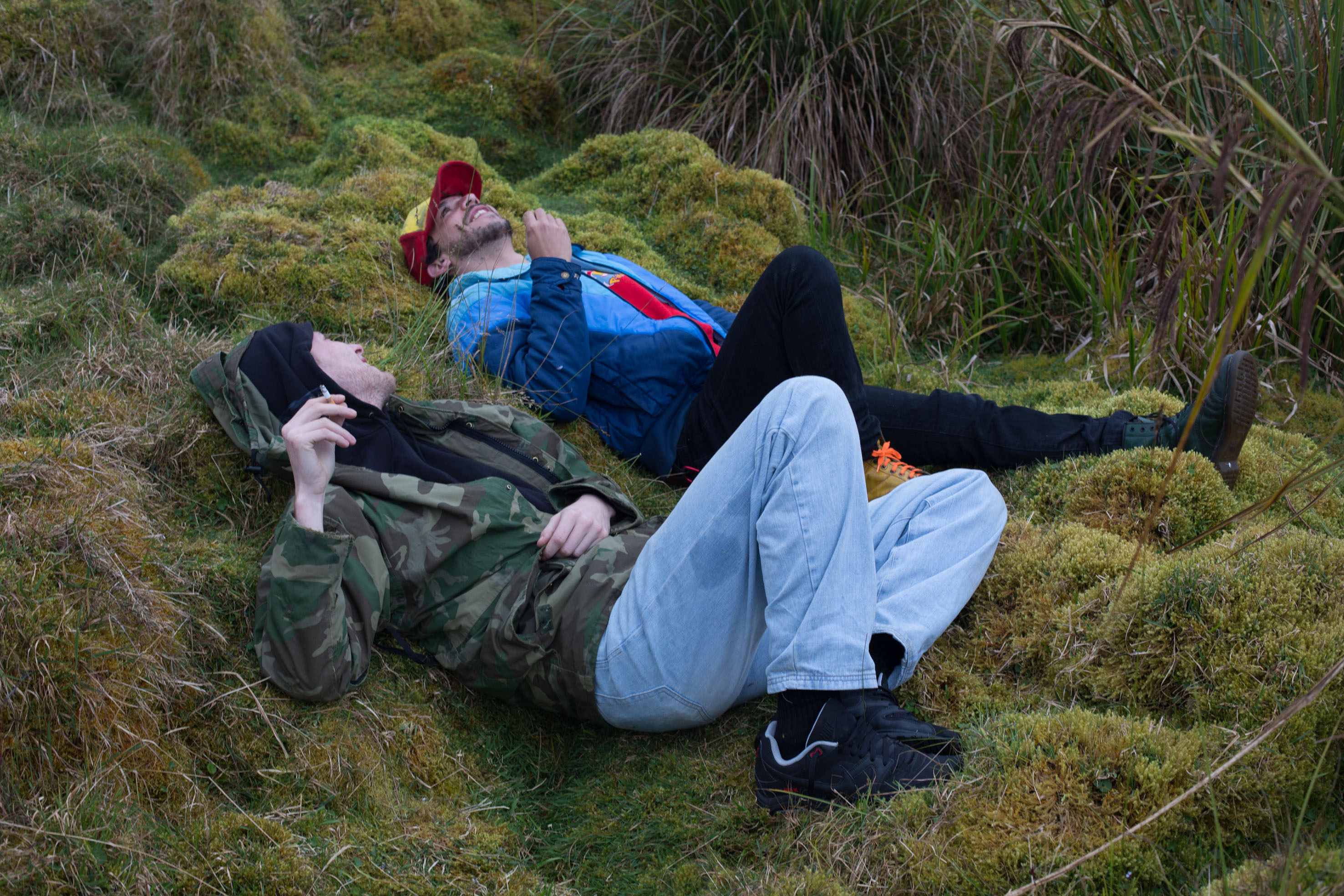
Juan Pablo & Karl, Chingaza (2012) by Wolfgang Tillmans
In fact the show reveals a determination to explore and diversify, to range over a huge variety of genres – portraits, still lifes, sky photographs, astro-photography, aerial shots and landscapes.
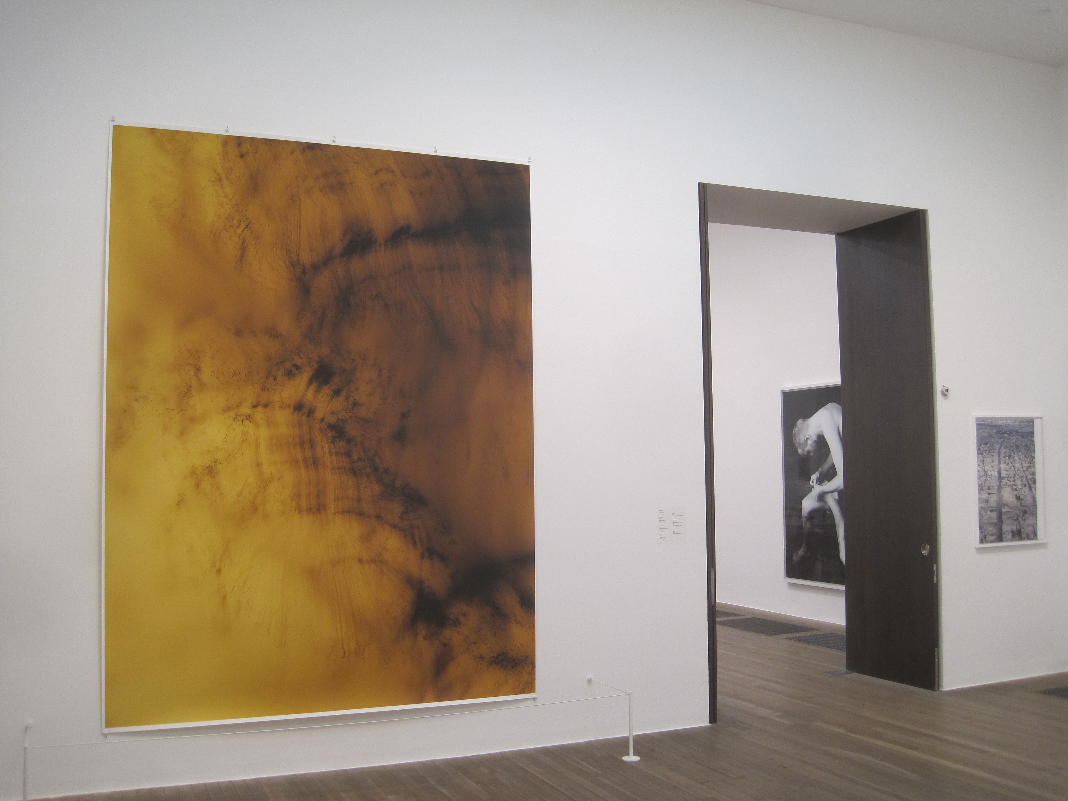
But he is just as interested in the presentation of the works as the subject matter, and this is one of the main themes of the show. It is emphatically not just a series of huge glossy photographs. Instead, there is a systematic exploration of the tremendous range of the media, of shapes and sizes and styles and formats, which the photographic image can come in.
There certainly are the big colour prints he’s famous for, but also photocopies and black and white prints, some enormous, some tiny – some expensively framed, some not – some are enormous and formally hung, some are in a cluster of Polaroid-size snaps just pinned up to the wall.
Also there are rooms full of display cases showing the range of arty or fashion magazines he’s worked for. Other rooms show collections of articles from newspapers and magazines concerning ‘issues of the day’, juxtaposed with relevant or related photos.
How we consume the image is as much a part of the show, as the images themselves.
Collum by Wolfgang Tillmans
Every room an installation
Quite quickly you realise that ideas and issues about photography are just as important as the images themselves
Thus, right at the beginning we are told that each room is a separate entity; each room has been individually created and curated – ‘specially configured’ – to address specific issues or themes or topics. The intention, then, is that each room (as a unique assembly of images) serves a double purpose – addressing varied issues and subjects but also exploring the wide range of formats which images can come in, ‘exploring’ the nature of the photographic image.
Operating on the basis of the fundamental equality of all motifs and supports, through this continual re-arranging, repositioning, questioning and reinforcement, Tillmans avoids ascribing any ‘conclusions’ to his work and thus subjects his photographic vision to a perpetual re-contextualization
To professional theorists of photography and the digital image, for all art and media students generally, this show is a goldmine of conceptualisation and theory. To ordinary gallery-goers simply curious to see arresting, beautiful or imaginative images… maybe not quite so compelling.
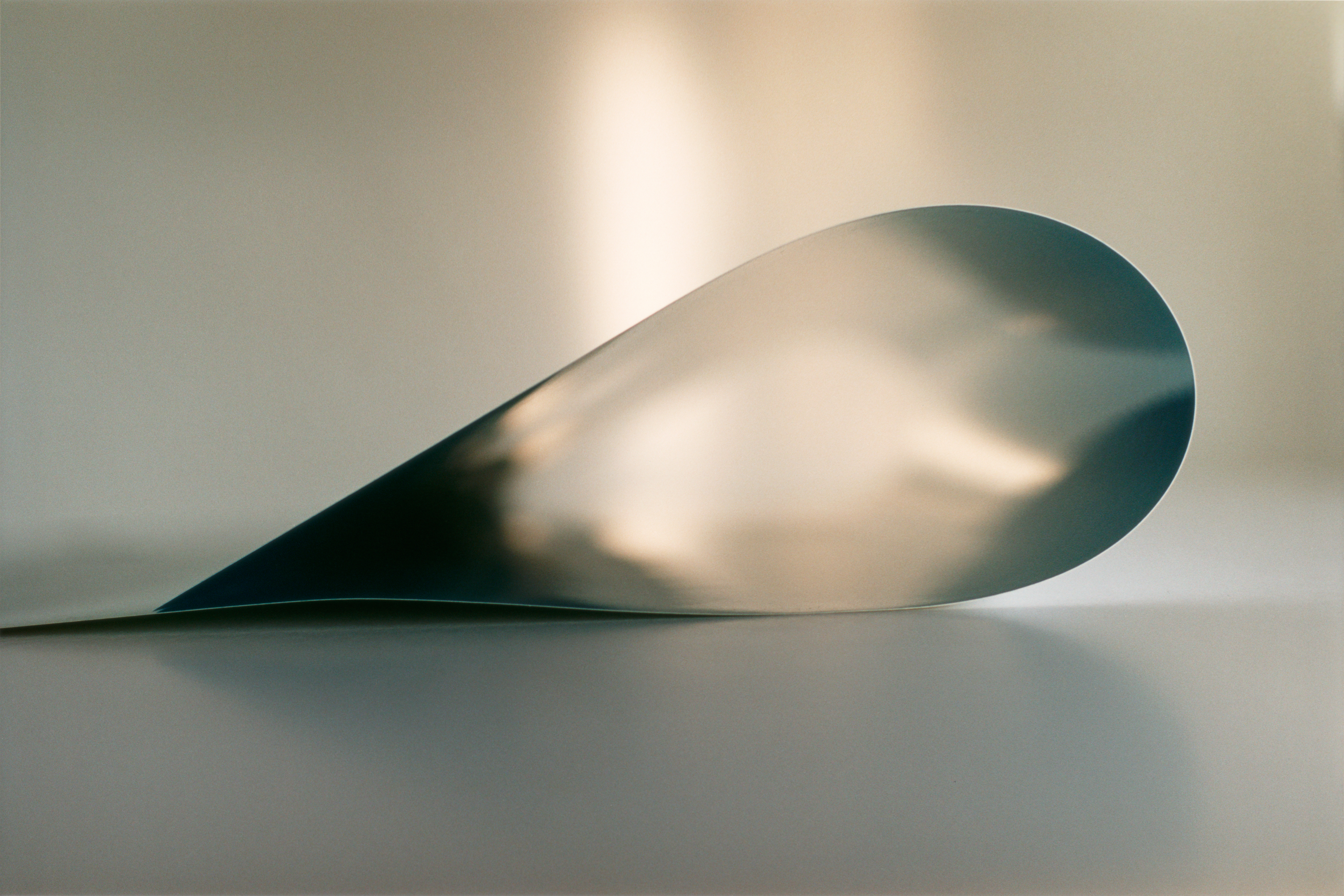
paper drop Prinzessinnenstrasse (2014) by Wolfgang Tillmans
Read the booklet
Indeed at the entrance to the exhibition the visitor attendant on the door tells us there will be no wall labels giving context and information, as is usual in most modern art exhibitions. Instead, the visitor is told they must consult the free booklet given out at the door to read up on what each room is about, what it is trying to say, the idea behind the installation.
There are 14 rooms so that’s 14 short essays. That’s quite a lot of reading, quite a lot of information processing to be done before you even look at anything.
And the only snag is that, the more you read, the less impressive the concepts and ideas become. As early as room 2 we learn that Tillmans spends a lot of time in his studio, making prints, planning exhibitions, collecting materials, gathering ideas and so on. Thus room 2 contains photos of… his studio, which, like most workplaces these days, consists mainly of computers on messy desks, with odd shots of cardboard boxes full of bottles, a colour photocopier taken to pieces and so on. It looks, in fact, like a really boring office.
But the commentary tries to gee it up by quoting from the man himself. Among other things it tells us that Tillmans has often described the core of his work as:
translating the three dimensional world into two dimensional pictures.
Wow. Profound. Isn’t this a tad… obvious? Do you think there has been any artist since about 1300 and any photographer since about 1850 who hasn’t been aware that they are engaged in transferring the 3D world onto a 2D surface?
In room 3 we learn about Tillmans’s project to travel the world and deliberately spend just a few days in each place photographing his first impressions, untainted by any understanding or knowledge of the local culture. He did, we are reassured, use ‘a high resolution digital camera’. And this approach led to some pretty impressive revelations, to a number of ‘shrewd observations about contemporary worldviews’.
For example? Well, he noticed that the shape of car headlights has changed in the past few decades. Herr Tillmans detected that car headlights are now much more angular than they used to be which, giving them, as the booklet helpfully explains:
a predatory appearance that might reflect a more competitive environment.
Golly. He spent four years travelling round the world and discovered… that car headlights are more angular than they used to be. Do you see what I mean by the ‘concepts’ and ‘ideas’ underpinning the show not being that…. impressive. Don’t get me wrong: the photos of car headlights are beautifully shot, big, perfectly in focus, very much like… well… high def adverts for car headlights.
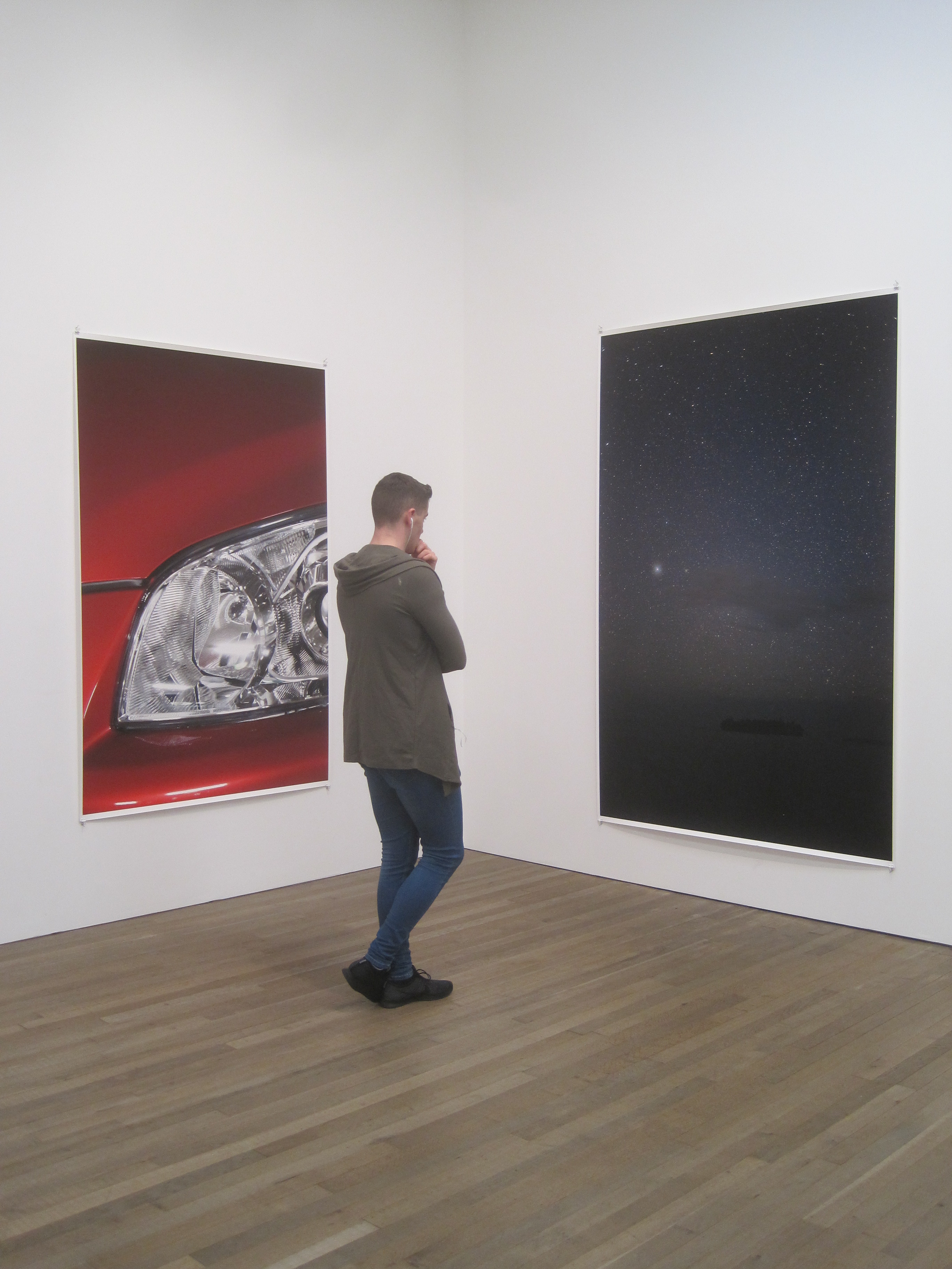
Installation view of Wolfgang Tillmans at Tate Modern featuring Headlight (left)
Room 4 is devoted to a series of display cases showing a project titled truth study centre which has been rumbling on since 2005. Photos, newspaper and magazine clippings, objects, drawings and copies of his own images are laid out in cases to highlight the revelation that – the media sometimes contradict themselves, politicians sometimes make statements about things they don’t understand, scientific knowledge is limited and partial, you shouldn’t believe everything you read.
I’m helping my daughter revise for her GCSE Media Studies exam. I know for a fact that these are the kinds of ‘insight’ which are quite literally taught to every 15-year-old schoolchild in the country.
It began to dawn on me that if you expect people to spend a lot of time at your exhibition reading about your ‘insights’ and ‘concepts’ – it would be a good idea to have something worth reading about. By room 5 I stopped reading the booklet for any ‘insight’ it gave me, but purely as a source of unintentional comedy.
Another example of the overconceptualisation of the stunningly banal is room 7, a nice-sized room with roof-height windows looking out over the Thames. In it are placed a very expensive sound system and some state-of-the-art loudspeakers which are playing a loop of tracks by Colourbox, an English band from the 80s that Tillman likes. And some benches to sit on.
That’s it. The idea seems to be that bands spend months in music studios recording music on incredibly hi-quality digital equipment – and then lots of people listen to this music through dodgy headphones via their mobile devices. The Big Idea seems to be: doesn’t that seem a bit of a shame?
I sat staring out at the view, tapping my feet to Colourbox and reading the rest of the booklet in a private game of ‘bullshit bingo’, spotting pretentious clichés and choice examples of curator-speak. According to the booklet the music room – ahem, I mean the installation entitled Playback Room – is:
An example of Tillman’s curatorial practice, he has chosen to include it here to encourage others to think about how recorded music can be given prominence within the museum setting.
Well, I bet nobody’s ever thought of playing music in an art gallery before. Truly we live in an age of exciting innovations!
The Painted Word
In his blistering satire on the 1970s New York art world, The Painted Word, Tom Wolfe describes how it suddenly dawned on him – as the new movements of minimalism and conceptual art became prominent in the early 1970s – that the concept, the idea, the project, the word, had now become the truly creative part of a work of art – and that the actual painting or photo or sculpture, was merely an appendage, an afterthought, a kind of dubious, oh-do-we-really-have-to illustration of the idea for the work.
The idea, and its formulation in words, was now the creative achievement. Hence his title – the insight that a lot of modern art is merely a sort of painted word. I couldn’t help thinking of Wolfe as I was obliged at the start of each one of the 14 rooms here to read the short essay in the booklet to find out what the devil the room was on about. Increasingly ignoring the text, I had the subversive idea of looking closely at what was actually on display.
Four thoughts
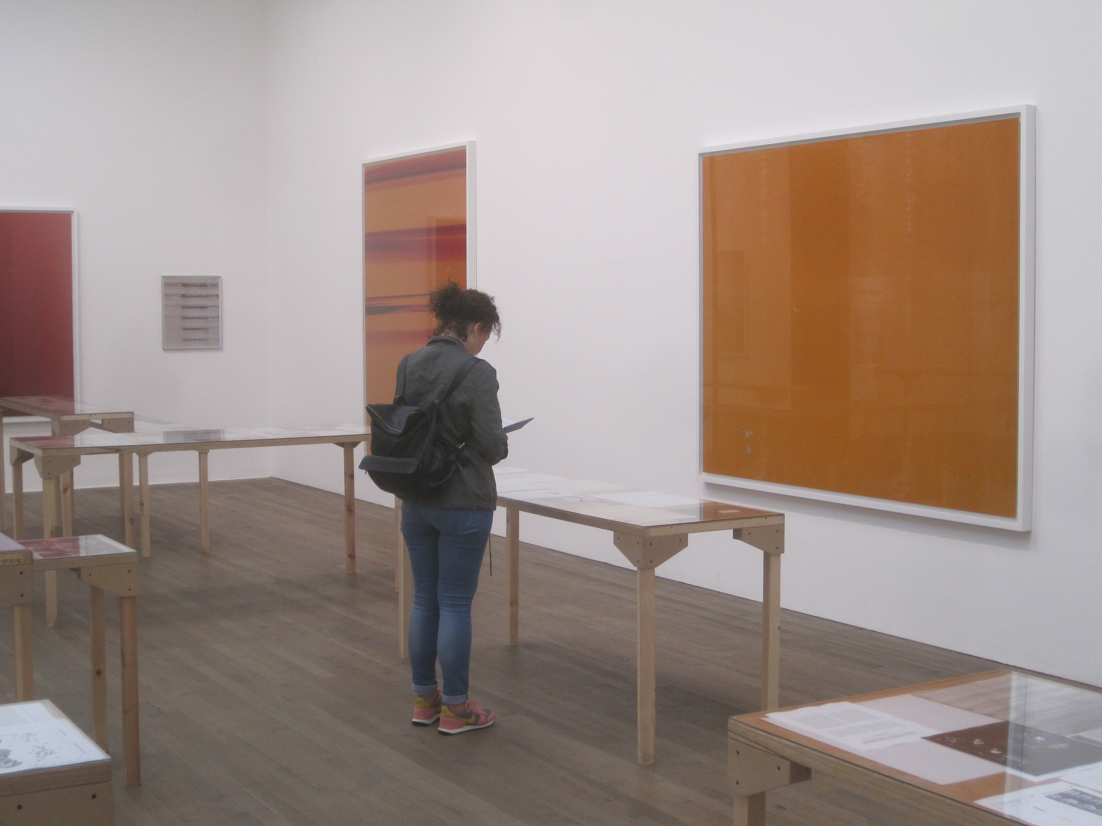
1. Abstracts
Once you actually focus on the art, then a number of the really large abstract prints, in the series named Silver and Greifbar, really stand out. Large swirls of colour which are apparently created without using a camera but by manipulating light and chemicals directly onto photosensitive paper. Big bold and attractive – though maybe because they look so much like the abstract expressionists I’ve been reading about recenty. They are a sort of cross between abstract expressionism and a funky advert for ice cream being mixed. Or maybe shots of campari or whiskey being twirled in a glass.
Installation view of Wolfgang Tillmans at Tate Modern featuring Greifbar 29 (left) and a portrait of a guy picking his toenails (through the doorway)
Good, aren’t they? And massive. Immersive. And immensely familiar because you feel like someone somewhere has surely been making pictures like this for decades, but you can’t quite remember who. Maybe they haven’t. Either way, big and very relaxing.
2. Ugly
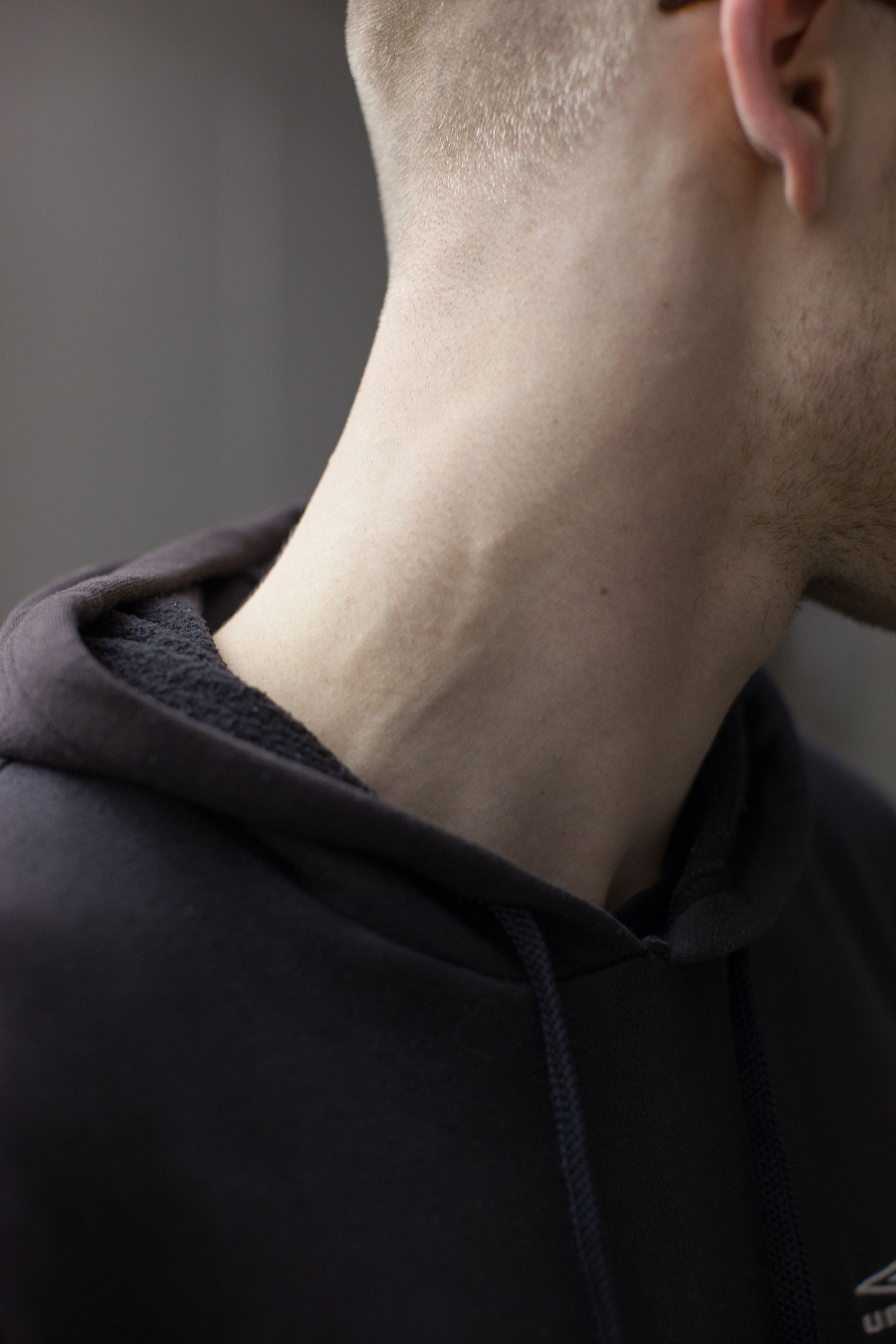
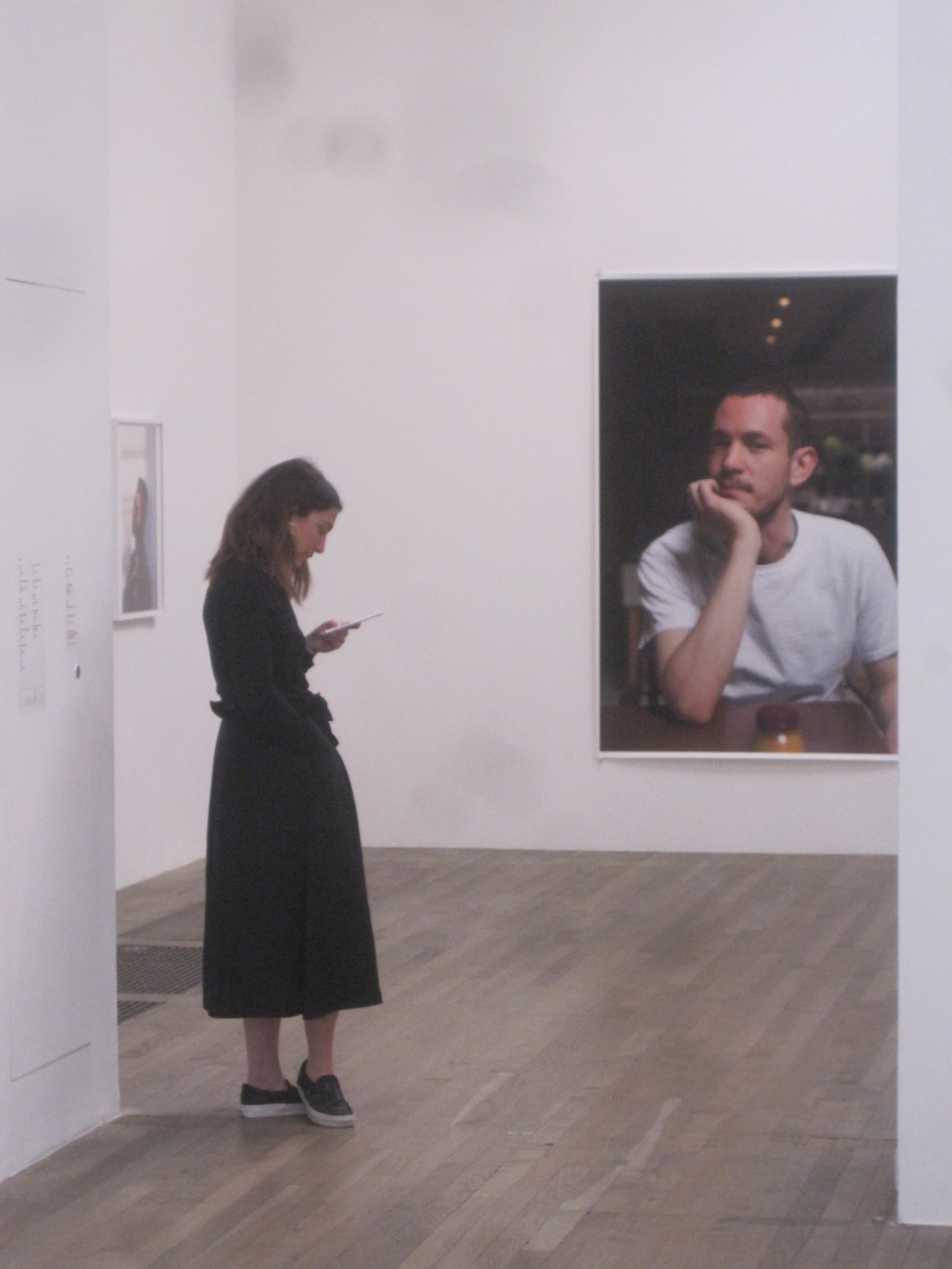
A lot, in fact every single one of the many, many portraits sprinkled throughout the exhibition, are ugly. Some of the famous people – the usual arty suspects like Vivienne Westwood or Patti Smith or Morrissey – are fairly old and raddled to start with, but even the various-sized portraits of his young gang, his mates, scruffy sneaker-shoed arty types in dodgy-looking flats and apartments, gay men, gay women, young boho types, ALL of them are done with a deliberately unflattering, anti-romanticism.
In this respect Tillmans combines, to my mind, the deliberate willful ugliness of much modern photography and contemporary art, with an extra helping of the traditional German taste for the grotesque, a lineage which stretches from Dürer, through the German Expressionists, to George Grosz and Otto Dix and on to Joseph Beuys v a lot of German art has foregrounded ugliness, crudity and ungainliness. No grace. No poise. Scruffy unshaven blokes in duffel coats. Clunky hairy people with all their spots and pimples.
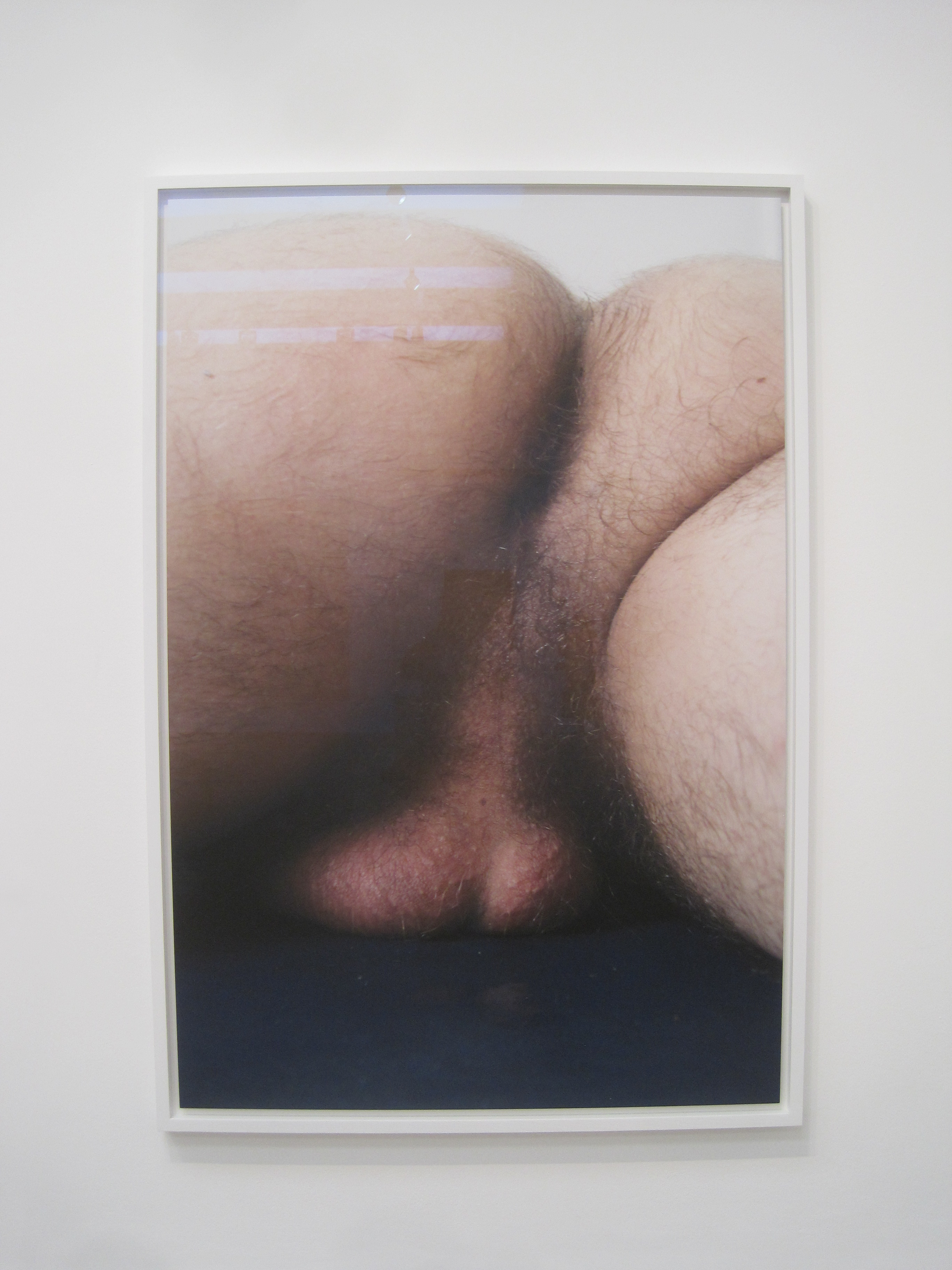
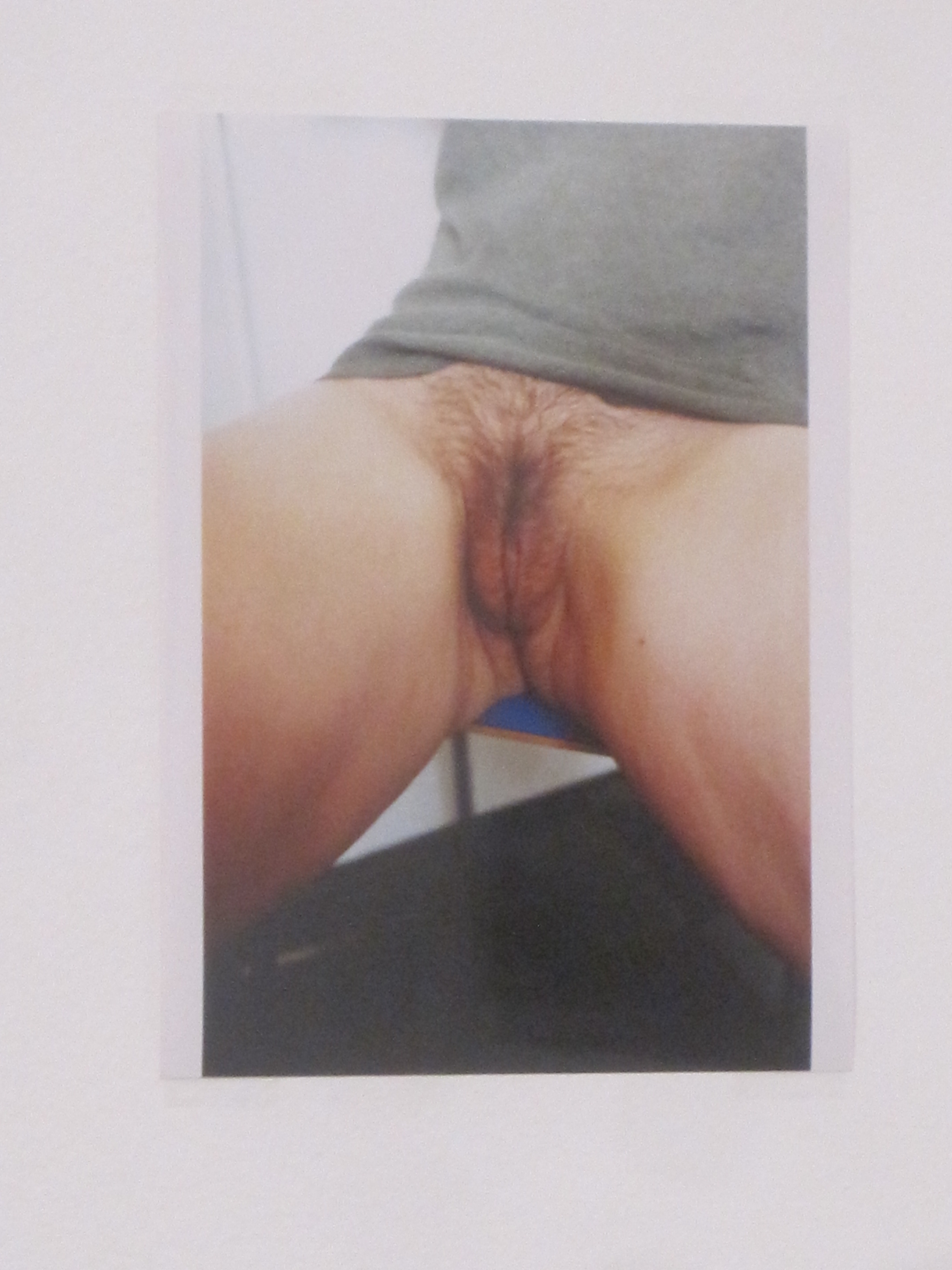
Given his queer punk credentials it’s a little surprising how few sexually explicit photos there are here, but it’s entirely characteristic that the two really rude ones – of a man’s bollocks and a woman’s pussy – are hairy and unglamorous. Shrewdly composed and framed, alright – beautifully in focus – technically perfect – but determinedly, almost brutally, real. (See below) The aesthetic is in the refusal to retouch, soften, smooth out or prettify. In cold white light, in perfect focus, in unforgiving colour – this is what it is.
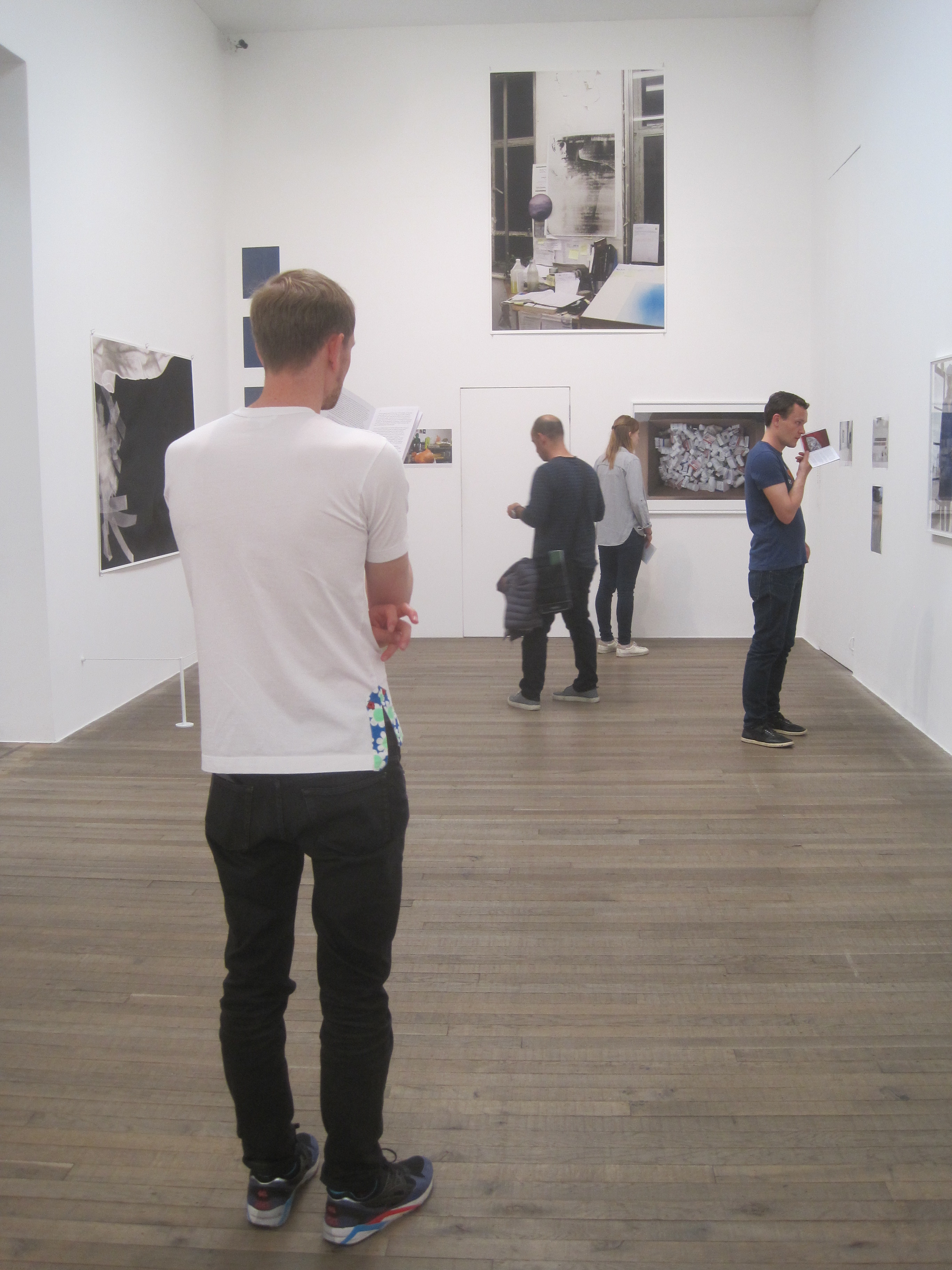
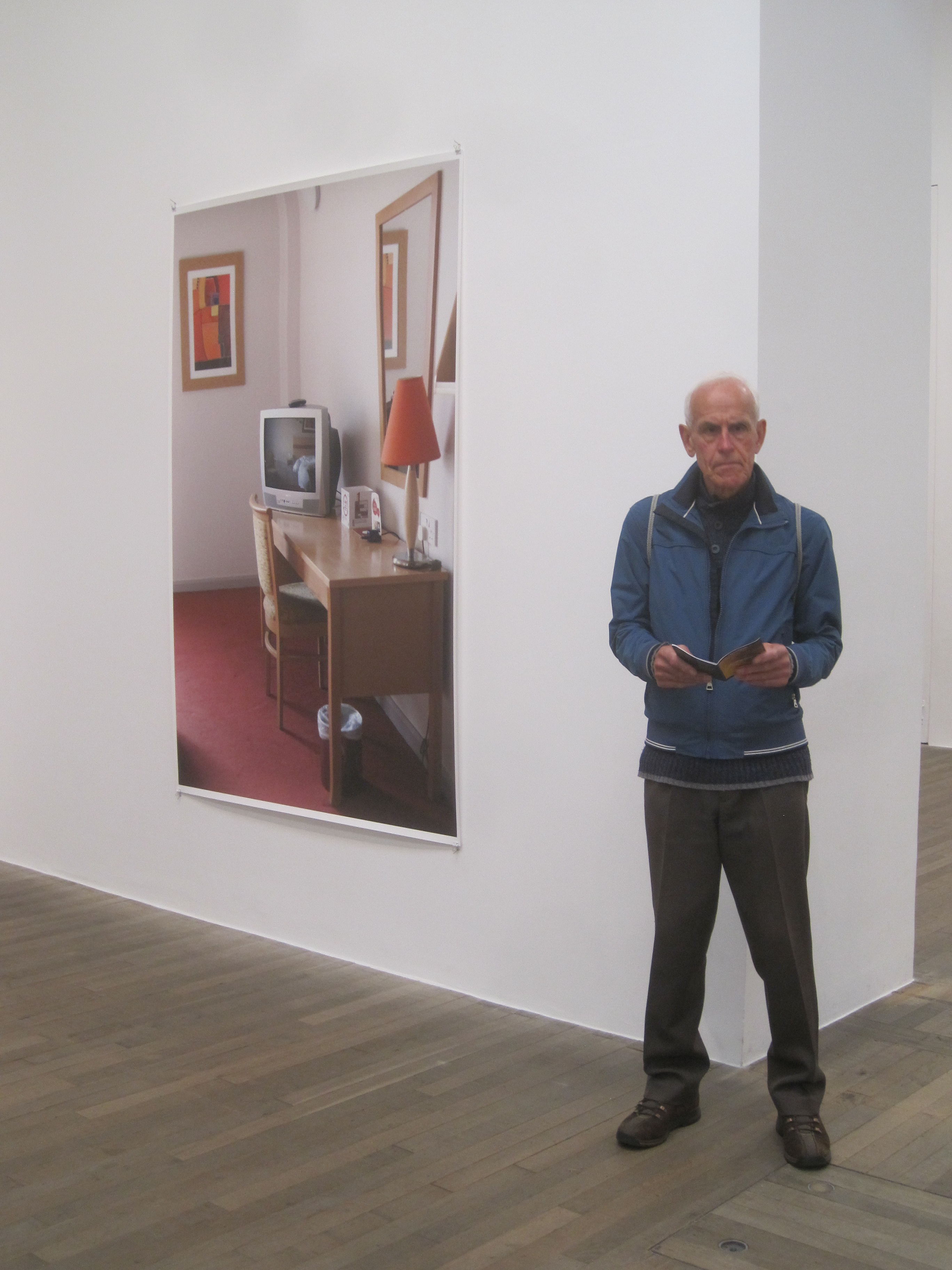
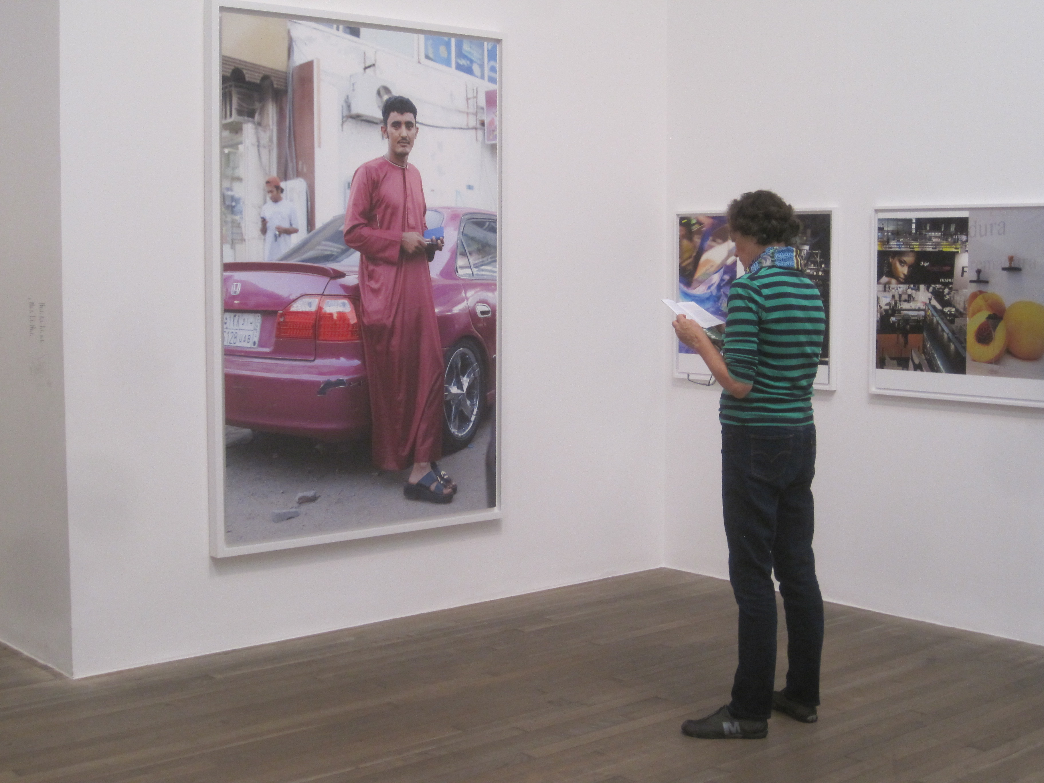
3. People reading the booklet instead of looking at the art
Half way round I noticed just how many of the visitors were standing heads-down, intently studying the curator’s booklet and not looking at all at the supposed ‘art’. As a private joke, I began to take photos of visitors reading the booklet instead of looking at the art. I like to think this is a new artistic genre which I have just invented – ‘Photos of visitors to a Wolfgang Tillmans exhibition who spend more time reading the booklet about the exhibition than actually looking at the works in the exhibition’. Maybe I’ll enter my portfolio for the Turner Prize.
Wolfgang Tillmans: Don’t look: Read! #1
Wolfgang Tillmans: Don’t look: Read! #2
Wolfgang Tillmans: Don’t look: Read! #3
Wolfgang Tillmans: Don’t look: Read! #4
Wolfgang Tillmans: Don’t look: Read! #5
4. ‘Practice’
Usually in the commentary on a contemporary artist we learn that they are challenging, subverting, investigating, questioning and engaging with contemporary issues – more often than not these days, issues of gender and identity, the favourite subject of artists and curators alike.
Tillman does all that, of course, but I couldn’t also help noticing the obsessive repetition of the word ‘practice’ in the booklet:
- … these elements [photographing everyday life and contemporary culture and displaying the prints as whole-room installations] remain central to his practice…
- … cultural attitudes towards race, gender and sexuality have become more open over the three decades since he began his practice…
- [the sound room is] an example of Tillman’s curatorial practice…
- [since his high school days Tillman] has found ways to resist the idea that the photograph is solely a direct record of reality. In 2011, this area of his practice was compiled for the first time in his book Abstract Pictures…
- An acute awareness of fragility endures across Tillmans’s practice in all its different forms…
- Since 2014 he has allowed performance to become a more prominent strand of his practice…
- Portraiture has been central to Tillmans’s practice for three decades…
This word ‘practice’ always reminds me of GPs or vets – probably because, looking after two children and two cats as I do, I spend a LOT of time either at the vets or the GPs’ – and so I kept finding myself standing in front of big or little photos, of the sea, or a dusty car, or a garden weed, or ships in China or a roll of paper or someone’s bollocks, with the titles of James Herriot’s vet books drifting through my mind in ironic counterpoint.
If Only They Could Talk
Let sleeping vets lie
It shouldn’t happen to a vet
The sea
The final room contains two huge photos of the sea. Like lots of Tillmans’ giant pics, what’s not to like? Big bold beautifully shot, nicely framed.
However, because none of us can be expected to really get these photos unless we’ve read the booklet and had the curators properly explain to us what we’re looking at, I quote the relevant paragraph in full:
Symbol and allegory are artistic strategies Tillmans is usually keen to avoid. The State We’re In, A 2015 is a departure from this stance: the work’s title is a direct reference to current global political tensions. Depicting the Atlantic Ocean, a vast area that crosses time zones and national frontiers, it records the sea energised by opposing forces, but not yet breaking into waves. Differing energies collide, about to erupt into conflict.
Now do you understand this photo? (And thanks for the tip that the Atlantic Ocean is vast and crosses several time zones. I might pass that on to my daughter for her GCSE Geography exam which she is taking tomorrow. The Atlantic Ocean is very big. One to remember. Where would we be without artists, curators and their amazing insights?)
Conclusion
Although most of the text and installation paraphernalia was bollocks, I actually enjoyed this exhibition. The music room was nice and relaxing and the really big abstracts (the Silvers and Greifbars, the series showing rolls of paper as abstract shapes) are wonderful. The enormous photos of the sea or a market in Africa or a dusty car or the messy desk in his studio or two guys playing chess in China are all very quaffable, easy on the eye, slip down a treat.
I spoke to another visitor who commented that it was all very ‘cool’ in the older sense of the word – there was absolutely no emotional affect in any of it. Once you realised that the ‘concepts’ and ‘installations’ were based on incredibly simplistic schoolboy ideas (pictures are 2D representations of a 3D reality, it might be nice to have music in galleries, cars are sleeker than they used to be, attitudes to gender and race are more relaxed than they were thirty years ago, some of the stuff you read in newspapers isn’t strictly true) you felt free to ignore them completely, and just drift among this haphazard selection of all kinds of photographic images – large and small, colour or monochrome, framed or tacked to the wall – and like whatever takes your fancy.
And without the verbiage of the booklet – if you consciously ignore the attempt at conceptualisation, the frameworks of the installation and so on – then the real message that comes over is one of enormous randomness – haphazardness, aimlessness, arbitrariness. Sea, a weed, a car, some random people, a computer, big abstracts, rolls of paper, magazines, more random people – it’s like going for a walk through Google Images – each done to technical perfection, with a high gloss finish, perfectly in focus, made with Germanic precision – but completely odourless, uninflected, unaffecting.
In fact it bears out one of the few bits of the booklet which had any real purchase v that Tillmans believes in ‘the fundamental equality of all motifs’. Everything is the same. As an old boss of mine used to say, When everything’s a priority, then nothing’s a priority. Alles ist gleich. The apple tree outside his window, Hannah the lesbian, the Atlantic Ocean, a cardboard box, some Chinese guys, some Pakistani guys, a desk, a waterfall, a shiny red car, the Director of the British Museum, some students in a room…
It all goes into the Tillmans machine and comes out wonderfully and completely bereft of meaning or significance, entirely inconsequential – and so, all taken together, producing an effect of great calmness.
A very relaxing and soothing experience – and if you throw in a game of bullshit bingo or watching-people-read-the-booklet, very funny too.
Vielen Dank, Herr Tillmans.
