Into the Night: Cabarets and Clubs in Modern Art @ Barbican

This is a fabulous exhibition, packed with wonderful paintings, photos, films, drawings, posters and all kinds of memorabilia connected with a dozen or so avant-garde and trend-setting nightclubs around the world from the 1880s to the 1960s, And as well as all the lovely works and ideas and stories, it raises a number of questions, which I’ll address at the end of this review…

First the clubs and their stories. The Barbican exhibition space is laid out not as ‘rooms’ but as successive alcoves or spaces running off the first floor gallery, from which you look down onto the ground floor which can be divided up into various areas, or opened up to make one through-space (as they did for the Lee Krasner exhibition).

There are eight of these room-sized alcoves upstairs, and in this exhibition each one tells the story of one or two famous nightclubs which became a focus for artists, or was designed and decorated by artists, in various countries from the 1880s onwards…

Paris

The Chat Noir nightclub was the most famous of the new generation of nightclubs which opened in the Montmartre region of Paris in the 1880s. The darkened interior combined Gothic, Neo-Classical and Japanese features, in fact it contained so many artworks some people nicknamed it the Louvre of Montmartre.

Reopening of the Chat Noir Cabaret by Théophile-Alexandre Steinlen (1896) © Victoria and Albert Museum, London

In 1885 a shadow theatre was installed on the Chat Noir’s third floor in a room hung with drawings by Edgar Degas, Monet and Toulouse-Lautrec. Here artist Henri Riviere and collaborators staged what ended up being a series of 40 increasingly elaborate shadow plays. The exhibition features photos and drawings of the Chat Noir, along with some fabulous posters, and a big display case of some of the elaborately designed zinc silhouettes used in the plays, explaining how they were made, what characters they represent, along with some of the books, kind of novelisations of the plays they staged, including music and illustrations

The shadow theatre’s owner Rodolphe Salis took it on an international tour in the 1890s, inspiring a generation if avant-garde artists.

Meanwhile, the strange and dramatic dances of Loïe Fuller staged at the Folies Bergère in the 1890s were trail-blazing experiments in costume, light and movement. Fuller held long sticks attached to swathes of fabric to enormously increase the swirling effects of her dances. She was a real innovator who set up a laboratory to experiment with spectacular effects.

Henri de Toulouse-Lautrec captured her performances in a series of delicately hand-coloured lithographs, she inspired early film-makers like Edison and Lumiere brothers, and the alcove devoted to her also has a set of huge and very evocative posters by the great poster-maker of the era, Jules Chéret.

Folies Bergers by Jules Chéret

Vienna

The Cabaret Fledermaus was opened in Vienna in 1907 by the Wiener Werkstätte. It is a total art work in which every element – chairs, tables, light hanging, stairs and the brightly coloured tiled walls – each tile featuring a unique fantastical motif – were designed to create an overwhelming effect. Joseph Hoffmann designed the overall concept and commissioned the Wiener Keramik workshop to produce the tiles. The club hosted satirical plays, poetry readings, avant-garde dance and a variety of musical events, including a performance of The Speckled Egg by the 21-year-old Oskar Kokoschka, a puppet show based on an Indian folk tale – the exhibition includes the fragile, original hand-made puppets.

Postcard showing the Interior view of the bar at the Cabaret Fledermaus (1907) Collection of Leonard A. Lauder

London

Not to be left behind, some London artists banded together to set up The Cave of the Golden Calf in 1912, an underground haunt in Soho set up by Frida Uhl Strindberg. It was located in ‘a dingy basement below a cloth merchant’s warehouse just off Regent Street, where her artist friends Spencer Gore, Jacob Epstein, Wyndham Lewis, and Eric Gill contributed to the futurist and Russian ballet-inspired art that covered the club’s interiors. It was also, apparently, possibly the first ‘gay bar’ in the modern sense and was certainly conceived by its creator, as an avant-garde and artistic venture.

This section included designs for the interior by British artists Spencer Gore and Eric Gill, as well as Wyndham Lewis’s highly stylised programmes for the eclectic performance evenings. I came across Wyndham Lewis at school and have never stopped loving his savage angular art, either satirising English society or brutally conveying the reality of the Great War, which he saw from the front as a bombardier. For me his programme designs were the best thing in this section.

Study for a mural decoration for the Cave of the Golden Calf by Spencer Gore (1912) © Tate, London 2019

Zurich

Zurich during the war is famous as the birthplace of the Cabaret Voltaire (1916), which in its short existence (February to July 1916) hosted far-out Dada events and happenings in a deliberately absurdist environment. The exhibition includes samples of absurdist sound poetry and fantastical masks that deconstruct body and language, as used in the anarchic performances of original Dadaists Hugo Ball, Emmy Hennings and Marcel Janco. Later Jean Arp recalled ‘pandemonium in an overcrowded, flamboyant room’ with works by Picasso or Arp hanging on the wall while Hennings sang anti-war songs there were puppet shows, improvised dances, African drums, and booming ‘poetry without words’ was yelled through a megaphone by people wearing silly costumes. This is a 1960s reconstruction:

Rome

The curators select two clubs from the post-war period in Rome which demonstrated the hold of the dynamic new art movement of Futurism in Italy in the 1920s.

In 1921 Futurist artist Giacomo Balla was commissioned by Ugo Paladini to create a Futurist nightclub and the result was Bal Tic Tac, which used Futurist angular design to create a wonderfully colour-saturated designs for the club’s interior. The exterior of the building was sensible neo-classical, the interior deliberately undermined this with brightly coloured interlacing shapes meant to capture the movement of dancers. It was one of the first places in Rome to promote the new American jazz music. A sign on the door read, ‘If you don’t drink champagne – go away!’

Also in the same room is a display devoted to drawings and furnishings for Fortunato Depero’s spectacular inferno-inspired Cabaret del Diavolo (1922) which occupied three floors representing heaven, purgatory and hell. Depero’s flamboyant tapestry writhes with dancing demons, expressing the club’s motto ‘Tutti all’inferno!!! (Everyone to hell!!!)’.

Black and White Little Devils: Dance of the Devils by Fortunato Depero (1922) © DACS 2019. Archivo Depero, Rovereto. Courtesy Mart  Archivio Fotografico e Mediateca

Weimar Germany

After Paris in the Belle Epoque, probably the most famous era of nightclubs was in Weimar Germany between the wars, the exhibition doesn’t disappoint, with a selection of paintings and drawings of decadent German nightclubs by the likes of George Grosz, Otto Dix and Max Beckmann, Grosz – as usual – for me at any rate, emerging as the star among the men.

But, living in the era when we do, the exhibition goes out of its way to promote the work of ‘often overlooked female artists’, such as Jeanne Mammen and Elfriede Lohse-Wächtler.

Jeanne Mammen is really good. Her drawings and paintings are recognisably from the same time and place as the guys, but feel a little softer, more rounded, her figures are a little more like humans and less like the porcine animals of Grosz or Dix. Also her use of colour, particularly watercolour, the colours washing or dribbling or spilling over to create colour and life and action and depth. She depicted almost only women, many set in overtly lesbian nightclubs, in fact some of the wonderful pictures here were illustrations to a 1931 book titled A Guide To Depraved Berlin.

She Represents by Jenna Mammen (1928) published in Simplicissimus magazine Volume 32, Number 47

One of the most purely beautiful paintings in the exhibition is Karl Hofer’s iconic portrait of a couple of Tiller Girls, the Tiller Girls being dancers who did high-precision, high-kicking routines.

Tiller Girls by Karl Hofer (before 1927) Kunsthalle Emden – Stiftung Henri und Eske Nannen © Elke Walford, Fotowerkstatt Hamburg

Interestingly, a social theorist write in the same year this was painted, 1927, that the uncanny precision and interchangeability of the girls mirrored the large-scale mechanical methods of manufacturing which were then coming in and capturing people’s imaginations: ‘the hands of the factory correspond to the legs of the Tiller Girls’.

Strasbourg

Meanwhile in Strasbourg, Theo van Doesburg, Hans Arp and Sophie Taeuber-Arp worked together to create the L’Aubette (1926–28), conceived as the ultimate ‘deconstruction of architecture’, a highly modernist, strict, functional design, with bold geometric abstraction as its guiding principle. The vast building housed a cinema-ballroom, bar, tearoom, billiards room, restaurant and more, each designed as immersive environments.

The Ciné-bal at Café L’Aubette, Strasbourg, designed by Theo van Doesburg (1926 to 1928) Image: Collection Het Nieuwe Instituut

Harlem

During World War One a Great Migration began of African-Americans from the Deep South to escape segregation, poverty and violent racism. They came north, to northern cities like Chicago and New York, and brought with them new music and sounds, specifically jazz. In New York many settled in the uptown Harlem district which underwent a great artistic flowering of music, poetry, dance, art and more, which eventually became known as the Harlem Renaissance.

The exhibition includes a fascinating street map of Harlem (by E. Simms Campbell) which shows all the different nightclubs and the types of jazz to be found there. The most evocative thing here is the movie made around Duke Ellington’s jazz suite, Symphony In Black, which was intended to convey a panorama of African-American life.

All the static artefacts struggle to compete with the evocativeness of a) the music and b) some of the scenes from the movie. But what comes close is the fabulous silhouette art of Aaron Douglas who is represented by paintings and prints and illustrations to a book of blues lyrics by Langston Hughes. Vivid, beautifully crisp and rhythmic, it’s no wonder the curators chose one of his images as the exhibition poster.

Dance by Aaron Douglas (1930) © Heirs of Aaron Douglas/VAGA at ARS, NY and DACS, London 2019

I’d like to know a lot more about Douglas, every one of the half dozen or so images on show here are excellent. They also made me realise the black and white silhouette art of Kara Walker, the contemporary Afro-American artists, is not as original as I thought it was.

So far all these settings and stories and artists have been European and American, part of a familiar narrative of Euro-American modernism which most of us are pretty familiar with. But this huge exhibition has a few surprises in store. First, the non-Western subjects.

Mexico City

Two and a half thousand miles south of New York City is Mexico City. Here, in the aftermath of the prolonged Mexican Revolution, in the early 1920s, a radical new art movement emerged named Estridentismo which sought to overthrow established bourgeois modes and create a new poetry which combined the folk fiction of the peasants with the reality of urban life in the big cities. How to unite rural peasants and urban workers – it was Lenin’s problem, Mao’s problem, Guevara’s problem, and the founders of the movement – Ramón Alva de la Canal, Manuel Maples Arce and Germán Cueto – discussed this and much more at the Café de Nadie (Nobody’s Café) in Mexico City.

One of them came up with the characteristically inane motto: ‘Chopin to the electric chair!’ (characteristic for the post-war era of anti-bourgeois rhetoric)

Well, the twentieth century was to send many poets, painters, composers and musicians to the gulag, to the death camp and the execution cell, so in a roundabout way they got their wish.

El Café de Nadie by Ramón Alva de la Canal (c. 1970) © DACS, 2019. Courtesy Private Collection

Later in the 1920s, some of the group plus new members set up the ¡30-30! group (named after a popular rifle cartridge) with a socialist agenda of bringing art to the masses, and they organised lots of exhibitions and events in 1928 to 30. In January 1929 they staged an ambitious interactive exhibition-cum-event in a large carpa or low-cost tent used for travelling circuses. The Carpa Amaro event featured many woodprints, a deliberately cheap, affordable form.

The exhibition includes photos of these young firebrands, alongside a case of handmade masks made by German Cueto, and then a wall of thirty or so of the woodcuts which featured in the carpa exhibition by artists such as Gabriel Fernandez Ledesma and Fermin Revueltas Sanchez, ranging in subject matter from revolutionary leaders to suckling pigs via many portraits of working people.

Viva el 30-30 by Fernando Leal (1928)

Nigeria

Then, to my surprise, there is a whole section about Nigeria, specifically about the highly influential Mbari Artists and Writers Club, founded in the early 1960s in Nigeria.

The exhibition focuses on two of the club’s key locations, in Ibadan and Osogbo, describing how they were founded as laboratories for postcolonial artistic experimentation, providing a platform for a dazzling range of activities – including open-air dance and theatre performances, featuring ground breaking Yoruba operas by Duro Ladipo and Fela Kuti’s Afro-jazz; poetry and literature readings; experimental art workshops; and pioneering exhibitions by African and international artists such as Colette Omogbai, Twins Seven-Seven, Ibrahim El-Salahi and Uche Okeke.

There were some striking paintings here, I appreciated the swirling designs of Twins Seven-Seven but was drawn to the three works by Ibrahim (later discovering these are talismanic pieces of post-colonial African art).

Self-Portrait of Suffering by Ibrahim El-Salahi (1961) Iwalewa-Haus, University of Bayreuth, Germany © Ibrahim El-Salahi

There was a very interesting film playing, Art In A Changing Society made back in 1964 by Francis Speed and Ulli Beier, which was a TV documentary-style introduction to the art and architecture, design and dance and music of post-colonial Nigeria but which I cannot, alas, find on the internet.

Tehran

Lastly, and most unexpected of all, we come to Tehran in 1966 where the club Rasht 29 emerged as a creative space for avant-garde painters, poets, musicians and filmmakers to meet and discuss. There were spontaneous performances and works by artists like Parviz Tanavoli and Faramarz Pilaram hung in the lounge while a soundtrack including Led Zeppelin and the Beatles played constantly.

Best of the works here were the three or four works by Parviz Tanalovi, who incorporated industrial leftovers and detritus into picture sculptures i.e picture sized and shaped objects, which hang on a wall, but which come out of the picture frame into three dimensions. Apparently many of his works incorporate a grille which looks to me like the symbol of a prison but apparently refers to the traditional design of a saqqakhaneh, the ‘sacred commemorative water fountains’ which gave their name to the artistic movement they all belonged to Saqqakhaneh.

Heech and Hands by Parviz Tanavoli (1964) Collection Parviz Tanavoli © Parviz Tanavoli


1. Including the non-Western clubs

As you can see, it’s a lot to take in. I find it hard to keep in mind all of the aspects of Modernism across Europe and the States – bringing in new non-Western countries is a brave and admirable move – it is good to learn about Ibrahim El-Salahi and Parviz Tanalovi, in particular.

But it begs quite a few questions:

1. Why do we get to see so very little non-Western art in all our major art galleries. Mexico, Nigeria, Iran – these are all major countries with huge populations and long cultural heritages. Yet you only rarely hear anything about them.

2. Do they really fit into this exhibition? Not only was the Western stuff unified by coming from a common European artistic heritage, but it was unified in date as well, showing the flow of thought from the late-nineteenth century through the Great War and into the inter-war period: it covers the period roughly described as Modernism. Whereas the Nigeria and Tehran stuff suddenly leaps into the 1960s, a completely different period with a completely different vibe.

So not only do I know next to nothing about Nigerian or Persian traditional art, but I am not told anything about Nigerian or Iranian art of the 1900s, 20s, 30s, 40s or 50s to help put the sudden focus in the clubs of the 1960s in focus.

2. Recreating the nightclub vibe

There is one massive aspect of the show I haven’t mentioned yet – which is that, having processed through the historical exhibition and display up on the balcony, the visitor then goes back down to the ground floor and discovers that, in the central gallery space, the curators have recreated some of the art clubs which we’ve been reading about. Specifically, there is:

  • Chat Noir a white room with 7 or 8 of the big metal stencils fromt he Chat Noir hanging from the ceiling and slowly rotating in the mild breeze and throwing shadows on the wall, all to the contemporaneous music of Debussy and Satie – a very calm, peaceful, meditative room
  • Cabaret Fledermaus a striking reconstruction of the Viennese nightclub in which the walls and bar are studded with brightly coloured tiles

Recreation of the Cabaret Fledermaus, Vienna, 1907

  • L’Aubette a reconstruction of L’Aubette, the semi-industrial, architectural complex in Strasbourg, complete with cinema projection running a series of contemporary films, including Modern Times by Charlie Chaplin and Metropolis

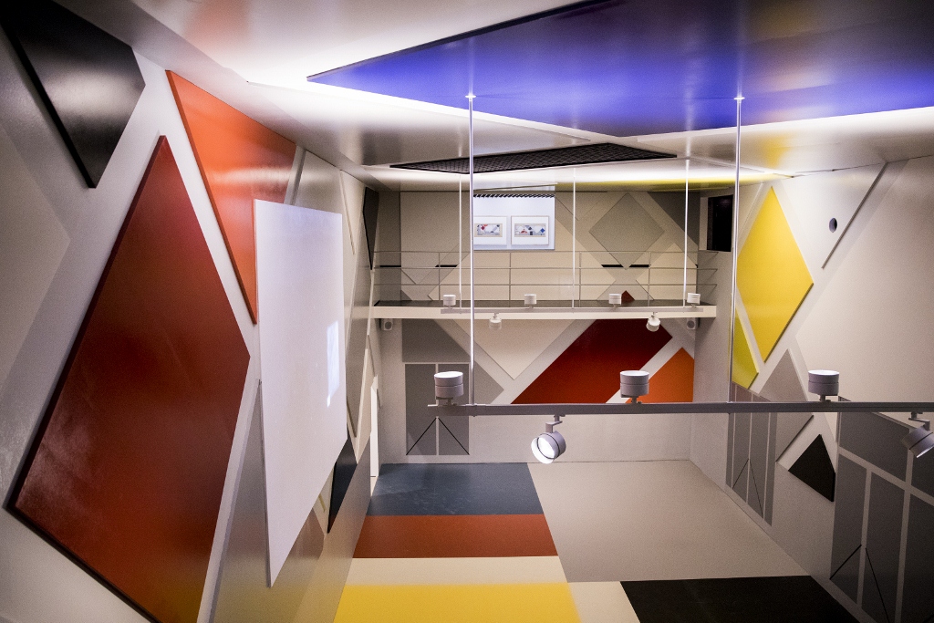
Recreation of the cinema-ballroom L’Aubette by Theo van Doesburg, Hans Arp and Sophie Taeuber-Arp

  • Mbari Clubs and a nice space set off from the corridor by a barrier or wall made out of sculpted patterns in a Nigerian style, inside which was playing a video of Nigerian youths dancing

You can see that a great deal or time, trouble and expense has gone into recreating each of these ‘zones’. But.. The most obvious thing about most nightclubs is, or was, that they were traditionally subterranean, smoky, often very noisy and very cramped and packed environments, in which people are drinking too much and laughing and joking and often having to shout over the very loud music, and laughing and going off to the bogs or stopping for a snog on the stars or chatting up the barmaid or barman, and asking someone for a light. They are/were places of intense hectic human interaction.

It was an ambitious, maybe quixotic notion, to try and recreate all that human bustle, noise, sweat and booziness in… the uniquely silent, white, perfectly scrubbed and essentially sterile environment of the modern art gallery. Nothing could really have been more dead than the Mbari Clubs little zone, completely empty when I walked in, admired the Yoruba wall paintings, and walked out again. Or the loving recreation of the Cabaret Fledermaus, beautiful coloured tiles and all, and utterly empty and utterly silent when I walked through it.

Conclusions

This is a fascinating insight into an enduringly interesting subject, a subject which has inspired all manner of artists across numerous countries and periods.

In fact, maybe you could think of The Nightclub as being an entire genre, a very twentieth century genre, as The Nude or The Landscape were for previous centuries.

And I admire the way the curators have made it so multinational, showing the same impulse at work across multiple cultures and continents.

Like previous Barbican shows it is so packed as to be overwhelming, bringing together over 350 works rarely seen in the UK, including paintings, drawings, prints, photographs, films and archival material.

And yet I was really perplexed by the recreations. The young woman who took my ticket explained that they have been having music evenings, with live bands playing. Maybe that helps, maybe that lifts it a bit. But it was eerie walking through perfect recreations of places which were meant to be temples to human interaction in all its smelly, sweaty, boozy, smoke-ridden, music-drowned glory but were now empty and silent – turned, quite literally, into museum pieces.


Related links

Other Barbican reviews

Aftermath: Art in the wake of World War One @ Tate Britain

The First World War ended on 11 November 1918. To mark the end of the conflict Tate Britain has been hosting an extensive exhibition devoted to the aftermath of the war as it affected the art of the three main nations of Western Europe – Britain, France and Germany.

Thus there is nothing by artists from, say, Russia, Italy, Austria-Hungary, Turkey, Serbia, Bulgaria, nor from the white colonies, Canada, Australia, New Zealand, nor from America which entered the war in 1917. It is a Western European show of Western European art.

Paths of Glory (1917) by Christopher Richard Wynne Nevinson © IWM

Paths of Glory (1917) by Christopher Richard Wynne Nevinson © IWM

Masterpieces

The show includes a staggering number of masterpieces from the era, interspersed with fascinating works by much less-well-known artists.

For example, room one contains the Rock Drill by Jacob Epstein, possibly my favourite work of art anywhere, by anyone. For me this hard brooding metallic figure contains the secret of the 20th century, and of our technological age.

Torso in Metal from “The Rock Drill” (1913-14) by Jacob Epstein. Tate © The Estate of Jacob Epstein

Torso in Metal from The Rock Drill (1913 to 1914) by Jacob Epstein. Tate © The Estate of Jacob Epstein

Layout

The exhibition is in eight rooms which take you in broad chronological order:

  1. Images of battlefields and ruins, early movies, and memorabilia (helmets, medals, cigarette cases)
  2. The official War memorials of the three featured nations (statues, designs and paintings by conventional artists such as William Orpen and the sculptor Charles Sargeant Jagger)
  3. A room devoted to images of disfigured and maimed soldiers
  4. Dada and Surrealism i.e. the extreme irrationalist response to the war of Swiss, German and French artists – including signature works by George Grosz, Max Ernst, Kurt Schwitters
  5. A room of black and white prints showcasing series of lithographs and woodcuts made by Max Beckman, Käthe Kollwitz, Otto Dix and Georges Rouault
  6. The ‘return to order’ in a revival of nostalgic landscapes in works by Paul Nash and George Clausen, sculptures of sleek femininity by Eric Gill and Aristide Maillol, neo-classical portraiture by Meredith Frampton, and the revival of a strange post-war type of Christian faith in the work of Stanley Spencer and Winifred Knights
  7. Politics and pass-times – divided between gritty depictions of a newly politicised working class by socialist and communist artists, such as The International by Otto Griebel, and a rare opportunity to see an original ‘portfolio’ or pamphlet of lithographs by George Grosz – and on the other hand, depictions of the newly fashionable night-life, the craze for jazz dancing depicted in The Dance Club 1923 by William Patrick Roberts, cabaret clubs of the Weimar Republic, or the Folies Bergère as painted by English artist, Edward Burra
  8. The exhibition ends with brave new world visions of technology, machinery, skyscrapers, Russian constructivist images by El Lissitsky, the geometric paintings of Fernand Leger, and the sleek new design and architecture of the German Bauhaus school

1. Images of the battlefield

First impressionistic indications of the appalling nature of the war. A display case contains an original infantry helmet from each of the three featured nations, one French, one German and one British. Oil paintings of corpses in trenches or hanging on barbed wire. A rare black-and-white-film shot from an airship shows the devastation

2. Memorials

In terms of memorials I don’t think you can do better than Edwin Lutyens’s Cenotaph in Whitehall, arresting in its monolithic abstraction. But the show includes three large memorial sculptures by Charles Sergeant Jagger.

No Man's Land (1919-20) by Charles Sargeant Jagger

No Man’s Land (1919-20) by Charles Sargeant Jagger

3. The disfigured

The room of disfigured servicemen is hard to stay in. The grotesques of Otto Dix and Gorge Grosz are bearable because they have a cartoon savagery and exaggeration which defuses the horror. But the realistic depictions of men with their jaws shot away, half their faces missing, skin folding over where their eyes should be, and so on by artists like Heinrich Hoerle and Conrad Felixmuller, are almost impossible to look at.

Prostitute and Disabled War Veteran, Two Victims of Capitalism by Otto Dix (1923) © Estate of Otto Dix

Prostitute and Disabled War Veteran, Two Victims of Capitalism by Otto Dix (1923) © Estate of Otto Dix

4. Dada and Surrealism

The exhibition takes on a completely different tone when you enter the room of works by Dada and Surrealist artists – although the grotesques of the previous room make you realise how so much of Dada’s strategy of cutting up and collage, of rearranging anodyne images (especially from glossy optimistic magazines and adverts), to create incongruous and grotesque new images, is actually a very reasonable response to the grotesqueness of war and its dismemberments.

Here there are works by Kurt Schwitters, pioneer of cut up and paste art, as well as the stunning painting Celebes by early Surrealist Max Ernst.

Seeing a number of examples of post-war collage – works by Max Ernst, Kurt Schwitters, the English Surrealist Edward Burra and their peers like Hannah Hoch and Rudolf Schlichter all together – brings out the superiority of George Grosz.

It’s probably because I’m a longstanding fan but he seems to me to combine the best eye for design and caricature, with the best feel for how to create a collage of elements cut out from newspapers and magazines.

As well as a good selection of his biting political satires, there is an opportunity to see a reconstruction of the Dada-mannequin he created for the 1920 Berlin Dada exhibition.

Why be sensible? How could you be sensible and take any of the standards and values of the old order seriously? After what they had seen in the trenches? After that old order had brought about Armageddon?

The Petit-Bourgeois Philistine Heartfield Gone Wild. Electro-Mechanical Tatlin Sculpture (1920) by George Grosz © Estate of George Grosz, Princeton, N.J.

The Petit-Bourgeois Philistine Heartfield Gone Wild. Electro-Mechanical Tatlin Sculpture (1920) by George Grosz © Estate of George Grosz, Princeton, N.J.

5. Prints, lithographs, woodcuts

In the print portfolio room it is interesting to compare the style of the four featured artists: Max Beckman was too scratchy and scrappy and cluttered for my taste. The Georges Rouault images are harsh but use shading to create an eerie, gloomy depth, as if done with charcoal.

'Arise, you dead!' (War, plate 54) (1922-27) by Georges Rouault. Fondation Georges Rouault © ADAGCP, Paris and DACS, London

‘Arise, you dead!’ (War, plate 54) (1922 to 1927) by Georges Rouault. Fondation Georges Rouault © ADAGCP, Paris and DACS, London

By contrast Käthe Kollwitz’s series War is made from harsh, stark, pagan woodcuts, which exude a really primeval force. This set is a masterpiece. You can see the continuity from the harsh emotional extremism of pre-war German Expressionism, but here a widely used technique has found its perfect subject. Kollwitz is a great artist. Her images may be the most profound in the show.

The Survivors (1923) by Käthe Kollwitz

The Survivors (1923) by Käthe Kollwitz

6. The return to order

After the physical and metaphysical gloom of the print room, room six is large, well lit and full of images of sweetness and delight. In all kinds of ways the European art world experience a post-war ‘return to order’, a revival of neo-classical technique, in music as much as in painting. It had quite a few distinct strands.

Landscape

One strand was a return to painting idyllic landscapes, represented here by a haycart trundling down a lane by the pre-war artist George Clausen, and a similarly idyllic but more modern treatments of landscape by the brothers Paul and John Nash.

Woman

After the disfigurements of the war and the parade of grotesques in the previous galleries, this one contains a number of images of complete, undisfigured bodies, particularly female bodies, used as celebrations of beauty, fertility, of life. These include the big, primeval statue Humanity by Eric Gill, alongside a more realistic depiction of a naked woman, Venus with a Necklace by Aristide Maillol. After such horror, why not? Why not unashamed celebrations of peace, whole-bodiedness, beauty, youth, fertility – a new hope?

Venus with a Necklace by Aristide Maillol (cast 1930) © Tate

Venus with a Necklace by Aristide Maillol (cast 1930) © Tate

Interestingly, this room contains three or four works by Picasso, portraits of women or a family on a beach, done in a kind of revival of his rose period, with the figures now more full and rounded.

Neue Sachlichkeit

Another strand was the particularly German style known as ‘New Objectivity’ which I’ve written about extensively elsewhere, not least because it was itself sub-divided into a number of strands and styles.

It’s represented here by a signature work from the era, Christian Schad’s half-realistic, half-cartoonish, and wholly haunting self-portrait of 1927.

Self-Portrait (1927) by Christian Schad © Christian Schad Stiftung Aschaffenburg/VG Bild-Kunst, Bonn and DACS, London

Self-Portrait (1927) by Christian Schad © Christian Schad Stiftung Aschaffenburg/VG Bild-Kunst, Bonn and DACS, London

Christianity

Amazingly, after such a cataclysmic disaster, many artists retained their Christian faith, although it emerged in sometimes strange and eccentric new visions.

These are exemplified by the English artists Stanley Spencer, who is represented by one of the many paintings he made setting Christian stories in his native home town of Cookham. And also by the strange and eerie vision of Winifred Knights, here represented by her unsettling vision of the Flood.

The Deluge (1920) by Winifred Knights

The Deluge (1920) by Winifred Knights

Not so long ago I saw a whole load of Knights’ paintings at a retrospective at Dulwich Picture Gallery. Seeing it here makes you realise the link to the stark geometric modernism of someone like Paul Nash. But also to the deliberately naive style of Spencer. It is a kind of Christianity by floodlights.

Portraiture

Separate from these varieties of self-conscious modernism was an entire strand of neo-classical portraiture. A style which had observed and absorbed the entire Modernist revolution from Cezanne onwards, and then reverted to painting exquisitely demure neo-classical portraits, generally of demure and self-contained young women. Exemplified here by Meredith Frampton’s still, posed portrait of Margaret Kelsey.

Marguerite Kelsey by Meredith Frampton (1928) © Tate

Marguerite Kelsey by Meredith Frampton (1928) © Tate

Is this a portrait of refinement and sensibility? Or is there an eerie absence in it, a sense of vacuum? Does it have all the careful self-control of someone recovering from a nervous breakdown?

7. Politics and pastimes

Room seven juxtaposes images of The People, The International and the proletariat – with images of jazz bands and people getting drunk in nightclubs. Which is the real world? The International by the German communist painter Otto Griebel faces off against William Roberts modernist depiction of a jazz nightclub (heavily influenced, I’d have thought, by Wyndham Lewis’s pre-war Vorticism).

The Dance Club (1923) by William Roberts. Leeds Museums and Galleries © Estate of John David Roberts

The Dance Club (1923) by William Roberts. Leeds Museums and Galleries © Estate of John David Roberts

By now it felt as if the exhibition was turning into an overview of artistic trends of the 1920s. A number of the works were painted 10 or 12 years after the end of the war. When does an aftermath stop being an aftermath?

8. Brave new worlds

The last room is devoted to technocratic visions of the machine age. Russian constructivists, French futurists, some of the old Vorticists, all the Bauhaus artists, looked to a future of skyscrapers, chucking out Victorian ideas of design and taste and creating a new, fully twentieth century art, architecture and design.

Fernand Leger perfected a post-cubist style based on brightly coloured geometric shapes suggesting a new machine civilisation, and the exhibition includes footage from the experimental film he made, Ballet Mechanique with music by the fashionably machine-age composer George Antheil. The Russian constructivist El Lissitsky devised an entirely new visual language based on lines and fractured circles. Bauhaus teacher Oskar Schlemmer is represented by an abstract figurine. Oskar Nerlinger evolved from pencil sketches of the war to developing a distinctive style of constructivist illustration featuring stylised views of up to the minute architecture.

Radio Mast, Berlin (1929) by Oskar Nerlinger

Radio Mast, Berlin (1929) by Oskar Nerlinger

Now I like this kind of thing very much indeed but I feel we had wandered quite a long way from the First World War. Much of this last room struck me as having next to nothing to do with the war, or any war, instead being the confident new visual language of the hyper-modern 20s and 30s.

Wandering back through the rooms I realised the exhibition splits into two parts: rooms one to five are unambiguously about war, the horrors of war, trenches and barbed wire and corpses, moving onto war memorials and horrible images of mutilated soldiers, how those disfigurements were taken up into the distortions and fantasies of Dada and Surrealism and then extracted into a kind of quintessence of bleakness in the woodcuts of Kollwitz.

And then part two of the show, rooms 6, 7 and 8 show the extraordinary diversity of forms and style and approaches of post-war art, from nostalgic or semi-modernist landscape, through neo-classical if unnerving portraiture, Christianity by floodlight, from bitterly angry socialist realism to the frivolities of jazz bands and strip clubs, and then onto the Bauhaus and Constructivist embrace of new technologies (radio, fast cars, cruise liners) and new design and photographic languages.

Whether these latter rooms and their contents can be strictly speaking described as the ‘aftermath’ of the Great War is something you can happily spend the rest of the day debating with friends and family.

But there is no doubting that the exhibition brings together a ravishing selection of masterpieces, well-known and less well-known, to create a fascinating overview of the art of the Great War, of the immediate post-war period, and then the explosion of diverse visual styles which took place in the 1920s.

From the po-faced solemnity of:

To the Unknown British Soldier in France (1921-8) by William Orpen © IWM

To the Unknown British Soldier in France (1921-8) by William Orpen © IWM

to the compelling crankiness of:

'Daum' Marries her Pedantic Automaton 'George' in May 1920, John Heartfield is Very Glad of It (1920) by George Grosz © Estate of George Grosz, Princeton, N.J.

‘Daum’ Marries her Pedantic Automaton ‘George’ in May 1920, John Heartfield is Very Glad of It (1920) by George Grosz © Estate of George Grosz, Princeton, N.J.

From the earnest political commitment of:

Demonstration (1930) by Curt Querner. Staatliche Museen zu Berlin, Nationalgalerie © DACS

Demonstration (1930) by Curt Querner. Staatliche Museen zu Berlin, Nationalgalerie © DACS

to the vision of an all-metal brave new technocratic future:

Abstract Figure (1921) by Oskar Schlemmer

Abstract Figure (1921) by Oskar Schlemmer

The promotional video


Related links

Other blog posts about the Great War and its aftermath

Politics and soldiers

Art and design

More Tate Britain reviews

Rodin and the Art of Ancient Greece @ the British Museum

‘In my spare time I simply haunt the British Museum.’
(Rodin, 1892)

Rodin and the British Museum

François Auguste René Rodin (1840 to 1917), known as Auguste Rodin, is widely seen as the godfather of modern sculpture. He visited London for the first time in 1841. On a trip to the British Museum, he discovered the so-called Elgin Marbles, the supersize Greek sculptures of men horses and mythical creatures which once lined the Parthenon in Athens – and was immediately captivated by their scale and power.

For this exhibition the Museum has had the strikingly simple and effective idea of borrowing a substantial number of Rodin’s classic works from the Rodin Museum in Paris, and placing them next to and among a generous selection of original Parthenon sculptures. Over 80 works by Rodin in marble, bronze and plaster, along with some 13 of Rodin’s sketches, are displayed alongside major pieces of ancient Greek art from the Museum collection.

Thus the exhibition includes a number of Rodin’s greatest hits, iconic sculptures which are part of the Western imaginarium, such as The Thinker, The Kiss, The Gates of Hell and the Burghers of Calais.

Years ago, when a teenager, I hitch-hiked to Paris, kipped in the Bois de Boulogne,and spent the days going on pilgrimages to all the art galleries and museums. I remember being bitterly disappointed by the Musée Rodin and that disappointment has lasted to this day. The exhibition was an opportunity to see if my largely negative image of Rodin stood up to the evidence or was just a personal prejudice.

The ancient Greeks

Between 1800 to 1812 workmen employed by Thomas Bruce, 7th Earl of Elgin – British Ambassador to the Ottoman Empire, or ‘the Sublime Porte’ as it was referred to in those days – removed about half of the surviving sculptures of the Parthenon, the vast temple to Athena in Athens, as well as sculptures from the nearby buildings Propylaea and Erechtheum. These were shipped to Britain and put on display but, even at the time, contemporaries were critical enough for Parliament to hold an enquiry into his actions. Seeing the way the wind was blowing, Elgin sold the marbles to the British Government who passed them along to the recently created British Museum where, despite vocal lobbying by the Greek government, they remain to this day.

Cavalcade from the north frieze of the Parthenon, by Phidias (around 440 BC)

Cavalcade from the north frieze of the Parthenon, by Phidias (around 440 BC)

Throughout the nineteenth century the art of ancient Greece, and especially the statuary, was seen as the peak of human creativity and art. Renaissance giants like Michelangelo, Raphael and Leonardo had attempted to recreate some of their magic in painting, but the Greeks remained the source of artistic ideas of Beauty, which were built around realism – the realistic depiction of the human and animal body, with accuracy, elegance and grace.

The Parthenon figures were carved to fill the triangular pediment at the west and east of the building, as well as to fill the metopes or square alcoves roughly above each of the 46 outer columns. There was also a set of inner columns supporting an inner wall, and above these ran a continuous frieze of figures carved in relief.

There was, in other words, a huge amount of space to be filled by more than life size carvings of gods and heroes and animals (mostly horses being ridden in battle). Hence the fact that, even though the Elgin Marbles only represent a fraction of the originals, they still fill a vast gallery at the Museum.

Because all the statues we have now are worn to a kind of perfect white, people forget that Greek sculpture was originally brightly painted, and sometimes had gold leaf applied. This is a fanciful imagining of how the Parthenon would have looked when new. At this end we can see the pediment filled with freestanding statues of gods, small in the narrow ends, growing larger in size to gesture up towards the King of the Gods at the apex. And underneath you can see a set of 14 metopes above each column, each with an individual carving of an incident from Greek myth.In the Museum the curators tried to recreate the effect of the arched pediment by placing the scattered fragments in their correct positions relative to each other, with the metope carvings placed separately. This is how Rodin saw and was overwhelmed by them.

The Parthenon gallery in the British Museum, about 1890. Photograph. © The Trustees of the British Museum

The Parthenon gallery in the British Museum, about 1890. Photograph © The Trustees of the British Museum

What is so special about the sculptures from the Parthenon? They were thought, even by the Greeks themselves, to be the peak of their artistic achievement. The sculptor in charge of the works, Phidias, was credited with a godlike power for realism, for his ability to summon the gods from Olympus, and heroes from the Elysian Fields, and place them before the viewer.

For me the important factors are:

  1. They are larger than life. They had to be since they were embedded 30 metres high on walls.
  2. As a result their gestures are clear and distinct. The overall positioning of all the figures creates harmonies and rhythms which are perceivable even at a distance.
  3. Counter-intuitively, maybe, there is a staggering amount of detail in the sculptures. Observed down at eye level in an exhibition like this (as they were never intended to be seen), you can see the amount of effort that has gone in to depicting the muscles, ligaments and veins of, for example, this wonderful horse’s head, with its flared nostrils and bulging eyes. It’s called the Selene horse’s head because it is part of a frieze depicting the moon goddess, Selene.
Selene horse's head, East Pediment of the Parthenon, designed by Phidias (c. 435 BC)

Selene horse’s head, East Pediment of the Parthenon, designed by Phidias (c. 435 BC)

There is therefore, to my mind, a kind of super realism about the figures. They are larger than life in both senses – the subjects are gods of heroes of legend, and the figures are all larger than life size – yet they include finely carved details which also work to ennoble, expand and aggrandise the figures. They are images of power, imaginative, political and cultural power.

Rodin

Rodin in his Museum of Antiquities at Meudon on the outskirts of Paris, about 1910 Photo: Albert Harlingue. Image © Musée Rodin

Rodin in his Museum of Antiquities at Meudon on the outskirts of Paris, about 1910
Photo by Albert Harlingue. Image © Musée Rodin

By the 1880s Rodin had made his reputation as a sculpture and was gaining public commissions. He had always been fascinated by the sculpture of the ancient Greeks, still in his day held up as the absolute peak of human artistic achievement.

He had already studied Greek sculpture from books, sketches and casts available to him in Paris (he never, in fact, went to Greece). After all the Louvre in Paris has a large collection of ancient Green sculpture. Where possible Rodin collected fragments of ancient sculpture when they became available, placing them around the garden of his property in Meudon. Apparently he moved and repositioned them among the trees and bushes to create changing artistic effects.

Eventually he amassed a collection of some 6,000 fragments and he never ceased sketching and drawing them, from all angles. The result is a vast archive of sketches, drawings, half-finished carvings and completed sculptures.

Rodin’s aesthetic

But Rodin wasn’t slavishly devoted to simply making copies of ancient Greek perfection. He had a more modern aesthetic than that. He came to believe that sculptures had a life cycle of their own, an inner artistic integrity. If many had been damaged, well, that was their fate, and their current damaged state was somehow ‘true’ to their inner destiny. Thus Rodin resisted various suggestions that ancient Greek statues be ‘repaired’. You can see what he’s getting at.

Rodin liked the way that powerful expression was conveyed through the fragmented bodies of the Greek statues. He even removed the heads and limbs from his own figures to make them closer to the broken relics of the past. By doing so, he created a new genre of contemporary art – the headless, limbless torso.

This explains the prominence of process in Rodin’s own work. Many of his pieces seem to be emerging from the stone they are carved in, often with struggle. Similarly his ‘finished’ pieces often betray the work and effort required to make them.

The exhibition displays a massive male torso from the Parthenon next to a similar sized male torso by Rodin. The Parthenon one is smooth (though with pockmarks and gouges caused over time) but the Rodin one has a deliberately knobbly bobbly surface – at its core it is a realistic depiction of the male body, muscles and all, but in Rodin’s hands the sculpture also preserves the sense of effort which went into making it. The statue is not so much an image of Perfection as a symbol of the human effort to create Perfection.

Torso by Auguste Rodin

Torso by Auguste Rodin

On reflection, it is this deliberate favouring of a muddy, impure, less than precise, deliberately knobbly, bulgy, imperfect surface, which I don’t like about Rodin.

You see it in individual works and in his larger compositions.

The gates of hell

In the same year he visited the British Museum, 1881, aged 41, Rodin received his first big public commission, to create the bronze gates for a new museum of the decorative arts in Paris. Inspired by Dante, Rodin decided to create a set of gates on the theme of hell (‘Abandon hope all ye that enter here’ being the motto carved above the gates of hell in Dante’s medieval poetic epic, The Divine Comedy).

To this day I remember the massive build-up given to this piece at the Musée Rodin in Paris, and then my massive disappointment on seeing it. Instead of clarity and order – the clarity and rhythm you see so perfectly achieved in the Parthenon friezes – what I was immediately struck by was what a mess it is.

The gates of hell by Auguste Rodin

The gates of hell by Auguste Rodin

I defy you to figure out what is going on here. Your eye is drawn to the three figures at the top (themselves in a demoralising, broken backed huddle) then to the figure of the Thinker beneath them and beneath him? What the devil is going on in the two panels of the doors? And what is happening on the two columns either side of the doorway? I still find it as muddy and confusing as I did forty years ago.

The exhibition has a large section devoted to the gates. Rodin worked on it for decades, even after the planned museum was abandoned and the commission rendered redundant. He continued tinkering with all the small figures, taking many of them out of the gates and blowing them up into full-scale figures.

The most famous is The Thinker and there is a huge cast of it here. For me it epitomises Rodin’s strengths and weaknesses.

The Thinker by Auguste Rodin

The Thinker by Auguste Rodin

On the pro side it captures an archetypally human action in such a profound way that it quickly became an icon of Western art, and is probably among the half dozen most famous art images in the world (along with the Mona Lisa, Michelangelo’s David etc).

But, up close and personal, I don’t like it. It looks lumpy and unfinished. (Alas it reminded me a bit of The Thing from the Fantastic Four comics in the way the surface, though polished and shiny, is ridged and gnarled and patched with what look like strips of clay used to build up the figure, rather than the actual lineaments of cartilage and muscle.) It looks unfinished in exactly the way that the Gates of Hell look unfinished to me – muddy and indistinct.

This, I’m sure, is part of Rodin’s conscious aesthetic, a muscular, sculptural style which makes a virtue of flagging up its own effort, the struggle of creation.

Aesthetic of the unfinished

Among other aspects of this, Rodin encouraged the assistants and students who often helped him to carve his figures (he ran a workshop full of assistants) to leave secondary parts of the sculpture unfinished, and even to emphasise the physicality of the work by marking secondary areas with notches created by claw hammers and chisels.

This is perfectly obvious in Rodin’s other supersonically famous work, The Kiss of 1882. The exhibition curators a) are proud to have borrowed this larger-than-lifesize plaster cast of the kiss from the Rodin Museum. And b) make the ingenious suggestion that the pose of the two lovers (actually a scene from Dante’s Inferno of two adulterous lovers about to be discovered and murdered by the cuckolded husband) is based on the pose of two female goddesses, originally on the East Pediment of the Parthenon, one of which reclines luxuriously in the lap of her companion.

The Kiss by Auguste Rodin, large version, after 1898. Plaster cast from first marble version of 1888–98 © Musée Rodin

The Kiss by Auguste Rodin, large version, after 1898. Plaster cast from first marble version of 1888–98 © Musée Rodin

But for me the really dominant motif is the deliberately rough unfinished nature of the rock they’re sitting on. On the plus side I suppose the proximity of the gouged and hacked rock emphasises and brings out the luxurious smooth polished surface of the lovers’ two young bodies. But I still don’t like it.

To clarify further, here are two works which are directly related. The first one is a scene from the fight between the lapiths and the centaurs, which takes up a large part of one of the friezes on the Parthenon and is thought to be an allegory of the struggle between reason and animality. Note the clarity, even the stylised nature of the pose, and the clarity of line of each of the figures.

Lapith and centaur fighting from the Parthenon

Lapith and centaur fighting from the Parthenon

Next to it the exhibition places a sculpture titled The Centauress (1904), a figure Rodin expanded from a minor position on the gates of hell.

The Centauress by Auguste Rodin (1901-04)

The Centauress by Auguste Rodin (1901 to 1904)

I found this object particularly ugly and clumsy. The device of having the figure emerge from heavily-notched stone really doesn’t work for me at all. The way her overlong arms are merging with the pillar strikes me as some kind of horrifying physical deformity or mutation. It is not a very good depiction of either a horse’s body or a woman’s torso, and the less said about the unformed / melting head the better.

To summarise – Rodin’s attempt to assimilate the Greek influence and go beyond it to create a new ‘modern’ aesthetic of fragments which foreground the effort of their own creation has, in my opinion, very hit and miss results. Mostly miss.

His large masterpiece, The Burghers of Calais, is here – as a complete piece showing six larger-than-lifesize statues of the six men, alongside individual preparatory studies of some of the figures.

If you are a student of sculpture or a fan of Rodin this is a really thrilling opportunity to study his sketches, his inspiration, his working practices and the models which go towards creating a masterpiece. But for me, set among the light and clarity of line and design of the Greeks, they felt clumsy and hulking, their postures contrived and awkward.

Rodin:

The Burghers of Calais by Auguste Rodin

The Burghers of Calais by Auguste Rodin

Phidias:

Unmounted youths preparing for the cavalcade, block from the north frieze of the Parthenon, about 438–432 BC, Marble, © The Trustees of the British Museum

Unmounted youths preparing for the cavalcade, block from the north frieze of the Parthenon, about 438–432 BC, Marble © The Trustees of the British Museum

On the cusp of modernism

Rodin lived long enough to see the advent of full-blown Modernism. By 1905 Matisse and Picasso in their different ways were experiencing the influence of ‘primitive’ masks from Africa and the Pacific which were suggesting entire new ways of seeing and thinking about ‘art’.

Within a few years a new generation of sculptors would break decisively with the entire Western tradition and its indebtedness to the naturalism of the ancient Greeks – the ones that spring to mind being Jacob Epstein (born in 1880), Eric Gill (born in 1882), Henri Gaudier-Brzeska (born in 1891) and Alberto Giacometti (born in 1901).

I suppose it’s unfair to compare Rodin to what came after him, but for me this next generation of sculptors blow the world apart, open the doors to an infinity of possibilities, and are the true creators of modern sculpture.

For me, a piece like Henri Gaudier-Brzeska’s Red Stone Dancer (c.1913) is worth more than everything Rodin did put together. I like clarity of line and design as against muddiness and vagueness, crisp geometry as against random lumpiness, and energy as against languid kissing, dull thinking and the hapless, demoralised postures of the Calais Burghers.

Red Stone Dancer (c. 1913) by Henri Gaudier-Brzeska © Tate

Red Stone Dancer (c. 1913) by Henri Gaudier-Brzeska © Tate

For me the Henri Gaudier-Brzeska is sensuous but with a virile, alert, energetic sensuality, the sensuality of athletic life.

Light and airy exhibition space

By far the most striking thing about the exhibition is that the Museum has opened up the big windows at the end of the Sainsbury Gallery in order to let light flood in.

The partitions between different sections of the show do not extend to the ceiling so the effect is not of separate ‘rooms’ – rather dark and gloomy rooms as they had for, say, the Scythians exhibition – but of light flooding throughout the space, showing the Greek works, in particular, in something more like the fierce Mediterranean light of their homeland.

Installation view of Rodin and the art of ancient Greece at the British Museum

Installation view of Rodin and the art of ancient Greece at the British Museum

I’m afraid this isn’t a very good photo, but enough to show how the individual statues are staged at the window end of the exhibition, building up to the full cast of the Burghers of Calais in the middle distance of the shot.

The effect of this natural light, and the clean lines and clarity of the modern floor-to-ceiling windows, are wonderfully uplifting. It was relaxing to just sit on the benches conveniently placed next to them, and to enjoy the precise, geometrical architecture of the Georgian houses opposite, and the bright patio space with its carefully tended shrubs and small trees.

The video


Related links

Nineteenth century France reviews

Other British Museum reviews

Every room in the Victoria and Albert Museum

Cousin Carlos was over from Spain and asked if we could have a go at visiting every room in the (vast) Victoria and Albert Museum. In one full day, from opening time at 10am to chucking out time at 5.30pm, we managed to visit the first 50 rooms, i.e the whole of the ground floor.

The highest-numbered room in the V&A, up on the sixth floor, is 146 – but it quickly becomes obvious that not all the rooms exist, or are accessible, and that entire sets of rooms seem to have gone missing. So maybe there are more like 120 accessible rooms.

The advantage of the ‘every room in XXX’ approach is it makes you visit parts of museums you’ve never visited before, didn’t even know existed, or usually walk past in a hurry to get to the latest exhibition.

Cosimo III de' Medici by Giovanni Battista Foggini (1718)

Cosimo III de’ Medici by Giovanni Battista Foggini (1718)

Rooms 1 to 7: Europe 1600 to 1815

These are next to the tunnel entrance and are relatively new. They show objects from Europe – mainly France – between 1600 and 1815. A gallery attendant was keen to show us the latest digital innovation, which is you can look up some of the objects on a smartphone app and listen to commentary about them.

But the most striking thing about these seven big rooms is the question – Why are they in reverse chronological order? Why don’t the rooms start in 1600 and proceed through to 1815, showing you the development of various styles of furniture, metalwork, silverware and cutlery etc?

Instead, you begin with busts of Napoleon and Josephine and some striking ‘First Empire’ furniture from 1805 or so, and then move slowly back in time through the neo-classicism of the late 18th century with elaborate clothes and enormous dinner services (1770), past attractive rococo paintings (1750) and on into the heavy, elaborate and melodramatic statuary, painting and metalwork of the Baroque (1600 to 1700).

Of the wealth of impressive objects on display I most liked the rococo paintings. I liked their delicacy and humour, especially so close to the heavy, grinding Baroque mirrors and furniture and the architect’s plans and paintings of the vast palaces designed to squash the viewer with their power and wealth.

The Alarm (La Gouvernante Fidèle) by Jean Francois de Troy (1679 - 1752)

The Alarm (La Gouvernante Fidèle) by Jean Francois de Troy (1679 to 1752)

The galleries include several spaces entirely recreating the inside of a rococo or Baroque room of the time. There’s also a fancy interactive video built around the characters of the commedia dell’arte, popular across Europe in the 18th century.

Towards the end was a space devoted to 17th century guns with an informative video showing how they were loaded and fired. Beautifully made with plenty of fancy scrollwork and decorative metal work, these are, nonetheless, instruments designed to blind, eviscerate and kill people. As I get older I find it harder to ‘enjoy’ the sight of such things.

Case of 17th century muskets

Case of 17th century muskets

Rooms 8 to 10: Medieval and Renaissance 300 to 1500

I’ve reviewed these rooms elsewhere.

Not enough late antique/Dark Age/early medieval stuff, for my taste. More Vikings, please! In line with the confusing room number policy, although the numbers indicate three rooms there are in fact six, numbers 8, 9, 10, 10a, 10b and 10c. I like the pagan motifs, the Dark Age animals, the hieratic postures of these pre-Conquest figures, and the strange forest animals and foliage woven into the capitals of the wooden columns on display.

11th century carved wooden columns and capitals

11th century carved wooden columns and capitals

I liked this 12th century Madonna and child because it is so modern. It looks like an Eric Gill.

12th century Madonna and child

12th century Madonna and child

I love the enormously solid but beautifully carved wellhead from 900. Although a Christian artefact it is decorated with classic ‘Celtic’ interwoven knots and is redolent of a strange dark time, full of pagan secrets and mysteries.

Carved stone wellhead from Murano, north Italy

Carved stone wellhead from Murano, north Italy (c.900)

Room 10c is dominated by an enormous work – the Devonshire Hunting Tapestry: Boar and Bear Hunt (1425 to 1430). The tapestry is impressive in itself but benefits enormously from a stylish touch-screen guide. This lets you select particular themes or parts of the image and then zooms in to give extra information about them, giving you time to really absorb the details and let the impression of this huge work really sink in.

On the whole, I prefer medieval art because I find it full of touching and humorous details, to Renaissance art which I find too austere and coldly perfect. Hence I liked the three wooden statues in this room, depicting a knight and squire and man at arms, quirkily thin and cartoon-like, missing bits of their arms and equipment.

Three standing English wooden figures (1450)

Three standing English wooden figures (around 1450)

Rooms 11 to 15

Missing, as far as I can tell.

Room 16a

A corner room between 27 and the café which contains one statue, probably by Tilman Riemenschneider of Wurzburg, Germany, made around 1510.

Carved limewood statue by Tilman Riemenschneider from Wurzburg, Germany (1510)

Carved limewood statue by Tilman Riemenschneider from Wurzburg, Germany (1510)

Along with the north European statuary in rooms 26 and 27, this makes me wonder if there is a distinctive northern Renaissance ‘look’ i.e. the faces seem longer and narrower, the figures slightly gaunter, than the smooth perfections of the Italy Renaissance. I find them more characterful, in their strange remote medieval way.

Rooms 17 to 19

Don’t appear to exist.

Rooms 20 to 24: The sculpture gallery

Room 20 appears to be closed off. You could be mistaken for not realising numbers 21 to 24 were rooms at all since they in fact constitute the long narrow corridor you cross when you step down from the shop and walk across a narrow space to get to the swing doors into the John Madejski garden in the centre of the museum.

Joshua Ward by Carlini, Agostino (1764)

Joshua Ward by Carlini, Agostino (1764)

The corridor is lined with, and has a long central row of, a great array of statues of all shapes and sizes. This is the first time I’ve ever stopped and read the wall panels here and so I realised for the first time that this is the V&A’s European statue collection. As I’ve sauntered through it towards the exhibition rooms, I never suspected that it was divided into categories – funerary statuary, portrait statuary, garden statuary. Nor that it is arranged chronologically.

In the usual V&A manner, the rooms are in reverse chronological order i.e. the oldest statues – Jacobean funeral images and wall monuments from churches – are in ‘room’ 24, while ‘room 21’ contains a surprising array of 20th century sculpture. So, as so often, if you start at the lowest number and go through them in order, you are travelling back in time.

I had no idea that the far left of the corridor, room 21, contained such brilliant highlights of 20th century Modernist sculpture.

Mankind by Eric Gill (1928)

Mankind by Eric Gill (1928)

By taking the time to stop and read the many wall panels, I learned that most of the statuary belongs to the neo-classical i.e. hyper-real style which dominated from 1700 to around the 1850s. Master of this style appears to be have been Antonio Canova, who was one of several European sculptors who immigrated here and made a living supplying tasteful classical statuary for the homes and gardens of members of the aristocracy who had learned about this sort of thing on their Grand Tours of the Continent.

The cut-off date of 1850 coincides with the rise of ‘Romantic’ sculpture, which for practical purposes is dominated by the French artist Auguste Rodin. Apparently, eighteen or so of his works were being shown in a London exhibition of modern art in the summer of 1914 just as the Great War broke out. As the British found themselves fighting the Hun alongside the French, Rodin made the magnanimous gesture of donating all the works to the British nation. And so here they are, the Rodin Bequest, on permanent display in room 21a.

Rooms 26 to 27

These form the corridor running between the exhibition shop with windows to the left onto the Garden, which you walk down to get to the café. They are statues, so sort of related to the earlier preceding rooms, but statues of the north European (German, Dutch) Renaissance, almost all figures of Christ, the Crucifixion, Mary, saints, from around 1500, so in fact more closely related to the medieval and Renaissance galleries. And mostly in wood, often cracked perished wood, compared with the impossibly smooth white marble of Canova’s 18th century creations.

Rooms 28, 29, 30, 31

Missing.

Rooms 32 and 33

These are the numbers of the corridor outside the main exhibition rooms. They have half a dozen huge mosaics commissioned by an early director of the museum from contemporary artists. The one that stood out for me was the figure of Pisano as created by Frederick Lord Leighton.

Rooms 34, 35, 36, 37

Missing.

Rooms 38a, 38b, 38c

The main exhibition rooms. 38b and 38c are closed while the curators take down the big Botticelli exhibition and prepare the 1960s Revolution show, which is due to open in September.

38a is hosting a temporary exhibition of photographs from the past century, which take the camera itself as their subject. Oooh, the self-referentiality! From kids in New York slums taking pics of themselves holding Kodak brownies to paparazzi shots of glamour models or Richard Burton and Elizabeth Taylor being hounded by press photographers, none of these really interested me.

Earlier this year it was announced that ‘The world’s largest and finest collection on the art of photography is to be created in London when more than 400,000 objects transfer from the National Media Museum (NMM) in Bradford to the Victoria and Albert Museum.’

Just from a few hours’ exploration I’d realised that the V&A is really pressed for space. Its collection is vast and the rooms and corridors and galleries which currently exist can only show a fraction of its artefacts.

So where on earth is it going to display an additional 400,000 photographs? A purpose-built photography museum would be a much better idea.

Room 40

This is a big stand-alone room in the west wing, just up the stairs from room 21 of the statue gallery. In the centre of the room is a big circular construction which you need a ticket to enter and which hosts clothes-related exhibitions. This is where they had the stimulating show of fashion shoes earlier in the year. Now it’s hosting the exhibition of underwear through the ages, which I whistled through a few weeks ago and found surprisingly boring.

Lining the walls of the room which surrounds it are big cases displaying historic European clothes.

Rooms 41 to 45: The Asian galleries

These four rooms are each a world unto themselves, focusing on, respectively the art and culture of:

Room 43 is the central main V&A shop

  • China (44)
  • Japan (45) ‘The V&A has been collecting Japanese art and design since it was founded in 1852 and now holds one of the world’s most comprehensive collections, including ceramics, lacquer, arms and armour, woodwork, metalwork, textiles and dress, prints, paintings, sculpture and modern & contemporary studio crafts.’

These rooms are so large and so packed with stuff that they have their own diagrams showing how the displays are organised into themes and subjects. Whole worlds, thousands of years of tradition, can be sampled and enjoyed in each one and they are related to specialist rooms tucked away elsewhere in the Museum. From these rooms I liked the geometric woodwork of the Islamic galleries, like this 19th century window panel.

Islamic wooden carved screen

Islamic wooden carved screen

  • the numerous small 18th century watercolours from India, such as this depiction of Nawab Sikander Jah (1810) artist unknown
  • almost any of the lovely Japanese prints:
19th century Japanese print

19th century Japanese print

Rooms 47a to 47g: The Asian corridor

As with the sculpture galleries, I’d always thought of this as a corridor – architecturally it is the long corridor which runs to either side of the main entrance (47d). I’d never really realised that each division of the corridor counts as a ‘room’ and that these are arranged to showcase artefacts from South-East Asian countries such as Indonesia, Thailand, Cambodia, Sri Lanka and so on. There were no end of golden Buddhas from all these countries and a space dedicated solely to Buddhas. Among all these the delicate puppet figures from Indonesia stood out, for me.

Rooms 46a and 46b: The cast courts

At the east end of this long corridor is an entrance into the famous Cast Courts. There are usually two of these but room 46a is closed for refurbishment.

46b is an enormous room, well-lit by a glass roof, which contains monstrously enormous plaster casts of some of the great classics of the Italian Renaissance. The casts were created for the 1851 Great Exhibition and were an education for the great majority of the population, and the many artists, who couldn’t afford to go on the Grand Tour to Italy themselves. Obvious highlights include:

although many of the best things are the tiny details to be found among the vast friezes and reliefs copied from towns and cities across Renaissance Italy.

Room 48a: The Raphael Cartoons

This is entered from the South-East Asia corridor – from room 47a to be precise – and is a vast darkened room containing half a dozen enormous ‘cartoons’ by the famous Italian Renaissance painter Raphael. These are ‘full-scale designs for tapestries that were made to cover the lower walls of the Vatican’s Sistine Chapel. The tapestries depict the Acts of St Peter and St Paul, the founders of the early Christian Church.’

Subsequently, they were bought by King Charles I and transported to Britain, to the royal tapestry manufactory at Mortlake, where they were used as templates to make tapestries, before eventually passing onto the V&A.

In this shrouded room we are intended to reverence the genius of the Renaissance in hushed tones. You can see the characteristic soft-focus outline of the angelic faces, and the bold physical gestures of the figures in a totally achieved three-dimensional space. All of this must have seemed like magic to its earliest viewers.

Room 49 Exhibition space

I’m guessing room 49 is the exhibition room to the left of the main entrance hall. This is currently displaying an exhibition of the life and work of Ove Arup, the engineering company.

Rooms 50a to 50d

50a and 50b are enormous rooms, big wide and very tall, containing original Renaissance statuary and entire stone pulpits and the entire facade of an enormous Italian church.

Room 50a: The Renaissance City 1350 to 1600

I disliked most of the things in room 50a, the bigger of the two spaces – the flawless pastiches of classical statues, the vast looming choir screen from the Cathedral of St John at Hertogenbosch which covers one wall, the numerous heavy, threatening church features such as pulpits, fonts and screens, all done with a leaden, heartless perfection. It is a spectacular space, no doubt about it, and individual items are beautifully carved and created – but I recoiled from its overbearing scale.

Vast Renaissance sculpture in the renaissance Gallery

Vast Renaissance sculpture in the Renaissance City Gallery

What I love in Dark Age and Medieval art is the sense of delicacy and mystery, not vague sentimental hints, but the real, solid, dark impenetrable mystery of the northern forests. What I dislike about a lot of Renaissance, especially public Renaissance art, is its oppressive projection of power and control, typified by the equestrian statue above.

50b: The Northern Renaissance

The smaller of the two rooms is still enormous. Its artefacts appear to come more from the Northern Renaissance and feature more painted altars and crucifixes than 50a. Overall, I prefer statuary from the Medieval or Northern Renaissance, as being less superhumanly perfect. It tends to portray the imperfections of the human form, and therefore be more capable of humour. Very roughly speaking, repeat visits to the V&A make it clear to me that I prefer ‘Gothic’ to ‘Classical’.

Gothic North European altar

Gothic North European altar

But also, strolling through these rooms, the 50s, the goal of our challenge to see all the rooms on the ground floor of the V&A – another reservation emerges. Compared to the timeless simplicity of much of the Japanese art, the heavenly serenity of Chinese jade sculptures, the geometric mazes of Islamic design – all these bloody crucified Christs and saints and martyrs being beheaded, crucified, burned, drowned and eviscerated seemed like the quintessence of barbarism. Compare:

with any of the hundreds of serene, unviolent Buddhas from China, India, Thailand and across Asia:

with the dainty paintings of graceful Japanese women, with characterful Chinese jade statues of horses, with the geometric beauty of Islamic design, with the watercolour depictions of life at the Mughal court in India.

It’s difficult not to be appalled at the bloodthirsty images which lie at the core of the Western Christian tradition. But maybe this guy should have the last word…

English carved sandstone corbel (12th century)

English carved sandstone corbel (12th century)


Related links

More V&A reviews

Other museums

Every room in Tate Britain (part two)

Tate Britain is dedicated to exhibiting British art from 1500 to the present day.

It is housed in a striking neo-classical building (opened 1897) complete with columned portico and grand steps leading up to the entrance, which faces out onto the river Thames. To the left of the main entrance a ramp and steps lead down to the lower floor, which holds a large exhibition space (currently showing Artist and Empire). To the right of the main building is the Clore Galleries (opened in 1987) – nine rooms on the ground floor housing the gallery’s enormous collection of JMW Turner paintings, watercolours, sketches etc, along with a room of Constable and, upstairs, a room of pre-Raphaelite drawings/paintings, and a small room of William Blake engravings and paintings.

If you enter up the grand steps through the main entrance you arrive at a long central hall, home to changing displays and currently housing Susan Philipsz’ War Damaged Musical Instruments, an entirely audio display, tannoy speakers emitting the mournful sound of brass music played by instruments damaged in war, which she has rescued and refurbished. Haunting, scattered sounds drift through the galleries as you saunter through the history of British art.

The west wing contains ten rooms covering British art from 1540 to 1910. Then you cross the entrance hall to the east wing and pick up the story in 1930, to walk through another ten rooms containing the twentieth century exhibits.

Off to the side of the main chronological sequence are seven or eight single rooms dedicated to ad hoc displays of art ancient or bang up to date.

The rooms:

1910

I left off my coverage of every room in Tate Britain (part one) with the advent of the Great War, half way through the 1910 room. The second half of the room includes post-War art:

  • Alfred Wallis St Ives (1928) Wallis was a ‘naive’ artist, a retired sea captain who took up painting on scraps of cardboard or wood he could scrounge. He was discovered and taken up by professional artists Ben Nicholson, was exhibited in London and became a sensation.
  • Eric Gill The East Wind (1929) Gill was commissioned to create relief sculptures for various public buildings including the BBC building in Portland Square. This is a scale model of one of a series commissioned for London Underground headquarters. I venerate it for its combination of medieval and modernist influences.
  • Stanley Spencer The Resurrection (1927) From my visit to Cookham and the Stanley Spencer gallery there, I got a powerful sense of Spencer’s very English, eccentric reverence for his birthplace, which he saw as an earthly paradise suffused with God’s presence. Thus his resurrection is placed in the homely graveyard of Cookham church.
  • Frank Dobson Sir Osbert Sitwell, Bt (1923) Both Dobson and Sitwell were part of the packed but somehow second-rate literary and artistic world of the 1920s. This is modernism watered down to become Art Deco.
  • Charles Sargeant Jagger No Man’s Land (1919 to 1920) The wall label makes the interesting point that in the immediate post-war years there was a flood of memorials. Jagger served and was wounded twice. His most famous memorial is the stunning Royal Artillery memorial (1921 to 1925) at Hyde Park corner.
  • William Roberts The Cinema (1920) Typical of the way the Futurist and Vorticist experiments on the eve of the war were turned into a formula afterwards.
  • Wyndham Lewis Edith Sitwell (1923 to 1935) I’ve loved Lewis for thirty years. This comes from his later ‘portraits of poets and writers’ phase, when the harsh Vorticism of the pre-War had been softened right down to create realistic though still beautifully stylised portraits. Apparently the sittings were fraught, with Lewis unable to conceal his growing contempt for Sitwell and her brothers and the shallow English dilettantism he thought she epitomised.

Just in this one room I think you can see the damage the Great War did. On its eve there was a tremendous sense of excitement and anticipation as the European figurative tradition was rejected and transcended by artists in Paris and London and Rome and Moscow and Berlin and Vienna. But, apart from killing off many of these artists, the War somehow damaged Modernism. The post-War saw a great retrenchment and retreat from the heady visions of its eve. Moscow was taken over by revolutionary utopianism; Berlin was characterised by the bitterness of the losers, Grosz and Dix; Paris saw a bewildering confusion of styles; and here in England, although Modernist mannerisms and styles dominated, they somehow feel secondary, lacking the first fine careless rapture. Compare and contrast the phenomenal excitement of Henri Gaudier-Brzeska’s Red Stone Dancer (1913) with the smooth professionalism of Dobson’s Sitwell (1923).

  • Related maybe to Spencer’s naive view of the English landscape but rerouted into an uncanny proto-surrealism is the work of Paul Nash, demonstrated here by Landscape at Iden (1929). The discretely placed, carefully spaced, unconnected objects are reminiscent of the strange dream landscapes of Giorgio de Chirico, only in a bucolic Sussex landscape not the Italian’s eerily emptied Renaissance piazzas.

Henry Moore

There are two rooms dedicated to Henry Moore, one of England’s most famous twentieth century artists, one of the most successful, prolific and easily recognisable. Typifying the philistinism which crippled the nation’s art collections in the 1920s and 1930s, the Tate’s then Director, JB Manson is quoted as saying in 1938 that Henry Moore would enter the Tate over his dead body. The wall label quietly crows that Tate now owns 634 works by Moore, who ended up a director of Tate, as well as a Companion of Honour and Order of Merit. The first three acquisitions were:

It may be blasphemy but seeing two rooms full of his work assembled like this gave me the overwhelming impression how morbid and dated Moore is. His international reputation was sealed when he won first prize at the 1948 Venice Biennale and from then onwards commissions flooded in and work poured out. The first room is long and narrow, with half a dozen smaller works and some of the wartime sketches of Londoners sheltering in the Tube during the Blitz. The second room contains a video of the artist at work and half a dozen enormous sculptures such as Draped seated figure (1958). Je n’aime pas.

One of the wall panels shows how one of his works ended up on the windswept Stifford council estate in Stepney and photos of the proud councillors in suits and ties and pearl twinsets and horn-rimmed glasses standing nervously around this object from another planet. The recent Barbara Hepworth exhibition included sections showing how Hepworth, Moore and their contemporaries’ work was in part driven by utopian hopes for a new, more egalitarian or even socialist society, after the sufferings of the Second World War. Their sculptures are part of the world, the mindset, the culture of the exciting new high-rise flats of the 1950s and 60s. Is the art as much of an optimistic failure as the utopian and now discredited architecture?

1930

  • Edward Burra Snack bar (1930) Burra is undervalued, an English combination of the strange detachment of surrealism – then flourishing in France – with the biting social satire of a Georg Grosz.
  • There are several examples of Ben and Winifred Nicholson’s pallid white relief sculptures.
  • Gerald Leslie Brockhurst’s Portrait of Margaret, Duchess of Argyll (c.1931) A traditional technique applied in unpropitious times, the darkness of catastrophe creeping in from the East. It’s an oddly haunting image.

The room is dominated by Jacob Epstein’s Jacob and the Angel (1940 to 1941), the other works barely exist next to it. Monumental primitivist sculpture is one of the enduringly successful strands of the first half of the century of catastrophes, as practiced by Gaudier-Brzeska, Gill, Epstein.

1940

In my opinion something bad happened to English art during the 1930s and 1940s and lingered on into the 50s. Although there is a wide range of works on display, most by people I’ve never heard of, the main works by the main figures all seem to me depressed, dark and murky. The overcast climate, the windswept streets, the London fogs become part of the terrible political situation, which went rapidly downhill into the horror of the Second World War, the Holocaust, Hiroshima, in a vortex which seems to have dispirited and demoralised so much art from this period.

  • Graham Sutherland Green Tree Form: Interior of Woods (1940) the reproduction makes this picture appear more interesting than it is, in a science fiction-y kind of way. In fact it is a good specimen of Sutherland’s horrifying distortions. I like his portrait of Somerset Maugham (not on display). It’s fitting that Churchill’s wife destroyed Sutherland’s portrait of her husband, it was so revolting. But much of his painting seems damaged, stricken, scary.
  • David Bomberg Bomb store (1942) Compare and contrast with the same artist’s phenomenal Mud bath from 1914. Hasn’t there been a tragic decline from clarity and excitement into static murk?
  • Alan Davie Entrance to Paradise (1949) You can’t blame them for being depressed but a lot of the English work from this period is black, psychologically and pictorially. Paradise looks like this?
  • Francis Bacon Study for three figures at the foot of the cross (1944) It may be a masterpiece and Bacon a vast presence in post-war English and international art and it’s hard not to respond to its power and horror. But I don’t like it. It adds to the circumambient murk the added flavours of despair and nihilism.
  • Stanley Spencer Double Nude Portrait: The Artist and his Second Wife (1937) Spencer had the same naive approach to painting himself, his wife or mistresses naked as he did to painting Jesus preaching in Cookham. But I find it depressing that even he shares in the ‘human beings are hunks of meat’ mentality epitomised by Francis Bacon’s screaming, tortured beasts. There was something dehumanising about the times, which light, politely experimental pieces like Ben Nicholson’s white reliefs struggle against in vain eg White relief (1935)

1950

  • R.B. Kitaj Erasmus Variations (1958) Kitaj, an American, moved to Britain in 1958 to study art after serving in the US Army. This is, therefore, a very early work. Interesting, but unrepresentative of what was to follow.
  • F.N. Souza Crucifixion (1959) Born to Catholic parents in the Indian state of Goa, Souza moved to Britain to study art. 1. It’s noticeable that there is more explicitly Christian art in the Tate’s display of the 20th century, than in the displays of previous 400 years. 2. This is actually a strikingly modern work, with its consciously third World feel. Alternatively, you could say more recent works by artists from former colonies haven’t progressed much beyond where Souza was in 1959. Dark, though.
  • Lowry The Pond (1950) Last year’s big Lowry exhibition crystallised why I don’t like him. For some reason people in the North see him as some kind of advocate or champion of their culture, when the art very obviously embodies a faceless, anonymous, grey-skied, depressive worldview, fully reinforced by interviews with the miserable old so-and-so.
  • Peter Lanyon St Just (1953) This painting is darker, murkier in the flesh. I’d have dismissed it as another 1950s abstract in the dirty greens I associate with Graham Sutherland, but for the lucky coincidence that I happen to have visited the smashing exhibition of Peter Lanyon’s gliding paintings earlier this week and saw how his work would evolve into bigger, brighter, happier pictures.

1960

An explosion of talent, which contemporaries must have experienced with tremendous excitement.

  • Anthony Caro Early one morning (1962) His unashamed use of industrial materials must have blown a few minds.
  • Bridget Riley. My understanding of Riley was recently improved by the exhibition of her early work at the Courtauld Gallery, so that I enjoyed and appreciated her two works here as among the most original and exciting in the 1960s room: Hesitate (1962) and Late morning (1967-8), both examples of her interest in optical effects or Op Art.
  • John Hoyland 28. 5. 66 (1966) A kind of missing link between Riley’s clean and precise line paintings and the shimmering blocks of colour made by Mark Rothko, which I recently saw at Tate Modern.
  • Eduardo Paolozzi (1924-2005) Born of Italian parents, Paolozzi was a sculptor, collagist, printmaker, filmmaker and writer. The Tate search engine suggests they have nearly 400 of his works. He’s represented here by Konsul (1962) a big, impressive abstract sculpture, reminiscent of the found materials used by the Italian Arte Povera artists.
  • David Hockney is here of course, represented by the early Tea Painting in an Illusionistic Style (1961) which is Pop but ruined by a very mid-century urge to deform the human figure, and the later A bigger splash (1967), one of his countless California swimming pool series.
  • John Latham Film Star (1960) The books are stuck to the surface of the canvas and stick out prominently. I like art with stuff stuck to the surface, from the cubists onwards, as if the art is enacting the struggle to emerge from the actual world of junk and rubbish which surrounds us.
  • Patrick Heron Azalea Garden : May 1956 (1956) I don’t know much about Heron but this was a welcome relief from so many dark images.
  • Peter Blake is associated with happy shiny Pop Art so it comes as surprise to see just how dark are works like On the balcony (1955 to 1957) and Self portrait with badges (1961). Very dark. Painted at night.

1980

  • Gilbert and George England 1980 Either you like G&G or you don’t. I find the scale, the brightness and the humour of their stuff a terrific relief from the murk and darkness and nihilism of so much of the painting of the 1940s to 1970s.
  • A case in point is Leon Kossoff. This reproduction of Booking Hall, Kilburn Underground (1987) in no way conveys the three dimensional nature of the painting, with its gloops and loops of oil rising above the surface like muddy waves in the North Sea.
  • Prunella Clough Wire and Demolition (1982) One of the stories of these rooms is the steady increase in the number of women artists. I know nothing about Clough but I liked the brightness and kookiness of the composition.
  • Richard Long has been making walking art for decades, either creating art works along the way of his massive hikes across the UK or in remote foreign locations, then photographing them; or bringing raw materials back from his trips and creating generally simple geometrical shapes with them. The sculptures are genuinely connected to the source locations. In the middle of the 1980s room is Red Slate Circle (1988) and very wonderful it is, too.

1990 and 2000

After a series of same-shaped rooms, the space devoted to the 1990s and 2000s is much larger, irregularly shaped, brighter, with bigger sculptures and installations as well as bigger, more brightly coloured paintings and several videos.

  • Damien Hirst Forms without life (1991) One of his many vitrines or cabinet pieces. There it is. Hirst is the Henry Moore or David Hockney of our generation, an initially exciting and liberating presence who has turned himself into an international brand amid an unstoppable torrent of output, of never-ceasing product.
  • Jane and Louise Wilson Blind landings (2013) These sisters produce black and white photos of ruined buildings and sites. I learned about them via Tate’s exhibition of Ruin Art, which featured their massive and hugely evocative photos of abandoned Nazi defences on the Normandy coast. What’s not to like, indeed love, about their beautifully framed and shot and composed images of architectural desolation?
  • Howard Hodgkin Porlock (2012) Born in 1932 Hodgkin has been a presence in English painting for 60 years. Lots of his work is big and bright and colourful so it’s disappointing he’s represented by this brown and grey daub.
  • Martin Boyce Suspended fall (2005) Anyone who’s visited Tate Modern’s Alexander Calder exhibition will know about the history and evolution of the ‘mobile’. Instead of lovingly crafted organic shapes, Boyce has smashed up a modern chair and suspended its pieces from metal brackets. An apt image of English vandalism.

One-off rooms

Charlotte Moth Downstairs, next to the cafe, is the Archive display room. This is currently given over to a display by Charlotte Moth, born in 1978. According to the wall label Tate has over 1 million items in its archive and 800 full collections. Moth was given free run of it and came up with a show titled ‘Inserts 2015’. It consists of 10 vitrines ie glass-fronted cabinets displaying photos, magazines, newspaper cuttings and other ephemera from the 1930s to the 1960s, inspired by and often depicting the staging and positioning and unveiling of sculptures by Barbara Hepworth. Plus a ten-minute video, Filmic sketches, taken in places mentioned in the cases. My favourite was a b&w photo of a clutch of civil dignities uncomfortably posed around a lean modernist sculpture in front of a new red-brick civic centre. Standing there in their black suits and ties and twin pearls and horn-rimmed glasses, how they hope it will all somehow make sense. But it won’t. 15 years later, the Sex Pistols will be playing in that civic centre, the failure of the post-war dream converted into sonic fury.

Bruce McLean This room is dedicated to a a 23-minute black and white film McLean made in 1970 titled In the shadow of your smile, which consists of the artist sitting behind a desk with bits of studio bric-a-brac in vision, talking into a microphone about how he is struggling to create work in the shadow of his art school teachers Anthony Caro and such like, with deliberate bad edits, sound interference, drifting in and out of synch with shapes or tape damage appearing in the image. Phenomenally dated.

Gustav Metzger (b.1926) Metzger was born of Polish Jews in Nuremberg. He was lucky enough to get out of Germany on the eve of World War II but, obviously, a lot of his family will have been murdered along with tens of millions of others between 1939 and 1945. This room is devoted to the idea of Auto-Destructive Art which Metzger developed right at the start of the 1960s, art made on transient, destructible media like wood or cardboard. He was a vociferous political activist who managed to get arrested a few times. The act of making things and then destroying them is as important as displaying them, so there are photos and pamphlets and brochures about his work. Images of auto destructive art.

John Gerrard The room is devoted to Sow Farm (near Libbey, Oklahoma) (2009) consists of one continuous tracking shot around the Sow Farm of the title, an industrial buildings isolated in a perfectly flat landscape, looking like… well, you can bring your own associations to this flat, silent, eerie moving image.

Tracey Emin This small room contains My bed (1998) looking as dirty, unmade and surrounded with detritus as ever, along with several Francis Bacon paintings which she’s chosen – Study of a dog (1952) and Reclining woman (1961), and some of her drawings, apparently of a female nude. To quote the wall label: ‘By virtue of bringing the domestic into the public sphere, without directly representing specific events, the installation is forcefully and compellingly suggestive of personal narratives.’

Art Now: Vanilla and concrete In a room off to the side near the main entrance is an exhibition of contemporary art, comprising works by three women artists:

  • Marie Lund Stills What look like big brown abstracts but, on closer investigation, turn out to be four large canvases painted to convey the effect of curtains. Raising the vessel, a couple of attractive bronze plates each with what looks like the impact of a meteorite denting them. Loads a bunch of sacks cast in concrete with polyester sewing. Not so impressive, rather like Rachel Whiteread’s concrete casts.
  • Rallou Panagiotou A Pop Art-ish interest in mass-produced everyday objects. These made me smile, what a relief after the murk and Bacon pieces of meat. Liquid Degrade white is a straw and lessons in eye liner is two eyebrow shaped black swirls stuck to the wall.
  • Mary Ramsden Her work, according to the wall label, is inspired by the smears and traces left by fingers on touch screens and smart phones. Hyper modern subject matter, but I felt I’d seen many, many abstract works in the preceding galleries which looked just like her paintings, so I liked her least of the three.

Related links

More ‘every room’ reviews

More Tate Britain reviews