Cutting Edge: Modernist British Printmaking @ Dulwich Picture Gallery

Good God this is one of the most wonderful, uplifting, informative and visually fabulous art exhibitions I’ve ever been to!

In 1925 Scottish wood engraver Iain Macnab set up the Grosvenor School of Modern Art, a private British art school, in his house at 33 Warwick Square in Pimlico, London. He ran it with Claude Flight and, although it taught many skills, including composition, design and dance, it was Flight’s course in making prints from linotype which made it famous and, eventually, gave rise to the term the ‘Grosvenor school’ of prints.

Linoleum was regarded as a cheap, industrial material, and the technique of printing with it seen as an introductory skill, useful for teaching children, maybe, but no more. But Flight thought it presented the opportunity to create simplified and stylised images which reflected the speed and angularity of modern life. He is quoted as saying it had no tradition behind it, unlike traditional methods of print-making, where the artist was always looking over their shoulder worrying how Dürer or Rembrandt would have done it.

Carving lino was easier and cheaper than carving wood, requiring far fewer specialist tools. And, in line with the school’s bohemian principles, Flight thought lino could be used to create prints cheap enough for the working man and woman to afford, that it could and should be ‘an art of the people for their homes’.

Usually two to four blocks are cut, each containing different elements of the design, and then printed in sequence onto fine Japanese paper, each block printing a different element and colour in the final design.

It was the 1920s – the Jazz Age – and the school operated amid the heady mix of Art Deco in design and architecture, combined with the Modernist impulse in art which had found its purest expression in the short-lived Vorticism and Futurism from just before the Great War.

Vorticism was invented by the artist Percy Wyndham-Lewis and the poet-publicist Ezra Pound, and combined the formal experiments of French cubism with the dynamic machine-worship of Italian Futurism. The first room of the exhibition includes some prime examples of Vorticism from during the Great War, by leading exponents like Christopher Nevinson and Edward Wadsworth. Flight had studied alongside Nevinson at the Slade School of Art, so there is a direct biographical and stylistic link, with Flight absorbing Futurist ideas about how to convert the movement, energy and speed of urban life into images characterised by simplification, stylisation and dynamic lines and curves.

It was almost worth the price of admission to see these Vorticist works alone. I nearly swooned. I love to distraction their depiction of angularity and energy. Seeing not the skull beneath the skin, but the machine-like aspects of the human anatomy, men marching to war like robots, townscapes morphing into geometric patterns, everything becoming hard, technological, everything organic turning into engineering.

Tempting to show an example, but this exhibition is about the Grosvenor school. What Flight and his two lieutenants and then a suite of students did, was take the really mechanistic hardness of Vorticism-Futurism and give it a human face, somehow making it feel warmer, more likeable. Many of their designs became instant classics.

This exhibition brings together 120 prints and sketches, posters, woodcuts and lithographs, along with magazines, articles, exhibition programmes and some of the tools used in carving the lino, to create a joyous overview of the Grosvenor school tradition of lino printing, to show us the range of subject matter they covered, and to introduce us to the ten or so main exponents of lino print-making, displaying many of their greatest hits, and helping us learn to distinguish between their subtly different styles.

The Big Three

Claude Flight

Flight pioneered the new approach and look. Here’s a very early example, from before the school was even founded, of his style. Regent Street is turned into simplified curving architecture, and the passing buses are linked by curvilinear lines which emphasise the dynamism of their movement.

Speed (1922) by Claude Flight © The Estate of Claude Flight. Photo © Elijah Taylor

Cyril Power

Power lectured in architecture but also became a prolific and characteristic lino printmaker. Each colour in this design will have been carved on a different block. Look at the amazingly dynamic effect created by the swirling lines both above and below the merry-go-round, and by the whizzing effect of the passengers closest to us whose bodies have been changed by their speed, from vertical humans to horizontal blurs of movement.

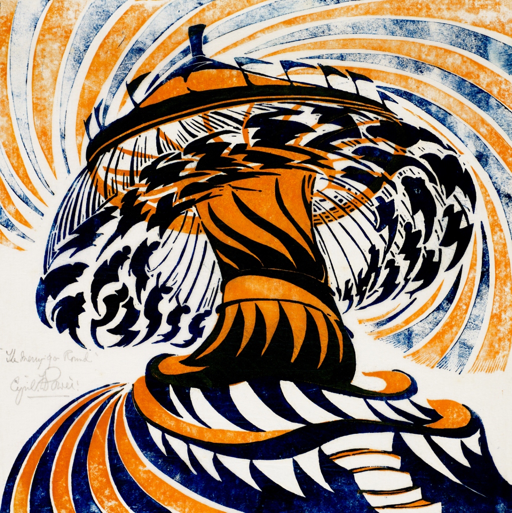
The Merry-Go-Round (c.1930) by Cyril Power © The Estate of Cyril Power. Bridgeman Images/ photo The Wolfsonian–Florida International University

Sybil Andrews

Andrews worked as the school secretary but was already a craftswoman and artist in her own right. Andrews emerges as very nearly the star of the entire show. Good God, she had an extraordinary eye for converting everyday scenery and activities into Art Deco stylised images of extraordinary vim and energy!

Concert Hall (1929) by Sybil Andrews © The Estate of Sybil Andrews. Photo: the Osborne Samuel Gallery, London

These three have the most prints on display and sustained activity throughout the 1920s, 30s and into the 1940s, when Power and Andrews were commissioned to create poster for London Transport, creating images of Epsom Races, Wimbledon or racing at Broadlands, which are gloriously on display in the final room of the show.

More peripheral figures

Most of the prints on display are by Flight, Power or Andrews. But they are set among works by half a dozen others.

The Australian women

Three young women artists travelled from Australia to Pimlico to study with Flight and power. They were: Ethel Spowers (1890 to 1947), Eveline Syme (1888 to 1961) and Dorrit Black. Their works are scattered throughout the exhibition, and are generally slightly softer and less angular. Slightly. It varies. Here’s Spowers.

Wet Afternoon (1929 to 1930) by Ethel Spowers © The Estate of Ethel Spowers. Photo: Osborne Samuel, London

Eveline Syme recorded a visit to Italy in prints. There was a wall of these and they were very pretty but – to my mind – lacked the fizz and energy of the pictures set in London or England. They could be illustrations from a straight travel book.

Outskirts of Siena (1930 to 1931) by Eveline Syme. Art Gallery of South Australia, Adelaide

Spowers, Black and Syme returned to Australia and became instrumental in organising exhibitions and promoting the school in their homeland. The exhibition includes some prints depicting the vast, open spaces of the Outback in the Grosvenor school style.

Lill Tschudi (1911–2004)

Tschudi was Swiss. Although she depicted activities, work and sport as much as the others, Tschudi’s images have a distinctive quality of their own. From the evidence here, they were less curved and dynamic, and a little more blocky and static, the colours a little more pastel.

Gymnastic Exercises (1931) by Lill Tschudi © The Estate of Lill Tschudi, courtesy of Mary Ryan Gallery New York. Photo: Bonhams

Tschudi has half a dozen works on display. Much less well represented, fleeting presences among the main participants, are a handful of works by two men, William Greengrass (1898 to 1972: a wood engraver, sculptor and became a curator at the V&A) and Leonard Beaumont.

Greengrass is represented by this picture of a young family on a beach holiday. It certainly is stylised, it has an abrupt angularity. But it doesn’t – to my eye anyway – have any of the energy and dynamism of the classic Power and Andrews works.

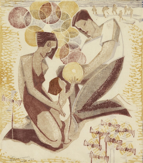
Windmills and Balloons (1936) by William Greengrass. Photo: Bonhams/ © The Estate of William Greengrass. All rights reserved, DACS 2018

Beaumont is represented by a small number of works which seem to owe more to Art Deco vibe than many of the others, in the straightforward way they depict women’s bosoms.

Whereas nudity is conspicuous by its absence in the works of Flight, Power and Andrews, in both the most memorable works by Beaumont on show here, lithe, nubile women pose slender and athletic, like countless thousands of other slender, topless, female sculptures and statuettes during the joyous heyday of Art Deco.

Nymphs, Errant by Leonard Beaumont (1934) Photo Museums Sheffield/ © The Estate of Leonard Beaumont

Work and sport

In one of the most interesting wall labels I’ve ever read, the curator – Gordon Samuel, one of London’s leading specialists in Modern British painting – explains major social changes which took place in the 1920s and 1930s. This was the passage of legislation which limited the length of the working day, and of the working week, and created a number of bank holidays when all workers were allowed to down tools and relax.

The direct result of this legislation, and the seismic change it brought about in the work habits of most of the working population, was to create leisure industries.

Cinemas and dance halls saw a boom in business and were built across the land. But just as significant was the explosion of interest in sports of all kinds. These ranged from the posher end – tennis and horse racing – through new motor sports like motor racing and speedway racing, through to a surge of health and fitness activities among the young. I live near a lido, in fact I’m going swimming there later this afternoon. Like most of Britain’s lidos it was built in the 1930s, in a wonderful Art Deco style, as part of the boom in sports and healthy activities. (This was the decade when the Ramblers Association was founded [1935], from which we have many photos of healthy young chaps with walking socks and hiking boots and knapsacks and pipes heading off into the Lake District.)

The energy and competitiveness of sport naturally played to the Grosvenor School style, and there are numerous examples here of dynamic, colourful depictions of exercise, sport and fitness.

Speed Trial (c.1932) by Claude Flight © The Estate of Cyril Power. Photo Osborne Samuel Gallery London / Bridgeman Images

Not only sport and leisure, though. The 1930s was a highly politicised decade when many artists and intellectuals responded to the Great Depression by adopting socialist or communist politics, and by creating all kinds of works which explored the hitherto occluded world of the working classes. Think of George Orwell travelling to Wigan Pier and going down a coalmine, or the work of the Mass Observation sociological movement, or the poetry of W.H. Auden which celebrates machines and work.

Flight wanted to create ‘an art of the people… an art expressed in terms of unity, simplicity and of harmony’, and he, Power and Andrews created some striking images of hard, manual, physical labour – particularly well done in a sequence of five magnificent prints by Sybil Andrews.

Sledgehammers (1933) by Sybil Andrews

I like dynamic, semi-abstract art of the Vorticist, Futurist type. But I also respect art which manages to capture the reality of work, the kind of hard physical labour which men and women have spent so much of their lives performing, for so many millennia.

Andrews and Power emerge as the most consistent creators of strong, striking designs, with Andrews probably the better of the two – very close – a fun topic to discuss after seeing the show. But the Swiss artist Lill Tschudi also created some really bold images of men at work. (Note the obvious contrast between the studied angularity of Tschudi’s figures and the razor straight telegraph wires, and the dynamic curves of the figures in the Andrews, and the way the background is entirely stylised to emphasise the energy and activity of the working men.)

Fixing the Wires by Lill Tschudi (1932)

The exhibition culminates with two rooms dedicated to London and its transport system, with a suite of vibrantly evocative images of the Tube, with its escalators, lifts, winding staircases and dynamically curved platforms. Power and Andrews were commissioned by Frank Pick, the Managing Director of London Underground in the 1920s and ‘30s, to create a set of posters publicising sporting events people could reach by Tube. Most of the resulting posters are on display here, along with preliminary sketches and draft works, giving you a fascinating insight into the works in progress.

God, this is an absolutely brilliant exhibition, not only because of the consistent quality of the works on display – all of them are good, and many of them are outstanding – but also because of the fascinating light it sheds on London and English social history between the wars. What’s not to love?

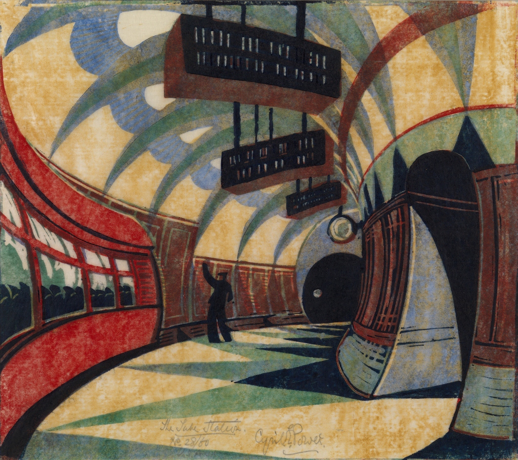
The Tube Station (c.1932) by Cyril Power. Photo: Osborne Samuel Gallery, London © The Estate of Cyril Power

The promotional video


Related links

More Dulwich Picture Gallery reviews

Corita Kent: Power Up @ the House of Illustration

Corita Kent (1918 to 1886) was a nun, who began making personal, rather Expressionist prints with religious subjects in the 1950s, and then swiftly evolved in the early 1960s into a pioneering political print- and poster-maker. In 1968, under pressure from the revolutionary times and enjoying greater artistic and commercial success, she asked to be released from her vows, left her order, and became a fully commercial artist, continuing to make prints as personal statements, but also for a wide range of commercial clients, up to her death.

The House of Illustration has brought together some 70 large, colourful Corita Kent prints to create the largest ever show in the UK of this ‘pop artist, social activist and nun’.

The exhibition is bright, uplifting, thought-provoking and, as usual, divided between the gallery’s three exhibition rooms and small video room.

Introduction room

In 1936, aged 18, Frances Kent entered the Catholic Order of the Immaculate Heart of Mary and took the name of Sister Mary Corita. In 1951 she was introduced to the technique of print-making by Maria Sodi de Ramos Martinez.

The first room displays a handful of Kent’s early works, which are dark and stormy, every inch of the surface covered with often dark browns and blacks, amid which you can see outlines of primitivist or Byzantine images of Christ the King. Dark and troubled, packed and claustrophobic, they’re redolent of the Abstract Expressionism which dominated the American art world of the time.

As A Cedar of Lebanon by Corita Kent (1953)

As A Cedar of Lebanon by Corita Kent (1953)

In their murkiness they reminded me a bit of the art of Graham Sutherland, the presence of the religious imagery reminding me of Sutherland’s work for Coventry cathedral.

Within a few years Kent had begun to experiment by including handwritten text into the designs. The need to make the text legible meant she had to declutter the images though they are still, in this first room, a little scary, apocalyptic, done in drab austerity colours.

Christ and Mary by Corita Kent (1954)

Christ and Mary by Corita Kent (1954)

Main room

This first room is sort of interesting but it doesn’t prepare you at all for the impact of walking into the next space, the gallery’s main room – which features a riot of colour, an orgy of huge colourful prints and posters, showcasing a wide range of fonts and lettering set against vibrant dynamic colour designs.

Installation view of Corita Kent at the House of Illustration. Photo by the author

Installation view of Corita Kent at the House of Illustration. Photo by the author

It’s difficult to believe it’s the same artist. Out have gone the minutely detailed, busy and cramped designs, and in have come big white spaces used to emphasise the use of primary colours to bring out simple texts and slogans laid out in a dazzling variety of formats and designs.

Some of the prints still use religious texts from the Bible, but these are accompanied by slogans from protest movements, song lyrics, modernist poetry and lots of subtle or overt references to the signage and billboard adverts of Kent’s native Los Angeles.

There’s a sequence of searing prints protesting against the war in Vietnam and unashamedly using images lifted from magazines and newspapers, hard-core images of soldiers and war of the kind the American public was watching on their TVs every night from the mid-60s onwards, alongside images and slogans protesting against black segregation, celebrating the Civil Rights Movement, bitterly lamenting the assassination of Martin Luther King, and so on.

Where have all the flowers gone? by Corita Kent (1969)

Where have all the flowers gone? by Corita Kent (1969)

Everywhere you look are classic slogans from the long-haired, dope-smoking, flower power protests of the day. ‘Where have all the flowers gone?’ ‘Stop the bombing’. ‘Get with the action’. ‘Violence in Vietnam’. ‘Yellow submarine’. ‘Come Home, America’, and the slogan which gives the exhibition its title, the words POWER UP spread across four enormous prints. (Which, on closer reading, we discover was the slogan used by the Richfield Oil Corporation in their ads, and one of the many elements of signage in the cluttered visual landscape of her native Los Angeles).

Installation shot of Corita Kent at the House of Illustration. Photo by Paul Grover

Installation shot of Corita Kent at the House of Illustration. Photo by Paul Grover

It is an astonishing transformation, from the personal and cramped and expressive, to the public and political, big, bright and open, in half a decade.

One of the videos playing in the video room shows ancient footage of young men and woman dancing in circles and painting their faces and carrying all manner of props and decorations and art works, to and from the numerous ‘happenings’ which blossomed all over America.

Earnest young women in mini skirts, men in Grateful Dead sideburns, dancing and painting themselves, intercut with the usual footage of napalm over Vietnam, the assassination of Martin Luther King, and so on. It’s the ever-popular 1960s, the decade we can’t leave alone.

The exhibition feels like the poster and print accompaniment of that era, flower power, hippies, protest songs, the stormy later 1960s.

The Fraser Muggeridge studio

A word on the design and layout of the exhibition which is beautifully done by Fraser Muggeridge studio. They have very successfully replicated the super-bright, Pop Art colour palette of the original works without in any way over-awing them, which is quite a feat. The result is that the main and final room themselves take part in the exhibition’s vibrancy and dynamism.

At the end of the main room is a set of 26 prints, Circus Alphabet, from 1968, each one of which combines one of the letters from the alphabet done big, set against a fascinating variety of layouts, some simple, other cluttered with text, in a wide range of fonts. Reminded me of the imagery surrounding Sergeant Pepper’s Lonely Hearts Club Band and the song Being For the Benefit of Mr Kite.

Apparently, Kent was inspired by the poet e.e. cummings who was devoted to the institution of the American circus (‘damn everything but the circus’, he is quoted as writing), and the prints combine political texts with material she found at the Ringling Museum of the Circus in Sarasota, with images from A Handbook of Early Advertising Art, compiled by Clarence P. Hornung.

Circus Alphabet by Corita Kent (1968) Photo by Paul Grover

Circus Alphabet by Corita Kent (1968) Photo by Paul Grover

What fun! What a tremendous eye for layout and design. What an consistent thirst for innovation and experiment.

End room

The smaller final room is painted a deep azure blue. This space showcases work Kent produced after she asked to be released from her vows and left the convent in 1968. At which point she moved to Boston and became a fully commercial artist. Apparently, her sister became her business manager.

Installation view of Corita Kent at the House of Illustration. Photo by Paul Grover

Installation view of Corita Kent: Power Up at the House of Illustration. Photo by Paul Grover

The photo above captures pieces which demonstrate a new variety and style in her work.

At the bottom right you can see ‘our country is red spilled blood’ from 1970, a poster commissioned by the Vietnam Moratorium Committee to promote a three-day fast for peace and depicting a Vietnamese woman grieving over the body of her dead husband. (At the turn of the 60s, early 70s, a lot of the titles omit capital letters, another testament to the influence of the laureate of lower-case, e.e. cummings).

The wide, thin poster to the left of it uses the slogan, ‘Come home America’, the slogan used in the campaign of Democratic Presidential contender George McGovern during the 1972 presidential campaign.

Above it, the piece divided between blue on the left and orange on the right, is ‘the Ellsberg poster’ from 1972, containing a quote from US government analyst Daniel Ellsberg who decided to leak the Pentagon Papers to the press in 1971 (subject of the recent Stephen Spielberg movie, The Post). The quote reads: ‘Wouldn’t you go to jail if it would help end the war?’

The display case in this room shows a number of books Corita illustrated, including several by Catholic priests protesting against the war.

But it isn’t all political protest. The two works on the right hand wall in the photo above, are designs to accompany purely literary texts, by James Joyce (on the left) and Rainer Maria Rilke (the pink and orange one on the right).

You have a sense that Kent was exploring beyond the dayglo and sometimes rather baroque stylings of the 1960s (the Sergeant Pepper circus chic) into a more laid-back 1970s. I suppose low-key minimalism was coming in during this period to replace plastic Pop Art.

The work in this room all feels cooler. More understated. The Joyce and Rilke ones look like a cross between Mark Rothko and Matisse’s late paper cuts in their combination of bold colour with abstract patterning.

And I also realised that the texts in all the works in that photo are hand-written and in relatively small point sizes. You have to go right up to the Rilke piece to even realise there’s writing on it. This is a sharp contrast with the Circus works – which use an entertaining variety of ready-made, machine fonts in massive sizes – and with the other more political works: these had non-machine font, hand-cut-out texts and slogans, but they were enormous and simple. The works in this room feel more… intimate in scale and effect.

On the wall opposite is a montage of prints featuring quotes from classic authors, each one treated in interesting new ways, experimenting with fonts and layouts and colours and designs. These are ads commissioned by Group W Westinghouse Broadcasting, a TV station. Kent began working with them as early as 1962 and continued to produce magazine-page-sized ads until nearly the end of her career.

A wall of Corita Kent's work for Westinghouse Broadcasting. Photo by the author

A wall of Corita Kent’s work for Westinghouse Broadcasting. Photo by the author

The texts are fairly trite – worthy and high-minded quotes from Shakespeare or Dr Johnson or Thoreau – the kind of unimpeachable uplift any corporation could use to mask its commercial operations in spiritual guff (‘The noblest motive is the public good’). Taken together, I found they called into question the whole point of pithy slogans. Somehow the way she could turn her vivid imagination to souping up Shakespeare in order to promote a TV channel undermined the seriousness of the ‘political’ work. I could almost hear a stoned hippy saying ‘All artists sell out, man’. She was 52 at the dawn of the 1970s. ‘Don’t trust anyone over 30, man.’

Content aside, what impresses is the way Kent produces such a wonderful variety of fonts, designs and layouts in which to set the text, and yet still manages to retain a visual unity and identifiable style. No wonder Westinghouse stuck with her for nearly 20 years.

IBM

The whole final wall is a blow-up of a magazine advert for computer manufacturer Digital. They commissioned Kent to create three suites of screen-printed decorative panels for Digital’s range of desks and computer cabinets. You see the blue and green wash panels at the end of the guy’s desk, on the side of the filing cabinet? That’s Kent’s design. This was in 1978, ten years after the heady year of the King assassination, the Democratic convention riots and all the rest of it. Her designs no longer hope to change the world but to beautify its everyday element. ‘Sold out to the man, baby.’

Advert for Digital computers by Corita Kent

Advert for Digital computers by Corita Kent

Videos

In one of the two videos running in a loop in the small projection room (a spot of googling shows that there are quite a few films about Kent and extended interviews and documentaries), Kent is quoted saying something very interesting about the interaction of text and design. She relates it right back to the work of medieval copyists and the unknown monks who produced the extravagant decorations of illuminated manuscripts (of the kind to be seen at the British Library’s brilliant Anglo-Saxon Kingdoms exhibition).

As she puts it, from those early textual illustrators right up to the times of her and her peers, there is some kind of joy and delight in the way colour and pattern brings out additional meanings latent in texts, and words crystallise and empower what would otherwise be abstract colours and designs.

For some reason, no doubt to do with the wiring of the human brain and the way we separately register colour and meaning, the power and variety of interplay between the two systems can often be extremely powerful and, as her work goes to prove, seems to be never-ending.

In my ignorance I’d never heard of Corita Kent. This is a wonderful – and wonderfully designed and laid out – introduction to the development and variety and life-affirming positivity of this scintillating artist.


Related links

More House of Illustration reviews

The American Dream: pop to the present by Stephen Coppel and Catherine Daunt

The British Museum is currently hosting a huge exhibition of prints by American artists from the 1960s to the present. It showcases over 200 works by over 70 artists, including most of the important US artists of the period, and so manages to be a brilliant introduction to the art and artists of the period as well as shedding an oblique light on the history of America over the past 60 years.

This is the catalogue of the show, a large format, beautifully produced and lengthy book (332 pages) which includes every work from the show in lavish colour, each given a brief analysis and discussion alongside a thumbnail profile of each of the artists, all prefaced by a couple of introductory essays. It is not only a record of the show but also an introduction to the sweep of American art from the past 60 years, and well worth the exhibition price of just £15.

I have written a thorough review of The American Dream in another post. Over and above being able to review the images you’ve already seen in the show at your leisure, the book has several other features and benefits.

Introductory essays

The introductory essay by Stephen Coppel, the lead curator, reinforces the sense that the exhibition struggles to escape from the overbearing influence and success of the Pop Art of the 1960s. His essay is eight pages long and it’s only half way down page five that he finally wriggles free of Warhol and Rauschenberg and Hockney; the remaining topics of the exhibition and the book (protest, AIDS, feminism, African Americans) get relatively brief and dutiful paragraphs.

The standout contribution is the long essay by Susan TallmanThe rise of the American print workshop. This is a really interesting and detailed account of the rise of print as a technological medium across America and explains a) the huge variety of print-making techniques b) how they were explored by the post-war generation of artists c) how print-making is necessarily a collaborative enterprise with a lead role going to the actual printers and to the many technicians who have to come up with technical solutions to achieving the artists’ visions.

The essay introduces us to pioneers like Tatyana Grosman who single-handedly set up the innovatory firm Universal Limited Art Editions in 1957, more or less in her own back yard, which went on to work with some of the most important artists of the day. And describes numerous other collaborations between new or existing firms and between well-known printers and artists. It’s a big, complex story and Tallman tells it really well. And she has a handy way with words:

  • Pollock and the giants of Abstract Expressionism are engaged in a ‘visible struggle to wrest private truths from intransigent matter’.
  • An early convert to print-making was Jasper Johns, whose iterated images of flags, numbers and targets were already playing with ‘the conundrum of repetitive uniqueness which is at the heart of printmaking’.

Technical complexities

It’s only once you’ve had the technical processes explained that you can begin to understand the ways in which the different artists here tried to stretch, adapt and innovate what was possible – and this allows you to return to the images with a new and deeper appreciation of the vision, work and persistence which went into their making.

For example, it is fascinating to learn that for his lithographic series 0-9 (Black) Jasper Johns carved into a lithographic stone the numerals 0 to 9 in a grid at the top and then a big 0 below, and ran off prints; then carved a 1 over the 0, and ran off a set of prints; then carved a 2 over the 1 over the 0, and ran off a set… until he had completed a set of 0 to 9. Each consecutive number shows the scars and scraping made by the previous numbers, creating a palimpsest, a building site of numerology, or as Tallman puts it, a portfolio of prints which are:

visually intimate, epistemologically complex, and emotionally elusive.

And daunting and impressive to learn that the complete process took three years! It took Chuck Close two intensive months to carve by hand the plate for Keith, an intaglio print of one of his trademark photorealist paintings (1972). Or to learn that it took Claes Oldenburg an entire year to carve the relief mould for his innovative 3-D print in polyurethane, Profile airflow (1968) while the printer, Ken Tyler, experimented with a wide range of polyurethanes to find one which would be firm enough to stand be solid but appear fluid, be rigid but flexible enough to be fitted into a larger frame. The effort!

It makes you look anew at many of the images here once you realise quite how much work their creation involved, not just from the ‘artist’ but from a whole team of collaborators, technicians, master printers and publishers.

No tradition

Her account makes clear that the new start-up American printers benefited hugely from having no tradition, unlike the very hidebound and often masculine milieu of traditional printers in Europe, above all the home of modern art, Paris. By contrast a striking number of the pioneering founders of new printworks were women:

  • Tatyana Grosman (Universal Limited Art Editions 1957)
  • June Wayne (Tamarind Lithography Workshop 1960)
  • Kathan Brown (Crown Point Press 1962)

Ditto new young print publishers:

  • Rosa Esman (Original editions, Tanglewood Press)
  • Marian Goodman (Multiples Inc 1965)

Escaping artistic control

She also makes a solid point when she says that the move to print-making represented an escape from the overbearing egocentrism of Abstract Expressionism. The praise of randomness in the writings of John Cage, the invention of ‘happenings’ which can involve any number of people, along with the collaborative vibe of the Black Mountain College, all these straws in the wind represented artists seeking to escape the prison house of total autonomy and total control – ‘strategies for relinquishing control’.

The collaborative aspect of printmaking, the technical limitations, the frequent accidents and mishaps, all introduced chance and randomness beyond the artist’s overt intentions. Warhol, as usual, is an easy example in the way that he a) stumbled over the impact of printed colours not lining up with the outlines, creating a whole new aesthetic and b) delegating a large amount of the work, even the selection of which colours to print his Marilyns and Maos in, to his assistants.

This is a beautifully produced book which greatly deepens your understanding and enjoyment of the vast array of images collected for this breath-taking exhibition.

Promotional video of The American Dream


Related links

Other British Museum reviews