
The Design Museum
Haven’t been to the Design Museum since it moved from its old location at Shad Thames and opened in its fancy new building at Holland Park at the end of 2016.
To quote their website:
The Design Museum is the world’s leading museum devoted to architecture and design. Its work encompasses all elements of design, including fashion, product and graphic design. Since it opened its doors in 1989 the museum has displayed everything from an AK-47 to high heels designed by Christian Louboutin. It has staged over 100 exhibitions, welcomed over five million visitors and showcased the work of some of the world’s most celebrated designers and architects.
On 24 November 2016, The Design Museum relocated to Kensington, West London. Leading architectural designer John Pawson has converted the interior of a 1960s modernist building to create a new home for the Design Museum giving it three times more space in which to show a wider range of exhibitions and significantly extend its learning programme.
Both the exterior and interior of the new building are spectacular.
The Design Museum exterior. Photo © Hufton + Crow
The museum is currently hosting two exhibitions, one about sculptor-turned-couturier Azzedine Alaïa, and the one I came to see, Hope to Nope.
Hope to Nope
The rise of graphic design
The idea is that the ten years since the global financial crash of 2008 have been especially politically volatile. At the same time, the rise of social media has changed the way graphic political messages are made and disseminated. Traditional media have been joined by social media, with its hashtags and memes – all of which means that the influence and impact of graphic design have never been greater.
This exhibition explores the numerous ways graphic messages have challenged, altered and influenced key political moments.
Have they, though? ‘Challenged, altered and influenced key political moments’?
Or are they just creative images, slogans and memes – millions of them, easy to make for anyone with a smart phone and a bit of flair – which are as enjoyable as TV ads or pop songs, but change nothing? I went along to find out.
Big and varied
This big exhibition cherry picks from many of the political protest movements of the past ten years all sorts of ephemera – placards, banners, posters, t-shirts, installations and art works – alongside film footage of political rallies, and a section devoted to the rise of social media.
Politically neutral
The curators are careful to say that the exhibition takes no particular political line and doesn’t necessarily support any of these causes, but I didn’t really accept that. One of the two ‘media partners’ is the Guardian newspaper and the exhibition is really a sort of three-dimensional Guardian. Among many others issues and events, it features:
- a display case about the anti-capitalist Occupy movement
- a wall-sized photo of the women’s marches in Washington, London and elsewhere
- a big quilt, a protest video and other artefacts from the Black Lives Matter movement
- opposition to Vladimir Putin, especially to his anti-gay policies
- opposition to Tory Austerity and Brexit in Britain
- opposition to Jacob Zuma’s corrupt regime in South Africa
- opposition to the North Korean dictatorship of Kim Jong-un
- opposition to the authoritarian Turkish president Recep Tayyip Erdoğan
You get the picture. Lots of opposition movements.
Oh, and Donald Trump. Did I mention Donald Trump? It very very powerfully comes across that a lot of American artists, feminists, academics, writers and activists don’t like Donald Trump one little bit.
Banner from International Women’s Day. Photo by Steve Rapport
In other words, no surprises – all the usual movements are here and all the usual hate figures from the front pages of the Guardian and other bien-pensant publications.
Structure of the show
The exhibition is rather loosely divided into three parts: Power, Protest and Personality.
1. Personality
This is the clearest (and smallest) section – highlighting the way politics around the world has come to be dominated by strong personalities who provoke strong and divisive reactions v Trump, Putin, Erdogan and so on.
In this section we find Theresa May being pilloried in a set of very funny cartoons by Chris Riddell (of the Guardian). Jeremy Corbyn has a section to himself, which features a suite of satirical front covers from Private Eye, the glossy cover shoot he did for GQ magazine, samples from the Corbyn comic books which (apparently) proliferated when he was elected leader, and a striking Corbyn t-shirt – plain white with the Nike swoosh on it and the word Corbyn where ‘Nike’ should be. (Apparently, the designer and manufacturer had an injunction taken out against them and had to scrap the design, making this a valuable rarity.)
Corbyn t-shirt with Nike swoosh. Photo by Benjamin Westoby
But the award for the Political Personality Who Dominates Our Age and Who You Love To Hate goes to… Go on, guess. Well, he owns a tower and is called Donald.
There’s a wall-sized display of more than 50 news magazines (including The Economist, TIME and Der Spiegel) chosen because they all feature cartoons, lampoons, caricatures, spoof and doctored portraits of The Donald, from the moment he was selected as the Republican candidate to when he became President.
What does this prove, exactly? Mainly that there has been no let-up in the scathing satire and criticism Trump has been subjected to by the left-liberal press since he first entered the presidential race. And with what result? Did satirical cartoons and scathing articles prevent him becoming Republican candidate, or prevent him being elected president? Have they gotten him impeached and kicked out?
Nope. Fail. As about a million other commentators have pointed out, all this ridicule by the East Coast – or foreign, intellectual – élite only confirms the belief of his grass-roots supporters that Donald is their man, an outsider, someone who will stand up for their values, values they see being ridiculed on a daily basis across almost all the mainstream media. ‘We’ may hate him but ‘they’ just carry on loving him to bits.
Wall of magazine covers lampooning Donald Trump. Photo by Benjamin Westoby
2. Protest
The section on Protest is dominated by a wall-sized screen onto which are projected a few minutes of news footage from each of five countries showing protesters in action – marching, chanting, fighting with the police.
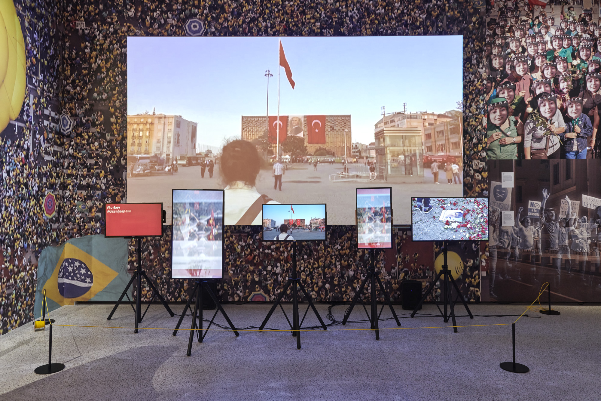
Hope to Nope film installation by Paul Plowman. Photo by Benjamin Westoby
This turns out to be an installation by Paul Plowman. In front of the big screen is a set of smaller screens on stands showing alternative images of protests, interspersed with the hashtags which were used in each of the different protests featured. The countries and events being:
- Catalonia – street protests for independence
- South Africa – street protests, speeches etc against President Jacob Zuma
- Grenfell Tower in London – an angry crowd shouting ‘justice justice’
- Turkey – street protests against Erdogan
- The Women’s March in Washington
Nearby are posters mocking Vladimir Putin, a suite of posters from North Korea exemplifying the state-sponsored poster art of that country, some photographs showing a protester in China, a panel about the ‘Umbrella protests’ in Hong Kong in 2014, some examples of wall art and graffiti made by Iranian artists to protest what they see as the corrupt nature of the Iranian government.
One of the most striking things in the show is a two-metre-high replica of the inflatable duck from the 2016 protests held against Brazilian president Dilma Rousseff.
And there’s material from the 2015 Je Suis Charlie movement and the ‘Peace for Paris’ marches.
But I kept being drawn back to the enormous Plowman video installation, not least because it is very loud, with sounds of people chanting and yelling, the roar of police sirens etc.
I also liked the way the hashtags zoomed past on the smaller screens of the installation, hundreds of them. Maybe their sheer number is meant to shock and awe the viewer into realising how Mighty the opposition is, how many of ‘us’ there are, how global ‘the movement’ is.
But to me it powerfully conveyed the opposite, the sheer ephemerality of many of these movements, each with their fleeting moments on TV, and a few days trending on twitter, before being forgotten.
And when you see a load of hashtags all together, following in quick succession, you can’t help noticing how facile they are.
#stopoppression #wewantahome #justice #democracy #solidarity #thestreetwillbeours #zumamustfall #SAwillrise #defendourdemocracy #womensmarch #freemelania #dumptrump #mybodymyvoice #womensmarchparis #thisisglobal #thisisnew #justice #truth #neveragain #blacklivesmatter #bluelivesmatter #greenlivesmatter #justice4grenfell #resistance #occupy #resist #vaginadentata #stopspain #democracy #solidarity #justice
And so on, round and round like a hamster in a wheel.
Anti-capitalism
Also in the Protest section we learn that capitalism is a bad thing. We know this because of all the people who’ve used their Macs and Ipads (designed in America, built in China, delivered to your door by Amazon) to design graphics, cartoons and memes slagging off evil international corporations.
And also because of all the anti-capitalist protesters who use multinational corporations like Facebook, Twitter, Instagram and YouTube to protest, organise and lobby against the way the world is run by multinational corporations.
The most notable example was the 2011 Occupy movement, active here in London, in New York and elsewhere. Display cases show their numerous anti-capitalist leaflets, booklets, posters and slogans, t-shirts and badges. And did they overthrow capitalism? Even a teeny tiny bit?
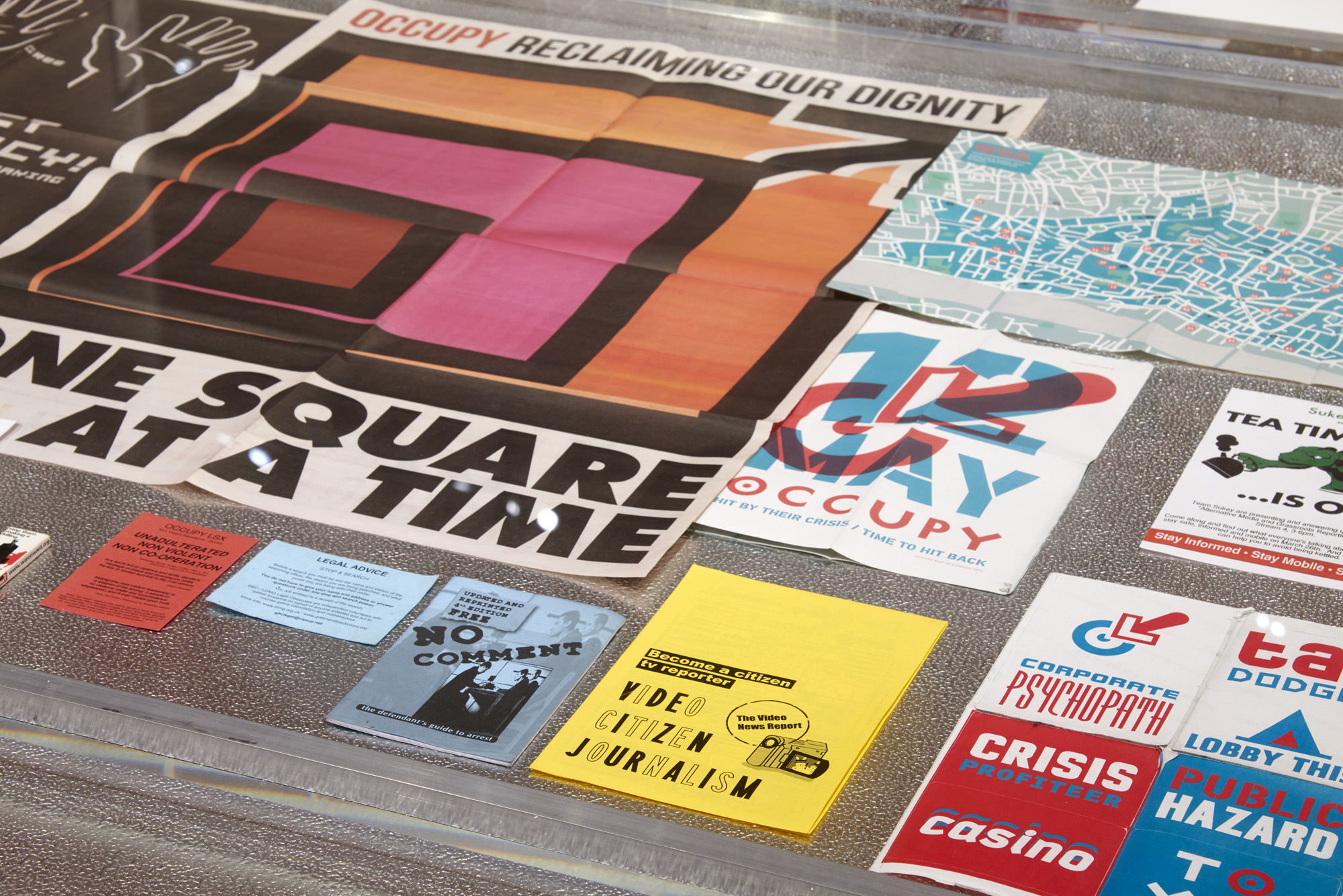
Display case of Occupy items. Photo by Benjamin Westoby
We also learn that some of these massive corporations tell fibs v videlicet a vast poster reminding us of the way Volkswagen comprehensively lied about the diesel output of its cars.
It’s next to art work criticising BP, which will be forever associated – by the kind of protesters this exhibition celebrates – with the Deepwater Horizon oil spill.
the art work is a sort of neck frill, not unlike the ones Elizabethan courtiers used to wear, made of green crepe paper designed to look like the BP logo. From the accompanying photo the idea is that you paint your face BP green, slip on the crepe BP logo, and go join a crowd protesting against wicked oil companies. Maybe you drive there, or organise a coach…
Protest web statistics
I work in website analytics. Until recently I worked as a Digital Insights Manager for a British government agency. This experience has taught me that you really can prove anything with statistics. Another way of putting that is how remarkably easy it is to bamboozle people who don’t use figures very often or aren’t at home with figures.
As a result I don’t really believe any statistics about anything I hear from anyone, not just governments, anyone.
This is relevant because the exhibition features a timeline dating the advent and rise of various social media platforms over the past ten years (Facebook, YouTube, Twitter, Instagram, all the usual suspects). They are the big red, blue and green circles you can see in the photo below.
Beneath these – under each of the black, red and blue smart phone icons – is an array of Fascinating Facts and Stunning Stats designed – I think – to show you just how Important and Relevant and Urgent contemporary protest is. Certainly how social media helps spread its messages at lightning speed to huge numbers of people.
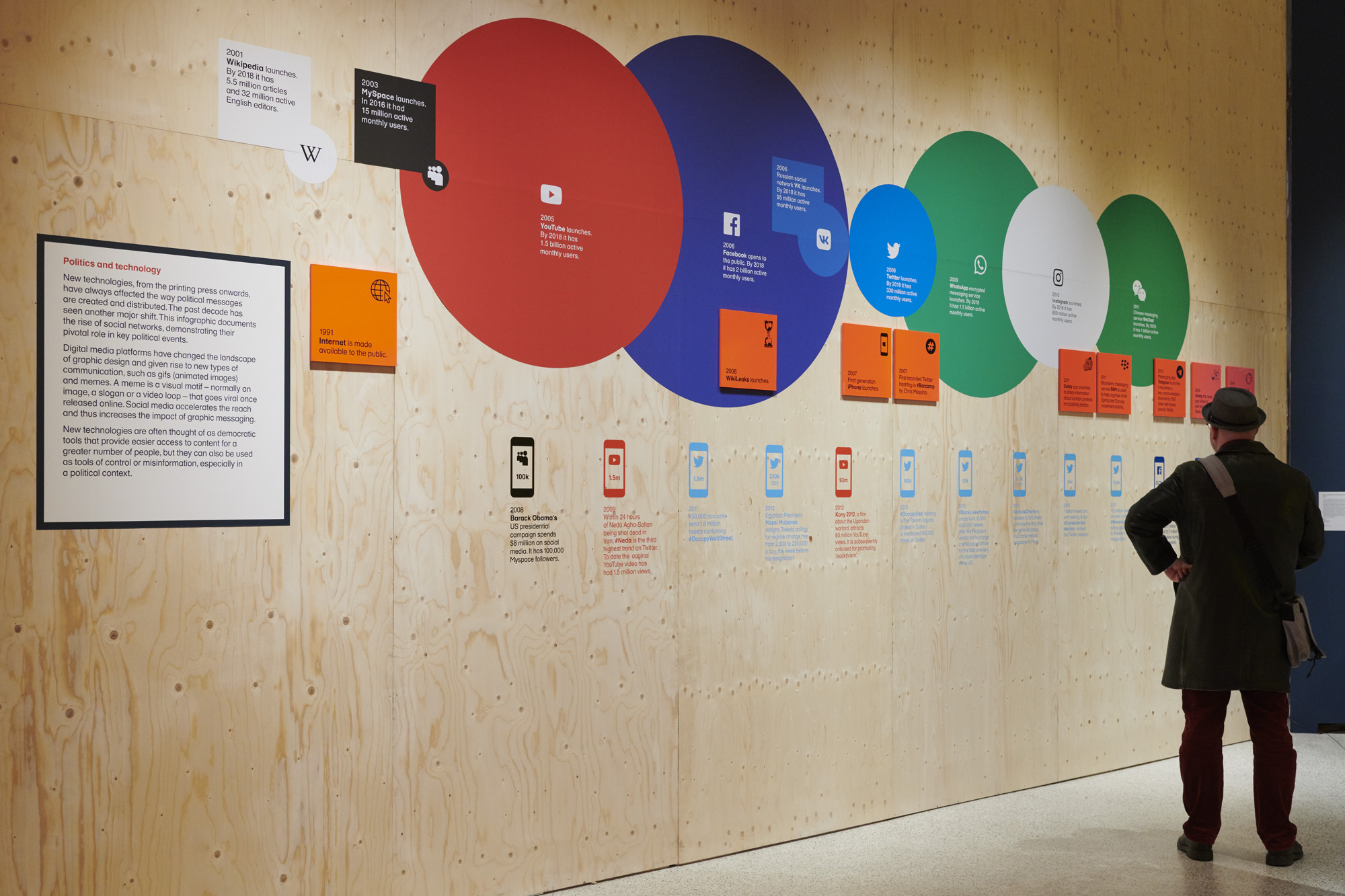
Timeline of social media and protest statistics. Photo by Benjamin Westoby
Thus we are told that:
- in 2011 450,000 accounts sent 1.8 million tweets containing #OccupyWallStreet
- in 2012, in the week before he quit, tweets calling for the resignation of Egyptian president rose from 2,300 a day to 230,000 a day
- in 2013 #OccupyGezi relating to the Taksim Square protest in Turkey was mentioned 160,000 times on Twitter
- in 2013 #BlackLivesMatter jumped from 10,000 to 93,000 tweets after the Ferguson verdict not to charge a white police officer who shot dead a black teenager in the U.S.
- in 2016 1 billion tweets were sent relating to the U.S. presidential election
- in 2017 11.5 million tweets were sent containing #WomensMarch during global reaction to President Trump’s inauguration
For a start none of these figures are put in any kind of context. Yes 11.5 million is a big number, but a basic fact of the internet and social media is that it is awash with big numbers. What other topics were trending that day or week or year, to help us put these numbers in context? How did it compare with that day’s stats about Ed Sheeran or Beyoncé?
Numbers alone don’t mean anything. Numbers only mean something in a context and it’s humans who create that context.
32.
Is that how old I am or the temperature outside, the number of teams that started the Word Cup in Russia or the number of refugees who drowned in a boat off Libya?
At work, I create the context which makes the figures I present about my web service look really impressive, even though I know that putting them in a different context, with a different narrative, would show them up to be very poor.
Not forgetting that there are quite a few ways to give my numbers a context which would just be confusing, or would make them disappear by making them look like lots of other numbers, and so make any pattern at all difficult or impossible to discern. I could make them do whatever my boss wanted them to do.
Statistics are always created, and for a purpose.
Same here, in this exhibition. The curators have selected a handful of statistics to show how quick and massive social media responses were to key moments of ‘protest’. No doubt they were.
But what that means v how you should interpret the numbers, how they stack up next to other events on the same day, or to similar events happening at the same period or to the tweets and Facebook likes from the opposing point of view…. that context, those other points of view, a fuller picture… are not here.
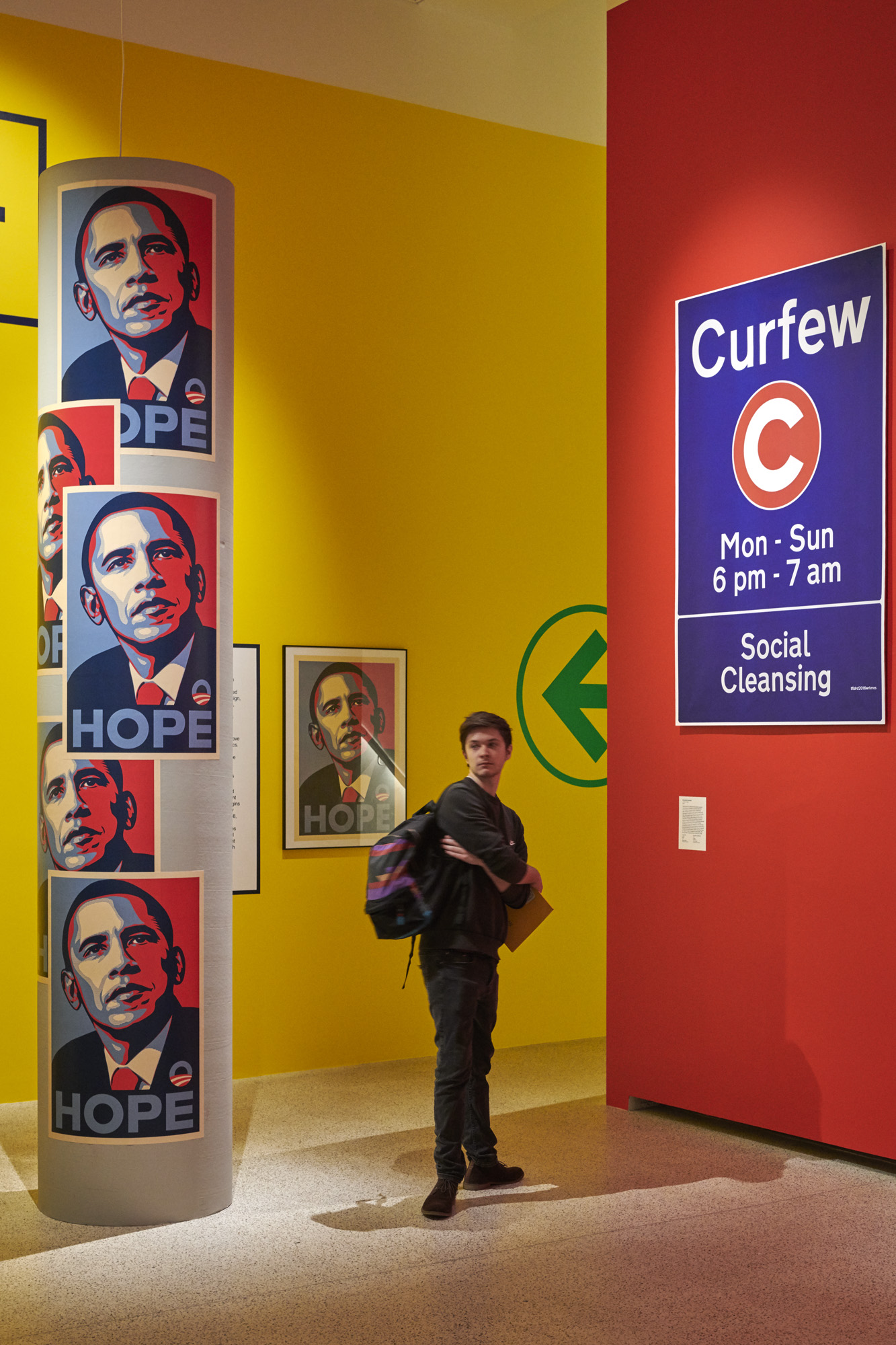
The Hope icon for Barack Obama’s election campaign. Photo by Benjamin Westoby
Results
Oh and as one of my bosses said when I showed him a particularly dramatic graph I had concocted v ‘Fancy figures don’t pay our wages. What about results?’ Practical results which people outside your social media bubble might notice.
Did those 1.8 million tweets bring about the downfall of capitalism? Did #OccupyGezi topple Erdogan? Did those 1 billion tweets sent during the U.S. presidential election stop Trump becoming President?
10 out of 10 for impressive stats. 0 out of 10 for impact.
Global interconnectedness gives a misleading impression of the scale of political protest
I’m dwelling on the issue of numbers because democracy is a numbers game. To win power you have to build coalitions, often with people you don’t really like or share values with.
My view on the current situation is that the internet and social media have certainly made everything more global (and this exhibition is a good example), but that this is not necessarily the blessing it appears.
It now means that women protesting against rape in India can hook up with Reclaim the Night campaigners in America, or that anti-capitalist protesters all across Europe and the States can link up and co-ordinate their protests and publications. Fine.
All this activity (not to mention the relentless support of papers like the Guardian and the New York Times and their liberal avatars around the world, and artworks and installations and exhibitions like this one) gives the impression that it’s all coming together, that we have the numbers, that truth and justice are on our side so we must win, that we’re soooooo close to the tipping point, one more march, one more protest, and we will get our way and…
Capitalism will be toppled. The patriarchy will be overthrown. Trump will be impeached. Catalonia will win its independence. Turkey will become a liberal democracy. Putin will resign and name a gay video artist as his successor.
But I wonder whether it’s the very internationalism of the movement which condemns it to failure v because, although sizeable communities of protesters, objectors and activists can now hook up across regions, countries and continents, reassuring and encouraging each other – within their own individual countries they remain definitely in the minority. Within their own individual countries there simply aren’t enough of them to make the changes they want to see.
After all, despite the deluge of opposition across social media, mainstream media, despite all the street protests, t-shirts and badges, and all the TV comedians relentlessly mocking the other side v Trump won the US election, Brexit won the referendum, Putin was re-elected, Erdogan has just won re-election, Viktor Orbán has just won re-election, The Five Star Movement are in power in Italy, and so on…
Fancy t-shirts, stylish badges, clever hashtags aren’t enough, nowhere nearly enough, to begin to effect real social and political change.
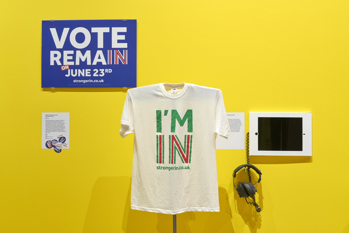
Forlorn poster, t-shirt and other items promoting the Remain campaign. Photo by Benjamin Westoby
I had thought this was the message of the so-called Arab Spring. Bien-pensant liberals in the West thought ‘Hooray, Libya is going to turn into Switzerland, Syria is going to turn into Sweden, the whole Middle East is going to be transformed into socially progressive democracies’.
All the revolutionaries in Egypt, Syria, Libya and so on were excited by the online networks they were able to create among themselves, and the support they could give via the internet to fellow revolutionaries in the other countries, and the support they got from all well-meaning folk in the West.
All of which DELUDED them into thinking they were in a majority in their own country. But it was social media smoke and mirrors. The majority of the populations of Syria, Egypt, Libya and so on are NOT video artists and LGBTQ+ activists; they are illiterate peasants and vast numbers of under-employed urban youths who don’t have Facebook accounts, don’t particularly want political change or, if there is change, want to see strong nationalist leaders emerge who will give them jobs, keep their country together, and defend their cultural values.
It’s odd that the one of the biggest artefacts here more or less acknowledges this obvious fact. It reads:
SLOGANS IN NICE TYPEFACES WON’T SAVE THE HUMAN RACES
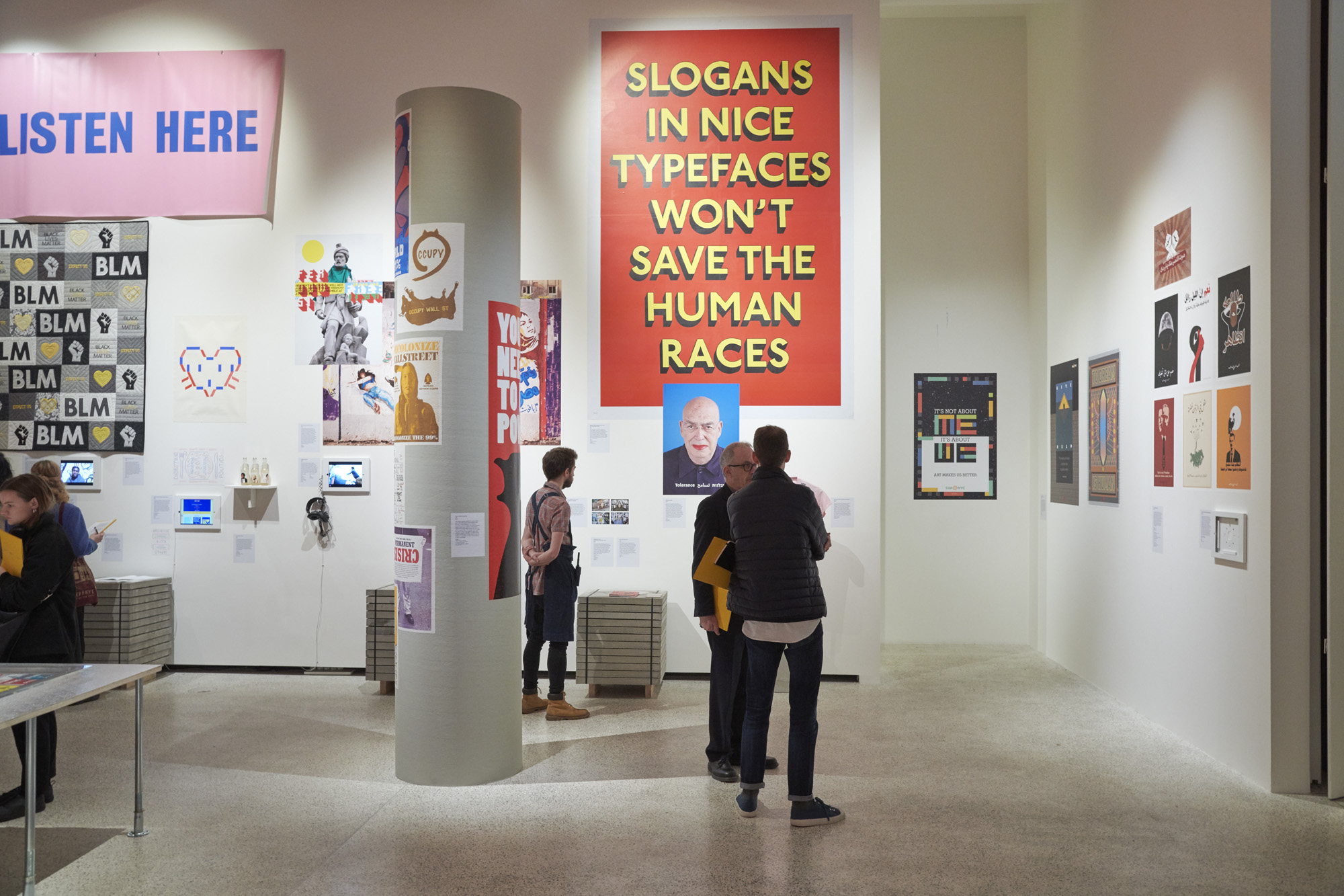
Slogans in nice typefaces won’t save the human races. Photo by Benjamin Westoby
To paraphrase: no amount of fancy design, diligent video journalism, snappy hashtags, witty placards and spirited street fighting will overthrow a regime. Only securing the support of (admittedly not necessarily the majority) but still a sizeable minority of the population, will lead to real and cultural political change.
Riots which escalate into the seizure of the presidential palace and the TV stations are often little more than coup d’etats which, as we have seen hundreds of times in the developing world over the past fifty years, generally end up with military dictatorships worse than the one you were trying to overthrow (as in Egypt), or with anarchy (as in Libya) or with prolonged civil war (as in Syria).
The net result of all these attempts to overthrow the wicked dictator is not a wonderful rainbow nation where everyone respects each other’s gender choices, but hundreds of thousands of people fleeing for their lives and drowning in the Mediterranean.
The role of graphics in political protest
Which brings us to the role of graphics in all this political protest. The curators assert at various points that the political activism of the past ten years has seen a particular upsurge in the use of graphics in political protest.
The exhibition aims to capture, depict, examine and display the political graphic design of a turbulent decade.
Alongside traditional posters and banners, the exhibition charts the rise of digital media and social networking, which have given graphic iconography an extraordinary new reach.
Graphic design in the form of internet memes, posters and protest placards is being used by the marginalised and powerful alike to shape political messages like never before.
This is a fascinating, entertaining and often unintentionally funny exhibition but I couldn’t decide whether its central claim was true or not.
On the anti side, the huge photos of the various Women’s Marches and the footage of protest rallies in Barcelona, South Africa, Turkey and so on seemed to feature people holding exactly the kind of home-made banners and placards which I can remember protesters holding from any time in the last 40 years.
I couldn’t see any evidence of a ‘graphics revolution’ in a hand-made placard reading ‘This Pussy Grabs Back’.
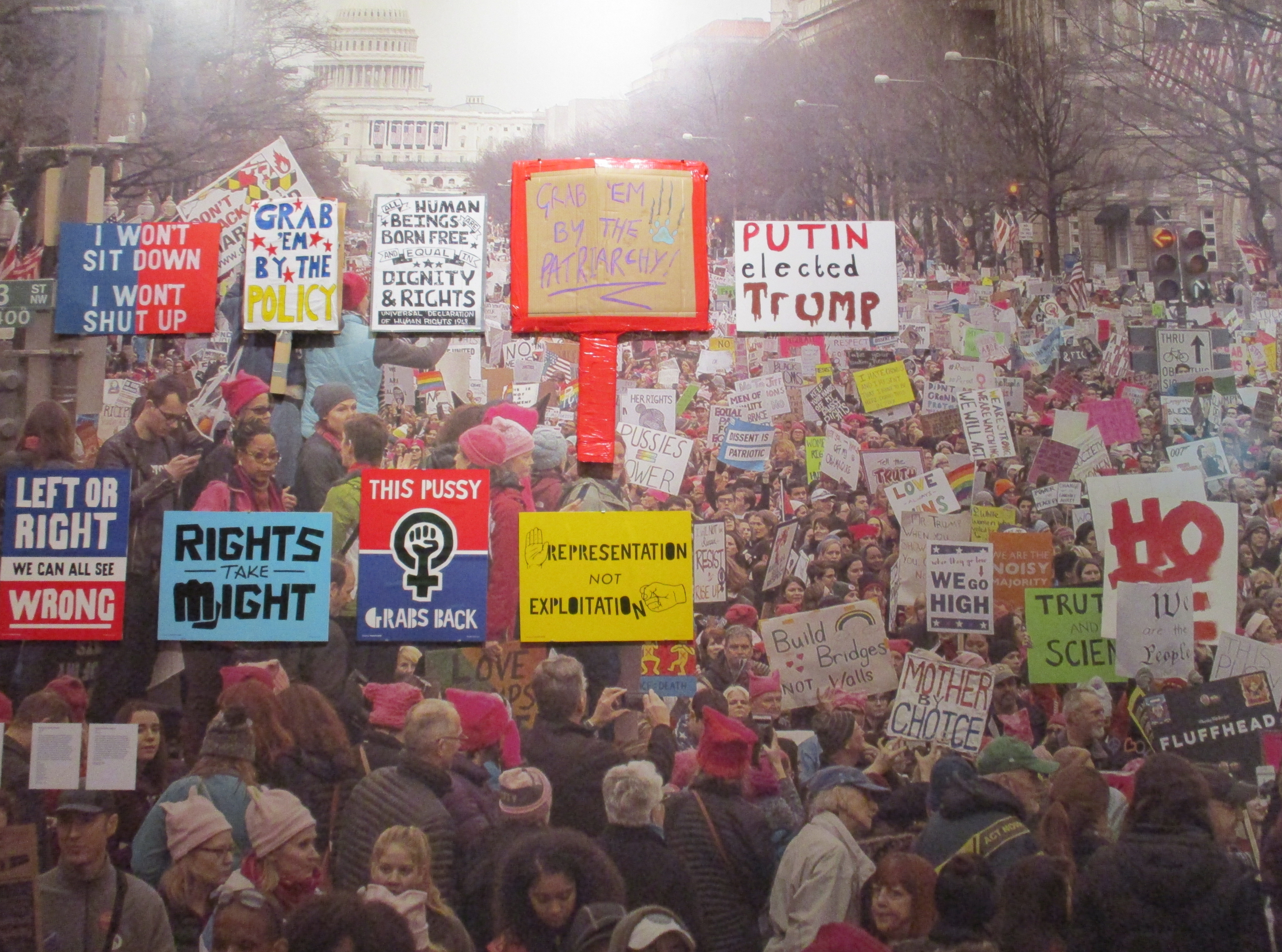
Wall-sized installation celebrating the Women’s March in Washington DC
On the other hand, it stands to reason that hundreds of millions of people (generally, we can guess, university-educated, middle-class people) now have access to personal computers which contain an unprecedented array of programs for writing, designing, colouring, typefacing, laying out, and printing all sorts of images, placards, posters, magazines, handouts and so on.
So without a doubt there is more protest material being created, and without a doubt more of it can be distributed over social media than ever before for the self-evident reason that social media didn’t really exist ten years ago. So I suppose it must be true that the internet/social media have given ‘graphic iconography an extraordinary new reach’.
But has it changed the look and impact of graphic elements in political protest?
This might be an impossible question to really answer. The world is a big place, so much is going on, and so many people are creating, publishing, printing and manufacturing so much stuff all the time that it would be pretty challenging to decide if much of it is new.
We made t-shirts and fanzines in the punk era of my youth, back in the 1970s. The Greenham Common women and any number of protesters against Ronald Reagan and Mrs Thatcher managed to make badges, t-shirts, posters and placards and banners and to print off magazines and broadsheets back in the 1980s, without any help from computers or the internet.
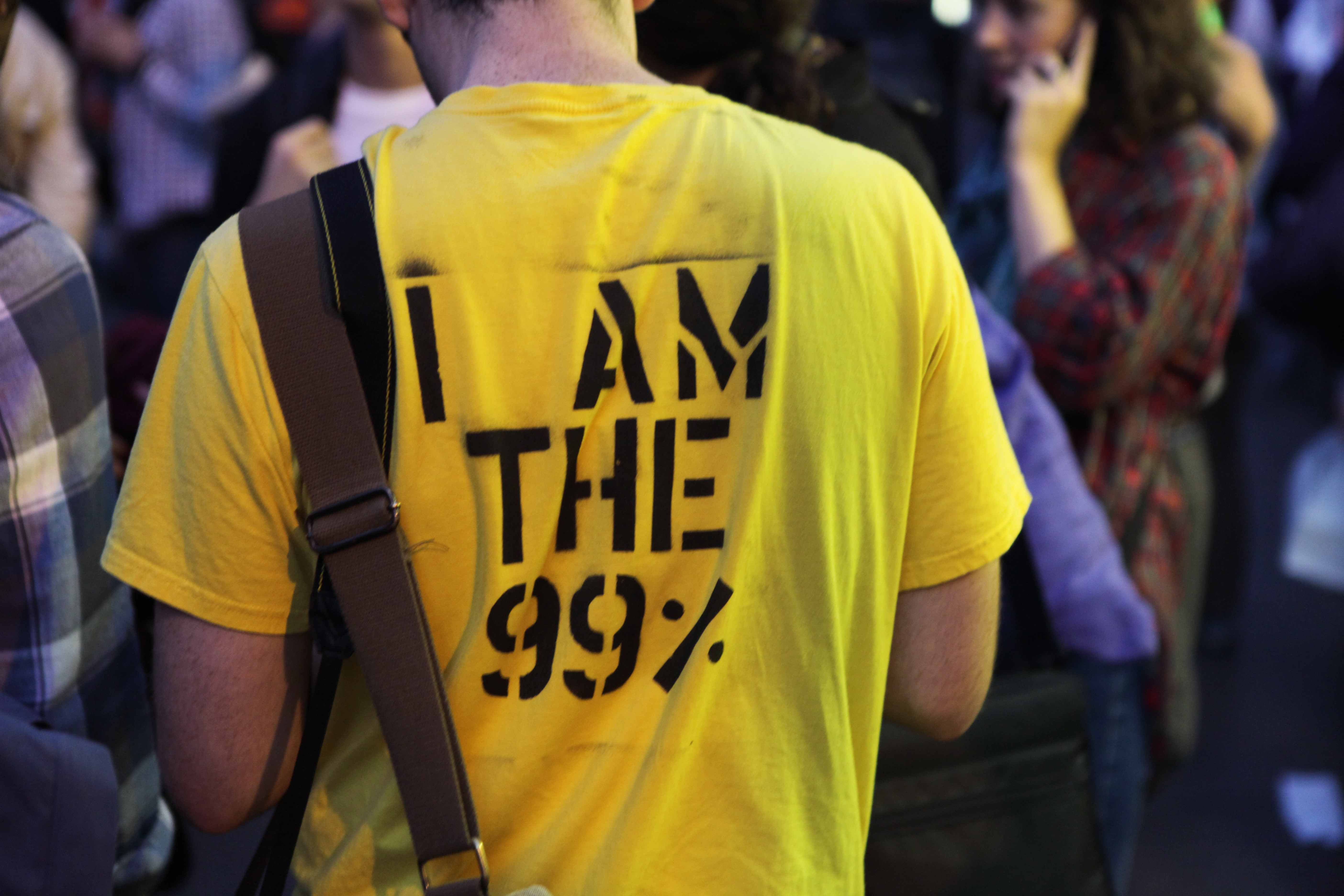
Occupy Wall Street t-shirt. Photo by Jason Lester
The speed and spread of visual content online is new, because the whole online infrastructure is relatively new and has expanded at a phenomenal rate. But the nature of that content, and in particular its graphic elements – snappy slogans, faces of hate figures humorously defaced, stirring images of suffering women or children, badges with a little slogan on them — is the graphic content of much of this protest material really new?
A morality tale
Two relatively small display cases placed at opposite ends of the exhibition were, I think, intimately linked and also, I think, tell a neat morality tale.
On the first wall by the entrance door there’s an interesting little display telling us that Hillary Clinton’s team brought in design consultant Michael Bierut from design agency Pentagram to develop a core campaign logo. His proposal was for a logo based round the first letter of her name – H – which would be infinitely ‘refreshable’, and easy for campaign team designers and supporters alike to reversion and use.
Fascinatingly, we get to see the notebook in which he jotted down his early ideas. You can’t help wondering how much he was paid for this great stroke of ‘genius’.
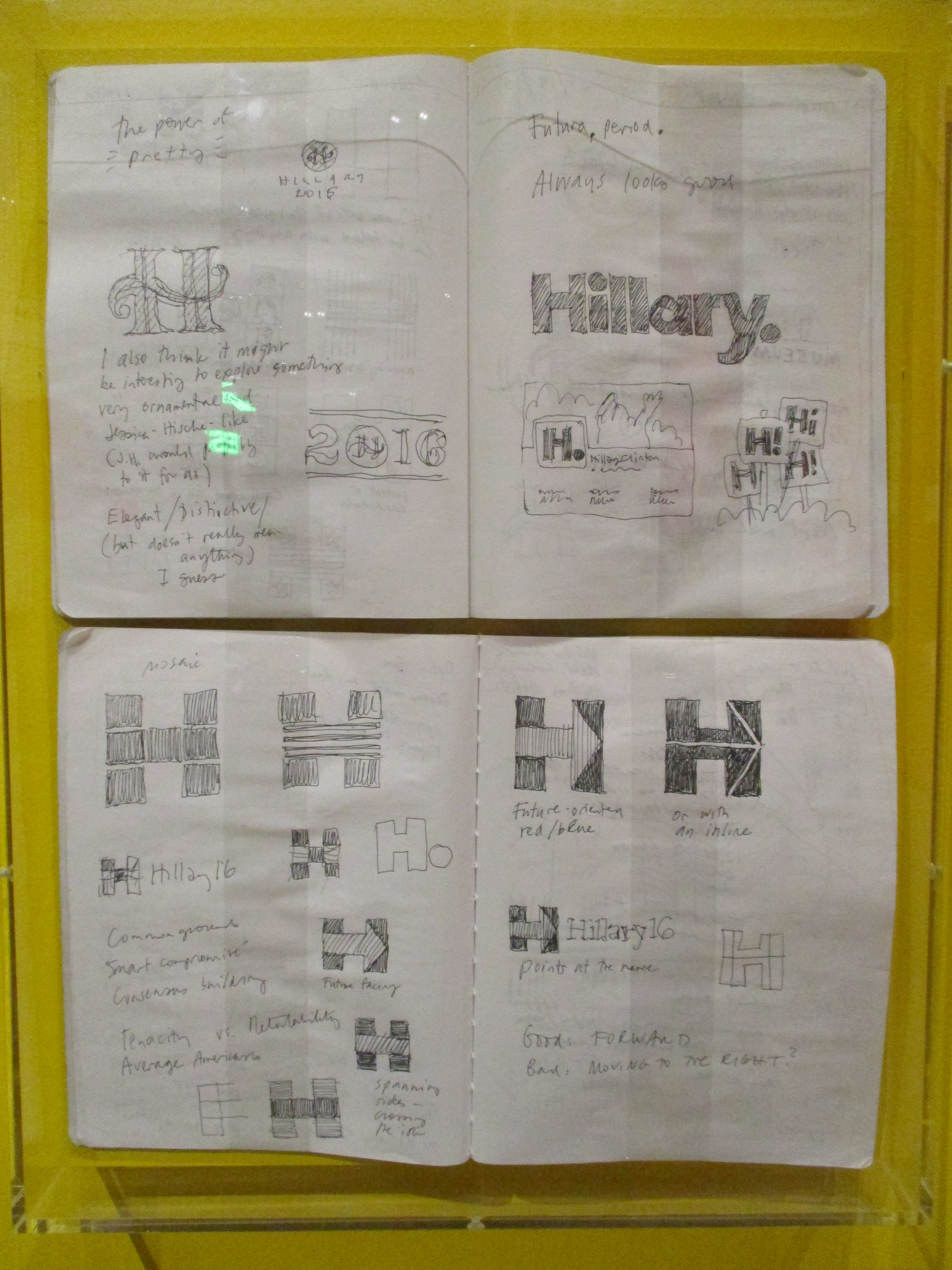
Notebook of Michael Bierut showing his notes on the idea of ‘H’. Photo by the author
Fittingly enough, right at the other end of the exhibition space we come across another display case showing this work of art.
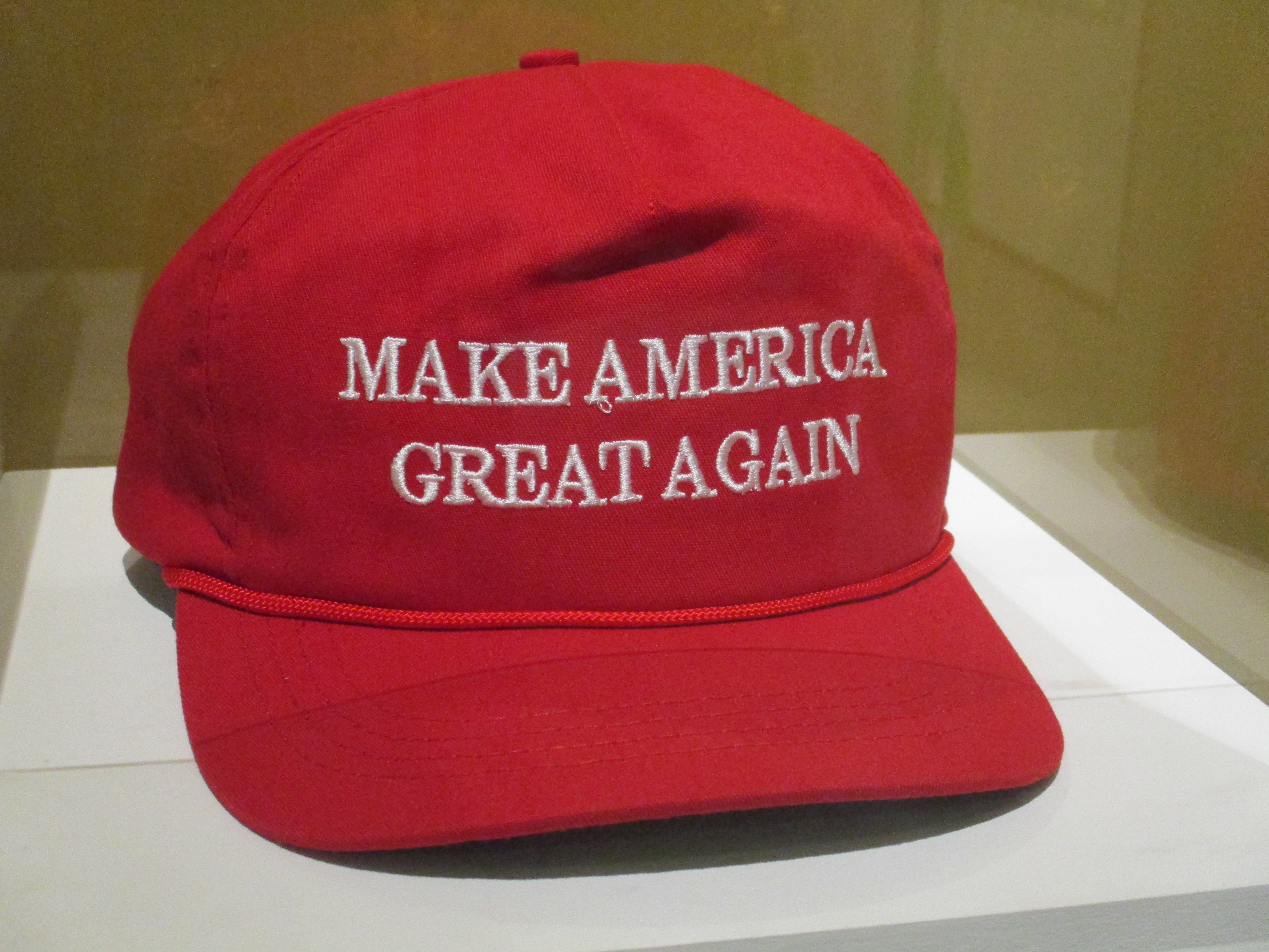
Donald Trump campaign Make America Great Again baseball cap. Photo by the author
Recognise it? Yes, because it is very recognisable. It is in fact, possibly, of all the 300 or so objects on display here, the most successful and recognisable design icon in the exhibition – the red workers’ baseball cap which Donald Trump wore throughout most of his campaign.
And you know the most interesting thing about it? The curators don’t know who designed it. Almost all the other 300 objects, artefacts, t-shirts, badges, cartoons, pamphlets, videos, infographics and so on are carefully attributed to named designers or organisations.
Not the Trump cap. Nobody knows who came up with it. It’s a standard factory-produced cap, and (as the curators point out) even the Times Roman font used for the slogan text is as bog-standard, traditional and reassuring as it gets.
The everyday look of the cap struck a chord with Trump supporters from early in his campaign, helping to position him as an everyday guy, an ordinary Joe, a working class guy made good.
Unlike the social media stats which I read and forgot straightaway, possibly the most fascinating fact in the whole exhibition is that between June 2015 and October 2016 the Trump campaign spent more on producing and distributing these caps than on polling.
The moral of this little story would appear to be that expensive, fancy, East Coast design fails, whereas anonymous, everyday, easy-to-make, easy-to-recognise, easy-to-understand artefact and logo, succeeds.
Underlining my belief that, to win power in a democracy, you have to reach out to the greatest number of the electorate, with the widest possible appeal – not just to people who went to college like you, think like you, and have a refined taste in sophisticated graphics like you.
Curators
Hope to Nope is co-curated by the Design Museum and GraphicDesign&’s Lucienne Roberts and David Shaw, with Rebecca Wright. It is really imaginatively laid out, very interesting throughout, with very informative wall labels, some genuinely hilarious pictures, objects and installations, as well as some fascinating new infographics commissioned specially for the show.
It is an excellent, informative and thought-provoking exhibition. But it won’t change anything.
A video
Watch co-curator Lucienne Roberts being interviewed about the exhibition.
Related links
- Hope to Nope: Graphics and Politics 2008 to 2018 continues at the Design Museum until 12 August 2018
- Objects of Desire: Surrealism and Design 1924 to today @ the Design Museum (February 2023)
