Philip Guston @ Tate Modern

The curators think the American artist Philip Guston (1913 to 1980) was one of the most remarkable artists of the twentieth century. Usually I can see what they’re getting at, even if I don’t like an artist much, but this a rare occasion when I really didn’t get it at all.

On the evidence of this huge, major retrospective, which contains more than 100 paintings and drawings from across Guston’s 50-year career, it feels like he toyed with or experimented with a series of 20th century styles, never an innovator, seeming much more like a follower who did copied styles invented by other people, often very competently, until, in the late 60s, he had painted himself into a corner, had reached the end of road copying other people, and had a massive block, painting nothing for a couple of years.

When he re-emerged it was with a radically new style, because he had discovered cartoons. The curators call it ‘drawing’ and there’s plenty of drawings here, a roomful of the studies which got him back into the groove, but, in my opinion, all in a cartoon style, and certainly it eventuated in hundreds and hundreds of paintings which look like this.

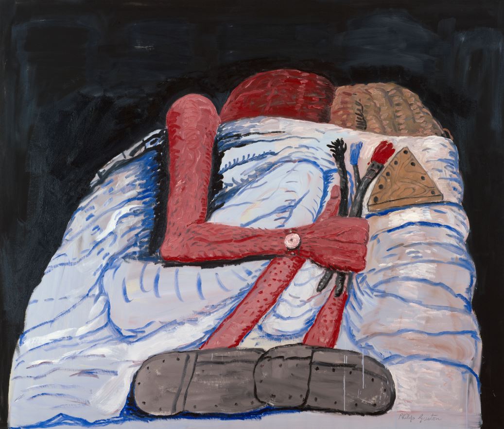
‘Couple in Bed’ by Philip Guston (1977) The Art Institute of Chicago © The Estate of Philip Guston, courtesy Hauser & Wirth

In this brief review I’ll reprise the shape of his career so you can judge for yourself.

Early years

He was the son of dirt poor Jewish immigrants, the Goldsteins, who had experienced antisemitic pogroms in the Ukraine, and then the tragic deaths of family members when they made it to America, crossing all the way over to Los Angeles to settle in 1922, when our guy was just 9 years old.

So he was raised in a hard-working, socially conscious, left-wing environment, with a particular sensitivity to racism of all forms (which was to come out, a lot later, in the form of a weird obsession with the white hooded figures of the Ku Klux Klan – see below).

Picasso

His early works seem to me to straight copies of Picasso’s neo-classical 1920s style with some surrealism thrown in. Thus this woman seems Picasso while the stitched head or ball on top of the easel looks like de Chirico.

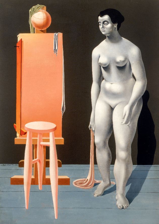
‘Female Nude with Easel’ by Philip Guston (1935) Private Collection © The Estate of Philip Guston, courtesy Hauser & Wirth

But he also did a completely different style of grubby, gritty, stylised but much more realistic portraits, including a powerful one of himself

‘Self-Portrait’ by Philip Guston (1944) Private Collection. © The Estate of Philip Guston

The 1930s were a very political decade, and he was also drawn to the large-scale and very socially conscious mural art of the Mexican Diego Rivera. In fact Rivera helped Guston get a commission, alongside Reuben Kadish and Jules Langsner, to create a large mural in Mexico in 1934.

The result, ‘The Struggle Against Terrorism’ (1934 to 1935) was later painted over by the Mexican authorities. Only recently has restoration work made it available again, and this exhibition features a massive video projection of it, highlighting its theme of the oppressive nature of the Mexican church.

Back in the States Goldstein changed his name to Guston, precisely to avoid a growing swell of antisemitism in America and moved to New York. Moving among artists and writers and intellectuals boosted his left-wing attitudes even more and led, among other works, to a defining work of the era, ‘Bombardment’ from 1937, which combines the clear sheets of colour from the classical Picasso with the large-scale composition of his mural approach and a popular (cartoony?) treatment.

‘Bombardment’ by Philip Guston (1937) Philadelphia Museum of Art © Estate of Philip Guston, courtesy Hauser & Wirth

1940s

Then came a massive change in his style. He began teaching at universities in lowa City and Saint Louis and turned away from public political art. He continued doing portraits (in their quiet way, maybe these are the best bits of the show). But, like so many of his generation, appalled by the trauma of the Second World War and the revelation of the Holocaust, he turned to increasingly abstract compositions. It was the birth of Abstract Expressionism and Guston chucked his old figurative style(s) and threw himself into the new way of seeing and working.

The exhibition has two rooms of his abstract expressionist paintings, one from the 1940s, then moving on to the 1950s and it seemed to me blindingly obvious that he got steadily worse. In the winter of 2016 the Royal Academy hosted a blockbuster exhibition of Abstract Expressionism and it came as a revelation; I was blown away; room after room of masterpieces; a revelation that paintings which don’t depict anything could be so varied and so exciting.

None of Guston’s abstract paintings did it for me. He hadn’t the excitement of Jackson Pollock, the meditative power of Mark Rothko, the dynamic patterning of Lee Krasner, or the stark drama of Clyfford Still. In my opinion the first room of Guston abstracts is bad and the second one is horrible.

‘Passage’ by Philip Guston (1957 to 1958) MFAH © Estate of Philip Guston, courtesy Hauser & Wirth Photograph © MFAH / Will Michels

Nonetheless, he was, apparently, an influential figure in the New York School alongside his high school friend Jackson Pollock, Willem de Kooning and Mark Rothko.

Disillusion

As the gusty 1960s turned into the colourful 1960s, though, Guston got sick of painting in the same mode. For me, it really shows, his abstract paintings start off poor, become terrible, and then it feels like he gives up in disgust. The exhibition compensates for the poor quality of the art with a great deal about Guston’s political views. He was not, as you might have guessed, a big fan of the Vietnam War, but in fact it was the resurgence of racism back home in the states which really got to him.

Extras

The curators have done their best to make this a really defining, landmark exhibition of the full range of Guston’s work, along with all kinds of supporting material and documentation. The show is accompanied by commentary, stories, and personal reflections from Tate curators and guest contributors, including:

  • the artist’s daughter Musa Mayer
  • writer Olivia Laing
  • art historian and curator Aindrea Emelife
  • artist Charles Gaines
  • Tate paintings conservator Anna Cooper
  • illustrator and artist Blk Moodie Boi
  • chef and family friend of Guston’s, Ruth Rogers

Also included in the exhibition are specially commissioned responses from musician Anja Ngozi and poet Andra Simons, inspired by Guston’s collaborative spirit.

In his 1950s abstract phase he was friends with avant-garde composers –John Cage, of course, everyone knew Cagey, but also Morton Feldman and one of the abstract rooms plays bits from the very long (four hours) piece by Feldman which the composer wrote specially for Guston. It is characteristically serialist or abstract, but quiet and lovely. I like Morton Feldman. As one of the commenters on YouTube says, it ‘sounds like an alien trying to make human music’, which is precisely the quality I like, away off the edge of something.

Blockage

A wall label tells us that in the late 60s Guston abandoned painting altogether for 18 months or so. But during that period he continued drawing and sketching obsessively, mainly the objects in his own apartment, tables and chairs and shelves and beds but above all, books.

‘Book and Charcoal Sticks’ by Philip Guston (1968) © Philip Guston Estate, courtesy Hauser & Wirth

Note the vertical black lines in the book, and lying around on the (invisible) table. Using these lines as decoration, to create space, to define objects, would become a signature trick of his final style. Because out of this drawing came a way out of the corner he’d painted himself into. He embraced figuratism again, but of a very, very simplified, reductive type. He expanded the drawings into paintings, and then suddenly found himself painting unstoppably. The dam had broken. His block was over. for the next ten years he would paint hundreds and hundreds of really big paintings all taking the new approach.

‘Painting, Smoking, Eating’ by Philip Guston 1973) Stedelijk Museum, Amsterdam © The Estate of Philip Guston

Note several things. The colour is pink, pinks and reds, a worrying shade of pink skin, pink flesh, a world of burned or flayed human skin. Then the dotted lines, like the nails in hobnailed boots. Are those boots piled up behind the bed? Certainly the use of dots and dashes to fill and decorate objects became a signature.

The Ku Klux Klan

The Klan was a symbol of evil racism for the young Guston. Now in the era of the Vietnam War, of the ferocious racist pushback against the Civil Rights Movement, and the tide of violence sweeping across America, they make a startling reappearance in Guston’s work, as disturbing cartoon emblems of the banality and ludicrousness of evil.

‘City Limits’ by Philip Guston (1969) Museum of Modern Art, New York © The Estate of Philip Guston

So: 1) pink, very pink, buildings, sky, road all shades of pink, so a kind of abstraction. 2) The obviously ‘naive’, untrained, outsider cartoon style. 3) Those lines of dashes, giving definition to everything from the windows in the skyscraper, the wheels of the car (or tractor?), the eyeslits of the Klansmen, and the odd dotted lines on the back of their hoods.

In 1970 Guston showed 30 of these works at a now infamous show at New York’s Marlborough Gallery. Almost all the critics and his friends were appalled. Abstract Expressionism was closely connected with an immensely serious, ‘committed’ attitude to life and art and politics, a tragic worldview mixed up with European existentialism.

All of that had (apparently) been chucked out in the name of what most critics thought a disastrous turn to a naive, crudely cartoony style. But Guston persisted, and the last four rooms of this huge exhibition are stuffed with scores of examples of the same approach applied again and again.

Many of them are depictions of interiors but coloured with a kind of naive surrealism, giant eyes, mountains of legs, abandoned shoes, and everyday objects rendered both familiar and strange. There’s a lot of him or some human being in bed, like ‘Couple in Bed’ that I opened with.

I found that once you’d assimilated the approach, the pink worldview with dots and dashes, men in pointy hats, other men curled up in bed, er, there wasn’t much more to take in. To try and be positive, there’s no doubting that he had finally created a signature style – his early works seem to me straight copies of Picasso, de Chirico-style surrealism, Rivera-style social murals, and then Pollock and Rothko abstraction. In all of them he seems, to me, a follower. Here, though, in  his last fertile decade, he emerges as utterly original and distinctive. I can see that much, and I managed to like some of the images, the best of them, but most of the ones in these four big rooms left me indifferent.

The last room contains one of the best uses of his new style which has, justifiably, been chosen as the poster and promotional image. On its own it looks great. Set amid 30 or so other very similar images in a closely related palette and style, not so much.

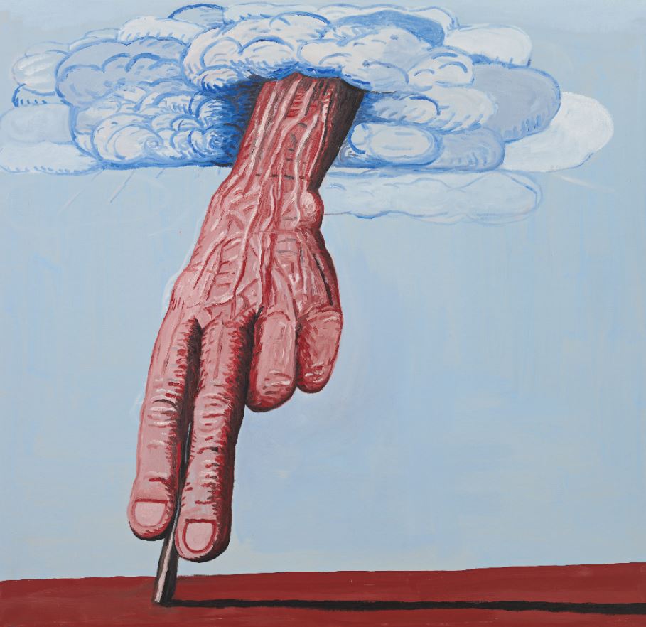
‘The Line’ by Philip Guston (1978) © The Estate of Philip Guston, courtesy Hauser & Wirth

If you’re anywhere near Tate Modern and fancy an exhibition, I wouldn’t go and see this – see the outstanding exhibition of African photography, instead.


Related links

Tate Modern reviews

Hilma af Klint and Piet Mondrian @ Tate Modern

‘Nature or, that which I see, inspires me, puts me, as with any painter, in an emotional state so that an urge comes about to make something, but I want to come as close as possible to the truth and abstract everything from that…’
(Piet Mondrian, 1914)

‘The more we discover the wonders of nature, the more we become aware of ourselves.’
(Hilma af Klint, 1917)

Mondrian is obviously one of the masters of modern art; most educated people would immediately recognise one of his characteristic abstract paintings. By contrast, Hilma af Klint is a lot less well-known. What they have in common, though, was that they both journeyed from late-Victorian figurative i.e. realistic art, to abstraction, albeit completely different styles of abstraction. And, as with so many pioneers of abstraction, they developed their modern abstract styles in response to surprisingly old-fashioned spiritual motivations, to deeply-held mystical and Theosophical beliefs about Nature and Truth which this excellent exhibition explores in great detail.

I didn’t expect to like this exhibition that much and, from the publicity photos had taken a little against af Klint. How wrong I was! This is a brilliant exhibition – af Klint emerges as a huge artist in her own right – and, above all, I had no idea that two artists could have produced such a range and variety of styles. There are so many different types of painting to savour and enjoy.

Landscape painters

Hilma af Klint (1862 to 1944) and Piet Mondrian (1872 to 1944) began their careers as academically trained landscape painters in the late nineteenth century, before developing radically new models of painting in the twentieth century. Although they did not know each other – or of the other’s work – the exhibition shows how they began their careers very firmly rooted in naturalistic depictions of the natural world, and how they slowly, steadily took different but parallel paths away from these roots to arrive at highly stylised abstraction.

‘The Gein: Trees along the water’ by Piet Mondrian (c.1905) Kunstmuseum Den Haag

Flowers and trees

Both artists spent a lot of time painting flowers. Room three devotes a whole wall to displaying 20 wonderfully accurate botanical watercolours done by af Klint, the kind of thing which still illustrates guides to wildflowers I’ve bought recently.

Botanical drawing by Hilma af Klint (c.1890) Courtesy of The Hilma af Klint Foundation

Marvellous, isn’t it? A whole wall of lovely paintings of buttercups, nasturtiums, stonecrop, thistle, saxifrage, apple blossom and many more. I wanted to buy the entire wall and take it home with me.

Installation view of ‘Hilma af Klint and Piet Mondrian’ at Tate Modern, showing the wall of botanical paintings by af Klint (photo by the author)

On the opposite wall are 15 flower paintings by Mondrian which are more full-bodied and intense. According to the curators:

Many of these paintings and drawings of flowers that Mondrian made in 1908 to 1909 are full of symbolism, mainly relating to Theosophy. Shortly afterwards, he moved away from symbolist representations, but continued to portray flowers until his death, selling them for income at times of financial difficulty. He repeatedly returned to the same varieties, such as chrysanthemums and arum lilies.

Some of these are really standout pieces. Take this stunning amaryllis.

‘Red amaryllis with blue background’ by Piet Mondrian (1909 to 1910) Private Collection

After staring at it for some time I realised I really liked the depiction of the bottle the flower is standing, a beautifully pure and evocative rendition, almost a piece of 1960s Pop Art.

The Ether

During their careers, new technologies such as the microscope, X-ray radiography and photography were challenging human perception. The evidence of worlds invisible to the human eye catalysed shifts across science, spirituality and the arts. These discoveries in the sciences meshed with slightly earlier schools of thought, especially the theories of Theosophy. The Theosophy Society was founded in 1875 its chief thinker, Helena Blavatsky, published works developing the theory during the 1880s and 90s.

The exhibition devotes an entire room to exploring various aspects of Theosophical belief and its impact on our two artists, and it wasn’t a peripheral impact: in 1904, af Klint joined the Stockholm lodge of the Theosophical Society and Mondrian Amsterdam Lodge in 1909. A central belief, which meshed with the science of the time, was that all living things are connected by an invisible, imperceiveable force, which they called ‘the ether’, and that’s why this gallery has been called The Ether.

One among many aspects of this was an anthropomorphised version of Darwin’s theory of evolution which lent it a spiritual aspect, optimistically hoping that all life forms were evolving and yearning towards higher spiritual truths. Hence af Klint’s series titled ‘Evolution’. Here you can see how zoomorphic shapes and botanical motifs have been simplified and stylised to form the basis of complex but abstract designs.

‘The Evolution, The WUS/Seven-Pointed Star Series, Group VI, Number 15’ by Hilma af Klint (1908) Courtesy of The Hilma af Klint Foundation

This spiritualised version of evolution attracted many writers, artists and thinkers at the turn of the century. The Great War had yet to dent, or demolish, people’s romantic faith in progress and improvement. Mondrian gave the title to a strikingly different kind of work, one depicting three highly stylised female forms.

‘Evolution’ by Piet Mondrian (1911) Kunstmuseum Den Haag – bequest Salomon B. Slijper. X83910

Mondrian wrote of this painting: ‘It’s not so bad, but I’m not there yet.’ The figures represent the stages in evolution from the physical to the spiritual realm, as promoted in Theosophy. The triangular nipples and navels of the women, which point upwards and downwards, symbolise their spiritual and earthly orientation. The central figure embodies the fulfilment of the evolutionary process, to the spiritual realm. The flowers on the left panel are symbols of purity, while those on the right symbolise tragic suffering.

Incidentally, among many other treasures in the Ether Room is the surprising inclusion of four small paintings by the famous psychotherapist and guru Carl Jung. To quote the curators:

Carl Jung’s Liber Novus is now known as ‘The Red Book’, due to the colour of its cover. It is not certain that he ever intended to publish this account and interpretation of his years of personal crisis between 1913 and 1916. The book is full of illustrations combining symbols from various religions, such as mandalas and trees encased in egg-like forms that resonate with af Klint’s work. It is regarded as the seed of the analytical psychology Jung would later develop, in which the conscious and unconscious are assimilated into the whole personality.

The four works by Jung are surprisingly powerful and certainly fit right in, in this context.

Illustration from Carl Jung’s Red Book © The Foundation of the Works of C.G. Jung

Abstraction 1. The impact of cubism

How did Mondrian arrive at his final style? In stages. He travelled to Paris in 1911 and was immediately galvanised by cubism which he reinterpreted with a spiritualist slant. He began reworking drawings and paintings of trees in the new style. the catalogue has a nifty quote from Guillaume Apollinaire assessing a small show of Mondrian’s drawing attention to the obvious cubist influence, but cannily predicting that Mondrian was using it for other ends and would probably develop his own version.

There are many cubist-era works by Mondrian on show. Here you can see cubism hitting his naturalistic depictions of flowers and trees like a freight train, taking it somewhere completely new.

‘Grey tree’ by Piet Mondrian (1911) Kunstmuseum Den Haag

The exhibition includes examples of the many interim steps, fascinating and often beguiling abstracts in their own right, which move towards this, six years later, in the midst of the Great War, when the discrete elements of the earlier paintings have become solidified into blocks, blocks of abstract colour, floating against an empty background (or a background flooded with invisible ether, which joins the disparate entities?)

‘Composition in colour B’ by Piet Mondrian (1917) Collection Kröller-Müller Museum, Otterlo, the Netherlands

Abstraction 2. Mondrian reaches his mature style

‘By the unification of architecture, sculpture and painting a new plastic reality will be created.’ (Piet Mondrian, 1917)

Around 1920 everything came together in the new style of rectangular grids separated by thick straight black lines, a visual language of ‘pure relationships’ which he called ‘neo-plasticism’. These paintings abandoned any form of symbolism as they become irregular grids. He set out to reduce painting to its basic principles, removing individual aspects (which he called ‘tragic’) to express the ‘universal’.

In 1921 he published an essay titled ‘Le Néo-Plasticisme: Principe général de l’équivalence plastique’ which explains neo-plasticism as an approach to representing the ‘universal’ through balancing oppositions of the most basic elements of painting: position, size and colour.

‘Composition with Red, Black, Yellow, Blue and Grey’ by Piet Mondrian (1921) Kunstmuseum Den Haag

Mondrian believed that neo-plastic principles were destined to define the world around us. Some critics described the paintings as having ‘jazz rhythms’ and I’ve seen modern jazz album covers with Mondrians on them, both of them expressing something about the clean pure and yet somehow dynamic lines of modernity. The Tate bookshop includes ‘The Afterlife of Piet Mondrian’ by Nancy Troy which looks interesting, an examination of how the Mondrian style was curated, copied and publicised, of how ‘the popular appeal of Mondrian’s instantly recognizable style in fashion, graphic design, and a vast array of consumer commodities’.

One room is devoted to Mondrian’s mature style and there’s a very noticeable difference between the works from the 1920s and 30s. In both the works from the 1920s, not all the lines extend to the very edge of the canvas. Petty detail though this may seem, it makes a lot of difference, because in the next space are three classic Mondrians from the 1930s and in each instance the black lines do extend all the way to the edge. Trivial though it sounds, they look more complete, more finished, more total.

It’s a mystery to me and something the curators don’t address which is how come such rigid geometric shapes are so very pleasing to the eye and mind. they feel calming, deep, completing in a way which is hard to convey. Mondrian himself commented:

‘Vertical and horizontal lines are the expression of two opposing forces; they exist everywhere and dominate everything; their reciprocal action constitutes “life”. I recognised that the equilibrium of any particular aspect of nature rests on the equivalence of its opposites.’ (Piet Mondrian, 1937)

Not sure that helps explain why this look immediately struck everyone as clean and classic and has remained so for 80 years.

Abstraction 3. The Ten Largest

‘My mission, if it succeeds, is of great significance to humankind. For I am able to describe the path of the soul from the beginning of the spectacle of life to its end.’ (Hilma af Klint, 1917)

I thought the climax of Mondrian’s development in those three classic works from the 1930s, presented in a clean white rectangular space, would be difficult, but in the event the curators completely trump them with the last room in the exhibition. This is devoted to a set of ten enormous, huge and overwhelming canvases by af Klint, titled ‘The Ten Largest’.

The Ten Largest, Group IV, Number 7, Adulthood by Hilma af Klint (1907) Courtesy of The Hilma af Klint Foundation

These ten huge paintings represent the stages of life, with two each representing Childhood, two devoted to Youth, four to Adulthood, and the final pair to Old Age. I thought I wouldn’t like these at all but, somehow, the preceding nine rooms, showing the slow development of her style, explaining the mystical and spiritual beliefs behind it, had softened me up and prepared me. I thought they were magnificent.

The Ten Largest, Group IV, Number 3, Youth by Hilma af Klint (1907) Courtesy of The Hilma af Klint Foundation

‘The Ten Largest’ are part of ‘The Paintings for The Temple’, a body of works af Klint believed was commissioned by her spiritual guides (we have learned about her spiritual guides throughout the show). Af Klint dreamed of building a temple in the form of a spiral where her paintings could be hung together as a ‘beautiful wall covering’. To ascend through the temple would mean moving towards a higher state of being.

Installation view of ‘Hilma af Klint and Piet Mondrian: Forms of Life’ at Tate Modern showing two of the four Adulthood works.  Photo: Tate (Jai Monaghan)

It took me a while to realise that the four ages are colour coded: the Childhood pair have a lovely deep blue background, the two Childhood works have an orange background, the four Adulthood paintings the lilac colour you can see in the photo above, and the final Old Age pair have a pink background. Then I realised that the colour in each set fades and becomes paler in the second or later work in each set, as if that era’s virility fades as it prepares to transmute to the next stage of life. None of that, none of the richness or intensity of the colour, and the dramatic sense of their changing hues, comes over in these photographs.

Installation view of ‘Hilma af Klint and Piet Mondrian: Forms of Life’ at Tate Modern showing, from left to right, the second Childhood (blue), the two Youth (orange) and the four Adulthood (lilac) paintings. Photo: Tate (Jai Monaghan)

As you can see each painting consists of arrangements of completely abstract designs and patterns and yet, slowly, as you study them, you realise certain motifs recur in each set, giving them a thematic unity.

I spent a lot of time wondering why the final two paintings, the Old Age set, were the ones with the most conspicuous use of symmetry. Is it because, after the storms of life, your knowledge settles into a balanced wisdom?

And the even more puzzling fact that the very last painting is the only one to contain  a square or rectangular feature, namely a grid of squares like a chessboard. Is it because the swirling zoomorphic shapes of active life give way, in one’s last years, to a harder, adamantine, inflexible knowledge?

The Ten Largest, Group IV, Number 10, Old Age by Hilma af Klint (1907) Courtesy of The Hilma af Klint Foundation

Almost certainly not, but I was beguiled. I found myself walking round, sitting and staring, getting up and reviewing them slowly, again and again. I couldn’t tear myself away, an experience I’ve had with only a few other exhibitions – I remember not wanting to leave a room full of Monet paintings of the River Thames years ago. Same here. I found this final room completely absorbing, entrancing and didn’t want to leave.

There’s lots and lots of lovely paintings, in an amazingly wide range of styles, sizes, and intentions, throughout this wonderful show. But this final room is worth the admission price by itself.

The video


Related links

More Tate Modern reviews