
This exhibition takes you on a strange and mysterious journey through the career of one of Finland’s most eminent artists, Helene Schjerfbeck, from entirely conventional late-Victorian naturalism like this:
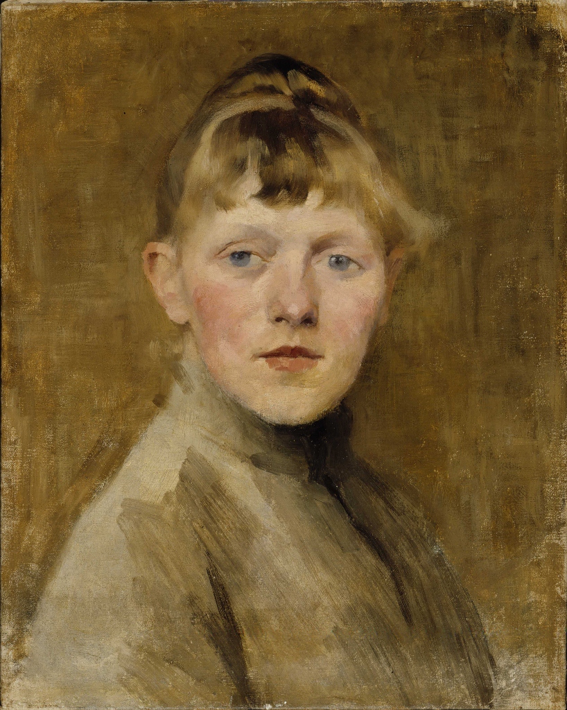
Self-portrait by Helene Schjerfbeck (1884 to 1885) Finnish National Gallery / Ateneum Art Museum. Photo by Hannu Aaltonen
Via a kind of haughty modernism like this:
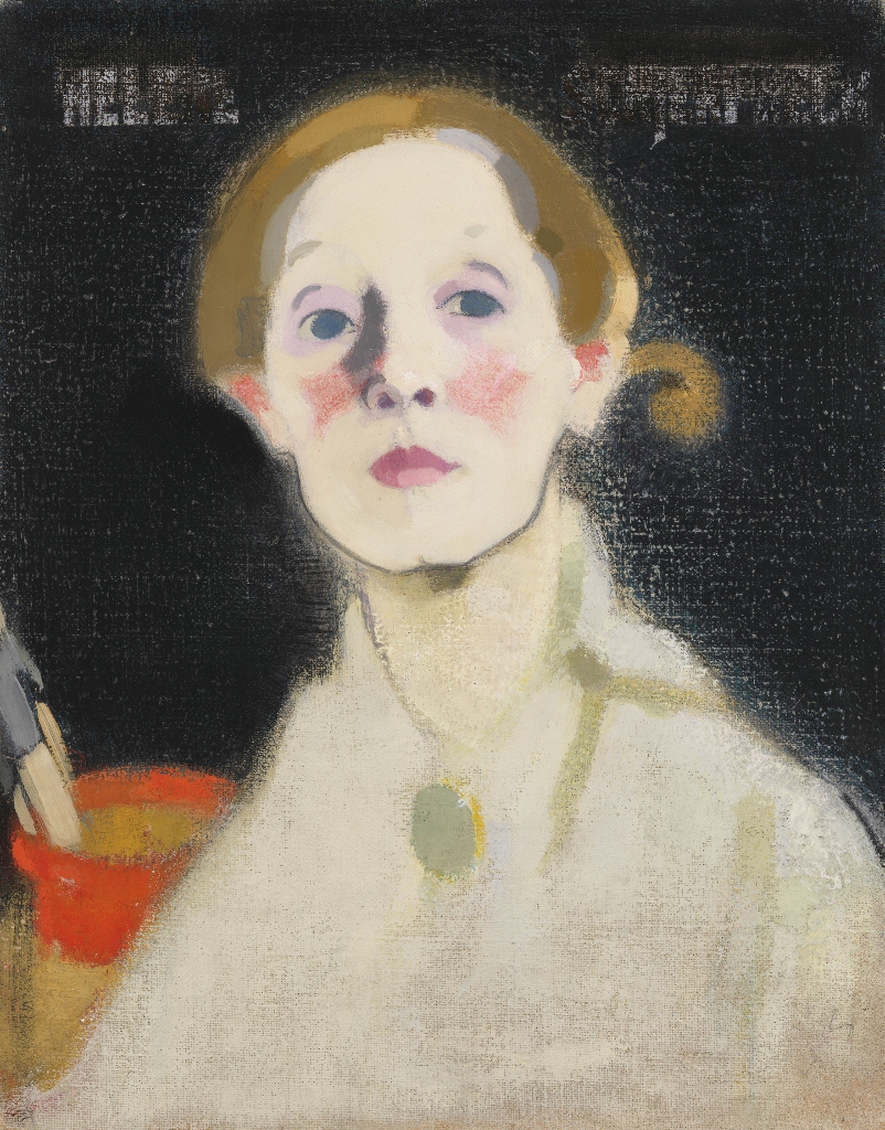
Self-portrait with a black background by Helene Schjerfbeck (1915) Finnish National Gallery / Ateneum Art Museum. Photo by Yehia Eweis
To the incredibly bleak, post-Holocaust self-portraits of her last few years.
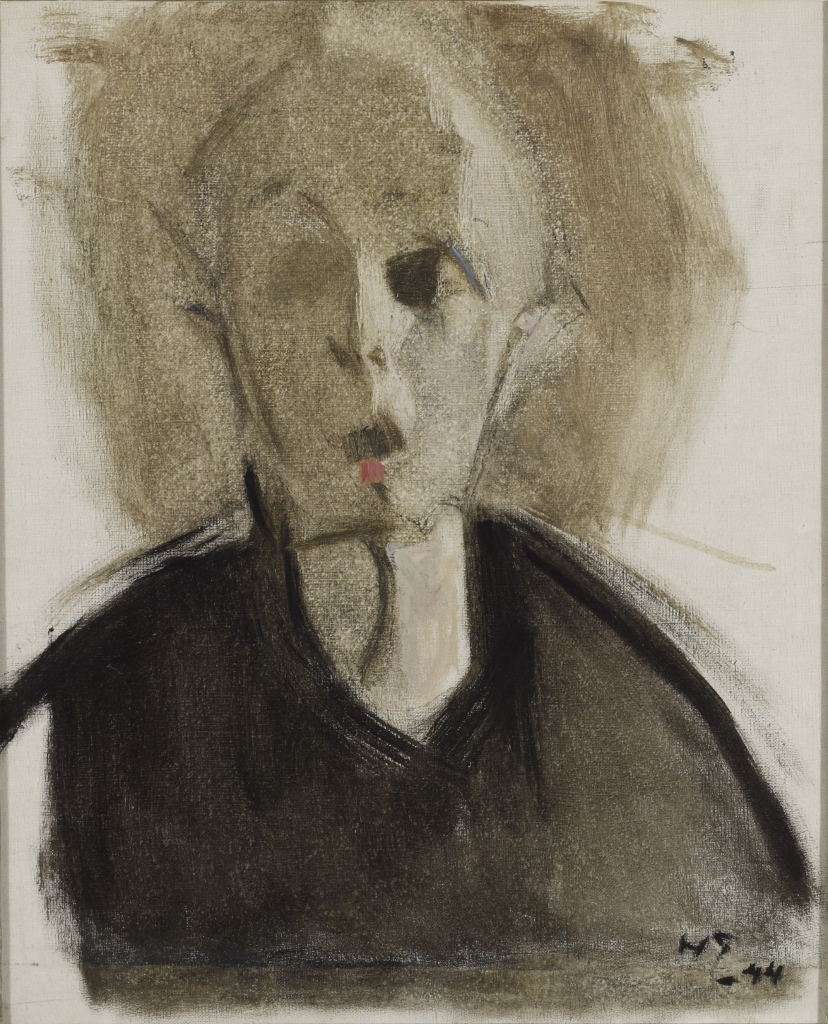
Self-portrait with Red Spot by Helene Schjerfbeck (1944) Finnish National Gallery / Ateneum Art Museum. Photo by Hannu Aaltonen
Synopsis
Helene Schjerfbeck lived from 1862 to 1945. She is one of Finland’s most eminent artists. This is the first ever UK exhibition ever devoted to her work. It contains some 65 portraits, landscapes and still lifes, selected from the estimated 1,000 works that she produced in a career spanning nearly seventy years.
Early career and studies
Helene was the third child of an office manager in the Finnish state railway’s workshop. The family were lower-middle-class Swedish-speaking Finns. At the age of 11 some of her drawings were shown to a successful painter who arranged a free place for her at the drawing school of the Finnish Art Society. Aged 11! She won a prize every year for the four years she was there.
In 1877 she moved to a private academy in Helsinki, learning to handle oil paints. In 1880 her painting Wounded Soldier in the Snow won a prize from the Finnish Senate which allowed her to go and study in Paris. She made friends and visited Pont-Aven the emerging art colony where Gauguin was later to work.
In 1887 she travelled to St Ives in Cornwall at the invitation of a fellow art student who had married an Englishman. She returned again a year later and made many paintings, enjoying the English coastal light.
The first picture in the show is Two Profiles from 1881, when she was just 18. It took my breath away. The oil paint is laid on in swatches and clearly visible strokes which give a bracing energy and dynamism to what is, on the face of it, a passive image. This reproduction is terrible. In the flesh it is much more bright and airy.
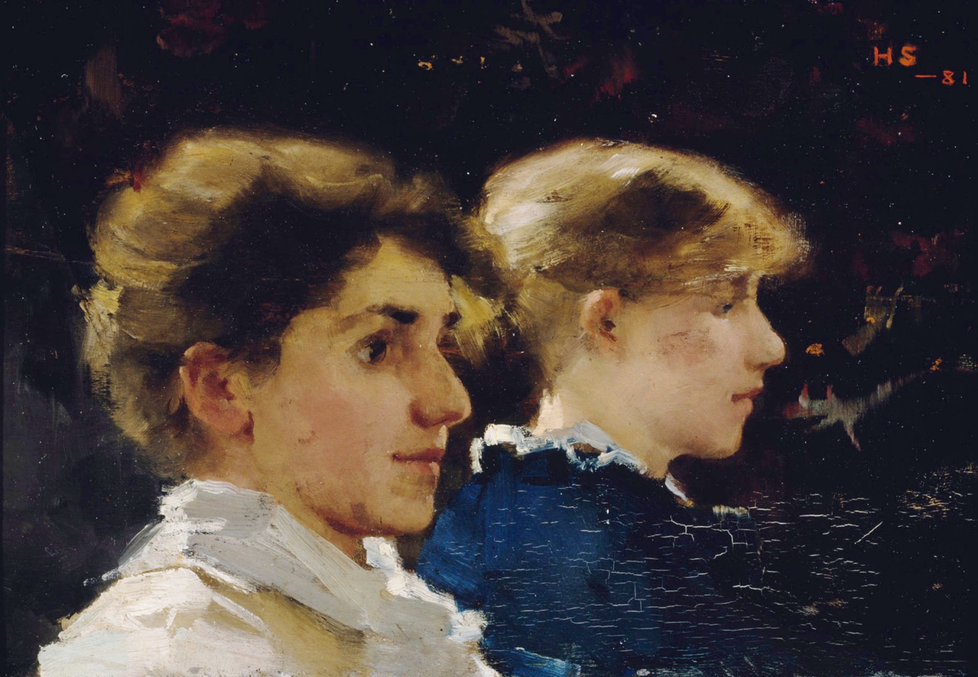
Two Profiles by Helene Schjerfbeck (1881)
All the other early paintings have a tremendous confidence with oil paint, she handles it in the loose expressive way I associate with John Singer Sargent. They all deal with light and sunny Cornish landscapes or healthy looking peasants and workers and family and friends. Chocolate box. The rural settings and confident if (when you look closely) roughly applied paint remind me a bit of the farm paintings of George Clausen.
View of St Ives by Helene Schjerfbeck (1887)
The largest painting from this early phase is The Convalescent from 1888. It is a rich slice of late-Victorian tweeness, complete with a blue-eyed little girl. It was exhibited at the Paris Salon of that year and bought by the Finnish Art Society. It is tremendously proficient. Look at the glass jar on the right of the table. What immense talent she had for this kind of naturalism.
The Convalescent by Helene Schjerfbeck (1888)
Travelling and teaching
There is then a hiatus in the exhibition. The next painting is from 1905. What happened in between? She travelled and got a job as a teacher.
Travel
In 1892 the Finnish Art Society commissioned her to travel to St Petersburg and make copies in the Hermitage Museum of Frans Hals, Diego Velasquez and other Old Masters for the Finnish Collection. In 1894 she visited the Austrian national museum to make more copies, then travelled on to Italy to make copies of Renaissance masters.
Teaching
Schjerfbeck got a job as a teacher in the Finish Art Society’s drawing school. She was, by all accounts, extremely exacting. Complete silence in the classroom.
Ill
Schjerfbeck was always unwell. As a child she had fallen and broken her hip leading to a permanent limp. She fell ill in 1895, took sick leave till 1896, and was again on extended sick leave in 1900. In 1902 she resigned her teaching job and went to live with her mother in the small town of Hyvinkää north of Helsinki. There is a series of portraits of her mother which hint at the psychological tensions between them. Nonetheless her mother’s small state pension meant she didn’t have to work.
Schjerfbeck ended up living in Hyvinkää for fifteen years, corresponding with friends and asking for copies of newspapers and magazines. During this time she used local girls and boys and men and women as models for her painting.
The mature style
All of this goes some way to explaining the radical change which came about in her art. Compare the two women and the little girl in the paintings above with the next one in the exhibition, from 1911.
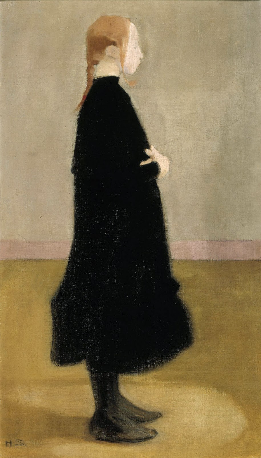
Schoolgirl by Helene Schjerfbeck (1911)
The idea is that Schjerfbeck no longer needed to compete – to bow to current taste in order to sell things to the Salon or to compete for prizes or sales. Now she could experiment with her vision – and it is completely unlike anything from the 1880s and 90s.
Now the outlines of figures becomes misty and vague. The faces lose the precise features they formerly had. Detailed description disappears in favour of blocks of abstract colour. And the palette becomes deliberately more narrow, so that the compositions seem more aligned, more focused, creating a sense of luminosity.
Many of the paintings are deliberately unfinished, leaving patches of canvas showing through. And in many of them, she either scores the surface of the paint, or lets it dry then scrapes away at it, repaints a new layer, dry, and scrapes it back again – the idea being to mimic the aged and worn affect of the many frescos she had seen on her trip to Italy.
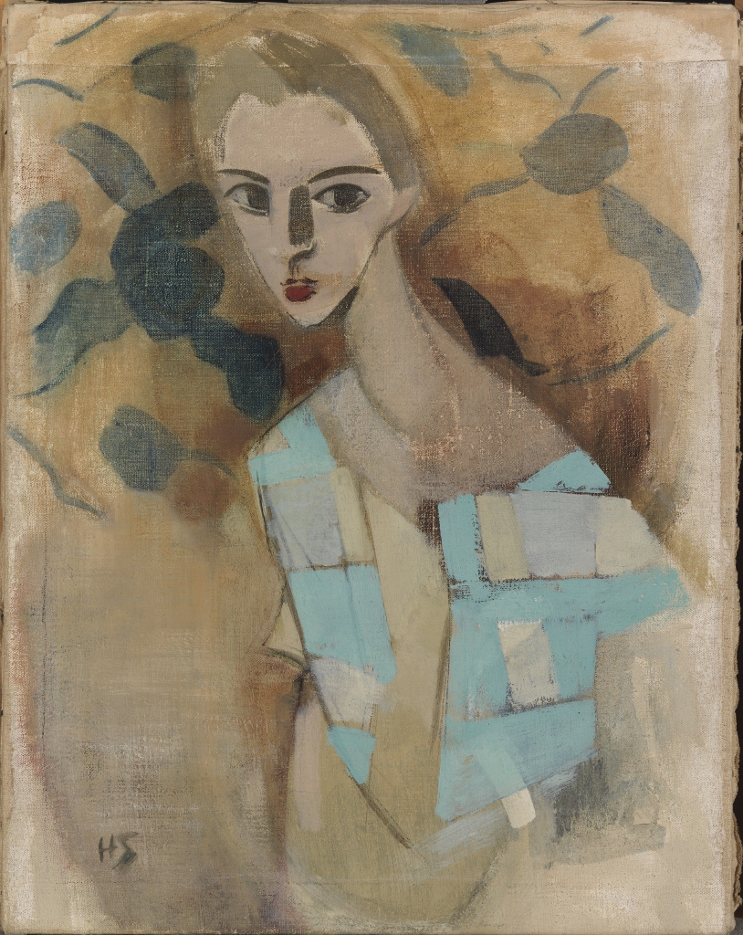
Flappers
The Great War came but didn’t greatly effect her art. Instead this rather misty style continues unabated into the between the wars period. Surprisingly, many of them reflect the fashions of the era. She subscribed to fashion magazines such as Marie Claire and was interested in the slender gender-neutral look of the ‘flapper’, and she also created fictional characters or types. Almost all her models were local working class people but she used them as the basis for novelistic ‘types’ such as The Skiier or The Motorist or, one of the most vivid images, the Circus Girl.
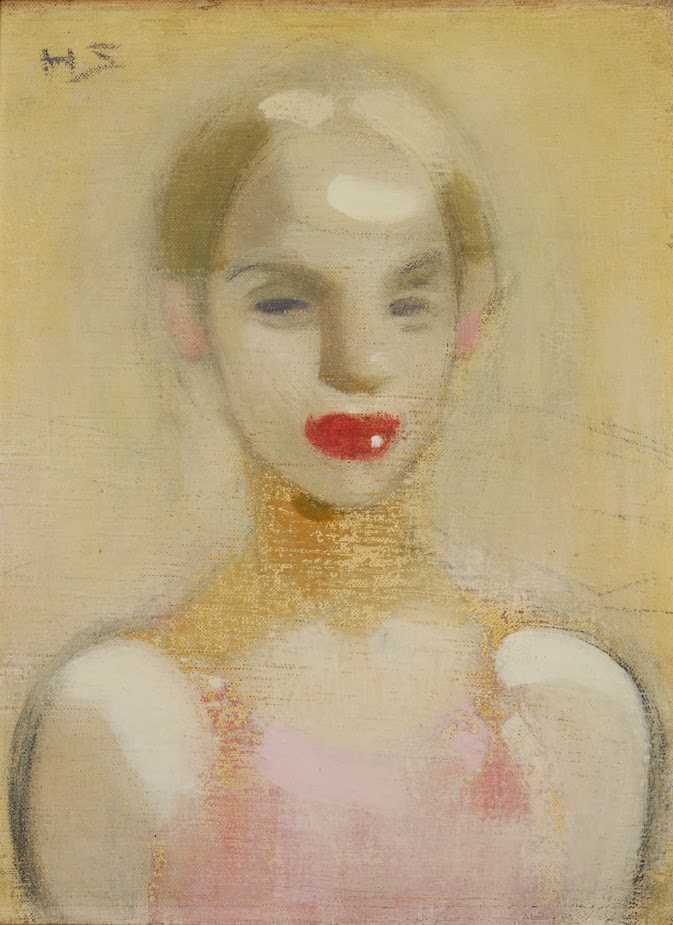
The Circus Girl by Helene Schjerfbeck (1916)
Note the vague unfinishedness of the whole image; the sketchiness of the outline; the sense that it has been scored or marked by charcoal lines; the tonal unity of the yellow background and yellow skin, the pastel top and golden choker. And note the unexpected surprise of the big red lips with their cartoon-style catchlight.
There are 20 or more paintings which are all variations on this theme, and in which the face is more or less stylised. In some it becomes a shield-shaped mask, verging on the abstract and obviously indebted to the experiments the great modernists had made earlier in the century, copying actual tribal masks held in museums of Ethnography.
A handful of other works deliberately reference El Greco who she particularly liked, he was, I suppose, another eccentric or outside-the-mainstream artist.
I love drawing, I love clear defined outlines, but I also love it when they’re not finished, incomplete and hint at a perfection they don’t try to achieve. I love the suggestion of struggle in a work of art. Hence I love lots of sketches and drawings by Degas. And hence I loved lots of Schjerfbeck’s misty, unfinished, gestural works. Is there some Picasso’s harlequin period in this one?
Girl from Eydtkuhne II by Helene Schjerfbeck (1927) Finnish National Gallery / Ateneum Art Museum. Photo by Hannu Aaltonen
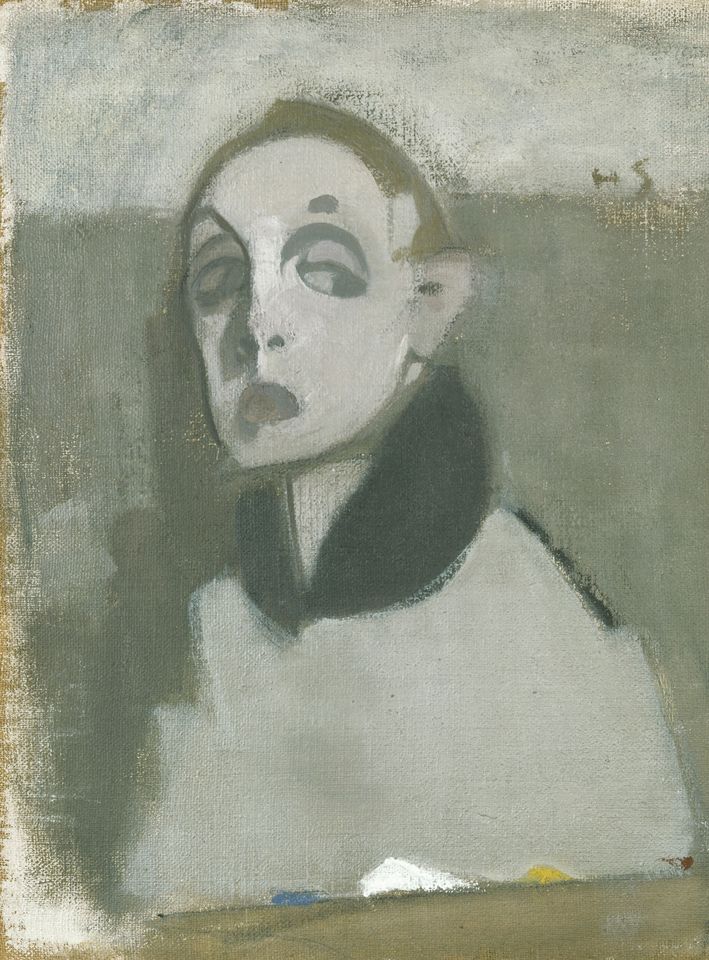
The self portraits
Schjerfbeck painted her first self-portrait at age 22 and her last at 83. The exhibition has a room devoted to them, with seventeen examples placed in simple chronological order, and they create quite a harrowing effect, as shown at the top of this review, progressing from sweet and gentle young woman, in her naturalistic phase, to the haughty modernist of between the wars and then, in the 1930s and 40s, to an awesomely bleak and unforgiving vision. During the 1930s the familiar lineaments of her face are subjected to distortions, her cheekbones melting, her mouth becoming a dark wound. The only colour is grey, shades of grey, grisaille, the only tones left when all the colours of life have drained away.
Self-portrait with Palette by Helene Schjerfbeck (1937)
But these turn out to be only the build-up for the final half dozen self portraits painted during the Second World War as Schjerfbeck, by now an old woman and ill with the cancer which would kill her, morphs into a gaunt, grey, death-haunted skull-face which foreshadows the era of the Holocaust, the atom bomb, and the harrowed writings of Samuel Becket.
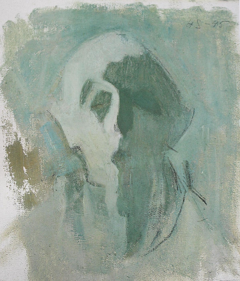
Green Self-Portrait – Light and Shadows by Helene Schjerfbeck (1945)
What an extraordinary pilgrimage. And what a distinctive, individual, strange and troubling journey she takes us on. This is a remarkable exhibition.
Promotional video
Curators
Rebecca Bray, Anna-Maria von Bonsdorff, Sarah Lea.
Related links
- Helene Schjerfbeck continues at the Royal Academy until 29 September 2019
- Complete wall labels
- Five things to know about Helene Schjerfbeck


