The Architectural Review is a monthly international architectural magazine. It was founded in London in 1896 and does what its title suggests, covering all aspects of the built environment.
Manplan
Just over 50 years ago, in 8 issues from September 1969 to September 1970, the Review ran a series of eight specially commissioned reports on the state of architecture at the end of the 1960s. It was to review not just architecture in the narrow sense but the entire state of town planning, in an age when old Victorian slums were being torn down to make way for gleaming new towns made of high-rise towers, medium-rise blocks characterised by lifts and concrete walkways, subways under sweeping new ring roads, nicely laid-out grassed areas and so on.
The Review’s editors called the series of articles ‘Manplan’ and hired leading photojournalists and street photographers to address a set of eight themes, being:
Frustration
Travel and communication (‘Society is its contacts’)
Town Workshop
Education (‘The continuing community’)
Religion
Health and Welfare
Local government
Housing
The result was a series of brilliant photos shot on a 35mm camera in a spirit of photo-reportage – vivid and dramatic black-and-white works which captured a nation in the midst of great social, cultural and environmental change. To the horror of some of its contributors and readers, the magazine turned its back on large-format, heroic photography of buildings and their details, instead embracing a grainy, 35mm black-and-white reportage aesthetic, where people were as, if not more, important than the places. In the words of The Royal Institute of British Architects, publishers of the Architecture Review:
The aim was to propose an alternative and more holistic approach to urban planning, which would look at all basic human needs as a whole. The photographs illustrating the issues were created in the spirit of photo reportage and often featured people inhabiting the spaces studied by the survey, thereby shifting the focus from the architecture itself to the human element within the built environment.
So it was intended to be polemical stuff. The photographers were:
Ian Berry
Tony Ray-Jones
Tim Street-Porter
Patrick Ward
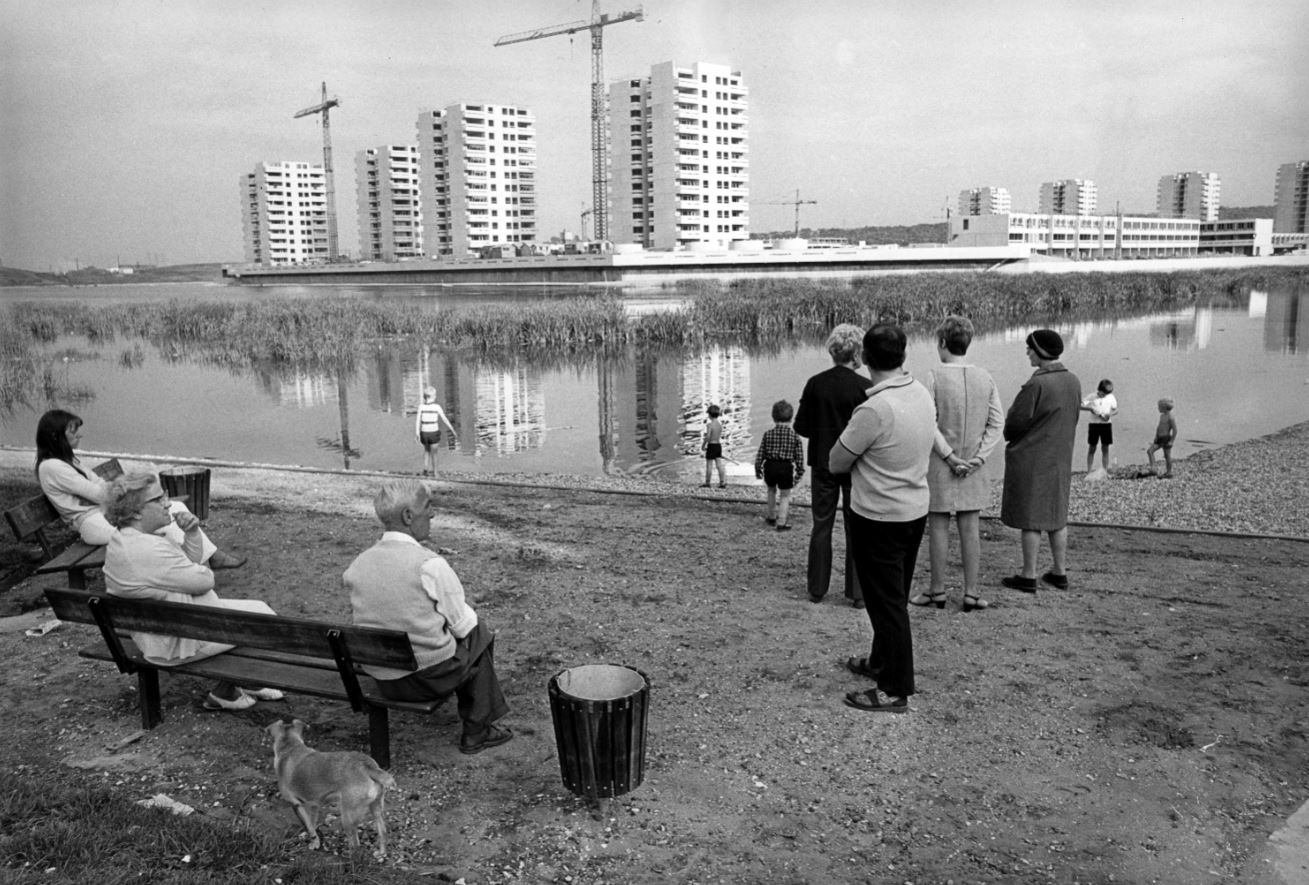
Altogether the Architectural Review published about 80 photographs. Just 16 are on display here, but every single one of them is a masterpiece; there’s no slack. Each one is a densely packed, highly charged vignette. This exhibition isn’t big but it is packed with social history, with memories and nostalgia for a time within the living memory of many but feeling evermore distant.
Design and layout
On a separate wall is a display of the actual copies of the magazine which the photo-essays appeared in, along with the words and designs of ‘Manplan’ editor Tim Rock and designers Michael Reid and Peter Baistow. This section goes into detail about how the photographs were processed, reproduced and printed (using ‘special matt black ink’) along with analysis of the layout and typography. All a bit over my head but interesting for students of design.
The photographs
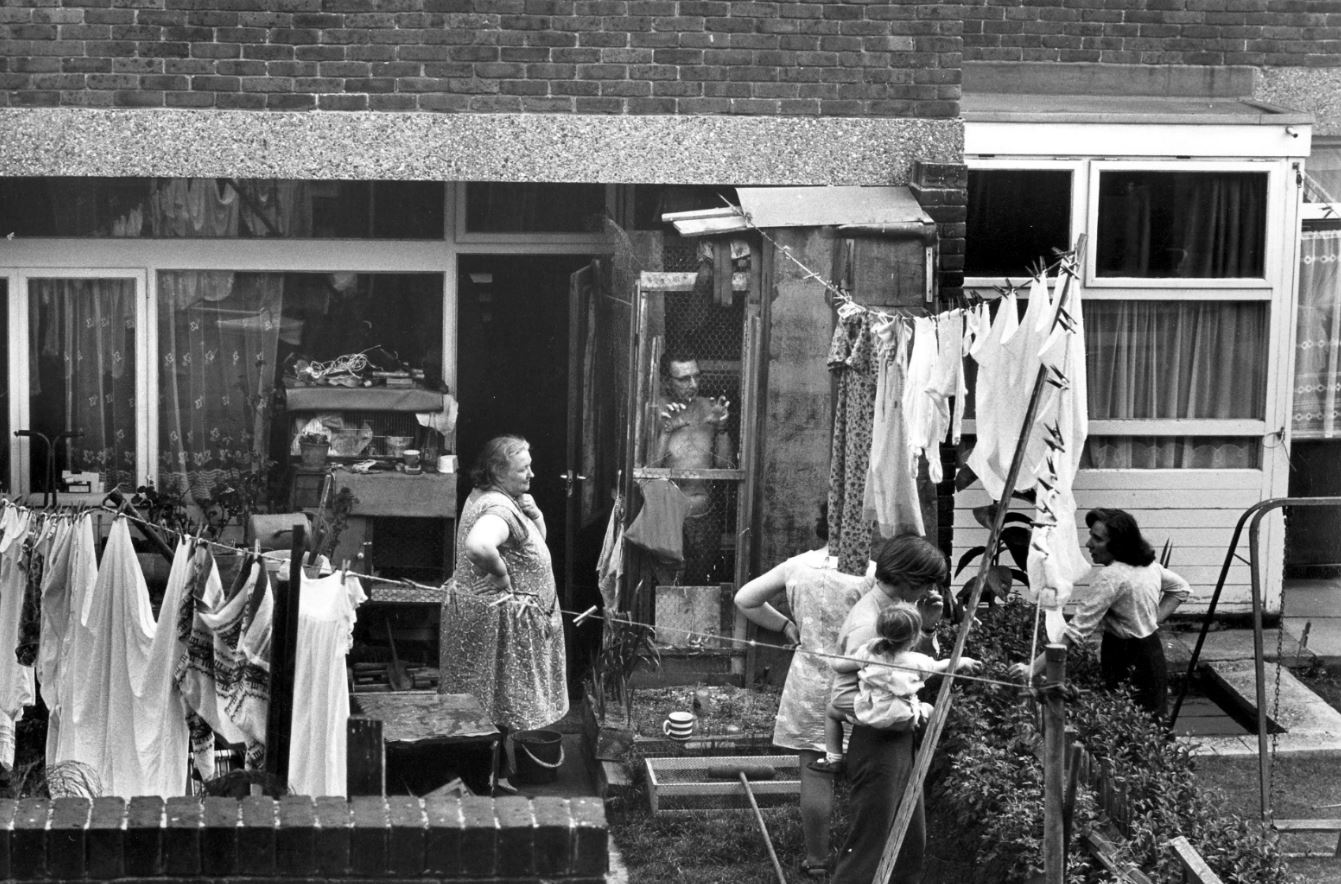
Private terraced houses on the Old Kent Road opposite Camelot Street Estate, London by Tony Ray-Jones (1970) part of ‘Manplan 8: Housing’, in Architectural Review, September 1970. Courtesy Architectural Press Archive / RIBA Collections
Housing at New Ash Green, Kent by Tony Ray-Jones (1970), part of ‘Manplan 8: Housing’, in Architectural Review, September 1970. Courtesy Architectural Press Archive / RIBA Collections
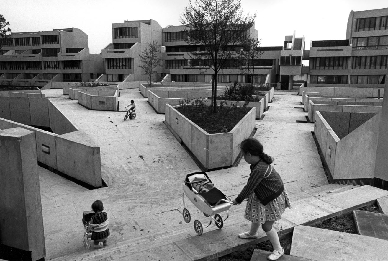
Low-rise housing, Tavy Bridge, Thamesmead, Greenwich, London, 1970 by Tony Ray-Jones, part of ‘Manplan 8: Housing’, in Architectural Review, September 1970. Courtesy Architectural Press Archive/RIBA Collections
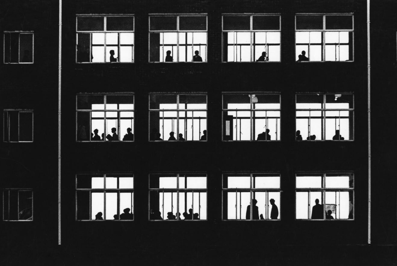
Classroom windows in a school in Wales, 1969 by unknown photographer, part of ‘Manplan 4: The continuing community (education)’, in Architectural Review, January 1970. Courtesy Architectural Press Archive / RIBA Collections
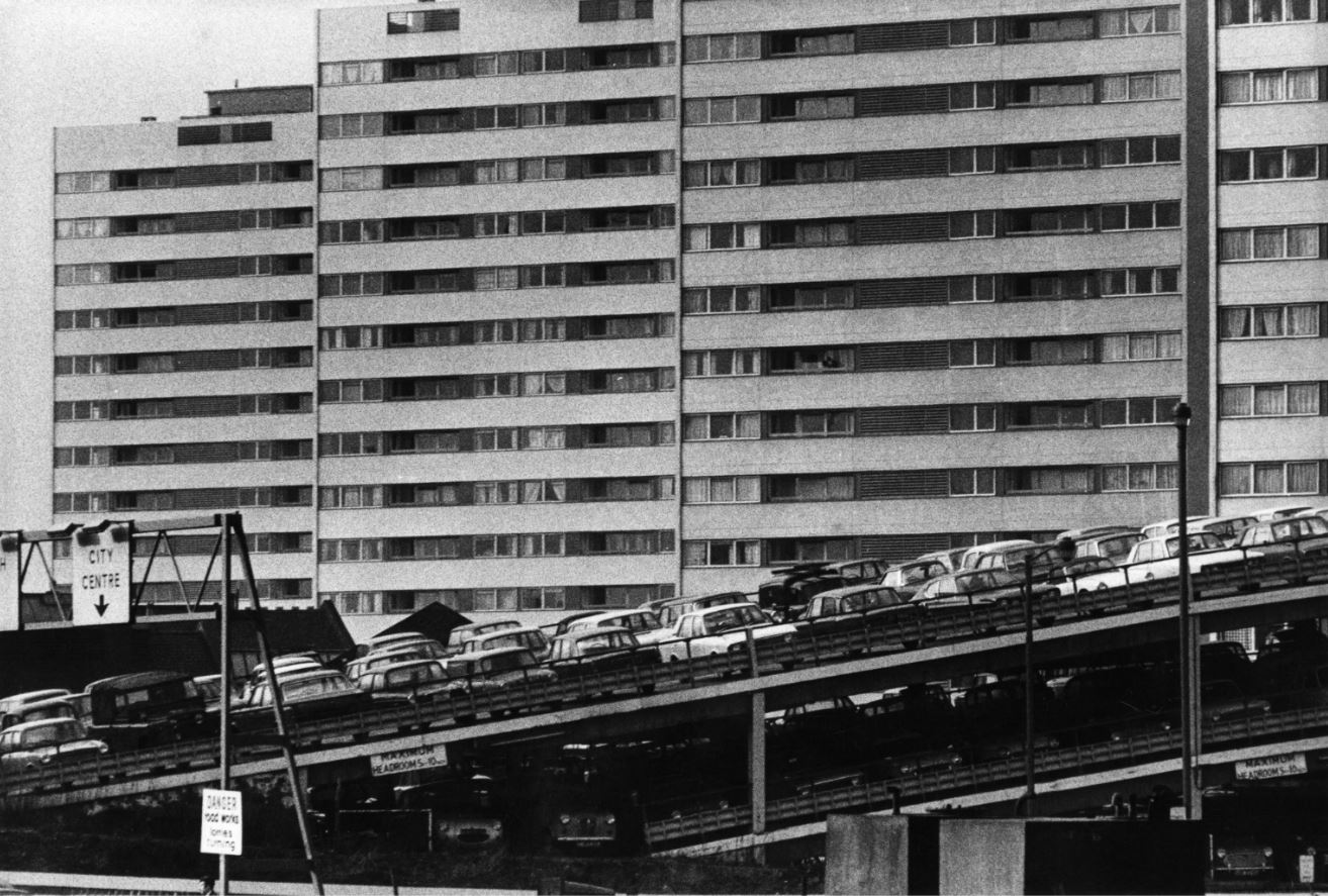
High-rise flats and multi-storey car park, Birmingham, 1970 by Peter Baistow, part of ‘Manplan 5: Religion’, in Architectural Review, March 1970. Courtesy Architectural Press Archive / RIBA Collections
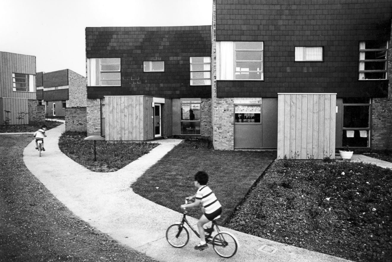
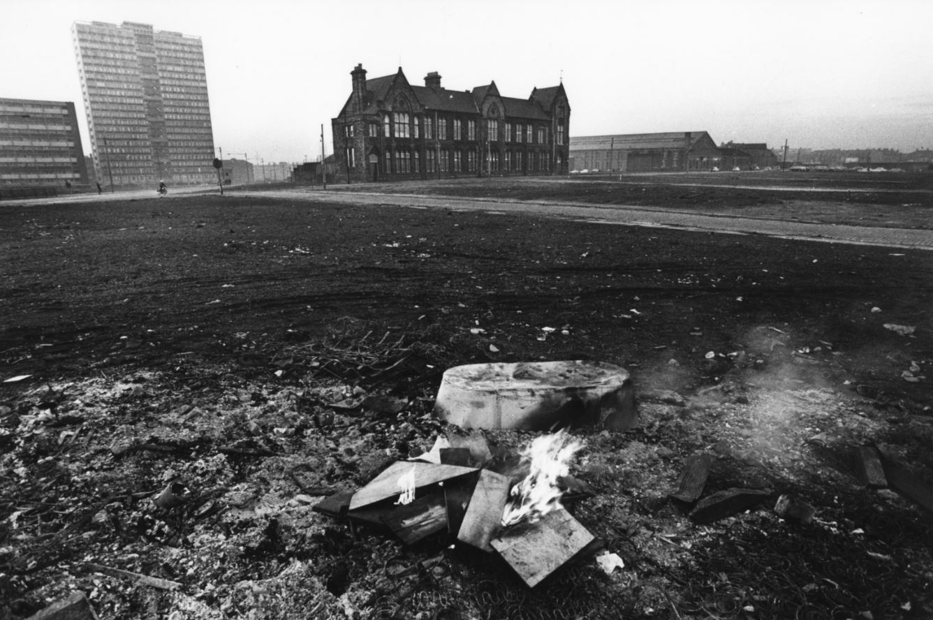
Chatsworth Street school and high-rise housing block overlooking the cleared site, Liverpool, 1969 by Tom Smith, part of ‘Manplan 4: The Continuing Community (education)’ in Architectural Review, January 1970. Courtesy Architectural Press Archive / RIBA Collections
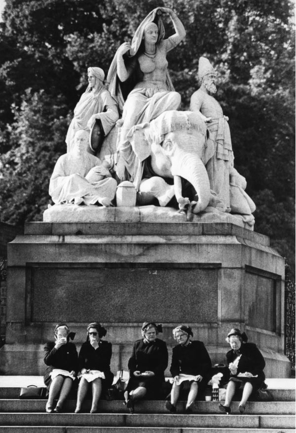
Salvation Army officers picnicking on the steps of the figure group Asia by J H Foley, Albert Memorial, Kensington Gardens, London, 1969 by Peter Baistow, part of ‘Manplan 5: Religion’, in Architectural Review, March 1970. Courtesy Architectural Press Archive/RIBA Collections
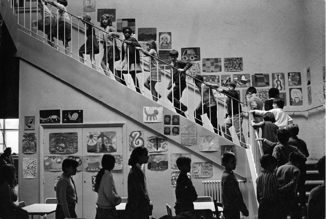
Unidentified primary school, 1969 by unknown photographer, part of ‘Manplan 4: The continuing community (education)’, in Architectural Review, January 1970. Courtesy Architectural Press Archive / RIBA Collections
Thamesmead film
To one side of the 16 framed photos on the wall, is a TV monitor showing a film from around the same time (in fact the year before the project, 1968). So far as I can tell it’s not directly connected with RIBA or the Manplan project except for the slender link that one of the 80 Manplan photos happens to cover the same subject as the film, namely the new estate being built at Thamesmead. So it wasn’t directly related to the Manplan project but gives context to the kind of architectural and town planning thinking which was going on at the time of the Manplan project.
Directed by Jack Saward, this 25-minute public education film gives an overview of the history and construction of Thamesmead, a sort of new model suburb built down the River Thames from London on the site of the old Royal Arsenal, a site that extended over Plumstead Marshes and Erith Marshes.
Alas, to quote the introduction to the video on YouTube:
The ambition is commendable but it didn’t quite work in practise, with Thamesmead becoming a notoriously problematic estate and its architects perceived as exhibiting many of the faults of post-war planning, with communities being tinkered with from above like a real-life experiment. This is where utopia meets authoritarianism.
Hard to believe, but the planners that designed the place provided insufficient transport links with London, no way of crossing the Thames for 5 or 6 miles in either direction and – best of all – an almost complete lack of shopping facilities and banks. Lots of pretty little lakes but…nowhere to buy food. According to the label in the exhibition, the estate ‘was soon plagued by social problems caused by lack of facilities and public transport’.
The half-built estate won an unwanted fame when American film director Stanley Kubrick used parts of it as the setting for his notoriously violent 1971 movie, A Clockwork Orange, a vision of an alienated, dystopian society. Here’s the photo of it taken by the brilliant Tony Ray-Jones which provides a sort of coincidental link between the Manplan series and the film.
Thamesmead under construction, Greenwich, London, 1970 by Tony Ray-Jones in ‘Manplan 8: Housing’, Architectural Review, September 1970. Courtesy Architectural Press Archive / RIBA Collections
Which do you prefer? Which do you think is telling the truth, the film or the photo?
The Robert Elwall Photographs Collection
All the materials for the Manplan exhibition, photos and old copies of the AR magazine, come from the Robert Elwall Photographs Collection. This comprises around 1.5 million images from the earliest days of photography to the present day. The collection includes photographic archives of individual architects and practices, travel and topographic images from across the world, press photographs from major architectural journals, and large bodies of work by some of the best known architectural photographers of the 20th century. The collection includes prints, negatives, slides, transparencies, photographically illustrated books and digital files. It is itself part of the larger Royal Institute of British Architects collections.
Conclusion
Flicking through some of the text on the walls is a dispiriting experience. These 1970 writers were raging against the soulless design of modern cities, the daily struggle of commuting to work on overcrowded public transport, against air pollution, excess traffic and the destruction of the environment, against the dominance of the car over human-friendly spaces, against the dehumanising effects of modern technology, against social inequality and the lack of social housing, against the prioritising of profit over people.
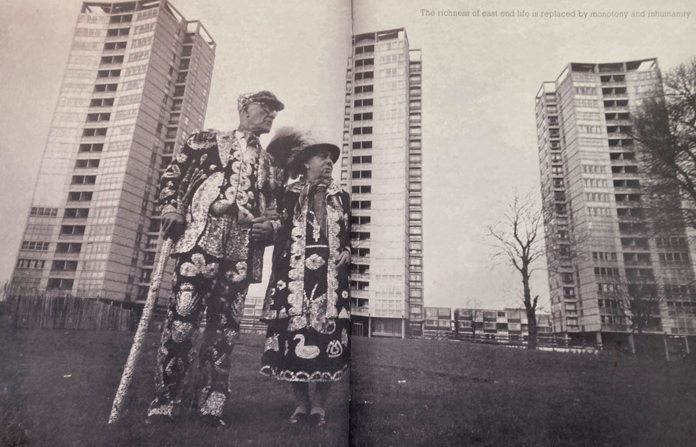
It’s as if, 53 years later, nothing has changed except we all have smart phones to share our frustration about how things obstinately carry on being rubbish. The Manplan writers’ rage and frustration is captured by this, the last entry in the exhibition.
Double page spread from Manplan 1. ‘Frustration’
It’s a copy of the original magazine, open to a double page spread showing a traditional Pearly King and Queen standing in front of the typically sterile, barren waste ground surrounding a clutch of looming, threatening tower blocks. Up in the top right is a text reading: ‘The richness of East End life is replaced by monotony and inhumanity.’
Yep. that’s the world I grew up into and which punk rock, with its angry nihilism, was a direct response to. Eternal shame on England’s architects and town planners.
Related links
A Brief Revolution continues at the Photographers Gallery until 11 June 2023
‘British Baroque: Power and Illusion’ covers art and architecture (and gardens and sculpture and oddities and gimmicks) from the Restoration of Charles II in 1660 to the death of Queen Anne in 1714. The big word in the title is Baroque but it’s a problematic term and by the end of the exhibition I was left wondering, in my non-scholarly way, whether any of the art on display here actually qualifies for the description ‘Baroque’.
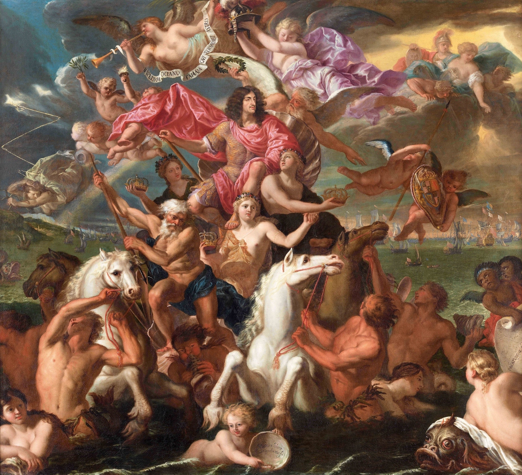
‘The Sea Triumph of Charles II’ by Antonio Verrio (c.1674) The Royal Collection / HM Queen Elizabeth II
1. Dates
Traditionally, in art history, the term Baroque denotes Power – Religious and Royal Power. Baroque art and architecture are big, heavy and imposing.
The Baroque is one of the major Periods of Western Art, preceded by the Renaissance and Mannerism and followed by the Rococo. The dates usually given are:
Early Renaissance 1400 to 1495
High Renaissance 1495 to 1520
Mannerism 1520 to 1600
the Baroque 1600 to 1740
Rococo 1730s to 1760s
Neo-Classicism 1760 to 1830
The convention is to date the Baroque from the early 1600s, at least in Italy and on the Continent. It is a striking decision by the curators to delay it as late as 1660 for this exhibition, though you can see why – England was always slow to adopt developments in continental art and architecture.
Some outliers and pioneers may have been introducing ‘baroque’ styles into the English court in the 1620s and 1630s (the designer and architect Inigo Jones is often mentioned), but then all artistic and architectural endeavour was suspended during the great cataclysm of the British civil wars, which lasted:
from the rebellion in Scotland in 1637
through the civil wars in England (1642 to 1648)
the execution of King Charles I in 1649
continued wars in Scotland and Ireland into the early 1650s
the rule of Oliver Cromwell from 1653 till his death in 1658
the collapse of the Parliamentarian regime in 1658 to 1659
to the triumphant restoration of Charles II in 1660
Quite obviously the commissioning of royal art and architecture was put on hold for the whole of this war-torn and then republican period.
So starting the exhibition in 1660 with the restoration of Charles II provides a neat, clean starting point to a period which was distinctive in music (Purcell), literature (Dryden, Restoration Comedy) and philosophy (John Locke), as well as architecture (Christopher Wren) and art (Peter Lely) – the subjects specifically covered in this exhibition.
Plus – England was always late. Stuck up here on the remote periphery of Europe, England was late to experience all the trends which originated in the Mediterranean heartland. Thus Renaissance art and literature was flourishing in Italy in the 1400s but we date ‘our’ Renaissance period from the 1530s or later. Literature students tend to equate it with the reign of Queen Elizabeth which started in 1558, getting on for 150 years after the Renaissance started in Italy, by which time the Italians had been all the way through the Renaissance, High Renaissance and Mannerism. During the 18th century the motor for artistic innovation moved to France and stayed there until, arguably, the First World War, maybe beyond.
Anyway, for centuries the Europeans were waaaay ahead of us Brits. Mind you, we had something they didn’t have, which was an empire to set up and run.
2. The term ‘Baroque’
Its origin is obscure. It seems to derive from the Portuguese barocco meaning, ‘irregular pearl or stone’, i.e. a technical term in jewellery for a kind of pearl which was not perfectly round: for a pearl which was ugly and misshapen.
It seems that early uses of the term ‘baroque’ were all negative and used to criticise unnecessary complication and ugliness which were creeping into art. The word was never used by the artists or architects actually working during the ‘Baroque’ period; it wasn’t a self-conscious movement like Cubism.
Baroque is a term which was imposed a long time later, by late-eighteenth century or nineteenth century historians who, looking back, needed terms to assign to all the ‘period’s they wanted to divide art history into.
‘The Annunciation’ by Benedetto Gennari (1686) The John and Mable Ringling Museum of Art, The State Art Museum of Florida
3. The origins of the Baroque in the Counter-Reformation
Articles about the Baroque all point to its origins in the Councils of Trent, the organisational centre of the Counter-Reformation.
In 1517 the monk Martin Luther had nailed his theses about theology to the door of his local church (in fact a traditional way to announce a theological debate). Luther called for a revolution in all aspects of European Catholicism, sweeping away scores of central dogmas and traditions and ceremonies which he regarded as later additions, corrupt folklore and legends and superstitions and inventions which had been grafted onto what was originally the pure and spartan teachings of Jesus as recorded in the four gospels.
Many German princes and north European kings took Luther’s teachings as an opportunity to throw off the shackles of Catholic rule from Italy, and within a generation a host of independent ‘Protestant’ churches and states had been established across northern Europe, not least in England where Henry VIII rejected rule of his church from Italy by an Italian pope and declared himself head of a newly-styled Church of England.
One aspect of the Protestant revolt had been aesthetic. In rejecting the cults of saints and relics – the excessive worship of Mary Mother of God and a host of other Catholic traditions – the really revolutionary Protestants (who came to be nicknamed the Puritans, in England) cleaned out their churches, smashing statues, defacing medieval paintings, burning wooden rood screens and so on in an orgy of iconoclasm.
Result: by the 1550s or so European Christianity existed in two forms, a stripped-down, militantly white-walled protestant form held in bit white undecorated halls – and a defiantly gold candelabra-ed, smells and bells Catholicism performed in churches crammed with statues of saints and the crucified Christ and a blue-robed Mary.
In light of the Protestant attacks, the Catholic authorities called a series of congresses at Trent (Trento in northern Italy) to thrash out just what they did agree on, in order to redefine every element of Catholic theology and practice, to create a new, stronger, more centralised ideology. Reacting against what had become known as the Protestant Reformation, this fightback became known as the Counter-Reformation.
Among a host of new theological and administrative rules emerged a belief that Catholic churches, Catholic aesthetics, should defy the know-nothing, philistine, iconoclastic, whitewash-everything Protestants and build their churches on an even more elaborate scale.
Catholic architecture should be enormous, characterised by domes soaring into heaven and festooned with flocks of angels and risen Christs flying over the heads of the congregation. Every nook should be full of florid statues of saints in the agony of their martyrdoms, and the authorities encouraged a style where every fold of their robes and cloaks became more and more elaborate, intricate and charged with emotion.
Italian Catholicism deliberately set out to be as flamboyant, as big, as majestic and as over-awing as could be achieved in buildings, statuary and painting. This is the key impulse behind the new heavy, elaborate, contorted and highly emotional style which later ages were to term the Baroque.
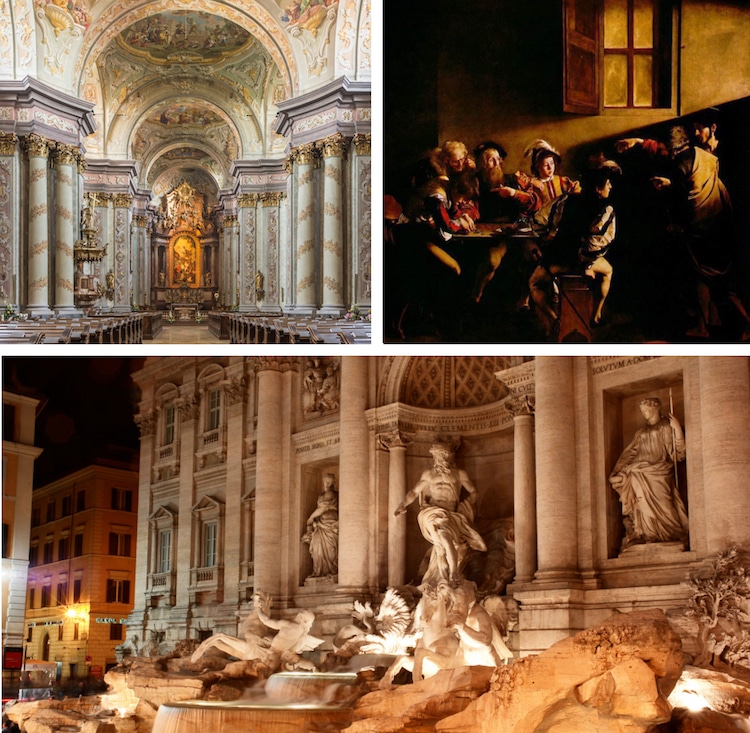
Examples of the Baroque: from top left: The interior of the church of Santa Maria, Rome; ‘The Calling of Saint Matthew’ by Caravaggio; The Trevi Fountain in Rome, designed by Italian architect Nicola Salvi and completed by Giuseppe Pannini in 1732.
4. Royal power
Not surprisingly, kings liked this style. ‘Big, imposing, overpowering, yep that’s me’ was the thought of rulers all over Europe, who proceeded to commission artists and architects to copy this new, super-solid, massive and imposing architectural and artistic style in their realms, from Poland to the Palace of Westminster.
It’s important to remember that, although he rarely features in histories of the civil war and Republic, Charles II was very much alive during all the events and where was he living? In the French court of Louis XIV (in fact the extended reign of Louis XIV, the so-called Sun King more than matches the entire period covered in this exhibition, he reigned from 1645 to 1715.)
Thus Charles didn’t just return in triumph to the palace of Westminster and resume all the rights and accoutrements of a king of England; he returned:
with his head full of European theories about the Divine Right of Kings
with the example of Louis XIV firmly in his mind about how to be such a king
and with his imagination packed with the architectural and artistic achievements of the French courtly builders and painters
It was under Louis XIV in the 1680s that the Palace of Versailles was redesigned and rebuilt to become the largest and grandest royal palace in Europe. Charles had watched his French peer think and plan on the grandest scale.
The British Baroque
So that’s a brief background to the ascent of the supposed Baroque style in Britain. But was it really Baroque? Here’s one of the thousands of definitions you can find on the internet:
The Baroque style is characterized by exaggerated motion and clear detail used to produce drama, exuberance, and grandeur in sculpture, painting, architecture, literature, dance, and music. Baroque iconography was direct, obvious, and dramatic, intending to appeal above all to the senses and the emotions.
If the Baroque is anything it is dramatic, operatic and exuberant, grand gestures in enormous buildings, huge and heavy marble statues, imposing porticos. Histrionic is a good word.
But after a few sort-of grand paintings in the first room (such as The Sea Triumph of Charles II by Antonio Verrio at the top of this review), the exhibition leads into a room of court beauties, a handful of Charles II’s many mistresses – and ‘grand’, ‘dramatic’ and ‘exuberant’ are not really the words which describe these paintings at all.
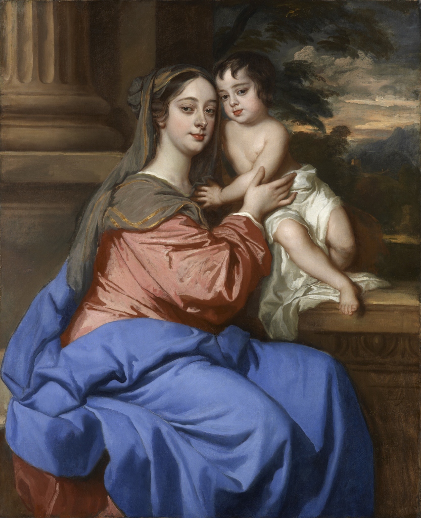
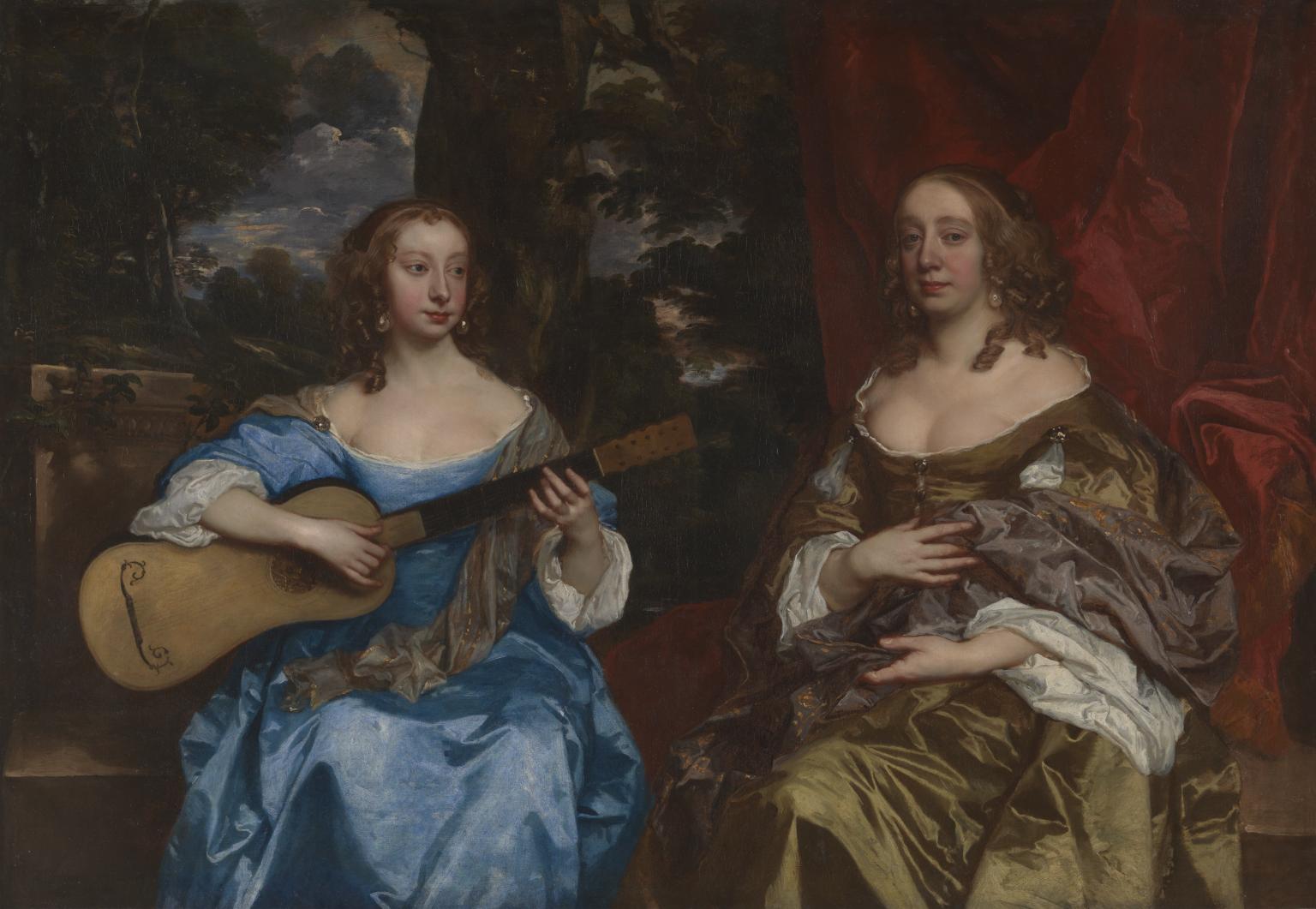
‘Barbara Palmer (née Villiers), Duchess of Cleveland with her son, probably Charles Fitzroy, as the Virgin and Child’ by Peter Lely (c.1664) National Portrait Gallery, London
There’s a nice pillar in this painting and, to those in the know about painterly symbolism, the Duchess of Villiers is wearing the bright red and blue traditionally associated in Renaissance painting with the Virgin Mary, but… It’s not really ‘grand’, ‘melodramatic’ or ‘histrionic’, is it? In fact Barbara’s snub nose, poky little mouth and bulbous eyes are more homely than grand and intimidating.
The seed of doubt whether the term ‘baroque’ really applies to the British art and architecture of the period is sown early and crops up throughout the rest of the exhibition.
The Sea Triumph of Charles II by Antonio Verrio at the top of this review is certainly an elaborate allegorical composition and contains a neat pyramid of tumbling sea nymphs and sea goddesses and so on, but the figure the whole composition leads you to… Charles II’s black moustachioed face of an old debauchee… to me it completely lacks awe or grandeur or dignity.
To me Charles looks a bit of a twerp, as if his face has been photoshopped onto a foreign fantasia.
There’s a moment in the room devoted to architecture where we learn about the murals the painter Sir James Thornhill was commissioned to create to decorate the dome of Sir Christopher Wren’s magnificent new St Paul’s Cathedral. They are a series of large murals depicting scenes from the life of St Paul, so far so good. But then we learn that he rendered them in black and white in order to be restrained and dignified and to suit the Protestant atmosphere of what was, in effect, the world’s first Protestant cathedral.
Restrained? That’s like saying we’re going to an all-night Brazilian samba party and we’re going to drink lemonade and dance the waltz.
It is completely against the spirit of the Baroque. The baroque is drama and opera and huge flights of angels soaring up into vast church domes. But that isn’t the English spirit at all. The English spirit then as now is faaar more sensible and restrained and undemonstrative.
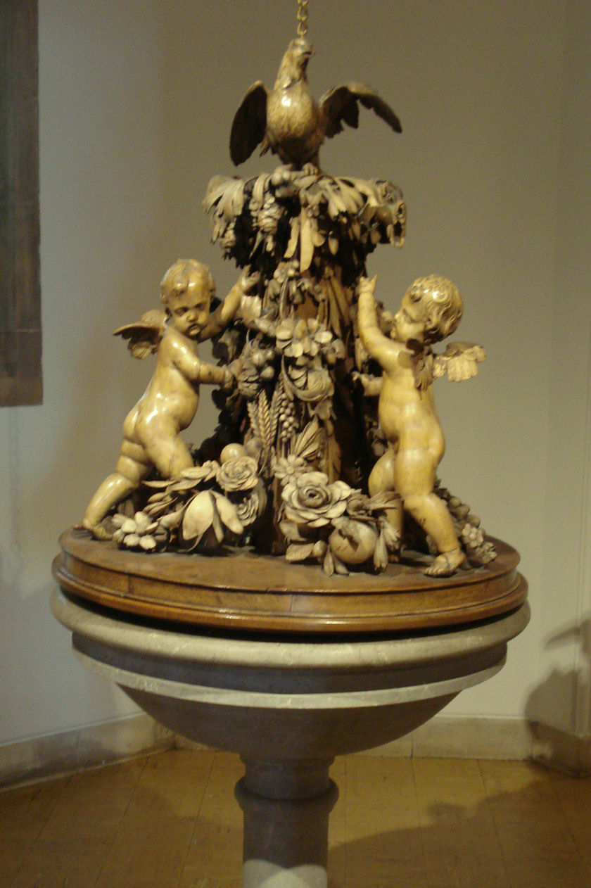
A glaring indicator of this was the simple lack of religious imagery throughout the show. Of the exhibition’s ten rooms, only one is devoted to religious imagery and that one is virtually empty. The only interesting thing in it is a wonderful carved wooden cover for a font by Grinling Gibbons which is all Italianate grapes and leaves, with a few winged putti holding up the swags, but there’s nothing particularly Christian about it. Certainly none of the agony and ecstasy and religious melodrama of the Italian Baroque. There are no bleeding saints rolling their eyes to heaven.
Font cover from All Hallows by the Tower church, London, by Grinling Gibbons, carefully avoiding all religious imagery whatsoever
Instead, what comes over is the way British and foreign painters domesticated the brash, grand, outdoors Italian Baroque for a culture which is far more indoors, domestic and family-orientated.
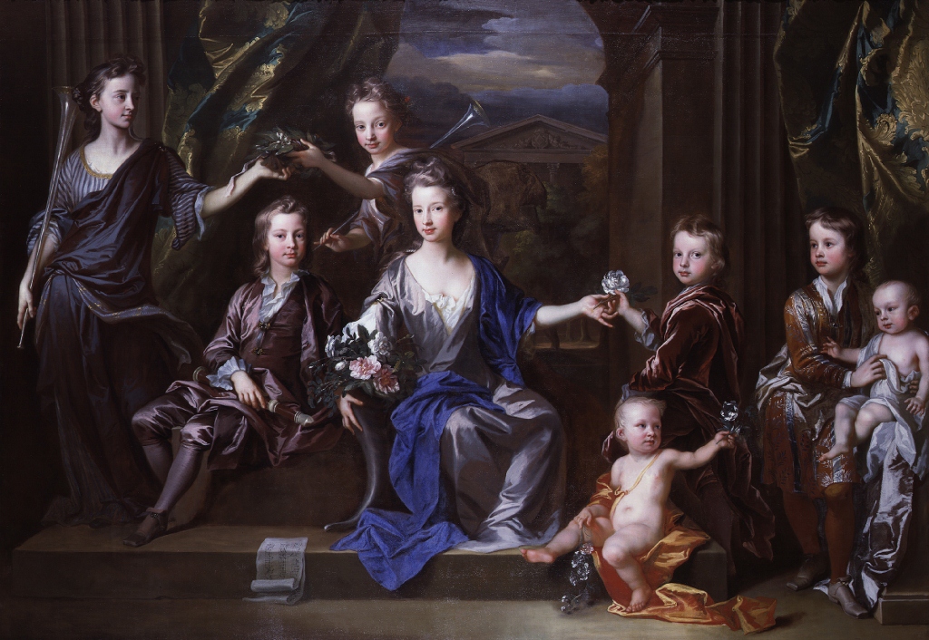
‘The Children of John Taylor of Bifrons Park’ by John Closterman (1696) National Portrait Gallery, London
There’s as much, in fact I think there’s more in the exhibition about the late 17th century fashion for trompe l-oeil optical illusions in paint as there is for Christian imagery. We just didn’t go in for the melodrama, the agony in the garden, the upturned eyes of adoring angels and the flurried cloaks of muscular saints.
A quick review
Here’s a quick overview of the ten rooms and my highlights:
Room 1. Restoration
Artists who returned with King Charles and became associated with his reign included Peter Lely, the King’s Principal Painter; Samuel Cooper, his official miniaturist; and the mural painter, Antonio Verrio.
Miniaturist? Yes there are a number of miniature portraits of Charles and leading courtiers. Couldn’t help thinking that the entire concept of a miniature is the exact opposite of the Baroque spirit which is to be as big and imposing as possible.
Room 2. The Restoration Court
Contains classy but surprisingly restrained full-length portraits of half a dozen of Charles’s mistresses and assorted courtiers, including John Wilmot, Earl of Rochester, the rudest poet in English, one of whose poems begins:
Much wine had passed, with grave discourse
Of who fucks who, and who does worse
(Such as you usually do hear
From those that diet at the Bear),
When I, who still take care to see
Drunkenness relieved by lechery,
Went out into St. James’s Park
To cool my head and fire my heart.
But though St. James has th’ honor on ‘t,
‘Tis consecrate to prick and cunt…
What is really striking about these portraits is nothing to do with Power and Magnificence, and everything to do with the extremely stylised depictions of their faces. They all look the same. All the women have the same rounded faces, long noses, white skin relieved by heavily rouged cheeks and, above all, the same rather bulbous eyes, the overlids and underlids of the eyes deliberately shadowed to create a sense of an unhealthy prominence of the eyeball.
‘Two Ladies of the Lake Family’ by Sir Peter Lely (c.1660) Tate
Room 3. The religious interior
As I’ve mentioned, a thin collection. Some surviving paintings and wall paintings from the Catholic chapels in London, at St James’s Palace and Somerset House, where the Catholic consorts Catherine of Braganza (Charles’s wife) and Mary of Modena (James II’s wife) enjoyed freedom of worship, providing a focal point for the Catholic community.
But this was a very small, constrained part of English life or architecture.
Room 4. Illusion and Deception
Much more fun, much more interesting, and much more English, is this room full of fashionable trompe l-oeil optical illusions. Highlights include a series of paintings by Edward Collier of items apparently pinned to a real wooden board or held in place by tape, which appear astonishingly lifelike and three-dimensional.
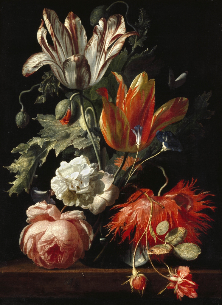
There’s an elaborate peepshow by Samuel van Hoogstraten: you look through a little pinhole to the side and see what looks like a realistic interior of a house with rooms giving off in front of you and to the side. There’s Chatsworth’s famous violin painted as if hanging on the back of a door, and the hyper-real flower paintings of Simon Verelst which looked so real that they fooled the diarist Samuel Pepys.
‘A Vase of Flowers’ by Simon Verelst (1669)
Room 5. Wren and Baroque architecture
Here, in the magnificent churches designed by Christopher Wren and his student Nicholas Hawksmoor, with the Queens House and other buildings built at Greenwich and plans to rebuild Whitehall Palace after it burned down, and the country houses designed by the later John Vanbrugh, you approach something like the continental Baroque in scale and ambition.
But as the story of Sir James Thornhill’s murals indicates, it is a European style which has been restrained, watered down and made sensible.
Room 6. Country mansions and courtly gardens
How Hampton Court was remodelled to be more like Versailles and so was William III’s grand Het Loo Palace in Apeldoorn in the Netherlands. Diagrams and paintings of Chatsworth and Bleinheim, the grandest of grand English country houses.
Paintings of huge, geometric, symmetric formal gardens.
Room 7. Painted interiors
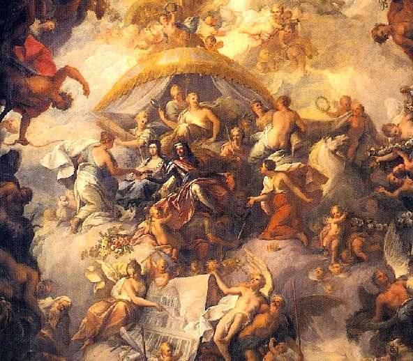
This was maybe my favourite room. It contains a photo of the vast and sumptuous mural on the ceiling of the dining room at Old Greenwich Palace, and is lined by preparatory paintings of other vast mythological murals by the likes of Antonio Verrio and Louis Chéron and Sir James Thornhill.
Apparently, it was the arrival of seasoned muralist Verrio in England in 1672 which sparked a new fashion for grandiose murals, and it’s in these (essentially private) murals – vast compositions awash with Greek mythical or allegorical figures that you get closest to thinking the English had a Baroque period or style.
Lower Hall ceiling of the Painted Hall at the Old Royal Naval College, Greenwich by Sir James Thornhill
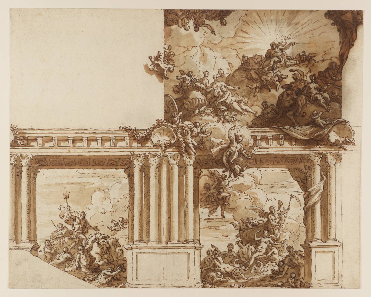
But what I really liked was the preparatory sketches for these works. The exhibition includes huge sketchbooks in which Thornhill sketched out his initial designs and compositions for various murals. For me, these rough sketches often had more energy, vim and dynamism that the finished works.
In particular, the human shapes and faces, although left as rough outlines, somehow, have more character and vibrancy than the smooth finished oil paintings, in many of which Thornhill has had to defer to the peculiar contemporary style of restoration faces, with their rounded features and bulging eyes.
Thornhill’s sketches are fun, mad profusions of tumbling cartoon characters. This one shows a grand mythological scene which was clearly designed to cover the wall of a staircase (hence the 45 degree angle at the bottom left): at the bottom-right Venus is being born from the waves; watched from the left by Neptune King of the oceans holding his triton; and above her a frothing scramble of other gods and goddesses.
A Ceiling and Wall Decoration (circa 1715 to 1725) by Sir James Thornhill
Room 8. Beauty
A striking and inventive piece of curating in which the Tate has taken seven of eight massive, full-length portrait paintings of English society beauties and made an attempt to recreate the atmosphere of the kind of grand drawing room they would have adorned. They’re selections from two series of paintings:
The Hampton Court Beauties, a set of eight full-length portraits, commissioned by Mary II in 1690 to 1691
The Petworth Beauties, commissioned by the 6th Duke and Duchess of Somerset for their country mansion Petworth House
In a way, though, the real star of the room is the huge heavy wood furniture, adorned with gold clasps and legs modelled from what appear to pregnant black woman (!?) and which bear a set of massive Chinese vases. There are candelabra on the walls and one can only wish the curators had had the courage of their convictions and turned the gallery’s electric lights off and installed replica candles so we really could have seen what paintings like this would have looked like in the flickering candlelight of the 1690s.
Room 9. Triumph and glory
Critics could easily complain that the exhibition doesn’t really describe or explain the complicated and momentous political events of the years 1660 to 1700, which saw not just the restoration of Charles II, but:
Charles’s death in 1685 and the succession of his brother, as King James II.
The rebellion of Charles’s eldest illegitimate son, the Duke of Monmouth, who raised an army in the West Country, before being crushed by James’s army.
The so-called ‘Glorious Revolution’ of 1688 when James announced that he was going to raise his son by his second wife, Mary of Modena, a Catholic i.e. ensuring that the next in line to the English throne would definitely be a Catholic. At this point a cabal of leading aristocrats decided to overthrown James and invited William Prince of Orange (a state in the Low Country) to come and be King of Britain, using the fig leaf that William was the son of James’s dead sister, and also that his wife Mary was the eldest daughter of James II, the king she helped to overthrow.
Having secured the throne in England, William went on to defeat the Irish at the Battle of the Boyne in 1689, a defeat/victory which is commemorated to this day in Northern Ireland.
And the creation of the Bill of Rights and other constitutional devices which ensured the supremacy of Parliament and other legal rights which made Britain one of the most advanced and liberated nations on earth.
But then this is an art exhibition and not a history lesson.
The advent of William as King not only overthrew the House of Stuart but created two broad political parties among the political elite – those who remained true to the old Stuart line and came to be known as Tories, and those who moved to ingratiate themselves with the polemically Protestant new rule of this progressive king and came to be known as Whigs.
And it also drew Britain deep into European politics. We gained not only a new king but a new web of complex international alliances and enmities which this king brought with him, not least total opposition to the king of France’s ambitions for European hegemony.
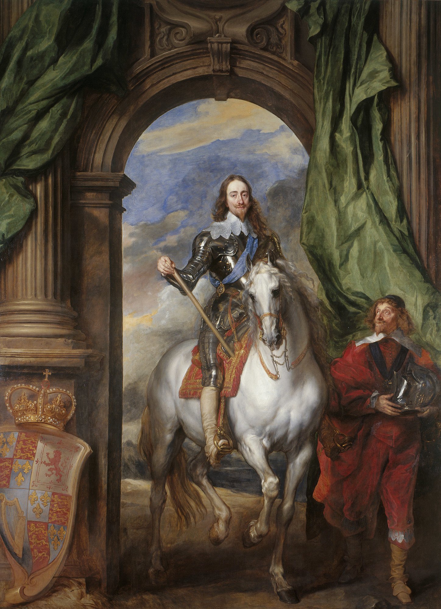
And thus this room has paintings of William and various of his generals, in warlike pose, astride horses, in martial postures. The thing is… most of them are a bit rubbish. Here is a painting of Charles I on a horse by the genius Sir Anthony van Dyke back in the 1630s.
‘Charles I with M. de St Antoine’ by Sir Anthony van Dyck (1633)
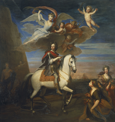
Now here is a painting of King William III, portrayed as the victor of one of his innumerable endless wars, by Sir Godfrey Kneller.
‘William III on horseback with allegorical figures’ by Sir Godfrey Kneller (1701)
The van Dyck has genuine grace and dignity and regality. The Kneller has many good effects, but it’s just nowhere nearly as good as the van Dyck. And there’s something about those high wigs for men which is just… ludicrous. And whereas Charles is accompanied by a real retainer the chocolate box angels and putti flying above William are laughable.
(To be precise, the allegorical figures in the Kneller painting are: Neptune in shadow on the far left; Ceres and Flora [goddesses of fertility and crops] the two women on the right; Astrae [Justice] and Mercury [messenger of the gods] flying overhead.)
Room 10. The Age of Politics
The constitutional and legal reforms which accompanied the Glorious Revolution which ushered in a new age. Formerly a king appointed a lead minister whose job it was to draw up policy and steer legislation through a mostly passive parliament until, that is, the increasing dissension which led up to the civil war.
Now it was agreed in law that parliamentary elections would be held every three years, and this ushered in a new era where groups and cabals of aristocrats came together to press for their own interests. It was the birth of parliamentary parties. And also the birth of an early form of journalism as magazines arose to cater to the taste for reading about the ever-more complex political intriguing and jockeying which was going on in and around Parliament, such as the original Spectator magazine, founded by Joseph Addison and Richard Steele in 1711.
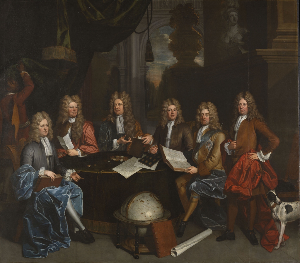
Thus it is that the final room contains portraits of leading lights of the is new world of intrigue, clubs and parties. There is a massive and unflattering portrait of Queen Anne (reigned 1702 to 1714) along with portraits of the members of the various clubs which had their origins at this time, including Kneller’s portraits of members of the Whig Kit-Cat Club, and this fine body of podgy, bewigged men – the leading figures in the Whig Junto as depicted by John James Baker.
‘The Whig Junto’ by John James Baker (1710) Tate
Conclusion
If you watch the Antiques Roadshow or flick through popular history, nobody refers to an English ‘baroque’ period – the eras and styles they refer to are the Restoration, or Queen Anne, or Georgian periods and styles (the Georgian began at Queen Anne’s death in 1714).
And the exhibition skimps on the enormous importance of the political events of the time, and skates very thinly over the momentous philosophical and scientific revolutions of the period – Newton discovering the laws of the universe and the nature of light, the Royal Society founded in 1660 and sponsoring all kinds of breakthrough in engineering, hydraulics, dynamics, the circulation of the blood and so on.
But then it’s an exhibition of art and architecture not a history lesson. And one of the most interesting lessons I took from it was how very unBaroque a lot of the art of this period was. In sharp contrast with the European Baroque, it was dedicatedly Protestant, unreligiose, unshowy, undramatic and often very tame and domestic in feel.
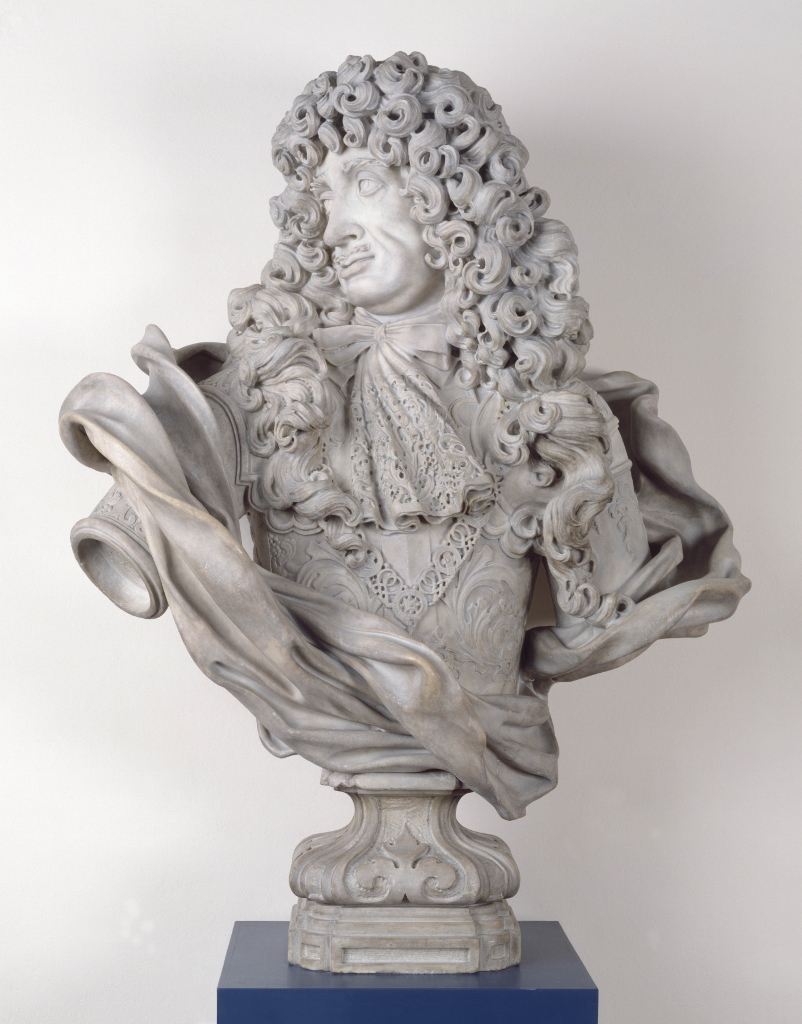
In fact walking slowly back through all ten rooms I came to the conclusion that in the entire exhibition there was only one real Baroque pieces, an enormous, fearfully heavy marble bust of Charles II made by the French-born, Genoa-based sculptor Honoré Pelle in 1684.
This, it struck me, was grand – large, imposing, showed its subject in a moment of movement, dramatised by the extraordinary realism of the cloak of fabric flying around his shoulders. This, for me, was by far the most convincing and successful Baroque work of art in the exhibition.
‘Charles II’ by Honoré Pelle (1684) Victoria and Albert Museum